(Español) Moritz Feed Dog 2019
The Colour Community: Multiple

The Colour Community has just presented the new report of colours and materials that will influence the Autumn-Winter season 2020-2021 in the world of design and fashion. The initiative, led by three colour professionals , was presented, as usual, in the Old Estrella Damm Factory in Barcelona before the watchful eye of a hundred enthusiasts from the sector. We remind you that the founding team is made up of the architect Pere Ortega , the designer specialized in Colour & Trim , Eva Muñoz ; and Rosa Pujol , Textile & Colour Stylist from Gratacós . In each issue new partners are added to this “mother team”who bring their vision and help shape the new range of colours and materials that will inspire the new season. It is an initiative that is repeated twice a year and that has our support. ” Gratacós always has the doors open to our fashion- area, for every lover of fabric, texture and colour,” declares Juan Gratacós at the beginning of the presentation of the report .
Juan Gratacós : ” Our fashion-area is always open to lovers of fabric, textures and colour”
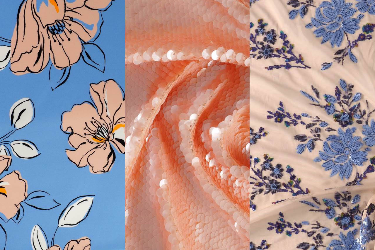
On this occasion the season is based on the concept of ‘ Multiple ‘ and consists of a reflection in a positive key about the future society where the line between the real and the virtual will be more diffuse than ever . ” Currently this virtual reality exists on social networks or in videogames but little by little it will become as tangible as what we now call reality,” explains Pere Ortega in presenting the report. The ‘ Multiple ‘ proposal , in turn, is articulated through four colour ranges and materials which are named On , Inside , Balanced and Metronome .
Pere Ortega: “Currently this virtual reality exists on social networks or in videogames but little by little, it will become as tangible as what we now call reality”

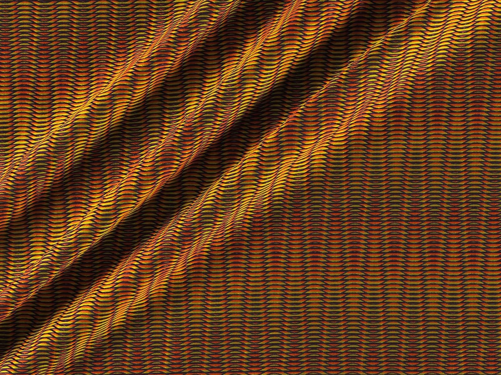
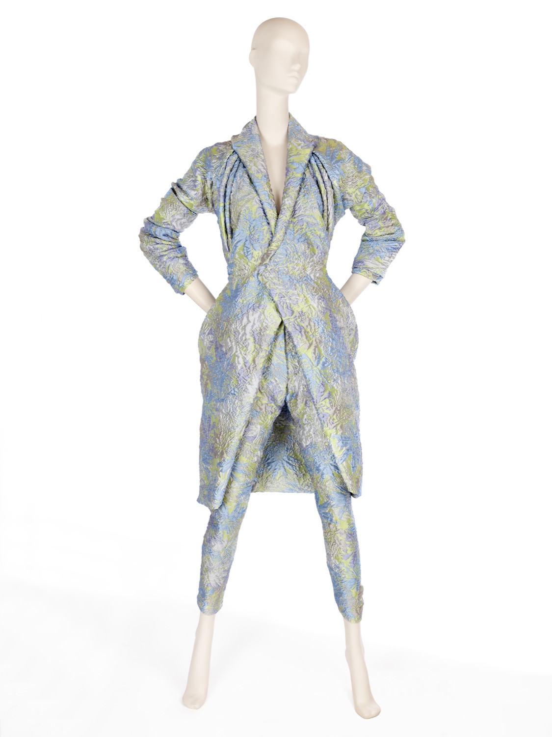
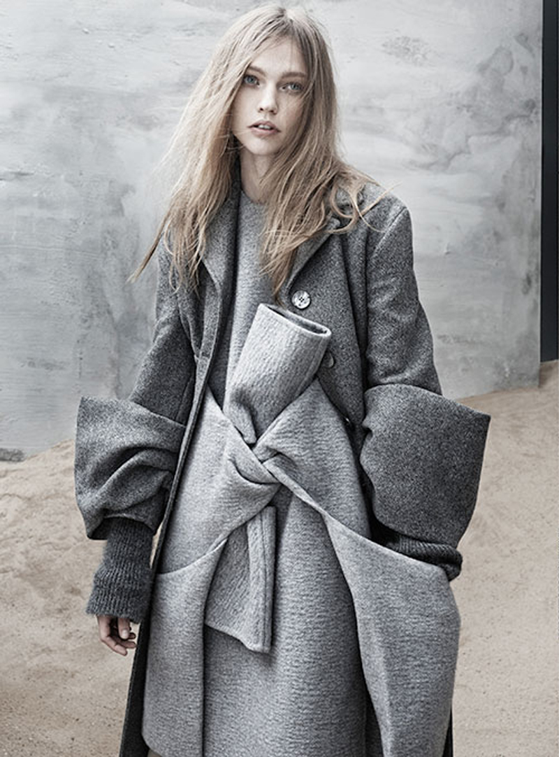
1.- On
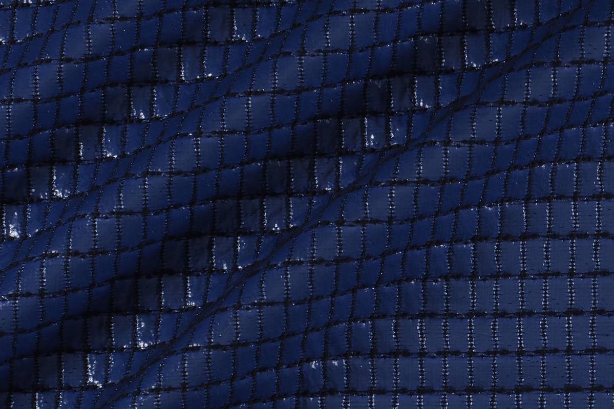
The first inspiration appeals to dynamism, to the creation of a dialogue with new realities that are virtual. It is a dynamic and versatile range that creates products connected to the human being in a digital environment. The shades chosen to conceptualize it are the cold ones in their most attractive version: metallic greys, iridescents, smoky blues, bright blacks and touches of yellow that play in contrast. The range of industrial and futuristic themes plays with plastic, oily materials, straight and curved architectural lines and artificial shapes. Fantasy under control.
2. Inside
The second range is more dense and theatrical than the first. It works with the realities that look back at the past, in a kind of retrospective. The shades that are used to give it shape are the browns, purples, deep blues and the metallic range that always appears in each of the four inspirations as a common link. Floral prints, organic shapes, sinuous lines, elements of nature, upholstery … all these elements influence this intimate range that takes as its model the baroque of Versailles in its most contemporary version.
 |
 |
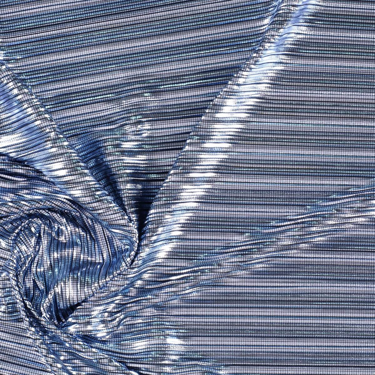
3. Balanced
The third inspiration is based on the concept of balance and chromatic harmonies. It is a modest range that is inspired by the shapes and textures of nature and works with craftsmanship in a very folky way. The predominant colours refer to autumn: the beiges, earth-coloured , whites, metallics and forest greens mixed with vibrant blues. Rough surfaces,skins, the most basic geometric elements and tribal influence are also treated in this folk range.
4. Metronome
Finally, the fourth inspiration is based on the metronome’s rhythm, with elements in movement that follow its beat: it is a work of colours that come and go and in turn play on the contrasts. This range belongs to the world of the city: it is urban, cosmopolitan and youthful. It is inspired by all the multiplicity of people, tribes and individuals that coexist within the same community. There are plenty of grey shades, silver and metallic details on smooth surfaces that contrast with graphic elements and arty patterns. Denim and overlays of garments, understood as a show of expression, configure the different identities that make up the same city.
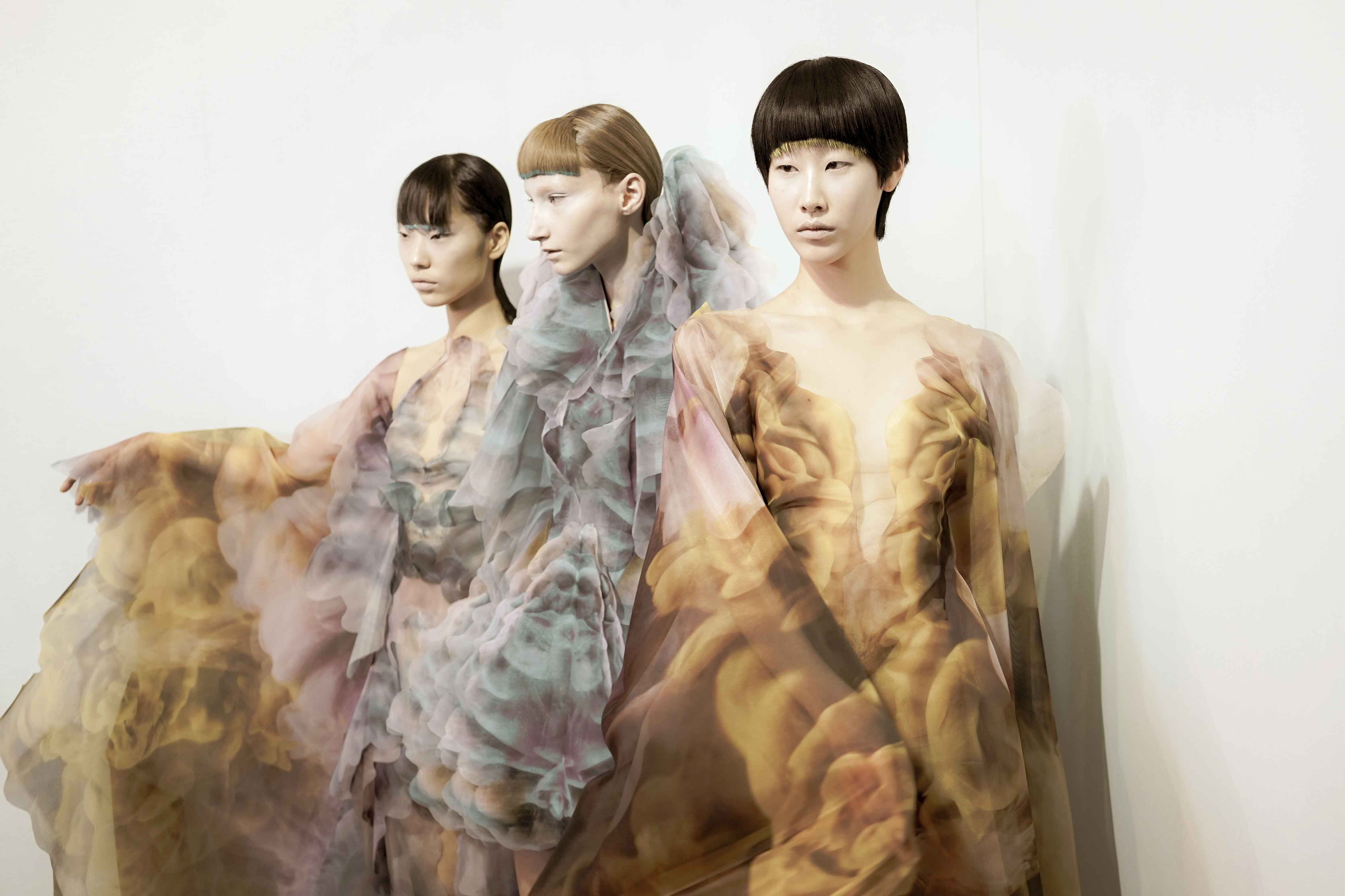
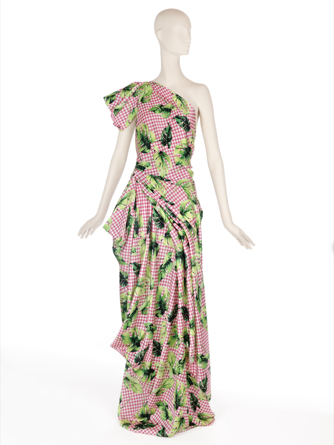
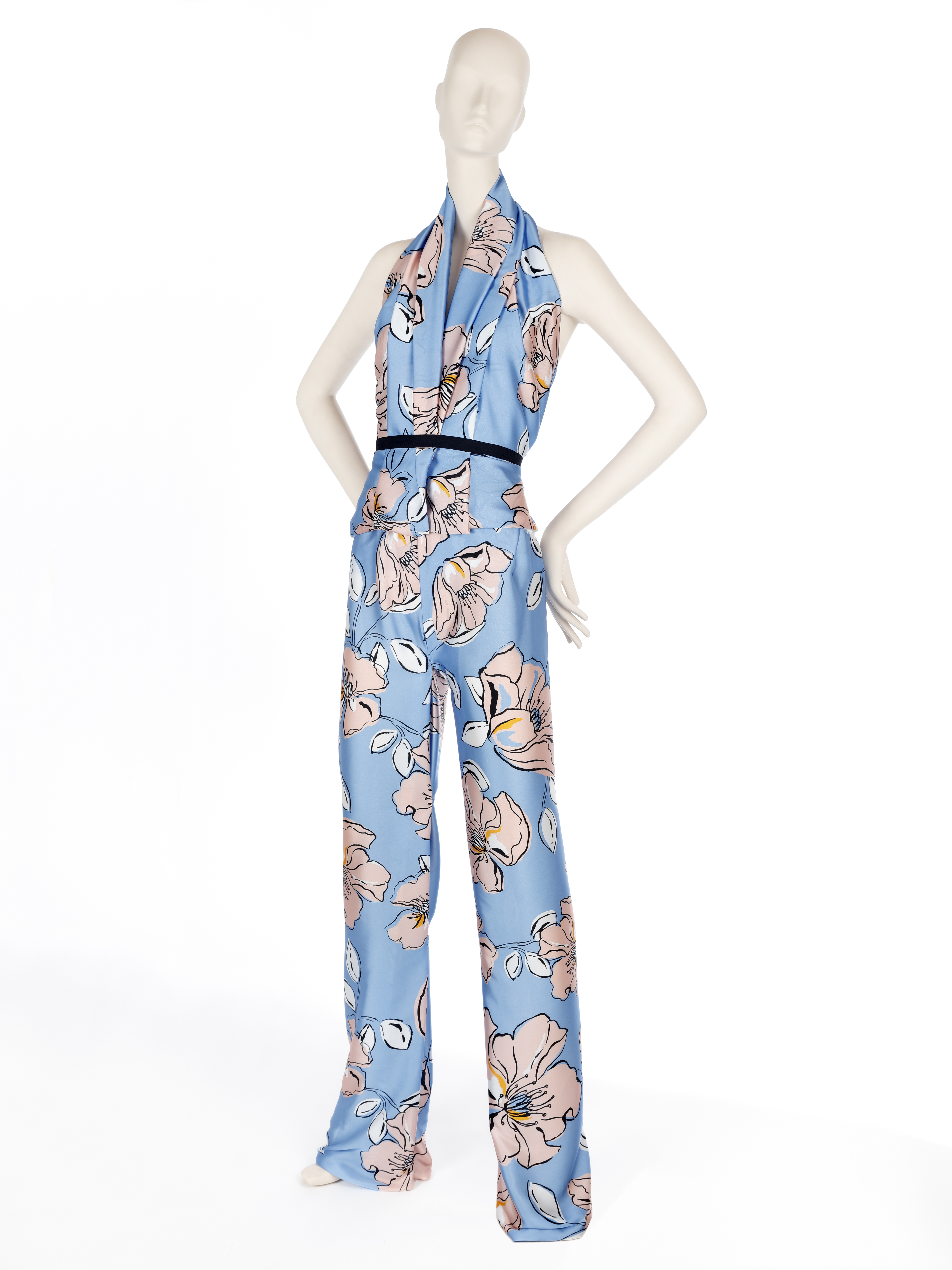
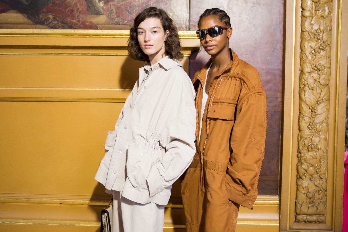
SS19 Collection : Play
Are you ready to play? To play the game in its broadest sense. The game as fun, where there is space for experimentation mixed with hints of entertainment and large doses of curiosity. In this new season that we are premiering we pay homage to leisure, to recreation, to freedom in a collection that is inspired, as could not be otherwise, by the concept of ‘ Play ‘. It is a presentation which is both sophisticated and casual, which focuses on colour, movement with light fabrics and craftsmanship for the warmer months of the year. This Spring-Summer 2019 collection has a large dose of creativity and ingenuity on the part of our design team, who make Gratacós a luxury fabric company with a defined style and personality. So let’s enjoy the latest creation we have prepared with the intention once again to surprise and excite. Let’s play together: Let’s play!
 |
 |
“Play is a sophisticated and casual presentation which at the same time goes for colour, movement and craftsmanship”
General concept
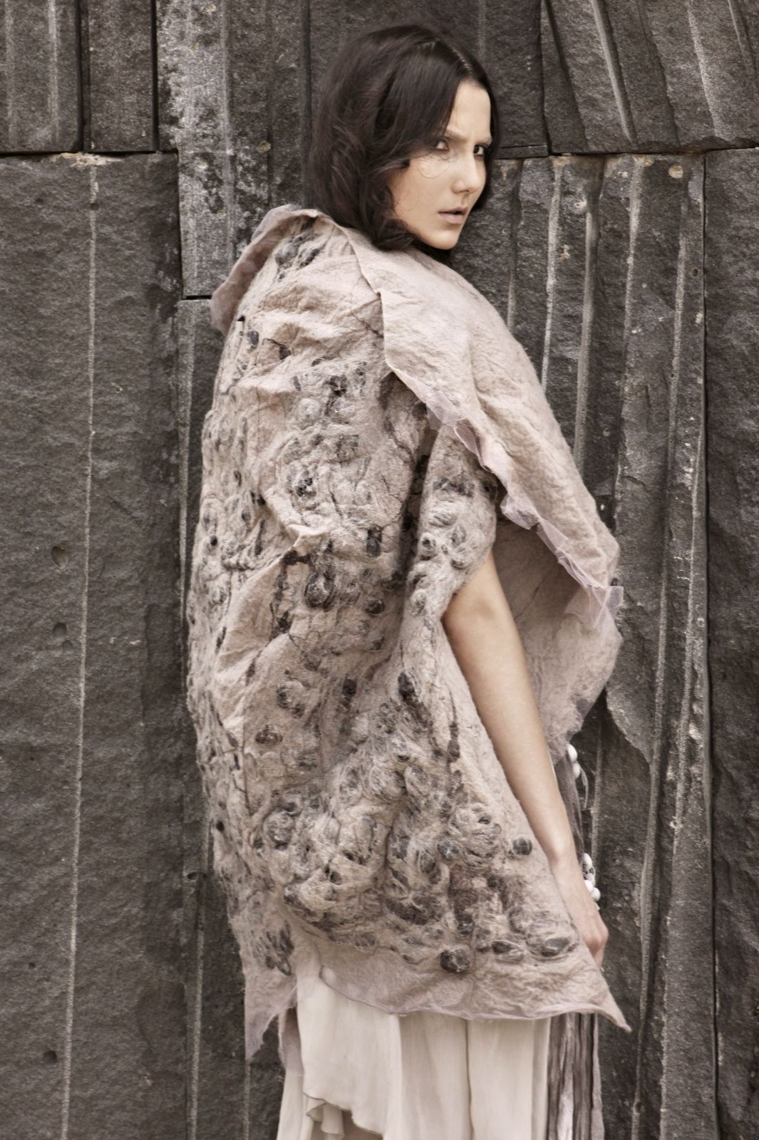
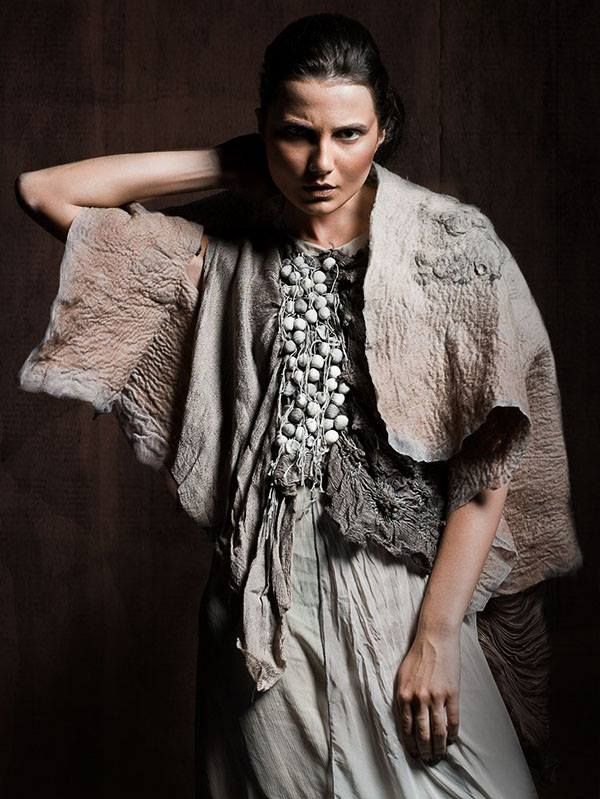
‘Play’ is a sympathetic collection that seeks at first glance to combine apparent simplicity with products that are attractive and appealing. It is an aesthetic presentation based on timeless articles far away from extravagance and artificiality, but these have to provide a distinctive feature, a certain personality. We are not seeking the versatile and basic, which is somewhat insipid, but rather to give it a creative turn. In parallel we are bringing back the characteristic features of folk culture and opting for craftsmanship to present traditional fabrics with rustic aspects and manual details.
“We are seeking to combine apparent simplicity with attractive and seductive products at first glance”
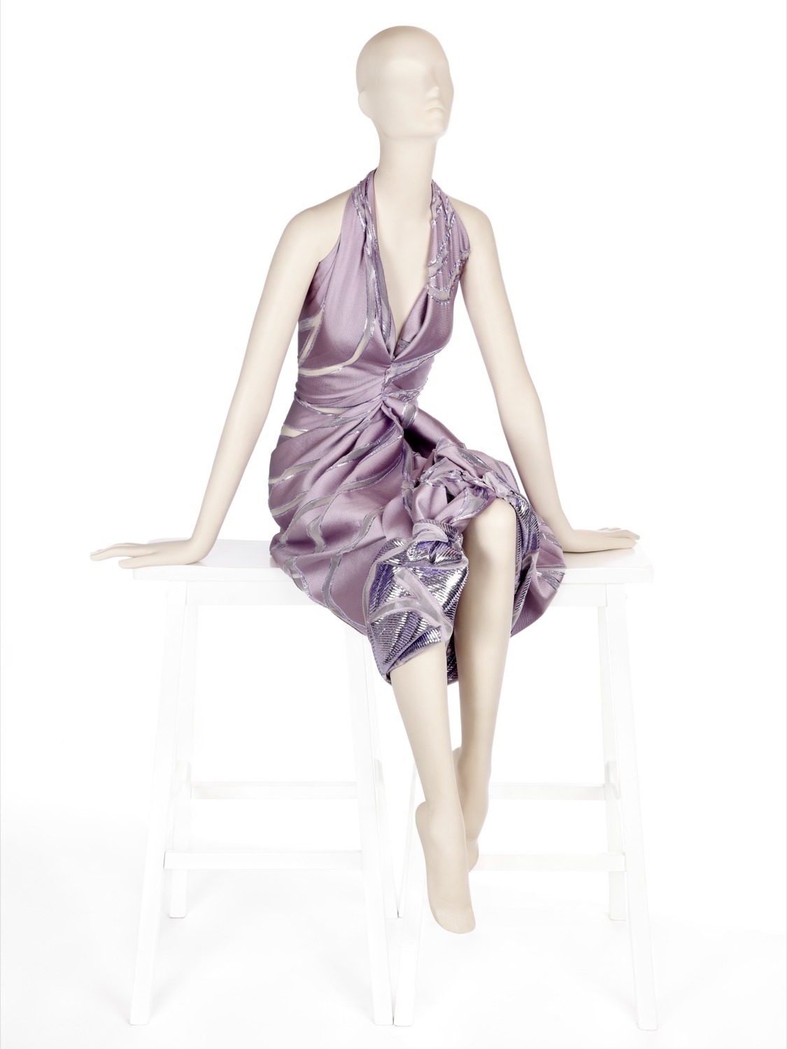
Fabrics
The objective of this collection is to revitalize the luxury of textures and materials. To achieve the new basics we use impeccable fabrics with clean and serene appearances. We also go for colourful Jacquards with tactile reliefs, fluid fabrics of silk or polyester of delicate appearance, gauzes with transparencies, dense satins, iridescent materials that captive the light or floral prints of watercolors. At the same time, within the folk trend, we are bringing back granular textures, fibrous and light aspects that show the relief through the thread-work, the hand-made reliefs and the embroidery with motifs inspired by nature.
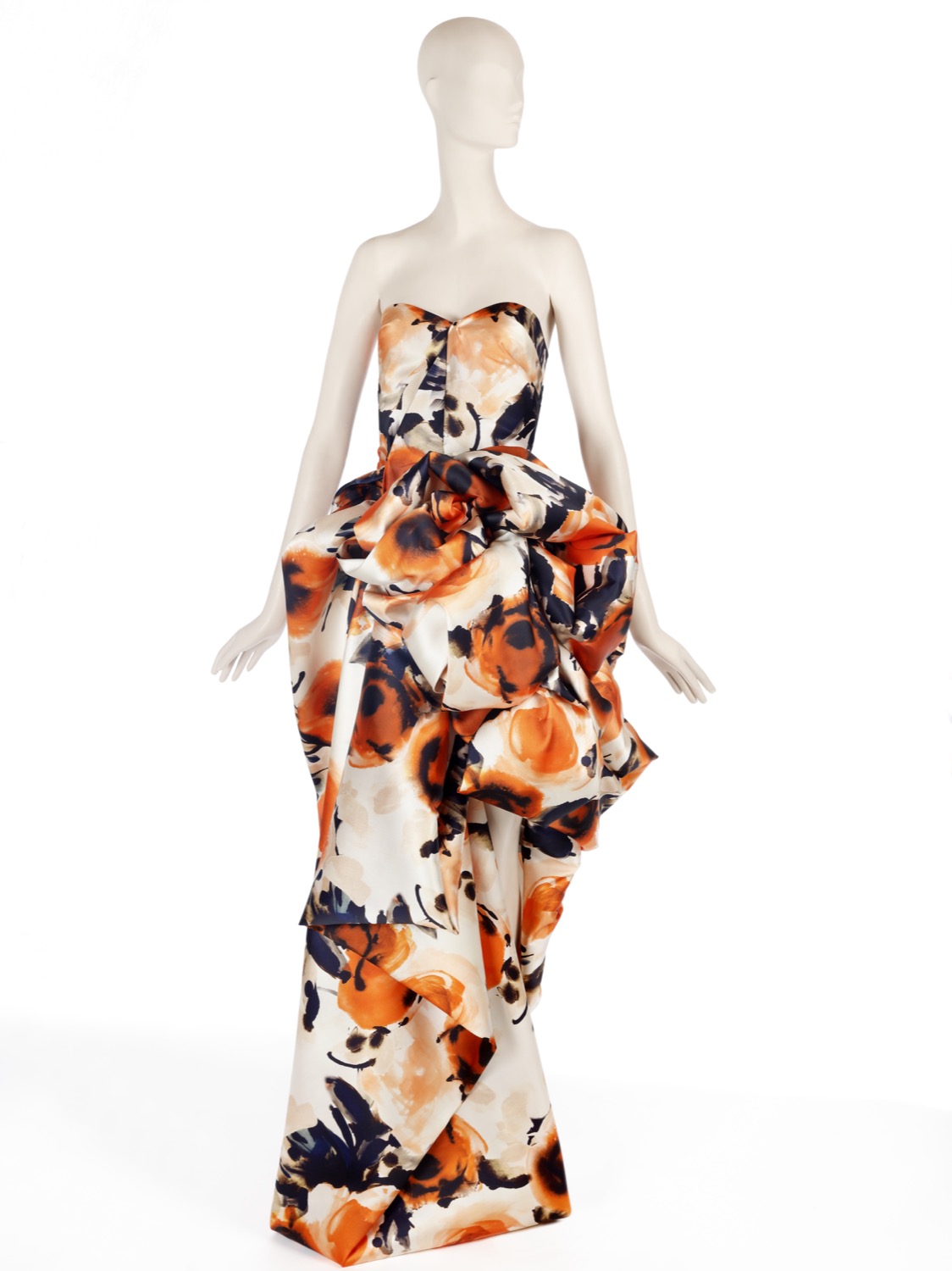 |
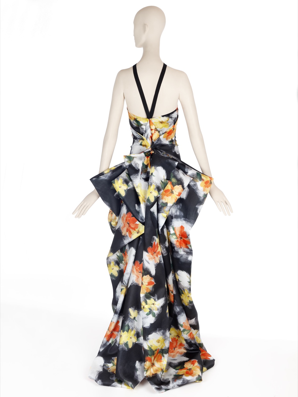 |
“We are revitalizing the luxury of textures and materials”
Colours
The range of colours evolves from the natural to the artificial. Thus pastel shades and soft,sweet shades give way to the most vivid colours in a smooth transition and in a key feminine way . The most vibrant tones are used for details. ‘Play’ is also a collection dedicated to light, that’s why it also opts for the iridescent, transparent and nacreous with a nod and a wink to things nautical.
Discover some inspirations in our new lookbook Spring – Summer 2019! click here.
(Español) Oda a la sobremesa
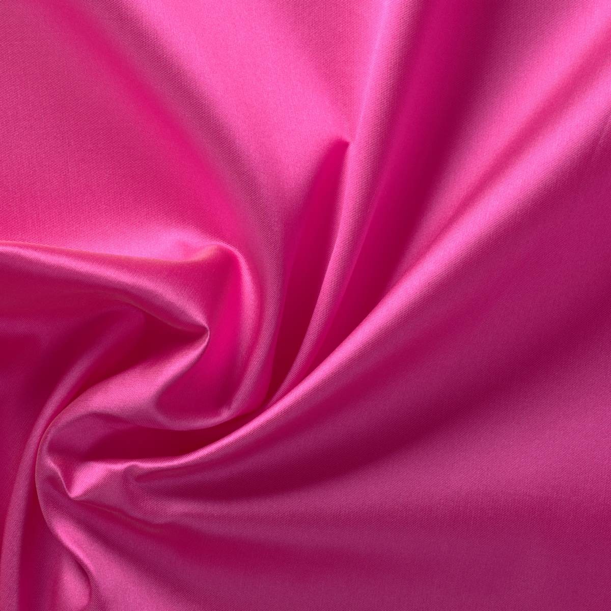
Pink Power, the pink that empowers
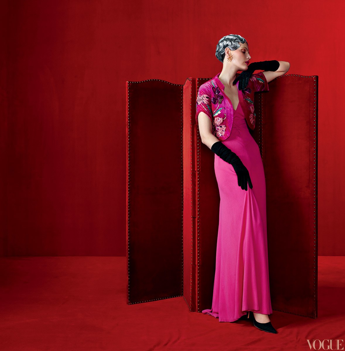
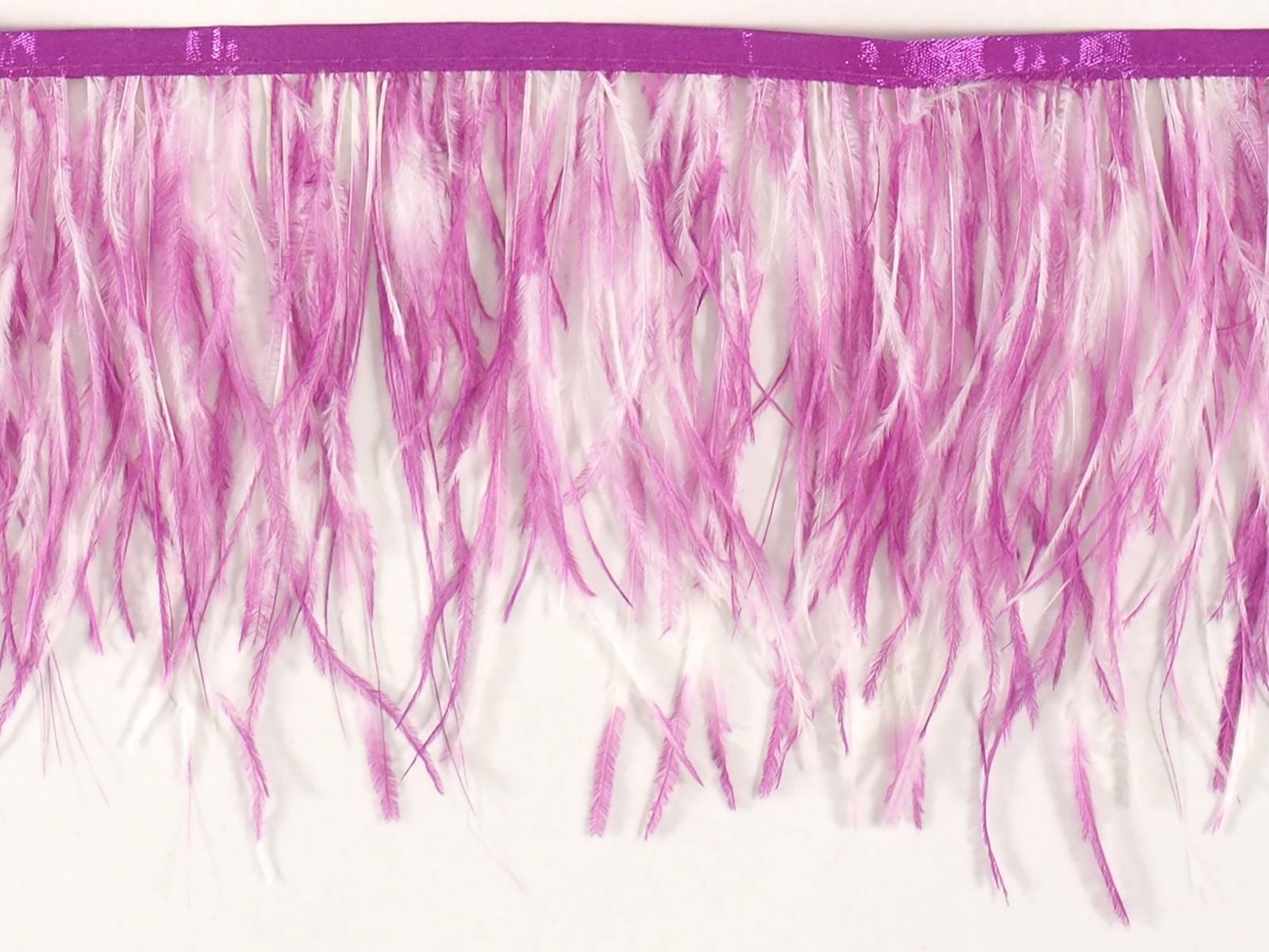
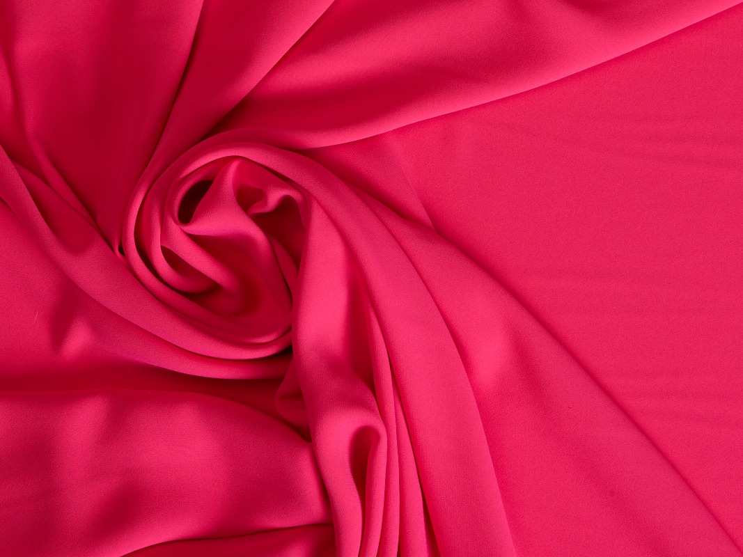
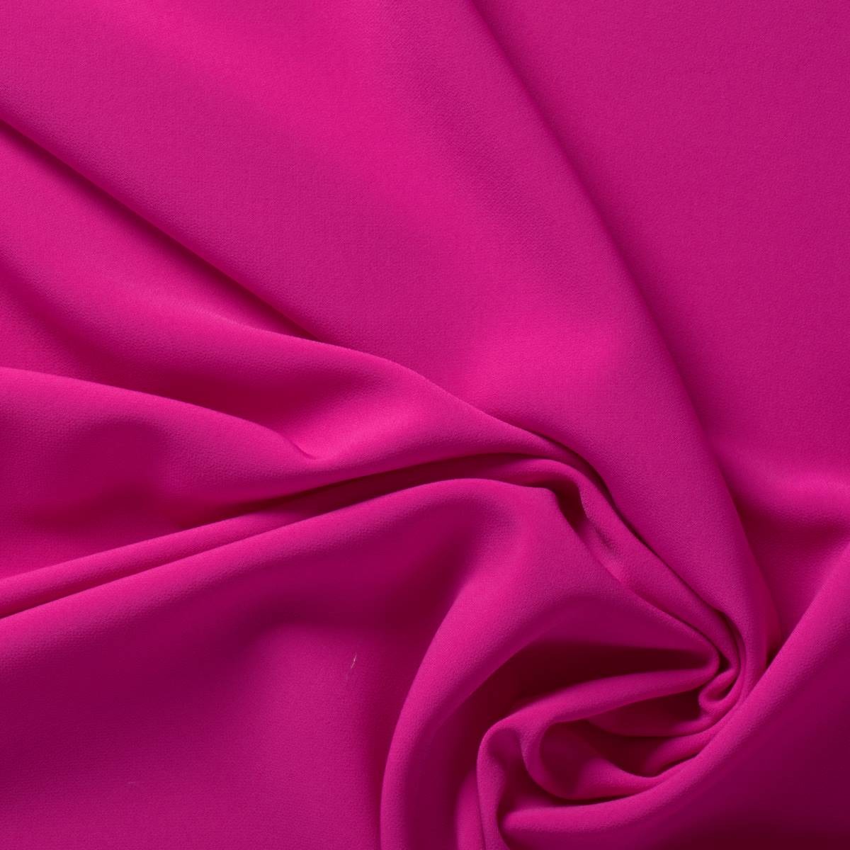
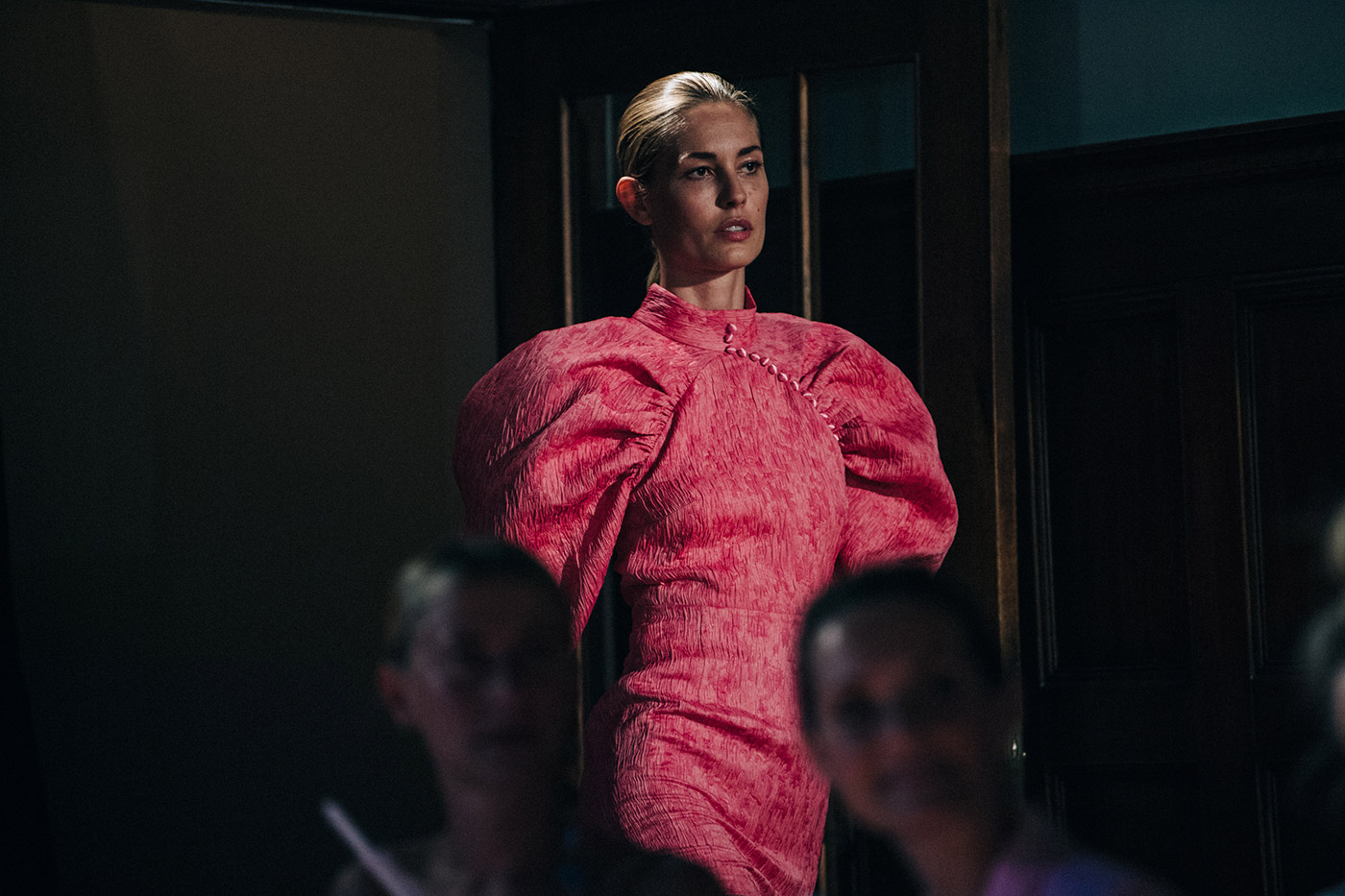
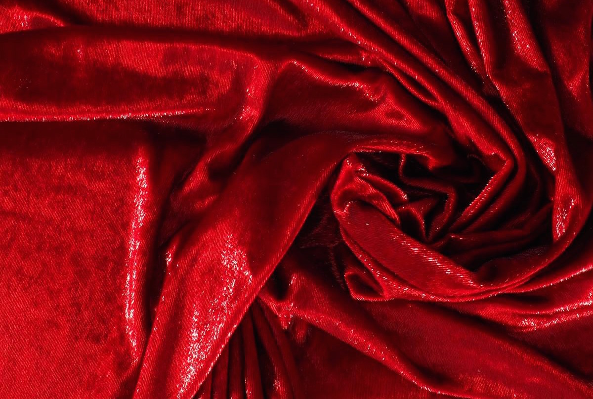
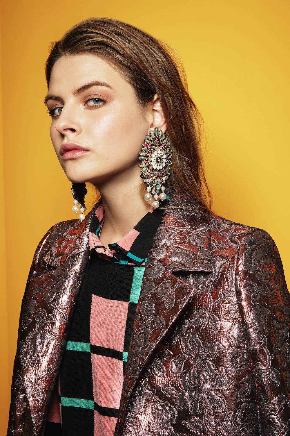
Pink is no longer just a colour traditionally attributed to femininity, charm or politeness. The shade that comes from the name of a flower has been stripped of its delicate attributes to present brand new symbolisms that evoke courage, strength or bravery. Pink Power has arrived in the fashion industry. We are not talking about just any pink. This shade of pink refers to a shocking pink, the strong and bright pink that has something of violet and that the colour experts call “magenta “.
Did you know…
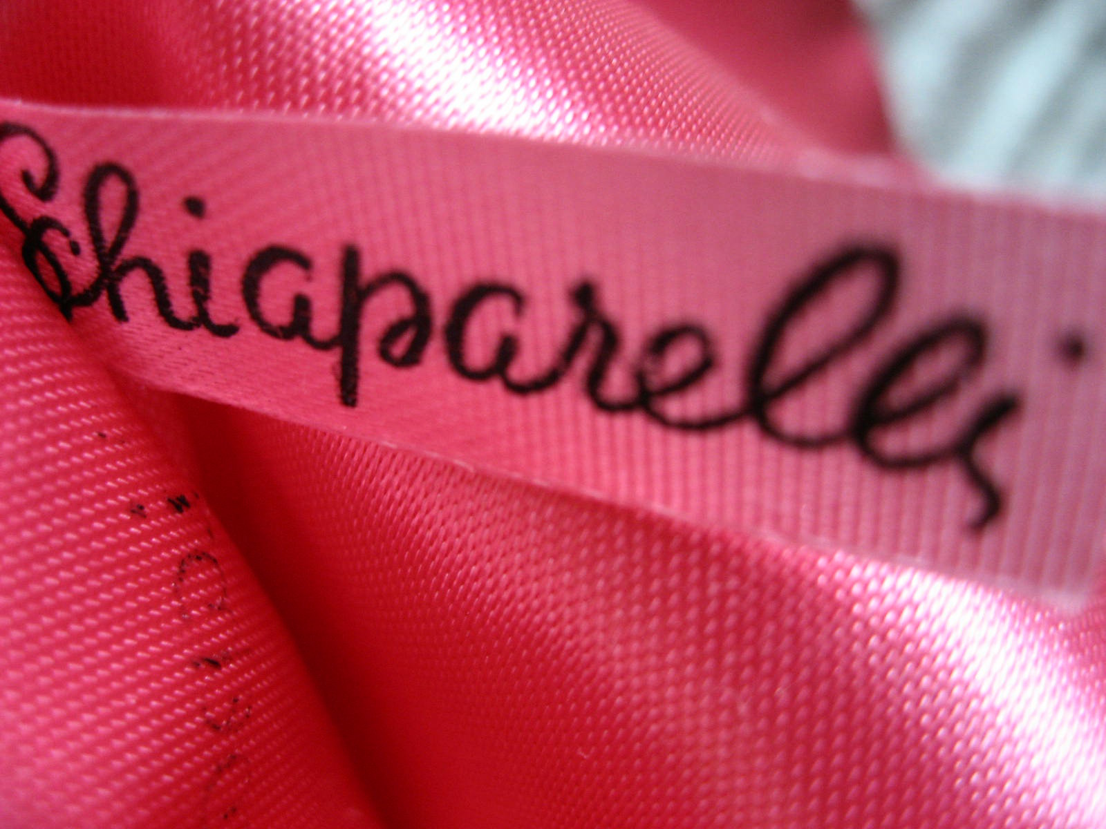
Italian fashion designer Elsa Schiaparelli , who brought the ideas of surrealist painters to fashion, launched a new colour in 1931: shocking pink , a mixture of magenta and a hint of white (similar to fuchsia),a colour that the designer used in fashion to provoke and challenge the established norms. In parallel he also created a perfume with the same name and it was sold in a box of that colour, inside which was a bottle with the shape of a female bust. This launch literally left the audience in shock because nobody had believed that pink could be so aggressive. This pink does not have any of the traditional feminine qualities.
The pink revolution
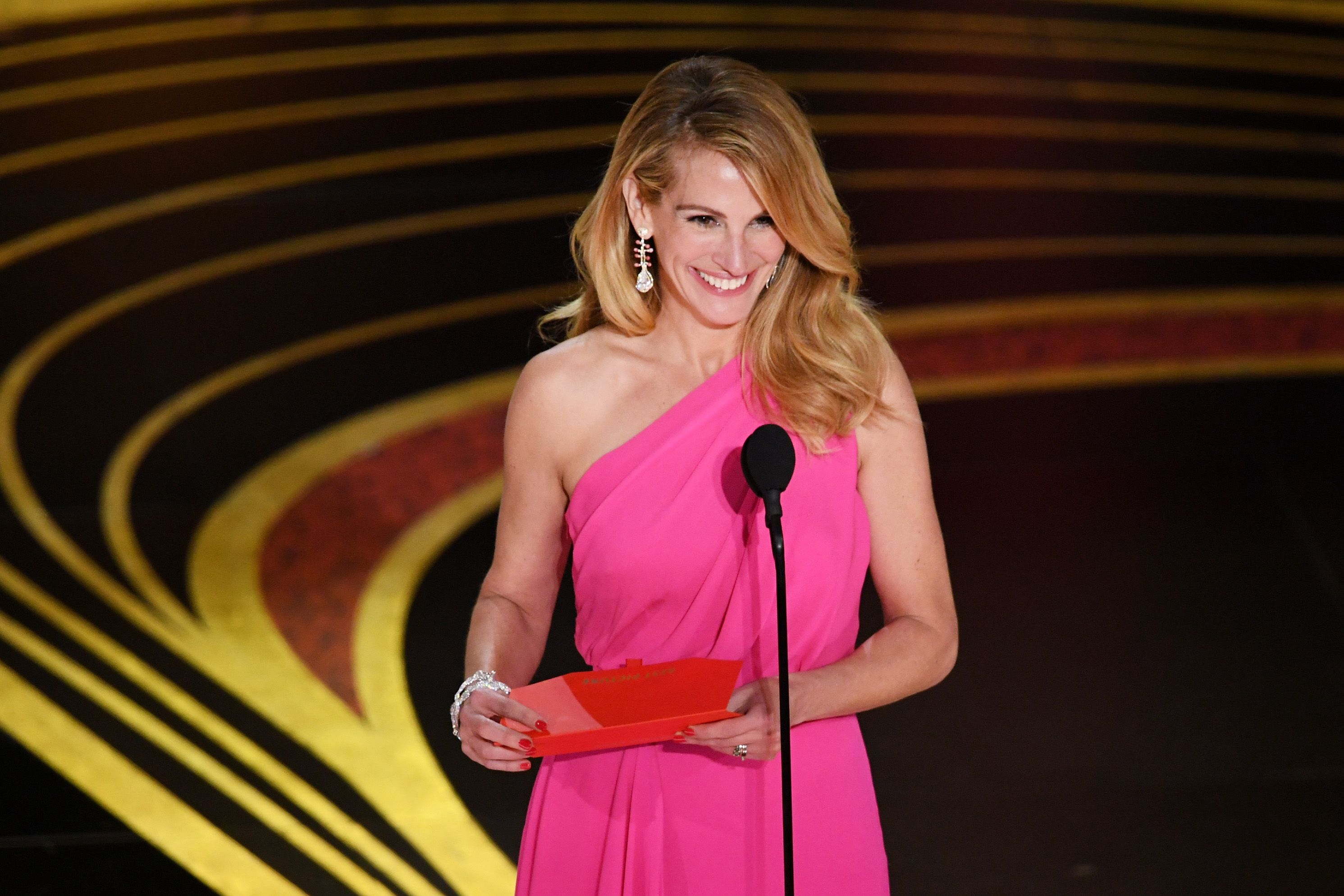
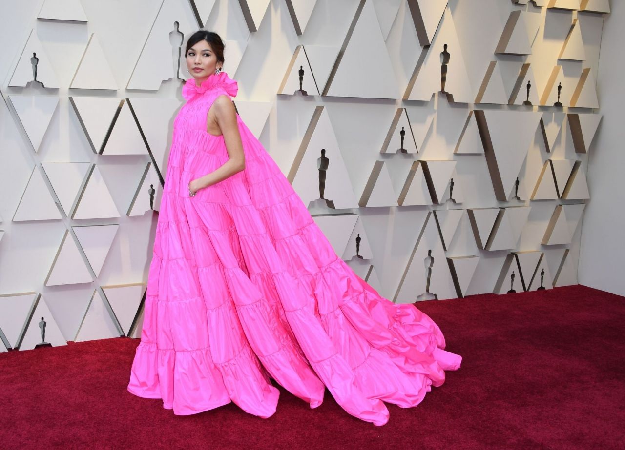
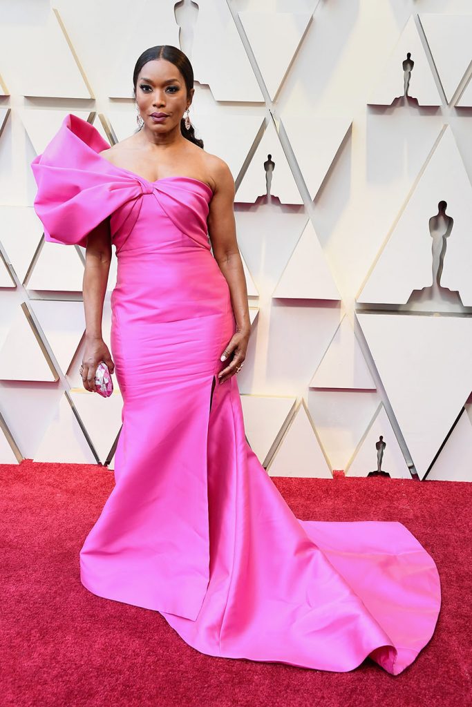
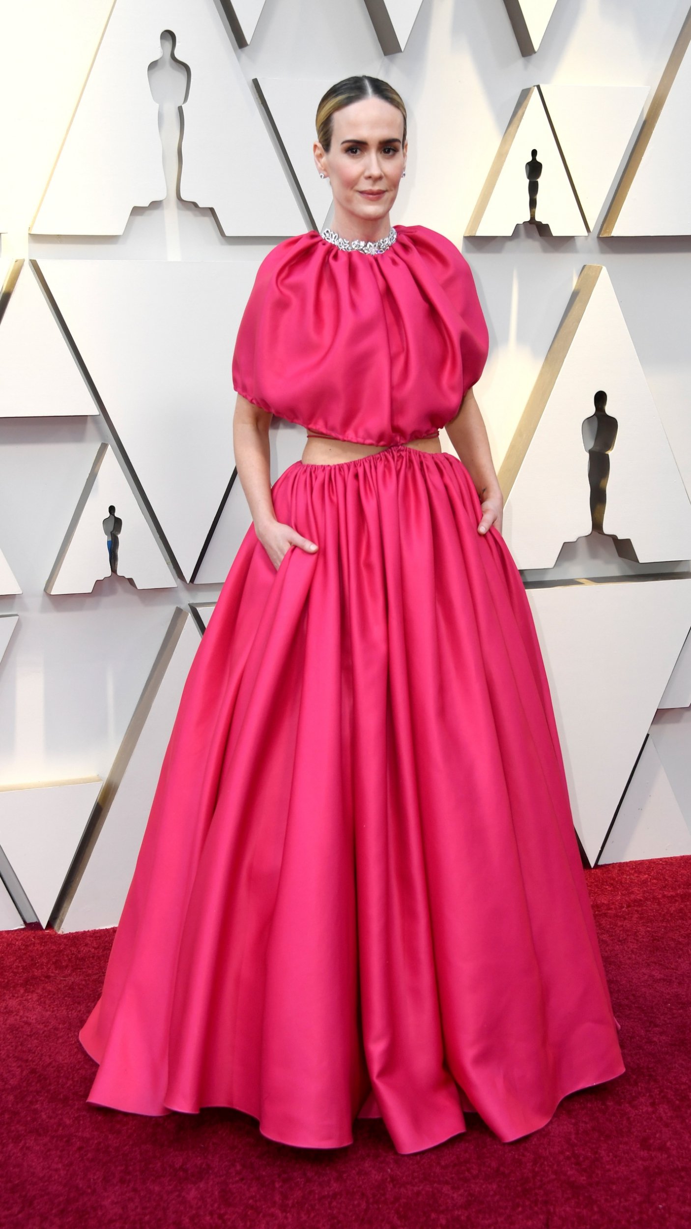
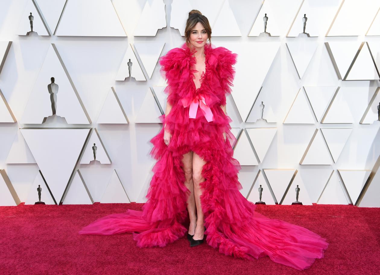
Pink is and still is in vogue. Apart from the shade linked to a generation, millennial pink, the fashion industry has taken advantage of the pull of popularity of this controversial colour to increase the presence of the shade in clothes, complements and accessories with its brightness and a certain rebelliousness. Pink shows charisma. It was not for nothing that it was one of the favourite colours displayed on the red carpet of the 2019 Oscars. And it is well-known that on the most powerful and influential red carpet in the world there is nothing left to chance.
The actress Julia Roberts wore pink when she presented the award for best film ‘Green Book’ clad in a dress by Elie Saab, a design with asymmetrical cut, gathered at the waist and low with ruffles of different length that put the finishing touch to the gala. Also in vibrant pink was the much- commented styling of Linda Cardellini signed by Schiaparelli made in tulle with V-neckline, asymmetric length and a delicate tail that extended along the floor. Or the stunning design by Valentino with a raised neck worn by British actress and model Gemma Chan.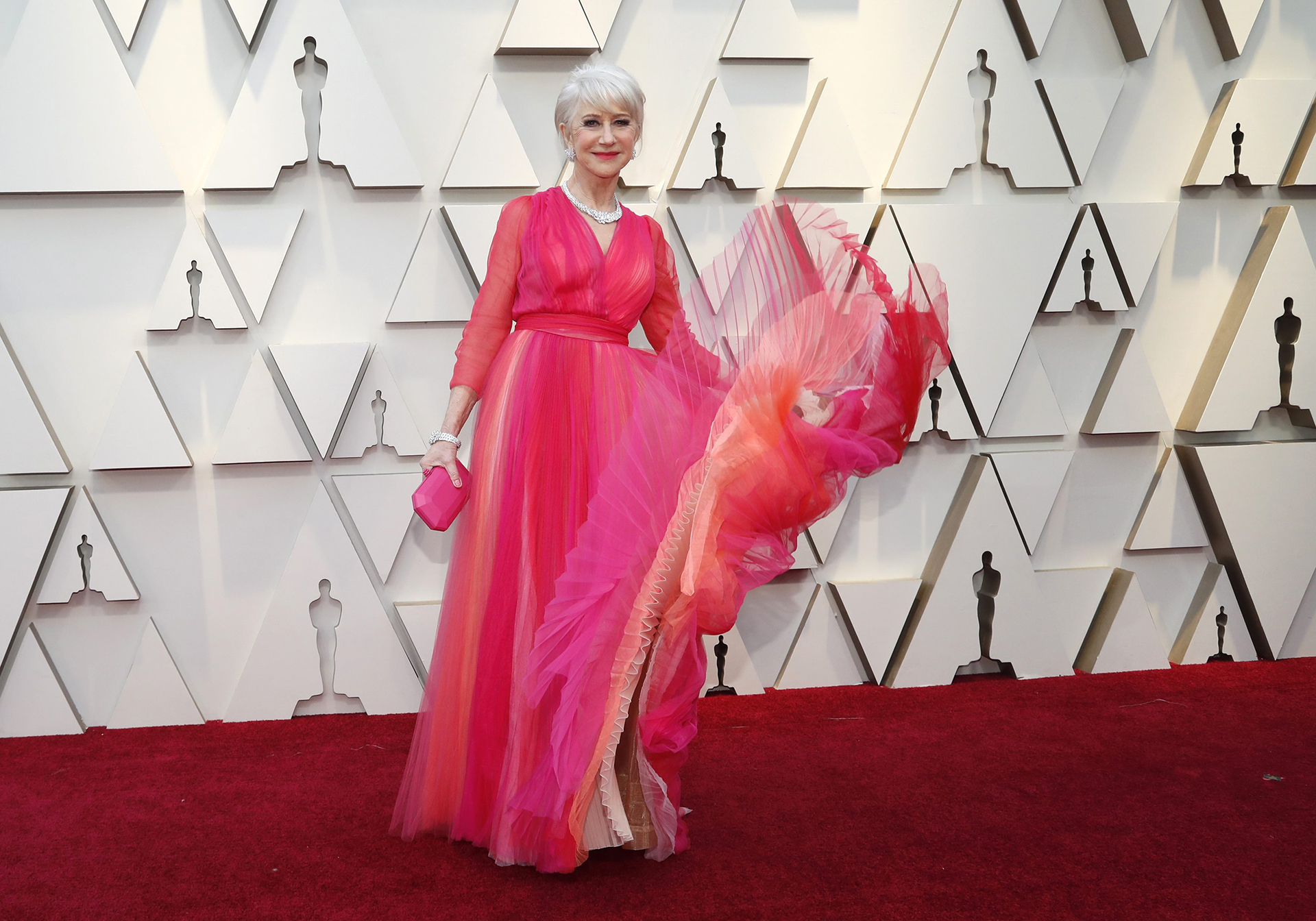
Pink was also the favourite color for Sarah Paulson, the actress of ‘American Horror Story ‘ who succumbed to its power with an expansive dress with a cut- out opening by Brandon Maxwell. For her part the British actress Helen Mirren wore a flowing dress by Schiaparelli, a creation with V-shaped neckline and ruching at the waist that played with different intensities of pink. Angela Basset, one of the actresses in the film ‘Black Panther ‘ also opted for the brightest and most metallic version of this colour in a ReemAcra model with asymmetric neckline.
There is no doubt that pink will give us much to talk about in 2019.
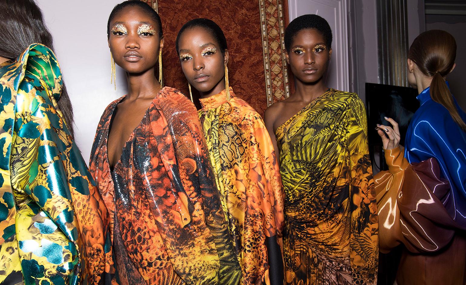
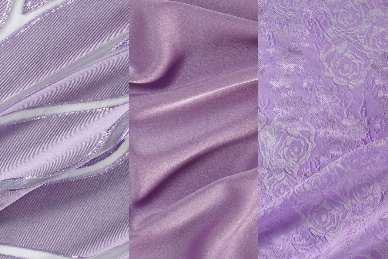
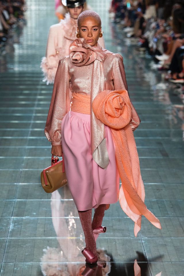
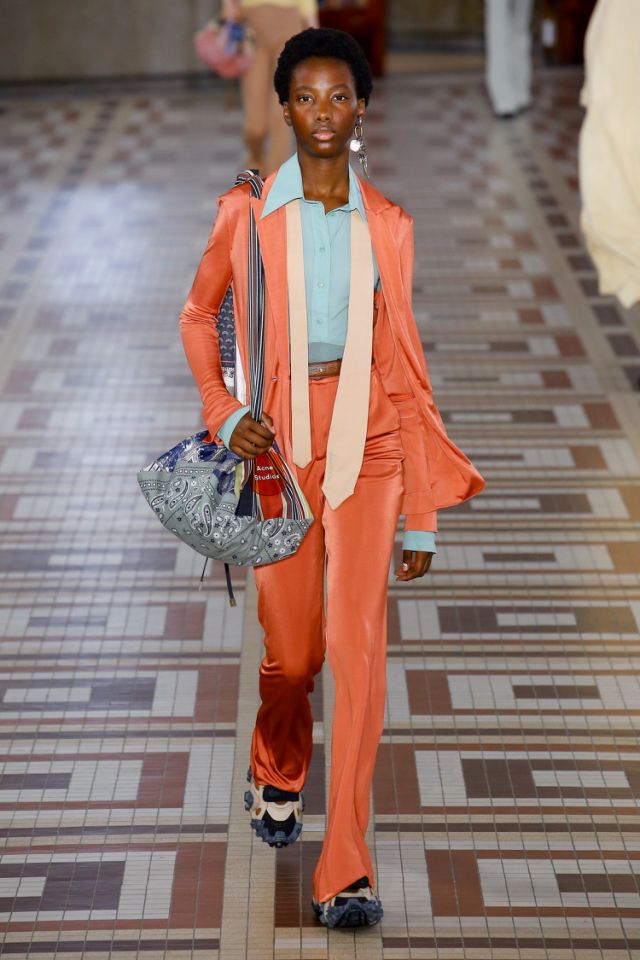
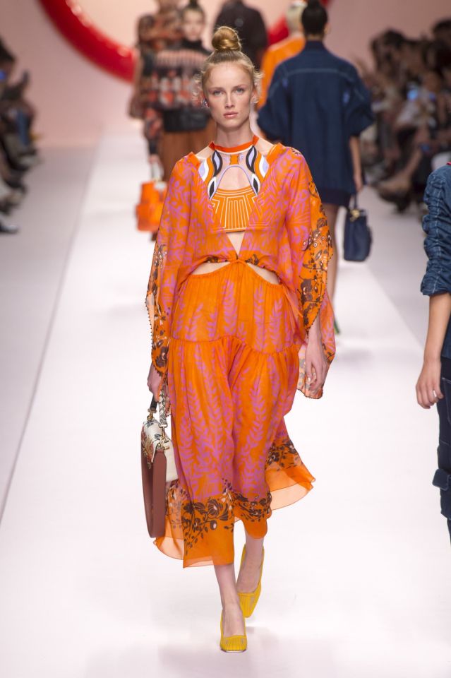
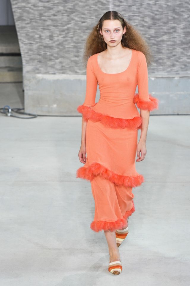
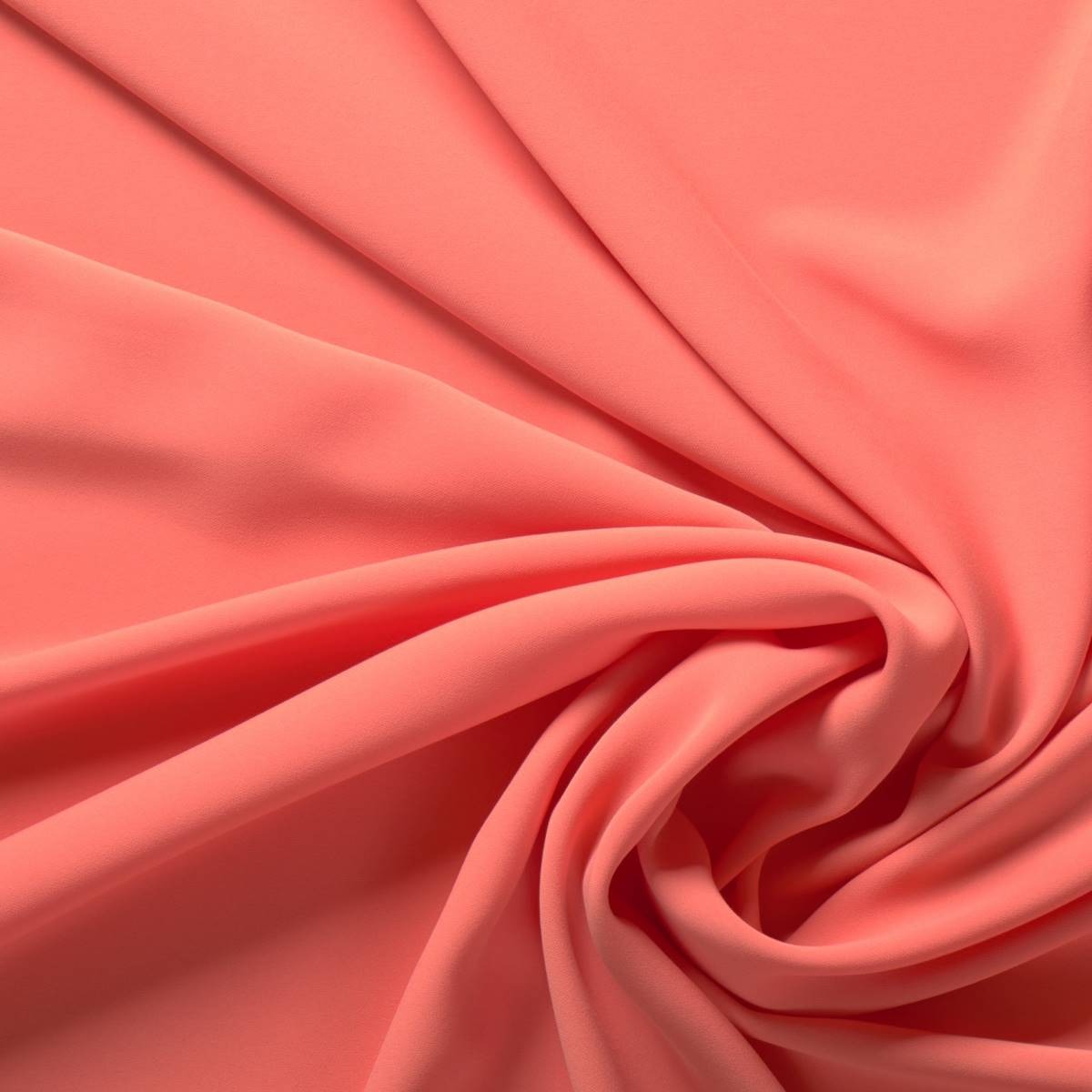
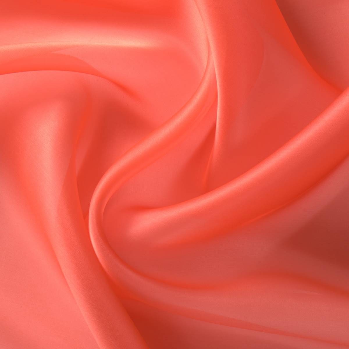
In 2019 the shade is ‘ Living Coral ‘
Once again we say goodbye to the year with a new colour that will be a reference for the next one. According to Pantone, the shade of influence in 2019 will be ‘Living Coral’, a particular orange-pink that as the name suggests refers to living coral and highlights the beauty, uniqueness and fragility of these marine ecosystems. This hue, Pantone 16-1546, takes over from the violet shade of 2018 (Ultra Violet) or the yellowish green of 2017 (Greenery). Remember that since 2000 the international colour authority has established what will be the shade of the year and this choice directly affects the fashion industry, design, advertising or decoration.
A cheerful colour that connects digital identity with real life
What are the reasons to choose ‘Living Coral’ as the colour of 2019? Although it may seem so, the decision is not random, but the result of a thorough analysis and research in the field of global trends affecting several sectors and which are present within a current social and economic context. They are varied influences that may come from new technologies, the entertainment industry, collections of art, fashion, popular destinations, the environment or lifestyles …
 |
 |
The company, founded in New Jersey in 1962, commercializes standardized colour samples and in a statement has explained that ‘Living Coral’ is a shade that “provides comfort and stability” and is “full of warmth and encouragement” to a society in constant change in the face of “the onslaught of digital technology and social networks that are increasingly incorporated into everyday life “. The cheerful and lively tone symbolizes “the search for immersive authentic experiences, which in turn permit connection and intimacy”. In this context the coral tone symbolizes the union of opposing concepts that interrelate with each other: the social connection with human interaction . It links digital identity with true identity via “a lively cheerful shade with a golden hue, that imparts energy and vitality while maintaining a smooth finish.” The executive director of the institute, Leatrice Eiseman also points out that this colour “symbolizes our innate need for optimism and the search for happiness”.
 |
 |
From another point of view it is clear that this hypnotizing colour also evokes the coral reefs that shelter a multitude of marine species “in a diverse kaleidoscope of colour,” according to Pantone. From an environmental perspective ‘ Living Colour ‘ symbolizes the fragility of these ecosystems and the devastating effect of today’s society on nature.
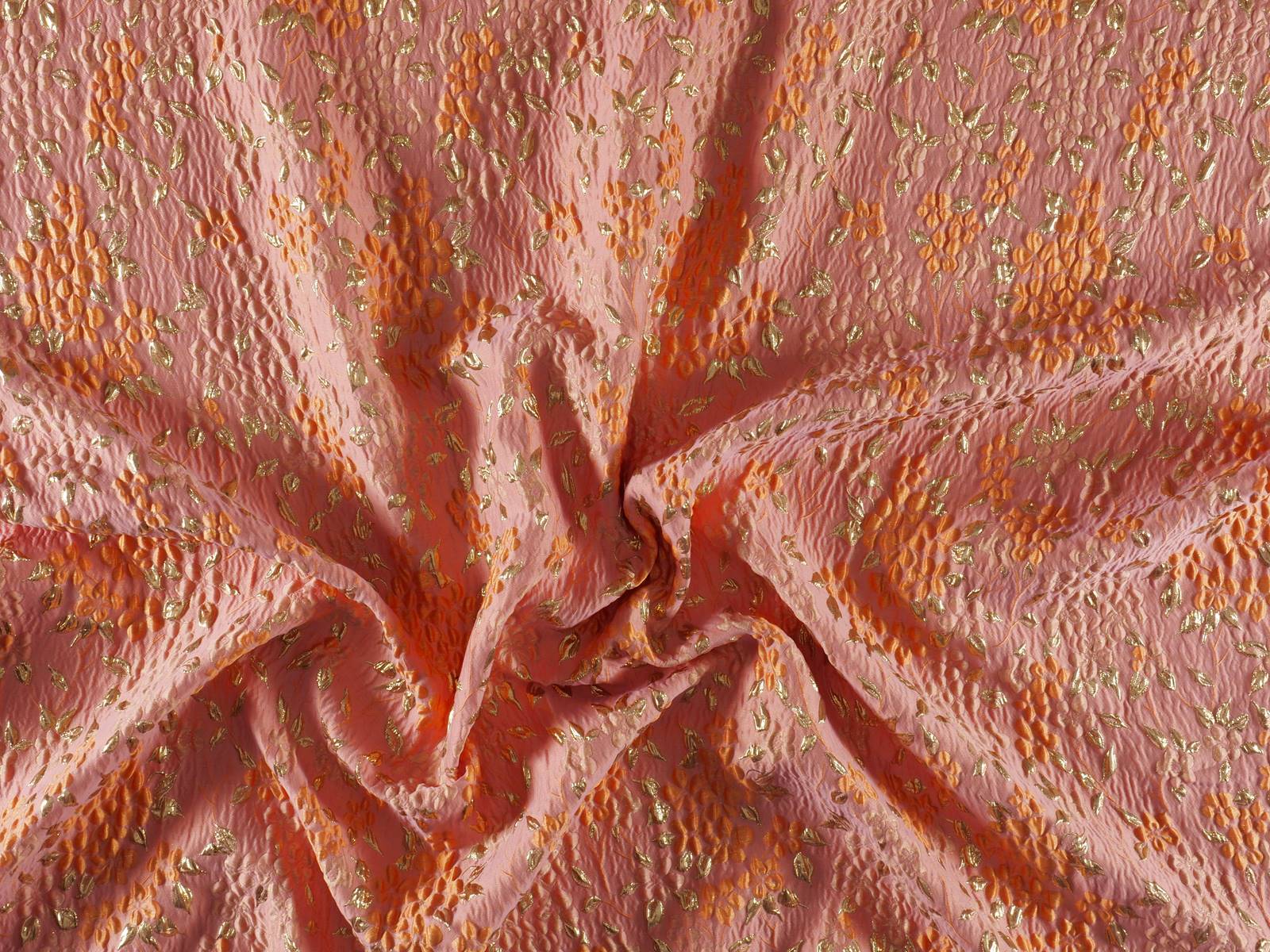
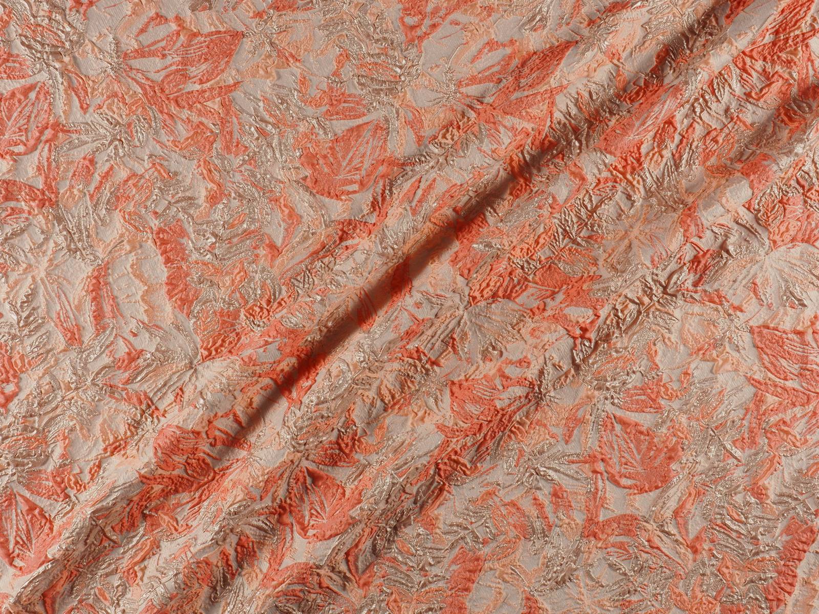
Vibrant coral in the new collections of fabrics
In Gratacós we also pay homage to vibrant ‘Living Coral’ via the new collections of fabrics. Silky textures, bright finishes that capture that golden brush-stroke, floral Jacquards full of brilliance or soft matt reliefs … Find them on our website or ask for them in our shop in Barcelona. We are waiting for you!
Trend Note-book: Autumn-Winter 2019/2020
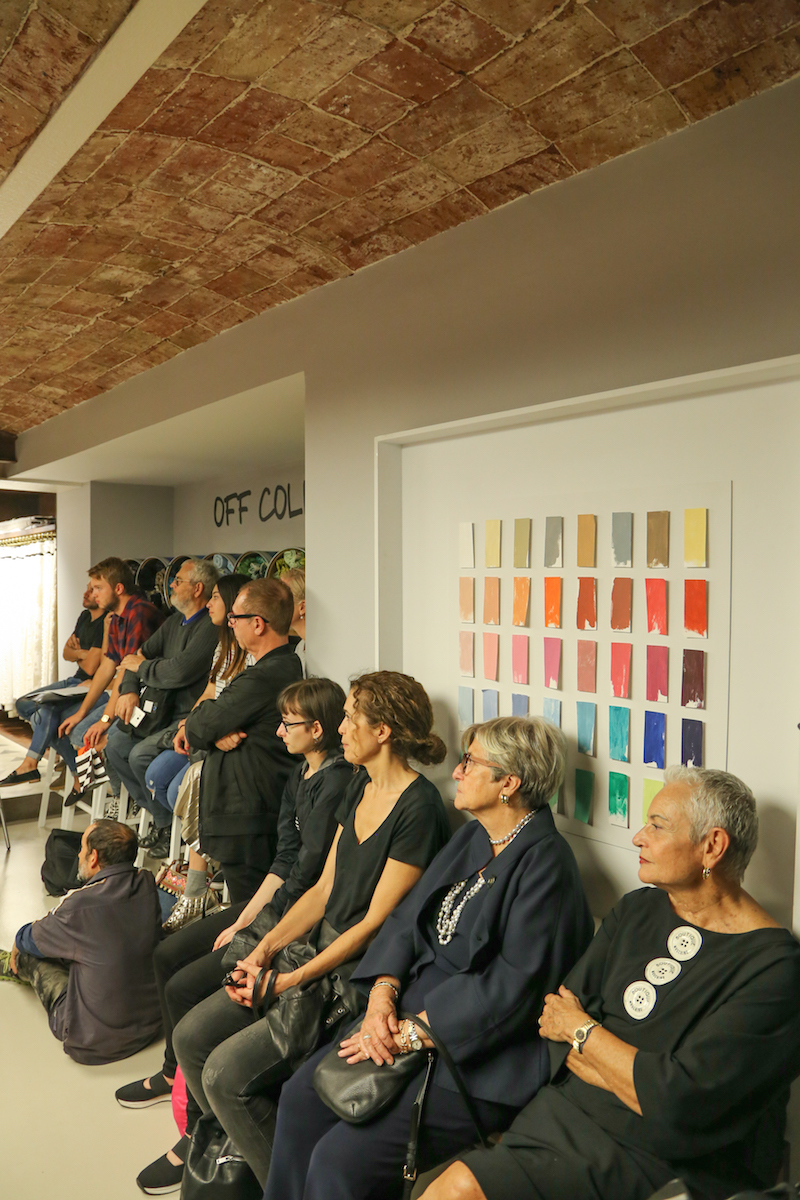
Successful convening of the new edition of ‘ Cuaderno de Tendencias’, a biannual educational initiative, which brings together in the Gratacós shop dozens of students from various design schools to learn about the main global trends that will mark the Autumn-Winter season2019 / 2020. A relaxed and instructive talk will be given by Ursula Uría, spokesperson in Spain for the prestigious research agency Nelly Rodi, who will explain the colours and textures that will mark the patterns of next winter.
As general points of influence on the conception of the fashion collections of the AW19 / 20 season, Uría has highlighted a complex economic and social situation: “We are not talking about crisis, but about a break that affects many sectors and that entails radicalization.” The polarization of politics, the rise of migratory movements, social demands … are some of the phenomena that will continue to mark the fashion industry. “The collections that emerge will be more ground-breaking and alternative,” explains Nelly Rodi’s spokeswoman in Spain. Current names such as Palomo Spain and her feminization of men, the return of Agatha Ruiz de la Prada with her colourful essence or the singer Rosalía with her flamenco-inspired tour are some examples that, according to Uría, show this general tendency towards the alternative.
Úrsula Uría: “Fashion collections will be more ground-breaking and alternative”
From this scenario, Nelly Rodi draws four fashion trends that encompass the following categories: Master, Ride , Oddity Y Spirit .
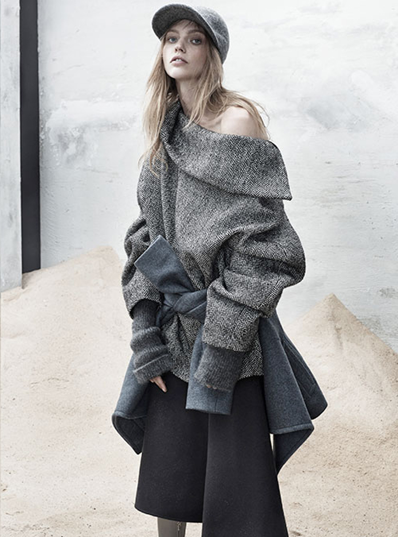
1.MASTER
 |
 |
A minimalist trend that represents the return of tailoring and pattern-making from the point of view of rigour and perfectionism. Return of well-made garments, crafts, geometrical tracings and functionality.
Visual references : origami , geometry, mathematics, sculptures, straight lines, defined strokes, designer Issey Miyake , the last campaign of Dior man, Tilda Swinton for Gentle Monster or Arket’s featured colour therapy.
Silhouettes: Straight lines, well-marked lines and versatile, functional garments predominate.
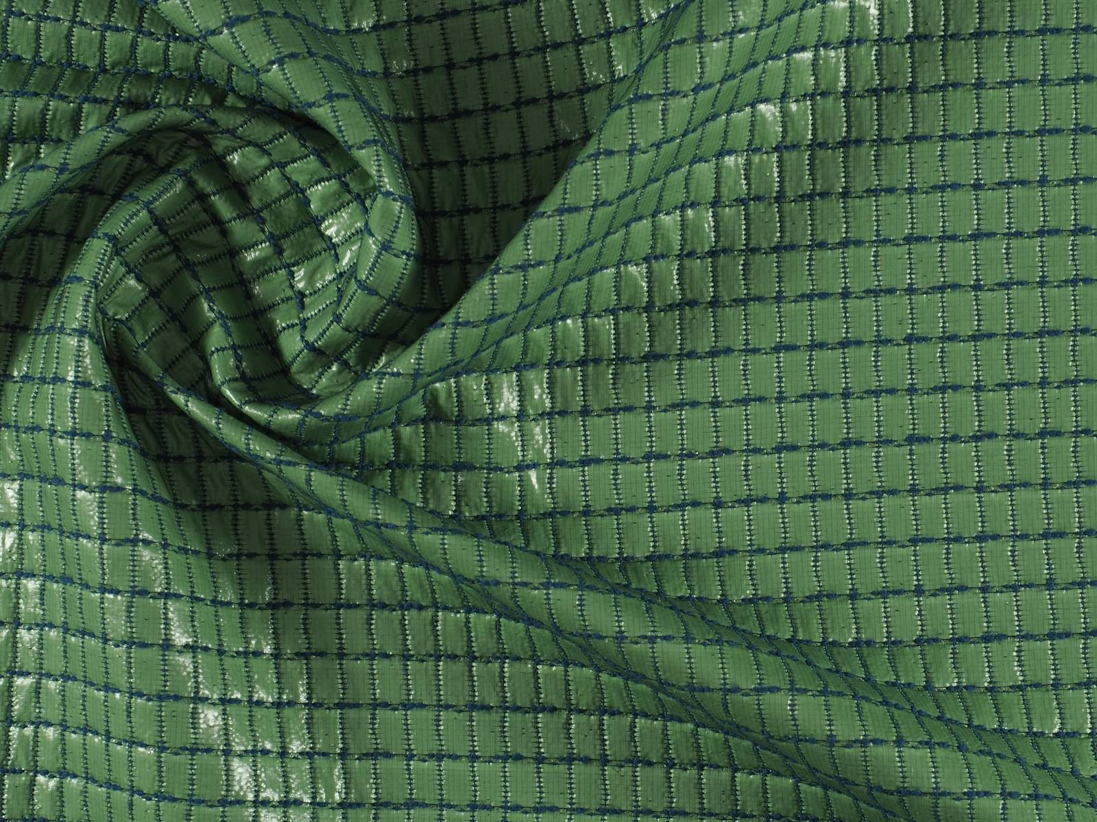
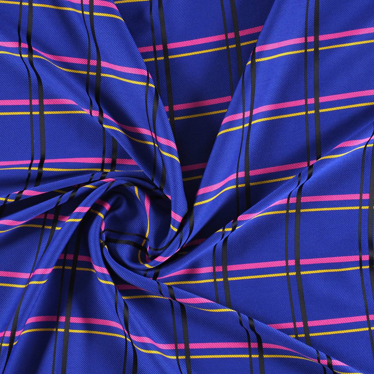
Colours: A hark back to the industrial era, revolving around grey and blue. Black does not appear, whilst tinted shades give depth. Single shade colour block is also being worn.
Fabrics: Bright finishes, quilting and experimentation in technical fabrics.
Audience: Rational consumers who buy selective and expensive products, who know what they want and consume it consciously.
2. RIDE
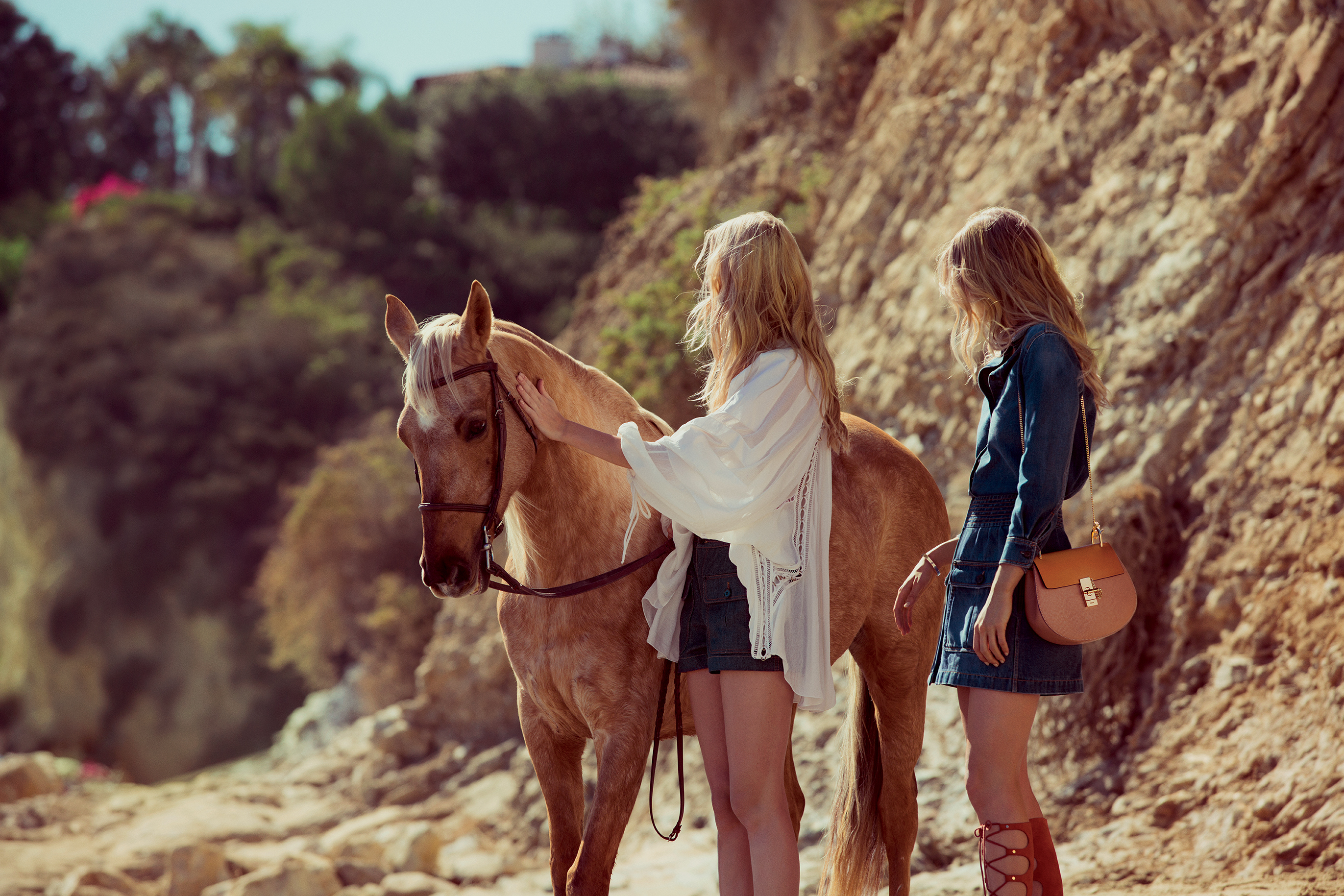
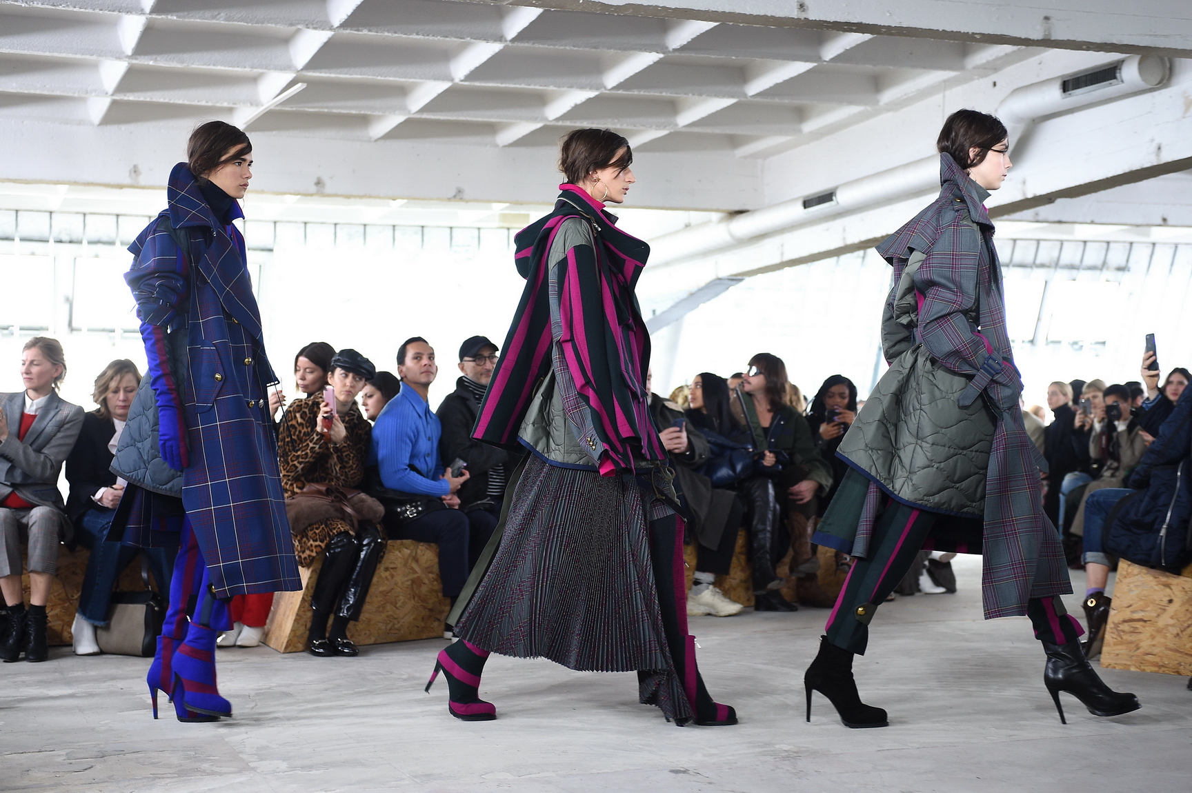
A premium trend inspired by the world of racing (horses and cars) and speed. Appeals to the reinvention of the classics as already done by companies such as Burberry, Hermès or Loewe.
Visual references: the equestrian world, the concept of private club, sagas, Amazons, the prestige of the uniform and elegant authenticity of it girls (Carlota Casiraghi , Olivia Palermo, Marta Ortega) with families linked to the world of horses.
Silhouettes: Structured garments, geometry, biker jackets with reformulated silhouettes..
Colours: Brown shades and red Ferrari which add a touch of warmth.
Fabrics: A return of classic fabrics such as suede, leather, hair applications and plaid prints inspired by riders.
Audience: A consumer who knows the stories of the brands and gives value to family sagas. Consume products that have a history behind them, a well- marked savoir faire.and
3. ODDITY
 |
 |
A youthful tendency that is inspired by the poetic aspects of protest movements. The alternative is not aggressive, but its creativity is radical. It has a hippy quality.
Visual references : the cover of Vogue USA on the empowerment of women, social movements, communities, identity, grunge aesthetics, activism and collaboration, the concept of Princess Peter Pan, eco-activism, futurism and withered flowers.
Silhouettes: Overlays, experimentation of materials, layers, surprising openings … functional and very technological garments.
Colours: Grey latex, electric blue and sweet tones (pastel colours ).
Fabrics: Mohair, plastic, lúrex, experimentation with alternative fabrics.
Audience: A young public that seeks to make a statement via fashion. Fashion as a channel for the expression of a message.
Cuaderno de Tendencias: summer 2019
As was expected, the new call of the prestigious research agency Nelly Rodi , to publicize the main international trends that will mark next summer was a success in capital letters. More than 70 people, most of them fashion and design students, filled the upper floor of the Gratacós space with their presence. All of them waited impatiently for the thesis and premises offered by the informative Úrsula Uria , in an instructive talk to disclose in an orientative way the colours and textures that will set the tone for the Spring- Summer 2019 season .
On this occasion, the head of Nelly Rodi in Spain unveiled four new trends within a social and global economic context that also influence her choice such as the revival of national values and patriotic folklore; young people’s need to enjoy through the consumption of experiences related to travel and not so much in the own ownership of products; or the rise of new musical icons that influence through their image with more identity power, to mention some examples.
Based on these general premises, four trends will influence fashion in the next summer season: Magnetic , Sassy , Life and Native
-
MAGNETIC
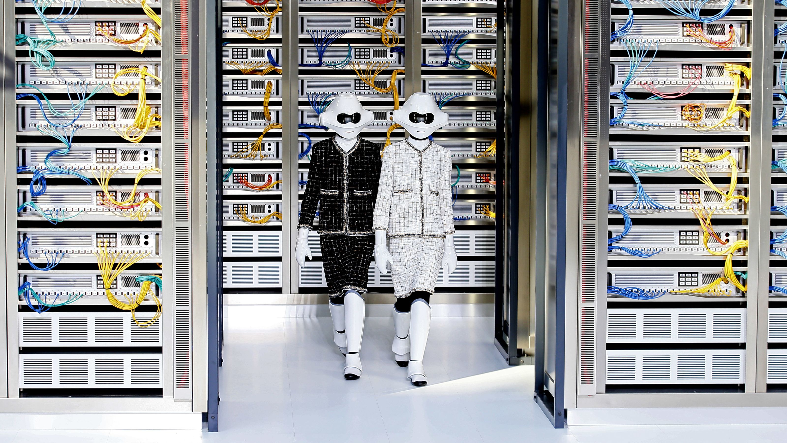
A futuristic trend, with an androgynous and minimalist base, inspired by technological innovations and applications of them in the textile world.
Visual references : Artificial intelligence, virtual reality , Tokyo, science fiction, functional technology, holograms, the cosmos, Dries Van Noten or the kinetic designs of the British creative Es Devlin.
Silhouettes : Fluid and deconstructed silhouettes prevail, functional garments, large pockets in parkas and coats, fastenings with ropes and accessories on the zips.
Colours : Metallized such as gold and silver along with iridescent colours and blue denim.
Fabrics : Fabrics that attract light. The pastel colours in neon version and iridescents in lamé. Also experimentation with technical fabrics out of the ordinary.
Public: A rational and active consumer, ultra connected to the latest technologies and a lover of aesthetic sports fashion in a chic key.

2. SASSY
An exuberant trend inspired by avant-garde movements such as Surrealism and Dadaism. An elegant and refined style that seeks to surprise and entertain through clothing and accessories.
Visual references : The works of Dalí and Miró, abstract art, Cristina Celestino for Fendi , the lipsticks for men by Tom Ford, Lladró, the interior designer Jaime Hayón , the lobsters, bumbags …
Silhouettes: Fitted silhouettes with an 80s look and their characteristic volumes, review of the suit jacket and 60’s cut dresses. The accessories and the details have a cheeky point that plays with humour and irony.
Colours: The whole range of pastel colours. From the most decaffeinated to the highest tones in this line of dull.
Fabrics: The classic tailoring is renewed with new codes adapted to today.
Public: An individualistic consumer who is somewhat impulsive and in turn has a particular taste for fashion. He likes to be noticed with garments that attract attention, that transform concepts and turn more conventional codes.
3. LIFE
A minimalist trend that recovers a healthy lifestyle through moods and emotions. An evolution of the current “Horizon “ trend with differentiating tints.
References: Ecology, healthy lifestyle, veganism, noble materials such as wood, steel, botany, nature, works by Suzanne Anker, roots or designer Angela Luna, to name a few examples.
Silhouettes: Fluid patterns are worn and comfort is the main characteristic that is taken into account.
Colours: Green on green. White, vanilla and nude tones. The vegetal prints gain ground to the florals.
Fabrics: Natural fabrics , lightweight and handcrafted details.
Public: A purist consumer , lover of the slow life that treasures expensive clothes in the wardrobe, but more durable
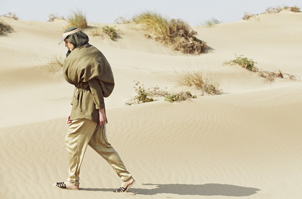
4. NATIVE

A trend of folk spirit that the tribes have, the feeling of belonging and refers back to the origins. The boho -chic style in its wildest version.
References : Ethnic and cultural miscegenation, mysticism, roots, nomadic, desert landscapes, elements of nature, talismans, Xavier Noël’s artistic totems , trips to lost paradises, handicrafts, urban Aborigines …
Silhouettes : An intermingling of baggy patterns with tight-fitting garments in a style that combines the casual with the sexy. The Madras check pattern.
Colours: Earth tones, green camouflage, orange and blue combination, yellow tones, gradients … Tonalities found in the sky and the earth.
Fabrics : Rustic and handmade reminiscences. Crochet fabric and draped clothes.
Public: A more impulsive profile that fits in with an it girl or it boy. They look for singularity through an aesthetic that advocates the ancestral side.
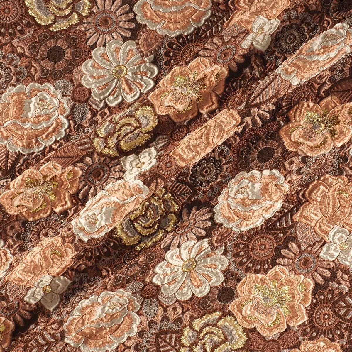
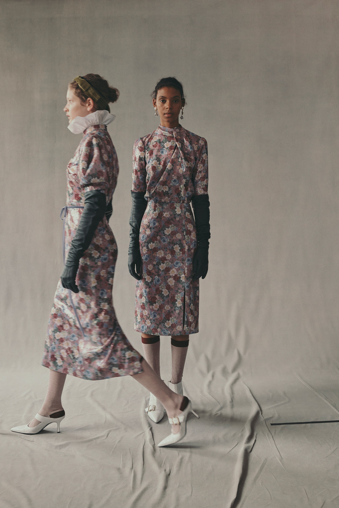
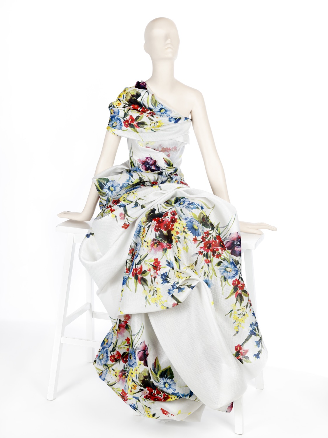
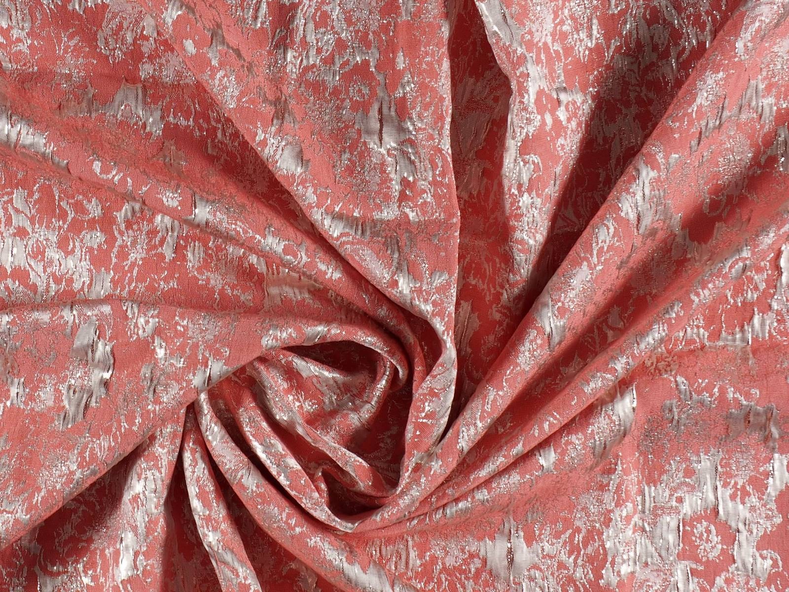
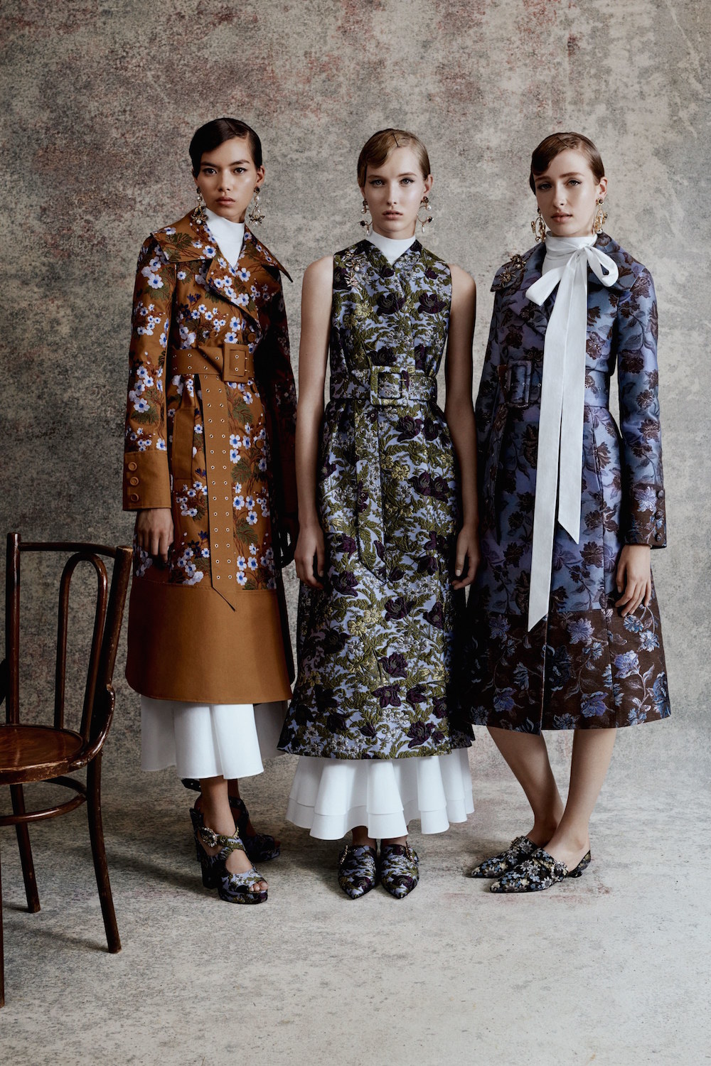
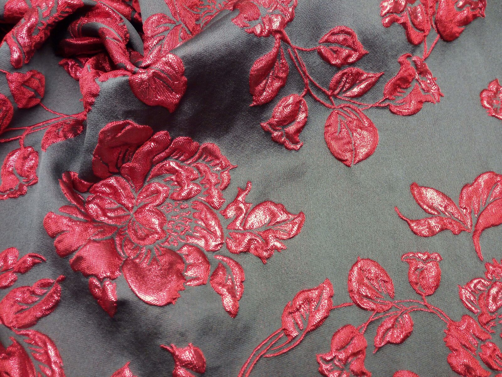
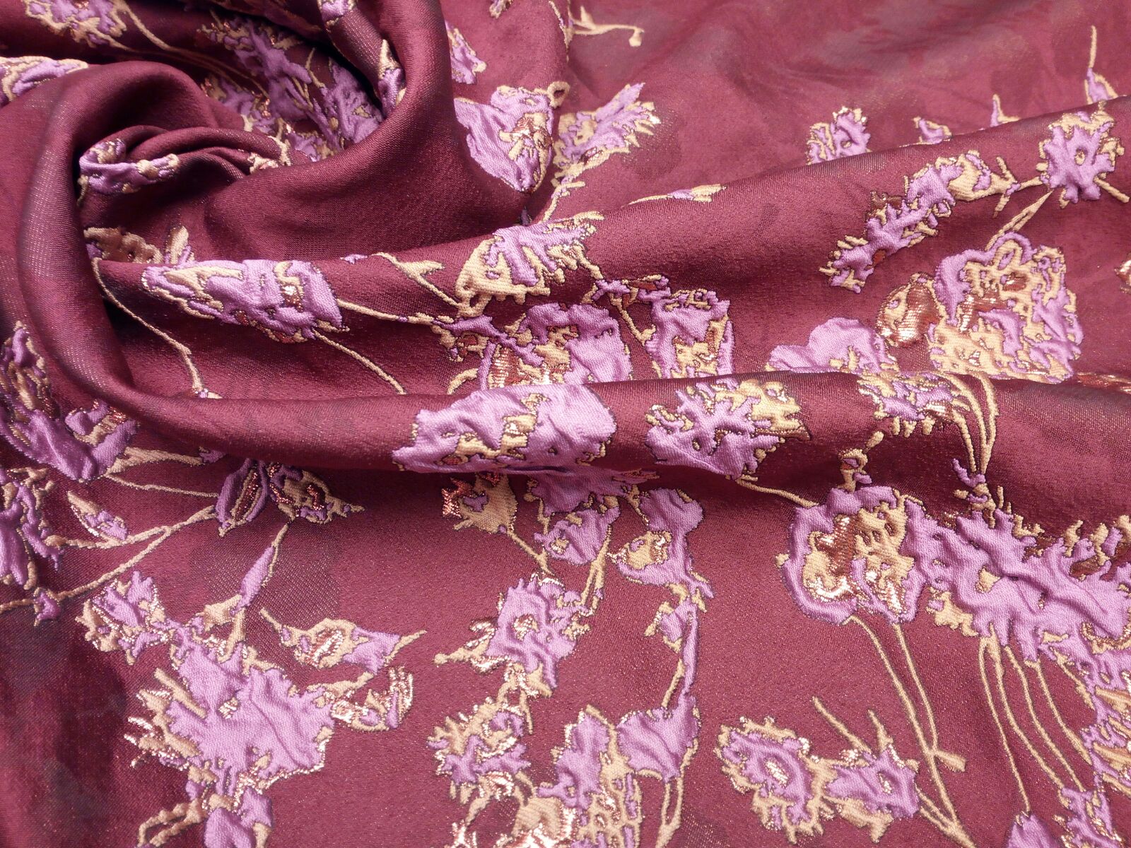
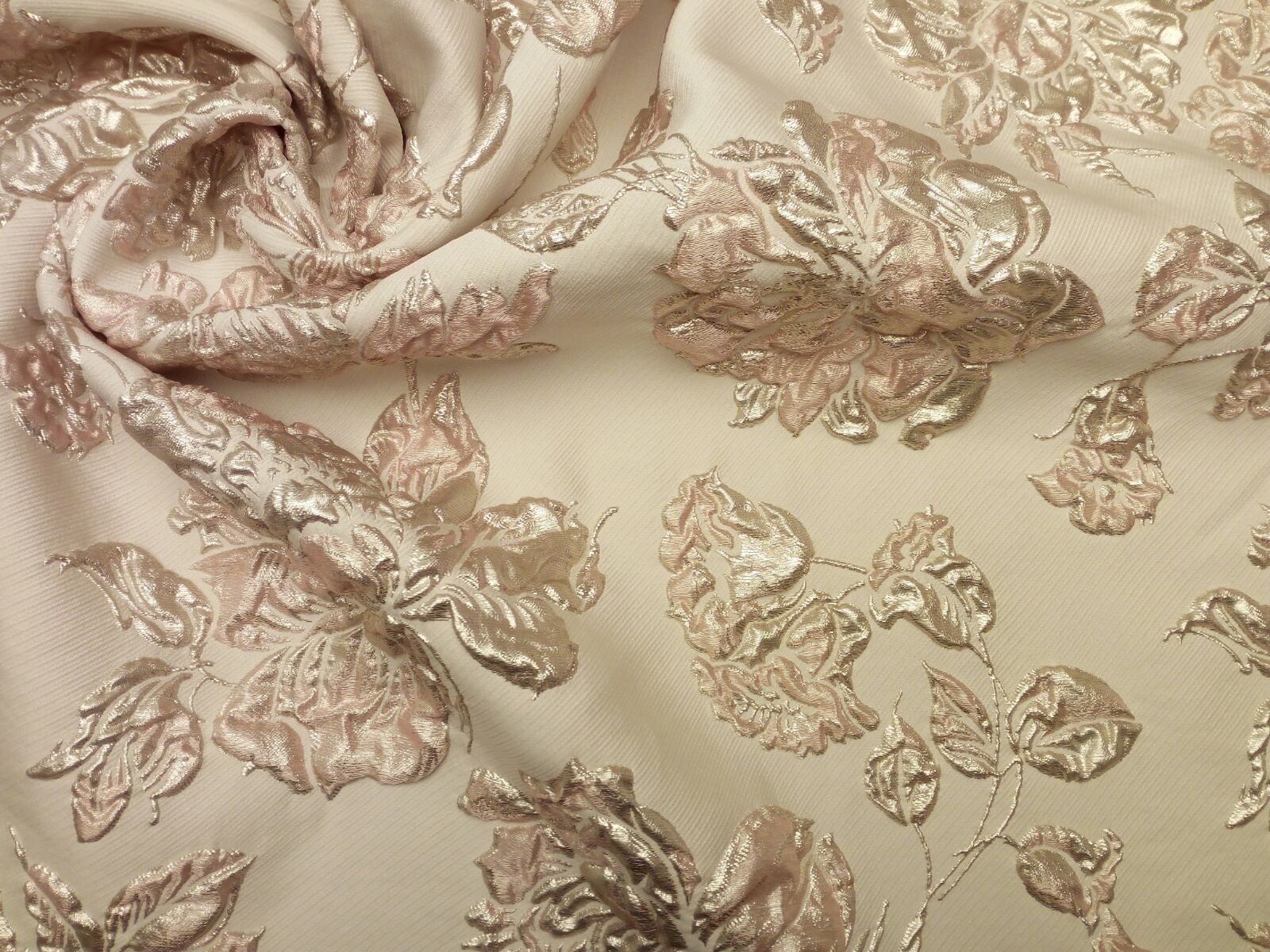
Winter flowers
Often, it may seem that prints that belong to a particular season do not mix well with others. Maybe because “it’s not the right time” or because they are out of tune. This is not true. This is the case with the floral print, one of the most popular and ubiquitous in the history of fashion.
 |
 |
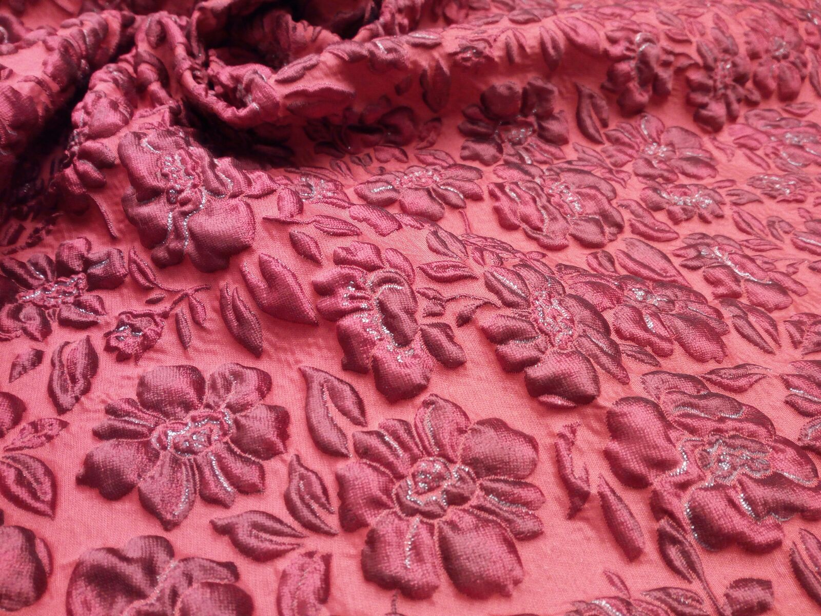
On this occasion we focus on floral jacquards. These richly ornamental fabrics made in specialized looms that exhibit suggestive patterns and prints and are usually rich in colours, outlines and textures. Jacquards are usually reflected in tapestries, brocades, damasks, false plains and they are commonly seen in the textile world with multiple applications in fashion and interior design providing that vintage touch that makes them distinguished.
This season, several designers use upholstery fabrics to decorate autumn styles. Josep Font in DelPozo decorates coats and dresses with floral jacquards with soft reliefs and metallic threads. The firm Etro, whose prints are easily recognizable, present vibrant prints where flowers with other motifs in very bold colors prevail. Erdem garments also surprise, with romantic floral motifs with a very British touch. In fact, this firm has collaborated with the Swedish giant low cost, H & M to launch a capsule collection that is already the rage in stores. Finally, the most rococo version of this pattern has been seen on the catwalk for Dolce & Gabbana in golden tones that give a more flamboyant look.
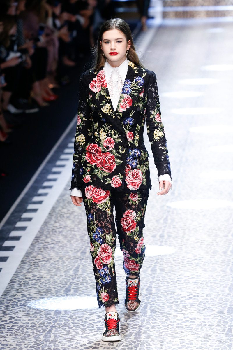
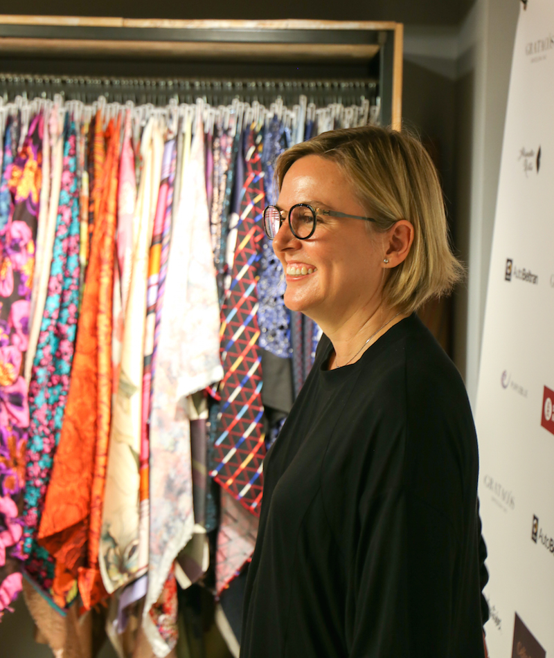
These are some examples seen on the catwalk. We invite you to come to the Gratacós store to see all the floral Jacquards we have at your disposal.
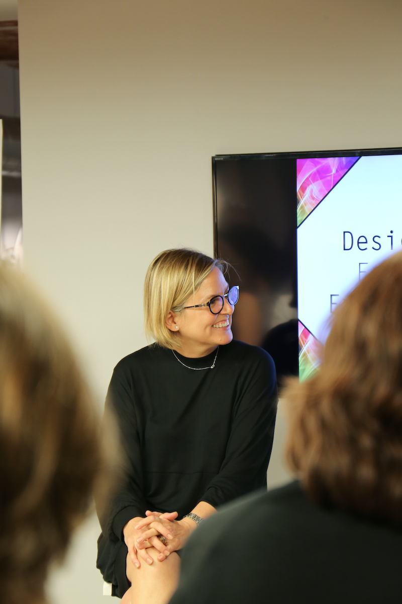
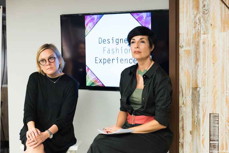
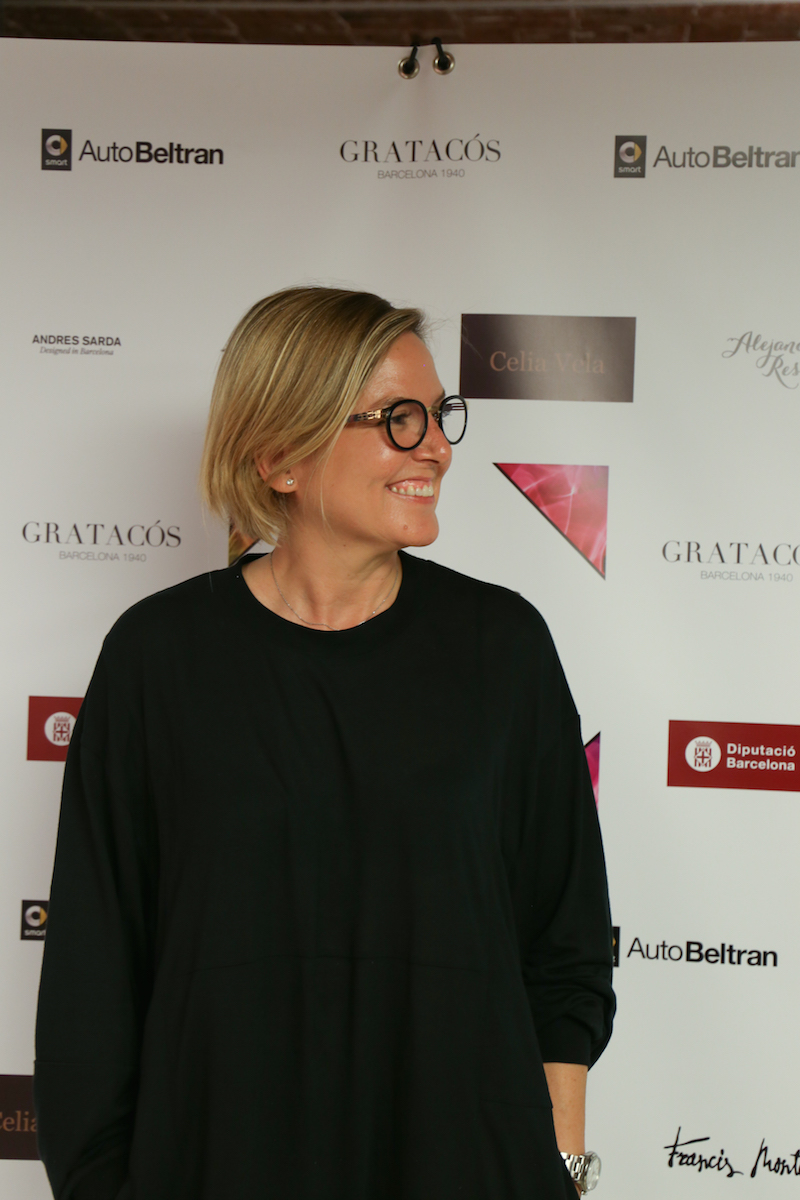
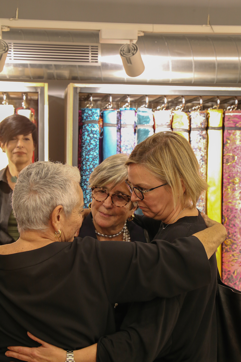
Designers Fashion Experiences: Núria Sardà
Last week we had the pleasure of welcoming to Gratacós Núria Sardà, designer for the women ‘s lingerie company, Andres Sarda. Nuria has continued the legacy of her father by maintaining the essence of the brand, one that combines sophistication, elegance and femininity with soft linen garments, lightweight shapes and fascinating colours that embellish every woman’s body. Within the framework of the conference Designers Fashion Experiences Nuria explained to those present the keys to success, which also deal with the adaptation and evolution of the brand to the new demands of the market. She left them with some valuable advice.
We interviewed Núria Sardà to learn about some of her concerns. Remember that you can recover the conversation we had last week on the website of Designers Fashion Experiences.
 |
 |
Why have you participated in the initiative Designers Fashion Experiences?
I like to support new designers as much as possible and these conferences seem to me a good reason for doing so. In addition the organization has given me a lot of confidence.
Andres Sarda has extensive professional experience which unites generations of the same family. What can you explain from your own experience?
Each person lives their own experience and it is always good to know it firsthand. In this day-session I have focused on the opportunities and also on some obstacles that I have had in my career.
I gather that your passion for design is inherited …
Not really, I never thought about dedicating myself to the world of design. I never chose this profession, but life led me to choose it .
“I never chose this profession, but life led me to choose it “
If you could go back in time, would you go back to design?
Yes, it’s a very stressful, fun and changeable job. It allows you to meet interesting people and tour the world. My daily routine is not strictly routine and allows me to express all my creativity. It is also true that it is a world where you are very exposed and your creations are judged severely by the company, the business world and lastly the customers. In this sense if everything goes well it is fantastic, but you also suffer because in each collection you put head, heart and soul. And there are many hours of work!
What obstacles are there in the fashion industry?
More than obstacles, I would call it circumstances. The offer, the distribution, the customers and their motivations. In this sector everything changes very quickly. We companies have to adapt to changes and advance according to to market movements.
“In every collection you put head, heart and soul”
Then adaptation is a tool that ensures survival. Which would you most emphasise?
From my point of view you need to have your personality in the creations, the quality and the reliability of the product and the company. This has to be coupled with adaptation and evolution of market needs, as I said previously.
What do you recommend to future designers?
That they should do what they do, make sure that their work is always original and that they contribute some innovation. Let them follow their instinct and never give up.
“We always have to look for excellence in everything we do”
Tips that might be a good leitmotiv…
Yes, we always have to look for excellence in everything we do.
 |
 |