 Pics by Ugo Camera
Forget London, Paris, Milan, Copenhagen, or Madrid. Or rather, introduce a new dimension to the leading European fashion capitals. Lisbon is in the spotlight in the fashion sector and has become a hotbed of trends in recent years. The city, with its vibrant and cosmopolitan atmosphere, has managed to merge its rich history with a vibrant creative scene. And this shift is evident both in the creative and practical spheres.
A new generation of independent designers has revitalized the Portuguese fashion scene, complementing established brands and achieving recognition both at home and abroad. This boom is no coincidence: the combination of a strong textile tradition, a commitment to sustainability, and a fresh, contemporary approach to design have positioned the Portuguese capital as a strategic hub for the industry.
The legacy of textile tradition remains alive
Nothing would make sense without this premise: Portugal is one of Europe’s leading textile producers, with factories that work for some of the world’s most prestigious brands. And it remains so today despite the relocation of its industrial fabric to emerging economies in Asia and Africa.
From organic cotton to the most innovative techniques in the production of sustainable fabrics, the Portuguese textile industry has evolved without losing its local and artisanal essence. In regions such as the Ave Valley and Guimarães, workshops and factories that combine artisanal know-how with cutting-edge manufacturing processes are concentrated, allowing many brands to focus on local production. This textile heritage has been key to the development of emerging designers who seek to differentiate themselves through quality and innovation. It is also important to note that this proximity also provides greater direct access to the consumer, turning fashion into a good that encompasses quality, proximity, and the prestige of the region.
Lisbon Fashion Week , the nerve centre of Portuguese fashion
It’s not the biggest or most media-driven catwalk show in terms of coverage, but it’s the one that’s gaining increasing relevance for offering the industry a fresh and different perspective. ModaLisboa not only presents fashion shows but also fosters dialogue and learning through talks and workshops, highlighting not only designers but also the country’s creative ecosystem. With each edition, Lisbon reaffirms its position as the epicentre of innovation, consolidating its unique identity within the European fashion landscape.
Lisbon Fashion Week, also known as ModaLisboa, is the benchmark event for Portuguese fashion. Founded in 1991, it has become a key platform for both emerging and established designers. Its focus on sustainability and unrestricted creativity have set it apart on the international fashion week circuit.
ModaLisboa is held twice a year and brings together designers, buyers, and media to present the season’s collections. Rather than being confined to a single exhibition venue, its shows take place in iconic venues around the city, such as the Pavilhão Carlos Lopes or the Palácio Sinel de Cordes, turning the Portuguese capital into a fashion scene in itself.
One of its fundamental pillars is support for emerging talent, embodied in initiatives such as Sangue Novo. This program gives visibility to young designers, providing them with a platform to showcase their work and facilitating their entry into the industry. With this commitment to creativity and innovation, ModaLisboa not only promotes Portuguese fashion but also reinforces its role as a key event on the international scene.
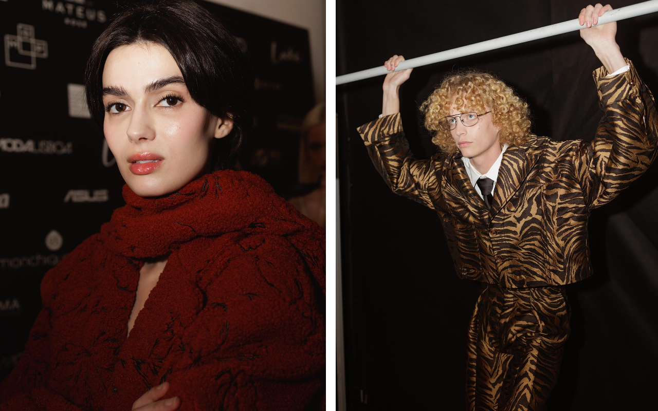
Designers who catch our attention
There’s a wealth of talent, with proposals ranging from the most established to the most disruptive. At Gratacós, we keep an eye on designers and brands that regularly show at Lisbon Fashion Week, as well as other independent labels that are setting the pace in Portuguese fashion. Below, we highlight some of the designers who inspire us the most:
 Pics by Ugo Camera
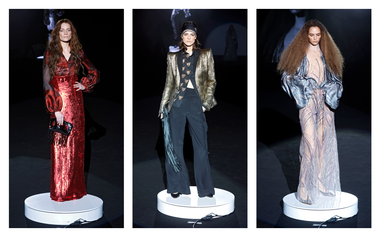
Gonçalo Peixoto
Gonçalo Peixoto is a young designer who began his training in Fashion Design in 2012 in Guimarães, and later graduated from ESAD in Matosinhos. From his earliest studies, he has proven to be a passionate artist, driven by his love of fashion and his desire to create. His collections have captured the attention of renowned fashion stores and specialized publications, quickly establishing himself on the Portuguese scene.
In September 2017, Gonçalo presented his first collection at London Fashion Week, and in March 2018 he joined the official ModaLisboa calendar, where he began showing his collections regularly.
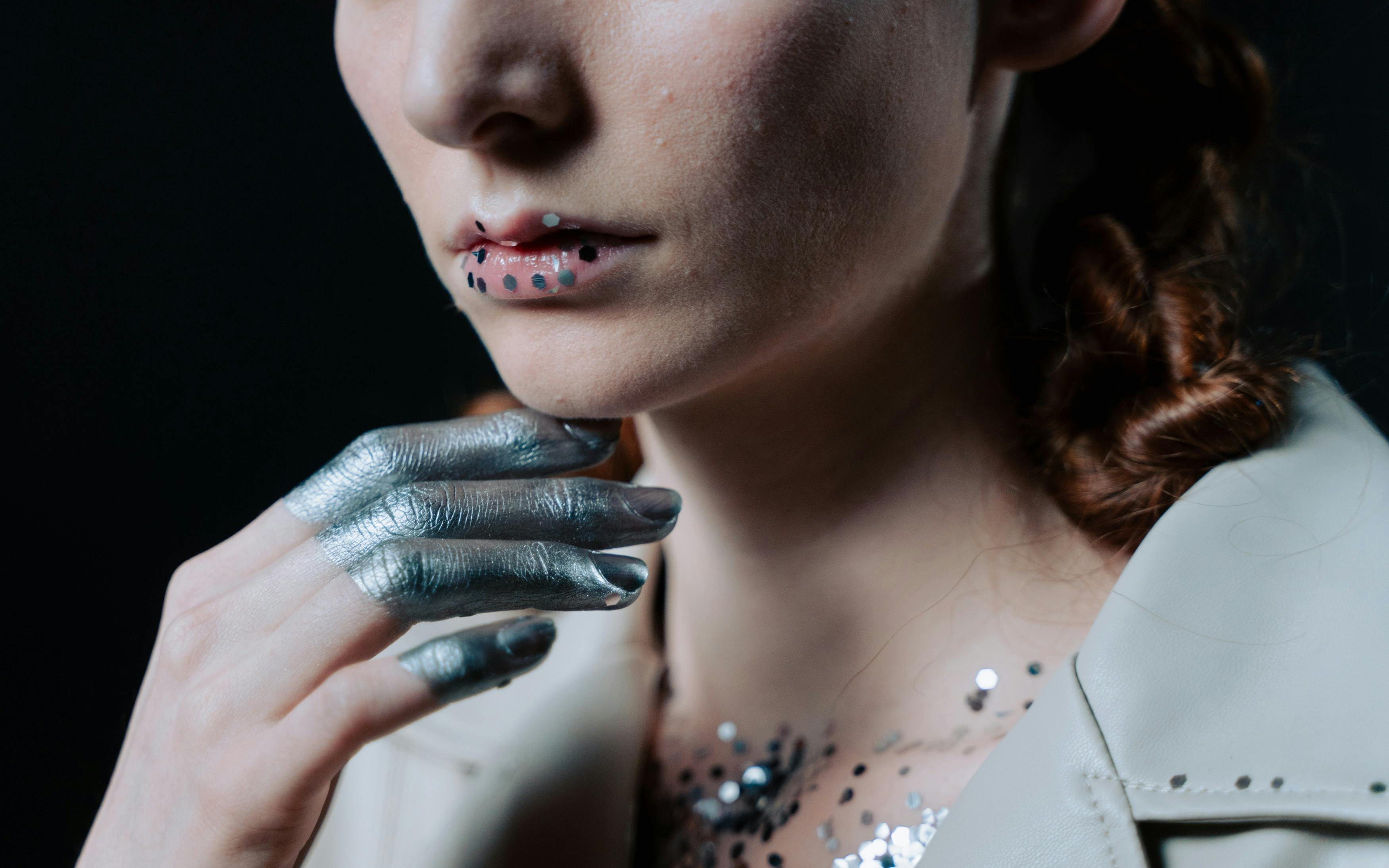
With a youthful and sophisticated aesthetic, Peixoto embraces modern femininity, reinterpreting trends with a fresh and bold vision. Her latest collections, presented at Lisbon Fashion Week, frequently feature surprising combinations: metallic fabrics, sheer layers, and asymmetrical cuts, reflecting a contemporary vision of fashion. Vibrant colours and fitted silhouettes are often the focus of a collection designed for a self-confident woman with a strong personality.
 Pics by Ugo Camera
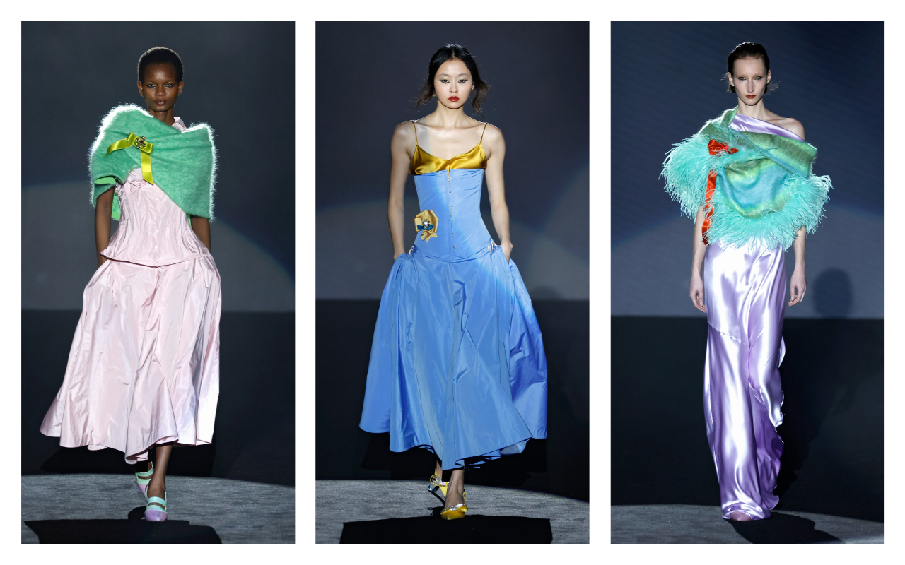
Carlos Gil
Carlos Gil is a designer with a solid track record, recognized for his mastery of pattern making and his ability to balance the classic with the contemporary. Born in Nampula, Mozambique, in the late 1960s, Carlos Gil trained in Fashion Design in Portugal. In 1998, he opened his atelier in Fundão , the city where he lives and works, and a few years later, he opened his first store under the CARLOS GIL brand.
Carlos Gil regularly presents his collections at ModaLisboa and has successfully conquered international markets through his participation in major fashion weeks. Throughout his career, he has received numerous awards and recognitions, such as the Medalha de Mérito da Cidade do Fundão (2009), the Premio Jovem de Sucesso (Young Success Award ) in Portugal and abroad (2009), and the Commenda de Gran Oficial de la Orden del Infante D. Henrique (Command of Grand Officer of the Order of Infante D. Henrique) (2015).
The designer stands out for his ability to create striking pieces of remarkable quality, with an approach that combines sophistication and elegance. His collections are cosmopolitan and contemporary, yet always maintain a strong distinction. In his latest offerings, Gil has explored sophistication through structured fabrics, volumes, and embroidered details. The color palette ranges from neutral tones to bold color accents that bring dynamism to each look. His style reflects an updated retro vibe, with influences from the elegance of the 1970s reinterpreted for today’s audience.
 Pics by Ugo Camera
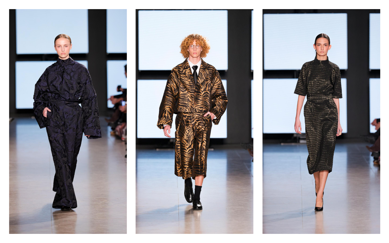
Nuno Balthazar
Nuno Baltazar is one of the most important designers in Portuguese fashion. He trained in Fashion Design at Citex (now Modatex ) and from his earliest days stood out for his talent, winning awards such as Young Designers from Máxima Magazine and Porto Moda. In 1999, he began presenting his collections at ModaLisboa , initially with Cravo, and in 2004, he launched his own brand.
In 2005, he opened his store in Porto and created unique pieces under the label Nuno Baltazar Atelier, collaborating with figures such as Carminho , Raquel Strada , and Victória Guerra. He has also designed the image of presenter Catarina Furtado and worked on costumes for television and theatre. Throughout his career, he has received awards such as the Fashion Award from Fashion TV Portugal (2011) and the Golden Globe for Best Designer (2013). In 2020, he returned to the ModaLisboa runways with his signature collections.
Nuno Baltazar is characterized by his minimalist approach and meticulous attention to detail, which has made his brand a benchmark in contemporary fashion. In his latest collections, he has showcased a series of pieces that fuse refined cuts with texture-rich materials, such as lightweight wools and printed silks. Reinvented tailoring has been a cornerstone of his designs, highlighting unstructured suits and a fusion of masculine and feminine, always with his signature touch.
 Pics by Ugo Camera
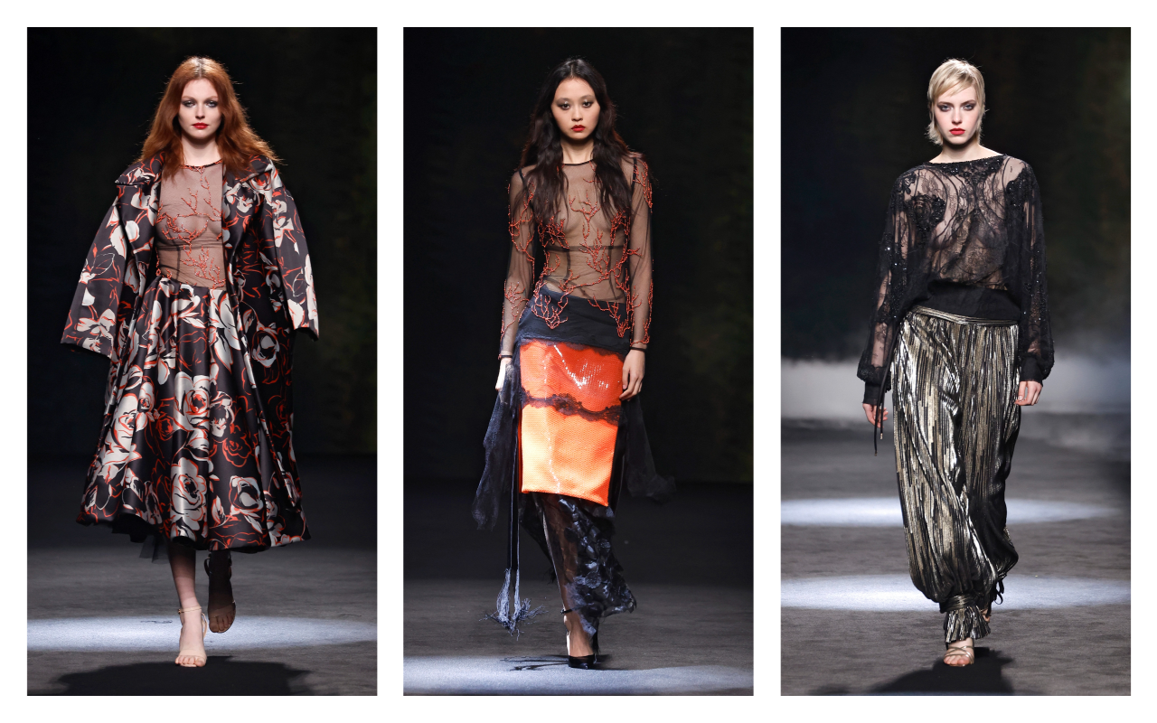
Luis Carvalho
Luís Carvalho , originally from Vizela , trained in Fashion and Textile Design at the Polytechnic Institute of Castelo Branco. Throughout his career, he has participated in various fashion competitions and worked at ModaLisboa and in the ateliês of renowned designers such as Filipe Faísca and Ricardo Preto . He was a designer at Salsa Jeans for two and a half years before creating his own label in 2013, debuting his first collection at ModaLisboa. That same year, he opened the LUIS CARVALHO | studio in Vizela, a combination of his atelier and his own store. Carvalho has received several awards, including the “Maison Mode Mediterranée” Prize in Marseille (2018 and 2019) and has presented her work in Paris, at the Moda Portugal Showcase.
The designer is known for dressing numerous public figures, both nationally and internationally. His creative approach has established him as a creator who challenges the boundaries between the conceptual and the commercial. His designs are distinguished by their experimentation with shapes and materials, opting for architectural volumes and high-quality fabrics. In his recent collections presented at Lisbon Fashion Week, Luis Carvalho has opted for garments that explore structure and movement. The fusion of geometric cuts and subtle draping has added fluidity to his designs, creating a contemporary and sophisticated aesthetic that defines his style.
At Gratacós, we’re closely following these events, which celebrate not only fashion but also the culture and identity of Portugal. The next edition promises to be even more exciting and full of surprises!
Sorry, this entry is only available in Español.

At Gratacós, creativity and innovation are part of our essence. As creators and suppliers of fabrics for the major fashion houses, international brands and designers, our mission in each collection is to anticipate trends and offer items that define the future of fashion through the senses. Fabrics that are eye-catching, but also seductive to the touch.
Every year, we present our collections at the world’s leading textile fairs, such as Première Vision (New York and Paris) and Milano Unica (Milan). These events allow us to share our proposals with international designers and brands, as well as to obtain valuable feedback to continue adapting to a constantly evolving market.
So in February, we exclusively unveiled our Spring-Summer 2026 collection, a preview of the trends that will mark the coming seasons. But now, it’s time to dive into the SS25 Collection, the current one that we sell on our website and in our space in Barcelona.
An ode to creativity, freshness and lightness
In general terms, the SS25 collection is born from the need to explore the naive and the pure, connecting us with our most spontaneous essence. From tenderness, freshness and sweetness, the new season transports us to a universe of lightness, where fashion becomes a refuge of kind and optimistic sensations.
This collection is designed for simple, yet sophisticated, effortless and versatile fashion, perfect for those seeking elegance without sacrificing comfort. Through innovative fabrics and high-quality finishes, the new proposal creates ethereal garments that celebrate the arrival of summer.
Colour
Colour is a fundamental pillar of the season. Beyond the neutrals, always elegant and combinable, the collection explores a palette of soft and delicate tones, from the most ethereal pastels to vibrant shades inspired by sugared flowers.
The shades evoke purity and freshness, with nuances reminiscent of sunny days, clear skies and natural light. A play of colours that allows for the creation of elegant and versatile combinations for the summer season.
Textures and reliefs
Gratacós fabrics stand out for their innovation and richness in textures. In this collection, jacquards provide depth and sophistication, while embroidery adds a touch of fantasy to next spring-summer fashion.
Prints will be the main feature, with designs carefully crafted to offer a balance between modernity and timelessness. Each fabric is designed to be transformed into unique garments, ready to come to life in the hands of the most demanding designers.
SS25 not only marks a new era in summer fashion, but also reaffirms Gratacós’ commitment to innovation, creativity and textile excellence. An invitation to dream, create and reinvent summer fashion. We invite you to discover it!
Mi�rcoles 26 febrero 2025
 Fely Campo. Mercedes-Benz Fashion Week Madrid. Fall/Winter 2025/2026 Collection
At Gratacós, we closely follow the main Spanish fashion catwalks, always looking to discover how our fabrics become unique pieces full of creativity. We are fascinated to see the transformation of our fabrics in the hands of designers, who manage to give life to collections full of personality and their own style. This connection between raw material and inspiration is, without a doubt, what motivates us the most to continue betting on innovation and quality.
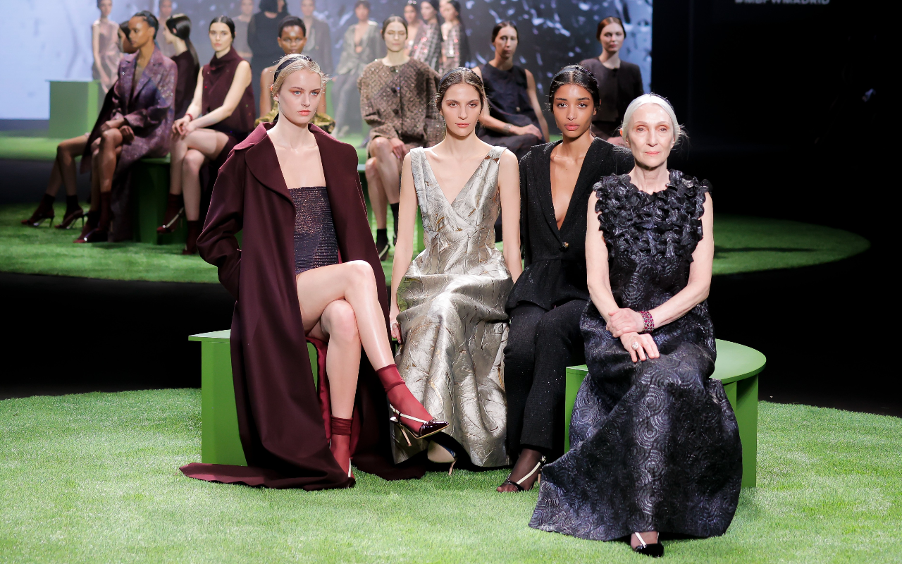
During the recent edition of Mercedes-Benz Fashion Week Madrid, held in February 2025, we had the opportunity to once again see the trust that many designers place in our fabrics for their designs. Female empowerment, sustainability, experimentation with textures and the commitment to materials that combine tradition and technology have been some of the key themes of this season, where each garment not only stands out for its aesthetics, but also for the story behind it.
Below, we present a selection of the most outstanding shows of the Fall- Winter 2025/2026 season, where our fabrics have been the protagonists. It is a privilege to see how each designer explores new forms of expression and plays with textures to propose trends that inspire.
 Fely Campo. Mercedes-Benz Fashion Week Madrid. Fall/Winter 2025/2026 Collection
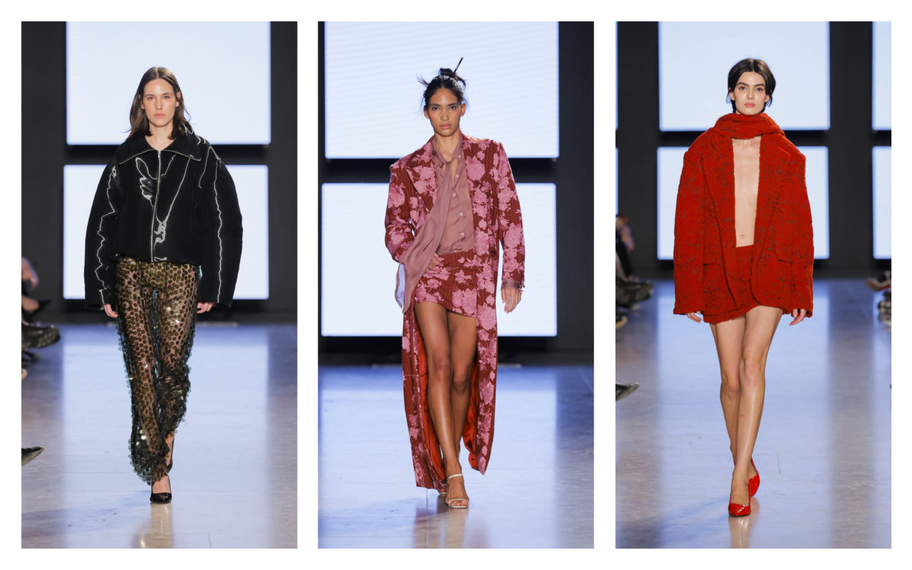
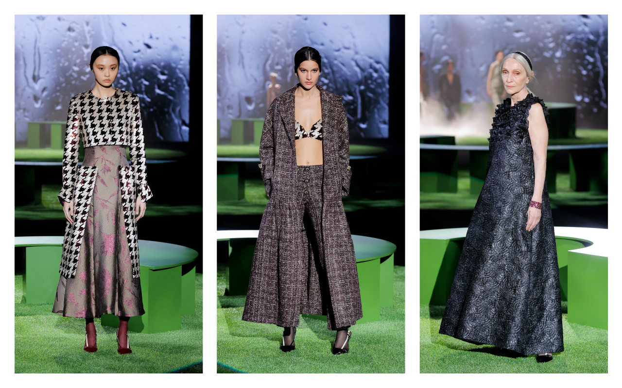
Fely Campo
Fely Campo has presented SELF><WORLD , a collection that invites us to reflect on the relationship between our identity and our environment. What do we project to the world? How is our inner self translated into the image we show? With these questions as a starting point, the designer from Salamanca proposes luxury ready-to-wear where personal essence and external expression merge into the same language.
The autumn-winter 2025/26 collection stands out for its balance between structure and fluidity, playing with materials that evoke emotions and awaken the senses. Tweed, with its enveloping texture, brings warmth and recalls tradition, while velvet is presented as a tribute to sensorial richness, combined with sequins and embroidery that suggest restrained shine and sophistication. Silk, light and ethereal, slides between the pieces, providing movement and softness, in contrast with heavier fabrics such as wool, creating a visual dialogue between the robust and the delicate.
The colour palette breaks free from conventions, breaking the traditional boundaries of colour. Deep tones intertwine with bright flashes, reflecting the multiple facets of the ” self ” and the diversity of emotional states. The versatility of the garments allows each woman to express herself in her own way, with designs intended for everyday use that do not renounce elegance or timelessness.
True to its commitment to sustainability, Fely Campo is committed to pieces that transcend the ephemeral. Each design is conceived to last, resisting the urgency of the new and embracing the beauty that endures over time. The refined and comfortable silhouettes enhance the female figure without imposing themselves, leaving room for the personality of the wearer to be the true protagonist. SELF><WORLD is an invitation to recognize and show oneself as one is, with garments that accompany, envelop and reflect the authenticity of each woman. Because, as the designer herself says, “beauty is in the eyes of the beholder.”
Johanna Calderon
Johanna Calderón chose the emblematic Four Seasons in Madrid to celebrate a fashion show that represents a hymn to body diversity. Each design by the Madrid native with an Andalusian heart is a declaration of self-love, an exaltation of feminine strength and sensuality. Sequins, rhinestones and transparencies took over the catwalk, drawing silhouettes that embrace the body with strategic cuts that enhance the figure without losing elegance. Her collection immerses itself in a festive universe where each garment celebrates self-affirmation. Subtle transparencies coexist with meticulous embroidery and fabrics that shine with their own light, conceived for women who want to feel powerful and radiant. More than fashion, it is a hymn to security and empowerment, with pieces that invite you to dress with confidence and freedom.
To bring this proposal to life, Calderón collaborated with Miah Management , the first Spanish agency dedicated entirely to curvy models. “I was not able to find such a diverse cast of models in any other agency,” explains the designer, a staunch defender of the real representation of women. Diversity was thus one of the central themes of the show, with sizes ranging from 38 to 56, vindicating beauty in all its forms. In short, Johanna Calderón transforms the act of dressing into an experience full of meaning, where sensuality and diversity intertwine to pay tribute to the modern woman: strong, confident and in control of her own story.
 Malne. Mercedes-Benz Fashion Week Madrid. Fall/Winter 2025/2026 Collection
Malne
In “Bohemian Future” Malne has celebrated romantic glamour and the bohemian essence under a futuristic gaze. The firm, founded in 2016 by Paloma Álvarez and Juanjo Mánez, once again opts for slow fashion and artisanal production from its atelier in Madrid, reaffirming its commitment to sustainability and the creation of timeless pieces. With a narrative that fuses the boho chic aesthetic of the 70s with an urban and contemporary approach, the collection dresses a woman who plays with fashion without losing sight of environmental responsibility.
The key garments explore the duality between delicacy and structure: impeccably cut tweed layers are combined with fluid tunics and vaporous blouses that glide over the catwalk. The chiffon dresses, voluptuous and light, are dyed in intense colours such as emerald green, ruby red and classic black, the firm’s fetish tone. Jackets, another of Malne’s distinctive features, are presented in a fitted version, enhancing the feminine silhouette with a sophisticated and urban touch.
As for the materials, the collection for next winter is based on noble fabrics such as tweed, silk chiffon, cashmere, gazar and micropaillettes, which provide texture and subtle shine to the compositions. Each piece is designed to transmit strength and personality, reflecting the DNA of the firm and its focus on fashion as a form of artistic expression. “This collection speaks of a woman of the future, conscious and free, who does not give up luxury or the beauty of what is well done,” comment Álvarez and Mánez.
With this proposal, Malne not only reinterprets bohemian luxe, but reaffirms its place in the Spanish fashion scene as a benchmark for contemporary haute couture, where craftsmanship, sustainability and exclusivity go hand in hand to create unique and timeless garments.
 Mans. Mercedes-Benz Fashion Week Madrid. Fall/Winter 2025/2026 Collection
Mans
The Mans collection, winner of the L’Oréal award for the best collection at the 81st edition of Mercedes-Benz Fashion Week Madrid, delves into the reinterpretation of the feminine suit with impeccable tailoring that balances tradition and innovation. Led by Seville designer Javier Álvarez, the proposal stands out for its careful construction and attention to detail, exploring structured silhouettes with straight lines and fluid volumes that adapt to the female figure, responding to the demands of comfort and contemporary elegance.
Key pieces include British-style suits with double-breasted jackets and large lapels, combined with high-waisted, wide-leg trousers, fitted with cummerbunds and bows that add a playful touch to the ensemble. The coats, in different versions, down to the feet with rounded lapels and enveloping textures, while the shirts, both in their feminine and masculine versions, surprise with horizontal pleats and ruffle details that add a romantic air. This gender duality is also reflected in the sheer blouses and mini and midi skirts, which add versatility to the collection.
The colour palette, dominated by neutral tones, is enlivened by vibrant accents such as red, purple, yellow and orange, evoking a cosmopolitan and bold spirit. Velvet, the textile protagonist of the proposal, pays homage to the aesthetics of the 90s with Tom Ford as a reference, while Scabal wools – iconic fabrics that have dressed characters such as James Bond or Vito Corleone – provide an extra touch of sophistication and sartorial heritage.
The recognition of this collection not only celebrates the excellence of the design, but also the evolution of Mans towards a fashion that embraces diversity, functionality and contemporary luxury, always maintaining the essence of tailoring that defines its DNA. For Javier Álvarez, this award is a reward for a collection that is “difficult to build” and reflects the firm’s connection with the needs of a public that seeks special and timeless pieces.
 Menchen Tomas. Mercedes-Benz Fashion Week Madrid. Fall/Winter 2025/2026 Collection
Menchen Tomas
BLITZ by Menchén Tomás is a collection that travels to the heart of 1980s London to revive the creative and rebellious spirit of the legendary Blitz Club. Epicenter of the underground scene and cradle of the aesthetic and musical avant-garde of the time, this legendary club inspired a proposal that celebrates freedom of expression and stylistic audacity, reinterpreted from a contemporary perspective.
For autumn-winter 2025/26, the firm led by Olga Menchén proposes pieces that invite us to play with fashion as a creative and personal act. Delicate silks, structured crepe, triacetate and chantilly make up a selection of fabrics that offer movement, texture and a feeling of tactile luxury. The colour palette evolves from the sobriety of black and white to metallic shades, eucalyptus green, porcelain blue and pale pink, evoking emotions that complement the dynamism of the garments. The silhouettes explore volumes and structures that dialogue with the aesthetic experimentation of the Blitz Club. The designs dare to decontextualise traditional garments and materials, proposing tunics, oversized blouses, straight-cut trousers and dresses that play with layers and transparencies. Each look is an invitation to break free from established norms and embrace fashion as a form of self-expression.
Beyond aesthetics, BLITZ raises a reflection on sustainability and the importance of giving materials a second life. The firm champions local craftsmanship and the value of work done in Spain, guaranteeing meticulous control of each phase of production and reaffirming its commitment to quality and environmental responsibility.
This collection, presented on the catwalk at Mercedes-Benz Fashion Week Madrid, is an ode to creative daring and free identity, where each garment seeks to inspire and empower those who wear it. For Menchén Tomás, dressing is much more than covering up: it is daring to imagine and express who we are.
 Yolancris. Mercedes-Benz Fashion Week Madrid. Fall/Winter 2025/2026 Collection
Yolancris
YOLANCRIS, the Barcelona-based label founded by sisters Yolanda and Cristina Pérez, has presented its autumn-winter 2025/26 collection under the YC ready-to-wear line: a contemporary reinterpretation of the extravagance and art de vivre of the Marchioness Luisa Casati. Inspired by this iconic figure of the 20th century, the proposal pays homage to the empowered woman who turned her life into a work of art, challenging the established norms of her time.
The collection is based on three creative pillars: Catalan Modernism, the irreverent freedom of the 1970s and the artistic heritage of Mariano Fortuny. The result is a series of pieces that explore the duality between opulence and functionality, maintaining the artisanal essence that has defined the house since 2005. Wrap-around tunics and coats are combined with 70s-style trousers and maxi blouses, while straight dresses incorporate art deco details that provide sophistication without excess.
In terms of materials, Yolancris deploys a textile universe that emphasizes quality and texture. Leather and lace — the latter worked using the soleil pleating technique — coexist with rich velvets and silk gauzes that provide lightness and movement. Artisanal embroidery and hand-made ornamental details underline the firm’s commitment to excellence in tailoring and local savoir-faire. This combination of heavy and ethereal fabrics creates a visual contrast that, at the same time, reinforces the collection’s versatility.
The colour palette ranges from dark, neutral tones—such as intense blacks and deep grays—to more vibrant accents that evoke the free spirit of the 1970s. Yolancris ‘ proposal not only seeks to dress, but also to empower: each garment is a declaration of freedom, designed for the contemporary woman who values comfort without giving up elegance.
This first foray of the YC ready-to-wear line into Mercedes-Benz Fashion Week Madrid represents an important step for the brand, reaffirming its commitment to local production and sustainability. Yolancris demonstrates that everyday fashion can be a vehicle for self-expression and authenticity, fusing tradition and modernity with a sophisticated and contemporary approach.

Fotografía: Paula Caballero
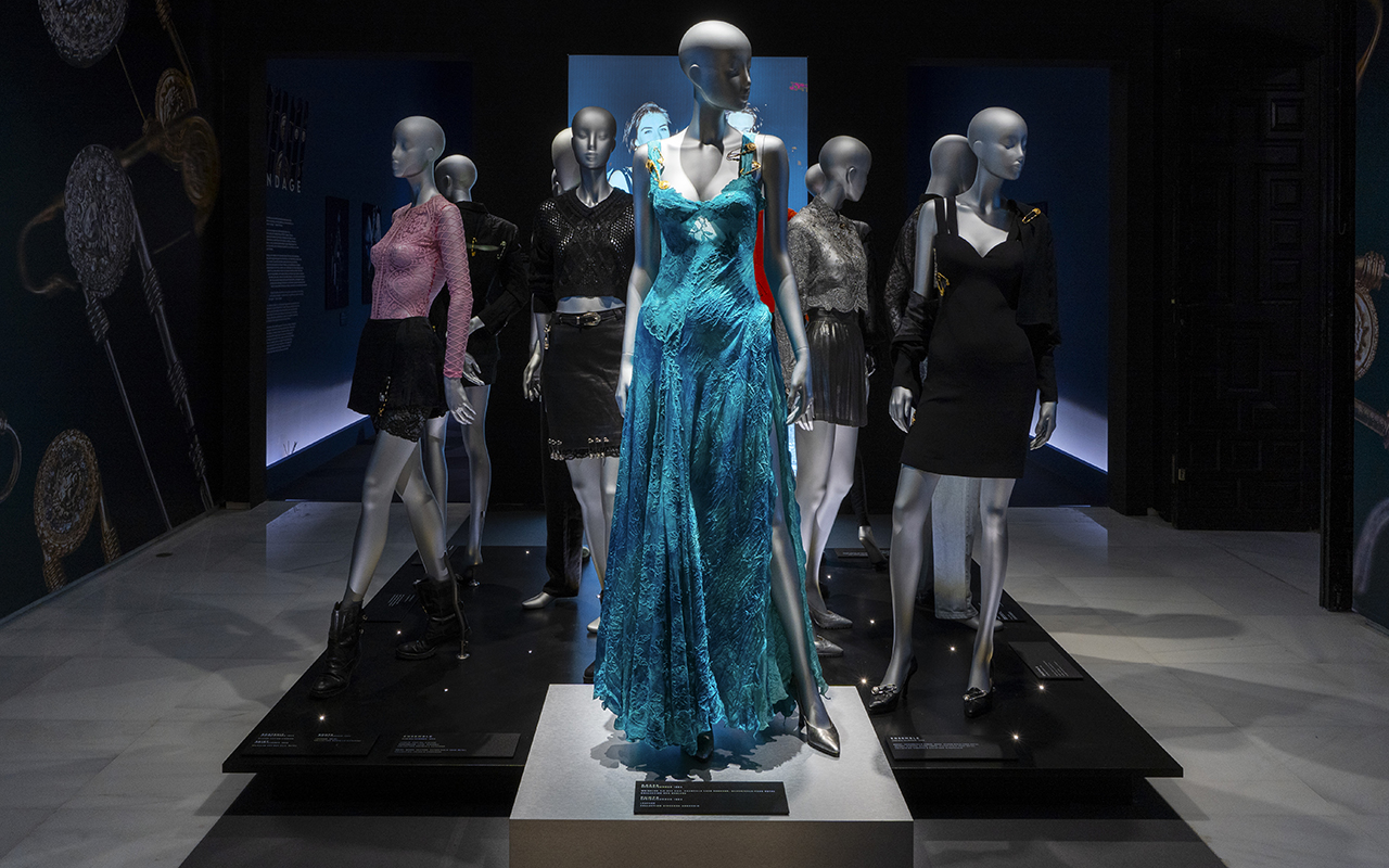
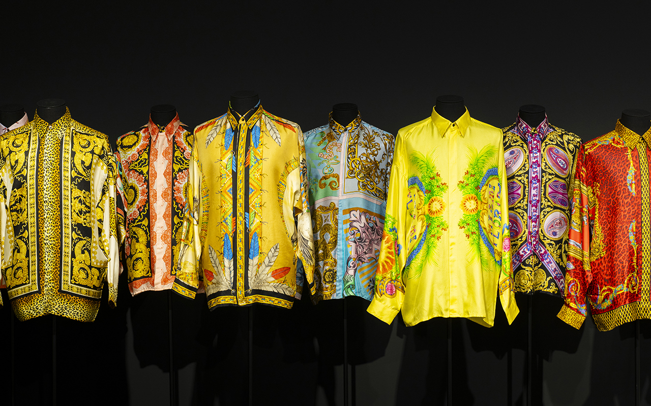
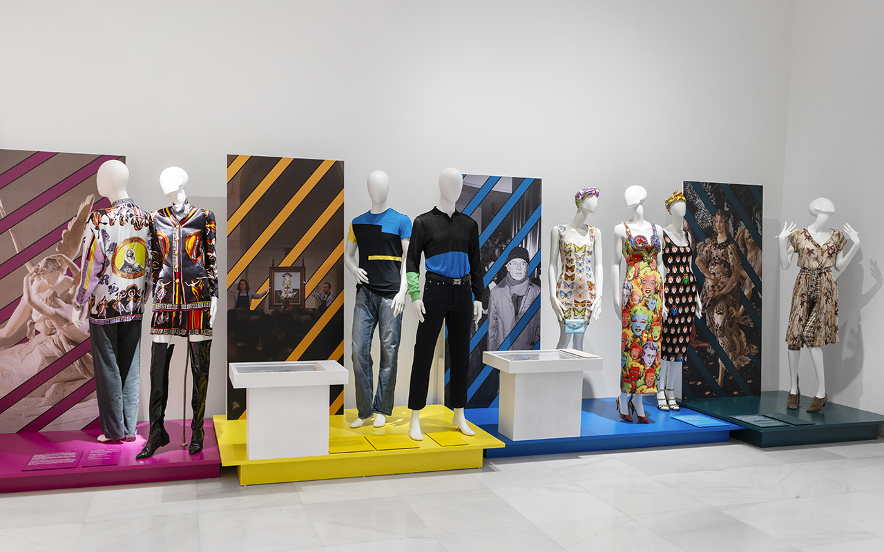
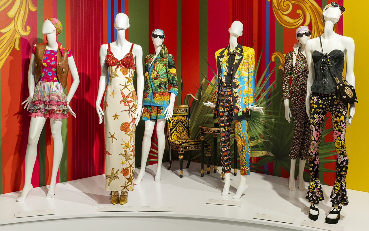
If there is a designer who understood fashion as a spectacle, it was Gianni Versace. He did not limit himself to creating clothes; he built his own universe, where excess was synonymous with elegance and pop culture was mixed with classical mythology. Now, his essence re-emerges in Gianni Versace Retrospective , an exhibition never seen before in Spain organized by Fundación Unicaja that lands in Malaga with more than 500 original pieces to take a tour through the mind of the Italian genius.
The exhibition is housed in the historic building of the Episcopal Palace and, across nine thematic sections, invites us to explore its inspirations, from Classical Greece to the vibrant Miami Beach scene in the 90s. Between shiny fabrics, baroque prints – such as the iconic Barocco – and looks that defined the era of the Supermodels, this exhibition reminds us that the Versace legacy is more alive than ever.
Fotografía: Paula Caballero
The designer who made fashion a spectacle
Gianni Versace didn’t just revolutionize fashion, he redefined it. In the 80s and 90s, his shows were events where supermodels walked like modern goddesses and the clothes screamed power and sensuality. His creations also dressed stars like Madonna, Prince and Elton John, cementing him as the designer of icons.
His ability to mix cultural references from different eras and geographies turned his designs into wearable pieces of art. From Greco-Roman classicism to punk aesthetics, Versace absorbed everything that inspired him and transformed it into something unique. His approach to fashion was instinctive and deeply visual: he was not afraid of colour, exuberant patterns or bold silhouettes. His brand became synonymous with daring luxury and boundless glamour.
The exhibition is unprecedented in Spain and captures that spirit, from his beginnings in Calabria, his arrival in Milan and his fascination with art and architecture to his last collection in 1997, before he was murdered. Through his most iconic looks, original sketches and previously unpublished photographs, Gianni Versace Retrospective immerses us in his creative process.
Fotografía: Paula Caballero
The keys to understanding the soul of Gianni Versace
The exhibition is structured into nine spaces that capture some of the key aspects of Gianni Versace’s imagination, evident in all of his designs.
Inspiration from Greco-Roman mythology : Versace’s fascination with classical antiquity is reflected in his recurrent use of mythological iconography. The Medusa, which became the brand’s emblem, symbolised irresistible attraction and power. His collections incorporated motifs of Ionic columns, golden friezes and depictions of gods, fusing the opulence of imperial Rome with a modern vision of luxury.
Baroque splendour : No one like Versace at mixing gold, classical motifs and excess without losing sophistication. Inspired by art, the Christian religion and Italian architecture, his use of ornamentation and rich fabrics made him a master of maximalist luxury. Despite this, the exhibition also reveals his minimalist side towards the mid-90s. An interesting exercise in stylistic contrasts.
The magic of South Beach : Miami was his refuge and his muse. The Art Deco aesthetic, classic cars and multicultural energy of the city were reflected in his 90s collections. The light, colours and vitality of the city influenced the vibrant prints and marine motifs that characterised some of his most memorable collections.
Art and pop culture : Inspired by Warhol and the repetition of images, Gianni Versace created unforgettable prints. Versace understood before anyone else that fashion should dialogue with popular culture, and his collaborations with artists marked a turning point in the relationship between fashion and art.
Supermodels of the 90s : The Italian couturier elevated Cindy, Naomi, Claudia and Linda to the status of goddesses. He not only designed for them, but helped shape the modern concept of the “supermodel” by turning his shows into media extravaganzas. His 1991 show, where top models walked to George Michael’s Freedom , is an iconic fashion moment.
The power of provocation : She redefined rebellion with leather, studs and harnesses. Her reinterpretation of punk and fetish aesthetics proved that fashion could play with boundaries without losing its sophistication. The iconic Bondage collection of 1992 turned traditionally provocative elements into haute couture pieces that challenged established norms.
Fotografía: Paula Caballero
Fashion, culture and myths of the 90’s
Beyond the catwalk, Gianni Versace’s impact on popular culture was immense. His vision was cinematic, his shows were carefully orchestrated productions, and his approach to fashion broke with many of the conventions of the time. He pioneered a strong visual identity for his brand, integrating architectural elements, instantly recognizable prints, and a use of color that defied the trends of minimalism.
Versace also understood the power of image and marketing in fashion. He was one of the first designers to forge ties with the entertainment industry, dressing artists and creating moments that transcended the catwalk. Lady Diana, Madonna, Cher, Elizabeth Hurley… they all became ambassadors of his bold and sophisticated aesthetic.
Versace also made his mark in cinema and theatre, designing costumes for operas and films. His passion for dramatization and theatricality was reflected not only in his fashion, but in the way he presented his work to the world.
The legacy of a visionary
More than 25 years after his death, Versace’s impact is still felt. His influence can be seen on catwalks, red carpets and even in urban culture. The brand he founded, now under the direction of his sister Donatella, continues to reinterpret his aesthetic, keeping the DNA of the house alive.
The 1990s fashion revival has brought back into the spotlight many of the elements that Versace popularised: the tight-fitting clothes, the baroque prints, the fusion of luxury and rebellion. Contemporary designers continue to find inspiration in his work, and his name remains synonymous with audacity and opulence.
This exhibition is not just a tribute, it is an invitation to relive the art of a designer who turned fashion into a statement of intent. To immerse oneself in his universe is to understand how fashion can be much more than clothing: it is identity, it is art and it is history.
The Gianni Versace Retrospective exhibition will be open to the public until the 30th June at the Unicaja Foundation Cultural Center in Malaga.
Fotografía: Paula Caballero
Sorry, this entry is only available in Español.
 Irving Penn.Centennial by Fundación MOP
He was an icon of fashion photography and his revolutionary vision can now be remembered in Spain. The Marta Ortega Pérez Foundation (MOP Foundation) takes a further step in creating bridges between photography and fashion with the exhibition Irving Penn: Centennial. This is the largest retrospective dedicated to the talented American photographer ever presented in Spain. A symbolic exhibition that covers the 70 years of his prolific career, which has already been shown in New York, Paris and Berlin.
Irving Penn: Centennial is an exhibition organized by The Metropolitan Museum of Art in New York, in collaboration with the Irving Penn Foundation and curated by Jeff L. Rosenheim , Joyce Frank Menschel Curator in Charge of Photography at The Met . The exhibition can be visited free of charge until the 1st May 2025 at the MOP Foundation exhibition centre, located in the port area of A Coruña.
A journey into the soul of Irving Penn’s photography
Created in 2017 to mark the centenary of the artist’s birth, Irving Penn: Centennial is a tribute to his prolific career in all its breadth, from his beginnings in the late 1930s to the early years of the 21st century. What is most interesting about the exhibition is that it allows us to delve deeper into the photographer’s work beyond his best-known projects. This is precisely the aim of the exhibition: to cover all facets of Penn’s work, including fashion photography, delicate female nudes, floral compositions and still lifes, the still lifes of everyday objects that he was fond of throughout his life.
The exhibition also highlights the portraits of personalities who made him famous, such as his muse Lisa Fonssagrives, Pablo Picasso and Marlene Dietrich, as well as his photographic series documenting ordinary people captured in different corners of the world. It also includes unique pieces such as the backdrop of his studio and unpublished works that allow the visitor to delve into his creative process. Altogether, the exhibition brings together more than 160 works that offer a complete overview of the career of an artist who revolutionised the visual language of the 20th century.
 Irving Penn.Centennial by Fundación MOP
A democratic look
The exhibition is the perfect excuse to decipher Irving Penn’s legacy and understand his role in fashion photography, a field that transcended to create a unique visual universe. His motto, “less is more”, remains a reference for artists and creatives, reminding us that beauty can be found in the essential and the simple.
Vogue magazine redefined visual standards through a style that combined simplicity with sophistication. His images, characterized by a minimalist use of space and neutral backgrounds, transformed the perception of commercial and fine art photography. With an avant-garde approach, Penn turned the everyday into art, immortalizing everything from iconic figures such as Audrey Hepburn and Miles Davis to objects as common as cigarette butts.
The exhibition also highlights his technical mastery: Penn revived techniques such as platinum-palladium printing and experimented with materials to achieve a unique quality in his photographs. Each image reveals his ability to capture the essence of his subjects, transcending documentation and creating pieces charged with emotion and symbolism.
Supplementary materials
To enrich the experience, the MOP Foundation has exclusively published a catalogue in Spanish of the exhibition, a must for admirers of Penn’s work and 20th-century photography. This volume brings together almost 300 images, including iconic and previously unpublished works, accompanied by essays that explore the main themes of his career.
In addition, as every year, visitors will be able to enjoy a new set designed specifically for the exhibition, both inside the warehouse and in the outer space. The venue has also reopened its bookstore, specialising in photography, fashion, design and other artistic disciplines.
A legacy that endures
Irving Penn: Centennial exhibition becomes the fourth major retrospective promoted by the MOP Foundation, reaffirming its commitment to photography, fashion and its connection with A Coruña. Since its creation, the Foundation has promoted highly relevant exhibitions, such as Peter Lindbergh. Untold Stories (2021-22), Steven Meisel 1993: A Year in Photographs (2022-23) and Helmut Newton: Fact & Fiction (2023-24).
Photos by:
Irving Penn. Picture of self, Cuzco, 1948© The Irving Penn Foundation
Irving Penn. Marlene Dietrich, New York, 1948 © The Irving Penn Foundation
Irving Penn. Woman in Chicken Hat (Lisa Fonssagrives-Penn), New York, 1949 © The Irving Penn Foundation
Irving Penn. Naomi Sims in Scarf, New York, ca. 1969 © The Irving Penn Foundation


The Christmas season is here, and with it comes the first flashes of lights in the streets, company dinners, intimate gatherings with friends and family, and big celebrations that invite us to show off our best clothes. It’s the perfect time to stand out with special garments that stand out for their elegance and sophistication.
At Gratacós, we understand this need and, therefore, each collection includes carefully designed fabrics, made with the premium quality that special occasions demand. In this new blog entry, we want to guide you through our star fabrics so that you shine during the holidays, whether in a subtle way or with a dazzling touch. Discover their characteristics and learn how to make the most of each one for your most special moments. We will tell you about it below!
Velvet
Few fabrics inspire as much fascination as velvet. Its soft texture, with a short pile surface that changes direction when brushed, and its ability to delicately reflect light make it an irresistible classic for the holiday season. Plus, its slight elasticity makes it perfect for creating elegant and comfortable garments that stand out at any event.
Velvet evokes instant luxury and is incredibly versatile, especially for evening looks. From long evening gowns to full suits with fitted blazers and palazzo pants, this fabric adds a touch of sophistication to every look. The best part? At Gratacós we offer you a wide range of shades so you can find the one that best suits your style and the occasion.
Discover all the possibilities of velvet here.
Silk
Since ancient times, silk has been a symbol of luxury and sophistication. This natural fabric is distinguished by its extreme softness, natural shine and fluid drape, making it the perfect choice for garments that seek to elegantly adapt to the body. Silk has an impeccable drape, ideal for dresses and blouses that, without losing their shape, envelop with unique delicacy.
For the Christmas festivities, nothing beats a long silk dress with a lingerie style in metallic tones or deep red, ideal for a New Year’s party. If you prefer a more groundbreaking style, a silk blouse combined with high-waisted trousers creates a sophisticated and modern look. Another must-have? A long silk skirt, combined with a knitted or cashmere sweater, for an outfit that perfectly balances femininity and comfort.
Discover our silk fabrics here.
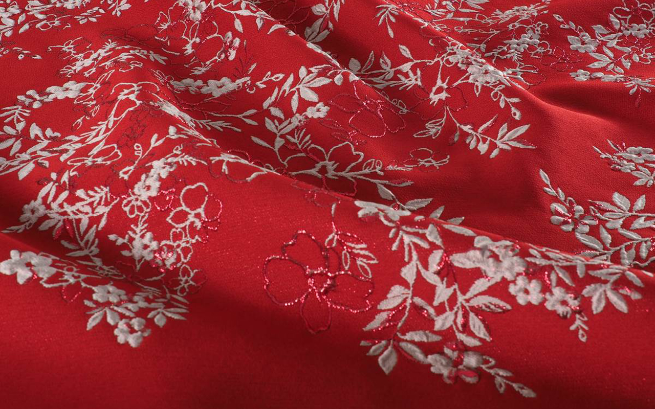
Brocade
Ornate and full of character, brocade evokes baroque splendour with its homage to excess and intricate floral or geometric patterns woven in metallic threads. With its coarse texture and imposing presence, this fabric is perfect for creating structured garments that stand out on any special occasion.
What possibilities does it offer? A brocade dress is the perfect choice for very formal events, but this fabric can also be adapted to a more contemporary style. For example, a brocade jacket combined with high-waisted jeans creates a modern and sophisticated look with an unexpected twist. In addition, brocade is ideal for striking layers such as coats, jackets or blazers that add a regal air to any outfit.
Opt for a brocade garment for Christmas Eve dinners or events where you want to convey elegance and a subtle touch of royalty.
Jacquard knitting suggestions that you will fall in love with here.
Sequins
If there is a fabric that captures the essence of the festive season, it is sequins. This timeless classic reflects light in a spectacular way, becoming the centre of attention. But at Gratacós we go one step further: this season, sequins are reinvented with maxi versions and combinations of 2 or 3 colours that create irresistible and unique mosaics.
Do you already know how to combine them? If not, here are some ideas: go for a head-to-toe shiny dress to dazzle at any event or dare to try less conventional options, such as jackets with metallic embellishments or even accessories such as bags. And if you are looking for an infallible look, a midi sequin dress in gold or silver tones is perfect to stand out on New Year’s Eve with elegance and glamour.
Discover our most original sequins here.
Taffeta
When we think of glamorous pieces with volume and structure, taffeta is the undisputed star. This lightweight yet firm fabric stands out for its rigidity, which allows it to hold its shape, and its subtle sheen, making it a classic choice for ball gowns and evening wear.
Design ideas? Taffeta is ideal for dresses with full skirts or layered details that need structure. Bright hues like silver or emerald further enhance its elegance, making it the perfect choice for high-end events like Christmas galas or New Year’s Eve dinners in luxurious settings.
Discover our seasonal taffetas here.
And if you’re looking for something even more special, explore our premium collection with fabrics designed for unforgettable occasions. Plus, our surprise boxes with four fabrics from past collections will inspire you to create unique and magical looks for this holiday season.


Mi�rcoles 30 octubre 2024
Sorry, this entry is only available in Español.
Jueves 26 septiembre 2024
 Featured in the collage: Lola Casademunt by Maite, Fely Campo, Álvaro Calafat, JCPajares, and Malne for MBFWMadrid. Courtesy of the brands.
At Gratacós, we are always keeping an eye on the most important catwalk shows in Spanish fashion, looking for those surprising looks that are created with our fabrics. We love to see how each designer adds their personal touch and transforms our fabrics into authentic works of art in motion. This constant search for creativity and innovation inspires us deeply.
At the latest edition of Mercedes-Benz Fashion Week Madrid, held in September 2024, we confirmed once again that many designers trust in the quality and versatility of our fabrics to bring their collections to life. This year, artisanal and sustainable fabrics have taken centre stage, highlighting a clear focus on recycled, natural and technological materials. Not only do they make garments look amazing, but they also tell stories full of purpose.
Here are some of the most outstanding looks from the Spring -Summer 2025 collections, where our fabrics have been an essential part. It is fascinating to see how each designer contributes their unique vision and plays with textures to set trends that do not go unnoticed.
Alvaro Calafat
In his new collection ODDITIES ODYSSEY, Álvaro Calafat takes us on a journey into the past, evoking the old cupboards of curiosities where the strange and the fascinating coexist. Inspired by collectible objects and mysterious images, the designer from Malaga has created a proposal that mixes the classic with the innovative, breaking down the barriers between fashion and art.
The standout pieces include impressive volumes and constructions using 3D printing, one of the brand’s hallmarks. Hand-made textures and techniques such as cyanotype add a handcrafted touch that reinforces the collection’s unique aesthetic. Each garment becomes a canvas for experimentation, where the surreal comes to life through appliqués and embroidery.
The firm maintains its commitment to sustainability, emphasizing natural and high-quality fabrics such as silk, cotton, leather and tencel. The brand’s classic bomber jackets are reinterpreted with surreal details, elevating their design to another level. This collection reflects Álvaro Calafat’s commitment to innovation and respect for the environment, always with that air of mystery and sophistication that characterizes the firm.
Fely Campo
With “ Lei Zu”, Fely Campo invites us on an aesthetic journey along the mythical Silk Route, fusing history, legend and fashion. This luxury ready-to-wear collection features 29 sophisticated looks, starting with the masterful use of tweed and intertwining with artisanal silks brought from Guangzhou. Each garment celebrates textile richness, where opulence and subtlety meet.
The volumes of taffeta, the lightness of organza and printed brocades combine to create pieces that stand out for their precision in cuts and careful silhouettes. The collection begins with more structured shapes and tailored suits, evolving towards a more fluid aesthetic with shirt dresses and maxi lace kaftans that mesmerize with their movement.
The colour palette of “ Lei Zu” is a visual poem: crystal blues, pearly whites and soft lilacs mingle with acidic limes and radiant pistachios. With golden brushstrokes on Chinese silks, light plays a fundamental role in this proposal, which goes beyond being just a collection; it is a tribute to the essence of fashion and the magic of the Silk Road.
JCPajares
JCPAJARES surprises us with “ANNUAL 25,” its fifth annual collection, where the essence of summer and winter intertwine in designs that celebrate craftsmanship and innovation, all with a strong environmental commitment. This proposal highlights the new artisan luxury, the result of a collaboration with master craftsmen from Castilla-La Mancha, which revives centuries-old techniques in danger of extinction, giving them a contemporary feel.
The collection is a true feast for the senses, with materials including ceramics, blown glass, hand embroidery, crochet and painted prints, all crafted on historic looms. Spanish wool, often considered waste, is brought back to life, while leather and wicker accessories add a unique touch to each look.
“ANNUAL 25” is an ode to sustainability, where social responsibility and animal welfare are fundamental pillars. Oversized silhouettes and innovative patterns combine with prints evoking sunsets, creating pieces perfect for both day and night. The collection includes feathers, ruffles, cut-outs and goth details, made of wool cloths, silk crepes, taffetas and faded denims, along with tulles and fabrics adorned with rhinestones and sequins with floral motifs.
In each garment of “ANNUAL 25,” craftsmanship and modern aesthetics merge, offering a visual and sensorial experience that highlights the quality of the materials and real traceability, ideal for those looking for unique pieces with history.
Lola Casademunt by Maite
LOLA CASADEMUNT BY MAITE ‘s new collection is inspired by the rich Japanese culture, with geishas as muses. This proposal captures the femininity and delicacy that characterize these emblematic figures, bringing them to life through garments adorned with floral details and glitter, in a vibrant palette that evokes the iconic kimonos.
Fluid and delicate fabrics are combined with more structured and casual materials, creating a dialogue between tradition and modernity. Stitched collars, embroidery and bows intertwine classic elements of geisha costumes with a contemporary style, while wide volumes on skirts and trousers and flowing sleeves add movement and elegance to each look.
Fitted dresses and geometric patterns enhance the silhouette, adding a touch of sophistication. Accessories are essential in this proposal, including okobo, traditional sandals, and sashes that imitate the obis of kimonos, all designed with the colors and prints characteristic of the collection.
“Spring/Summer 2025” by Lola Casademunt by Maite offers a contemporary take on Japanese aesthetics, fusing the traditional with the modern in a fresh and sophisticated proposal. Each piece not only celebrates cultural heritage, but also adapts to the modern lifestyle, making this collection an ideal choice for those seeking elegance and distinction in their outfits.
Malne
Malne, the luxury label created by renowned designers Paloma Álvarez and Juanjo Mánez, has presented “De Rerum Natura.” Inspired by the poem by Roman poet Titus Lucretius, this collection for the upcoming summer season celebrates nature and is a journey toward happiness and environmental awareness.
The proposal focuses on epicurean fashion, using natural fabrics such as linen, raffia and silk, as well as animal and floral prints that evoke the essence of spring. Each garment reflects freedom and connection with the outdoors, ideal at this time of year when it invites you to enjoy leisure time away from the hustle and bustle of the city.
The silhouettes are soft and fluid, combining haute couture elements with a feminine approach. Malne pays homage to classic corsetry, using lace and corsets that wrap the body with elegance. The firm remains faithful to its principles of creating unique fashion with an authorial message, highlighting its commitment to craftsmanship and slow fashion, becoming one of the pioneering brands of the movement in Spain.
“De Rerum Natura” is not just a collection, but an invitation to reconnect with nature and enjoy life to the fullest. Each piece in this limited edition collection is designed for clients seeking luxury and exclusivity, reaffirming Malne ‘s position in the world of high-end ready -to- wear.