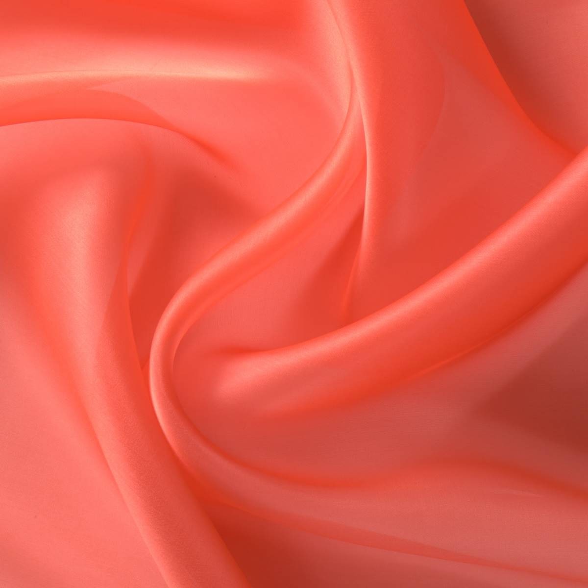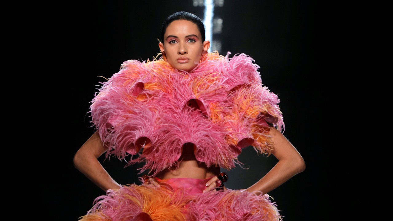
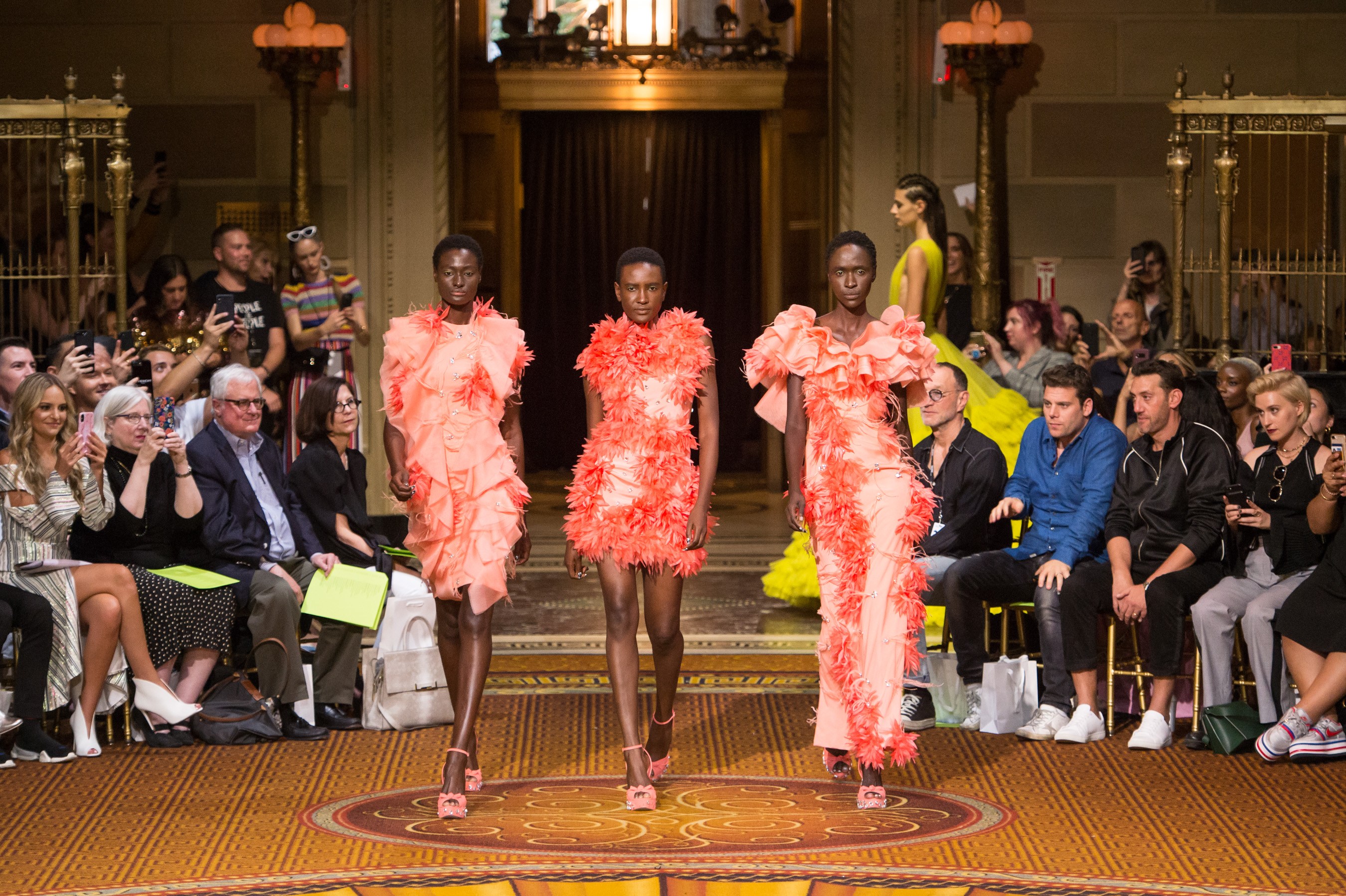
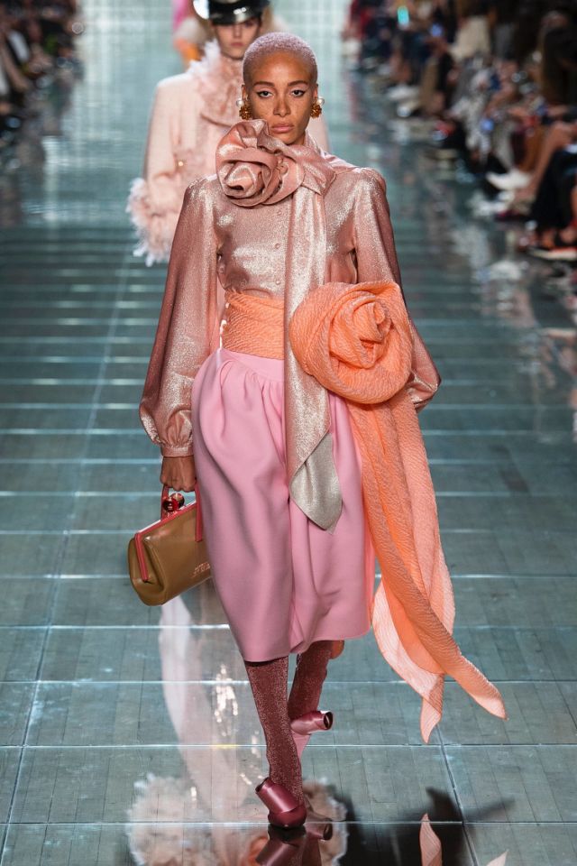
Once again we say goodbye to the year with a new colour that will be a reference for the next one. According to Pantone, the shade of influence in 2019 will be ‘Living Coral’, a particular orange-pink that as the name suggests refers to living coral and highlights the beauty, uniqueness and fragility of these marine ecosystems. This hue, Pantone 16-1546, takes over from the violet shade of 2018 (Ultra Violet) or the yellowish green of 2017 (Greenery). Remember that since 2000 the international colour authority has established what will be the shade of the year and this choice directly affects the fashion industry, design, advertising or decoration.
A cheerful colour that connects digital identity with real life
What are the reasons to choose ‘Living Coral’ as the colour of 2019? Although it may seem so, the decision is not random, but the result of a thorough analysis and research in the field of global trends affecting several sectors and which are present within a current social and economic context. They are varied influences that may come from new technologies, the entertainment industry, collections of art, fashion, popular destinations, the environment or lifestyles …
 |
 |
The company, founded in New Jersey in 1962, commercializes standardized colour samples and in a statement has explained that ‘Living Coral’ is a shade that “provides comfort and stability” and is “full of warmth and encouragement” to a society in constant change in the face of “the onslaught of digital technology and social networks that are increasingly incorporated into everyday life “. The cheerful and lively tone symbolizes “the search for immersive authentic experiences, which in turn permit connection and intimacy”. In this context the coral tone symbolizes the union of opposing concepts that interrelate with each other: the social connection with human interaction . It links digital identity with true identity via “a lively cheerful shade with a golden hue, that imparts energy and vitality while maintaining a smooth finish.” The executive director of the institute, Leatrice Eiseman also points out that this colour “symbolizes our innate need for optimism and the search for happiness”.
 |
 |
From another point of view it is clear that this hypnotizing colour also evokes the coral reefs that shelter a multitude of marine species “in a diverse kaleidoscope of colour,” according to Pantone. From an environmental perspective ‘ Living Colour ‘ symbolizes the fragility of these ecosystems and the devastating effect of today’s society on nature.
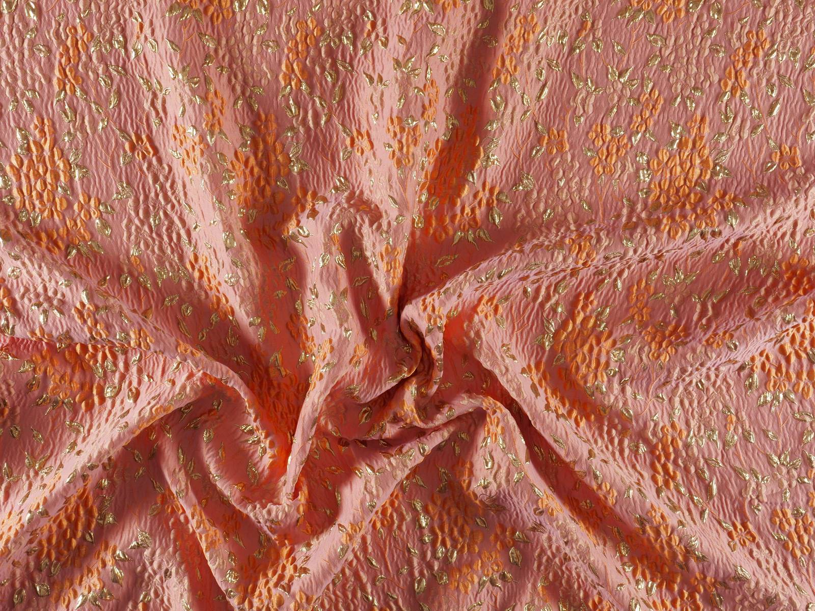
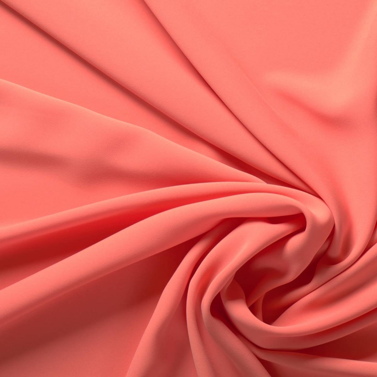
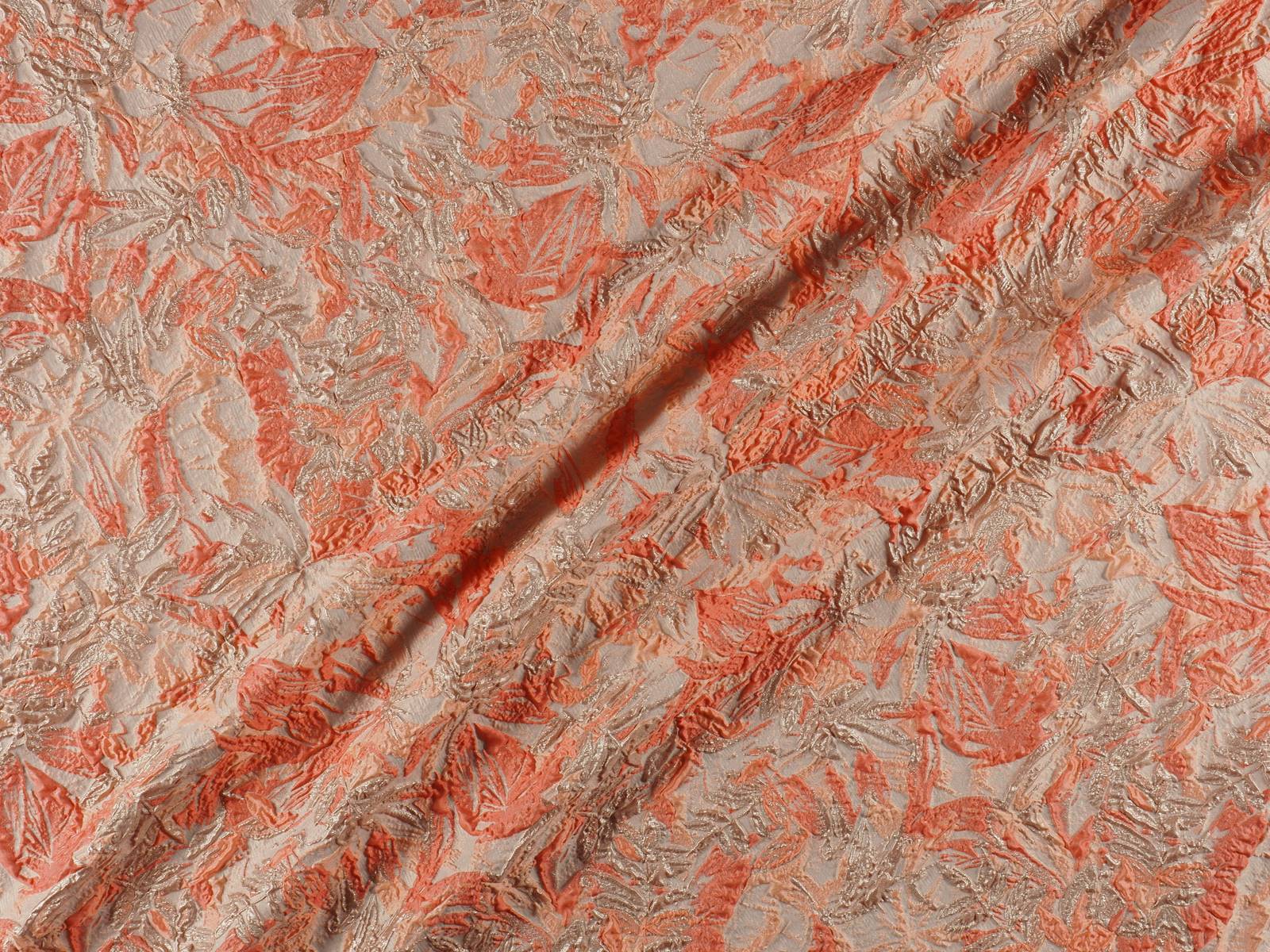
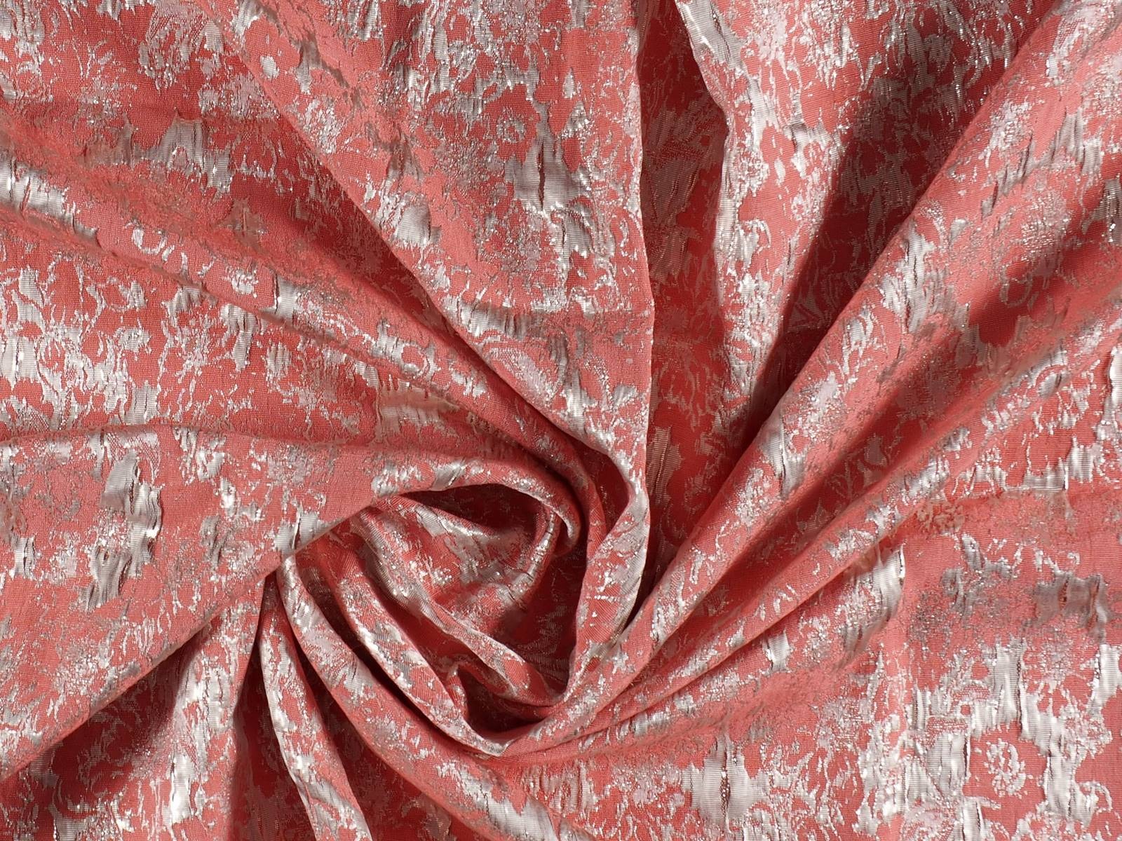
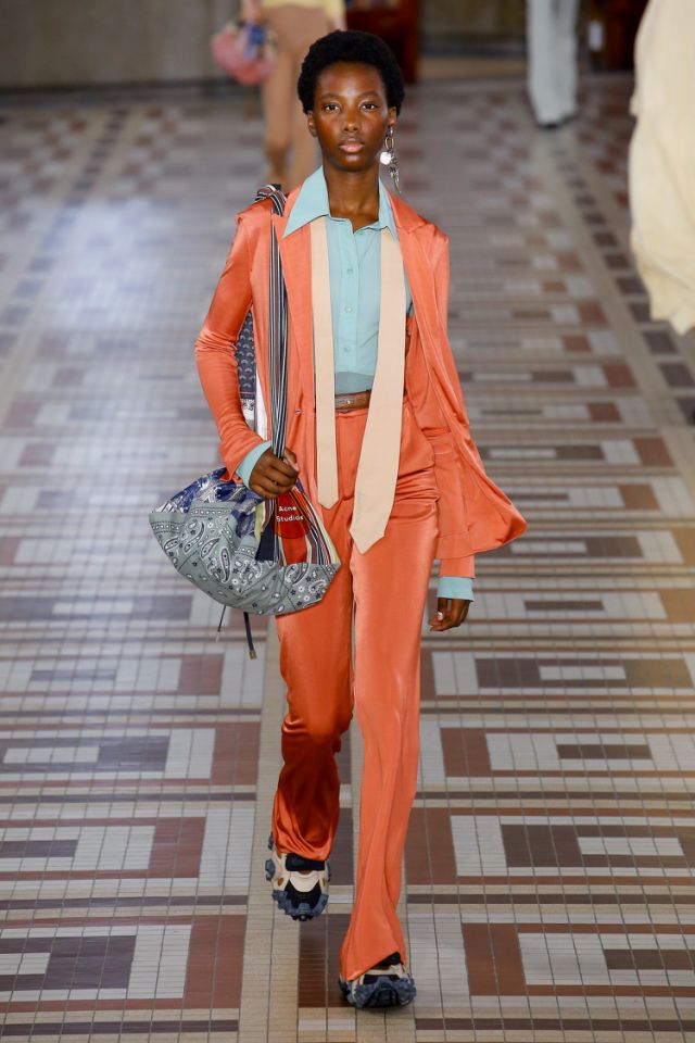
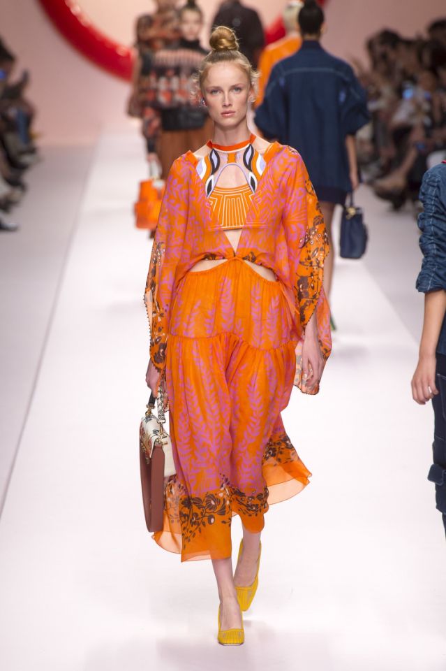
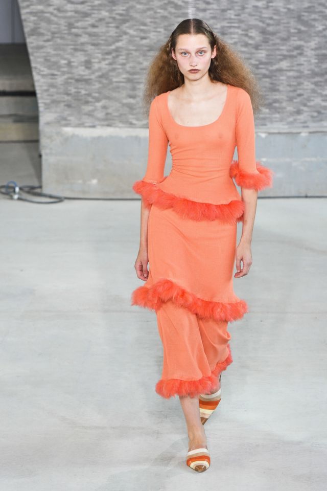
Vibrant coral in the new collections of fabrics
In Gratacós we also pay homage to vibrant ‘Living Coral’ via the new collections of fabrics. Silky textures, bright finishes that capture that golden brush-stroke, floral Jacquards full of brilliance or soft matt reliefs … Find them on our website or ask for them in our shop in Barcelona. We are waiting for you!