Miércoles 03 noviembre 2021
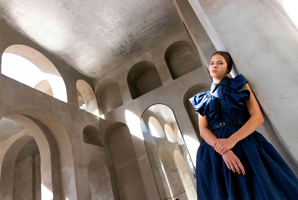 From Gratacós we closely follow the Spanish catwalks because we like to appreciate the creativity of designers in the form of impressive seasonal garments and how, sometimes, one of our fabrics sneaks into the looks of their magnificent collections. After the Mercedes-Benz Fashion Week Madrid in September, the last appointment with fashion was held by 080 Barcelona Fashion last month, in a new exhibition of fashion and power.
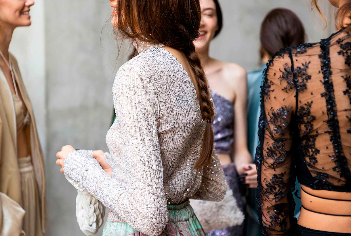
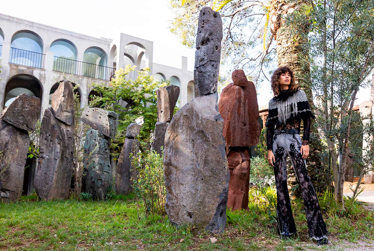
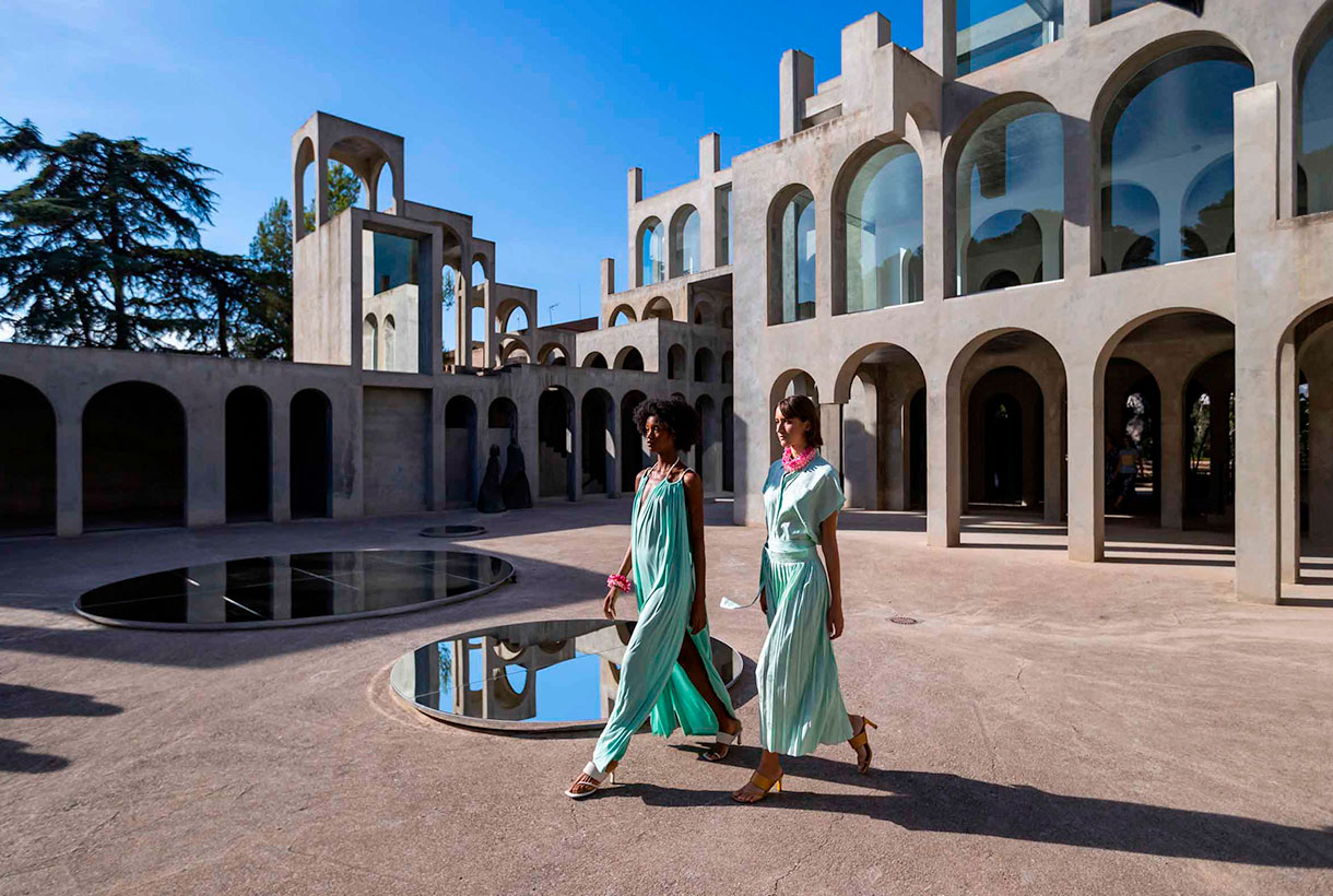
The Catalan catwalk once again opted for the digital format, presenting for the third time in a row, fashion short films previously recorded and edited by 22 designers who participated in the last edition. This time, the film set of the audiovisual pieces took place in a space that broke with the modernist legacy of recent editions: Xavier Corberó’s residential and architectural complex located in Esplugues de Llobregat. A wonderful sculptural work of concrete and glass of a rationalist character with dreamlike buildings that recall the metaphysical painting of Giorgio de Chirico or the mathematical art of Escher.
Next, we explain in detail some of the collections that surprised us the most with designers who maintain creative discourses linked to uniqueness, craftsmanship, sustainability or proximity.
Avellaneda
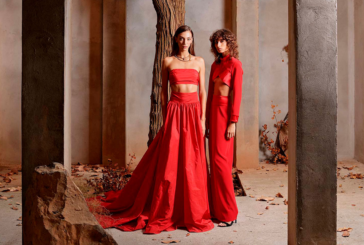
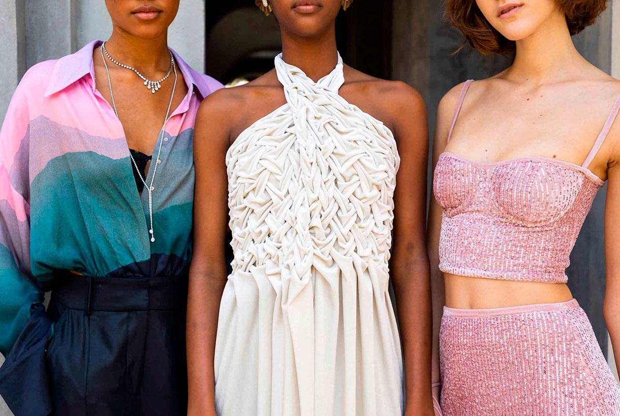
Avellaneda turned the XC space of the Xavier Corberó architectural complex into a glamorous party displaying beauty, youth and good taste in clothing. In the new collection, the Barcelona designer Juan Avellaneda was inspired by the city and the individuals who inhabit it and share secrets, passions, ephemeral romances, eternal promises and moments of fun. This urban jungle consisted of a sophisticated collection of cocktail looks with traces of safari style: a revision of the zebra animal print , sequined jackets and baggy pants in earth tones. These innovative pieces coexisted with their signature flagships: tuxedos, dresses with sensual openings, silks, ruffles and sequins reign in clothes with daring patterns in a unique proposal that mixes exoticism with its usual elegance. The neutral bases, the pairing of black and white, red and fuchsia gave colour to this festive collection that plays with the classic codes of good dress.
Eiko Ai
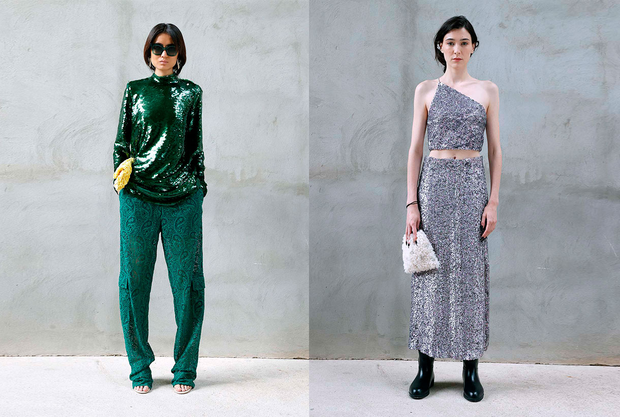
Eiko Ai brings a new value in women’s fashion by combining concepts such as sophistication and sensuality in the clothes that she creates in a casual style for everything to wear. Always with that point of magic that invites clients to dream through the designs. On this occasion, the firm led by Glò Lladó has presented in 080, a collection that represents a fantastic trip to the mountains that allows us to discover the nymphs of the forest. These creatures of evocative power, inspiring myth and legend, have been dressed in two-piece combinations with bras – a hallmark of Eiko Ai-, oversized bomber jackets, trench coats with sparkly fabrics and sheer dresses with surprising cuts that insinuate without showing excessively. All this adorned with sequins, velvets, satins, lace and iridescent materials that create sensual transparencies on the models’ bodies. The silhouettes have a minimalist point inspired by the 90s and the lingerie looks blend with the festive in this exciting proposal tinged with deep green, silver and lavender that attracts at first glance.

Moisés Nieto
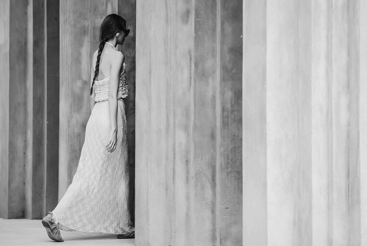
The designer from Úbeda (Jaén) made his debut on the Catalan catwalk displaying his credentials: contemporary design combined with the passion for craftsmanship and the trade that characterizes his elegant style from restraint. In the new collection for next season, Moisés Nieto takes a trip back in time to reconnect with his childhood in Andalusia. From the summers of the 90s, the designer chooses elements rescued from memory that serve to shape a proposal that speaks of everyday life: the crochet of the doilies, the nets of the curtains, the lace or the plants of the patio are a representation of the memories that take us to the eternal hot summers of the south. The sustainable brand shapes its particular vision in roomy midi dresses and pleated silk skirts. Light garments made with organic cotton or silk fabrics and mixed with artisan techniques such as knitting, crochet and macramé. It is worth noting the textures displayed that play with different weights and structures to create volume in women’s garments that add unexpected details. As in previous collections, the designer approaches craftsmanship and values sustainability, two aspects that have become the most visible hallmarks of the Spanish firm.

Y_Como
Finally, highlight the new work of Cristina and Yolanda Pérez from Yolancris in the new brand, Y_Como, which once again surprises with a new collection based on research and the creative process. The summer proposal presented at 080 Barcelona Fashion is inspired by the painting ‘The Garden of Delights’ by Bosco. Specifically in the panel that refers to Paradiso with a free interpretation, but full of visual references that refer to the work focused on creation. In the first scene of the fashion film , set in the architectural garden of Xavier Corberó, the models that embody the characters in the painting appear: there is the owl that represents the evil that contemplates falling into temptation, the figures of Adam and Eve , and followed by exotic animals that are represented by models of baroque aesthetics that show spectacular golden robes with floral embroidery. Also featured are other black sexy dresses, garments with lots of floral and patchwork denim, fabric star creative signature ready-to-wear bulky clothes that give a rebellious streak this sensuous YComo proposal.
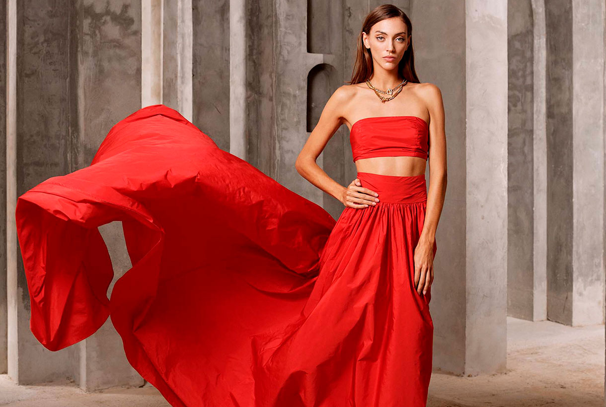
Miércoles 08 septiembre 2021
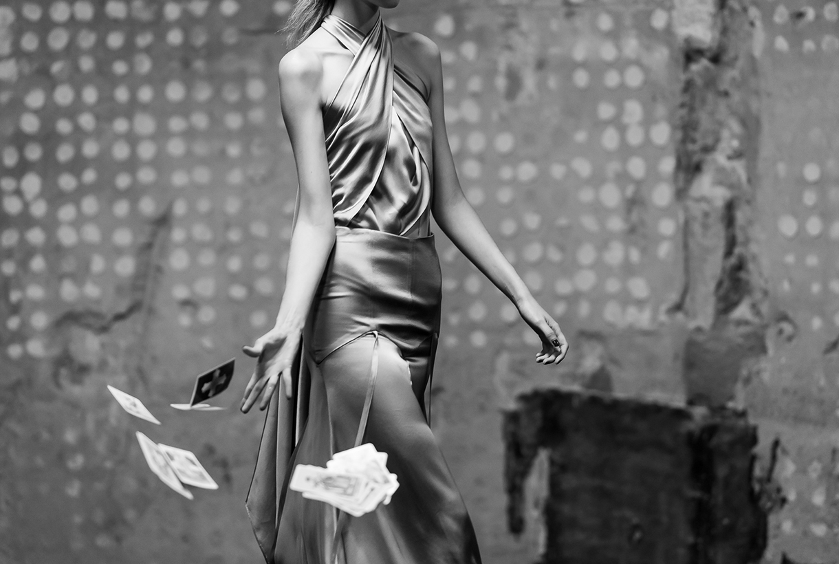 It was to be expected! Within its cyclical nature, fashion evokes fantasy after having spent almost two years stuck in comfort and austerity, two values influenced by the global pandemic. Remember that fashion is always a reflection of society. Thus, the reign of tracksuits, sweatshirts, pyjamas and slippers (whether they are at home or not), seems to be coming to an end with new inspirations that are postulated totally antagonistic: More luxury, more ornamentation and of course, more shine in festive garments and collections that cry out to escape from reality.
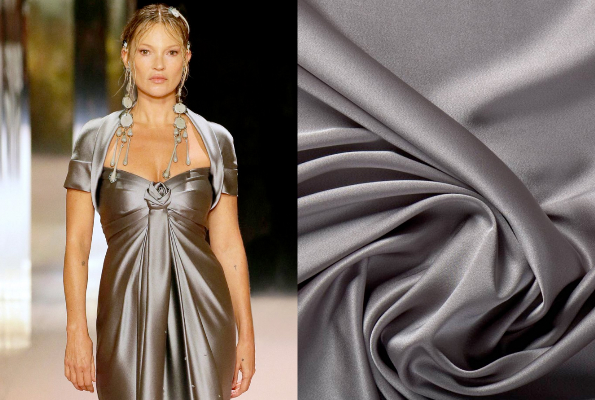
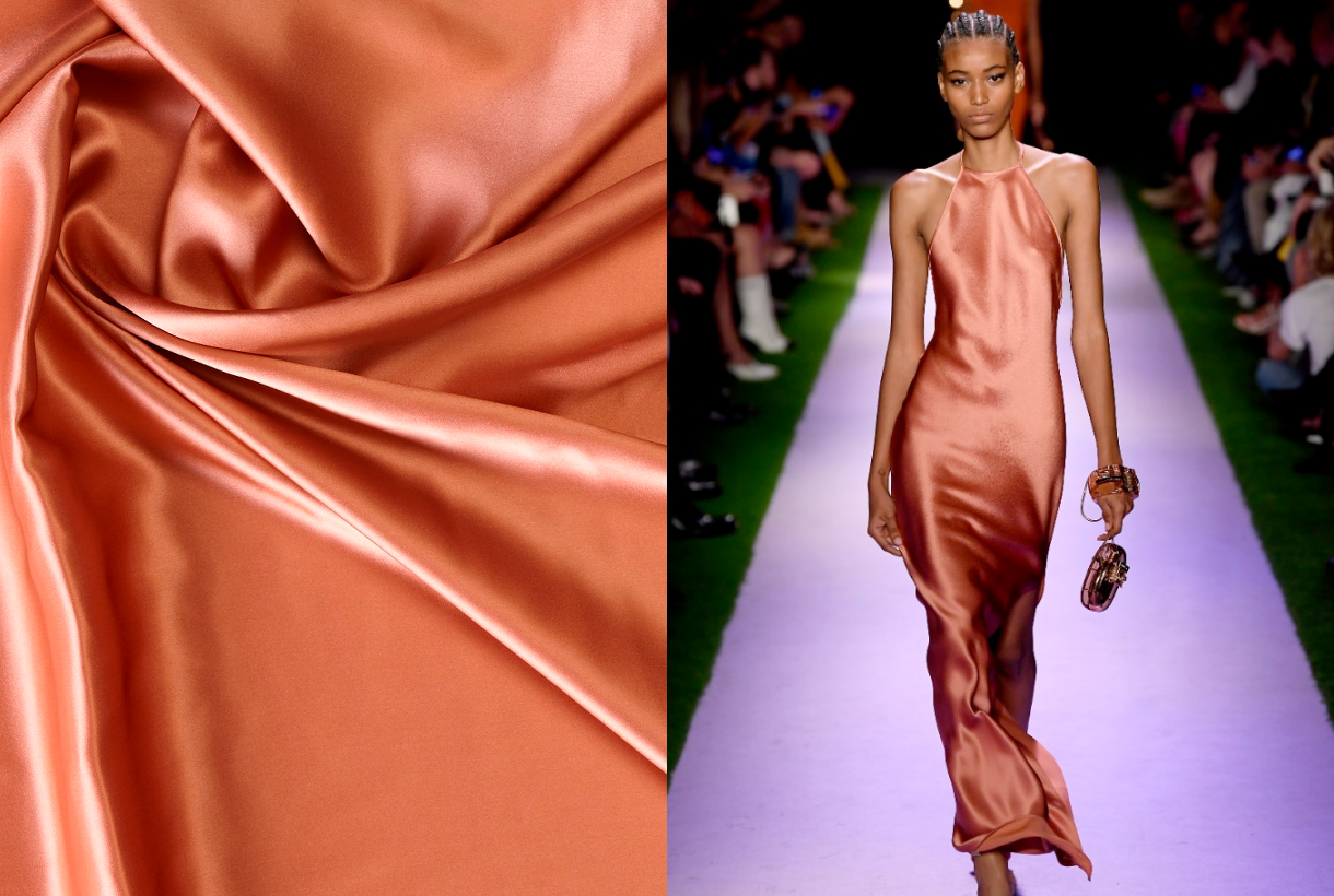
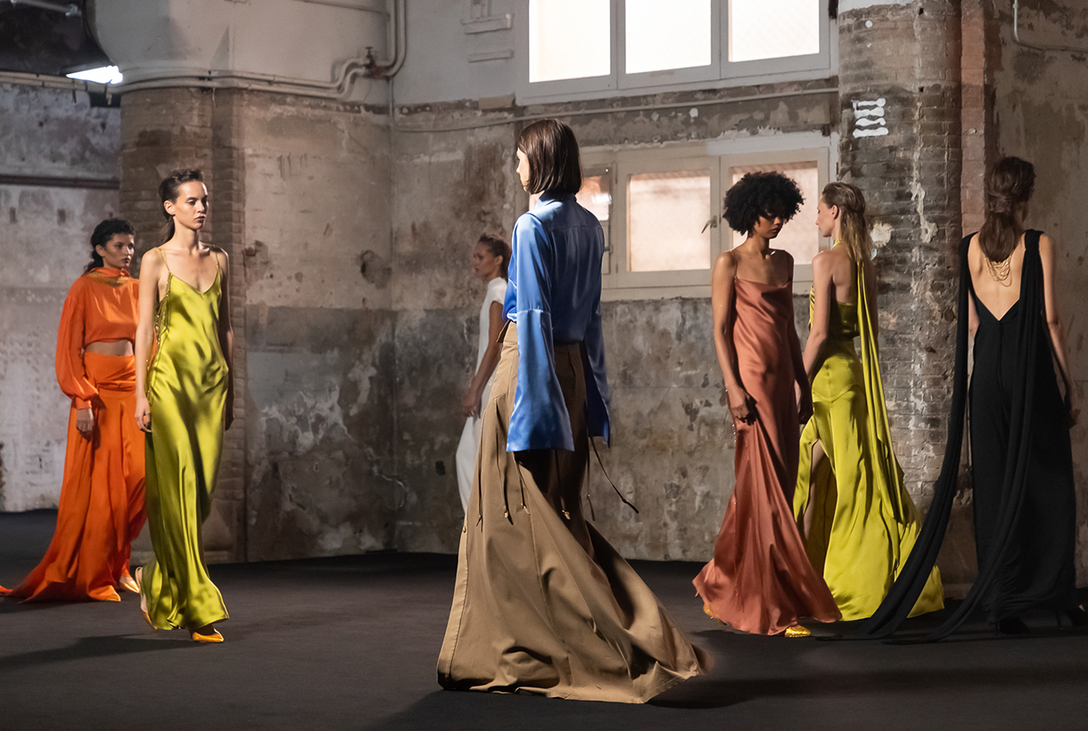
Of the three maxims, we want to focus on shiny fabrics as one of the trends that is going strong this Fall- Winter 21/22 season that we will premiere in September. Beyond the sequins that have had huge success as from now on and arrive in their most ostentatious version ( sequins on sequins in pants, jackets and voluminous dresses ), we want to talk about satin fabrics, one of the great bets of the new collections that we have seen in garments, shoes and bags and whose subtlety and sumptuousness continues to inspire us when it comes to making our fabrics.
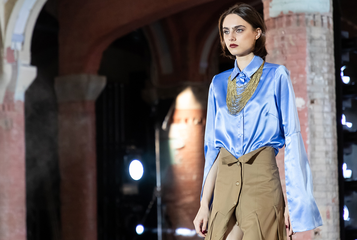
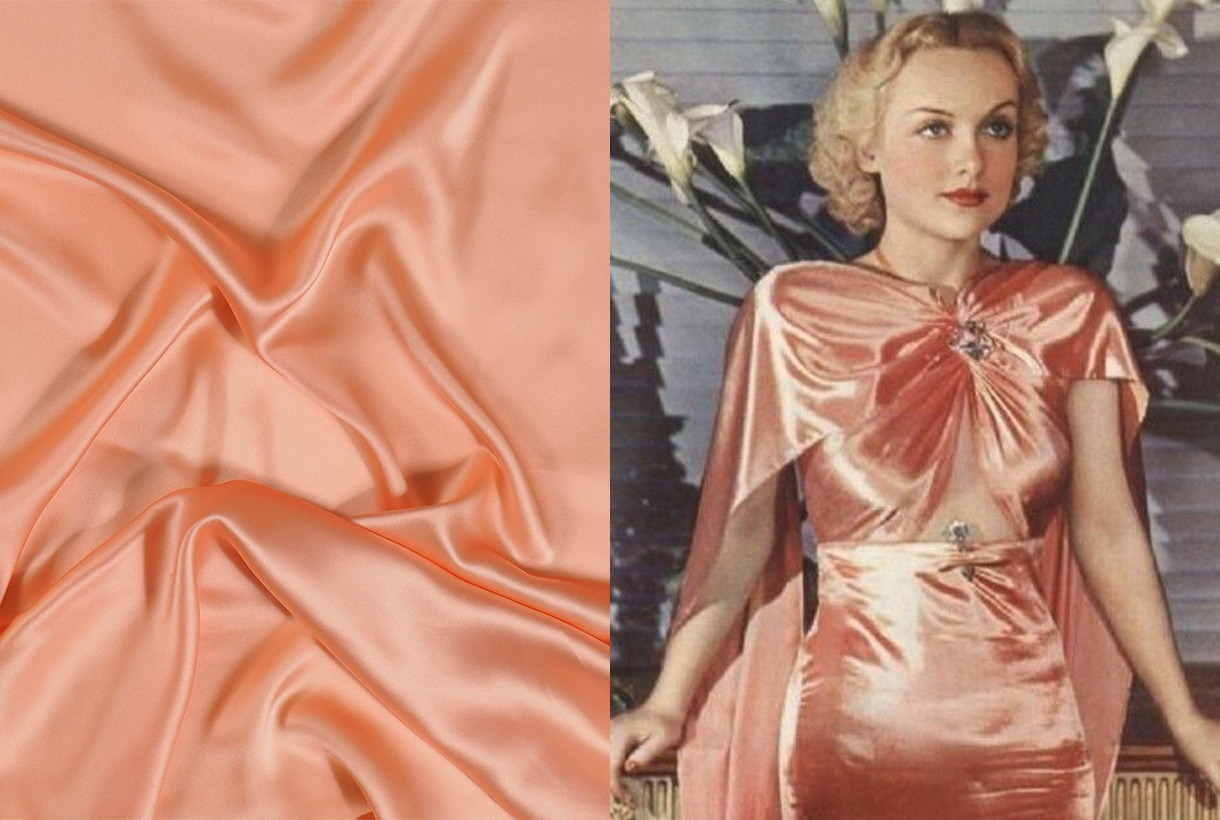
It is curious how satin is one of the few fabrics that knows no limits in the wardrobe: it serves us both for winter and summer, or between seasons. Beyond its timelessness, its versatility also stands out because it admits infinite possibilities, making it an indispensable fabric in anyone’s wardrobe. Satin has a nice drape thanks to its fluidity and soft sheen. It is a silky fabric capable of transforming a style and allowing it to navigate between formal and casual. On the catwalk, we have seen it in a variety of garments and accessories for a long time, especially in slip dresses (inspired by lingerie nightgowns), romantic tops and blouses, light and flowing skirts, and even handbags.
A brief history of satin
Satin originated in China more than 2,000 years ago and come from silk. In fact, its name derives from Zaitun, a Chinese port famous for exporting satin. Although it was popular and highly desired in Greco-Roman culture, the consumption of silk satin spread in Europe in the Middle Ages towards the 12th and 13th centuries. Italy was the main exporting and consumer port. Satin captivated for its richness, fluidity and splendor, it was cheaper than silk, and was one of the fabrics most used in clothing for the privileged classes. It was also used in textiles to decorate grand castles and palaces. Satin was not popularized en masse, until the 19th century, after the Industrial Revolution and advances in the production and marketing process. This fabric also spread to other areas such as underwear. Then, satin became an affordable and versatile fabric, that could emulate the softness, richness and elegance of silk.
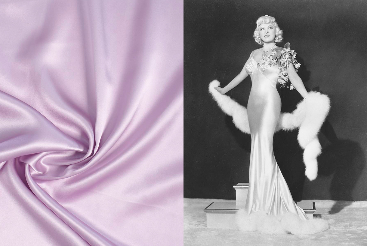
During the 20th century, satin conquered the sexiest and most chic clothing of the old Hollywood actresses. It was seen through lingerie dresses that were a scandal in their time for their daring. Some examples: the actress and sex symbol, Mae West wore in 1937 a satin dress adorned with flowers on the shoulder that marked her curves or could not go unnoticed. Also iconic was the tight white dress that sculpted Marilyn Monroe’s silhouette in ‘Gentlemen Prefer Blondes’ (1954) or the strapless outfit with lace motifs worn by Elizabeth Taylor in the movie ‘ Butterfield 8’ .
Decades later, the development of synthetic fabrics made satin even more affordable, bringing it into mainstream fashion. Since then, satin has transcended beyond a seasonal trend and has become a regular and staple fabric in everyday wardrobe.
Satin is not always silk
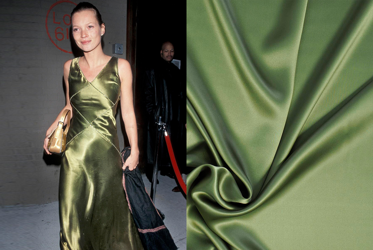
Although it may seem like it, satin is not always silk. It is actually a type of weft and not a fibre. In satin fabric, at least four weft threads are woven over one warp thread. Traditionally, satin has a shiny side and a duller side and can be made from different fibers, such as nylon, rayon, polyester, and even used silk. So it can be natural or artificial. In any case, it is a fabric that is characterized by its shine and softness. This makes it a star fabric for multiple applications, from fashion outfits to home décor.
Discover the new silk satins in our Gratacós space or in the online store. Click here 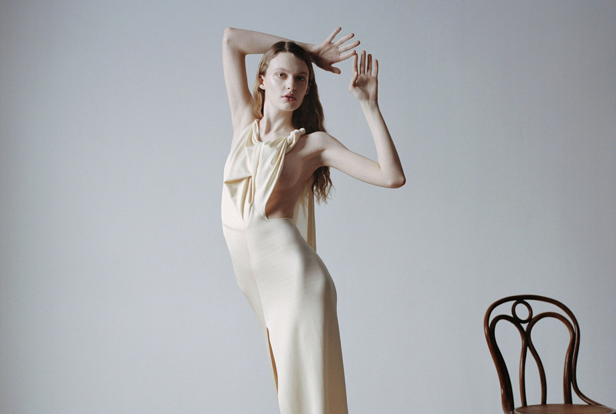
Miércoles 16 diciembre 2020
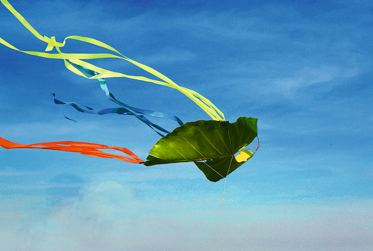
This anomalous 2020 has also upset the calendar of the interesting informative talks by the Color Community. association. A private initiative, which we have followed closely since its creation, led by a group of three professionals who love colour: the architect Pere Ortega; the designer specialized in Colour & Trim, Eva Muñoz; and Rosa Pujol, Textile & Colour Stylist and creative director of Gratacós.
This year, the biannual and face-to-face meetings at the Old Damm Factory in Barcelona have been converted into digital format, thus via screen respecting the security measures imposed by the current health situation. Despite the difficulties, Colour Community was able to present the new colour chart that will serve as a guide for the Spring-Summer season 2022 in an orientation report that serves as a source of inspiration for creative professionals who are dedicated to fashion, design, advertising or architecture, among other areas.
Within a current social and economic context marked by instability and uncertainty, the new broad and global creative proposal Wait… SS22. A concept that articulates the entire chromatic range and which symbolizes the preamble to an infinity of optimistic possibilities, guided by the real need to make better decisions as a society and also in relation to the environment. This “waiting” is essential, according to the association, “to appreciate and value life with humility and simplicity, and its functional daily life to structure the whole future.” For this reason, it will be necessary to design from practicality, but without forgetting beauty or creativity.
“The new creation symbolizes the preamble to celebration,
play and optimism”
“Wait…” also symbolizes the beginning of celebration, play and optimism, opening seamlessly to coexistence with digital reality. As for colour, it materializes like never before, conveying human emotions and being the conductive support of these senses.
In turn, the ‘Wait…’ colour scheme is structured through four ranges of colours, textures and materials named Wait… & Listen, Wait… & Wish, Wait… & Enjoy and Wait… & Grow Up. Colour Community sums it up with a claim to a final message of hope: “Wait… & tomorrow”. Wait and there will be a tomorrow.
Below, we summarize each creative proposal:
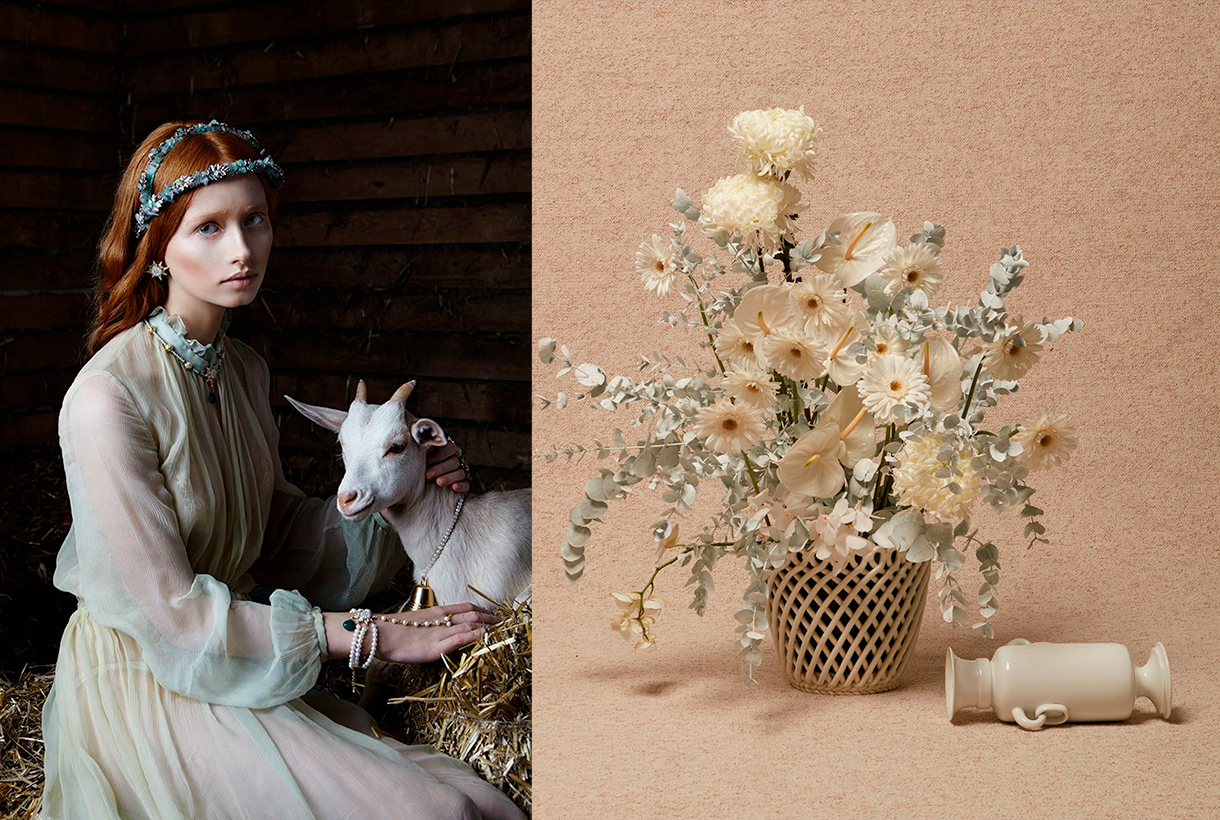
Wait… &Listen
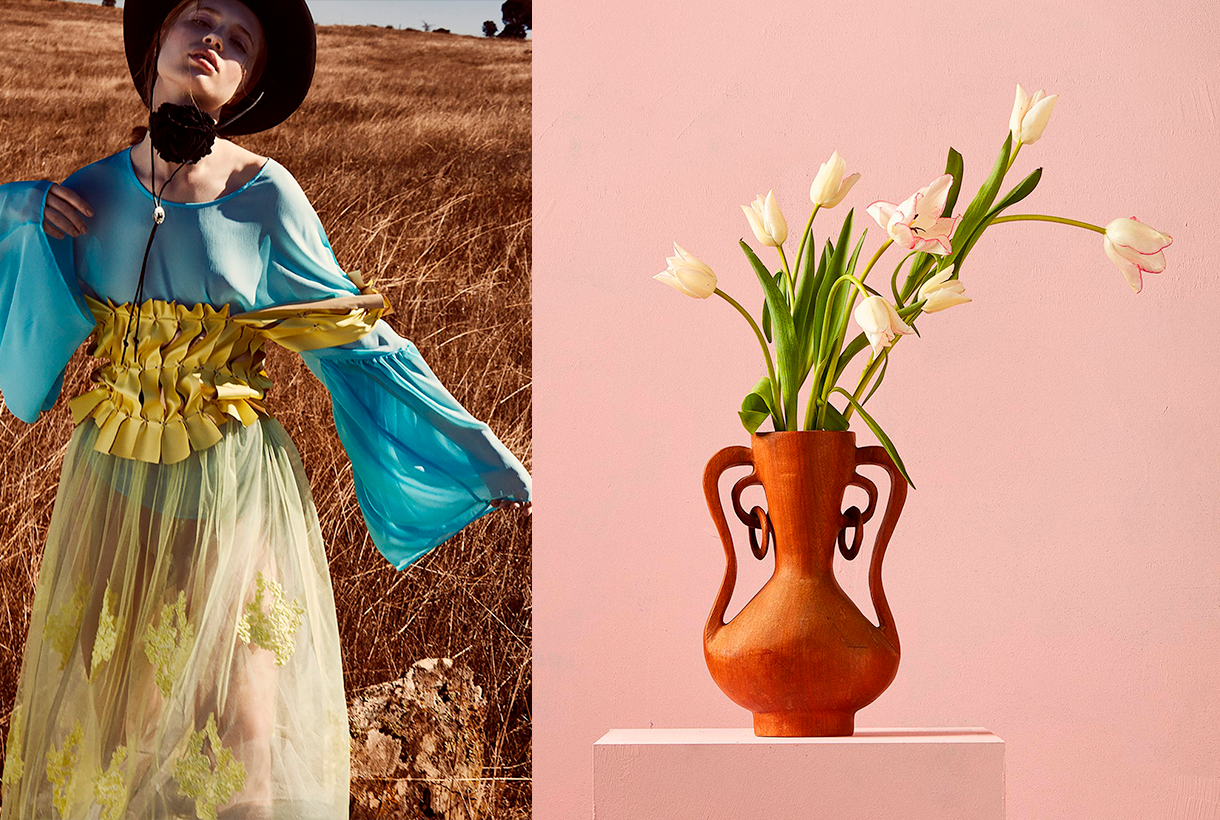
This first range is inspired by attentive waiting: ” one that is willing to receive information and learn from it “. A proposal that is based on learning from the proximity of natural society and human knowledge. Wait… &Listen is built from neutrality and naturalness, presenting colour with renewed subtlety. That means that we speak of natural realism, of materials and finishes that connect with a well-manipulated origin, worked from harmony and sustainability. As for the colour palette, relaxing neutral tones abound, such as natural white, basic ecru and calcareous grey, among other soft colours that structure and soothe. The designs mark a return to the simplicity with linear shapes and geometric basics such as the circle. Rough textures, natural and imperfect finishes, wrinkles and rustic aesthetics return. This trend is also seen in fabrics that are expressed without decorative excesses. Clean-looking matt cotton, linen, hemp, poplin and satin threads abound. Finally, natural fibres coexist with recycled and regenerated synthetics.
Wait… &Wish
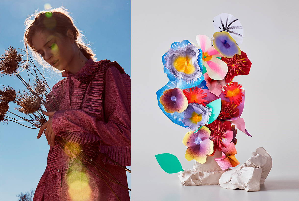
The second range appeals to desire, this concept that cannot be materialized and that activates the most creative part of the human being. According to Colour Community: “desire is not satisfied with the tangible and looks for something else as far as possible”. Under this premise, Wait… & Wish seeks to rediscover the secrets of craftsmanship, revaluing all its specific features. In turn this range also focuses on the plant world, but this time it focuses its attention on that nature that we know, but that we rarely touch or experience consciously. The colour is inspired by the apparent chaos of natural beauty, its uniqueness and exuberance with rich, bright and contrasting chromaticism: vegetal green, bright blues, gold foils or crimson brushstrokes. The designs seek to seduce by their elemental, organic and abstract geometries, hand-drawn striped prints, paintings in their freest version and colour combinations that reflect the chromatic chaos of nature. As regards materials there are many works with artisan natural dyes, semi-gloss yarns, die-cuts and laser cuts, utilitarian clothing and satin looks. Finally, in fabrics we are committed to sustainability and comfortable and practical fabrics that do not abandon design. In the fantasy section, Jacquards abound with geometric structures, mesh fabrics, nets and refined weavings such as reliefs and embossing.
Wait… &Enjoy
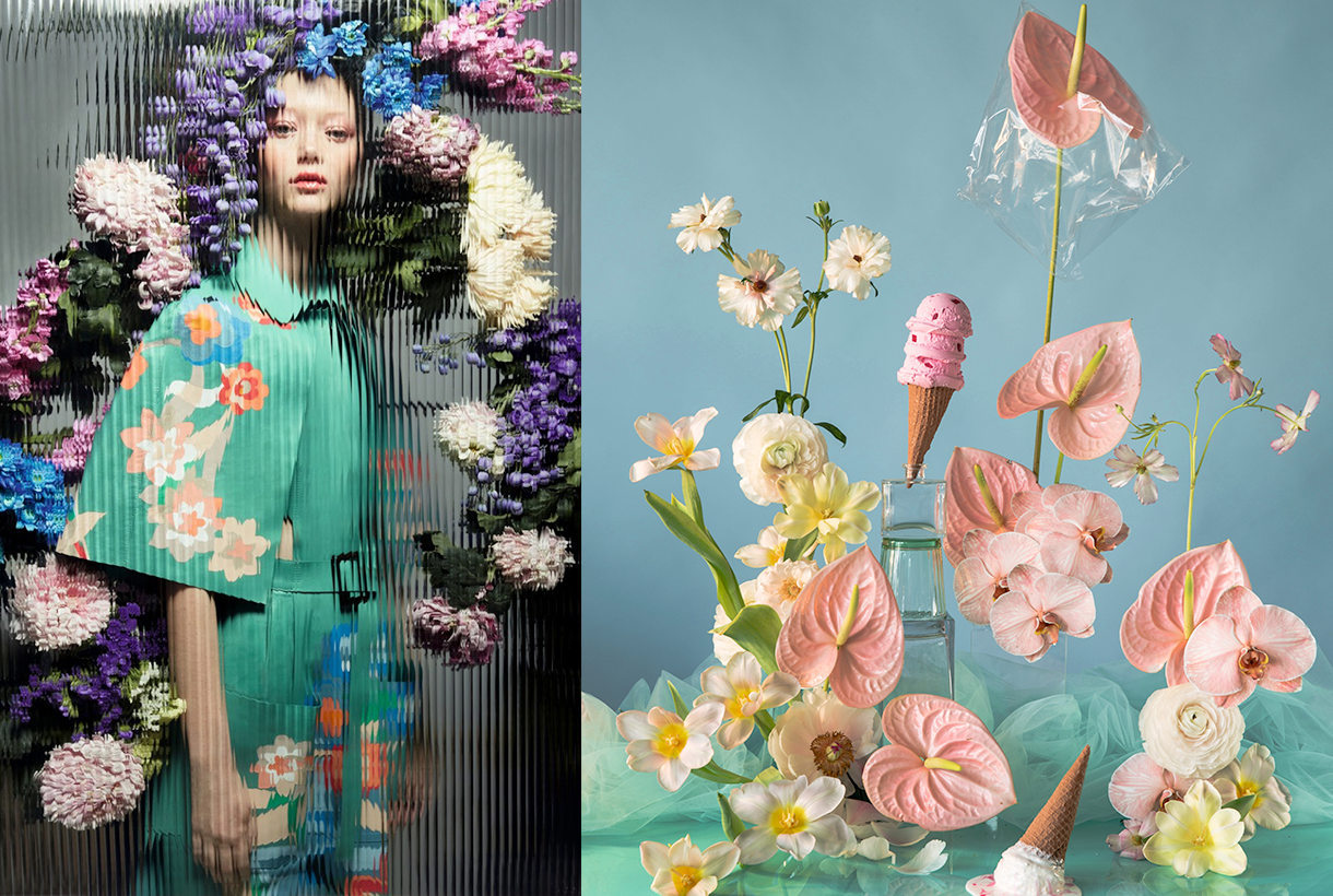
The third inspiration is the opposite on a conceptual level to the first two: it wants to project the future in an optimistic and creative way, exploring concepts such as freedom, evasion and extroversion. A creative enjoyment that will become limitless, but consistent and thoughtful with the common good. In this range, Colour Community features a creation enriched and loaded with subjective personality, but always coherent and respectful with the environment. The colour palette is based on fresh, cheerful, playful and sensual tones full of positivity and ready to be combined with neutrals. Vital tones such as geranium, fresh mint, chlorophyll, pink and vitaminised lime which combine with neutrals like white and sand-coloured. The designs are seduced by the power of the flowers and the magnetism of the most exuberant vegetation. Leaves, petals, gardens, green spaces … plant nature also takes centre-stage in summer fabrics. In addition to the flower motifs there are beautiful yarns for new colour sensations, shiny fibres, fluid fabrics that create transparency, textured organza with iridescent yarns, Jacquards with reliefs and piqué. In general, the fabrics express that intention to celebrate and dance again through movement.
Wait… &Grow Up
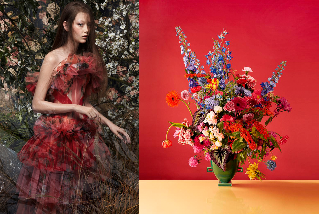
Finally, Wait… & Grow Up represents an evolution of the previous range. It is based on the imperfection of growth, the acceptance of the passage of time and integration of the past in order to understand the future. This range is “a reunion with the most chromatic geometry with a high expressionist content”. Products designed from a future perspective, with this range of colours, will be approached with a stimulating and light-filled mentality in which multicoloured harmonies generating multitone patterns will play a prominent role. The colour palette is thus multifaceted, symbolic, versatile and adaptable to all sectors: mauve, yellow, intoxicating pink, coral, orange, green, grey, blue and sophisticated brown. In designs a mixture of antagonistic, strange motifs and visual surprises is prioritized. With regard to fabrics this last range follows the line of the previous three and has a clear intention: to better production via recovered or recycled yarns, reducing the chemical impact and water consumption, in order to face a future with hope. Finally, the proposal is based on tactile fabrics that provide an extroverted, colourful and highly visible look.
Sorry, this entry is only available in Español.
Sorry, this entry is only available in Español.

The Colour Community has just presented the new report of colours and materials that will influence the Autumn-Winter season 2020-2021 in the world of design and fashion. The initiative, led by three colour professionals , was presented, as usual, in the Old Estrella Damm Factory in Barcelona before the watchful eye of a hundred enthusiasts from the sector. We remind you that the founding team is made up of the architect Pere Ortega , the designer specialized in Colour & Trim , Eva Muñoz ; and Rosa Pujol , Textile & Colour Stylist from Gratacós . In each issue new partners are added to this “mother team”who bring their vision and help shape the new range of colours and materials that will inspire the new season. It is an initiative that is repeated twice a year and that has our support. ” Gratacós always has the doors open to our fashion- area, for every lover of fabric, texture and colour,” declares Juan Gratacós at the beginning of the presentation of the report .
Juan Gratacós : ” Our fashion-area is always open to lovers of fabric, textures and colour”
On this occasion the season is based on the concept of ‘ Multiple ‘ and consists of a reflection in a positive key about the future society where the line between the real and the virtual will be more diffuse than ever . ” Currently this virtual reality exists on social networks or in videogames but little by little it will become as tangible as what we now call reality,” explains Pere Ortega in presenting the report. The ‘ Multiple ‘ proposal , in turn, is articulated through four colour ranges and materials which are named On , Inside , Balanced and Metronome .
Pere Ortega: “Currently this virtual reality exists on social networks or in videogames but little by little, it will become as tangible as what we now call reality”
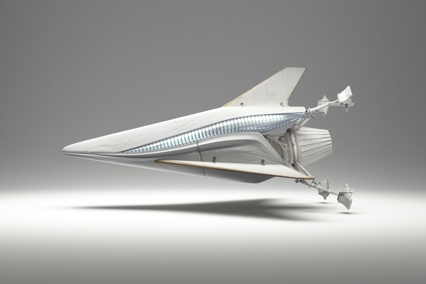
1.- On
The first inspiration appeals to dynamism, to the creation of a dialogue with new realities that are virtual. It is a dynamic and versatile range that creates products connected to the human being in a digital environment. The shades chosen to conceptualize it are the cold ones in their most attractive version: metallic greys, iridescents, smoky blues, bright blacks and touches of yellow that play in contrast. The range of industrial and futuristic themes plays with plastic, oily materials, straight and curved architectural lines and artificial shapes. Fantasy under control.
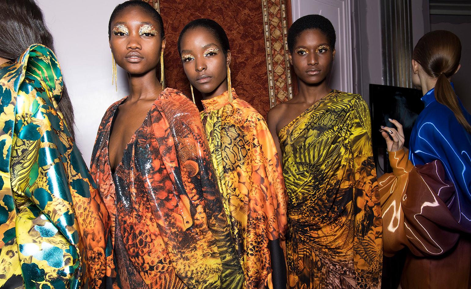
2. Inside
The second range is more dense and theatrical than the first. It works with the realities that look back at the past, in a kind of retrospective. The shades that are used to give it shape are the browns, purples, deep blues and the metallic range that always appears in each of the four inspirations as a common link. Floral prints, organic shapes, sinuous lines, elements of nature, upholstery … all these elements influence this intimate range that takes as its model the baroque of Versailles in its most contemporary version.
3. Balanced
The third inspiration is based on the concept of balance and chromatic harmonies. It is a modest range that is inspired by the shapes and textures of nature and works with craftsmanship in a very folky way. The predominant colours refer to autumn: the beiges, earth-coloured , whites, metallics and forest greens mixed with vibrant blues. Rough surfaces,skins, the most basic geometric elements and tribal influence are also treated in this folk range.
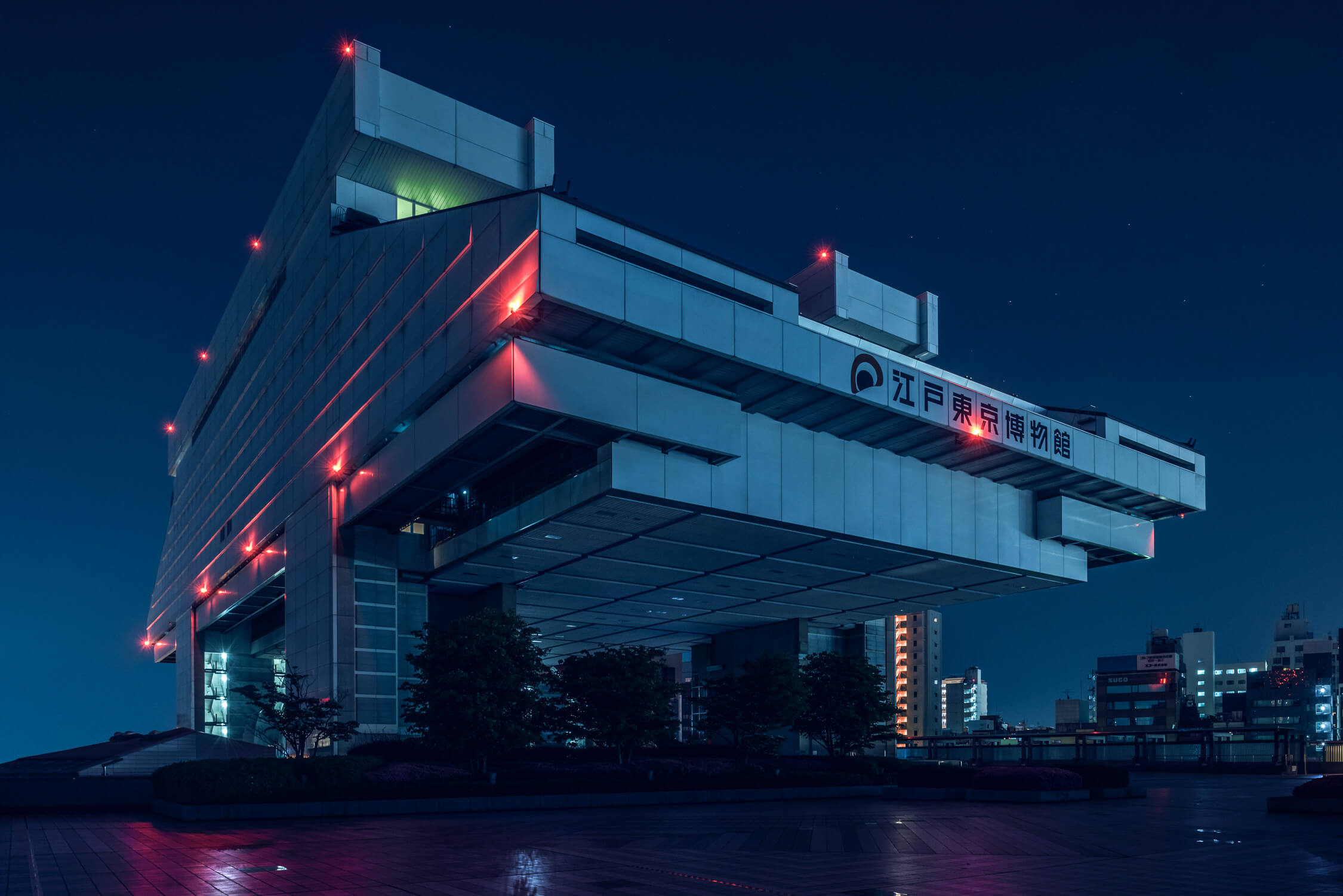
4. Metronome
Finally, the fourth inspiration is based on the metronome’s rhythm, with elements in movement that follow its beat: it is a work of colours that come and go and in turn play on the contrasts. This range belongs to the world of the city: it is urban, cosmopolitan and youthful. It is inspired by all the multiplicity of people, tribes and individuals that coexist within the same community. There are plenty of grey shades, silver and metallic details on smooth surfaces that contrast with graphic elements and arty patterns. Denim and overlays of garments, understood as a show of expression, configure the different identities that make up the same city.
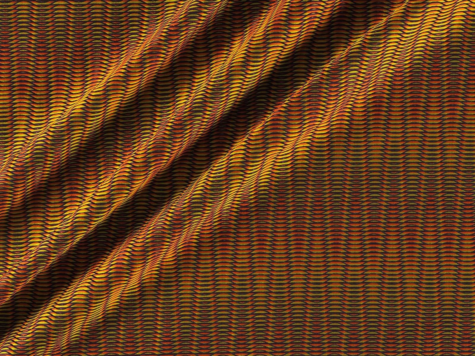
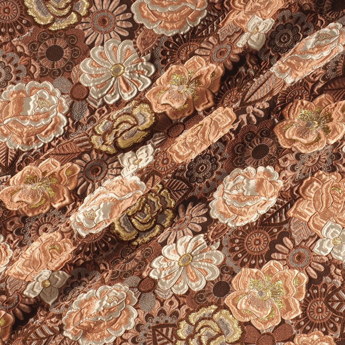
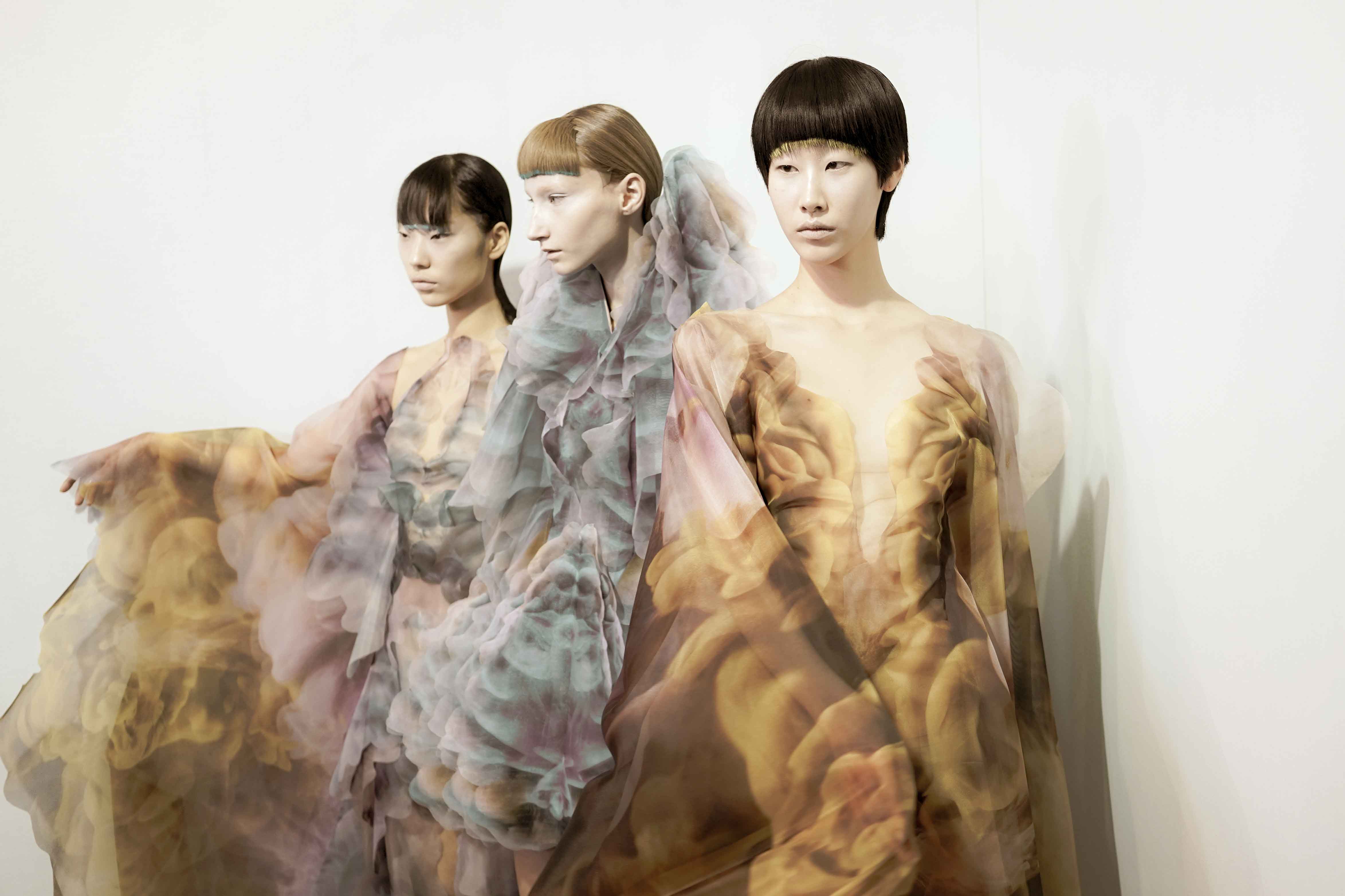
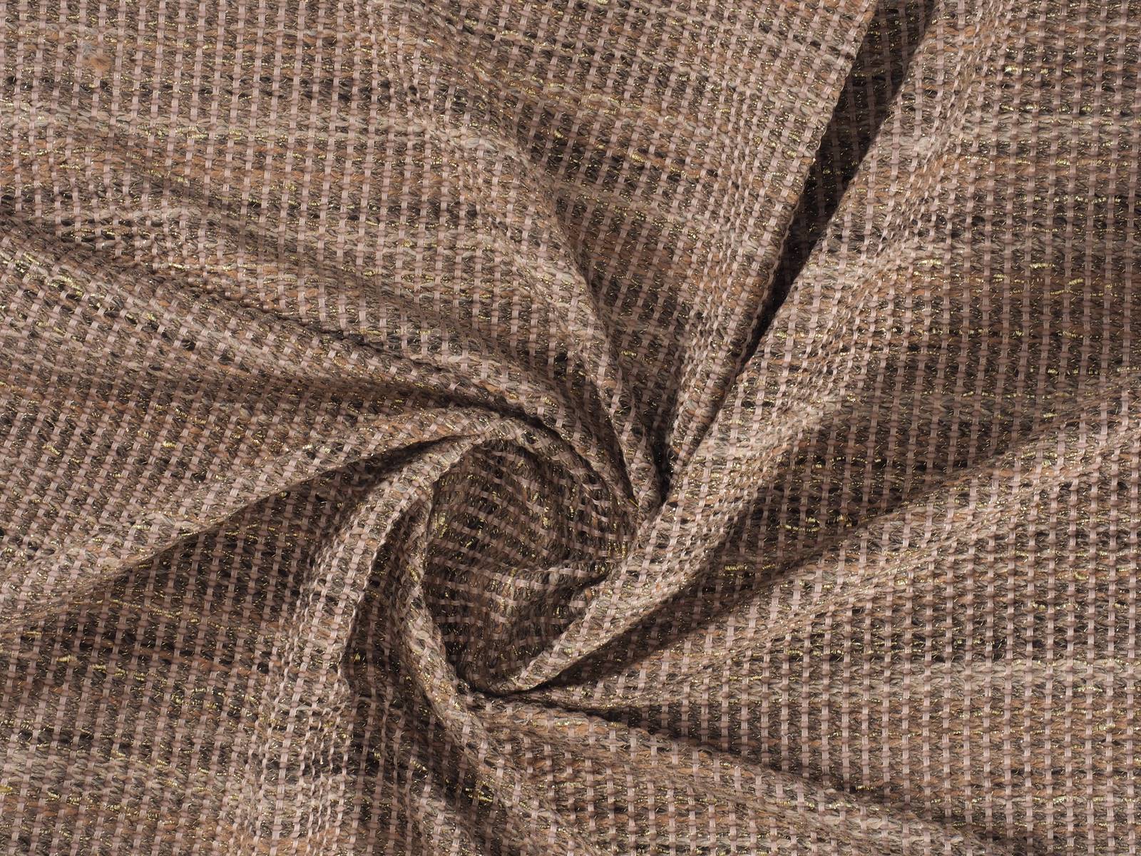
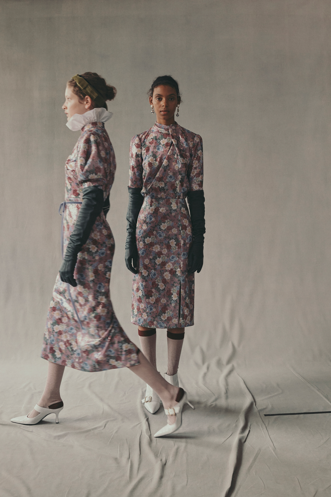
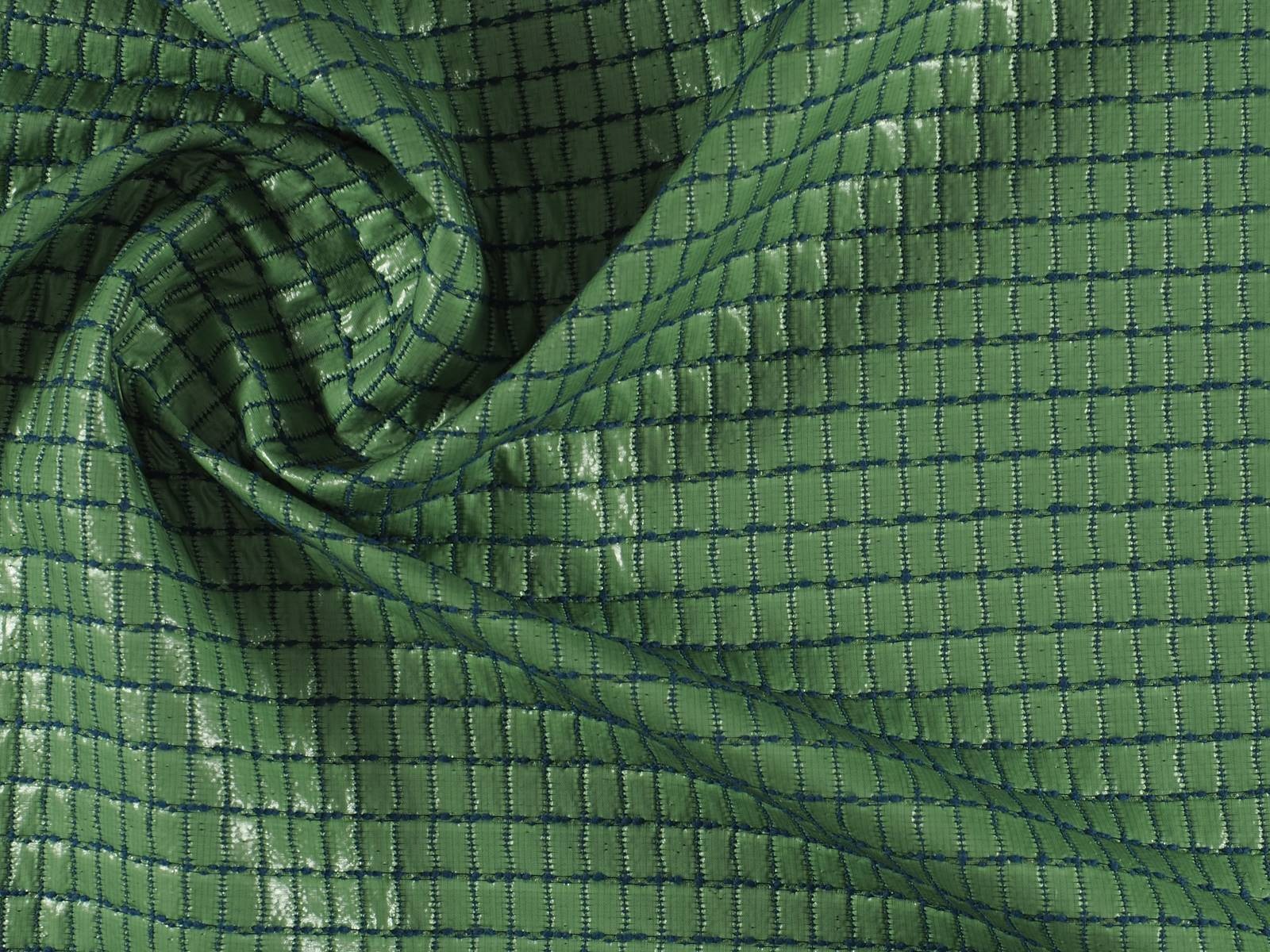
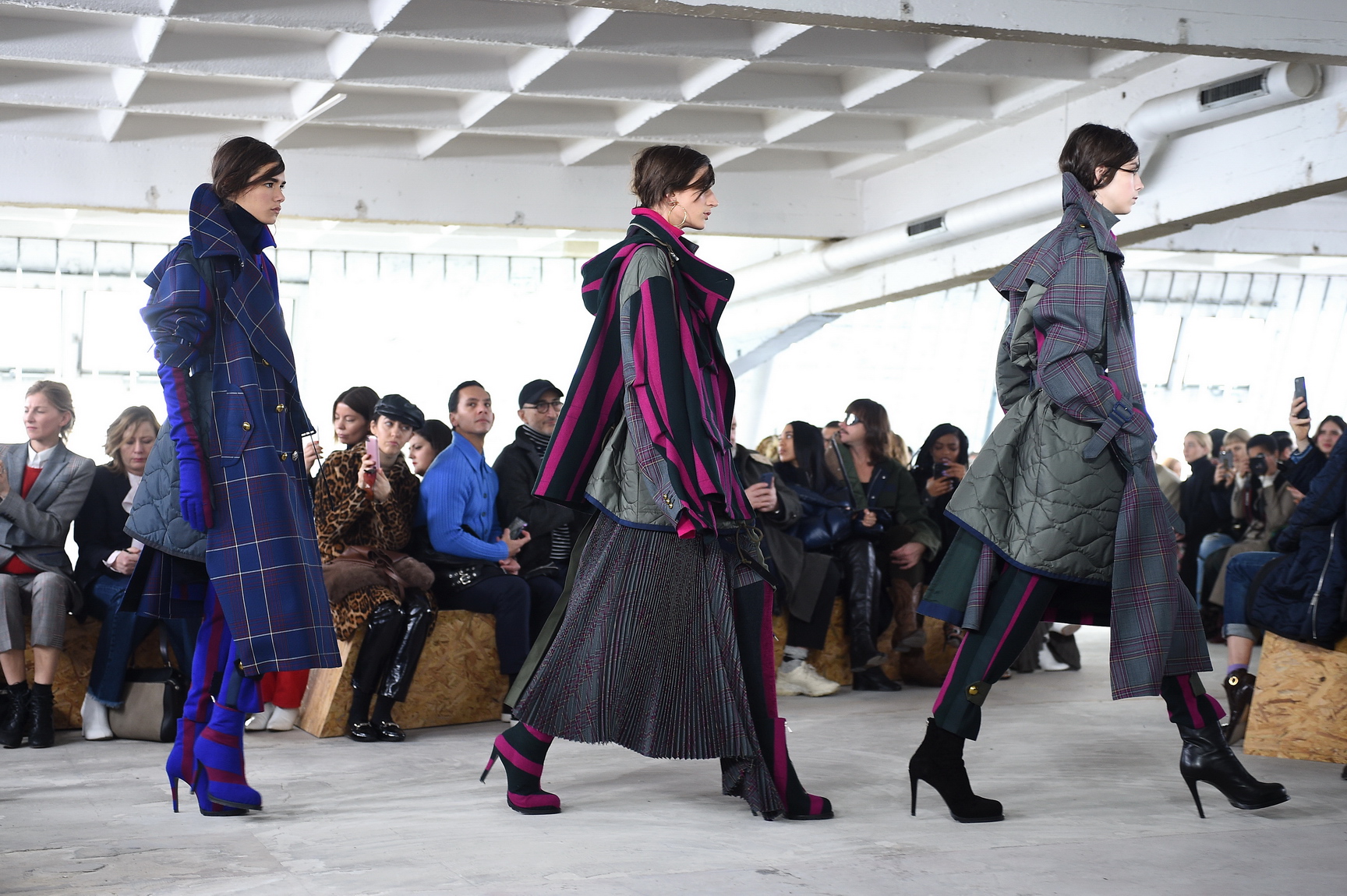
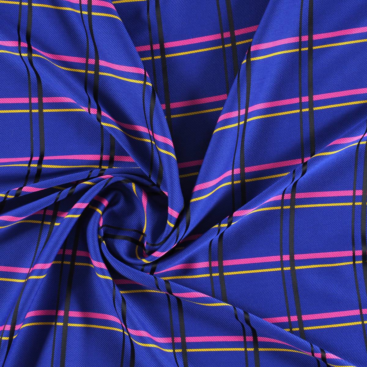
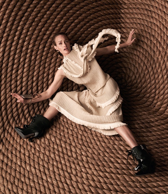
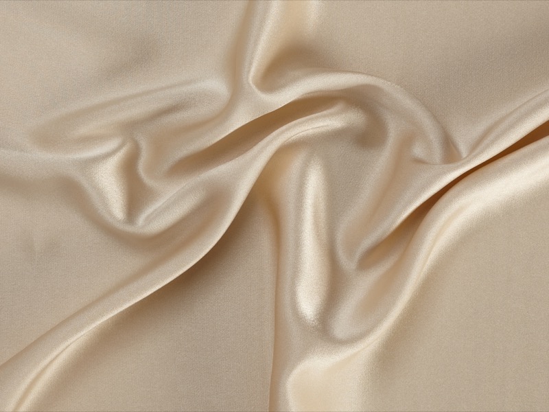
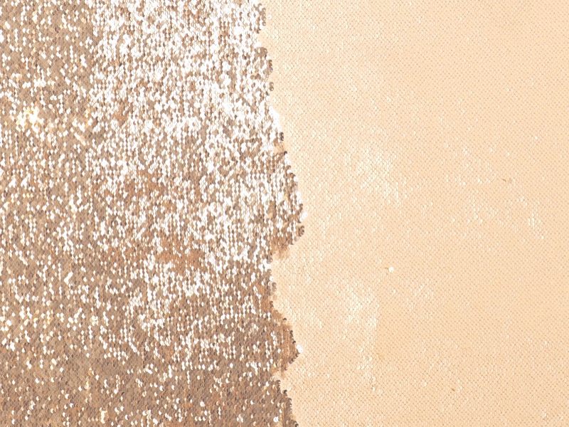
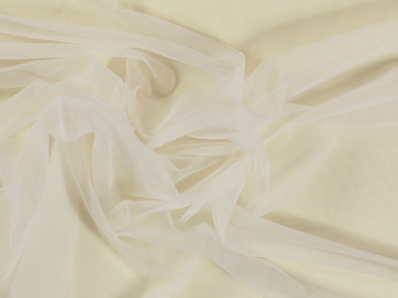
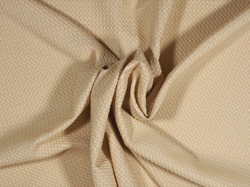
Hazelnut, beige, tan, brown, makeup, nude … Neutral colours are in fashion this summer 2017. In fact, regardless of the trend this year, the cream tones are classic and modern at the same time. Timeless colors that soften the face and skin, and do not necessarily have to fall in the monotony if you know how to combine with small details in other pigmentations to make an evocative contrast.
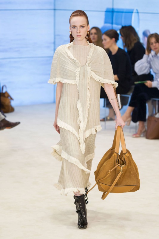
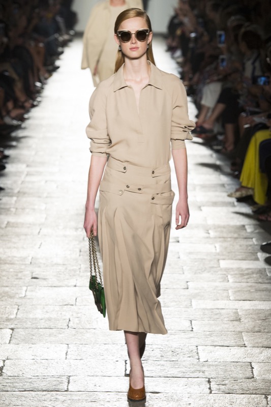
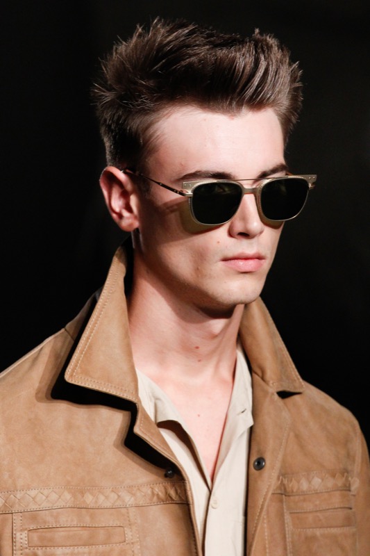
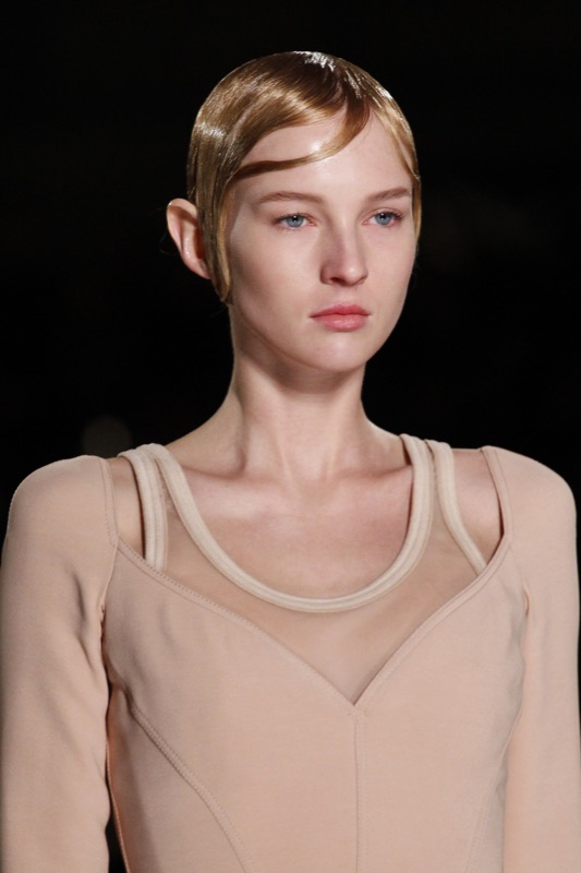
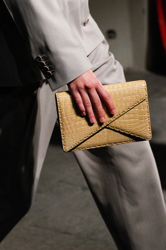
This season neutral tones can be seen on the catwalk shows of the luxury brands with a clear tendency to single – colour blocks with some minor variations in tone. What has changed are those embossed fabrics, the focus on pleated loose clothing and volumes around the shoulder area and attenuated at the bottom. For example, DelPozo exhibits a skirt and jacket outfit in butter colour with wide sleeves; Bottega Veneta goes for fluid dresses insinuating the body without marking it and finally, Chloé gives prominence to floral embossed fabric dyed in dusty pink.
How to combine neutral tones?
Neutral tones are fresh, bring warmth and are present in the most relaxed looks of summer. They soften out and are discreet enough to make the details of the garments stand out. In this sense, they easily pass fade into the background with an unexpected colour touch. This season, the neutrals combine with stylish burnt orange, chocolate-brown appeasers, the ivory tones – the fake whites – and the pink tones. It is not a season of excessive contrasts, rather of complementary shades that are simple and elegant without effort. Blessed discretion!
Embossed fabrics
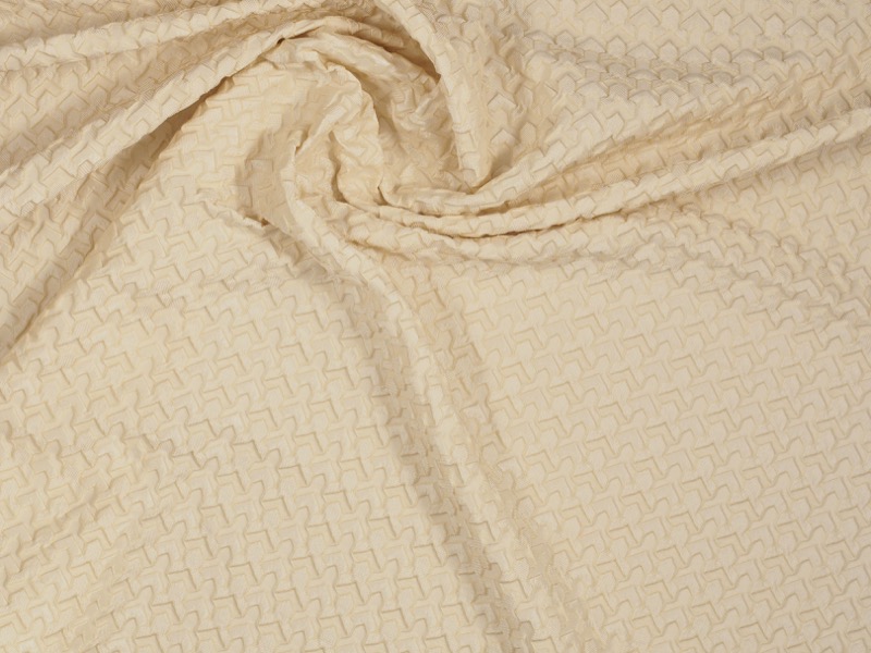
As we noted above, the colour gives prominence to the fabric as you can see in the trend “Flor de Cala Blanca” on our website. Textures, outlines, floral motifs … give this counterpoint to details with fabrics that are pleasing to the eye and touch. Also to be seen are blends such as chiffon and silk combined with crochet and the most original jacquards. Finally, matt textures prevail. Better without shine.
If you want to discover the universe of neutral tones and textures, we invite you to discover the seasonal fabrics in our shop where we can advise you better.
Barcelona,
Catwalk Fabrics,
fabrics barcelona,
gratacos,
Gratacós1940,
Luxury fabrics,
neutral,
neutral colors,
neutral tone,
TeJidos Barcelona,
Tejidos lujo,
Tejidos pasarela,
Tienda tejidos,
tierra,
tono neutro
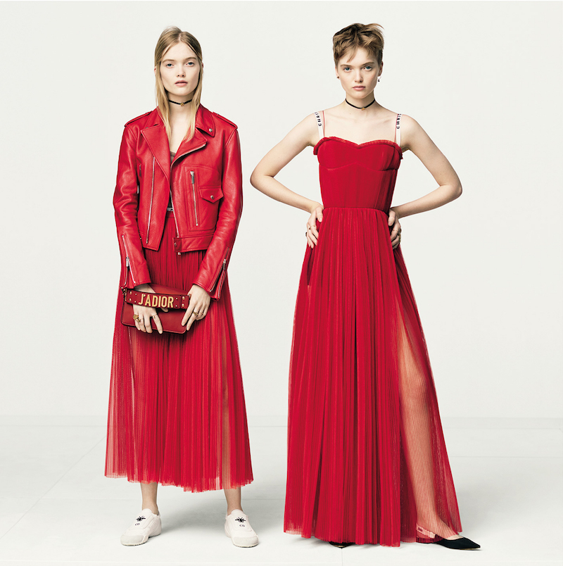
The hottest month of the year coincides with the colour that makes us blush: flame red with orange hues that reminds us of flames in motion. This lively and passionate tonality ignites summer looks with its fascinating power of attraction.
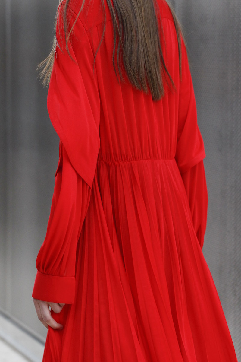
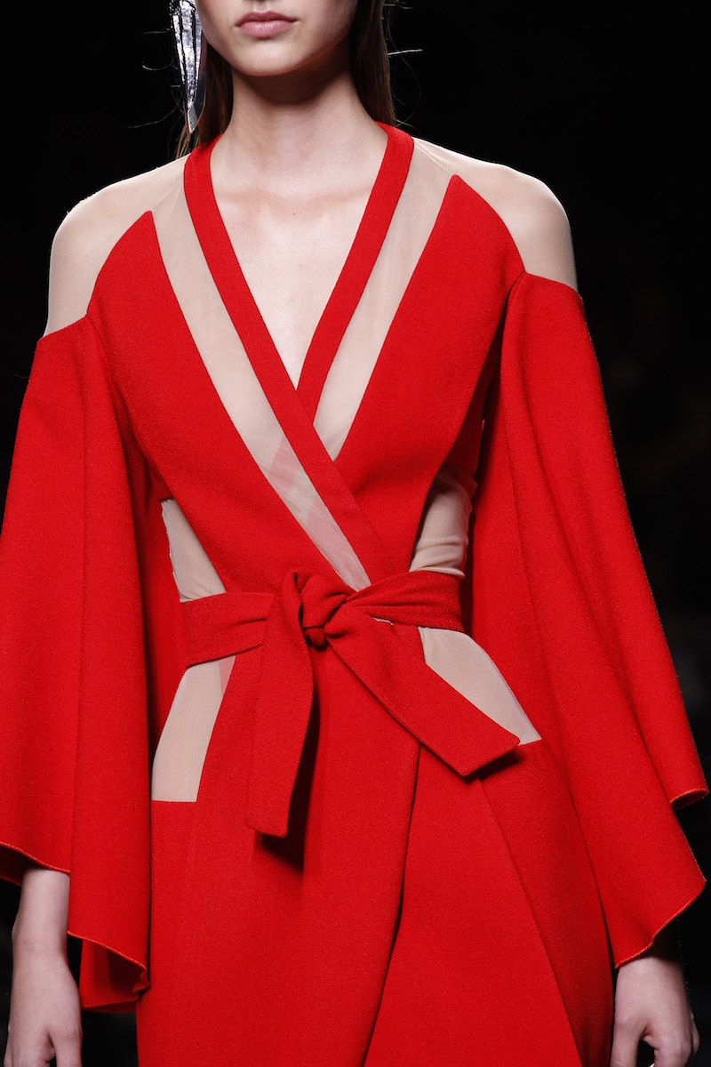
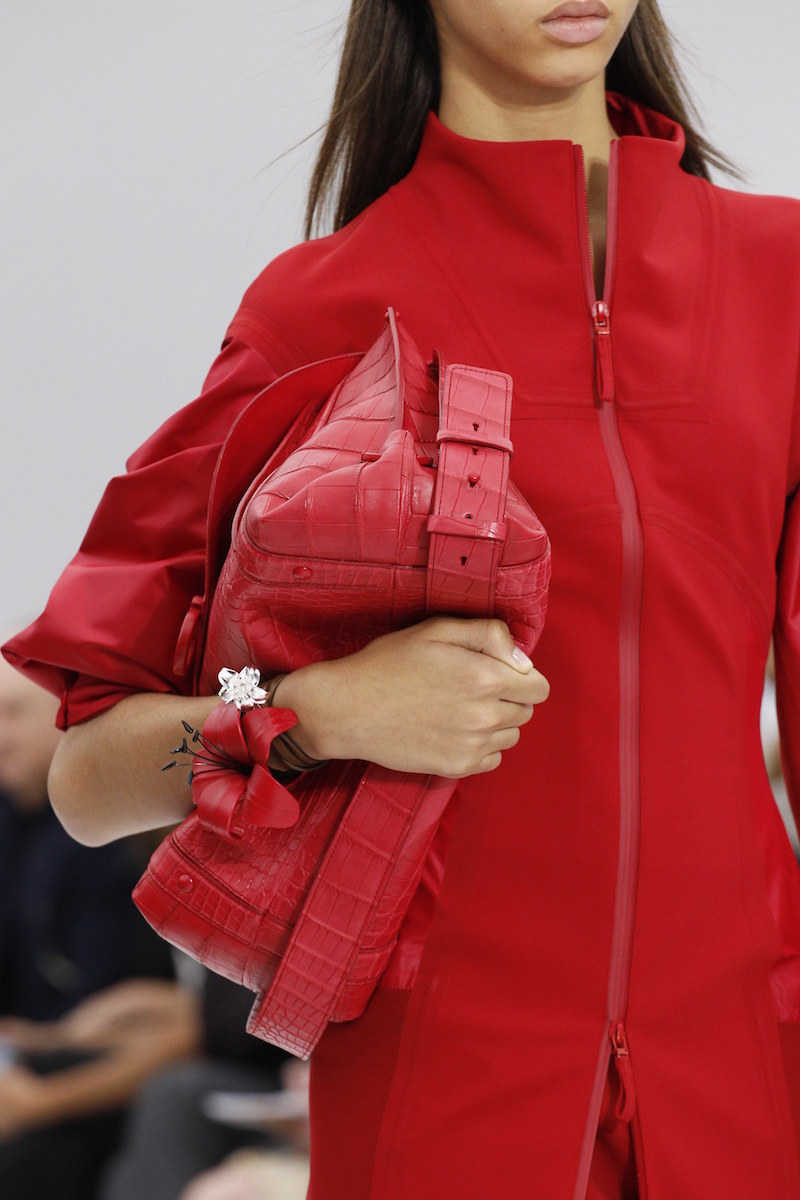
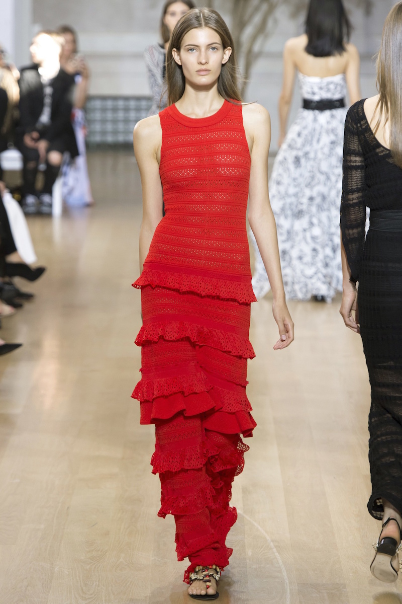
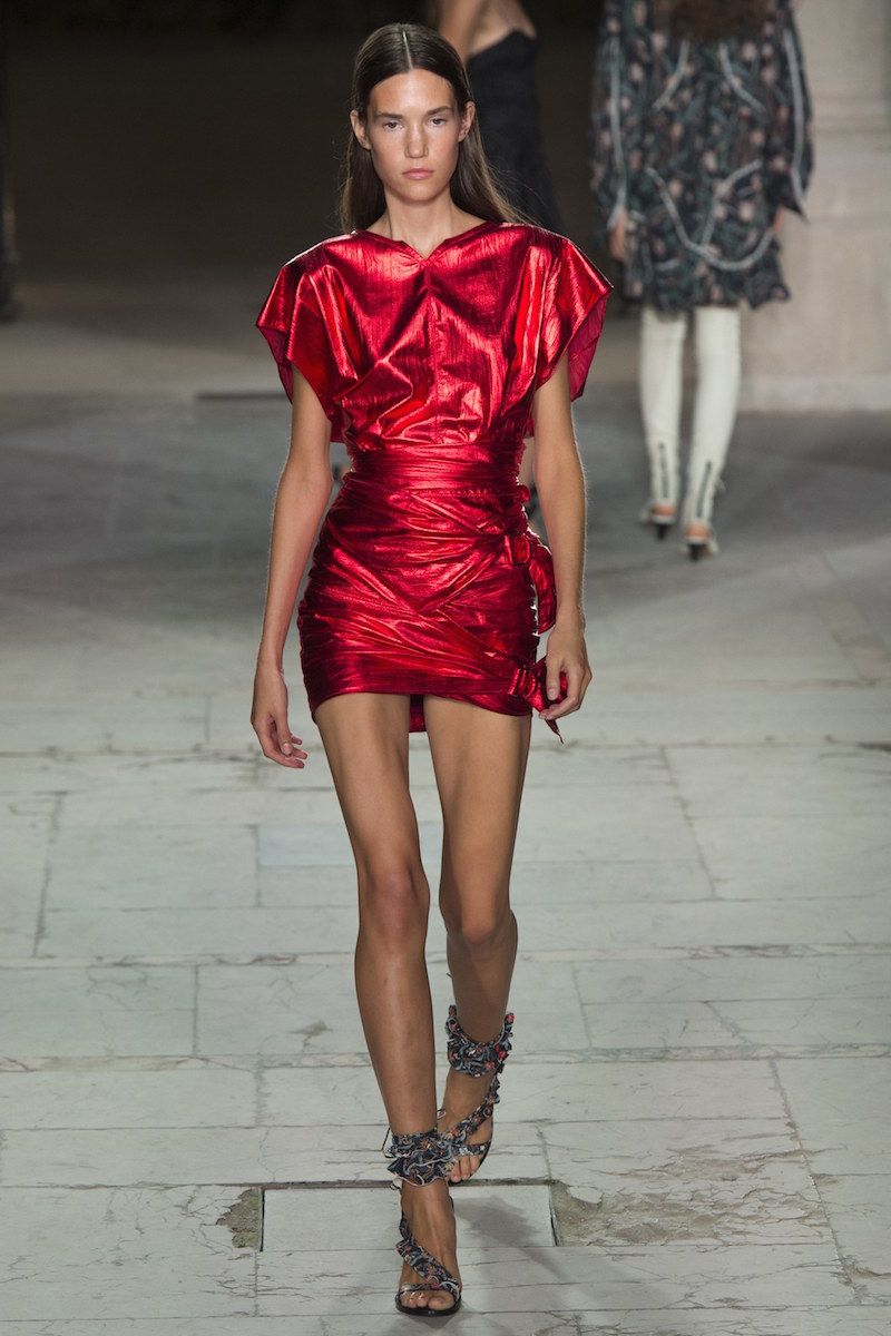
This season red is being worn in monochrome blocks maximizing its visibility: carmine, garnet, red currant, scarlet or coral shades in matt or glossy fabrics. The key is the same colouration. On the catwalk, for example, companies such as Valentino have not hesitated in going for flame reds in dresses with subtle prints, Dior too with their transparent tulle skirts and Kenzo or Balmain with low - cut garments. As well Oscar de la Renta with ruffles on dresses, Salvatore Ferragamo with original two - piece suits or Isabel Marant, who presents this vibrant color with metallic sparkles in an throw-back to to outfits inspired by the eighties.
How to combine red?
Red is a flattering color that works by itself, although sometimes the combination with other tones makes it acquire new nuances. Beyond the classic blends with white or navy blue so characteristic of the looks of Mediterranean - style red is allied with other less frequent colours to take us out of our comfort zone. For example, Emilio Pucci goes for mixing it with turquoise, where red is relegated to the background. Valentino and Gucci intermingle it with pink in one of the most striking chromatic alliances. Meanwhile Balmain dares to align red with purple in a glaringly strident combination.
Burning fabrics
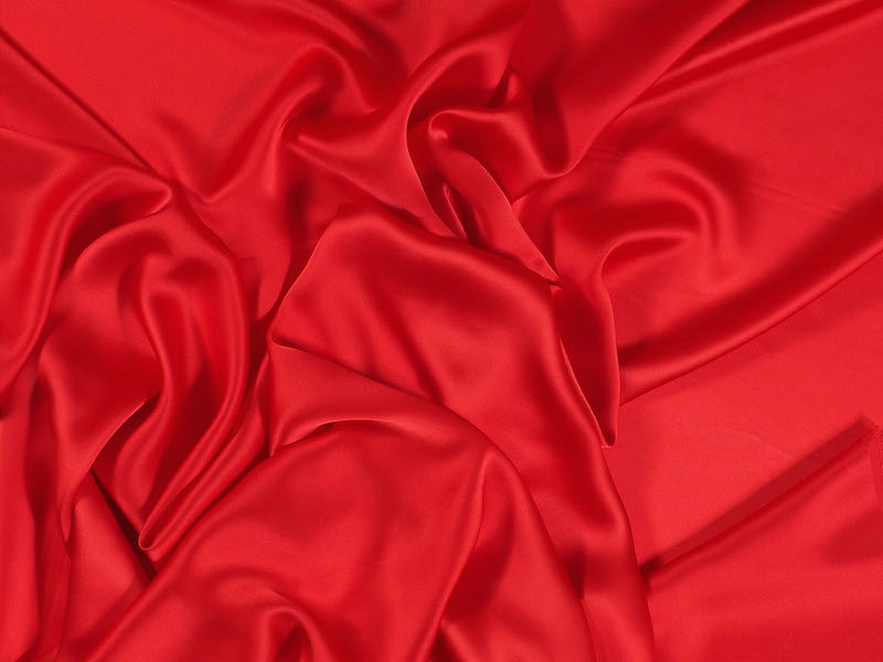
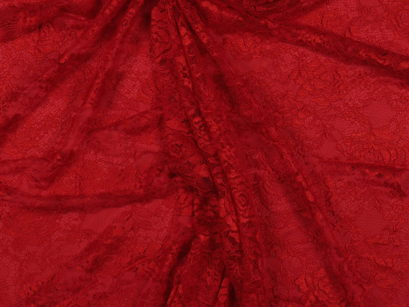
The reddish hues constitute one of our inspirations of the season, as you can see in the trend “Hawaiian Flower” on our website. In it you can find an assortment of fabrics with totally different textures, all with the same common denominator: red. Some flirt with floral lace, silk satin sheen, embossed mikados or jacquards with geometric motifs. Diversity is the taste.
At all events, we invite you to discover all the fabrics impregnated with the most ardent Pantone colour in our shop where we will be able to offer you further advice.
Catwalk Fabrics,
fabric store Barcelona,
fabrics barcelona,
gratacos,
gratacós 1940,
Luxury fabrics,
red,
Red fabrics,
Rojo,
TeJidos Barcelona,
Tejidos lujo,
Tejidos pasarela,
Tejidos rojos,
Tienda tejidos Barcelona

In the world of theatre they say that it brings bad luck, but it is not the case with fashion. And less so in summer. Superstitions aside, this season is tinted in vibrant yellow in a wide range of hues and shades. Vanilla, butter, lemon, mustard, sulfur, corn, honey, banana, pineapple … be guided through the colours of these foods to know what kind of yellow to choose to fill your summer wardrobe optimistically – and if you can’t decide, then opt for all of them because this season this vibrant colour is being worn in uni-colour blocks.
Note the most daring looks by Chanel, Max Mara, Chloé, Valentino and Emilio Pucci who go for this flattering color with in pastel shades, in total brilliance, neon finishes, satin effects or even embroidered translucent with creations that serve for both day and evening.


How to combine yellow?
It is well known that yellow is not a colour easy to wear and sometimes it is to be found only in the wardrobes of the most daring. Let’s break down the frontiers ! There are many ways to combine yellow, softening its effect to make it so less strident. How ?With the full range of neutrals like beige, taupe or ivory, the metallic shades or the black and white duo being relegated to small details or specific accessories that enliven the look.
Fabrics with lemonade effect
One of our inspirations this season is the yellow such as that seen in the trend “sunflower” we showed you on the web. In it you will find all kinds of fabrics ranging from more ethereal and smooth silks and outfits to the very brightest with encrusted sequins. Between these two extremes there is a wealth of prints, such as floral Jacquards, exotic mikados with oriental touches and fabrics with metallic shades. Light up the street with this daring colour!
We invite you to discover the whole new collection on the web or in our store!


We continue to pop up with more imaginative stores sharing good news: our store next week will host the unconventional pop up Sastreria Moderna. This is an initiative inspired by the slow fashion movement that will take place from 18 to 20 May in our store, where customers can interact directly with the designer and squeeze the most out of this relationship. The journalist Laia Beltran, organizer of the event, relies on Gratacós to carry out this ephemeral event. “Gratacós always encourages initiatives by independent designers and we love that. In addition, it is a well located working area, very attractive, with a shop-window that faces the street and an enthusiastic team. What more could you ask for?”.
“Gratacós always encourages initiatives by independent designers and we love that”
Sastreria Moderna advocates a sustainable, personalized and “low-simmering”fashion that is more rewarding, both for the maker and for the wearer. That is the value of the initiative where the clients can try out the clothing of the invited designer and order it on the spot. “Here the client does not try on a garment, pay for it and take it home inside a bag. Here she tries it on and if she likes it she orders it, with the option of making changes in colour and fabrics. That’s why we call it a non-conventional pop up, “says Laia Beltran. Thus, in a couple of weeks, the garment is made and delivered to the customer with the idea of promoting production on demand and avoiding stocks. In this third edition the possibilities of choosing fabric multiply, given that Gratacós will offer a wide range of possibilities to clients.

The designer EvaHumo as special guest
In the third edition, Sastreria Moderna EvaHumo invited the designer to present in public ‘Jazz’, her new collection. It is an elegant and sensual creation inspired by the twenties, by a woman who dances and surrenders herself without thinking that everything can end at any time. Dresses, blouses and light skirts in powdered colours and with an exciting set of textures. The designer’s more radical side will also be revealed with a selection of unique garments intentionally made for the event where intense colours, prints and handmade finishes predominate. In the presentation of the collection, clients will be able to try on the garments and order them with the fabric suggested by the designer or with any other fabric from Gratacós where we will take the opportunity to advise on the most appropriate choice.

Other Companies Confirmed
Sastreria Moderna will again have the support of several design brands that will put on sale their latest collections. These complements and accessories companies share the same spirit of the initiative in that they go for good design and local production. Thus this edition will feature the minimalist jewelry of Sew a Song and the most exuberant creations of Becker & Co, inspired by the most varied flora and fauna. The leather accessories of Encuire by the designer Eva Estévez will also be present, as will duffle bags - the classic cylindrical bags with sailcloth handles by Equipaje BCN. Finally,in footwear Dorotea’s marvellous sandals are a must. They are made by hand in Menorca with quality leather.
“Here the client tries on tests a garment and, if she likes it, she orders it, with the option of making modifications in colour and fabrics”
Apart from design, Sastrería Moderna also offers the possibility of having a good time among friends. “It’s a good excuse to meet up with old friends, with clients or meet new people. We like to chat with them, invite them to a beer and explain the work of each designer, ” Laia declares.
Sastreria Moderna has the support of Gratacós, the architectural studio and showroom Materia Terricola and Moritz beers.
We ‘re waiting for you!


Barcelona design,
Barcelona fabrics,
barcelona fashion,
Diseño Barcelona,
gratacos,
Gratacós1940,
moda Barcelona,
Modern tailoring,
New talents,
nuevos talentos,
sastreria moderna,
TeJidos Barcelona