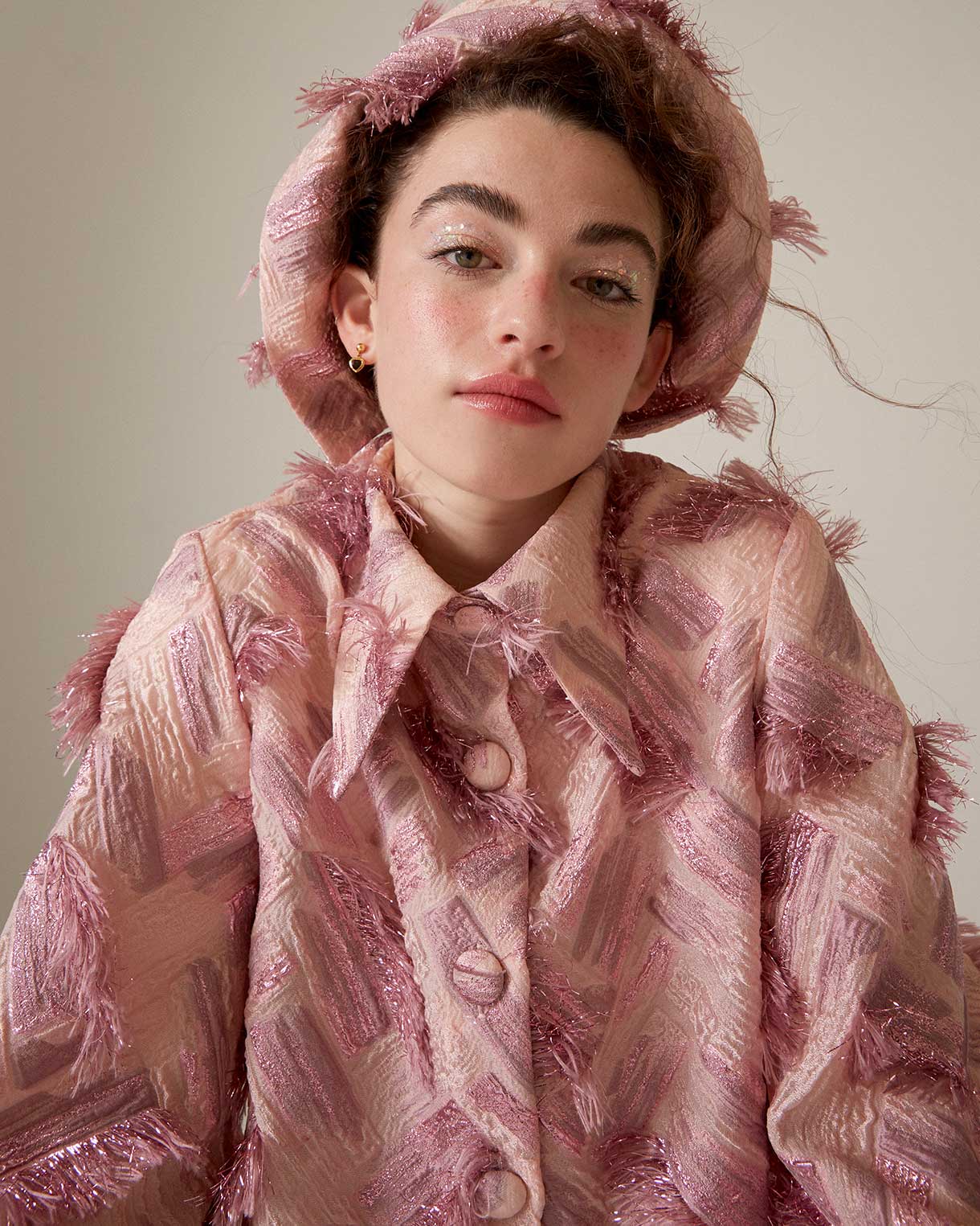
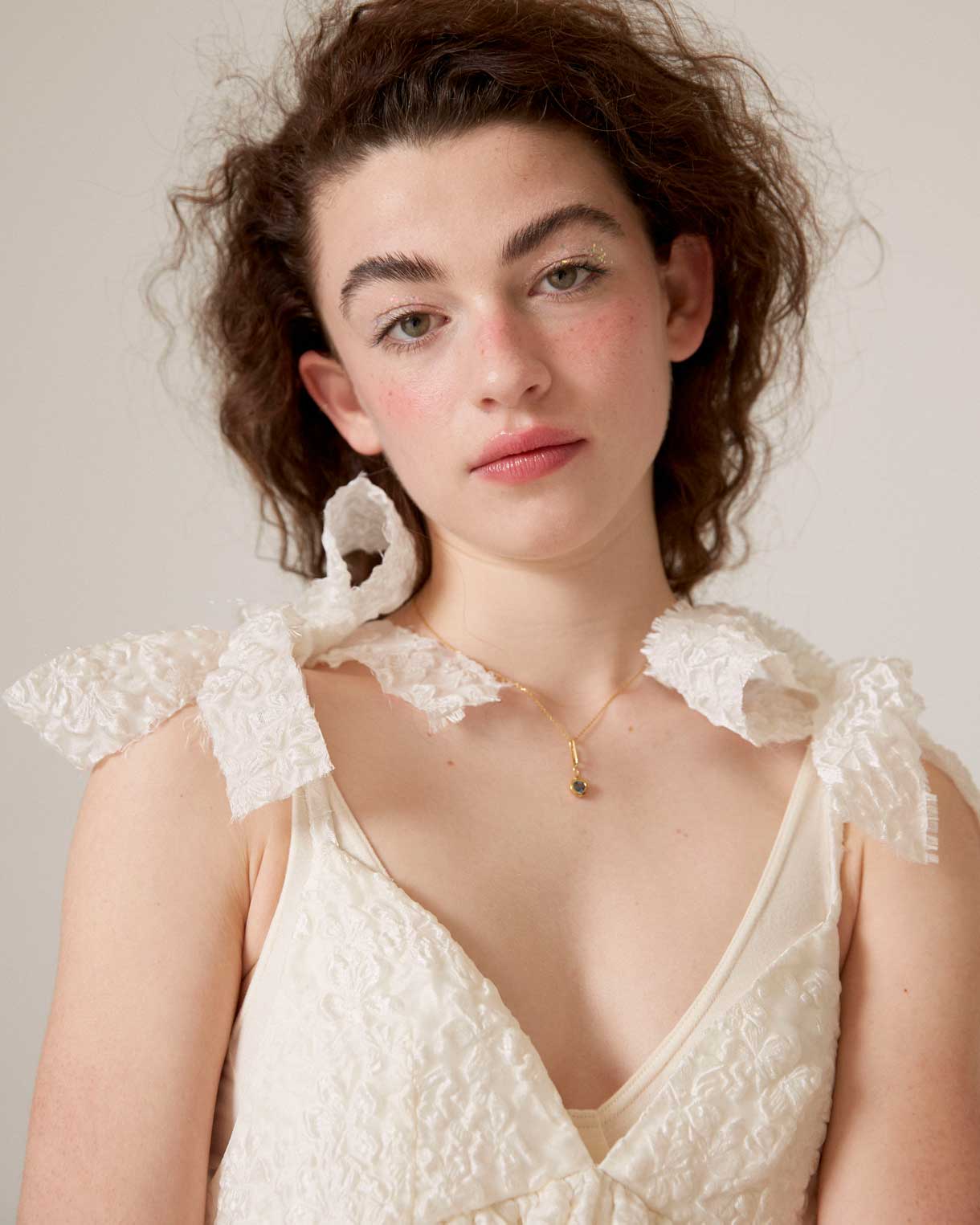
 Pantone has established a tradition that colour enthusiasts eagerly await as a prelude to the Christmas holidays. It is about the choice of the shade that will set the direction of trends in 2024 and that will influence art, design, fashion, decoration or advertising, among other creative disciplines directed by professionals who draw on the latest developments on the market, also chromatic.
A sincere, tender and empathetic colour
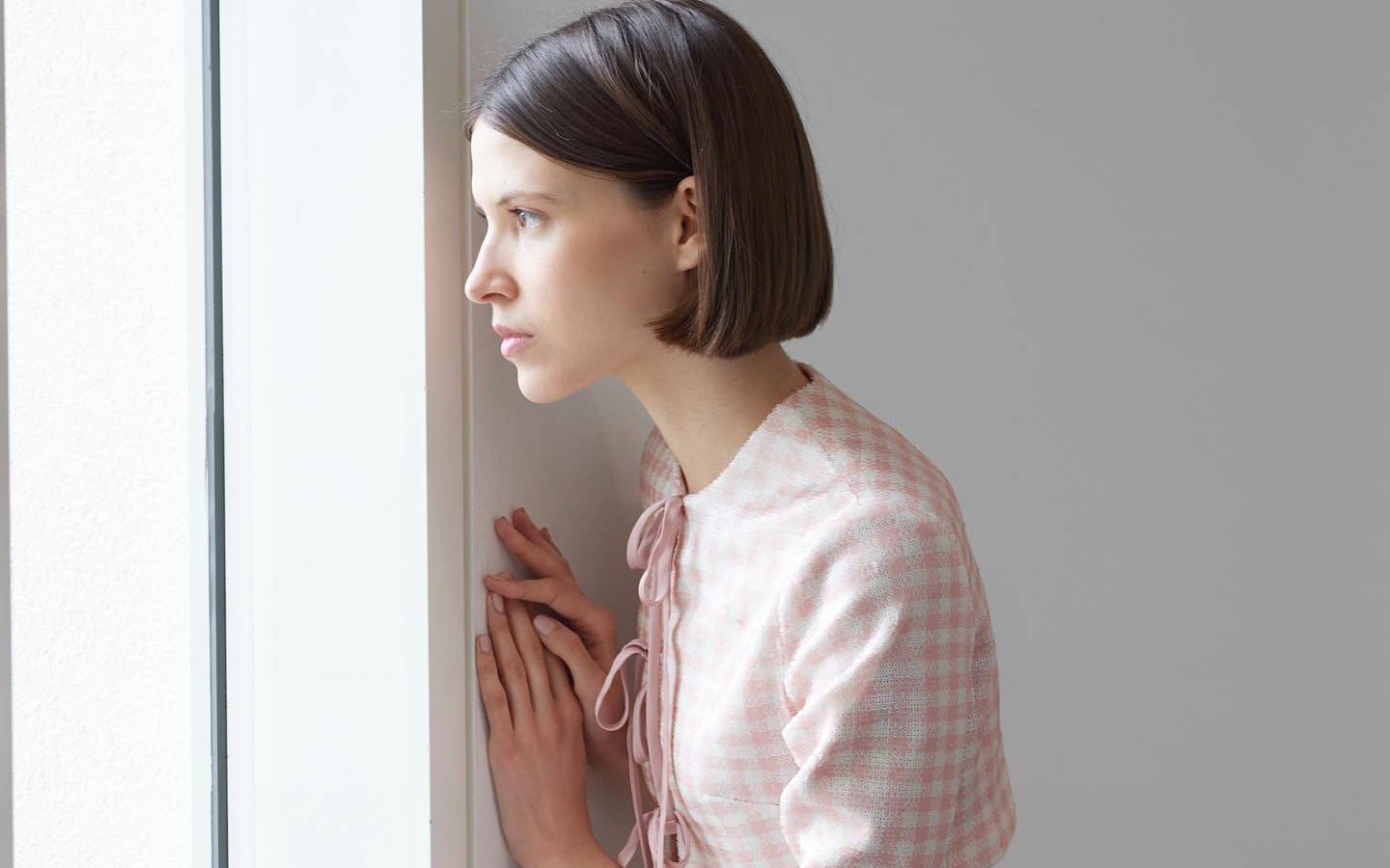
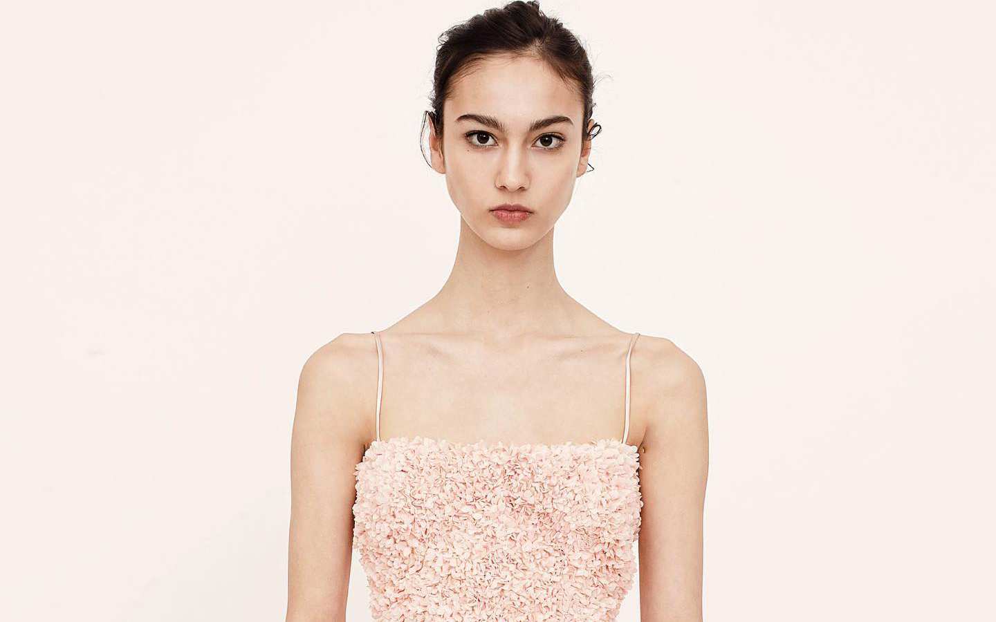
Following its vocation of naming colours with subtly sensual names, Pantone has chosen the winner for next year. The colour in question is called Peach Fuzz 13-1023 and it is a peach shade that evokes sincerity and tenderness, and conveys, according to the world authority on colourimetry, a desire to take care of ourselves and others. A soft and velvety shade whose enveloping spirit enriches the mind, body and soul. This is how Laurie Pressman, vice president of the Pantone Colour Institute, explains it in a statement about the colour that will take over everything in 2024. “We were looking for a hue that expresses our innate desire for closeness and connection, so we chose this radiant colour that exudes warmth and modern elegance. It is a colour that exudes empathy, wraps us in a hug that we can almost feel and naturally combines the youthful with the imperishable.” This warm and comforting tone stimulates the desire to unite with others or have moments of stillness, and the feeling of protection that this generates.
The tone of calm and inner peace
According to Pantone, Peach Fuzz 13-1023 is an alluring peachy hue, carefully balanced between pink and orange, that inspires belonging, relaxation and the opportunity to care, evokes calm and offers a space in which to live, feel, heal and prosper. Therefore, the colour of 2024 is comforting and encourages inner peace and well-being. Peach Fuzz 13-1023 has both an idea and a sensation and stimulates all the senses, as it makes one perceive its tactility and envelops people in its warmth.
A modern tone that takes refuge in nostalgia
Peach Fuzz 13-1023 is a sweet and light colour that evokes a new modernity. It focuses on the human experience of enriching and caring for the mind, body and soul, but it is also a subtly sophisticated, modern and deep peach tone, with a soft but effective luminosity that fills the digital world with beauty. A poetic, romantic peachy shade that conveys cleanliness and a vintage feel, Peach Fuzz 13-1023 reflects the past, but reimagined for modern settings. This last characteristic makes it especially interesting for the world of design and decoration.
The meaning of colour in an unstable context
Peach Fuzz 13-1023 is the colour that replaces Viva Magenta, which was chosen as the colour of 2023. The reasons given were: “A tone rooted in nature that vibrates with energy and vigor. “That descends from the red family and expresses a new sign of strength.” So, now we move from strength to warmth.
“When our lives are affected by instability, our need to care and to have empathy and compassion grows even more, as well as to imagine a future that brings more peace,” Laurie Pressman explains this meaning of the colour that we will see in the coming months throughout Instagram and Pinterest boards, aswell as, probably in the next trends in both fashion and decoration. “In a world where productivity and external achievements are often emphasized, it is crucial to recognize the importance of taking care of our inner self and seeking moments of calm, creativity and connection with other people in the midst of the hustle and bustle of modern life,” adds the vice president of the Pantone Colour Institute. Give value to the bonds, affection and home: “The colour we selected had to express our desire to be close to our loved ones and the happiness we feel when we connect with our own being and enjoy a moment of quiet alone. It had to be a colour that conveyed an enveloping warmth and a message of compassion and empathy,” argues Laurie Pressman.
25 years setting trends in colour
In 2024 it will be 25 years since the Pantone Colour Institute began putting colour on the sensory and creative map for the following year. It was in 1999 when the Pantone Colour of The Year educational program engaged the design community around the world in a conversation about colour. “We wanted to emphasize the relationship between culture and colour to make our audience aware of how what is happening in our global culture is expressed and reflected through colour language,” explains Pressman again. In this first session, a clear winner emerged: cerulean blue (Pantone 15-4020), a shade that returned to the stage thanks to the film ‘The Devil Wears Prada’ and Meryl Streep’s famous speech on how the fashion industry works. “Over the years, the Pantone Colour of the Year program has become a cultural touchstone around the world and has stimulated the imagination of many designers, brands and consumers,” explains Pressman.
To decide on each year’s selection, the Pantone Colour Institute team travels the world in search of new colour influences. They can be found in the entertainment industry (film, television series and even music), works of art and new artists. Of course, in fashion and design, but also in more aspirational places or concepts, such as travel destinations that are starting to become a trend, lifestyles, new technologies and materials, textures or effects (yes, like Instagram filters). that generate interest or capture attention in some way.
What began as a catalogue with 500 colours that served as a guide for graphic arts has grown in such a way that its influence on upcoming trends is comparable to what the biggest celebrity of the moment looks like on the cover of Vogue magazine. The Pantone guide already has more than 2,000 references that are updated every 18 months, with new, more precise shades being added to the list.
Another way to express the evolution as a society
Colour plays a fundamental role in people’s experience. It has a close relationship with emotions and the expression of feelings and its nuances can also be seen in how the story evolves year after year with its cycles of rise and fall. The impact of colour is also noticeable in the world of fashion, in the colours of cosmetics, in household items, in automotive and industrial design, and in products, packaging, multimedia design and retail interiors. “We are very pleased to have encouraged designers and colour enthusiasts around the world to tell their stories through colour language and show their creativity in their communities. We hope to continue doing this for many more years ,” concludes Pressman.
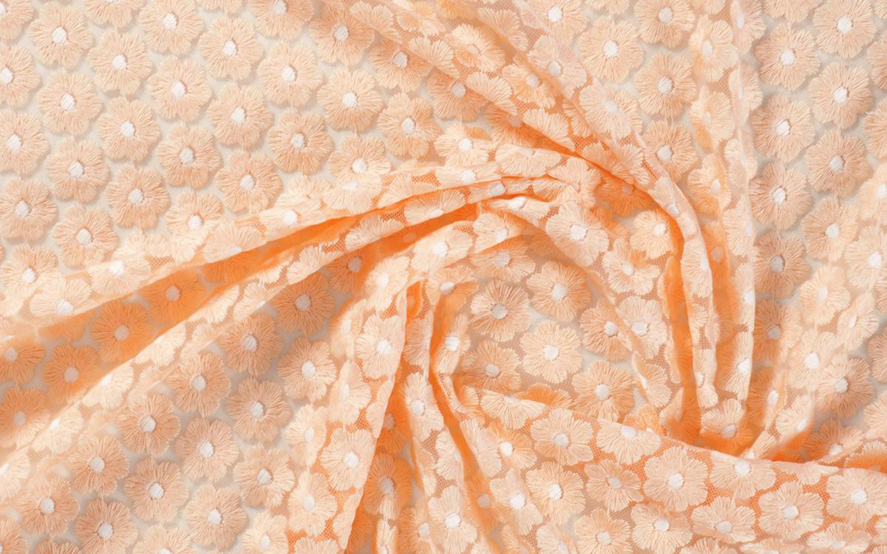
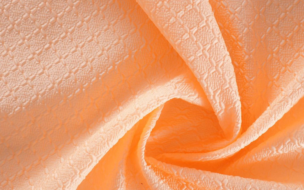
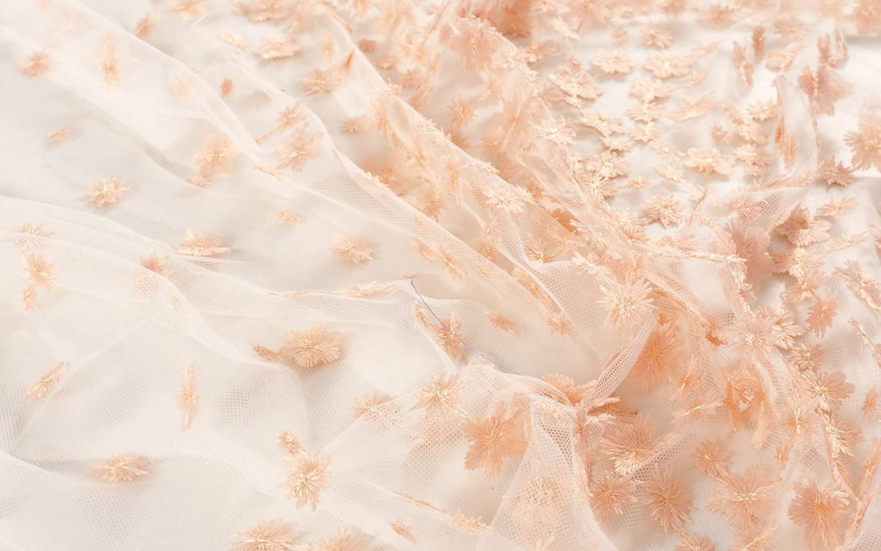
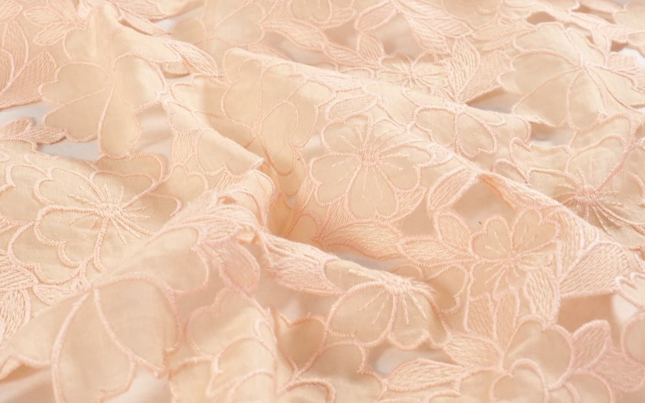
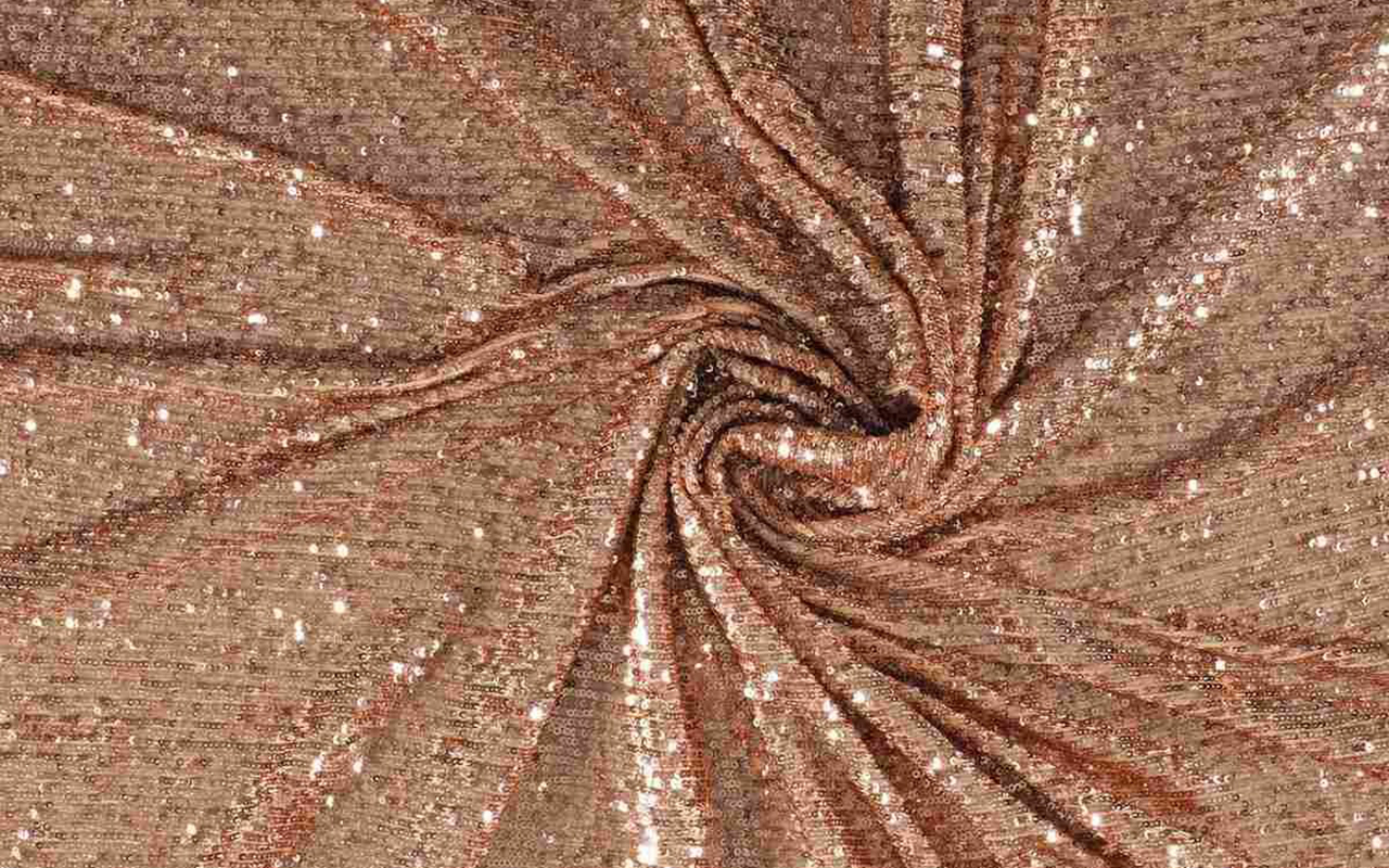
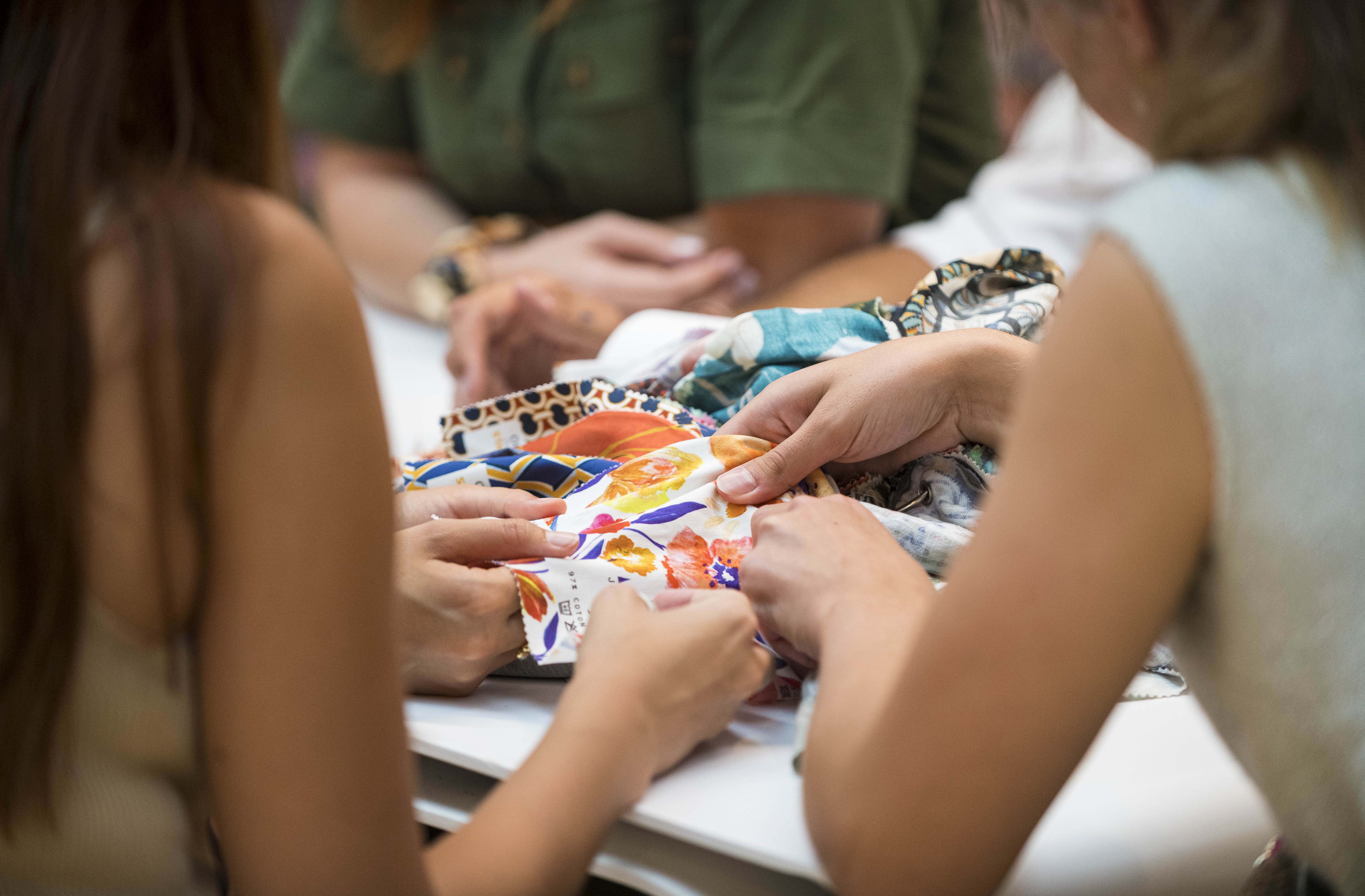
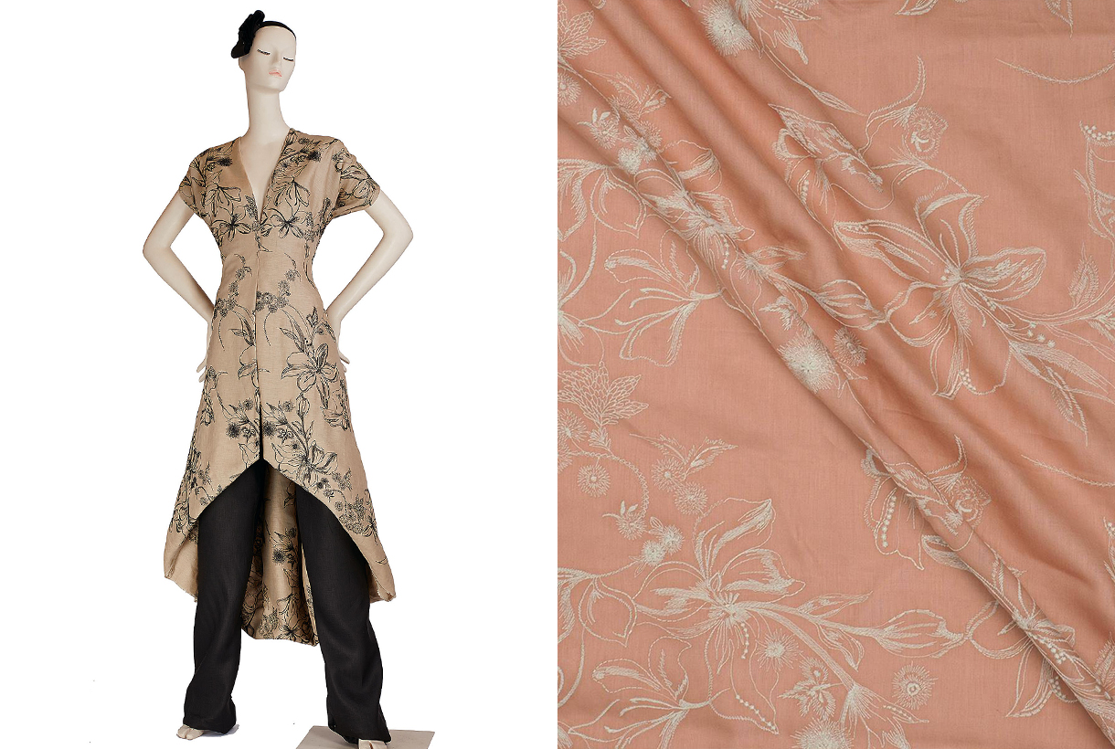
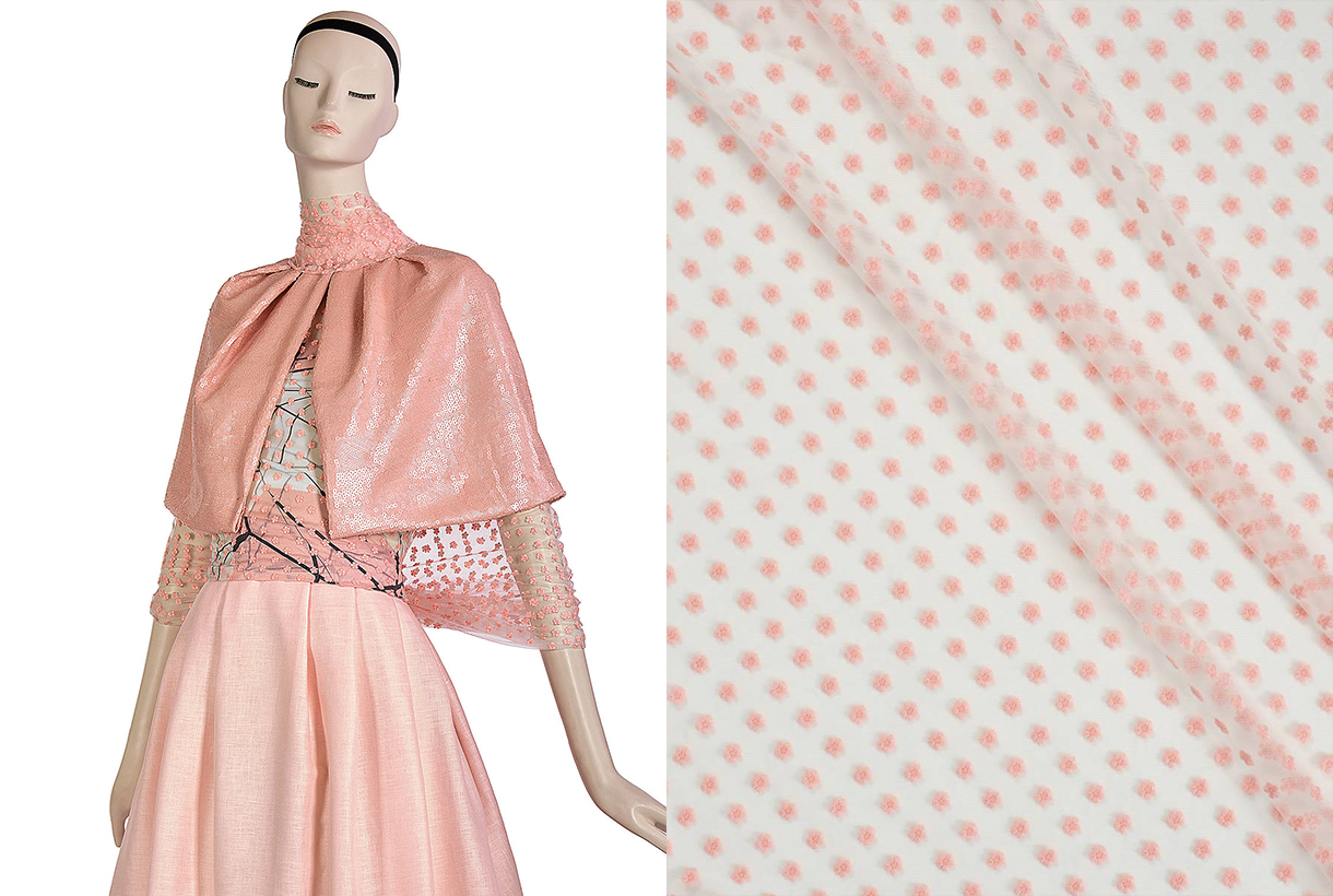
At Gratacós we also wanted to pay our particular tribute to Peach Fuzz 13-1023 with a selection of collection fabrics in peach tones so that you can think about a possible design for this 2024. You will find them here : Give free rein to your imagination!
Un color sincero, tierno y empático
Siguiendo su vocación de bautizar los colores con nombre sutilmente sensuales, Pantone ha elegido el ganador para el año que viene. El color en cuestión se llama Peach Fuzz 13-1023 y es una tonalidad melocotón que evoca sinceridad y ternura, y transmite, según la autoridad mundial en cuestiones de colorimetría, un deseo de cuidar de nosotros y de los demás. Una tonalidad suave y aterciopelada cuyo espíritu envolvente enriquece la mente, el cuerpo y el alma. Así lo explica Laurie Pressman, vicepresidenta del Pantone Color Institute, en un comunicado sobre el color que lo teñirá todo en 2024. “Buscábamos una tonalidad que expresara nuestro deseo innato de cercanía y conexión, así que escogimos este radiante color que rebosa calidez y elegancia moderna. Es un color que despide empatía, nos arropa en un abrazo que casi podemos sentir y aúna con toda naturalidad lo juvenil con lo imperecedero”. Este tono cálido y reconfortante estimula el deseo de unión con los demás o de tener momentos de quietud, y la sensación de protección que esto genera.
El tono de la calma y de la paz interior
Según Pantone, Peach Fuzz 13-1023 es una atractiva tonalidad amelocotonada, cuidadosamente equilibrada entre el rosa y el naranja, que inspira pertenencia, relajación y la oportunidad de cuidar, evoca calma y ofrece un espacio en el que se puede vivir, sentir, sanar y prosperar. Por lo tanto, el color de 2024 es reconfortante y fomenta la paz interior y el bienestar. Peach Fuzz 13-1023 tiene tanto de idea como de sensación y estimula todos los sentidos, ya que hace percibir su tactilidad y envuelve a las personas en su calidez.
Un tono moderno que se refugia en la nostalgia
Peach Fuzz 13-1023 es un color dulce y ligero que evoca una nueva modernidad. Se centra en la experiencia humana de enriquecer y cuidar de la mente, el cuerpo y el alma, pero también es un tono melocotón sutilmente sofisticado, moderno y profundo, con una luminosidad suave pero efectiva que llena de belleza el mundo digital. Un tono amelocotonado, poético y romántico que transmite limpieza y una sensación vintage, Peach Fuzz 13-1023 refleja el pasado, pero reimaginado para ambientes modernos. Esta última característica la hace especialmente interesante para el mundo del diseño y la decoración.
El significado del color en un contexto inestable
El Peach Fuzz 13-1023 es el color que substituye el Viva Magenta, que fue elegido como color de 2023. Lo defendían así: “Un tono arraigado en la naturaleza que vibra con energía y vigor. Que desciende de la familia roja y expresa una nueva señal de fuerza”. Así, ahora pasamos de la fuerza a la calidez.
“Cuando nuestra vida se ve afectada por la inestabilidad, crece aún más nuestra necesidad de cuidar y de tener empatía y compasión, así como de imaginar un futuro que traiga más paz”, explica de nuevo Laurie Pressman sobre el significado del color que veremos en los próximos meses a lo largo y ancho de todo Instagram y de tableros de Pinterest, así como, probablemente en las próximas tendencias tanto de moda como de decoración. “En un mundo en el que se suele enfatizar la productividad y los logros externos, es crucial reconocer la importancia de cuidar de nuestro interior y buscar momentos de calma, creatividad y conexión con otras personas en medio del ajetreo de la vida moderna”, añade la vicepresidente del Pantone Color Institute. Valorar los vínculos, el cariño y el hogar: “El color que hemos seleccionado tenía que expresar nuestro deseo de estar cerca de nuestros seres queridos y la felicidad que sentimos cuando conectamos con nuestro propio ser y disfrutamos de un momento de quietud a solas. Tenía que ser un color que transmitiera una calidez envolvente y un mensaje de compasión y empatía”, argumenta Laurie Pressman.
25 años marcando tendencias en color
En 2024 se cumplirán 25 años desde que Pantone Color Institute empezó a poner el color en el mapa sensorial y creativo del año siguiente. Fue en 1999 cuando el programa educativo Pantone Color of The Year involucró a la comunidad del diseño de todo el mundo en una conversación en torno al color. “Queríamos poner énfasis en la relación entre la cultura y el color para destacar ante nuestro público cómo lo que está ocurriendo en nuestra cultura global se expresa y refleja a través del lenguaje cromático”, explica de nuevo Pressman. En esta primera sesión salió un claro vencedor: el azul cerúleo (Pantone 15-4020), una tonalidad que volvió al estrado gracias a la película ‘El diablo viste de Prada’ y el célebre discurso de Meryl Streep sobre cómo funciona la industria de la moda. “Con los años, el programa Pantone Color of the Year se ha convertido en un referente cultural en todo el mundo y ha estimulado la imaginación de muchos diseñadores, marcas y consumidores”, explica Pressman.
Para llegar a la selección de cada año, el equipo de Pantone Color Institute recorre el mundo en busca de nuevas influencias cromáticas. Pueden encontrarse en la industria del entretenimiento (cine, series de televisión e incluso música), obras de arte y nuevos artistas. Por supuesto, en la moda y el diseño, pero también en lugares o conceptos más aspiracionales, como puedan ser destinos de viaje que empiezan a ser tendencia, estilos de vida, nuevas tecnologías y materiales, texturas o efectos (sí, como los filtros de Instagram) que generen interés o acaparen la atención de alguna forma.
Lo que comenzó siendo un catálogo con 500 colores que sirviese como guía para las artes gráficas ha crecido de tal manera que su influencia en las próximas tendencias se equipara a lo que la mayor celebridad del momento luzca en la portada de la revista Vogue. La guía Pantone cuenta ya con más de 2.000 referencias que se van actualizando cada 18 meses, con nuevos tonos más precisos que se van añadiendo a la lista.
Otra manera de contar la evolución como sociedad
El color desempeña un papel fundamental en la experiencia de las personas. Tiene una relación cercana con las emociones y la expresión de los sentimientos y en sus matices se aprecian también en cómo evoluciona la historia año tras año con sus ciclos de auge y descenso. El impacto del color también se nota en el mundo de la moda, en los colores de los cosméticos, en los artículos para el hogar, en el diseño automovilístico e industrial, y en los productos, embalajes, diseño multimedia e interiores de los comercios. “Nos complace enormemente haber estimulado a diseñadores y entusiastas del color de todo el mundo a contar sus historias a través del lenguaje cromático y a mostrar su creatividad en sus comunidades. Esperamos poder seguir haciéndolo durante muchos más años”, concluye Pressman.
Desde Gratacós también hemos querido hacer nuestro particular homenaje al Peach Fuzz 13-1023 con una selección de tejidos de colección en tonos melocotón para que vayas pensando un posible diseño para este 2024. Los encontrarás aquí: ¡Da rienda suelta a la imaginación!
Viernes 15 septiembre 2023
Sorry, this entry is only available in Español.
Viernes 04 noviembre 2022
Sorry, this entry is only available in Español.
Mi�rcoles 05 octubre 2022
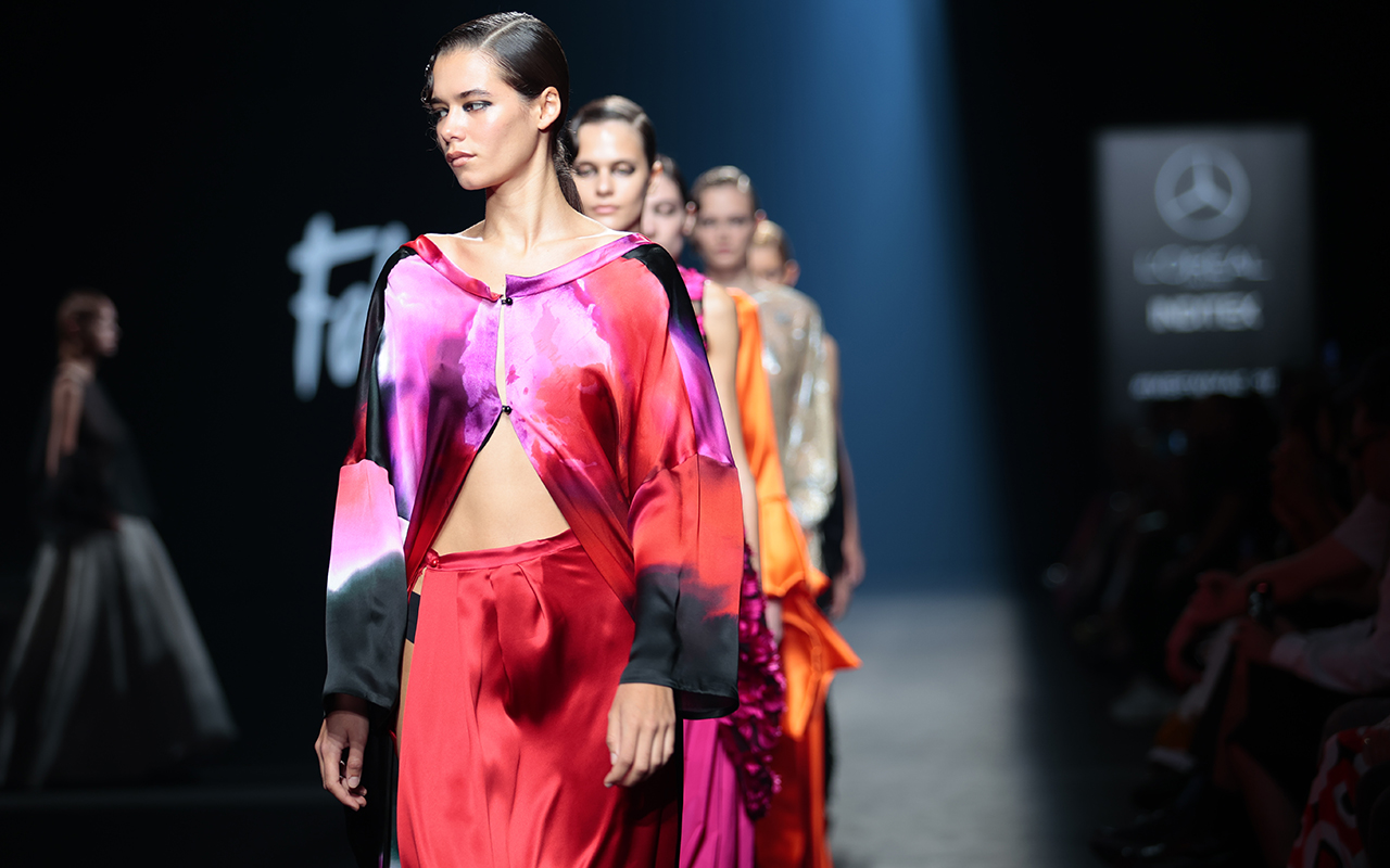
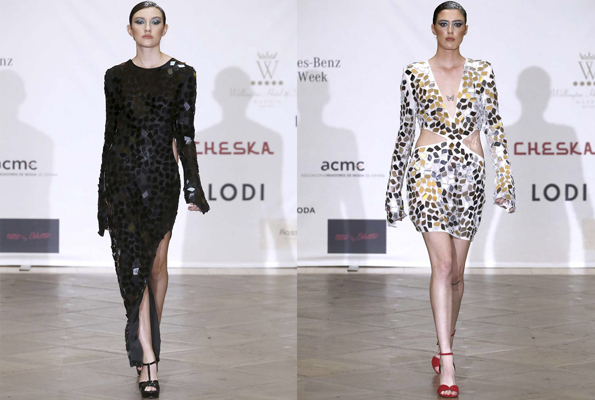
Fely Campo. Spring-Summer 2023. Pic: Gus Geijo
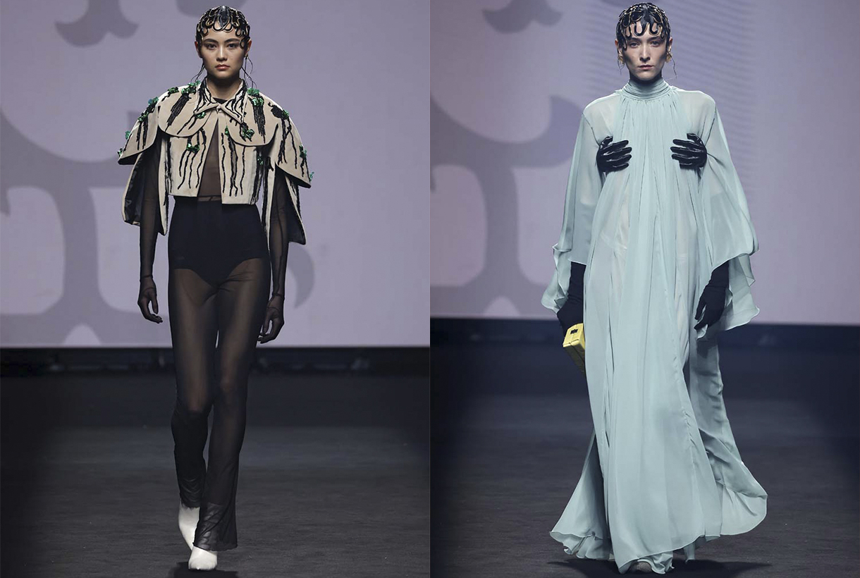
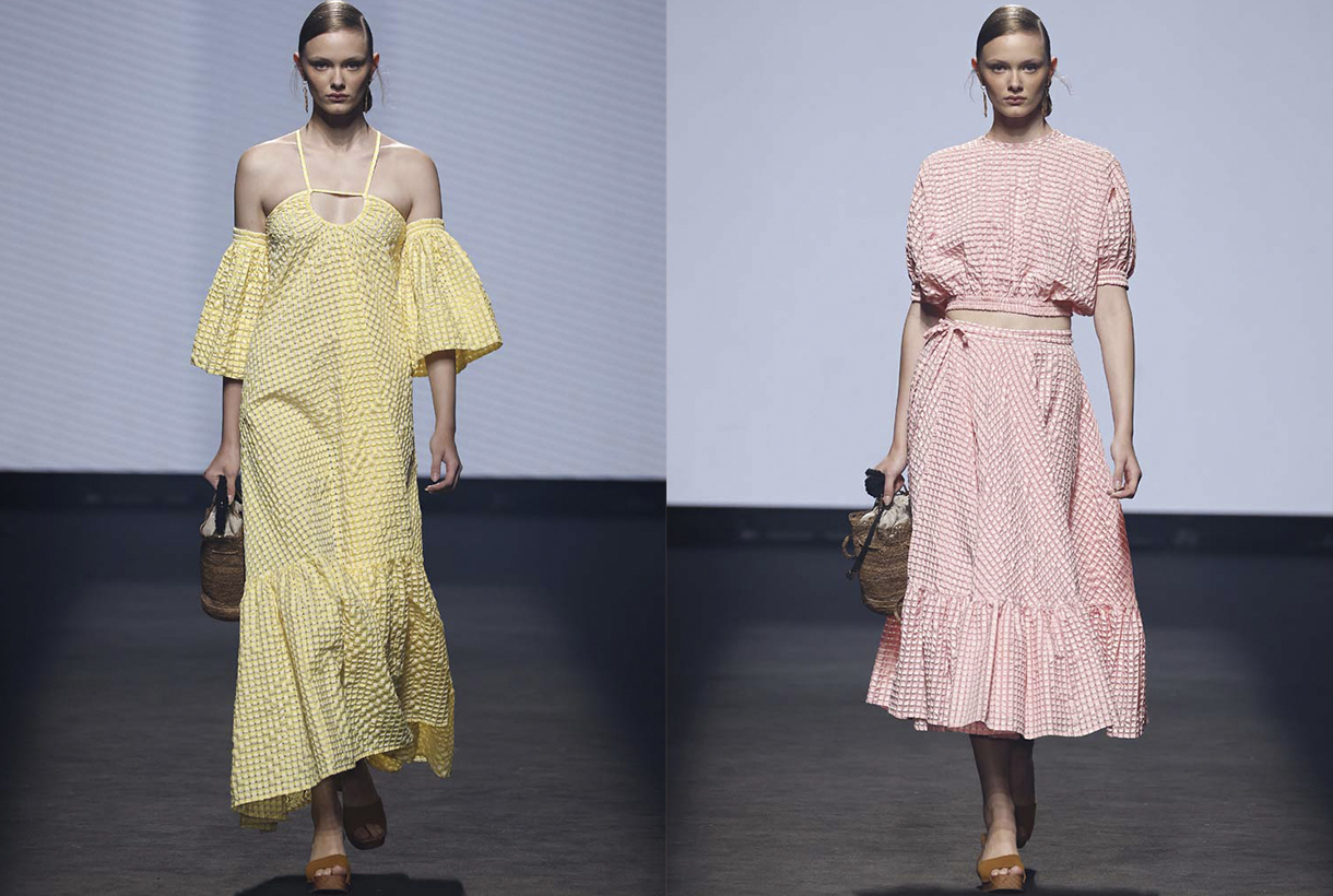
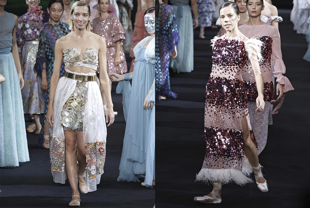
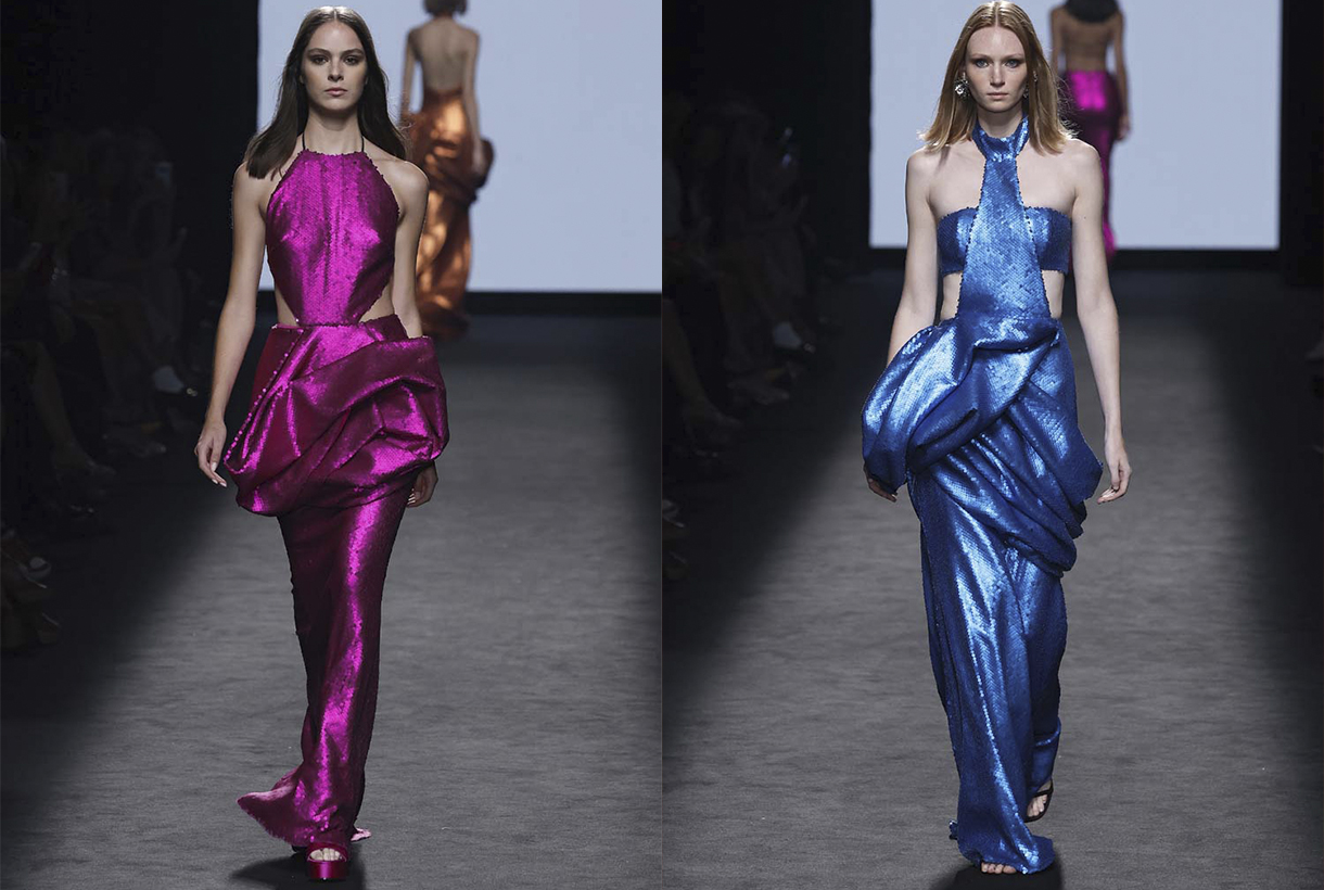
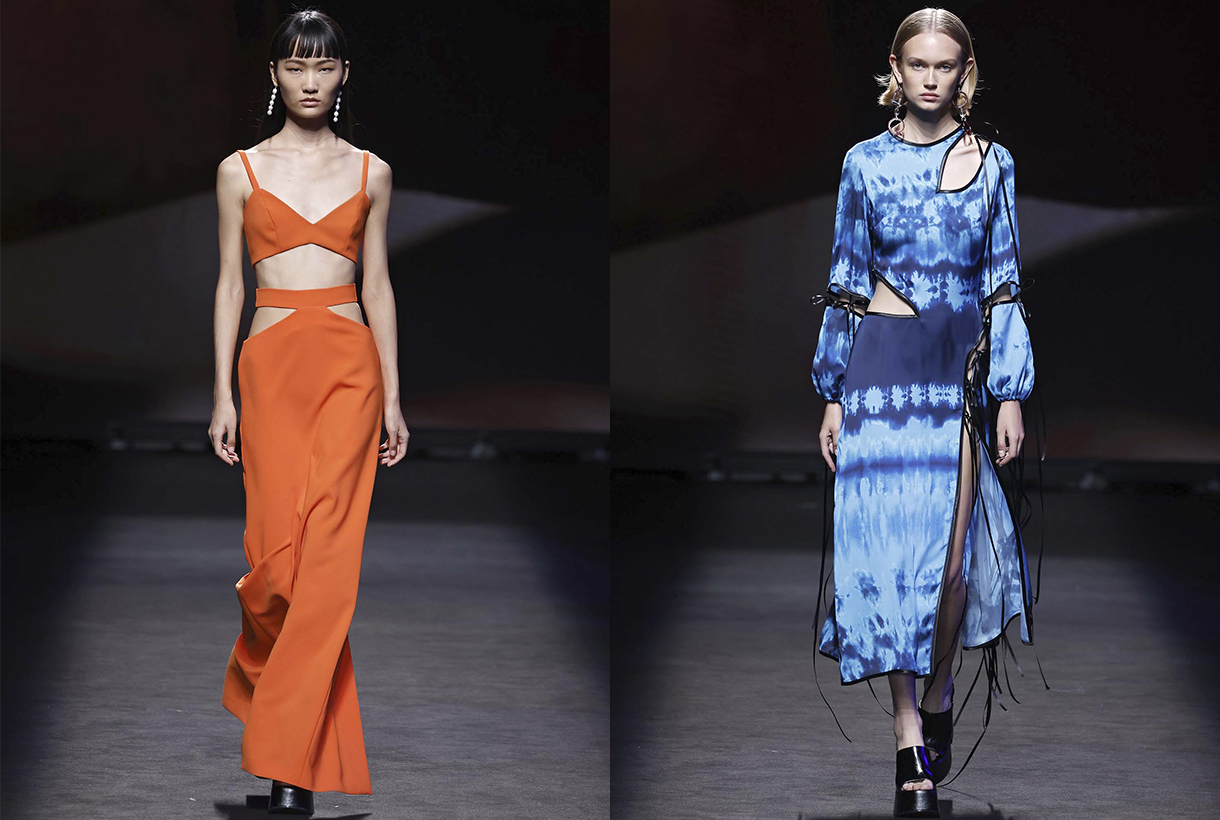
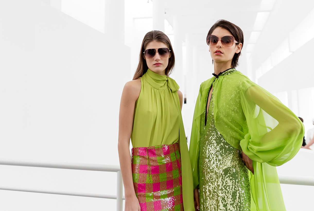
Gratacós has shone with its own light at the Great Spanish Fashion Week by stepping on the Mercedes-Benz Fashion Week Madrid catwalk, held in mid-September. Evidently, this has ocurred so indirectly through designers who are regular users of our and who have once again trusted in our know-how to create the magnificent collections for the coming summer season. In this edition we want to especially mention the collaboration that our family business has made with the designer Fely Campo in an urban and sensual SS23 proposal, where luxury is appreciated in every detail. Not only the creator from Salamanca has relied on Gratacós fabrics to devise works of art in movement. Other designers have also supported us, such as Álvaro Calafat, Aurelia Gil, Duyos, JC Pajares, Isabel Sanchís, Malne, Maison Mesa, Odette, Pilar Dalbat and Redondo Brand. To follow, we expose some details of each collection and also more details of the exhibited looks.
Fely Campo
Fely Campo understands fashion as “a tireless search for beauty”. A language that moves perseveringly and in which the designer from Salamanca finds the balance between the silence and the noise of our current way of life. Under this inspiration, the creator transmits in ‘Nagore’ an idea of sensuality that aligns with the frenetic urban rhythm of cities like Madrid, Tokyo or New York. Surprising cities in full vibration with which Campo alludes to notions such as the maelstrom, vibration and drive, but also evokes other values such as stillness, subtlety and desire, through fabrics, patterns and silhouettes that want to participate in this urban bustle.
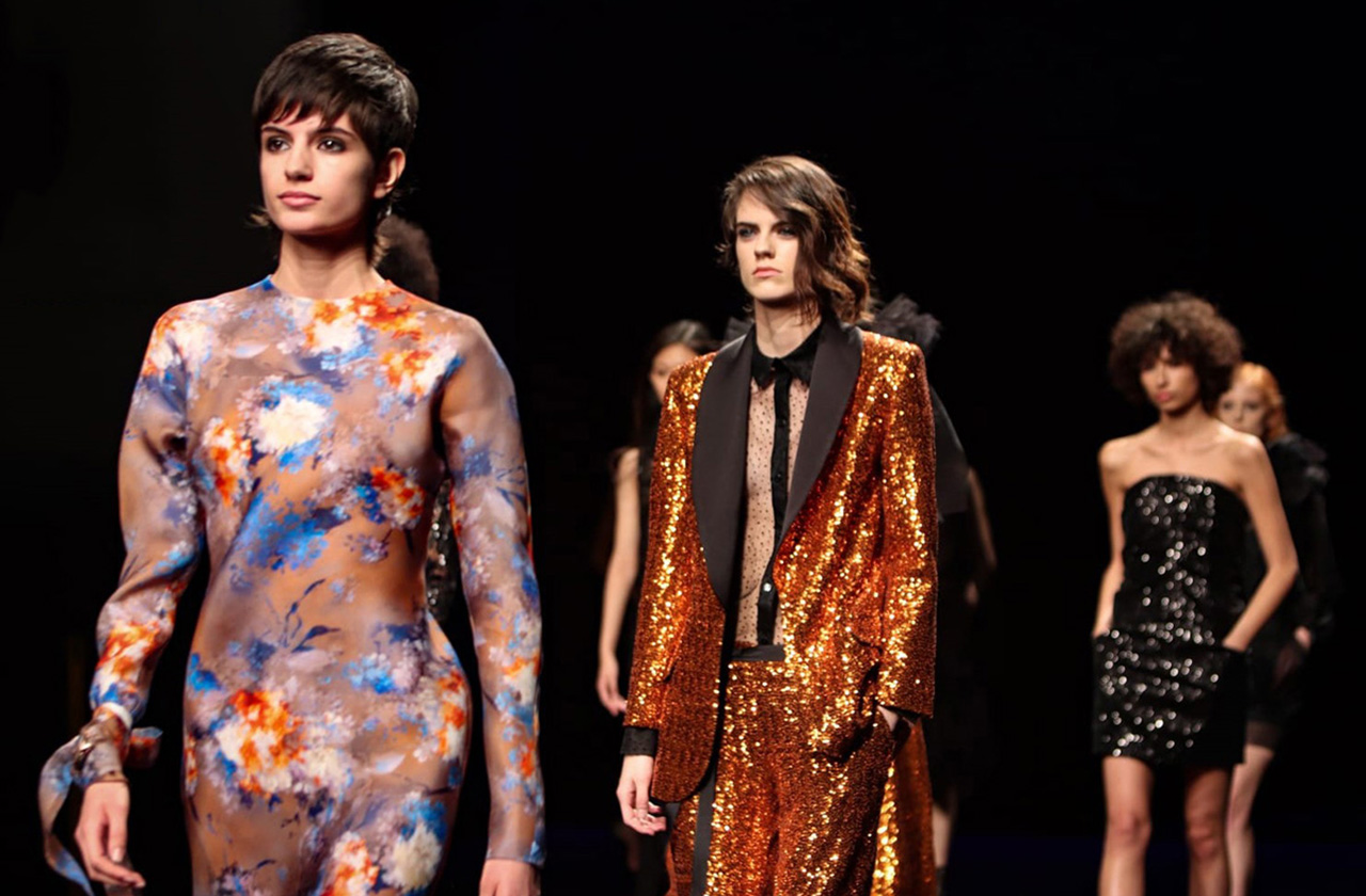
Thus, ‘Nagore’ is a luxury prêt-à-porter collection with which Fely Campo wants to represent the movement of our current rhythm of life. To do this, the designer, who has been dressing women from all over the world for more than 40 years, creates a contemporary image based on the concept of fluidity with ductile and versatile garments that reflect the feelings of today’s woman who is looking for Spanish author fashion aware of the need to consume sustainable fashion. Following her elegant and sober style, Fely Campo clings to an excellent pattern design with silhouettes that love subtlety, fabrics that become vulnerable to movement, exuberant floral prints and in a rich colour palette that ranges from neutrals: whites, light grays and black, to the radiant shades of fuchsia, orange and red with metallic nuances. The designer’s SS23 proposal is, above all, an explosion of feminine beauty in full motion.
Álvaro Calafat
Álvaro Calafat debuts on the Spanish catwalk with a new emotional collection where art and architecture merge with fashion. His third proposal is a heartfelt tribute to the death of one of the young designer’s best friends from Malaga. To talk about death, but also about its connection with life, love and sex, Calafat takes those present to the Khajuraho temple in India and does so through a free and creative interpretation of patterns, 3D structures, volumes and minute details. The silhouettes become daring, the fabrics combine rigidity with lightness and some surreal elements characteristic of her irreverent style do not go unnoticed.
Aurelia Gil
Aurelia Gil pays tribute to the trajectory of her brand, which turns 20 in 2023, through a timeless proposal that is a declaration of intent. Thus, ‘3 6 5’ represents a single collection a year made up of garments that fit together and work at any time of the day, in order to take another step towards sustainability.
The Canarian firm’s collection is made up of a large selection of the brand’s iconic garments that have been revised and updated through design and the use of new materials, such as Lycra yarn for crochet pieces. Gil is also committed to colour contrast and the mixture of fabrics. ‘3 6 5’ also has the added vision provided by Canarian artisans who have created the accessories that accompany the collection to reaffirm the values of tradition, craftsmanship and trade.
Duyos
With its own recognizable style, Duyos finds the inspiration for the next SS23 collection in Estonia through a sensory journey through its stunning nature, its crafts and tradition, and even its gastronomy. To translate experiences into fashion, the designer from Madrid allies himself with cotton jacquards, embroidery, organza, silk and tulle, which he uses to illustrate the floral explosion of early summer, but also other elements of native landscapes. Forest greens, luminous pinks, floral purples, evocative golds… which, subtly combined, represent the colourful energy of the country.
In the new Juan Duyos collection, his usual stylistic traits are not lacking either: overlapping garments, play on volumes and a mixture of motifs and textures that represent the playful but functional spirit based on handcrafted sewing.
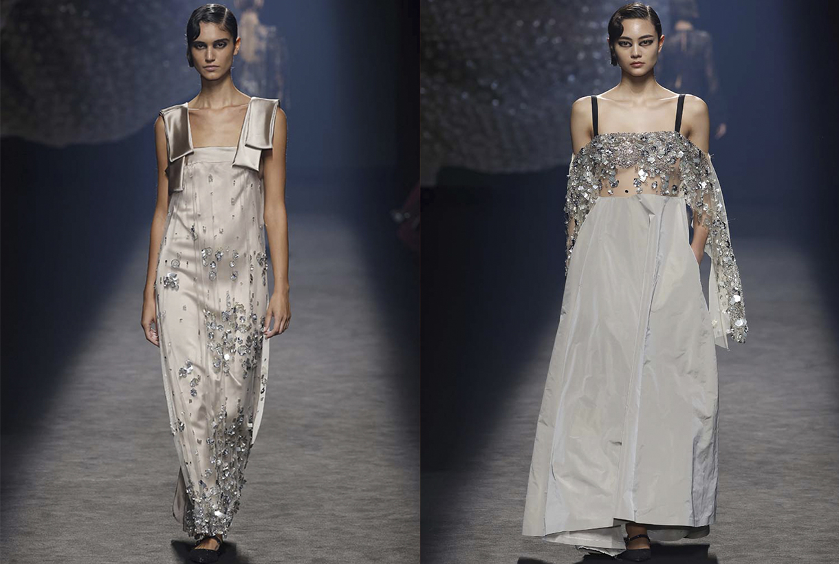
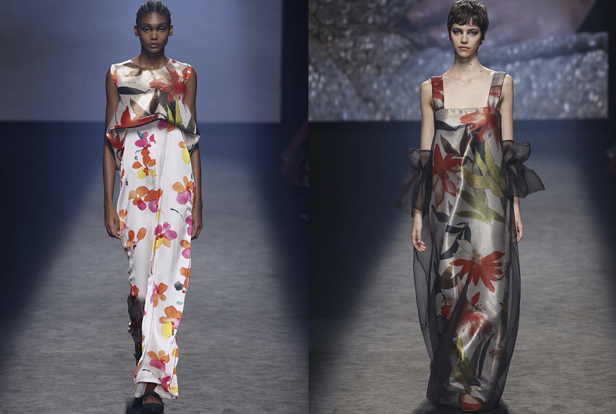
Isabel Sanchis
Isabel Sanchis has celebrated 30 years in fashion while keeping its credentials intact. The objective of the Valencian designer, who borders on excellence in needlework, has always been to magnify the femininity of contemporary women by working with care on the chosen materials and fabrics, with exclusive embroideries, strategic volumes and very precise pattern making.
The next collection for summer 2023 represents a very personal collection based on signature elements, flowers and volume. To do this, Isabel Sanchís interprets flowers in different ways, maintaining elegant and extremely feminine designs. The proposal is eclectic, it represents the diversity in today’s society, and there are pieces that start from laser-cut neoprene, passing through lighter pieces of organza or chiffon, with other sewn garments with volumes made with recycled liquid satin and feathers. The colours used are striking, where red, pink and green predominate, giving strength to the pieces in this collection for a woman of 2023.
JCPAJARES
JCPAJARES reaffirms its commitment to fashion without seasonality with its ‘Annual 22 23’ proposal. It represents the third annual collection where summer, winter and timeless garments come together through innovative, conscious and environmentally friendly designs.
‘ANNUAL 22-23’ becomes the firm’s most special collection thanks to the collaboration with master craftsmen. A union that revives and provides new aesthetic codes to centuries-old techniques that are about to disappear. Ceramics, blown glass, hand embroidery, wicker, fabrics made on century-old looms navigate through a collection that strengthens the character, style and stamp of the young designer’s signature. Also noteworthy are the innovative and sophisticated patterns, the sexy silhouettes combined with other oversize, the strategic gathers and the unexpected openings that materialize thanks to wool cloths, organza and silk dots, crepes and neoprene, among others.
Malne
Paloma Álvarez and Juanjo Mánez, the design tandem that hides behind the firm, is inspired by the symbolism of birth to present a dazzling collection in every way that is set in a hostile environment such as the desert. In ‘Birth’, Malne reflects on a process of transformation in a positive light: the end of an era, and the birth of new ethical paradigms and ways of life, in which nature is part of the beauty of that necessary mutation.
To take it to the field of fashion, Malne uses bright fabrics that reflect the sun’s rays on the sand and shades characteristic of the desert landscape such as sand tones or night blues. The silhouettes are daring without neglecting the sophistication that characterizes the Spanish brand.
Maison Mesa
The controversial figure of Elagabalus, Roman emperor of the 3rd century AD, inspires the new summer collection of Meson Mesa. An irreverent emperor, who breaks with the gender schemes, with established sexuality and with the power systems, who grants women the political power destined exclusively for men. Under this influence, femininity, desire and power are the central elements around which all the garments revolve, a story about feminine power without ties.
On the catwalk, Juan Mesa’s firm that mixes tradition and avant-garde, exhibits geometric pieces that generate volumes and drapes according to their construction structure. Also evening dresses along with day pieces such as sweatshirts, shirts or jackets, all united under the influence of the sun god Helios, which reflect its light with nuances and sparkles, with its colour or with embroidery and applications. The colour palette is bright and ranges from white to yellow, passing through celestial blue and gold, dusty greens and nuanced pinks against their more intense versions.
If we talk about fabrics, the new collection mixes classic materials with more contemporary and innovative ones, cotton voile, organdy, satin, mikado, silk muslin and crepes with metal fabrics, shiny and lurex finishes in Jacquard or knit, going through metallic or translucent sequins and others that create camouflage military embroidery. Fabrics that reflect light with their shine also predominate, with lurex, with satin weaves, fringed fabrics that add shine and movement, even fabrics that change their colour after continuous exposure to sunlight. In short, Helios is present from the concept to its textile manifestation.
Pilar Dalbat
Pilar Torrecillas, creative director of the brand, is inspired by the heritage monuments of her native Granada to present a harmonious collection that pays homage to native architecture.
On the catwalk, Pilar Dalbat composes 32 looks that combine linen gazar fabrics with tulle, pleats and taffetas creating new silhouettes full of transparencies. Metallic fabrics, present in the designs of each collection, also appear again this time in different textures. Evening garments are characterized by brightness, transparencies and pleats. Dresses, waistcoats and skirts that, accompanied by methacrylate embroidery and glass beads, combine with silky and neoprene tops. Lime green in taffetas, crepes and fantasy gives way to versatile and flowing garments.
In this new collection, Pilar reaffirms once again a way of making slow fashion collections, defending author fashion made in Spain.
Odette
The prêt-à-porter brand Teté by Odette presents a proposal inspired by the self-confident woman who wants to shine and who invests in completely handmade pieces made in Spain. Thus, the ‘Selena’ collection gathers the profile of its consumers with tailor-made looks for them. On the catwalk, the designer Odette Álvarez changes some patterns, now advocating femininity in a more subtle and simple way. Therefore, the silhouettes become minimalist and the fabrics caress the body creating fluid and sensual shapes.
The fabrics rich in crystal details, fringes, beads, plates and sequins, and the colours that flow between gold and silver, resounding fuchsia, white and black are the axis of this proposal inspired by the lights and shadows of the landscape. mole.
Martes 20 septiembre 2022
 © Première Vision / Alex Gallosi
The concept
We have ready to go our new collection of fabrics for the Autumn- Winter 2023/2024 season. And this one has once again raised many expectations among the suppliers who have visited us at the Première Vision Paris fair held in July, and also in the first edition of Fashion Rendez-Vous in early September, the new fashion event that complements the great Parisian fair. This optimism, together with the desire to channel the textile sector to return to pre-pandemic stability, encourages us to continue creating new collections of fabrics that combine creativity, innovation and sustainability. The three pillars that support the know-how of Gratacós.
Broadly speaking, the collection decodes and analyzes emerging trends in order to make colour, texture and material decisions that structure the season. In defining the new proposal, we have especially valued the expectations of our customers, quality (key to the longevity of fabrics) and the fight for the environment. That is why we say that the new collection is more sensitive to sustainability, society and the environment because we create and make fabrics that make you daydream. It is also time to think, respect our times, communicate with our audiences, protect ourselves and seek 360º prosperity.
Below, we are going to go into detail about each of the aspects of the new Autumn- Winter 2023/2024 collection.
 © Première Vision / Alex Gallosi
The concept
Fashion is a sponge because it absorbs the social, the political and the environmental. It is a resilient industry that has the ability to recover from complicated situations to continue moving towards the future with new proposals that adapt to times of uncertainty.
This season we have the need to verbalize, express, transmit and communicate through fabrics how we think, what we feel and what we want. The fabric in this aspect is the means of expression. A conduit that collects human experiences and appeals to the personality of each individual. At the beginning of the pandemic, the conception of fabric was the instinct of protection and care of people. Now it is the means of individual expression. That is why we are concerned about choosing the weight, the appearance, the tactility, the nobility of its fibres to make exceptional creations. The fabric speaks for itself. The fabric speaks of ourselves.
Fabrics and yarns
Beyond identity and self-expression, the fabrics in the new collection are designed to move. To do this, in this new season we promote more daring and personal approaches to fashion, always navigating between discretion and extravagance. Concepts such as expressive tactility, fresh images and innovative colours are incorporated within the design team to experiment with matter.
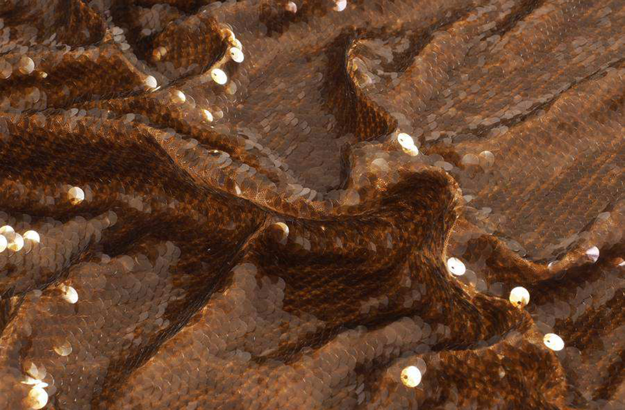
The fabrics also navigate between the powerful contrasts. The classics survive the tide of trends: items such as tweed, the Harris check, the cheviot, the wool herringbones that come from the Anglo-Saxon tradition are maintained for another season, but are reinterpreted with decorative motifs. Quilted fabrics are perfect for outerwear and the volumes that are built with reliefs become key to build winter fashion. On the other side, fantasy coexists, a trend on the rise that translates into an increased commitment to shiny items: sparkles of sequins, iridescence, oversized paillettes and crystals, along with jacquards full of fantasy colour and shine. Metallic and mineralized items also abound in the new collection: fabrics with reflections and sediments of iron crystals like iridescent carbons. We insert metallic and mineral reflections.
In terms of yarns, sustainability projects are increasingly necessary, and we consider that the supply of recycled fibres and yarns is an essential point to reintegrate waste into the textile circuit, creating a new materiality in favour of the essential circularity. For this reason, at Gratacós we work with more respectful fibres as a matter of environmental responsibility. This environmental fight is also linked to the acceptance of higher prices and ethically richer qualities without losing the aesthetic added value that distinguishes the sector.
 © Première Vision / Alex Gallosi
The colour
The Autumn- Winter 2023/2024 season stands out for the versatility of colours in their multiple nuances, both essential and maximalist. A colour range that amplifies the beauty of the materials. For truly desaturated excess, focus on shocking luxury and drama.
The density of the dark colours enhances the vigor of the intermediate tones and amplifies the visibility and character of the brighter tones for a new identity in the harmonies. Some shades play with their denser, brighter versions for an illuminating effect that helps us deliver modern, disruptive colour schemes that can be associated with a welcoming neutrality.
In this new collection, the palette will be made up of three colour levels. The first range is the most saturated and bright, and plays on contrast. We call it the Dopamine Shade Range. It is a line of intense and emotional colours that suppresses all classic rules of composition to bring out a vigorous passion. Orange, magenta, green and fuchsia emphasize contrasts in colour mixes to create surprising harmonies. The second range is more discreet and is made up of various neutral tones that modulate oxidized iridescence, mixing harmonious combinations and bright tones that meet again. Pearl gray, antique pink, earth colours, deep lilacs … are part of this second colour line. They are sophisticated and charismatic shades that evoke luxury in its most subtle version. Finally, the third range balances between nature and the rural world. To capture this serene and traditional universe we use warm and deep colours that are interrupted by brightness. Earthy tones, pale greens or muted blues are key in this range to offer us a recovered classicism that connects us with the past and memory, without giving us a vintage look.
 © Première Vision / Alex Gallosi
The aspects and designs
The Autumn- Winter 2023/2024 season stands out for a new hybrid sensoriality in the fabrics that is achieved through creativity and ingenuity. We are not satisfied only in making beautiful articles, but they must inspire beauty. To do this, in terms of aspects we will highlight the reliefs emphasized to reflect the movement of the textures.
Currently, fashion moves between the comfort of urban style or more streetwear with the elegance of tailoring, which is an unbeatable classic, and, finally, the sophistication of the most extravagant garments. For this reason, the items we create have to meet all existing demands on the market. Specifically, we are interested in functional, versatile and hybrid items that respond to various daily styles, but also the most fanciful items to respond to this commitment to escapism that fashion after the pandemic entails: sumptuous materials, extravagant ruffles and sequins. of all kinds and sizes.
In terms of design, this season is represented through ideas about exploring the limitless possibilities of forms and mixing with art. There is a strong relationship between tradition and emotion. A collection that goes towards a very expressive modernity, we want above all to awaken joy.
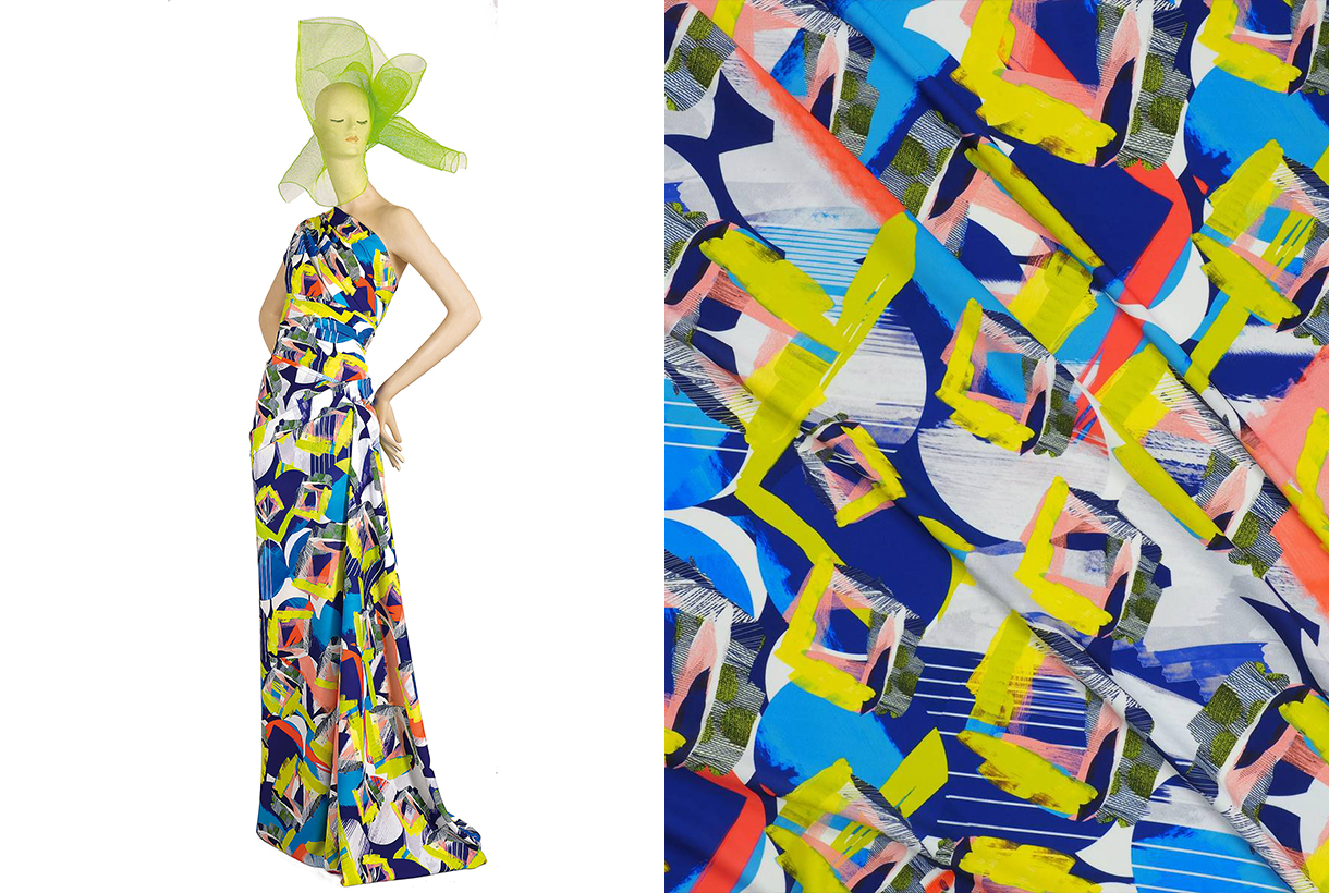
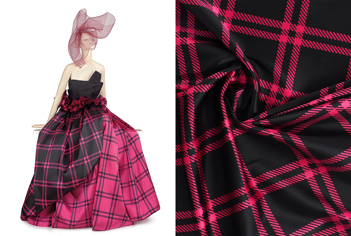
To convey the trend, contrasting motifs triumph in this collection: from the delicate and imperceptible tone on tone, to the macro designs in strong and vibrant colours for unapologetic visual opulence. Playful contrasts of proportions working together are also explored. In terms of prints, abstract designs that are inspired by a kaleidoscope of multiple reflections abound. Also the monochrome designs in Jacquards and prints, in contrast with an overflowing multicoloured expressiveness.
Lastly, the new season is not lacking in surprising plaid designs, exotic paisleys , almost baroque ornaments, the delicacy of flowers that become more artistic and less obvious, and autumnal fantasies for a decorative, warm and comforting aesthetic.
In short, we really want to present you the imagery of an entire eclectic and versatile season, which explores new limits where the ingenuity of the creative team is at the service of beauty and sensoriality. Soon you will discover the new season in the Gratacós space!
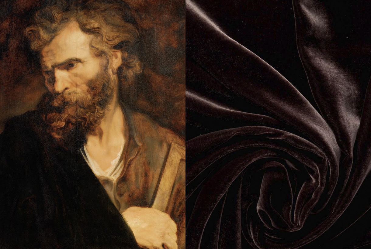
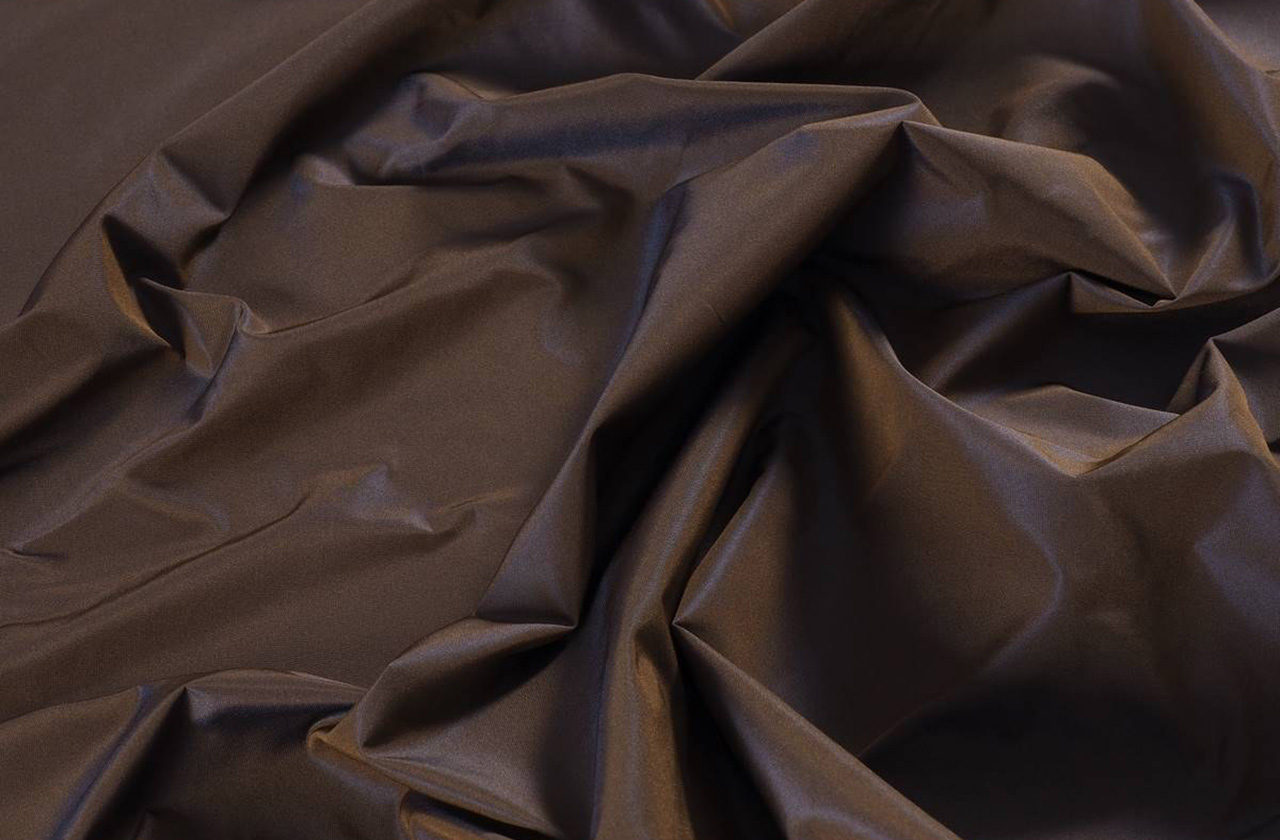
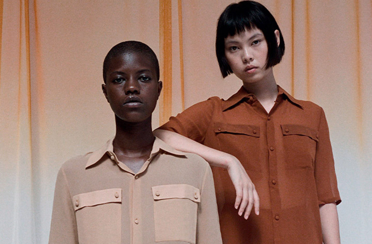
Brown. Right from the start it sounds ugly and unpleasant, it triggers some ridicule and in general, it represents an underappreciated colour: Only 1% of people admit to having it as a favorite, being the hue that generates the most rejection among the population. On a psychological level, brown has negative connotations because it is associated with the old and outdated, poverty, dirt or everyday life. The ordinary is represented in brown. The discreet also because brown, being the mixture of primary colours, goes unnoticed. These mental associations are related to the history of clothing and the use that was given to this underestimated colour in art. Despite this, brown also has a luminous underside: it represents the earth and is present in nature, through flora and fauna. In design and decoration, brown is highly appreciated because it refers to warmth, recollection and well-being. The rustic environments, with a great presence of wood, leather and mud and clay, are in brown tones. Below, we explain some curiosities about this reserved shade that is essential in autumn, the season that we psychologically associate with brown.
The origin of brown
Brown has always been there, and it abounds all around us. These tones are very common in nature: the bark of trees, the skin and hair of animals, clay soil, arid soils, mud flows… Brown represents mother earth, where it emanates with all its force. , its nature, and, therefore, life and death. Maturity is brown, so in autumn, this colour shines in all its intensity. The flowers lose their youth and the leaves gradually turn this shade to announce the end of their cycle.
Etymologically, the name of the colour is a Gallicism. It refers to “marron” which means chestnut in French. This word was introduced in the mid-nineteenth century to designate what was previously known as chestnut. The acceptance and use of the term among the population was so great that it was introduced into the normative dictionary in 1927. Therefore, not even a century has passed since our language has accepted the word brown to designate the brown or brown colour. Despite this, today we continue to use the old adjective to name hair and hair that is neither blonde nor brown.
The colour of humility and poverty
Historically, brown has always been an abundant colour, easy to produce and in many cases, represented undyed fabrics through elaborate pieces of flock and hair of goat, deer and hare spun with raw and brownish flax and hemp. Therefore, the brown clothing was the original and did not need any added treatment. Since Classical Greece and practically up until the end of the 18th century, pieces of clothing in bright colours such as red, ultramarine blue, green or golden yellow were status symbols -they were expensive colours to produce- and were reserved for women. privileged classes. The undyed garments clearly showed an inferior status and for this reason, the popular classes used them frequently, with brown being the colour associated with simplicity, humility and poverty. For example, in Ancient Rome, brown clothing was associated with the poor or the barbarians – those peoples who did not master the dyeing arts. The term used to address the commoners was “pullati”, which literally means those dressed in brown. In the Middle Ages, brown was considered the ugliest colour on the spectrum because it was the colour worn by peasants, serfs, servants, and beggars. It also represented an abundant, ordinary and vulgar colour, values opposed to the opulence of the nobility. Therefore, brown was seen as a worldly colour, associated with the crowd, the mob and why not, with dirt. Feces, mud and bitumen are brown and frequently surrounded the plebs.
If brown also represented a symbol of humility, it was not surprising that the first Christian monks used this colour to preach a simple life, away from all kinds of luxuries. When the colours for the different orders were established, the brown and gray colours dressed the monks who took a vow of “maximum poverty” such as the Franciscans known for their brown robes as a symbol of Christian humility.
Brown was also, for centuries, the colour of mourning for the poor because black-dyed fabrics were inaccessible to the most popular classes.
A change of conception
The aesthetic ideal of vibrant colours lasted as long as the cost of luminous tints remained high. This paradigm began to change from the eighteenth century when it was possible to dye pure colours for the first time (red, blue and green were the most valued) at reasonable prices. This fact changed the value system: pure colours were then considered simple, and the dyer’s art was transformed into the art of mixing dyes. From there arose, in the rococo era, the predilection for pastel colours, and the introduction of chestnut as a fashionable colour among the nobility. To obtain the coveted brown, they were dyed several times with different colours, one after the other, to obtain a more varied tone. For example, Louis XVI had a predilection for flea colours (he called them coleurs de puce ) with very varied nuances: old flea, young flea, flea back, flea head, flea leg… All would refer to a type of brown distinct.
Goethe, on the other hand, considered pure colours to be negligible, since they were difficult to combine in the clothing of sophisticated people: “The use of solid colours undoubtedly has many limitations; On the other hand, colours such as dirty, dead, the so-called fashion colours, show many gradations and nuances, most of which are graceful”, he said. The “dirty colours” were all shades of brown, and the “dead colours” referred to those that darkened to black with its various variations that were more versatile. This is how German culture progressively turned the meaning of brown upside down. From the plebs and marginalization, it came to represent the culture and good taste of the upper classes.
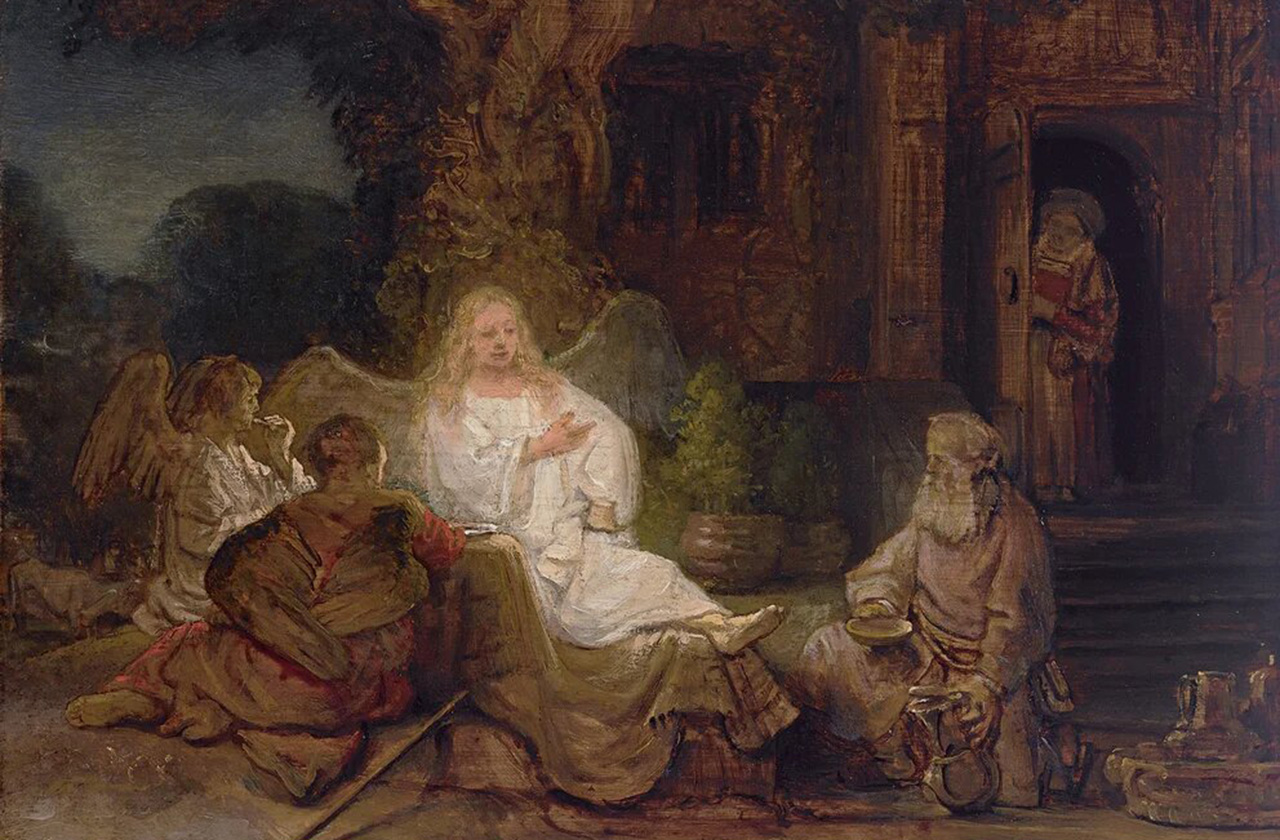
Brown in art
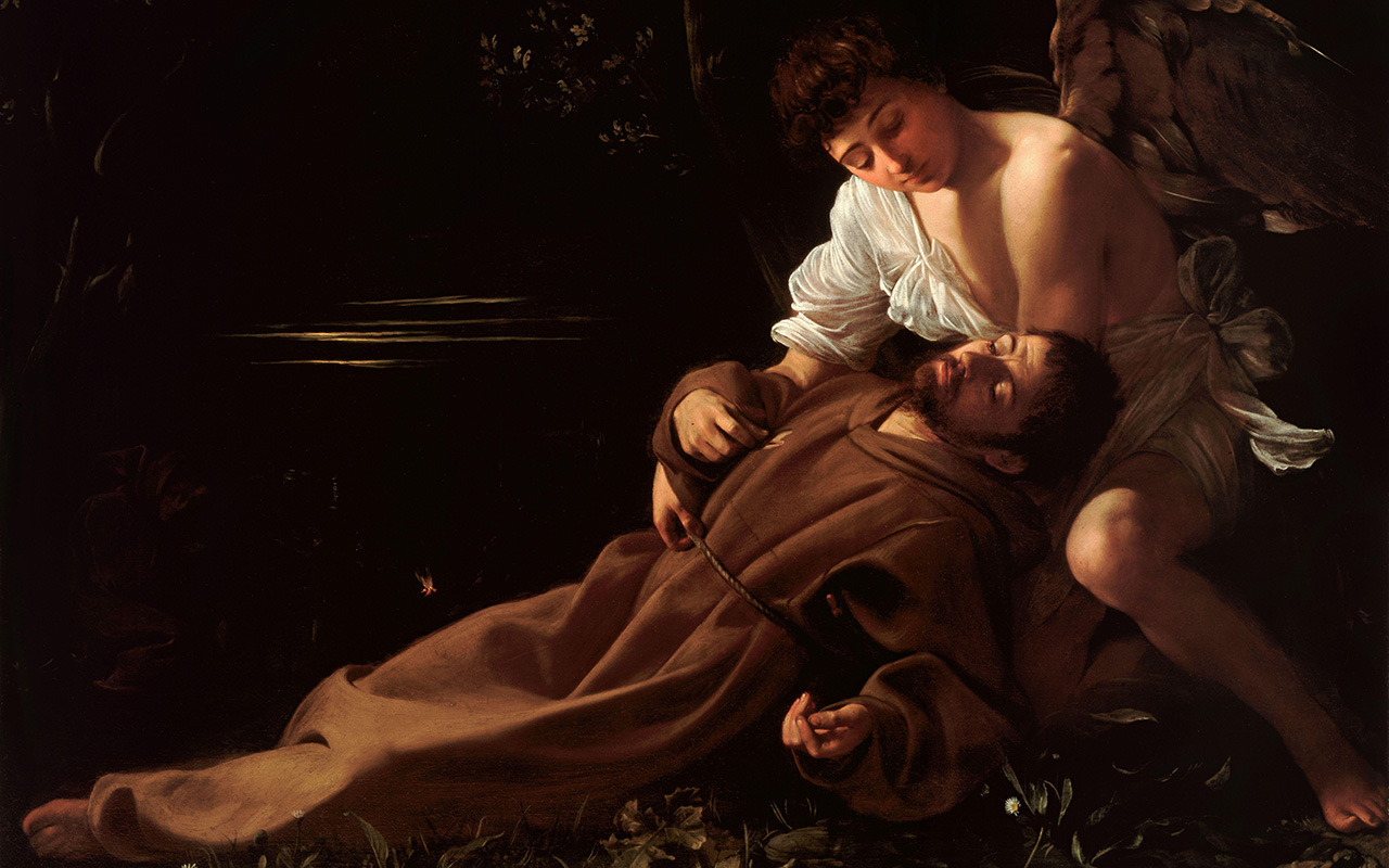
Although brown has been used in art since prehistoric times, this hue was rarely used in art until the Renaissance. In the Middle Ages, for example, artists preferred bright, distinctive colours to paint pictures or illustrate religious books. In the 17th and 18th centuries brown was in greater use. Caravaggio and Rembrandt used various shades of brown to create chiaroscuro effects, where the subject stood out from the darkness. Rembrandt also added shading to the ground layers of his paintings because it promoted faster drying. The artist began to use a new brown pigment, called Cassel earth or colony earth. This was a natural earth colour made up of organic matter, such as soil or peat. It was used by Rubens and Anthony van Dyck, and later became commonly known as Van Dyck brown. The French Impressionists of the 19th century were not very fond of the colour in question, with the exception of Paul Gauguin who created luminous brown portraits of the people and landscapes of French Polynesia.
A colour appreciated in fashion
Traditionally, it was thought that the person who wore brown conveyed to the world that they wanted to go unnoticed. The psychological effect it causes is that of being an ordinary colour, even mediocre. In fact, there are still rules attached to clothing issues that go back to this imaginary of colours. For example, high-ranking executives are said to be banned from wearing brown suits because they detract from their status.
Beyond certain beliefs or traditions, fashion has adopted brown in its bed and has given it infinite possibilities. Brown is a warm and deep tone, it exudes magnetism, it is easy to combine, and therefore it adapts perfectly to countless looks because it makes its discretion its best asset. Not in vain is it considered a neutral like white, black or navy blue. Despite being traditionally related to autumn, brown this 2022 has been worn in spring and summer, through youthful and fresh looks that have been followed by some celebrities and fashion prescribers such as Cardi B, Dua Lipa, Selena Gómez, Kendell Jenner or Rihanna. Wearing it in a total look version has also been the preference of the big fashion firms.
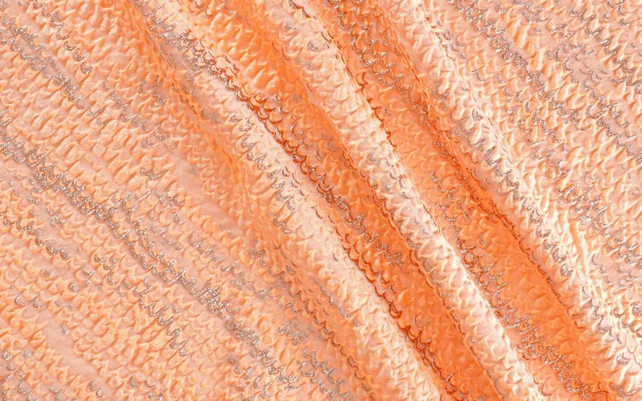
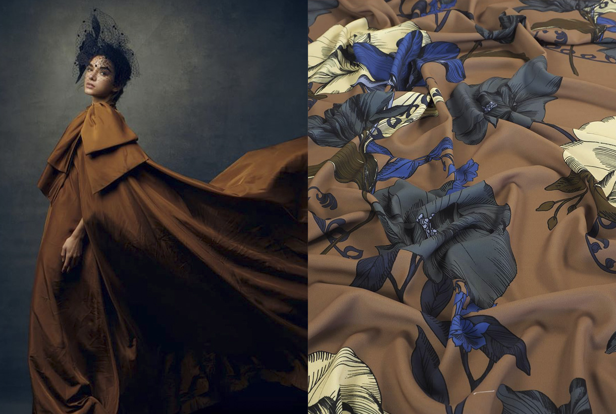
At Gratacós we want to show you some of the key fabrics for the new season in shades of brown to show you their full potential. You will also find other items at discounted prices. You will find them available in our online store.
In short, brown will never go down in history as one of the most significant colours, but it will walk hand in hand with it thanks to its simple, versatile and discreet nature.
 April is the month of fashion in Barcelona. Prior to a new edition of Barcelona Bridal Fashion Week, a week ago saw the start of the latest edition of 080 Barcelona Fashion, with 22 virtual parade shows and designers who presented the new season in the Macba, within the rationalist building designed by the architect Richard Meier. A new staging of the imaginative creativity exhibited by brands via Fashion Films, seasonal collections that can be followed visually on the website of the Catalan catwalk. Gratacós has also followed the latest fashion trends to check once again how our fabrics have taken shape thanks to the designers who habitually trust in us: Avellaneda, Eiko Ai, Menchen Tomás, Yolancris and Victor Von Schwarz. We review the new creations and some of the key looks.
Summer nights
Faithful to his hedonist philosophy the dandy Juan Avellaneda transposes us to tropical latitudes in his new summer collection to continue exploring the most relaxed elegance, inspired by warm paradises in the north of Africa. The central feature of the creation is via natural fabrics, luminous or fiery shades such as pink, orange and coral, and patterns that in general lack rigidity. There are also several models of jacket, the fetish garment of the brand of this Barcelona designer, which oscillate effortlessly between male and female wardrobes. The prints move away from the banal to embrace a Mediterranean version of delicateness that gives character to ethereal skirts and smoking-jackets which rebel against the boring. The garments evoke the practical elegance of Saharan and classic tailoring by those mid-century holiday-makers who immortalized Slim Aarons. Blouses caress the body and intertwine. Trousers dance and dresses cling to the skin or deploy fabulous volumes and flyers, another 100% Avellaneda detail. In Au réveil il était midi all the clothes combine with everything, they harmonize and flow for a perfect summer.
The warm sunlight
Eiko Ai dazzles us with Lucid Dreams, a radiant collection inspired by the vitality of solar energy. In addition to this inspiration Glò Lladó’s formula remains firm in each of her designs and consists of promoting feminine beauty by playing with delicacy and sensuality. And how does she achieve it? Via vaporous silhouettes, ethereal fabrics which give glimpses of skin and via evocative stamping that mixes sophistication without abandoning the casual and cosmopolitan spirit of this Barcelona company. The new summer creation from Eiko Ai enhances the kimono dresses, fluid blouses and two-piece combinations featuring transparencies, subtle glitter and faded prints with other florals that pay tribute to that mystical vision of woman as an urban nymph. The palette of the collection goes for positivism, summer life and golden light via intense oranges playing with the range of yellows, pinks and whites and brushstrokes of intense blue sky.
Class is class
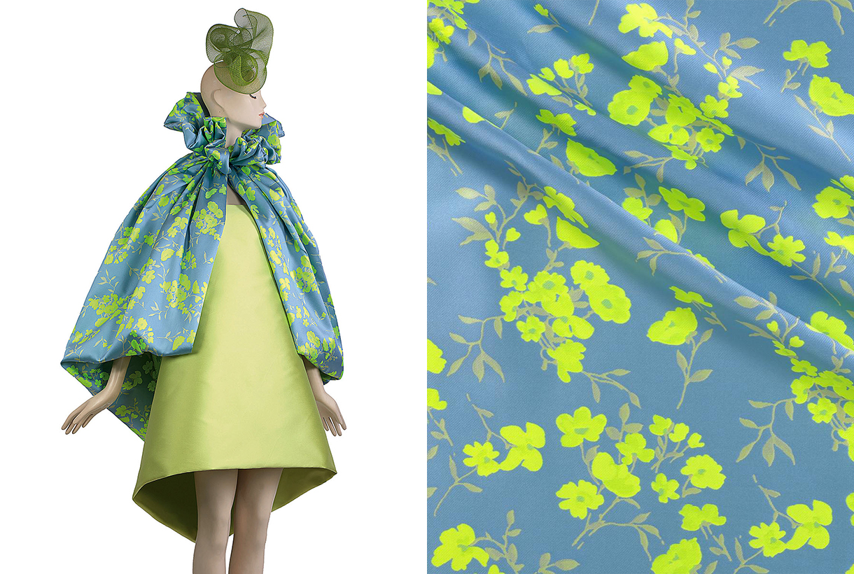
For his part, Menchen Tomás reminds us of the importance of inheritance in Old Money, a collection that is inspired by the way of dressing and living of American families who have managed to pass fortune, class and status from generation to generation. An aesthetics characterized by sophistication, the fusion between the classic and the contemporary and timeless elegance, far from the culture of logo and ostentation. With that interpretation the Barcelona company brings together garments such as dresses and midi-skirts, pinned wide trousers, voluminous poplin shirts with other sporty garments that could be used for a day in a country-club or dinner in a garden on a summer night. Regards fabric details there is no shortage of silks, organzas and tulle flowers in a vibrant chromatic palette: blue, lime green, yellow, fuchsia-pink and bright-red.
Fashion without gender
Victor von Schwarz is part of the new generation of young talents that bring creativity and freshness on the 080catwalk. This time, the designer Barcelona presented a collection inspired by the Asian Mafia films of the 80s and 90s, whose centre of operations was the red neighbourhoods of cities such as Taipei or Hong Kong. Victor von Schwarz is committed to fashion without gender. Therefore, the designer, inspired by oriental clothing, creates open pieces, which anyone can wear, regardless of sex or gender. The silhouettes of the new summer creational are divided into two blocks. The first is very bright, with volumes, drape and transparency features that give a glimpse of skin. The second, part of a much more square silhouette and with variations of the classic tailored jacket. In this collection the fabrics are characterized by their imaginativeness. Sequins are prominent, from Vichy print to bright degrade. We also highlight bright laminates based on viscose and tulles with silver prints. As for colours, pastel shadestones and splashes of colour are a feature of this genderless creation.
Black velvet
Yolancris this time participated in the 080 Barcelona Fashion with her party collection, leaving aside her more experimental project Y Como. The new creation highlights the craft-work redolent of her own workshop itself where the accent is on velvet, flesh-colour and black. With regard to detail, velvet is mixed with golden threads, embedded French lace and macramés in an attractive combination. Binomies of colour also dominate: gold-black and white-black, and are separated with explosions of monocoloured dresses: red and powder pink. As for silhouettes, the collection brings together some classic pattern ideas combined with some more daring features, evident, for example, in the openings of the dresses. In general Yolancris’s creation aims to be timeless so as to offer an expansive wardrobe for special occasions.
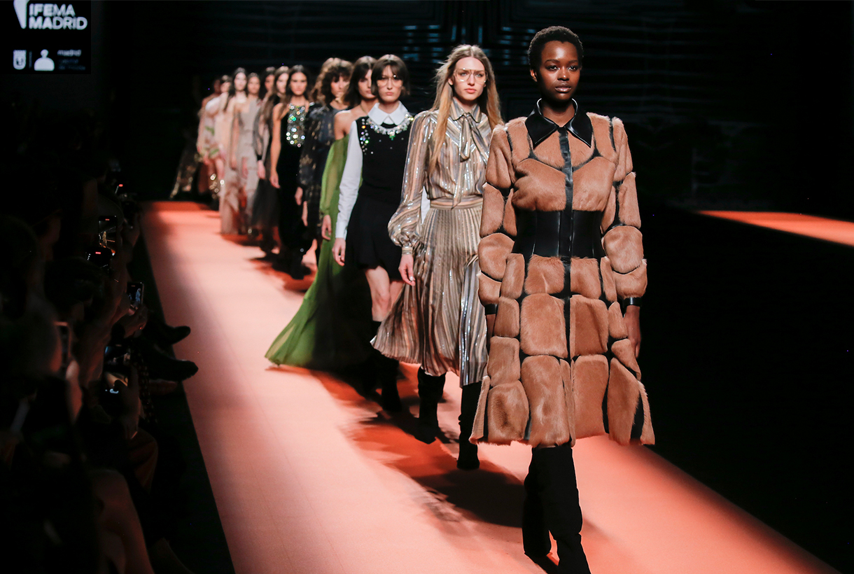
Another edition, Gratacós fabrics have made their appearance at Mercedes-Benz Fashion Week Madrid that was held in the Spanish capital at the beginning of March. Companies such as Brain & Beast, Dominico, Fely Campo, Malne, Redondo Brand and Teresa Helbig have trusted in our creations with new designs for the Autumn-Winter Collections 22/23. As always we have put together some of the most prominent looks with gratacós fabrics as well as the spirit that each designer wanted to transmit. It is worth remembering that it is an honour to have the confidence of these Spanish designers who, year after year, are opting for our family-run business.
Brain & Beast
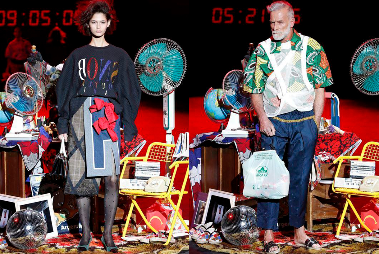
Brain&Beast returned to the Madrid catwalk – after an absent edition – to claim the heritage of this Barcelona company with its usual style characterized by humor, riddles and double meanings via colour, print, unstructured patterns and references to the idols of contemporary culture. This time in Puzzle, Ángel Vilda presented a seasonless collection – irrespective of all seasons – which exhibited the playful DNA of the most rebellious company at Mercedes-Benz Fashion Week Madrid. Garments with deconstructed phrases, patterned collage, as one that mixes the faces of Alain Delon and Catherine Deneuve, denim everywhere and impossible mixes of prints that seem to coexist effortlessly. In short, daring and casual outfits that go beyond trends because what they seek is to vindicate authenticity, a trait not always appreciated in the fashion industry.
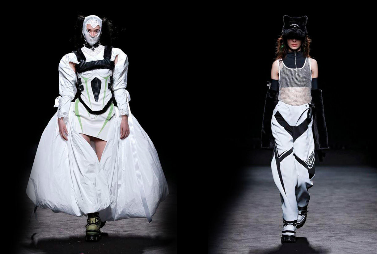
Dominnico
Domingo Lázaro, winner of the Who’s on Next 2021 prize, with his creation Lovercross took us to a dystopian future to dive into the origins of Cyberpunk and Grunge via silhouettes of aerodynamic lines with the retro futurism of the 90’s as a connecting thread. In the new Dominnico creation proposal there is no shortage of volume or intermingled textures: Tweed, Lamé, mesh with rhinestone, laminates, taffetans, Renylon or 3D textured foams, present in long cloaks, evening dresses with asymmetric neckline or impossible hair-pieces. The dark inspiration is also represented with skewers, black leather and metallic details. As for the chromatic palette used, the Barcelona company created in 2016 is committed to primary colors and acidics, such as neon orange, fuchsia, green lime and apple and Klein blue to contrast with black, white and silver. In general this new Dominnico creation recalls the world of the motor-bike which the singer Rosalía also explores from her own private vision. We will see if together they establish a new dialogue between music and fashion.
Fely Campo
If there is a designer who has made our fabrics visible on the Madrid catwalk it is Fely Campo. The designer from Salamanca presented a luxury prêt-à-porter collection inspired by the natural beauty of the balconies of the Arribes and its landscape. This admiration is transmitted via the creation named Diafonía for the contrast of textures: the subtle beauty of nature give it the fine details, the transparencies, the vaporous tissues and the delicate reflections that open out onto the ruggedness of a more abrupt landscape, composed of coats which are firm and strong in the touch, such as those in wool. The most sober collection lines are composed of tailored volumes and oversize garments which are presented like a breastplate. Diafonía truly has constructed a feminine wardrobe which reflects the hardness and delicacy of an inspiring landscape via aesthetic counterpoint.
Malne
“Fashion is the glare of a moment, and it is also the immortality of beauty. Fashion is as ephemeral as unforgettable. ” Under this premise was framed the new Splendor creation from the Malne designers Paloma Álvarez and Juanjo Mánez. On the catwalk this winter collection is evident in the fusion of fabrics in the same garment or in the composition of each look, volumes in key garments with details ranging from pearls to feathers and the black and white binomial to represent the mystery and the brightness of fashion. For the feminine wardrobe it is an elegant and timeless creation for all those special occasions.
Redondo Brand
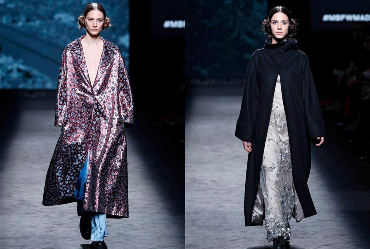
Jorge Redondo, creative director of Redondo Brand, gives a contemporary twist to party styles by reinterpreting the classics of elegance. The designer remembers his childhood when he admired the spectacular dresses that were exhibited on the red carpets and how one of his dreams would be to dress the celluloid stars. That glamour is behind a company that defines itself as “a very democratic guest brand” because it adapts the main trends on the catwalk to those of a real woman. In his new creation the eclecticism of americana becomes the central axis of the winter collection, an inspiration that merges with the essence of Redondo Brand to create natural volumes, asymmetric silhouettes and colour blends. Natural fibres such as silk, cotton or wool appear in different finishes and together with embroidered, glass or shiny pieces coexist between the more acidic and the most harmonizing tones. For the designer Jorge Redondo this sophisticated creation led to the L’Oréal Award for the best collection of the MBFWM at its 75th edition.
We have been following their path for a long time and have admired the creations of Quique Vidal (Valencia, 1996), alma mater of Becomely, a fashion brand with its own personality. If you follow us on Instagram, you will have seen in our feed, those baby doll silhouette dresses in pastel tones and large volumes that we usually share from the young 26-year-old creator. Despite the naive spirit, Quique Vidal’s project has nothing to do with lightness or immaturity. Quite the opposite…
Beginnings are not easy
Becomely was officially founded in 2015. Previously, the young designer had done some work for several teachers who requested dresses for their graduation. That spontaneous start dressing anonymous women encouraged him to move to Madrid to make a living as a designer. He participated twice in Samsung EGO, the catwalk for emerging talents at MBFW Madrid. In parallel, Quique Vidal sold t-shirts, socks and also his famous biodegradable plastic costume jewelery made with 3D printing to cover part of the costs of producing and designing the collections presented. In fact, the designer currently combines his artistic work at Becomely with his other project, Estudio Cartulina, a company specializing in communication, brand consulting and production. The moonlighting artist is a reality for many young people in the world of fashion.
Craft and production on demand
Becomely is a sustainable, artisanal brand that creates intricate limited edition pieces that are produced on demand. The pandemic disrupted Quique’s business model to evolve towards new, more direct channels for consumers. If before they sold through the website and in some selected stores that included countries like Asia, now the Spanish firm focuses sales on social networks, especially on Instagram. This change allows greater contact with the clientele: a more personalized service can be offered and the budget can also be adjusted.
The design has not changed. Becomely maintains the emblem of the baby doll dresses with a V-neckline, puffed sleeves and volumes also in the skirt. A model that is repeated from the first collections and in which Quique Vidal is adding variations: large buttons, shirt lapels, different lengths… The fabric he uses to create his designs is also a differentiating element. Opt for eye-catching items: enigmatic Jacquards, tactile reliefs, details such as feathers, shiny motifs, fabrics with extra volume… always in pastel shades such as pale pink, baby blue, lavender or off-white. In fact, it is no mystery that Quique Vidal manages to magnify some of our most special fabrics each season. Becomely also takes advantage of the small scraps left over from his shirts and dresses to create new pieces such as bags, satchels or hats. A formula that take sustainability to its ultimate consequences.
Becomely’s designs have already hit the stage through artists like Amaia . The singer appeared in her latest video clip, Yamaguchi, wearing a white dress that follows the recognizable aesthetics of the brand and is made as we pointed out, with deadstock fabric : leftovers from suppliers or workshops. The actress Emma Suárez also noticed Quique Vidal’s creations and ordered a dress for a premiere that she had at the beginning of the year.
The Bride Becomely
Recently, Quique Vidal has dared to design a wedding dress that maintains the aesthetic codes of the brand. It is a flattering model that combines a minimalist silhouette with romantic elements and precious details. The dress is long with a V-neckline and straps dominated by huge bows. A voluminous skirt in embossed Jacquard fabric has just structured the ideal bridal design for millennial or Zeta brides . In fact, it is such a versatile model that it can be worn for a wedding, a special occasion or to add fantasy to a daily look, always depending on the footwear that is combined. What is clear is that there are fewer and fewer limits and barriers between formal or informal styles. Let each one interpret it in their own way!
Mi�rcoles 23 febrero 2022
 Go back, start and use for the first time. These are the verbs that we wanted to put into motion after liquidating the last winter season and presenting the new collection for next spring at Première Vision Paris. In this limbo of past and future proposals, we can only talk about the present, in this case the spring-summer 2022 collection that we are eager to show in all its splendor through the catalogue, the online store and our physical space in Barcelona.
Roughly…
We start the season inspired by a quote from the Israeli historian and philosopher Yuyal Noah Harari : “This storm will pass, but the decisions we make now could change our lives in the years to come.” This phrase marks the course of the collection because, without neglecting the contributions of the past, our eyes are fixed on the future and on the path we have to follow to explore new territories without losing our identity.
“This storm will pass, but the decisions we make now could change our lives for years to come” – Yuyal Noah Harari
 In the context of uncertainty that we have had since the start of the pandemic, we have seen people cling to solid values such as security and trust. For this reason, the textile proposals that we present this season will focus on articles that reassure, calm, do not disappoint and, above all, are durable. We are not interested in the frugal or the unstable. This season, colour is the catalyst that will bring consumers back to the world of design and trust in it. For this reason, colour is essential to shape fabrics and plays a key role in defining new proposals. From neutral tones, to their brightest reverses, through blues and greens to bright pinks and oranges.
In general terms, we present to you a season that we would like to be tranquil, brimming with calm, joy and optimism, but always guided by the need to make products that take into account the environment and the surroundings in which we live. Here below, we give you more details.
The colour softens
This season, colours are oxygenated and lose saturation to establish harmonic mixes and emotional combinations that calm and reassure. Neutral tones stand out, incorporating sparkles, transparencies and small brushstrokes of colour in blue, pink, green and yellow. The soft and delicate tones provide a contemporary vision and are understood discreetly, without excesses or additions.
If we discussing precisely, we highlight the beige colour of kraft paper, the white that helps us to work shapes and volumes, and the black that we will use to add sophistication and create total looks with designs of great graphic impact. As happier tones, within this palette of fresh but less saturated colours we highlight millennial pink, blue in its most multifaceted, versatile and adaptable version, and green that brings us closer to nature and continues to play a leading role in fabrics from the season. As a counterpoint, we highlight the optimism of lime yellow, attenuated orange and coral that are perfect for refreshing and adding light to items. These tones are mixed with an antagonistic hue: turquoise in a refreshing and unique combination.
Lastly, the colour will also be worked on in different ways: in plain, two-tone or multi-colour versions for a liberating and stimulating effect.
Huggable fabrics and commitment to sustainability
This season we highlight natural fibres that are involved in resource management and also recycled and regenerated synthetics. Specifically, we will work with BCI cottons, FSC viscose, tussah silk, undyed natural linens and recycled polyesters, some of them obtained from used plastic bottles.
In the spring-summer 2022 collection we want to enjoy simplicity for a more comfortable, minimalist and beautiful type of fashion. To do this, we will use gazar, voile and organza in neutral tones, gently differentiated between them, which will define the lightness of the fabrics. We want to produce that fresh and affectionate component, like a tender hug. We will also work with fil coupé techniques that connect us with a modern romanticism and weave structures with soft contrasts for simple beauty.
“We want to enjoy simplicity for a more comfortable, minimalist and beautiful type of fashion”
 Within the collection we highlight clean-looking matte poplin and satin, classic weaves, embossed reliefs inspired by cardboard packaging, Jacquards with geometric structures in rhythmic repetition, summer tweeds with thick yarns and piqués for structured weaves. This season the rustic aspect is also plays a leading role and through the fabrics we want to achieve a tactile rusticity through fancy yarns.
Within the collection we highlight clean-looking matte poplin and satin, classic weaves, embossed reliefs inspired by cardboard packaging, Jacquards with geometric structures in rhythmic repetition, summer tweeds with thick yarns and piqués for structured weaves. This season the rustic aspect is also plays a leading role and through the fabrics we want to achieve a tactile rusticity through fancy yarns.
The season is also characterized by proposals with an irregular appearance through inspiring wrinkled fabrics and natural finishes, with other lighter ones such as precious organza that covers the body creating volumes without excesses, voiles that are worked in layers, gazar that provide the appropriate transparencies and sensual cotton satins that can be either plain or printed.
Refined designs that still bear the floral gardens
In general terms, the fabrics will be expressed without decorative excesses through serene geometries and visible contrasts, but without visual noise. It is not a season of excesses or shrillness, quite the opposite. We are inspired by the ethnic and folk style from a stylized and refined point of view. In terms of prints, there are fabrics that welcome abstract strokes with brushstroke details. Also the stripes with a manual stroke and the checks persist, but in their freer version.
In spring, flowers cannot be missing, and this season will not be an exception either. A walk through the country gardens brings us renewed inspirations for a new creative spin on these prints that use flowers and leaves, chosen for their particular shapes, inspiring textures and surprising colours.
Finally, it should be noted that we continue with our commitment to sustainability, which began in previous seasons and is here to stay. Our collection uses regenerated and recycled yarns with European certificates and this helps to reduce the environmental footprint of textile production: BCI cotton, regenerated cotton, tussah silk, linen, FSC viscose, New Life and recycled polyester, are some of the yarns present in this new spring-summer 2022 collection that we have just launched. Brand new, this verb that we like so much…
We invite you to discover the entire collection in our shop online!