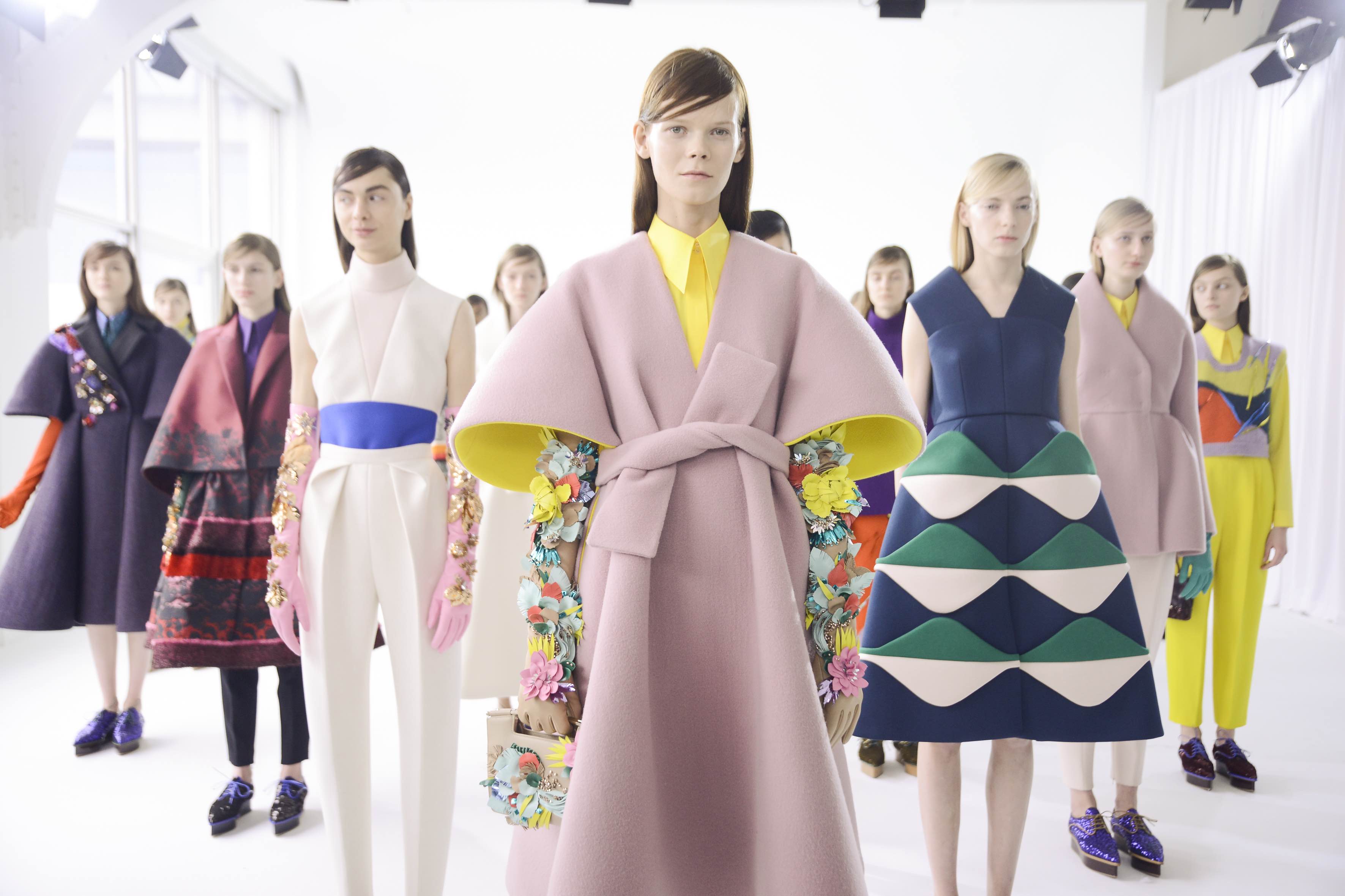
This anomalous 2020 has also upset the calendar of the interesting informative talks by the Color Community. association. A private initiative, which we have followed closely since its creation, led by a group of three professionals who love colour: the architect Pere Ortega; the designer specialized in Colour & Trim, Eva Muñoz; and Rosa Pujol, Textile & Colour Stylist and creative director of Gratacós.
This year, the biannual and face-to-face meetings at the Old Damm Factory in Barcelona have been converted into digital format, thus via screen respecting the security measures imposed by the current health situation. Despite the difficulties, Colour Community was able to present the new colour chart that will serve as a guide for the Spring-Summer season 2022 in an orientation report that serves as a source of inspiration for creative professionals who are dedicated to fashion, design, advertising or architecture, among other areas.Â
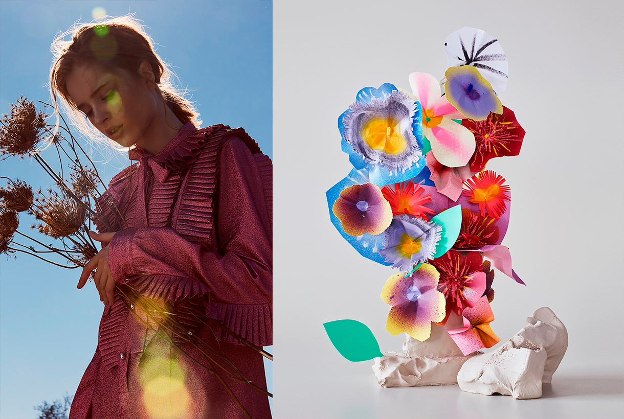
Within a current social and economic context marked by instability and uncertainty, the new broad and global creative proposal Wait⊠SS22. A concept that articulates the entire chromatic range and which symbolizes the preamble to an infinity of optimistic possibilities, guided by the real need to make better decisions as a society and also in relation to the environment. This “waiting” is essential, according to the association, “to appreciate and value life with humility and simplicity, and its functional daily life to structure the whole future.” For this reason, it will be necessary to design from practicality, but without forgetting beauty or creativity.
âThe new creation symbolizes the preamble to celebration,
play and optimismâ
âWaitâŠâ also symbolizes the beginning of celebration, play and optimism, opening seamlessly to coexistence with digital reality. As for colour, it materializes like never before, conveying human emotions and being the conductive support of these senses.
In turn, the ‘Wait⊒ colour scheme is structured through four ranges of colours, textures and materials named Wait⊠& Listen, Wait⊠& Wish, Wait⊠& Enjoy and Wait⊠& Grow Up. Colour Community sums it up with a claim to a final message of hope: âWait⊠& tomorrowâ. Wait and there will be a tomorrow.
Below, we summarize each creative proposal:
Wait⊠&Listen
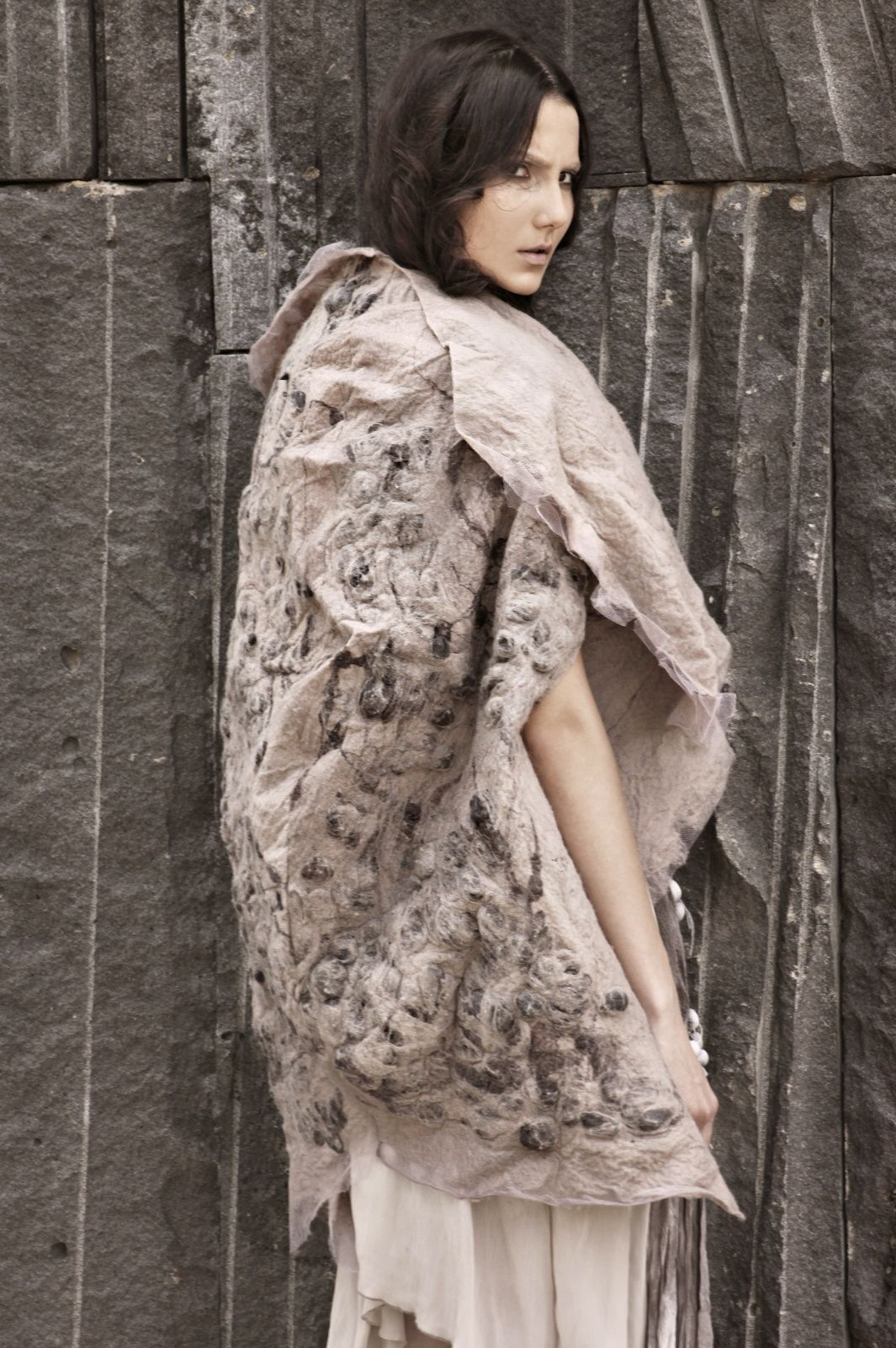
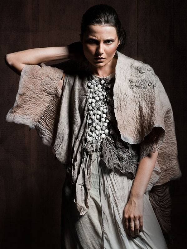
This first range is inspired by attentive waiting: ” one that is willing to receive information and learn from it “. A proposal that is based on learning from the proximity of natural society and human knowledge. Wait⊠&Listen is built from neutrality and naturalness, presenting colour with renewed subtlety. That means that we speak of natural realism, of materials and finishes that connect with a well-manipulated origin, worked from harmony and sustainability. As for the colour palette, relaxing neutral tones abound, such as natural white, basic ecru and calcareous grey, among other soft colours that structure and soothe. The designs mark a return to the simplicity with linear shapes and geometric  basics such as the circle. Rough textures, natural and imperfect finishes, wrinkles and rustic aesthetics return. This trend is also seen in fabrics that are expressed without decorative excesses. Clean-looking matt cotton, linen, hemp, poplin and satin threads abound. Finally, natural fibres coexist with recycled and regenerated synthetics.
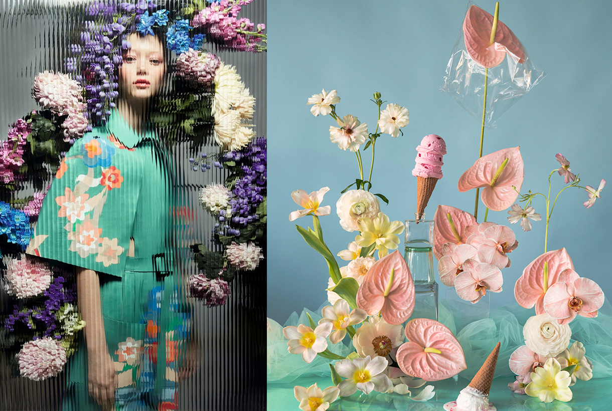
Wait⊠&Wish
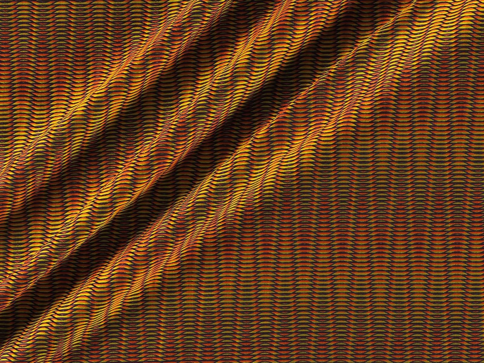
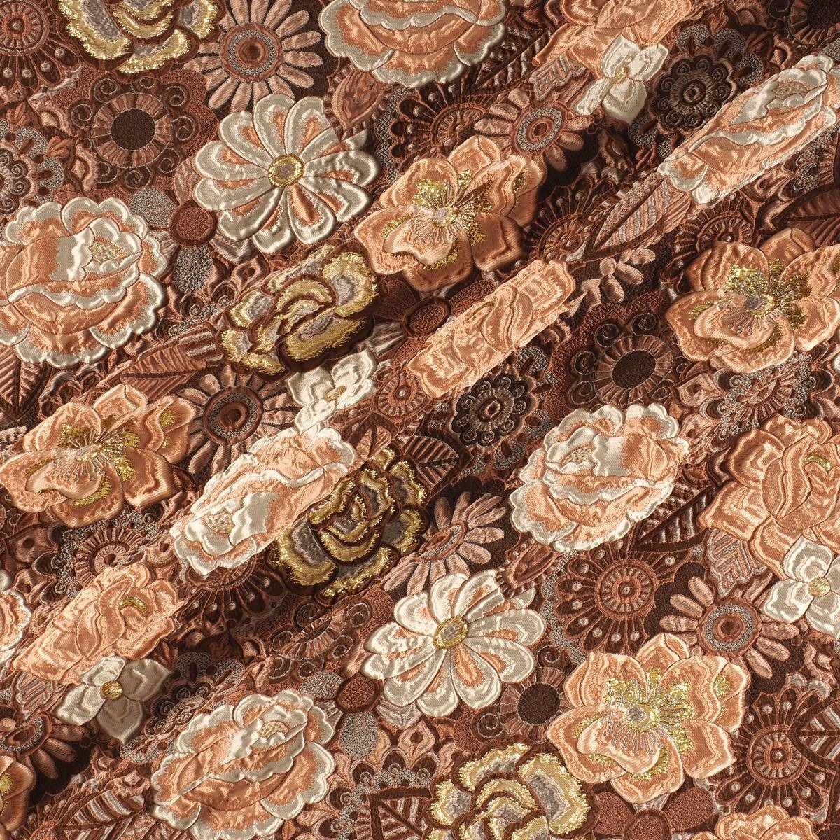
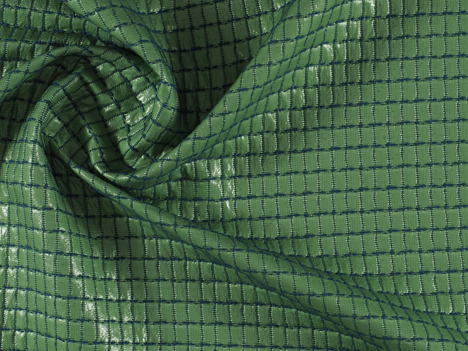
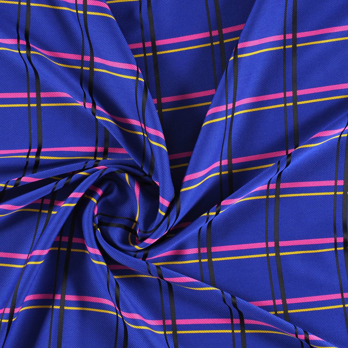
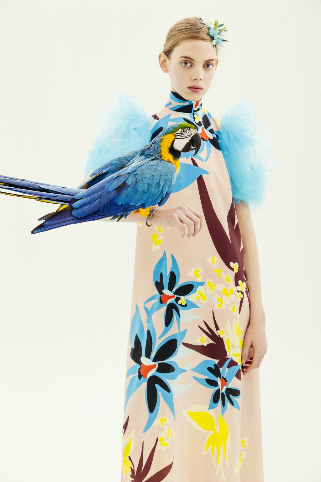
The second range appeals to desire, this concept that cannot be materialized and that activates the most creative part of the human being. According to Colour Community: “desire is not satisfied with the tangible and looks for something else as far as possible”. Under this premise, Wait⊠& Wish seeks to rediscover the secrets of craftsmanship, revaluing all its specific features. In turn this range also focuses on the plant world, but this time it focuses its attention on that nature that we know, but that we rarely touch or experience consciously. The colour is inspired by the apparent chaos of natural beauty, its uniqueness and exuberance with rich, bright and contrasting chromaticism: vegetal green, bright blues, gold foils or crimson brushstrokes. The designs seek to seduce by their elemental, organic and abstract geometries, hand-drawn striped prints, paintings in their freest version and colour combinations that reflect the chromatic chaos of nature. As regards materials there are many works with artisan natural dyes, semi-gloss yarns, die-cuts and laser cuts, utilitarian clothing and satin looks. Finally, in fabrics we are committed to sustainability and comfortable and practical fabrics that do not abandon design. In the fantasy section, Jacquards abound with geometric structures, mesh fabrics, nets and refined weavings such as reliefs and embossing.
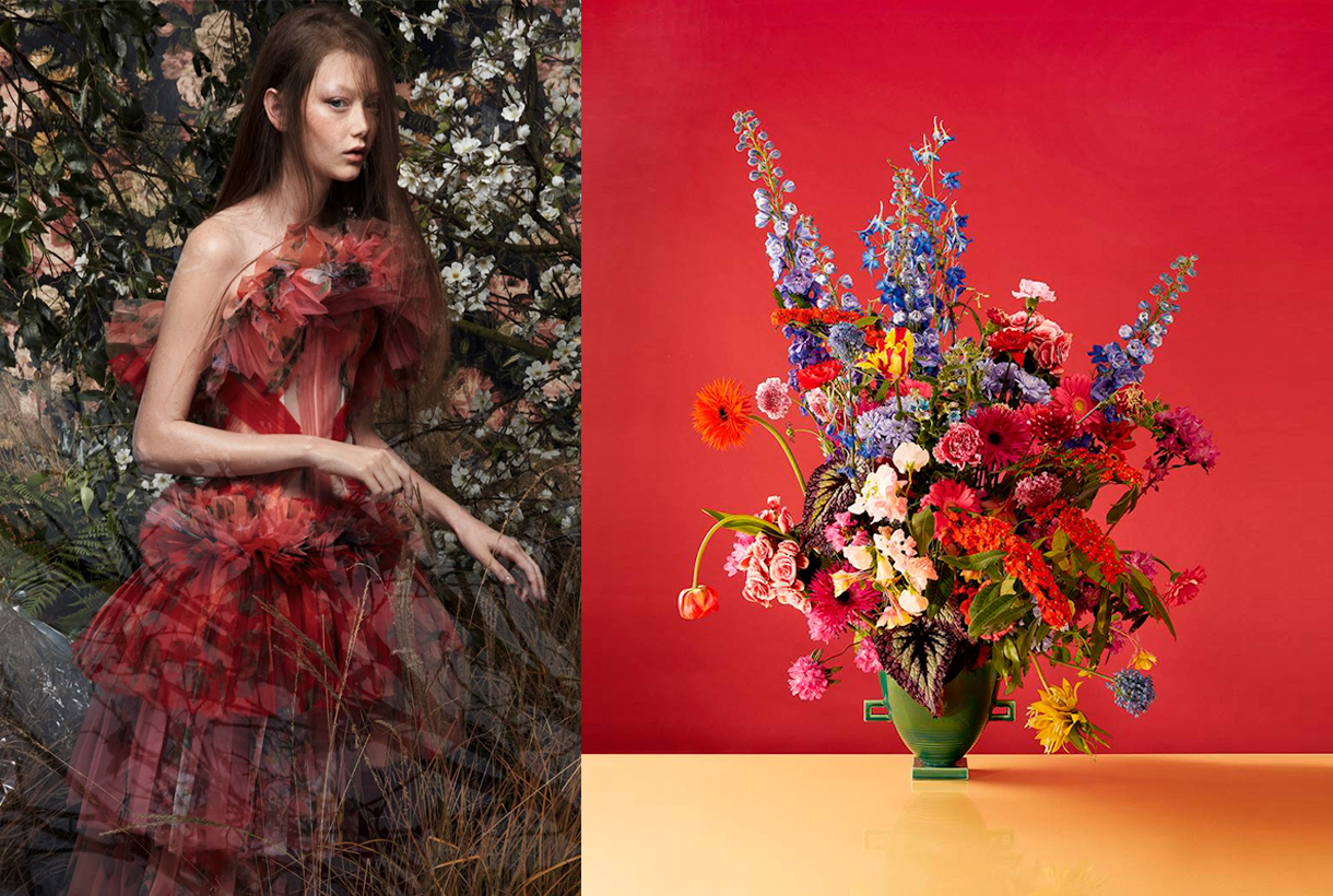
Wait⊠&Enjoy
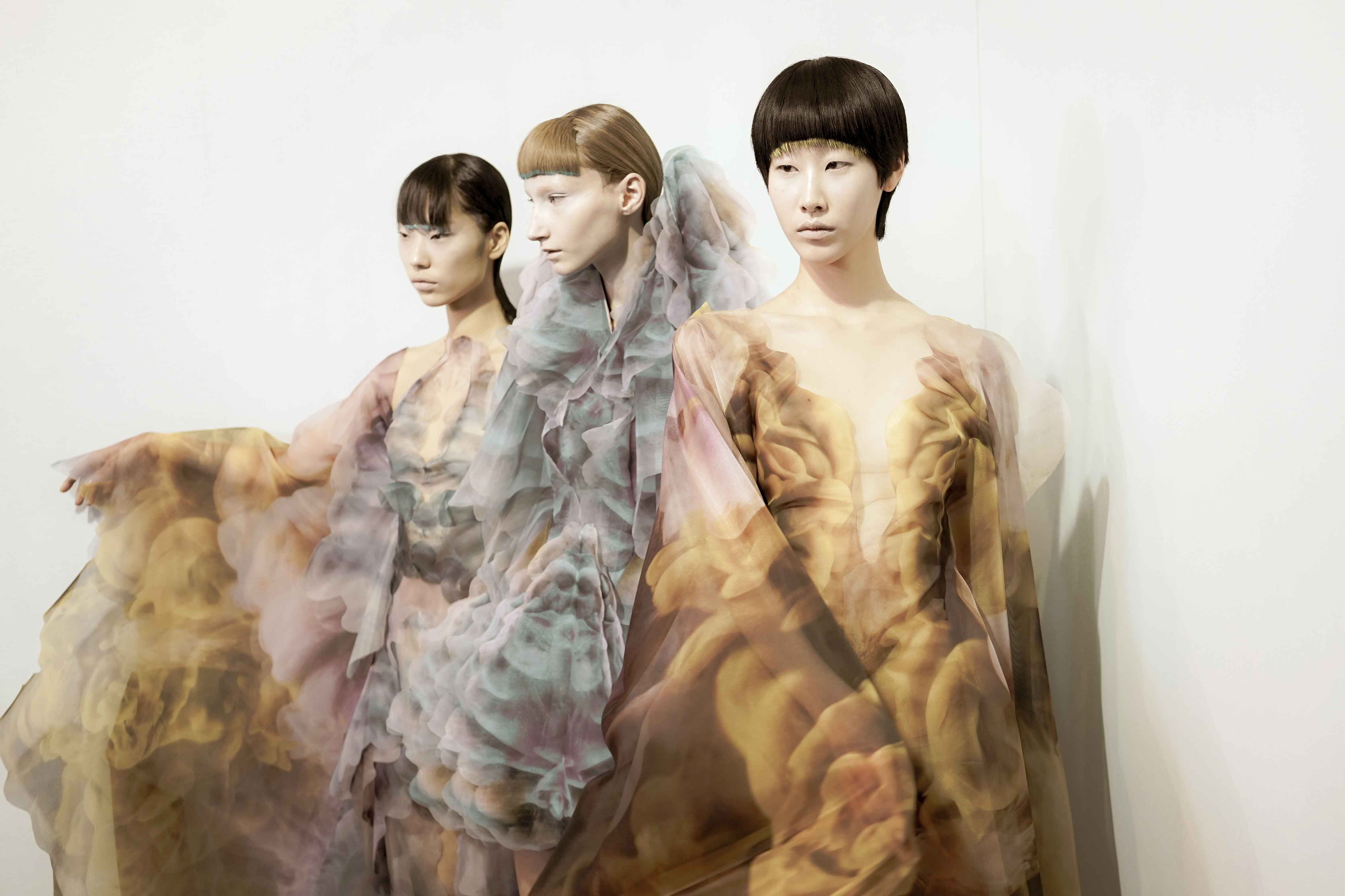
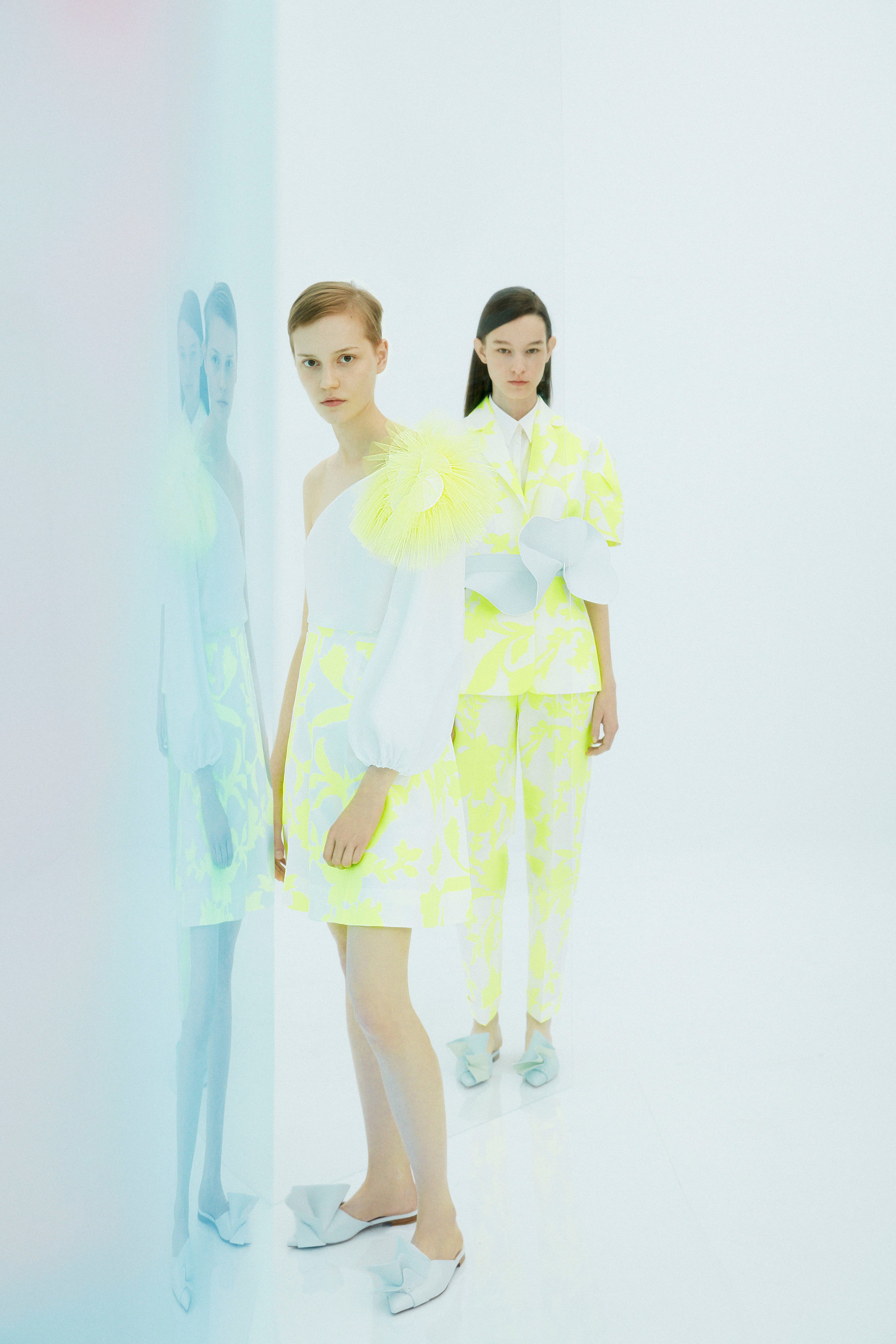
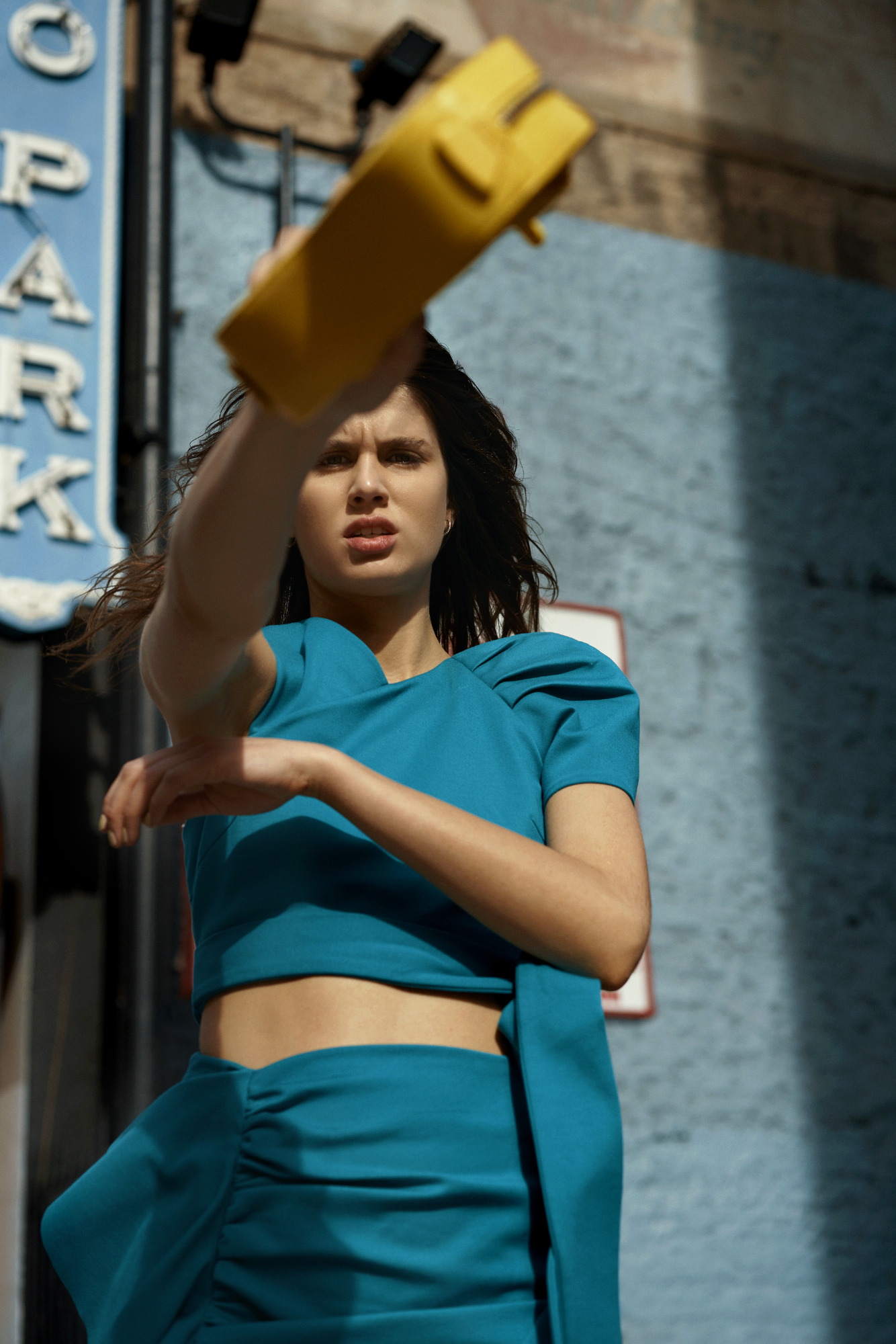
The third inspiration is the opposite on a conceptual level to the first two: it wants to project the future in an optimistic and creative way, exploring concepts such as freedom, evasion and extroversion. A creative enjoyment that will become limitless, but consistent and thoughtful with the common good. In this range, Colour Community features a creation enriched and loaded with subjective personality, but always coherent and respectful with the environment. The colour palette is based on fresh, cheerful, playful and sensual tones full of positivity and ready to be combined with neutrals. Vital tones such as geranium,  fresh mint, chlorophyll, pink and vitaminised lime which combine with neutrals like white and sand-coloured. The designs are seduced by the power of the flowers and the magnetism of the most exuberant vegetation. Leaves, petals, gardens, green spaces … plant nature also takes centre-stage in summer fabrics. In addition to the flower motifs there are beautiful yarns for new colour sensations, shiny fibres, fluid fabrics that create transparency, textured organza with iridescent yarns, Jacquards with reliefs and piquĂ©. In general, the fabrics express that intention to celebrate and dance again through movement.
Wait⊠&Grow Up
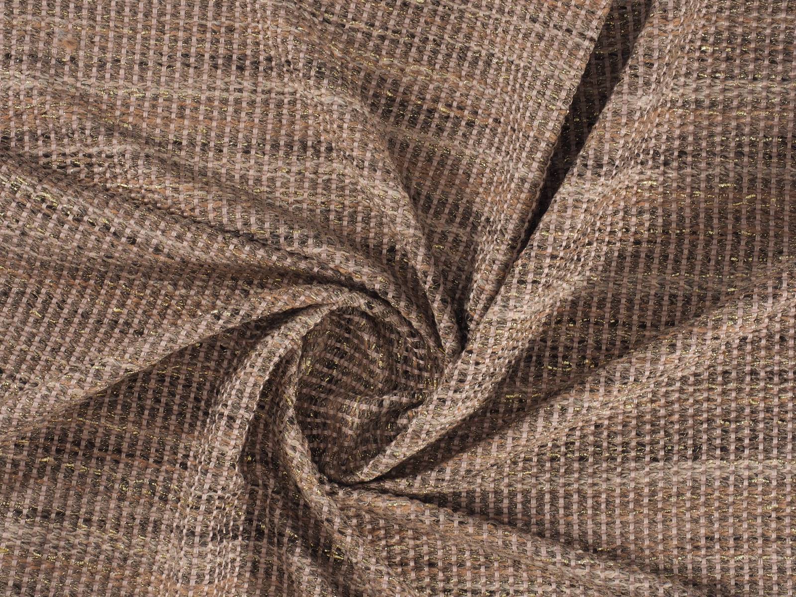
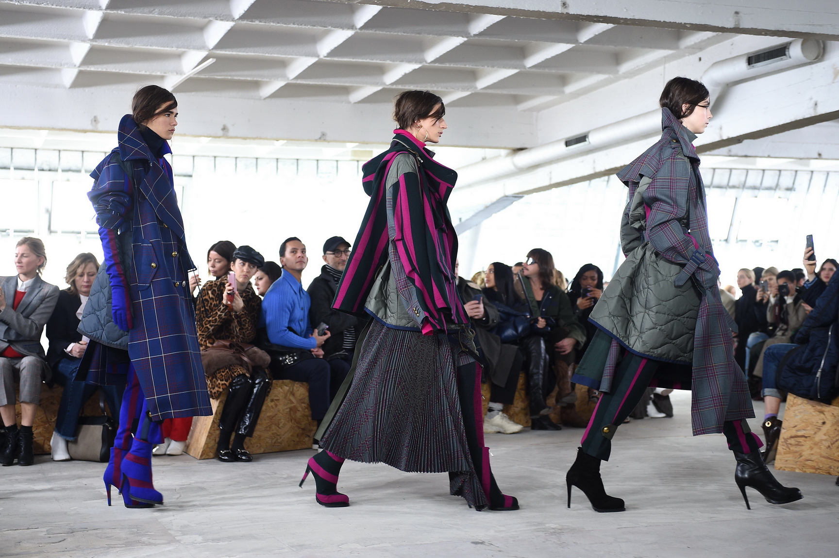
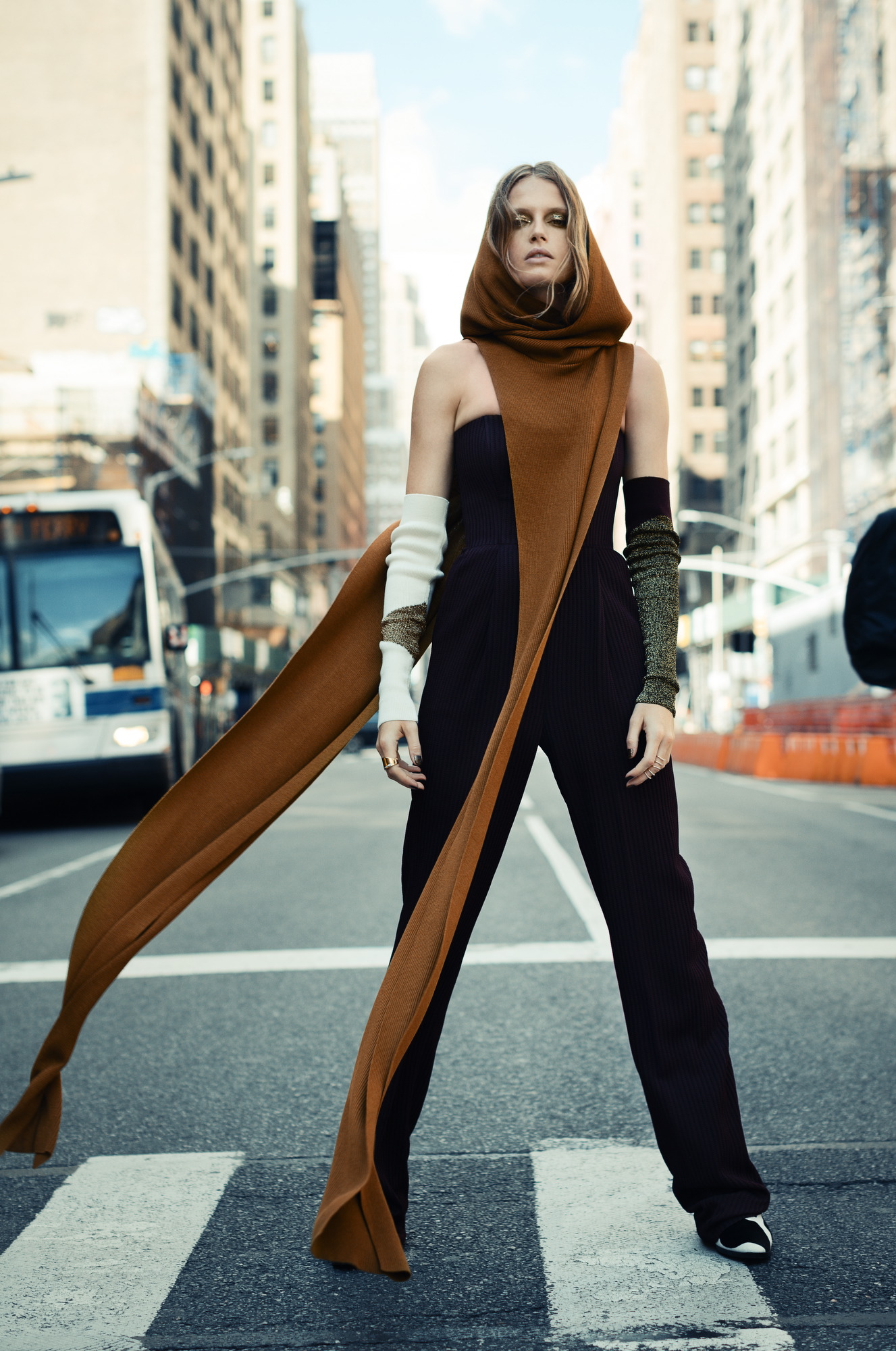
Finally, Wait⊠& Grow Up represents an evolution of the previous range. It is based on the imperfection of growth, the acceptance of the passage of time and integration of the past in order to understand the future. This range is “a reunion with the most chromatic geometry with a high expressionist content”. Products designed from a future perspective, with this range of colours, will be approached with a stimulating and light-filled mentality in which multicoloured harmonies generating multitone patterns will play a prominent role. The colour palette is thus multifaceted, symbolic, versatile and adaptable to all sectors: mauve, yellow, intoxicating pink, coral, orange, green, grey, blue and sophisticated brown. In designs a mixture of antagonistic, strange motifs and visual surprises is prioritized. With regard to fabrics this last range follows the line of the previous three and has a clear intention: to better production via recovered or recycled yarns, reducing the chemical impact and water consumption, in order to face a future with hope. Finally, the proposal is based on tactile fabrics that provide an extroverted, colourful and highly visible look.
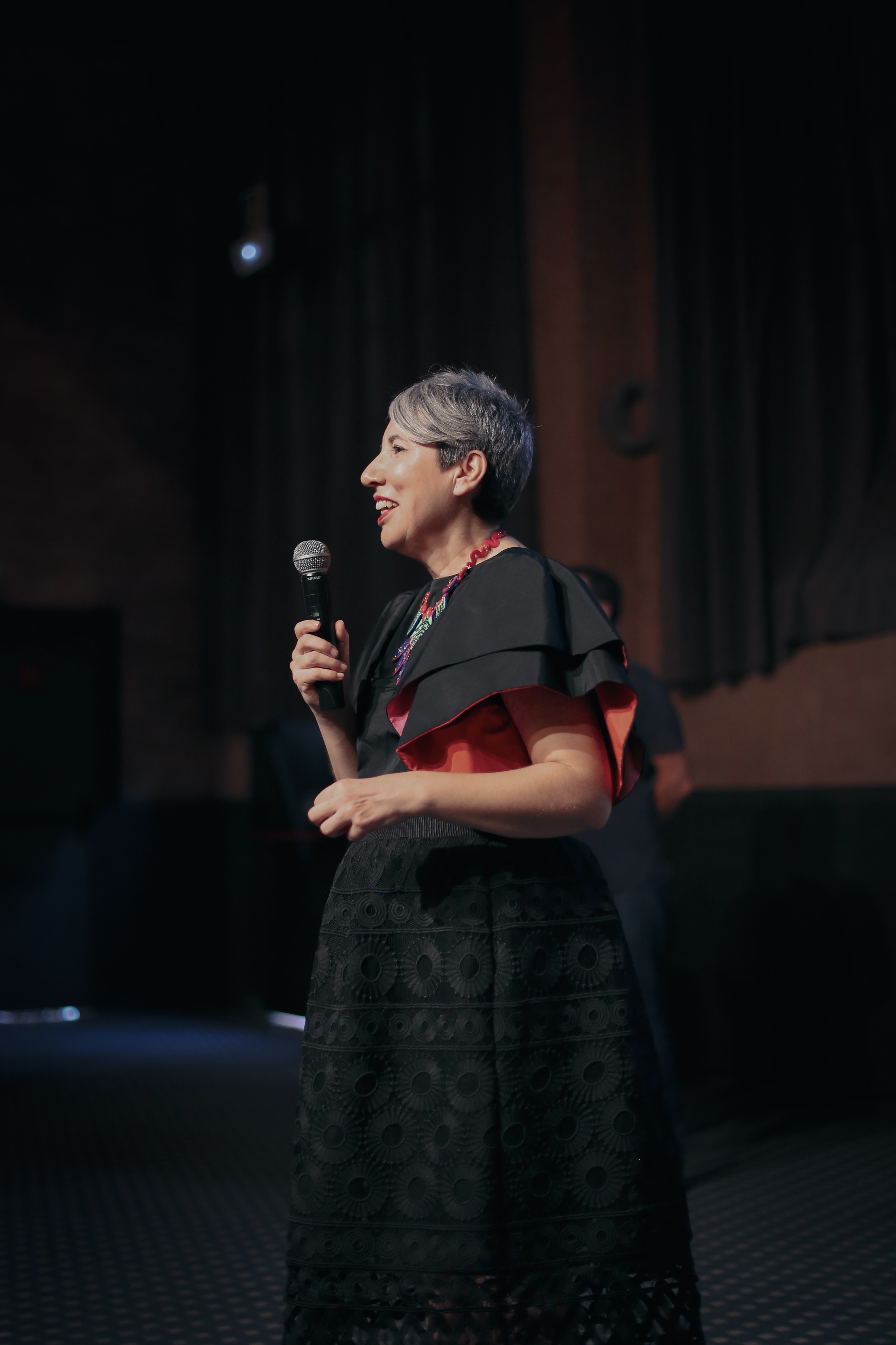
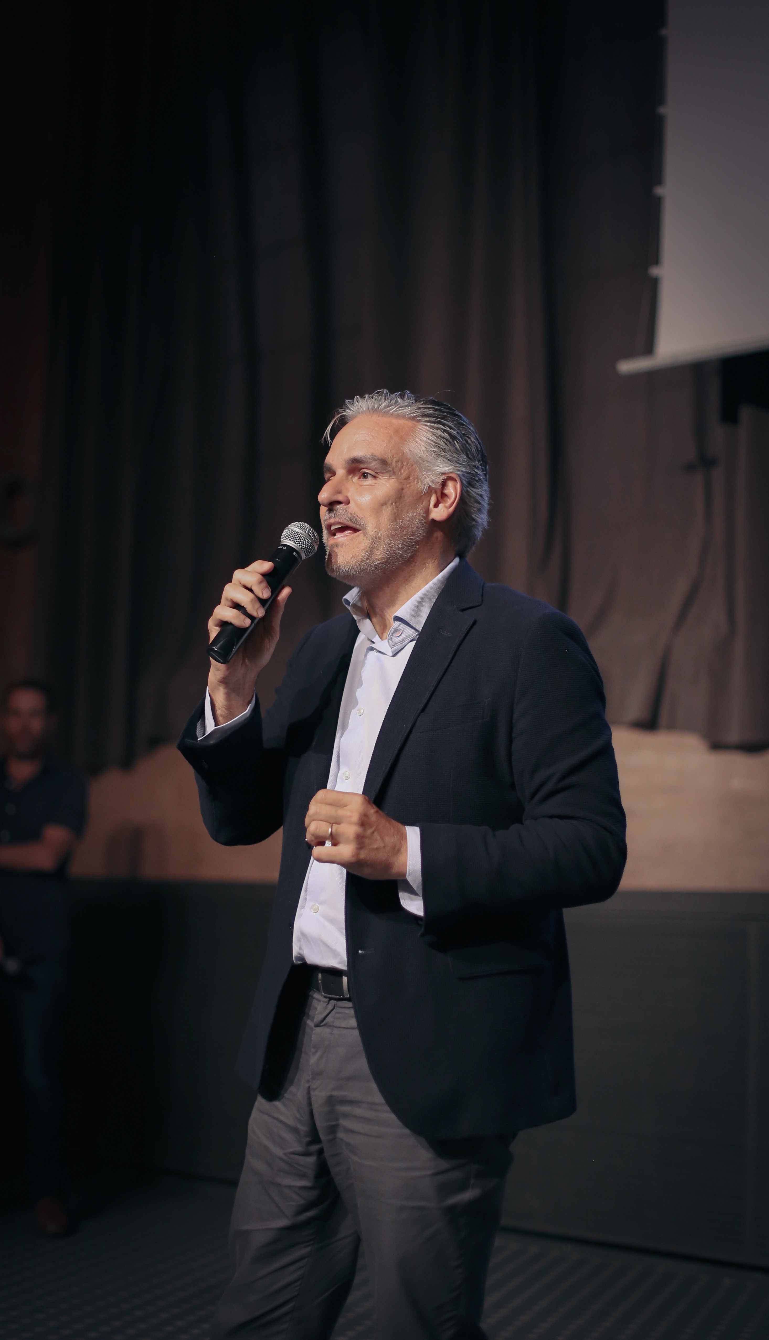
La âcomunidad del colorâ crece ediciĂłn tras ediciĂłn generando una gran expectativa entre los profesionales del diseño que se marcan en el calendario, las citas que marca dos veces al año The Color Community. Como ya sabĂ©is, se trata de una iniciativa dirigida por un grupo de profesionales que, desde diferentes disciplinas creativas, comparten un estudio global del color y la materia. Aunque en cada informe que se presenta participan varios colaboradores, el nĂșcleo base lo forman tres profesionales: el arquitecto Pere Ortega; la diseñadora especializada en Colour & Trim, Eva Muñoz; y Rosa Pujol, Textil & Colour Stylist de GratacĂłs.
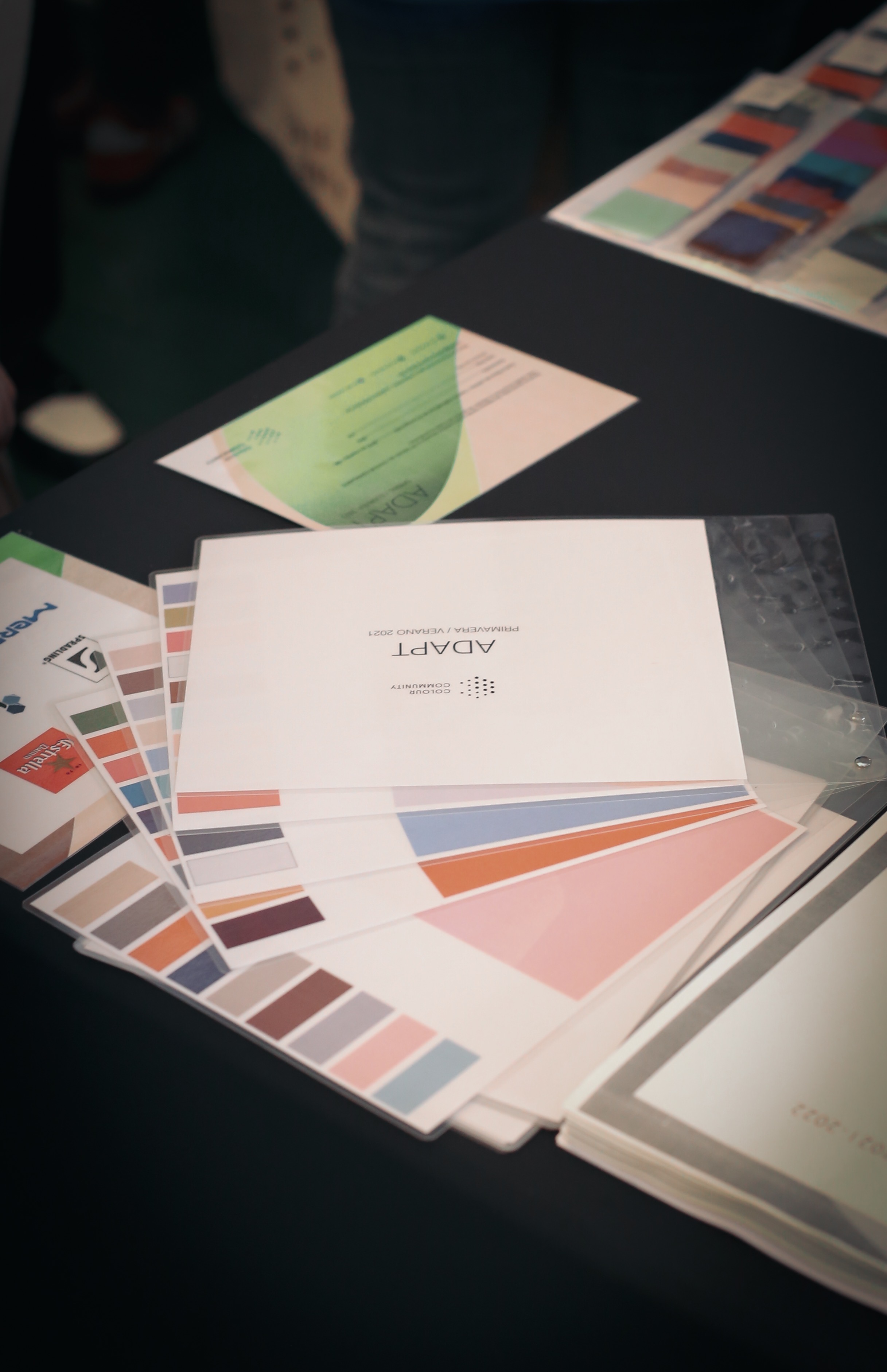
Como es habitual, The Color Community se celebra en la Antigua Fåbrica Damm de Barcelona, un poderoso colaborador que cede las instalaciones y dispone de refrigerios para llevar a cabo la presentación del informe y un posterior afterwork. En esta decimotercera edición, se presentó la carta de colores que marcarån la temporada Primavera-Verano 2021. Es un informe orientativo que como cada año sirve de inspiración para los profesionales del sector.
Juan GratacĂłs: âEl tejido sin color serĂa aburridoâ
En nuestro caso, esta cita es siempre imperdible. No solo por la participaciĂłn de Rosa Pujol, encargada del departamento de diseño de la empresa, sino porque GratacĂłs se desvive por las gamas cromĂĄticas. âNos encanta el color y el tejido sin color serĂa aburridoâ, comentĂł Juan GratacĂłs minutos antes de la presentaciĂłn del nuevo informe.
Esta ediciĂłn se inspira en el concepto de la adaptaciĂłn con matices positivos. âLe sacamos la carga humilde o negativa a la palabra porque adaptarse no quiere decir conformarse, todo lo contrarioâ, detallĂł el arquitecto Pere Ortega en la presentaciĂłn. AsĂ, âAdaptâ se basa en la idea de ajustarse a un contexto determinado, utilizando un tipo de creatividad racional que permita buscar soluciones concisas y vĂĄlidas. âNos referimos a la creatividad inteligente que es fruto de una estrategia pensada y reflexionada que encaje con la situaciĂłn actual. No tiene nada que ver con la genialidad del momento o un brillo puntualâ, explicĂł. La adaptaciĂłn como sĂmbolo de la inteligencia, de la estrategia racional y la sabidurĂa popular.
Pere Ortega: âEntendemos la adaptaciĂłn como un tipo de creatividad inteligente que es fruto de una estrategia pensadaâ.
La propuesta cromĂĄtica âAdaptâ se estructura a travĂ©s de cuatro gamas de color, texturas y materias bautizadas como, Afterwork, Baltic Sight, Natif y Modern. A continuaciĂłn, os explicamos un breve resumen con sus inspiraciones.
-
AFTERWORK
La primera inspiraciĂłn se centra en el momento de ocio despuĂ©s de trabajar. Un espacio para el descanso, la diversiĂłn y el hedonismo, siempre compartido. Afterwork es una propuesta versĂĄtil, que se adapta en estos contextos festivos a travĂ©s de tonos pastel como el rosa candy o el azul bebĂ© que contrastan con algunos flĂșores que le dan ese punto de luz necesario en cualquier fiesta: se tiñen de verde lima, amarillo y fucsia. En esta inspiraciĂłn se introduce el concepto del tono transparente a travĂ©s de superficies vĂtreas y texturas y estampados que imitan el reflejo del agua.
-
BALTIC SIGHT
La segunda gama es mĂĄs introspectiva y toma como fuente de inspiraciĂłn el mar BĂĄltico que baña los paĂses del norte de Europa. Es una propuesta frĂa y racional que apela al confort y a la intimidad en esa bĂșsqueda de los refugios interiores. La gama de azules se inspira en las aguas profundas en tonos frĂos y grisĂĄceos, verdes apagados y los tonos neutros como el blanco, el negro y el beige. Como nota de color juega con algunos tonos rojizos. La propuesta tambiĂ©n hace un guiño a los patrones estructurados, las siluetas arquitectĂłnicas, los estampados lineales y los accesorios verticales. Se trabaja el concepto de silencio.
-
NATIF
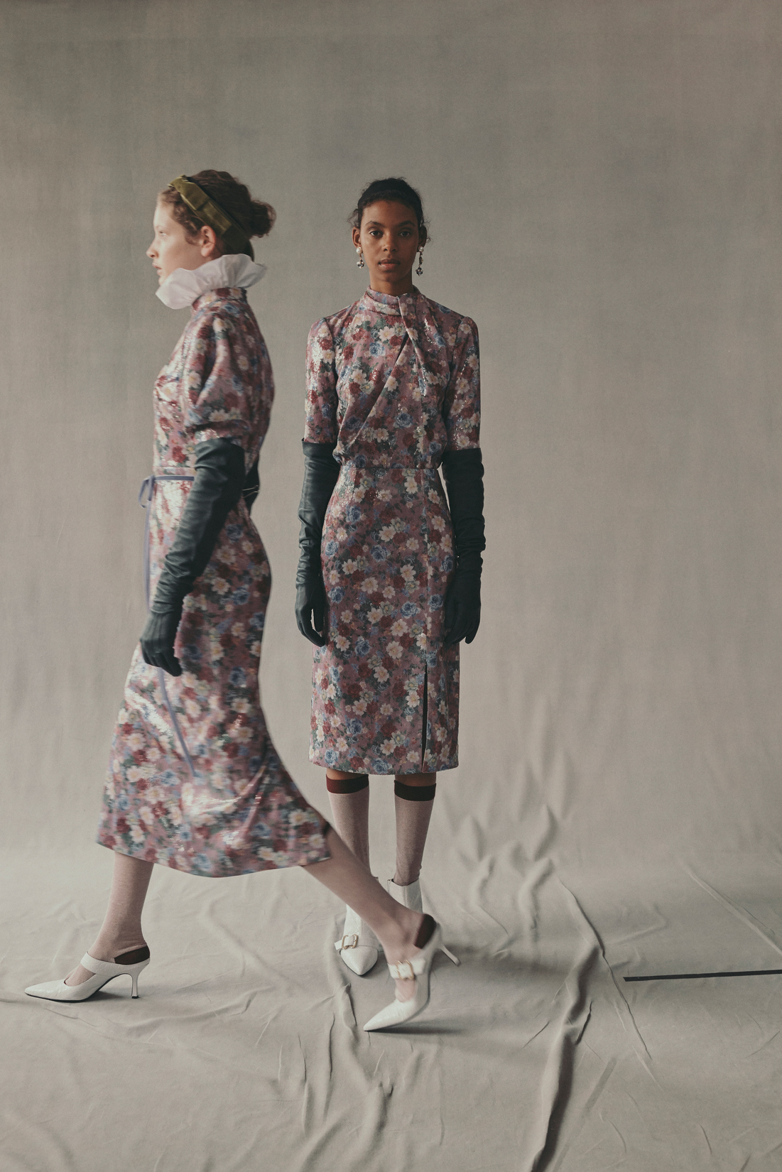
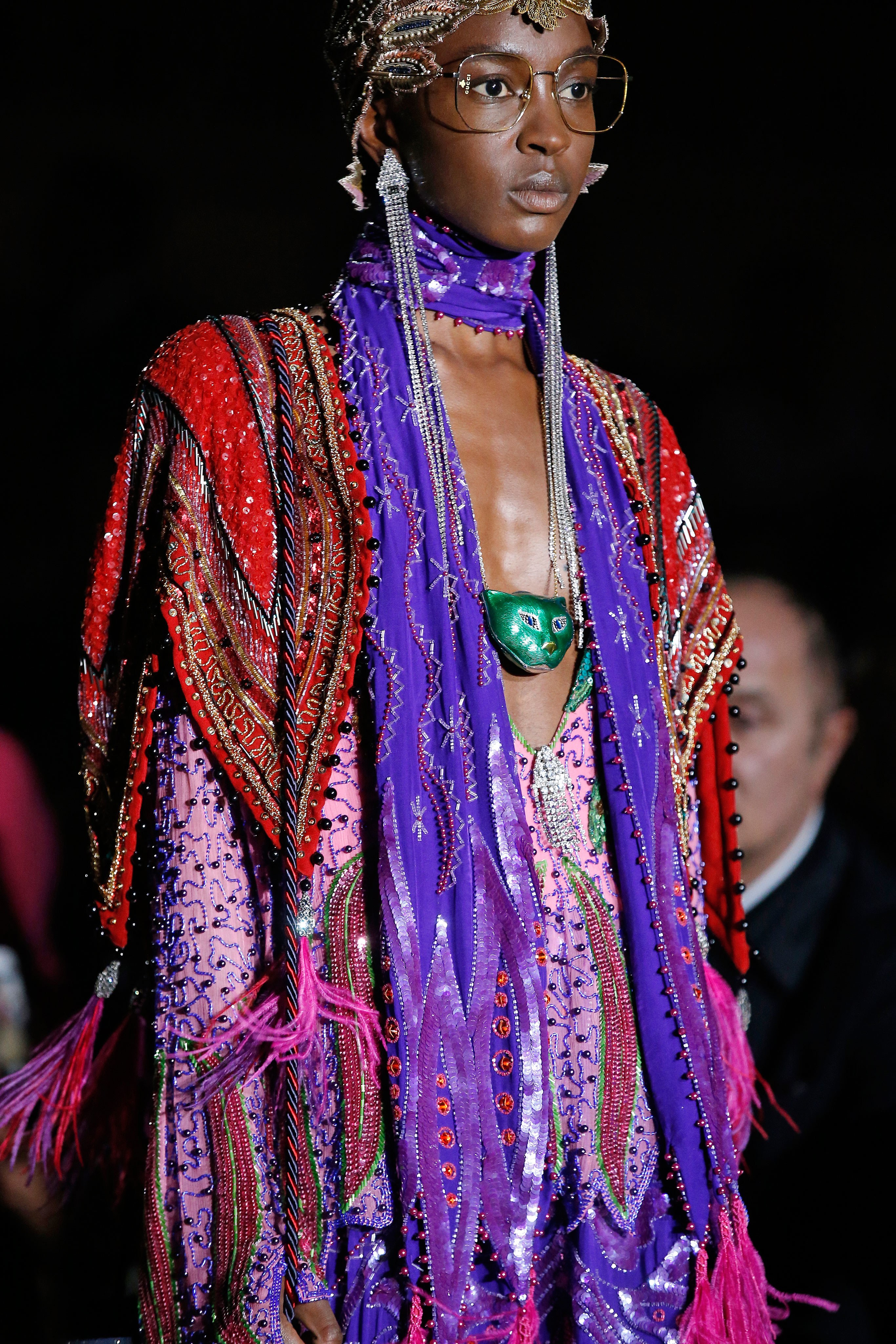
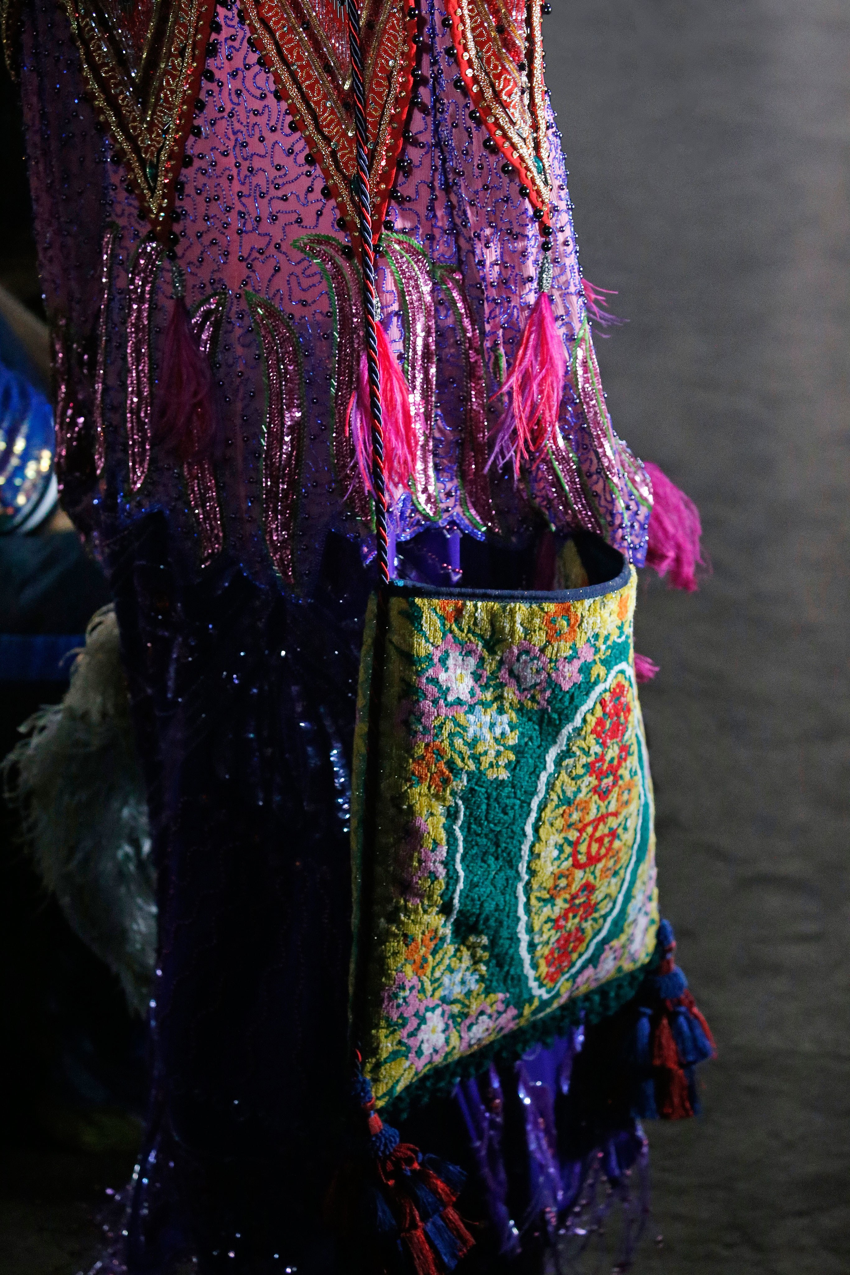
La tercera inspiraciĂłn es un homenaje a la autenticidad, a la tierra y a la naturaleza. Representa un giro hacia la artesanĂa y tambiĂ©n quiere transmitir la multiculturalidad con diseños sin denominaciĂłn de origen. Todo forma parte del todo. La paleta de colores de Natif es vibrante con tonos poderosos que van desde los naranjas saturados, los morados, los azules mĂĄgicos y los rojos tierra. Las tonalidades verde se vinculan con las hojas y los bosques. La singularidad cultural se consigue a travĂ©s de los estampados florales y los que imitan el trazo manual, los motivos geomĂ©tricos y los acabados rĂșsticos.
-
MODERN
Por Ășltimo, la cuarta inspiraciĂłn representa un pasaje por las otras gamas. La ciudad y su vida interior es el motor de la creatividad y la gama de colores expresa como los individuos se adaptan a la ciudad, a la vez que se mimetizan en sus edificios, asfalto, huertos urbanos, zonas verdes⊠Forman parte de la urbe las 24 horas. Para expresarlo se utiliza una paleta cromĂĄtica muy sensitiva con colores que aportan vitalidad. Los falsos crudos, los verdes apagados, el azul petrĂłleo, el rosa pĂĄlido, el denim, el naranja excĂ©ntricoâŠconviven con siluetas minimalistas, materias tableadas y estampados lineales.

The Colour Community has just presented the new report of colours and materials that will influence the Autumn-Winter season 2020-2021 in the world of design and fashion. The initiative, led by three colour professionals , was presented, as usual, in the Old Estrella Damm Factory in Barcelona  before the watchful eye of a hundred enthusiasts from the sector. We remind you that the founding team is made up of the architect Pere Ortega , the designer specialized in Colour & Trim , Eva Muñoz ; and Rosa Pujol , Textile & Colour Stylist from GratacĂłs . In each issue new partners are added to this âmother teamâwho bring their vision and help shape the new range of colours and materials that will inspire the new season. It is an initiative that is repeated twice a year and that has our support. ” GratacĂłs always has the doors open to our fashion- area, for every lover of fabric, texture and colour,” declares Juan GratacĂłs at the beginning of the presentation of the report .
Juan GratacĂłs : ” Our fashion-area is always open to lovers of fabric, textures and colour”
On this occasion the season is based on the concept of ‘ Multiple ‘ and consists of a reflection in a positive key about the future society where the line between the real and the virtual will be more diffuse than ever . ” Currently  this virtual reality exists on social networks or in videogames  but little by little it will become as tangible as what we now call reality,” explains Pere Ortega in presenting the report. The ‘ Multiple ‘ proposal , in turn, is articulated through four colour ranges and materials which are named On , Inside , Balanced and Metronome .
Pere Ortega:Â “Currently this virtual reality exists on social networks or in videogames but little by little, it will become as tangible as what we now call reality”
1.- On
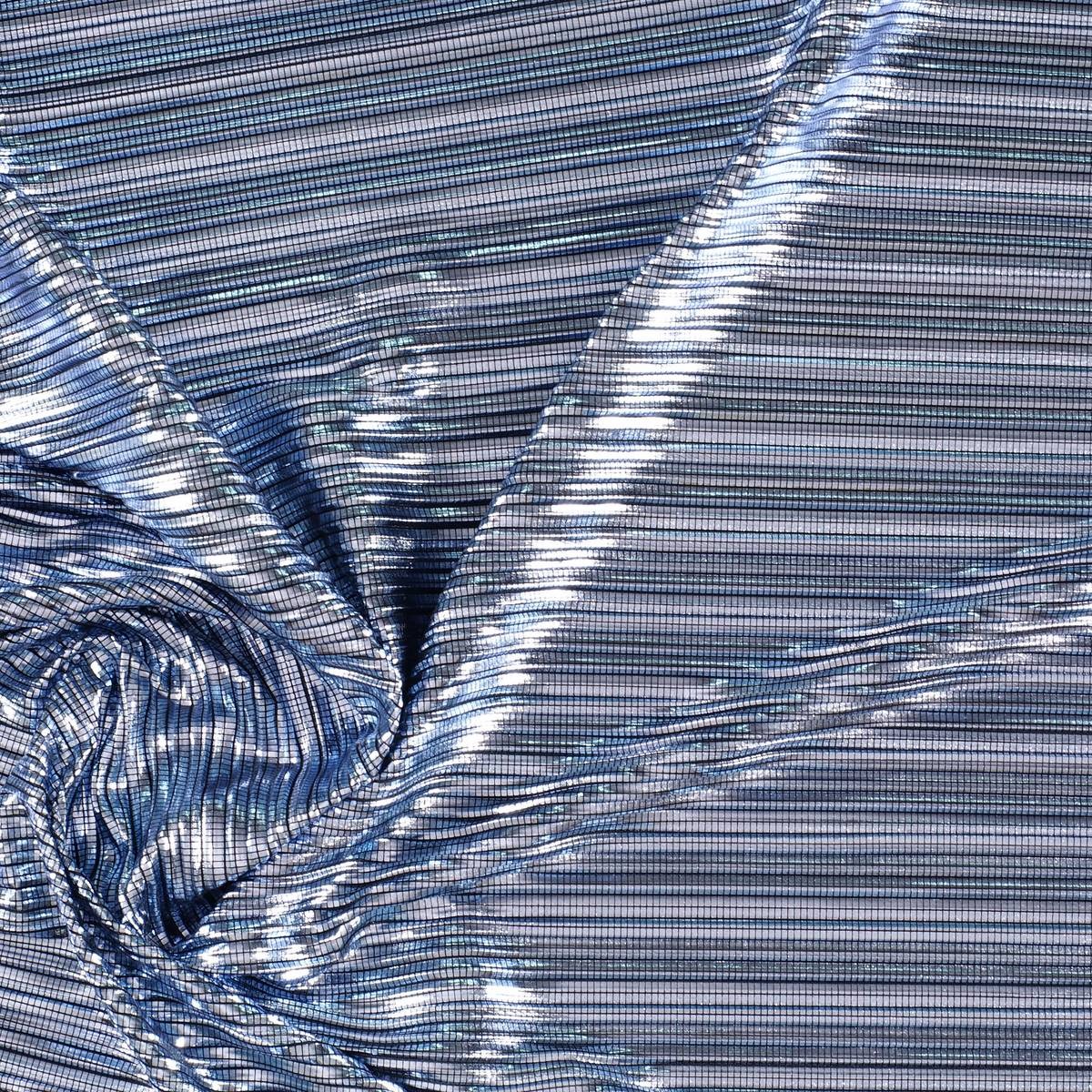
The first inspiration appeals to dynamism, to the creation of a dialogue with new realities that are virtual. It is a dynamic and versatile range that creates products connected to the human being in a digital environment. The shades chosen to conceptualize it are the cold ones in their most attractive version: metallic greys, iridescents, smoky blues, bright blacks and touches of yellow that play in contrast. The range of industrial and futuristic themes plays with plastic, oily materials, straight and curved architectural lines and artificial shapes. Fantasy under control.
2. Inside
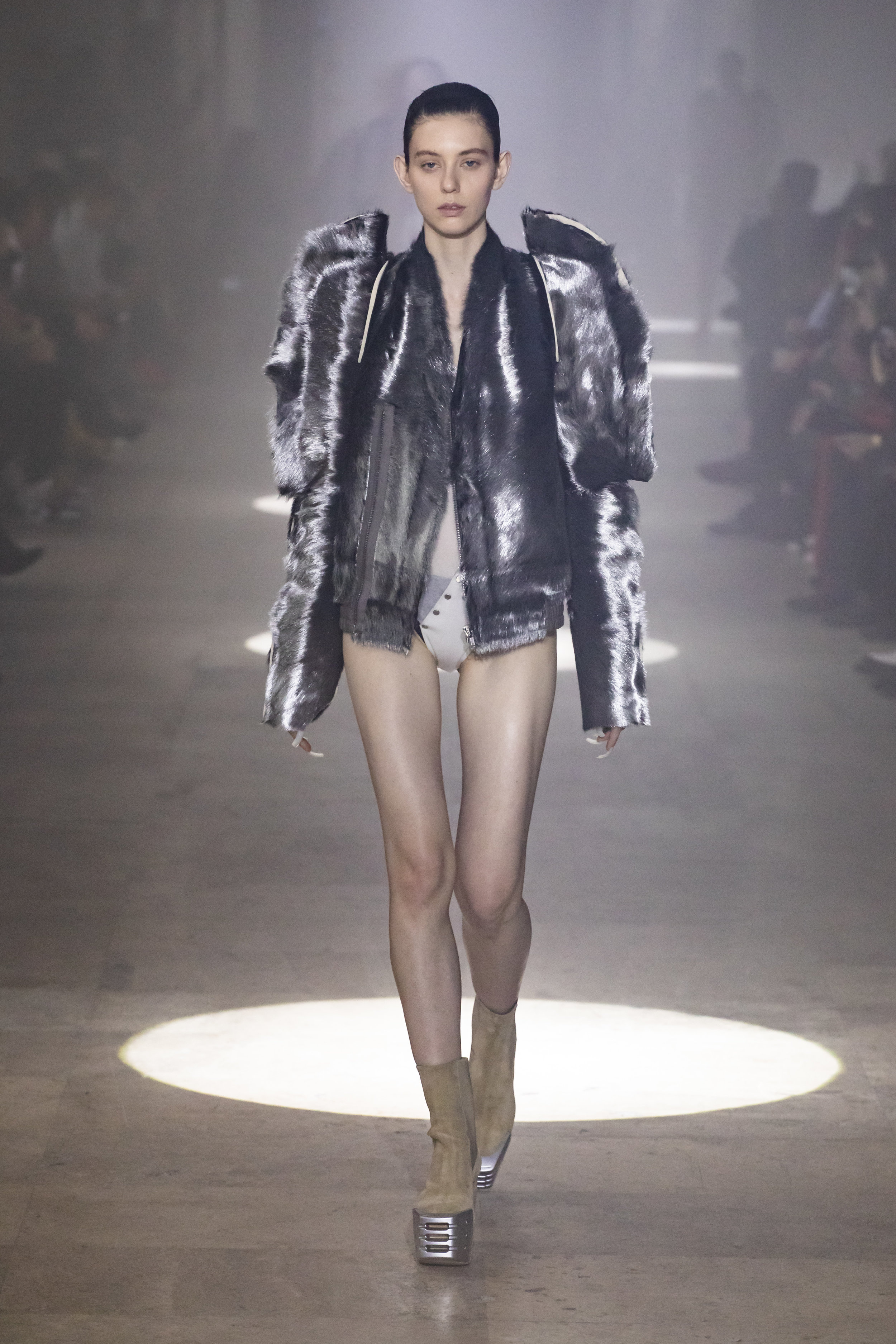
The second range is more dense and theatrical than the first. It works with the realities that look back at the past, in a kind of retrospective. The shades that are used to give it shape are the browns, purples, deep blues and the metallic range that always appears in each of the four inspirations as a common link. Floral prints, organic shapes, sinuous lines, elements of nature, upholstery … all these elements influence this intimate range that takes as its model the baroque of Versailles in its most contemporary version.
3. Balanced
The third inspiration is based on the concept of balance and chromatic harmonies. It is a modest range that is inspired by the shapes and textures of nature and works with craftsmanship in a very folky way. The predominant colours refer to autumn: the beiges, earth-coloured , whites, metallics and forest greens mixed with vibrant blues. Rough surfaces,skins, the most basic geometric elements and tribal influence are also treated in this folk range.
4. Metronome
Finally, the fourth inspiration is based on the metronome’s rhythm, with elements in movement that follow its beat: it is a work of colours that come and go and in turn play on the contrasts. This range belongs to the world of the city: it is urban, cosmopolitan and youthful. It is inspired by all the multiplicity of people, tribes and individuals that coexist within the same community. There are plenty of grey shades, silver and metallic details on smooth surfaces that contrast with graphic elements and arty patterns. Denim and overlays of garments, understood as a show of expression, configure the different identities that make up the same city.