This anomalous 2020 has also upset the calendar of the interesting informative talks by the Color Community. association. A private initiative, which we have followed closely since its creation, led by a group of three professionals who love colour: the architect Pere Ortega; the designer specialized in Colour & Trim, Eva Muñoz; and Rosa Pujol, Textile & Colour Stylist and creative director of Gratacós.
This year, the biannual and face-to-face meetings at the Old Damm Factory in Barcelona have been converted into digital format, thus via screen respecting the security measures imposed by the current health situation. Despite the difficulties, Colour Community was able to present the new colour chart that will serve as a guide for the Spring-Summer season 2022 in an orientation report that serves as a source of inspiration for creative professionals who are dedicated to fashion, design, advertising or architecture, among other areas.Â
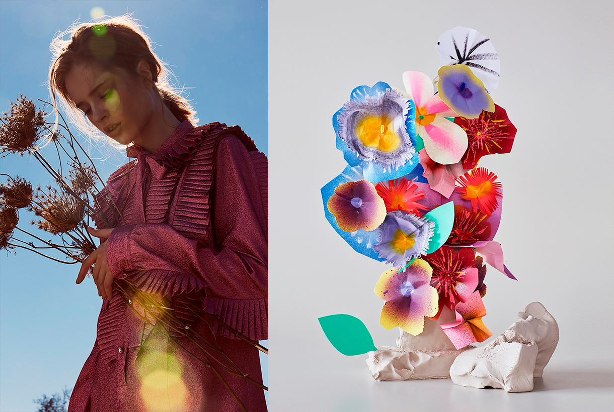
Within a current social and economic context marked by instability and uncertainty, the new broad and global creative proposal Wait… SS22. A concept that articulates the entire chromatic range and which symbolizes the preamble to an infinity of optimistic possibilities, guided by the real need to make better decisions as a society and also in relation to the environment. This “waiting” is essential, according to the association, “to appreciate and value life with humility and simplicity, and its functional daily life to structure the whole future.” For this reason, it will be necessary to design from practicality, but without forgetting beauty or creativity.
“The new creation symbolizes the preamble to celebration,
play and optimism”
“Wait…” also symbolizes the beginning of celebration, play and optimism, opening seamlessly to coexistence with digital reality. As for colour, it materializes like never before, conveying human emotions and being the conductive support of these senses.
In turn, the ‘Wait…’ colour scheme is structured through four ranges of colours, textures and materials named Wait… & Listen, Wait… & Wish, Wait… & Enjoy and Wait… & Grow Up. Colour Community sums it up with a claim to a final message of hope: “Wait… & tomorrow”. Wait and there will be a tomorrow.
Below, we summarize each creative proposal:
Wait… &Listen
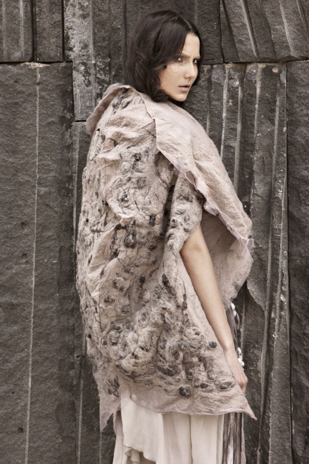
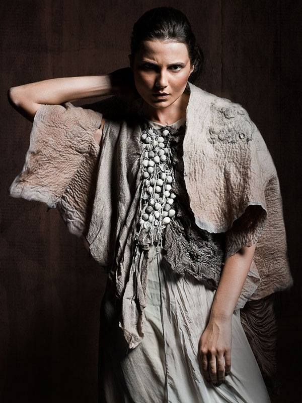
This first range is inspired by attentive waiting: ” one that is willing to receive information and learn from it “. A proposal that is based on learning from the proximity of natural society and human knowledge. Wait… &Listen is built from neutrality and naturalness, presenting colour with renewed subtlety. That means that we speak of natural realism, of materials and finishes that connect with a well-manipulated origin, worked from harmony and sustainability. As for the colour palette, relaxing neutral tones abound, such as natural white, basic ecru and calcareous grey, among other soft colours that structure and soothe. The designs mark a return to the simplicity with linear shapes and geometric  basics such as the circle. Rough textures, natural and imperfect finishes, wrinkles and rustic aesthetics return. This trend is also seen in fabrics that are expressed without decorative excesses. Clean-looking matt cotton, linen, hemp, poplin and satin threads abound. Finally, natural fibres coexist with recycled and regenerated synthetics.
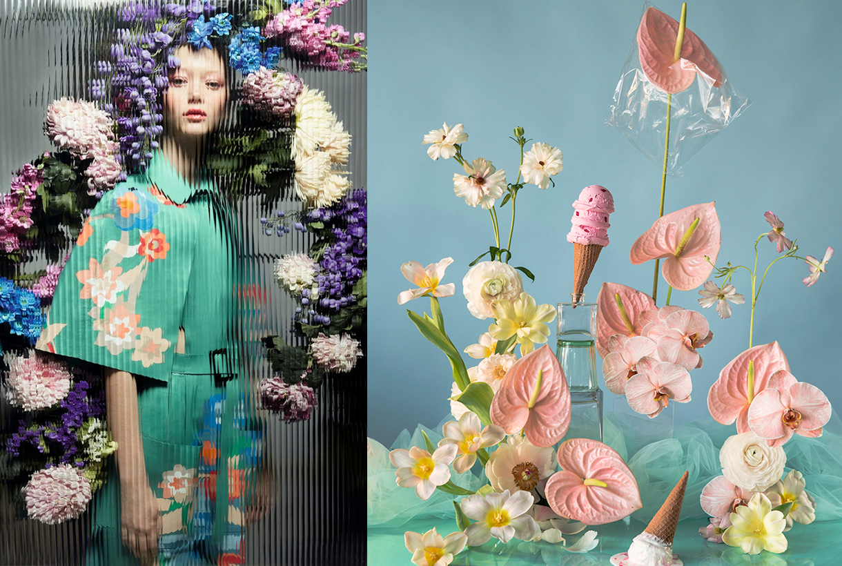
Wait… &Wish
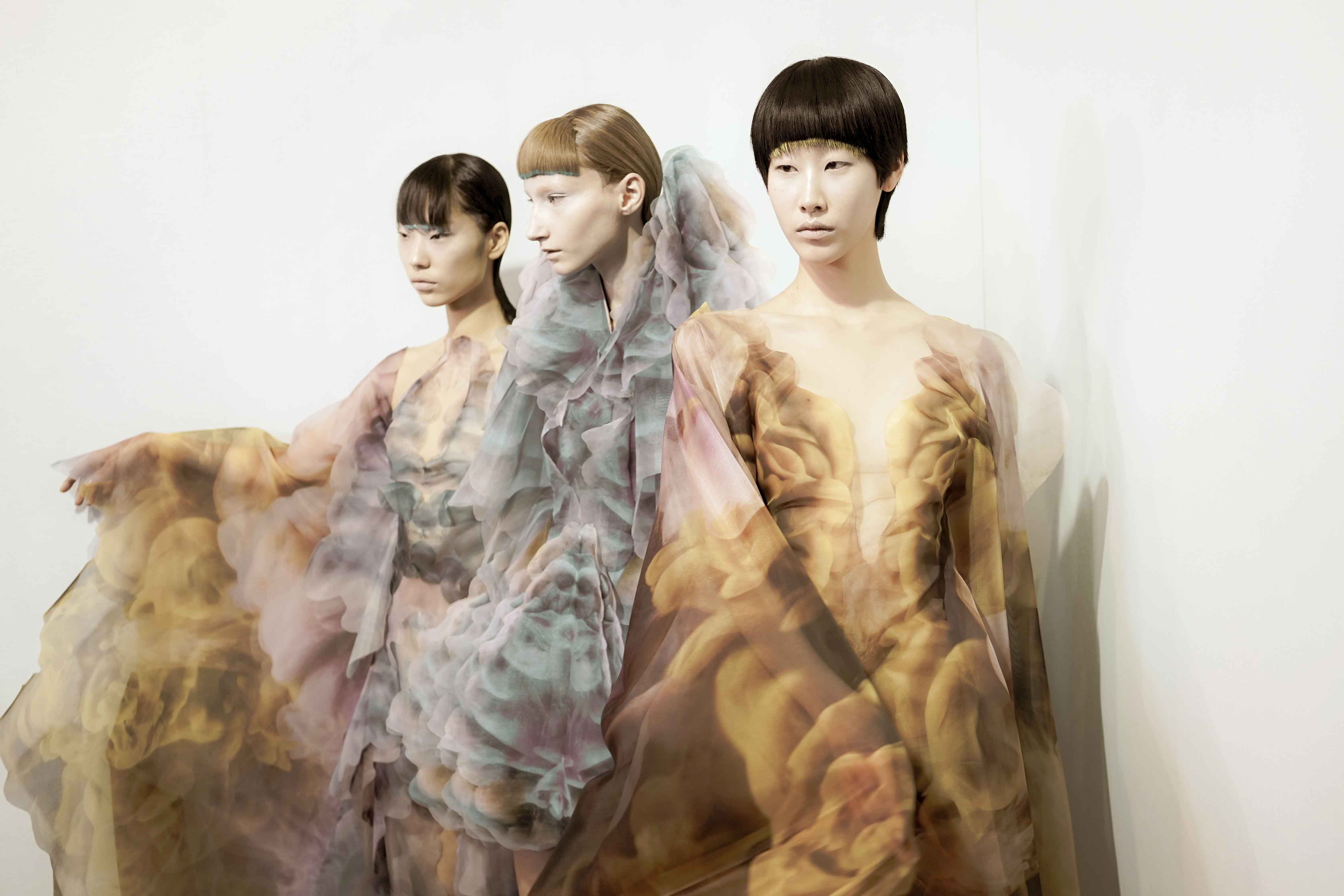
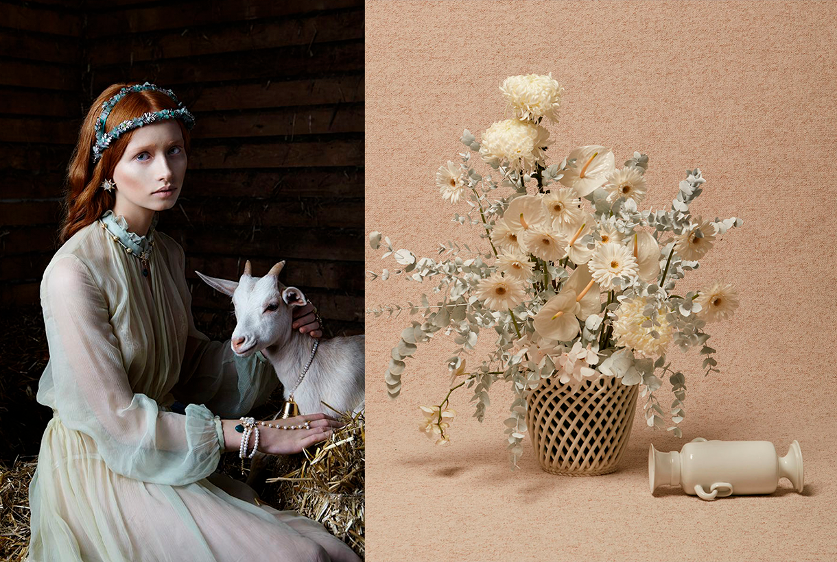
The second range appeals to desire, this concept that cannot be materialized and that activates the most creative part of the human being. According to Colour Community: “desire is not satisfied with the tangible and looks for something else as far as possible”. Under this premise, Wait… & Wish seeks to rediscover the secrets of craftsmanship, revaluing all its specific features. In turn this range also focuses on the plant world, but this time it focuses its attention on that nature that we know, but that we rarely touch or experience consciously. The colour is inspired by the apparent chaos of natural beauty, its uniqueness and exuberance with rich, bright and contrasting chromaticism: vegetal green, bright blues, gold foils or crimson brushstrokes. The designs seek to seduce by their elemental, organic and abstract geometries, hand-drawn striped prints, paintings in their freest version and colour combinations that reflect the chromatic chaos of nature. As regards materials there are many works with artisan natural dyes, semi-gloss yarns, die-cuts and laser cuts, utilitarian clothing and satin looks. Finally, in fabrics we are committed to sustainability and comfortable and practical fabrics that do not abandon design. In the fantasy section, Jacquards abound with geometric structures, mesh fabrics, nets and refined weavings such as reliefs and embossing.
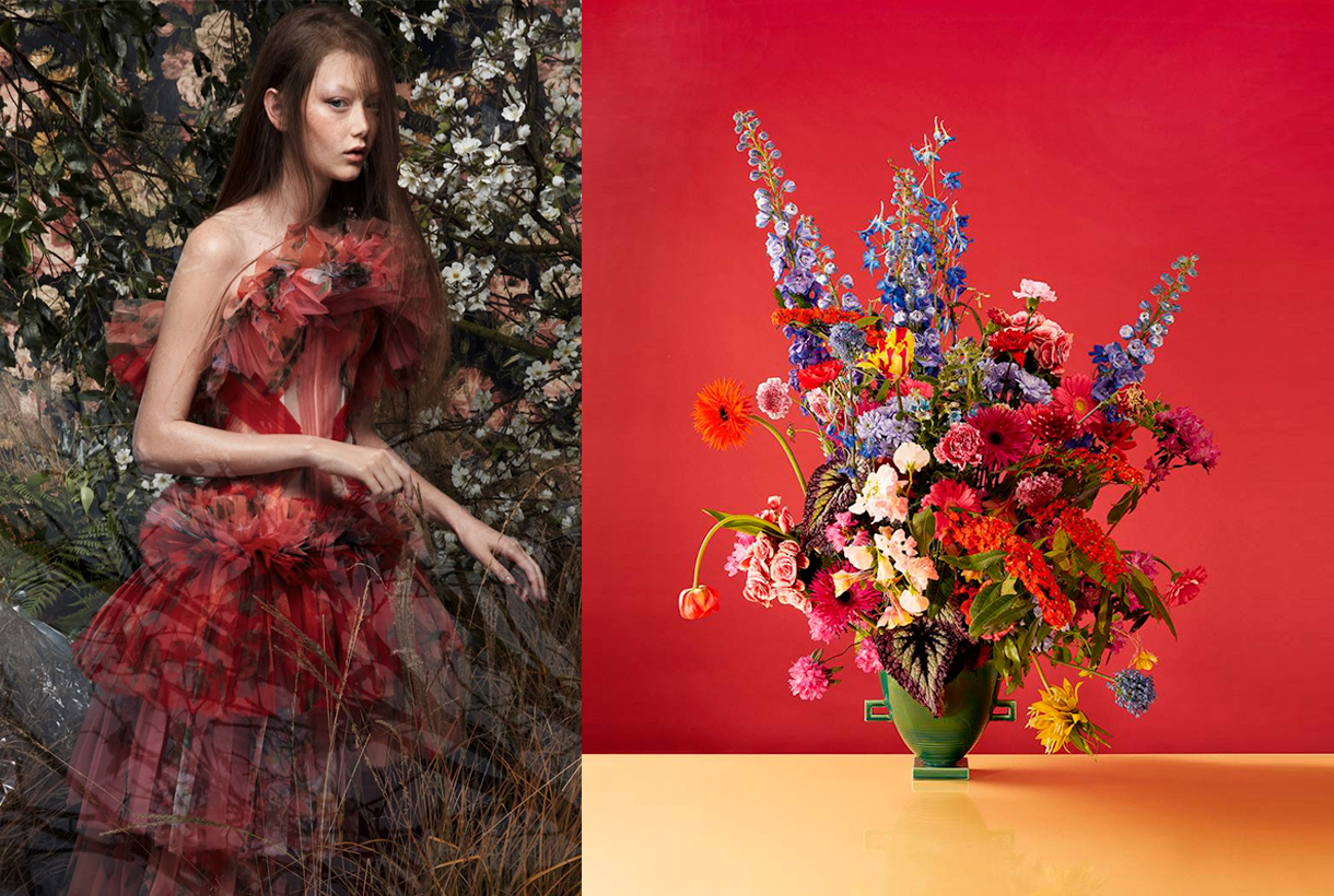
Wait… &Enjoy
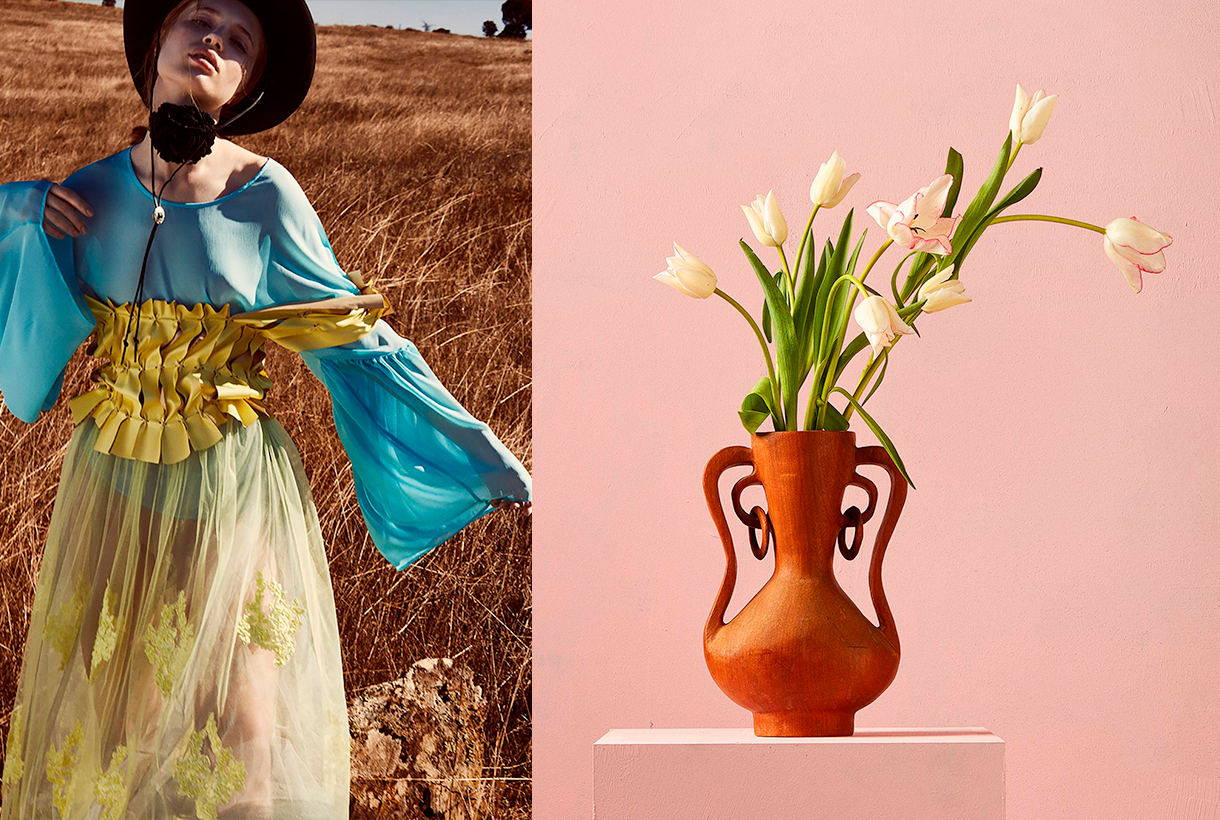
The third inspiration is the opposite on a conceptual level to the first two: it wants to project the future in an optimistic and creative way, exploring concepts such as freedom, evasion and extroversion. A creative enjoyment that will become limitless, but consistent and thoughtful with the common good. In this range, Colour Community features a creation enriched and loaded with subjective personality, but always coherent and respectful with the environment. The colour palette is based on fresh, cheerful, playful and sensual tones full of positivity and ready to be combined with neutrals. Vital tones such as geranium,  fresh mint, chlorophyll, pink and vitaminised lime which combine with neutrals like white and sand-coloured. The designs are seduced by the power of the flowers and the magnetism of the most exuberant vegetation. Leaves, petals, gardens, green spaces … plant nature also takes centre-stage in summer fabrics. In addition to the flower motifs there are beautiful yarns for new colour sensations, shiny fibres, fluid fabrics that create transparency, textured organza with iridescent yarns, Jacquards with reliefs and piquĂ©. In general, the fabrics express that intention to celebrate and dance again through movement.
Wait… &Grow Up
Finally, Wait… & Grow Up represents an evolution of the previous range. It is based on the imperfection of growth, the acceptance of the passage of time and integration of the past in order to understand the future. This range is “a reunion with the most chromatic geometry with a high expressionist content”. Products designed from a future perspective, with this range of colours, will be approached with a stimulating and light-filled mentality in which multicoloured harmonies generating multitone patterns will play a prominent role. The colour palette is thus multifaceted, symbolic, versatile and adaptable to all sectors: mauve, yellow, intoxicating pink, coral, orange, green, grey, blue and sophisticated brown. In designs a mixture of antagonistic, strange motifs and visual surprises is prioritized. With regard to fabrics this last range follows the line of the previous three and has a clear intention: to better production via recovered or recycled yarns, reducing the chemical impact and water consumption, in order to face a future with hope. Finally, the proposal is based on tactile fabrics that provide an extroverted, colourful and highly visible look.
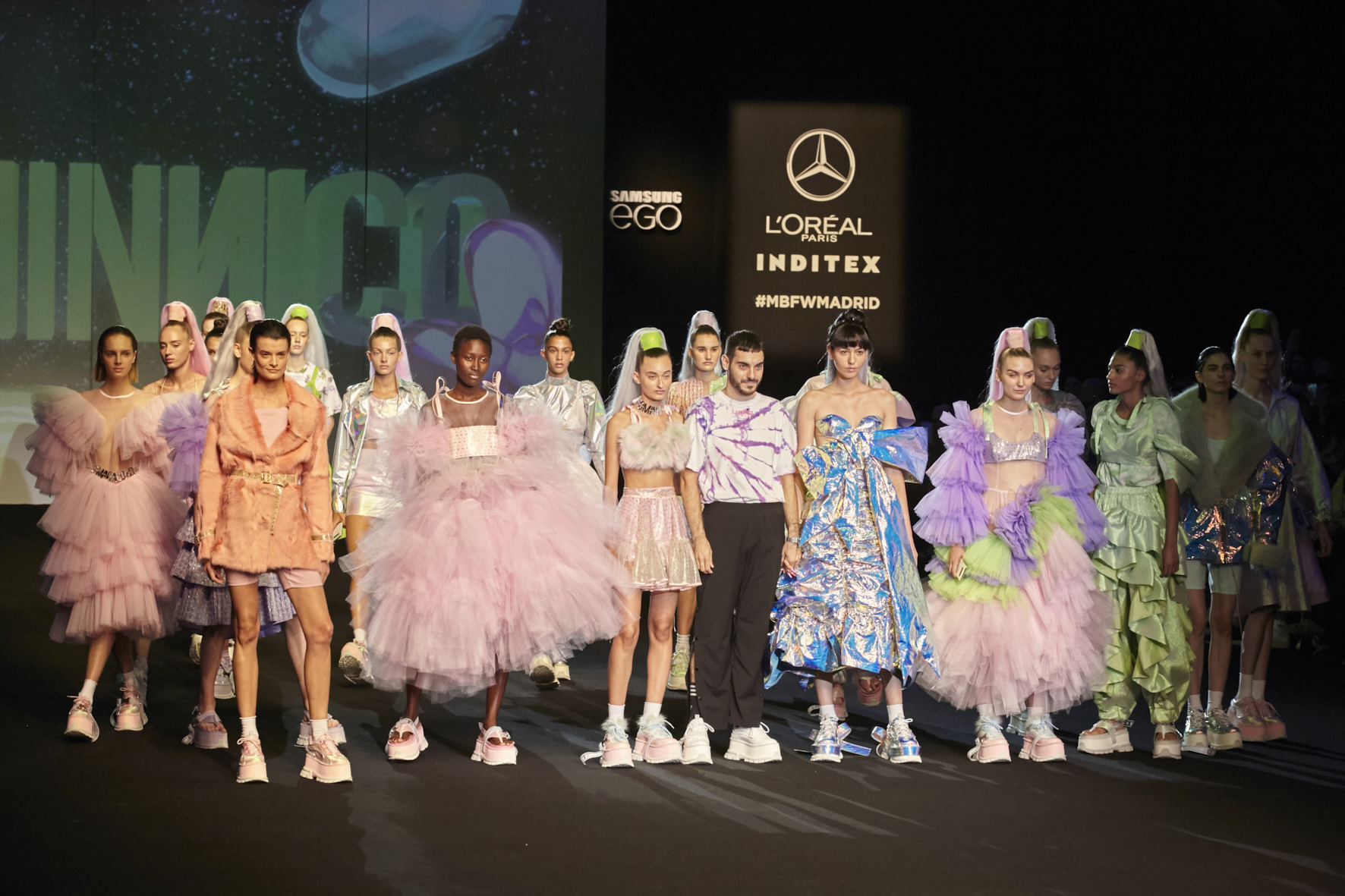
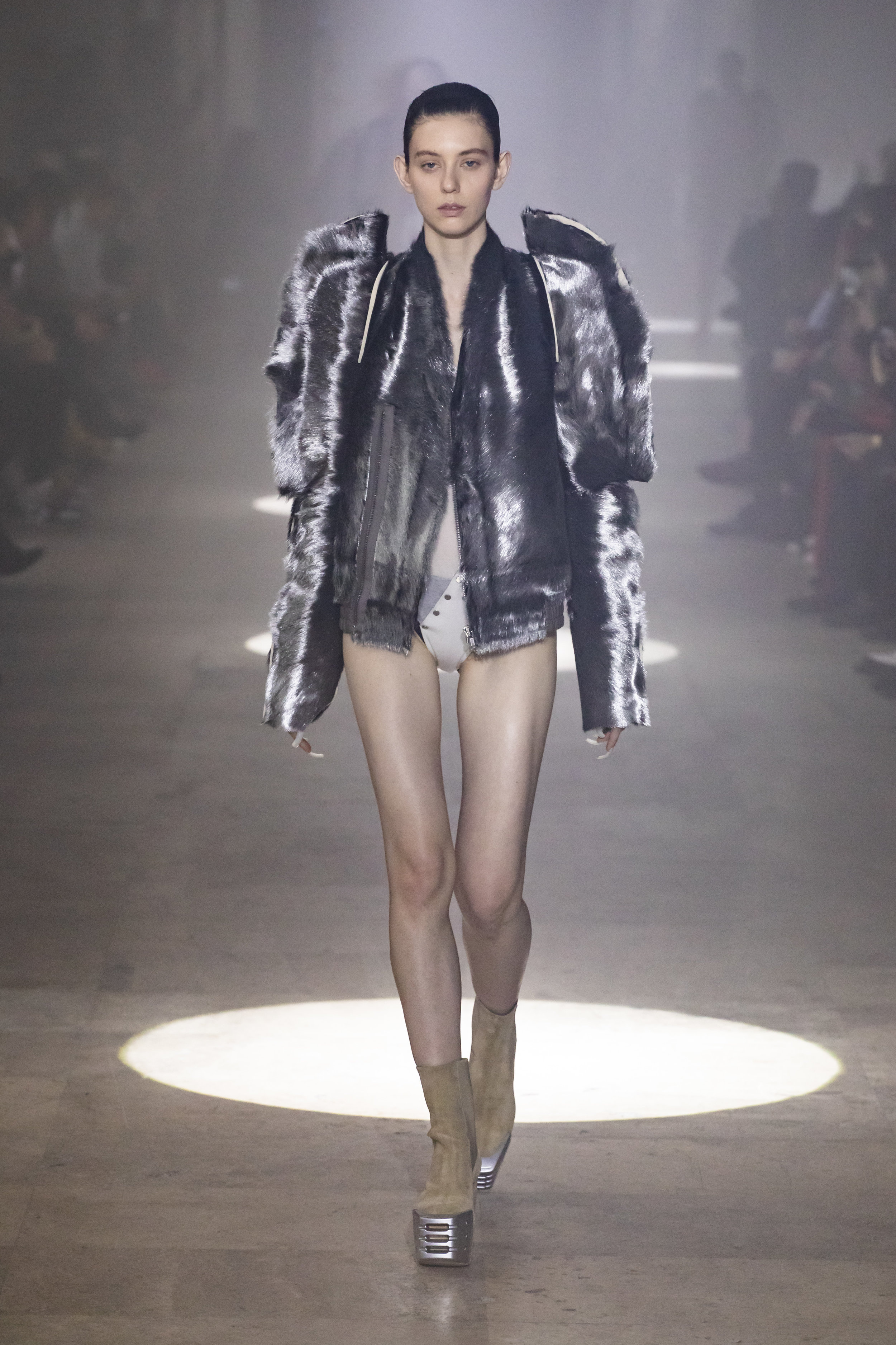
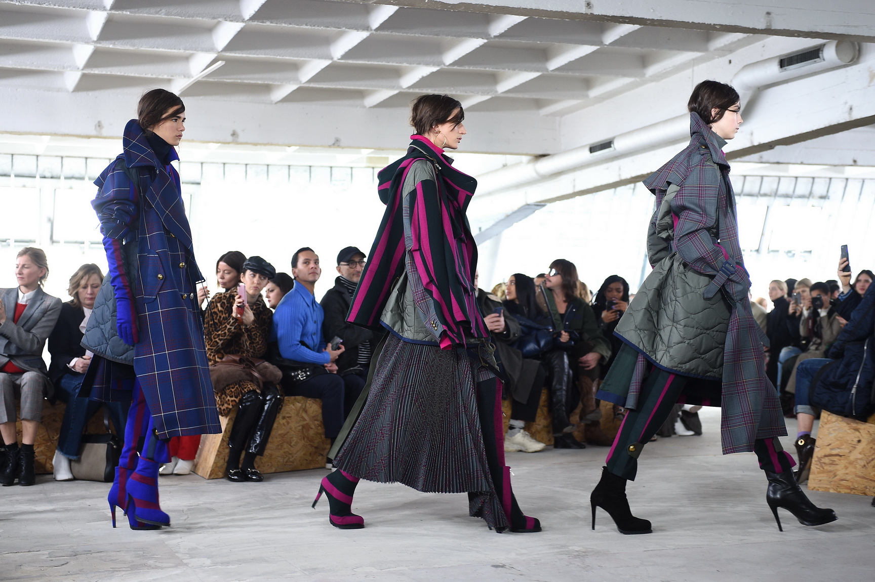
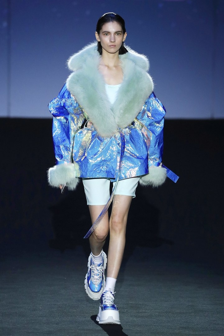
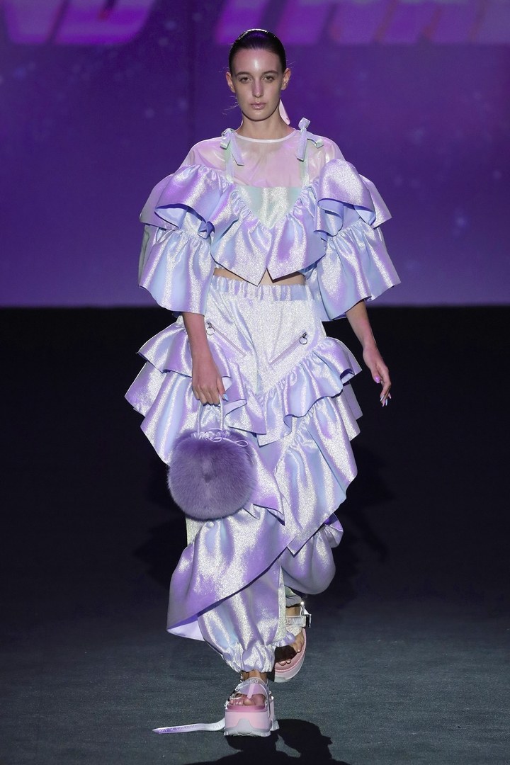
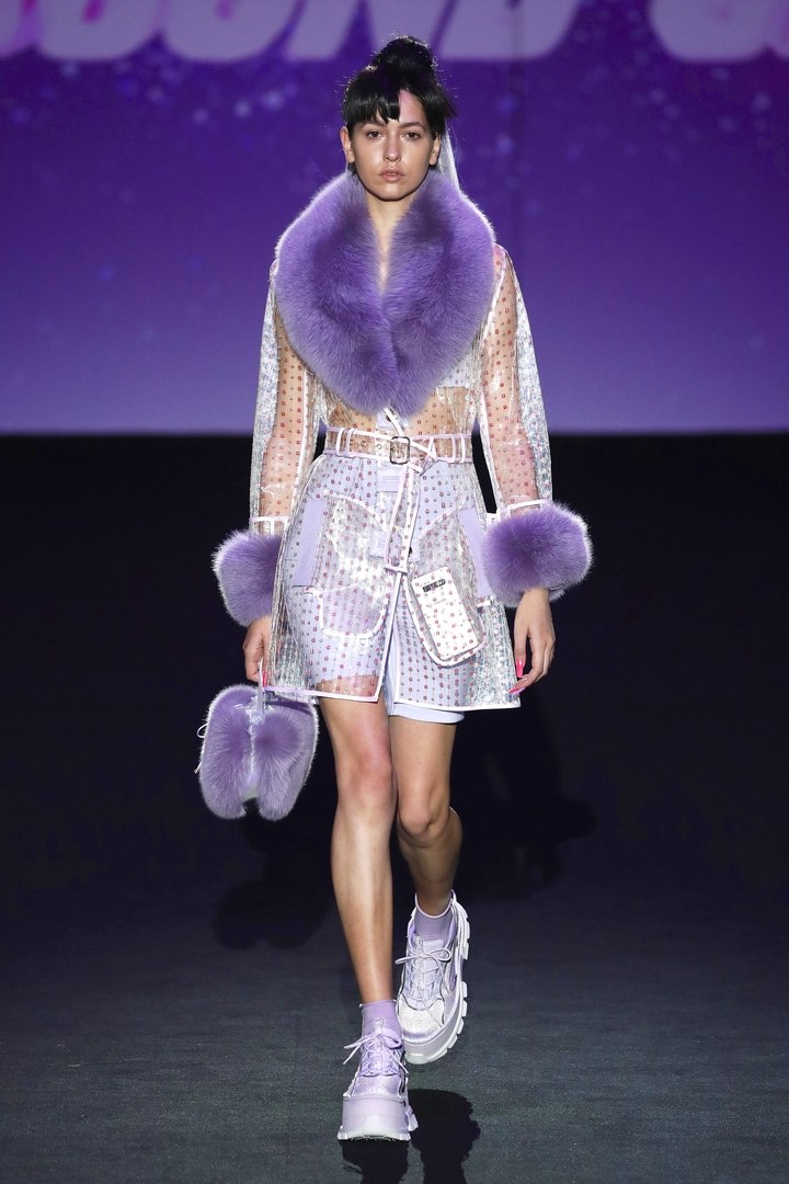
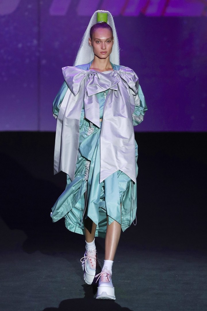
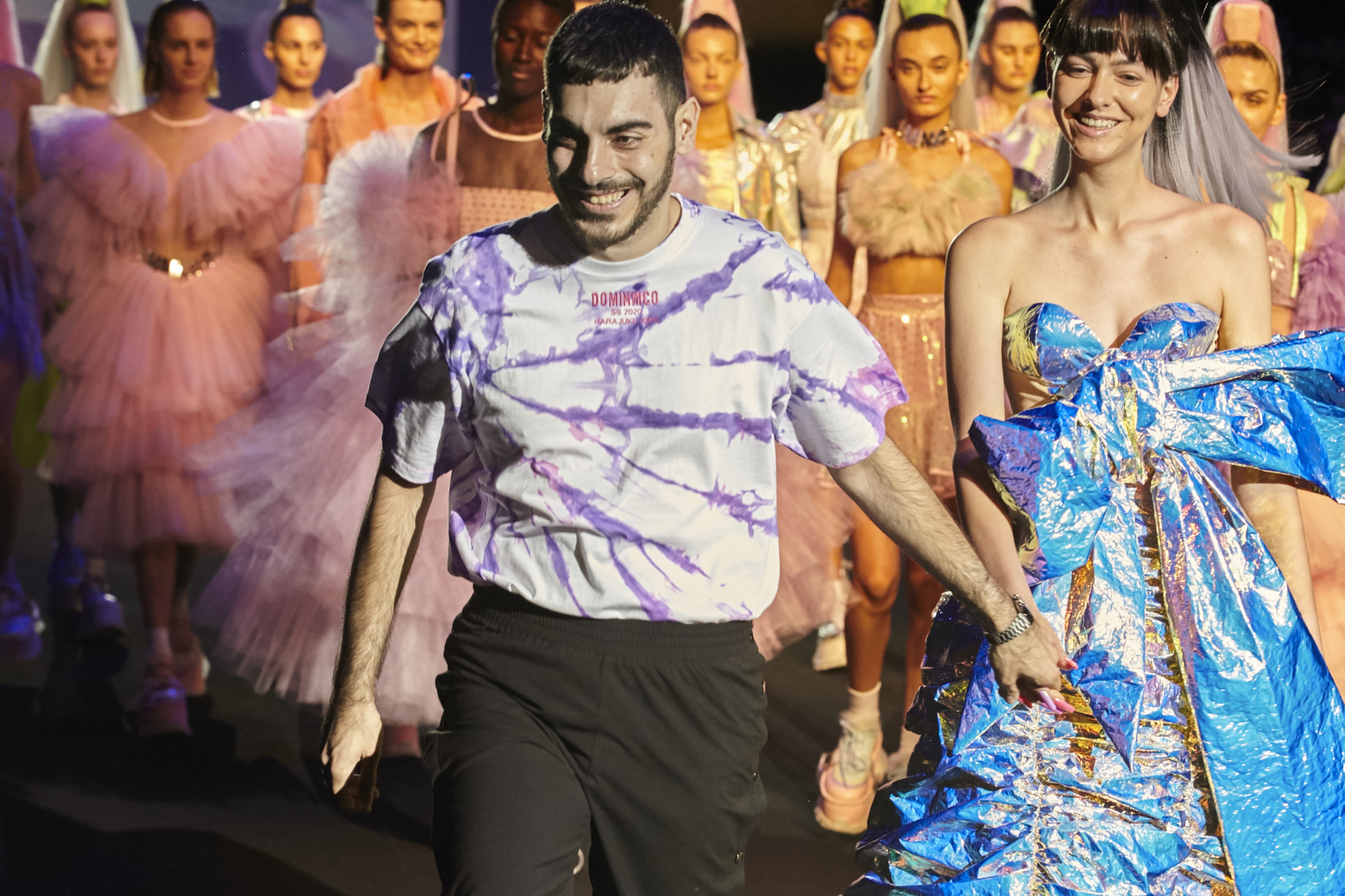
The rise of Dominnico was foreseen . It was just a matter of time for his meteoric career to take off. And this ascension has only just begun. Now, the restless Domingo RodrĂguez has landed himself a new achievement that consolidates him within the map of young promises of Spanish fashion : becoming the winner of the Mercedes-Benz Fashion Talent.
“Winning this award means fulfilling a dream.It represents the start of my firm and the beginning of a new stage for this project “, explained the young designer after winning the prestigious award.In fact, the designer has already begun to gain fame outside our borders.At only 24 years of age, Dominic has dressed personalities from the world of entertainment such as Lady Gaga, Rita Ora or RosalĂa, who have worn the outfits ,made in part with our fabrics on tours around the world.
His impeccable dressmaking, his huge national and international projection, his early maturity and his commercial outlook have been some of the attributes that have fascinated the jury. A project with a speech of its own and true to its essence that has made him the winner of the 14th edition of this contest that rewards young talents.
Domingo RodrĂguez: “inning this award means fulfilling a dream and the beginning of a new stage for Dominnico”
An ode to Generation Z
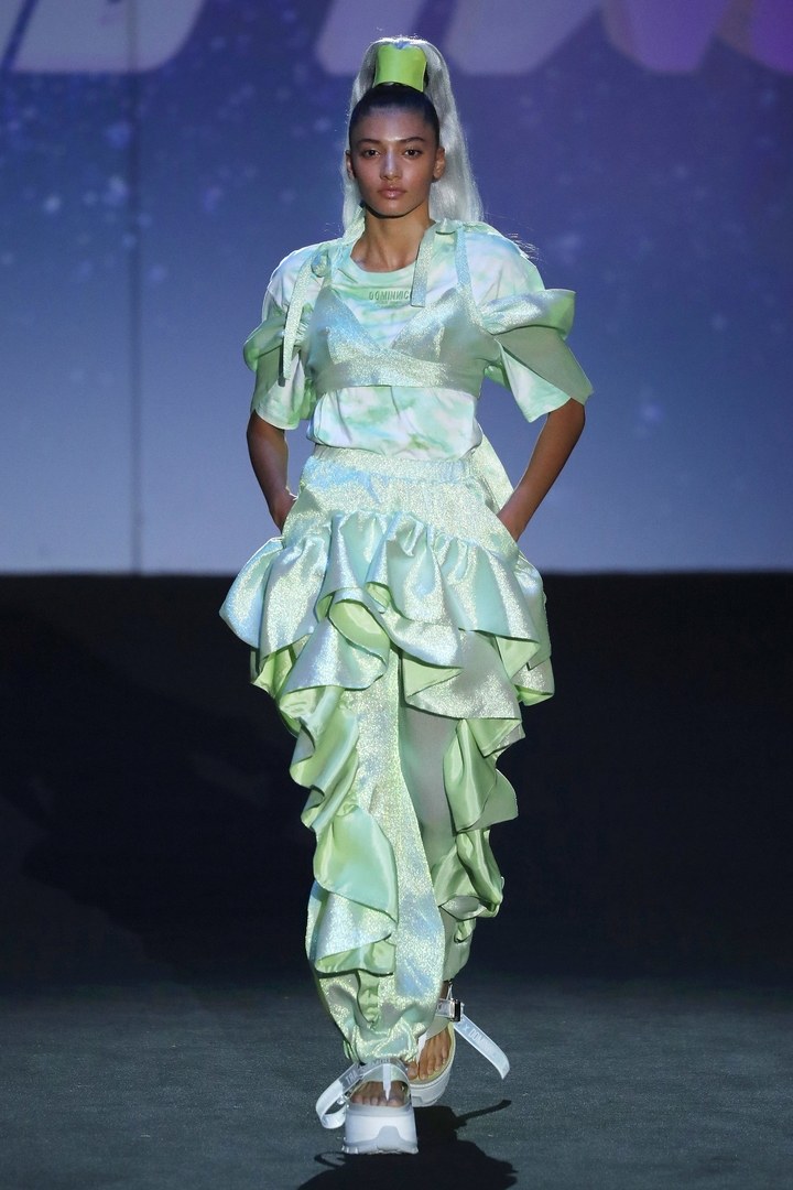
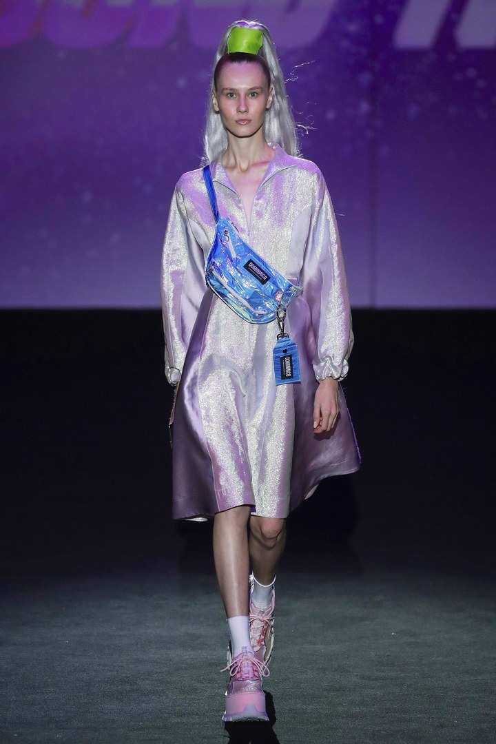
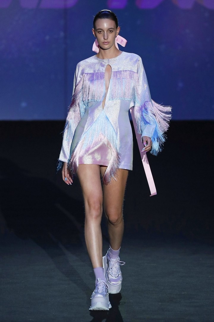
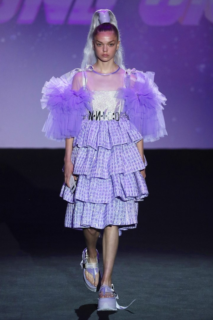
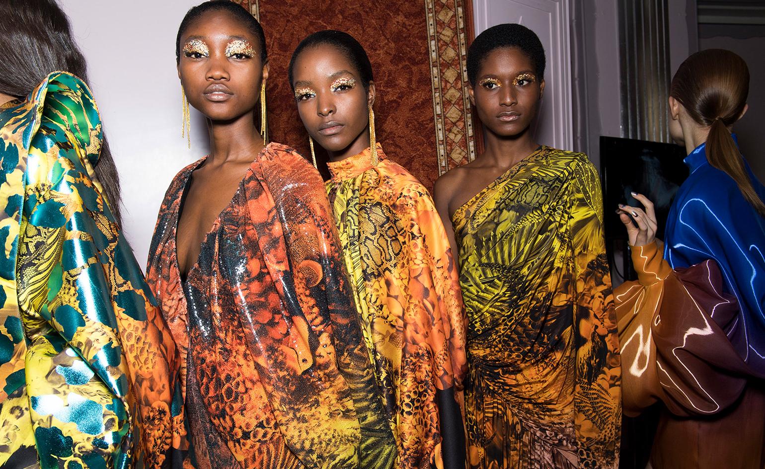
The award-winning collection , presented on the Madrid catwalk , is called Harajuku Kids and it is inspired by Club Kids, the London generation of the nineties, but also in the new digital era, centreed above all on social networks. Artists like Andy Dixon, Antoni Tudisco, Six N. Five, or the influencer Ruby Gloom have also been taken into account in the conception of the collection. A proposal that also takes into account the urban tribes of Japan and is conceived as agender, away from labels with extravagant shapes and silhouettes that are an invitation to individualism and character.
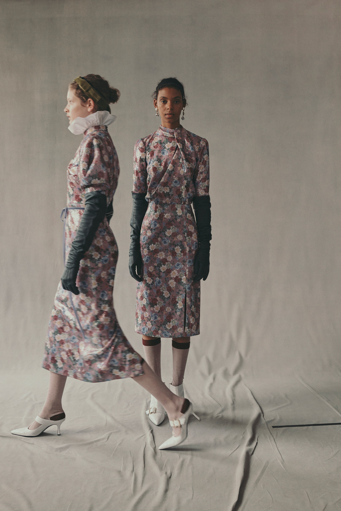
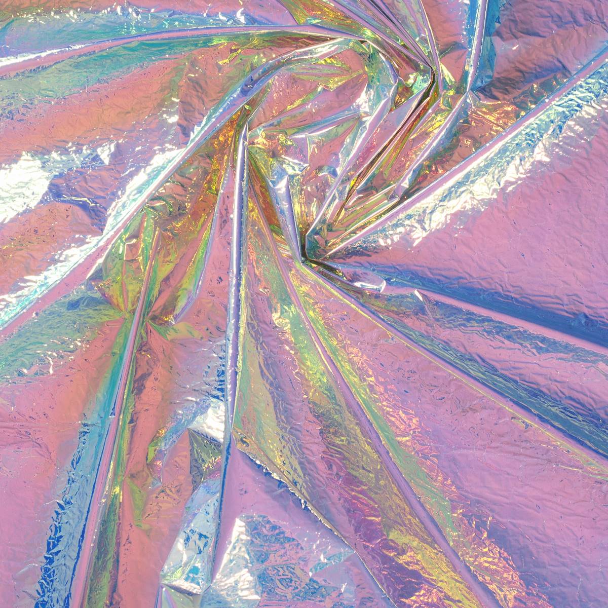
The collection, replete with Gratacós fabrics, is impregnated with textures, sequins, laminates, tulles, overlays and volumes wrapped in a range of pastel colours. In this way, inheritance, actuality and even future mix thanks to a sweetness and femininity unusual in Dominnico that advances to gain maturity in its style.
Next stop Georgia
Beyond the recognition, the prize includes the possibility of a catwalk next November at the international Mercedes-Benz Tilti Fashion Week in Georgia. A moment in which the designer from Alicante will already be presenting the winter collection of the following year. In this way, Domingo RodrĂguez joins the successful group of great young talents who got this award back in the day, such as Outsiders Division, CĂ©lia Valverde, Juan Carlos Pajares, Ela Fidalgo, Xavi Reyes, MarĂa Clè Leal, David Catalán, Ernesto Naranjo or Pepa Salazar.
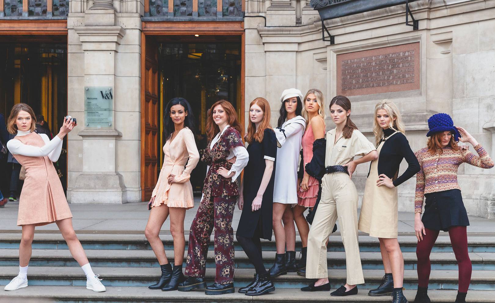
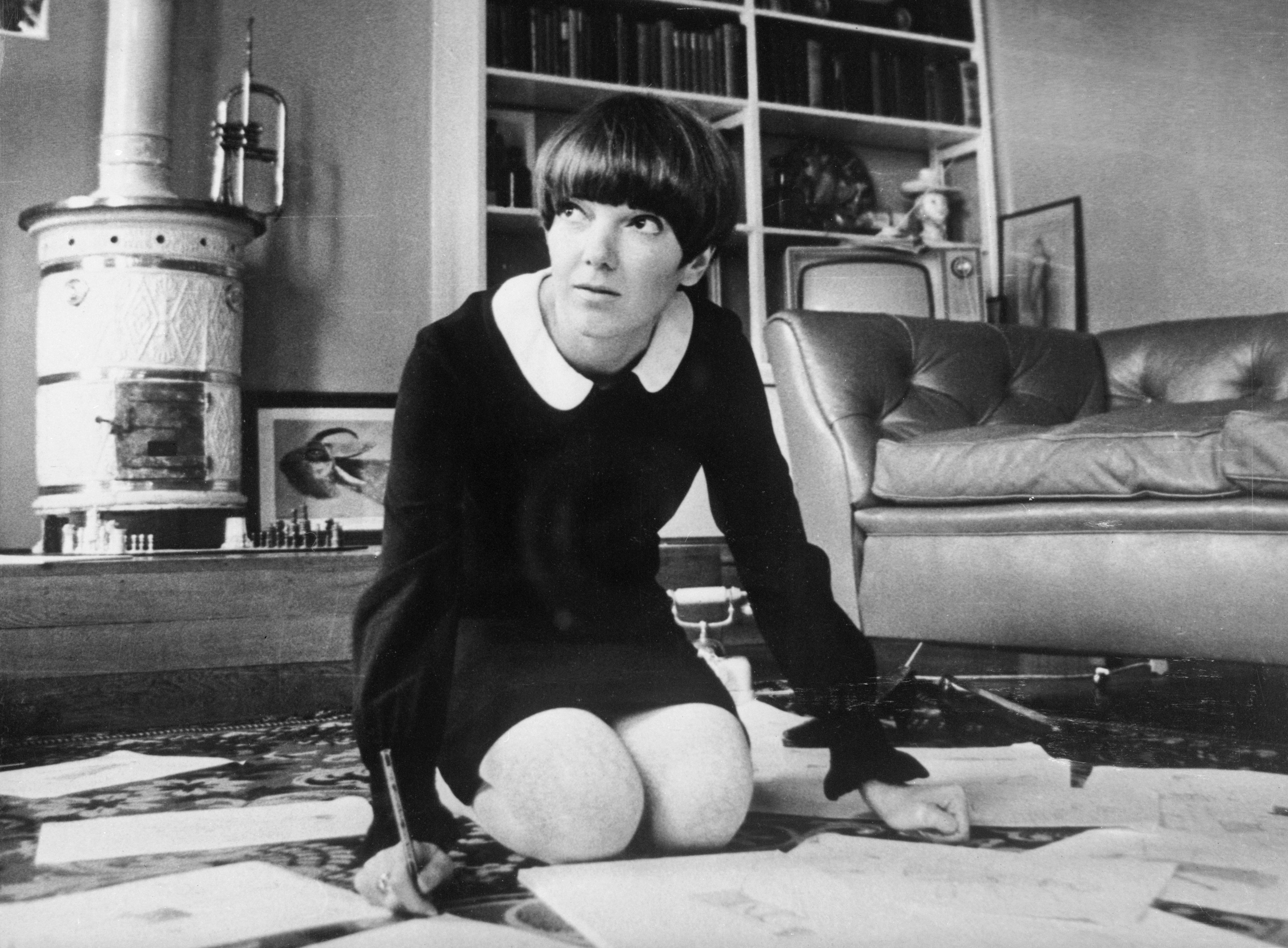
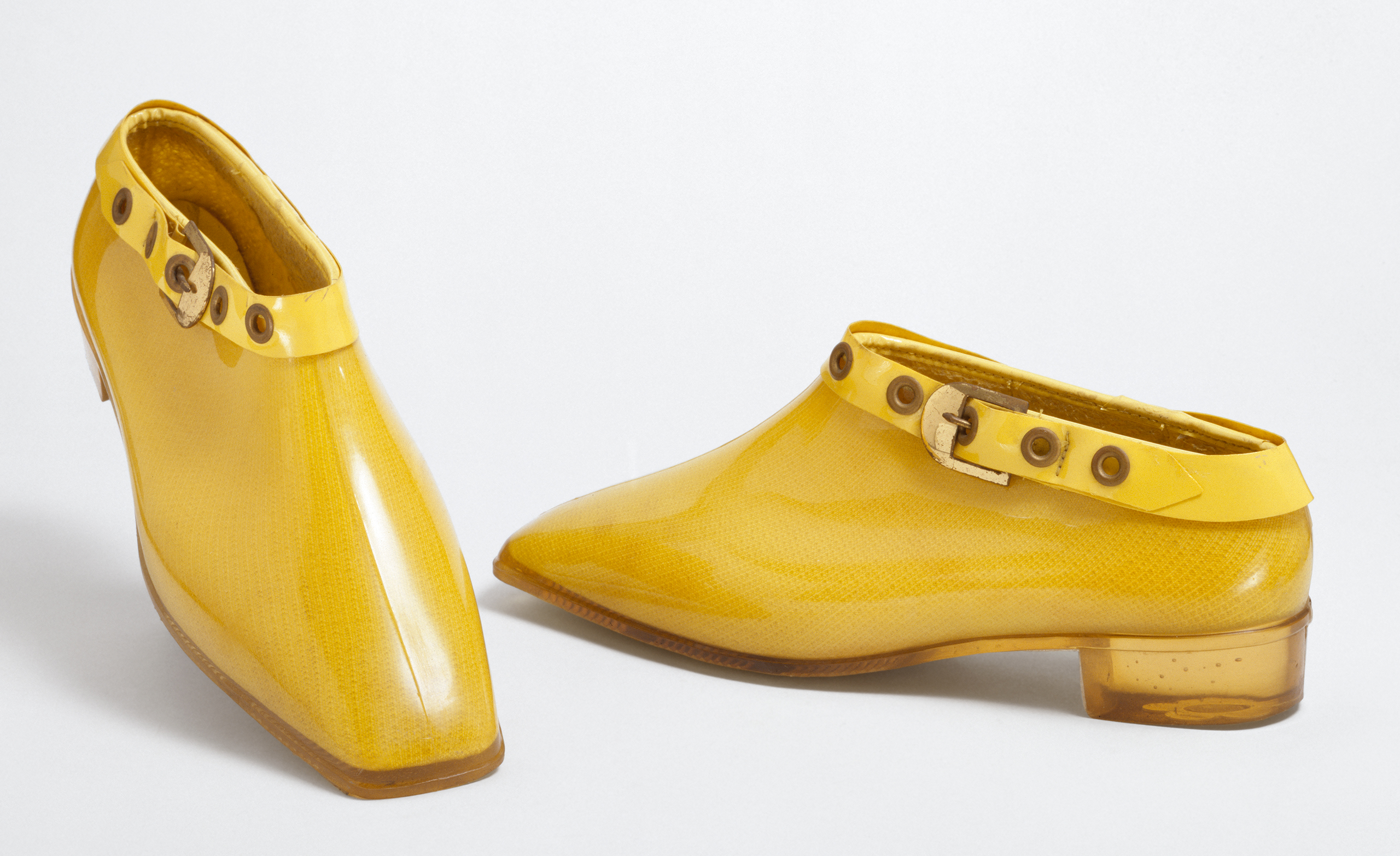
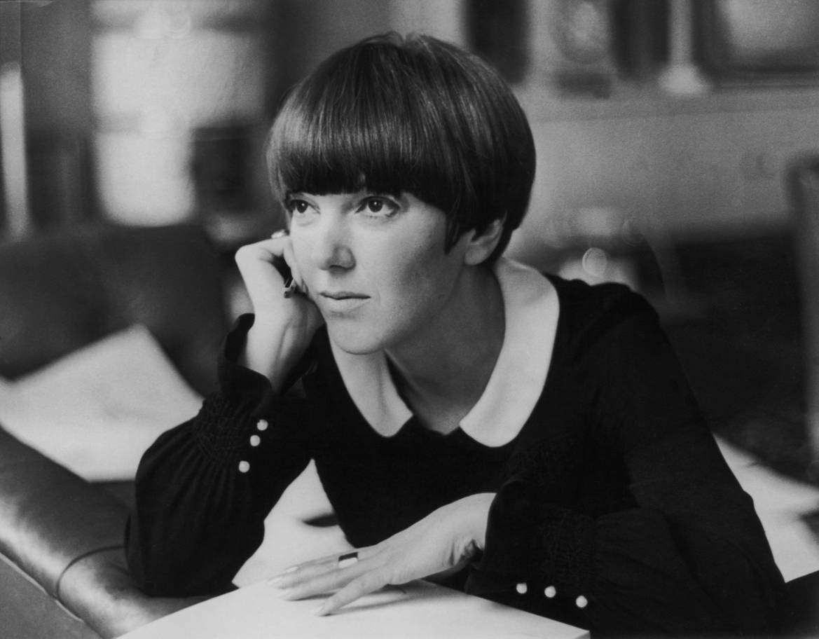
London pays tribute to Mary Quant (England 1930), living legend of fashion and guilty of stirring a whole era: the 60s with a garment of the most irreverent, the miniskirt. Although the authorship of such garment is disputed with the French couturier AndrĂ© Courrèges, “the mother of the miniskirt” knew how to popularize it and bring it closer to the whole world. “The goal of fashion is to make clothing available to everyone,” he used to remember. Now the Victoria & Albert museum praises this designer who revolutionized the fashion scene in that boiling decade so that the new generations know their great contribution up close. In the words of Jenny Lister, one of the curators of the exhibition, “Mary Quant is known as the architect of the democratization of fashion in the United Kingdom”.
The origin of the miniskirt is connected to the music, dance and urban fashion of the moment. It is said that he was born at the end of the 50s in North America and to dance the new rhythms of swing and rock, the skirts little by little were shortened. Who captured this progressive regression and this change was Quant, who in 1955 opened a small boutique called Bazaar in the street of King’s Road in the Chelsea neighborhood. To give visibility, Quant was among the first to adopt this garment that exposed the legs, knees and some calves, a real scandal in an era where conventions were challenged. Little by little, from her small store in London, the designer caught the attention of young people and the industry she saw in her miniskirts and brightly colored breastplates and brilliant finishes a glimpse of rebellion, transgression and freshness, three concepts that linked with the way of thinking of the new generations.
Mary Quant is the architect of the democratization of fashion in the United Kingdom
Quant had no specialized training in fashion and in fact her creations were the result of a personal apprenticeship that included experimentation with different materials. It was that courage and rebellious attitude that seduced the industry and became a reference for women of the time. Along with the modelTwiggy, Mary Quant made this short garment became the trademark not only of his clothing brand but also for a decade. A symbol was born. So much was his success that, in 1966, Queen Elizabeth II granted him the medal of the Order of the British Empire for his contribution to fashion, a distinction he picked up in Buckingham wearing one of his miniskirts.
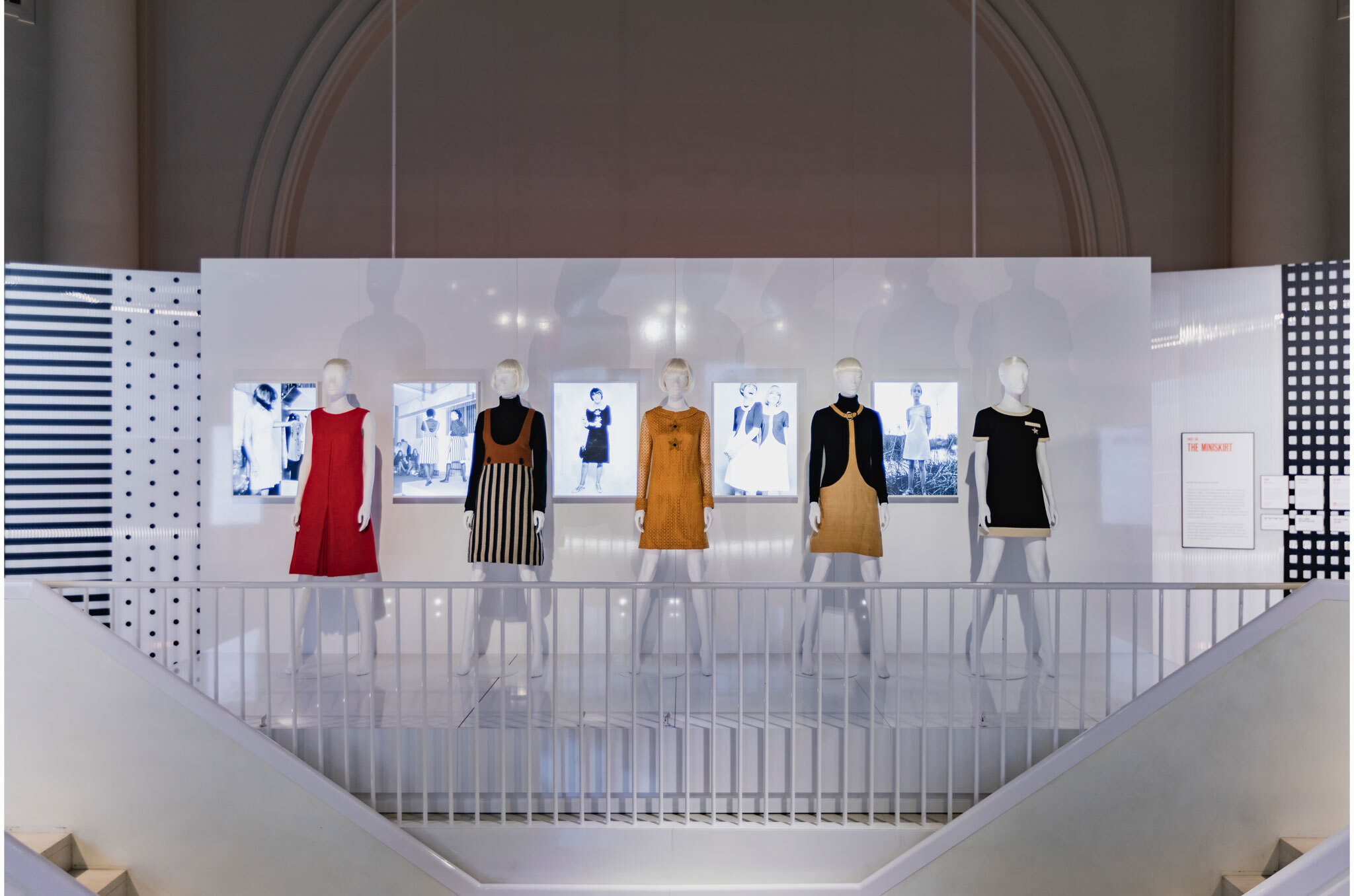
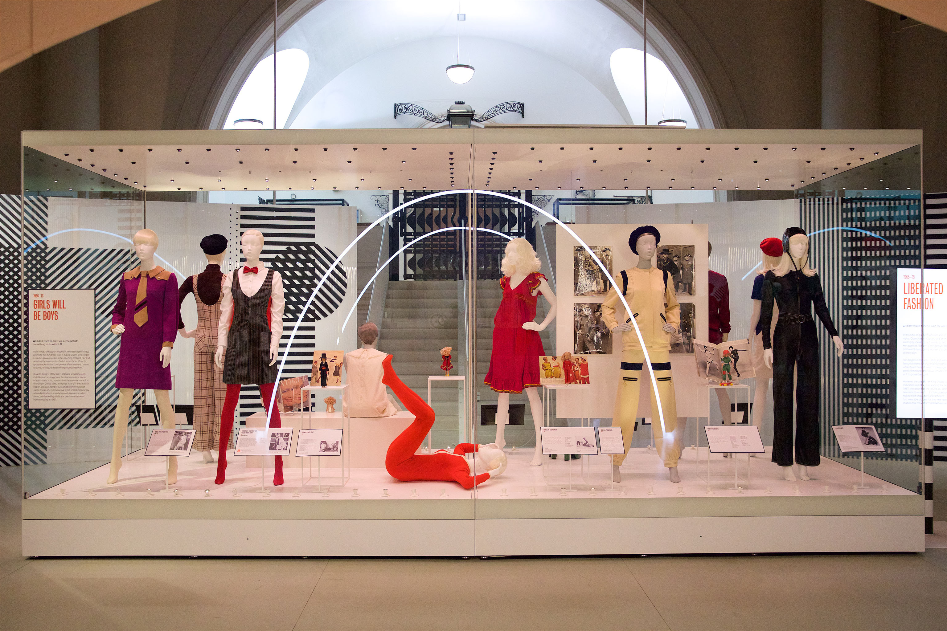
The exhibition exposes 200 pieces in which the colorful and innovative identity of the British designer is reflected. It includes the famous skirts along with other designs, as well as accessories and cosmetics, in a striking chronological journey that covers from 1955 to 1975. Among accessories and dresses, the museum also collects a selection of clothing and photos of anonymous women wearing the designs of Quant which shows the importance of the miniskirt for a decade’s fashion. The exhibition will be open to the public until February 16, 2020.

The Colour Community has just presented the new report of colours and materials that will influence the Autumn-Winter season 2020-2021 in the world of design and fashion. The initiative, led by three colour professionals , was presented, as usual, in the Old Estrella Damm Factory in Barcelona  before the watchful eye of a hundred enthusiasts from the sector. We remind you that the founding team is made up of the architect Pere Ortega , the designer specialized in Colour & Trim , Eva Muñoz ; and Rosa Pujol , Textile & Colour Stylist from GratacĂłs . In each issue new partners are added to this “mother team”who bring their vision and help shape the new range of colours and materials that will inspire the new season. It is an initiative that is repeated twice a year and that has our support. ” GratacĂłs always has the doors open to our fashion- area, for every lover of fabric, texture and colour,” declares Juan GratacĂłs at the beginning of the presentation of the report .
Juan GratacĂłs : ” Our fashion-area is always open to lovers of fabric, textures and colour”
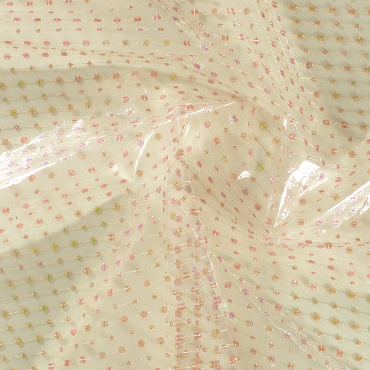
On this occasion the season is based on the concept of ‘ Multiple ‘ and consists of a reflection in a positive key about the future society where the line between the real and the virtual will be more diffuse than ever . ” Currently  this virtual reality exists on social networks or in videogames  but little by little it will become as tangible as what we now call reality,” explains Pere Ortega in presenting the report. The ‘ Multiple ‘ proposal , in turn, is articulated through four colour ranges and materials which are named On , Inside , Balanced and Metronome .
Pere Ortega:Â “Currently this virtual reality exists on social networks or in videogames but little by little, it will become as tangible as what we now call reality”
1.- On
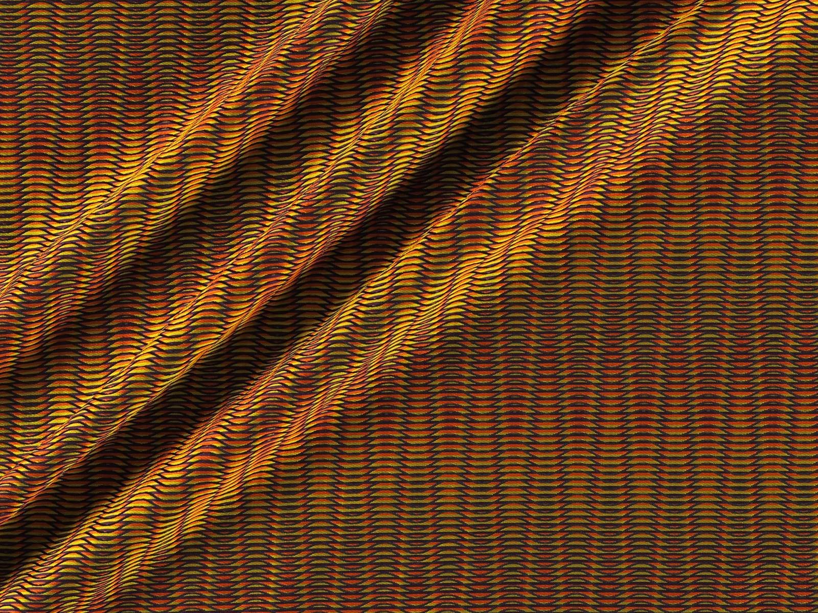
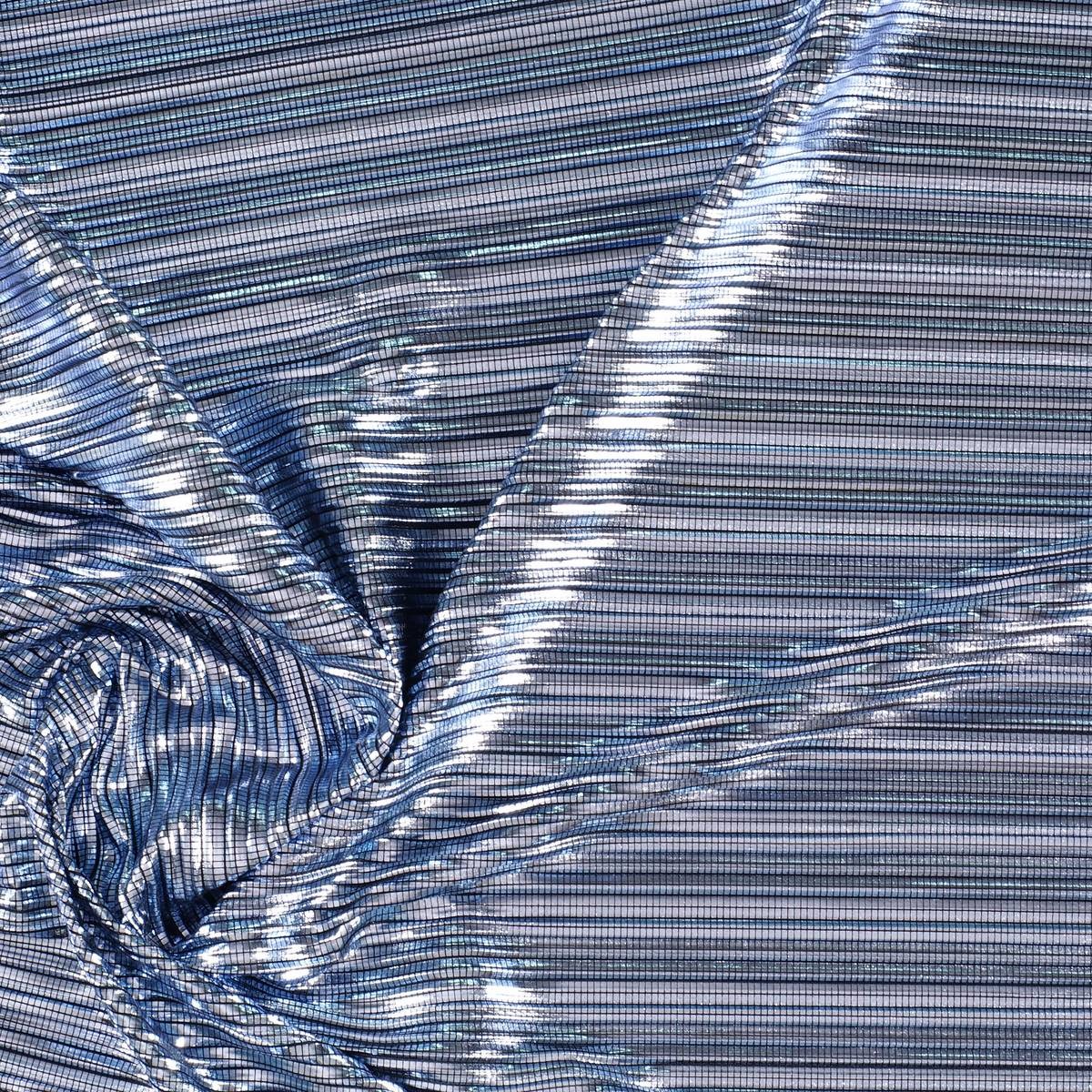
The first inspiration appeals to dynamism, to the creation of a dialogue with new realities that are virtual. It is a dynamic and versatile range that creates products connected to the human being in a digital environment. The shades chosen to conceptualize it are the cold ones in their most attractive version: metallic greys, iridescents, smoky blues, bright blacks and touches of yellow that play in contrast. The range of industrial and futuristic themes plays with plastic, oily materials, straight and curved architectural lines and artificial shapes. Fantasy under control.
2. Inside
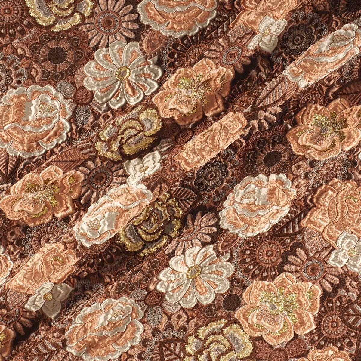
The second range is more dense and theatrical than the first. It works with the realities that look back at the past, in a kind of retrospective. The shades that are used to give it shape are the browns, purples, deep blues and the metallic range that always appears in each of the four inspirations as a common link. Floral prints, organic shapes, sinuous lines, elements of nature, upholstery … all these elements influence this intimate range that takes as its model the baroque of Versailles in its most contemporary version.
3. Balanced
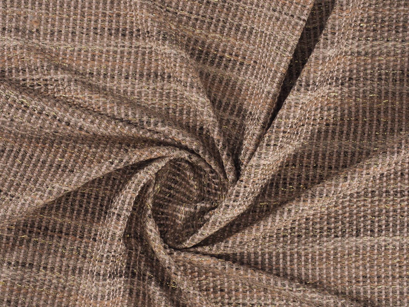
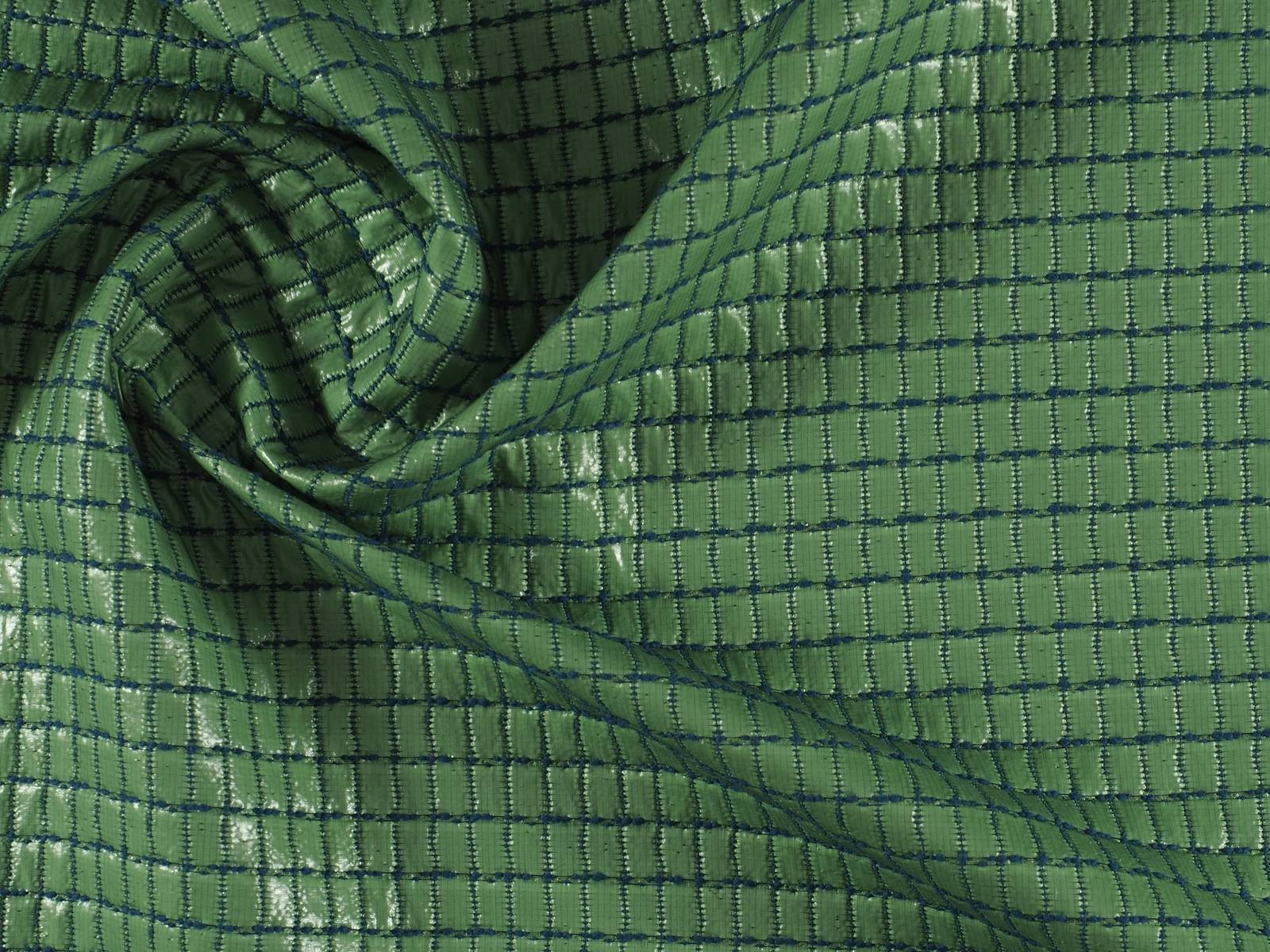
The third inspiration is based on the concept of balance and chromatic harmonies. It is a modest range that is inspired by the shapes and textures of nature and works with craftsmanship in a very folky way. The predominant colours refer to autumn: the beiges, earth-coloured , whites, metallics and forest greens mixed with vibrant blues. Rough surfaces,skins, the most basic geometric elements and tribal influence are also treated in this folk range.
4. Metronome
Finally, the fourth inspiration is based on the metronome’s rhythm, with elements in movement that follow its beat: it is a work of colours that come and go and in turn play on the contrasts. This range belongs to the world of the city: it is urban, cosmopolitan and youthful. It is inspired by all the multiplicity of people, tribes and individuals that coexist within the same community. There are plenty of grey shades, silver and metallic details on smooth surfaces that contrast with graphic elements and arty patterns. Denim and overlays of garments, understood as a show of expression, configure the different identities that make up the same city.