Miércoles 16 diciembre 2020
This anomalous 2020 has also upset the calendar of the interesting informative talks by the Color Community. association. A private initiative, which we have followed closely since its creation, led by a group of three professionals who love colour: the architect Pere Ortega; the designer specialized in Colour & Trim, Eva Muñoz; and Rosa Pujol, Textile & Colour Stylist and creative director of Gratacós.
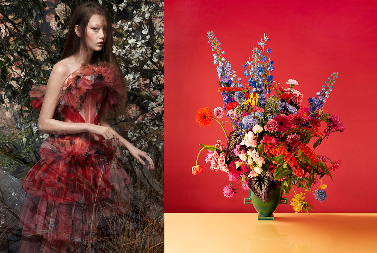
This year, the biannual and face-to-face meetings at the Old Damm Factory in Barcelona have been converted into digital format, thus via screen respecting the security measures imposed by the current health situation. Despite the difficulties, Colour Community was able to present the new colour chart that will serve as a guide for the Spring-Summer season 2022 in an orientation report that serves as a source of inspiration for creative professionals who are dedicated to fashion, design, advertising or architecture, among other areas.
Within a current social and economic context marked by instability and uncertainty, the new broad and global creative proposal Wait… SS22. A concept that articulates the entire chromatic range and which symbolizes the preamble to an infinity of optimistic possibilities, guided by the real need to make better decisions as a society and also in relation to the environment. This “waiting” is essential, according to the association, “to appreciate and value life with humility and simplicity, and its functional daily life to structure the whole future.” For this reason, it will be necessary to design from practicality, but without forgetting beauty or creativity.
“The new creation symbolizes the preamble to celebration,
play and optimism”
“Wait…” also symbolizes the beginning of celebration, play and optimism, opening seamlessly to coexistence with digital reality. As for colour, it materializes like never before, conveying human emotions and being the conductive support of these senses.
In turn, the ‘Wait…’ colour scheme is structured through four ranges of colours, textures and materials named Wait… & Listen, Wait… & Wish, Wait… & Enjoy and Wait… & Grow Up. Colour Community sums it up with a claim to a final message of hope: “Wait… & tomorrow”. Wait and there will be a tomorrow.
Below, we summarize each creative proposal:
Wait… &Listen
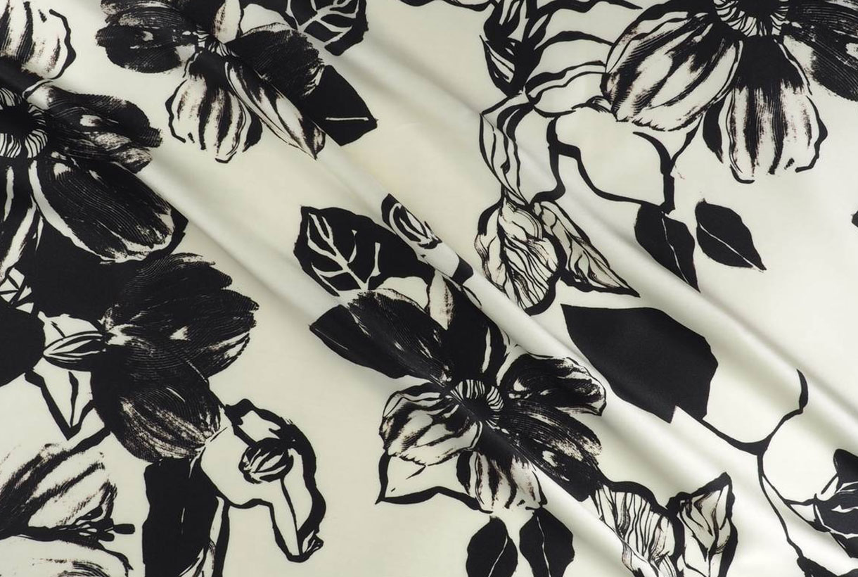
This first range is inspired by attentive waiting: ” one that is willing to receive information and learn from it “. A proposal that is based on learning from the proximity of natural society and human knowledge. Wait… &Listen is built from neutrality and naturalness, presenting colour with renewed subtlety. That means that we speak of natural realism, of materials and finishes that connect with a well-manipulated origin, worked from harmony and sustainability. As for the colour palette, relaxing neutral tones abound, such as natural white, basic ecru and calcareous grey, among other soft colours that structure and soothe. The designs mark a return to the simplicity with linear shapes and geometric basics such as the circle. Rough textures, natural and imperfect finishes, wrinkles and rustic aesthetics return. This trend is also seen in fabrics that are expressed without decorative excesses. Clean-looking matt cotton, linen, hemp, poplin and satin threads abound. Finally, natural fibres coexist with recycled and regenerated synthetics.
Wait… &Wish
The second range appeals to desire, this concept that cannot be materialized and that activates the most creative part of the human being. According to Colour Community: “desire is not satisfied with the tangible and looks for something else as far as possible”. Under this premise, Wait… & Wish seeks to rediscover the secrets of craftsmanship, revaluing all its specific features. In turn this range also focuses on the plant world, but this time it focuses its attention on that nature that we know, but that we rarely touch or experience consciously. The colour is inspired by the apparent chaos of natural beauty, its uniqueness and exuberance with rich, bright and contrasting chromaticism: vegetal green, bright blues, gold foils or crimson brushstrokes. The designs seek to seduce by their elemental, organic and abstract geometries, hand-drawn striped prints, paintings in their freest version and colour combinations that reflect the chromatic chaos of nature. As regards materials there are many works with artisan natural dyes, semi-gloss yarns, die-cuts and laser cuts, utilitarian clothing and satin looks. Finally, in fabrics we are committed to sustainability and comfortable and practical fabrics that do not abandon design. In the fantasy section, Jacquards abound with geometric structures, mesh fabrics, nets and refined weavings such as reliefs and embossing.
Wait… &Enjoy
The third inspiration is the opposite on a conceptual level to the first two: it wants to project the future in an optimistic and creative way, exploring concepts such as freedom, evasion and extroversion. A creative enjoyment that will become limitless, but consistent and thoughtful with the common good. In this range, Colour Community features a creation enriched and loaded with subjective personality, but always coherent and respectful with the environment. The colour palette is based on fresh, cheerful, playful and sensual tones full of positivity and ready to be combined with neutrals. Vital tones such as geranium, fresh mint, chlorophyll, pink and vitaminised lime which combine with neutrals like white and sand-coloured. The designs are seduced by the power of the flowers and the magnetism of the most exuberant vegetation. Leaves, petals, gardens, green spaces … plant nature also takes centre-stage in summer fabrics. In addition to the flower motifs there are beautiful yarns for new colour sensations, shiny fibres, fluid fabrics that create transparency, textured organza with iridescent yarns, Jacquards with reliefs and piqué. In general, the fabrics express that intention to celebrate and dance again through movement.
Wait… &Grow Up
Finally, Wait… & Grow Up represents an evolution of the previous range. It is based on the imperfection of growth, the acceptance of the passage of time and integration of the past in order to understand the future. This range is “a reunion with the most chromatic geometry with a high expressionist content”. Products designed from a future perspective, with this range of colours, will be approached with a stimulating and light-filled mentality in which multicoloured harmonies generating multitone patterns will play a prominent role. The colour palette is thus multifaceted, symbolic, versatile and adaptable to all sectors: mauve, yellow, intoxicating pink, coral, orange, green, grey, blue and sophisticated brown. In designs a mixture of antagonistic, strange motifs and visual surprises is prioritized. With regard to fabrics this last range follows the line of the previous three and has a clear intention: to better production via recovered or recycled yarns, reducing the chemical impact and water consumption, in order to face a future with hope. Finally, the proposal is based on tactile fabrics that provide an extroverted, colourful and highly visible look.
Miércoles 09 septiembre 2020
Sorry, this entry is only available in European Spanish.
Sorry, this entry is only available in European Spanish.
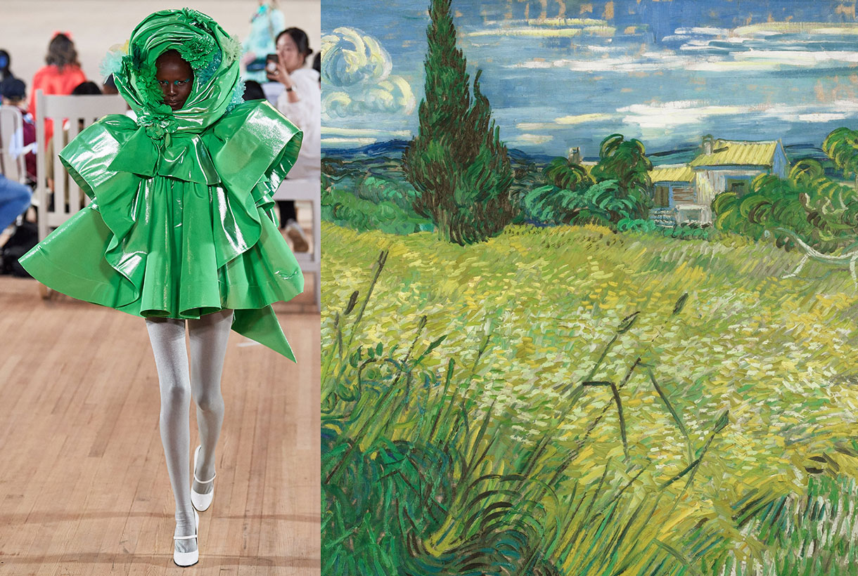
“Green green top the team. Green wind. Green branches … ” intones the enigmatic ‘ Romance Sonámbulo ‘ by Federico García Lorca , perhaps one of the most admired written works of the Spanish poet. A poem where green, which is used in a metaphorical key, is the protagonist of his verses and which serves as a prologue to introduce our particular tribute to this colour full of dualities.
Beyond the colour associated with hope, nature or the environment , did you know that green is the colour of fertility and the bourgeoisie? The tone that is linked with the sacred and the poisonous . The eternal intermediate , which calms and stimulates, and is secondary by definition because it is halfway between blue and yellow in the visible spectrum. Green is life, youth and freshness, but it can also be the tone of the unreal, of envy and disease. How contradictory, right?
We review some curiosities of green that, according to Eva Heller in her book ‘Psychology of colour’, is the preferred colour of 16% of men and 15% of women. A preference that increases with age, especially among the male population.
Brief history of green and some symbolism
In olden times it was considered a primary colour , but today , according to the colour wheel of the traditional RYB colouration model, green is one of the secondary colours, those that are obtained from the mixture in the same proportion of two primary colours. Etymologically the word green comes from the Latin ” virĭdis ” which derives from the verb ” virere “, which means “vigorous, flourishing, young”.
During postclassic and modern Europe, green was the colour associated with wealth, merchants, bankers, and aristocracy, whilst red was reserved for the nobility. For this reason, Leonardo da Vinci’s Mona Lisa outfit and the benches of the British House of Commons are green, while those of the House of Lords are red.
Green also symbolizes the sacred. In 1570, Pope Pius V established green as a liturgical colour, such as white, red, and violet. Of these, green represents the most modest and elemental. Green was also the prophet Muhammad’s favorite colour and is considered a symbol in Islam because it represents the lush vegetation of Paradise. It is no wonder that this colour is found on the flags of almost all Islamic countries. Green also has a long historical tradition as the colour of Ireland and Gaelic culture. It is the symbol of freedom.
In terms of fashion, there is an anecdote related to this enigmatic colour . In 1863, the chemist Eugen Lucius produced an intense green dye, baptized “aldehyde green”, which became very popular thanks to the elegant silk dress worn by the French empress, Eugenia , wife of Napoléon III to attend an opera night. At the time, Eugenia was considered the most beautiful woman in the world, and no one equaled her in elegance. In the light , the green shone inexplicably, which created a sensation among the crowd and immediately became fashionable. Thanks to this success, the German company Höchst emerged, which later put many green dyes on the market, followed by aldehyde green followed by iodine green, methyl green and bitter almond oil green.
Nature and the environment
Green is more than a colour, is the quintessence of nature, associated with environmental awareness and love for life, the fresh and healthy. Precisely, the political groups that defend the protection of the environment and social justice describe themselves as part of the Green movement, some are called Green Parties. This has led to similar advertising campaigns, as companies have sold green or organic products. Green is also the traditional colour of security and permission; a green light means continue, a green card allows permanent residence in the United States. It is also the colour most commonly associated with youth, spring, hope and in Asian countries, this tone is a symbol of fertility and happiness. Did you know?/span>
Another anecdote is that at the University of Frankfurt am Main, Germany, professors used to wear a gown differentiated by colours according to the faculty, green was for economists and social science students, the colour of growth and prosperity.
The dark reverse of green
Green provokes in its turn dualities. No one doubts that it is the symbol of life in its broadest sense and that the term itself adds a natural and well-being sense to any activity. Still, it’s funny how the same green in history has also been linked to the unreal, the monstrous, and the creepy. The colour of the dragon, demon, or monster? Their skins exhibit the most “inhuman” colour possible because there are no mammals with green fur. In popular culture, the os aliens also are represented with this colour. Coincidence?
Green is also sometimes linked to bitterness and in England it is closely linked to envy. The expression a look with green eyes does not refer to the colour of the eyes, but to an envious look. A male Gucci colony is called Envy (envy), and its colour is pale green. In France, green is a colour that brings bad luck for superstitious people. If a Frenchman says Je suis vert, he is very angry. Vert de colère, green with anger.
Green is also the colour of poison, and as we said above above, symbol of health-. We imagine poison as a green substance, and colloquial German uses a word made up of “green” and “poison”, giftgrün. Green also became for painters the colour linked to toxicity due to its complexity in the manufacturing process with the mixture of certain substances such as arsenic and other dyes that were harmful to health.
The ragin green news
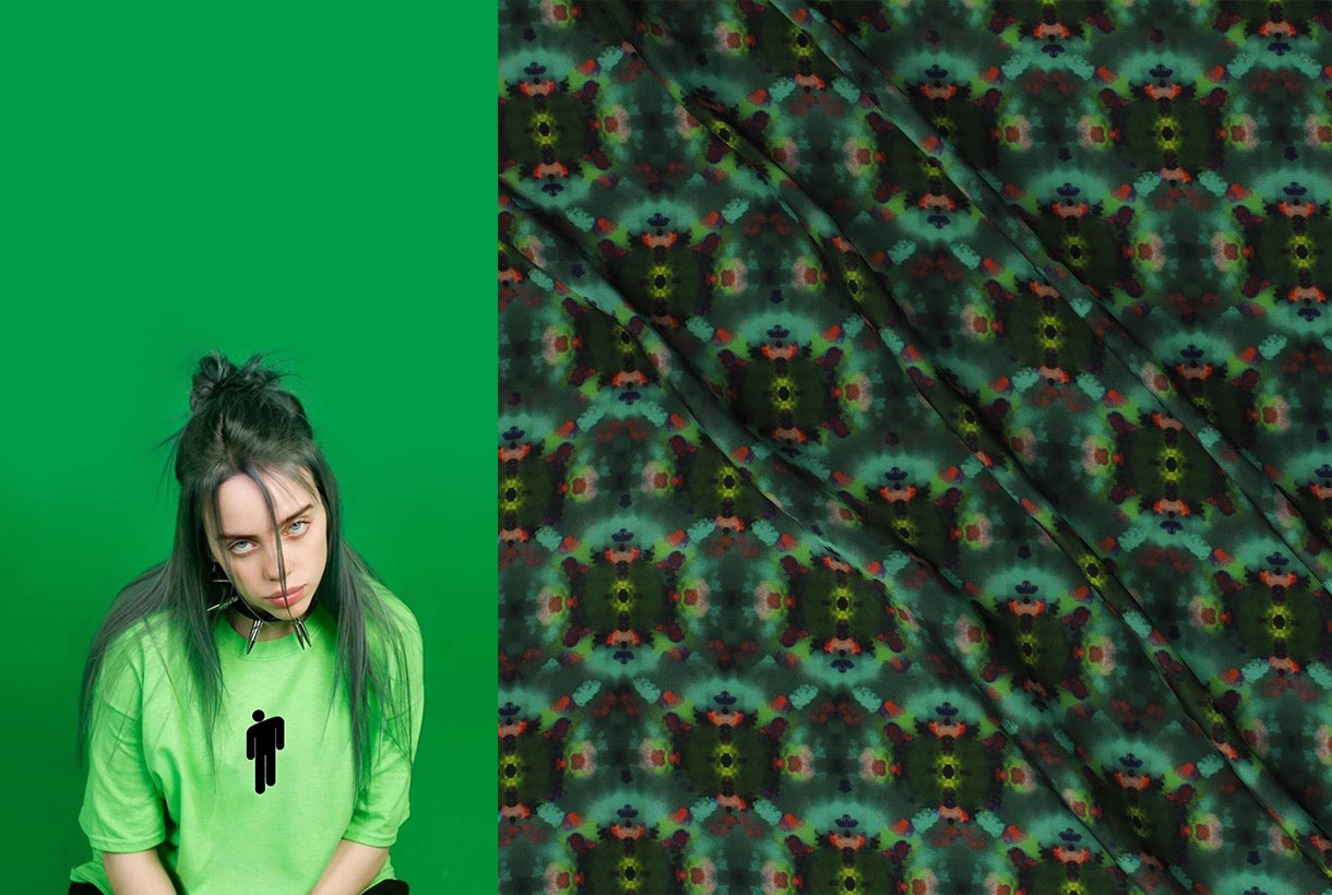
It is not the usual colour inside the wardrobe, nor is it very common to see in its most vibrant tones. Despite this, there are certain shades of green that are setting trends this Spring – Summer 2020 season and its design potential and combinations are infinite . Either because they have been seen on the catwalks, or on the street worn by artists like Billie Eilish -and her green hair- and the main fashion prescribers. We discover five types of green that are being worn, some of them will have continuity in the next season.
1. Biscay Green
If last year was the reign of pistachio tones, this year the crown is held by the unexpected Biscay Green. A fresh and refreshing aqua green that adorns chiffon dresses and sequined garments.
2. Mint
A pastel green that adds lightness and sweetness to the garments. It is very flattering on tanned skin and ideal to wear in monochrome looks.
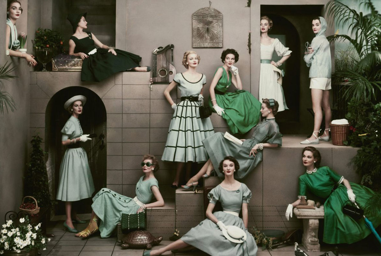
3. Emerald
It was the colour of the year in 2013, according to Pantone and in truth, this shade of deep green has never quite gone from the fashion scene. Powerful and hopeful, emerald green brings out its most enigmatic side when paired with pink and violets.
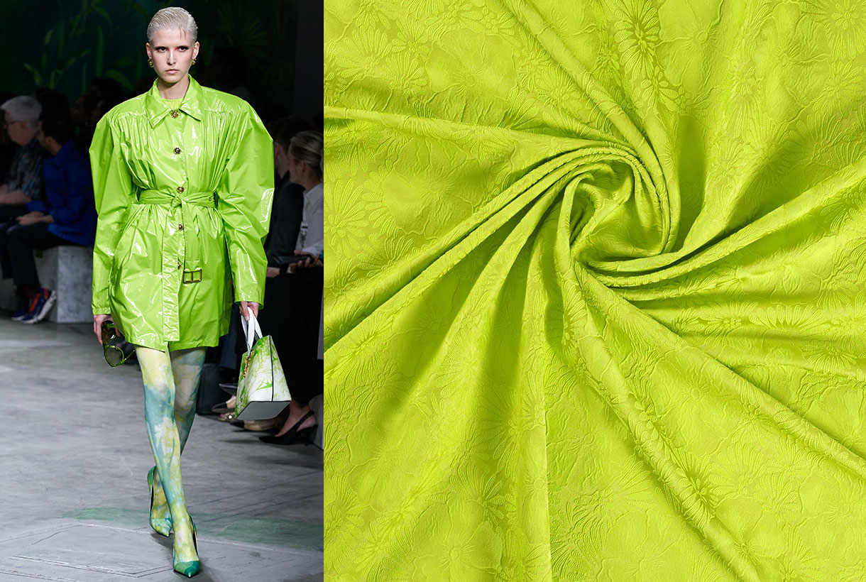
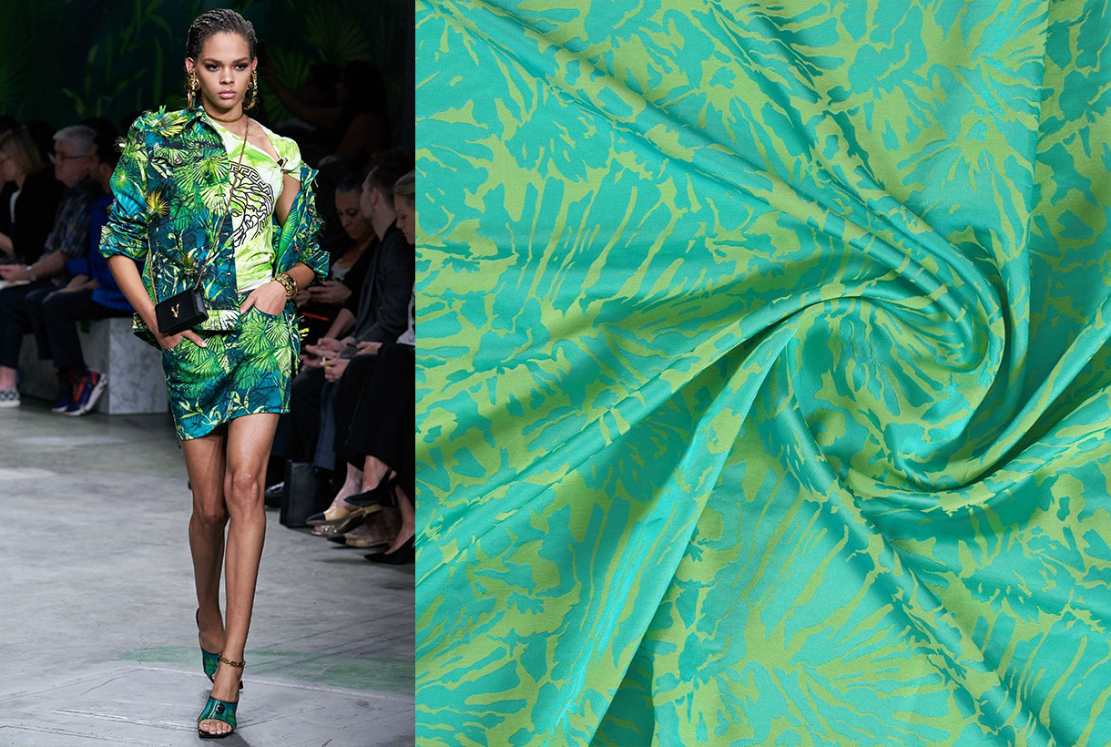
4. Lime
The lime green contiues to be one of the important green trendsetters. Now it comes in its most yellowish version with the Chartreuse and also in its more acidic tones, such as neon green. A striking, bold and regenerating colour.
5. Olive
A light shade that connects with the safari trend of camouflage tones with brown shades that give that feeling of naturalness. It works great with neutral colours.
We encourage you to discover the green tones of the new Spring- Summer 2020 season. Come to our space in Barcelona or access them through the new products that we have already on offer on our online store.
March, like September, is the month of rebirth. From the blooming of the new season that hitherto has been hibernating in our stores, waiting for its turn: the official presentation to society. And we really wanted to show the new collection of fabrics, this time absorbed under the Double Poetry concept.
Double Poetry appeals to poetry that hides duality. A dual year (2020) inspires a spring-summer collection that moves between two waters. On a creative level we are inspired by the antagonisms that are related to each other, especially in work processes: the mental and the irrational, technology and emotion, what develops in a cerebral way and what is guided from the heart. We provide the most advanced technology with poetry and human emotion to create a rational and tangible proposal, but with high doses of sensitivity.
Under this concept of extremes that complement each other, the Spring-Summer 2020 proposal is developed in two directions:
1. A turn to contemporary classics
The classic does not have to be predictable or boring, especially when it undergoes a transformation that shakes and rejuvenates it. We like to get out of our comfort zone with disruptive proposals. This line contemplates fabrics that retain a certain timeless primitivism. They are easily recognizable products, close to the domestic and that convey security and everyday life: wear a Jacquard out of the festive season or look for a type of cotton that conveys a message, why not? A range of traditional fabrics (drapery, tweeds and wool items are coming back), some of them rustic looking and which interact with the latest technologies to include us in contemporary fashion.
Within this line the tactile fabrics are grouped, with certain reliefs: granulated, obvious crepes, flamed, flexible volumes, synthetic glitters, silver lurex worked in a delicate way and without stridencies. These products stand out because they seek to enhance the beauty of the raw material. They are handmade and rustic fabrics, but at the same time technologically sophisticated and they show these imperfections (reliefs and volumes) with pride. In terms of design, contemporary classics are inspired by the ethnic universe in a minimalist key: in a natural folk style with firm strokes, sinuous and organic shapes. This category also abounds with repetitive, almost elementary geometries, with or without symmetry: clean frames and essential stripe patterns. Finally we are not forgetting floral prints with delicious compositions with petals and motifs that are inspired by the surfing universe of vibrant colours.
In this first block neutral tones abound, an earth palette with golden nuances, the unbeatable black and white or navy blue combinables.
2. An ode to the urban landscape
The second address of the Spring-Summer 20 collection puts us in an urban environment. The city as the core of human relations. We seek that direct connection with our glass and concrete home and within this line we embrace experimentation with surprising combinations of materials and textures with vital, luminous and energetic colours that can be confronted face to face to create an interesting dialogue in tune with the urban landscape.
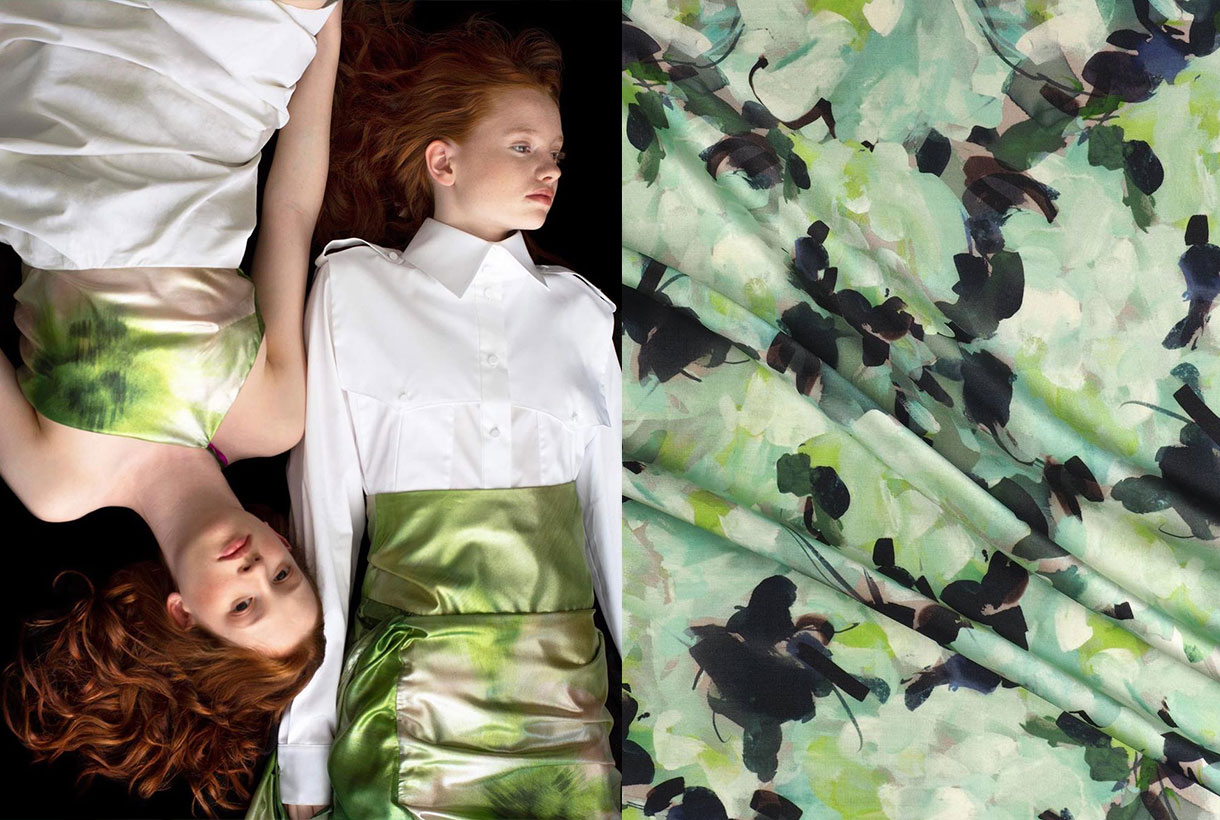
In this second block fabrics of a young and fresh luminosity abound, with intelligent and emotional shades at the same time. We seek to appeal to the emotions with this mix and we let ourselves get carried away by intuition. Thus the fabrics we are suggesting stand out for their evidenced volumes, they are dense in appearance, with artificial compositions and elegant textures for a seduction that enters daytime terrain. Feminine and fluid fabrics with light and fresh reliefs because we want to communicate energy and spontaneity through the materials. In turn the products have a clean appearance, technical touches only in finishes and they have a spontaneous and energetic design for a look that stands out within the city. The fabrics seek some theatricality and joy with giant graphics for the outdoors, aquatic reflections and botanical-inspired prints. A line that encourages us to rethink aesthetic codes and experiment without questioning the beauty or the need for the final products.
In this second block mineral colours abound ranging from blue to pale pink or lavenders, oranges and a palette of greens and limes. Vibrant tones that are exhibited for their own sake.
We invite you to discover the new Spring-Summer 2020 collection through the online store or in our Gratacós space in Barcelona. Let yourself be seduced by the materials, textures and patterns of the fabrics!
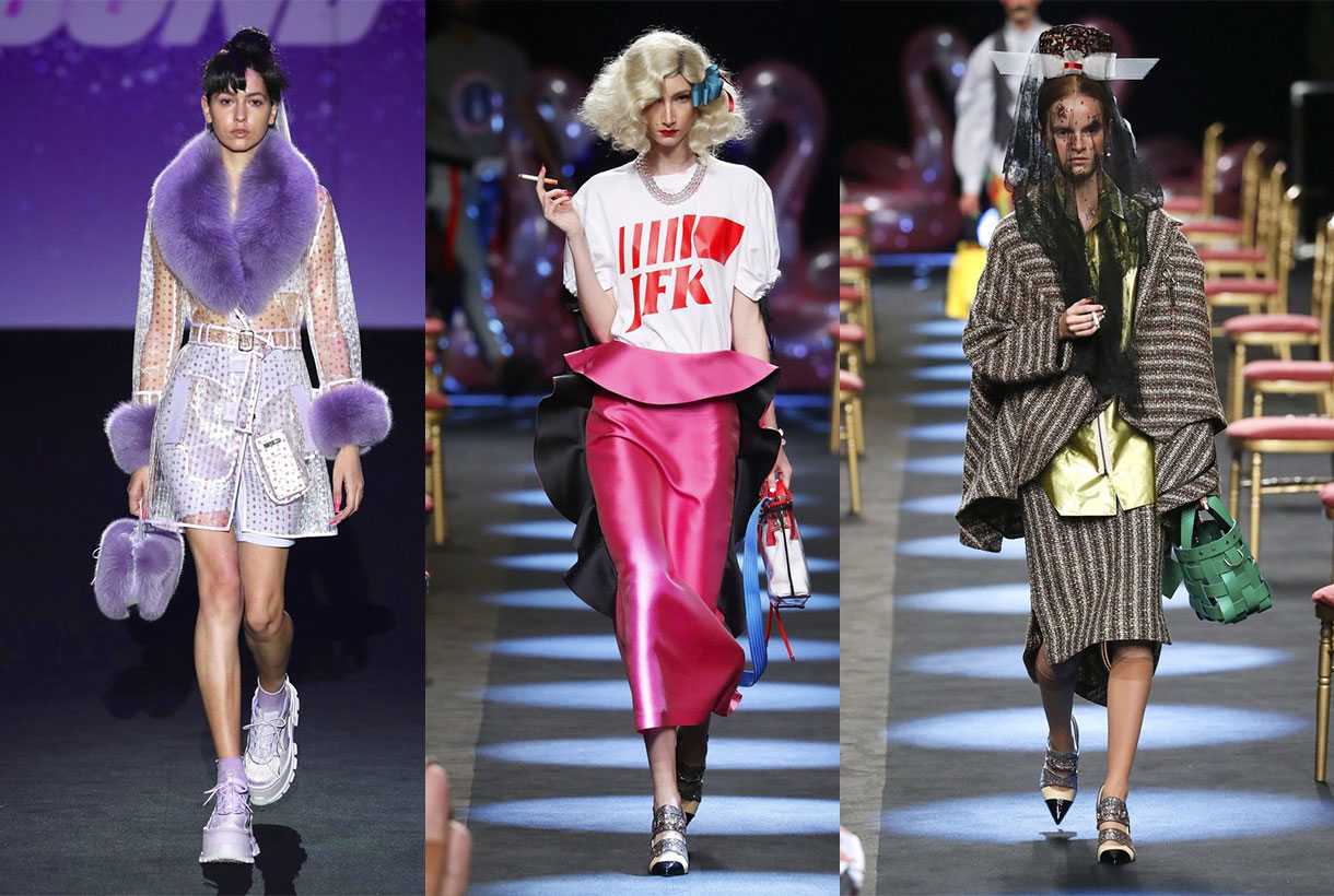
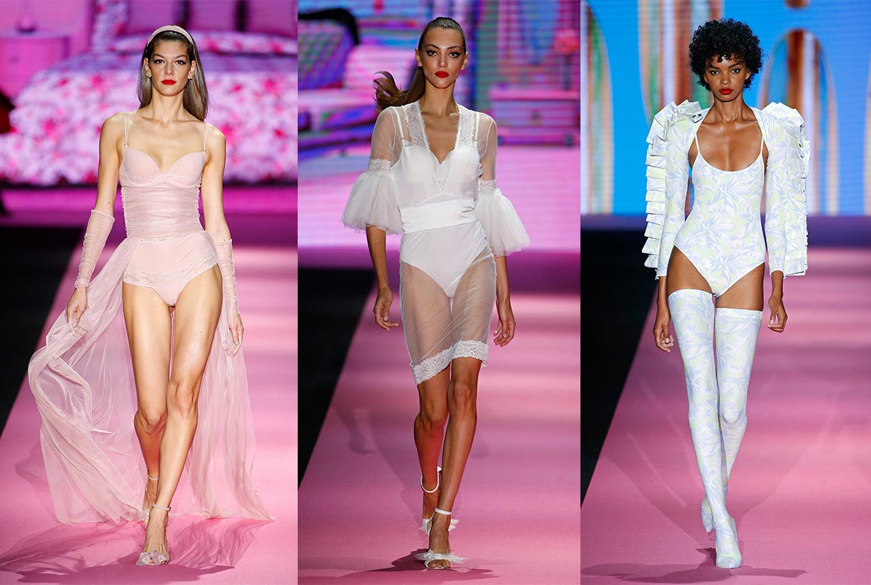
And after Madrid it was the turn of the fashion week in Barcelona with the new edition of 080 Barcelona Fashion held, as usual, in the Modernist Venue of Sant Pau. This year the Catalan catwalk did not have as many designers or brands as previous editions, but the initiative covered these local absences by reaffirming its commitment to international companies and the inclusion of new exhibition formats of the collections that adapt to the needs of the smallest of small designers. Once again at Gratacós we are following some fashion shows of designers who rely on our fabrics to come up with their proposals for the next Autumn-Winter season. These were the most hunted looks!
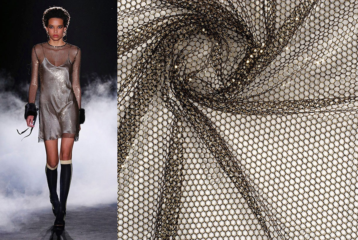
Eiko Ai
This young Barcelona firm debuted on the Catalan catwalk with ‘Quantum One’, a collection inspired by quantum energy and the unity of the cosmos that represents an evolution of its previous proposal. It was a feminine creation with a galactic theme, where several Gratacós fabrics were on display in a range of textures and transparencies: organza, flocking, jacquards, metallic finishes, sequins, technical fabrics, steams, satins and crepes combined with floral and geometric-inspired drawings with a print that precisely evokes those magical worlds.
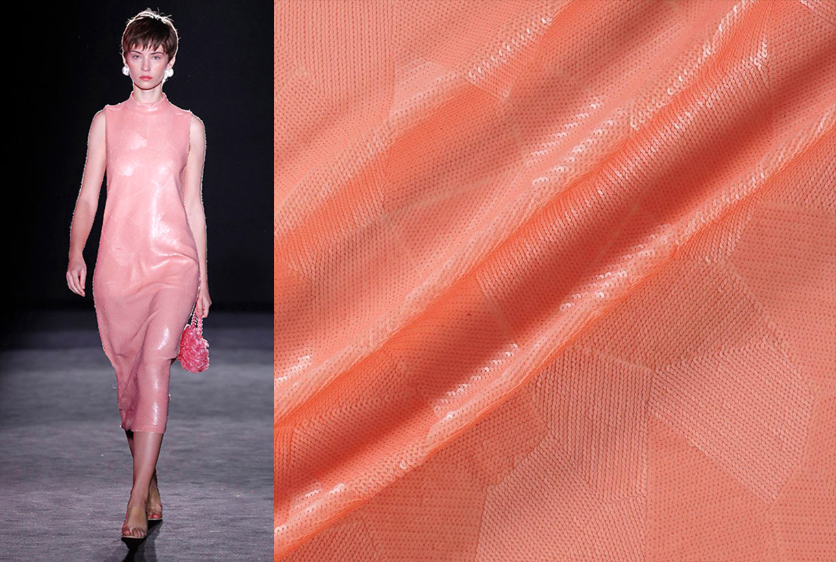
The stars and flashes of the Milky Way influenced the colour palette with shades full of light, artificial colours, lilacs, mints and off-white looks. From out of the immense darkness of space emerge jet black and midnight blue. And from the planets and cosmic materials come the reds, nudes and deep pinks.
En su conjunto, Eiko Ai designed a whole collection inspired by a daring and feminine woman with delicate designer clothes and a contemporary spirit which stand out for their artisanal creativity as well as for the quality of materials and local production.
Menchén Tomàs
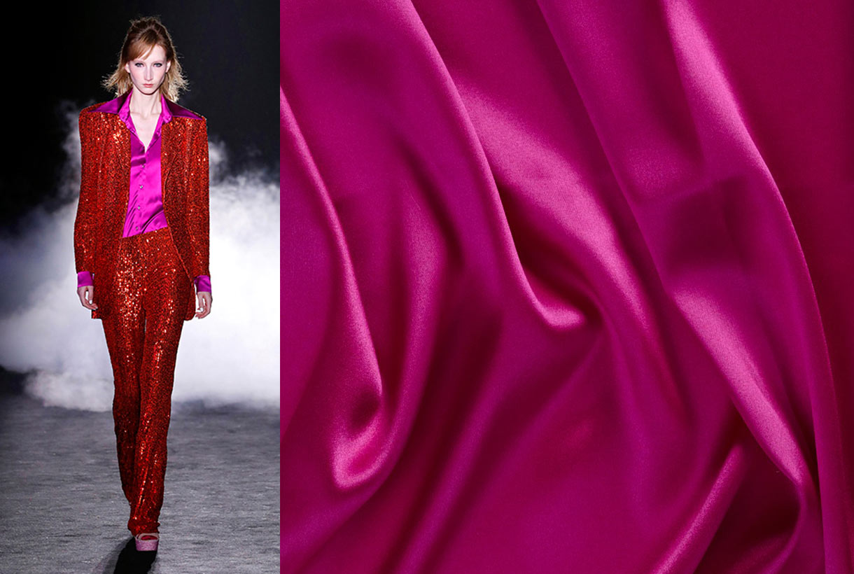
The sophisticated note of the latest editions of 080 is added by Menchén Tomàs. This time Olga Menchén was inspired by the busy night-life of Manhattan in the 70s, just at that time of sunset, when lawyers, brokers and office workers have left the streets and when with nightfall other characters appear on the scene, from diverse classes, cultures and origins such as millionaires, the homeless, artists, DJs, pimps and prostitutes … A mixture of disco, decay, drugs, the gay scene, the mythical Studio 54…
To shape this amalgam of people and nocturnal inspirations, Menchén Tomàs came up with a creation full of flared trousers, sleek jackets, billowing short dresses, oriental-inspired pieces, never-ending collars, embroidery, bias and lace finishes. They highlighted fabrics that radiate light, others hand-produced and embroidered, together with unique prints.
The colour palette used was intense and contrasted with impossible mixtures of great visual impact: pistachio green with fuchsia, pink with purples, glitters, sequins, and, of course, black and white.
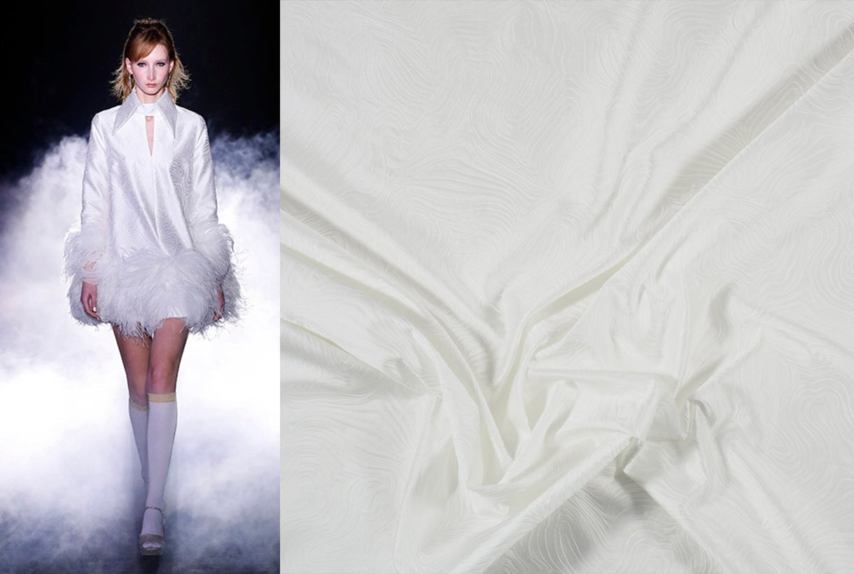
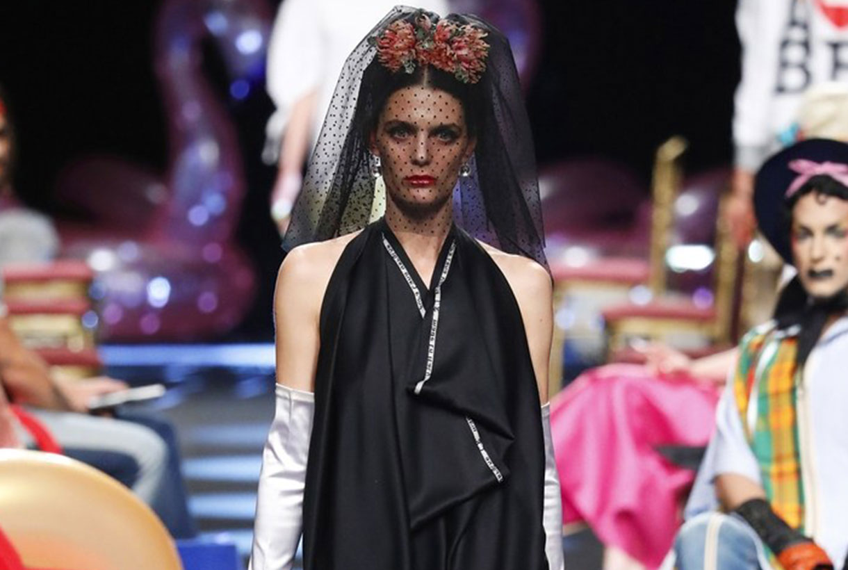
Juanjo Villalba
Juanjo Villalba Bermúdez opened the last day of 080 dedicated to capsule collections presented in more free and open formats than in traditional parades, with more scope for the creativity of each designer via presentations that resemble artistic performances. This designer took advantage of his participation in the Catalan catwalk to present his personal project: ‘Emotional mythology’ through 12 looks which at first sight seem unrelated but whose detail maintains their essence. Each look represented a love story told through the costumes and where each model represented a divinity. At the end of the parade attendees could view the collection from close-up and touch the garments directly.
Emotional Mythology was Villalba’s letter of introduction as a designer -before that he was working in fashion marketing- and it was a throw of the dice which opened up new professional opportunities in the fashion industry.
Miércoles 05 febrero 2020
Sorry, this entry is only available in European Spanish.
 We often focus on fashion shows as a centre of analysis of the latest trends in colour and trend-setting fabrics, although we do not deny that it is on the red carpet of major events related to cinema, fashion or music where these trends crystallize, through impact looks that also influence what will be worn during one season or another. These costumes or dresses worn by the artists of the moment are not chosen at random – or not at all – but are also part of the machinery of the industry itself in order to define the main features of the season. Designers choose, celebrities wear thelook and consumers buy. Everyone plays a role in this ephemeral sector.
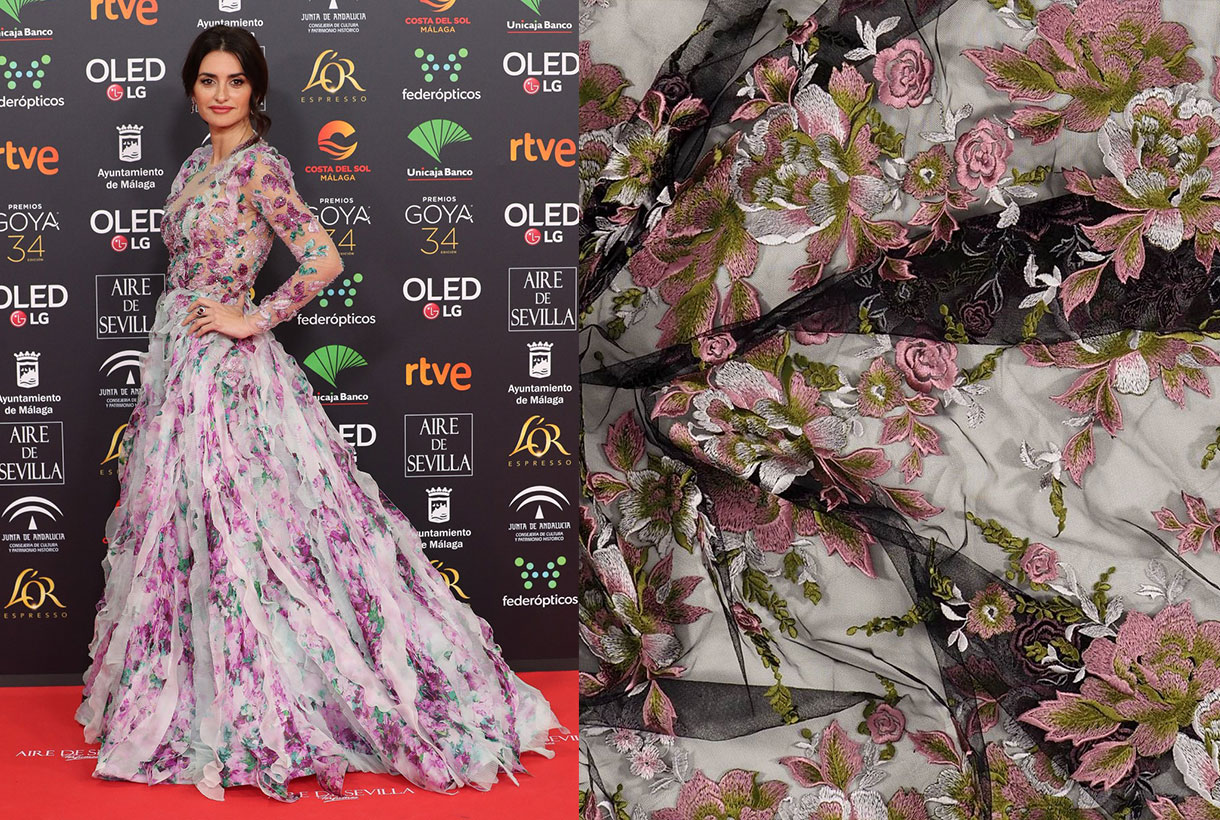
On a purely national level the red carpet of the Goya 2020 Awards was one of the most recent events, which highlighted an extensive cat-walk of trends with specific styles, couture, colours and fabrics. The event, apart from being the big night for Spanish cinema, is also important with regard to fashion, where many designers bring out their latest creations, each represented by his or her best muse. We analyze some of the trends, setting out the looks that impressed us most.
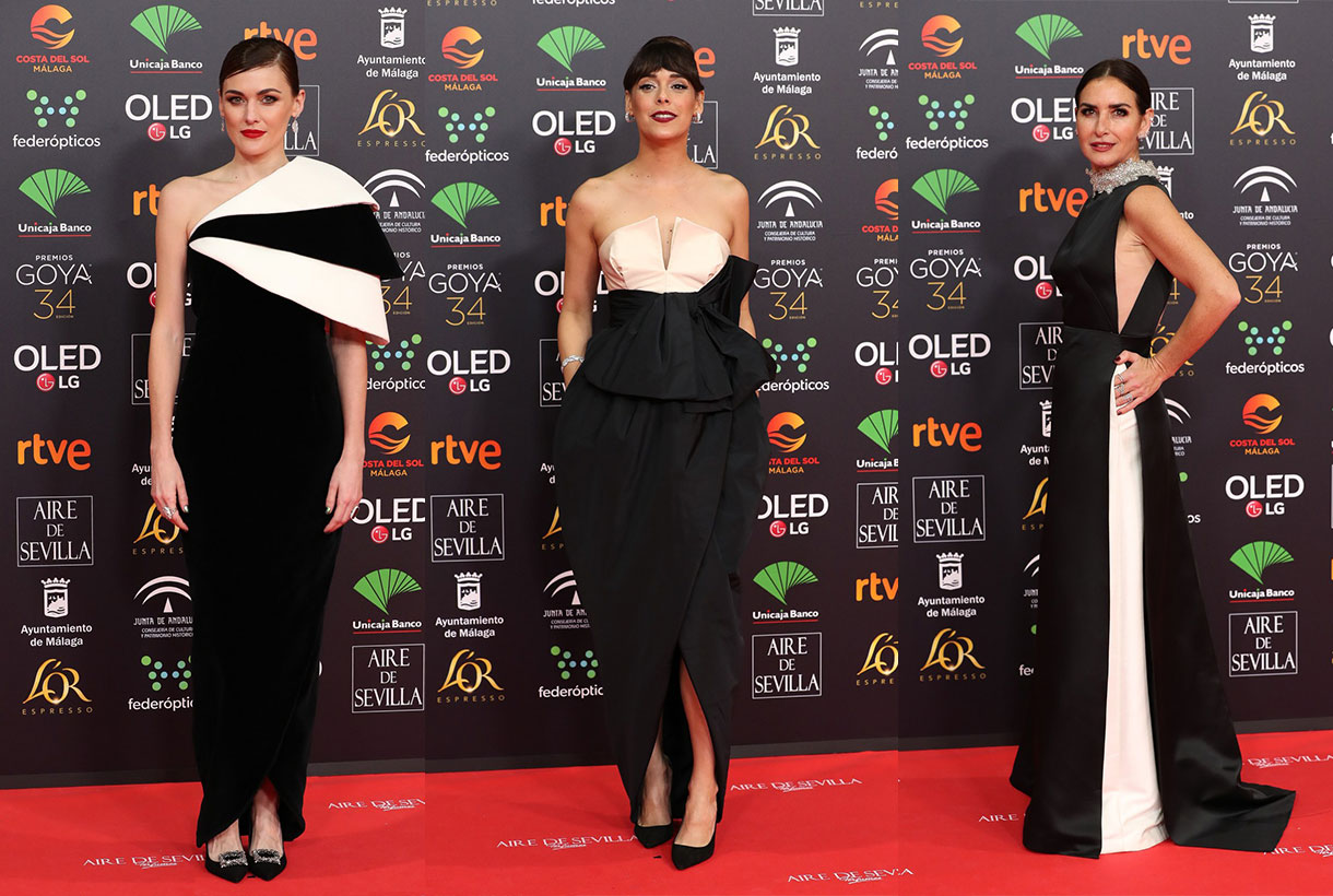
The return of the classic style
Never underestimate the power of classic style with elegant silhouettes of retro spirit, inspired by the outfits of old Hollywood glories. Actresses Marta Nieto, Belén Cuesta, Belén López or Andrea Duro have opted for this purist return with black and white styling, one of the most iconic and infallible duos that exist in fashion. And obviously they have triumphed stylistically on the red carpet.
Andrea Duro wore an asymmetrical dress in bright black and white fabrics from Philosophy di Lorenzo Serafini. Belén Cuesta, Best Leading Actress for her role in ‘The Infinite Trench’, was without parallel in a twin-coloures Pertegaz dress of classic features. Highly commended for her elegance was the asymmetrical dress of Marta Nieto, nominated for the Goya Award for Best Leading Actress for her role in ‘Mother’ by Jorge Acuña. Another outstanding look was that of Belén López with Antonio García’s dress in ivory and black satin together with turtleneck in embroidered tulle with Swarovski crystals.
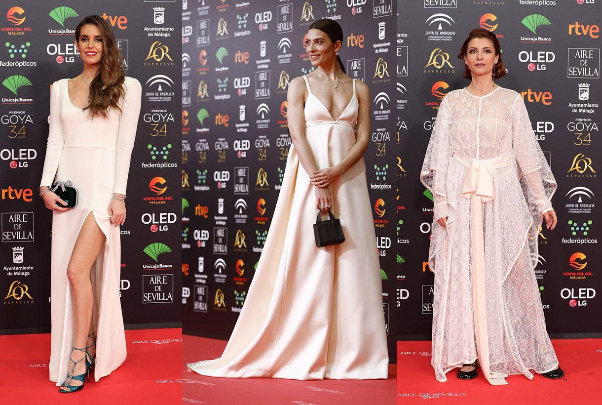
White too
White dresses, sometimes with slight shades of colour such as skin-tone, ivory or broken, were also a feature. Clear shades that ally with the neutral ones on a red carpet were no surprise in this edition, given their excessive colour. The splashes of colour , especially at the beginning of the red carpet, have been anecdotal, and it seems that the guests have found security in the neutrals, those recurring shades that are always infallible and that practically never go out of style.
The actress Paz Vega wore white, with a design created exclusively for her with shoulder pads, mermaid silhouette and sequins for the final touch of brilliance. Barbara Lennie was also in a white dress with contrasting back tie by Carolina Herreraas was singer Najwa Nimri with lace dress by Loewe and swimmer Ona Carbonell with a plain model with pronounced front slit by Miguel Marinero.
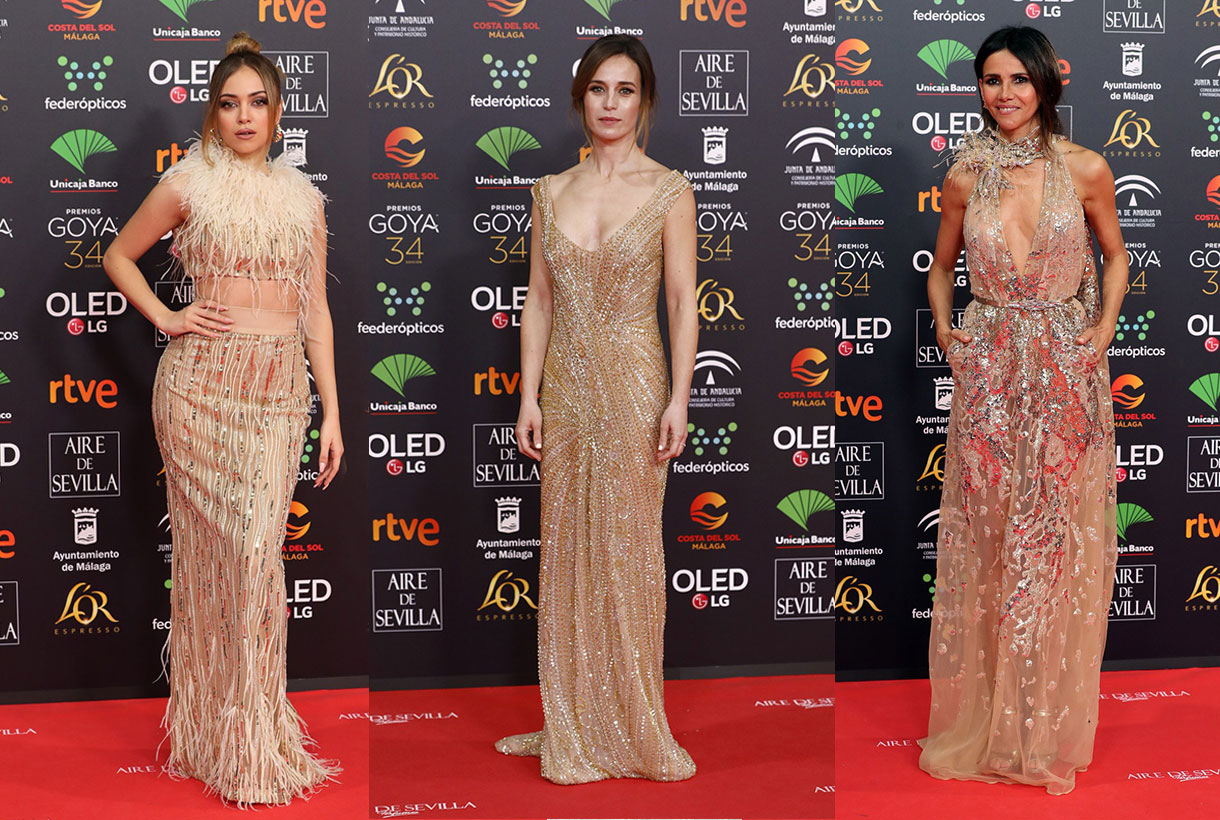
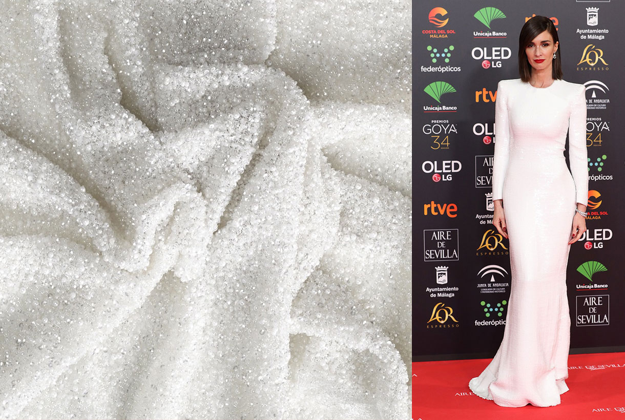
Sparkles in old gold
Within the neutral field metallic dresses stood out, especially those that opted for golden shades. To enhance their natural shine they were accompanied by sequins along with other details such as embroidery and feathers.
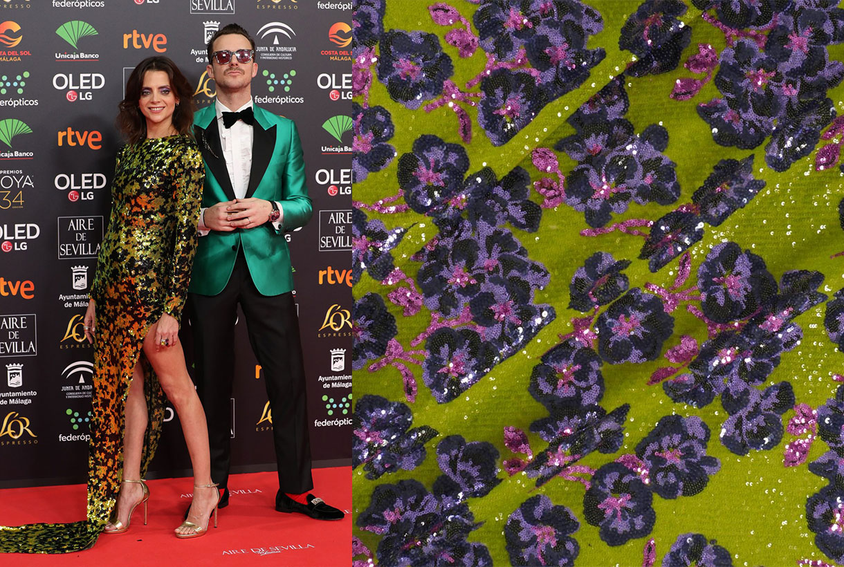
This tone linked to luxury and power was chosen by actress Clara Lago with a spectacular flake print dress by Oscar de la Renta Prefall 2019, Goya Toledo with embroidery and transparencies by Elie Saab, Marta Etura with a brilliant dress by Gabriel Lage and Ana Mena, who mixed sequins and feathers with a Rubén Hernández look.
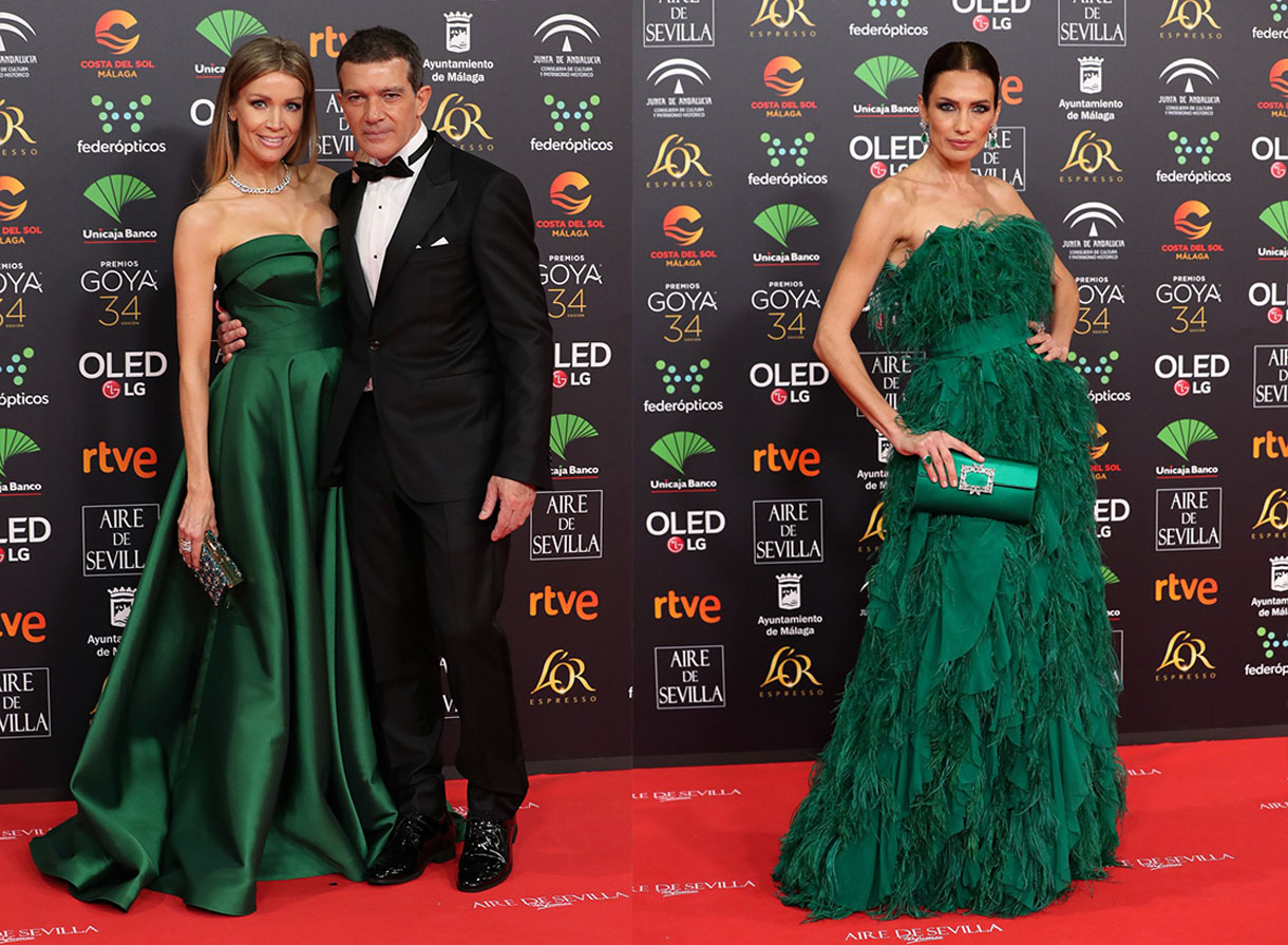
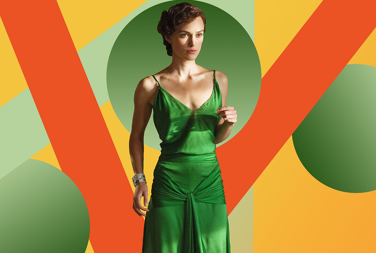
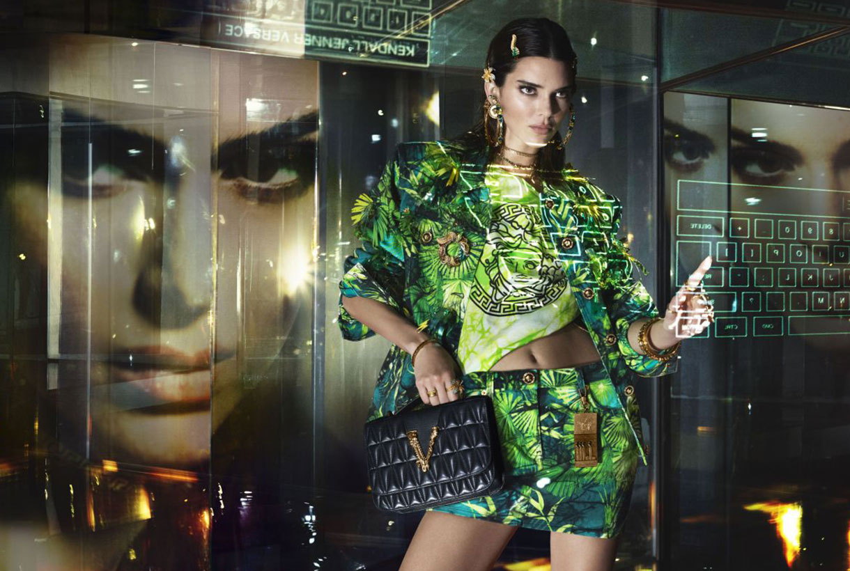
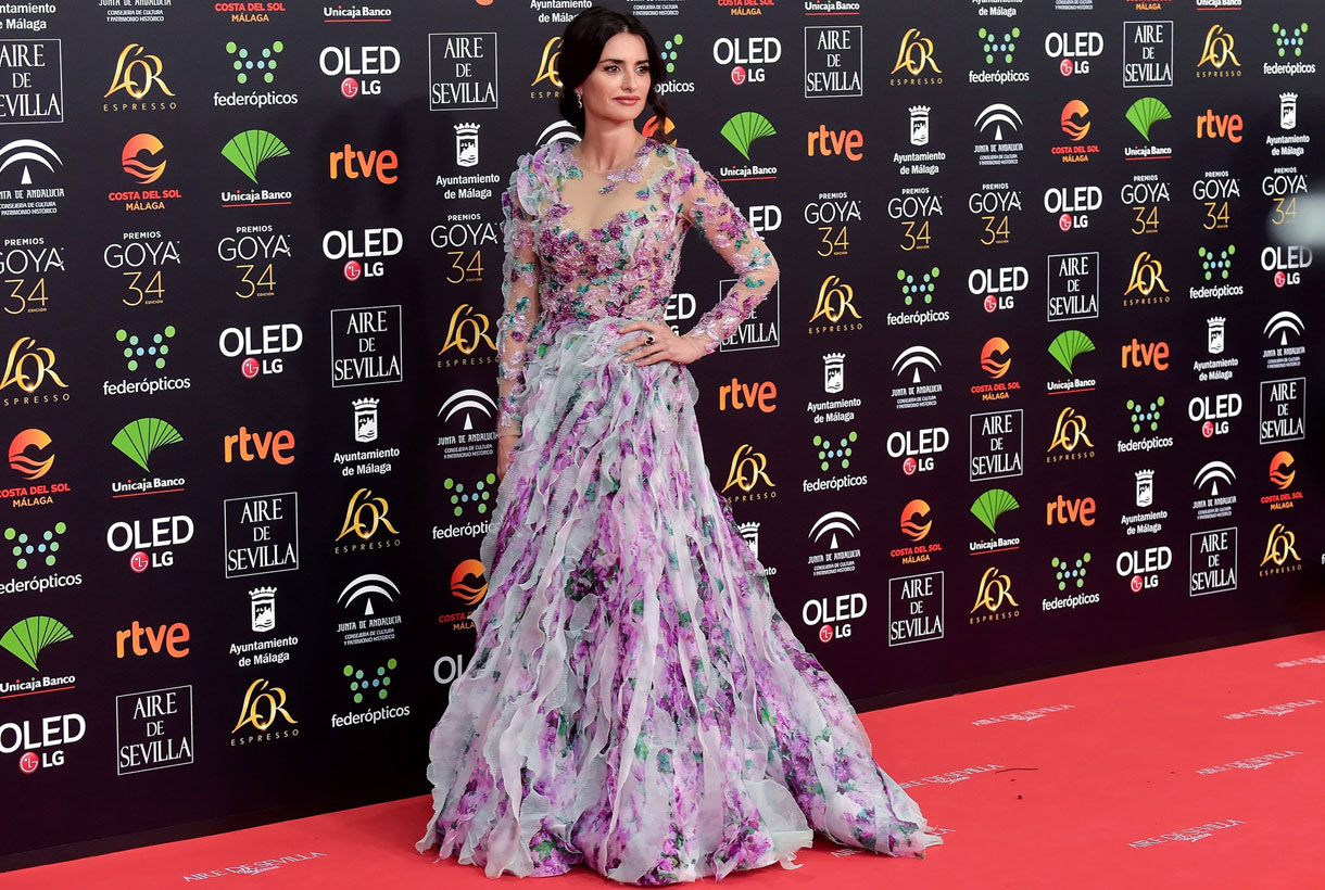
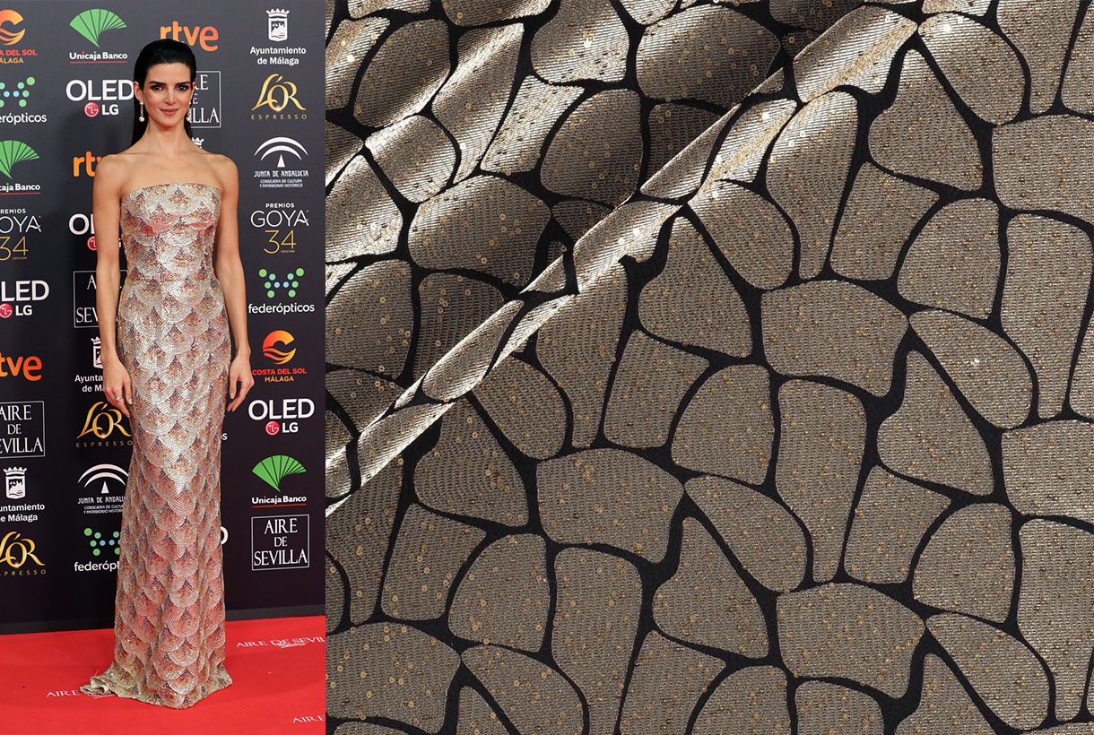
Emerald
Emerald green was, together with the colour red, one of the vibrant shades that dazzled on the red carpet of the Goya 2020. It is a hue that hides a powerful meaning since it has since time immemorial represented happiness, life and obviously, hope. It is a fresh and radiant shade associated with spring and, therefore, with youth.
The most daring couple of the night, chromatically speaking, were actress Macarena Gómez with asymmetrical floral sequin dress by Teresa Helbig and her husband Aldo Comas with Avellaneda silk jacket, trousers and shirt by Loro Pianza. Nieves Alvarez wore emerald green with her innate elegance in a plumage type dress by Alberta Ferretti Limited Edition, as did Nicole Kimpel in a Pronovias word of honour dress.
Gratacós are also attaching some fabrics inspired by these looks so you can dream of making your own creation. Are you already imagining it?
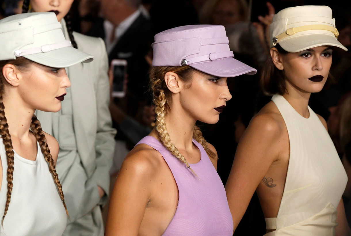
The catwalks of Madrid and Barcelona are both preparing their Spanish fashion week, where the best designers on the national scene will meet to present the Autumn-Winter 2020/2021 collections. As usual, at Gratacós we will be giving close attention to the new fabrics that will be presented on the catwalk in the form of original creations. Designers who trust in us always surprise us!
Mercedes-Benz Fashion Week Madrid
Mercedes-Benz Fashion Week Madrid is preparing a new edition with the participation of three key names in Spanish design that increase its range: the return of Pertegaz, which will the first time take to the catwalk and will do so with the signing of Galician fashion designer Jorge Vázquez; the Seville company Fernando Claro and Dominnico, which will be an extensive feature of the MBFWMadrid catwalk. These three companies are the highlights of the fashion event that will be held between January 28 and February 2 at IFEMA. Along with the new additions, the composition of the parade calendar is made up of 37 leading Spanish designers and brands such as Ana Locking, Devota & Lomba, The 2nd Skin Co, Agatha Ruiz de la Prada, Pedro del Hierro, Custo Barcelona, Angel Schelesser, Brain & Beast, Devota & Lomba , Andrés Sardá, Juan Vidal, among others. This edition of Mercedes Benz Fashion Week Madrid will also have a tribute to the designer Andrés Sardá, who passed away last September.
In this case, for the Madrid catwalk we will be following the Dominnico and Brain & Beast parades live and focus on the looks of Moisés Nieto, Mans Concept Menswear, Angel Schelesser, Ulises Mérida, Juan Vidal, Beatriz Peñalver, The 2nd Skin Co, Eduardo Navarrete and Teresa Helbig, who in turn will present the new designs for Iberia.
The Madrid catwalk will also pay tribute to Andrés Sardá , founder of the international lingerie firm, who died last September. The collection that will be presented is a tribute to his life, a review of the evolution of the company that forever changed intimate and bathroom fashion in Spain. The family firm took its first steps making shawls like the one Jackie Kennedy wore on her visit to Spain. Then they made the leap into lingerie and, in the 70s, to bathroom-wear. Women like Lady Gaga, Julianne Moore or Shakira have worn their creations. Luxury and comfort are the two key features of the company, headed today by Núria Sardá.
080 Barcelona Fashion
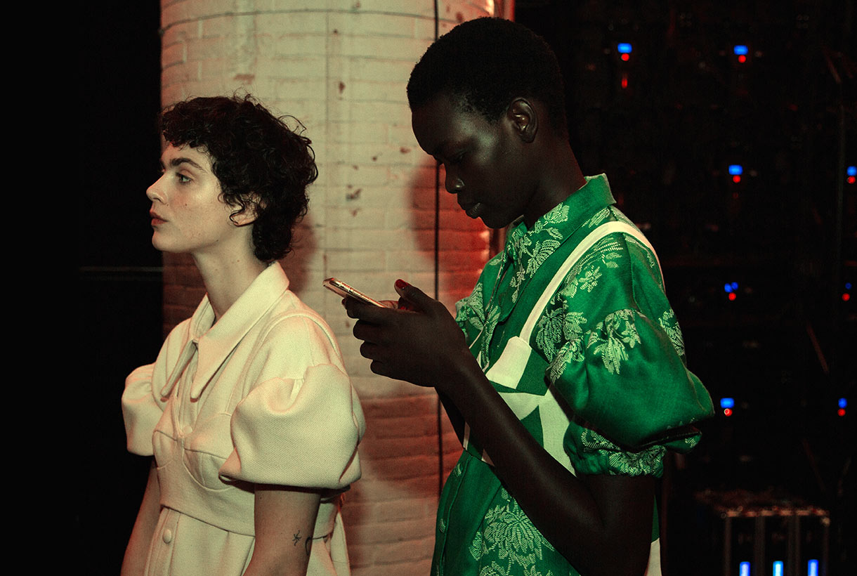
In Barcelona 080 Barcelona Fashion returns to its usual setting: the Sant Pau Modernist Venue that will incorporate new presentation formats in this edition, which seeks to be more international. Thus the latestt edition, that will take place from February 3-6, will feature prominent companies such as South Africa’s CHULAAP, the Asian-born Peruvian designer Esau Yori, the New York company Love Binetti, the designers Yiorgos Eleftheriades and Boris Bidjan, who will return to the parade in Barcelona after eleven seasons presenting his collections in Paris.
At Gratacós we will follow closely the new Menchen Tomàs collection inspired by the Manhattan of the 70s and the debut of Avellaneda with his range of feminine tailoring, and Eikò Ai , the company of the Barcelona designer Glòria Lladó. This brand will present Quantum One, a collection that takes as its reference quantum energy and the unity of the cosmos in its hand-made and locally produced design creations. We will see what they surprise us with!
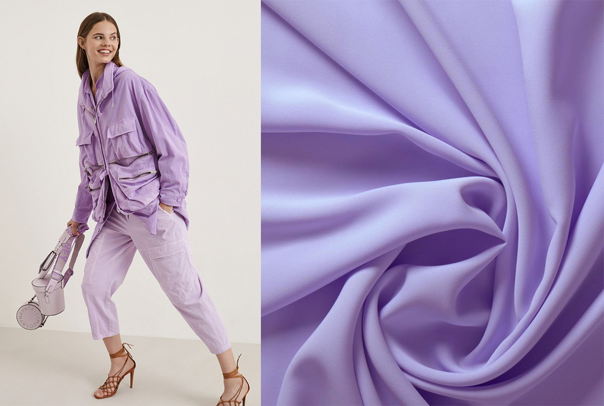
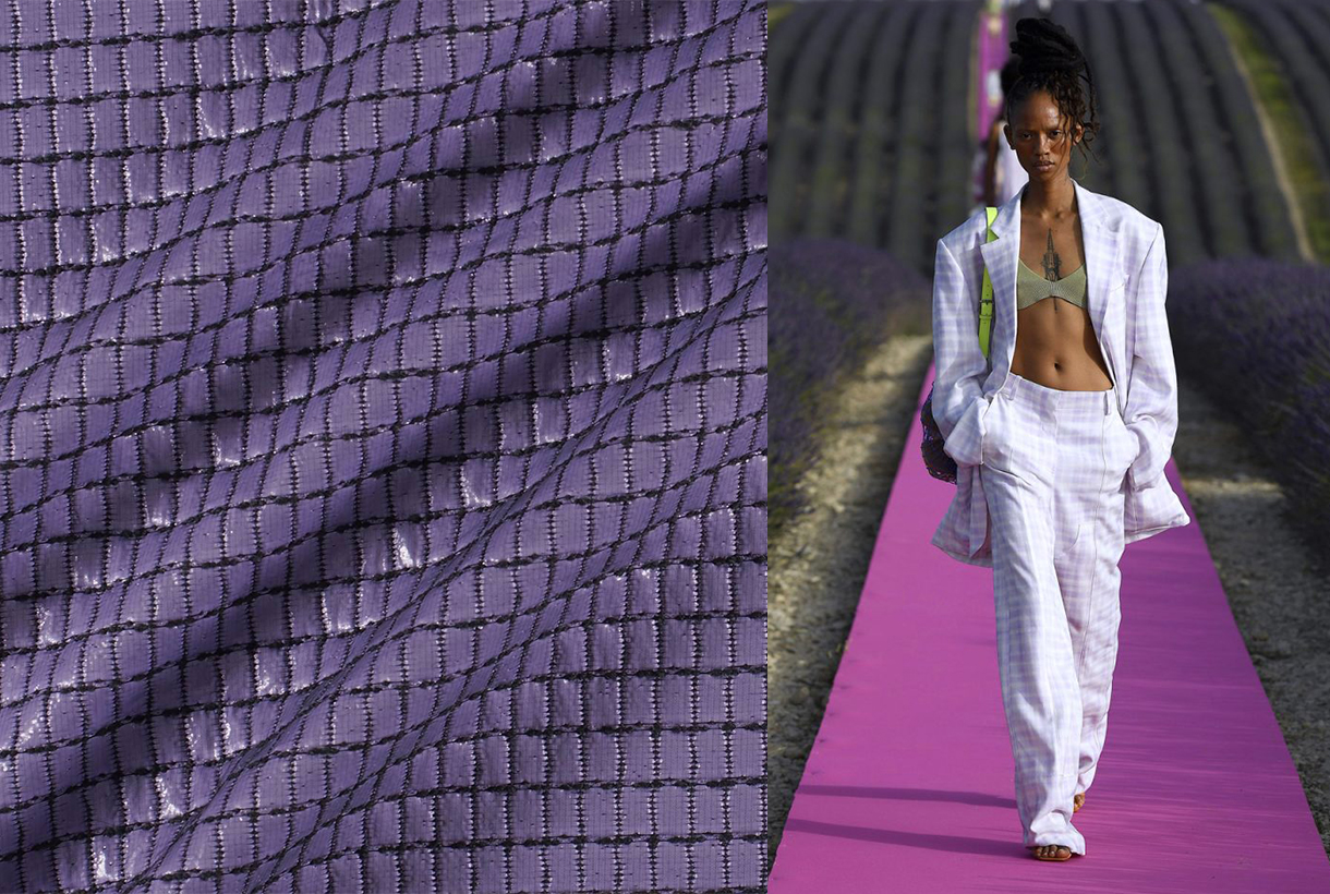
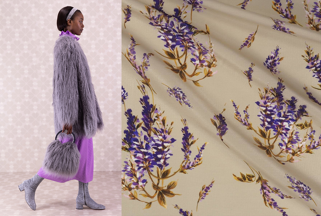
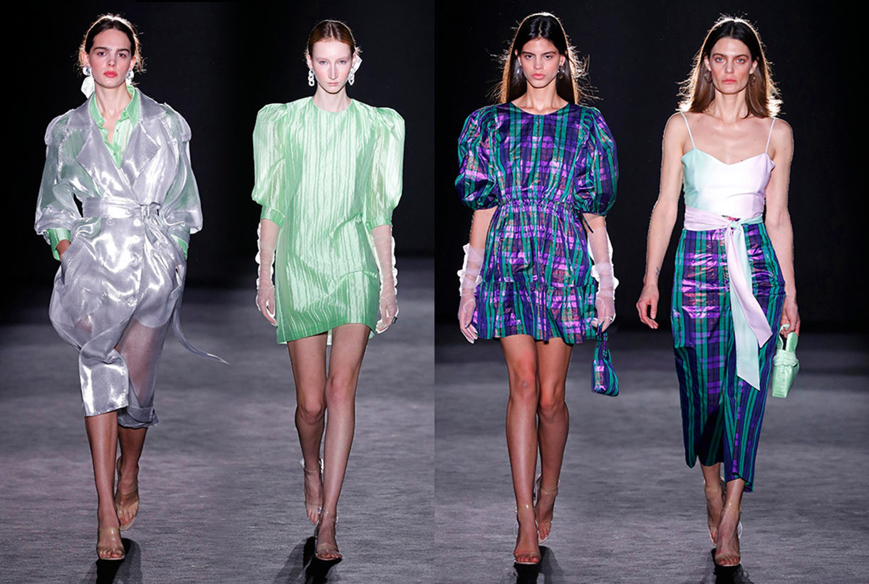
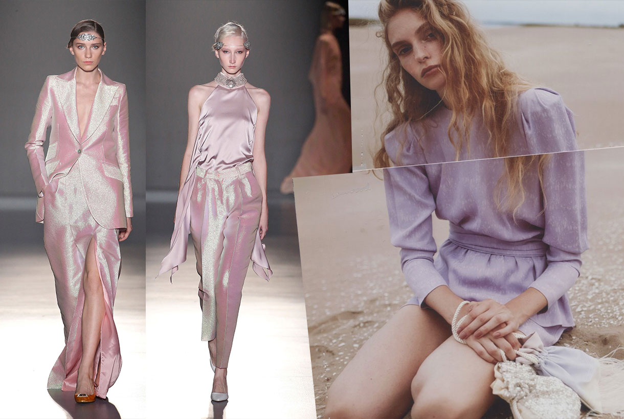
Sometimes what experts in the field dictate does not have to be what ends up as a success on the street because, after all, taste and preferences are governed by perception and subjectivity. The same happens year after year, by way of example, with colour. A few weeks ago, Pantone ruled which colour would influence the world of fashion in 2020, as well as among other sectors such as design, decoration or advertising. The colour chosen is Pantone 19-4052 Classic Blue, a timeless blue shade that aims to provide calm, confidence and connection in a year that acts as a hinge between two decades. Classic Blue is the theory dictated by the colour authority after a year of research and analysis of trends. In practice, the reality is different because it does not always lead to success among the knowledgeable public that creates the trend and the moment, where the colour that is triumphing in fashion is lilac or lavender. And who endorses it? The answer is to be found on the catwalks of the Spring-Summer 2020 collections and it is put it into practice by celebrities, prescribers of style and experts in the field who have not hesitated to wear it on the street, thus creating an advance idea as to what will come next season.
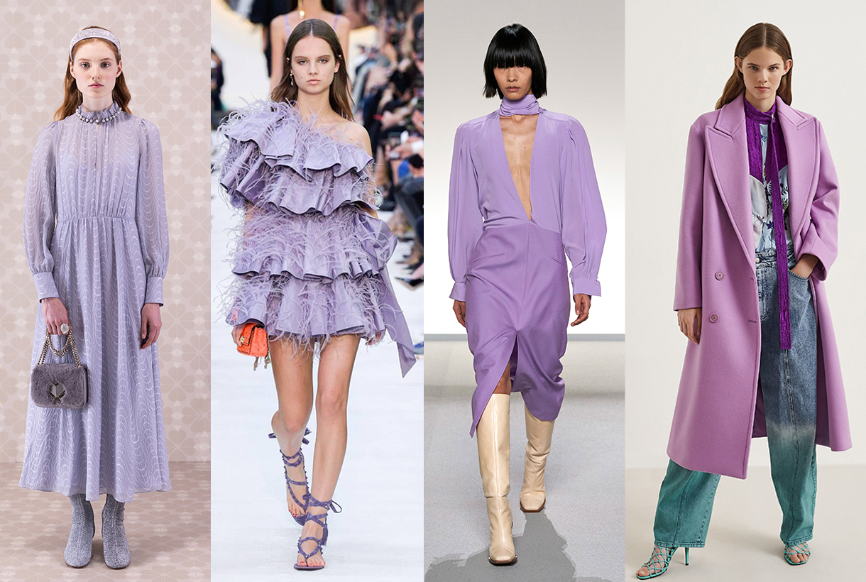
On the catwalk
The latest creations from the big fashion companies flirt with lilac and lavender. Each one chooses the tone that suits them best, but always within the lighter, usually presented palette in monochrome looks in the company of complements in neutral shades. It is a delicate tone that brings uniqueness, femininity and a cold counterpoint to the ideal styles when temperatures are at their highest.
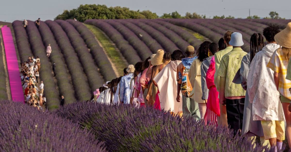
The vaporous chiffon and tulle dresses of Ulla Johnson or the extensive satin creations of Max Mara, the spectacular canvas-dresses with huge bows from Valentino, the most minimalist creations proposals with pronounced openings by Givenchy or even Alessandro Michele in Gucci have all made lilac into one of the most memorable looks of the new season. It is also worth remembering the impressive parade by Jacquemus amid the lavender fields of her native French Provence. The spectacular staging commemorates the tenth anniversary of one of the fashion-houses most in demand among millennials and the Z generation.
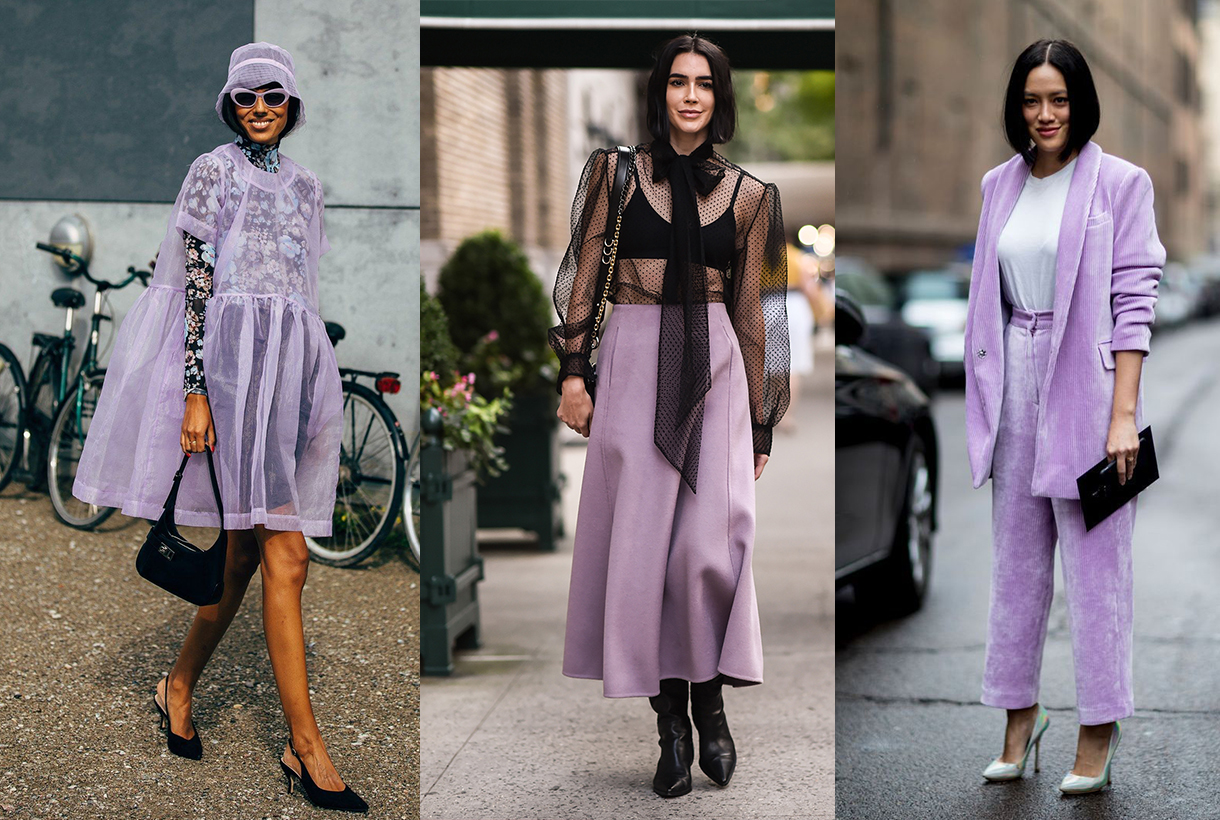
On the street
In parallel to the catwalks the most pastel purple began to (re) emerge strongly last year in the street style of the most influential fashion cities. Around the traditional parades in New York, London, Paris, Milan and Copenhagen (their street fashion show also deserves a mention), the style prescribers were the first to wear their outfits dyed in this singular colour that appeals to feminism.
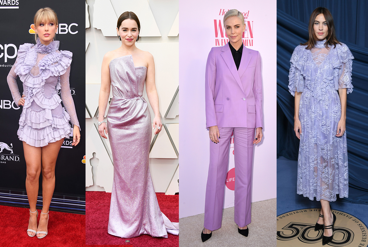
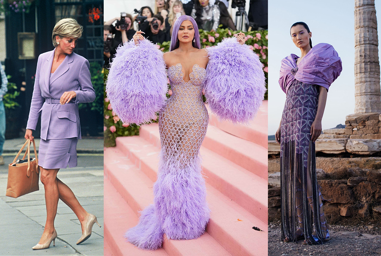
Throughout 2019 some lavender looks have also been seen on the world’s most prominent red carpets. We remember, for example, singer Taylor Swift and her short dress with romantic-inspired frills to attend the Billboard Music Awards or the dress worn by the youngest of the Kardashians girl at the MET Gala 2019. Actresses Emilia Clarke and Charlize Theron also opted for a Lavender shade: Clarke opted for a Balmain dress at the 2019 Oscars gala and Theron for a tailor-like suit. Even the British it-girl, Alexa Chung, opted for this colour in a vintage style dress with lace and transparencies at the BoF Gala during Paris Fashion Week.
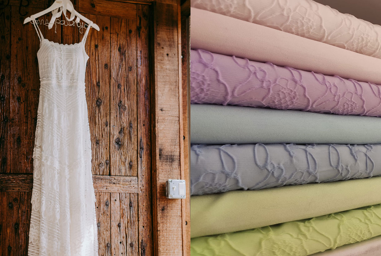
At Gratacós we also pay homage to the femininity of lilac and present some of the fabrics for next season. Some of them are have now in the sales. Ask us and we will advise you!