This anomalous 2020 has also upset the calendar of the interesting informative talks by the Color Community. association. A private initiative, which we have followed closely since its creation, led by a group of three professionals who love colour: the architect Pere Ortega; the designer specialized in Colour & Trim, Eva Muñoz; and Rosa Pujol, Textile & Colour Stylist and creative director of Gratacós.
This year, the biannual and face-to-face meetings at the Old Damm Factory in Barcelona have been converted into digital format, thus via screen respecting the security measures imposed by the current health situation. Despite the difficulties, Colour Community was able to present the new colour chart that will serve as a guide for the Spring-Summer season 2022 in an orientation report that serves as a source of inspiration for creative professionals who are dedicated to fashion, design, advertising or architecture, among other areas.
Within a current social and economic context marked by instability and uncertainty, the new broad and global creative proposal Wait… SS22. A concept that articulates the entire chromatic range and which symbolizes the preamble to an infinity of optimistic possibilities, guided by the real need to make better decisions as a society and also in relation to the environment. This “waiting” is essential, according to the association, “to appreciate and value life with humility and simplicity, and its functional daily life to structure the whole future.” For this reason, it will be necessary to design from practicality, but without forgetting beauty or creativity.
“The new creation symbolizes the preamble to celebration,
play and optimism”
“Wait…” also symbolizes the beginning of celebration, play and optimism, opening seamlessly to coexistence with digital reality. As for colour, it materializes like never before, conveying human emotions and being the conductive support of these senses.
In turn, the ‘Wait…’ colour scheme is structured through four ranges of colours, textures and materials named Wait… & Listen, Wait… & Wish, Wait… & Enjoy and Wait… & Grow Up. Colour Community sums it up with a claim to a final message of hope: “Wait… & tomorrow”. Wait and there will be a tomorrow.
Below, we summarize each creative proposal:
Wait… &Listen
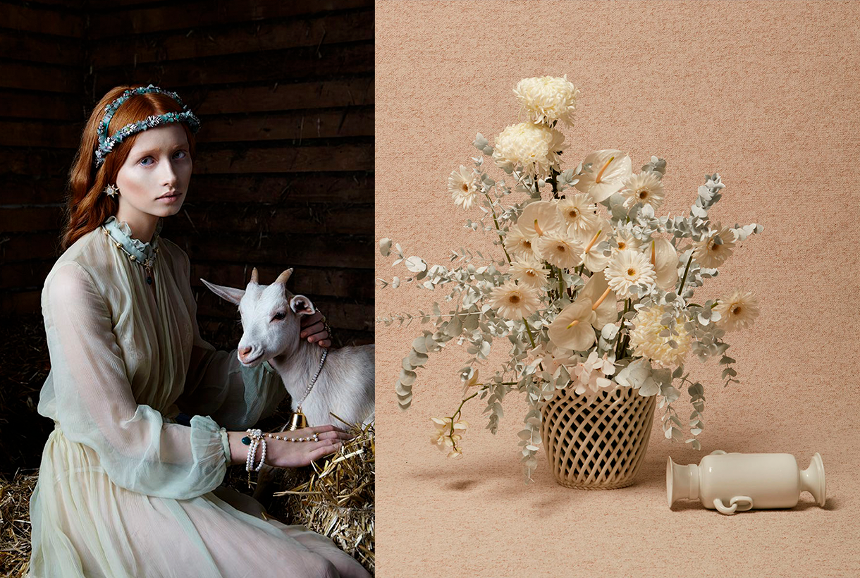
This first range is inspired by attentive waiting: ” one that is willing to receive information and learn from it “. A proposal that is based on learning from the proximity of natural society and human knowledge. Wait… &Listen is built from neutrality and naturalness, presenting colour with renewed subtlety. That means that we speak of natural realism, of materials and finishes that connect with a well-manipulated origin, worked from harmony and sustainability. As for the colour palette, relaxing neutral tones abound, such as natural white, basic ecru and calcareous grey, among other soft colours that structure and soothe. The designs mark a return to the simplicity with linear shapes and geometric basics such as the circle. Rough textures, natural and imperfect finishes, wrinkles and rustic aesthetics return. This trend is also seen in fabrics that are expressed without decorative excesses. Clean-looking matt cotton, linen, hemp, poplin and satin threads abound. Finally, natural fibres coexist with recycled and regenerated synthetics.
Wait… &Wish
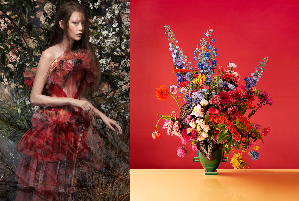
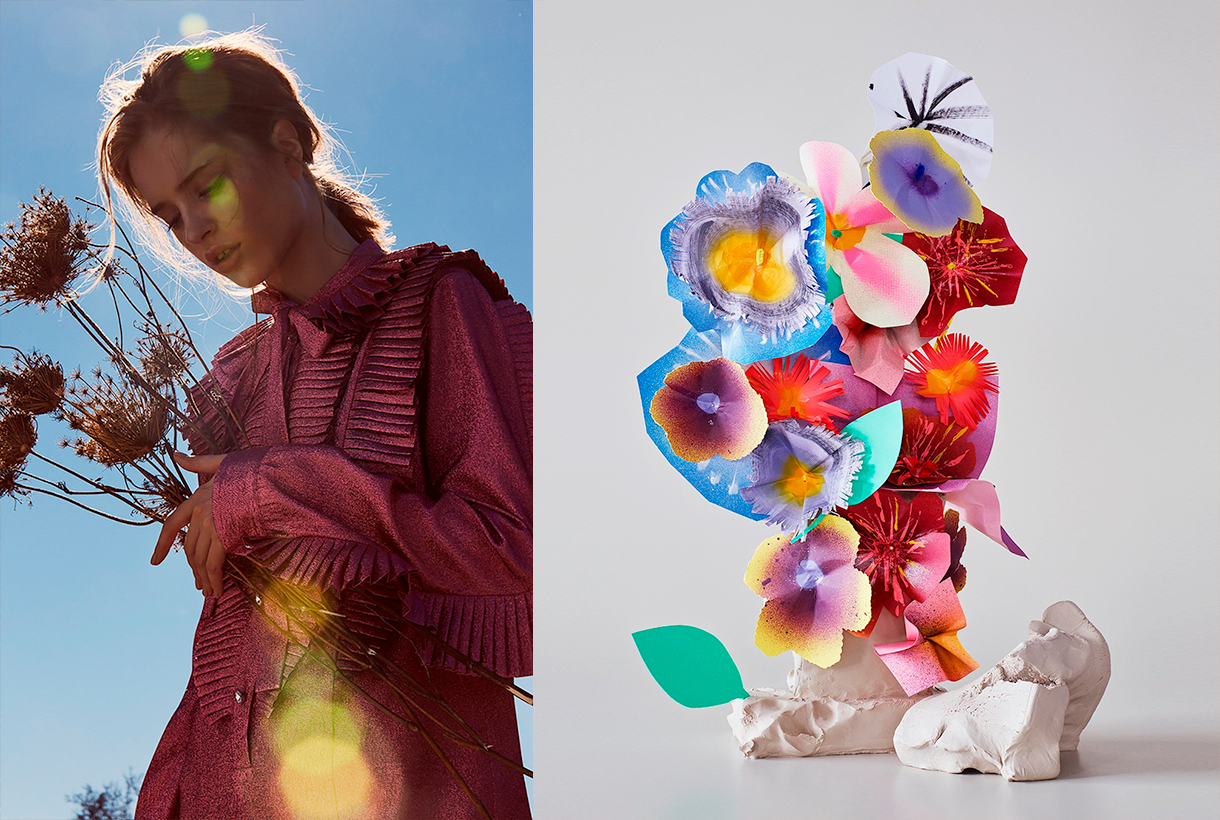
The second range appeals to desire, this concept that cannot be materialized and that activates the most creative part of the human being. According to Colour Community: “desire is not satisfied with the tangible and looks for something else as far as possible”. Under this premise, Wait… & Wish seeks to rediscover the secrets of craftsmanship, revaluing all its specific features. In turn this range also focuses on the plant world, but this time it focuses its attention on that nature that we know, but that we rarely touch or experience consciously. The colour is inspired by the apparent chaos of natural beauty, its uniqueness and exuberance with rich, bright and contrasting chromaticism: vegetal green, bright blues, gold foils or crimson brushstrokes. The designs seek to seduce by their elemental, organic and abstract geometries, hand-drawn striped prints, paintings in their freest version and colour combinations that reflect the chromatic chaos of nature. As regards materials there are many works with artisan natural dyes, semi-gloss yarns, die-cuts and laser cuts, utilitarian clothing and satin looks. Finally, in fabrics we are committed to sustainability and comfortable and practical fabrics that do not abandon design. In the fantasy section, Jacquards abound with geometric structures, mesh fabrics, nets and refined weavings such as reliefs and embossing.
Wait… &Enjoy
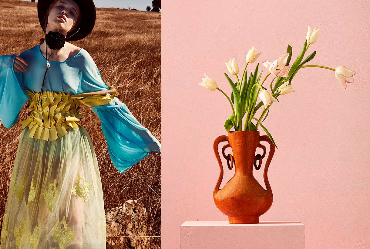
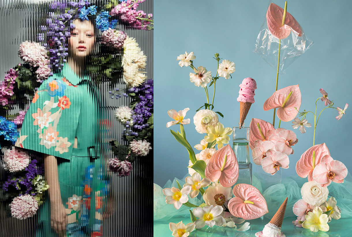
The third inspiration is the opposite on a conceptual level to the first two: it wants to project the future in an optimistic and creative way, exploring concepts such as freedom, evasion and extroversion. A creative enjoyment that will become limitless, but consistent and thoughtful with the common good. In this range, Colour Community features a creation enriched and loaded with subjective personality, but always coherent and respectful with the environment. The colour palette is based on fresh, cheerful, playful and sensual tones full of positivity and ready to be combined with neutrals. Vital tones such as geranium, fresh mint, chlorophyll, pink and vitaminised lime which combine with neutrals like white and sand-coloured. The designs are seduced by the power of the flowers and the magnetism of the most exuberant vegetation. Leaves, petals, gardens, green spaces … plant nature also takes centre-stage in summer fabrics. In addition to the flower motifs there are beautiful yarns for new colour sensations, shiny fibres, fluid fabrics that create transparency, textured organza with iridescent yarns, Jacquards with reliefs and piqué. In general, the fabrics express that intention to celebrate and dance again through movement.
Wait… &Grow Up
Finally, Wait… & Grow Up represents an evolution of the previous range. It is based on the imperfection of growth, the acceptance of the passage of time and integration of the past in order to understand the future. This range is “a reunion with the most chromatic geometry with a high expressionist content”. Products designed from a future perspective, with this range of colours, will be approached with a stimulating and light-filled mentality in which multicoloured harmonies generating multitone patterns will play a prominent role. The colour palette is thus multifaceted, symbolic, versatile and adaptable to all sectors: mauve, yellow, intoxicating pink, coral, orange, green, grey, blue and sophisticated brown. In designs a mixture of antagonistic, strange motifs and visual surprises is prioritized. With regard to fabrics this last range follows the line of the previous three and has a clear intention: to better production via recovered or recycled yarns, reducing the chemical impact and water consumption, in order to face a future with hope. Finally, the proposal is based on tactile fabrics that provide an extroverted, colourful and highly visible look.