 Pantone has established a tradition that colour enthusiasts eagerly await as a prelude to the Christmas holidays. It is about the choice of the shade that will set the direction of trends in 2024 and that will influence art, design, fashion, decoration or advertising, among other creative disciplines directed by professionals who draw on the latest developments on the market, also chromatic.
A sincere, tender and empathetic colour
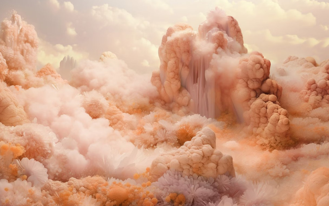
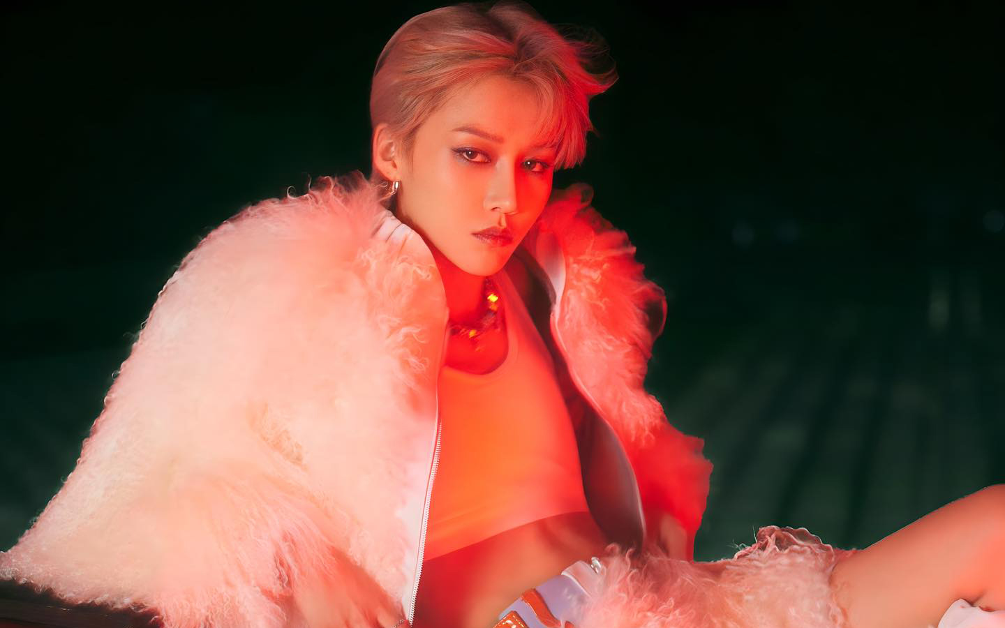
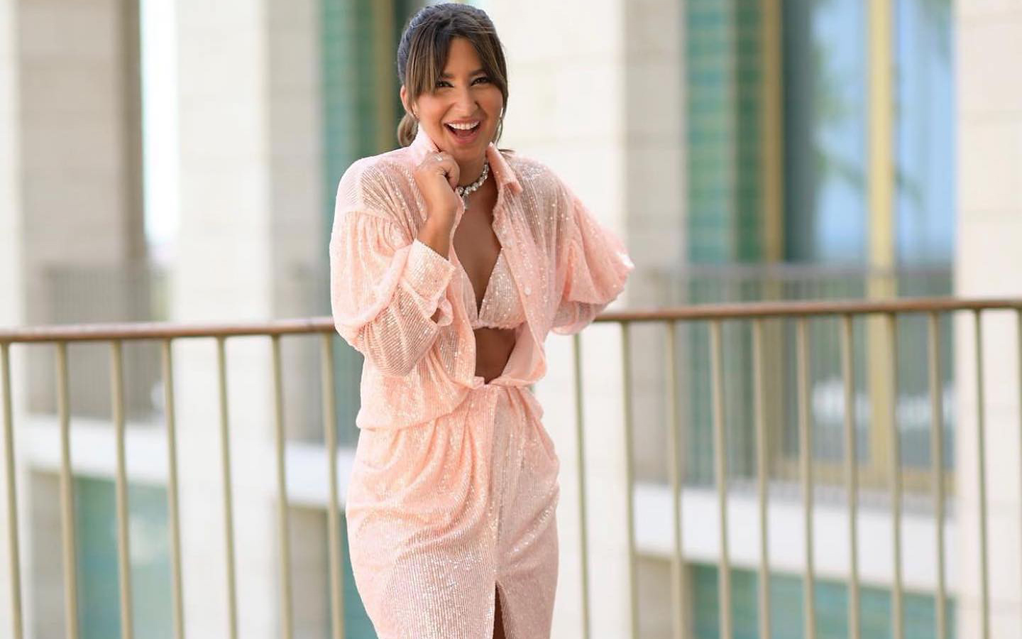
Following its vocation of naming colours with subtly sensual names, Pantone has chosen the winner for next year. The colour in question is called Peach Fuzz 13-1023 and it is a peach shade that evokes sincerity and tenderness, and conveys, according to the world authority on colourimetry, a desire to take care of ourselves and others. A soft and velvety shade whose enveloping spirit enriches the mind, body and soul. This is how Laurie Pressman, vice president of the Pantone Colour Institute, explains it in a statement about the colour that will take over everything in 2024. “We were looking for a hue that expresses our innate desire for closeness and connection, so we chose this radiant colour that exudes warmth and modern elegance. It is a colour that exudes empathy, wraps us in a hug that we can almost feel and naturally combines the youthful with the imperishable.” This warm and comforting tone stimulates the desire to unite with others or have moments of stillness, and the feeling of protection that this generates.
The tone of calm and inner peace
According to Pantone, Peach Fuzz 13-1023 is an alluring peachy hue, carefully balanced between pink and orange, that inspires belonging, relaxation and the opportunity to care, evokes calm and offers a space in which to live, feel, heal and prosper. Therefore, the colour of 2024 is comforting and encourages inner peace and well-being. Peach Fuzz 13-1023 has both an idea and a sensation and stimulates all the senses, as it makes one perceive its tactility and envelops people in its warmth.
A modern tone that takes refuge in nostalgia
Peach Fuzz 13-1023 is a sweet and light colour that evokes a new modernity. It focuses on the human experience of enriching and caring for the mind, body and soul, but it is also a subtly sophisticated, modern and deep peach tone, with a soft but effective luminosity that fills the digital world with beauty. A poetic, romantic peachy shade that conveys cleanliness and a vintage feel, Peach Fuzz 13-1023 reflects the past, but reimagined for modern settings. This last characteristic makes it especially interesting for the world of design and decoration.
The meaning of colour in an unstable context
Peach Fuzz 13-1023 is the colour that replaces Viva Magenta, which was chosen as the colour of 2023. The reasons given were: “A tone rooted in nature that vibrates with energy and vigor. “That descends from the red family and expresses a new sign of strength.” So, now we move from strength to warmth.
“When our lives are affected by instability, our need to care and to have empathy and compassion grows even more, as well as to imagine a future that brings more peace,” Laurie Pressman explains this meaning of the colour that we will see in the coming months throughout Instagram and Pinterest boards, aswell as, probably in the next trends in both fashion and decoration. “In a world where productivity and external achievements are often emphasized, it is crucial to recognize the importance of taking care of our inner self and seeking moments of calm, creativity and connection with other people in the midst of the hustle and bustle of modern life,” adds the vice president of the Pantone Colour Institute. Give value to the bonds, affection and home: “The colour we selected had to express our desire to be close to our loved ones and the happiness we feel when we connect with our own being and enjoy a moment of quiet alone. It had to be a colour that conveyed an enveloping warmth and a message of compassion and empathy,” argues Laurie Pressman.
25 years setting trends in colour
In 2024 it will be 25 years since the Pantone Colour Institute began putting colour on the sensory and creative map for the following year. It was in 1999 when the Pantone Colour of The Year educational program engaged the design community around the world in a conversation about colour. “We wanted to emphasize the relationship between culture and colour to make our audience aware of how what is happening in our global culture is expressed and reflected through colour language,” explains Pressman again. In this first session, a clear winner emerged: cerulean blue (Pantone 15-4020), a shade that returned to the stage thanks to the film ‘The Devil Wears Prada’ and Meryl Streep’s famous speech on how the fashion industry works. “Over the years, the Pantone Colour of the Year program has become a cultural touchstone around the world and has stimulated the imagination of many designers, brands and consumers,” explains Pressman.
To decide on each year’s selection, the Pantone Colour Institute team travels the world in search of new colour influences. They can be found in the entertainment industry (film, television series and even music), works of art and new artists. Of course, in fashion and design, but also in more aspirational places or concepts, such as travel destinations that are starting to become a trend, lifestyles, new technologies and materials, textures or effects (yes, like Instagram filters). that generate interest or capture attention in some way.
What began as a catalogue with 500 colours that served as a guide for graphic arts has grown in such a way that its influence on upcoming trends is comparable to what the biggest celebrity of the moment looks like on the cover of Vogue magazine. The Pantone guide already has more than 2,000 references that are updated every 18 months, with new, more precise shades being added to the list.
Another way to express the evolution as a society
Colour plays a fundamental role in people’s experience. It has a close relationship with emotions and the expression of feelings and its nuances can also be seen in how the story evolves year after year with its cycles of rise and fall. The impact of colour is also noticeable in the world of fashion, in the colours of cosmetics, in household items, in automotive and industrial design, and in products, packaging, multimedia design and retail interiors. “We are very pleased to have encouraged designers and colour enthusiasts around the world to tell their stories through colour language and show their creativity in their communities. We hope to continue doing this for many more years ,” concludes Pressman.
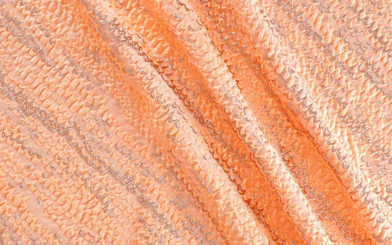
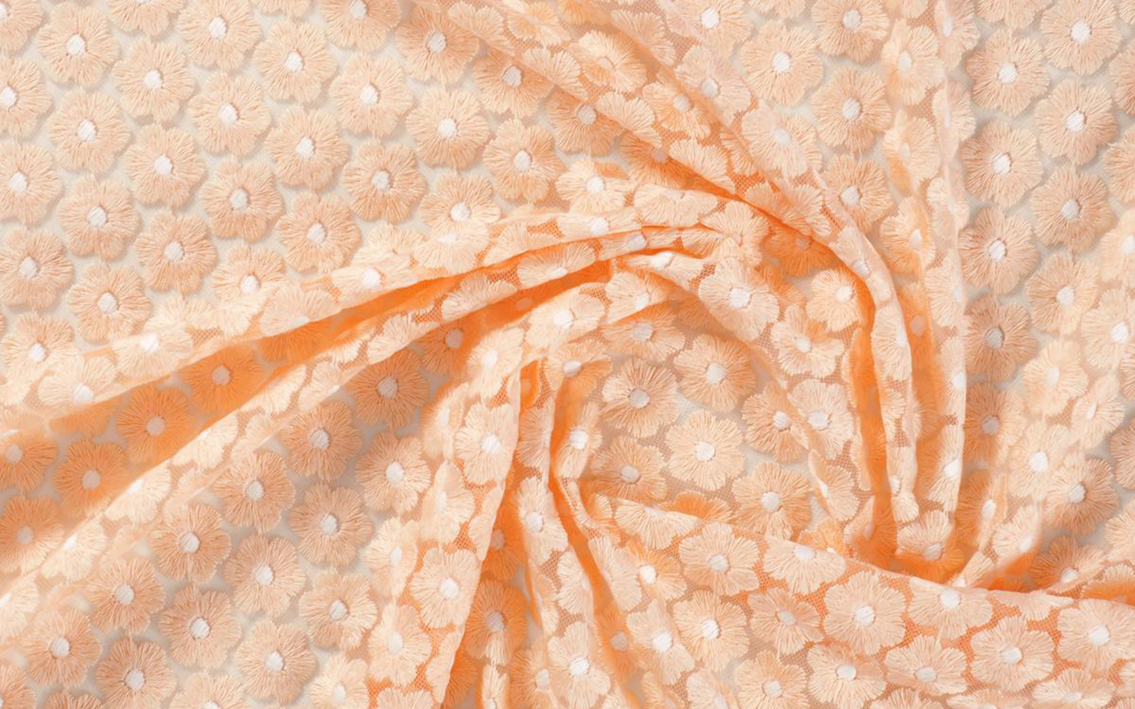
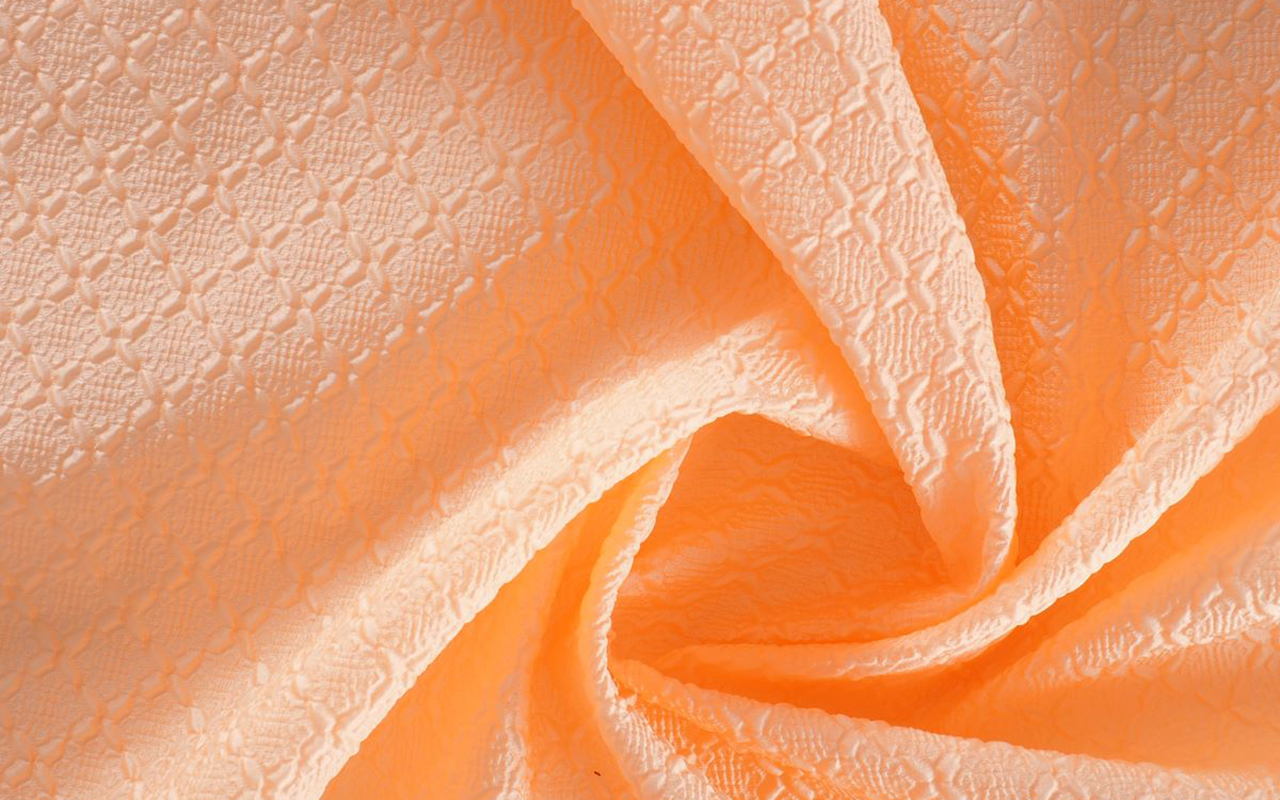
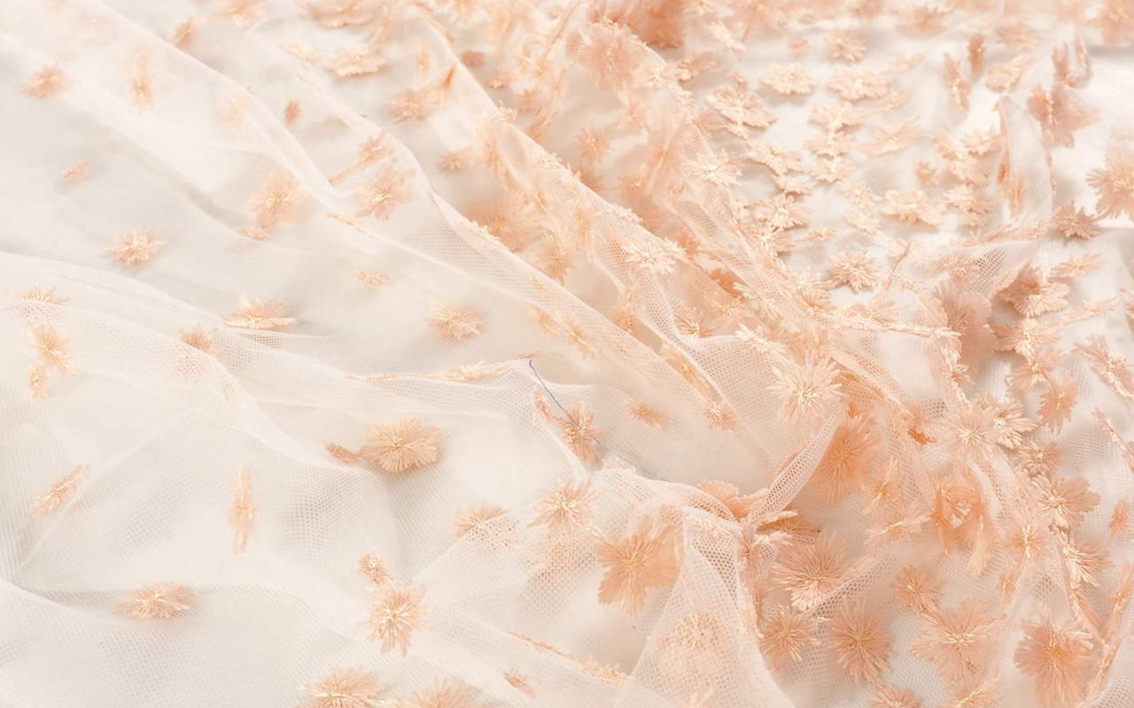
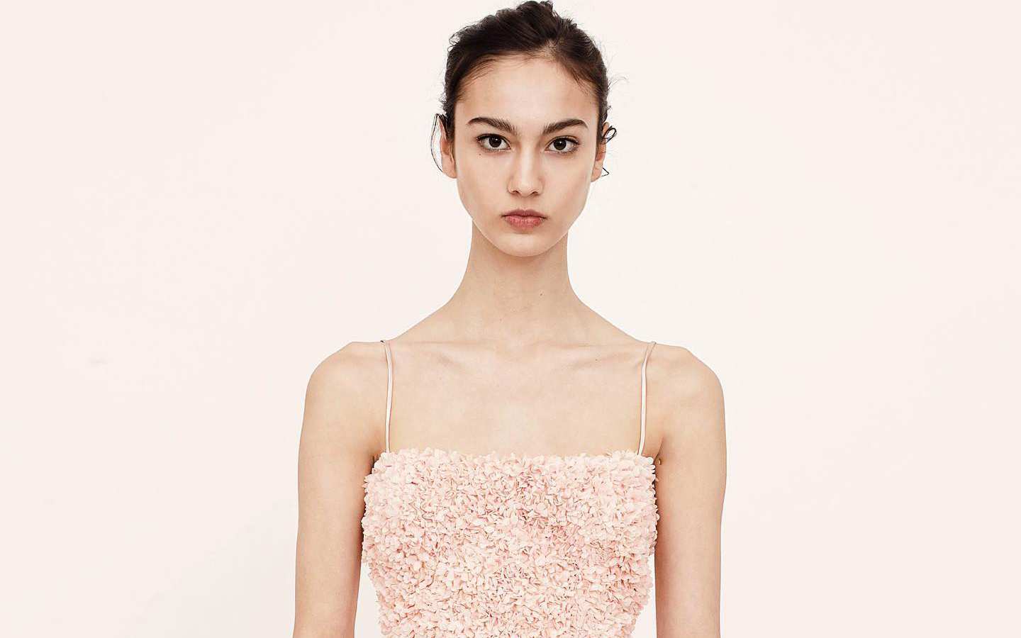
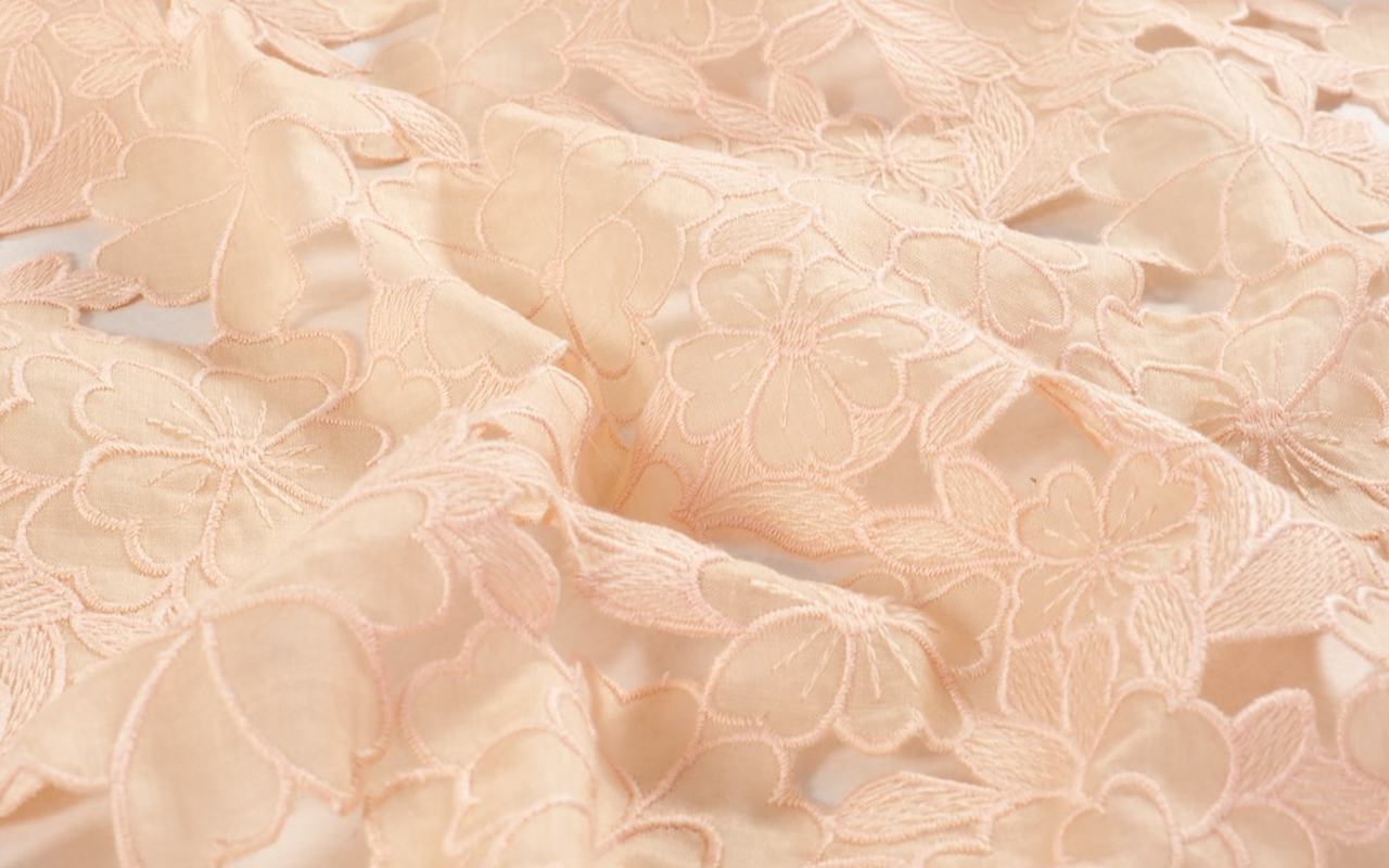
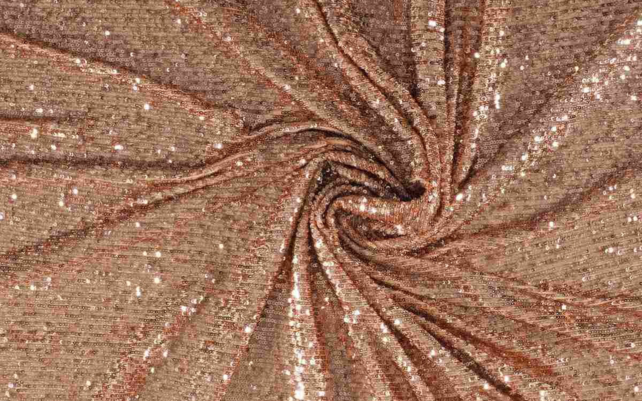
At Gratacós we also wanted to pay our particular tribute to Peach Fuzz 13-1023 with a selection of collection fabrics in peach tones so that you can think about a possible design for this 2024. You will find them here : Give free rein to your imagination!
Un color sincero, tierno y empático
Siguiendo su vocación de bautizar los colores con nombre sutilmente sensuales, Pantone ha elegido el ganador para el año que viene. El color en cuestión se llama Peach Fuzz 13-1023 y es una tonalidad melocotón que evoca sinceridad y ternura, y transmite, según la autoridad mundial en cuestiones de colorimetría, un deseo de cuidar de nosotros y de los demás. Una tonalidad suave y aterciopelada cuyo espíritu envolvente enriquece la mente, el cuerpo y el alma. Así lo explica Laurie Pressman, vicepresidenta del Pantone Color Institute, en un comunicado sobre el color que lo teñirá todo en 2024. “Buscábamos una tonalidad que expresara nuestro deseo innato de cercanía y conexión, así que escogimos este radiante color que rebosa calidez y elegancia moderna. Es un color que despide empatía, nos arropa en un abrazo que casi podemos sentir y aúna con toda naturalidad lo juvenil con lo imperecedero”. Este tono cálido y reconfortante estimula el deseo de unión con los demás o de tener momentos de quietud, y la sensación de protección que esto genera.
El tono de la calma y de la paz interior
Según Pantone, Peach Fuzz 13-1023 es una atractiva tonalidad amelocotonada, cuidadosamente equilibrada entre el rosa y el naranja, que inspira pertenencia, relajación y la oportunidad de cuidar, evoca calma y ofrece un espacio en el que se puede vivir, sentir, sanar y prosperar. Por lo tanto, el color de 2024 es reconfortante y fomenta la paz interior y el bienestar. Peach Fuzz 13-1023 tiene tanto de idea como de sensación y estimula todos los sentidos, ya que hace percibir su tactilidad y envuelve a las personas en su calidez.
Un tono moderno que se refugia en la nostalgia
Peach Fuzz 13-1023 es un color dulce y ligero que evoca una nueva modernidad. Se centra en la experiencia humana de enriquecer y cuidar de la mente, el cuerpo y el alma, pero también es un tono melocotón sutilmente sofisticado, moderno y profundo, con una luminosidad suave pero efectiva que llena de belleza el mundo digital. Un tono amelocotonado, poético y romántico que transmite limpieza y una sensación vintage, Peach Fuzz 13-1023 refleja el pasado, pero reimaginado para ambientes modernos. Esta última característica la hace especialmente interesante para el mundo del diseño y la decoración.
El significado del color en un contexto inestable
El Peach Fuzz 13-1023 es el color que substituye el Viva Magenta, que fue elegido como color de 2023. Lo defendían así: “Un tono arraigado en la naturaleza que vibra con energía y vigor. Que desciende de la familia roja y expresa una nueva señal de fuerza”. Así, ahora pasamos de la fuerza a la calidez.
“Cuando nuestra vida se ve afectada por la inestabilidad, crece aún más nuestra necesidad de cuidar y de tener empatía y compasión, así como de imaginar un futuro que traiga más paz”, explica de nuevo Laurie Pressman sobre el significado del color que veremos en los próximos meses a lo largo y ancho de todo Instagram y de tableros de Pinterest, así como, probablemente en las próximas tendencias tanto de moda como de decoración. “En un mundo en el que se suele enfatizar la productividad y los logros externos, es crucial reconocer la importancia de cuidar de nuestro interior y buscar momentos de calma, creatividad y conexión con otras personas en medio del ajetreo de la vida moderna”, añade la vicepresidente del Pantone Color Institute. Valorar los vínculos, el cariño y el hogar: “El color que hemos seleccionado tenía que expresar nuestro deseo de estar cerca de nuestros seres queridos y la felicidad que sentimos cuando conectamos con nuestro propio ser y disfrutamos de un momento de quietud a solas. Tenía que ser un color que transmitiera una calidez envolvente y un mensaje de compasión y empatía”, argumenta Laurie Pressman.
25 años marcando tendencias en color
En 2024 se cumplirán 25 años desde que Pantone Color Institute empezó a poner el color en el mapa sensorial y creativo del año siguiente. Fue en 1999 cuando el programa educativo Pantone Color of The Year involucró a la comunidad del diseño de todo el mundo en una conversación en torno al color. “Queríamos poner énfasis en la relación entre la cultura y el color para destacar ante nuestro público cómo lo que está ocurriendo en nuestra cultura global se expresa y refleja a través del lenguaje cromático”, explica de nuevo Pressman. En esta primera sesión salió un claro vencedor: el azul cerúleo (Pantone 15-4020), una tonalidad que volvió al estrado gracias a la película ‘El diablo viste de Prada’ y el célebre discurso de Meryl Streep sobre cómo funciona la industria de la moda. “Con los años, el programa Pantone Color of the Year se ha convertido en un referente cultural en todo el mundo y ha estimulado la imaginación de muchos diseñadores, marcas y consumidores”, explica Pressman.
Para llegar a la selección de cada año, el equipo de Pantone Color Institute recorre el mundo en busca de nuevas influencias cromáticas. Pueden encontrarse en la industria del entretenimiento (cine, series de televisión e incluso música), obras de arte y nuevos artistas. Por supuesto, en la moda y el diseño, pero también en lugares o conceptos más aspiracionales, como puedan ser destinos de viaje que empiezan a ser tendencia, estilos de vida, nuevas tecnologías y materiales, texturas o efectos (sí, como los filtros de Instagram) que generen interés o acaparen la atención de alguna forma.
Lo que comenzó siendo un catálogo con 500 colores que sirviese como guía para las artes gráficas ha crecido de tal manera que su influencia en las próximas tendencias se equipara a lo que la mayor celebridad del momento luzca en la portada de la revista Vogue. La guía Pantone cuenta ya con más de 2.000 referencias que se van actualizando cada 18 meses, con nuevos tonos más precisos que se van añadiendo a la lista.
Otra manera de contar la evolución como sociedad
El color desempeña un papel fundamental en la experiencia de las personas. Tiene una relación cercana con las emociones y la expresión de los sentimientos y en sus matices se aprecian también en cómo evoluciona la historia año tras año con sus ciclos de auge y descenso. El impacto del color también se nota en el mundo de la moda, en los colores de los cosméticos, en los artículos para el hogar, en el diseño automovilístico e industrial, y en los productos, embalajes, diseño multimedia e interiores de los comercios. “Nos complace enormemente haber estimulado a diseñadores y entusiastas del color de todo el mundo a contar sus historias a través del lenguaje cromático y a mostrar su creatividad en sus comunidades. Esperamos poder seguir haciéndolo durante muchos más años”, concluye Pressman.
Desde Gratacós también hemos querido hacer nuestro particular homenaje al Peach Fuzz 13-1023 con una selección de tejidos de colección en tonos melocotón para que vayas pensando un posible diseño para este 2024. Los encontrarás aquí: ¡Da rienda suelta a la imaginación!