The year has not exactly started on the right foot due to the new health restrictions to stop the continuous outbreaks of the pandemic. Even so, this 2022 promises to be different from its predecessors with the arrival of a cultural agenda, full of new exhibitions that we can visit in person in different cities throughout Spain. Great retrospectives, unpublished works by renowned artists or artistic movements that also connect art with fashion and design. We present five samples that we believe can be a source of creativity and inspiration for any creative work.
-
From Fauvism to Surrealism: masterpieces from the Musée d’Art Moderne in Paris
-
When? From February 11th 2022 to May 22nd, 2022
-
The audacious expression of freedom shown by the Fauvist and Cubist artists at the birth of both movements in the first decade of the 20th century was a revolution in the traditional representation of portraiture, landscape and still life that was considered scandalous at the time, as present disruptive canons with the observed reality. ‘From Fauvism to Surrealism: Masterpieces of the Musée d’Art Moderne de Paris’ brings together about 70 masterpieces that portray the history of the famous Parisian museum and show the pictorial transgression of the time. This museum is today an essential artistic reference that houses some of the avant-garde movements that revolutionized the capital of the Seine during the first decades of the 20th century.
In turn, this exhibition is the first major exhibition that the Guggenheim Museum Bilbao will host in 2022 within the program of activities scheduled for this cultural and sculptural complex, which will celebrate the 25th anniversary of its opening in October.
-
Cinema and fashion. By Jean Paul Gaultier
-
When? From February 17th to June 5th 2022
-
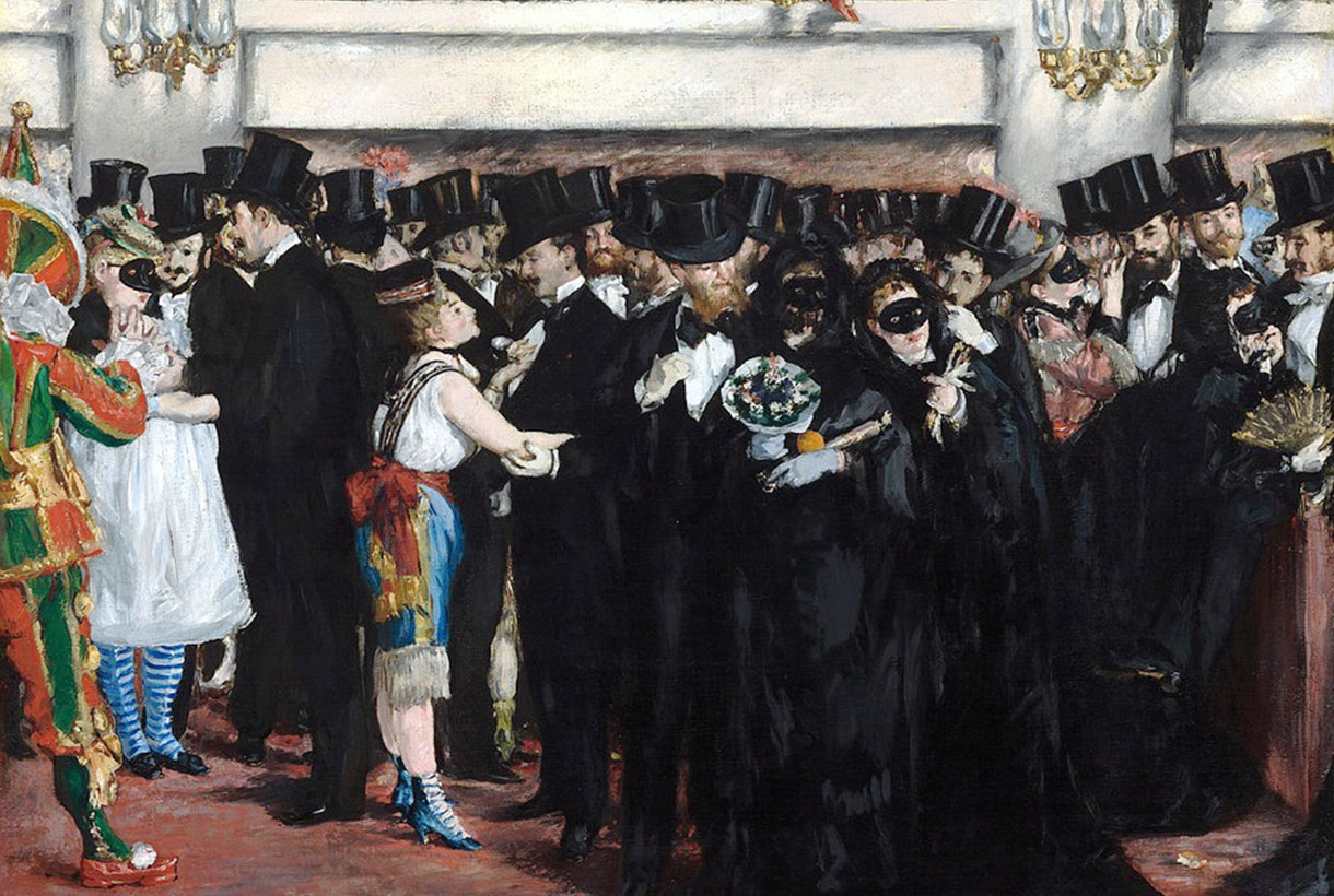
Film and fashion have been linked over the years to lead to a fruitful creative exchange. Under the gaze of Jean Paul Gaultier, this exhibition points out the communicating vessels of both industries, as well as an approach to their social contexts. The exhibition addresses the exchanges and influences that occur between cinema and fashion, a creative relationship led by Jean Paul Gaultier, co-curator and artistic director of the exhibition. Beyond mythomania, “Cinema and Fashion” covers the contexts of creation, both for dresses and films, and introduces us to ideas of modernity within clothing or eroticism. The show also offers a sociological approach by addressing issues such as female emancipation movements, gender transitions and power roles and how these are reflected in the fashion and filmography of its time.
“Cinema and Fashion” collects posters, photographs, film clips … up to 250 pieces that reflect the dialogue between the two disciplines. The exhibition begins with ‘Falbalas’, Jacques Becker’s 1945 film that influenced Gaultier to become a designer. After that, some of the characters that revolutionized the codes of cinema and sexuality are observed, such as Mae West, Marilyn Monroe, Marlon Brando, Brigitte Bardot or Jane Fonda. The exhibition will migrate to Barcelona from July 6.
-
The Magritte Machine
-
When? From February 24th to June 6th 2022
-
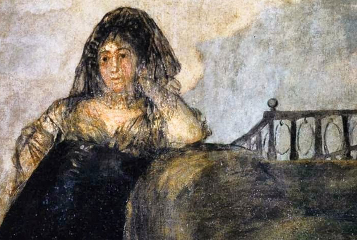
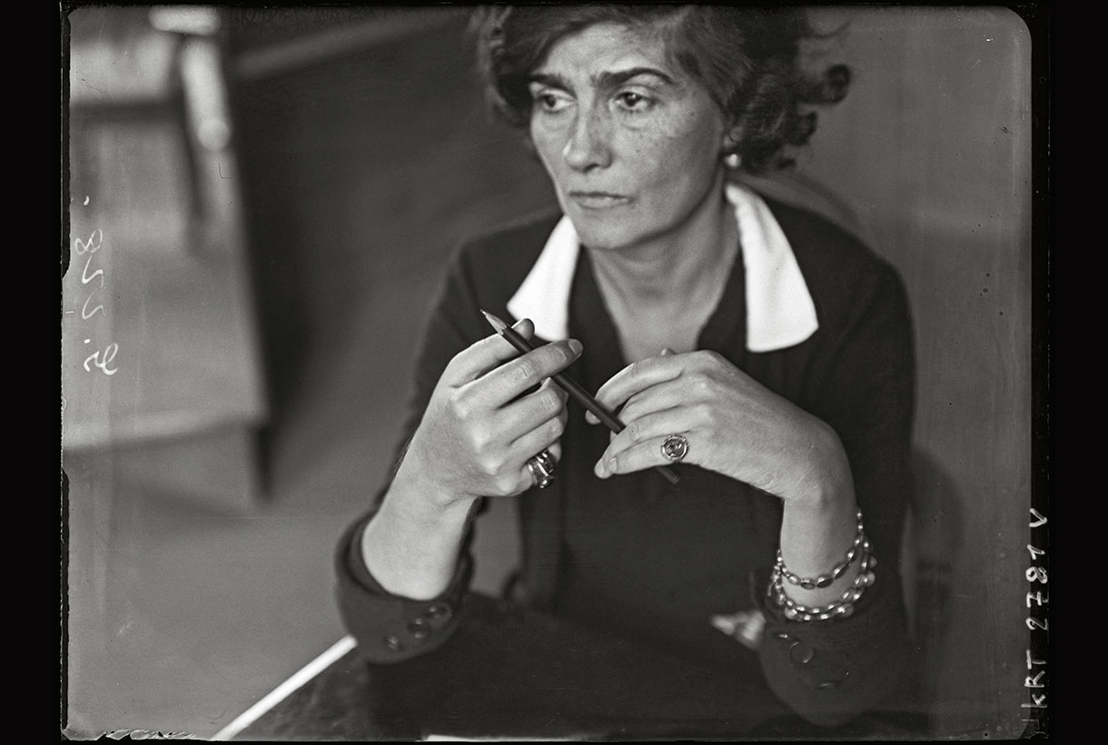
Meanwhile, at the Caixa Forum in Barcelona, René Magritte (Lessines, 1898 – Brussels, 1967) will be leading the main exhibition in an extensive retrospective dedicated to the Belgian surrealist artist that explores his attractive work, characterized by playing with visual logic and question our perceptual categories. This is Magritte’s first exhibition since 1989 in Spain and brings together a selection of 65 paintings from museums and collections around the world, along with a selection of photographs and home movies taken and filmed by the artist.
And why is it called The Magritte Machine? In 1950, in collaboration with some friends, the Belgian artist wrote the leaflet ‘La Manufacture de Poésie’, a catalogue of imaginary products amongst which the “Universal Painting Machine” stands out. Such a machine would make it possible to compose in a practical way an unlimited number of thinking pictures. The exhibition starts from the hypothesis that this Magritte Machine exists and is composed of several interconnected devices corresponding to recurring concepts in the artist’s work, such as mimicry and megalomania.
-
Teresa Lanceta. Weave as open source
-
When? From April 8th to September 11th, 2022
-
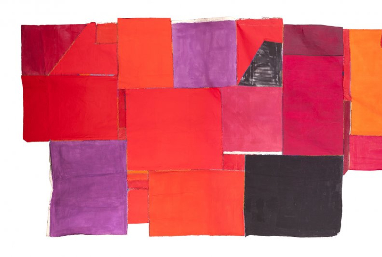
At the beginning of the 70s, Teresa Lanceta (Barcelona, 1951) made the decision to weave as a means of artistic expression, forcing the limits of understanding about what is or is not considered art. Her approach to weaving focuses on formal elements, on what fabrics are original and their own: their ligaments, materials, traditions and techniques. A way of doing without a previous sketch in which image and background, object and language, support and image are built at the same time, without going backwards, assuming mistakes.
Teresa Lanceta’s work reflects her vision of fabric and the act of weaving, but goes beyond individual expression by setting up dialogues in parallel with popular art, gender issues, non-verbal communication or the different forms of life in community. This exhibition, which brings together the entire career of the Catalan artist up to the present, includes a wide selection of tapestries, canvases, paintings, drawings, writings and videos, as well as several collaborations that Teresa Lanceta has done with other authors and which will be shown in the course of the exhibition.
-
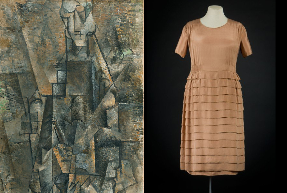
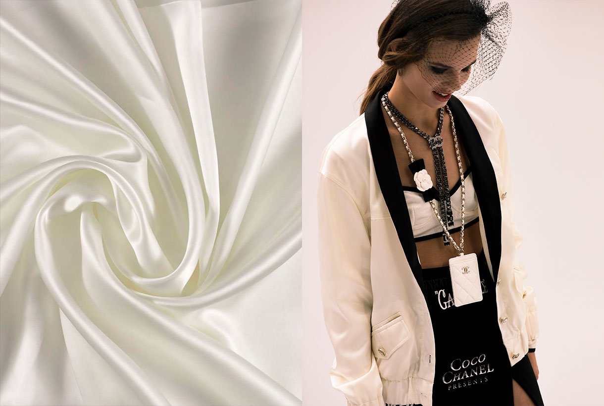
Pablo Picasso and Gabriele Chanel
-
When? From October 11th 2022 to January 15th 2023
-
Beyond fashion, Gabrielle Chanel maintained friendship with multidisciplinary artists, one of them was Pablo Picasso, whom she met around the spring of 1917, probably through Jean Cocteau or Misia Sert. The designer established a long and lasting friendship with both of them that would introduce her to the Spanish painter’s circle. From that moment, Chanel and Picasso established a creative relationship in which, among other influences, two collaborations emerged, both with Jean Cocteau: in ‘Antígona’ (1922) and in Sergei Diaghilev’s Russian ballet ‘Le Train Bleu’ (1924).
The Thyssen Bornemisza museum in Madrid invites us to explore this creative relationship of the 20th century, bringing together art and fashion in the same exhibition project. ‘Picasso and Chanel’, led by Paula Luengo, Curator of the Exhibition Area, explores the relationship between these two great geniuses of the 20th century with designs and works of art organized in four sections that follow a chronological order: between 1915 and 1925. Also it is appreciated how the painter’s work was a source of inspiration for some of Chanel’s designs. The designer herself used to talk about her friendships with the artistic and intellectual world of the time: “it is the artists who have taught me rigor”.
Viernes 10 diciembre 2021
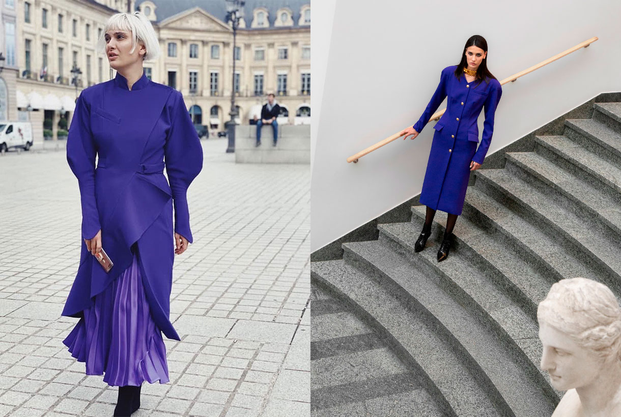
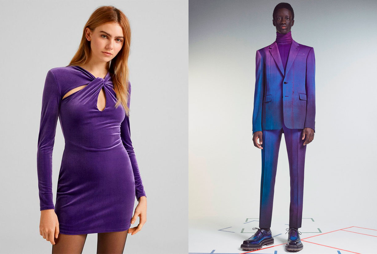
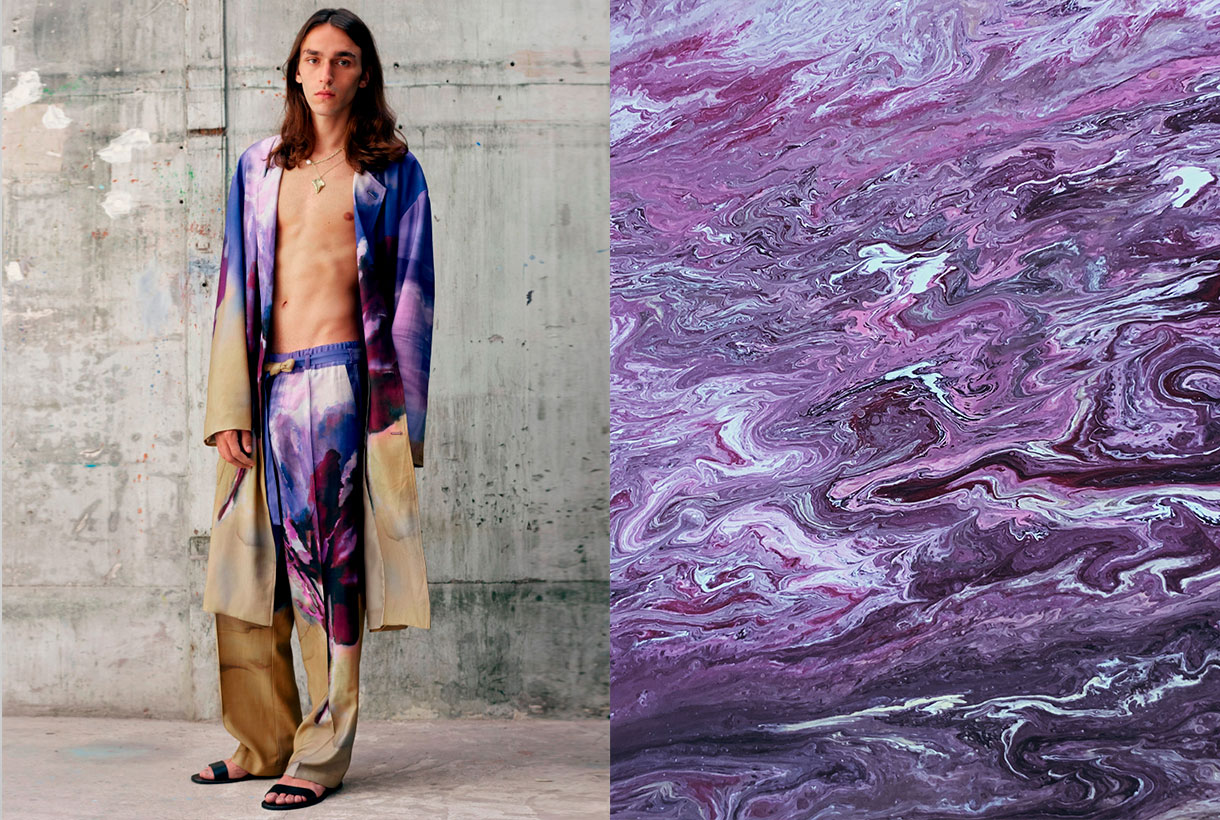
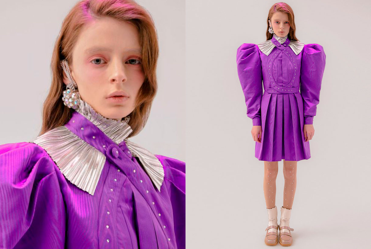
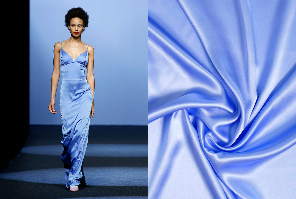
 December is the month of rituals and traditions marked especially by Christmas and the closeness to our loved ones. For designers, there is one thing that is awaited for with enthusiasm: finally knowing the colour that will mark the following year and that will be announced at this time, Pantone. The world authority of colour has once again communicated the tonality that will mark the year 2022 in areas as multidisciplinary as design, art, advertising or fashion. It’s called Very Peri and it’s a novel shade based on lilac that, they say, “maintains a daring presence and stimulates ingenuity and personal creativity.” Do you have a better cover letter?
As you already know, the annual choice of a colour is not done randomly or is the result of whim because it involves a deep study and analysis of trends by the trendhunters of the Pantone Colour Institute. With an in-depth study of the impact that various exhibitions, works of art, films that will be released next year, the most popular destinations, new technologies and all together, the global mood, they have a meticulous discussion and dimension the impression that every aspect will have. Before closing the year, experts have revealed what 2022 holds for us.
“Creating a new colour for the first time in the history of our colour program is a reflection of a process of innovation and transformation at a global level,” said Laurie Pressman, vice president of the Pantone Institute of Colour.
“The Pantone Colour of the Year is a reflection of what is happening in our world culture and expresses the answer to what people are looking for in this colour,” says Laurie Pressman, vice president of the Pantone Colour Institute. ” He adds: “The creation of a new colour for the first time in the history of our educational colour program Pantone Colour of the Year is a reflection of a process of innovation and transformation on a global level. As society recognizes colours as a fundamental form of communication and as a way of expressing, capturing, connecting and influencing ideas and emotions, this new and complex blue hue fused with purplish red highlights the range of possibilities that are presented to us. “
In this case, by encompassing the qualities of blues and, at the same time, having a purplish-red hue, PANTONE 17-3938 Very Peri displays a cheerful and lively attitude, as well as a dynamic presence that stimulates the courage to create and an imaginative expression.
Deciphering the enigmatic tonality of 2022
Very Peri represents the perfect fusion between blue and red. A bridge between two primary tones that are interrelated giving way to this enigmatic tone. According to Pantone, Very Peri is the result of carefree confidence and daring curiosity that encourages our creative, inquisitive and inclusive spirit. The authority of colour considers that this tonality helps to embrace this altered landscape of possibilities and opens a new vision so that each one can rewrite their own life. Rekindling gratitude for some of the qualities blue represents complemented by a new perspective that resonates today, PANTONE 17-3938 Very Peri puts the future ahead in a new light.
Very Peri displays a cheerful and lively demeanor, as well as a dynamic presence that stir up courage to create and an imaginative expression.
In times of transformation, Very Peri is a symbol of the spirit of our current global age and the transition we are experiencing today. As the period of isolation, marked by the global pandemic, is emerging, notions and standards are changing and people’s physical and digital lives have merged in new ways creating hybrids. This tonality also symbolizes the rise of digital design, which helps to stretch the limits of reality, opening the door to a dynamic virtual world where you can explore and create new colour possibilities. With trends in gaming, the growing popularity of the metaverse, and the growing arts community in the digital space, PANTONE 17-3938 Very Peri illustrates the fusion of modern life in correspondence with colour trends in the digital world and how together they are manifest in the physical world and vice versa.
This colour illustrates the fusion of modern life in correspondence with colour trends in the digital world and how together they manifest in the physical world and vice versa.
 How do we apply Very Peri in the world of fashion?
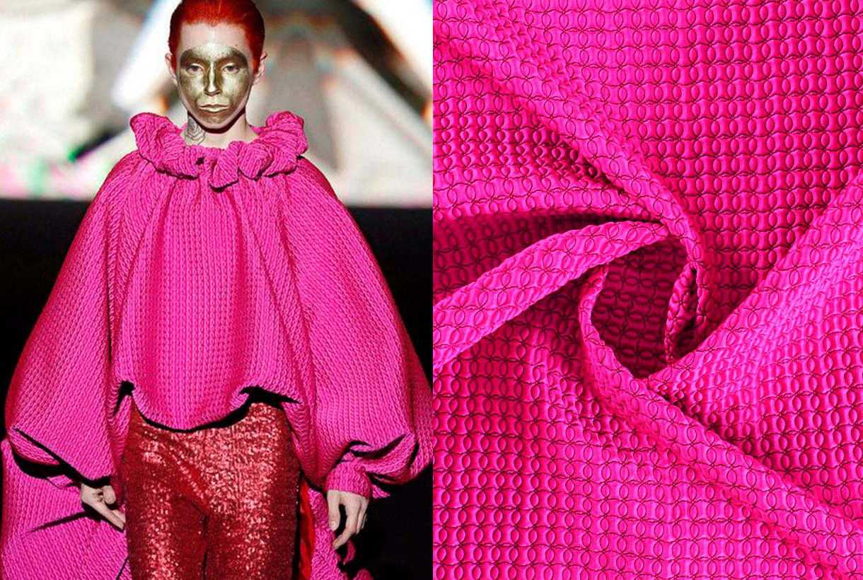
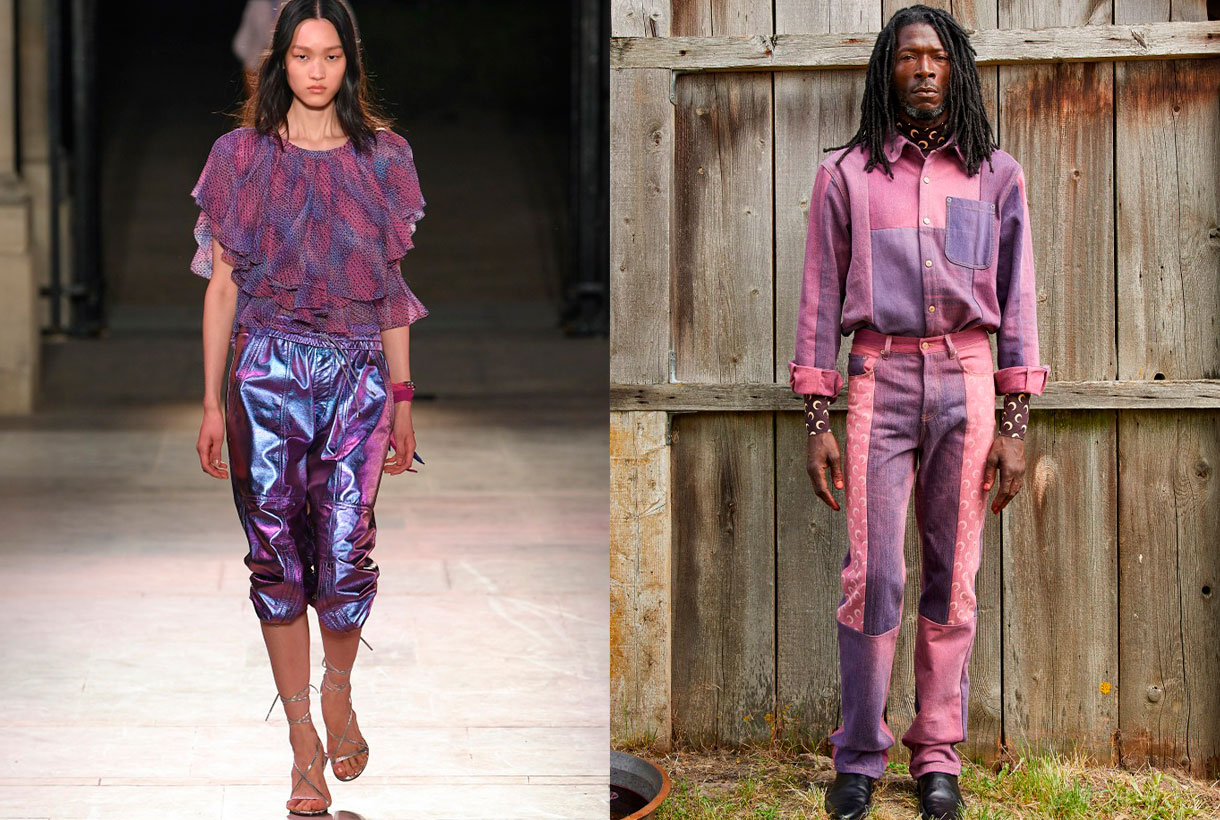
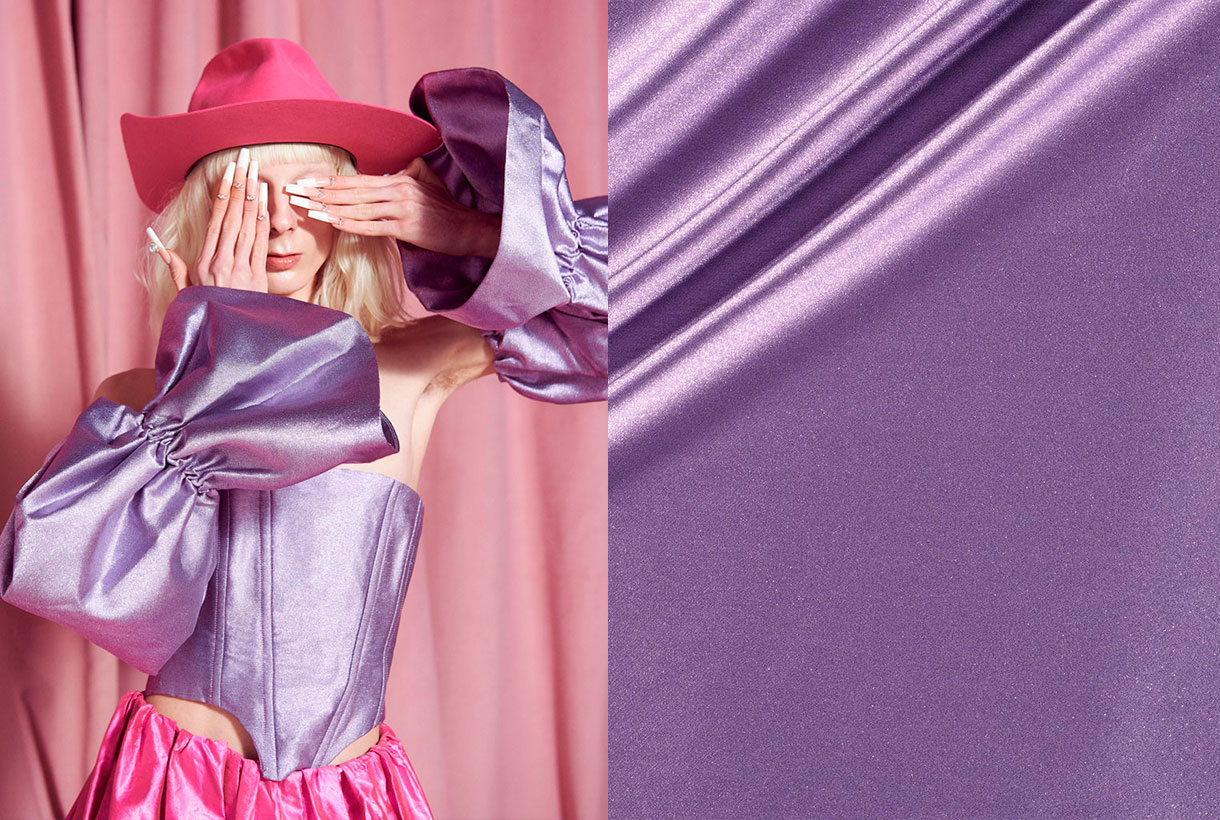
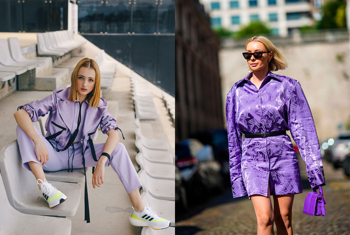
We said it at the beginning. Very Peri is the colour that seeks to convey courage, boost reinvention and stimulate creativity by displaying carefree confidence and infinite curiosity. It is a fresh, versatile and genderless shade that adapts to a wide variety of fabrics, textures and reliefs, provides a touch of colour and does not go unnoticed at all. On the catwalks, this hue has starred in monochrome looks in the shows of the new summer collections by Isabel Marant, Balenciaga, Thom Browne or Ermanno Scervino. Other firms such as Lanvin or Marine Serre have chosen to combine this violet tone with arty prints and neutral tones.
In Gratacós we have several seasonal fabrics where the Very Peri colour is present. You will find it in plain items and through prints or in its more sophisticated version with reliefs, iridescence and rhinestones. Take the opportunity to rediscover the collection that we have on offer in our online store.
Mi�rcoles 03 noviembre 2021
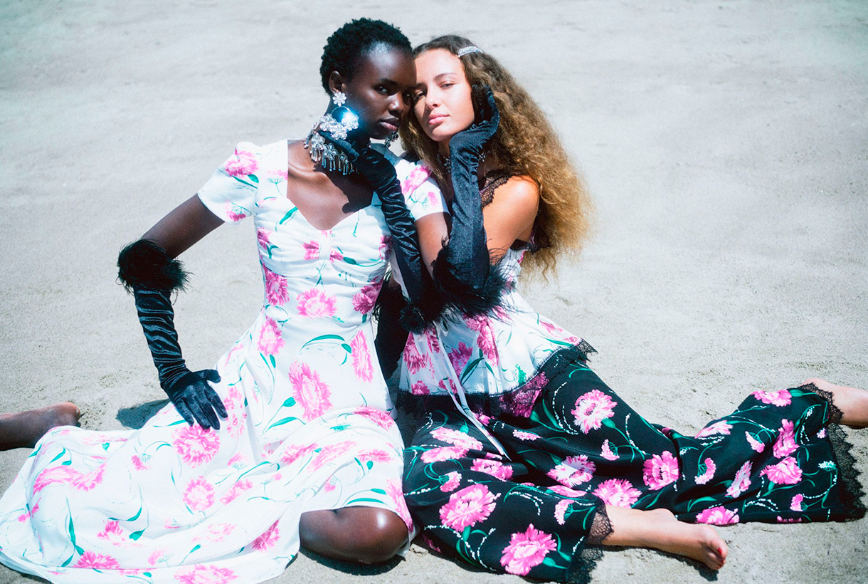
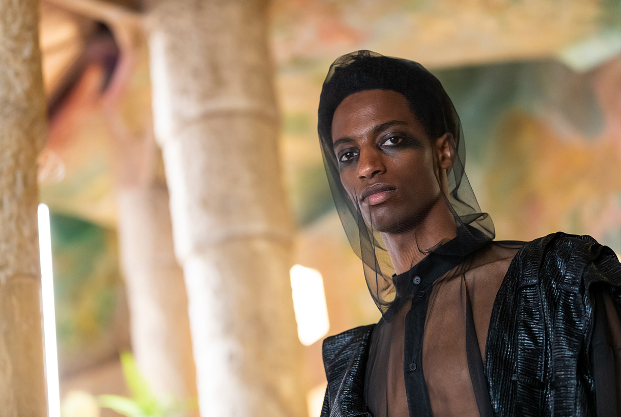
 From Gratacós we closely follow the Spanish catwalks because we like to appreciate the creativity of designers in the form of impressive seasonal garments and how, sometimes, one of our fabrics sneaks into the looks of their magnificent collections. After the Mercedes-Benz Fashion Week Madrid in September, the last appointment with fashion was held by 080 Barcelona Fashion last month, in a new exhibition of fashion and power.
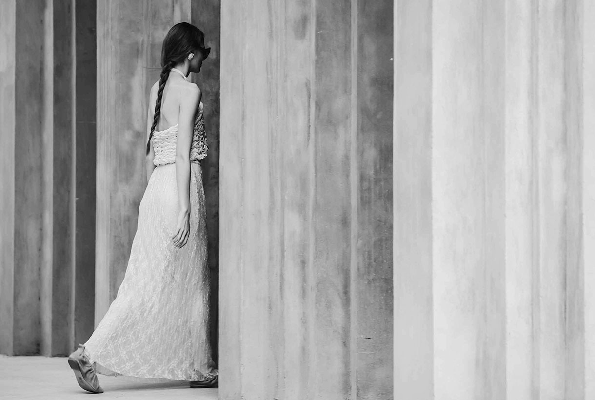
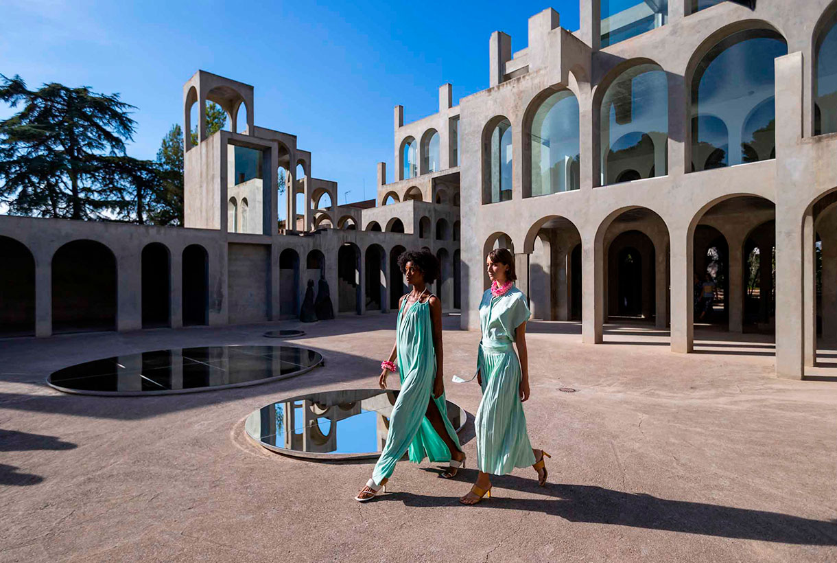
The Catalan catwalk once again opted for the digital format, presenting for the third time in a row, fashion short films previously recorded and edited by 22 designers who participated in the last edition. This time, the film set of the audiovisual pieces took place in a space that broke with the modernist legacy of recent editions: Xavier Corberó’s residential and architectural complex located in Esplugues de Llobregat. A wonderful sculptural work of concrete and glass of a rationalist character with dreamlike buildings that recall the metaphysical painting of Giorgio de Chirico or the mathematical art of Escher.
Next, we explain in detail some of the collections that surprised us the most with designers who maintain creative discourses linked to uniqueness, craftsmanship, sustainability or proximity.
Avellaneda
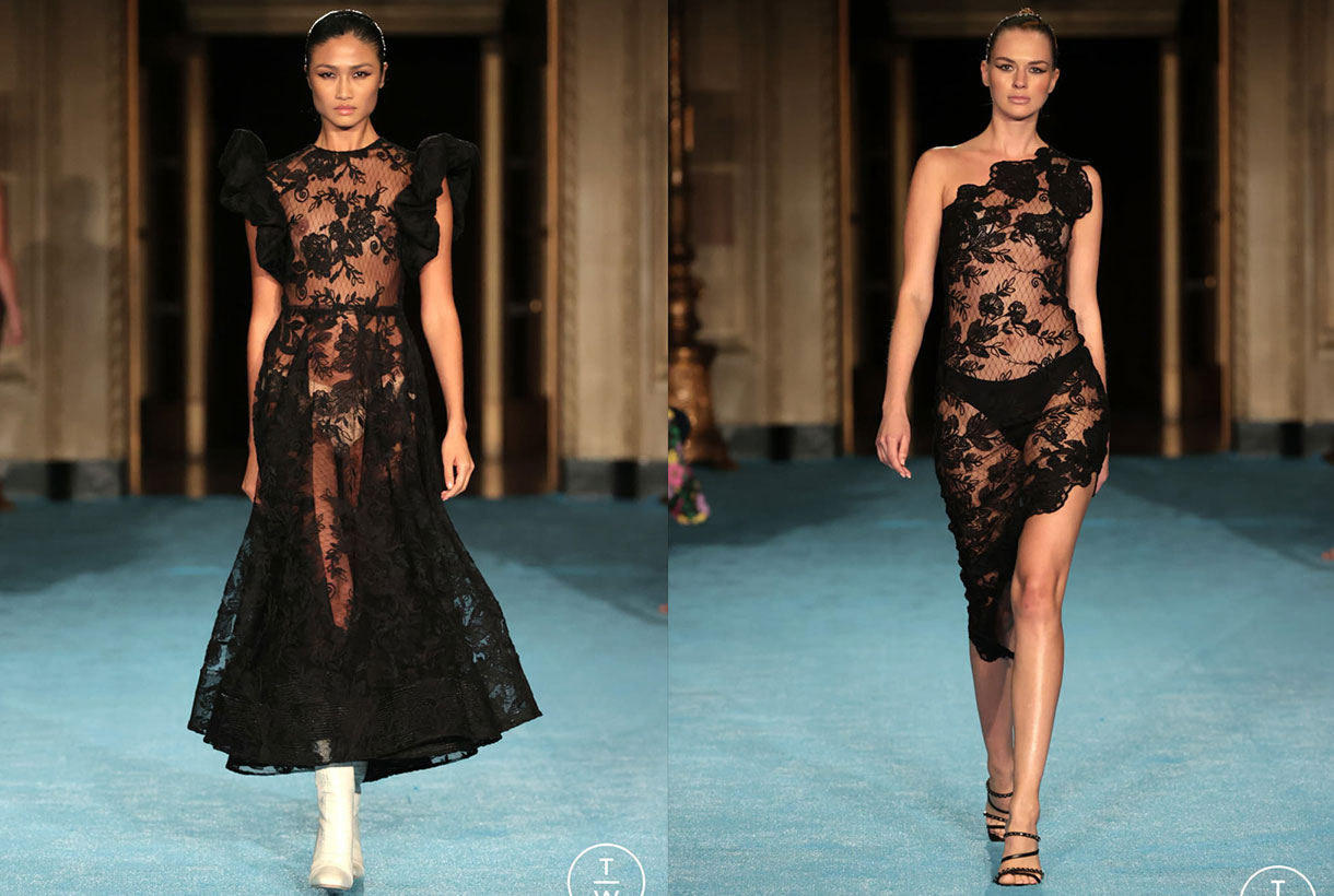
Avellaneda turned the XC space of the Xavier Corberó architectural complex into a glamorous party displaying beauty, youth and good taste in clothing. In the new collection, the Barcelona designer Juan Avellaneda was inspired by the city and the individuals who inhabit it and share secrets, passions, ephemeral romances, eternal promises and moments of fun. This urban jungle consisted of a sophisticated collection of cocktail looks with traces of safari style: a revision of the zebra animal print , sequined jackets and baggy pants in earth tones. These innovative pieces coexisted with their signature flagships: tuxedos, dresses with sensual openings, silks, ruffles and sequins reign in clothes with daring patterns in a unique proposal that mixes exoticism with its usual elegance. The neutral bases, the pairing of black and white, red and fuchsia gave colour to this festive collection that plays with the classic codes of good dress.

Eiko Ai
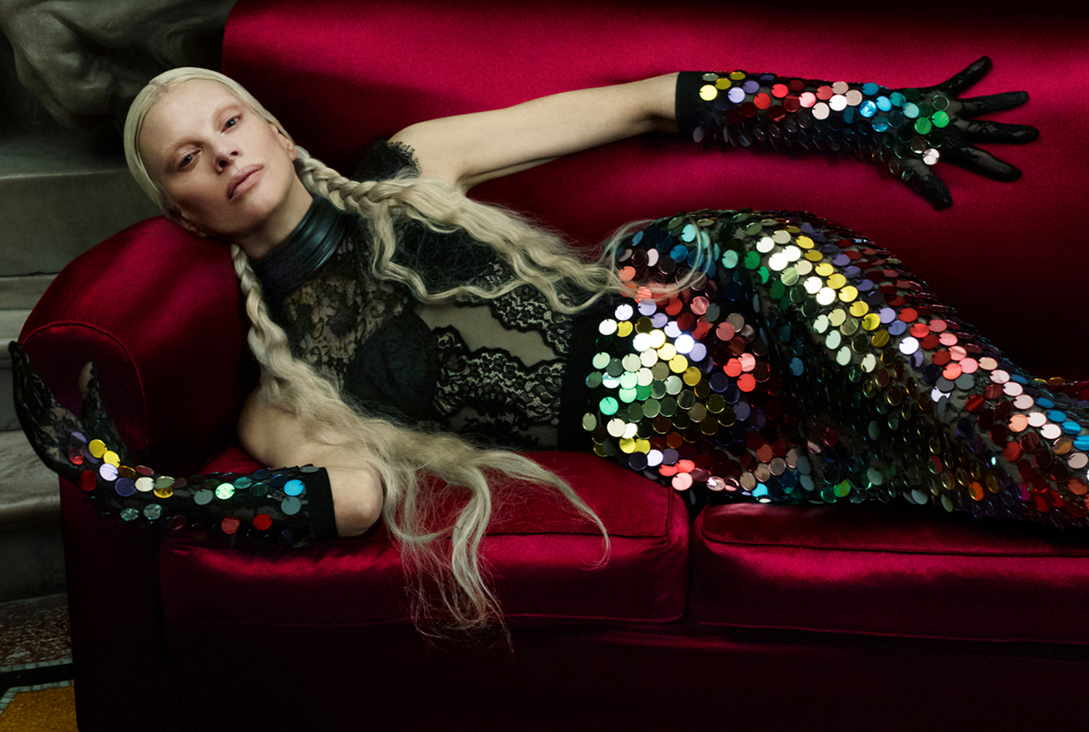
Eiko Ai brings a new value in women’s fashion by combining concepts such as sophistication and sensuality in the clothes that she creates in a casual style for everything to wear. Always with that point of magic that invites clients to dream through the designs. On this occasion, the firm led by Glò Lladó has presented in 080, a collection that represents a fantastic trip to the mountains that allows us to discover the nymphs of the forest. These creatures of evocative power, inspiring myth and legend, have been dressed in two-piece combinations with bras – a hallmark of Eiko Ai-, oversized bomber jackets, trench coats with sparkly fabrics and sheer dresses with surprising cuts that insinuate without showing excessively. All this adorned with sequins, velvets, satins, lace and iridescent materials that create sensual transparencies on the models’ bodies. The silhouettes have a minimalist point inspired by the 90s and the lingerie looks blend with the festive in this exciting proposal tinged with deep green, silver and lavender that attracts at first glance.

Moisés Nieto
The designer from Úbeda (Jaén) made his debut on the Catalan catwalk displaying his credentials: contemporary design combined with the passion for craftsmanship and the trade that characterizes his elegant style from restraint. In the new collection for next season, Moisés Nieto takes a trip back in time to reconnect with his childhood in Andalusia. From the summers of the 90s, the designer chooses elements rescued from memory that serve to shape a proposal that speaks of everyday life: the crochet of the doilies, the nets of the curtains, the lace or the plants of the patio are a representation of the memories that take us to the eternal hot summers of the south. The sustainable brand shapes its particular vision in roomy midi dresses and pleated silk skirts. Light garments made with organic cotton or silk fabrics and mixed with artisan techniques such as knitting, crochet and macramé. It is worth noting the textures displayed that play with different weights and structures to create volume in women’s garments that add unexpected details. As in previous collections, the designer approaches craftsmanship and values sustainability, two aspects that have become the most visible hallmarks of the Spanish firm.

Y_Como
Finally, highlight the new work of Cristina and Yolanda Pérez from Yolancris in the new brand, Y_Como, which once again surprises with a new collection based on research and the creative process. The summer proposal presented at 080 Barcelona Fashion is inspired by the painting ‘The Garden of Delights’ by Bosco. Specifically in the panel that refers to Paradiso with a free interpretation, but full of visual references that refer to the work focused on creation. In the first scene of the fashion film , set in the architectural garden of Xavier Corberó, the models that embody the characters in the painting appear: there is the owl that represents the evil that contemplates falling into temptation, the figures of Adam and Eve , and followed by exotic animals that are represented by models of baroque aesthetics that show spectacular golden robes with floral embroidery. Also featured are other black sexy dresses, garments with lots of floral and patchwork denim, fabric star creative signature ready-to-wear bulky clothes that give a rebellious streak this sensuous YComo proposal.
Mi�rcoles 20 octubre 2021
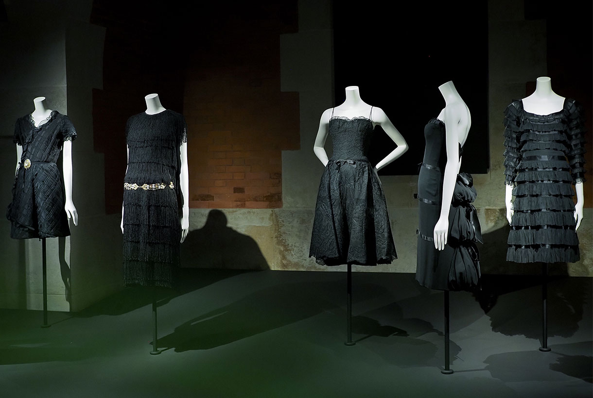 Is black a colour? There is still debate in which it represents the darkest shade, the result of the absence or complete absorption of visible light. Black is a colour without tone, a neutral base like white – its opposite – and gray. It lacks tonality and luminosity because it absorbs light without reflecting any of its component rays. Historically, the colour black has been used to represent darkness, mourning, solemnity, and authority, but it has also been linked to elegance, the unconscious, and individualism. Especially in the last century, the most revolutionary of all. Black symbolizes chaos. Now, it returns to the fore as the primary colour and absorbs the rest of the opponents, but first let’s investigate a little in the imaginary of a colour without colour.
From prehistoric origins: Art, the underworld and death.
Black was one of the first colours used in art. It was used by Paleolithic artists in cave paintings with drawings of bulls and other animals made with charcoal and later, pigments of more intense tones were made with manganese oxide or animal bones. In ancient times, the Egyptians gave positive associations to black: it was the colour that represented fertility (the soil flooding from the Nile was black). It also represented the god Anubis, guardian of the underworld, who took the form of a black jackal and offered protection against evil to the dead. For Classical Greece, black was also the colour of the “other world”, separated from the land of the living by the Acheron river, whose waters were black. The Greeks often used this colour in pottery with black figures set against other red figures. Interestingly, in the social hierarchy of ancient Rome, black was used by artisans. It wasn’t a deep, rich tone because the vegetable dyes they used to make black weren’t solid or long-lasting, so they often faded to grays or browns. Black was also the Roman colour of death and mourning. In the 2nd century BC, Roman magistrates began to wear a dark robe for funeral ceremonies. In Roman poetry, death was called the black hour.
From the darkness of the Middle Ages to the Renaissance
In the Middle Ages, black was associated with evil and darkness. It was the colour of magic, witchcraft, and the dark arts. In fact, the devil in medieval paintings was depicted in human form, but with black wings, skin, and hair. Europe also dressed in black during the bubonic plague episodes as a sign of mourning. In the fashion of the time, black did not have the prestige of red, the colour of nobility and was worn by Benedictine monks as a sign of humility and penance. Despite this, black could also symbolize power as the secret in the medieval world. The emblem of the Holy Roman Empire of Germany was a black eagle. Also the black knight in the poetry of the Middle Ages was an enigmatic figure, without identity.
In the Renaissance, the connotations of the colour black began to change. High-quality black dyes were introduced to the market, allowing garments of deep, rich black to be produced. It was at this time that magistrates and government officials dressed in their black robes, as a sign of the importance and seriousness of their positions. As only the nobility could wear bright colours like red or royal blue, the burgeoning middle class like bankers and merchants began to adapt black in their robes and dresses to distinguish themselves socially.
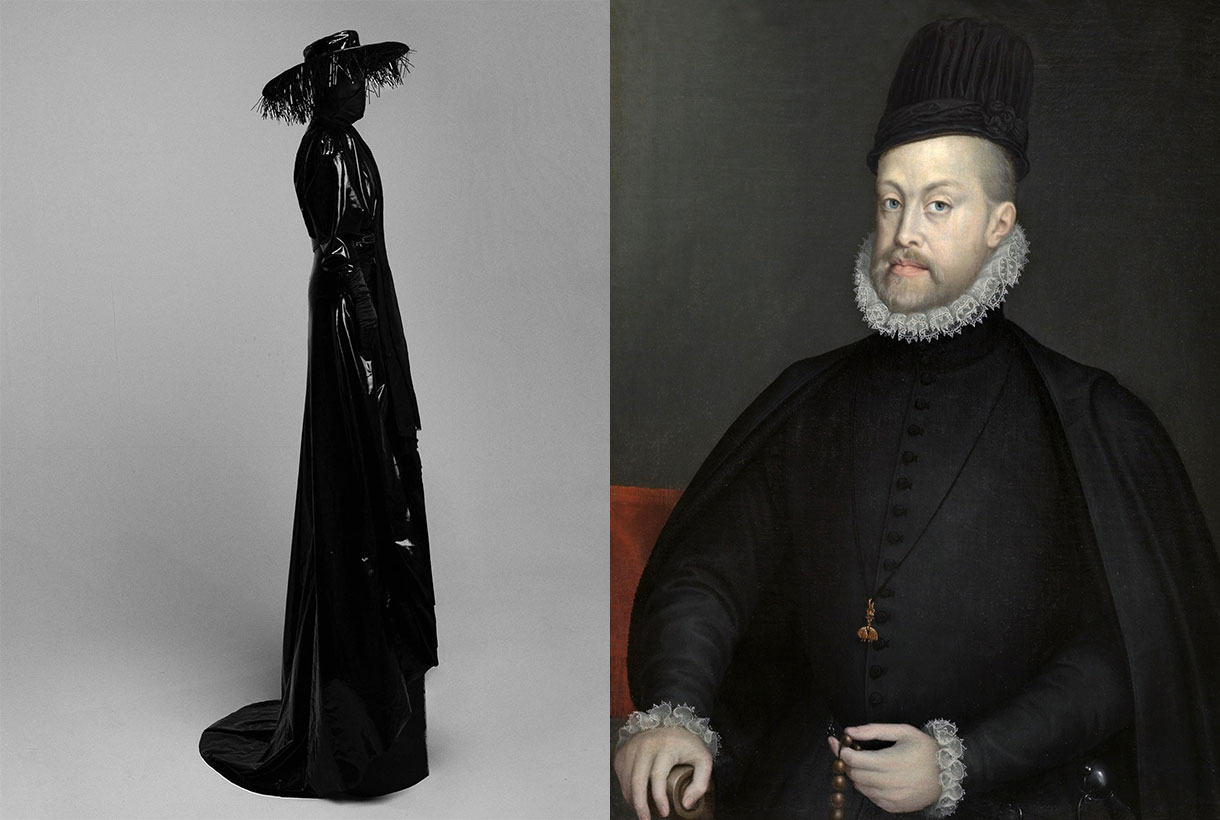
The colour of the Spanish court during the Golden Age
Black was a fashionable colour in the Spain of the Golden Age. It became the emblem colour of the Spanish Habsburgs, Carlos V and his son, Felipe II, who saw it as a symbol of power, dignity, and humility. and temperance. A world power such as Spain after the discovery of America, dictated the fashion and transferred the taste in the dress of the Spanish court to the rest of Europe. The black was austere and sober, but also rich in nuances and made one better appreciate the complexity of the fabrics used. The brighter and more solid it was, the more social status the person who wore it had.
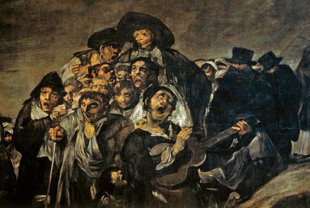
In Baroque painting there was also a resurgence of the colour black in the treatment of light and shadow in the works of Caravaggio and Rembrant or in the paintings of Velázquez, and later Goya . Who does not remember his famous black paintings? Later, when the Netherlands became a new world power, they determined a new fashion: clothing and rigid ruffles were loosened, but the colours did not return because among the Dutch the Reformation had triumphed, and the colour of the protestants was also black.
Black in the contemporary era
In the 18th century, during the European Age of Enlightenment, black lost its popularity as a fashionable colour. Paris became the capital of fashion, and pastel blue, green, yellow and white became the colours of the nobility and upper classes. After the French Revolution, black re-established itself as the dominant colour. The Industrial Revolution is also characterized by black, largely fueled by coal and later by oil. Charles Dickens and other writers of the time described the dark streets and smoky skies of London, and they were vividly illustrated in the engravings of the French artist Gustave Doré . Black was also the colour of romantic literature. The tone of melancholy, romanticism and nostalgia for the past. Stormy castles, rainy nights, secret meetings at midnight … black had a fantastic component and was adopted by the poets of the time.
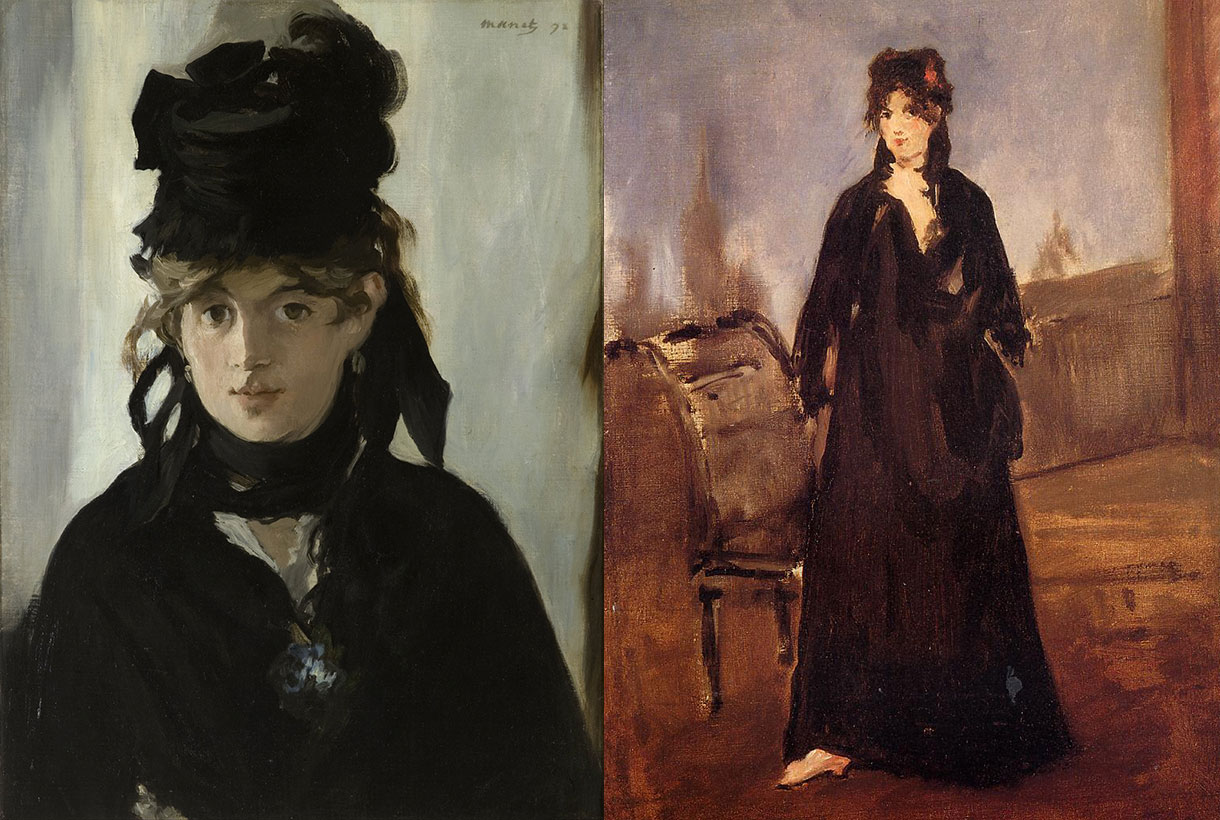
The black of impressionist artists
Impressionism did not recognize black as a colour. This pictorial trend, which began in France around 1870, was very popular and, even today, the viewer considers impressionist paintings as the culmination of pictorial beauty. Édouard Manet used the colour black for its strength and dramatic effect. Manet’s portrait of painter Berthe Morisot was a study in black that perfectly captured her spirit of independence. Black gave the painting power and immediacy. Henri Matisse quoted the French impressionist Pissarro as saying: “Manet is stronger than all of us: he made light with black.” Another famous painter: Pierre-Auguste Renoir used luminous blacks, especially in his portraits. When someone told him that black was not a colour, Renoir replied, “What makes you think that? Black is the king of colours ”. Vincent van Gogh used black lines to shape many of the objects in his paintings. In the 20th century, the colour black also experienced a new splendor. The Russian painter Kasimir Malevich , created the ‘Black Square’ in 1915 and it is considered the first purely abstract painting. For Henri Matisse , black was a prized colour. “When I didn’t know what colour to leave, I put black,” he said in 1945.
A symbol of individualism
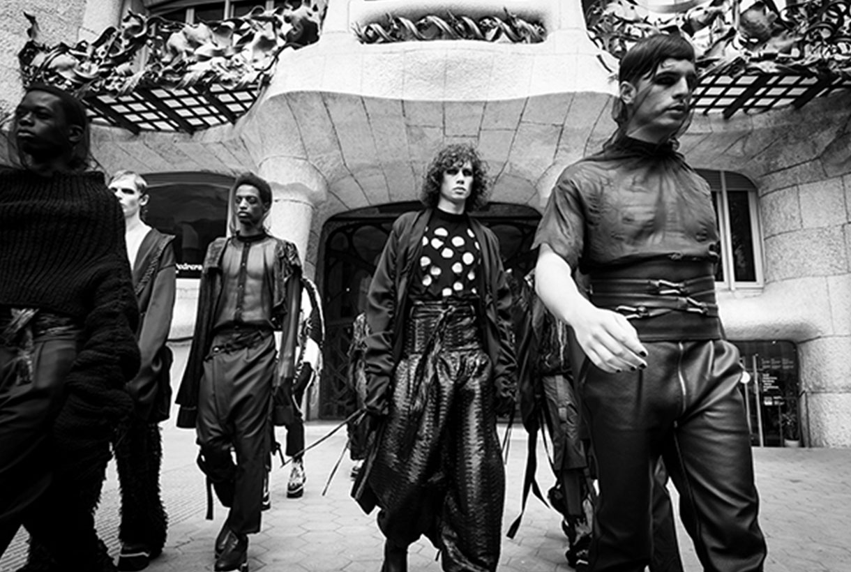
Black clothing concentrates on the face, considered the center of individuality, the impression that a person produces. Not surprisingly, in the 1950s, black was used as a symbol of individuality and intellectual and social rebellion, the colour of those who did not accept established norms and values. The philosopher Jean-Paul Sartre always wore black. Singer Juliette Greco, who embodied existentialism in more popular attitudes, was famous for her black shaded eyes, black corduroy pants, and chin-length black turtleneck. Black also became popular as a differentiating colour among all groups that did not feel like an integral part of the mass and did not participate in the values of adaptation. Rebels without a cause invariably wore black leather jackets. Then came the reign of rock’n’roll , punk fashion, and the goth subculture with a kind of Victorian-inspired funeral fashion.
The favorite colour of 20th century fashion
Black is the colour of elegance because it means giving up austerity and the desire to attract attention. Who wears black, renounces even colour. For this reason, wearing black symbolizes being successful without risk. This is especially evident in the more conservative men’s fashion: the elegant suits, the tailcoat and the tux, are always black. Black was also considered the colour that the artists wore so that the character did not overshadow the work: whoever wears black does not need to be interesting with other colours, personality is enough.
One of the big names in fashion who revolutionized 20th century women’s fashion was Coco Chanel. The French designer simplified women’s wardrobe with her great masterpiece: the little black dress . The short dress that until today has been ideal for all formal occasions. “A woman needs three things: a black dress, a black sweater and, on her arm, the man she loves,” she said. Black was also the favorite colour of Cristóbal Balenciaga, who wanted to rescue the splendor that it had centuries ago and bring it back to fashion. It also had power in Christian Dior who stated that the colour black “could be worn at any time, at any age and for any occasion.” For his part, the designer Gianni Versace considered that black: “It is the quintessence of simplicity and elegance”, and the French designer Yves Saint Laurent said: “black is the link that unites art and fashion”. In all the history between cinema and fashion, one of the most famous black dresses of the last century was designed by Hubert de Givenchy and worn by Audrey Hepburn in the 1961 film ‘Breakfast at Tiffany’s’.
Designers also wear black
We have seen it. Black has captivated the fashion industry with its understated elegance and chromatic harmony in which fabrics and textures also play a fundamental role. In fact, many of the industry assistants who sat in the front row called them black crows because of the clothing they used to always wear. Beyond a trend of the moment to reclaim its throne in the winter of 2021 with monochromatic looks, wearing black from head to toe has always been a wise option that does not have to be boring or monotonous. The catwalks have once again spoken for themselves with proposals that give this timeless “uniform” a twist . Alberta Ferretti, Fendi, Isabel Marant, Versace, Chanel, Gucci or Dolce & Gabbana review the seasonal looks that are full of rigorous black.
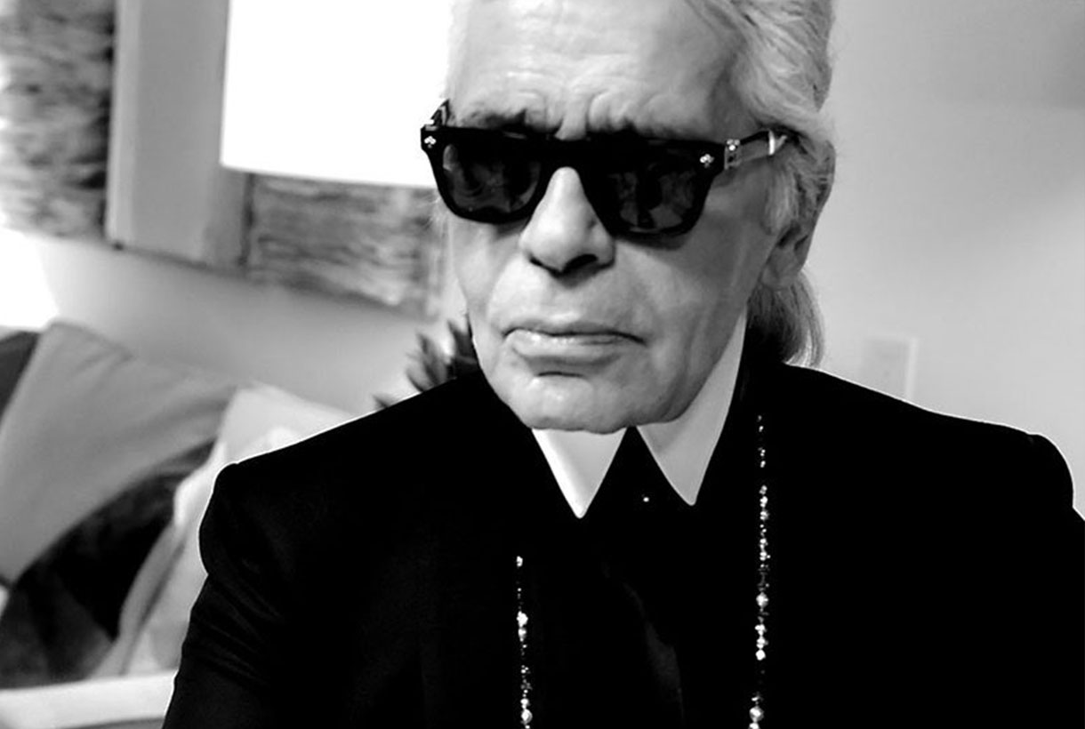
Beyond sophistication, mystery, elegance or individualism, this colour in turn has also been adapted by famous contemporary designers who have made it their preferred colour to display for the gallery. Of course, each one is true to its style. It is impossible not to imagine Carolina Herrera without her black knee-length skirt; to Tom Ford without his perfect black suit or Karl Lagerfeld without his iconic black glasses . In its more casual versions, for example, Alexander Wang with a black T-shirt and jeans or Yohji Yamamoto who made black an emblem of Japanese design stand out. “Black is modest and arrogant at the same time. Black is lazy and easy, but also mysterious”. Of the colour without colour par excellence, he also immortalized a phrase to The New York Times newspaper: “I don’t mess with you, so don’t bother me.” And he applies his mantra to the last consequences both in his designs and when dressing himself. Consistency, first and foremost.
Sorry, this entry is only available in Español.
Martes 21 septiembre 2021
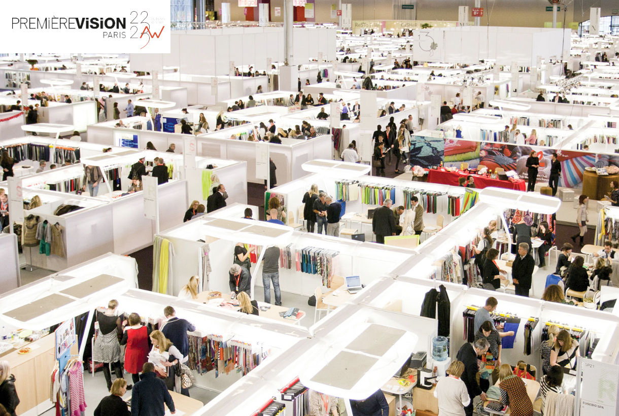
 Little by little, it seems that we return to a certain normality. And an indicator of this is our physical participation in Première Vision Paris. This fair that takes place twice a year is one of the most specialized and influential in the world for manufacturers of fabrics. Exhibitors present all the new collections coming one year ahead. This year, Gratacós is present again to kick off one of our most special proposals: Autumn- Winter 2022/2023. We say that it is “special” because the pandemic is representing a year of great challenges for the company to maintain creativity, production and sales , without overlooking innovation and sustainability that characterizes our business.
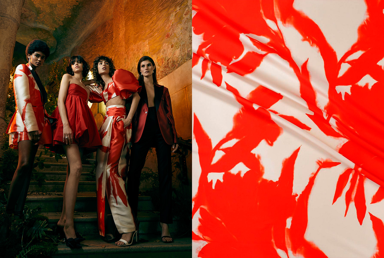
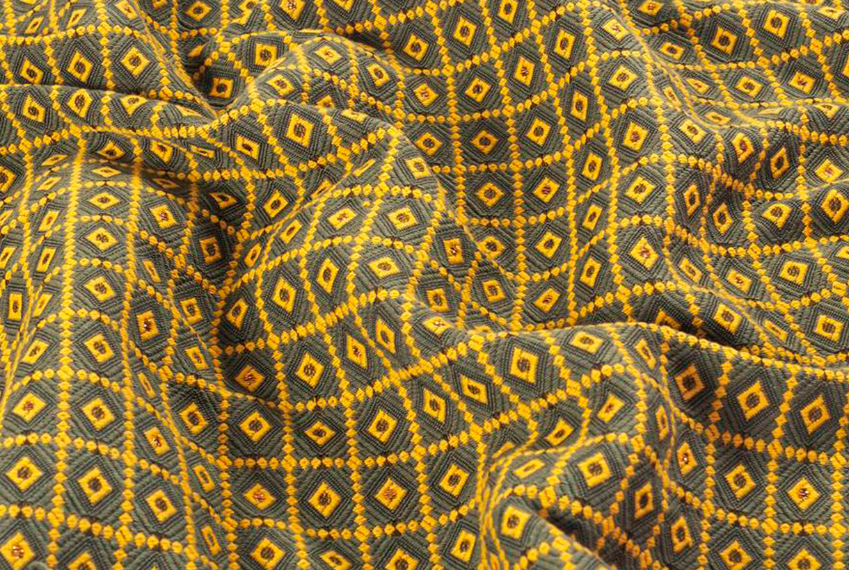
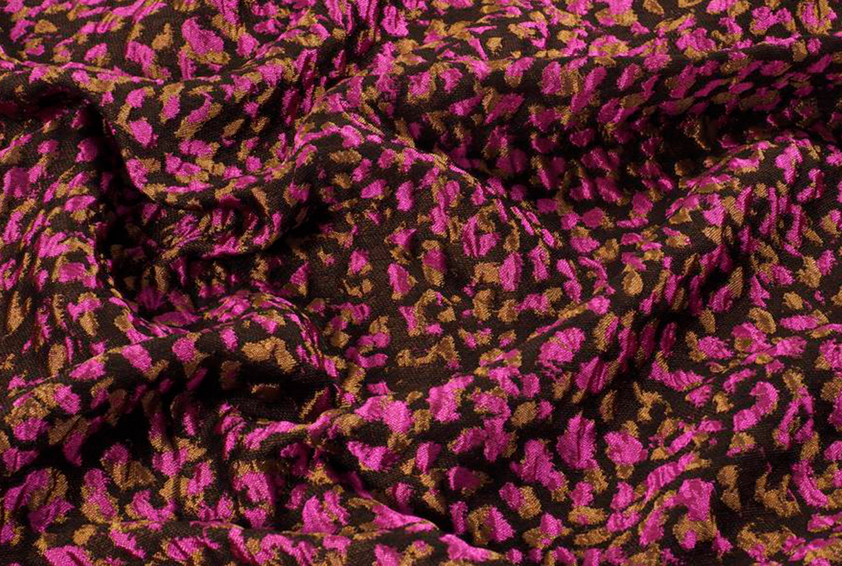
Broadly speaking, the new collection is a solid and choral proposal, which shows our desire to work and continue advancing through the generation of ideas, the creation of creative products and the investigation of new trends. A proposal based on the strength of colour, print and designs with great visual presence. We play with contrasting tones, unique prints and add an extra touch of fantasy because we believe that it is more necessary than ever. To do this, we mix flowers of different shapes and styles with geometric motifs , handicrafts, surprising textures, simplified neo Pucci motifs and neo William Morris with spacious backgrounds. All this to create a surprising game of harmonies, colour, light and tone that we believe will leave no-one indifferent.
The hug as the backbone
“We feel like going out and showing our joy, energy and positivity,” assures Rosa Pujol, creative director of Gratacós. Under this first premise, the Fall- Winter 22/23 collection has been structured, even more than usual on quality, fantasy and luxury. Show to surprise others and to surprise ourselves, is a maximum requirement now in capital letters.
And in this desire to show the fanciful side of fashion, the mother concept that underpins the entire proposal for next winter intervenes: the hug. The symbol of the union of affection and of brotherhood among people, most evident in unstable times like we are experiencing. To hug is to embrace with arms, reach out, understand, restrain, and even include. The creeper plants also hug the logs and facades of houses. And we liked that concept that unites and creates a feeling of sympathy. Aesthetic and visual. In fact, it is a collection designed to embrace multiple markets and different occasions through versatile and surprising items.
“We feel like going out and showing our joy, energy and positivity”.
Rosa Pujol,Gratacós creative director
Embrace materials
The Autumn- Winter 2022/2023 collection embraces craftsmanship. The thick yarns, the obvious braiding and the hand-made finishes. It is also a season where texture communicates by itself through complex folds, 3D effects, opaque transparencies that hint without showing, and precious embossing that surprise by their lines and shapes.
This season, the creative team also aims to stimulate new sensibilities by bringing together two fabrics that a priori are not compatible with each other to create daring aesthetics in the same outfit. It is about daring through complementary items that together create compatible chromatic harmonies. Another characteristic of the season is the commitment to the brightness that the night jump gives to establish itself during the day through surprising fabrics that seek a subtle and fantasy point of light that is 100% wearable. Simple, but sophisticated.
Embrace colour
Colour, more than matter, is light and is developed conscientiously this season to achieve very attractive results. A luminosity that makes us look better on the street. The collection works from the primary tones, through graphic prints , to the palette of metallics such as gold (solar energy) and silver (lunar energy) , mixed together.
As usual, in Première Vision Paris, three colour ranges will be presented. The first corresponds to a luminous band governed especially by radiant yellows and warm browns. The second card is the middle card with vibrant tones that go from oranges to blues and greens, to finish with fuchsias. Finally, the last letter corresponds to the neutrals and the duller tones, considered more masculine. A very interesting range that offers a great possibility of combinations as it is versatile and timeless.
Embrace nature
The Autumn- Winter 2022-2023 collection tries to strengthen the ties between man and closest nature through fabrics that refer to the beauty of plants. Garden inspiration returns through fabrics with plant motifs and country landscapes. As the writer and gardener, Jamaica Kincaid would say : “Gardens are spaces to connect us”. From Gratacós , the natural is also revalued with a commitment to the origin of the products and the raw material.
Finally, flowers also take over the collection in a particularly flowery winter. The flower is the protagonist of many of the fabrics with a variety of shapes, colors, sizes and arrangements.
Embrace geometry
Geometric motifs are very present in this coming season with fabrics that give a twist to the classics to attract the attention of the new generation of consumers: checks, polka dots, houndstooth or diamonds that are creatively combined to give new unexpected geometries.
In parallel, surprising combinations also arrive to generate all kinds of fantasies. The most extreme: combining two fabrics with graphic motifs that can be combined in the same outfit. Finally, although it is not an animal print season, in the next winter collection a fanciful item appears timidly such as a giraffe design Jacquard.
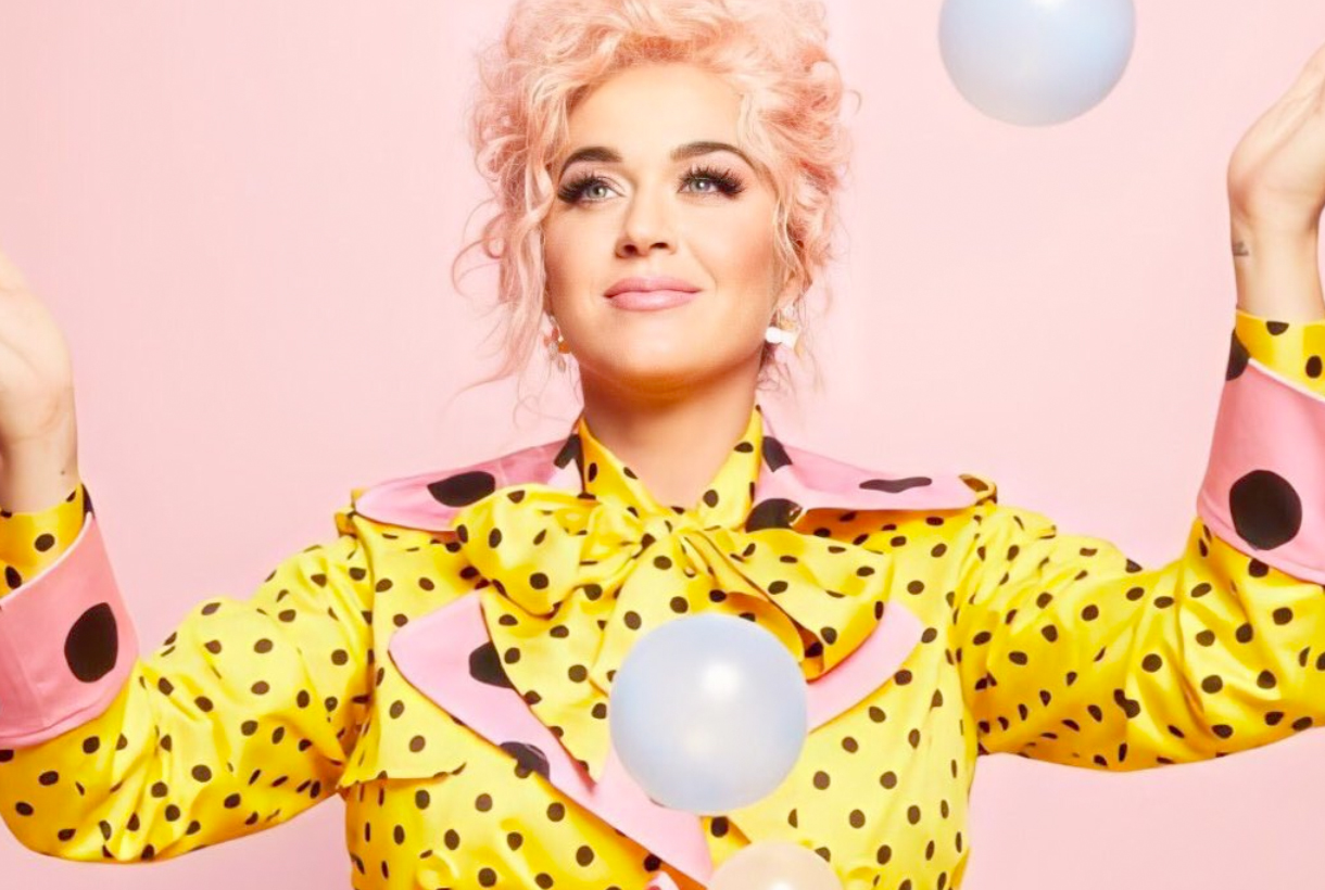
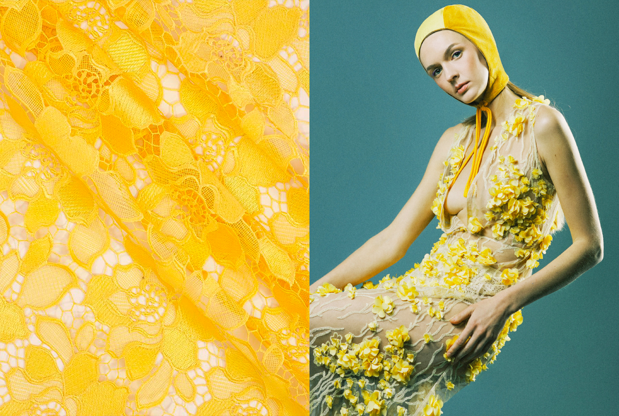
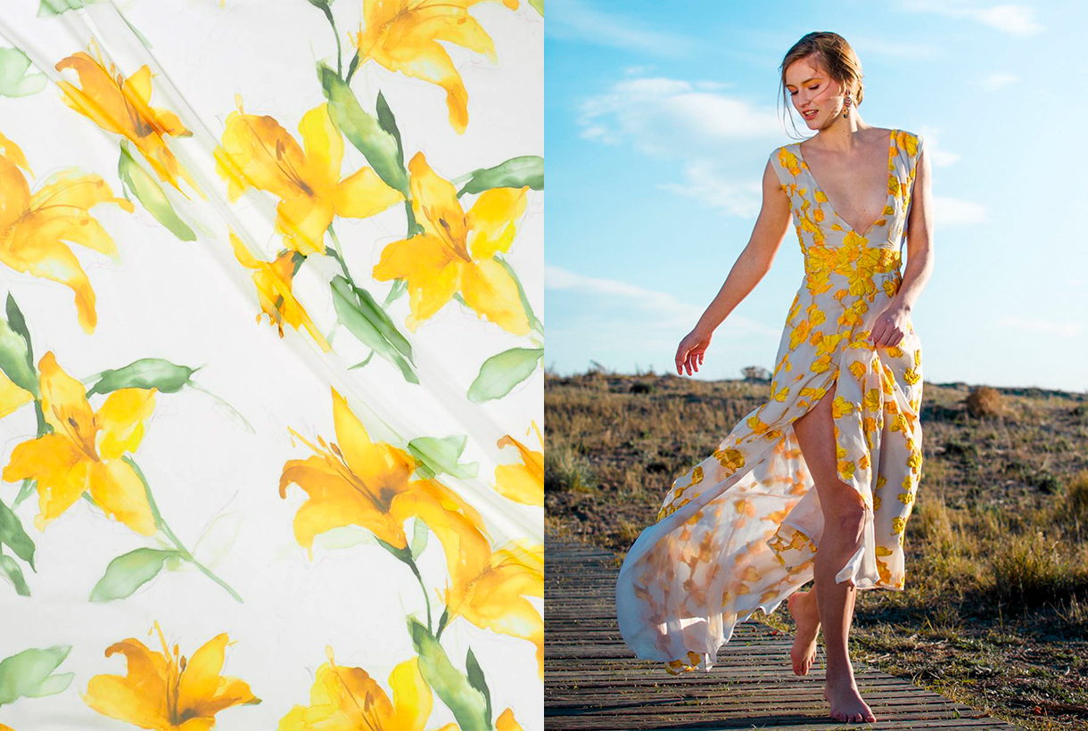
 Yellow is pure contradiction. A dual colour that glows as the lightest of all vivid colors and symbolizes optimism, happiness and abundance. On its dark reverse side, yellow is also the shade that has traditionally been associated with anger, jealousy, and envy. A tone that is loved and hated in equal measure, adored by young people and precisely represents the new generation of consumers: GenZ Yellow. Yellow is in turn one of the colours that is marking this 2021, according to Pantone. We analyze some anecdotes and curiosities of this rabidly trending colour.
The colour of fun, kindness and joy
Yellow is traditionally associated with the sun and as it is linked to the main astro, it is an encouraging and serene color. Optimists have a bright mood and yellow represents their state. Yellow in itself is fun in, it’s radiant like a broad smile. Not surprisingly, smileys or smiley emojis are naturally yellow. Could you imagine them in another colour?
This colour radiates light and is the main color of kindness. “For yellow to be friendly, it needs to always have orange and red at its side, which instill and represent ideas of joy and wealth,” wrote the painter Eugène Delacroix. This is also the chromatic chord that is linked to the joy of living, of activity and of energy.
Illumination is yellow
Sunlight is also perceived as yellow, although it does not actually have any colour. That is why colour is linked to light and illumination. As a light and luminous color that it is, yellow is related to white. Bright and light are qualities of the same character, and yellow is the lightest and lightest of vivid colours. It has a light effect that because it seems to come from above. Therefore, the colour of light is, figuratively speaking, the colour of mental enlightenment. In the Islamic world, golden yellow is the symbolic colour of wisdom and in ancient European symbolism it was linked to the tone of understanding, belonging to the world of reason and ideas. Spiritually, God has been represented symbolically as a yellow triangle, often with an eye within that geometry. A symbol of the omniscience and omnipresence of the all-seeing Being that leads to clarity and enlightenment.
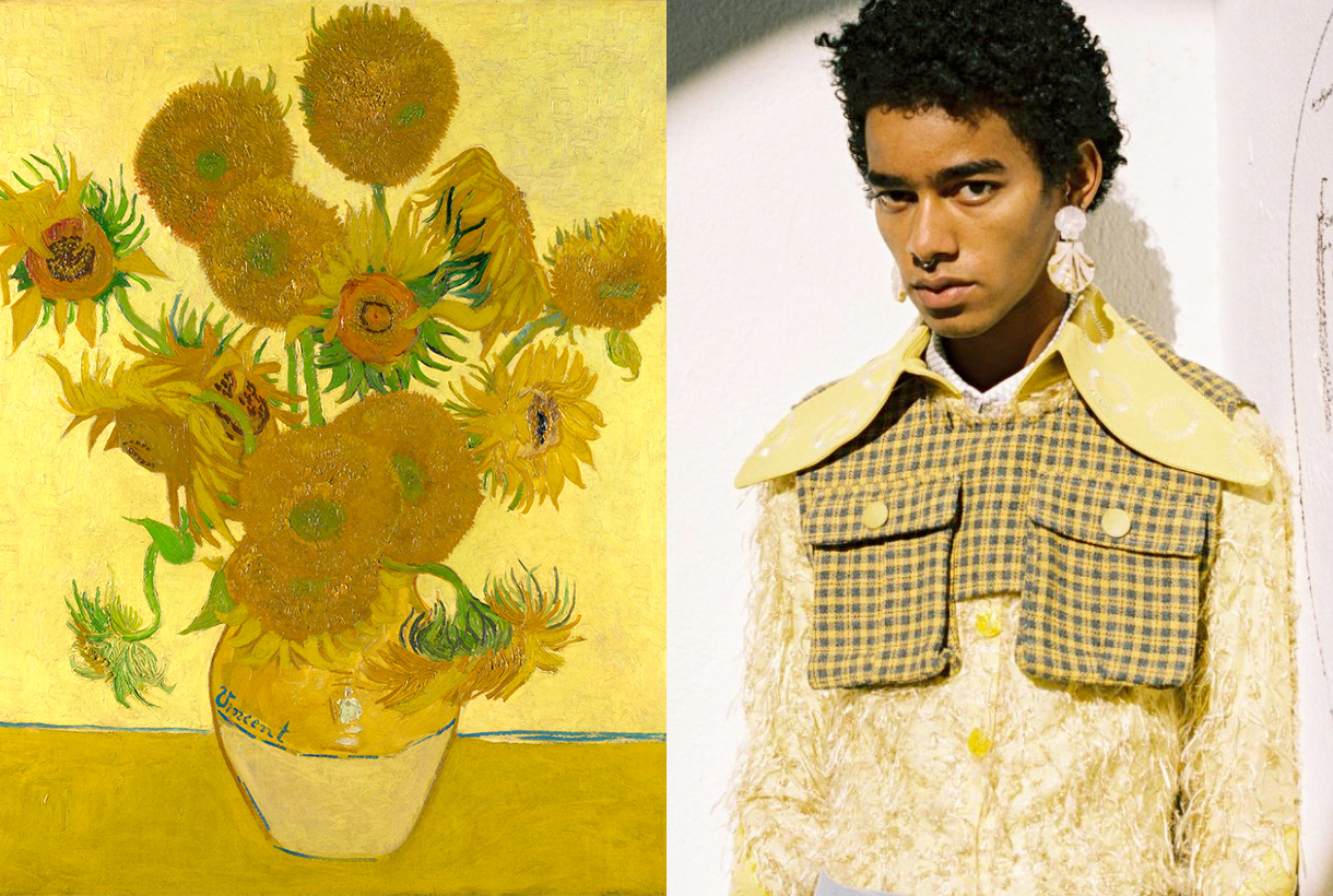
Psychologically, yellow is also linked to spontaneity and creativity as it is a colour that sharpens perception and invites reflection. Yellow are also Van Gogh‘s paintings that he painted with corm yellow, a very poisonous pigment that contains lead and sulfur, some of his most famous paintings such as ‘The sunflowers”
The colour of beautiful men and women
Since ancient times, yellow hair was related to the Sun with its brilliant reflections that seemed to be bathed in gold. Hence, the word blonde or blonde came out to designate a person with golden hair as the star king. The ancient Greeks represented their solar gods as Helios or Apollo of yellow color with statuesque bodies and blond hair, abundant and wavy. Faced with such beauty, all mortals wanted to be blonde. For this reason, they soaked their hair with a bleaching ointment that was manufactured in Athens, they sat for hours in the sun and waited until the hair turned blonde. The blonde symbolized the beautiful and the divine.
Yellow also represent fertility and maturity, idealized in summer fields with golden tones, and sensual love as it is the most frequent colour in flowers. Precisely, most of the flowers are of this colour: mimosa, sunflowers, forsythias, crocuses, primroses, physalis …
The dark side of yellow
Not all that glisters is gold, and yellow, as the most dual tonality of the colour palette, also hides its own contradictions. The warning of a hazard is yellow. This has a simple explanation: it is the lightest color and due to its optimal effect seen from afar and irritating seen from close up, it is the internationally adopted tone for signs indicating the presence of toxic, explosive or radioactive substances that show black signs on a background yellow. In fact, black writing on a yellow background is best read from afar.
Yellow is also the colour of everything you dislike: from envy (dislike for the posessions of others) to jealousy (dislike for the existence of others). Greed is also yellow, which, like envy, are capital sins, and are related to facets of selfishness. According to ancient belief, irritability and anger are linked to bile (yellow with greenish flecks), and when someone got angry they said that their skin turned yellow.
One more curiosity. In English, yellow means coward. The French call false laughter “yellow laughter”, and in France and Russia, “a yellow house” is a madhouse. What a dark reverse!
The colour of Generation Z
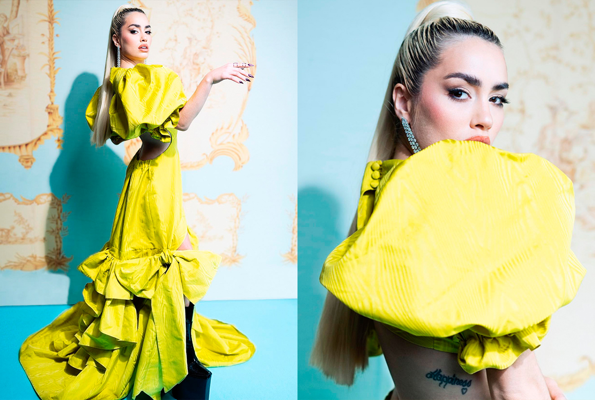
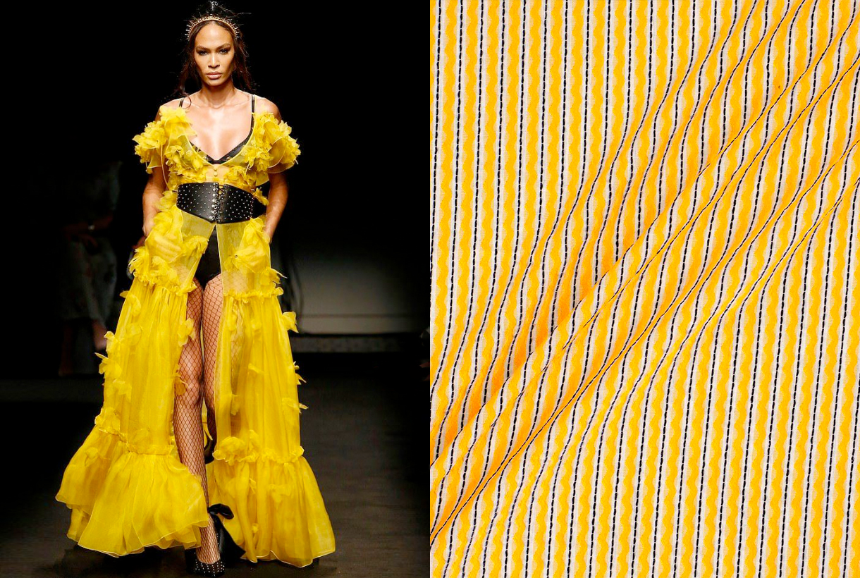
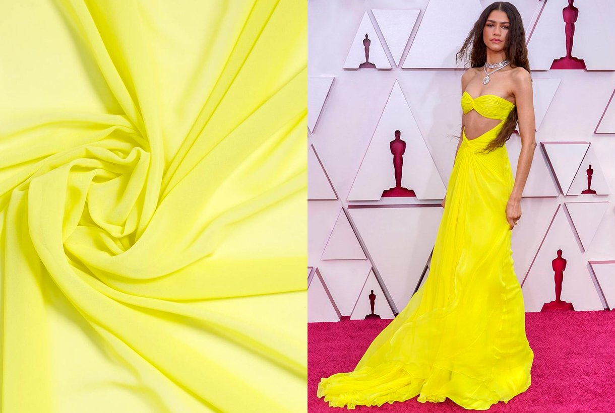
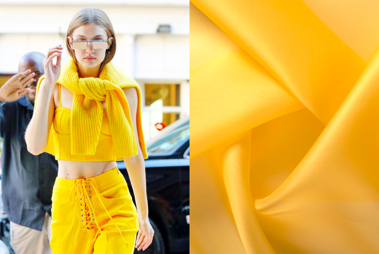
Pantone decided in 2021 that one of the colours that would mark the year would be Illuminating yellow. A bright and cheerful topne that generates liveliness and effervescence, and that, according to the authority of colour, symbolizes hope and positivity, values that connect with the future. And the future is marked by the new generation of young people: the effervescent Gen-Z, born between 1994 and 2008. Celebrities such as Zendaya, Gigi Hadid, Kaia Gerber, Kylie Jenner, Millie Bobby Brown, amongst many others, have taken yellow as their flag of style, and the fashion industry continues to use these tones to attract the attention of young, new consumers.
On the catwalks, yellow also does not go unnoticed this summer. From its most candy to the most acidic side, this colour has become one of the season’s stars in collections from firms such as Prada, Versace, Balmain or Etro that have not hesitated to combine it with golds, earth tones and the unbeatable neutrals. : black and white.
Therefore, yellow right now is the colour of the moment: of what flourishes in the fashion industry and is linked to the joy and dynamism of the carefree generation of young people. In less than a decade we have gone from millennial pink to GenZ Yellow.
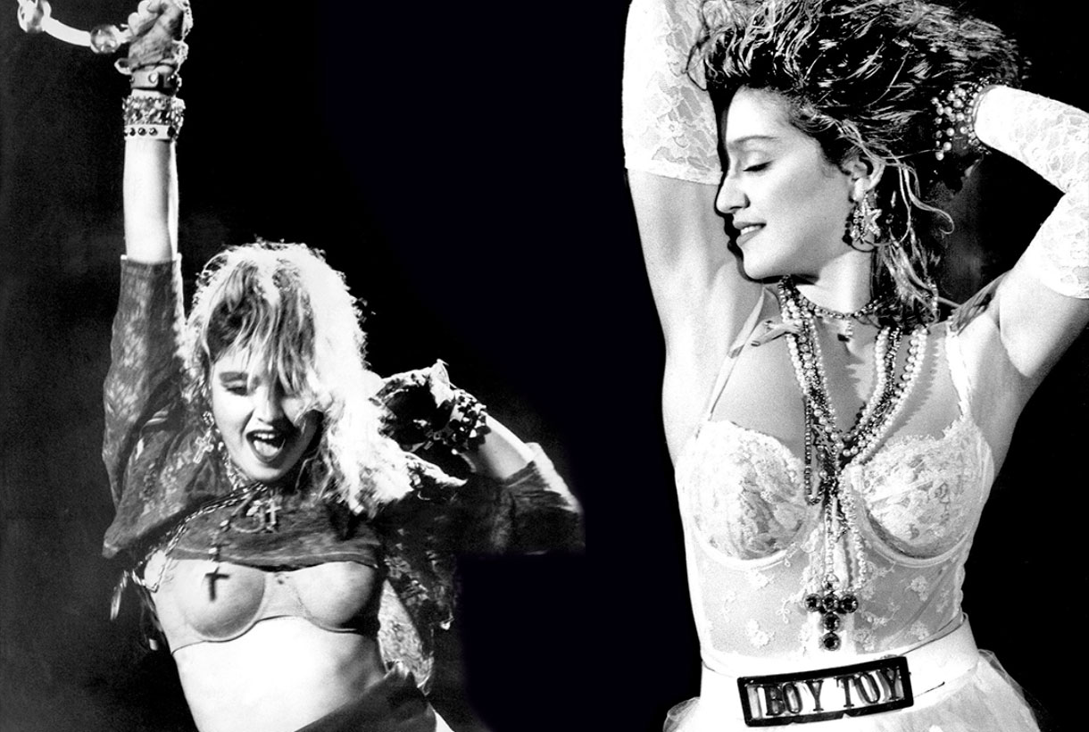
 The history of women’s intimate fashion is curious because it is not only linked to the trends of each era, but also to the rebellions of women and the strength of some female icons such as the dancers Isadora Ducan and Irene Castle, the writer Simone de Beauvoir or the pop diva, Madonna, who broke ground in her time, breaking some conventions and marked taboos. It is also remarkable, as in recent decades, the conception of what is intimate and what is not, is conspicuous by its absence because fashion evolves and transforms, merging concepts and adapting pieces that were once created to remain hidden behind the outer layers of the visible clothing.
From Egyptian to French. A brief historial view
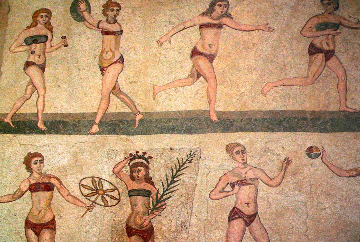
Intimate clothing was born to cover a basic need: hygiene and shelter for the female parts. Then, over the centuries, they became garments to mold and correct the female figure. It is estimated that they were the Egyptians of high society, who began to use some type of lingerie. Back then it was linen and cotton tunics glued to the body with a sort of petticoat that began below the chest and ended below the ankles as part of their daily dress. In ancient times, to lift the breasts, – the anatomical part that symbolized femininity, motherhood and pleasure, women accepted many sacrifices. For this reason, in Crete the bra was invented almost four thousand years ago. Also in Ancient Greece, the zoster was born, a girdle that single women used to enhance the bust. Married used another piece to hold the breast, called apodesmo, and used to be fabric with bright colors and decorated with care. In Rome, a band wrapped around the chest was used to give the female figure the harmony and shape that was considered beautiful at the time. During the Middle Ages, the brial and the camisole imprisoned the chest at a time when only maidens were allowed to show off the bust. As for panties, the garment was not conceived as part of the undergarment until the Renaissance. Finally, corsets emerged in the Middle Ages and had ups and downs in their use until the end of the 19th century. The famous corset was not only an intimate garment to maintain hygiene, but was also used to style and seduce.
France is considered the inventor country of underwear, similar to what we know today, and the popularization of its use. Towards the year 1830 there was a shift towards the use of underwear that coincided with the growing trend towards a public morality that during the Victorian era would reach its peak. The appearance of new materials and thinner and lighter fabrics, which were appropriate for use in certain areas of the body, also influenced. From 1860, the design of women’s underwear began, and in 1880, silk became the preferred fabric for such uses. Later, wool (in colder areas) and cotton were also used, fabrics that allowed the skin to breathe. Its use also extended to petticoats, nightgowns and panties. It took until the end of the 19th century for women’s lingerie to acquire a definitely sexy air with the appearance of the first silk stockings and garters. Although its use was reserved exclusively for the privacy of the bedrooms and for the so-called “women of bad life”.
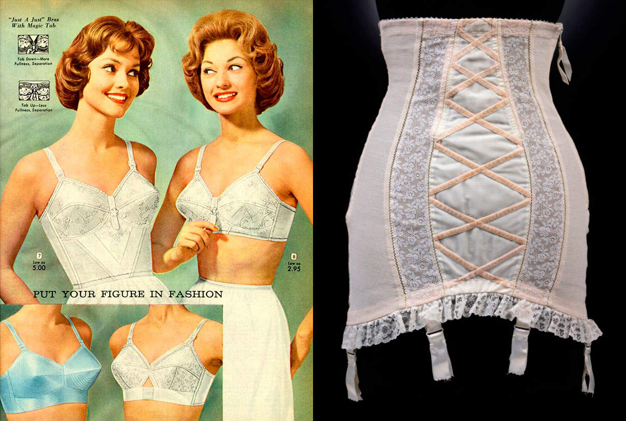
The 20th century was the century of the bra that ended up burying the corset as a garment to shape the chest and the introduction of cups in bras, showing that there were women with different sizes and bust sizes. In the 1950s, conical pointed cup bras were introduced, which immortalized the pin-up aesthetic models and later, Madonna in the transgressive 80s. Corsets were introduced as streetwear thanks to the influence of the cinema and the Golden Years of Hollywood. Finally, in 1990 was the boom of the wonderbra, a bra that enhanced the breast without the need for cosmetic surgery.
From indoors to outdoors. The lingerie is displayed without shame
As we have just mentioned, lingerie was born in France at the end of the 19th century to liberate women from the corsets of the time. The actresses of the film industry of the last century were in charge of giving it that glamorous touch by displaying their most intimate clothes in lavish film shoots. Garments such as nightgowns, tunics and kimonos made in beautiful light satin and silk fabrics, jumped from the bed to the stage, along with voluptuous lingerie sets that evoked sensual games of transparencies through tulle and lace, which went beyond the bedroom. Intimate fashion was under the spotlight ready to be consumed for a new generation of female consumers.
From the end of the last century to the present, we have experienced an authentic explosion of lingerie fashion that conquers en masse a new terrain until now forbidden: the street. They are not pieces of lingerie as such, but an adaptation that large firms create of these models to be exhibited in public. Thus, in the 90s, the boom in silk slip dresses or nightgowns with thin straps and lace motifs were immortatilized by the it girls of the time such as Kate Moss, Winona Ryder or Jennifer Anniston . Then came the outer bras or crop tops popularized by American rap and hip hop singers who shamelessly showed a foot above (or below) the navel. They were also the first to bet on showing off panties or thong straps underneath their low-rise sweatpants. Garments that create sensual games of transparencies are also experiencing their best moment, through plumeti tulle and lace in romantic Victorian-inspired outfits. Other parts such as two piece satin pyjamas and oriental kimonos have settled in our closet over the last decade as being completely normal, providing that elegant touch, but suggestive in the daily styles.
Regardless of style and trends, what is clear is that lingerie has been claiming its space for a long time and the catwalks attest to this exhibitionist trend that, at the moment, does not know its end.
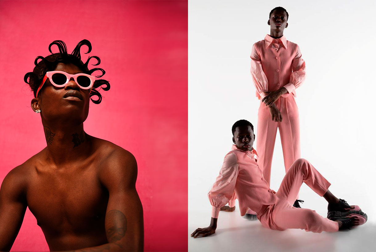
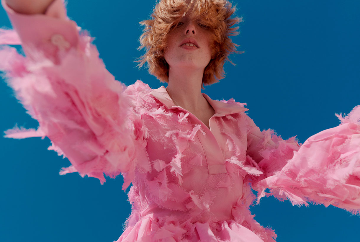
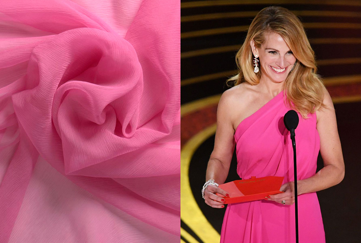
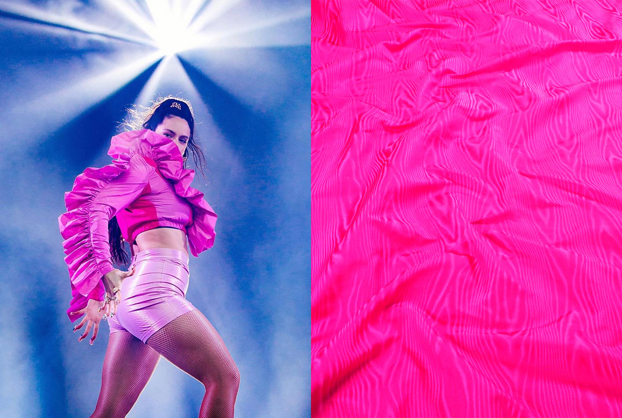
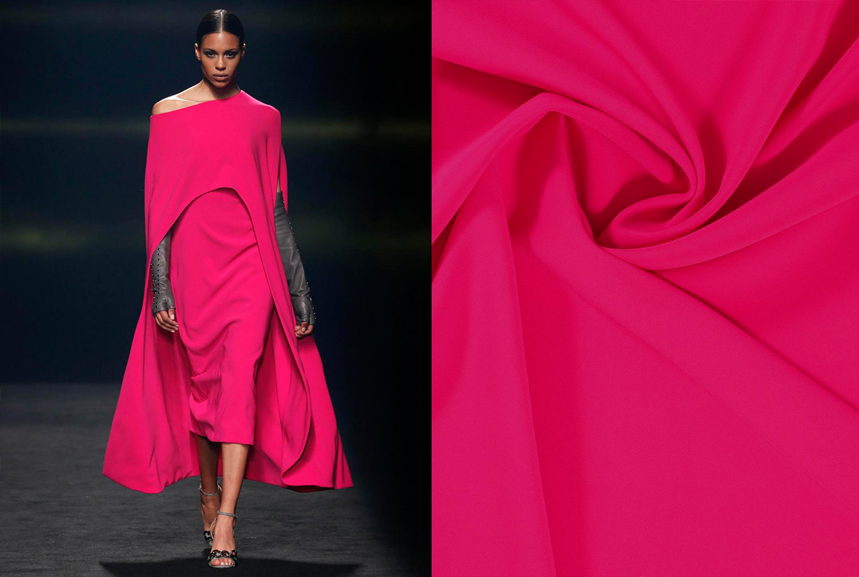
 Pink is a colour that generates debate. It never leaves you indifferent and its choice in fashion represents from the most classic to the most demanding femininity. The childish and the superfluous is tinged with pink, but also the controversial, the flashy as well as the minimalist. From Schaparelli pink to Millennial pink. Let’s review some anecdotes about one of our favourite colours via various seasonal fabrics.
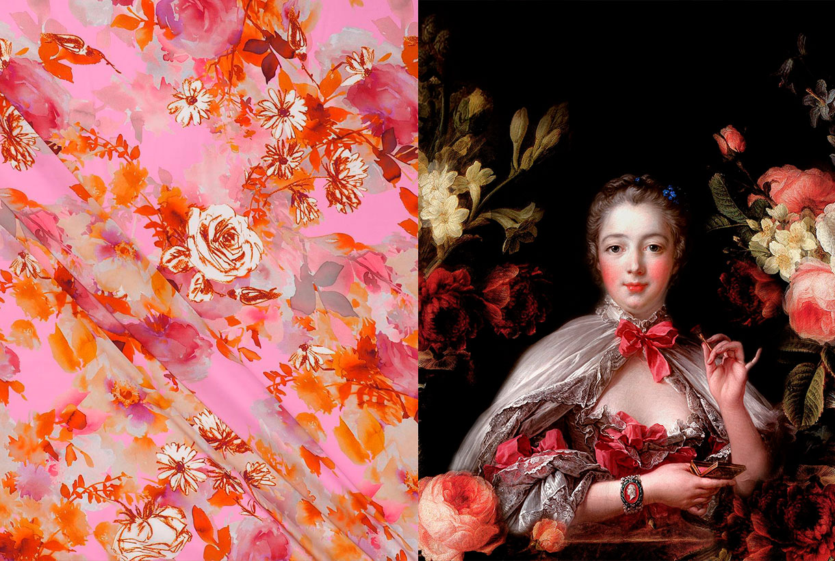
The colour of delight, happiness and miracles
Rosa, Rosalía, Rosanna, Rosita and Rosamunda. They all come from the rose. The flower that names the colour in question. All the qualities attributed to the rose are considered feminine because traditionally the rose has symbolized the strength of the meek, delight and kindness. William Shakespeare wrote in ‘Romeo and Juliet’ a revealing comparison: “I am as polite as the colour pink” to symbolize the sensitivity that this colour radiates.
Happiness is also dressed in pink as it is a hue that evokes fantasy. A rosy world is too beautiful to be true or anyone who adopts the motto think pink seeks to live out their optimism in the face of a grey reality. When life is like a dream, the French have an expression that alludes to the colour in question: C’est la vie en rose, they say. A theme that Édith Piaf also immortalized.
Pink in medieval paintings had also been linked to the colour of transfiguration, unreality, and extraordinary things. There are several works that represent the homeland or the life of a saint with pink details such as a house within a city or a pink aura around a person. The people of the time linked that colour with that of miracles.
Instead today’s artists (designers, illustrators, cartoonists …) use pink from a creative point of view to surprise the viewer through colour. When pink is used in an unconventional way, it directly draws attention and appeals to the object or subject in question. The most famous Panther in the world of cinema and comics is not exactly black.
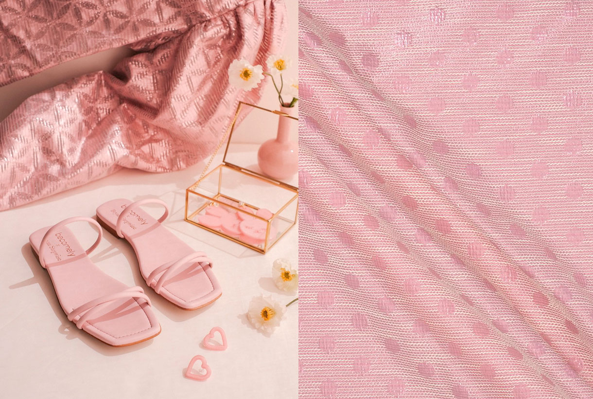
Tender and sweet pink
Pink is soft and tender and on a psychological level it is associated with delicacy. Pink makes us think of skin, softness and youth. Pink also expresses sweetness. It is the colour of confectionery, delight and cloying. We know that any edible product with a sweet wrapper is a food with a mild, appetizing and sweet taste. Not in vain is it the most used colour in pastry shops or sweet shops that unconsciously seduce consumers through the tempting pink tones.
From masculine pink to feminine pink
Pink has not always been a colour associated with the “typically feminine.” In fact, before the 20th century it was considered a masculine colour. For example, in ancient religious paintings the Child Jesus was often painted in pink, the diminutive of red, and the Virgin Mary in an indigo blue cloak. Another example. Today’s pink press dedicated to a predominantly female audience would contrast with the typically male financial newspapers, such as the Financial Times and the Gazzetta dello Sport, which continue to be printed, in accordance with the old tradition, on pink paper.
On the other hand, the convention to award pink to girls and light blue to boys arose around 1920. Before that little boys and girls were all clad in white. If they wore ribbons, they were almost always red, because according to tradition, this colour protected against the evil eye. After the First World War red disappeared from all men’s civilian fashion. At this time there was also a real revolution in clothing: the so-called “reformist fashion” that freed women from corsets and created a specific fashion for children who wore sailor suits and dresses, dyed with artificial indigo, the new fashion dye. Sailor suits derived from an almost forced logic, suggesting that light blue was the colour for boys and its opposite, pink, was awarded to girls. During World War II this message was reinforced through government propaganda with a “pink for a girl” mental association. In fact, in advertising, those perfect wives who took care of the children and the home wore dresses of that colour. At that time it also became the colour of discrimination: homosexuals who could not satisfy the ideal of masculinity were locked up in concentration camps and wore a pink triangle sewn to their clothing to distinguish them. The colour pink is indeed currently often identified with this group (the pink collective) who see in this shade a positive connotation of identification and of struggle to claim their rights.
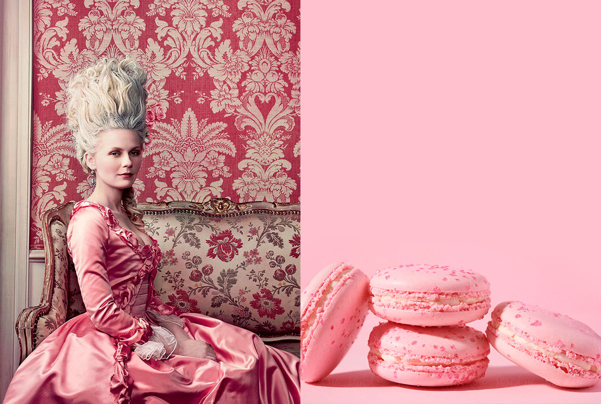
From Pompadour pink to Schiaparelli pink
During the Rococo period, which lasted from approximately 1720 to 1775, the pastel colours dictated by the French court, which set the fashion of the time throughout Europe, were all, the rage. Aqua greens, straw yellows, azure blues, and powdery pinks were worn by aristocratic men and women alike. Madame Pompadour (1721-1764), prototype of the Rococo lady, lover of art and exquisite taste, made the combination of pink and light blue fashionable, something which today seems typical of this artistic movement. Today the Pompadour rose still endures, a princely rose that the porcelain makers of Sèvres created for the lover of the King of France Louis XV: a rose with obvious traces of blue, some black and yellow.
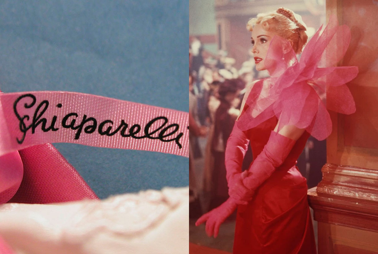
In fashion there is another rose worthy of mention, precisely because it does not go unnoticed: Elsa Schiaparelli‘s shocking pink. In 1931 the Italian dressmaker, who brought the ideas of surrealist painters into fashion, launched a new colour: shocking Pink (magenta with a hint of white). She also created a perfume that she called by the same name and which was sold in a box of that garish colour that scared the public by its aggressiveness. Yes, pink could be subversive and transgressive. In fact, this colour is currently used in outfits aimed at attracting attention whether on a runway or a red carpet.
Interestingly, Pink is the loudest colour in the range of roses. It is the colour that is usually present in advertising not very serious objects, the most strident accessories in fashion and the cheapest or most banal plastic articles.
The pink of the millennial generation
There is a type of pastel pink that has been appropriated by millennials during the first decade of the 21st century. A neutral tonality that unifies genres, identifies a generation and that has taken over a cultural movement that ranges from fashion to cinema. For example, millennial pink has been seen in Wes Andersen’s movies or on the fashion-parades of Valentino, Marni, Dolce & Gabbana, Hermès or Dries Van Notens. A tone that has also appeared throughout the world of design, from social media and printed materials to furniture. This pink, which mixes salmon tones, conveys a sense of calm and is associated with words like “youthful” and “accessible”, explaining why so many modern companies have been so drawn to it. Millennial pink fever broke out in 2016 when Pantone announced quartz pink, a candy-cotton-like shade, as its colour of the year. Although generation Z has taken over from the new youth by appropriating other colours, this type of pink is still very present in today’s society.
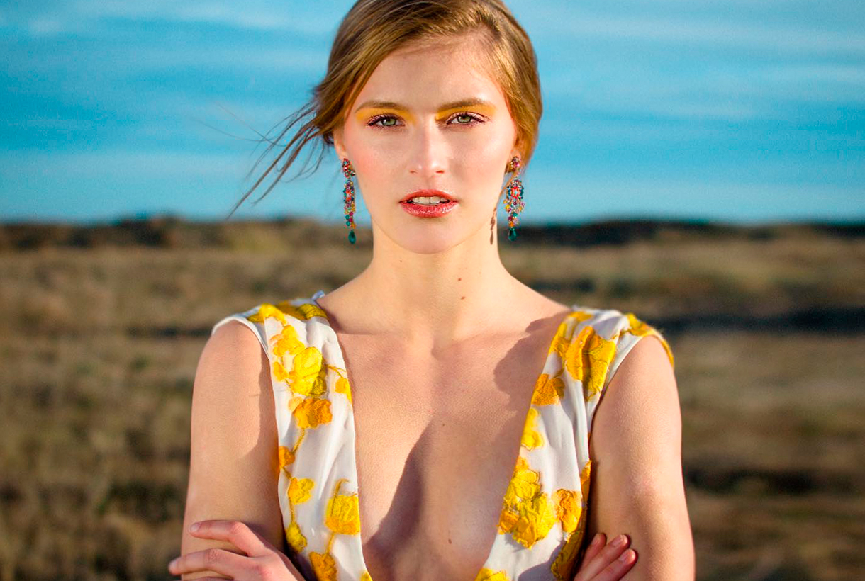
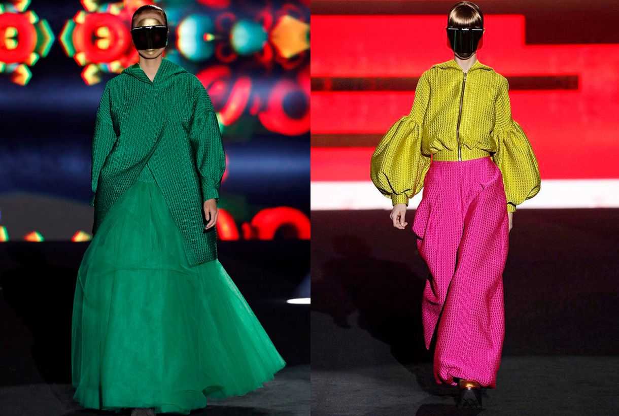
 Gratacós ends the month of April by reviewing the first Spanish catwalks of the year: Mercedes-Benz Fashion Madrid in hybrid format and 080 Barcelona Fashion with collections presented through fashion films. These are the proposals, designs and looks that we have found on the catwalks and that are made with various seasonal fabrics. Thanks to all the designers for trusting in us!
Mercedes-Benz Fashion Week
Brain & Beast souvenirs
Ángel Vilda, the alma mater of Brain&Beast has transmitted the concept of memory and nostalgia to the Madrid catwalk, via family memories with his new creationl ‘Souvenir’. Thus this daring designer, who turns shape, volume and colour upside down in each collection, has reverted to his childhood to reproduce garments that have marked him and that constitute valuable objects in themselves: the patterns of the dress his grandmother wore at her mother’s wedding, a coat that recalls the dressing-gown she wore on her holidays in Salou, a reconstruction of his grandfather’s dressing gown … All this personal memory takes shape via his customary design tics: oversize patterns, overlapping layers and textures, geometric motifs and some symbols inspired by contemporary culture that mix irony and humour. This company combines powerful social discourse with a strong visual identity and has managed to establish itself within the scene with its irreverent style. At Brain & Beast nothing is left to chance.
The art of volume by Isabel Sanchís
The Valencian designer once again magnifies the femininity of women via a new Autumn / Winter collection 2021/2022 full of pieces with intense silhouettes and volumes of sculptural inspiration that appeal to the five senses. To recreate these architectural figures, Isabel Sanchís uses elements such as shoulder- pads that provide volume and a certain futuristic air, drapes, embroidery, intertwined motifs, fringes and silicone appliqués. With regard to colour neutral tones, especially in grey, accompany touches of fuchsia, yellow and orange in strategic looks that reduce volume and enhance the feminine silhouette.
Maison Mesa, life is a party
Juan Carlos Mesa has actively contributed to the visibility and development of Spanish fashion. With his own company, Maison Mesa created in 2017, the designer exhibits his unique vision of fashion in a contemporary key, combining tradition (materials, classic and artisanal sewing techniques) with new technologies (3D printing and experimental materials). Under this concept the latest collection entitled ‘Rave’ was presented, inspired by the history and evolution of those bohemian parties born in London in the 50s that have been transformed over the decades into well-known electronic music events.
To represent this spirit of escape via partying Juan Carlos Mesa goes for clean and simple lines, full of references to urban clothing that stand out for their comfort and freedom of movement: wide pants and overalls, baggy pants and oversize garments. , cargo pockets, hoods and zippers, rubber or automatic, which hark back to sport garments. In terms of fabrics the designer uses a surprising mix of combinations: wool, satin and lurex twill, mixes of crepes with denim or quilted fabrics with a 3D effect together with tulle. All, within a colour range that ranges from the purest and primary colours such as yellow, green or magenta, to burgundy, indigo, grey, white or black along with touches of gold and silver.
The OFF catwalks
Parallel to the official calendar for the Mercedes-Benz Fashion Madrid, OFF shows were also scheduled, featuring young fashion designers.
In these alternative shows we highlight designers who habitually trust our fabrics, like Dominnico. This time Domingo Rodríguez Lázaro is inspired by the social crisis of coronavirus to create an imaginary uncertain future through the eyes of a generation of young people who want to socialize at a moment of emotional breakdown. To recreate this concern Dominnico goes for an upcycling exercise, recovering part of the brand’s fur leather inventory to create new pieces. In addition the denim fabric that appears with exclusive prints and also a new genderless fashion line is given prominence.
For her part, Pilar Torrecillas from the company Pilar Dalbat has presented a collection dedicated to the figure of Mariano Fortuny Madraza, taking as reference the 150th anniversary of the birth of this famous painter from Granada. We highlight the feminine designs featuring our fabrics with small fringes creating an interesting hair effect.
The Corsicana firm of Paula Currást tends to merge different disciplines and interests for its catwalk shows: fashion, design, cinema or music all appear together. The latest collection focuses on the home as a space for inspiration. ‘La Casa’ represents reflections on an environment of intimacy and introspection via fluid designs of urban inspiration, sartorial garments and pleated fabrics that are combined in a very controlled colour range.
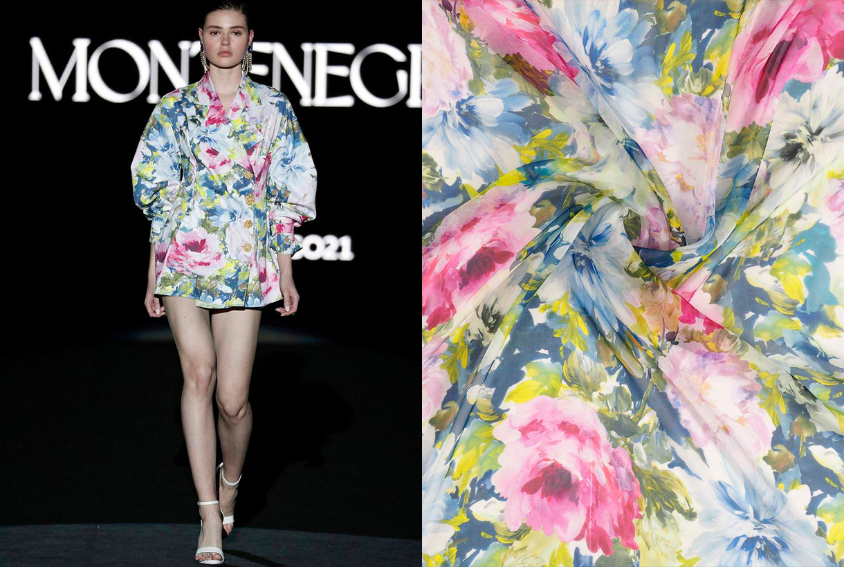
Finally, Montenegro, the debut of Nicolás Montenegro on the Madrid catwalk with a ready-to-wear proposal inspired by southern Morocco. The Sevillian’s creations abound in shirt dresses inspired by Moroccan djellaba with materials such as silk. The extremely striking cuffs and collars with character are some of the details that the creator applies to his shirts. Exceptional pieces that are dotted with lace, ruffles and delicate finishes, always topped by the company’s hand-made buttons.
080 Barcelona Fashion
The glamour of Avellaneda invades the Catalan catwalk
Juan Avellaneda has opened the 080 Barcelona Fashion calendar with a proposal that invites you to dream via sophisticated looks full of fantasy that connect with beauty, joy, escape and the desire to celebrate life. Thus in the proposal ‘La nuit éclairée’ the celebrity designer opts for the characteristic features that make up his DNA: tuxedos for men and women together with classic shirt and tailoring patterns, introducing novelties such as porcelain-china inspired prints and a collection of dresses inspired by tailored garments. The chromatic range makes a return to essentials via pure and energetic colours such as white, black, red and Klein blue that suggest Mediterranean culture and its celebration of the essential.
The magic of Menchén Tomàs
Menchén Tomás is inspired by the ‘Duende’ for the next Spring-Summer 2021 collection, that is, by the innate and intangible talent that causes almost magical sensations in those who witness it. In a fairy tale atmosphere and with various elements that refer to the tarot, Olga Menchén showed off her usual design skills through a sophisticated and feminine collection, full of volatile volumes, iridescent fabrics, radiant colours, evocative long dresses where craftsmanship is appreciated: prints suggesting astral charts, embroidered flowers and a laboriously- created wedding dress with almost a hundred hand-sewn pieces that closed the show. The use of oriental-inspired silk and patterned gauze with colours such as porcelain- blue, apple- green or mandarin- orange give the collection an energetic air.
The experimental craft of Y_Como
Born during lock-down, Y_Como is the new adventure of sisters Cristina and Yolanda Pérez, founders of Yolancris, the Catalan haute couturehouse that has catwalked in Paris. This new brand was born with the desire to explore the creative processes of the pieces, experimenting through innovative techniques, fabrics and silhouettes. The debut collection was actually presented at 080 Barcelona Fashion and is a declaration of intentions: it reclaims the spirit of freedom via the humanist poem ‘If’ by Rudyard Kipling in a manifesto that also combines the Arts & Crafts movement of designer William Morris and the naturalist architecture of Antoni Gaudí. Thus this proposal of great visual richness is in practice a great exhibition of the craftsmanship and experimentation of its designers. Particularly noteworthy is the meticulous way in which they have worked denim through draping, pleating and hand embroidery, together with hand-made prints and embroideries with floral and plant motifs. An exquisite hand-made proposal makes such a difference.
The free love of Paola Molet
Finally we also highlight Paola Molet who has made her debut on the Catalan catwalk with her own company, which was created 6 months ago. Her style is defined as neo-romantic and the collection is genderless, non gender-specific, with pieces that can be interchangeable. The proposed creation for next winter deals with how society understands love and the pursuit of happiness, whether following established canons or not. The young designer transmits this search in design through rigid, dense, hard and straight-shaped looks that are combined with de-constructed silhouettes and contrasting fabrics. The proposal is mostly black and white, with a touch of red.
I hope you enjoyed the collections as much as we did!