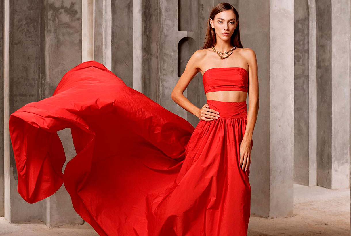
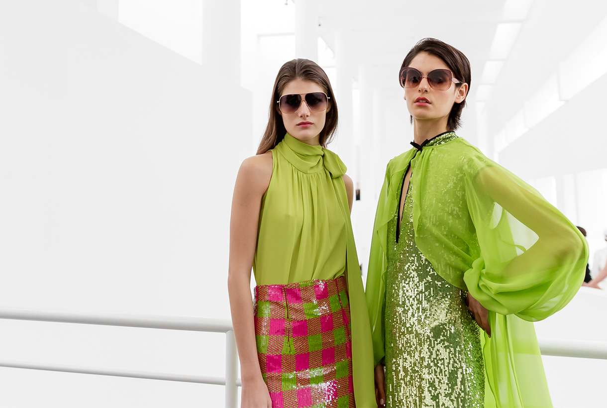
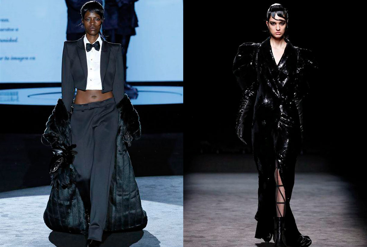
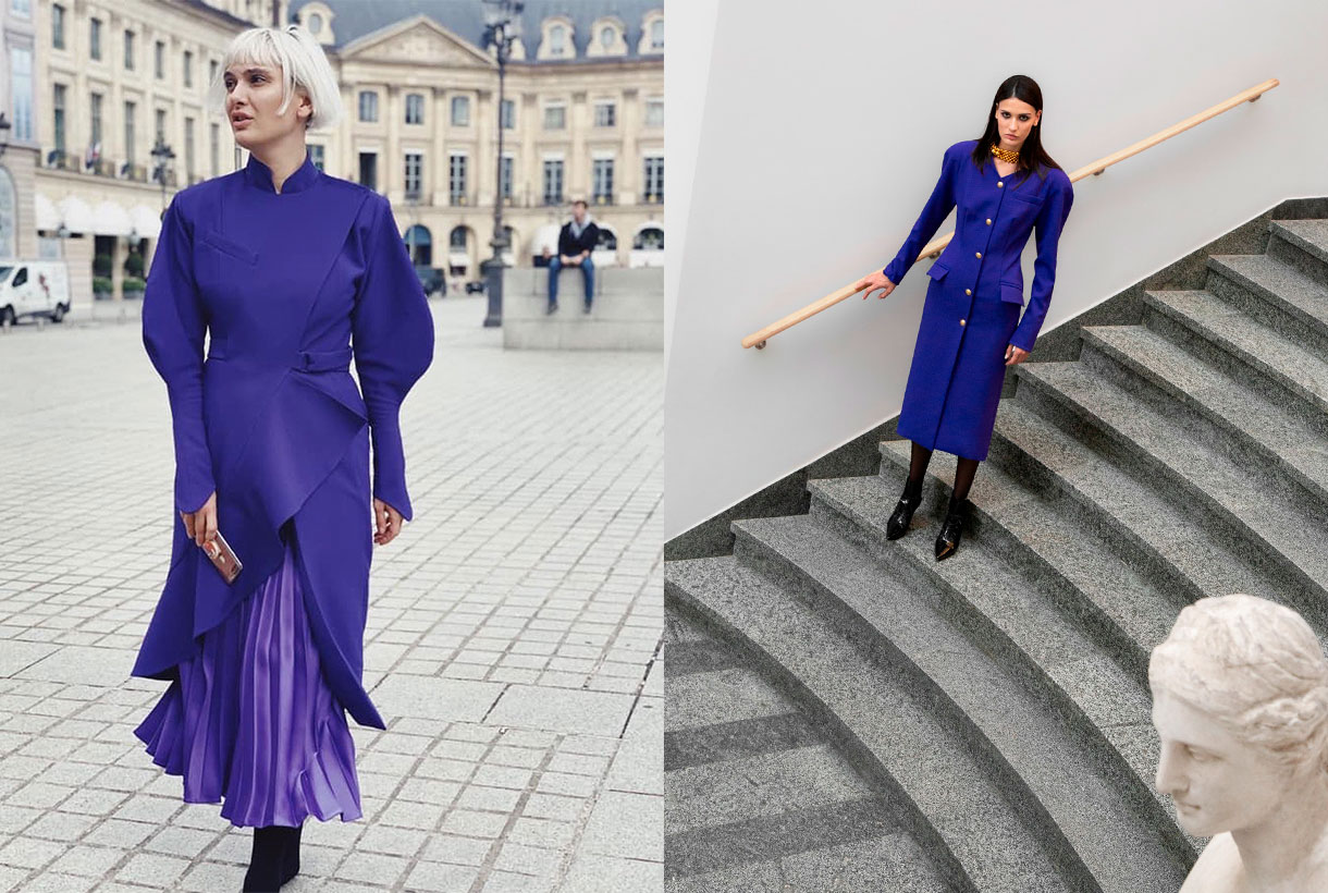
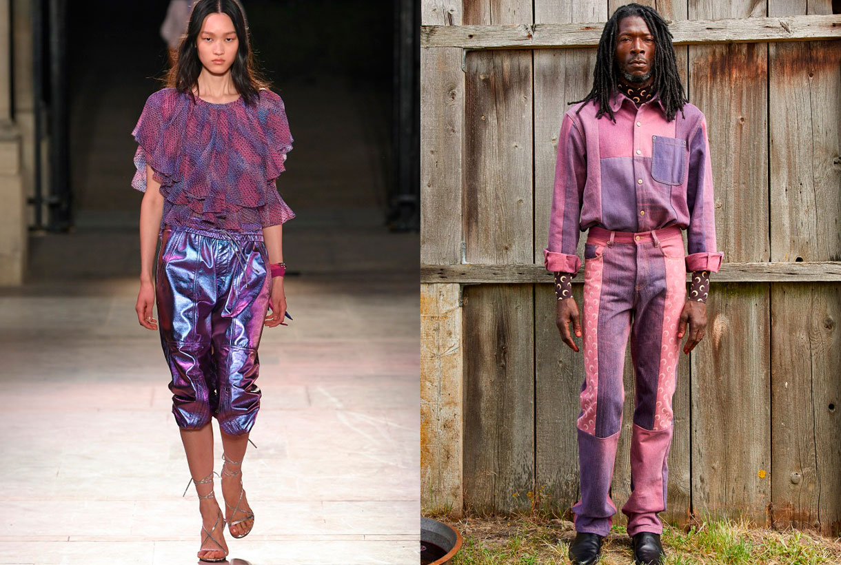
 April is the month of fashion in Barcelona. Prior to a new edition of Barcelona Bridal Fashion Week, a week ago saw the start of the latest edition of 080 Barcelona Fashion, with 22 virtual parade shows and designers who presented the new season in the Macba, within the rationalist building designed by the architect Richard Meier. A new staging of the imaginative creativity exhibited by brands via Fashion Films, seasonal collections that can be followed visually on the website of the Catalan catwalk. Gratacós has also followed the latest fashion trends to check once again how our fabrics have taken shape thanks to the designers who habitually trust in us: Avellaneda, Eiko Ai, Menchen Tomás, Yolancris and Victor Von Schwarz. We review the new creations and some of the key looks.
Summer nights
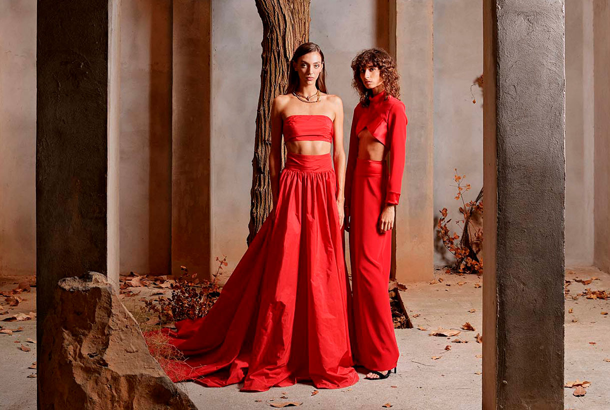
Faithful to his hedonist philosophy the dandy Juan Avellaneda transposes us to tropical latitudes in his new summer collection to continue exploring the most relaxed elegance, inspired by warm paradises in the north of Africa. The central feature of the creation is via natural fabrics, luminous or fiery shades such as pink, orange and coral, and patterns that in general lack rigidity. There are also several models of jacket, the fetish garment of the brand of this Barcelona designer, which oscillate effortlessly between male and female wardrobes. The prints move away from the banal to embrace a Mediterranean version of delicateness that gives character to ethereal skirts and smoking-jackets which rebel against the boring. The garments evoke the practical elegance of Saharan and classic tailoring by those mid-century holiday-makers who immortalized Slim Aarons. Blouses caress the body and intertwine. Trousers dance and dresses cling to the skin or deploy fabulous volumes and flyers, another 100% Avellaneda detail. In Au réveil il était midi all the clothes combine with everything, they harmonize and flow for a perfect summer.
The warm sunlight
Eiko Ai dazzles us with Lucid Dreams, a radiant collection inspired by the vitality of solar energy. In addition to this inspiration Glò Lladó’s formula remains firm in each of her designs and consists of promoting feminine beauty by playing with delicacy and sensuality. And how does she achieve it? Via vaporous silhouettes, ethereal fabrics which give glimpses of skin and via evocative stamping that mixes sophistication without abandoning the casual and cosmopolitan spirit of this Barcelona company. The new summer creation from Eiko Ai enhances the kimono dresses, fluid blouses and two-piece combinations featuring transparencies, subtle glitter and faded prints with other florals that pay tribute to that mystical vision of woman as an urban nymph. The palette of the collection goes for positivism, summer life and golden light via intense oranges playing with the range of yellows, pinks and whites and brushstrokes of intense blue sky.
Class is class
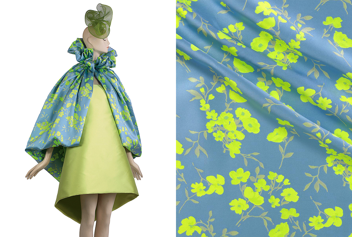
For his part, Menchen Tomás reminds us of the importance of inheritance in Old Money, a collection that is inspired by the way of dressing and living of American families who have managed to pass fortune, class and status from generation to generation. An aesthetics characterized by sophistication, the fusion between the classic and the contemporary and timeless elegance, far from the culture of logo and ostentation. With that interpretation the Barcelona company brings together garments such as dresses and midi-skirts, pinned wide trousers, voluminous poplin shirts with other sporty garments that could be used for a day in a country-club or dinner in a garden on a summer night. Regards fabric details there is no shortage of silks, organzas and tulle flowers in a vibrant chromatic palette: blue, lime green, yellow, fuchsia-pink and bright-red.
Fashion without gender
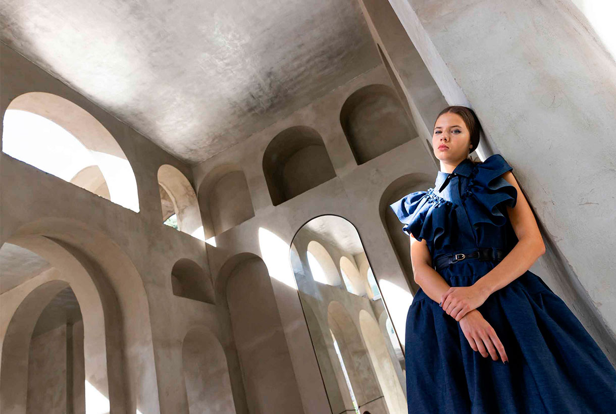
Victor von Schwarz is part of the new generation of young talents that bring creativity and freshness on the 080catwalk. This time, the designer Barcelona presented a collection inspired by the Asian Mafia films of the 80s and 90s, whose centre of operations was the red neighbourhoods of cities such as Taipei or Hong Kong. Victor von Schwarz is committed to fashion without gender. Therefore, the designer, inspired by oriental clothing, creates open pieces, which anyone can wear, regardless of sex or gender. The silhouettes of the new summer creational are divided into two blocks. The first is very bright, with volumes, drape and transparency features that give a glimpse of skin. The second, part of a much more square silhouette and with variations of the classic tailored jacket. In this collection the fabrics are characterized by their imaginativeness. Sequins are prominent, from Vichy print to bright degrade. We also highlight bright laminates based on viscose and tulles with silver prints. As for colours, pastel shadestones and splashes of colour are a feature of this genderless creation.
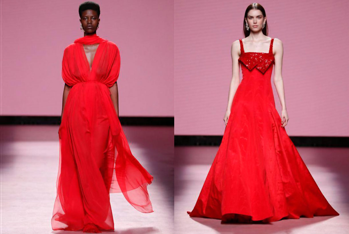
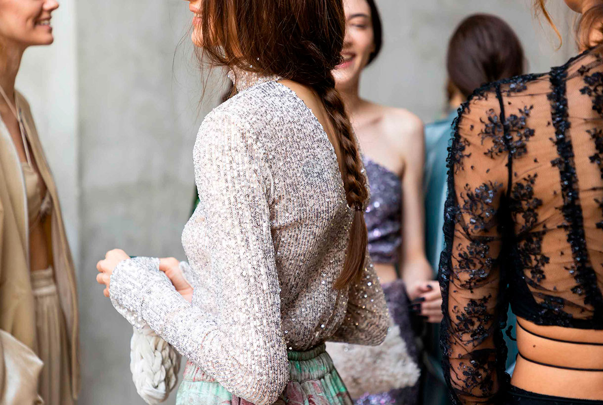
Black velvet
Yolancris this time participated in the 080 Barcelona Fashion with her party collection, leaving aside her more experimental project Y Como. The new creation highlights the craft-work redolent of her own workshop itself where the accent is on velvet, flesh-colour and black. With regard to detail, velvet is mixed with golden threads, embedded French lace and macramés in an attractive combination. Binomies of colour also dominate: gold-black and white-black, and are separated with explosions of monocoloured dresses: red and powder pink. As for silhouettes, the collection brings together some classic pattern ideas combined with some more daring features, evident, for example, in the openings of the dresses. In general Yolancris’s creation aims to be timeless so as to offer an expansive wardrobe for special occasions.
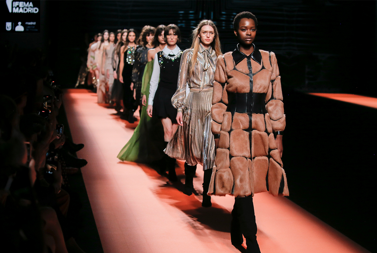
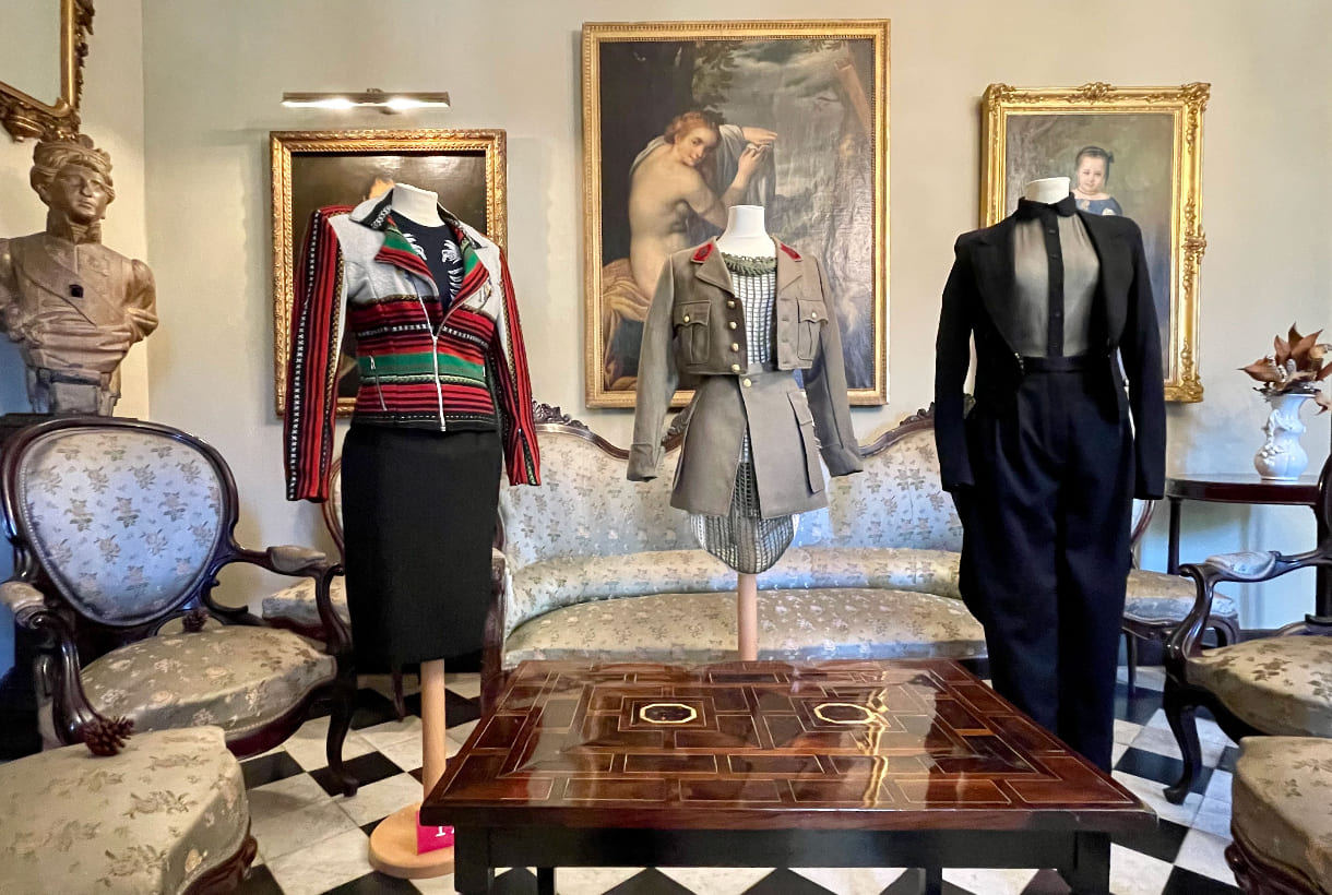
Another edition, Gratacós fabrics have made their appearance at Mercedes-Benz Fashion Week Madrid that was held in the Spanish capital at the beginning of March. Companies such as Brain & Beast, Dominico, Fely Campo, Malne, Redondo Brand and Teresa Helbig have trusted in our creations with new designs for the Autumn-Winter Collections 22/23. As always we have put together some of the most prominent looks with gratacós fabrics as well as the spirit that each designer wanted to transmit. It is worth remembering that it is an honour to have the confidence of these Spanish designers who, year after year, are opting for our family-run business.
Brain & Beast
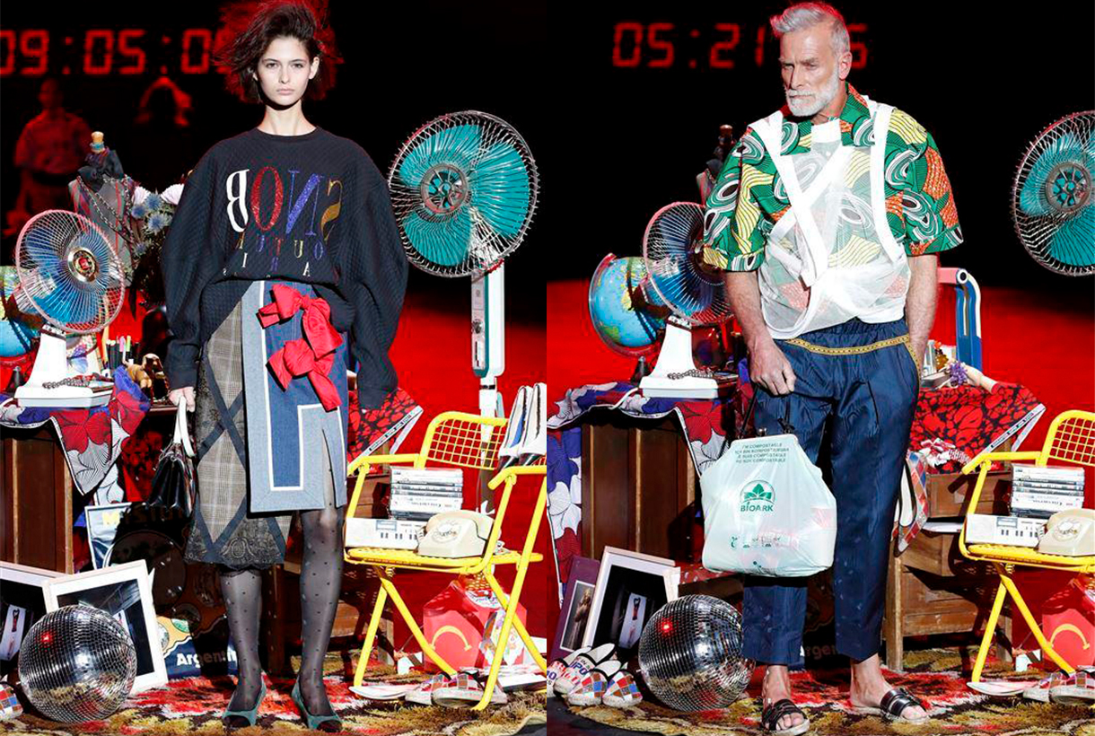
Brain&Beast returned to the Madrid catwalk – after an absent edition – to claim the heritage of this Barcelona company with its usual style characterized by humor, riddles and double meanings via colour, print, unstructured patterns and references to the idols of contemporary culture. This time in Puzzle, Ángel Vilda presented a seasonless collection – irrespective of all seasons – which exhibited the playful DNA of the most rebellious company at Mercedes-Benz Fashion Week Madrid. Garments with deconstructed phrases, patterned collage, as one that mixes the faces of Alain Delon and Catherine Deneuve, denim everywhere and impossible mixes of prints that seem to coexist effortlessly. In short, daring and casual outfits that go beyond trends because what they seek is to vindicate authenticity, a trait not always appreciated in the fashion industry.
Dominnico
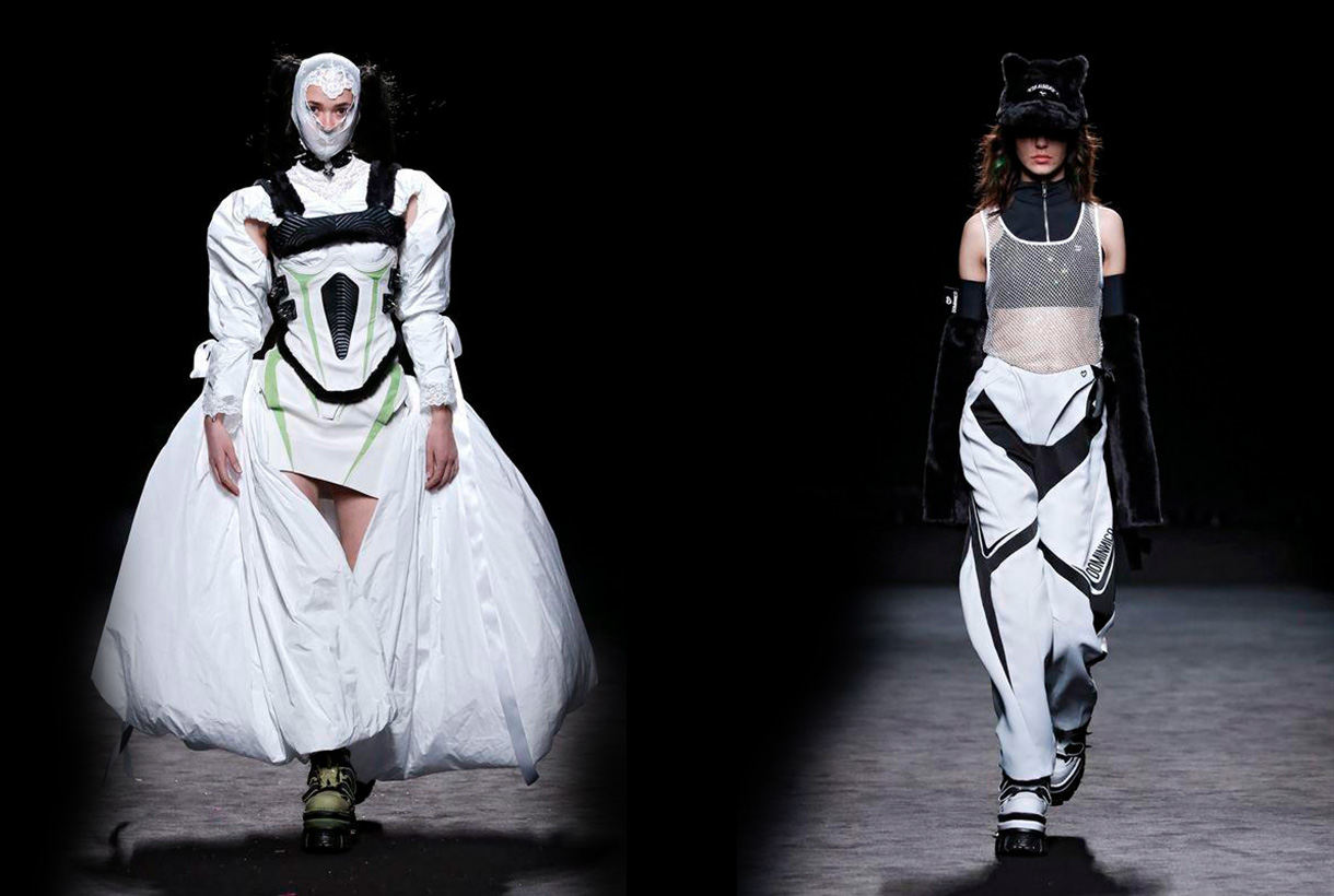
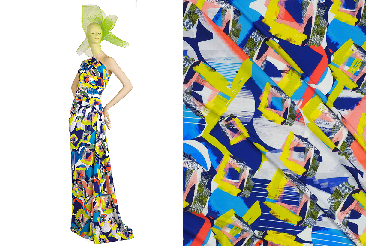
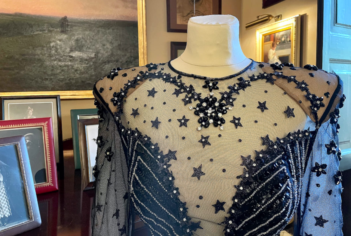
Domingo Lázaro, winner of the Who’s on Next 2021 prize, with his creation Lovercross took us to a dystopian future to dive into the origins of Cyberpunk and Grunge via silhouettes of aerodynamic lines with the retro futurism of the 90’s as a connecting thread. In the new Dominnico creation proposal there is no shortage of volume or intermingled textures: Tweed, Lamé, mesh with rhinestone, laminates, taffetans, Renylon or 3D textured foams, present in long cloaks, evening dresses with asymmetric neckline or impossible hair-pieces. The dark inspiration is also represented with skewers, black leather and metallic details. As for the chromatic palette used, the Barcelona company created in 2016 is committed to primary colors and acidics, such as neon orange, fuchsia, green lime and apple and Klein blue to contrast with black, white and silver. In general this new Dominnico creation recalls the world of the motor-bike which the singer Rosalía also explores from her own private vision. We will see if together they establish a new dialogue between music and fashion.
Fely Campo
If there is a designer who has made our fabrics visible on the Madrid catwalk it is Fely Campo. The designer from Salamanca presented a luxury prêt-à-porter collection inspired by the natural beauty of the balconies of the Arribes and its landscape. This admiration is transmitted via the creation named Diafonía for the contrast of textures: the subtle beauty of nature give it the fine details, the transparencies, the vaporous tissues and the delicate reflections that open out onto the ruggedness of a more abrupt landscape, composed of coats which are firm and strong in the touch, such as those in wool. The most sober collection lines are composed of tailored volumes and oversize garments which are presented like a breastplate. Diafonía truly has constructed a feminine wardrobe which reflects the hardness and delicacy of an inspiring landscape via aesthetic counterpoint.
Malne
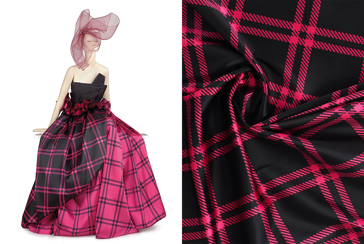
“Fashion is the glare of a moment, and it is also the immortality of beauty. Fashion is as ephemeral as unforgettable. ” Under this premise was framed the new Splendor creation from the Malne designers Paloma Álvarez and Juanjo Mánez. On the catwalk this winter collection is evident in the fusion of fabrics in the same garment or in the composition of each look, volumes in key garments with details ranging from pearls to feathers and the black and white binomial to represent the mystery and the brightness of fashion. For the feminine wardrobe it is an elegant and timeless creation for all those special occasions.
Redondo Brand
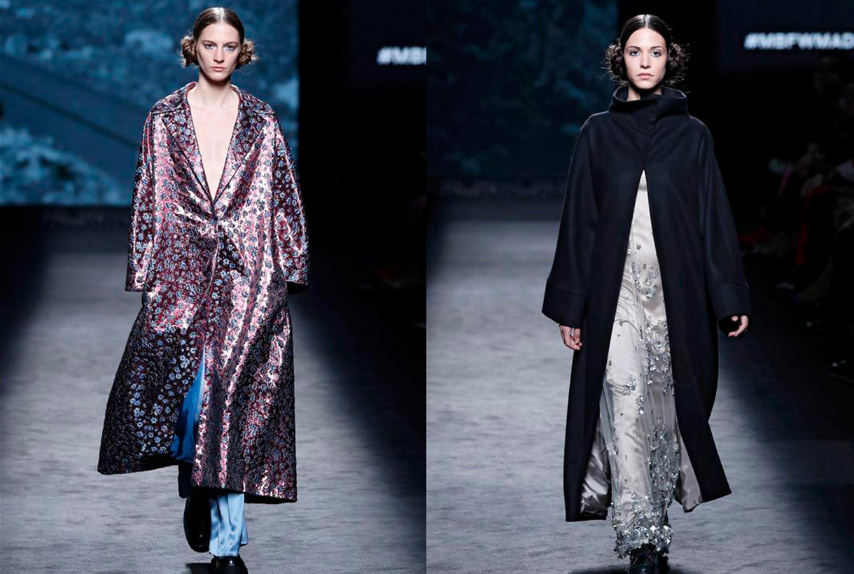
Jorge Redondo, creative director of Redondo Brand, gives a contemporary twist to party styles by reinterpreting the classics of elegance. The designer remembers his childhood when he admired the spectacular dresses that were exhibited on the red carpets and how one of his dreams would be to dress the celluloid stars. That glamour is behind a company that defines itself as “a very democratic guest brand” because it adapts the main trends on the catwalk to those of a real woman. In his new creation the eclecticism of americana becomes the central axis of the winter collection, an inspiration that merges with the essence of Redondo Brand to create natural volumes, asymmetric silhouettes and colour blends. Natural fibres such as silk, cotton or wool appear in different finishes and together with embroidered, glass or shiny pieces coexist between the more acidic and the most harmonizing tones. For the designer Jorge Redondo this sophisticated creation led to the L’Oréal Award for the best collection of the MBFWM at its 75th edition.
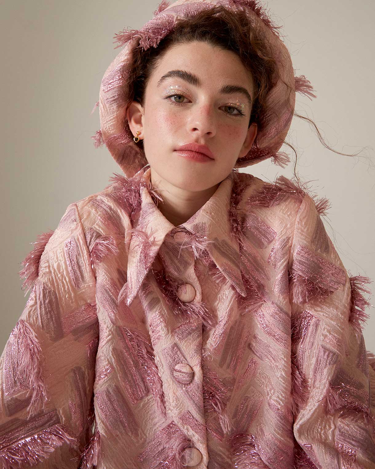
We have been following their path for a long time and have admired the creations of Quique Vidal (Valencia, 1996), alma mater of Becomely, a fashion brand with its own personality. If you follow us on Instagram, you will have seen in our feed, those baby doll silhouette dresses in pastel tones and large volumes that we usually share from the young 26-year-old creator. Despite the naive spirit, Quique Vidal’s project has nothing to do with lightness or immaturity. Quite the opposite…
Beginnings are not easy
Becomely was officially founded in 2015. Previously, the young designer had done some work for several teachers who requested dresses for their graduation. That spontaneous start dressing anonymous women encouraged him to move to Madrid to make a living as a designer. He participated twice in Samsung EGO, the catwalk for emerging talents at MBFW Madrid. In parallel, Quique Vidal sold t-shirts, socks and also his famous biodegradable plastic costume jewelery made with 3D printing to cover part of the costs of producing and designing the collections presented. In fact, the designer currently combines his artistic work at Becomely with his other project, Estudio Cartulina, a company specializing in communication, brand consulting and production. The moonlighting artist is a reality for many young people in the world of fashion.
Craft and production on demand
Becomely is a sustainable, artisanal brand that creates intricate limited edition pieces that are produced on demand. The pandemic disrupted Quique’s business model to evolve towards new, more direct channels for consumers. If before they sold through the website and in some selected stores that included countries like Asia, now the Spanish firm focuses sales on social networks, especially on Instagram. This change allows greater contact with the clientele: a more personalized service can be offered and the budget can also be adjusted.
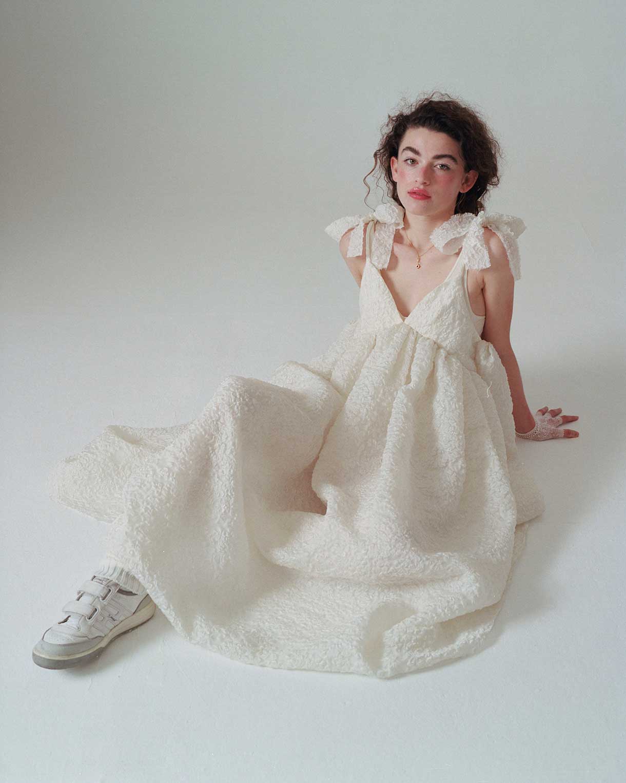
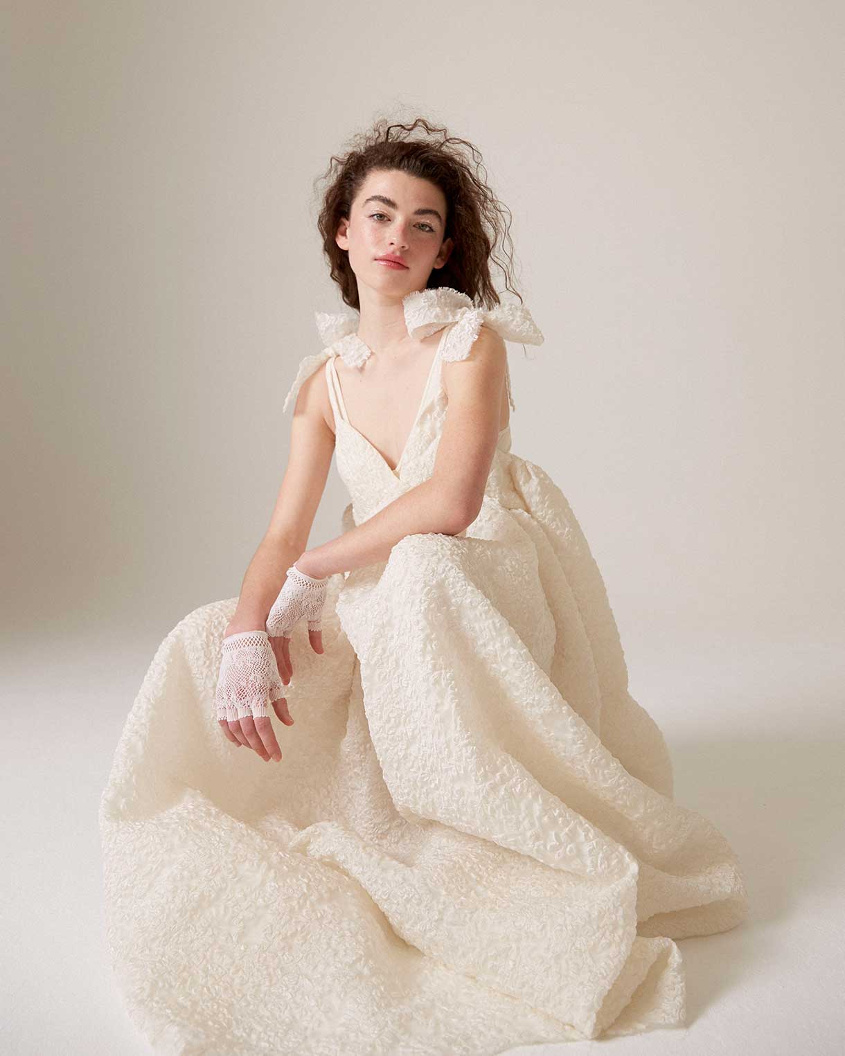
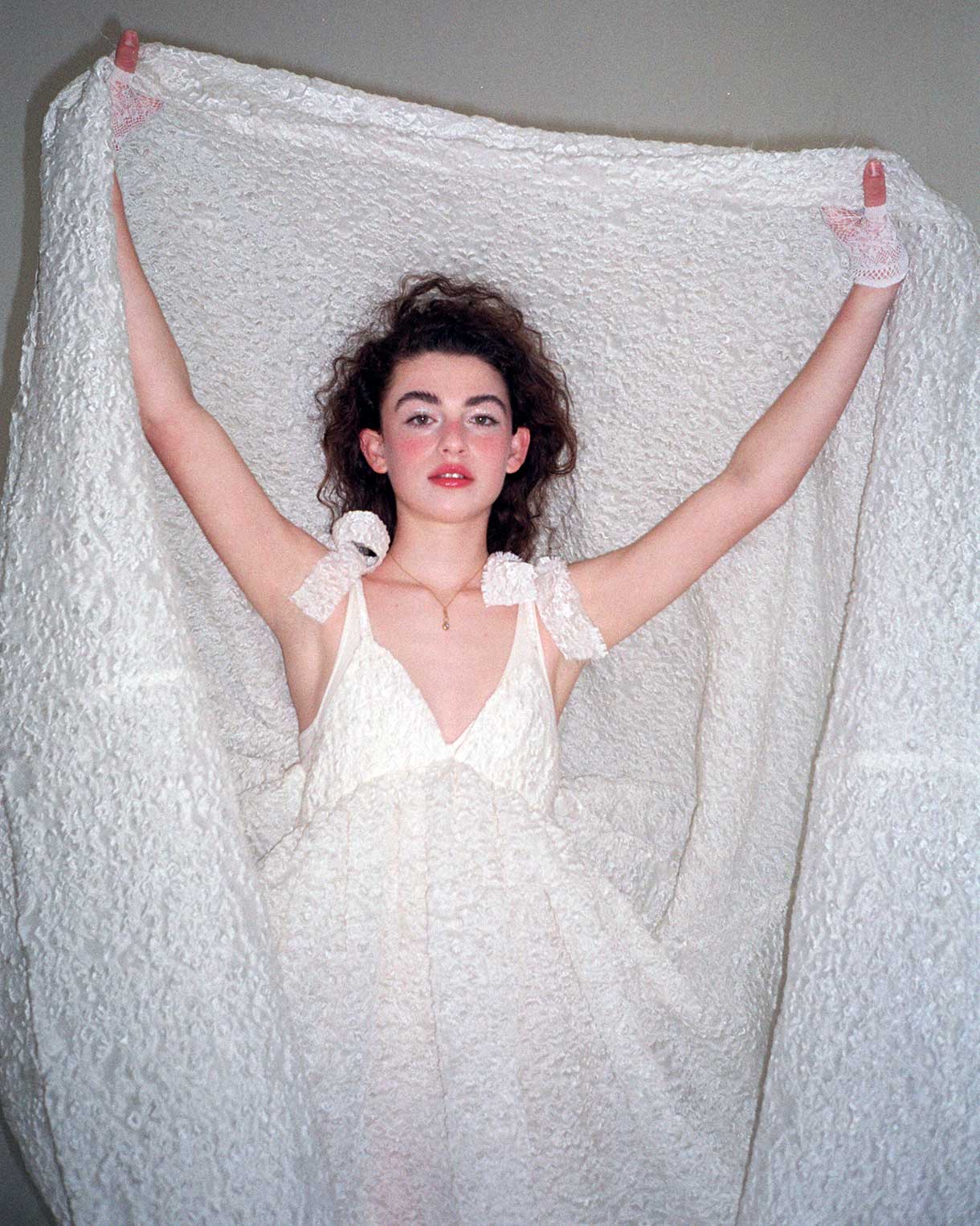
The design has not changed. Becomely maintains the emblem of the baby doll dresses with a V-neckline, puffed sleeves and volumes also in the skirt. A model that is repeated from the first collections and in which Quique Vidal is adding variations: large buttons, shirt lapels, different lengths… The fabric he uses to create his designs is also a differentiating element. Opt for eye-catching items: enigmatic Jacquards, tactile reliefs, details such as feathers, shiny motifs, fabrics with extra volume… always in pastel shades such as pale pink, baby blue, lavender or off-white. In fact, it is no mystery that Quique Vidal manages to magnify some of our most special fabrics each season. Becomely also takes advantage of the small scraps left over from his shirts and dresses to create new pieces such as bags, satchels or hats. A formula that take sustainability to its ultimate consequences.
Becomely’s designs have already hit the stage through artists like Amaia . The singer appeared in her latest video clip, Yamaguchi, wearing a white dress that follows the recognizable aesthetics of the brand and is made as we pointed out, with deadstock fabric : leftovers from suppliers or workshops. The actress Emma Suárez also noticed Quique Vidal’s creations and ordered a dress for a premiere that she had at the beginning of the year.
The Bride Becomely
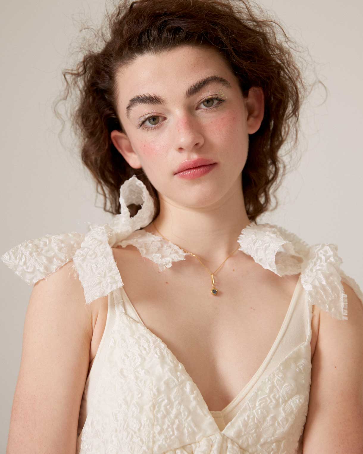
Recently, Quique Vidal has dared to design a wedding dress that maintains the aesthetic codes of the brand. It is a flattering model that combines a minimalist silhouette with romantic elements and precious details. The dress is long with a V-neckline and straps dominated by huge bows. A voluminous skirt in embossed Jacquard fabric has just structured the ideal bridal design for millennial or Zeta brides . In fact, it is such a versatile model that it can be worn for a wedding, a special occasion or to add fantasy to a daily look, always depending on the footwear that is combined. What is clear is that there are fewer and fewer limits and barriers between formal or informal styles. Let each one interpret it in their own way!
Miércoles 23 febrero 2022
 Go back, start and use for the first time. These are the verbs that we wanted to put into motion after liquidating the last winter season and presenting the new collection for next spring at Première Vision Paris. In this limbo of past and future proposals, we can only talk about the present, in this case the spring-summer 2022 collection that we are eager to show in all its splendor through the catalogue, the online store and our physical space in Barcelona.
Roughly…
We start the season inspired by a quote from the Israeli historian and philosopher Yuyal Noah Harari : “This storm will pass, but the decisions we make now could change our lives in the years to come.” This phrase marks the course of the collection because, without neglecting the contributions of the past, our eyes are fixed on the future and on the path we have to follow to explore new territories without losing our identity.
“This storm will pass, but the decisions we make now could change our lives for years to come” – Yuyal Noah Harari
 In the context of uncertainty that we have had since the start of the pandemic, we have seen people cling to solid values such as security and trust. For this reason, the textile proposals that we present this season will focus on articles that reassure, calm, do not disappoint and, above all, are durable. We are not interested in the frugal or the unstable. This season, colour is the catalyst that will bring consumers back to the world of design and trust in it. For this reason, colour is essential to shape fabrics and plays a key role in defining new proposals. From neutral tones, to their brightest reverses, through blues and greens to bright pinks and oranges.
In general terms, we present to you a season that we would like to be tranquil, brimming with calm, joy and optimism, but always guided by the need to make products that take into account the environment and the surroundings in which we live. Here below, we give you more details.
The colour softens
This season, colours are oxygenated and lose saturation to establish harmonic mixes and emotional combinations that calm and reassure. Neutral tones stand out, incorporating sparkles, transparencies and small brushstrokes of colour in blue, pink, green and yellow. The soft and delicate tones provide a contemporary vision and are understood discreetly, without excesses or additions.
If we discussing precisely, we highlight the beige colour of kraft paper, the white that helps us to work shapes and volumes, and the black that we will use to add sophistication and create total looks with designs of great graphic impact. As happier tones, within this palette of fresh but less saturated colours we highlight millennial pink, blue in its most multifaceted, versatile and adaptable version, and green that brings us closer to nature and continues to play a leading role in fabrics from the season. As a counterpoint, we highlight the optimism of lime yellow, attenuated orange and coral that are perfect for refreshing and adding light to items. These tones are mixed with an antagonistic hue: turquoise in a refreshing and unique combination.
Lastly, the colour will also be worked on in different ways: in plain, two-tone or multi-colour versions for a liberating and stimulating effect.
Huggable fabrics and commitment to sustainability
This season we highlight natural fibres that are involved in resource management and also recycled and regenerated synthetics. Specifically, we will work with BCI cottons, FSC viscose, tussah silk, undyed natural linens and recycled polyesters, some of them obtained from used plastic bottles.
In the spring-summer 2022 collection we want to enjoy simplicity for a more comfortable, minimalist and beautiful type of fashion. To do this, we will use gazar, voile and organza in neutral tones, gently differentiated between them, which will define the lightness of the fabrics. We want to produce that fresh and affectionate component, like a tender hug. We will also work with fil coupé techniques that connect us with a modern romanticism and weave structures with soft contrasts for simple beauty.
“We want to enjoy simplicity for a more comfortable, minimalist and beautiful type of fashion”
 Within the collection we highlight clean-looking matte poplin and satin, classic weaves, embossed reliefs inspired by cardboard packaging, Jacquards with geometric structures in rhythmic repetition, summer tweeds with thick yarns and piqués for structured weaves. This season the rustic aspect is also plays a leading role and through the fabrics we want to achieve a tactile rusticity through fancy yarns.
Within the collection we highlight clean-looking matte poplin and satin, classic weaves, embossed reliefs inspired by cardboard packaging, Jacquards with geometric structures in rhythmic repetition, summer tweeds with thick yarns and piqués for structured weaves. This season the rustic aspect is also plays a leading role and through the fabrics we want to achieve a tactile rusticity through fancy yarns.
The season is also characterized by proposals with an irregular appearance through inspiring wrinkled fabrics and natural finishes, with other lighter ones such as precious organza that covers the body creating volumes without excesses, voiles that are worked in layers, gazar that provide the appropriate transparencies and sensual cotton satins that can be either plain or printed.
Refined designs that still bear the floral gardens
In general terms, the fabrics will be expressed without decorative excesses through serene geometries and visible contrasts, but without visual noise. It is not a season of excesses or shrillness, quite the opposite. We are inspired by the ethnic and folk style from a stylized and refined point of view. In terms of prints, there are fabrics that welcome abstract strokes with brushstroke details. Also the stripes with a manual stroke and the checks persist, but in their freer version.
In spring, flowers cannot be missing, and this season will not be an exception either. A walk through the country gardens brings us renewed inspirations for a new creative spin on these prints that use flowers and leaves, chosen for their particular shapes, inspiring textures and surprising colours.
Finally, it should be noted that we continue with our commitment to sustainability, which began in previous seasons and is here to stay. Our collection uses regenerated and recycled yarns with European certificates and this helps to reduce the environmental footprint of textile production: BCI cotton, regenerated cotton, tussah silk, linen, FSC viscose, New Life and recycled polyester, are some of the yarns present in this new spring-summer 2022 collection that we have just launched. Brand new, this verb that we like so much…
We invite you to discover the entire collection in our shop online!
Miércoles 09 febrero 2022
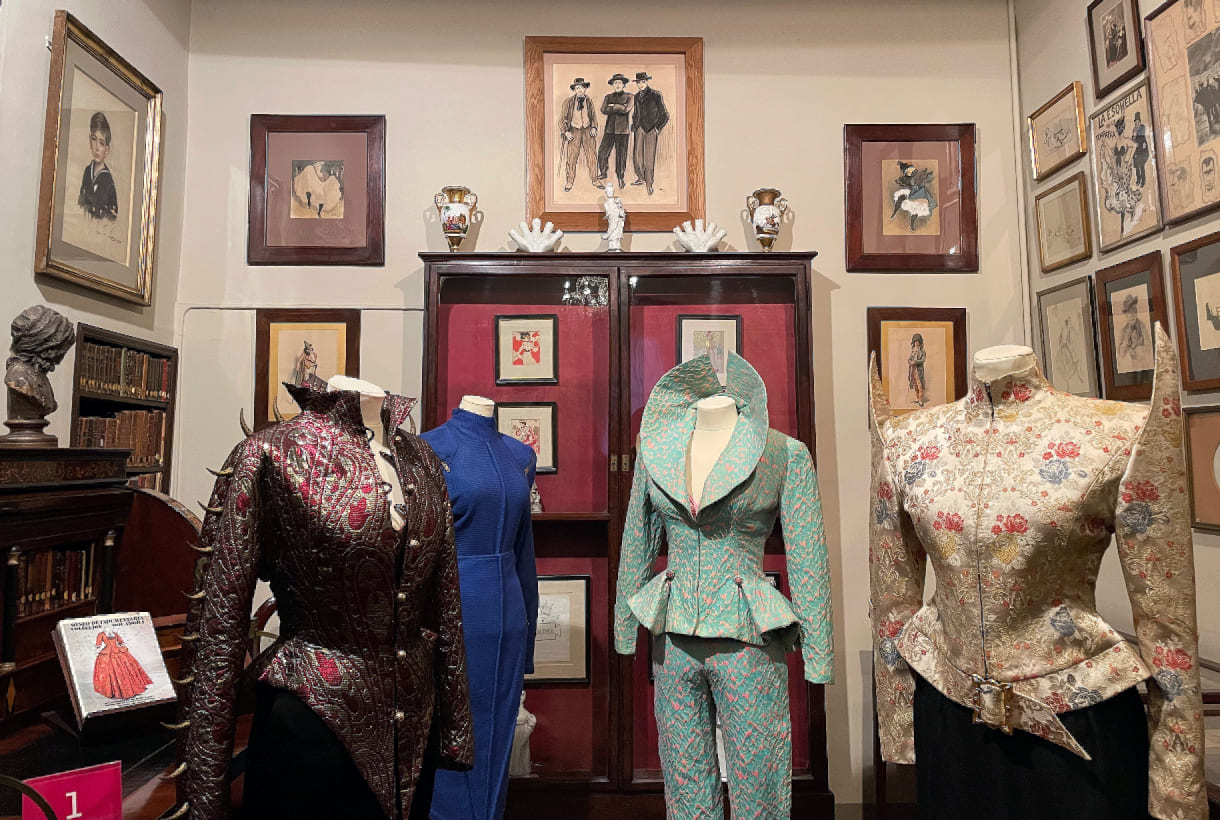
 An enfant terrible is a precocious genius with brilliant ideas, but with a rebellious and transgressive attitude, whose creations are innovative and offer a new disruptive vision, far from the traditional, orthodox or conventional. John Galliano, Jean-Paul Gaultier, Alexander McQueen are some of the most international enfants terribles in fashion. In our country there are also provocateurs of the thread and the needle. Some of the most notorious names are recovered by the Fundació Antoni de Montpalau together with the Fundación Rocamora in a new exhibition entitled ‘Daviddelfín and other enfants terribles of fashion’ that opened on February 6th in Barcelona. The exhibition consists of an exhaustive compilation of the work of the designer from Malaga, unique in Catalonia, together with the groundbreaking and provocative trajectory of other Spanish designers, from the 1980s to the present.
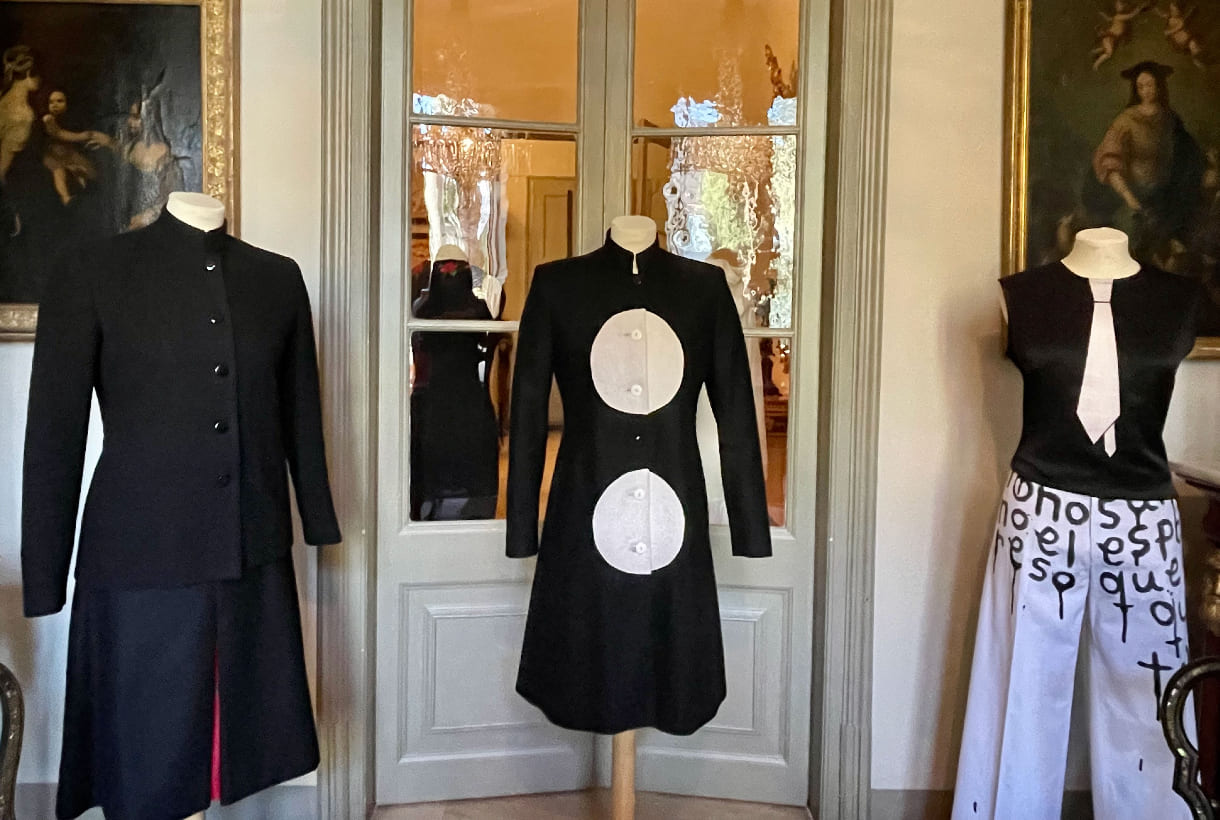
The most extensive work of David Delfin
The monographic part dedicated to David Delfín occupies the first floor of the Rocamora Foundation and brings together more than 60 pieces of clothing that review the designer’s collections, from 2001 to 2017, with some of the most emblematic works. Along with the pieces of clothing, a selection of accessories such as bags and shoes is also included.
Although Diego David Domíngez González, David Delfín, had already carried out some previous experiments, his homonymous brand would be born in 2001 in a joint project with the Postigo brothers (Deborah, Gorka and Diego) and Bimba Bosé, the designer’s muse and model. This innovative project went beyond fashion, mixing theatre, music, painting, poetry, photography and cinema. As a brand, Davidelfín debut in Barcelona on the alternative catwalk show Circuit with its first ‘Openin’ Nite’ collection. A year later he make the leap to the Cibeles catwalk in Madrid with the proposal ‘Cour des Miracles’, inspired by Luis Buñuel’s films ‘Viriadina’ and ‘Belle de Jour’ and also in the painting ‘Los Amantes’ by René Margritte , painted in 1928, showing two hooded lovers kissing.
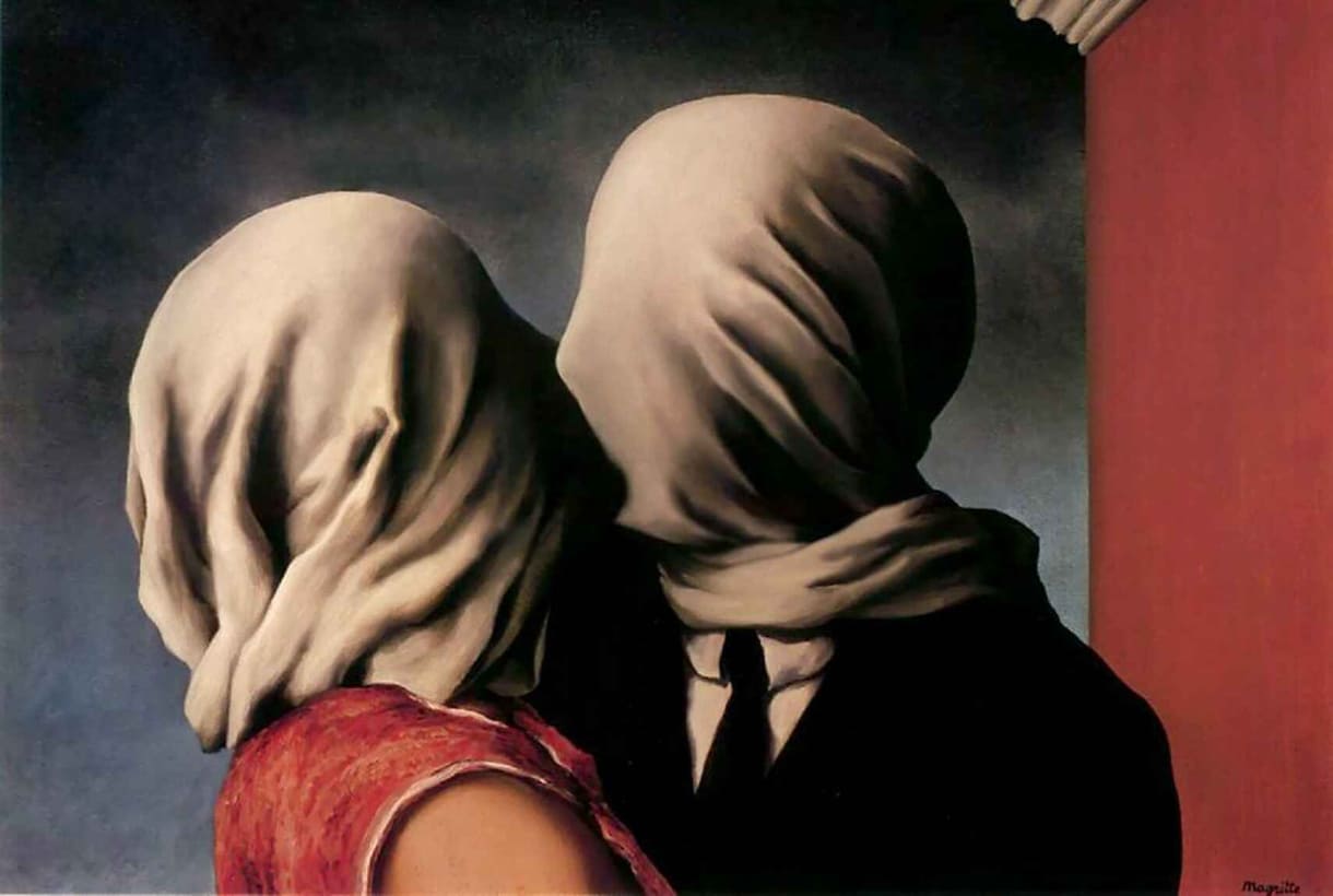
As a tribute to Magritte’s painting, the models paraded down the catwalk with hooded faces reminiscent of Arab burkas, ropes around their necks and large wooden rosaries, some garments made with sanitary bandages. This parade was misunderstood and criticized in the media, perhaps for coinciding with the war in Afghanistan. Despite the controversy, this show positioned the brand and a year later, Davidelfín would receive the L’Oreal award for young designers. From this moment on, the designer’s self-taught creativity had no limits: Bimba Bosé would be the indispensable protagonist of his fashion shows and among the public and their friends, they would become his best ambassadors. The designer continued to present his collections at Cibeles and made the leap to New York in 2009 and 2010. The brand was also awarded at Marie Claire, Telva and in 2016, won the National Fashion Design Award. Davidelfín also participated in numerous museums, institutions and art galleries in Barcelona, Madrid, Bilbao, Málaga, Venice, New York, Washington, Mexico, Tokyo and Moscow. Unfortunately, the promising creator’s career was cut short in 2017 after an intense battle with brain cancer, a few months after Bimba’s death. David Delfin was only 46 years old.
The other enfants terribles
The exhibition goes one step further and to accompany the tribute to Davidelfín, the Fundació Antonio de Montpalau has chosen a series of designers who have also known how to break the mold and occupy the ground floor of Manuel Rocamora’s summer mansion.
Thus, this second part of the exhibition begins with Luis Fortes, the controversial designer of the 1980s in Barcelona with very daring proposals that even anticipated those that Thierry Mugler, a recently deceased French creator, would make shortly after.
From Madrid in the 1990s, the Vacas Flacas duo, made up of Carolina Azcona and Miriam Cobo, would create a fuss at the Cibeles Catwalk with their garments made of cloths, gloves, towels, socks, zips or scarves. A good selection of that can be seen in the exhibition, along with a spectacular coat made with Barça scarves. Recently the actress Milena Smit has resurrected one of the most emblematic t-shirts of the Madrid firm. The sample also includes five spectacular Alaskan costumes, designed by Juan Pedro del Moral, Little Joe Couture, who has also designed the styling of the Blonde Nancys. In fact, the brand is also in charge of dressing the members of Fangoria. Also from the 1990s are the two pieces included in the exhibition by Estanislao, the creator of the renowned Eometric pattern-making method.
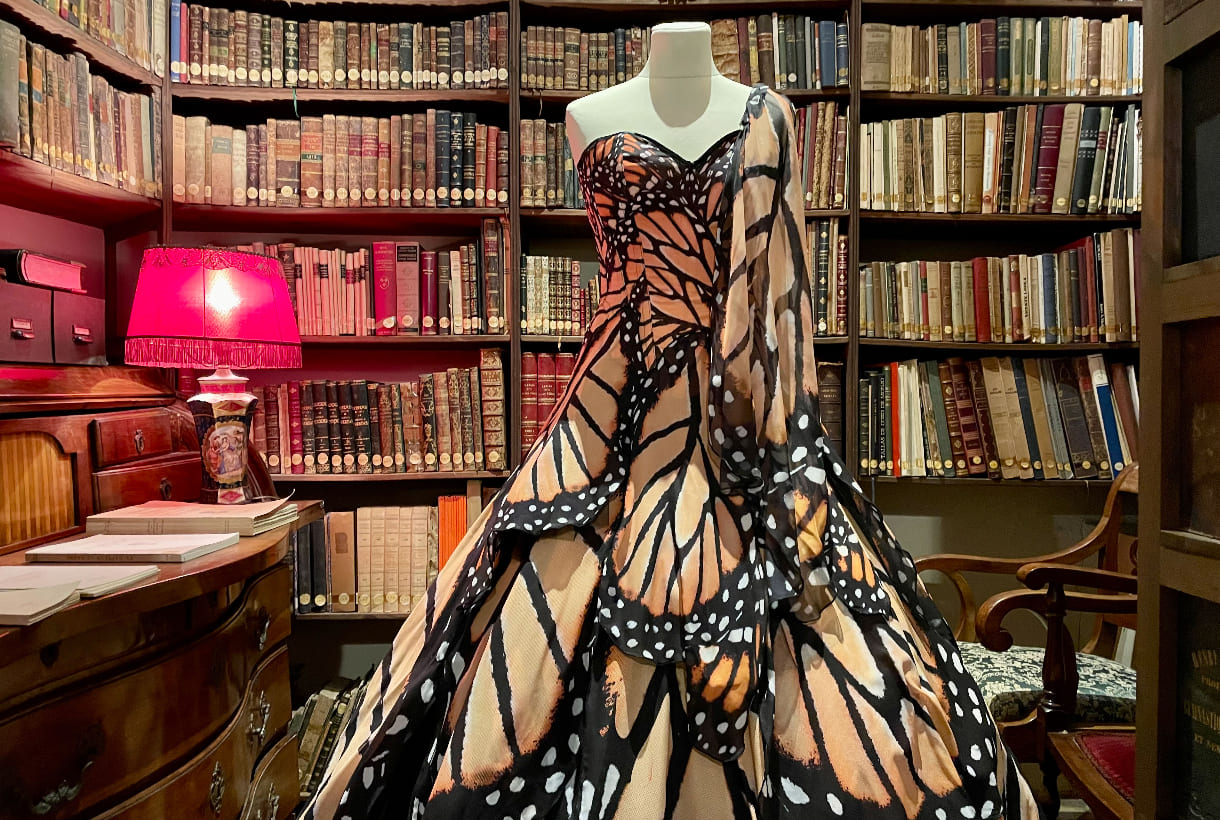
For her part, Bibian Blue, a designer famous for her bodysuits worn by international artists such as Katy Perry or Dolly Parton, was one of Luis Fortes’ most outstanding students in the 1990s and created her own brand in 2000, achieving great acceptance within the European underground scene. The sample includes one of her spectacular butterfly wing dresses.
The exhibition also makes reference to Mertxe Hernández. The designer created her MTC brand in 1997 and opened a store in El Born, where she became known. After presenting collections in Germany, the creator decided to dedicate herself to the world of artistic creation. Some of the garments that she presented on the ‘Colonia Fashion Days’ catwalk, made with polyamide stockings, are included.
Finally, the exhibition also brings together iconic garments from Gori de Palma (Modafad, Gaudí and Cibeles) and ¡Ánimo, Valiente! The firm of a Basque designer based in Barcelona who works with recycled jeans and from a decided marginality. Who also deserves a special mention is the latest designer to participate in the show: the current and mediatic Palomo Spain, who included one of the most emblematic suits of his meteoric career.
 The year has not exactly started on the right foot due to the new health restrictions to stop the continuous outbreaks of the pandemic. Even so, this 2022 promises to be different from its predecessors with the arrival of a cultural agenda, full of new exhibitions that we can visit in person in different cities throughout Spain. Great retrospectives, unpublished works by renowned artists or artistic movements that also connect art with fashion and design. We present five samples that we believe can be a source of creativity and inspiration for any creative work.
-
From Fauvism to Surrealism: masterpieces from the Musée d’Art Moderne in Paris
-
When? From February 11th 2022 to May 22nd, 2022
-
The audacious expression of freedom shown by the Fauvist and Cubist artists at the birth of both movements in the first decade of the 20th century was a revolution in the traditional representation of portraiture, landscape and still life that was considered scandalous at the time, as present disruptive canons with the observed reality. ‘From Fauvism to Surrealism: Masterpieces of the Musée d’Art Moderne de Paris’ brings together about 70 masterpieces that portray the history of the famous Parisian museum and show the pictorial transgression of the time. This museum is today an essential artistic reference that houses some of the avant-garde movements that revolutionized the capital of the Seine during the first decades of the 20th century.
In turn, this exhibition is the first major exhibition that the Guggenheim Museum Bilbao will host in 2022 within the program of activities scheduled for this cultural and sculptural complex, which will celebrate the 25th anniversary of its opening in October.
-
Cinema and fashion. By Jean Paul Gaultier
-
When? From February 17th to June 5th 2022
-
Film and fashion have been linked over the years to lead to a fruitful creative exchange. Under the gaze of Jean Paul Gaultier, this exhibition points out the communicating vessels of both industries, as well as an approach to their social contexts. The exhibition addresses the exchanges and influences that occur between cinema and fashion, a creative relationship led by Jean Paul Gaultier, co-curator and artistic director of the exhibition. Beyond mythomania, “Cinema and Fashion” covers the contexts of creation, both for dresses and films, and introduces us to ideas of modernity within clothing or eroticism. The show also offers a sociological approach by addressing issues such as female emancipation movements, gender transitions and power roles and how these are reflected in the fashion and filmography of its time.
“Cinema and Fashion” collects posters, photographs, film clips … up to 250 pieces that reflect the dialogue between the two disciplines. The exhibition begins with ‘Falbalas’, Jacques Becker’s 1945 film that influenced Gaultier to become a designer. After that, some of the characters that revolutionized the codes of cinema and sexuality are observed, such as Mae West, Marilyn Monroe, Marlon Brando, Brigitte Bardot or Jane Fonda. The exhibition will migrate to Barcelona from July 6.
-
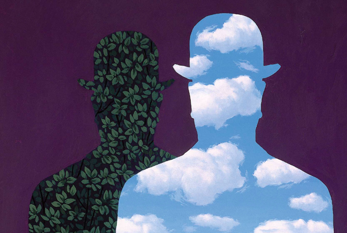
The Magritte Machine
-
When? From February 24th to June 6th 2022
-
Meanwhile, at the Caixa Forum in Barcelona, René Magritte (Lessines, 1898 – Brussels, 1967) will be leading the main exhibition in an extensive retrospective dedicated to the Belgian surrealist artist that explores his attractive work, characterized by playing with visual logic and question our perceptual categories. This is Magritte’s first exhibition since 1989 in Spain and brings together a selection of 65 paintings from museums and collections around the world, along with a selection of photographs and home movies taken and filmed by the artist.
And why is it called The Magritte Machine? In 1950, in collaboration with some friends, the Belgian artist wrote the leaflet ‘La Manufacture de Poésie’, a catalogue of imaginary products amongst which the “Universal Painting Machine” stands out. Such a machine would make it possible to compose in a practical way an unlimited number of thinking pictures. The exhibition starts from the hypothesis that this Magritte Machine exists and is composed of several interconnected devices corresponding to recurring concepts in the artist’s work, such as mimicry and megalomania.
-
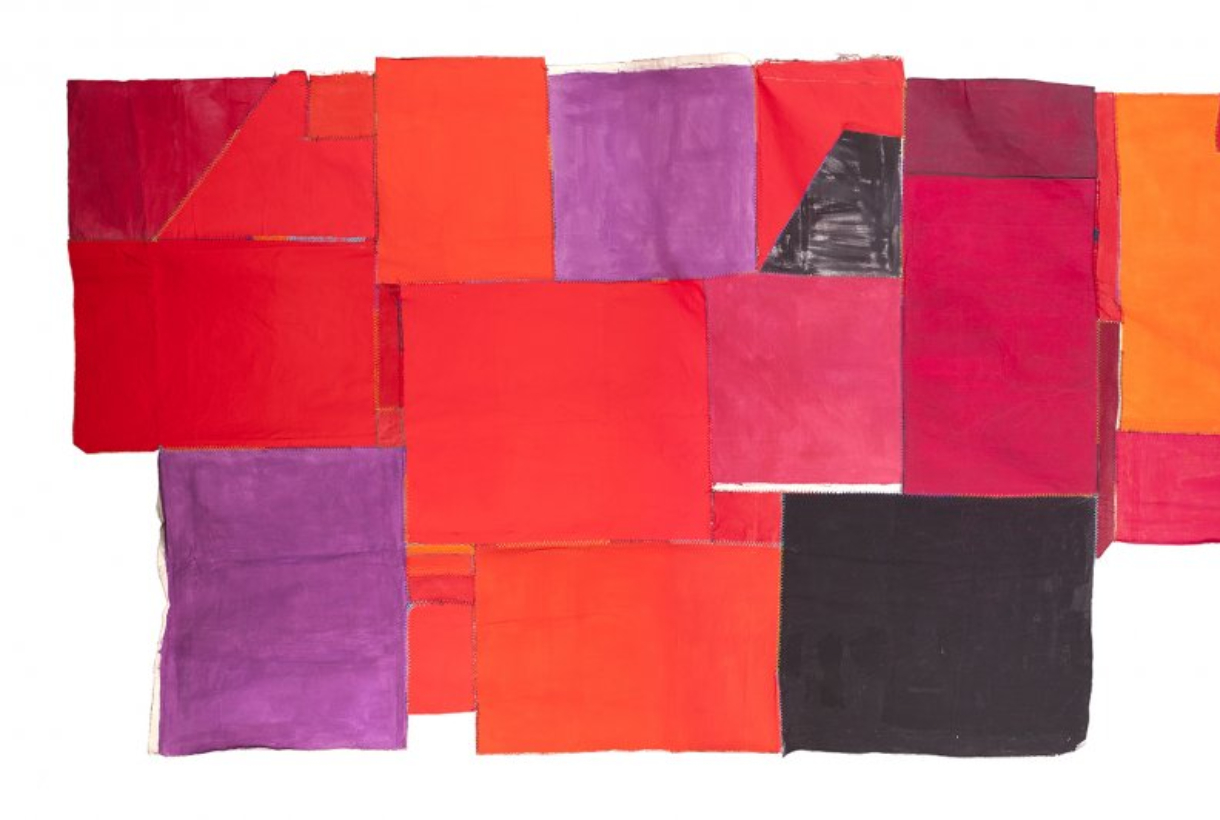
Teresa Lanceta. Weave as open source
-
When? From April 8th to September 11th, 2022
-
At the beginning of the 70s, Teresa Lanceta (Barcelona, 1951) made the decision to weave as a means of artistic expression, forcing the limits of understanding about what is or is not considered art. Her approach to weaving focuses on formal elements, on what fabrics are original and their own: their ligaments, materials, traditions and techniques. A way of doing without a previous sketch in which image and background, object and language, support and image are built at the same time, without going backwards, assuming mistakes.
Teresa Lanceta’s work reflects her vision of fabric and the act of weaving, but goes beyond individual expression by setting up dialogues in parallel with popular art, gender issues, non-verbal communication or the different forms of life in community. This exhibition, which brings together the entire career of the Catalan artist up to the present, includes a wide selection of tapestries, canvases, paintings, drawings, writings and videos, as well as several collaborations that Teresa Lanceta has done with other authors and which will be shown in the course of the exhibition.
-
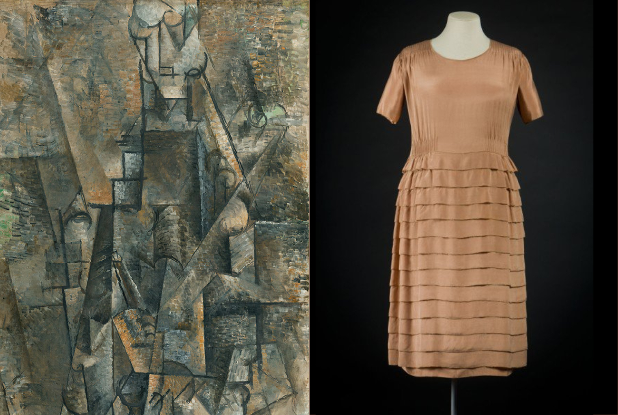
Pablo Picasso and Gabriele Chanel
-
When? From October 11th 2022 to January 15th 2023
-
Beyond fashion, Gabrielle Chanel maintained friendship with multidisciplinary artists, one of them was Pablo Picasso, whom she met around the spring of 1917, probably through Jean Cocteau or Misia Sert. The designer established a long and lasting friendship with both of them that would introduce her to the Spanish painter’s circle. From that moment, Chanel and Picasso established a creative relationship in which, among other influences, two collaborations emerged, both with Jean Cocteau: in ‘Antígona’ (1922) and in Sergei Diaghilev’s Russian ballet ‘Le Train Bleu’ (1924).
The Thyssen Bornemisza museum in Madrid invites us to explore this creative relationship of the 20th century, bringing together art and fashion in the same exhibition project. ‘Picasso and Chanel’, led by Paula Luengo, Curator of the Exhibition Area, explores the relationship between these two great geniuses of the 20th century with designs and works of art organized in four sections that follow a chronological order: between 1915 and 1925. Also it is appreciated how the painter’s work was a source of inspiration for some of Chanel’s designs. The designer herself used to talk about her friendships with the artistic and intellectual world of the time: “it is the artists who have taught me rigor”.
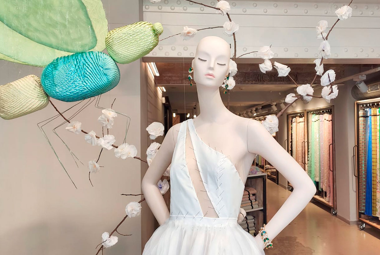
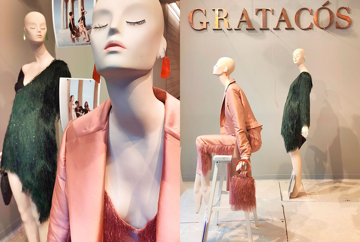
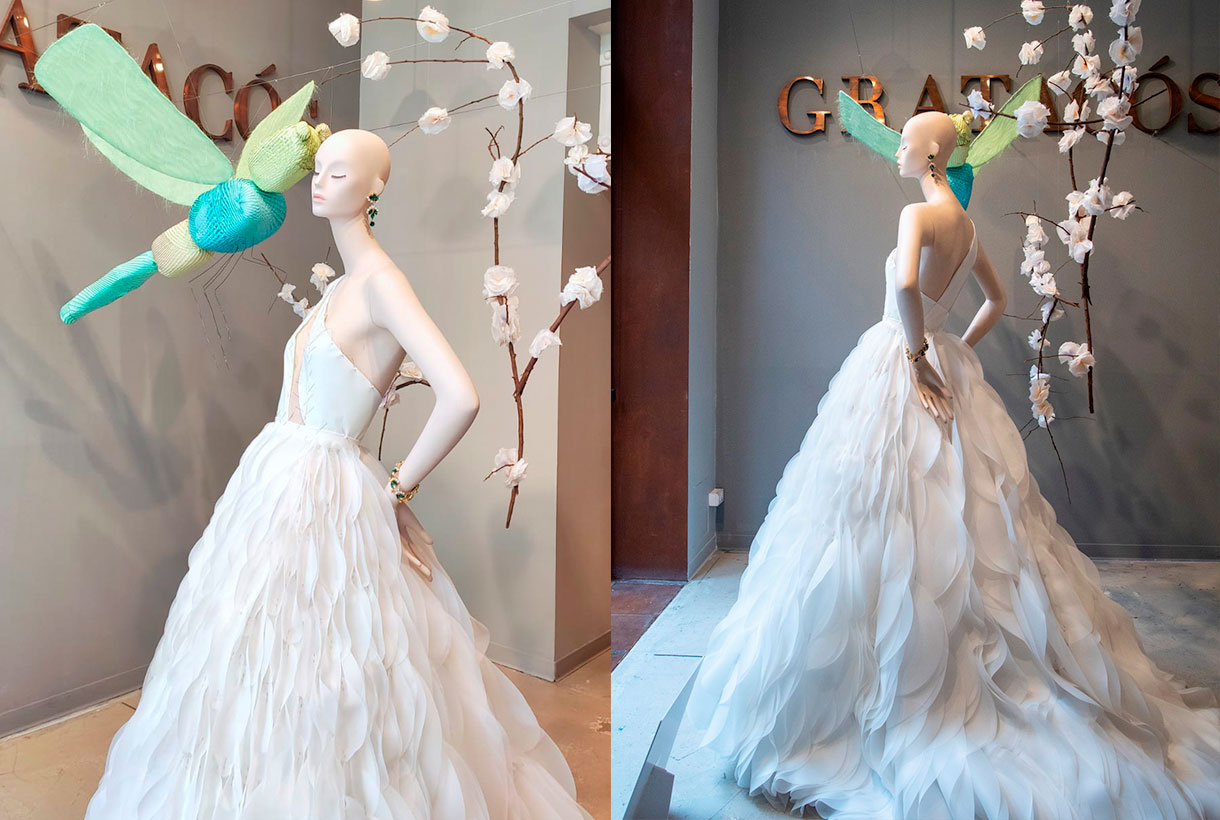
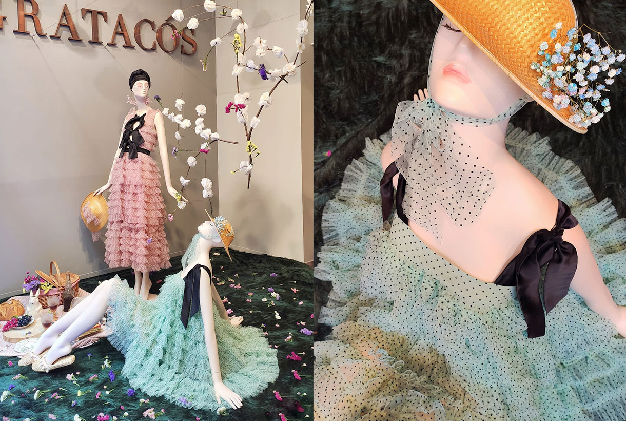
The showcase is a visual presentation of who we are, what we do and how we do it. An aesthetic entrance that attracts the visitor, but also justifies our work: the creation of quality fabrics that allow you to dream. During this uncertain year we have tried to surprise you with artistic windows that play with concepts that represent us such as luxury, elegance, fantasy, escape or everyday life through our mannequins that have been dressed in the most spectacular fabrics of the season along with other elements that we hope have surprised you. A wedding moulage, a chic picnic or a female interpretation of the Magi. These are some of the scenes that you have been able to observe through the window of our Gratacós space.
Now, before welcoming the new year, we take advantage of this post to say goodbye to 2021 with the certainty that it has been a year of transition that has allowed us to remain stable thanks to the cohesion between teams and your support and trust in this brand of family fabrics. We have new perspectives for 2022 and we want to move forward with new articles that will stand out for their quality, creativity and ability to surprise. Get excited, in short. Happy New Year!
March 2021. New direction
One year after the start of the pandemic, we awake dreaming of planning the upcoming holidays with a relaxation of restrictions. Easter, the May bank holidays and the not so distant summer disconnection. The beginning of spring also marked a minimalist-inspired showcase featuring two mannequins dressed for the occasion to pay tribute to those bridal celebrations that were returning to the fore. Tailoring, feather details and two antagonistic tones that capture the incipient change of season: forest green and dusty pink.
April 2021. Wedding bells
As tradition dictates, April is the bridal month par excellence and from Gratacós we always reserve this shop display to show off the work of one of the winners of the IED Barcelona. wedding dress design postgraduate moulage contest. This is an opportunity we offer to showcase the work of new talents in bridal design. This year, Eva Escudero created this impressive wedding dress with an asymmetrical design and a large flowing skirt, following in the footsteps of this unique tailoring technique.
May 2021. Country spirit
In the month of flowers, the Joplin Atelier company of the sisters Laura and Aida Molano turned our entrance space into an urban picnic with a Provencal air. The tulle dresses with small polka dots made with our fabrics, the details in bows and the pastel tones starred in a chic showcase with a multitude of details to carry out this picnic in the open air. An artistic representation that portrays the spirit of escape that connects us with nature.
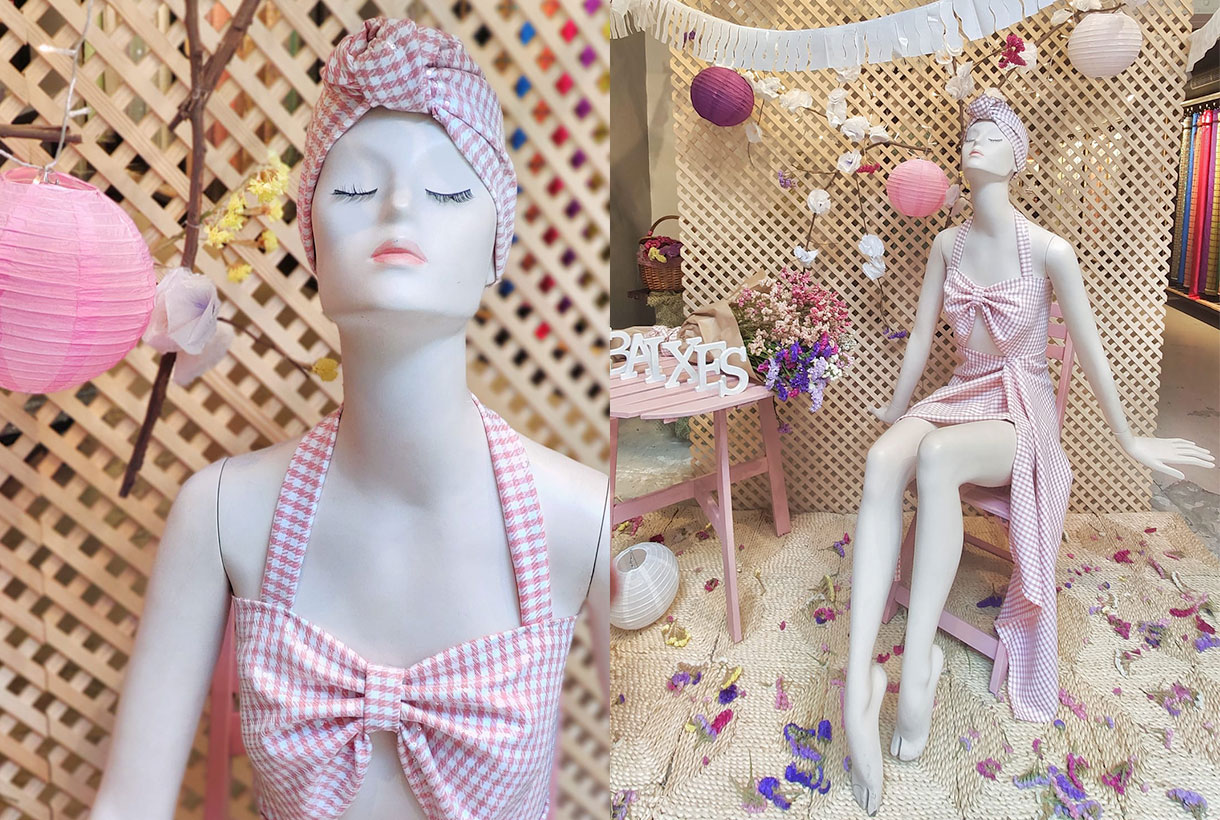
July 2021. Time to escape
The summer month par excellence is a tribute to festivals, fun and feeling carefree, maintaining that hedonistic attitude to take life a little more lightly, enjoying all the earthly pleasures. July has a fresh, youthful and daring character, as evidenced by the outfit of our mannequin in pink gingham fabric. Let the party begin!
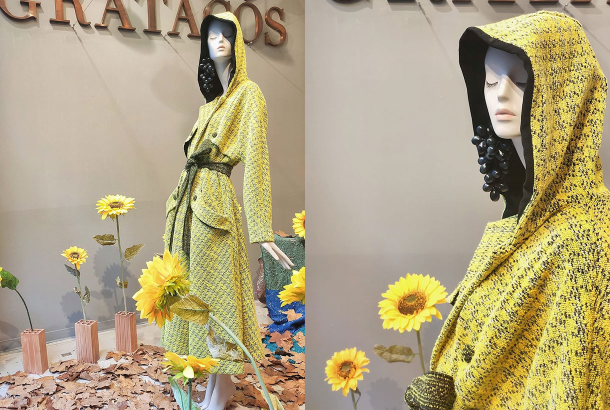
September 2021. Start over
September is the official month of beginnings. The new season, the change of season, the return to routines … we illustrate the busiest month on the calender by paying tribute to comfort through a bathrobe-type trench coat made of pistachio green tweed, all very daring dyed yarn, with a wool touch and thick weight. A carpet of dry leaves marks the beginning of autumn, which in Barcelona is light and soft.
October 2021. The Pink month.
It is called the pink month because it is recognized worldwide with this feminine color to raise awareness in men and women about breast cancer and promote self-examination and check-ups to be able to detect it early. Our tribute to the most delicate, subtle and romantic month was made by Rosa Cano, a student at ESDI, Escuela Superior de Diseño with these contrasting fabric models that play with the entire range of pastels and nudes. One of the most spectacular showcases of the year!
November 2021. Let the party commence!
The proximity of the Christmas holidays makes November a month of preparations. A headstart on shopping, lights that turn on and the search for the most surprising outfits to fill the holidays with magic. The designer Claudia from the Institut Català de la Moda (ICM) presents three models from the ‘Ritmos’ collection. Voluminous dresses with meters and meters of suggestive organza for celebrations full of fantasy.
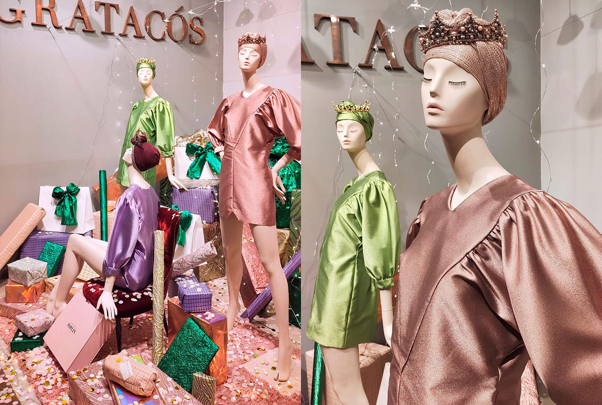
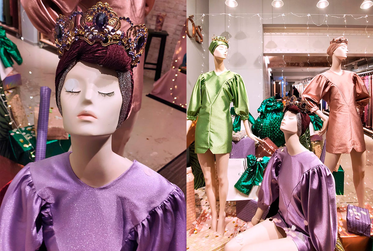
December 2021. The three queens
We ended the year again in collaboration with Joplin Atelier and its proposal in a feminine key. Our “Three Magical Queens” are a tribute to the strength of women, capable of dealing with all areas of their lives with determination and mastery. They are the philosopher’s stone of many families and especially during the hustle and bustle of the Christmas holidays. The mannequins share a turban and crown to match their short dresses with a closed neck and puffed sleeves made from acetate satin with lamé. Under their feet they protect all the gifts, the symbol of the act of sharing (and receiving).
Viernes 10 diciembre 2021
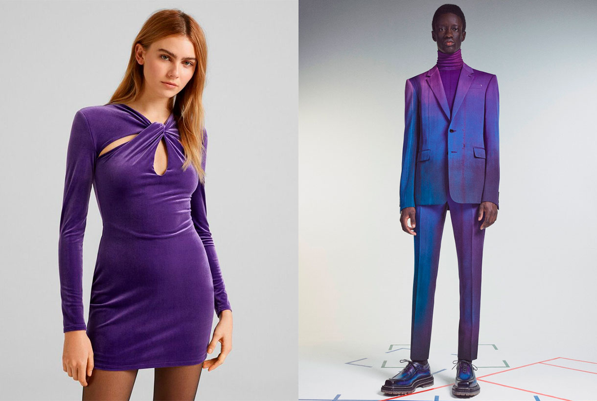
 December is the month of rituals and traditions marked especially by Christmas and the closeness to our loved ones. For designers, there is one thing that is awaited for with enthusiasm: finally knowing the colour that will mark the following year and that will be announced at this time, Pantone. The world authority of colour has once again communicated the tonality that will mark the year 2022 in areas as multidisciplinary as design, art, advertising or fashion. It’s called Very Peri and it’s a novel shade based on lilac that, they say, “maintains a daring presence and stimulates ingenuity and personal creativity.” Do you have a better cover letter?
As you already know, the annual choice of a colour is not done randomly or is the result of whim because it involves a deep study and analysis of trends by the trendhunters of the Pantone Colour Institute. With an in-depth study of the impact that various exhibitions, works of art, films that will be released next year, the most popular destinations, new technologies and all together, the global mood, they have a meticulous discussion and dimension the impression that every aspect will have. Before closing the year, experts have revealed what 2022 holds for us.
“Creating a new colour for the first time in the history of our colour program is a reflection of a process of innovation and transformation at a global level,” said Laurie Pressman, vice president of the Pantone Institute of Colour.
“The Pantone Colour of the Year is a reflection of what is happening in our world culture and expresses the answer to what people are looking for in this colour,” says Laurie Pressman, vice president of the Pantone Colour Institute. ” He adds: “The creation of a new colour for the first time in the history of our educational colour program Pantone Colour of the Year is a reflection of a process of innovation and transformation on a global level. As society recognizes colours as a fundamental form of communication and as a way of expressing, capturing, connecting and influencing ideas and emotions, this new and complex blue hue fused with purplish red highlights the range of possibilities that are presented to us. “
In this case, by encompassing the qualities of blues and, at the same time, having a purplish-red hue, PANTONE 17-3938 Very Peri displays a cheerful and lively attitude, as well as a dynamic presence that stimulates the courage to create and an imaginative expression.
Deciphering the enigmatic tonality of 2022
Very Peri represents the perfect fusion between blue and red. A bridge between two primary tones that are interrelated giving way to this enigmatic tone. According to Pantone, Very Peri is the result of carefree confidence and daring curiosity that encourages our creative, inquisitive and inclusive spirit. The authority of colour considers that this tonality helps to embrace this altered landscape of possibilities and opens a new vision so that each one can rewrite their own life. Rekindling gratitude for some of the qualities blue represents complemented by a new perspective that resonates today, PANTONE 17-3938 Very Peri puts the future ahead in a new light.
Very Peri displays a cheerful and lively demeanor, as well as a dynamic presence that stir up courage to create and an imaginative expression.
In times of transformation, Very Peri is a symbol of the spirit of our current global age and the transition we are experiencing today. As the period of isolation, marked by the global pandemic, is emerging, notions and standards are changing and people’s physical and digital lives have merged in new ways creating hybrids. This tonality also symbolizes the rise of digital design, which helps to stretch the limits of reality, opening the door to a dynamic virtual world where you can explore and create new colour possibilities. With trends in gaming, the growing popularity of the metaverse, and the growing arts community in the digital space, PANTONE 17-3938 Very Peri illustrates the fusion of modern life in correspondence with colour trends in the digital world and how together they are manifest in the physical world and vice versa.
This colour illustrates the fusion of modern life in correspondence with colour trends in the digital world and how together they manifest in the physical world and vice versa.
 How do we apply Very Peri in the world of fashion?
We said it at the beginning. Very Peri is the colour that seeks to convey courage, boost reinvention and stimulate creativity by displaying carefree confidence and infinite curiosity. It is a fresh, versatile and genderless shade that adapts to a wide variety of fabrics, textures and reliefs, provides a touch of colour and does not go unnoticed at all. On the catwalks, this hue has starred in monochrome looks in the shows of the new summer collections by Isabel Marant, Balenciaga, Thom Browne or Ermanno Scervino. Other firms such as Lanvin or Marine Serre have chosen to combine this violet tone with arty prints and neutral tones.
In Gratacós we have several seasonal fabrics where the Very Peri colour is present. You will find it in plain items and through prints or in its more sophisticated version with reliefs, iridescence and rhinestones. Take the opportunity to rediscover the collection that we have on offer in our online store.
Sorry, this entry is only available in Español.
Miércoles 03 noviembre 2021
 From Gratacós we closely follow the Spanish catwalks because we like to appreciate the creativity of designers in the form of impressive seasonal garments and how, sometimes, one of our fabrics sneaks into the looks of their magnificent collections. After the Mercedes-Benz Fashion Week Madrid in September, the last appointment with fashion was held by 080 Barcelona Fashion last month, in a new exhibition of fashion and power.
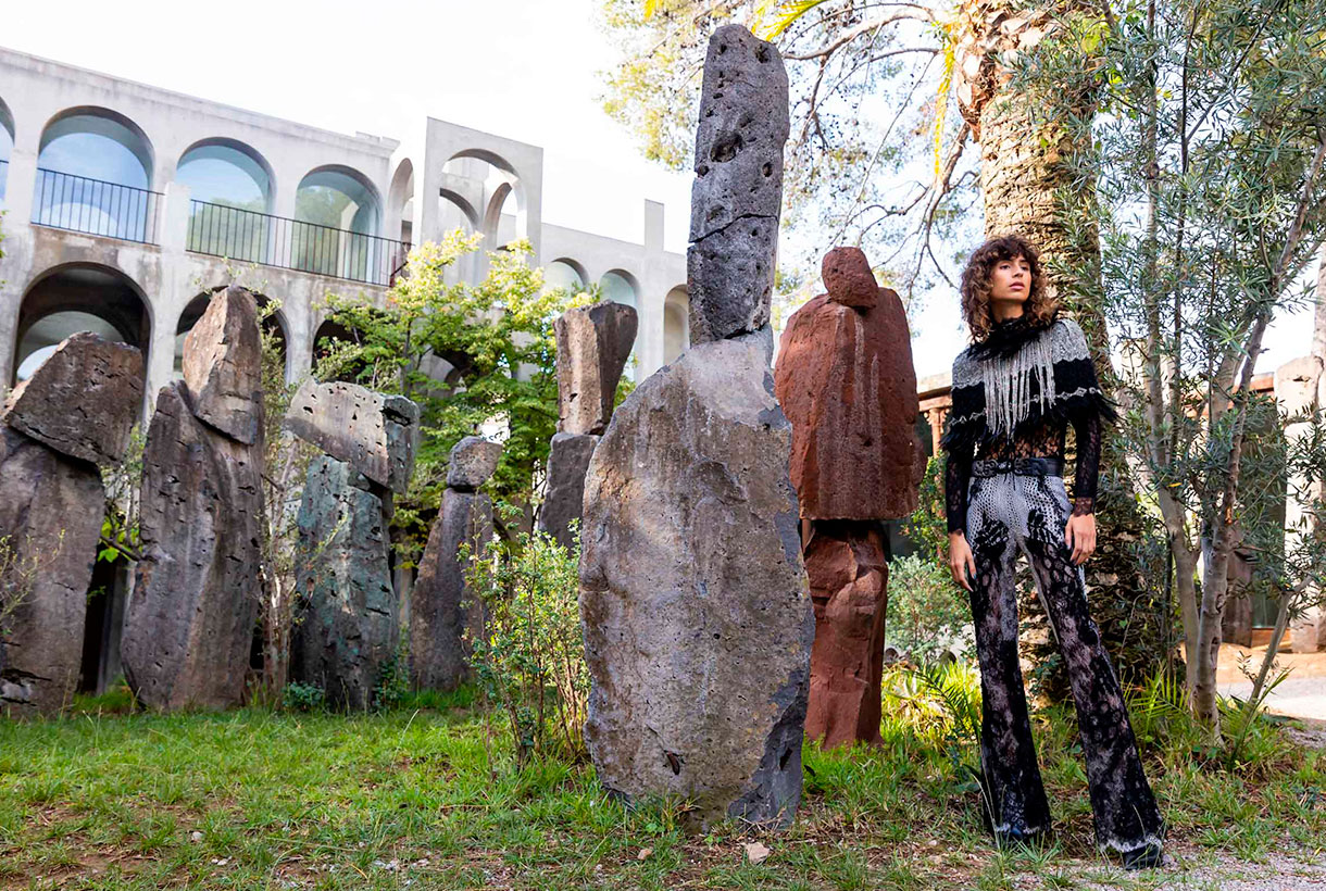
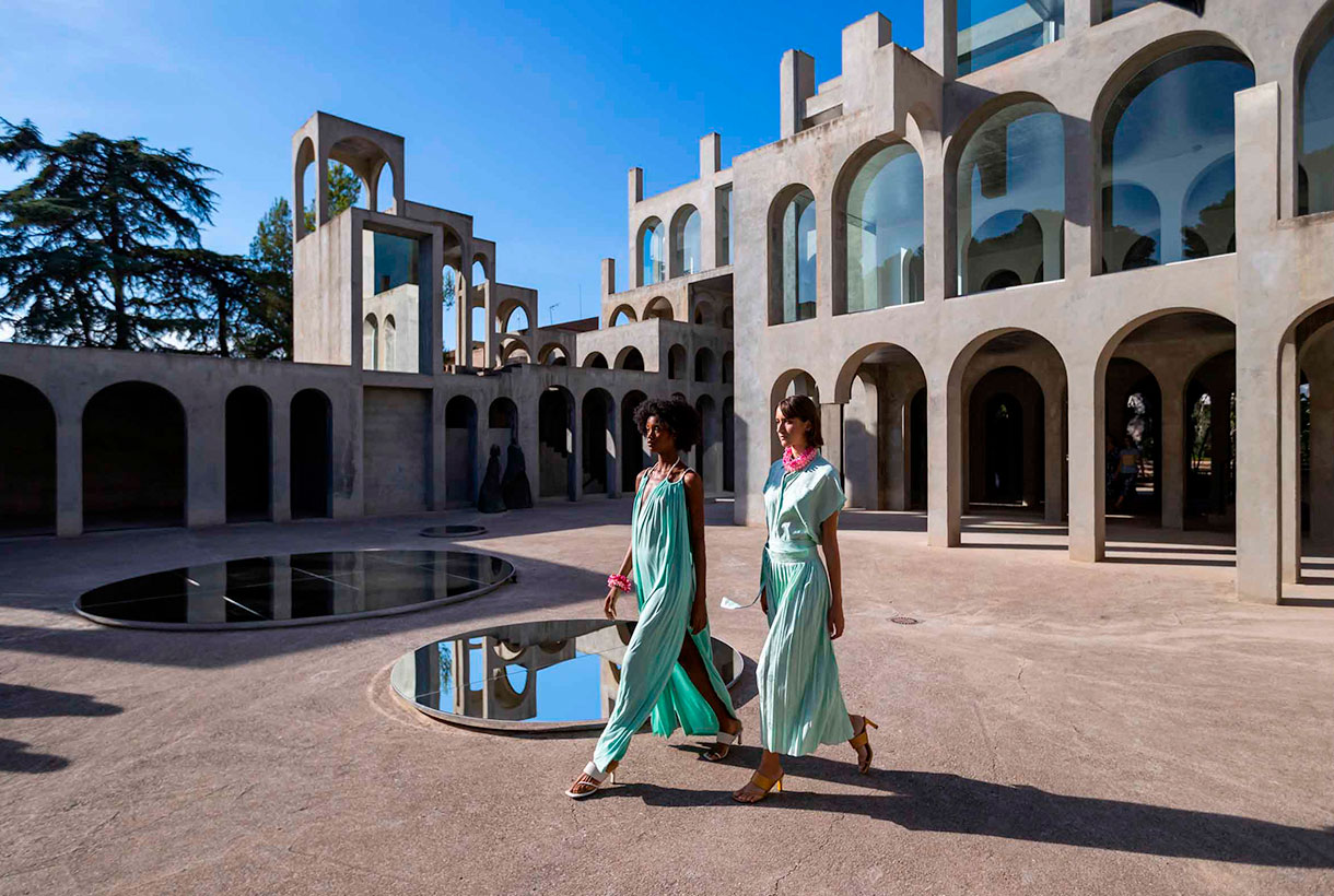
The Catalan catwalk once again opted for the digital format, presenting for the third time in a row, fashion short films previously recorded and edited by 22 designers who participated in the last edition. This time, the film set of the audiovisual pieces took place in a space that broke with the modernist legacy of recent editions: Xavier Corberó’s residential and architectural complex located in Esplugues de Llobregat. A wonderful sculptural work of concrete and glass of a rationalist character with dreamlike buildings that recall the metaphysical painting of Giorgio de Chirico or the mathematical art of Escher.
Next, we explain in detail some of the collections that surprised us the most with designers who maintain creative discourses linked to uniqueness, craftsmanship, sustainability or proximity.
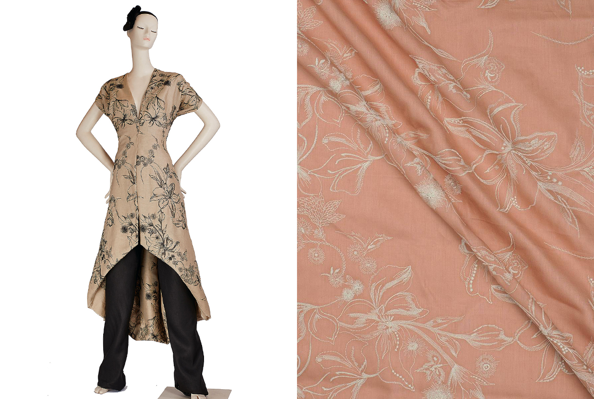
Avellaneda
Avellaneda turned the XC space of the Xavier Corberó architectural complex into a glamorous party displaying beauty, youth and good taste in clothing. In the new collection, the Barcelona designer Juan Avellaneda was inspired by the city and the individuals who inhabit it and share secrets, passions, ephemeral romances, eternal promises and moments of fun. This urban jungle consisted of a sophisticated collection of cocktail looks with traces of safari style: a revision of the zebra animal print , sequined jackets and baggy pants in earth tones. These innovative pieces coexisted with their signature flagships: tuxedos, dresses with sensual openings, silks, ruffles and sequins reign in clothes with daring patterns in a unique proposal that mixes exoticism with its usual elegance. The neutral bases, the pairing of black and white, red and fuchsia gave colour to this festive collection that plays with the classic codes of good dress.

Eiko Ai
Eiko Ai brings a new value in women’s fashion by combining concepts such as sophistication and sensuality in the clothes that she creates in a casual style for everything to wear. Always with that point of magic that invites clients to dream through the designs. On this occasion, the firm led by Glò Lladó has presented in 080, a collection that represents a fantastic trip to the mountains that allows us to discover the nymphs of the forest. These creatures of evocative power, inspiring myth and legend, have been dressed in two-piece combinations with bras – a hallmark of Eiko Ai-, oversized bomber jackets, trench coats with sparkly fabrics and sheer dresses with surprising cuts that insinuate without showing excessively. All this adorned with sequins, velvets, satins, lace and iridescent materials that create sensual transparencies on the models’ bodies. The silhouettes have a minimalist point inspired by the 90s and the lingerie looks blend with the festive in this exciting proposal tinged with deep green, silver and lavender that attracts at first glance.

Moisés Nieto
The designer from Úbeda (Jaén) made his debut on the Catalan catwalk displaying his credentials: contemporary design combined with the passion for craftsmanship and the trade that characterizes his elegant style from restraint. In the new collection for next season, Moisés Nieto takes a trip back in time to reconnect with his childhood in Andalusia. From the summers of the 90s, the designer chooses elements rescued from memory that serve to shape a proposal that speaks of everyday life: the crochet of the doilies, the nets of the curtains, the lace or the plants of the patio are a representation of the memories that take us to the eternal hot summers of the south. The sustainable brand shapes its particular vision in roomy midi dresses and pleated silk skirts. Light garments made with organic cotton or silk fabrics and mixed with artisan techniques such as knitting, crochet and macramé. It is worth noting the textures displayed that play with different weights and structures to create volume in women’s garments that add unexpected details. As in previous collections, the designer approaches craftsmanship and values sustainability, two aspects that have become the most visible hallmarks of the Spanish firm.

Y_Como
Finally, highlight the new work of Cristina and Yolanda Pérez from Yolancris in the new brand, Y_Como, which once again surprises with a new collection based on research and the creative process. The summer proposal presented at 080 Barcelona Fashion is inspired by the painting ‘The Garden of Delights’ by Bosco. Specifically in the panel that refers to Paradiso with a free interpretation, but full of visual references that refer to the work focused on creation. In the first scene of the fashion film , set in the architectural garden of Xavier Corberó, the models that embody the characters in the painting appear: there is the owl that represents the evil that contemplates falling into temptation, the figures of Adam and Eve , and followed by exotic animals that are represented by models of baroque aesthetics that show spectacular golden robes with floral embroidery. Also featured are other black sexy dresses, garments with lots of floral and patchwork denim, fabric star creative signature ready-to-wear bulky clothes that give a rebellious streak this sensuous YComo proposal.