 December is the month of rituals and traditions marked especially by Christmas and the closeness to our loved ones. For designers, there is one thing that is awaited for with enthusiasm: finally knowing the colour that will mark the following year and that will be announced at this time, Pantone. The world authority of colour has once again communicated the tonality that will mark the year 2022 in areas as multidisciplinary as design, art, advertising or fashion. It’s called Very Peri and it’s a novel shade based on lilac that, they say, “maintains a daring presence and stimulates ingenuity and personal creativity.” Do you have a better cover letter?
As you already know, the annual choice of a colour is not done randomly or is the result of whim because it involves a deep study and analysis of trends by the trendhunters of the Pantone Colour Institute. With an in-depth study of the impact that various exhibitions, works of art, films that will be released next year, the most popular destinations, new technologies and all together, the global mood, they have a meticulous discussion and dimension the impression that every aspect will have. Before closing the year, experts have revealed what 2022 holds for us.
“Creating a new colour for the first time in the history of our colour program is a reflection of a process of innovation and transformation at a global level,” said Laurie Pressman, vice president of the Pantone Institute of Colour.
“The Pantone Colour of the Year is a reflection of what is happening in our world culture and expresses the answer to what people are looking for in this colour,” says Laurie Pressman, vice president of the Pantone Colour Institute. ” He adds: “The creation of a new colour for the first time in the history of our educational colour program Pantone Colour of the Year is a reflection of a process of innovation and transformation on a global level. As society recognizes colours as a fundamental form of communication and as a way of expressing, capturing, connecting and influencing ideas and emotions, this new and complex blue hue fused with purplish red highlights the range of possibilities that are presented to us. “
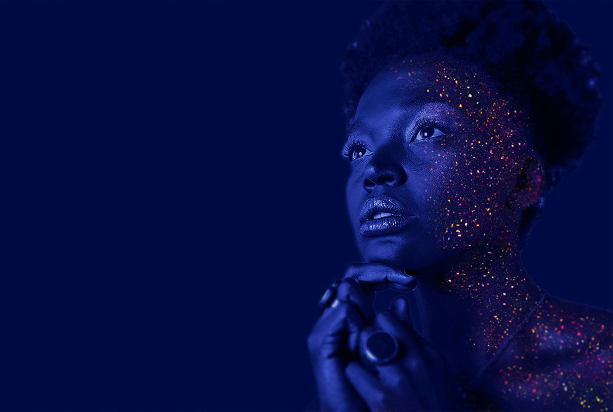
In this case, by encompassing the qualities of blues and, at the same time, having a purplish-red hue, PANTONE 17-3938 Very Peri displays a cheerful and lively attitude, as well as a dynamic presence that stimulates the courage to create and an imaginative expression.
Deciphering the enigmatic tonality of 2022
Very Peri represents the perfect fusion between blue and red. A bridge between two primary tones that are interrelated giving way to this enigmatic tone. According to Pantone, Very Peri is the result of carefree confidence and daring curiosity that encourages our creative, inquisitive and inclusive spirit. The authority of colour considers that this tonality helps to embrace this altered landscape of possibilities and opens a new vision so that each one can rewrite their own life. Rekindling gratitude for some of the qualities blue represents complemented by a new perspective that resonates today, PANTONE 17-3938 Very Peri puts the future ahead in a new light.
Very Peri displays a cheerful and lively demeanor, as well as a dynamic presence that stir up courage to create and an imaginative expression.
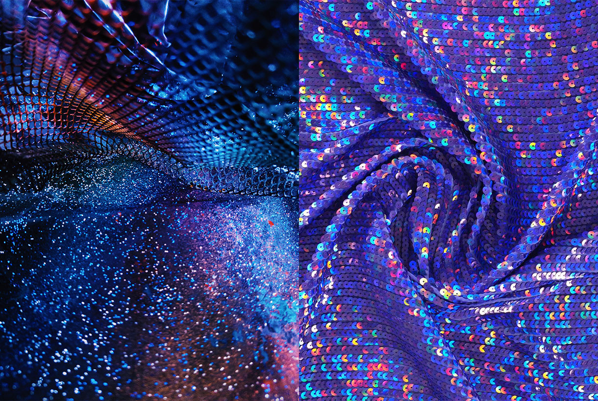
In times of transformation, Very Peri is a symbol of the spirit of our current global age and the transition we are experiencing today. As the period of isolation, marked by the global pandemic, is emerging, notions and standards are changing and people’s physical and digital lives have merged in new ways creating hybrids. This tonality also symbolizes the rise of digital design, which helps to stretch the limits of reality, opening the door to a dynamic virtual world where you can explore and create new colour possibilities. With trends in gaming, the growing popularity of the metaverse, and the growing arts community in the digital space, PANTONE 17-3938 Very Peri illustrates the fusion of modern life in correspondence with colour trends in the digital world and how together they are manifest in the physical world and vice versa.
This colour illustrates the fusion of modern life in correspondence with colour trends in the digital world and how together they manifest in the physical world and vice versa.
 How do we apply Very Peri in the world of fashion?
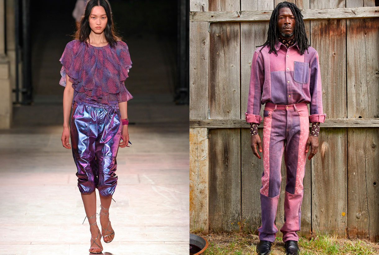
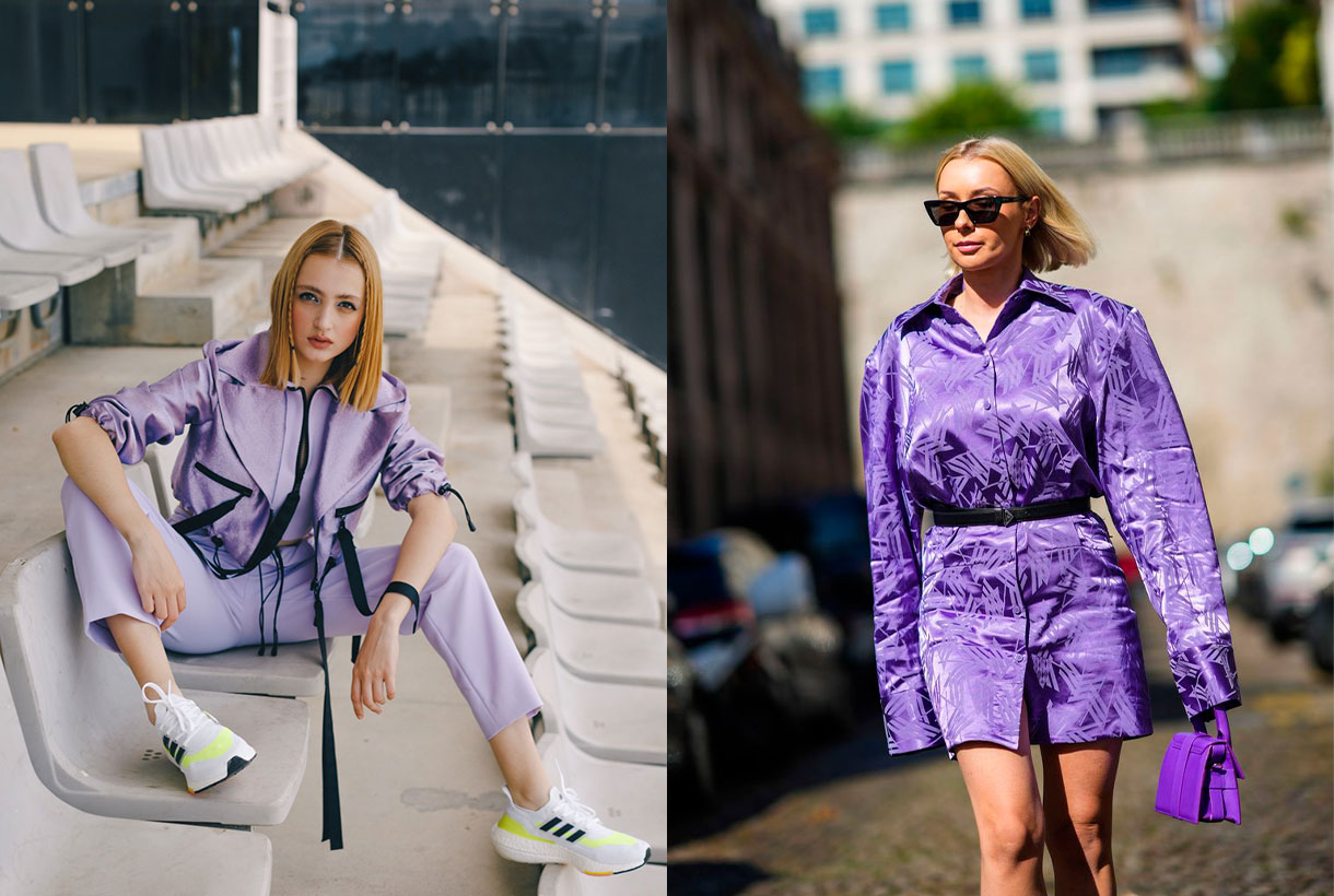
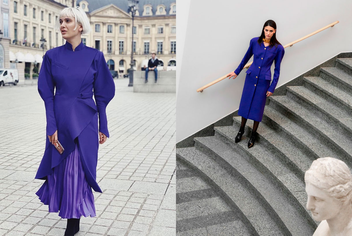
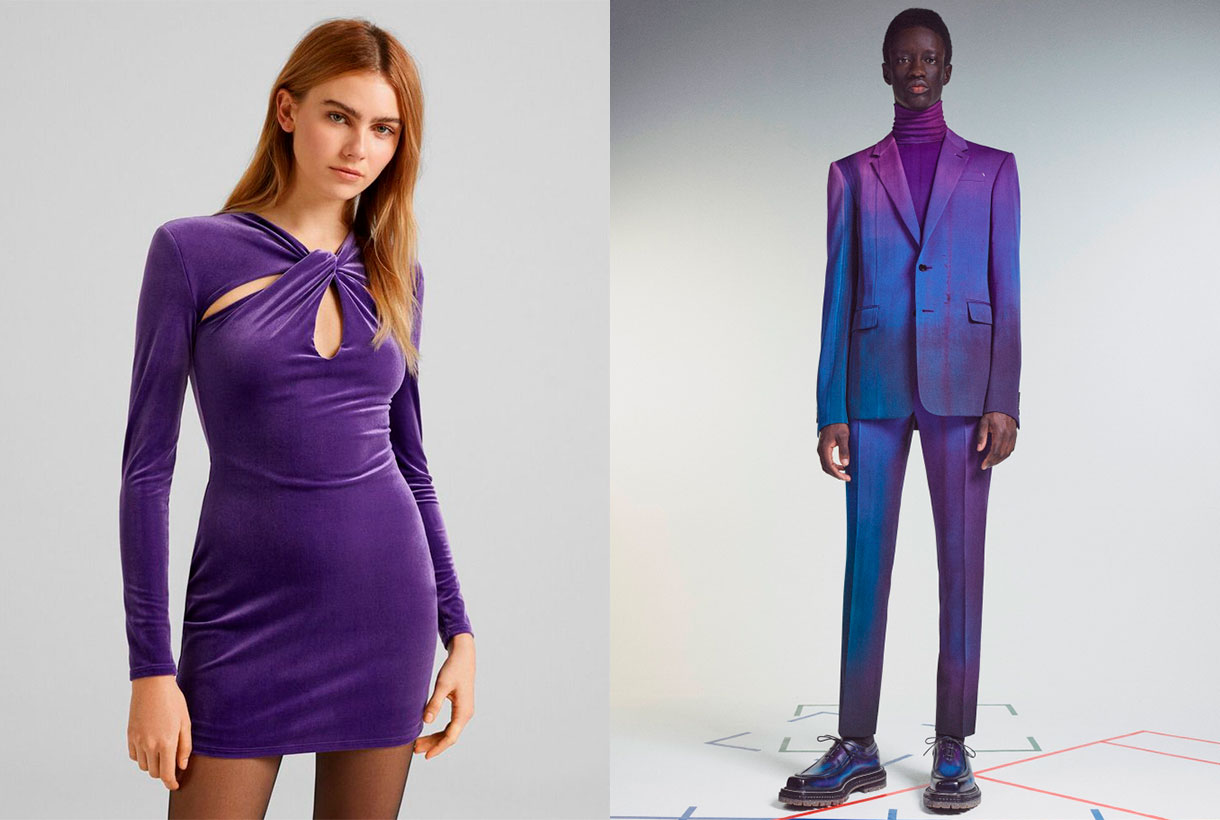
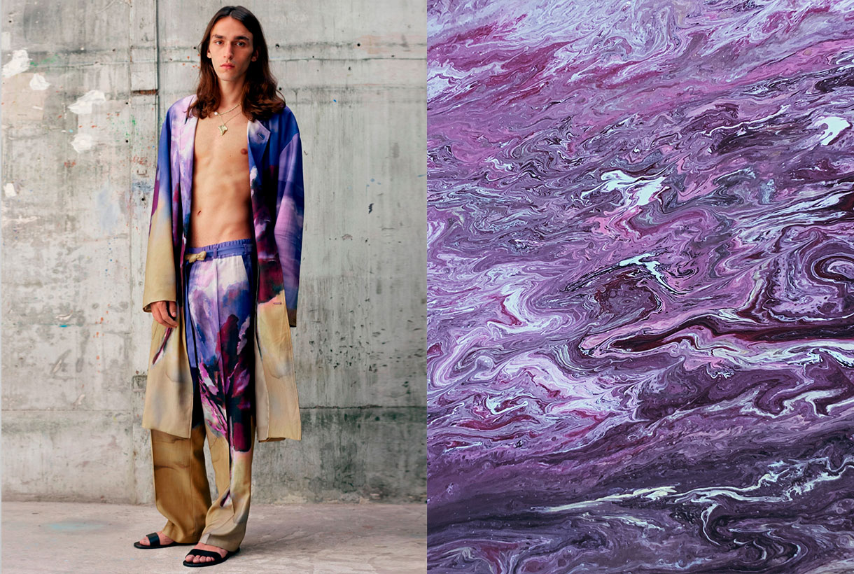
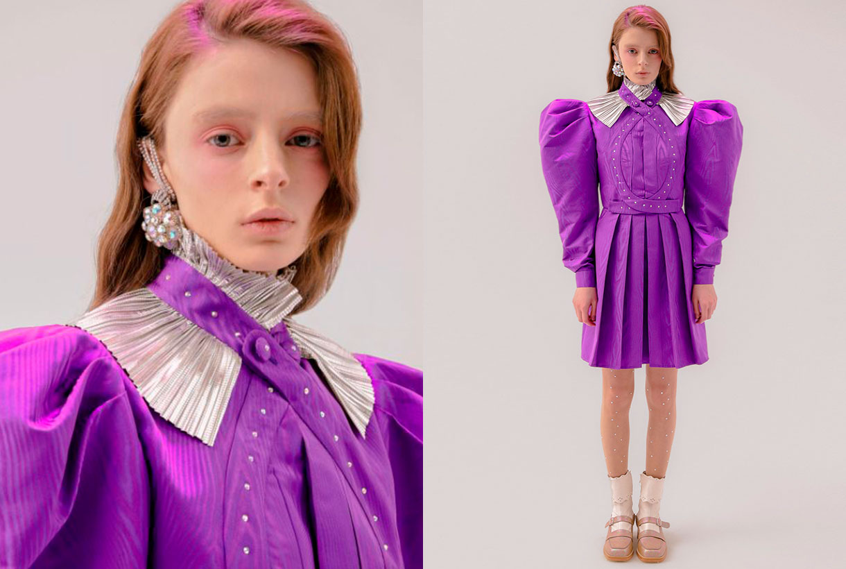
We said it at the beginning. Very Peri is the colour that seeks to convey courage, boost reinvention and stimulate creativity by displaying carefree confidence and infinite curiosity. It is a fresh, versatile and genderless shade that adapts to a wide variety of fabrics, textures and reliefs, provides a touch of colour and does not go unnoticed at all. On the catwalks, this hue has starred in monochrome looks in the shows of the new summer collections by Isabel Marant, Balenciaga, Thom Browne or Ermanno Scervino. Other firms such as Lanvin or Marine Serre have chosen to combine this violet tone with arty prints and neutral tones.
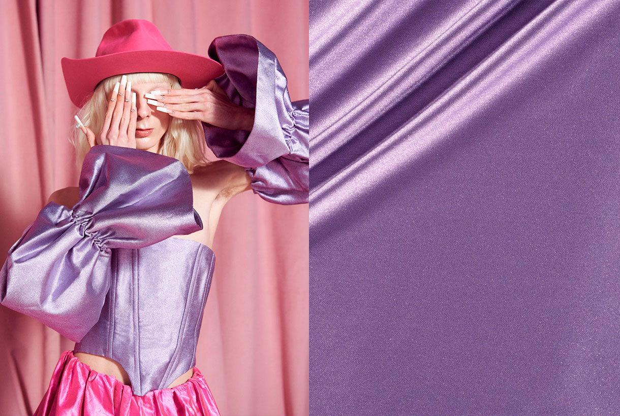
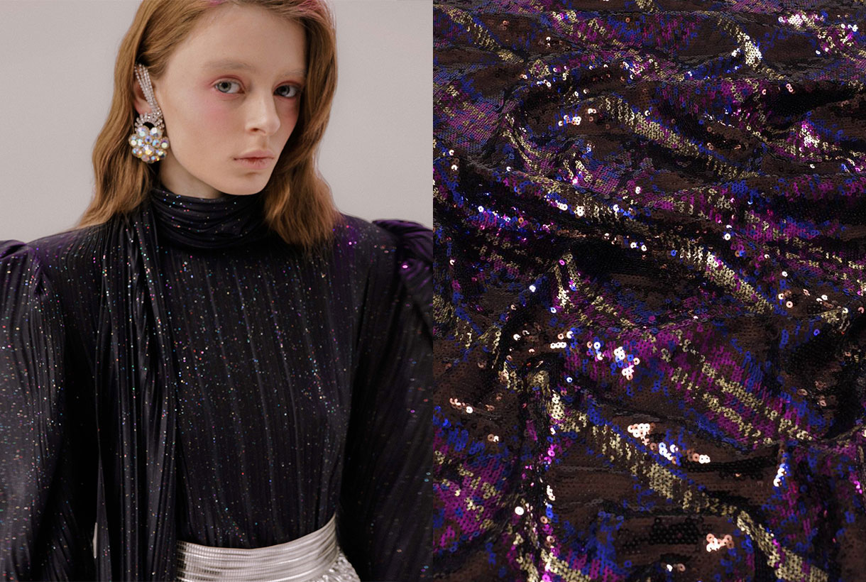
In Gratacós we have several seasonal fabrics where the Very Peri colour is present. You will find it in plain items and through prints or in its more sophisticated version with reliefs, iridescence and rhinestones. Take the opportunity to rediscover the collection that we have on offer in our online store.