Miércoles 20 febrero 2019
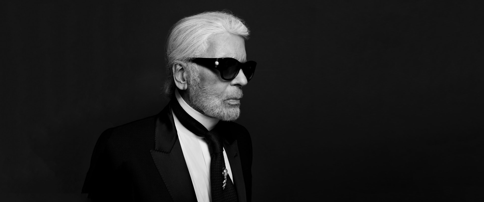
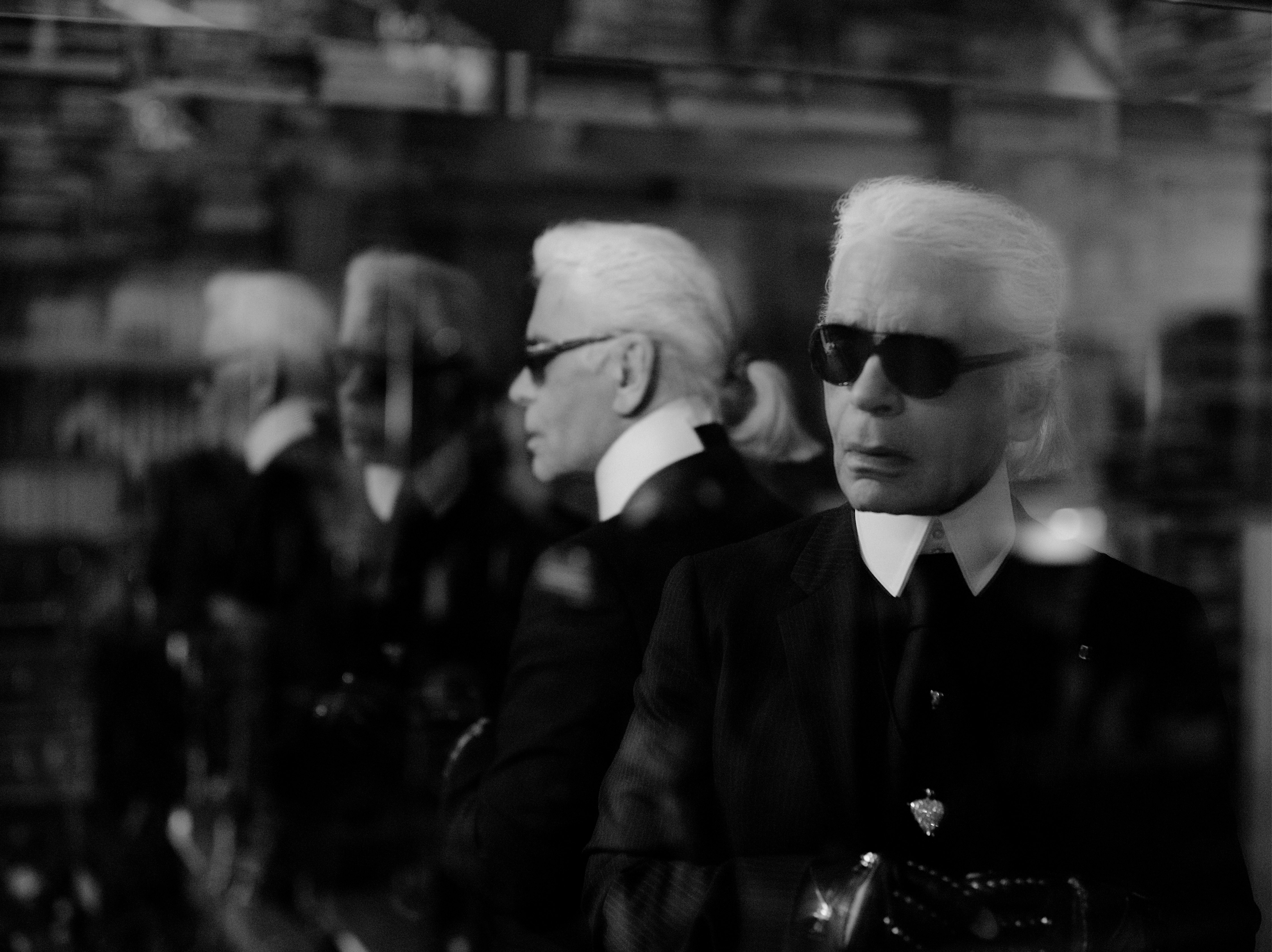
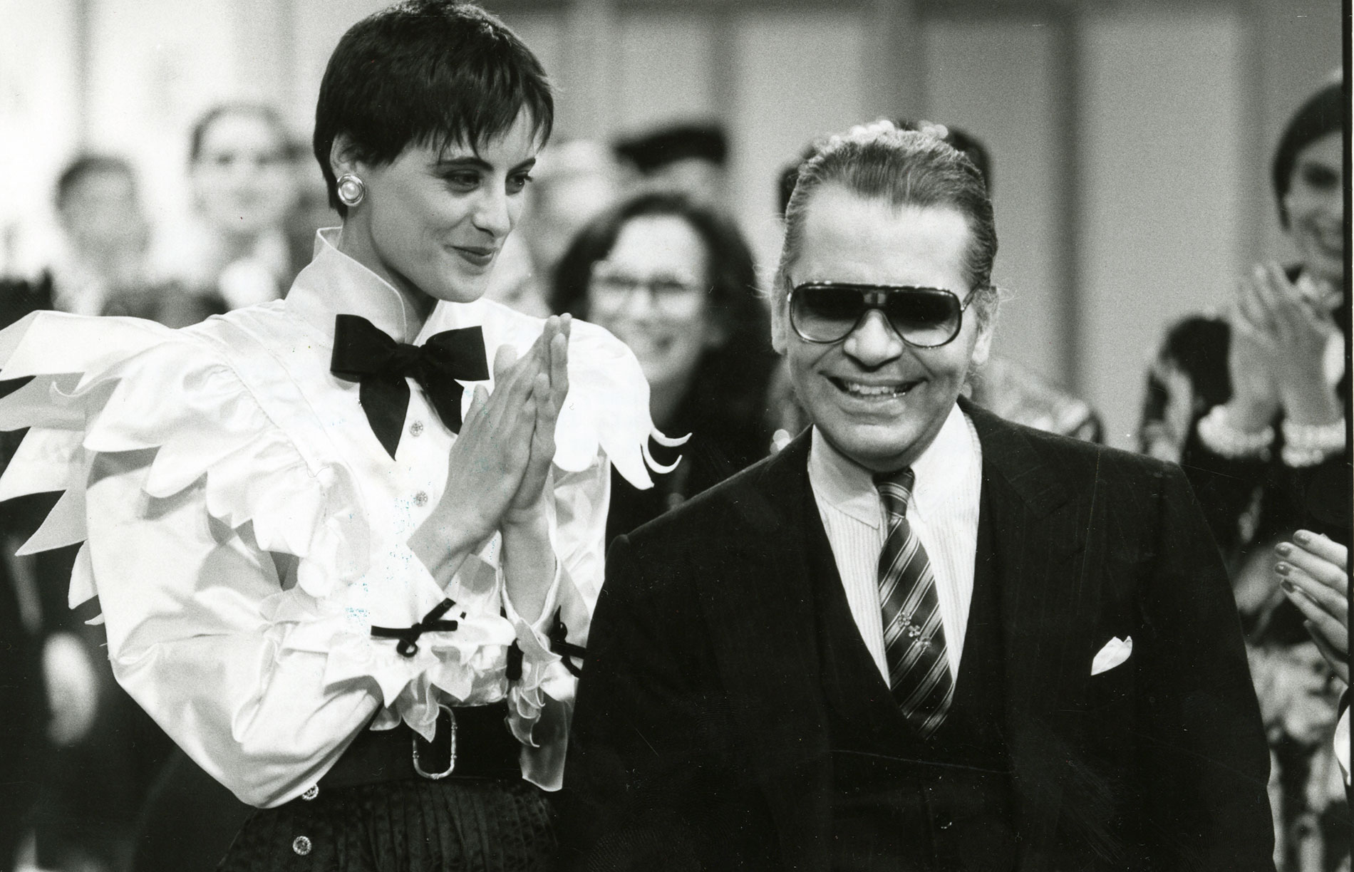
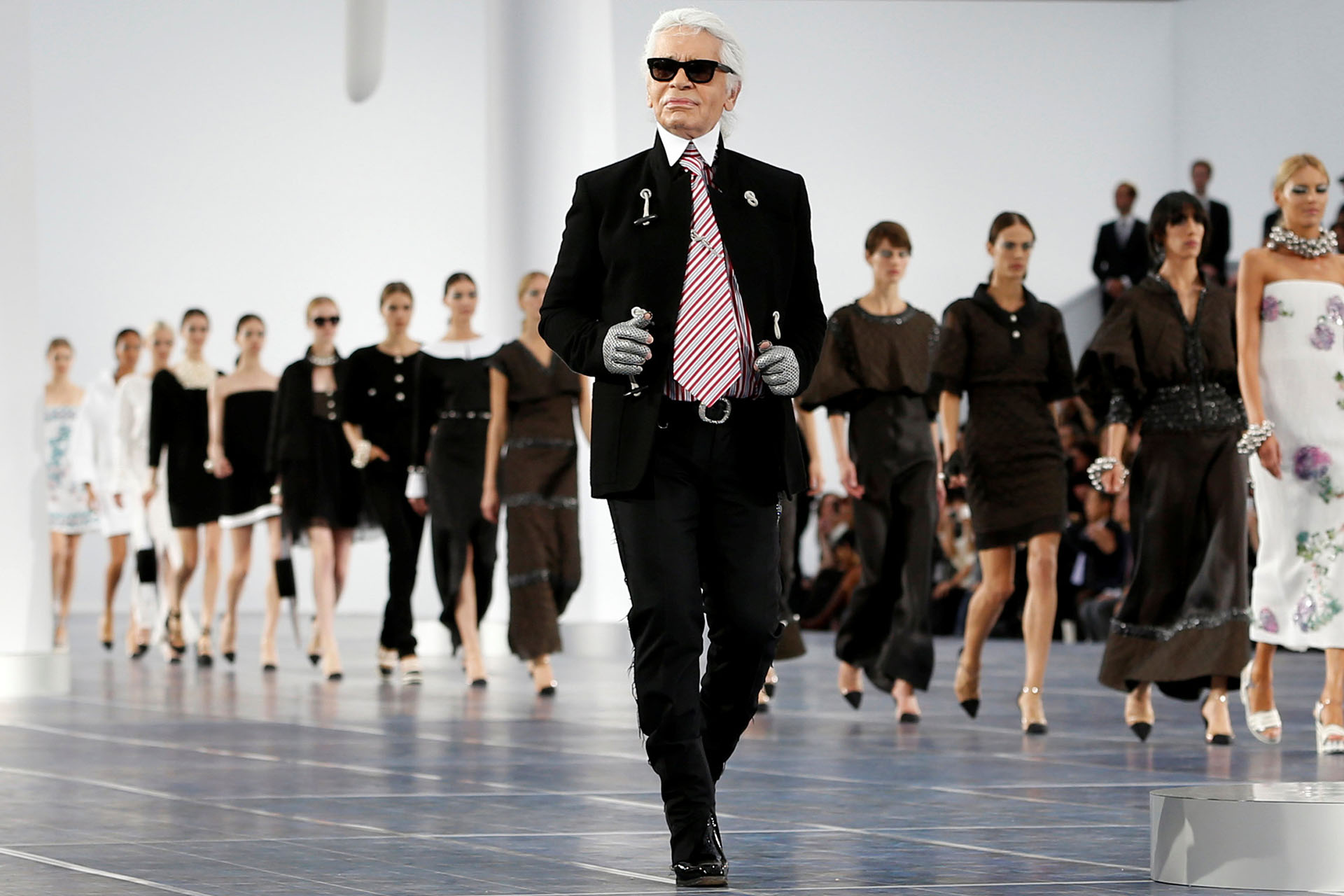
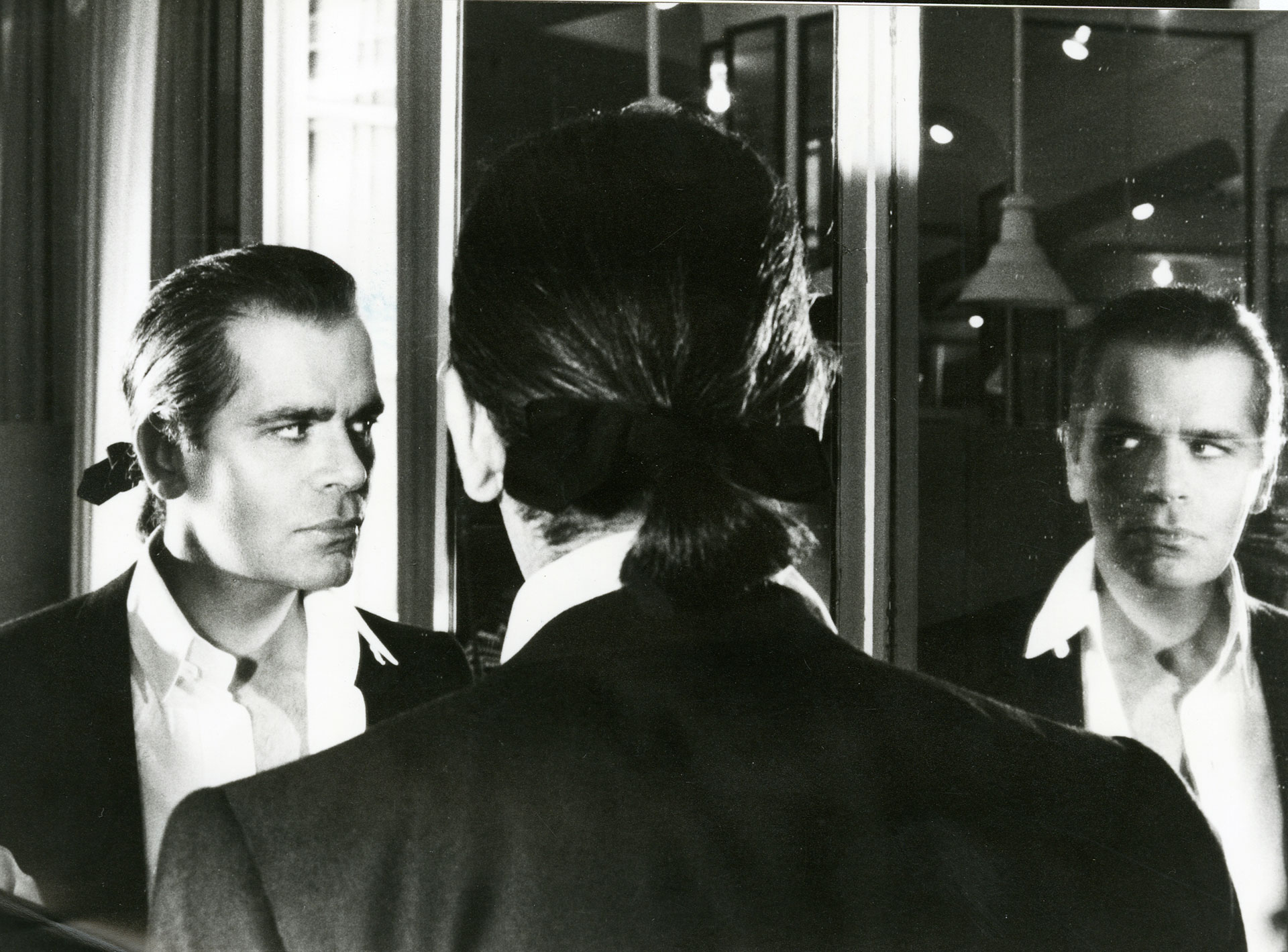
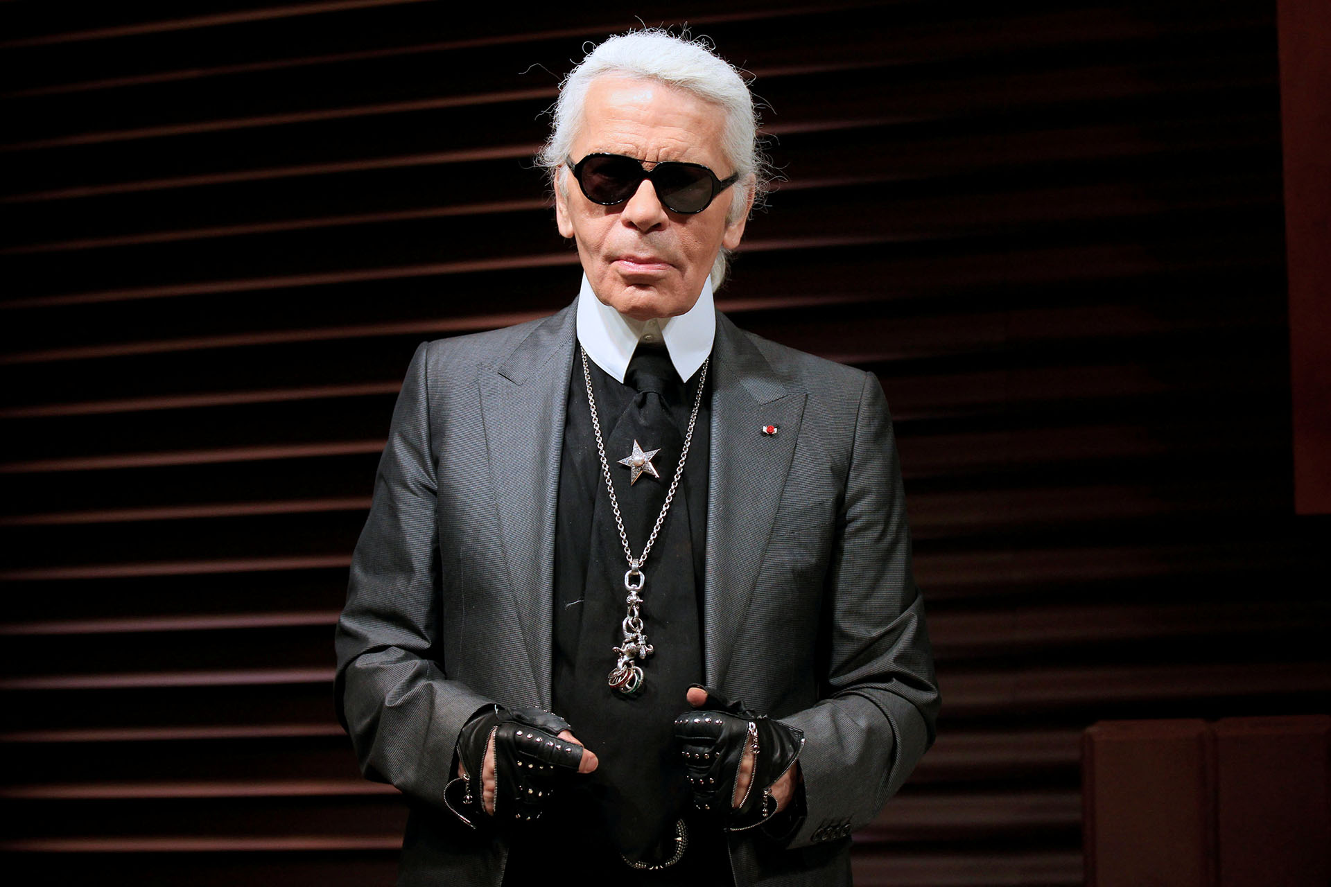
The news left the fashion industry in shock. Somehow it is orphaned after losing one of its flagship (and controversial) contemporary designers. The era of Karl Lagerfeld has come to an end and perhaps it is still hard to believe that there could be limits for this tireless mind that stayed in the business until the end . The iconic couturier of German origin died last Tuesday at age 85 in Paris. There were rumours that Karl’s health was weakened or that his retirement was imminent . In fact his absence from the spring-summer 2019 fashion show last January had already triggered the first alarms, since the Kaiser of fashion had not missed any of his appointments since his beginnings in Chanel in 1983. He was considered the longest-living designer to be at the head of a maison de couture. Together with Armani, who remained active and a creative director well into his 80s , he was a recognized artist world-wide. We should never forget that homage was paid to Karl Lagerfeld and his career at the British Fashion Awards in 2016.
Condolences for the loss of Karl Lagerfeld have poured in and prominent among the avalanche of celebrated personalities in the sector who have expressed their grief and praised the genius of the Kaiser are the statements put out by the three companies for which he worked right up to his last moments : Fendi and Chanel .”We owe him a lot: his good taste and talent were the most exceptional I’ve ever seen,” declared his friend Bernard Arnault , president and CEO of the luxury empire LVMH. “I will always remember his immense imagination, his ability to conceive new trends, his inexhaustible energy, the virtuosity of his drawings , his carefully guarded independence, his encyclopedic culture and his unique humour and eloquence.” For its part , via a statement Chanel has also expressed grief for the loss, praising the figure of Karl as key to the process of resurrection of the French maison . In the words of Alain Wertheimer, CEO of Chanel…. “thanks to his creative genius, generosity and exceptional intuition, Karl Lagerfeld was ahead of his time, which greatly contributed to the success of Chanel throughout the world . ” Karl also headed the company with his own name. Pier Paolo Righi, CEO of Karl Lagerfeld stated… “the world has lost an icon. Karl Lagerfeld was a creative genius, influential, inventive, strong and passionate. He leaves behind an extraordinary legacy as one of the great designers of our time. “
The man who resurrected Chanel
With his extensive and prolific career, the versatile Karl Lagerfeld , the Kaiser has gone down in history as the artistic director who managed to resurrect a company that was considered antiquated. Yes, we are talking about Chanel , a business that 36 years ago was in decline. “We have lost an extraordinary creative mind to whom I gave carte blanche at the beginning of the 80s to reinvent the brand,” Chanel president Alain Wertheimer recalled in the same statement. Thus Karl inherited the creativity of Gabrielle’s empire in January 1983 and with it the most difficult thing: he managed to modernize the classics of the famous maison without losing its essence: the tweed ensembles, the black dresses, the iconic handbags, the pearls, the two- coloured shoes , the camelias … Everything that happened under the lens of Karl received a new re-focus in accordance with the clientèle and the needs of each era. This positioned Chanel again as a global and transversal business model that marked the foundations of the current luxury industry.
His work had no end and the rhythms were tachycardic. Lagerfeld created 10 annual collections for the French house and another two for the Italian Fendi. Now the artistic direction falls to Virginie Viard , his right hand. Viard worked hand in hand with the Kaiser for more than 30 years and in the same statement Chanel commissioned her ” to continue the legacy of Gabrielle and Karl. “
Nothing by halves
Karl Lagerfeld never left anyone indifferent. Neither by ethics nor by aesthetics. He was not a man who did things by halves. His style was his arms and exterior armour : always dressed in black, spotless white shirt , hair with short ponytail , dozens of rings, mittens and his unmistakable sunglasses. “I’m a caricature of myself, and I like it. For me, the carnival in Venice lasts all year, “he said. Nor did his controversial judgments pass unnoticed, a real “ kick in the teeth ” for those who received them. Decribing the singer Adele as “a little too fat” or controversial phrases like “I hate children”, “The middle class does not have enough class”, “Buy small sizes and eat less food , “ Floral prints are for fat middle-aged women “, ” Be politically correct, but don’t bother other people rest with conversations about being so… were some of these pearls from Lagerfeld .
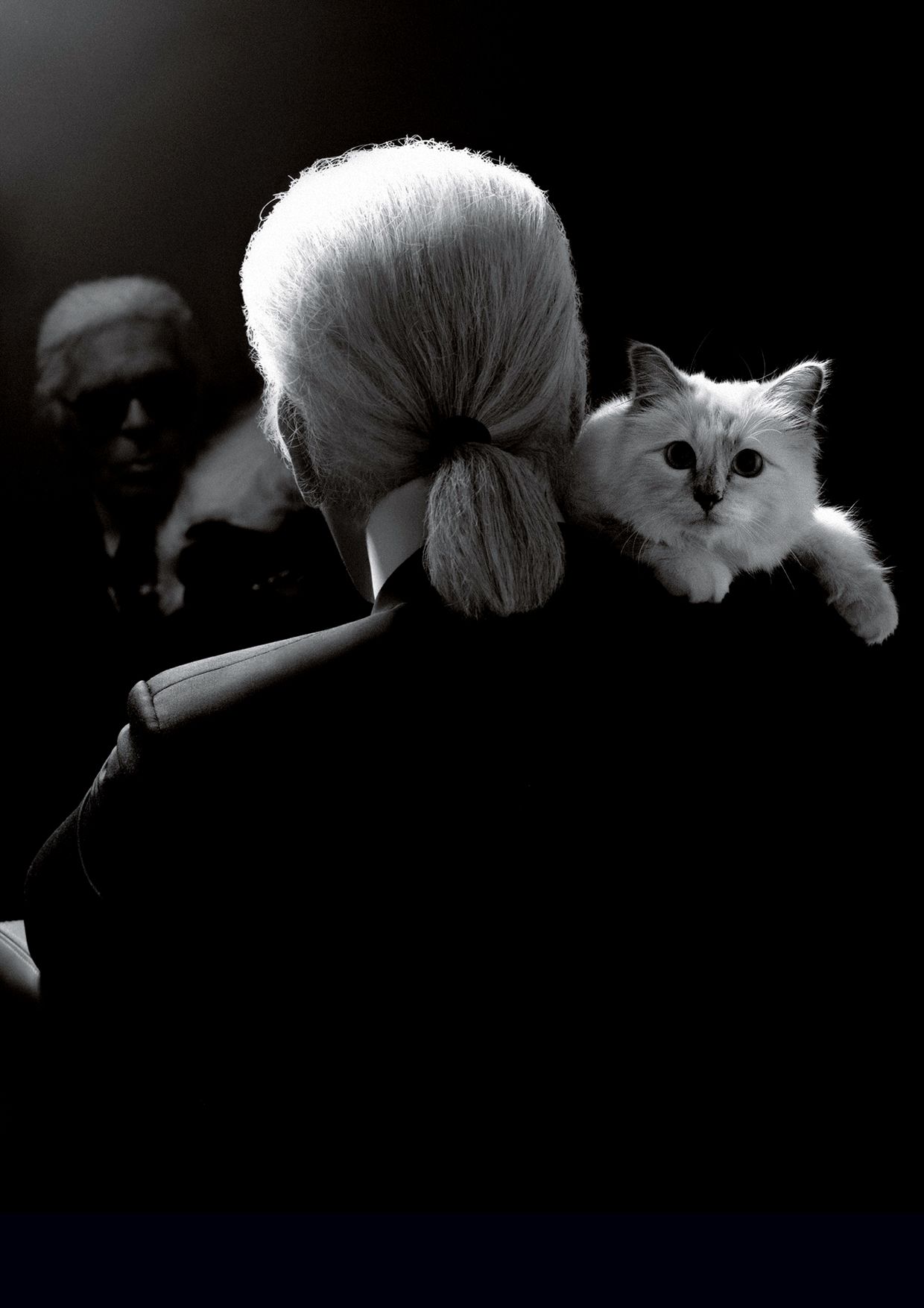
With regard to successors: To Viard it is already clear that she will succeed on Chanel’s throne, although the question now is whether she will become a transitional designer in the face of the pool of names that are always lurking in this constant ‘Game of Thrones’ of fashion. And as far as inheritance is concerned, Karl was single and without children, although surely his mediatic cat Choupette will inherit some of his fortune. He certainly was bearing her in mind: “ Choupette is like a reserved woman. She has personality. She has lunch and dinner with me at table with her own food and doesn’t touch my food. She doesn’t like eating on the floor. She sleeps on a pillow and even knows how to use an Ipad . “ She knew his most tender and homely side.
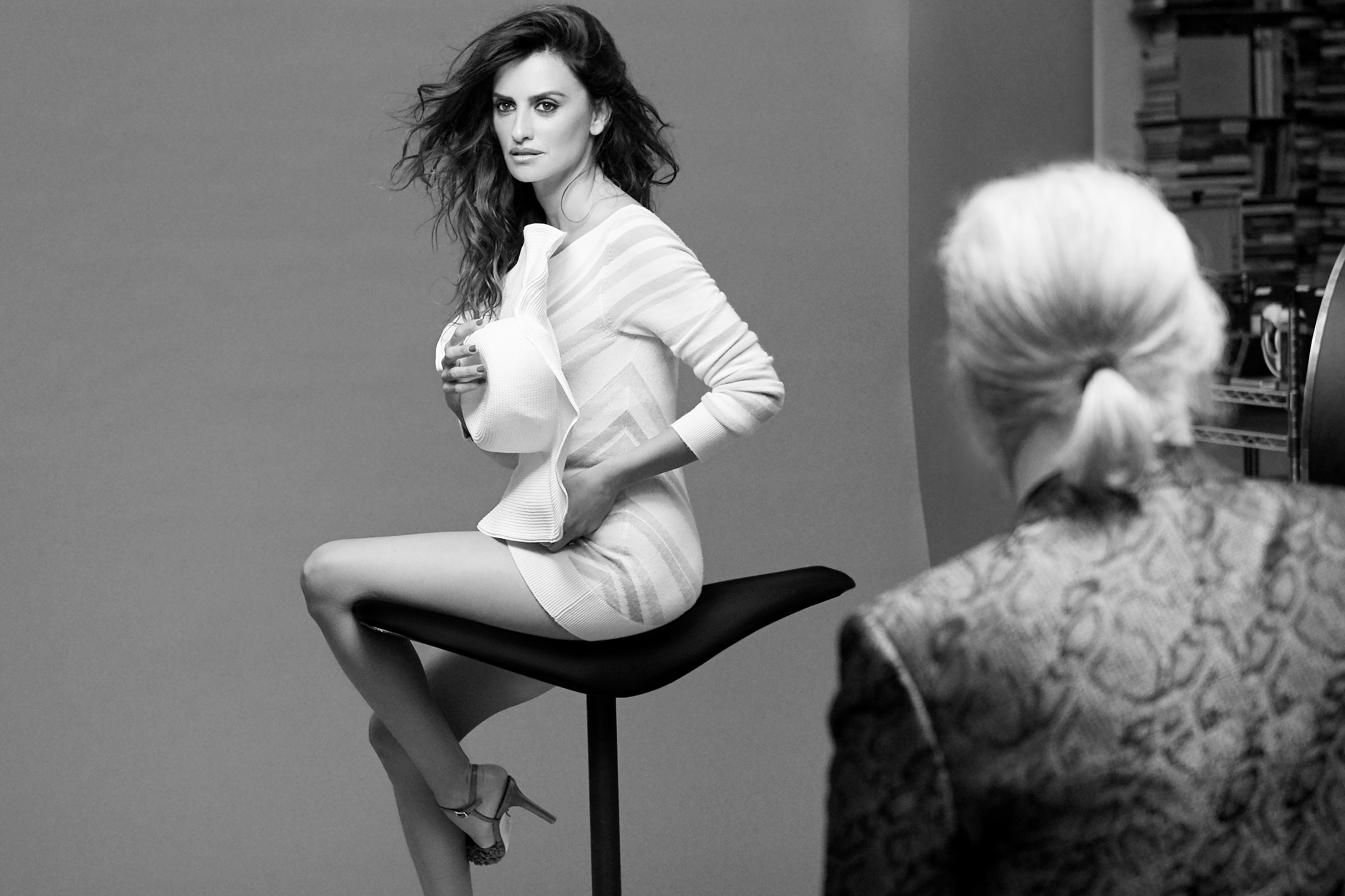
Foto portada y making of de la campaña 2019 con Penélope Cruz: Cortesía de Chanel
Sorry, this entry is only available in Español.
080 Barcelona Fashion,
Beatriz Peñalver,
Brain & Beast,
Christian Simmon.,
Edu Navarrete,
Gratacós en la pasarela,
La Condesa,
Malne,
Mans Concept Menswear,
Mercedes Benz Fashion Week Madrid,
tejidos Gratacós pasarela,
The 2nd Skin Co
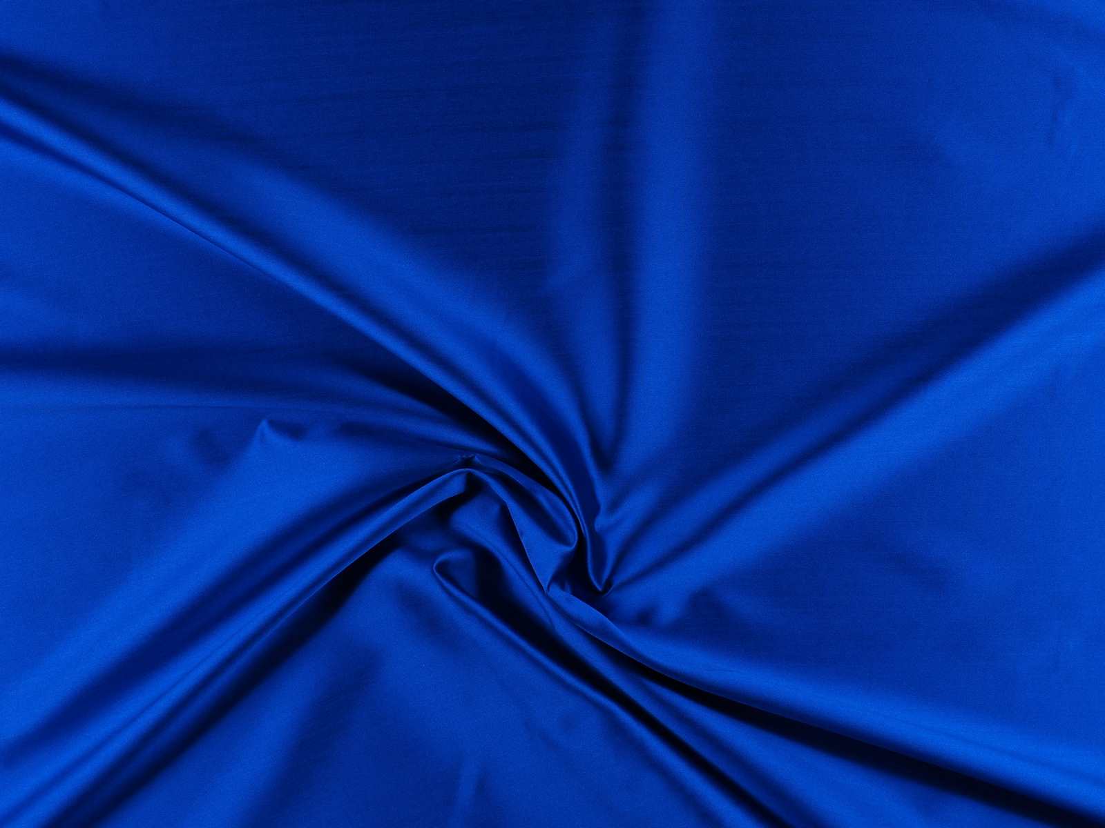
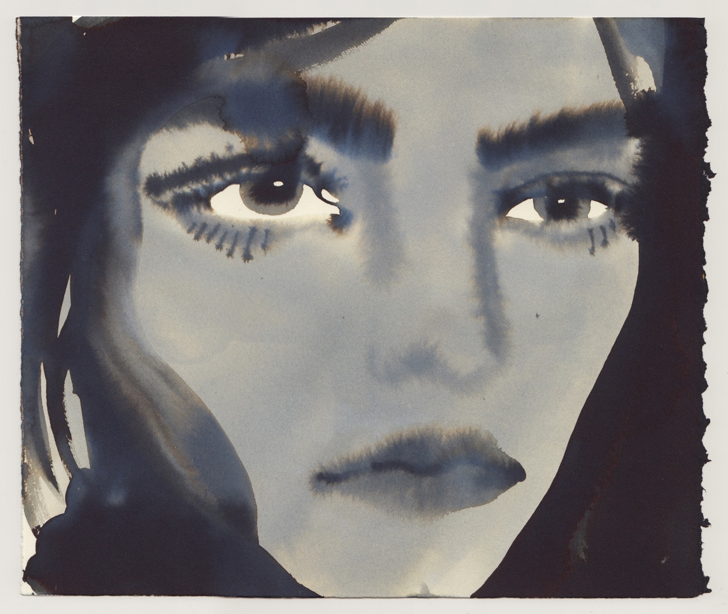
here are few artists whose works are linked to one single colour. An identifying tone, existential and full of meaning. The force of this tonality is so great that it acts as a true symbol to understand the creator himself, way beyond his artistic career.
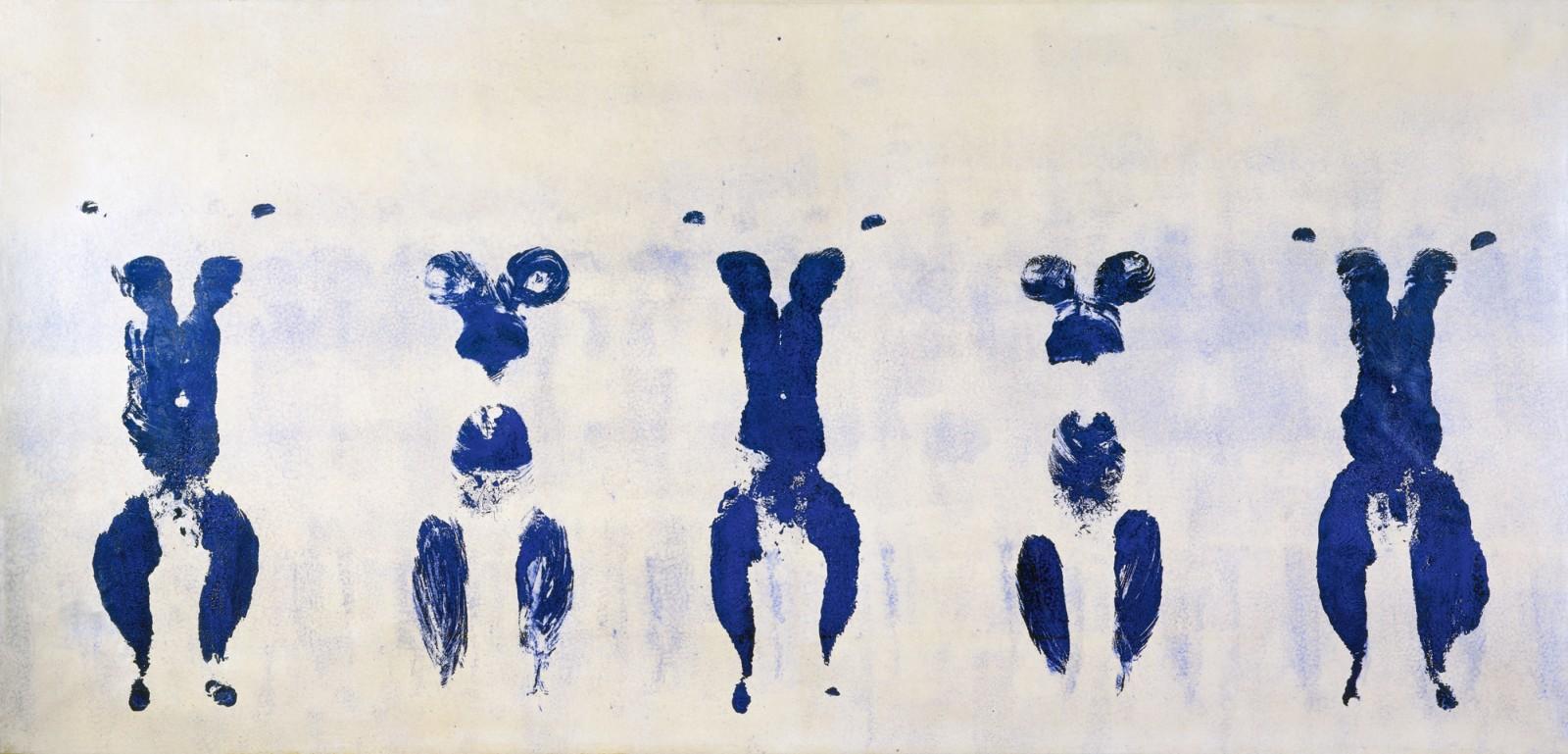
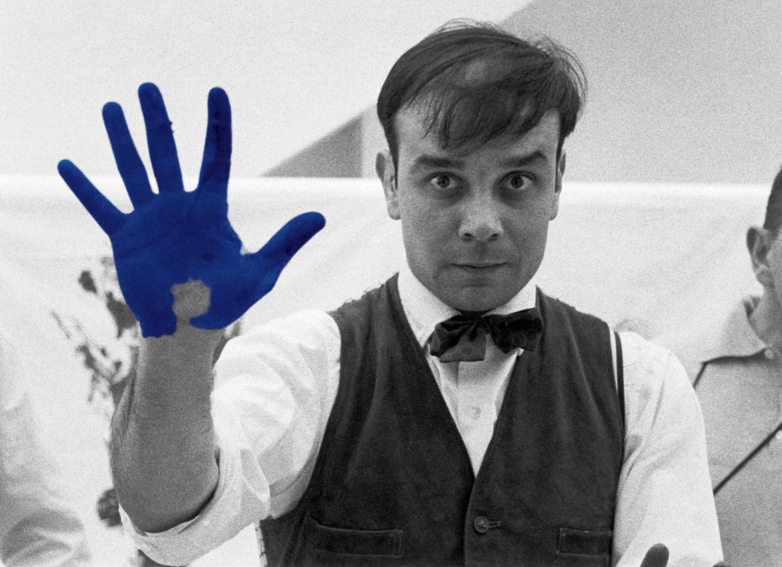
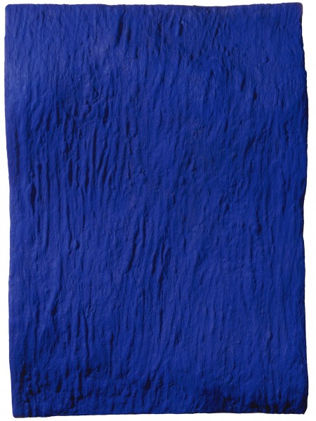
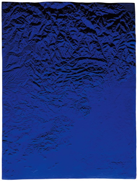
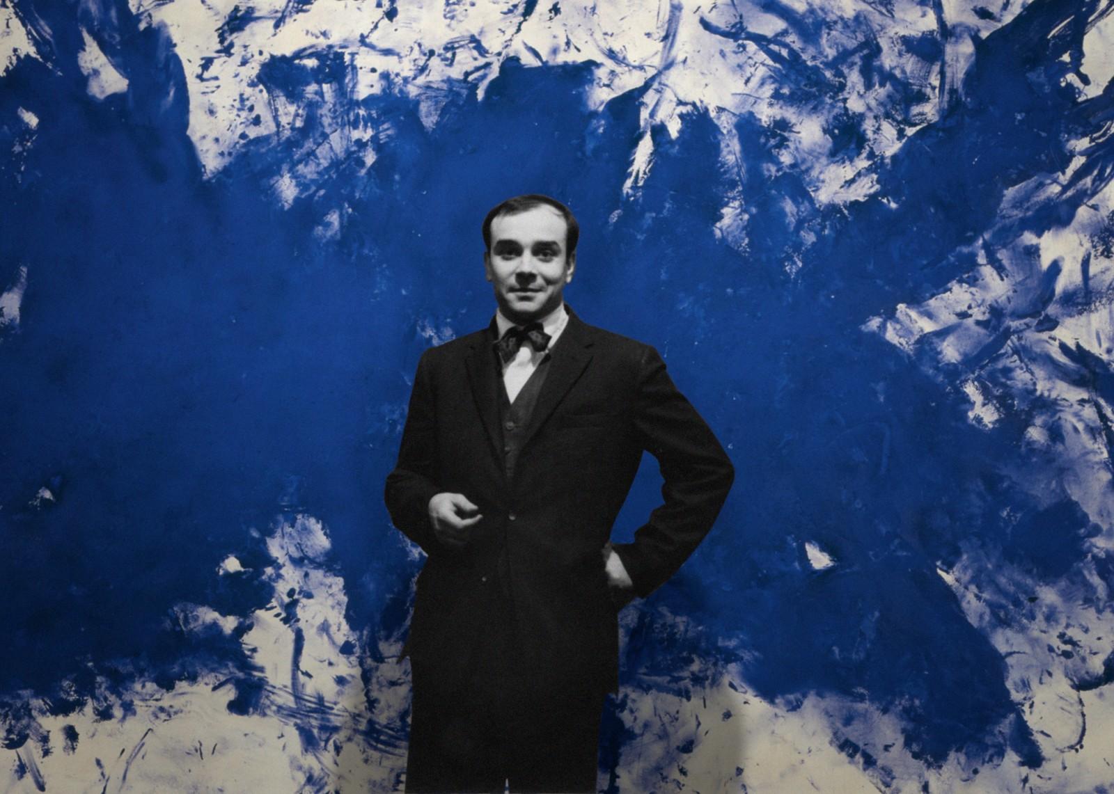
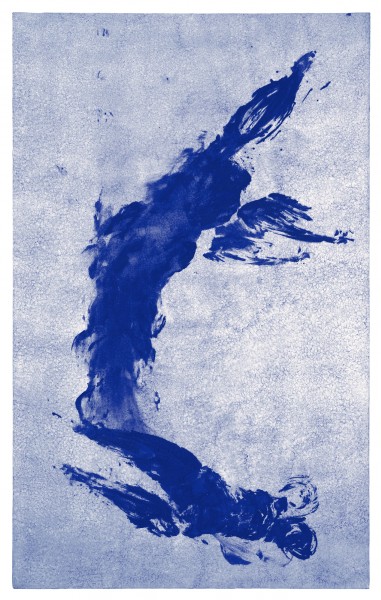
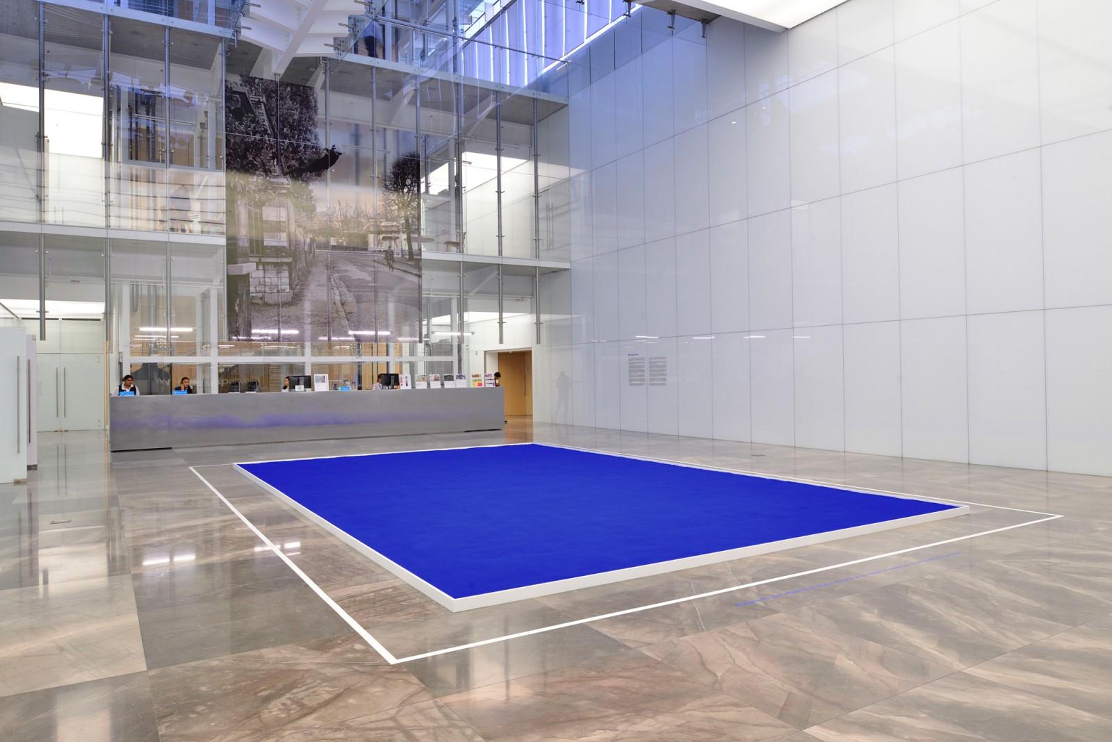
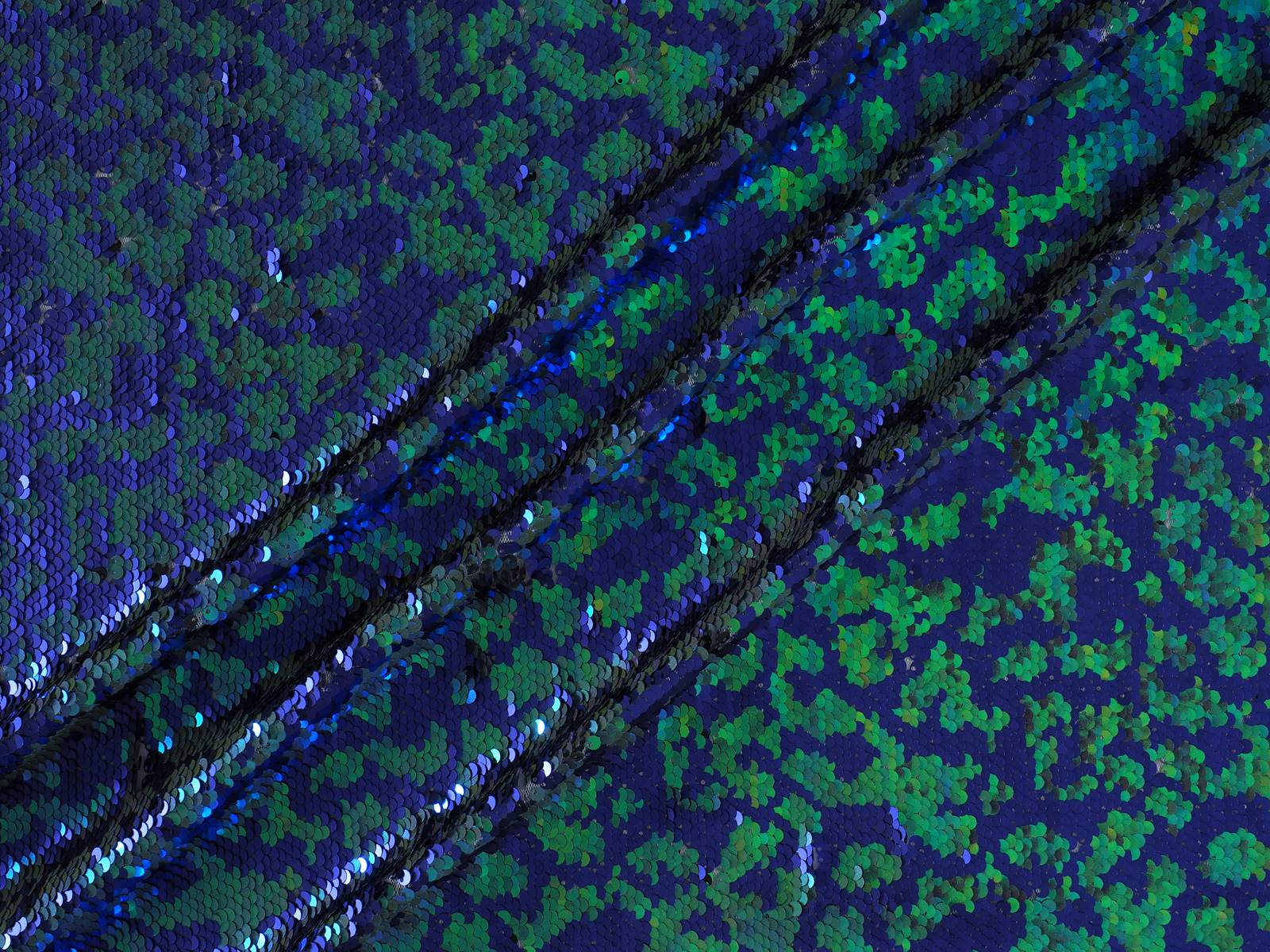
One of these names, that goes into the history of art for its totally identifiable chromatic fingerprint, was the experimental Yves Klein (Nice 1928-Paris 1962). This versatile artist and showman, was the inventor of a tone that had never existed before. As a ” father ” , he baptized and registered it in 1960 under his own name: International Blue Klein (IBK) . A deep tonality of blue that maintained the visual impact of its prized ultramarine blue, as well as the thicknesses and textures that Klein used to apply on his canvases.
How did this devotion for blue occur?
In several biographies of Yves Klein, it is explained anecdotally that one summer day in 1947, the French artist was with two friends sitting on a beach in Nice in southern France. To kill time, they decided to play a game and spread the world among them. One chose the animal kingdom, another the kingdom of plants and the young Klein examined the infinite blue of the sky and chose the mineral kingdom. That contemplation changed the destiny of his life and when he addressed his friends he announced: “The blue sky is my first work of art.”
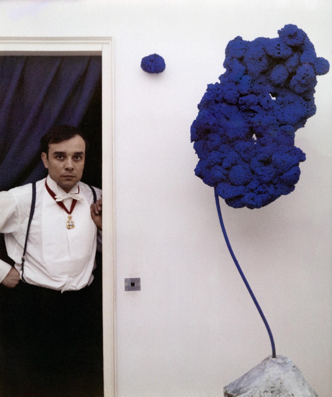
Enchanted by the cosmos and esotericism, the blue symbolized the spiritual, the mystical and the religious, and little by little, this deep tone was gaining ground with other colours present in his work such as gold or rose. It was in 1954 when he began his eclectic paintings of monochrome fields, which at the beginning were of different shades but which he eventually reduced to ultramarine blue. Klein erected around the blue colour an artistic theory that was articulated around two principles: absolute colour and emptiness, that he limited by creating what he called the “zones of immaterial pictorial sensibility.
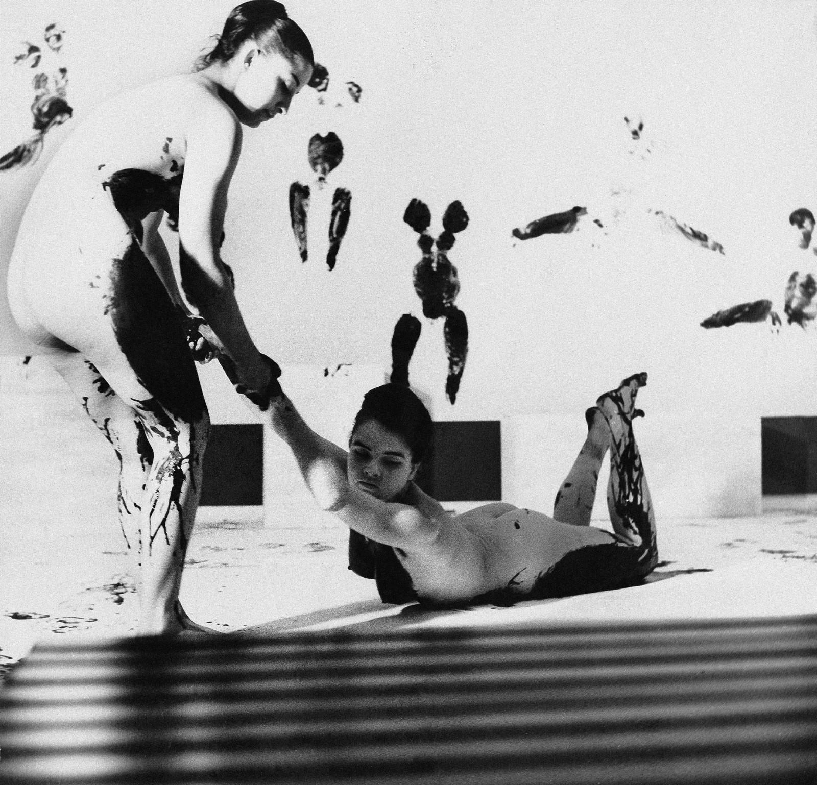
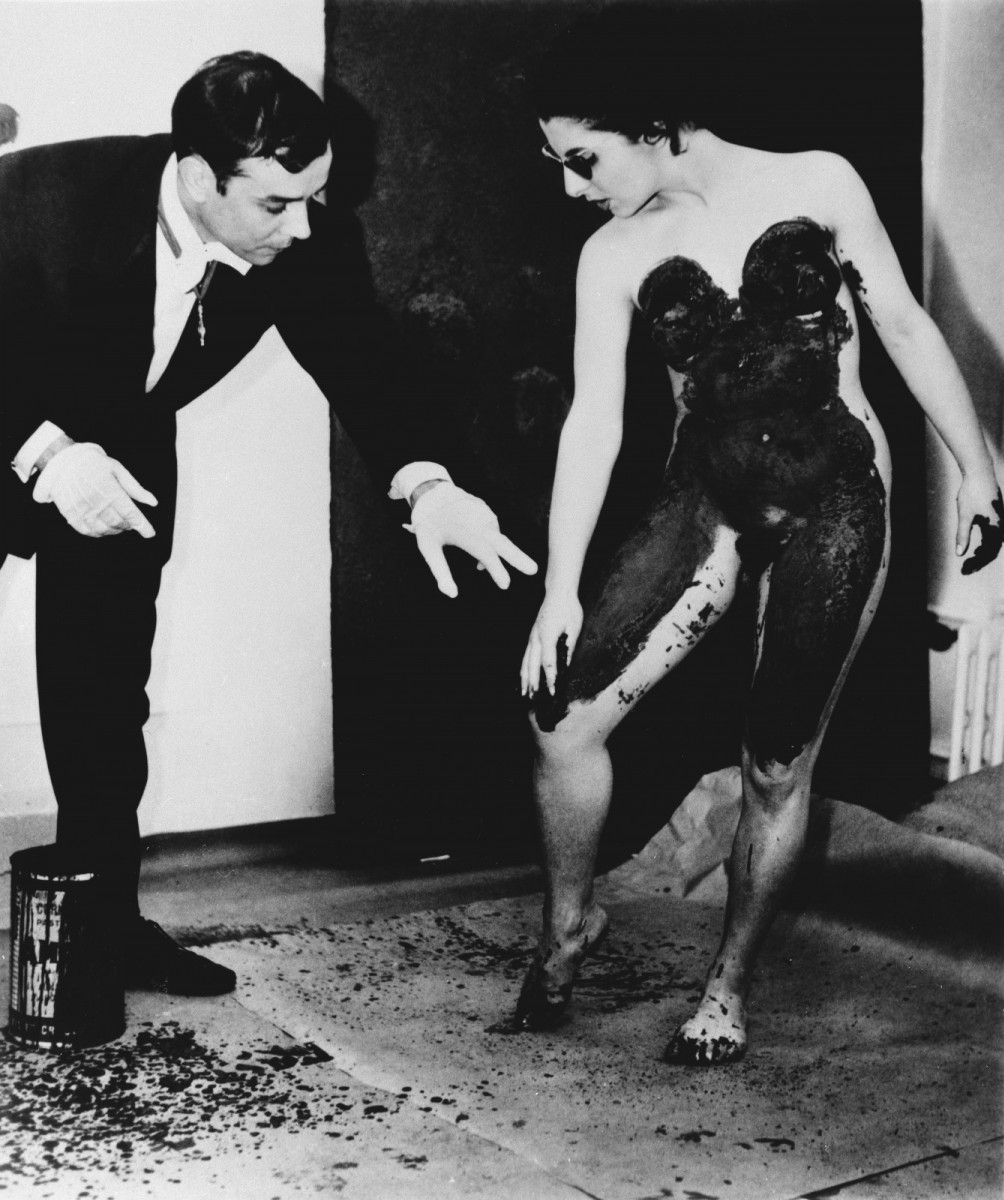
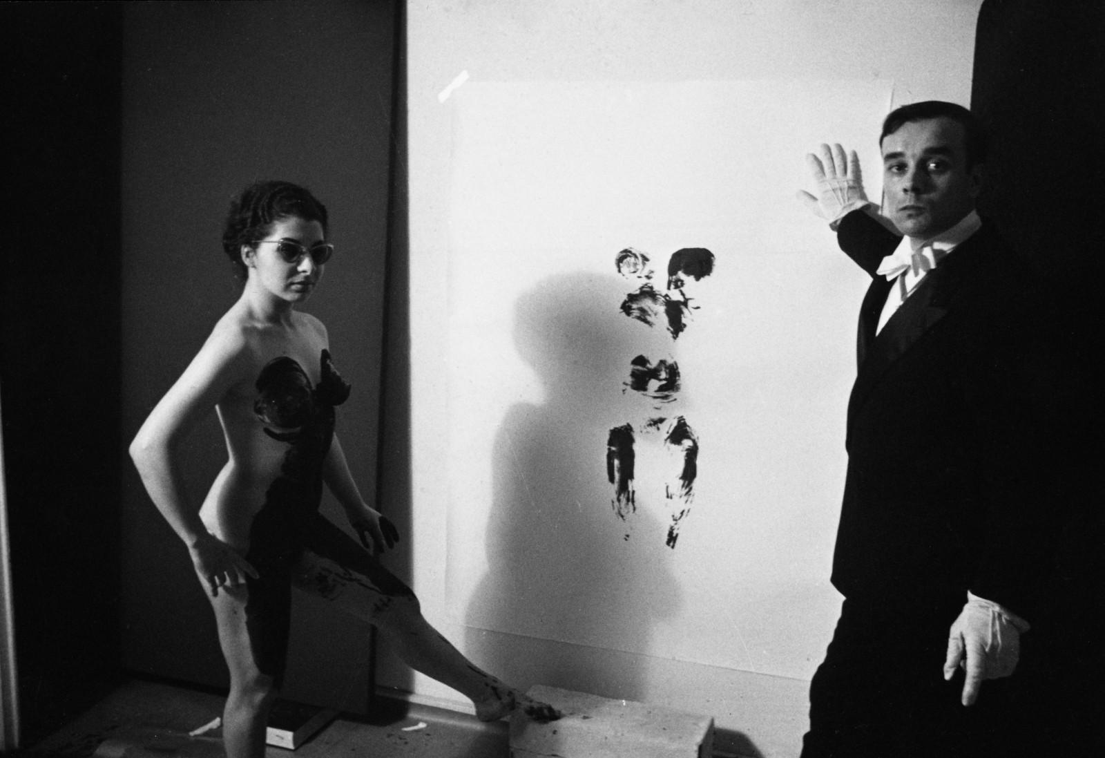
Beyond the blue period and fire paintings, Yves Klein’s artistic career is also known for his Anthropometries, where he explored his most provocative and experimental side with paintings made by nude women that were daubed in IKB blue and turned into a continuation of the artist’s brush when they left the imprint of their bodies on stretched canvases on the wall or floor. Occasionally, he organized authentic happenings with live audiences and musicians who entertained the experimental painting sessions. What today we would call performances.
Yves Klein had a very short but intense artistic career that was especially concentrated during the last eight years of his life. He died in 1962 of a heart attack at only 34 years of age. Despite his youth, Klein defined the course of Western art and its colour, the intense International Blue Klein (IBK) has become immortal, an icon of the legacy of what is considered “the last French artist of great international impact”.
Recognition on the catwalks
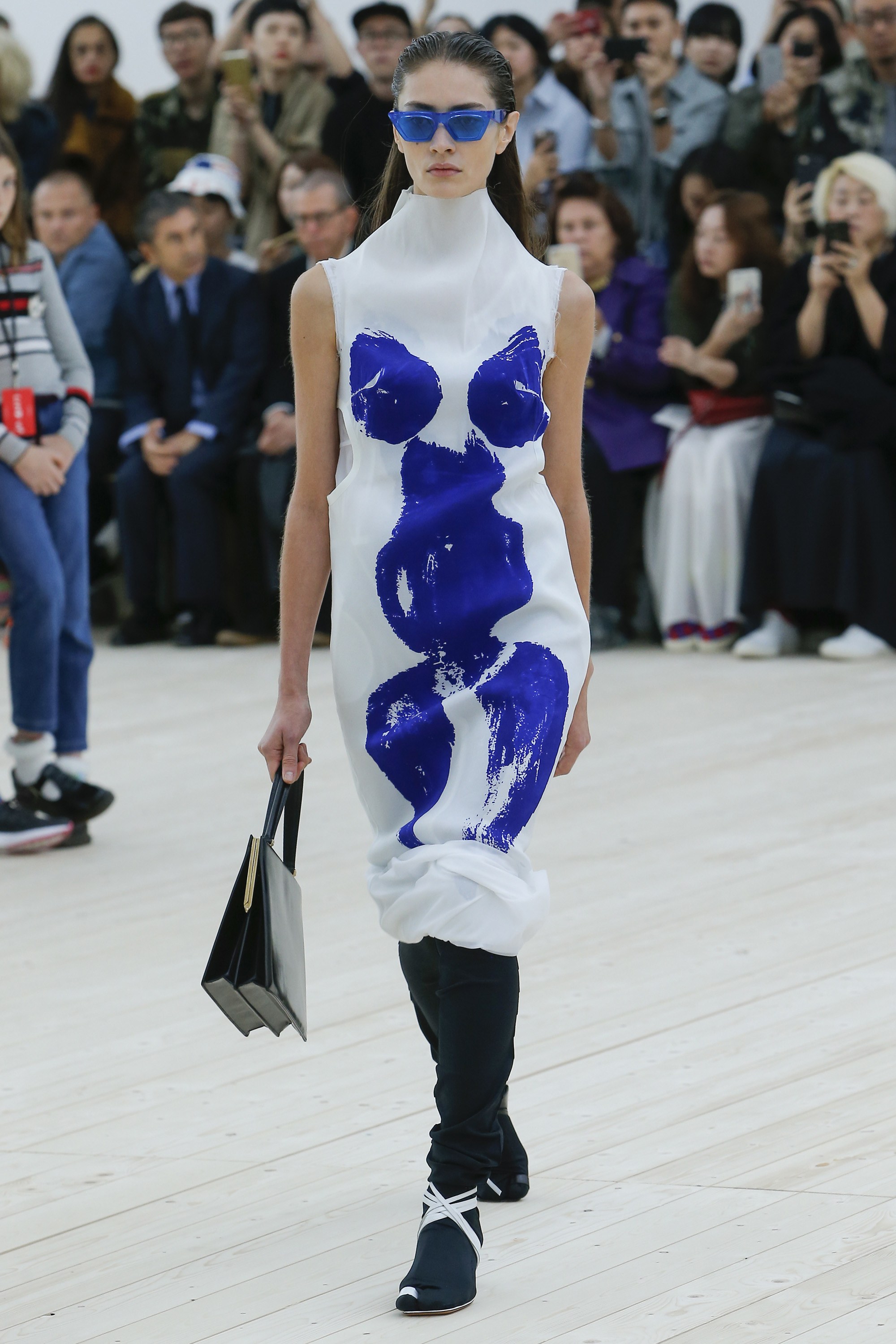
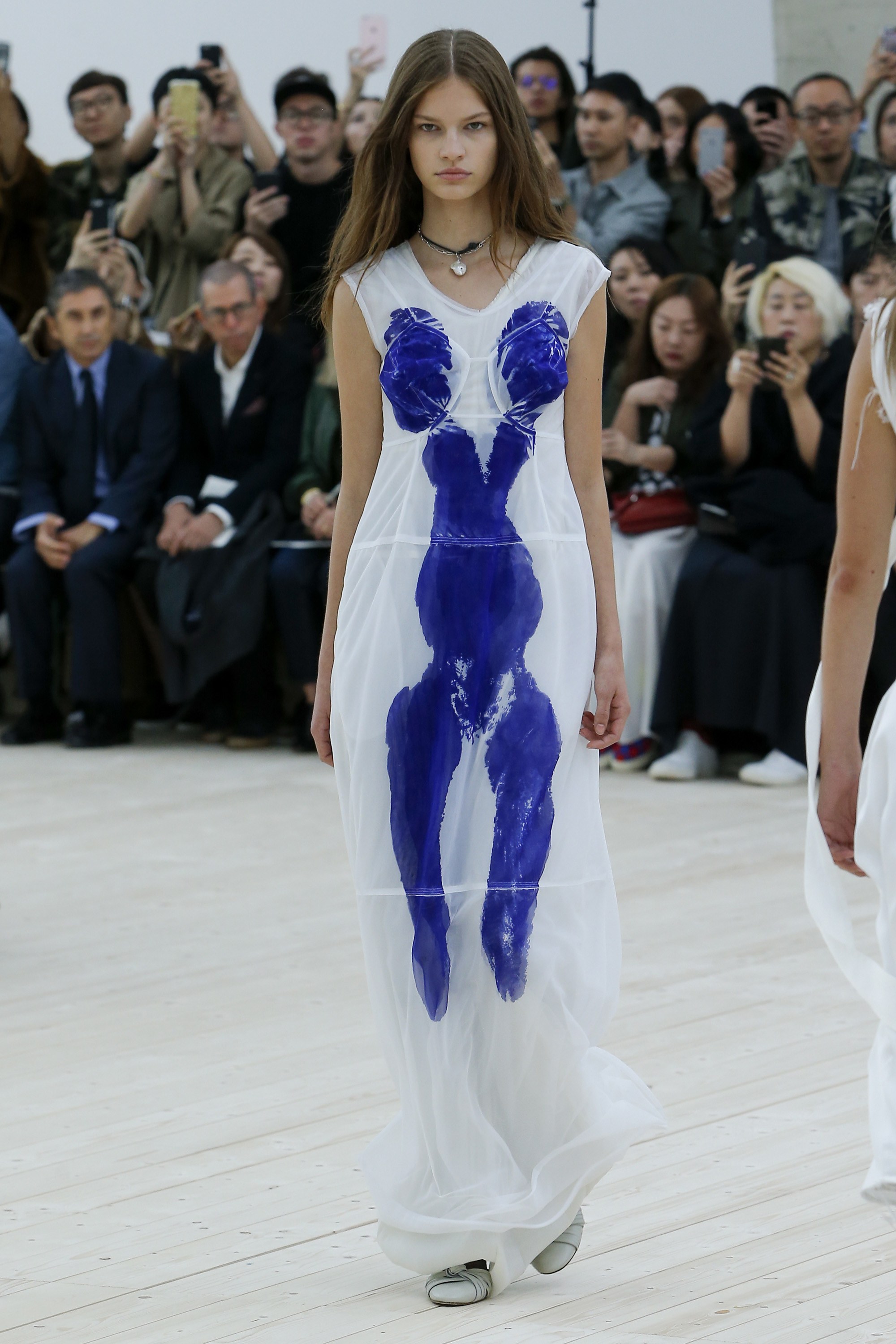
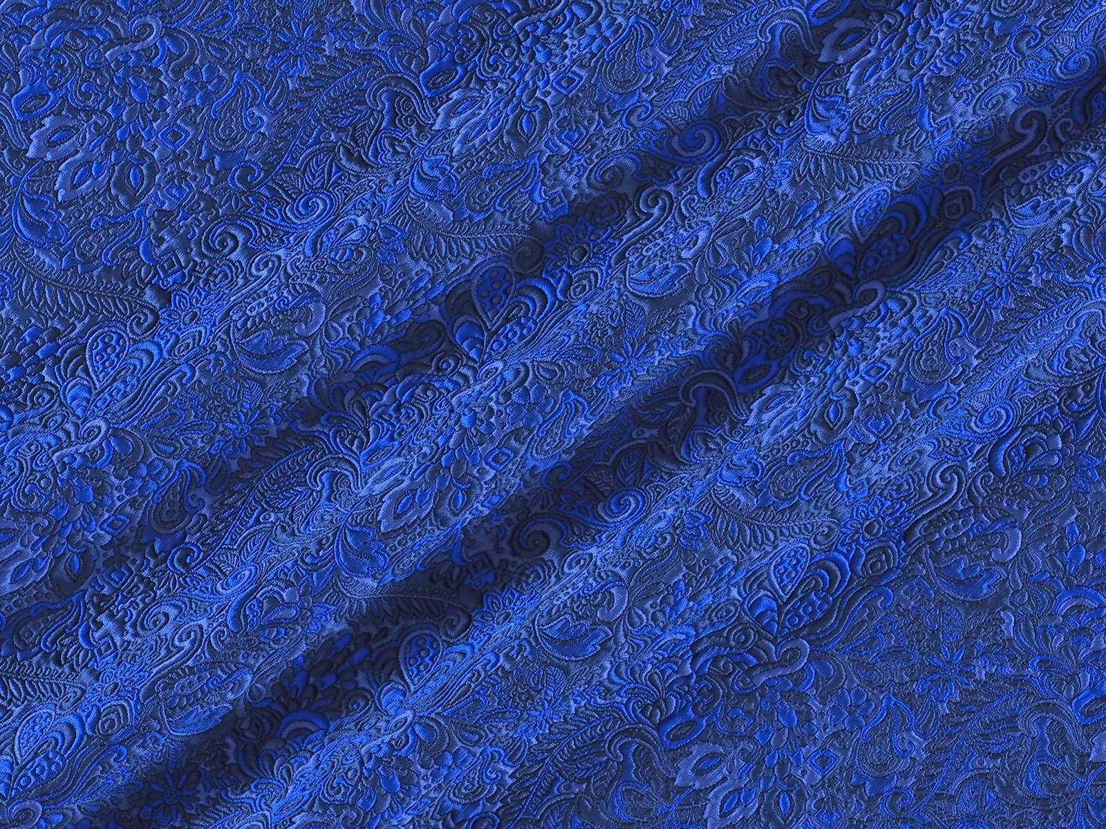
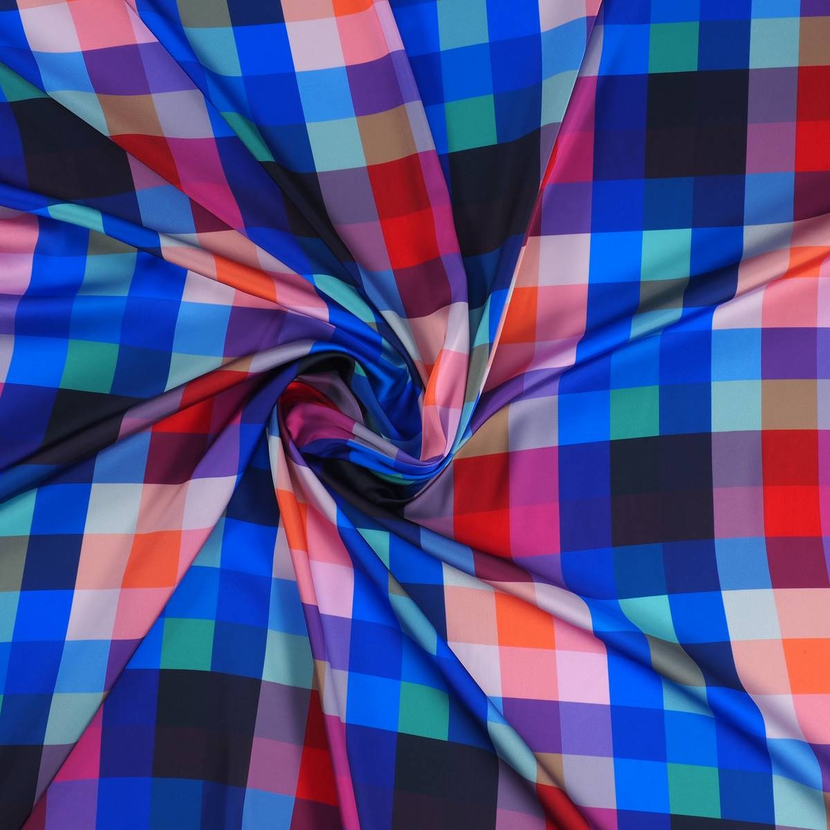
Two years ago, Yves Klein’s Anthropometries were present on the catwalk in Paris with Céline. The creative director at the time, Phoebe Philo wanted to capture in two dresses of the Spring-Summer 2017 collection, the blank canvases with the silhouettes of the bodies of the women that were smeared with Klein blue paint. A recognition of this imaginative creator of contemporary art. From Gratacós, we are fascinated by the vibrant blue of the master Klein and we pay homage through some fabrics of the current collection that capture the intensity of this totally evocative blue.
Sorry, this entry is only available in Español.
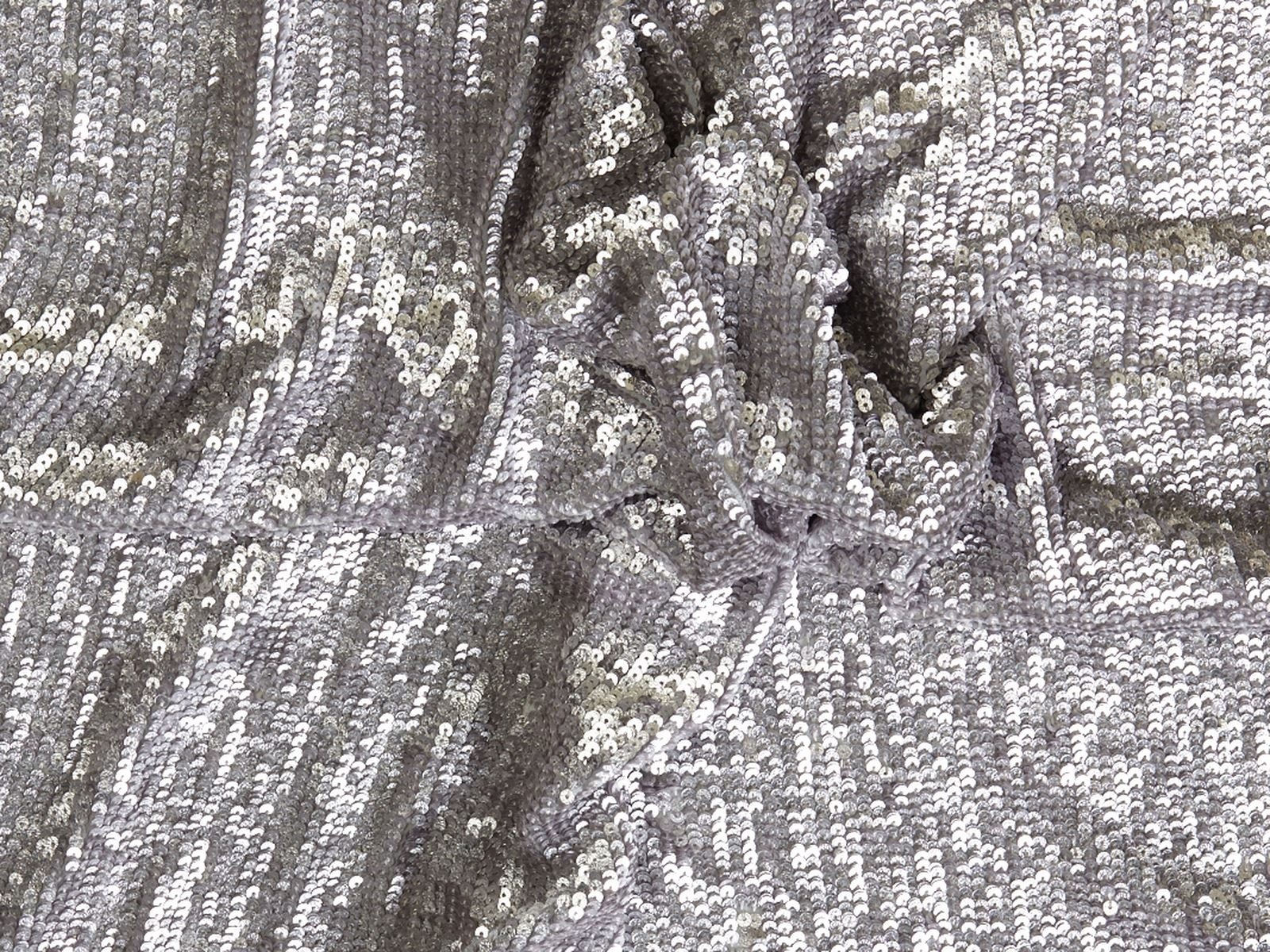
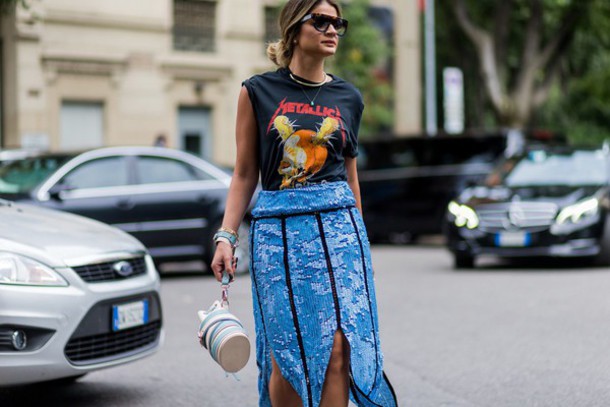
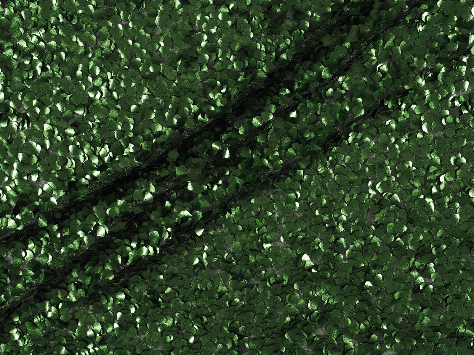
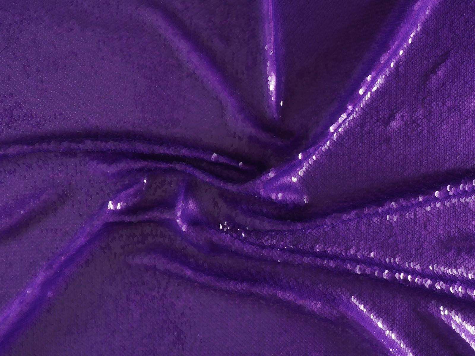
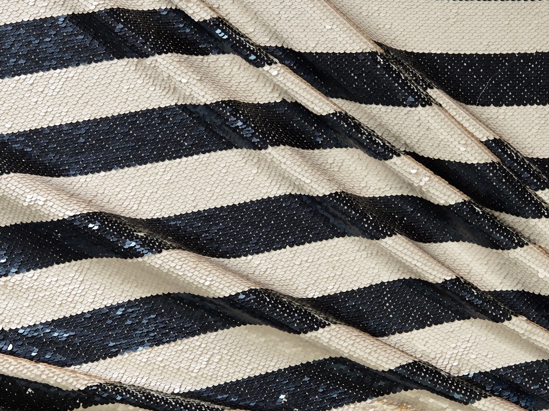
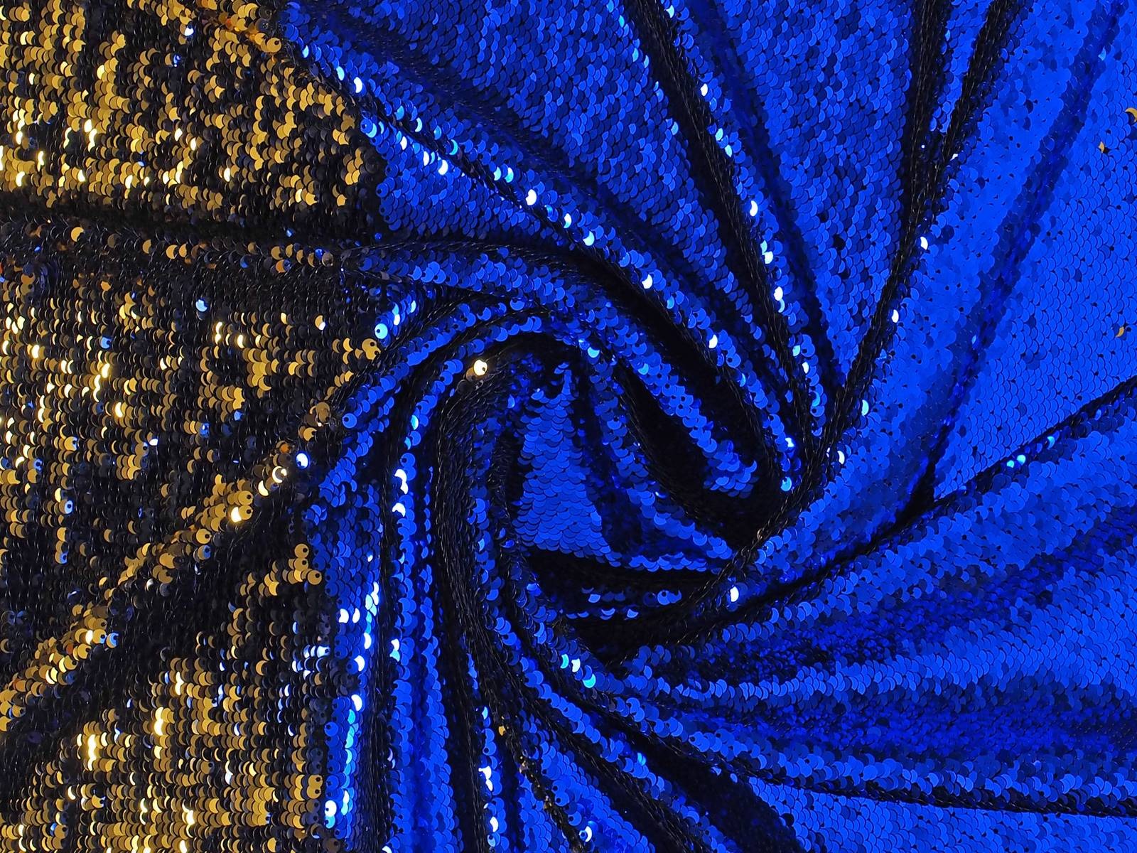
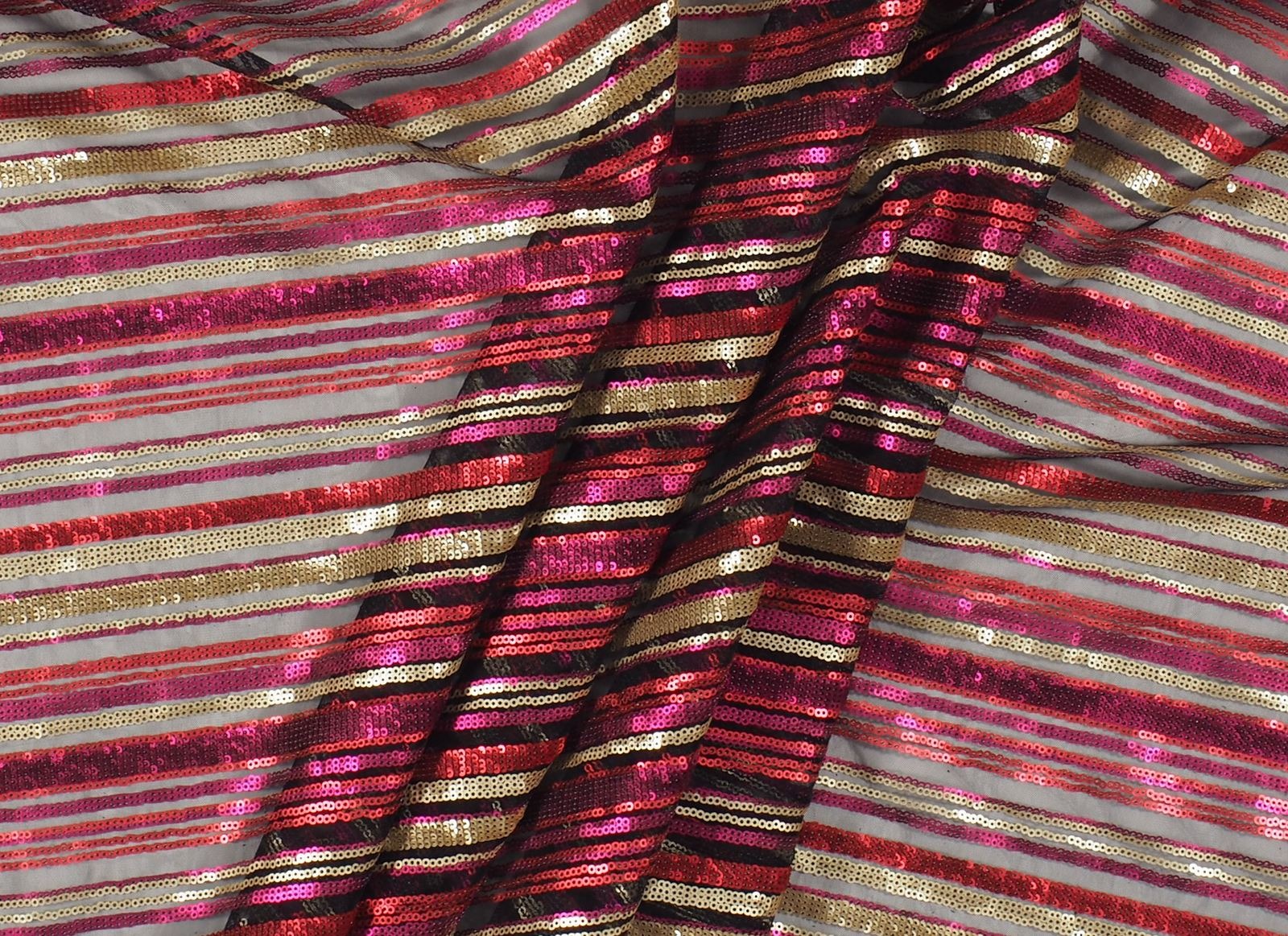
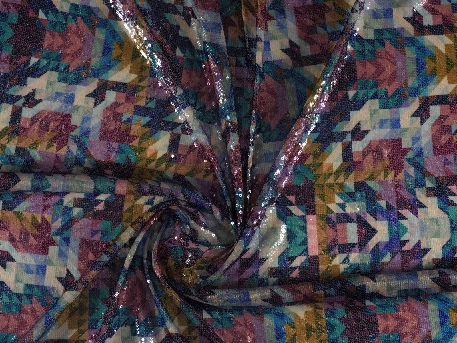
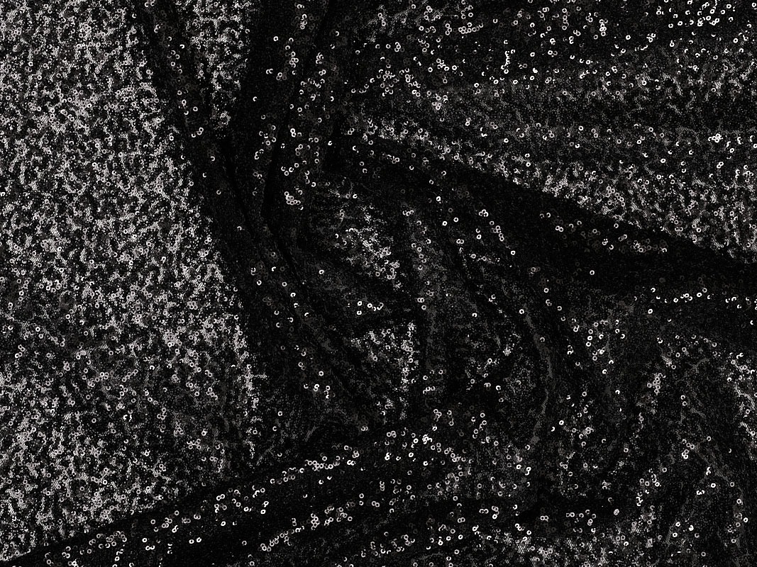
Sequins are not just synonymous with celebration. In any case, we will not deny the opposite either, because it is evident that during the festive periods -mainly between Christmas and New Year’s Eve- it is when they shine at their maximum splendor. But why do we insist on booking this shiny fabric for special occasions?
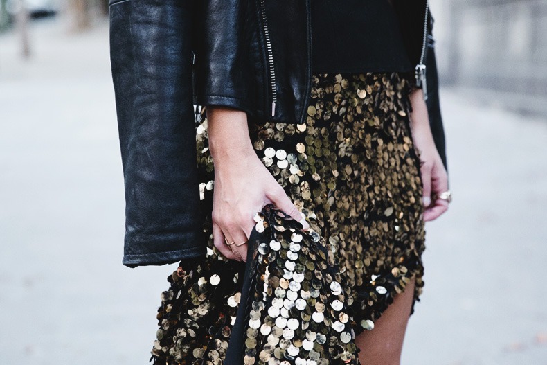
The change has already begun. In recent seasons, we have seen how, little by little, sequins have conquered the ground featuring in the daily outfits of celebrities and prominent personalities from the world of fashion. In various sizes from XS to XL, creating colourful graphic mosaics or blocks of colour, in this transition to street fashion, the sequins have appeared in all its versions to give that radiant air to daily looks.
How to combine these brilliant accounts in day to day wear? The key, more than in the fabric, lies in the garment itself and in the way it is combined. The star garment of the season is the narrow midi skirt. An ideal piece to add shine to a daily outfit without the risk of making mistakes. This garment can be combined with neutral garments such as basic sweaters, white shirts or coats in muted tones, which attenuate the brilliant effect of the sequins. In this way an elegant, daring and youthful outfit is achieved.
Beyond skirts or narrow trousers, you can use other garments with sequins that are also easily combined with a vest top, a shirt or a thin jumper. A trick to integrate it into your wardrobe is to play the overlays: it is an effective resource to combine several garments subtracting the bling bling effect of the sequins.
Finally, there is a garment that maintains all of its power if it is made with sequins: short jackets and blazers. A versatile and useful option for evening wear. To reduce its intensity, it is advisable to wear a black and white look underneath. Even so, its shiny effect means that, with sequins, it never goes unnoticed.
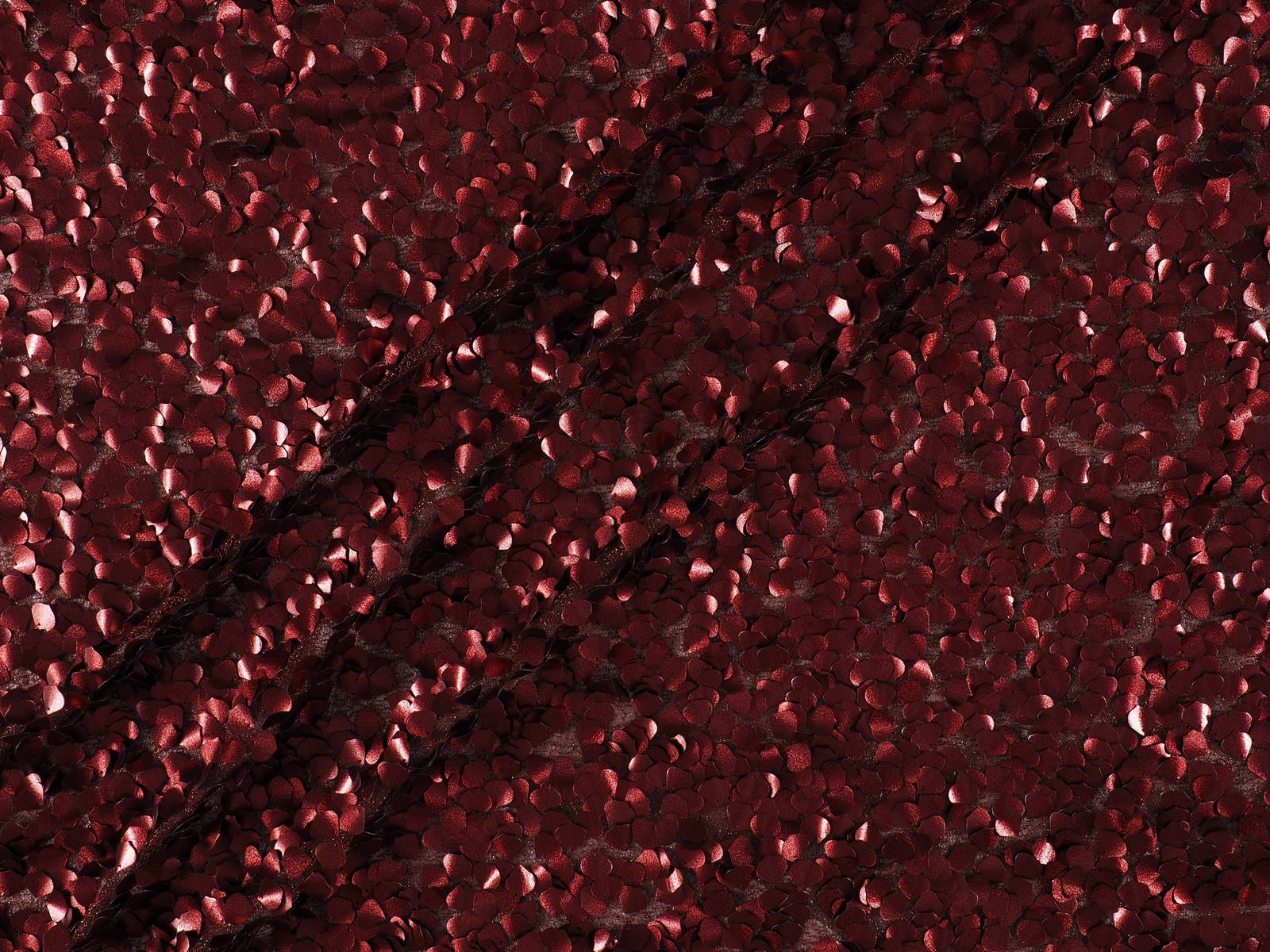
In Gratacós , we have a selection of very varied and colourful sequin fabrics for you to invent with them the garments that will star in the looks of the new season. Imagination to the power!
Sorry, this entry is only available in Español.
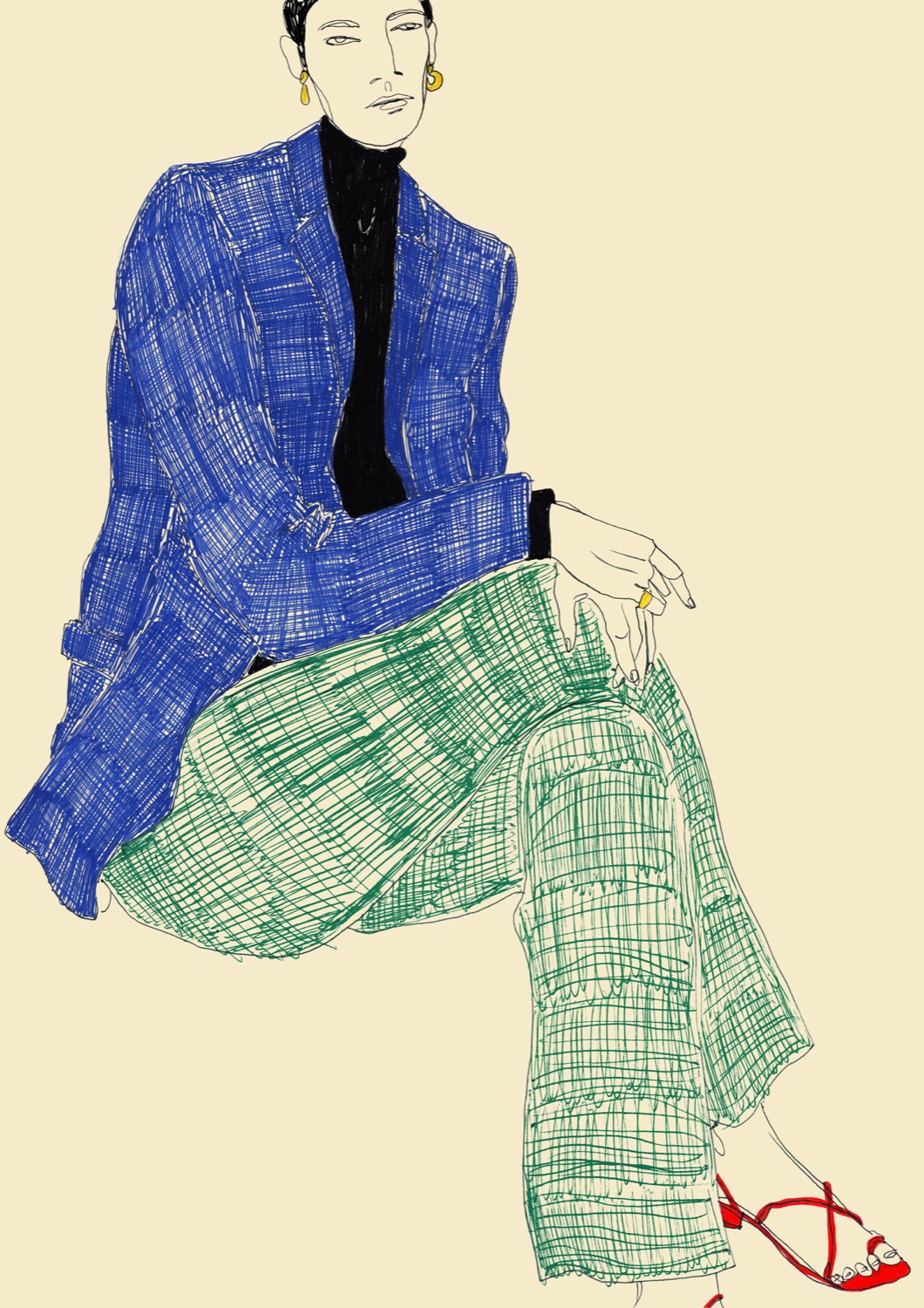
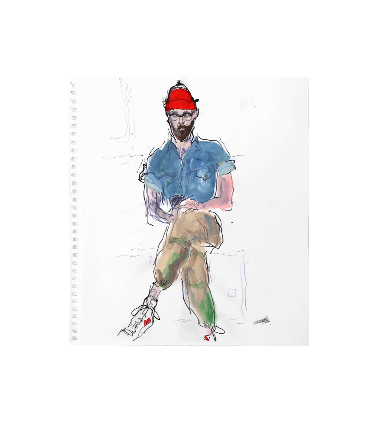
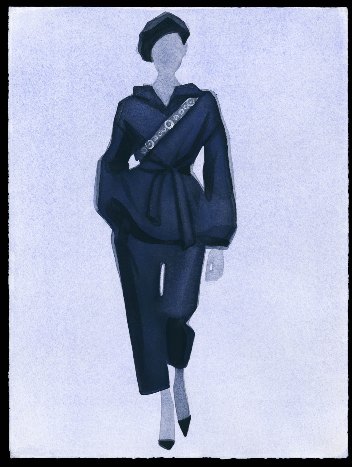
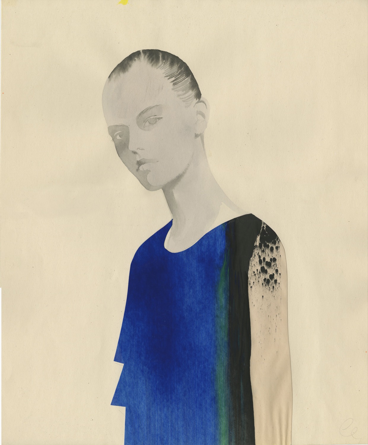
Fashion and illustration have always maintained a very close bond. In fact this alliance is not a new phenomenon. In the last century drawing was used as a vehicle for transmitting trends, shaping the most creative designs in the sector. The illustration creates a visual language that connects with art and provides added values such as originality, authenticity, identity. This discipline is also capable of appealing to consumers, especially young people, who see in the illustration a channel of genuine expression to show a product or a brand.
Currently the illustration is undergoing a golden new era with a batch of artists who translate into advertisements, campaigns, collections, lookbooks, fashion magazines … their unique approaches to the rhythm of the business they represent, increasingly innovative supports that manage to create that desired surprise effect. These neo-illustrators become known through social networks (especially on Instagram) as a platform for global dissemination of their work. The well-known digital revolution of individual work where each like makes the work of the artist more universal.
This boom has also led to the fact that, in recent years the line between art and fashion illustration has faded and these creators no longer become described with the adjective “commercial”. Today, many contemporary art collectors are desperately searching for original works by these illustrators, while at the same time specialized art galleries are emerging. It is the moment for claiming fashion illustration as an art form in itself.
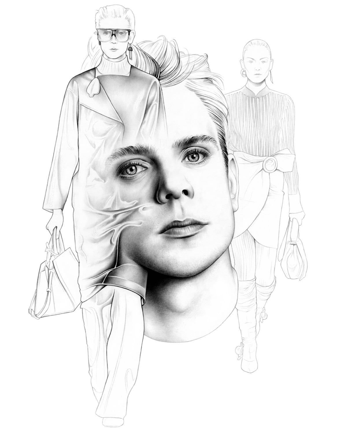
Aware of this new boom and power, the ABC Museum has promoted an exhibition that covers the phenomenon closely. Thus, under the title ‘Fine stamp. Illustration and fashion ‘, the exhibition includes a total of twenty-two artists (national and international, emerging and established) who work with illustration and the catwalk, with more than 150 original works on display. “It is the moment for claiming fashion illustration as an art form in itself, and what better than coinciding with its Second Golden Age and bringing together those creators who have revolutionized the sector in recent decades” said Jesús Cano, curator of the exhibition.
“It’s the moment for claiming fashion illustration as an art form in itself”
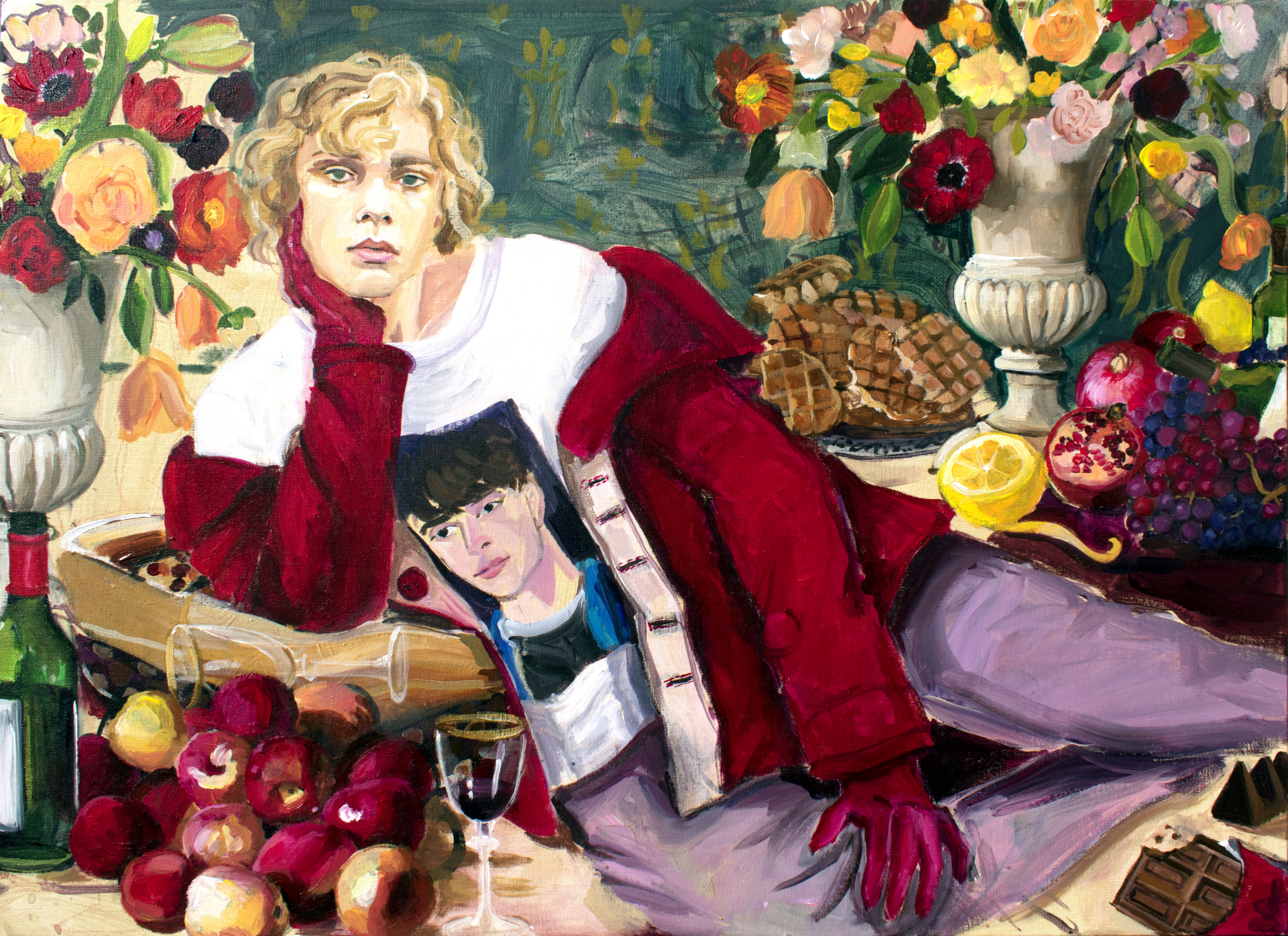
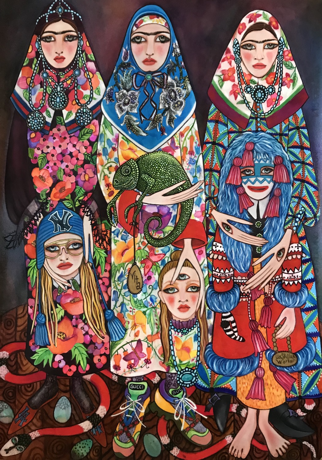
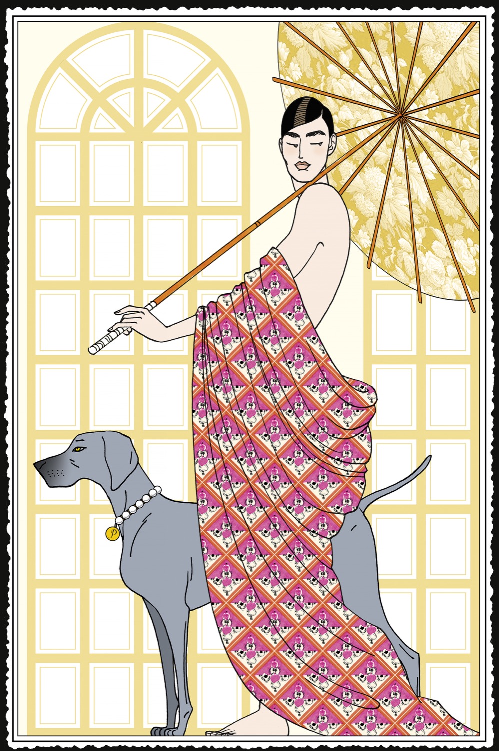
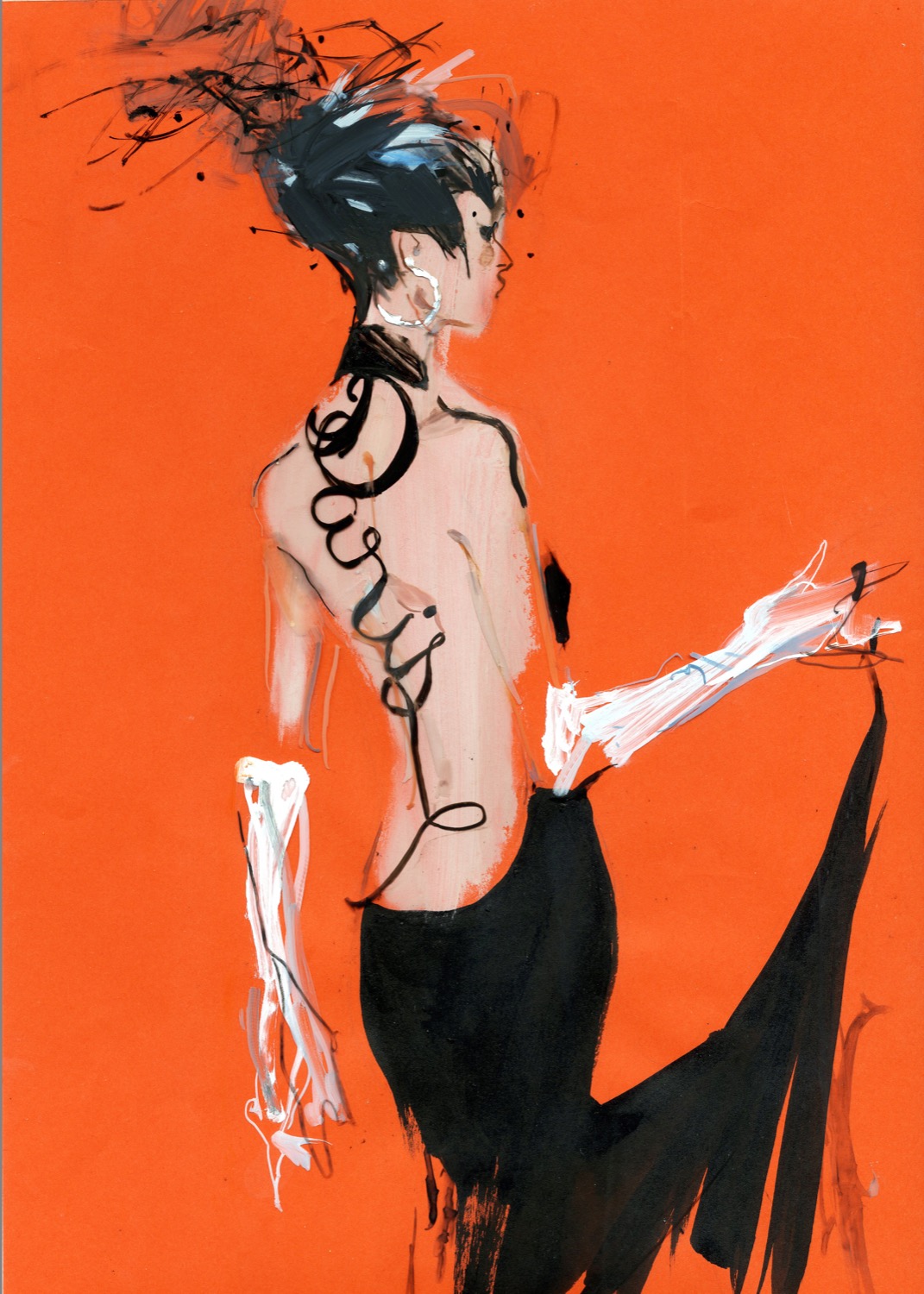
The story begins with the companies of maestros such as Mats Gustafson, David Downton, Aurore de la Morinerie, François Berthoud, Jean-Philippe Delhomme, Unskilled Worker, Gill Button, Hiroshi Tanabe, Jason Brooks, Tanya Ling or Jordi Labanda, and which continues with voices like Ricardo Fumanal, Richard Haines, Jowy Maasdamme or Richard Kilroy. More than half of the selected artists are women who are leading the way. Among them we find names such as Blair Breitenstein, Laura Gulshani, Inés Maestre, Hellen Bullock, Amelie Hegardt, Cecilia Carlstedt or Rosie McGuinness.
The exhibition #FINAESTAMPA_ aims to synthesize this precise moment through works, aesthetics and techniques that are used in the second decade of the 21st century. It is an X-ray of a subjective and abstract discipline that creates emotions and proximity, where the product stops being something physical to turn into an abstract, appetizing and inspirational entity. The exhibition is also a tribute to the personal story of each illustrator featuring in the exhibition.
#FINAESTAMPA_ can be seen from January 15th to May 19th at the museum’s headquarters and is part of the official programme of the second edition of the Madrid Design Festival.
Sorry, this entry is only available in Español.
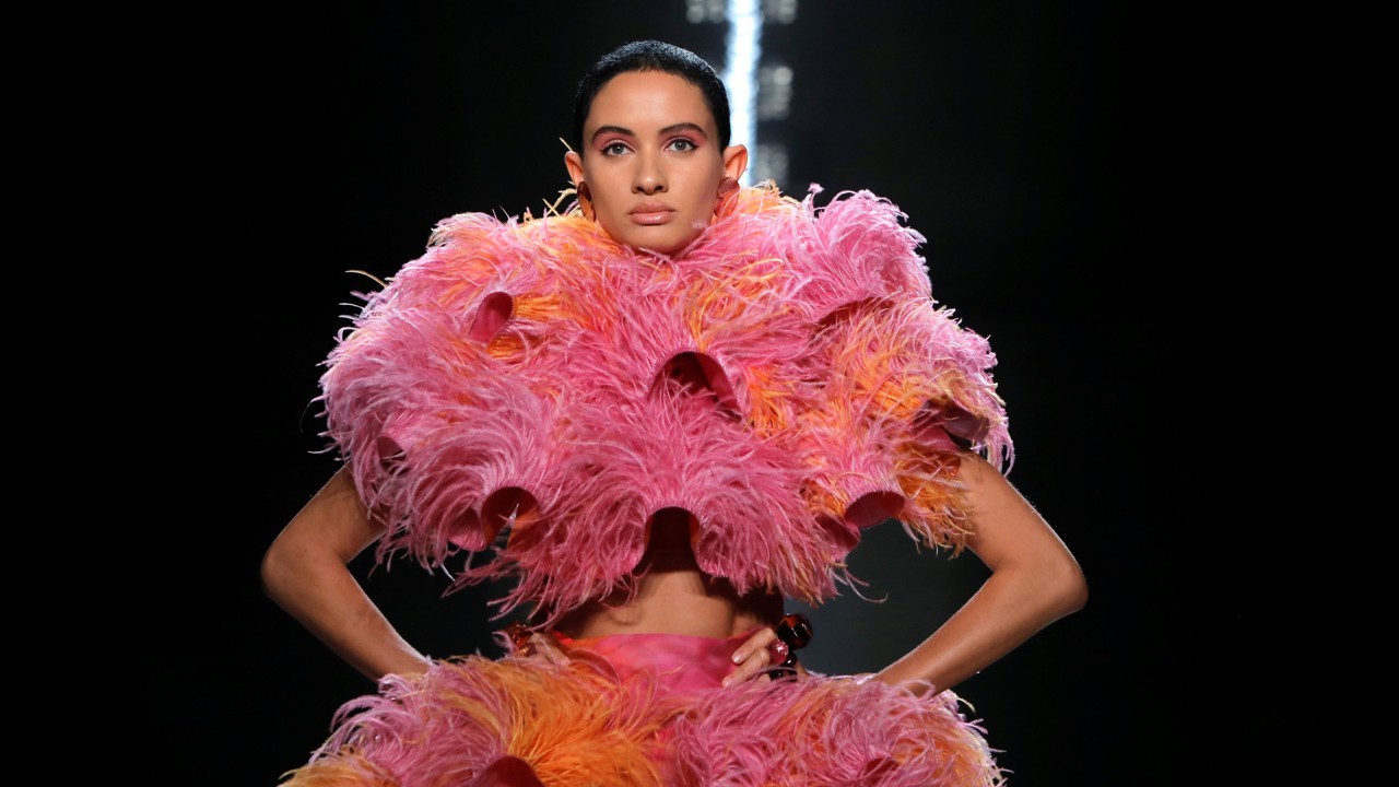
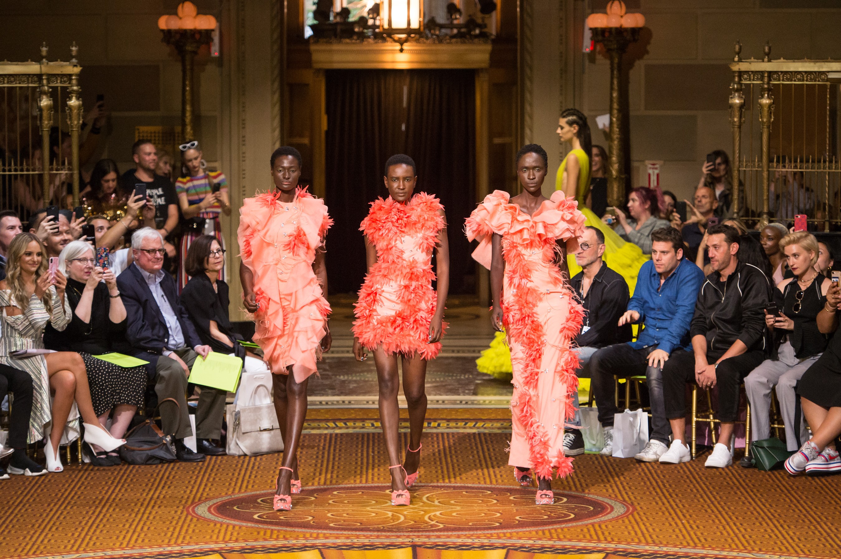
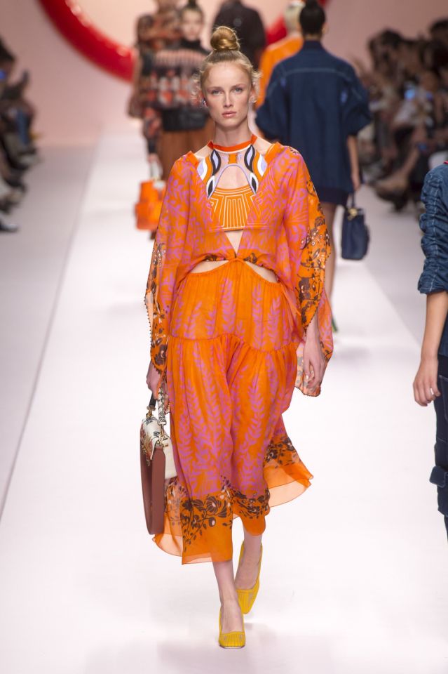
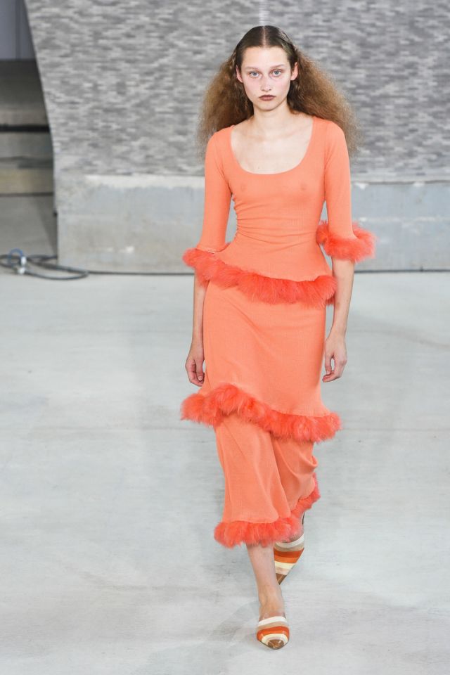
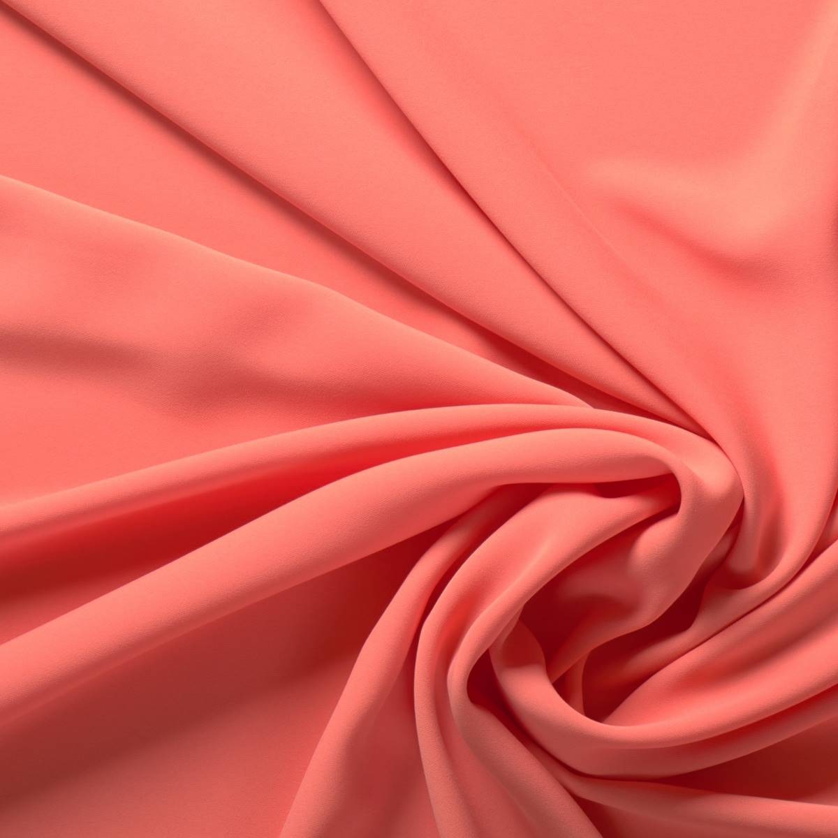
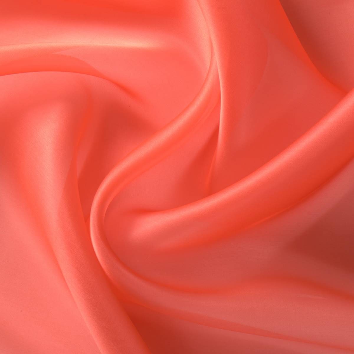
Once again we say goodbye to the year with a new colour that will be a reference for the next one. According to Pantone, the shade of influence in 2019 will be ‘Living Coral’, a particular orange-pink that as the name suggests refers to living coral and highlights the beauty, uniqueness and fragility of these marine ecosystems. This hue, Pantone 16-1546, takes over from the violet shade of 2018 (Ultra Violet) or the yellowish green of 2017 (Greenery). Remember that since 2000 the international colour authority has established what will be the shade of the year and this choice directly affects the fashion industry, design, advertising or decoration.
A cheerful colour that connects digital identity with real life
What are the reasons to choose ‘Living Coral’ as the colour of 2019? Although it may seem so, the decision is not random, but the result of a thorough analysis and research in the field of global trends affecting several sectors and which are present within a current social and economic context. They are varied influences that may come from new technologies, the entertainment industry, collections of art, fashion, popular destinations, the environment or lifestyles …
 |
 |
The company, founded in New Jersey in 1962, commercializes standardized colour samples and in a statement has explained that ‘Living Coral’ is a shade that “provides comfort and stability” and is “full of warmth and encouragement” to a society in constant change in the face of “the onslaught of digital technology and social networks that are increasingly incorporated into everyday life “. The cheerful and lively tone symbolizes “the search for immersive authentic experiences, which in turn permit connection and intimacy”. In this context the coral tone symbolizes the union of opposing concepts that interrelate with each other: the social connection with human interaction . It links digital identity with true identity via “a lively cheerful shade with a golden hue, that imparts energy and vitality while maintaining a smooth finish.” The executive director of the institute, Leatrice Eiseman also points out that this colour “symbolizes our innate need for optimism and the search for happiness”.
 |
 |
From another point of view it is clear that this hypnotizing colour also evokes the coral reefs that shelter a multitude of marine species “in a diverse kaleidoscope of colour,” according to Pantone. From an environmental perspective ‘ Living Colour ‘ symbolizes the fragility of these ecosystems and the devastating effect of today’s society on nature.
Vibrant coral in the new collections of fabrics
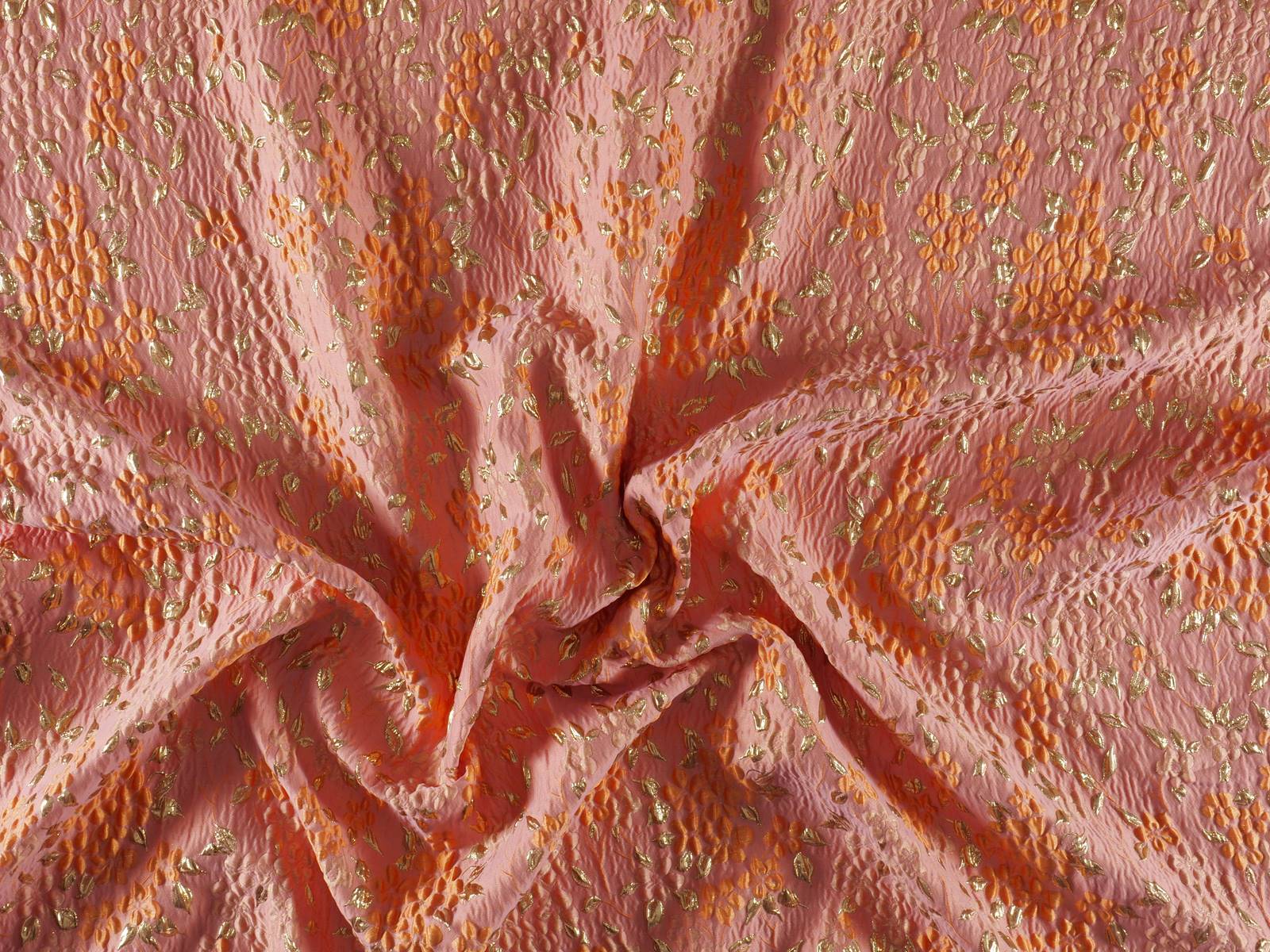
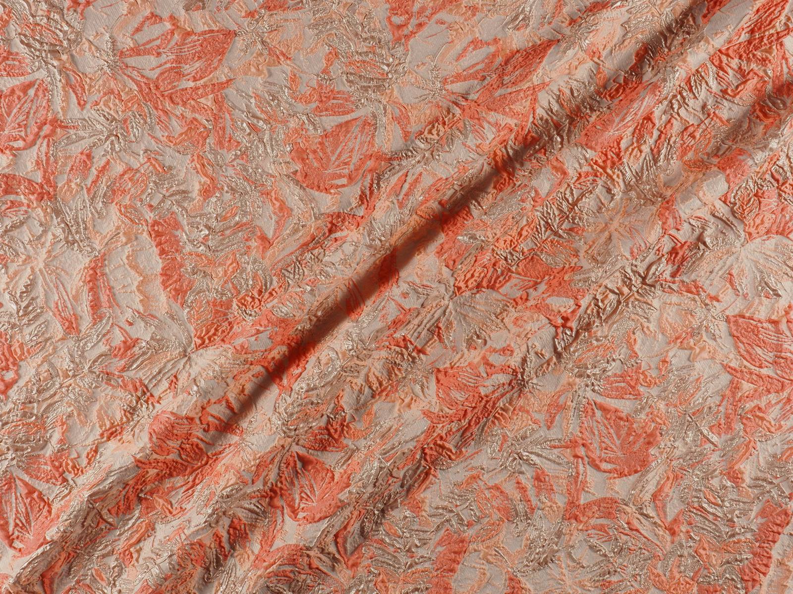
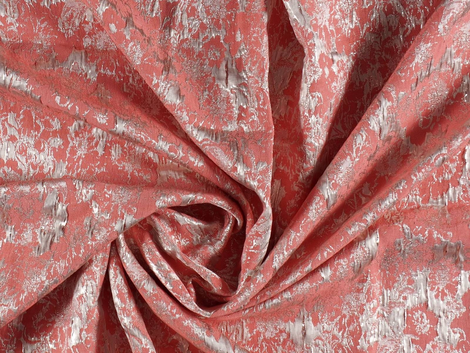
In Gratacós we also pay homage to vibrant ‘Living Coral’ via the new collections of fabrics. Silky textures, bright finishes that capture that golden brush-stroke, floral Jacquards full of brilliance or soft matt reliefs … Find them on our website or ask for them in our shop in Barcelona. We are waiting for you!
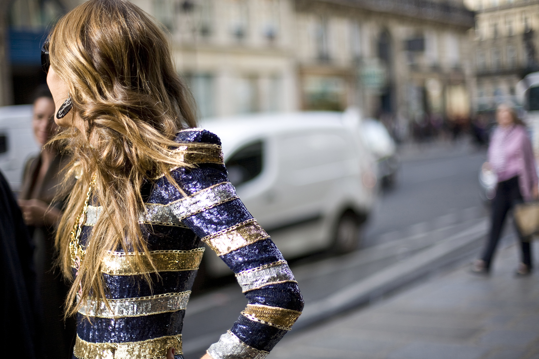
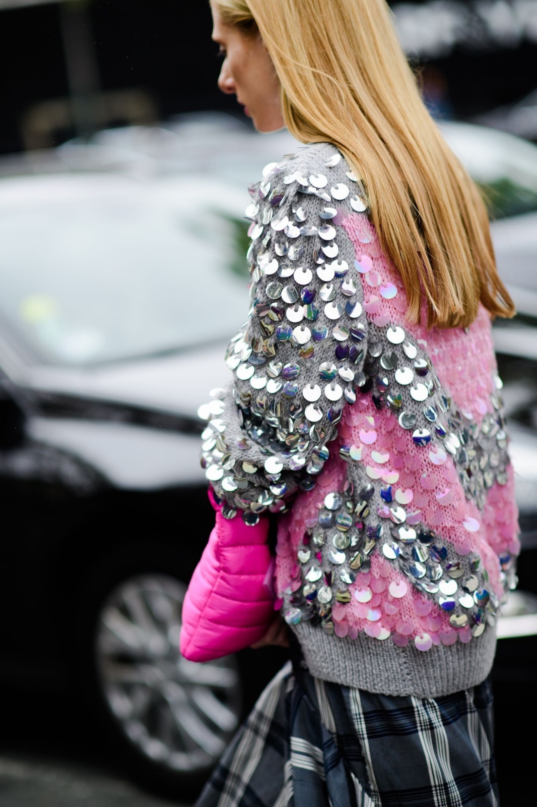
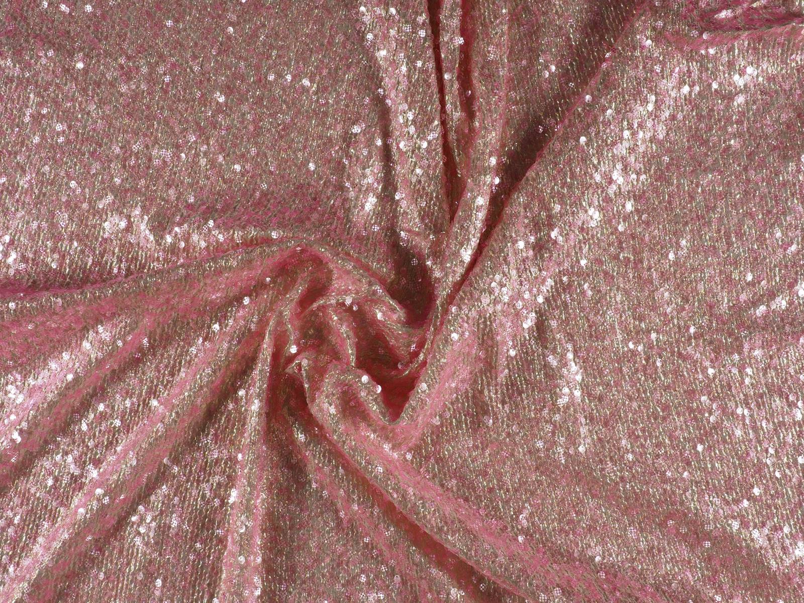
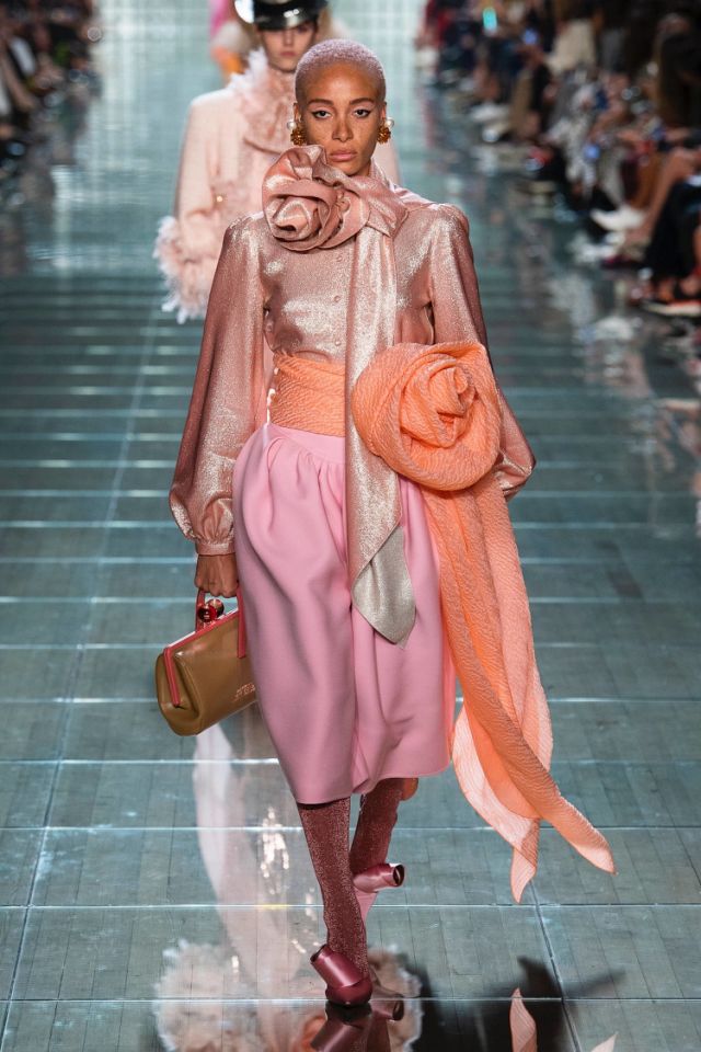
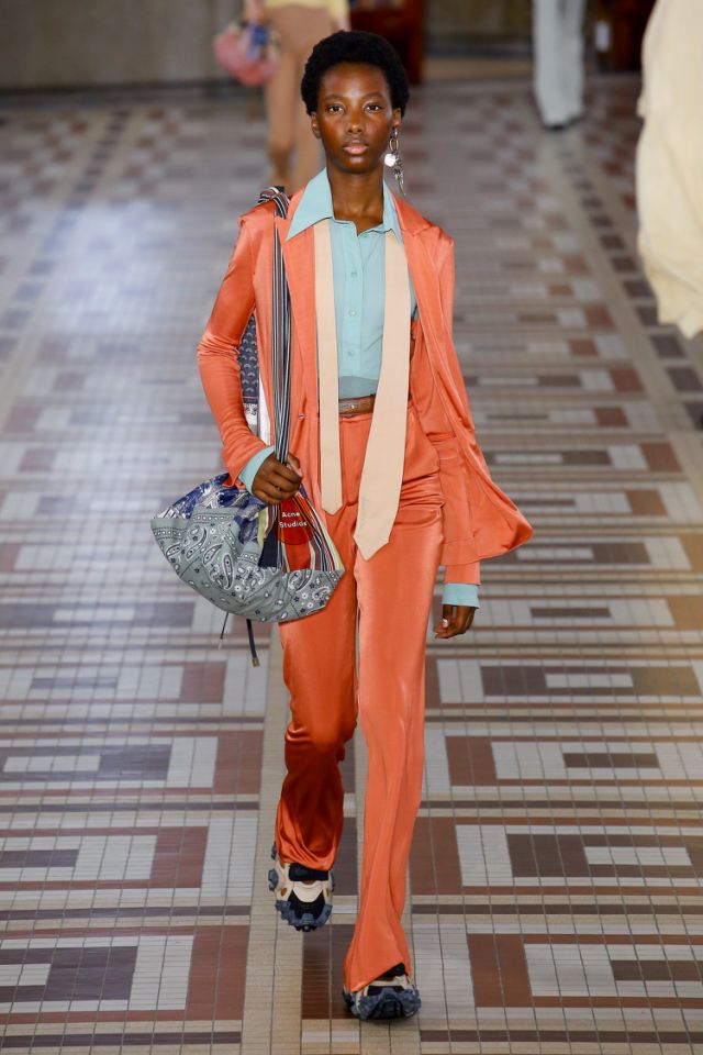
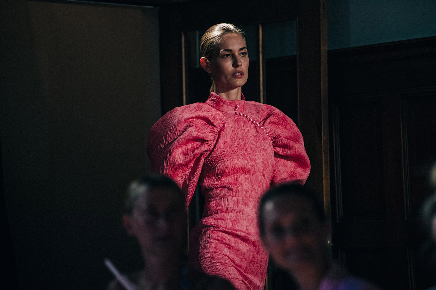
These are good times for metallic shades, which acquire their own identity within fashion, beyond their traditional connection with parties, luxury and excess. Thus in the past seasons we have seen how metallic fabrics have gradually taken over the catwalk in garments, accessories and complements that embrace a more casual style, exploring the urban and the sporty in an aesthetic festival that interweaves contrasting forms and volumes.
Yet the proximity of the Christmas season almost “forces us” to recover the conventional facet of metallic tones because it is precisely at this time of year when they have more presence within the festivities. From among all the fabrics that radiate their own light we are focusing on the two brilliant colours par excellence that are sometimes opposed: gold and silver.
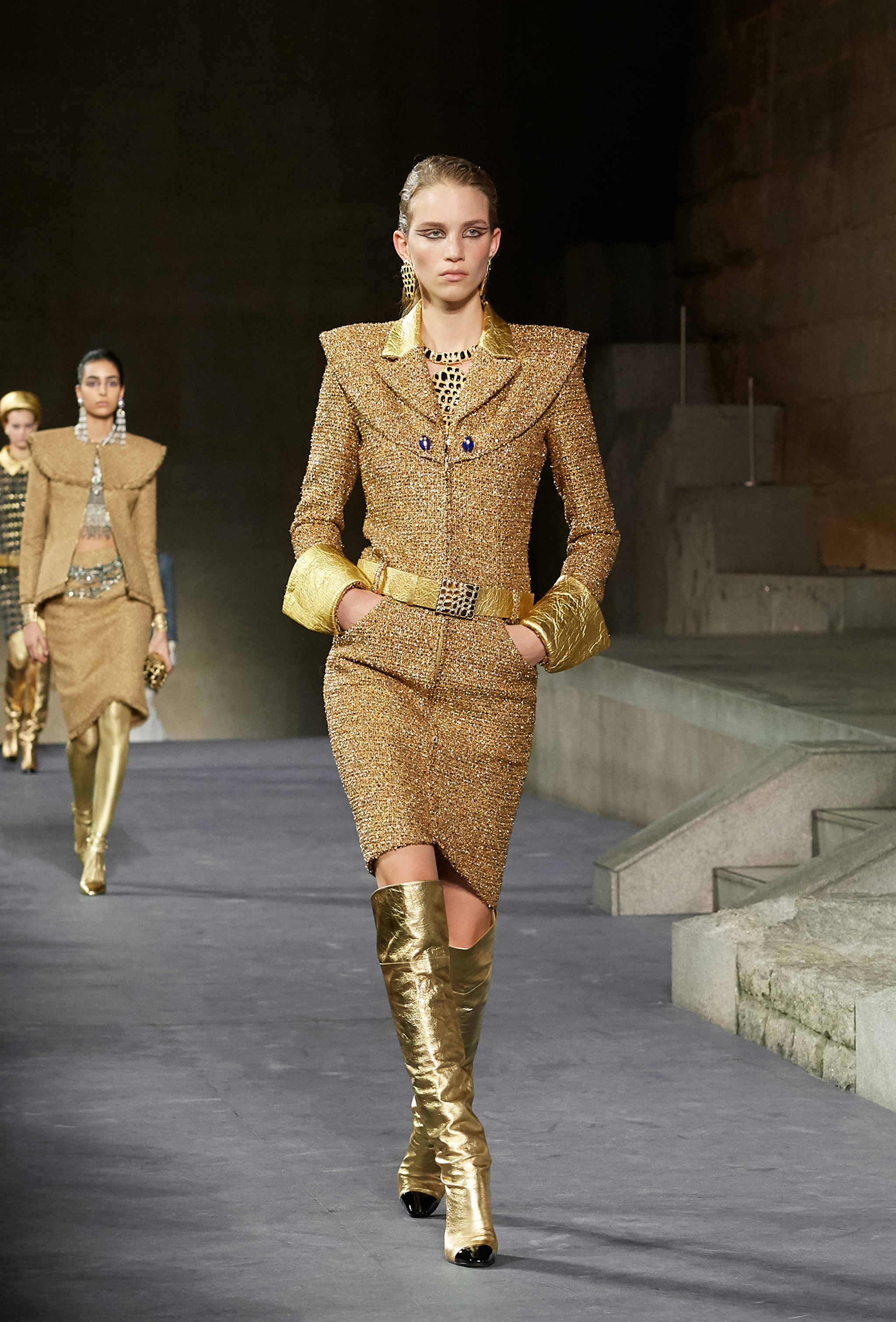
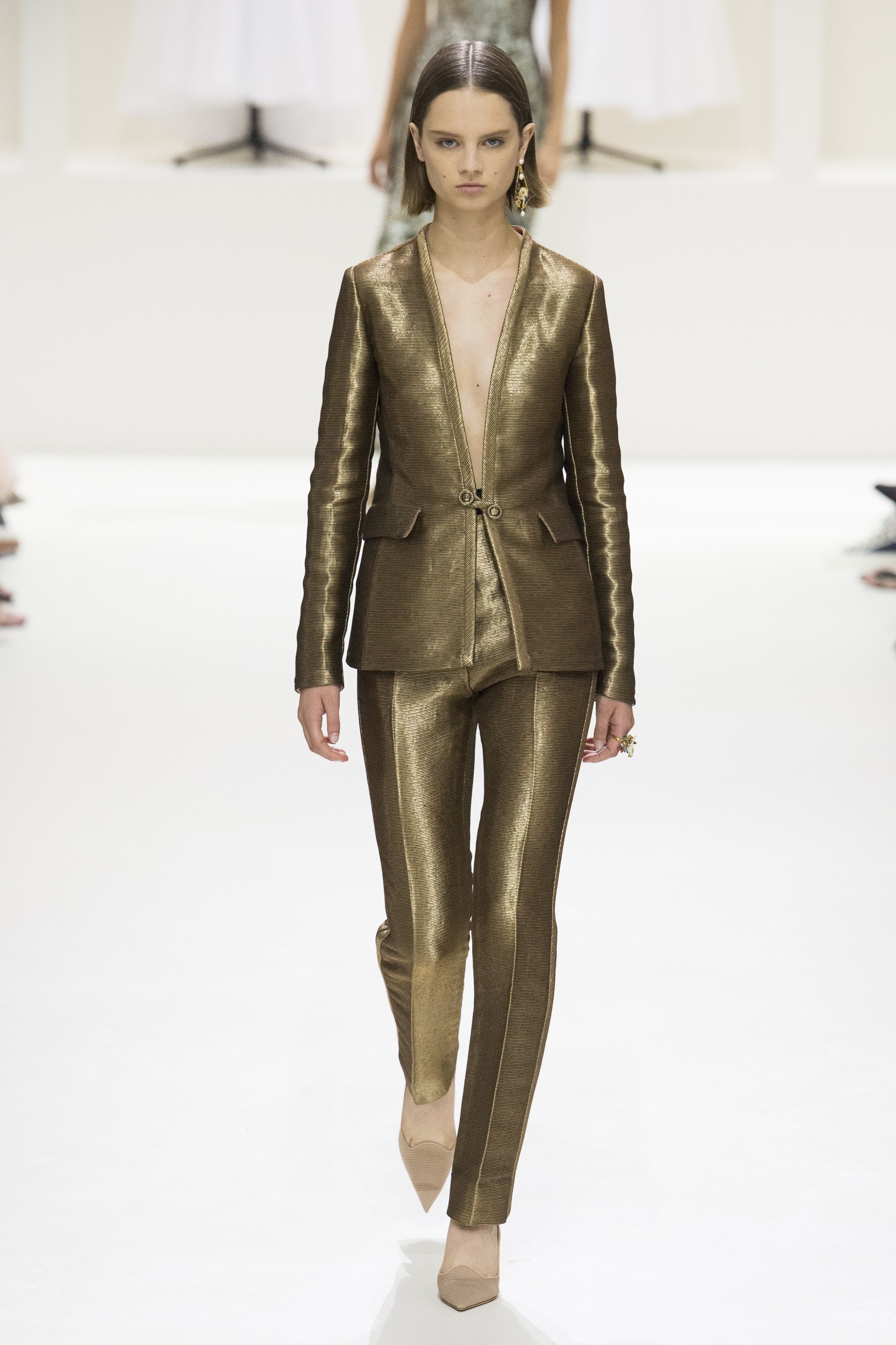
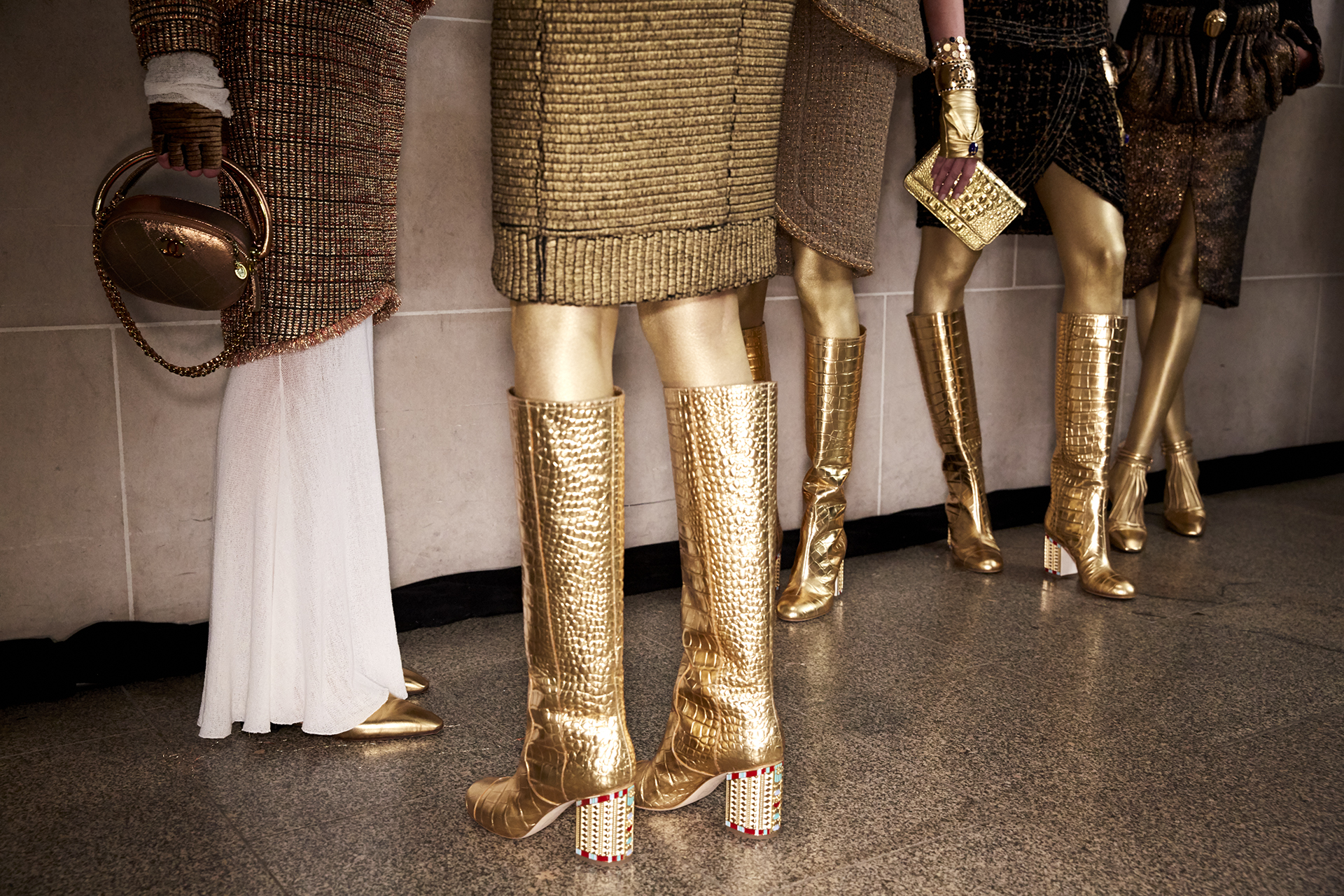
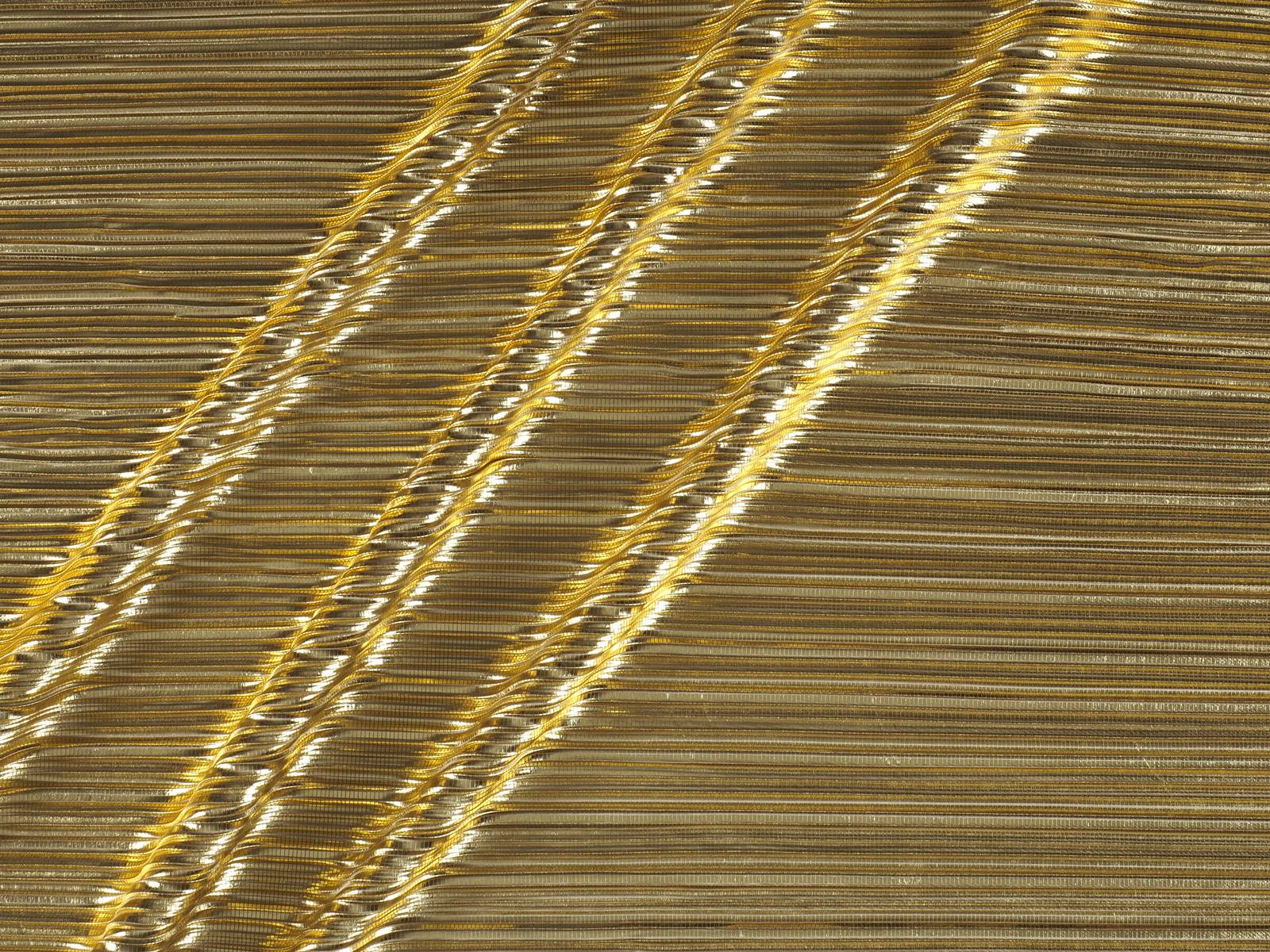
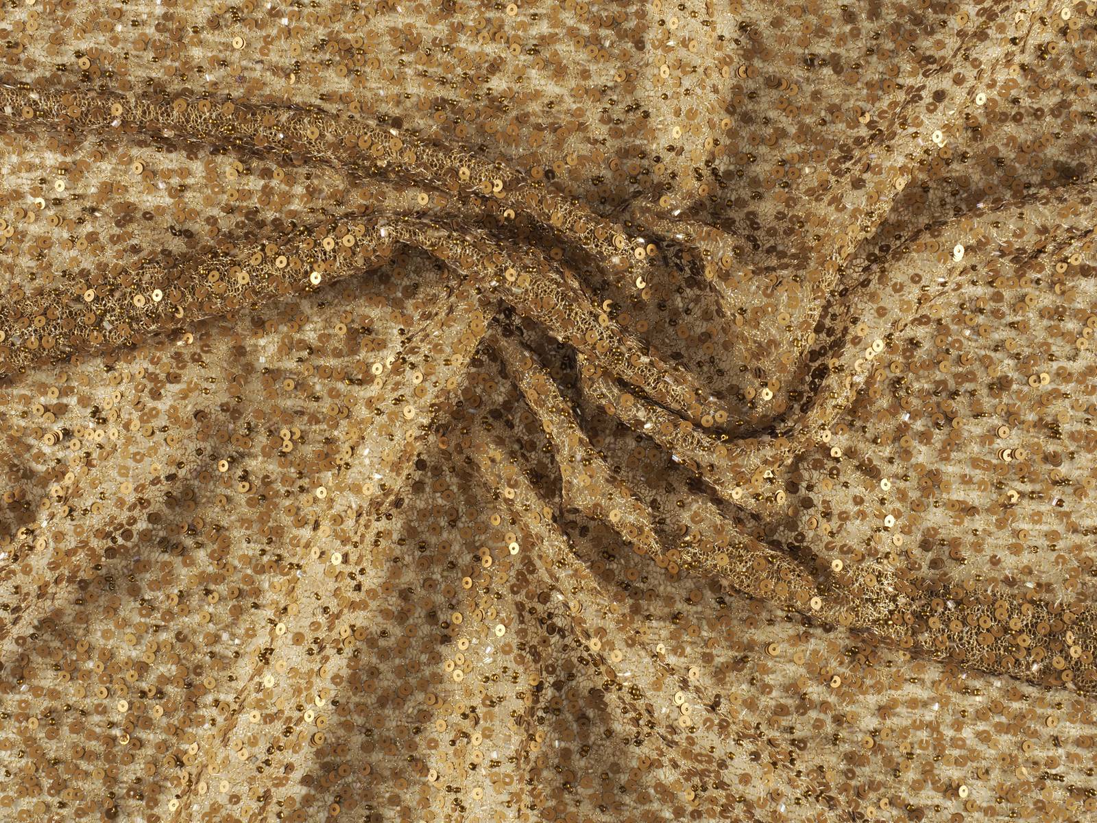
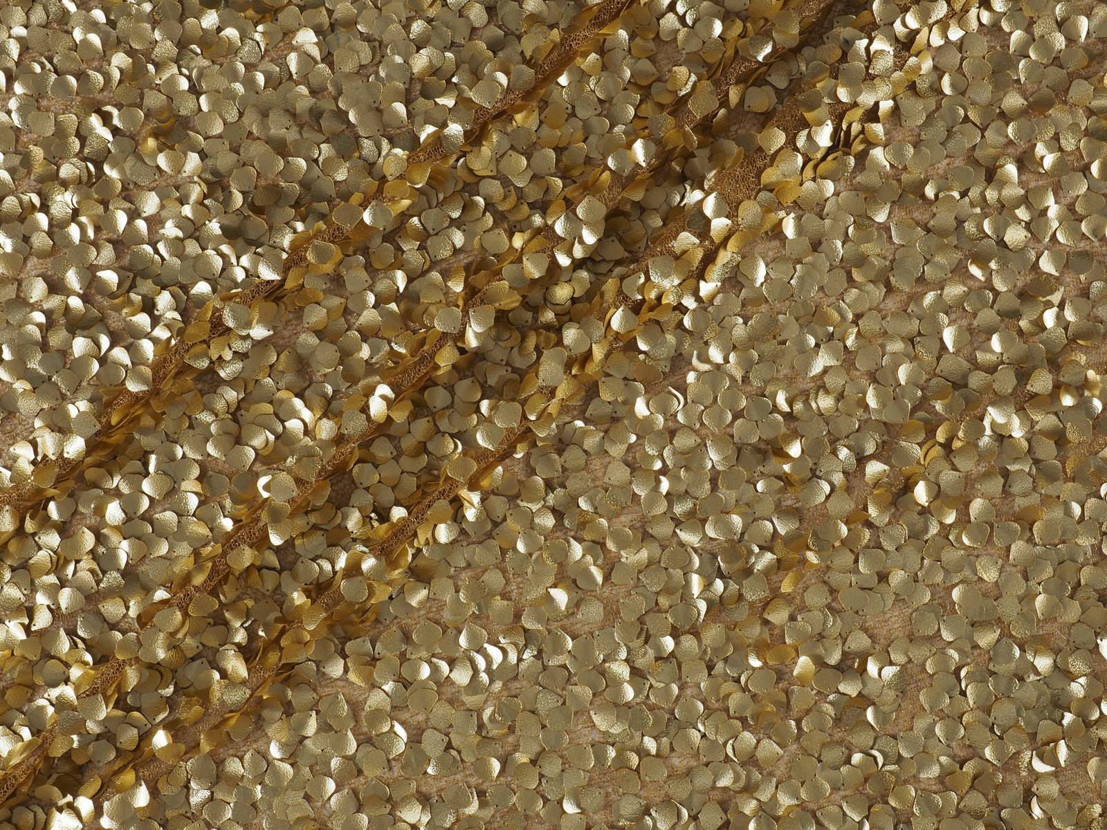
Gold Rush
Gold has always been associated with opulence, classic style, baroque ornamentation and luxury at its best. It is the colour of wealth and majesty, of the taste for excess, a warm and ultra-luminous shade that empowers, shines and overwhelms in turn because it does not accept half measures. The favourite of King Midas moves between the classic and the modern with fabrics that capture the attention of all eyes. It is impossible to go unnoticed!
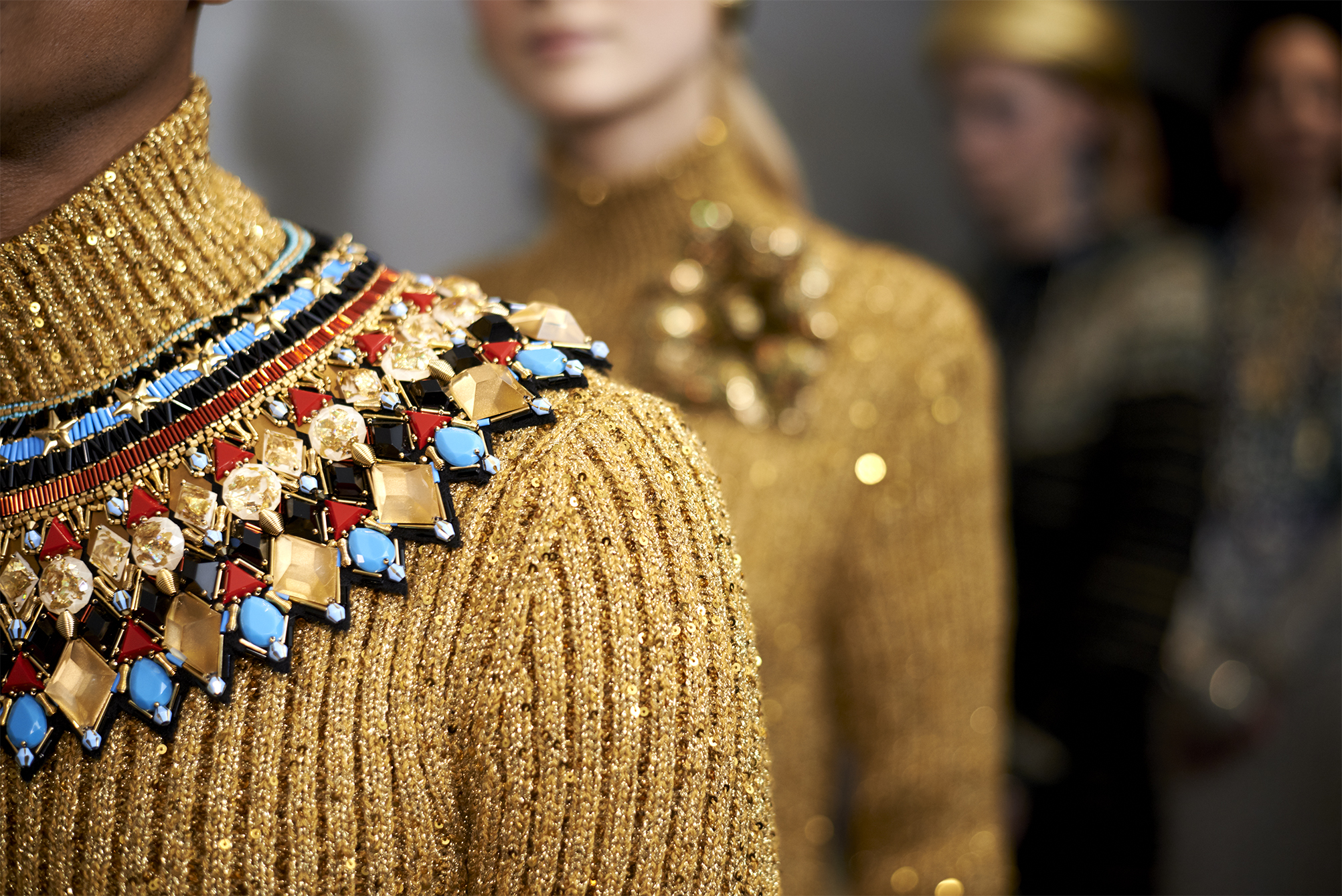
Gold takes over, for example, in fabrics with rhinestones, in pleats and Iamé, creating golden patinas that create fascinating optical games. It is also present in fabrics with sequins, together with other more discreet shades such as old gold or in rich floral embroidery combined with other colours such as red or black.
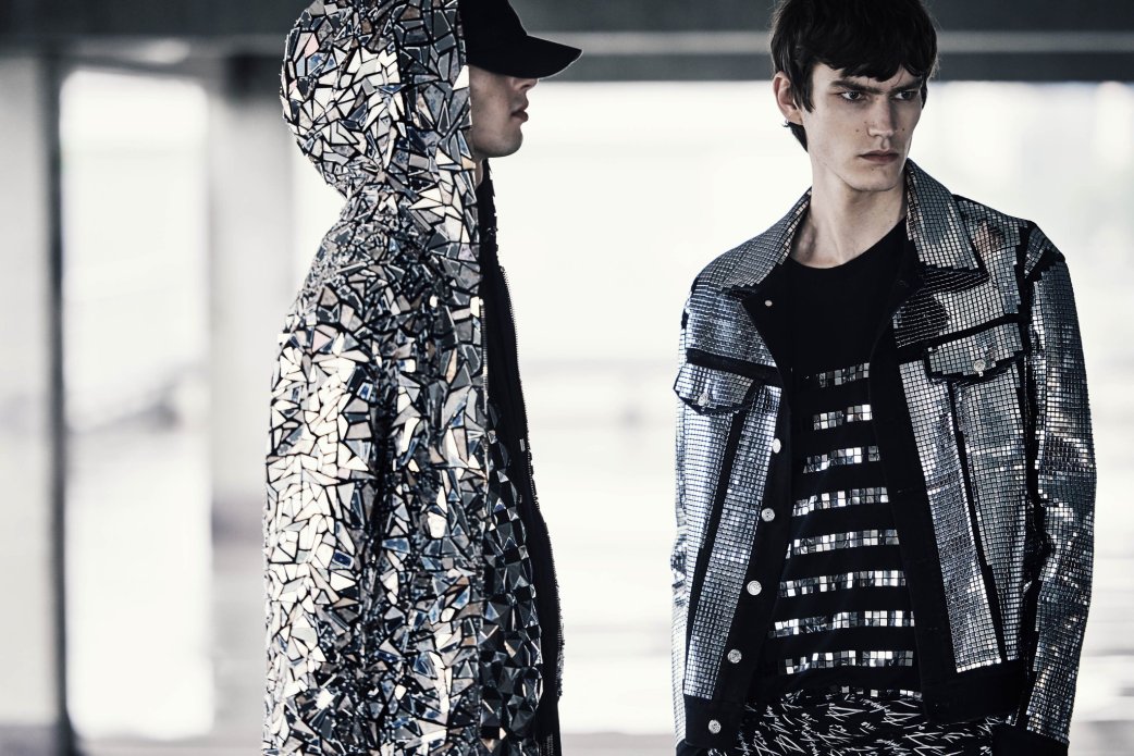
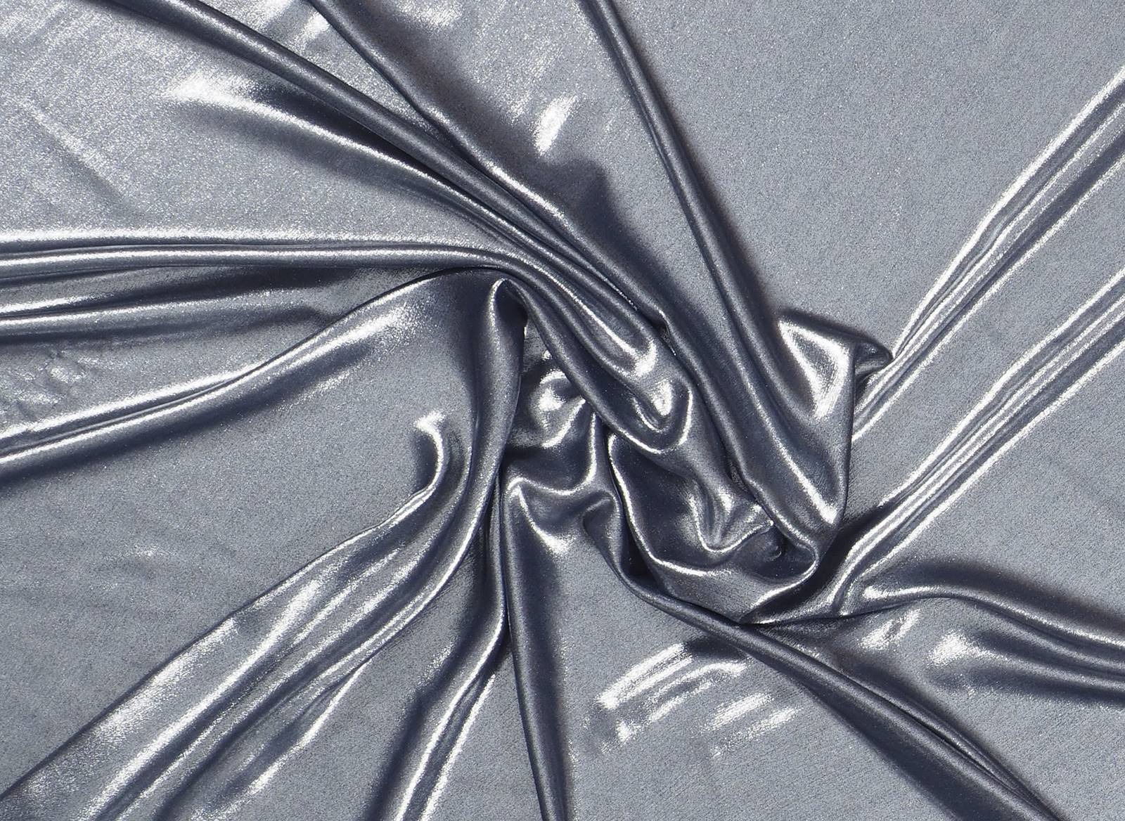
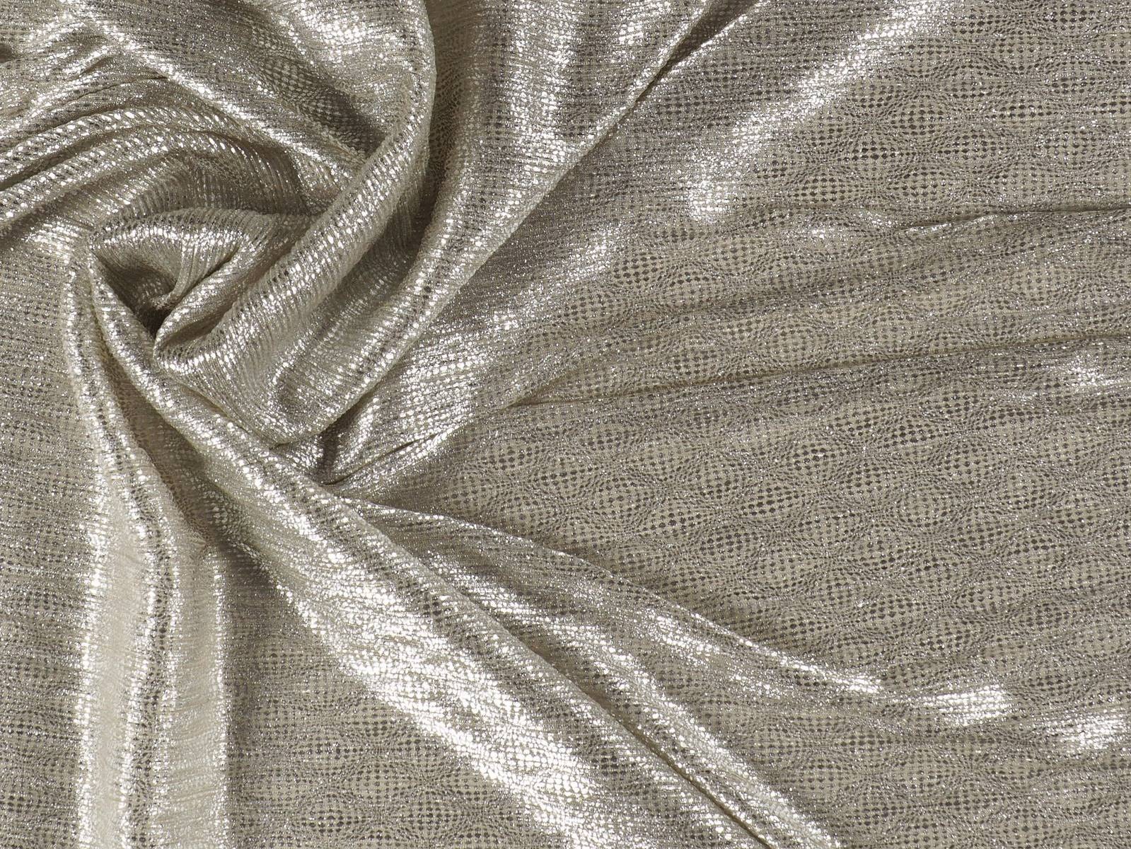
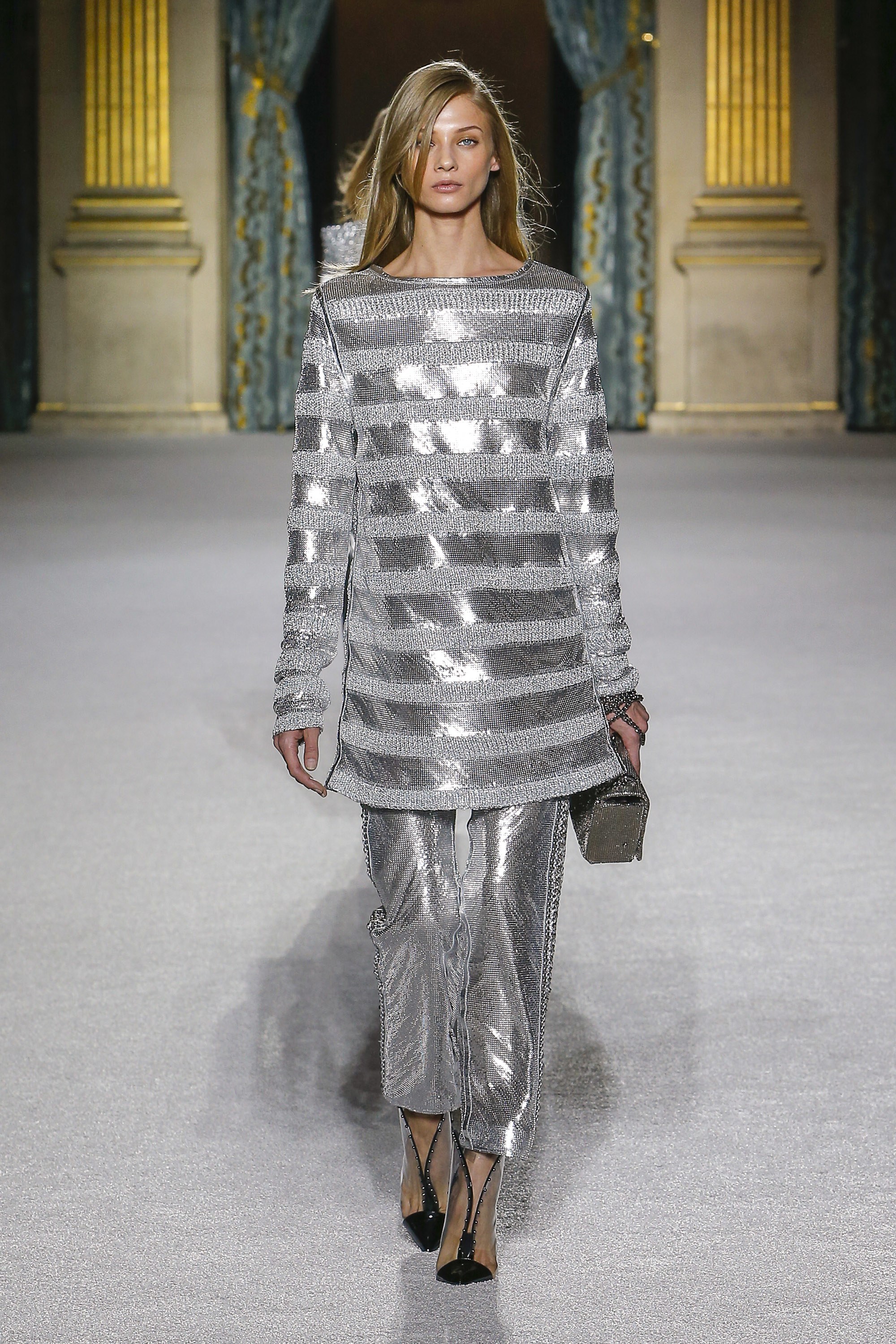
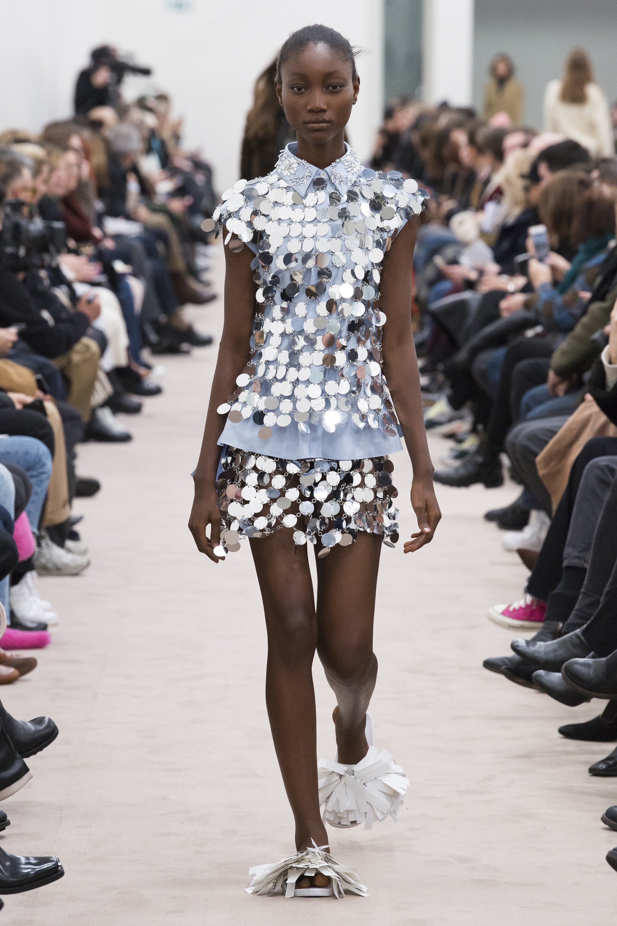
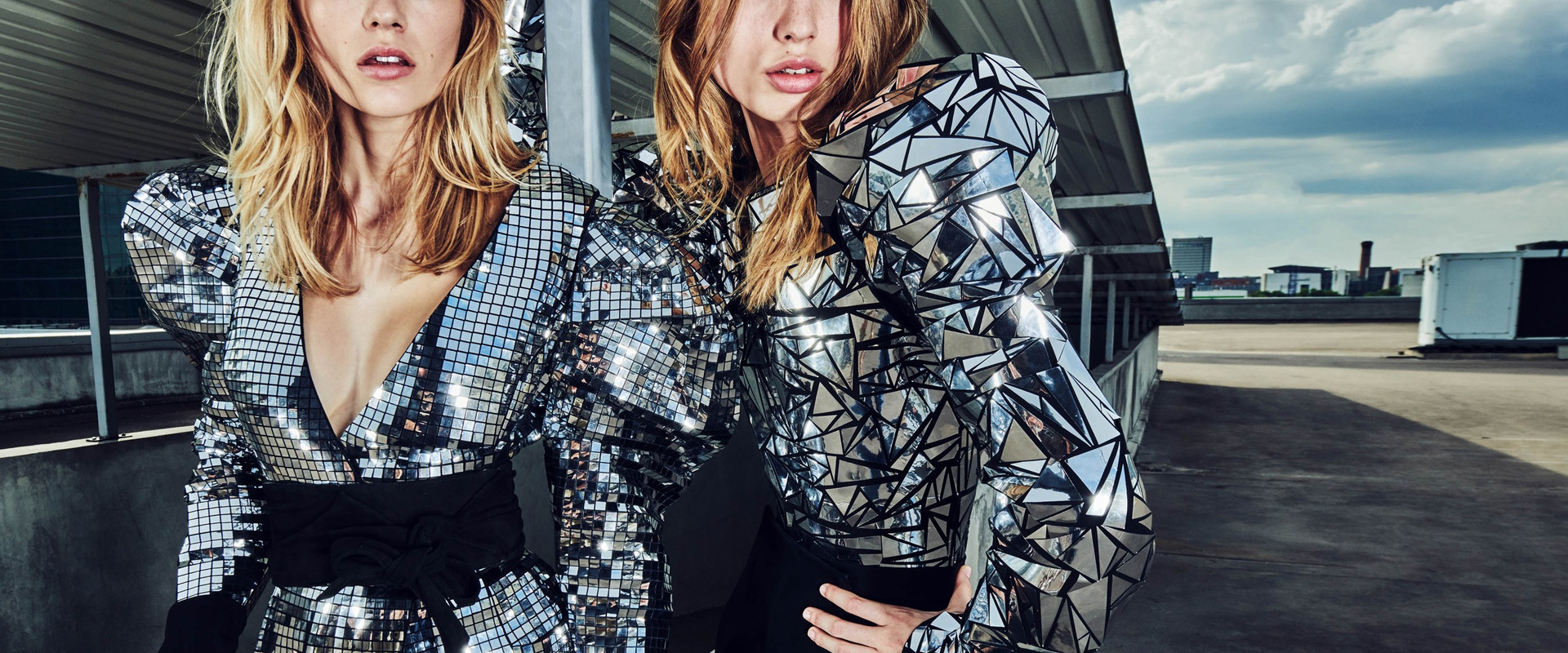
Futuristic silver
Far from being “the younger brother” of gold, the colour silver has in recent seasons acquired its own identity by exploring its most rebellious facet. In fashion it is also a luxurious hue that is associated with modernity, movement, technology and innovation. In this sense the colour silver is seen as the symbol of progress, of the functional, dynamic and technical, showing a great power of attraction linked to future advances such as in the field of space engineering. Hence the colour silver is sometimes linked with futuristic utopias.
This cool shade moves away from smooth fabrics and appropriates original textures such as the wrinkles associated with aluminum foil. On the catwalks of the current season there are Calvin Klein dresses 205W39NYC, iridescent nuances from Emporio Armani or fabrics with Balmain hologram effect. Finally mesh fabrics and large shiny sequins are also abundant, creating a seductive mirror effect, two classics that form the essence of Paco Rabanne.