 All About Viva Magenta, the Color of the Year 2023. Pic: Pantone
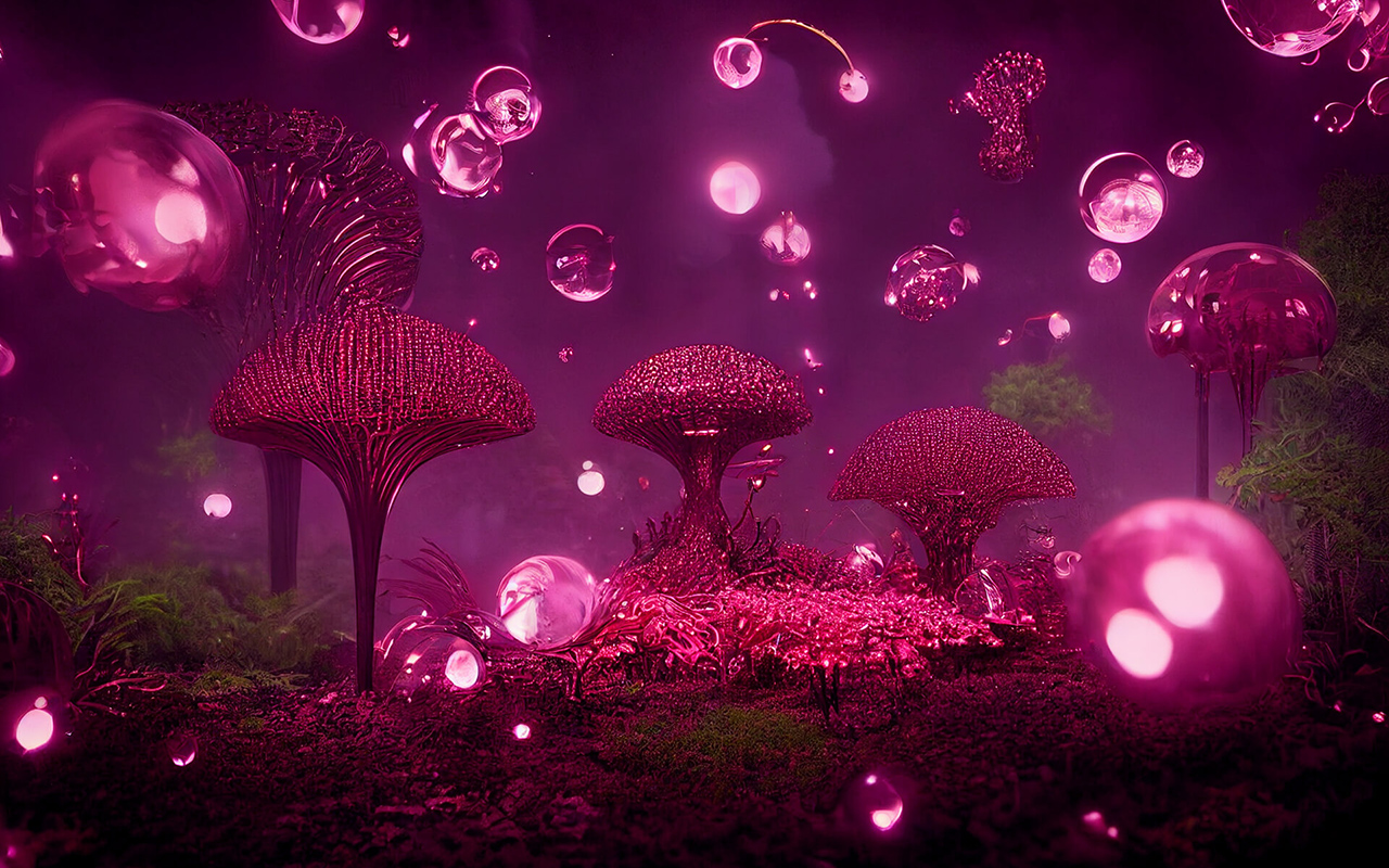
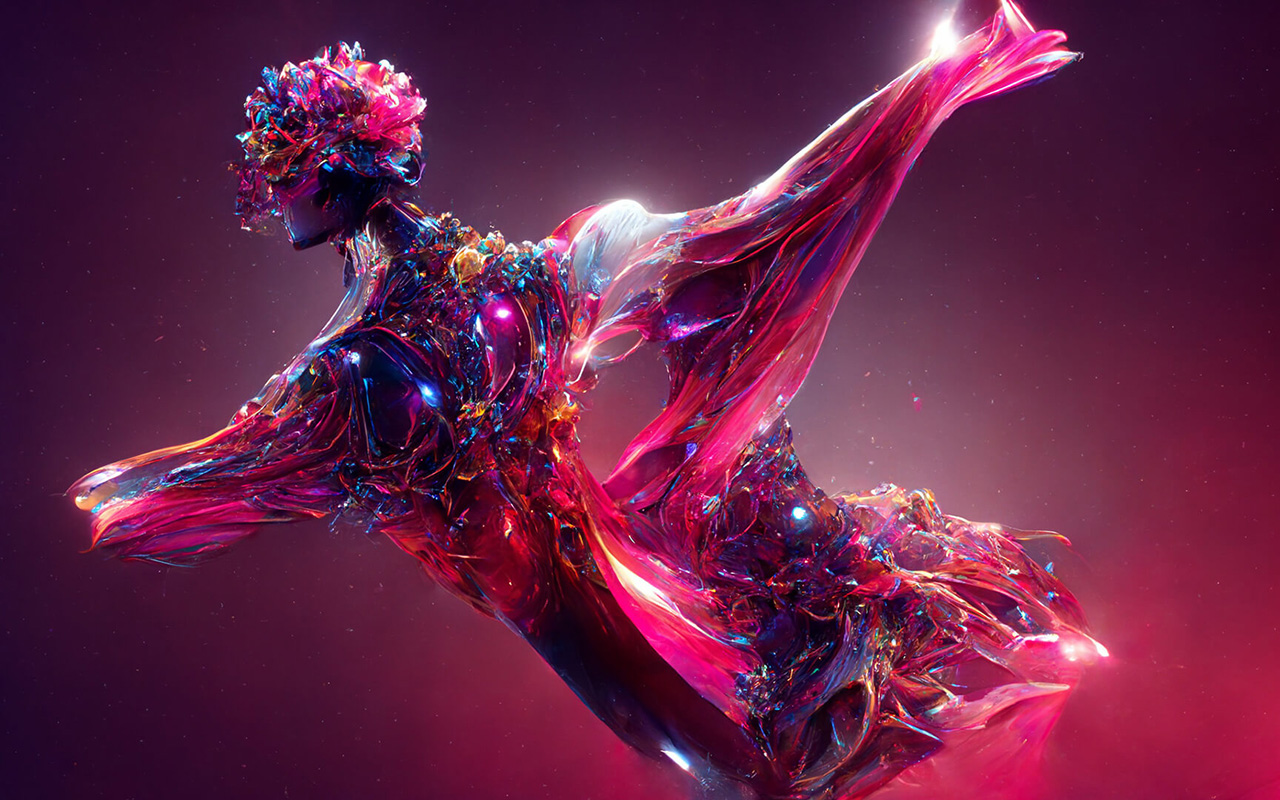
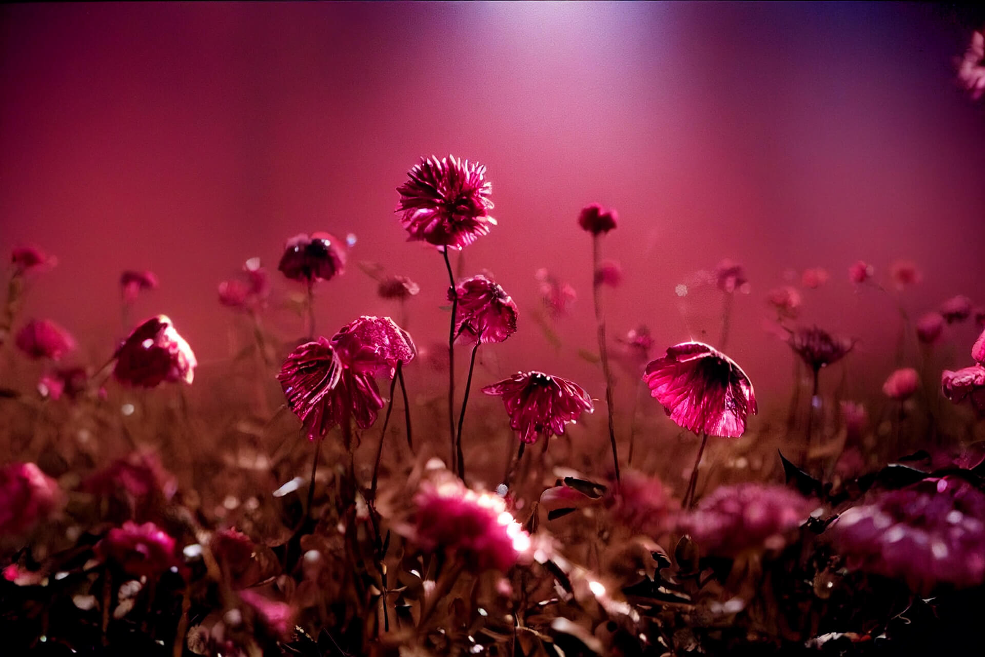
Is it rosy red? Reddish purple? Perhaps crimson red or rather, a deep raspberry hue. All these nuances that transition between red, pink and purple define the unique Viva Magenta , the colour that Pantone has chosen to guide 2023 and inspire disciplines related to art and design .“ It is brave and intrepid, and a pulsating colour whose exuberance promotes a joyous and optimistic celebration, writing a new narrative”, declared Leatrice Eiseman , Executive Director of the Pantone Colour Institute . Viva Magenta 18-1750, this is its technical name, is a tone that vibrates with energy and vigor. “A lively red that encourages experimentation and unrestrained self-expression. An electrifying, limitless tone that comes through with a bold statement,” said Eiseman .
“Viva Magenta promotes a joyful and optimistic celebration, writing a new narrative”
The arrival of this enigmatic red is not accidental. Pantone introduced the Viva Magenta shade in 2019, but it quickly rose in popularity to rise to stardom as the Colour of the Year 2023. This boom has been largely fueled by events in society in recent years. As Laurie Pressman, vice president of the Pantone Colour Institute , put it, “It’s an unconventional colour for an unconventional time.” The experience of Covid and its social and economic consequences have forced changes that, voluntarily or not, have transformed people’s lifestyles. And there, after two years of uncertainty expressed through cold tones ( Very Peri, 2022) or dual (Ultimate Gray + Illuminating , 2021), now comes a hybrid tone with enough personality to be able to light up 2023. Unlike its predecessor, Viva Magenta combines coldness and warmth in the same colour, and aims to mix the physical with the virtual, a dichotomy that cannot be more relevant today with the rise of virtual reality.
“It’s an unconventional colour for an unconventional moment”
Viva Magenta has already been spotted by trendhunters who work at the Pantone Colour Institute This choice is never the result of whim or chance, on the contrary, it is the result of a deep sociological and anthropological analysis of today’s society. Choosing the colour that will mark the year combines research, method and instinct. And magenta was there, in worlds as varied as fashion, cosmetics, concept store design , digital art, social networks or decoration. The question was, why pay attention to that carmine red that is already present in society and what emotional and psychological values is it transmitting? Pantone quickly looked up its meaning. According to the international authority on colour, in this era of technology, the aim is precisely to be inspired by nature and what is real. Pantone 18-1750 Viva Magenta is inspired by cochineal red, one of the most precious of all natural dyes, as well as one of nature’s strongest and brightest hues. Therefore, rooted in the primordial, the colour of 2023 reconnects with the original matter, revitalizes the spirit and helps build a new inner strength. “We set our sights on a colour that highlights our need to shift our perspective, highlights our desire to feel empowered, and gives us the strength to boldly, possibly, and fearlessly launch into a new path with complete confidence.” Pressman expressed.
“We have set our sights on a colour that makes us want to feel empowered”
Seen this way, Viva Magenta is a hue that is presented as a revitalizing balm that connects our interior to project ourselves strongly to the exterior.
How to apply Viva Magenta in our daily lives?
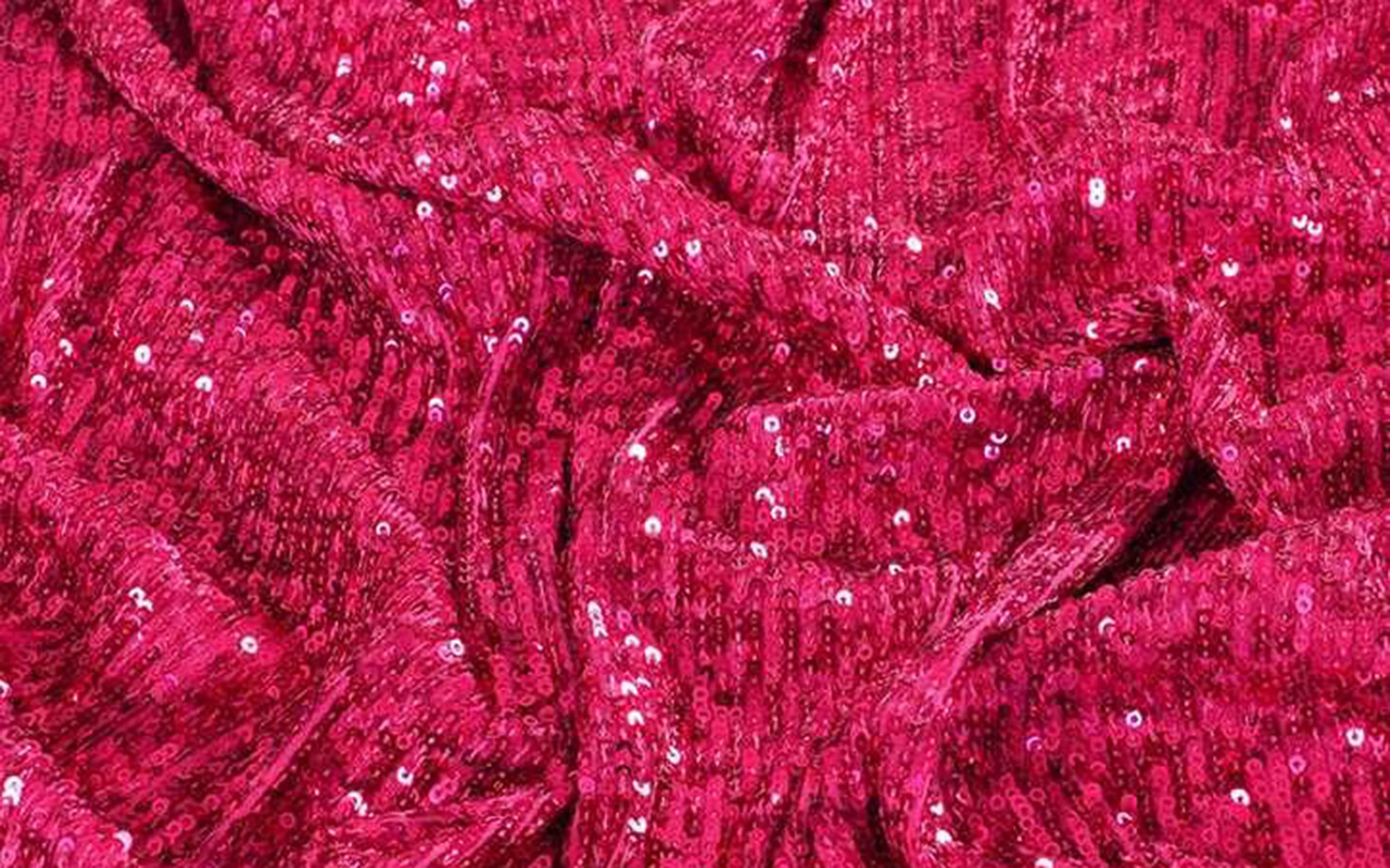
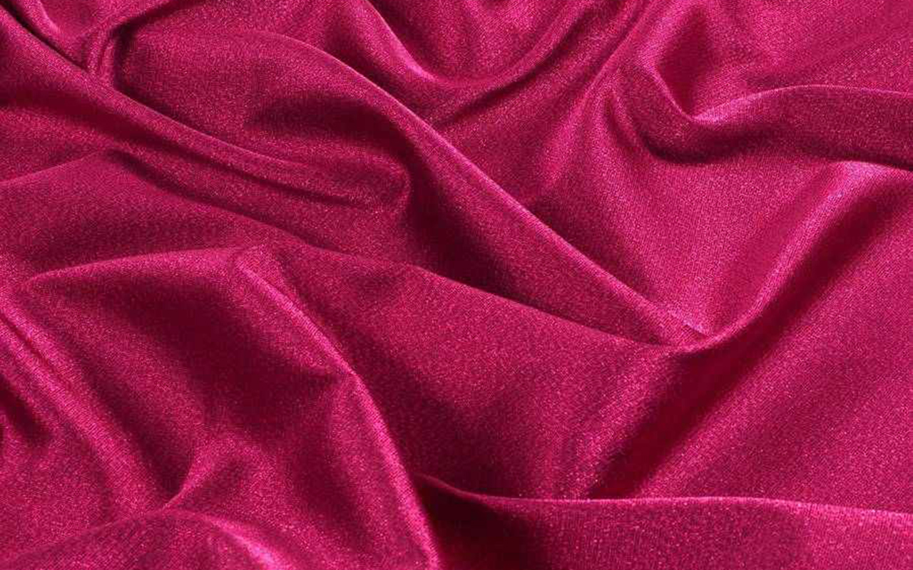
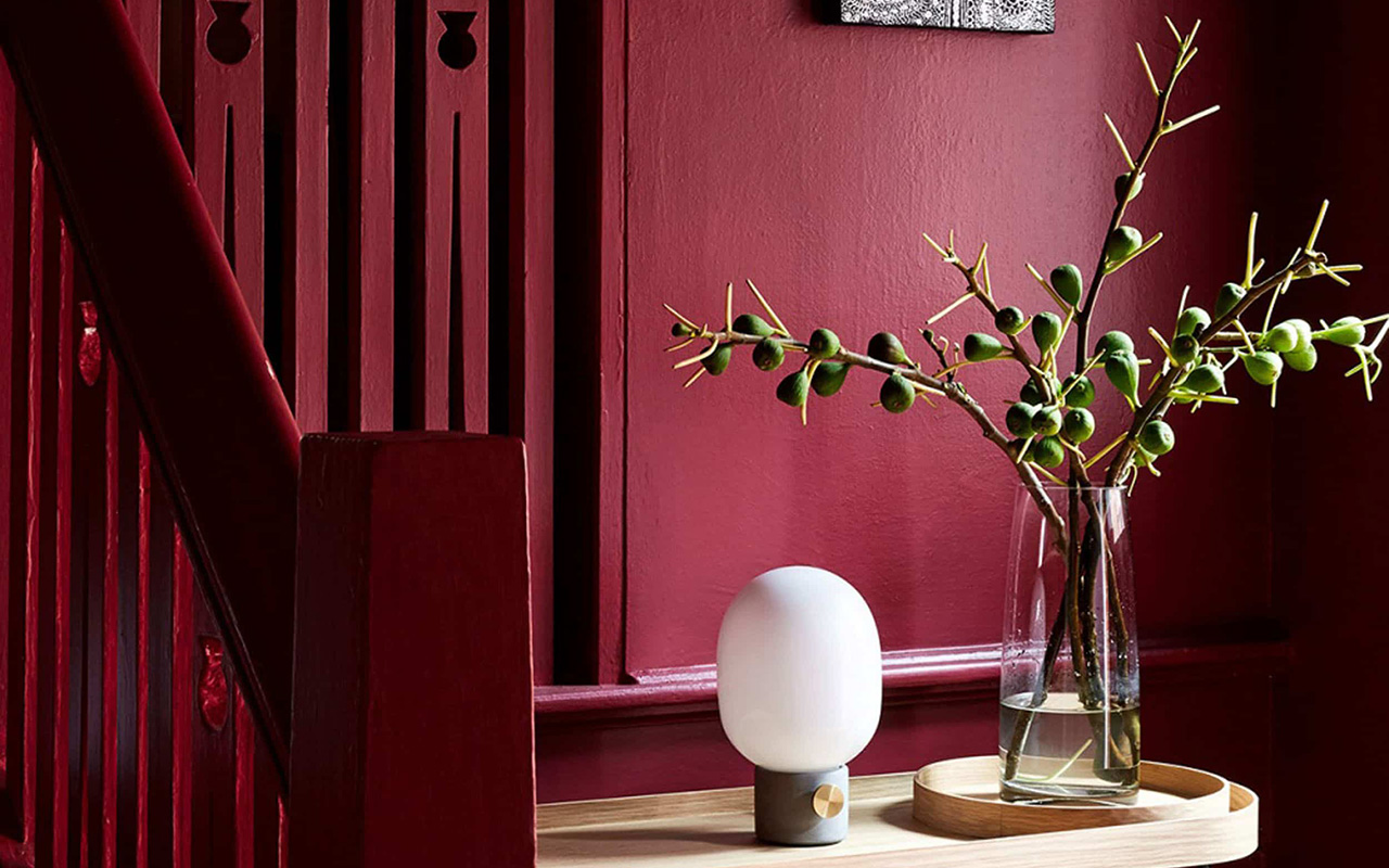
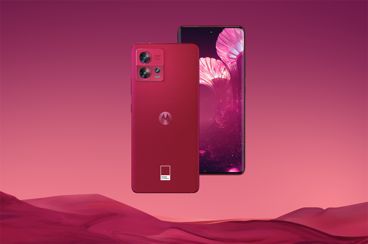
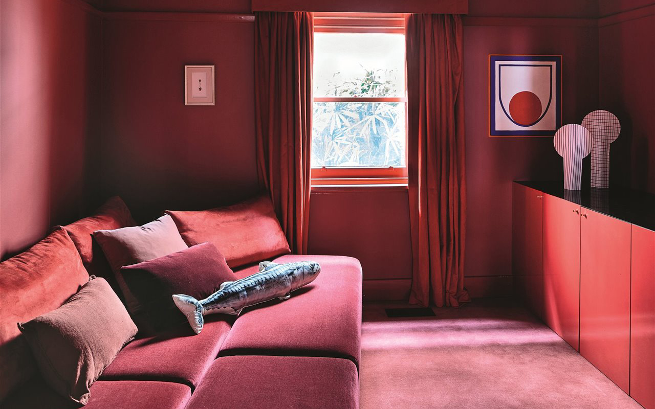
Reddish tones and explosive mixtures such as intense pink-red have been imposed everywhere, from the catwalks to the metaverse, and where it has the most possibilities of expansion is in interior design, be it a private home or a commercial establishment. According to Eiseman, kitchens (and appliances), which have long harbored a respect for red, can now be imbued with “a touch of novelty” through Viva Magenta and its ability to break away from the “same red hue of always”, which defined previous generations. Pantone 2023 colour is also suitable on glassware or any other reflective surface, and can even nestle in cushions and other small decorative items to make a “beautiful, dramatic and theatrical statement” in your home. Although such a lively colour can intimidate or condition the current of neutral tones that are prevailing in decoration, the truth is that Pantone affirms that consumers are more prepared than ever to begin to embrace all the possibilities of colour.
 Acuamona AW22/23. Pic: Acuamona
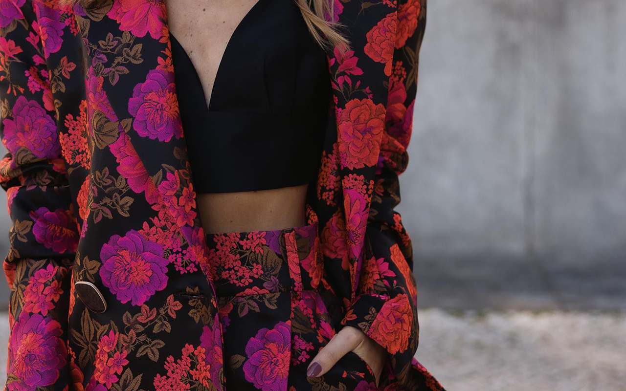
And in fashion, how is it appreciated?
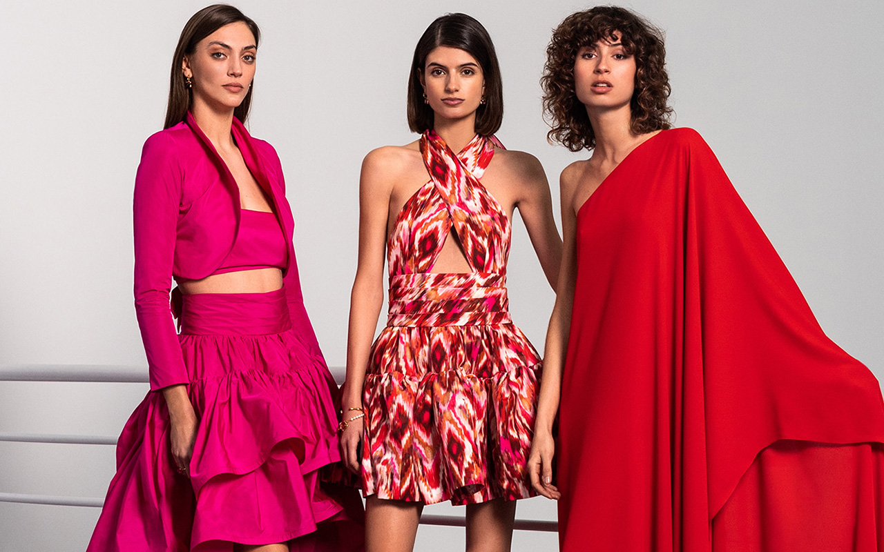
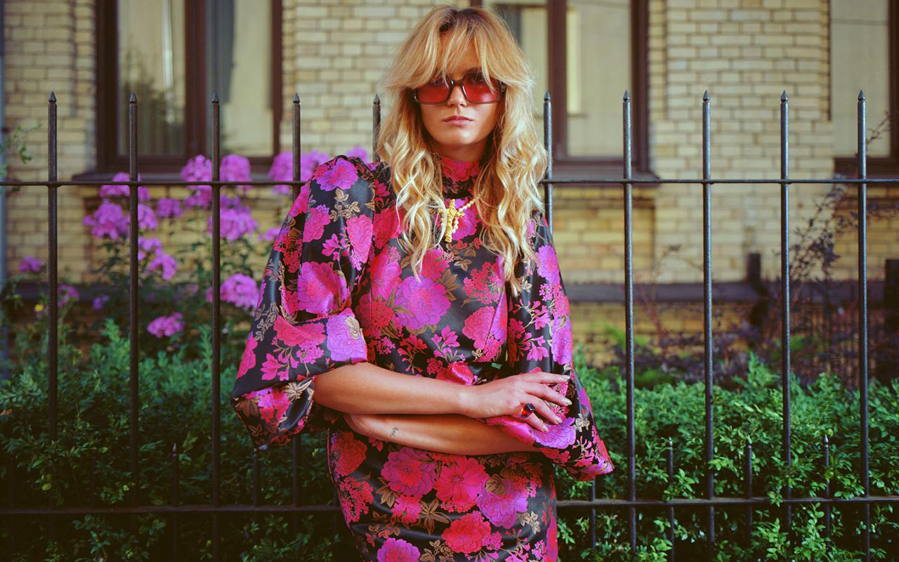
There is no doubt. The fashionable colour of 2022 has been the brightest fuchsia pink, a faithful ally of Valentino and its explosive Pink PP shade, and emblem of the entire Barbiecore aesthetic. Now, Viva Magenta is presented as a natural evolution of that hue, providing less stridency and keeping its magnetism intact. In truth, red has been one of the most repeated tones on the winter catwalks and for summer it returns with force, but it remains to be seen how the next collections that are being developed for 2023/2024 evolve so that Viva Magenta appears even more strength.
As the powerful colour that it is, Viva Magenta does not go unnoticed and takes centre stage in any outfit, even if it appears in small doses. On the one hand, it feels perfect surrounded by neutral tones such as black or white, or both together. They are the colours that best suit you with effortlessly flattering looks. On the other hand, for a more groundbreaking result, the colour of 2023 combines with its chromatic range: pastel pinks, lilacs or fuchsias, and also with complementary blues or greens, providing a touch of rebellion and transgression. In any case, if fashion needs a dose of optimism, strength and joy, to move forward it will inevitably embrace Viva Magenta. We’ll see it…