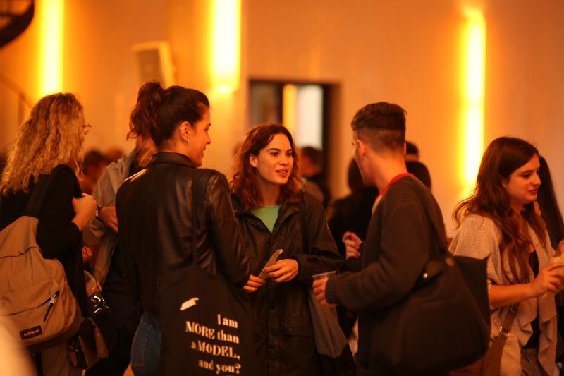
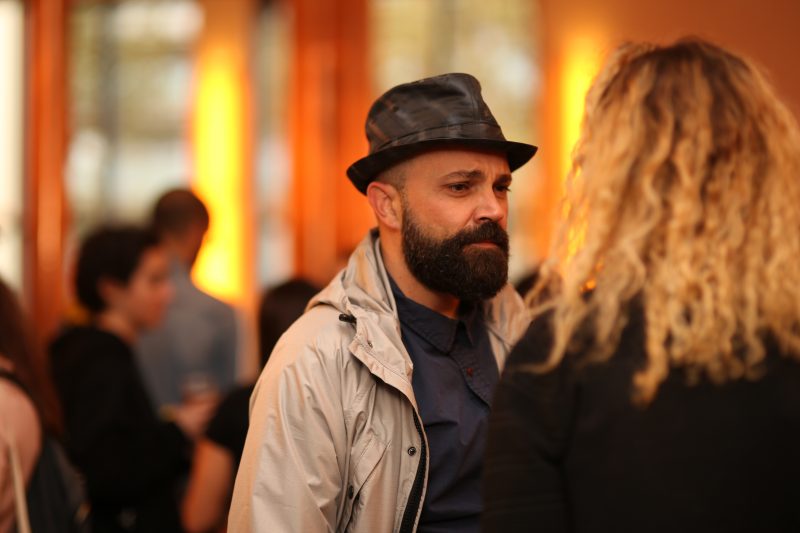
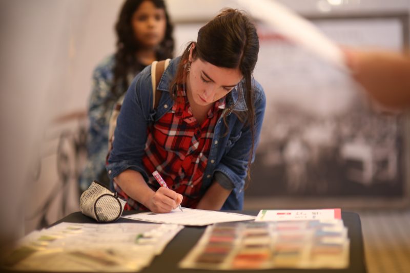
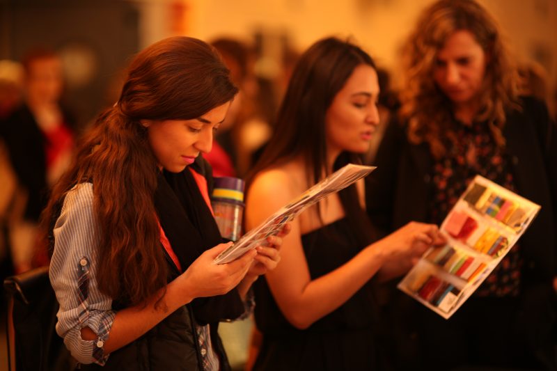
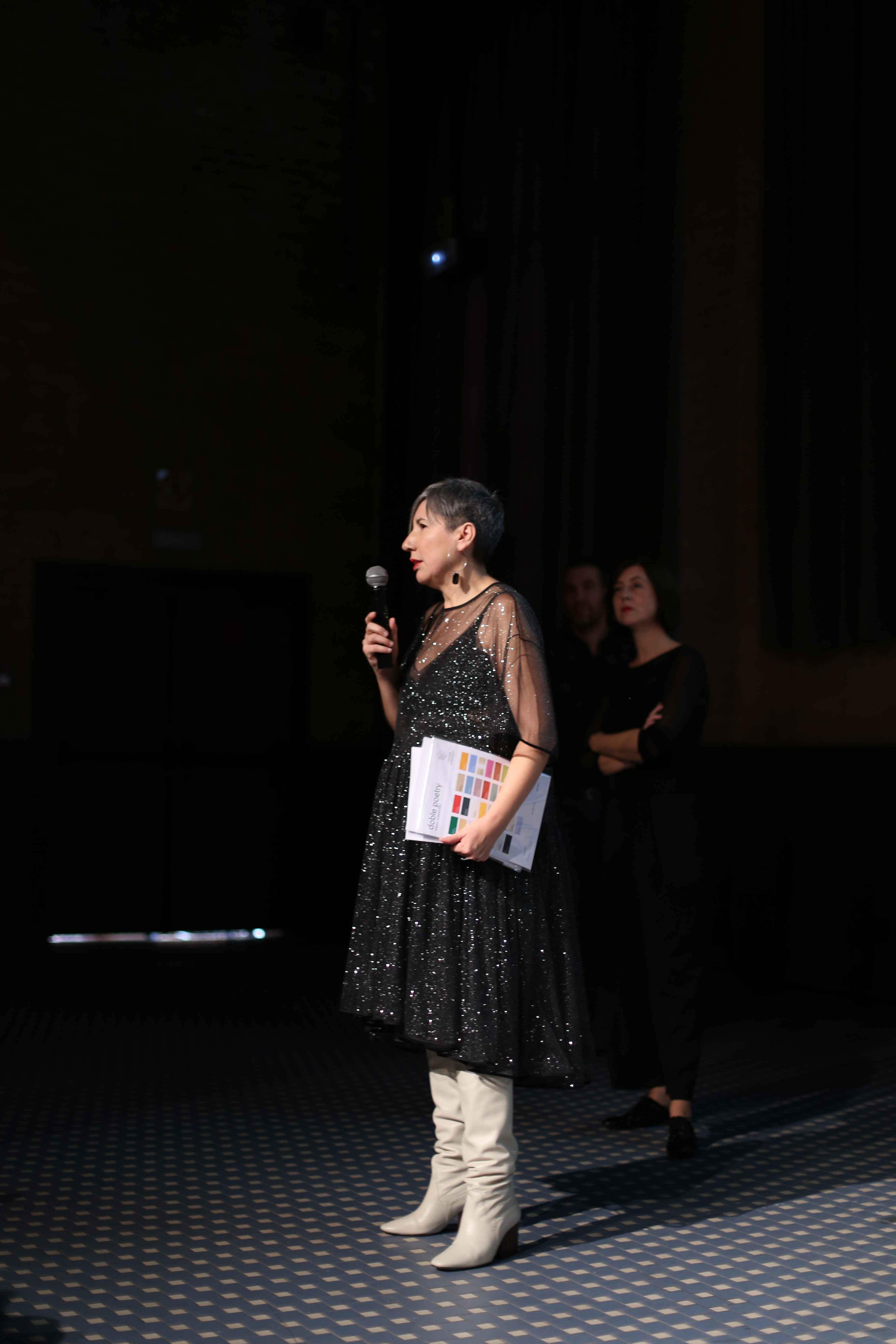
After the summer The Colour Community is back with a new inspiring report. The association for those “passionate about colour and materials” has presented the latest innovations in its eleventh edition, held as usual in the former Damm Factory in Barcelona. It highlights a new logo that transmits the essence of the association: the union of several multidisciplinary professionals who together constitute a totality of visions of colour; there is a new website offering consultation and guidance to those interested in investigating the subject and finally a new colour chart that act as a guide to the Spring-Summer 2020 season.
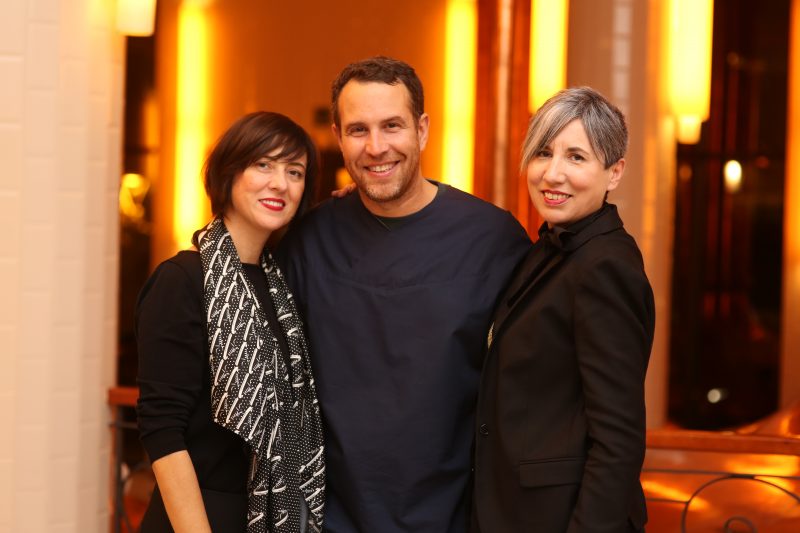
The Colour Community is an initiative in constant evolution that we have supported from its birth because as an international textile company we are also interested in colour and texture and how they are applied in design. The founding team of the initiative consists of three people: the architect Pere Ortega, the designer Eva Muñoz, a specialist in Colour & Trim and Rosa Pujol, Textile and Colour Stylist in the same company. These professionals work day to day with trends and their implications for seasonal and socio-cultural factors, never losing sight of the vision of the market in order to try to adapt to future needs. As they say in their online portal, ” We Do Colour “.
This edition revolves around the concept of ‘ Double Poetry ‘ that refers to duality: antagonisms which are related to each other, such as as the rational and the impulsive, the scientific and the emotional … and concepts that complement each other, but always playing on this linking of two ideas. This fresh and energetic creation is articulated through four ranges of colour, textures and materials and given the names Iced Risk , Los Angeles , Mother Tech and New New .
Below we give a brief explanatory summary of each of them:
-
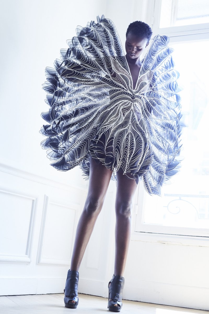
Iced Risk
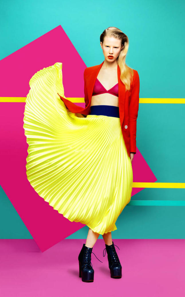
The first inspiration focuses on the idea of controlled risk. For the appropriate consumers it presents innovation in the service of functionality together with design without shrillness. It offers versatility and dynamism centred on geometrical lines, optical illusions, controlled volumes, technical,fluid and pleated fabrics, ethereal silhouettes and some grid motifs. It is represented mainly with a palette of greens inspired by nature, urban blues and brushstrokes of mustard yellow.
-
Los Ángeles
The second range is more youthful and is inspired by this Californian city and its more relaxed lifestyle. It draws on colour contrasts, forms inspired by water, by surfing and sailing aesthetic … Here there is an abundance of synthetic materials such as plastics, nets, faded or geometrical prints … in bright colours presented en bloc or which contrast with the purest white.
-
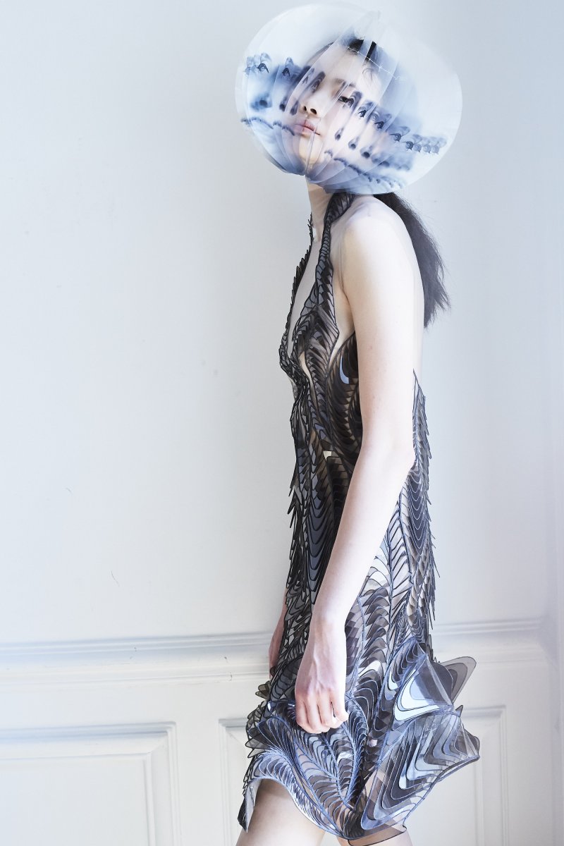
Mother Tech
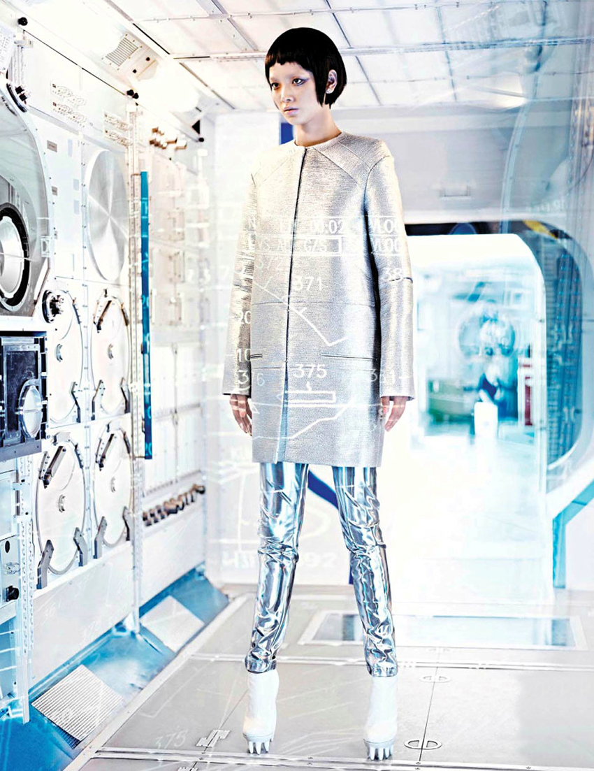
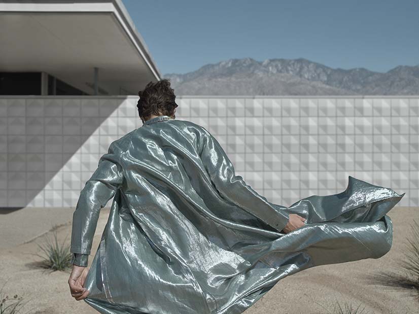
The third inspiration plays with the concept of technology and how it relates to the human being. It is a range which demands creative use and invites you to lose your fear. At the same time it also reflects how technology can coexist with nature and complement it. In terms of textures, it is expressed in experimental forms, water-marks, imperfect fibres, mirror-like sequins, iridescent fabrics, laser cuts … The range of colours goes from mint green to patina blue and metallics, especially the colour silver in both glossy and matt version.
 |
 |
-
New New
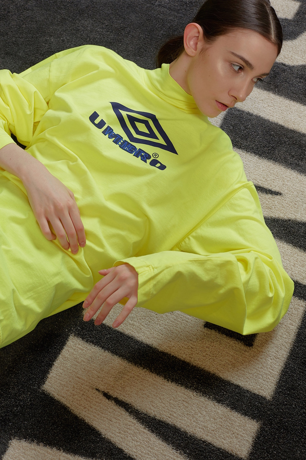
Finally, the fourth range is the most daring, connecting directly with Generation Z: young people of the 21st century who are now old enough to be consumers. It is inspired by the classics in a contemporary version, by collectors’editions, by the rare avis … It is a renewal of traditional codes for a totally new public unfamiliar with the past. Fabrics such as denim, non-typical shapes, textiles with a message … all combine in this presentation with a chromatic palette of the most strident colours, including yellow, lime green, chewing- gum pink or gold, among other shades
Sorry, this entry is only available in European Spanish.
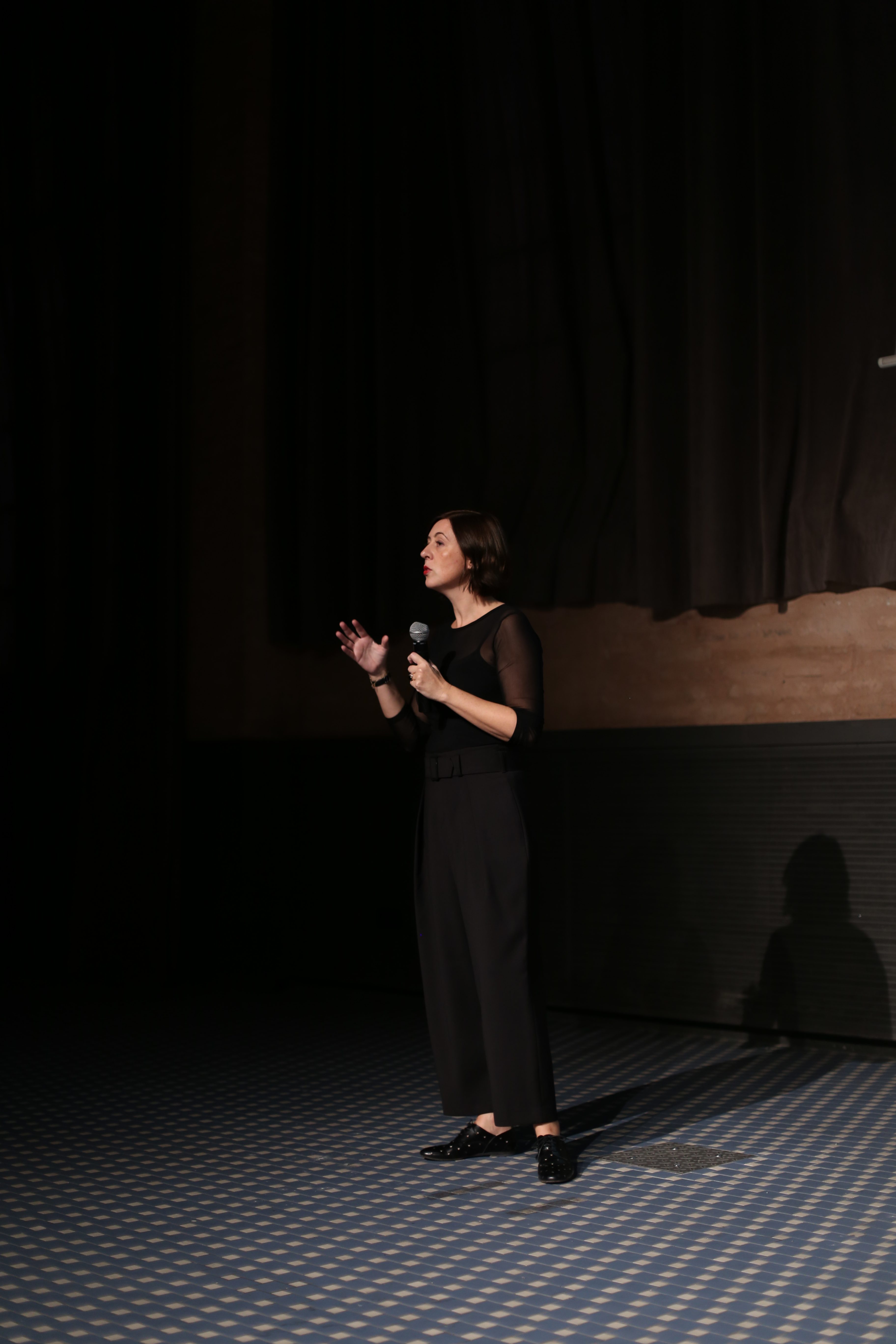
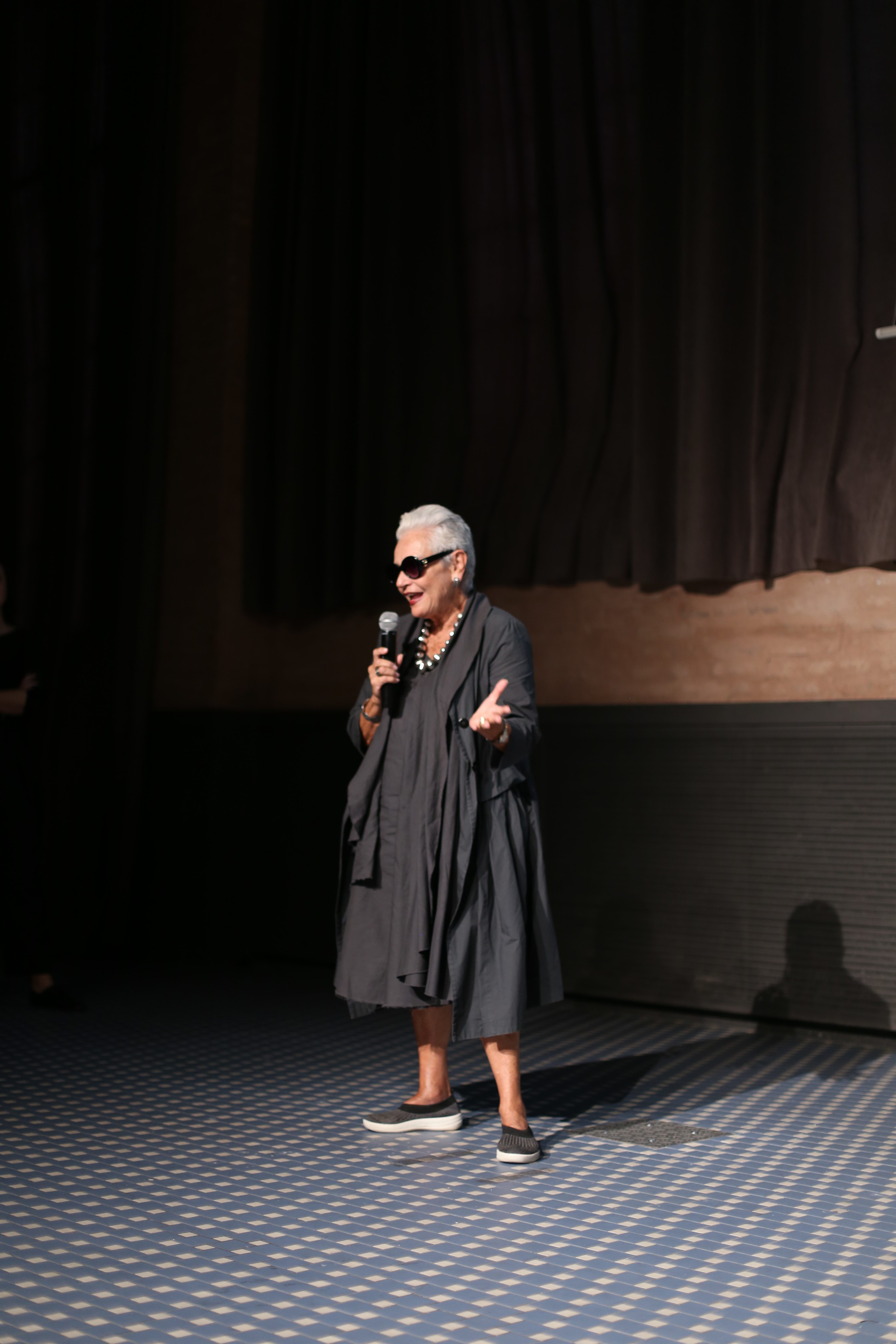
In yet another edition the old Damm factory in Barcelona brought together the sensitive project The Color Community to publicize new trends in materials, textures and colours for the Spring / Summer season 2019. The initiative was organized by three multidisciplinary professionals, Eva Muñoz, designer and specialist in Colour & Trim, Pere Ortega, architect in Saeta Estudi and Rosa Pujol stylist in fabrics and colours at Gratacós, to inspire creative professionals from various fields such as art, fashion, design or architecture. “We do not want to instruct, but to suggest through a palette rich in colours and textures which is very upbeat and energetic , ” explained Rosa Pujol at the beginning of the presentation.
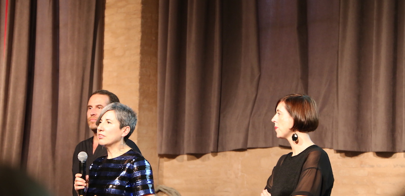
Rosa Pujol: “We do not want to instruct, but to suggest”
In fact, apart from the presentation of the four trends via a video with inspirational images ( parades, campaigns, front pages and still-lifes), other senses also played a role, such as that of hearing, with mood music and that of taste with the tasting of different ice creams, one for each trend. “We want to create a sensory path where all inputs generate different connections and help create a global vision”, declares Rosa Pujol.
This edition of The Color Community focuses on the concept of ‘Synchro’: the constant connection between people and disciplines and how they interrelate with each other . The proposal is articulated through four colour ranges and textures.
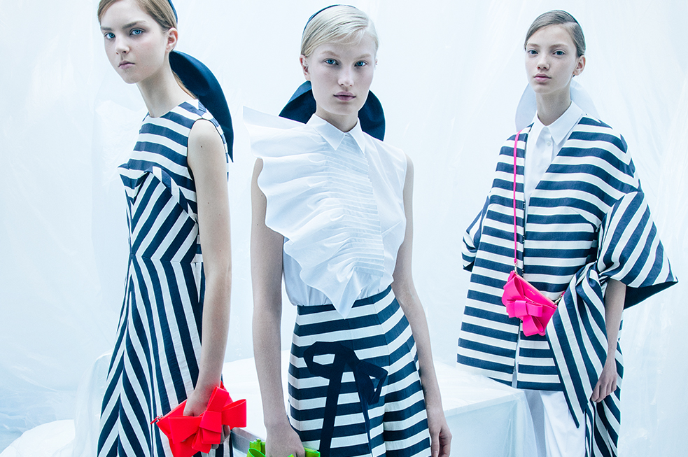
1.Newaddresses
It makes reference to multicultural connections with colours and materials that refer to the exoticism of other distant cultures. It aims for a reinterpretation of the ethnic style. There are tribal motifs,tones that mimic spices, cultural graphism, irregular geometry, elements of pop culture and a range of vivid and intense colours with shades like fuchsia, purple, blue or leaf-green.
2.Blur
An emotional trend that connects technology and virtual reality with a touch of nostalgia for the past. Innovation inspired by retro. In this trend synthetic materials abound, with industrial references, iridescent fabrics or luminous fibres. The chromatic palette focuses on technical green, pale blue and greys that act as a bridge between palettes.
3.Me anymore
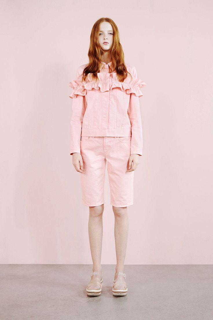
A calm, quiet and evocative style that aims to promote a pause for reflection and exalt silence. Soft textures without too many reliefs, watercolours, fine lines, multilayers and soft shades like pale pink, sky blue or white with beige tints add colour to this contemplative trend.
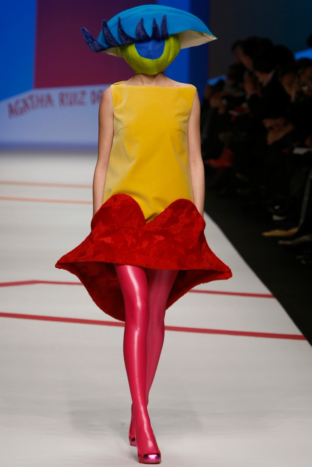
4.Sun-risa
It refers to eccentricity, delirium and surrealism. It connects these fantastic worlds with a naïve aesthetic through vivid and bold colours. It is a free and spontaneous style influenced by the plastic arts where there are abundant shades of fuchsia, yellow, turquoise or bright orange.
Finally, this edition of The Color Community was dedicated to Juan Gratacós Ortiz, president of Gratacós in a tribute after his recent death. “My father has always been a lover of colour and textures and in some way he is still present among us , “explained his son Juan Gratacós, full of emotion.
What colours will be in Fashion in summer 2018? Who decides the trends? How will they be applied?
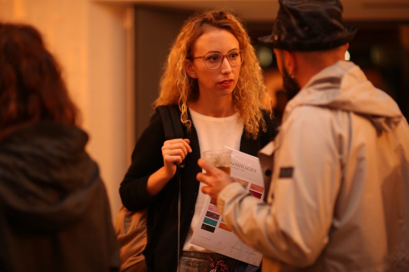
All these questions, aswell as many others, will be resolved in the The Color Community, a project we have supported since the beginning. This informative initiative is organized twice a year by three creative professionals that share interests and sensations towards the world of colour and design and seek to be a guide for inspiration for those engaged in this sector. The organizers are Eva Muñoz, designer and specialist in Color & Trim; Pere Ortega, architect in Saeta Estudi and Rosa Pujol, fabric and colour stylist in Gratacós. In this seventh edition, organized in the old Damm factory in Barcelona, around five hundred people attended to hear about the latest chromatic trends for 2018. The context of colour, material and its applications were some of the topics discussed at the conference.
The concept of colours for the Spring-Summer 2018 season goes by the name “Mirages”. This word describes the optical illusion created by the complete reflection of light and which connects to several current concepts that can be seen in the fashion industry.
The concept is structured around 4 colour ranges:
1. Please Touch!
It groups together a tactile and sensitive range that invites us to experiment, touch and use.
2. 2&3
This range is about geometric simplicity. By working the bicolour and tricolor combinations in a cheerful, clean and flat proposal with reminiscences of sport.
3. Fluid Signs
A defined and clear range with influence of liquids that dilute. Included in this range is a touch of folk, denim and floral prints. Nature and food are the motor of its inspiration.
4. Polyphonic
This is the range that is closest to the concept of mirages and refers to the harmony of colours to be developed in monochrome or mixed with any shade of other ranges. Metallic colours gain importance.