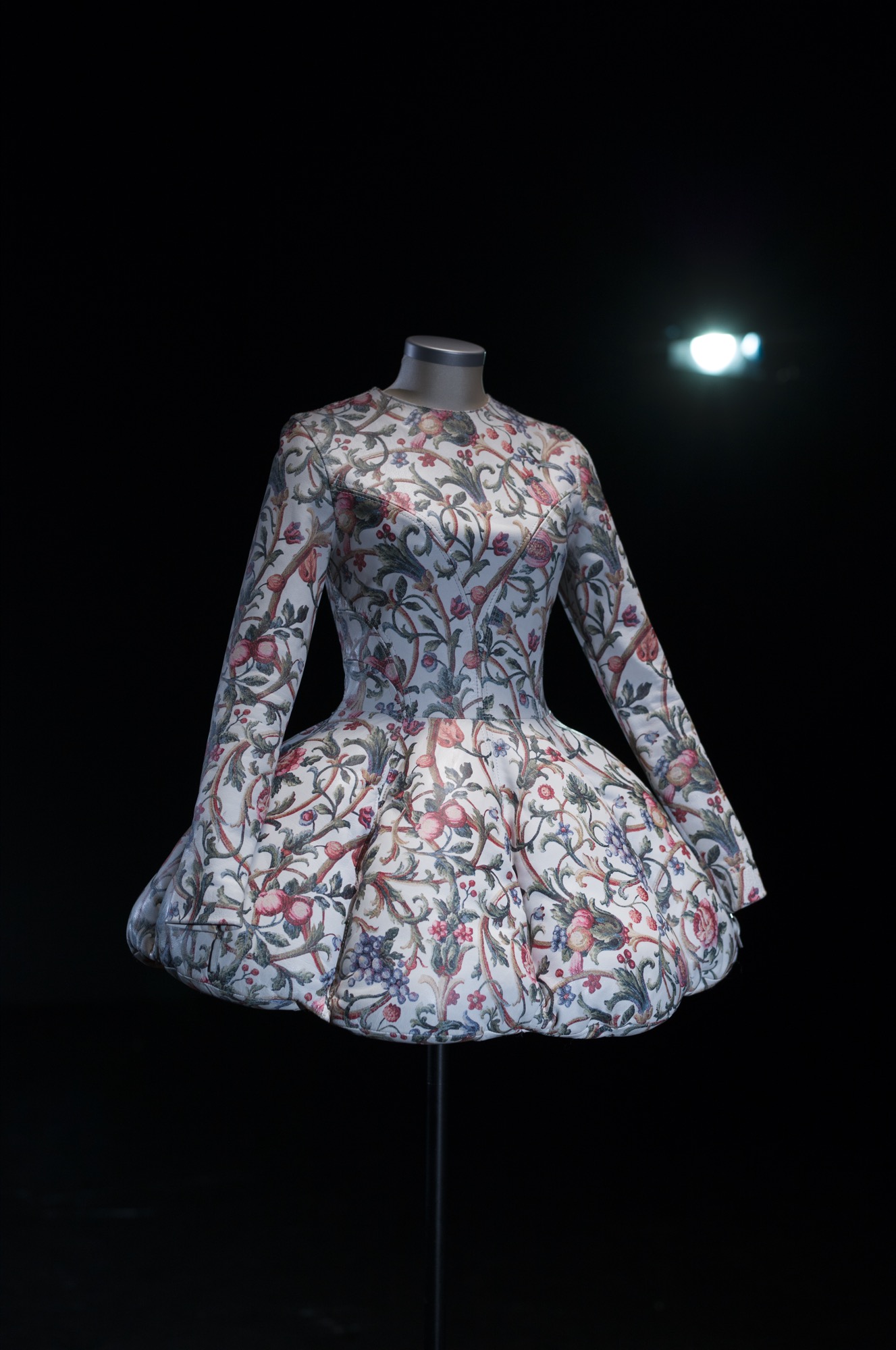
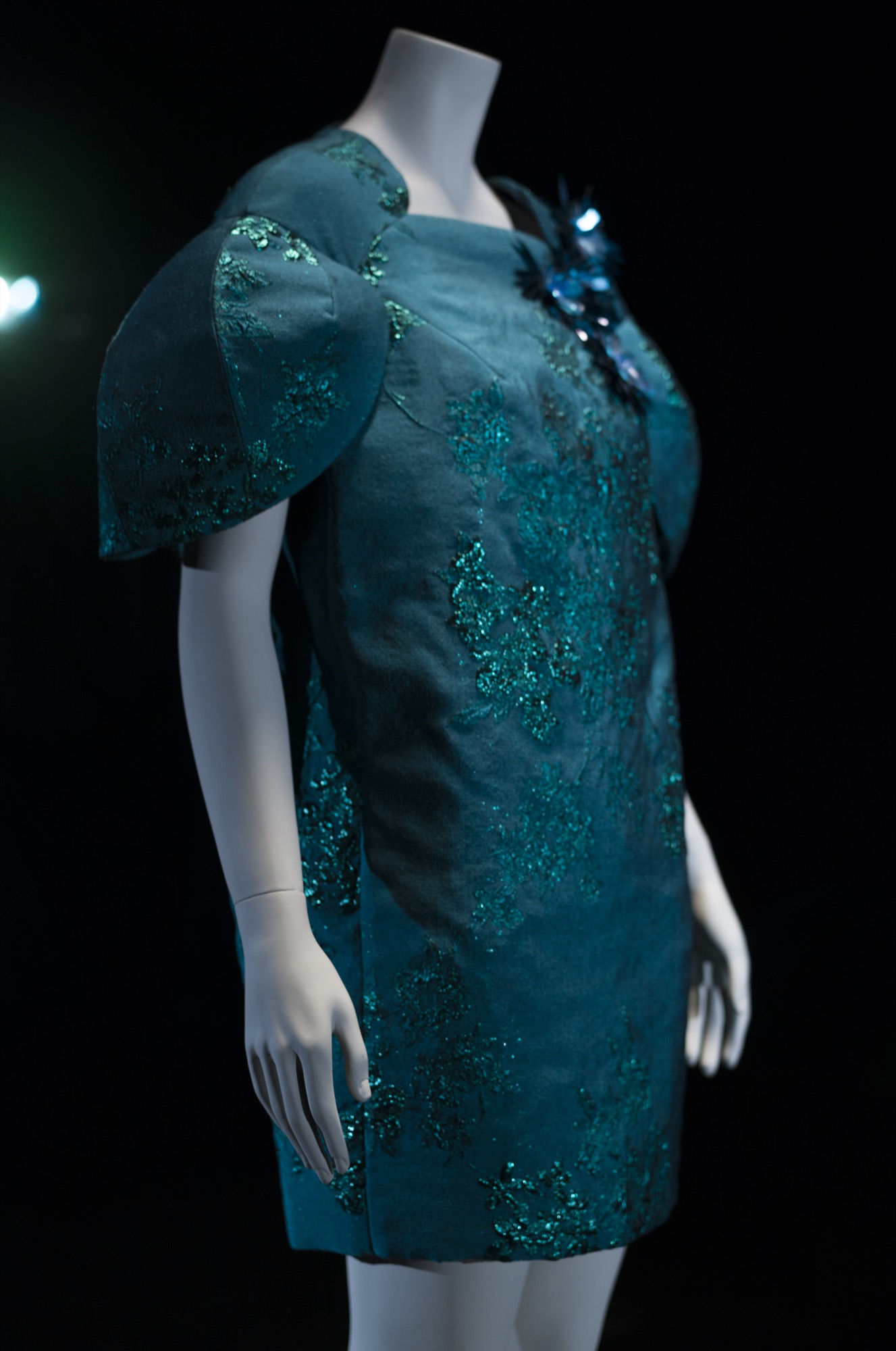
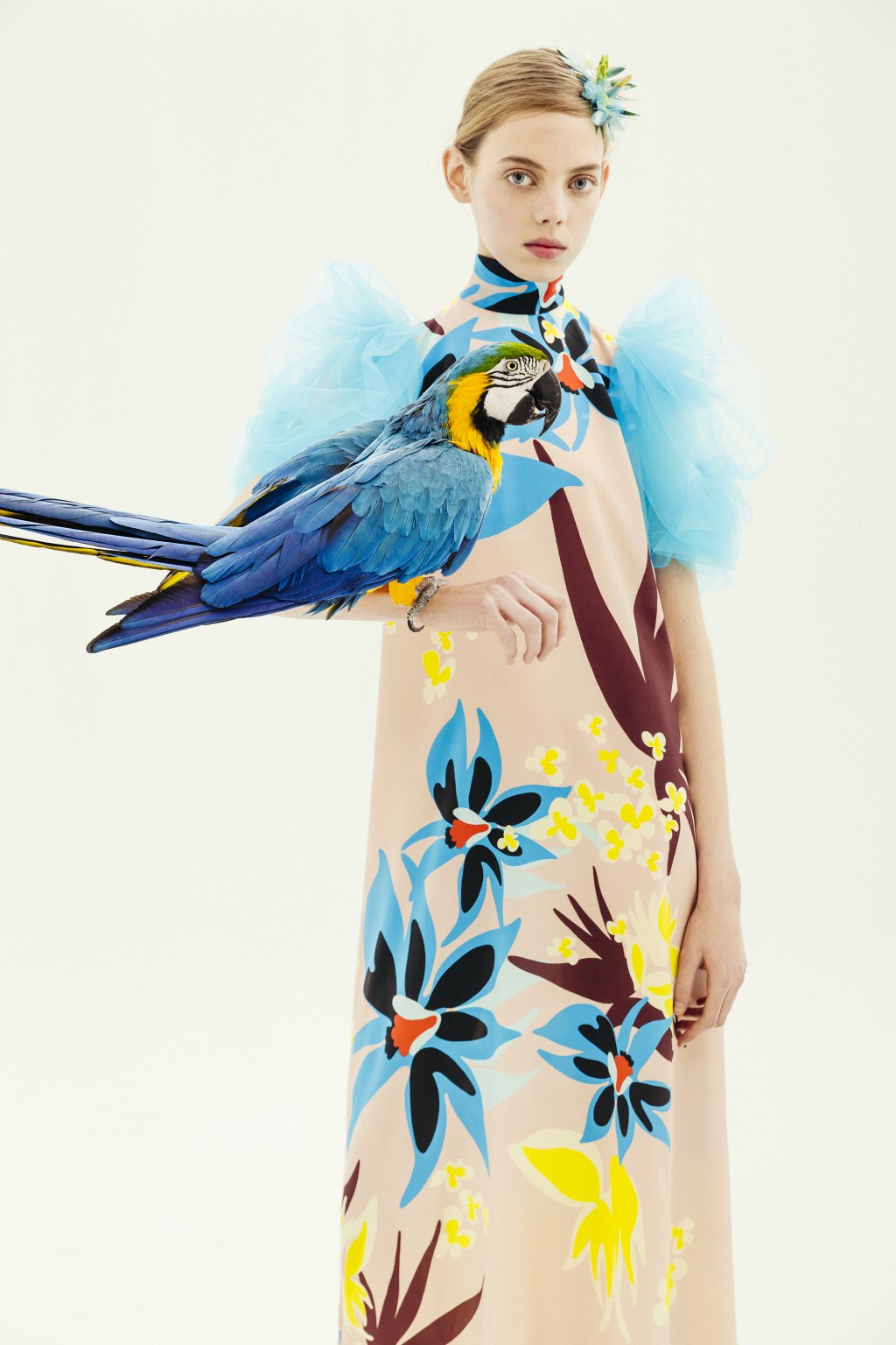
(EspaĂąol) GratacĂłs en la MBFWM: Colecciones AW2021
An aesthetic tour of shop-window displays 2019
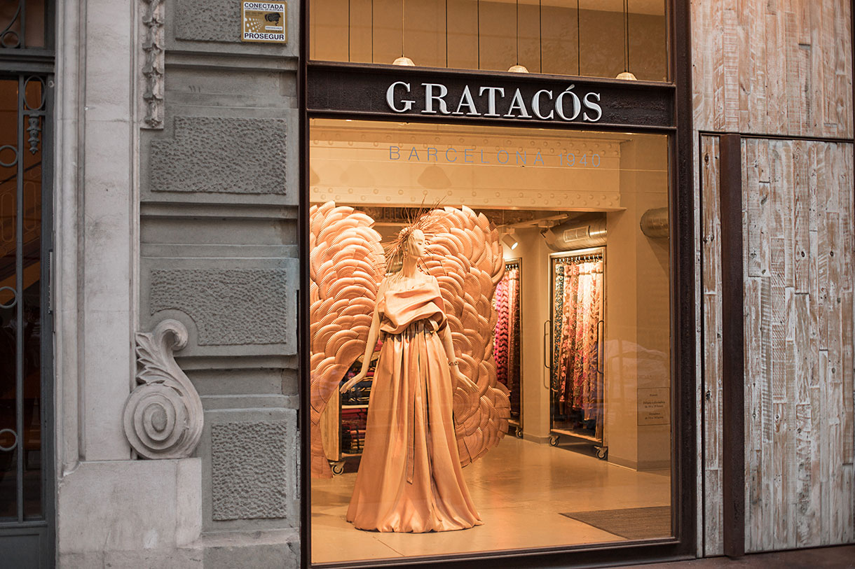
If anything has defined us since our beginnings, it is our firm commitment to the windows that decorate the shop we have in Barcelona. We are aware that they are our cover letter, the first visual point of attraction and “conquest” of the customer and represent a unique opportunity for designers’ creativity to flow hand in hand with our seasonal fabrics, creating dreamlike scenarios. Faced with this expectation, who can resist letting the imaginative madness of current fashion designers flow? Moreover, we like them to experiment, surprise and captivate us at first sight. An innovative staging of GratacĂłs fabrics in combinations that exceed our expectations. Moreover, the more disruptive the shop-front is, the better!
In 2019 we had the support of several artists who left their mark via our shop windows and to close last year, we want to recall them with a small tribute. Do you have any favourite? What did you like most? We review the most prominent:
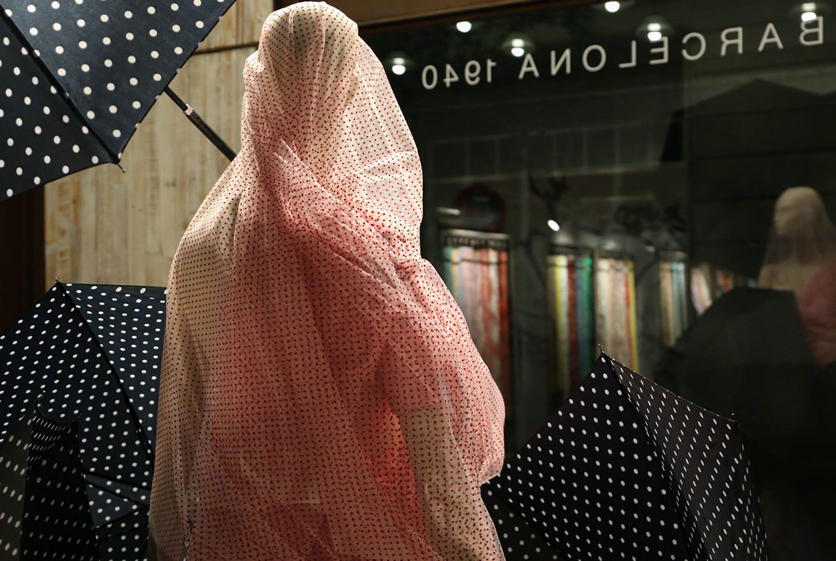
February 2019. Rainy weather
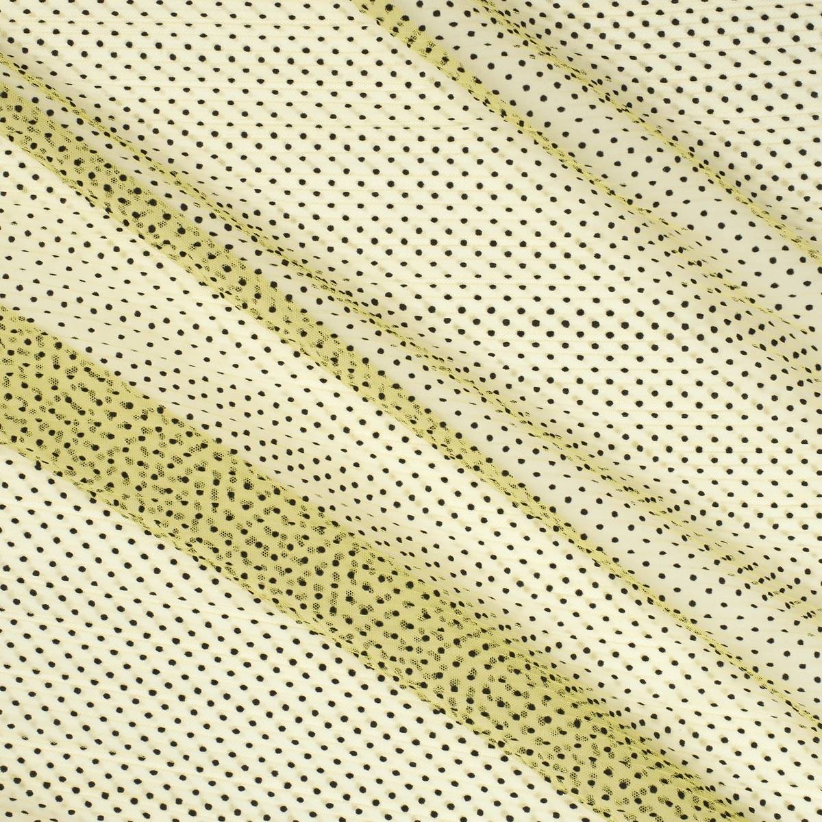
Rain was the main feature of the most ephemeral month of the calendar in a work signed by Antonio Iglesias.The Barcelona interior designer wrapped the mannequin in a delicate plumeti tulle in pale pink to give it a fragile and nostalgic hue, in contrast to the black umbrellas with polka dot pattern that accompanied the model. A colour contrast with the same common denominator: patchwork.
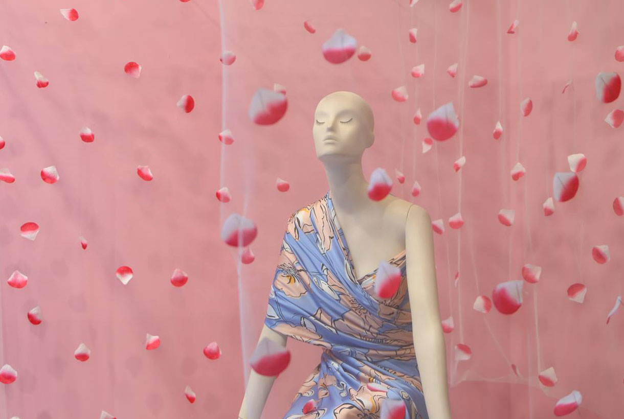
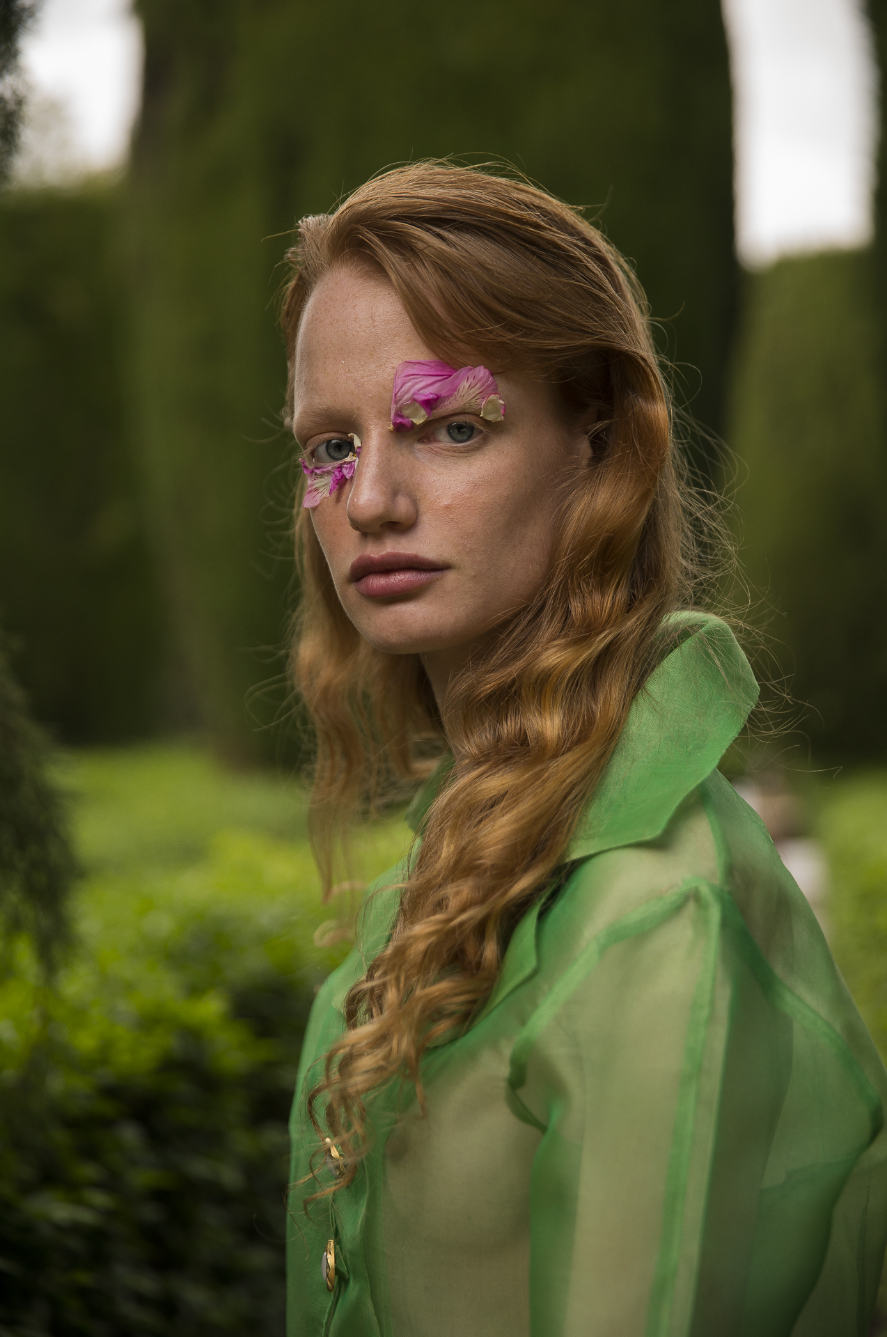
March 2019. The floral awakening
The beginning of spring marked the theme of a floral showcase that coincided with the presentation of the new fabric season. Antonio Iglesias captured the essence of all this renovation via a shop window in pink tones in which a tulle curtain with inserted petals surrounding the mannequin stood out, dressed in one of the most successful floral crepes from the last collection.
April 2019. Bridal Moulage
April is the month of brides and at GratacĂłs we reserved this shop-front for one of the winners of the moulage competition among IED Barcelona wedding dress design graduates. A unique opportunity to publicize the work of the new generations in bridal design. In this case it was the student Katia Combatti who developed a spectacular wedding dress with large volumes on the sleeves, following the steps of this unique cutting and sewing technique.
May 2019. Fashion illustrated
When fashion dialogues with other disciplines such as illustration, you can find creatives as fascinating as the one that Joel MiĂąana prepared in order to showcase the month of flowers. The renowned Catalan illustrator, capable of capturing the essence of fashion moments that escape photography, showed how he wanted the mannequin to be dressed: with textured fabrics contrasted in greenish tones and modern complements. Just take a look at the results!
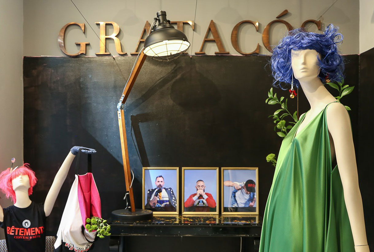
June 2019. Brain & Beast Essence
Ăngel Vilda, designer and most visible face of Brain&Beast transformed the GratacĂłs shop-front into one of his creative illusions, marked by the criticism and dualities that his rebellious streak loves to play with. There was no lack of elements of popular culture, contrasting colours and a luxury of detail that is part of the unique Brain & Beast universe. Anyone who is familiar with them knows full well what to expect…
September 2019. The Dominican Harajuku Kids
2019 has been the year of take-off for Dominnico. Apart from his collaborations with Rosalia, the young designer from Alicante, in July he won the Mercedes-Benz Fashion Talent award from among the young companies that parade in the EGO of Cibeles. The award-winning ‘Harajuku Kids’ collection, inspired by the histrionic urban tribes of Japan, was made with some of the most special fabrics from the last spring collection. The shop-window reproduced some of the key looks of this surprising creation.
November 2019. Youth Eclecticism
At GratacĂłs we like to give an opportunity to new talent. That is why our shop-front is also sometimes an experimental support where it is the young talents who set their own limits. Design students from the Institut CatalĂ de la Moda (ICM) created an eclectic showcase of some of their most identifying outfits with amazing fabrics from the current autumn-winter 2019/2020 collection. A creation that was both fresh and eclectic.
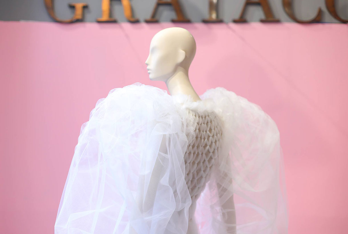
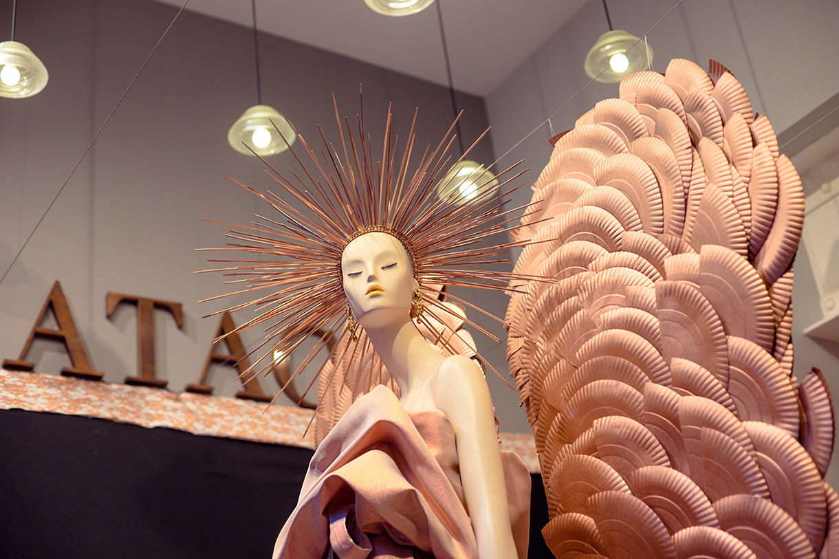
December 2019. The dazzling angel
The last showcase of the year was sublime, starring a look inspired by the strength and goodness of an angel to express the most glamorous and sophisticated femininity, coinciding as it did with the Christmas festivities. It was conceived by the students of IED Barcelona who created an impressive feminine look in pink tones that empowered and attracted all eyes. An unforgettable showcase!
Explore your festive side!
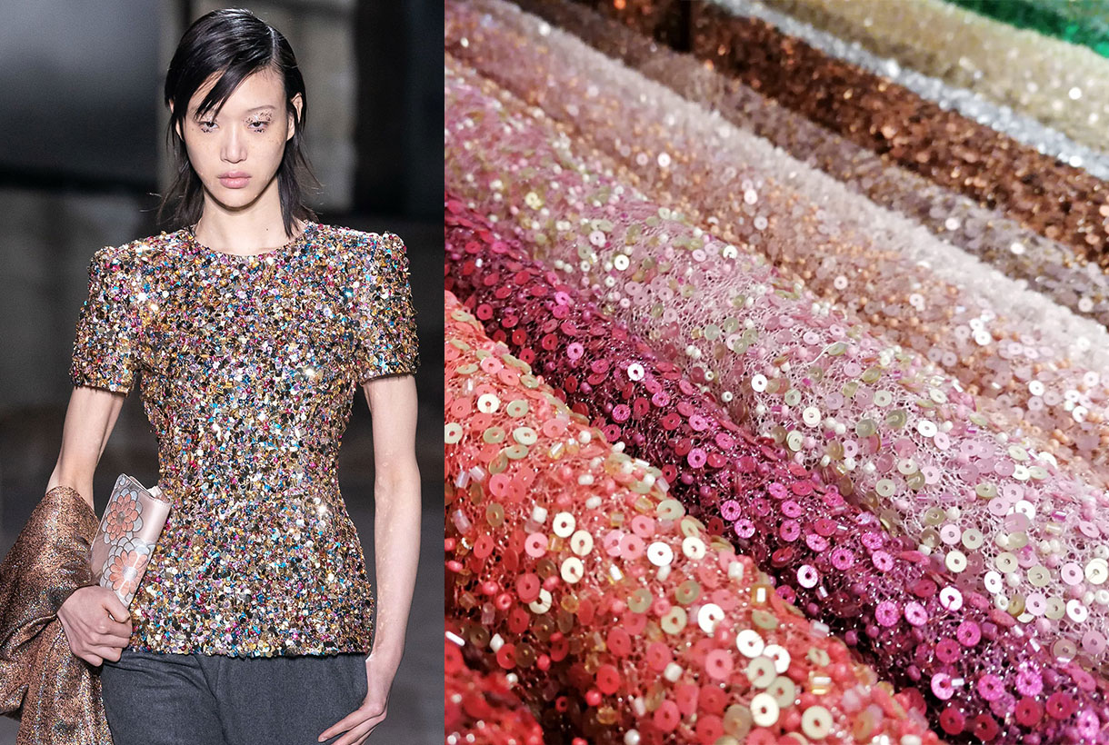
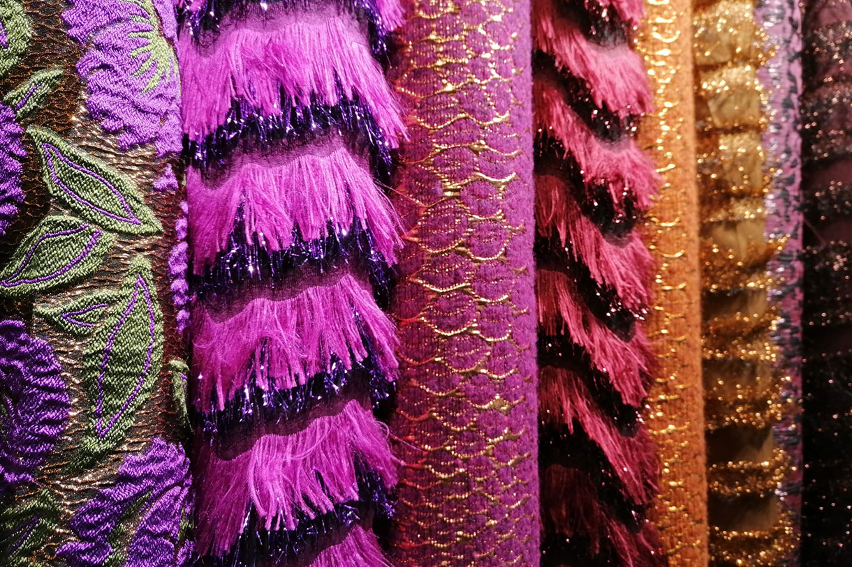
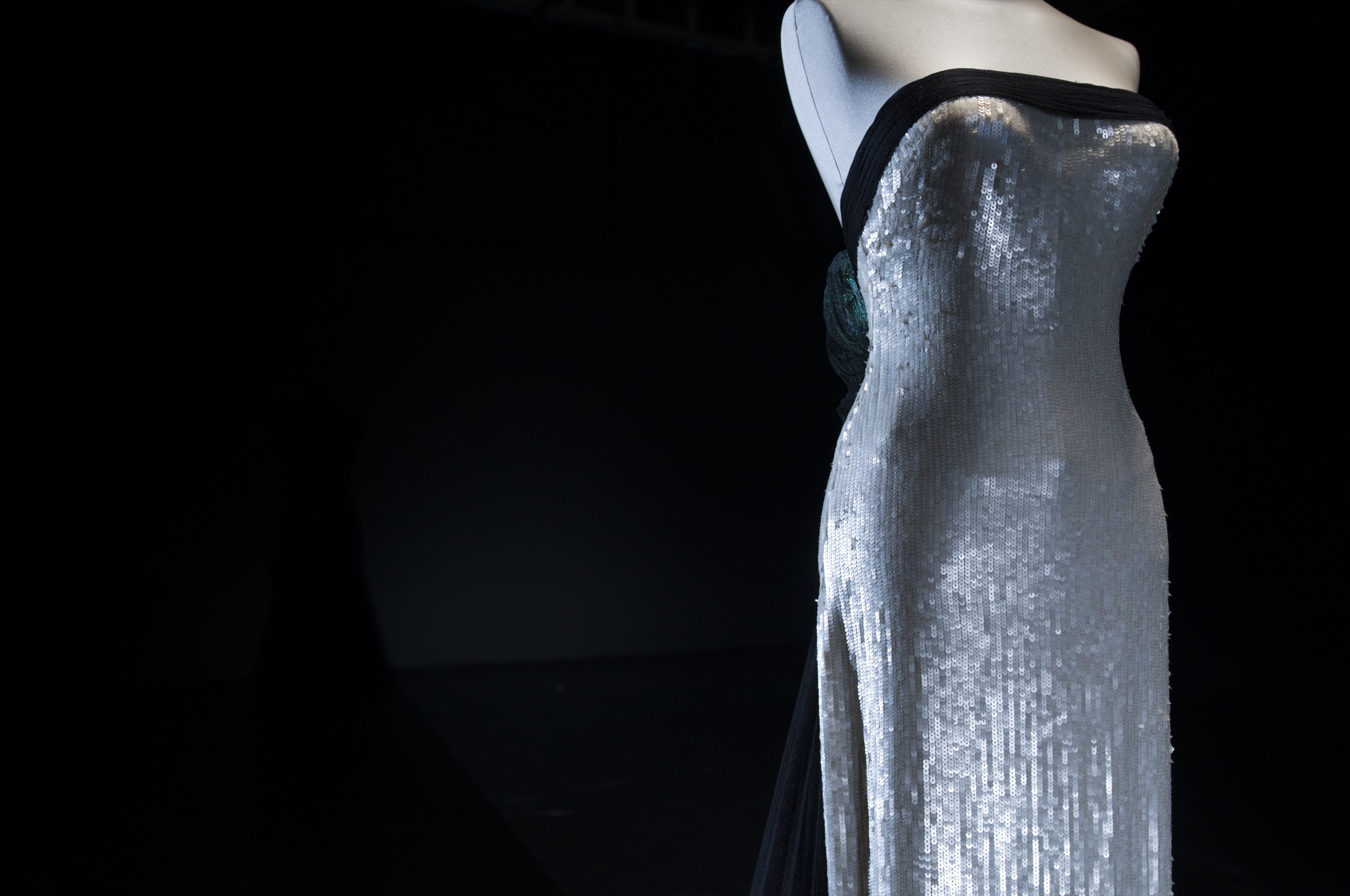
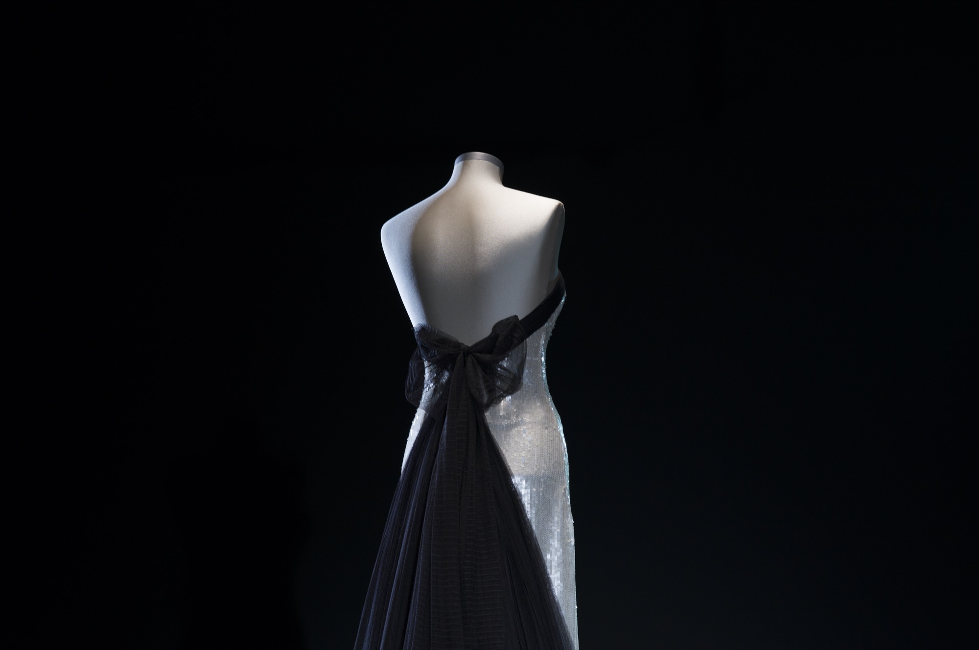
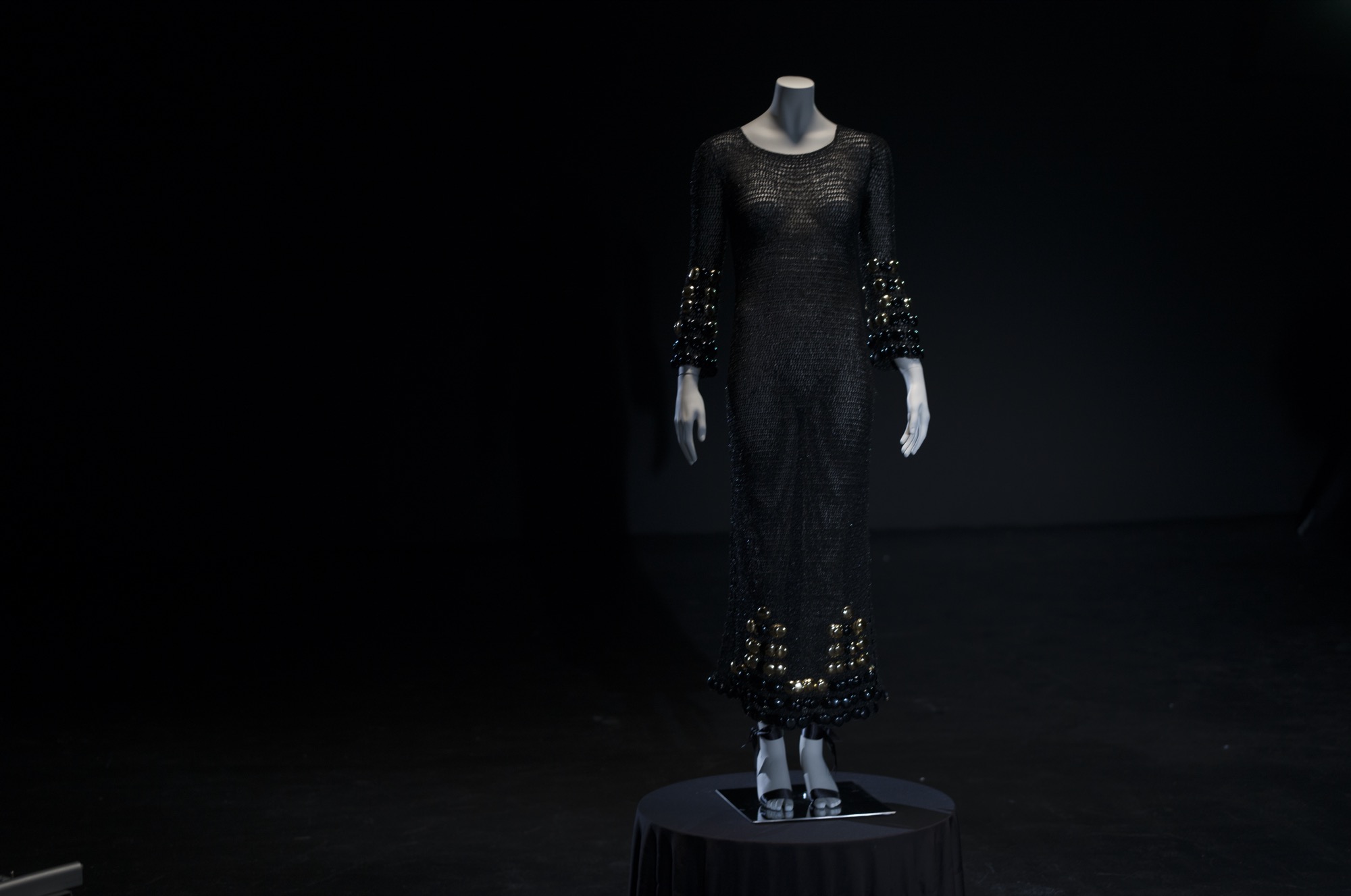
And the time has come! The time of the party and debauchery. Ornate garments and fabrics with sparkles that shine with their own light for daily celebrations accompanied by long nights that demand a more lavish dress code, where creativity and fantasy work at the service of sophistication. Those festive looks that bring out the best version of oneself because it is already known that the most shining âmeâ lives at Christmas. An era that us at GratacĂłs especially like for all its cultural and religious symbolism.
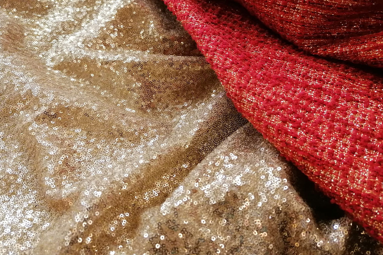
At this time of celebrations we want to show you the most fantasy collection of winter. That where gold and silver are the protagonists of the most sumptuous fabrics that gain in compositional richness, touch and volume. Also it is time to approach other products that explore the fantastical side of fashion through sequins, rhinestones, embroidery and metallic threads, among others.
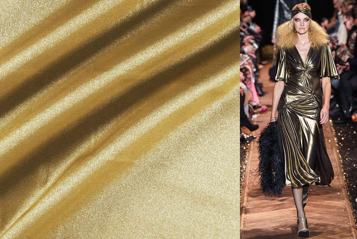
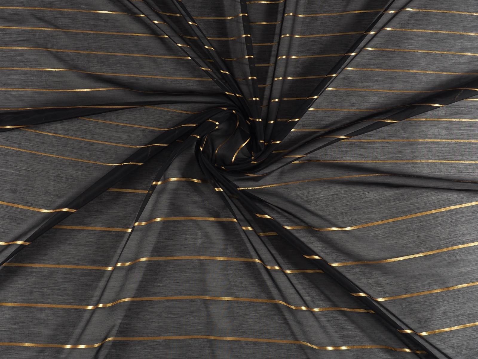
Gold
Did you know that the gold colour is neither the most loved nor the most hated? And yet it is a tone that has double standards in terms of meaning. In its splendorous side, gold is associated with beauty, triumph, wealth and happiness. It is a symbol of courage and power. On its dark side, this precious metal also has strong links with materialism, vanity and even arrogance. The treasures are golden or the majestic palace of Versailles surrenders to gold, which is associated with luxury in its maximum opulence. In terms of fabrics, we pay homage to gold through pleats, sequins, embroidery and lamĂŠs, which create soft golden layers in more colourful or muted tones.
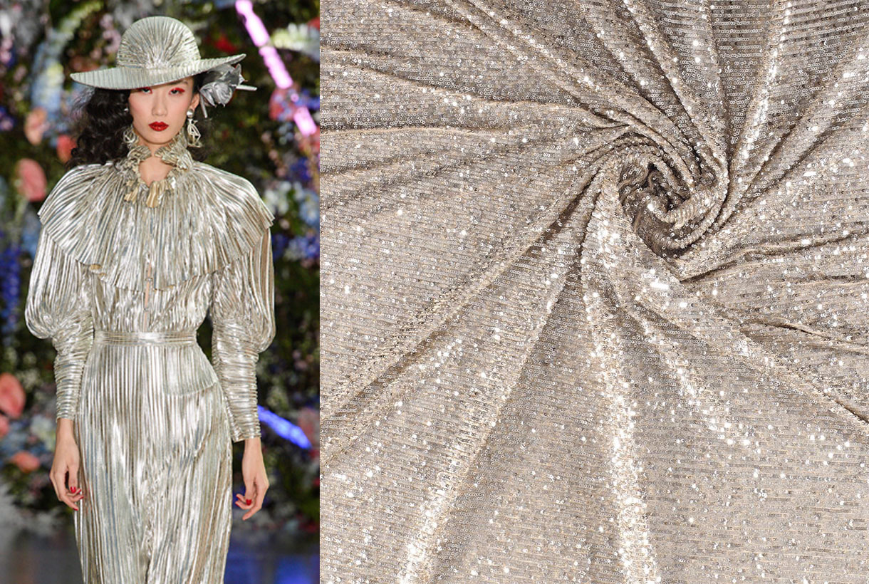
Silver
Silver is the colour that comes from the metal that gives it its name, silver. The first associations to this fashionable tone have to do with wealth, money or success, but also with coldness, greed or arrogance. Like its golden brother, it has an antagonistic connotation. Looking at the positive side of colour, silver is a tone also linked to luxury and partying that is associated with innovation, the future, movement and progress. It is not in vain that silver will dress future trends, avant-garde architecture, technological mechanisms or the most innovative developments. In fabrics, we highlight the inexhaustible sequins that are so successful during the festive season and the metallic sparkles of lame. Also some space-themed fantasy fabric.
Long life to colour
Not all the colour palette linked to partying has to do with metallic tones and the important thing is to choose fabrics that attract light through their fascinating sparkles. This season the games consists in the variety, the key lies in the brightness of the fabric. Thus, in our space the attractive emerald greens coexist, with the femininity of the powdered pinks, the enigmatic mauve and violet and the bet that never fails: the red classic in all its versions. From the vibrant crimson to the elegant maroon. Which one fits you the most?
Beyond our suggestions, we also invite you to enter our space in Barcelona to see the latest novelties and we want to surprise you with our new showcase of festive themes that IED Barcelona students have devised for these very special dates. The heavenly inspiration with an angel as main theme serves as a context to express the most glamorous femininity in a bewitching look in pink tones, which empowers and attracts all eyes. Happy Holidays to all!
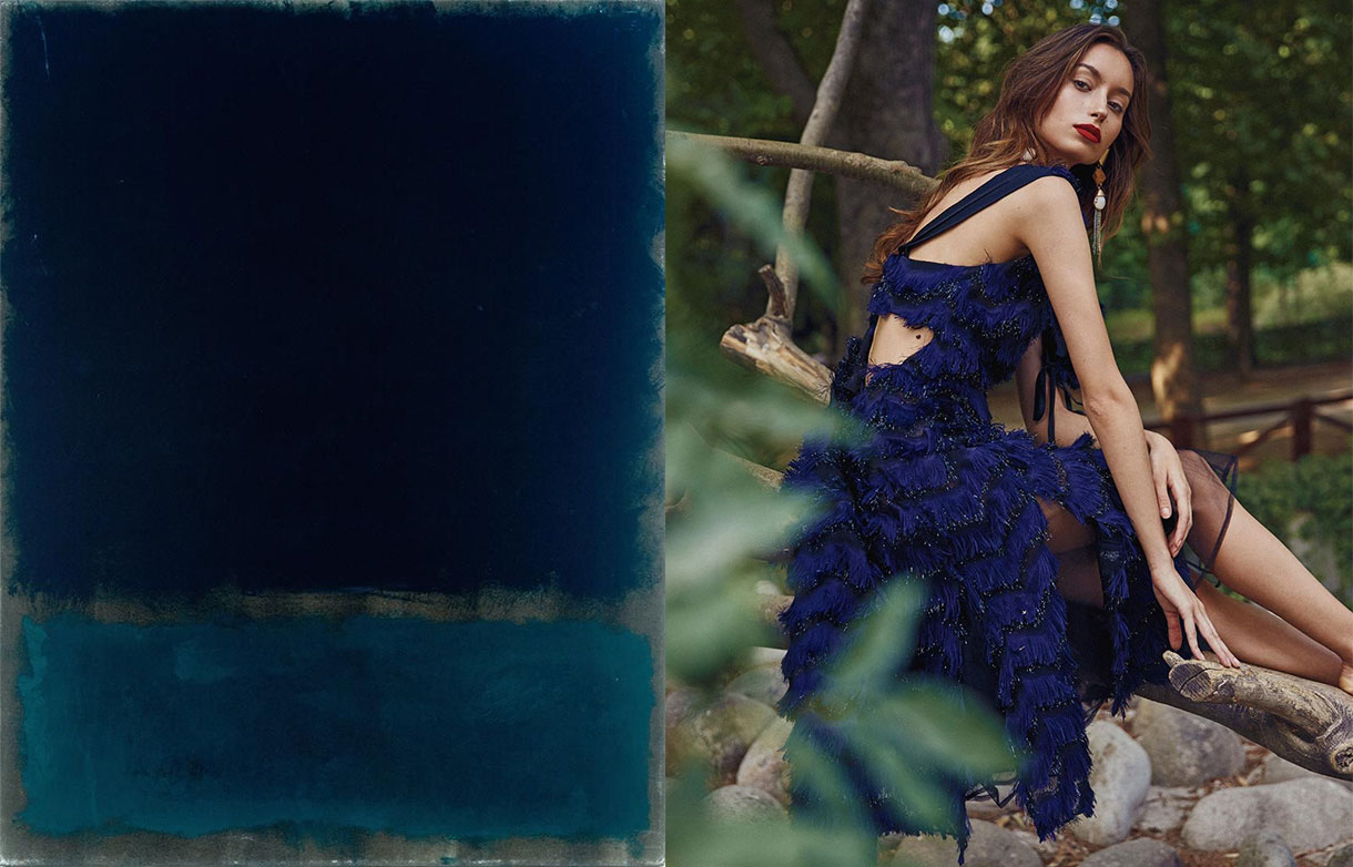
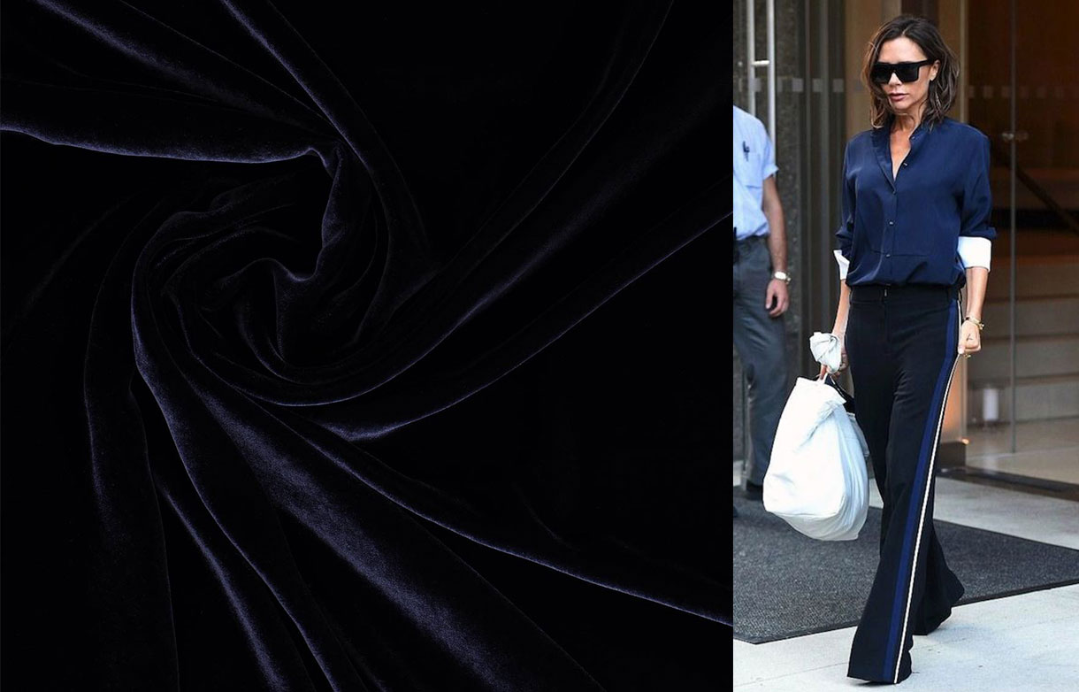
Dark blue, almost black
They call it the new black for its versatility and functionality, appealing elegance with discretion. Navy blue was never a risky tone, nor did it pretend to be because it is precisely through harmony, balance and timelessness that it seduces, which makes it a safe bet inside the wardrobe, one which goes beyond the cycles and fashions dictated by the sector. And it is already well-known that the classic never dies. For this reason the colour in question borders on immortality.
Here are some curiosities about enigmatic navy blue:
The origin of navy blue
Navy blue owes its name to the dark blue that was used in the uniforms of several navies. The first to adopt this shade was the British Royal Navy in 1748 and subsequently it was extended to most of the world's navies. In fact it offered the advantage that being almost black the loss of colour was avoided. Thus during the 18th century it was used as a base to dye uniforms.
During the 19th century the use of navy blue extended to other professions and quickly conquered the street. Then the colour black continued to maintain dominance in clothing which was considered serious. However, dyers used Prussian blue and indigo pigments to launch the fashion of navy blue fabrics and dresses, which became a social phenomenon. Navy blue maintained the sobriety of black, but it proved to be less hard and above all cheaper. In fact the colour of the clothing was generally not a matter of taste, but rather of money. After World War I this dark hue displaced black in many professions such as sailors, military, gendarmes, fire-brigade, police or civil servants.
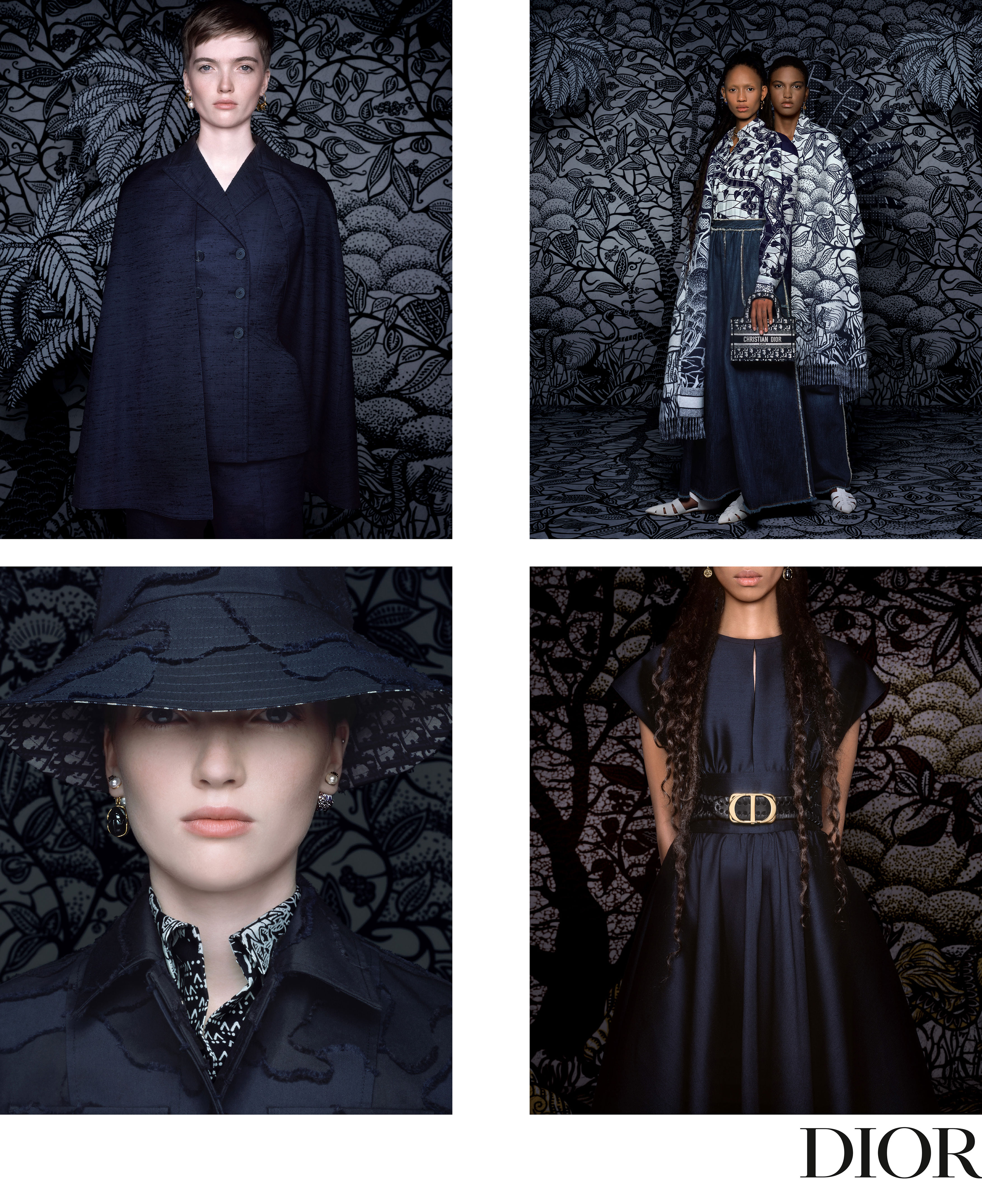
Dior adopts it as a feminist symbol
“Among all colours navy blue is the only one that can compete with black, by presenting the same virtues.” This phrase by Christian Dior has also guided the last stage of the French maison led by Maria Grazia Chiuri, the first woman to lead the creative direction since 2017. Navy blue was Chiuri’s second collection for Dior, rebelliously picking up the heritage of the French designer with creations brimmed with items never seen on the catwalk such as jeans or a black leather beret as a star accessory.
Thus evening dresses, with transparencies and brightness, alternated with other looks for trouserss and workers’ overalls, as if they were factory uniforms combined with printed handbags. Navy blue represents equality and uniformity for Chiuri. There is no distinction of classes or genders. “The worker’s look is a way of saying that we have to work towards equal opportunities,” she argued at the time. Since then this colour has become a common resource in Dior collections that in lesser or greater proportion have adopted navy blue.
The most classic blue will also be the colour of 2020
2020 will also be dyed in blue. The justify Institute, a world reference in chromatic themes, has chosen the Classic Blue 19-4052 as the colour that will influence next year in such creative sectors as design, fashion or advertising. According to the institution it is a âlasting blue shade for our times, elegant in its simplicityâ. It suggests the sky at sunset and its calming qualities, such as the promise of protection, âsaid Laurie Pressman, vice president of the Pantone Colour Institute.Â
According to the institution Classic Blue tends to surge at convulsive moments of change and this tonality evokes the desire to consolidate reliable and stable foundations on which we can build. In this sense, it offers us a refuge: âWe live in an era that demands trust and faith, and this type of blue offers a solid and reliable feeling that encourages us to broaden our thinking and challenges us to see things in depth,â explains Leatrice Eiseman, the executive director of Pantone.
The Pantone colour of the year is chosen by the directors of the company and about 40 experts from around the world, who take into account factors such as the economic situation, films and popular songs or social issues, among other variables. Thus Classic Blue is taking over from Living Coral, the colour of 2019.
A route of fashion exhibitions in Europe
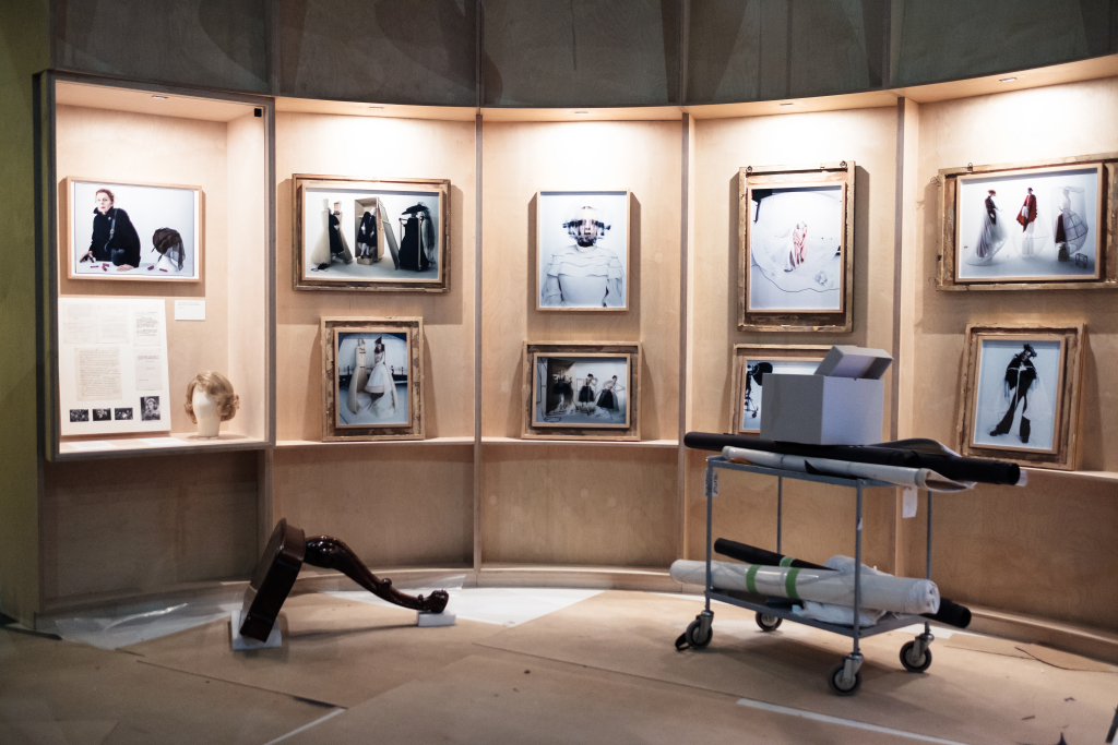
Fashion shows are appealing at any time of the year. They represent an opportunity to reflect on the sector from multiple points of view and covering topics as different as those we suggest below: the dialogue established by garments and their fabrics in migratory societies, the importance of sustainability, the history of footwear or a vision of fashion photography via one of the great contemporary artists.
On the eve of a new holiday, All Saints Day, we are offering you a new cultural route throughsome European exhibitions that we have not yet mentioned in this blog: interesting fashion shows in cultural capitals such as Antwerp, Florence, London and Paris, so that like us you can also find inspiration, knowledge and new ideas that enrich you in your respective jobs. Take note!
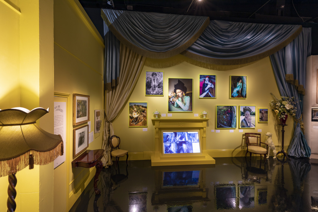
1. Antwerp: ‘Textile as Resistance’        Â
The exhibition ‘Textile as Resistance’ at the MoMu (Antwerp Fashion Museum) asks interesting questions of the public: What messages and stories can the fabrics convey? What does an item of clothing say about the person wearing it? Can fabrics weave the past with the present? Can they be acts of resistance? The journalist Samira Bendadi and the photographer Mashi Mohadjerin reflect on the values ââthat fabrics can provide (shelter, resistance, hope, happiness, tradition, beauty, spirituality and decolonisation) and try to answer all these questions through this challenging sample. It is a joint photographic project that began through stories from immigrants in the Belgian fashion capital and that soon spread to other parts of the world. Thus in ‘Textile as Resistance’ this creative couple invites you to discover clothes and textiles as an excuse to learn visual and written stories that transcend religious, cultural and national boundaries. Migration marks social, aesthetic and personal change.
Momu ‘Textile as Resistance’.Until February 16, 2020.
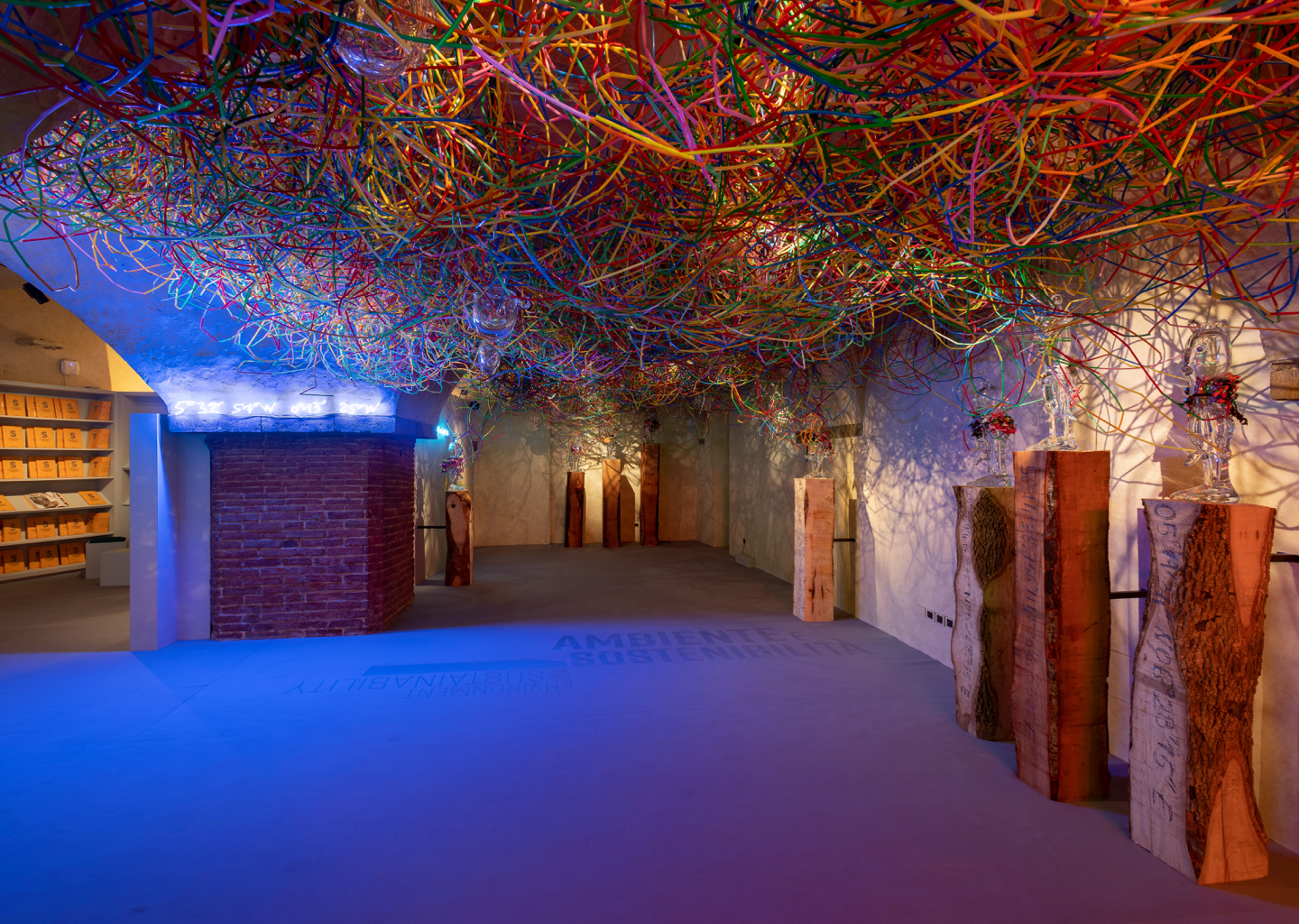
2.Florence: ‘Sustainable Thinking’
Sustainability is neither a fashion nor a trend: it is a real necessity. Aware of the move towards green issues that we are also promoting from GratacĂłs, we are especially interested in recommending this exhibition that houses the Salvatore Ferragamo Museum in Florence. ‘Sustainable Thinking’ invites reflection through art and fashion.
The term “sustainability” defines the human capacity to meet “the needs of the current generation without compromising the ability of future generations to meet their own needs.” It is a challenge that is not limited to production methods but also implies a greater focus on the environment in general. Balance must be restored, beginning with a more conscious and shared way of thinking that is capable of generating new development and coexistence strategies. For this reason, ‘Sustainable Thinking’ exposes the work of numerous artists who reflect on sustainability. Some projects focus on recovering the link with nature, the use of organic materials, the need for a creative reuse of materials, the connection between sustainability and technology … An opportunity for artists, fashion designers, textile and yarn manufacturers to offer a plurality of views to inspire new sustainable projects.
Salvatore Ferragamo Museum. ‘Sustainable Thinking’. Until March 8, 2020.
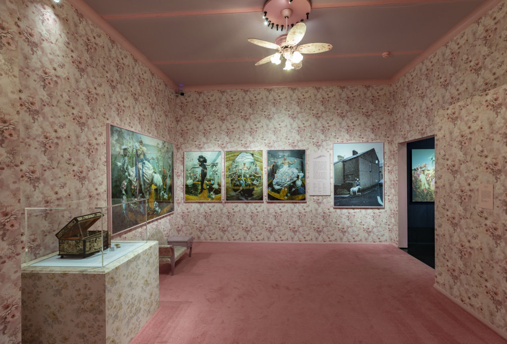
3. London. Tim walker
Coinciding with the exhibition dedicated to the talented designer Mary Quant, âthe motherâ of the iconic miniskirt, the Victoria & Albert Museum opens a new exhibition in parallel, this time dedicated to photography. As the name implies, ‘Tim Walker: Wonderful Things’ represents an immersive journey into the fantastic worlds created by this contemporary fashion photographer who is one of today’s most interesting profiles. Specifically the exhibition shows Tim Walker’s creative process via his pictures, films, photographic sets and special installations. The exhibition also includes an exclusive photo session made with some of the museum’s iconic garments
GOES. ‘Tim Walker: Wonderful Things’. Until March 8, 2020.
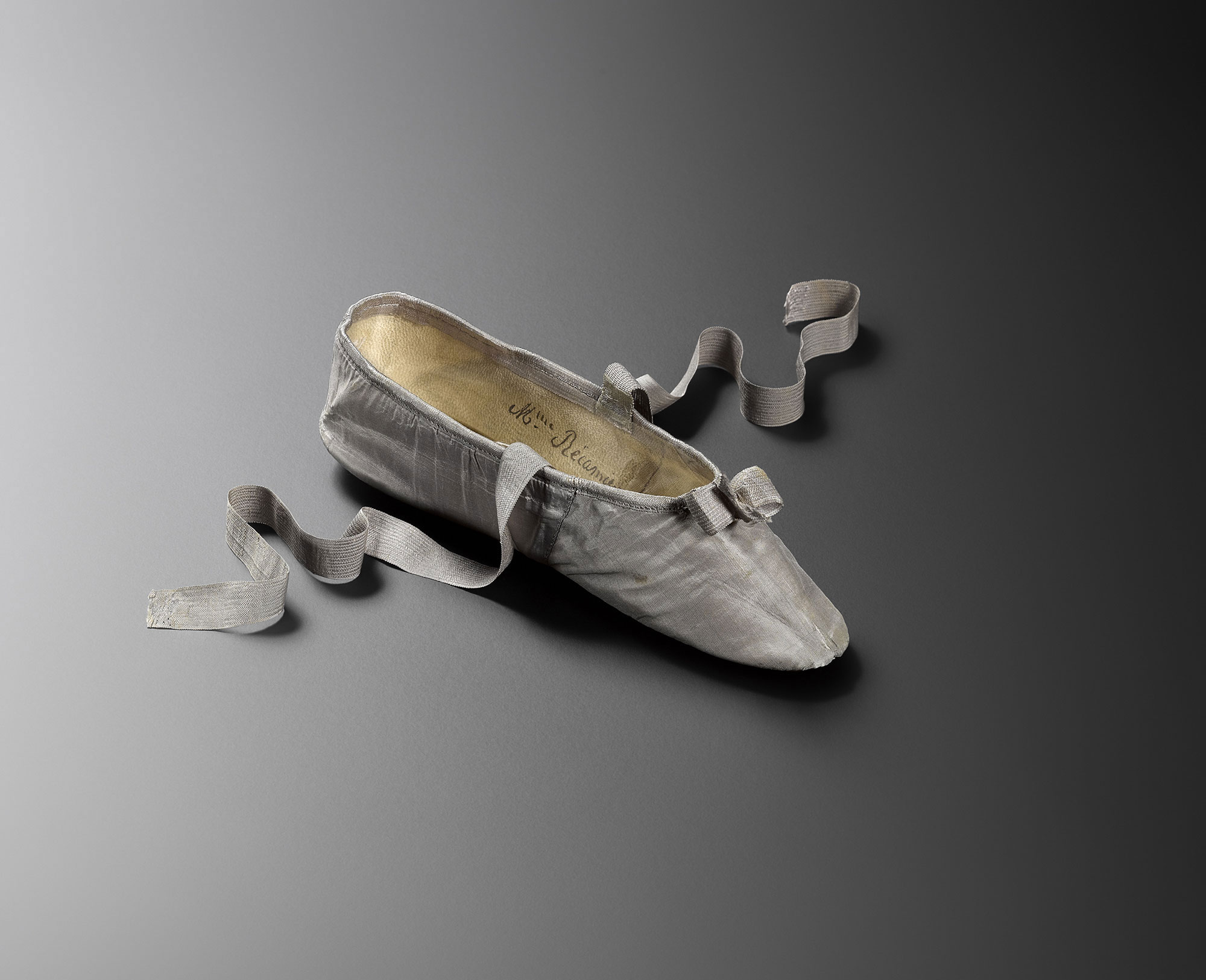
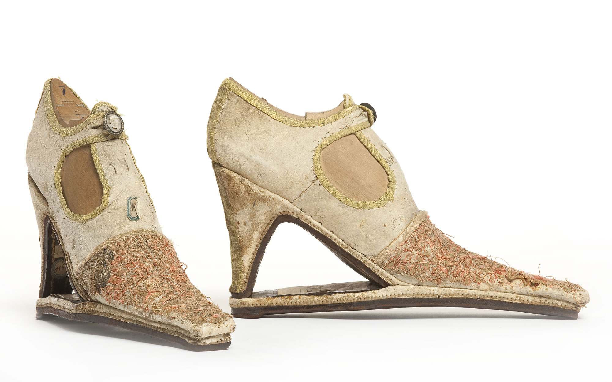
4. Paris. “MarchĂŠ et DĂŠmarche: Historie de la Chaussure”
The Museum of Decorative Arts in Paris reschedules a new fashion exhibition to capture the attention of visitors. On this occasion the focus of attention is footwear and its history. From the complement itself to a reflection on the act of walking. The sample is based on a 1792 shoe attributed to Marie Antoinette which was only 21 centimeters long and then, little by little, it delves into into the history that lies behind each accessory displayed. The sample of 500 works includes shoes, paintings, photographs, works of art and films in order to reveal more about this garment which covers our feet.
Museum of Decorative Arts. “MarchĂŠ et DĂŠmarche: Historie de la Chaussure”. Until February 23RD, 2020.
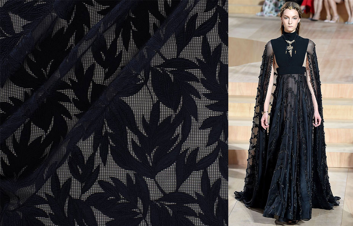
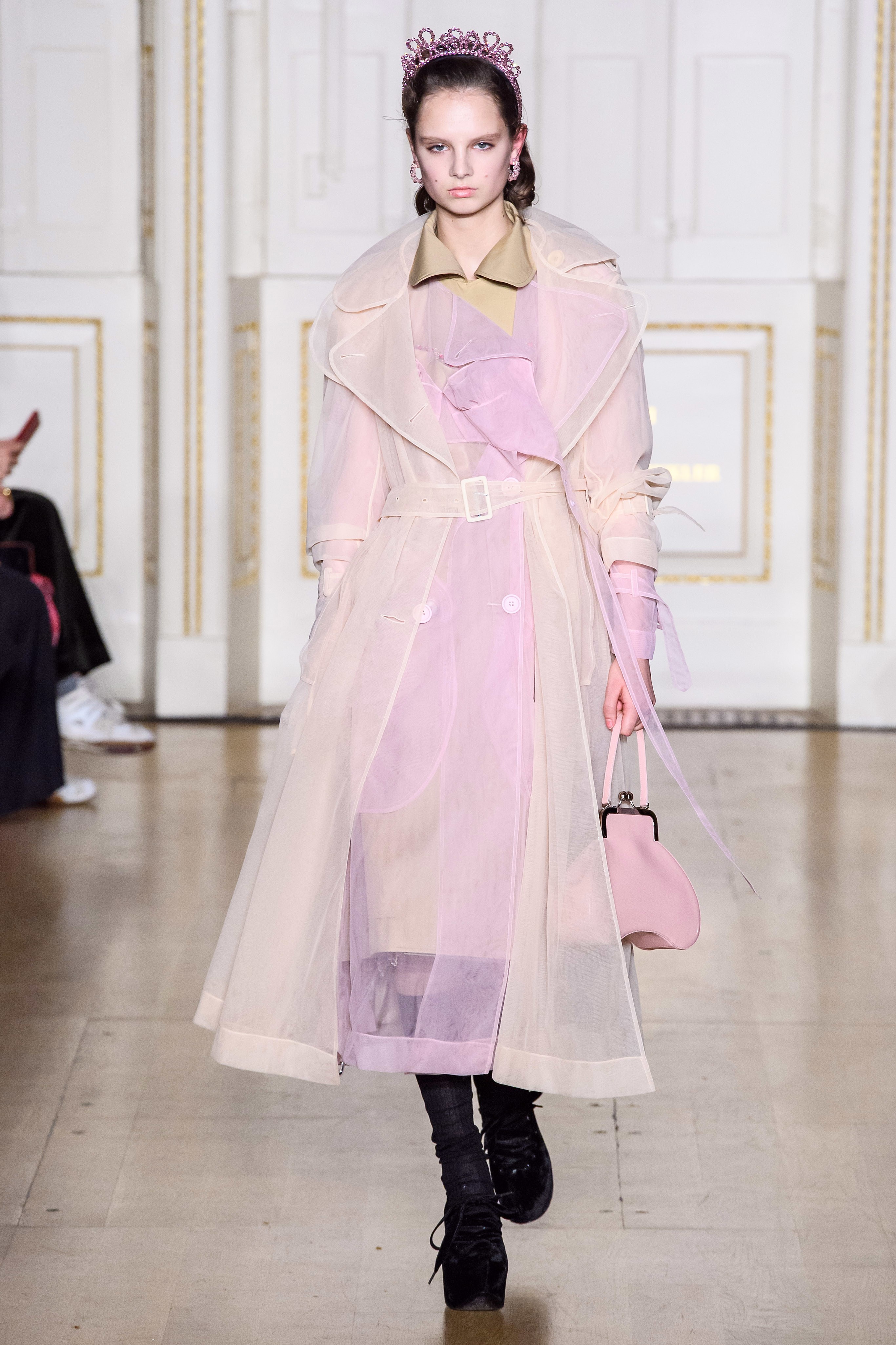
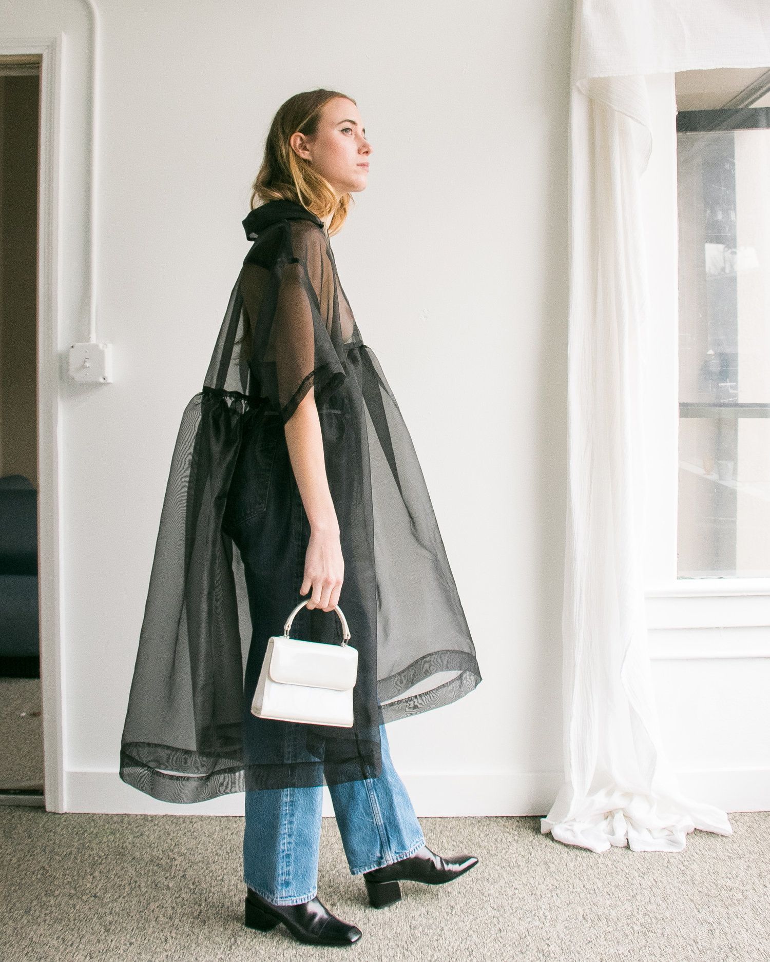
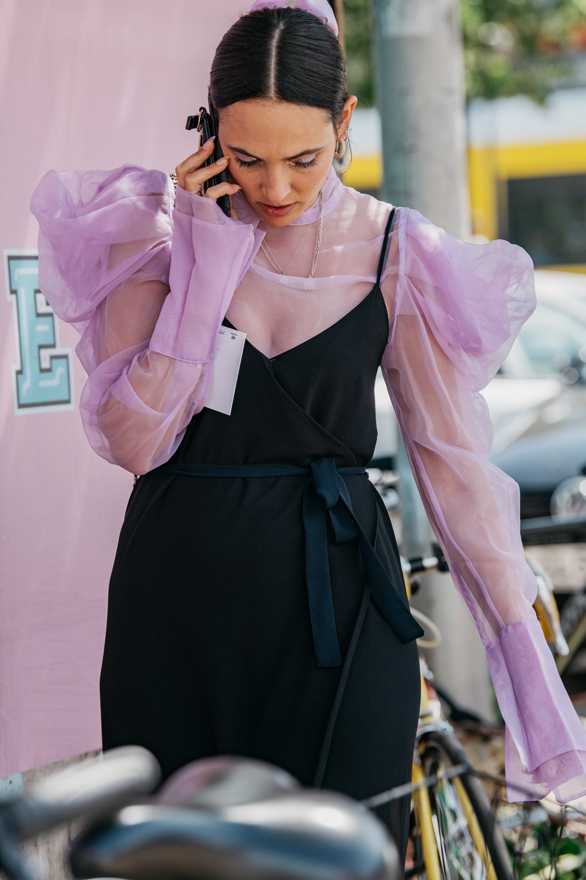
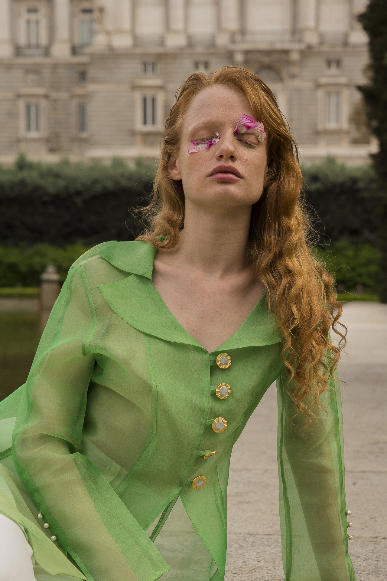
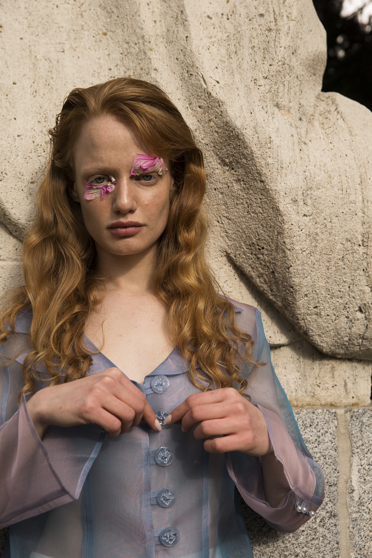
Organza, the top fabric of the season
Transparencies are associated traditionally to the mild or warm months of the year, where the high temperatures justify the apparent nudity these translucent fabrics given to garments. Until now, it was the norm or accepted by a majority and obeyed, in turn, to market demands and needs of the consumers. In the end, everything applied to a simple rule: more transparent and light fabrics in summer, more thick and opaque fabrics in winter. Nowadays, transparencies have lost their usual seasonality and designers of large firms have been responsible for the public wanting them at any time of the year by gradually including them in their collections. Laces, tulles, transparent embroideries … all the fabrics that show the skin in an insightful way. However, there is one particular one that grabs the limelight so far this year: the organza.
 |
 |
Brief historical evolution
Organza is a very fine silk fabric that is treated to maintain a certain stiffness that gives it that starchy appearance. Its name comes from Urgenc, a city in Uzbekistan and arrived in Europe from India in the 18th century. Despite being present in the continent and after its initial links to the maids of the aristocracy, it was not until the twentieth century when this fabric became popular to all social strata. The person responsible for this was Yves Saint Laurent who placed this fabric in the altars of the trends. It was in 1966 when Yves revealed his first look with transparencies. At first, the organza subtly revealed some parts of the body, but the scandal came two years later when she designed a bold dress that completely showed the chest. In the decade of the 80s, the organza allied with frills and volumes typical of that time to make exaggerated combinations, in line with the fashion of the moment that immortalized icons such as Molly Ringwald, Liz Taylor or Ladi Di. In the 90s, the fabric came back to life again thanks to the 1997 spring-summer Prada collection that homaged transparency and the triumph of minimalism. Interestingly, the Italian firm was among the first to rescue this fabric last year, probably influenced by the new furor that organza currently relives.
 |
 |
The revelation fabric of the season
This fine, translucent and rigid fabric has the peculiarity of adding elegance, delicacy and a certain romanticism and therefore, can boost any look with a simple garment. So far, the organza had also been linked in the exclusive field of celebrations, and although it remains there, the demand for this fabric, for other occasions, has not stopped growing.
On the catwalks today, organza has been present in the collections of Ralph Lauren, Balmain, Dolce & Gabbana Simone Rocha and Fendi, to name a few firms, but also in the chains of high street fashion that have democratized its use to make it accessible to the general public. For example, Zara presented in summer a collection of blouses, skirts and dresses made with organza that had a fulminating success, running out of stock.
 |
 |
From the catwalk to the high street
If a fashion is adopted in parallel by international fashion prescribers, success is more than assured and will end up arriving sooner or later to the general public. Thus, of all the pieces made with organza, the clear favourite is the blouse with puffed sleeves, being the best ally to reinvent a pair of jeans. This piece gives a romantic touch to the looks without needing other accessories. Despite the triumph of the neutrals (white, black, beige …), it also takes the colour that can range from the most vibrant palette to the pastels, our favorites. This garment works even with volume skirts or palazzo trousers.
 |
 |
From Gratacós we want to show you some organza from our current collection and the upcoming seasons. In our space in Barcelona you will find a good assortment of fabrics to decide if you want to use the organza on a festive occasion, or you decide to join the trend and dazzle with a garment made with this fabric for dayime wear.

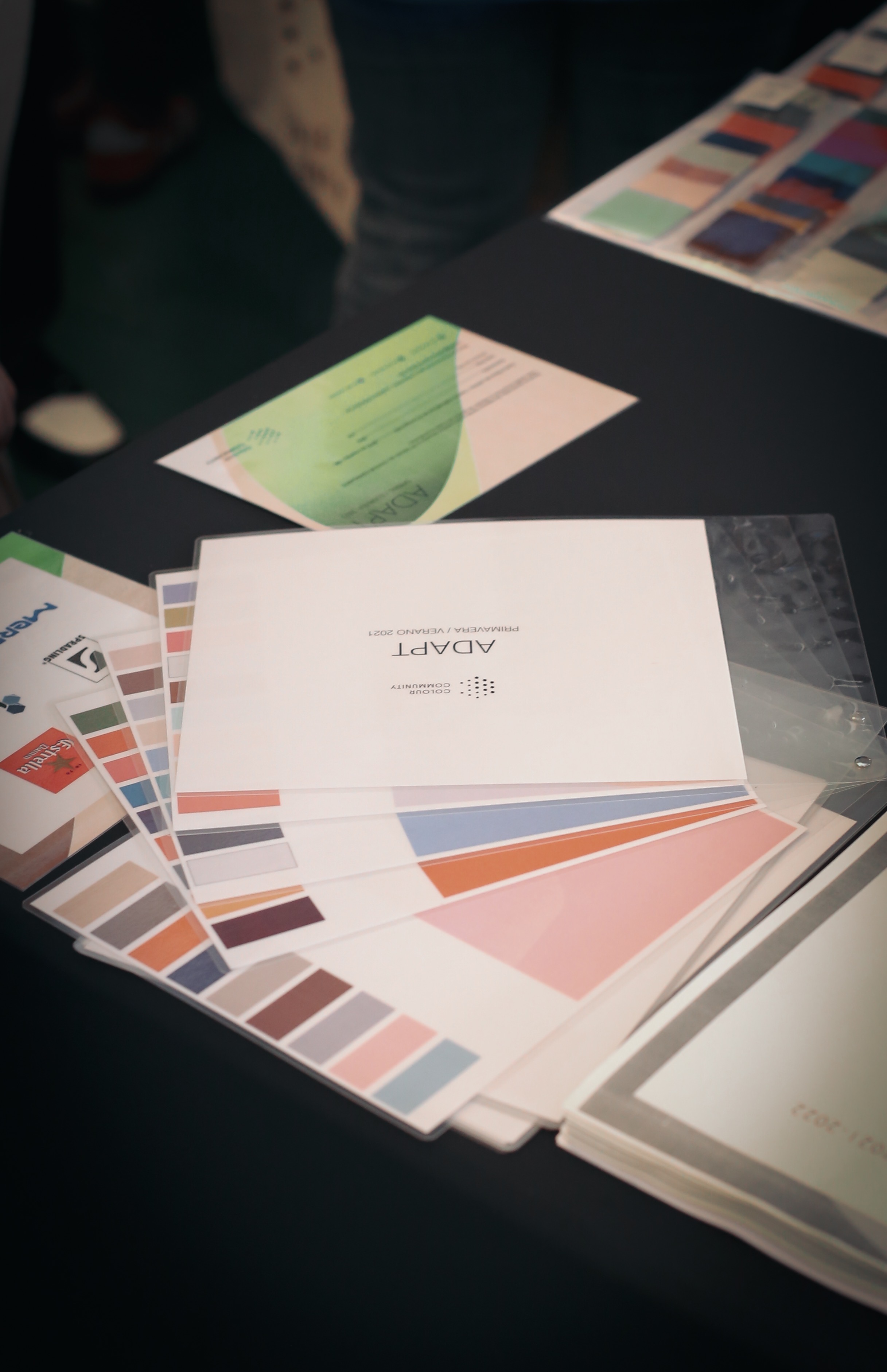
The Color Community: Adapt
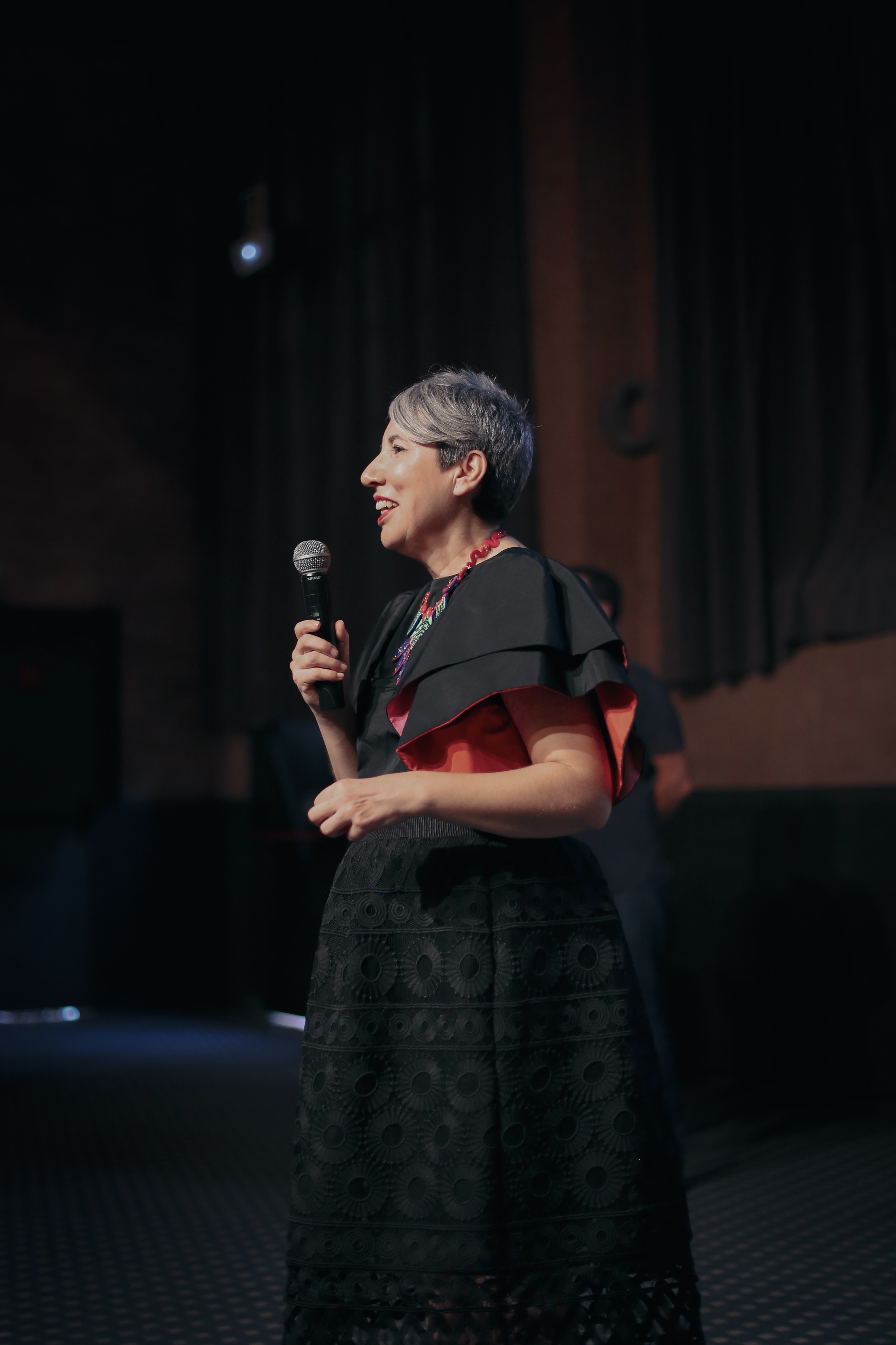
La âcomunidad del colorâ crece ediciĂłn tras ediciĂłn generando una gran expectativa entre los profesionales del diseĂąo que se marcan en el calendario, las citas que marca dos veces al aĂąo The Color Community. Como ya sabĂŠis, se trata de una iniciativa dirigida por un grupo de profesionales que, desde diferentes disciplinas creativas, comparten un estudio global del color y la materia. Aunque en cada informe que se presenta participan varios colaboradores, el nĂşcleo base lo forman tres profesionales: el arquitecto Pere Ortega; la diseĂąadora especializada en Colour & Trim, Eva MuĂąoz; y Rosa Pujol, Textil & Colour Stylist de GratacĂłs.
Como es habitual, The Color Community se celebra en la Antigua FĂĄbrica Damm de Barcelona, un poderoso colaborador que cede las instalaciones y dispone de refrigerios para llevar a cabo la presentaciĂłn del informe y un posterior afterwork. En esta decimotercera ediciĂłn, se presentĂł la carta de colores que marcarĂĄn la temporada Primavera-Verano 2021. Es un informe orientativo que como cada aĂąo sirve de inspiraciĂłn para los profesionales del sector.

Juan GratacĂłs: âEl tejido sin color serĂa aburridoâ
En nuestro caso, esta cita es siempre imperdible. No solo por la participaciĂłn de Rosa Pujol, encargada del departamento de diseĂąo de la empresa, sino porque GratacĂłs se desvive por las gamas cromĂĄticas. âNos encanta el color y el tejido sin color serĂa aburridoâ, comentĂł Juan GratacĂłs minutos antes de la presentaciĂłn del nuevo informe.
Esta ediciĂłn se inspira en el concepto de la adaptaciĂłn con matices positivos. âLe sacamos la carga humilde o negativa a la palabra porque adaptarse no quiere decir conformarse, todo lo contrarioâ, detallĂł el arquitecto Pere Ortega en la presentaciĂłn. AsĂ, âAdaptâ se basa en la idea de ajustarse a un contexto determinado, utilizando un tipo de creatividad racional que permita buscar soluciones concisas y vĂĄlidas. âNos referimos a la creatividad inteligente que es fruto de una estrategia pensada y reflexionada que encaje con la situaciĂłn actual. No tiene nada que ver con la genialidad del momento o un brillo puntualâ, explicĂł. La adaptaciĂłn como sĂmbolo de la inteligencia, de la estrategia racional y la sabidurĂa popular.
 |
 |
 |
Pere Ortega: âEntendemos la adaptaciĂłn como un tipo de creatividad inteligente que es fruto de una estrategia pensadaâ.
La propuesta cromĂĄtica âAdaptâ se estructura a travĂŠs de cuatro gamas de color, texturas y materias bautizadas como, Afterwork, Baltic Sight, Natif y Modern. A continuaciĂłn, os explicamos un breve resumen con sus inspiraciones.
-
AFTERWORK
La primera inspiraciĂłn se centra en el momento de ocio despuĂŠs de trabajar. Un espacio para el descanso, la diversiĂłn y el hedonismo, siempre compartido. Afterwork es una propuesta versĂĄtil, que se adapta en estos contextos festivos a travĂŠs de tonos pastel como el rosa candy o el azul bebĂŠ que contrastan con algunos flĂşores que le dan ese punto de luz necesario en cualquier fiesta: se tiĂąen de verde lima, amarillo y fucsia. En esta inspiraciĂłn se introduce el concepto del tono transparente a travĂŠs de superficies vĂtreas y texturas y estampados que imitan el reflejo del agua.
 |
 |
La segunda gama es mĂĄs introspectiva y toma como fuente de inspiraciĂłn el mar BĂĄltico que baĂąa los paĂses del norte de Europa. Es una propuesta frĂa y racional que apela al confort y a la intimidad en esa bĂşsqueda de los refugios interiores. La gama de azules se inspira en las aguas profundas en tonos frĂos y grisĂĄceos, verdes apagados y los tonos neutros como el blanco, el negro y el beige. Como nota de color juega con algunos tonos rojizos. La propuesta tambiĂŠn hace un guiĂąo a los patrones estructurados, las siluetas arquitectĂłnicas, los estampados lineales y los accesorios verticales. Se trabaja el concepto de silencio.
-
NATIF
La tercera inspiraciĂłn es un homenaje a la autenticidad, a la tierra y a la naturaleza. Representa un giro hacia la artesanĂa y tambiĂŠn quiere transmitir la multiculturalidad con diseĂąos sin denominaciĂłn de origen. Todo forma parte del todo. La paleta de colores de Natif es vibrante con tonos poderosos que van desde los naranjas saturados, los morados, los azules mĂĄgicos y los rojos tierra. Las tonalidades verde se vinculan con las hojas y los bosques. La singularidad cultural se consigue a travĂŠs de los estampados florales y los que imitan el trazo manual, los motivos geomĂŠtricos y los acabados rĂşsticos.
 |
 |
-
MODERN
Por Ăşltimo, la cuarta inspiraciĂłn representa un pasaje por las otras gamas. La ciudad y su vida interior es el motor de la creatividad y la gama de colores expresa como los individuos se adaptan a la ciudad, a la vez que se mimetizan en sus edificios, asfalto, huertos urbanos, zonas verdes⌠Forman parte de la urbe las 24 horas. Para expresarlo se utiliza una paleta cromĂĄtica muy sensitiva con colores que aportan vitalidad. Los falsos crudos, los verdes apagados, el azul petrĂłleo, el rosa pĂĄlido, el denim, el naranja excĂŠntricoâŚconviven con siluetas minimalistas, materias tableadas y estampados lineales.
 |
 |
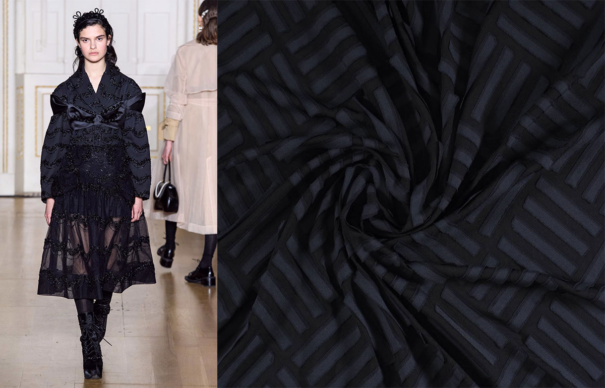
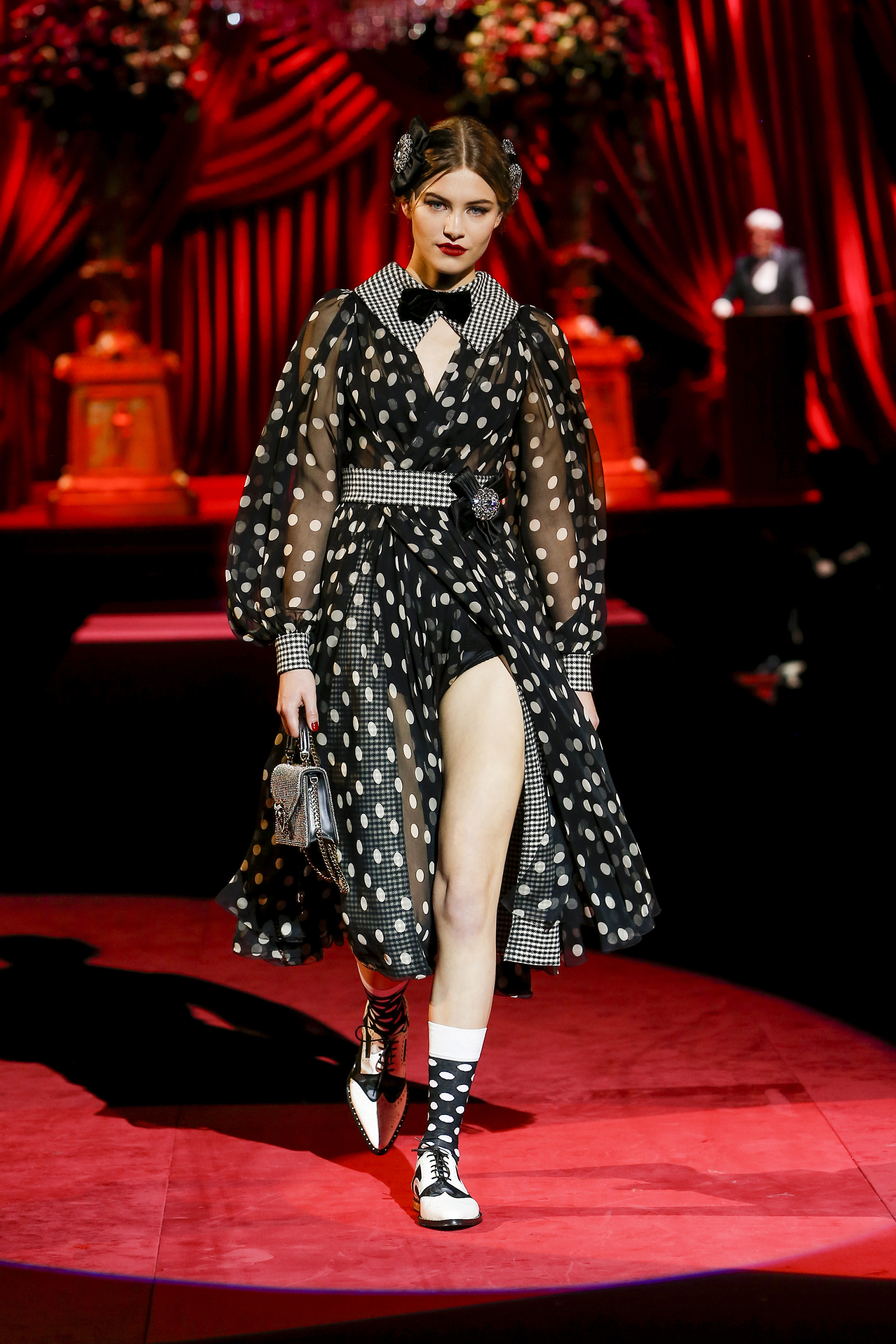
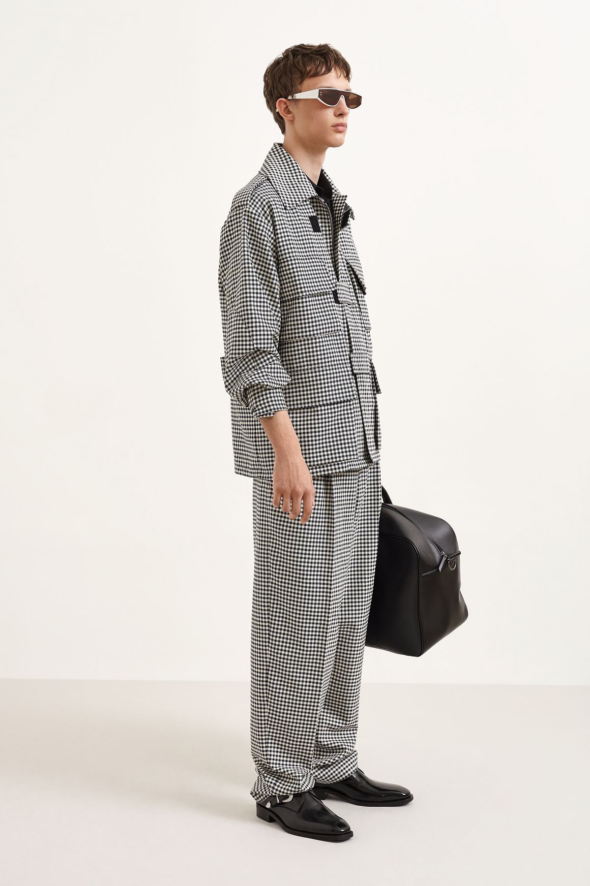
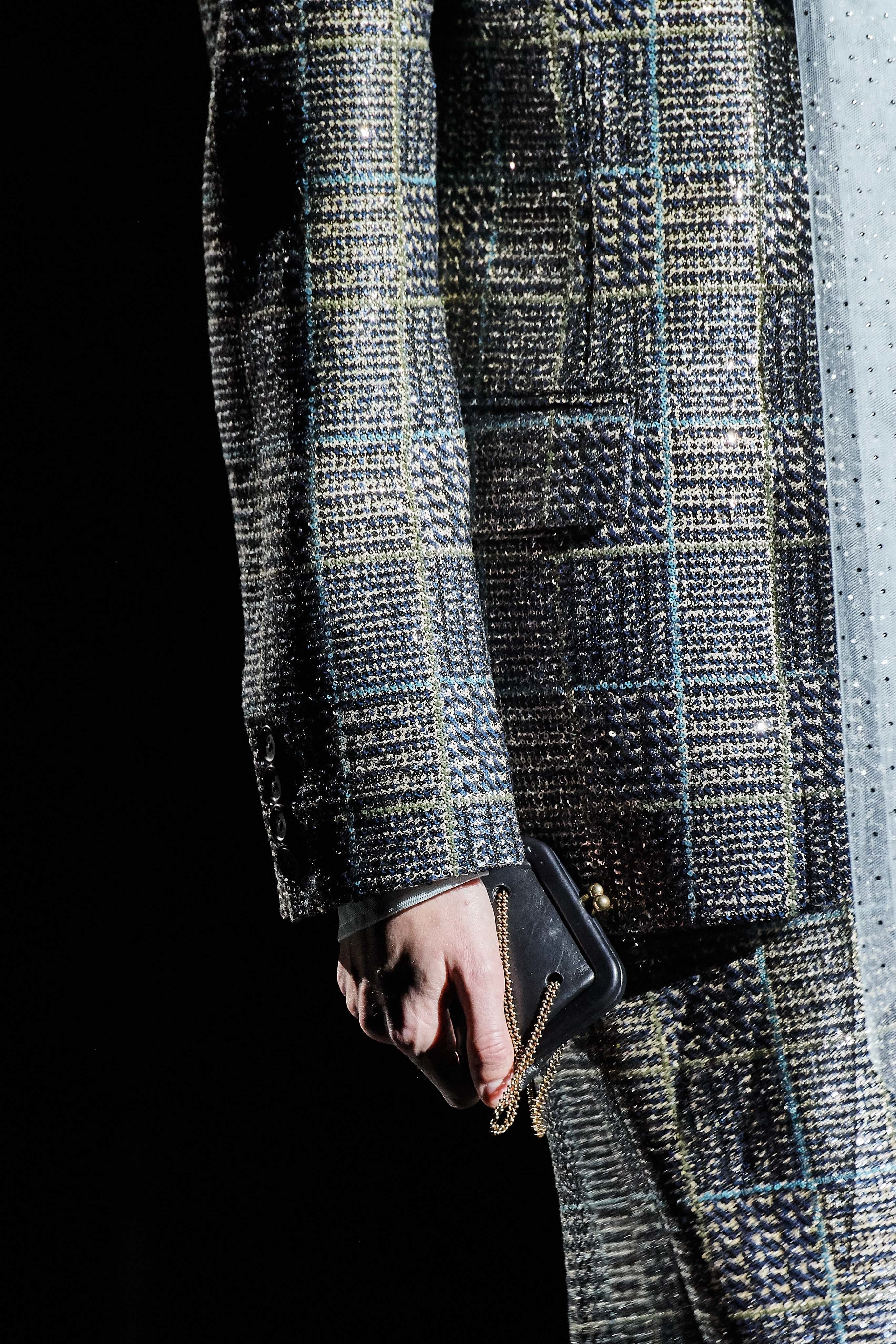
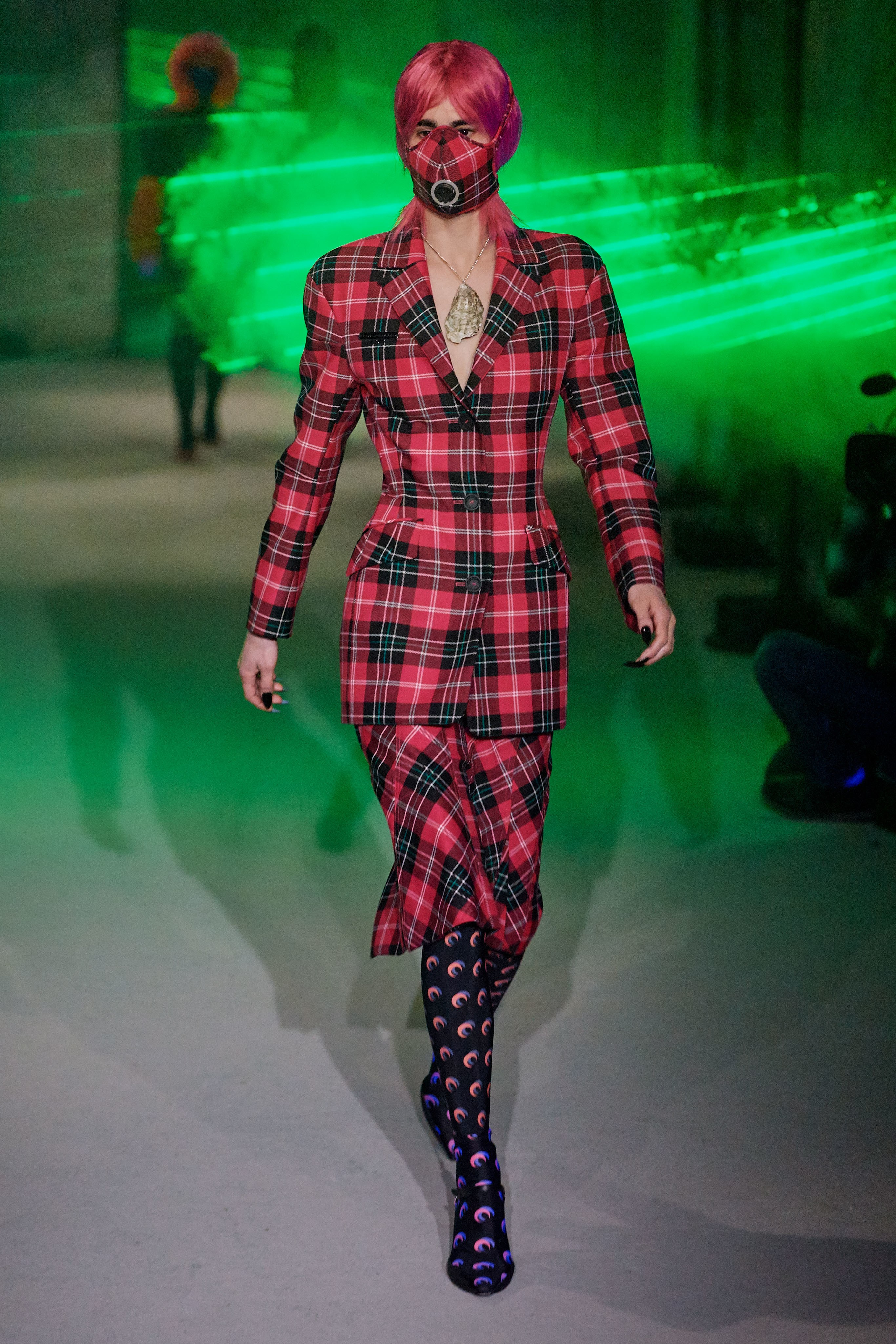
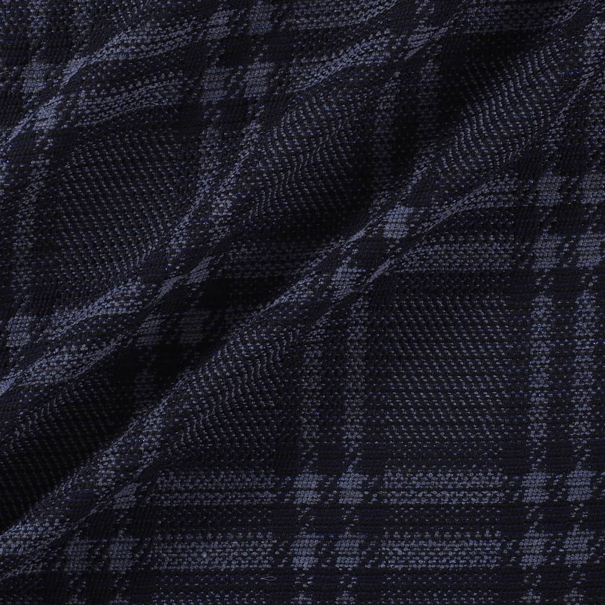
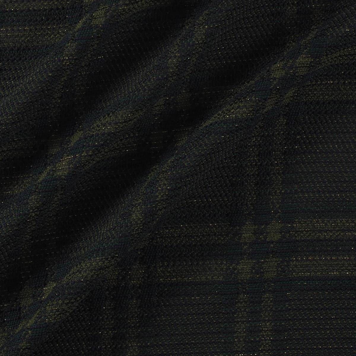
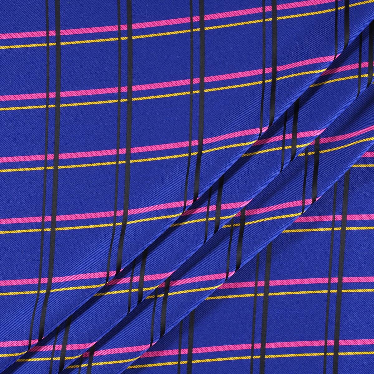
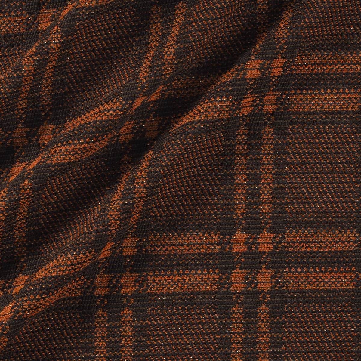
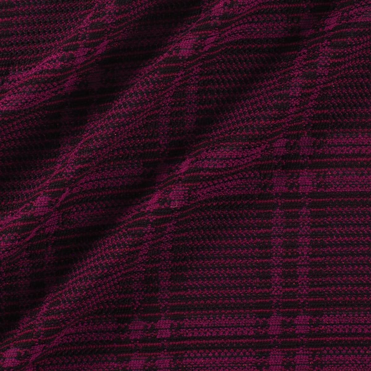
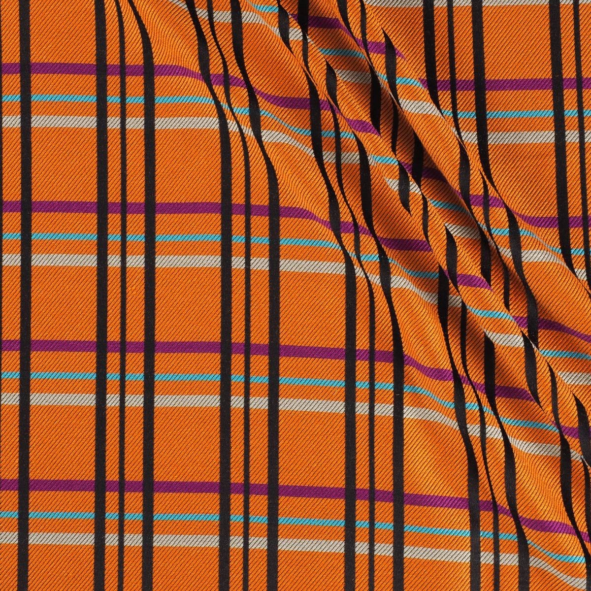
Checks that set the trend
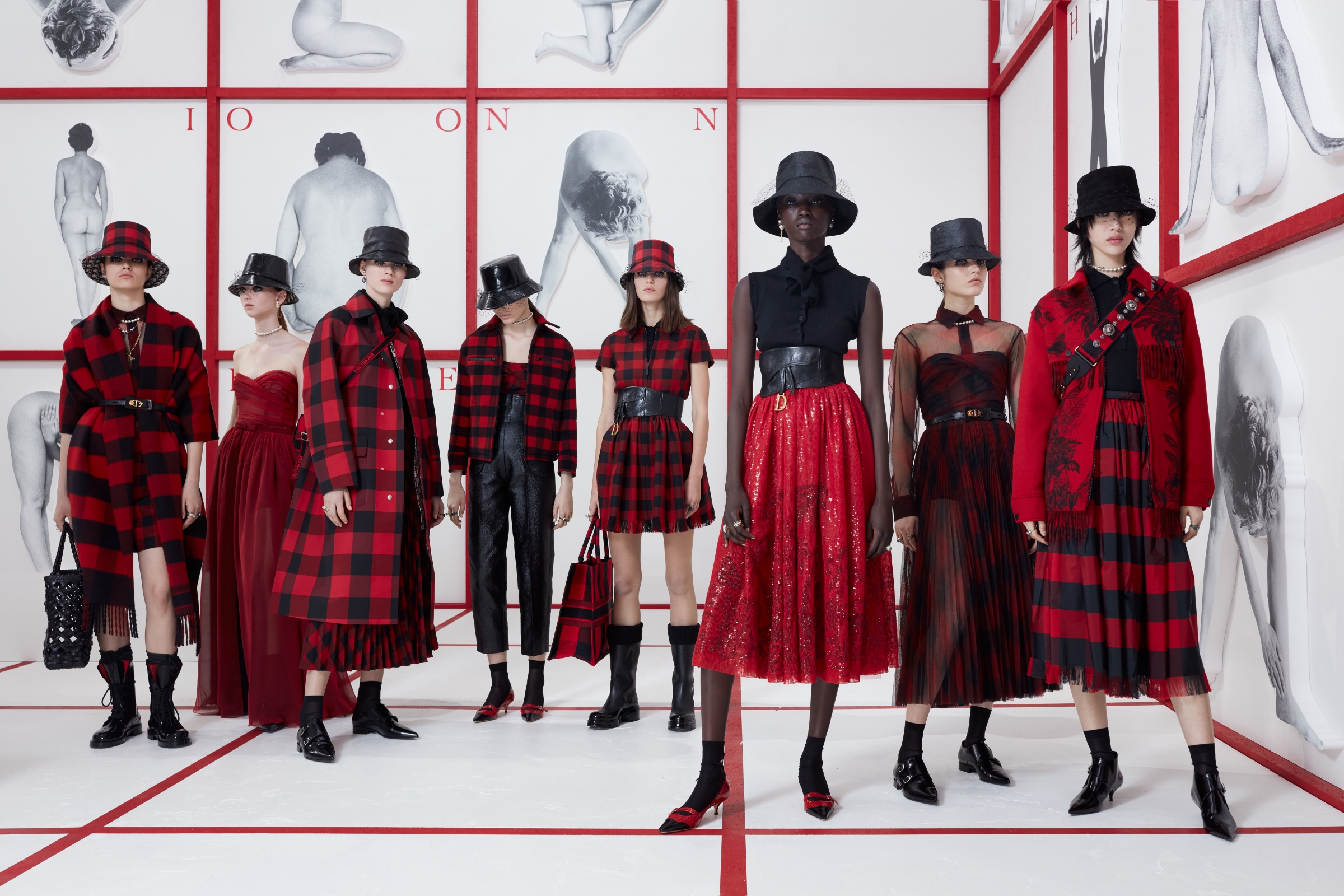
Checks have always been present in the history of contemporary fashion. Moreover, they are part of those unperturbed tendencies, oblivious to cycles, which are repeated and renewed without losing their identity.
A priori, when we talk of a check print the British style comes to mind with its classic costumes, the tartan reminiscent of the Scots or the vichy checks that refer us to the age of innocence. It is always time to opt for checks, whether in the winter or summer collections. The novelty is that today many checks break barriers and leave their comfort zone as they take over garments, accessories or complements which hitherto were less conventional.
We are going to analyze the three most common check prints on the cat-walks of the new Autumn-Winter 2019/2020 season:
 |
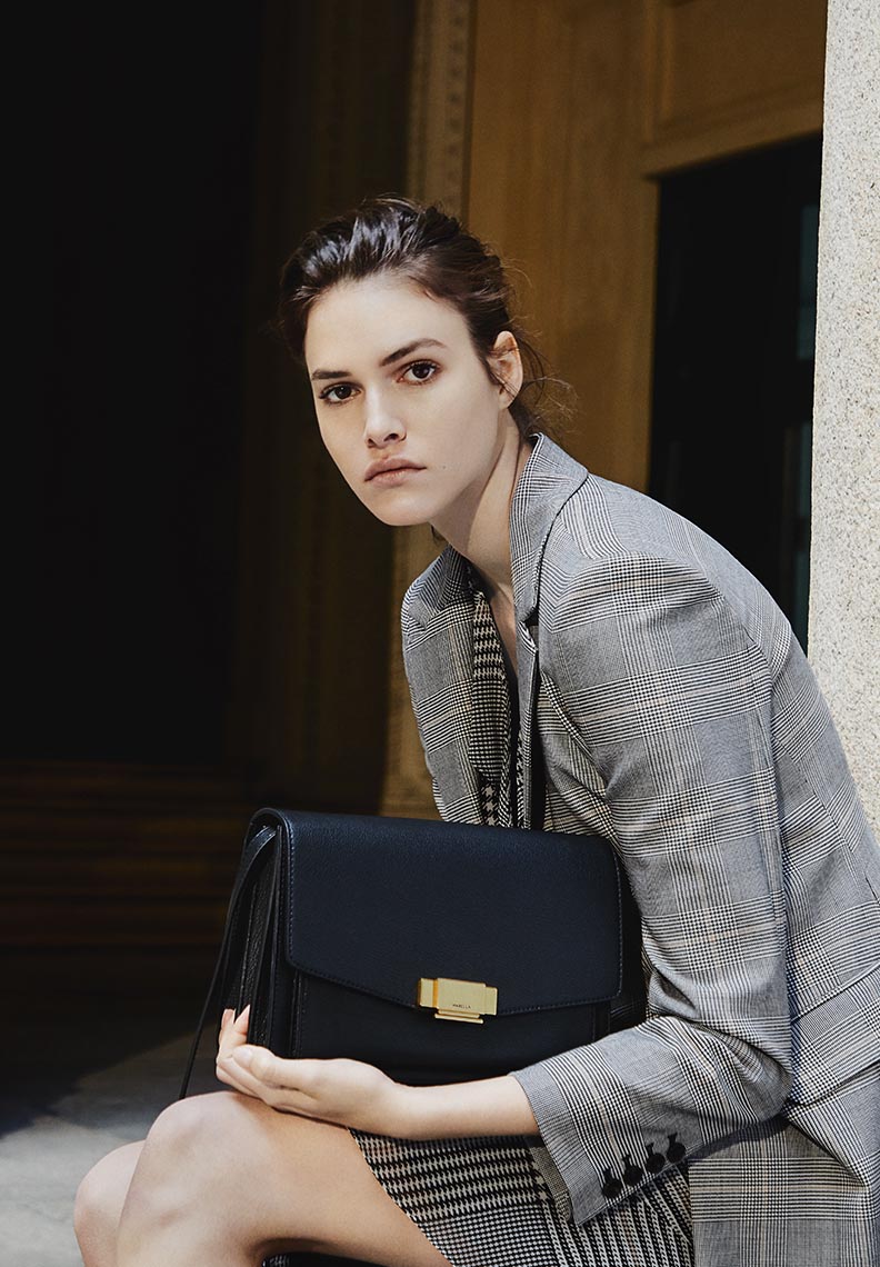 |
Prince of Wales
It is a type of two-colour fabric design in the form of complex frames, sometimes with a third colour as a profile. It alternately combines large checks with a milrayas design along with smaller squares in crow’s feet. Frequently the different grey scales (or muted colours) are used as base colours and sometimes one more colour is added to that base tone, usually blue. The origin of this print is popular as it is a fabric used by the workers, although it was the Duke of Windsor (Eduard VIII) who ended up popularizing it in the 1930s and spreading it throughout the world.
 |
 |
 When playing with the black and white binomial, this type of plaid print becomes a timeless classic, perfect in any wardrobe. This season, under a preppy style seen especially on cat-walks of Marc Jacobs, Prada, Givenchy, Balenciaga, ChloÊ and Marni, together with many others who opt for this pattern.
 |
 |
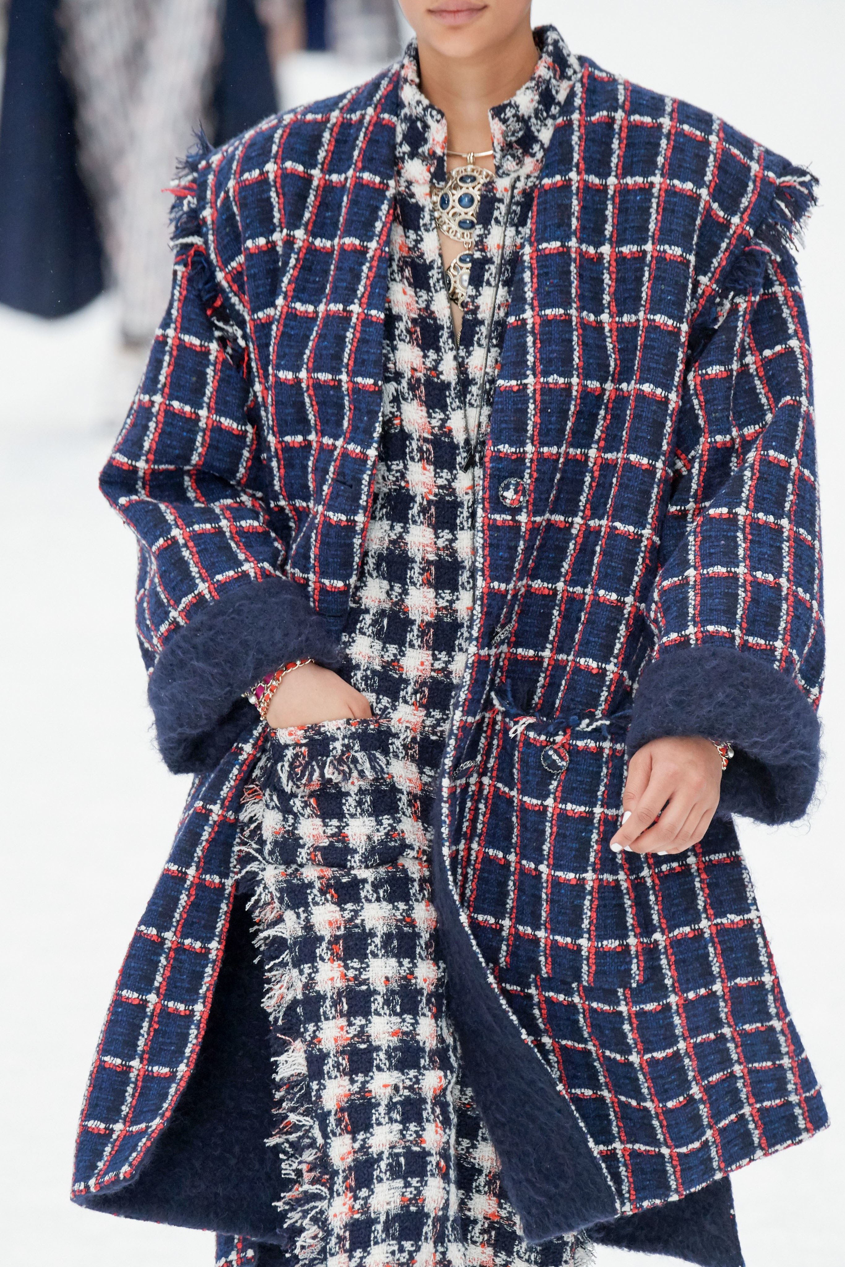
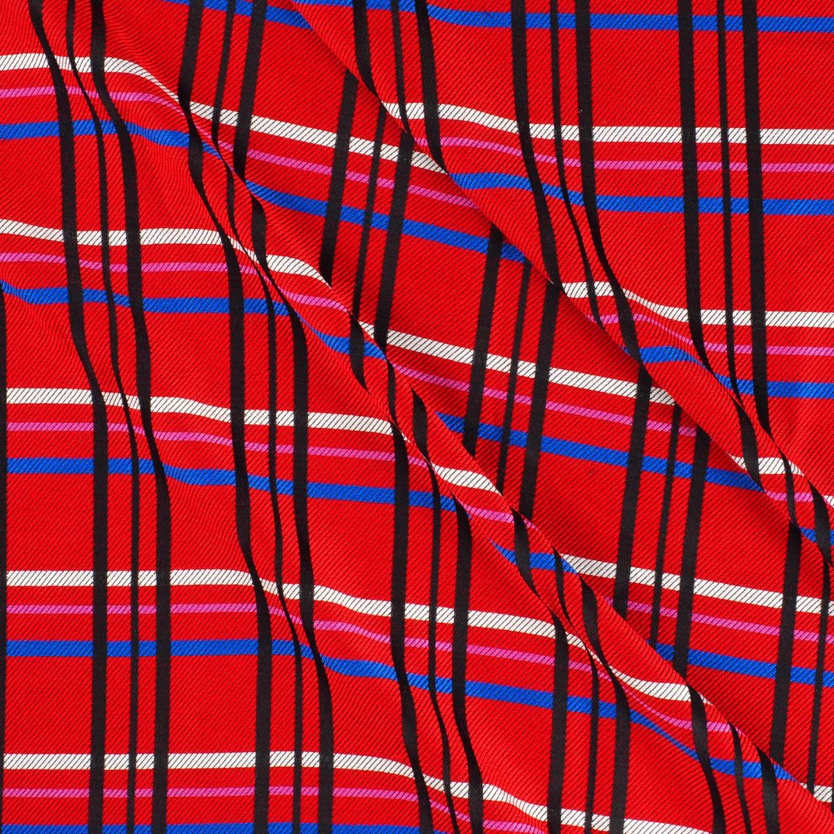
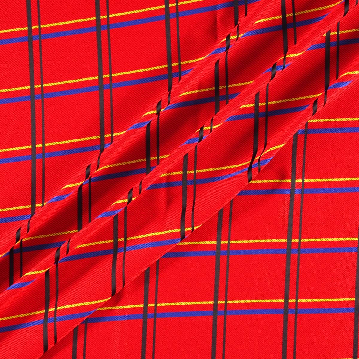
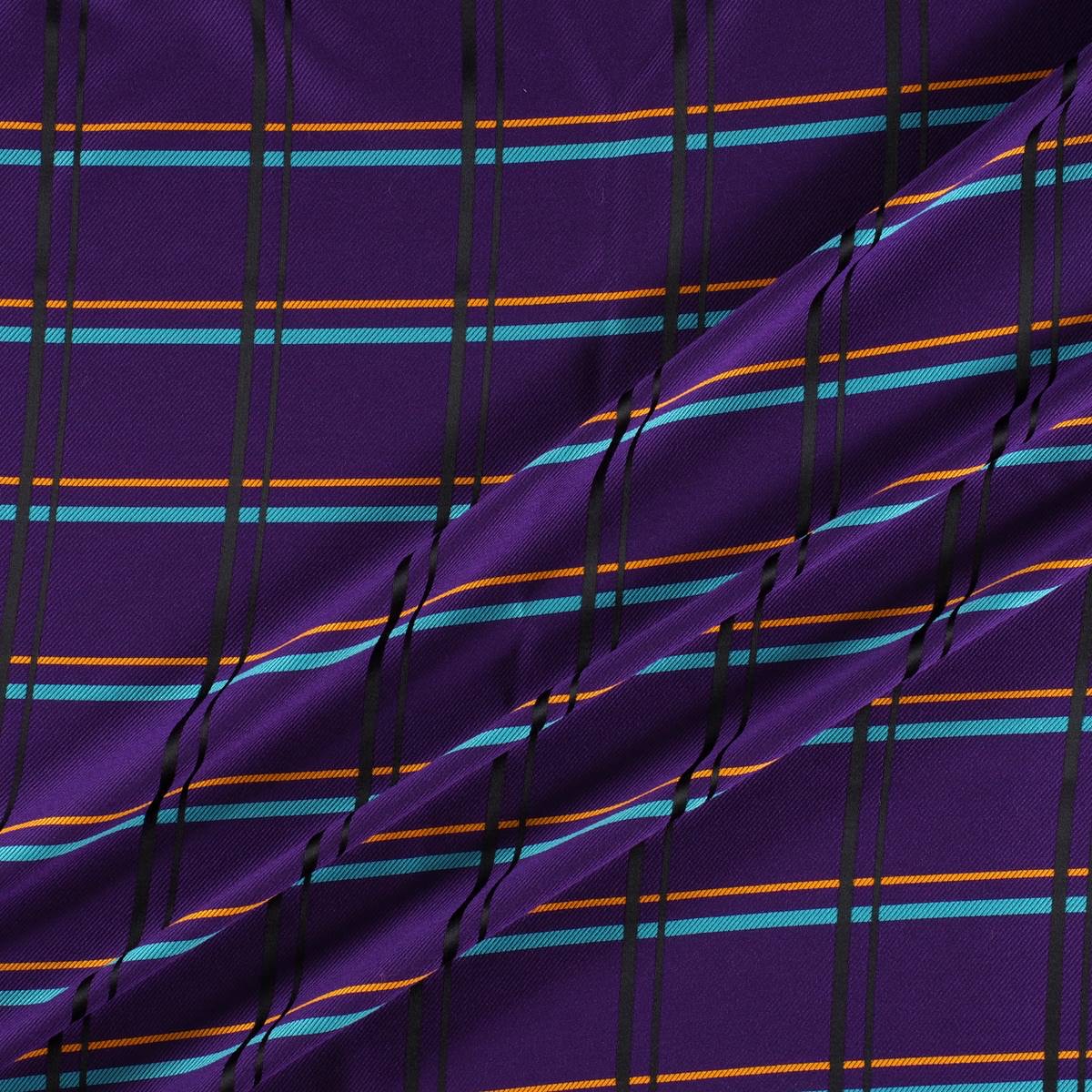
Tartan
It is perhaps the most identifiable picture. A fabric whose pattern is formed by horizontal and vertical lines that draw pictures of different colours. Of Scottish origin, tartan is associated with the clans that used them to distinguish themselves. Each family adapted particular designs, as well as colours that identified them as members of each clan. There are named tartans like McAndrew, McQueen, Douglas … even modern designs like the Royal Stewart, created by Vivienne Westwood. In its origin the tartan was made of wool, although today it is shaped through several fabrics. At present, with the appearance of new materials the word tartan has gone from defining the fabric to the design, regardless of where it is shaped.
 |
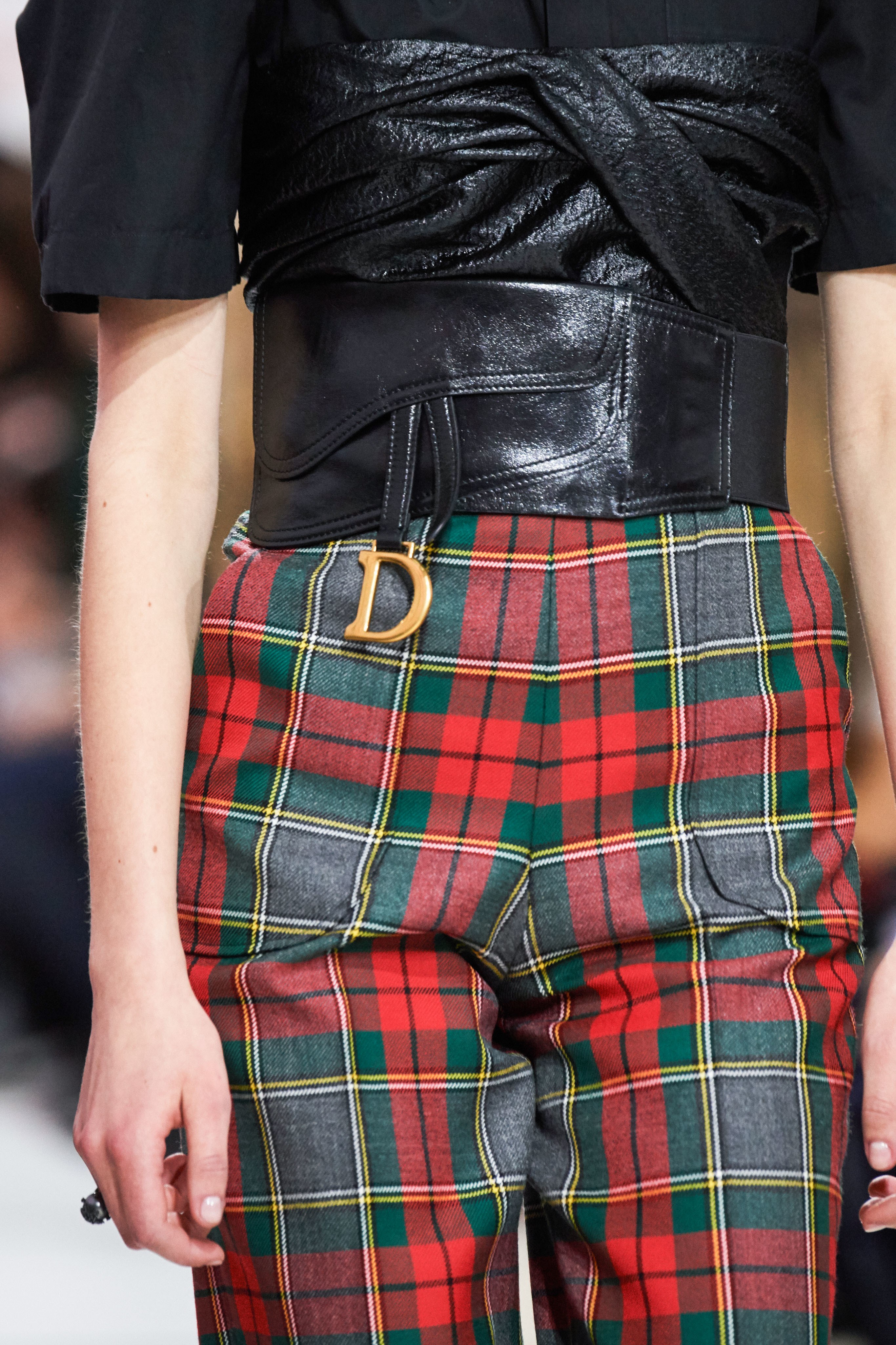 |
Tartan accepts countless colours and different combinations, the key lies in personal taste. The most common are the most classic in red or green or black and white and in XXL size. In the late twentieth century tartan was also associated with a more transgressive aesthetic and found adherents in the punk movement of the late 70s with designers such as Vivienne Westwood and grunge and its nineties counterculture. To cite some examples, at this time John Galliano and Alexander McQueen adapted it.
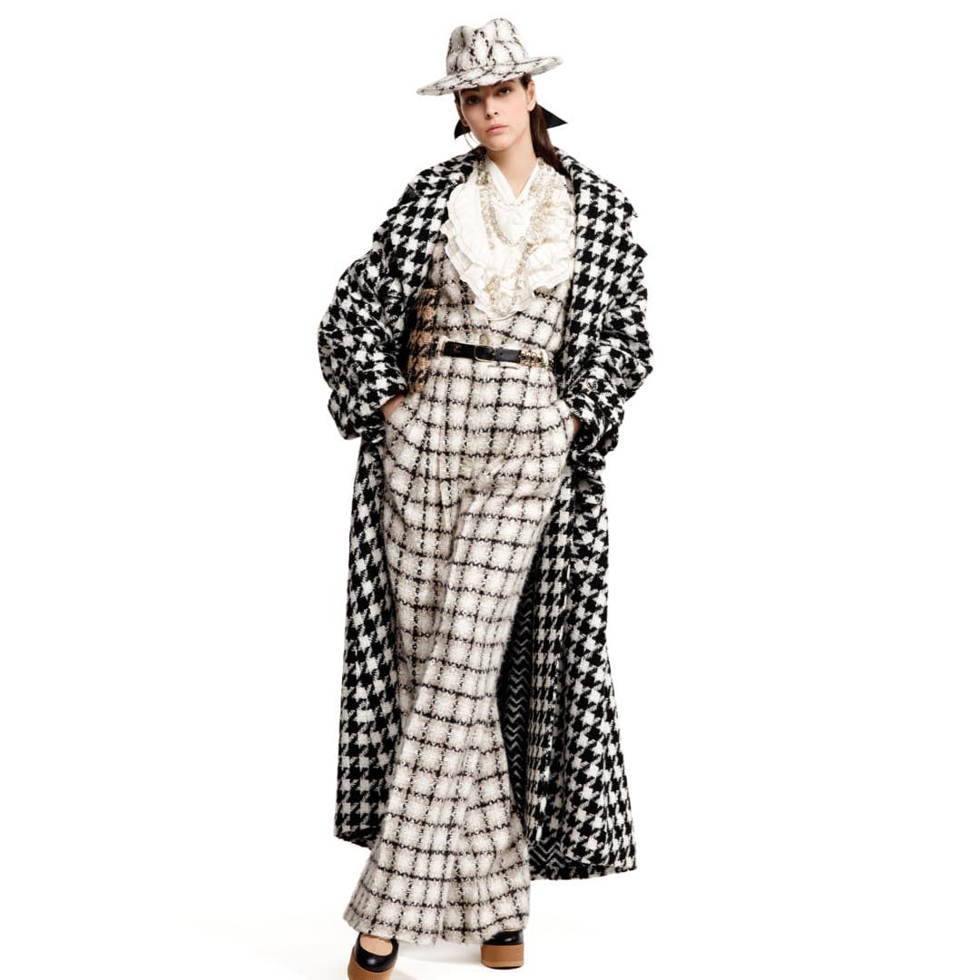
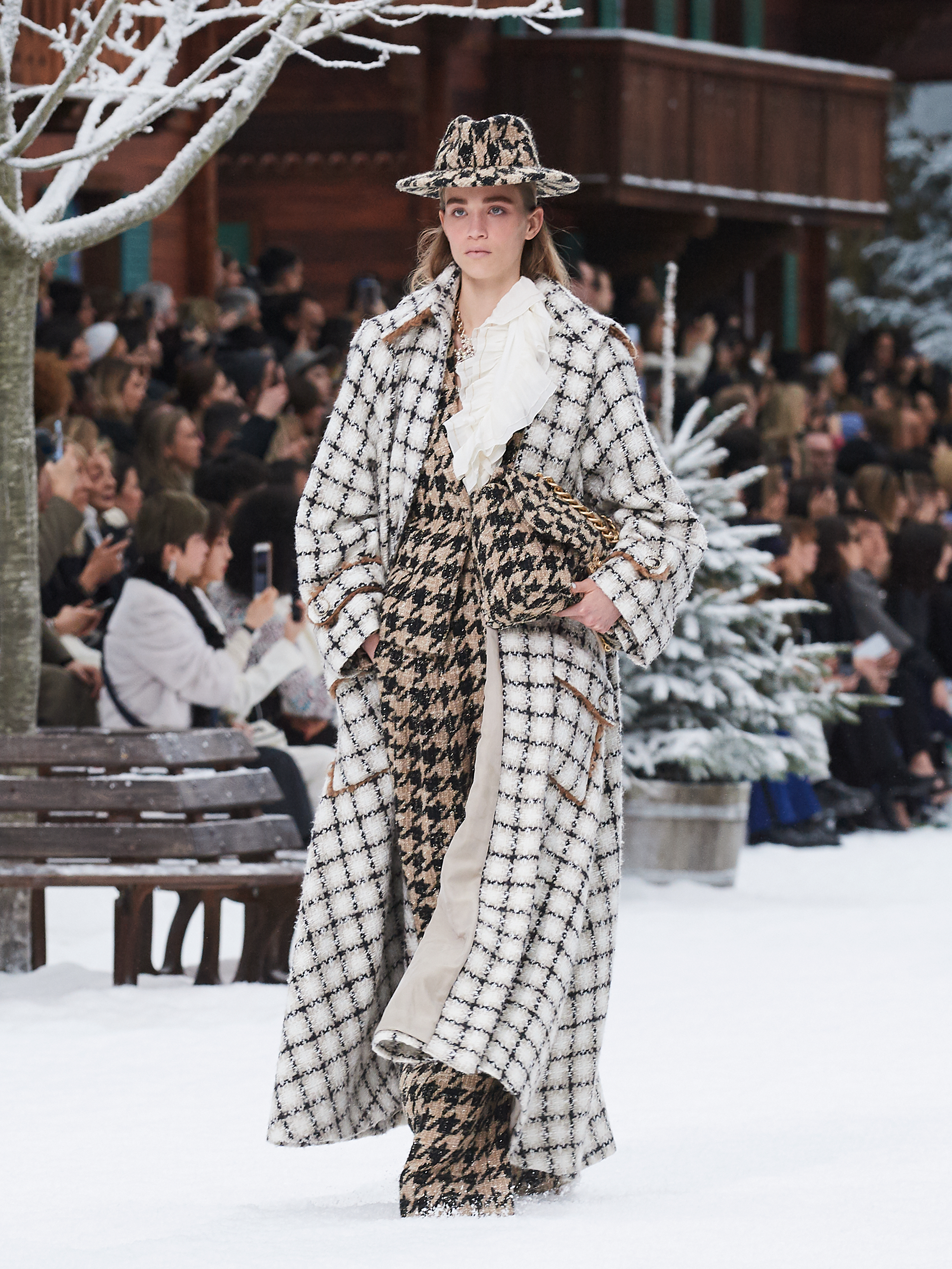
Window frame checks
We are talking about a type of simple frame that makes squares thanks to the fine lines that make it up. Thus on a dark background a light line is added that draws a broad picture. As a base the window frame can have a tartan (with finer wool) or a tweed (which gives it a more rustic look). This type of check became popular in the 30s in Britain when people began to look for more daring and informal prints that maintained that classical dandy image, but with certain licenses.
 |
 |
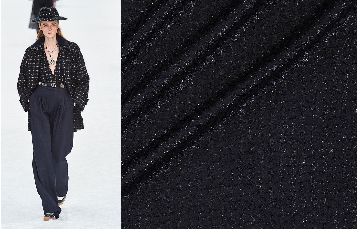
Today window frame checks are widespread and are used almost equally in winter and summer fashion collections. We refer you to the last collection made by Karl Lagerfeld for Chanel where you can observe these types of checks mixed with other fabrics and prints.
The current Gratacós collection also contains many plaid fabrics. Here are some references for you to get inspired.

(EspaĂąol) Las nuevas generaciones del diseĂąo mĂĄs inspiradoras
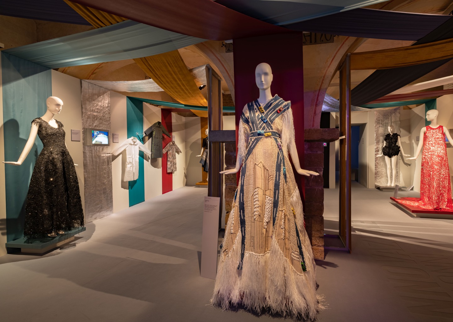
The beauty of the female silhouette
We kick off the season talking about another exhibition that extols the female figure and gives a new vision of the “body-fashion” relationship. Its title is evocative: âEl Cuerpo Inventadoâ. (The Invented Body). A sample organized by Collectors Collective in Madrid that highlights the aesthetic canons that have remained in fashion since the early twentieth century to the present day, providing a new dialectic of evolution and changes that are especially appreciated in women’s clothing .
4Â silhouettes and a century
The silhouette is responsible for creating the spirit of time beyond colours, fabrics or trimmings. It is precisely the silhouette that captures the aesthetic canon of an era.
In spite of its apparent richness and variety, the history of Western feminine dress has been repeating its forms throughout the centuries: there are only a handful of silhouettes with which the dressmakers have invented their creations. For example and focusing on the last 100 years, the silhouettes that have had more relevance in the twentieth century are four: tubular silhouette, triangular silhouette and double triangle silhouette, globular silhouette and anatomical silhouette. In addition, all of them have a history in previous centuries. Of course: the prevalence is not exclusive. The silhouettes can coexist in time, although the protagonism of one of them will be the one that defines the era.
In turn, the exhibition also proposes a reflection on “the tyranny of the invisible” and the naked body, a movement that has been consolidating in recent years to reach today unsuspected limits.
Collections and creators
‘The Invented Body‘ is formed of pieces by important fashion collectors (Antoni de Montpalau, Quinto, Maite MĂnguez and LĂłpez-Trabado), as well as three prestigious international renowned museums such as the Costume Museum of Madrid, MUDE : Lisbon Design and Fashion Museum and the Fashion Museum of Santiago de Chile.
The exposed designs are part of the most relevant names on the international scene such as Lanvin, Chanel, Christian Dior, Givenchy, Mainbocher, Versace, Yssey Miyake, Azzaro , Azzedine AlaĂŻa , Pierre Cardin , Yves Saint Lauren, Pucci, Christian Lacroix, Commes des Garçons or Gucci. There are also first-class Spanish designer models such as maestro CristĂłbal Balenciaga, Pedro RodrĂguez, Lorenzo Caprile , Ăgatha Ruiz de la Prada, JesĂşs del Pozo, Leandro Cano, Ernesto Artillo , Antonio Velasco or Josep Font.
Trendy icons of yesterday and today
Throughout the history of the suit, fashion has used influential people to spread itself. Until the nineteenth century, it was the aristocracy who used to have this mission, but at the end of that century this trend begins to change and it is women in the field of culture and entertainment who become fashion prescribers for the dissemination of fashions. Next to a specific silhouette there is usually an influential woman legitimizing it: how could we disassociate the silhouette that narrows the waist, projects the breasts and widens the hips of actress Marilyn Monroe?
Therefore, the exhibition also includes the role of these famous women who have consolidated the different aesthetic canons, taking a tour of the most influential names in fashion of the twentieth century, with dresses that belonged to Madonna, Claudia Schiffer, Rita Hayworth, Audrey Hepburn, Sophia Loren, Lady Gaga, or even her majesty Doùa Letizia, among other relevant women.
‘The Invented Body ‘ of Collectors Collective opens next Thursday, September 12th at General PerĂłn Avenue in Madrid and can be visited until December 15th.
Fotos: Alfonso Ohnur