Miércoles 05 octubre 2022
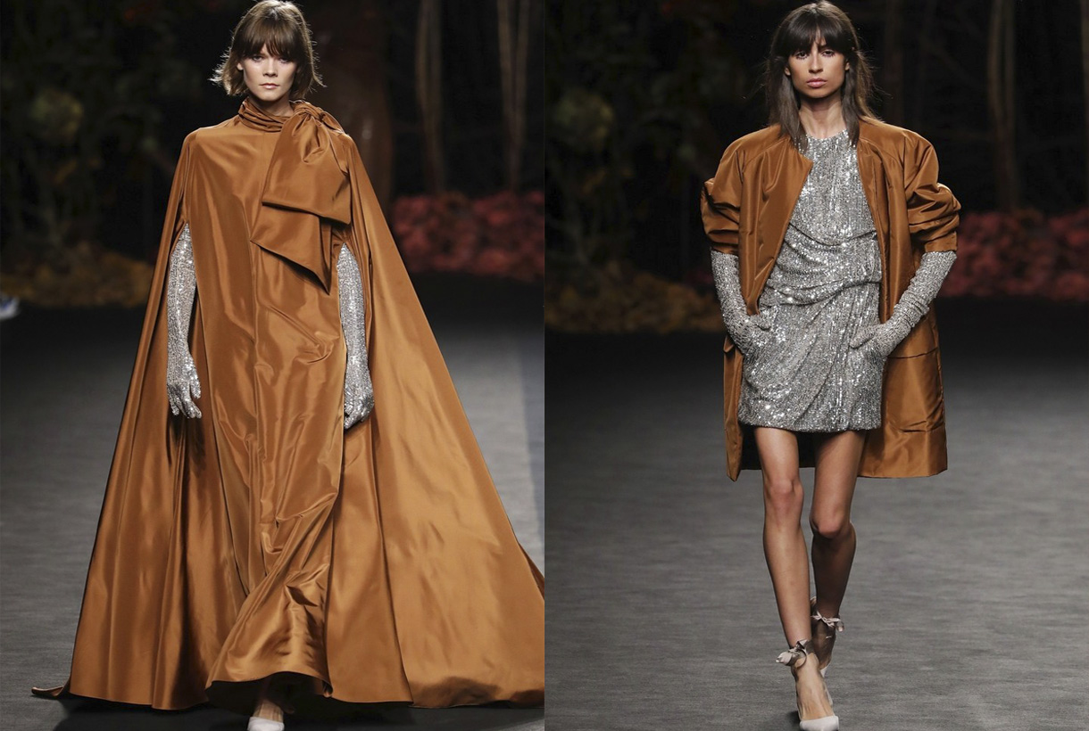
Fely Campo. Spring-Summer 2023. Pic: Gus Geijo
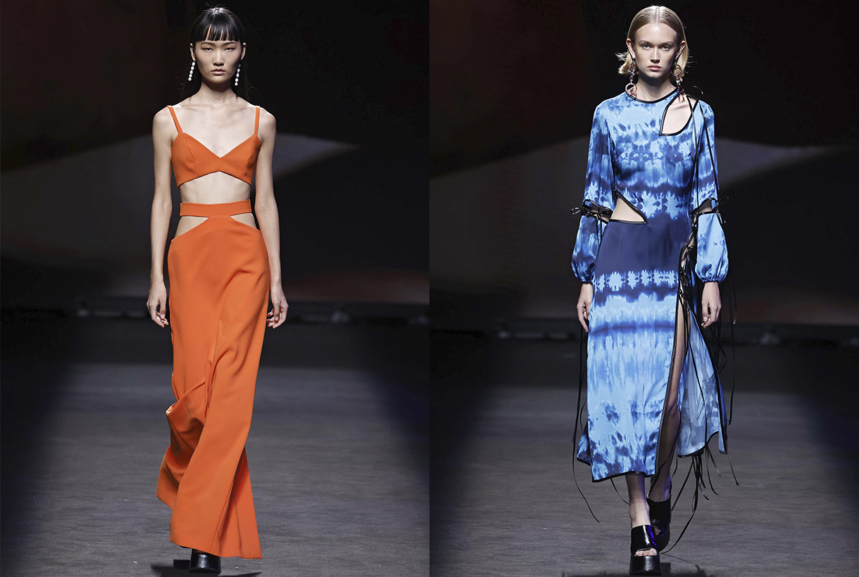
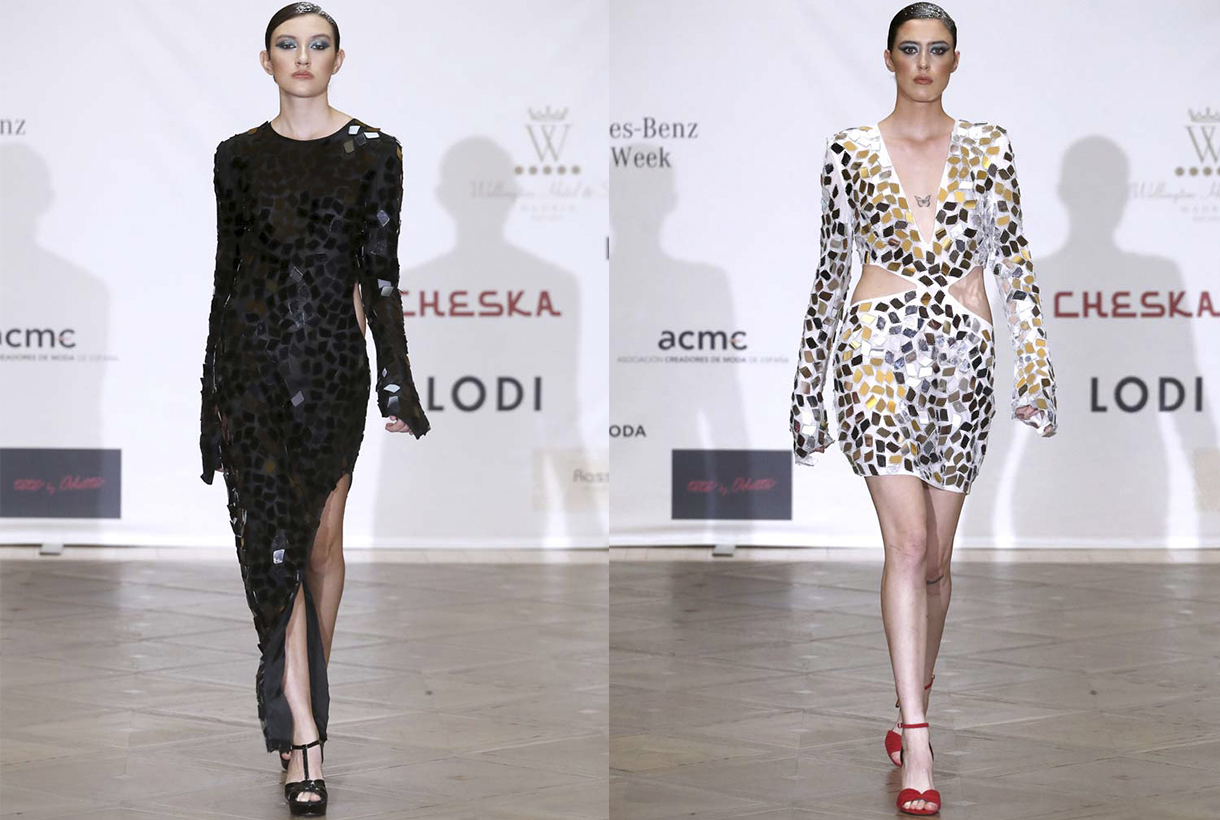
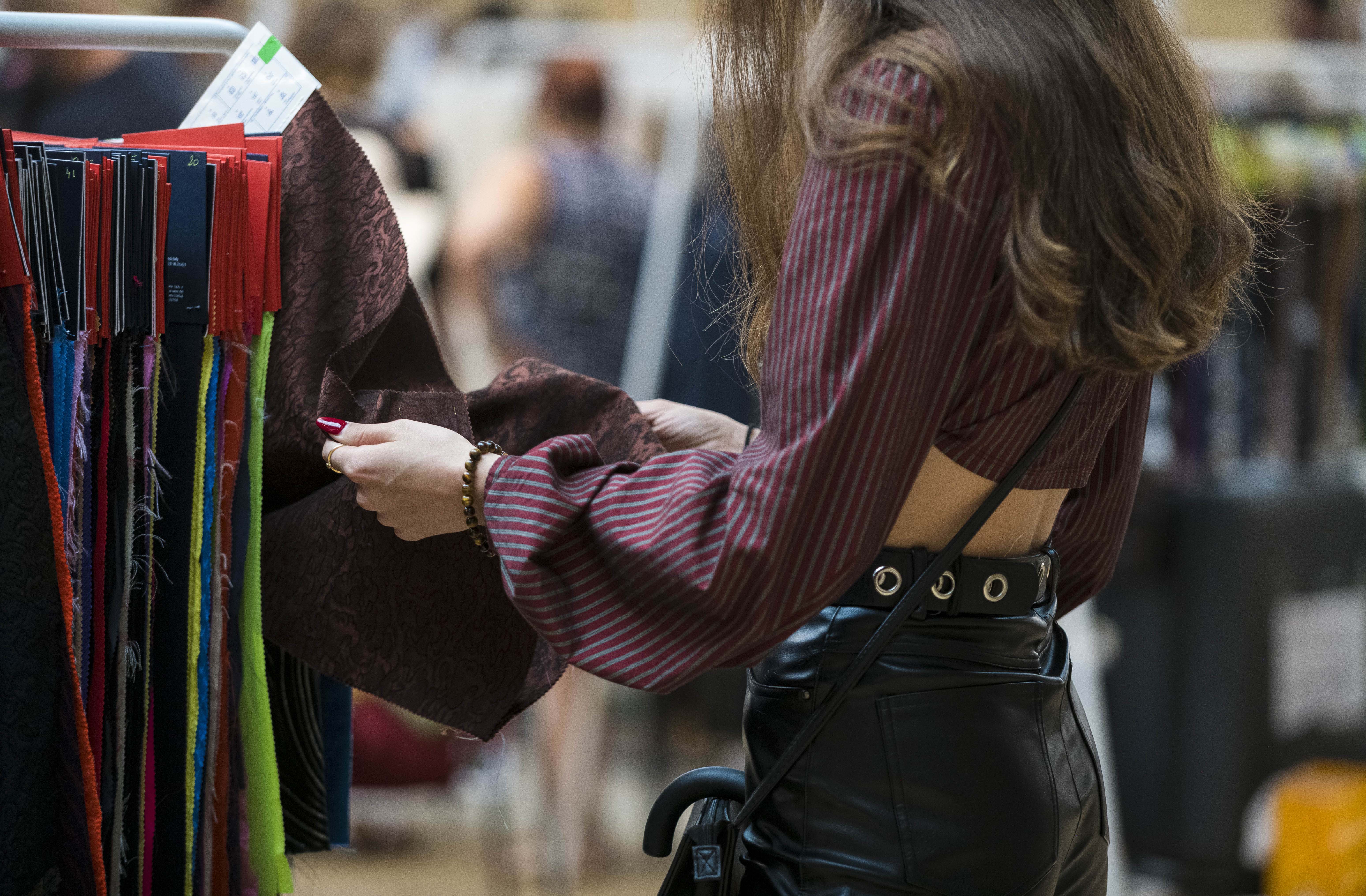
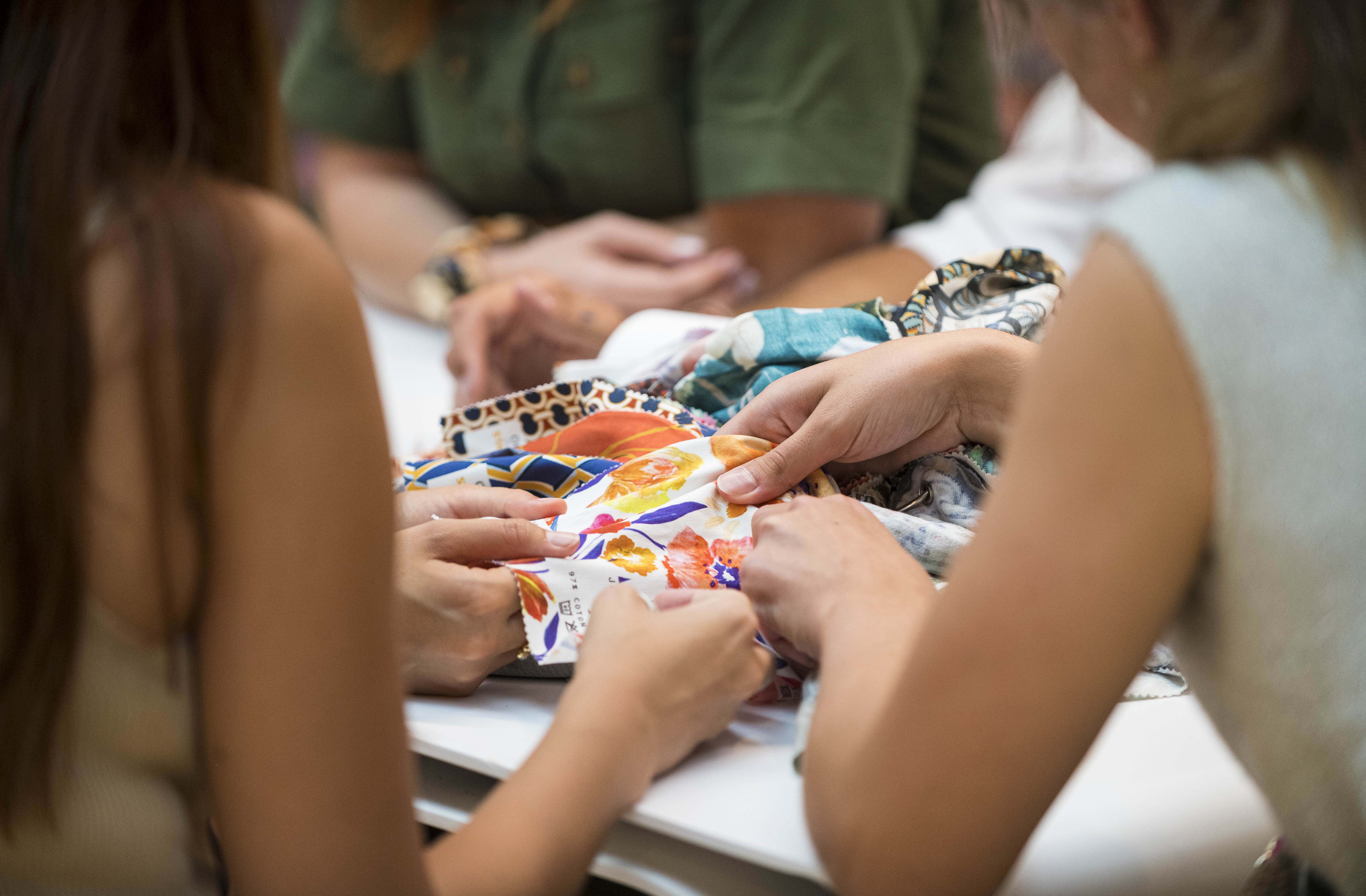
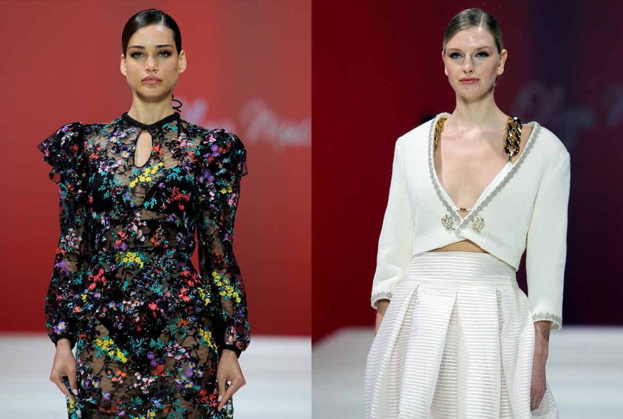
Gratacós has shone with its own light at the Great Spanish Fashion Week by stepping on the Mercedes-Benz Fashion Week Madrid catwalk, held in mid-September. Evidently, this has ocurred so indirectly through designers who are regular users of our and who have once again trusted in our know-how to create the magnificent collections for the coming summer season. In this edition we want to especially mention the collaboration that our family business has made with the designer Fely Campo in an urban and sensual SS23 proposal, where luxury is appreciated in every detail. Not only the creator from Salamanca has relied on Gratacós fabrics to devise works of art in movement. Other designers have also supported us, such as Álvaro Calafat, Aurelia Gil, Duyos, JC Pajares, Isabel Sanchís, Malne, Maison Mesa, Odette, Pilar Dalbat and Redondo Brand. To follow, we expose some details of each collection and also more details of the exhibited looks.
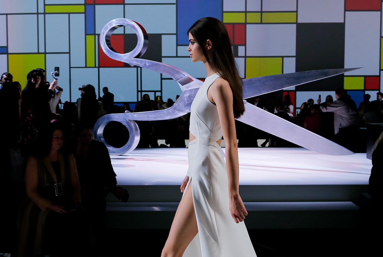
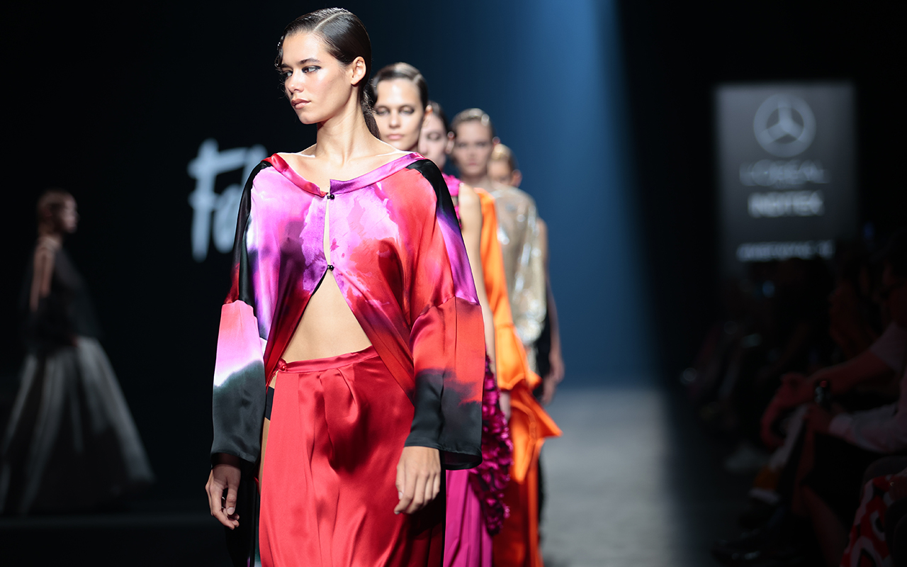
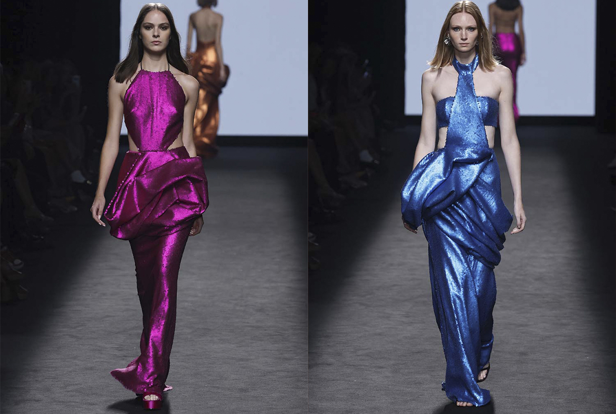
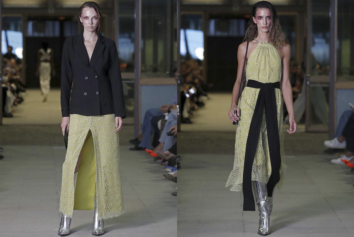
Fely Campo
Fely Campo understands fashion as “a tireless search for beauty”. A language that moves perseveringly and in which the designer from Salamanca finds the balance between the silence and the noise of our current way of life. Under this inspiration, the creator transmits in ‘Nagore’ an idea of sensuality that aligns with the frenetic urban rhythm of cities like Madrid, Tokyo or New York. Surprising cities in full vibration with which Campo alludes to notions such as the maelstrom, vibration and drive, but also evokes other values such as stillness, subtlety and desire, through fabrics, patterns and silhouettes that want to participate in this urban bustle.
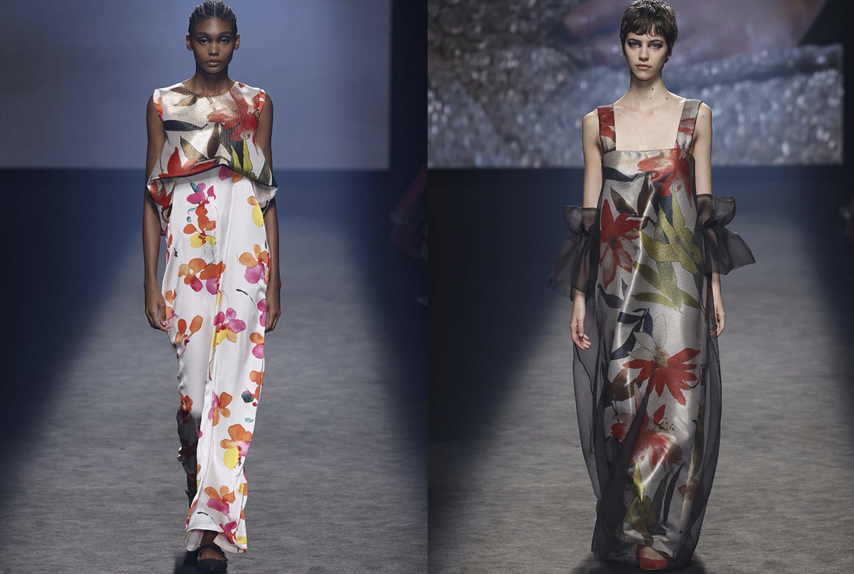
Thus, ‘Nagore’ is a luxury prêt-à-porter collection with which Fely Campo wants to represent the movement of our current rhythm of life. To do this, the designer, who has been dressing women from all over the world for more than 40 years, creates a contemporary image based on the concept of fluidity with ductile and versatile garments that reflect the feelings of today’s woman who is looking for Spanish author fashion aware of the need to consume sustainable fashion. Following her elegant and sober style, Fely Campo clings to an excellent pattern design with silhouettes that love subtlety, fabrics that become vulnerable to movement, exuberant floral prints and in a rich colour palette that ranges from neutrals: whites, light grays and black, to the radiant shades of fuchsia, orange and red with metallic nuances. The designer’s SS23 proposal is, above all, an explosion of feminine beauty in full motion.
Álvaro Calafat
Álvaro Calafat debuts on the Spanish catwalk with a new emotional collection where art and architecture merge with fashion. His third proposal is a heartfelt tribute to the death of one of the young designer’s best friends from Malaga. To talk about death, but also about its connection with life, love and sex, Calafat takes those present to the Khajuraho temple in India and does so through a free and creative interpretation of patterns, 3D structures, volumes and minute details. The silhouettes become daring, the fabrics combine rigidity with lightness and some surreal elements characteristic of her irreverent style do not go unnoticed.
Aurelia Gil
Aurelia Gil pays tribute to the trajectory of her brand, which turns 20 in 2023, through a timeless proposal that is a declaration of intent. Thus, ‘3 6 5’ represents a single collection a year made up of garments that fit together and work at any time of the day, in order to take another step towards sustainability.
The Canarian firm’s collection is made up of a large selection of the brand’s iconic garments that have been revised and updated through design and the use of new materials, such as Lycra yarn for crochet pieces. Gil is also committed to colour contrast and the mixture of fabrics. ‘3 6 5’ also has the added vision provided by Canarian artisans who have created the accessories that accompany the collection to reaffirm the values of tradition, craftsmanship and trade.
Duyos
With its own recognizable style, Duyos finds the inspiration for the next SS23 collection in Estonia through a sensory journey through its stunning nature, its crafts and tradition, and even its gastronomy. To translate experiences into fashion, the designer from Madrid allies himself with cotton jacquards, embroidery, organza, silk and tulle, which he uses to illustrate the floral explosion of early summer, but also other elements of native landscapes. Forest greens, luminous pinks, floral purples, evocative golds… which, subtly combined, represent the colourful energy of the country.
In the new Juan Duyos collection, his usual stylistic traits are not lacking either: overlapping garments, play on volumes and a mixture of motifs and textures that represent the playful but functional spirit based on handcrafted sewing.
Isabel Sanchis
Isabel Sanchis has celebrated 30 years in fashion while keeping its credentials intact. The objective of the Valencian designer, who borders on excellence in needlework, has always been to magnify the femininity of contemporary women by working with care on the chosen materials and fabrics, with exclusive embroideries, strategic volumes and very precise pattern making.
The next collection for summer 2023 represents a very personal collection based on signature elements, flowers and volume. To do this, Isabel Sanchís interprets flowers in different ways, maintaining elegant and extremely feminine designs. The proposal is eclectic, it represents the diversity in today’s society, and there are pieces that start from laser-cut neoprene, passing through lighter pieces of organza or chiffon, with other sewn garments with volumes made with recycled liquid satin and feathers. The colours used are striking, where red, pink and green predominate, giving strength to the pieces in this collection for a woman of 2023.
JCPAJARES
JCPAJARES reaffirms its commitment to fashion without seasonality with its ‘Annual 22 23’ proposal. It represents the third annual collection where summer, winter and timeless garments come together through innovative, conscious and environmentally friendly designs.
‘ANNUAL 22-23’ becomes the firm’s most special collection thanks to the collaboration with master craftsmen. A union that revives and provides new aesthetic codes to centuries-old techniques that are about to disappear. Ceramics, blown glass, hand embroidery, wicker, fabrics made on century-old looms navigate through a collection that strengthens the character, style and stamp of the young designer’s signature. Also noteworthy are the innovative and sophisticated patterns, the sexy silhouettes combined with other oversize, the strategic gathers and the unexpected openings that materialize thanks to wool cloths, organza and silk dots, crepes and neoprene, among others.
Malne
Paloma Álvarez and Juanjo Mánez, the design tandem that hides behind the firm, is inspired by the symbolism of birth to present a dazzling collection in every way that is set in a hostile environment such as the desert. In ‘Birth’, Malne reflects on a process of transformation in a positive light: the end of an era, and the birth of new ethical paradigms and ways of life, in which nature is part of the beauty of that necessary mutation.
To take it to the field of fashion, Malne uses bright fabrics that reflect the sun’s rays on the sand and shades characteristic of the desert landscape such as sand tones or night blues. The silhouettes are daring without neglecting the sophistication that characterizes the Spanish brand.
Maison Mesa
The controversial figure of Elagabalus, Roman emperor of the 3rd century AD, inspires the new summer collection of Meson Mesa. An irreverent emperor, who breaks with the gender schemes, with established sexuality and with the power systems, who grants women the political power destined exclusively for men. Under this influence, femininity, desire and power are the central elements around which all the garments revolve, a story about feminine power without ties.
On the catwalk, Juan Mesa’s firm that mixes tradition and avant-garde, exhibits geometric pieces that generate volumes and drapes according to their construction structure. Also evening dresses along with day pieces such as sweatshirts, shirts or jackets, all united under the influence of the sun god Helios, which reflect its light with nuances and sparkles, with its colour or with embroidery and applications. The colour palette is bright and ranges from white to yellow, passing through celestial blue and gold, dusty greens and nuanced pinks against their more intense versions.
If we talk about fabrics, the new collection mixes classic materials with more contemporary and innovative ones, cotton voile, organdy, satin, mikado, silk muslin and crepes with metal fabrics, shiny and lurex finishes in Jacquard or knit, going through metallic or translucent sequins and others that create camouflage military embroidery. Fabrics that reflect light with their shine also predominate, with lurex, with satin weaves, fringed fabrics that add shine and movement, even fabrics that change their colour after continuous exposure to sunlight. In short, Helios is present from the concept to its textile manifestation.
Pilar Dalbat
Pilar Torrecillas, creative director of the brand, is inspired by the heritage monuments of her native Granada to present a harmonious collection that pays homage to native architecture.
On the catwalk, Pilar Dalbat composes 32 looks that combine linen gazar fabrics with tulle, pleats and taffetas creating new silhouettes full of transparencies. Metallic fabrics, present in the designs of each collection, also appear again this time in different textures. Evening garments are characterized by brightness, transparencies and pleats. Dresses, waistcoats and skirts that, accompanied by methacrylate embroidery and glass beads, combine with silky and neoprene tops. Lime green in taffetas, crepes and fantasy gives way to versatile and flowing garments.
In this new collection, Pilar reaffirms once again a way of making slow fashion collections, defending author fashion made in Spain.
Odette
The prêt-à-porter brand Teté by Odette presents a proposal inspired by the self-confident woman who wants to shine and who invests in completely handmade pieces made in Spain. Thus, the ‘Selena’ collection gathers the profile of its consumers with tailor-made looks for them. On the catwalk, the designer Odette Álvarez changes some patterns, now advocating femininity in a more subtle and simple way. Therefore, the silhouettes become minimalist and the fabrics caress the body creating fluid and sensual shapes.
The fabrics rich in crystal details, fringes, beads, plates and sequins, and the colours that flow between gold and silver, resounding fuchsia, white and black are the axis of this proposal inspired by the lights and shadows of the landscape. mole.
Martes 20 septiembre 2022
 © Première Vision / Alex Gallosi
The concept
We have ready to go our new collection of fabrics for the Autumn- Winter 2023/2024 season. And this one has once again raised many expectations among the suppliers who have visited us at the Première Vision Paris fair held in July, and also in the first edition of Fashion Rendez-Vous in early September, the new fashion event that complements the great Parisian fair. This optimism, together with the desire to channel the textile sector to return to pre-pandemic stability, encourages us to continue creating new collections of fabrics that combine creativity, innovation and sustainability. The three pillars that support the know-how of Gratacós.
Broadly speaking, the collection decodes and analyzes emerging trends in order to make colour, texture and material decisions that structure the season. In defining the new proposal, we have especially valued the expectations of our customers, quality (key to the longevity of fabrics) and the fight for the environment. That is why we say that the new collection is more sensitive to sustainability, society and the environment because we create and make fabrics that make you daydream. It is also time to think, respect our times, communicate with our audiences, protect ourselves and seek 360º prosperity.
Below, we are going to go into detail about each of the aspects of the new Autumn- Winter 2023/2024 collection.
 © Première Vision / Alex Gallosi
The concept
Fashion is a sponge because it absorbs the social, the political and the environmental. It is a resilient industry that has the ability to recover from complicated situations to continue moving towards the future with new proposals that adapt to times of uncertainty.
This season we have the need to verbalize, express, transmit and communicate through fabrics how we think, what we feel and what we want. The fabric in this aspect is the means of expression. A conduit that collects human experiences and appeals to the personality of each individual. At the beginning of the pandemic, the conception of fabric was the instinct of protection and care of people. Now it is the means of individual expression. That is why we are concerned about choosing the weight, the appearance, the tactility, the nobility of its fibres to make exceptional creations. The fabric speaks for itself. The fabric speaks of ourselves.
Fabrics and yarns
Beyond identity and self-expression, the fabrics in the new collection are designed to move. To do this, in this new season we promote more daring and personal approaches to fashion, always navigating between discretion and extravagance. Concepts such as expressive tactility, fresh images and innovative colours are incorporated within the design team to experiment with matter.
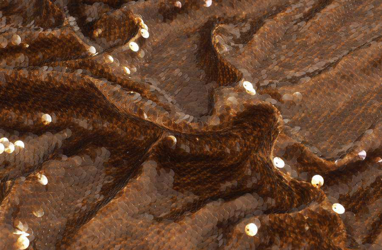
The fabrics also navigate between the powerful contrasts. The classics survive the tide of trends: items such as tweed, the Harris check, the cheviot, the wool herringbones that come from the Anglo-Saxon tradition are maintained for another season, but are reinterpreted with decorative motifs. Quilted fabrics are perfect for outerwear and the volumes that are built with reliefs become key to build winter fashion. On the other side, fantasy coexists, a trend on the rise that translates into an increased commitment to shiny items: sparkles of sequins, iridescence, oversized paillettes and crystals, along with jacquards full of fantasy colour and shine. Metallic and mineralized items also abound in the new collection: fabrics with reflections and sediments of iron crystals like iridescent carbons. We insert metallic and mineral reflections.
In terms of yarns, sustainability projects are increasingly necessary, and we consider that the supply of recycled fibres and yarns is an essential point to reintegrate waste into the textile circuit, creating a new materiality in favour of the essential circularity. For this reason, at Gratacós we work with more respectful fibres as a matter of environmental responsibility. This environmental fight is also linked to the acceptance of higher prices and ethically richer qualities without losing the aesthetic added value that distinguishes the sector.
 © Première Vision / Alex Gallosi
The colour
The Autumn- Winter 2023/2024 season stands out for the versatility of colours in their multiple nuances, both essential and maximalist. A colour range that amplifies the beauty of the materials. For truly desaturated excess, focus on shocking luxury and drama.
The density of the dark colours enhances the vigor of the intermediate tones and amplifies the visibility and character of the brighter tones for a new identity in the harmonies. Some shades play with their denser, brighter versions for an illuminating effect that helps us deliver modern, disruptive colour schemes that can be associated with a welcoming neutrality.
In this new collection, the palette will be made up of three colour levels. The first range is the most saturated and bright, and plays on contrast. We call it the Dopamine Shade Range. It is a line of intense and emotional colours that suppresses all classic rules of composition to bring out a vigorous passion. Orange, magenta, green and fuchsia emphasize contrasts in colour mixes to create surprising harmonies. The second range is more discreet and is made up of various neutral tones that modulate oxidized iridescence, mixing harmonious combinations and bright tones that meet again. Pearl gray, antique pink, earth colours, deep lilacs … are part of this second colour line. They are sophisticated and charismatic shades that evoke luxury in its most subtle version. Finally, the third range balances between nature and the rural world. To capture this serene and traditional universe we use warm and deep colours that are interrupted by brightness. Earthy tones, pale greens or muted blues are key in this range to offer us a recovered classicism that connects us with the past and memory, without giving us a vintage look.
 © Première Vision / Alex Gallosi
The aspects and designs
The Autumn- Winter 2023/2024 season stands out for a new hybrid sensoriality in the fabrics that is achieved through creativity and ingenuity. We are not satisfied only in making beautiful articles, but they must inspire beauty. To do this, in terms of aspects we will highlight the reliefs emphasized to reflect the movement of the textures.
Currently, fashion moves between the comfort of urban style or more streetwear with the elegance of tailoring, which is an unbeatable classic, and, finally, the sophistication of the most extravagant garments. For this reason, the items we create have to meet all existing demands on the market. Specifically, we are interested in functional, versatile and hybrid items that respond to various daily styles, but also the most fanciful items to respond to this commitment to escapism that fashion after the pandemic entails: sumptuous materials, extravagant ruffles and sequins. of all kinds and sizes.
In terms of design, this season is represented through ideas about exploring the limitless possibilities of forms and mixing with art. There is a strong relationship between tradition and emotion. A collection that goes towards a very expressive modernity, we want above all to awaken joy.
To convey the trend, contrasting motifs triumph in this collection: from the delicate and imperceptible tone on tone, to the macro designs in strong and vibrant colours for unapologetic visual opulence. Playful contrasts of proportions working together are also explored. In terms of prints, abstract designs that are inspired by a kaleidoscope of multiple reflections abound. Also the monochrome designs in Jacquards and prints, in contrast with an overflowing multicoloured expressiveness.
Lastly, the new season is not lacking in surprising plaid designs, exotic paisleys , almost baroque ornaments, the delicacy of flowers that become more artistic and less obvious, and autumnal fantasies for a decorative, warm and comforting aesthetic.
In short, we really want to present you the imagery of an entire eclectic and versatile season, which explores new limits where the ingenuity of the creative team is at the service of beauty and sensoriality. Soon you will discover the new season in the Gratacós space!
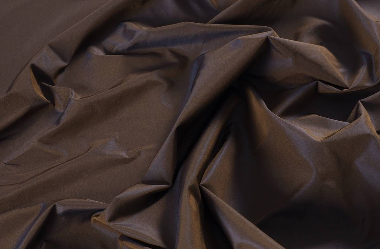
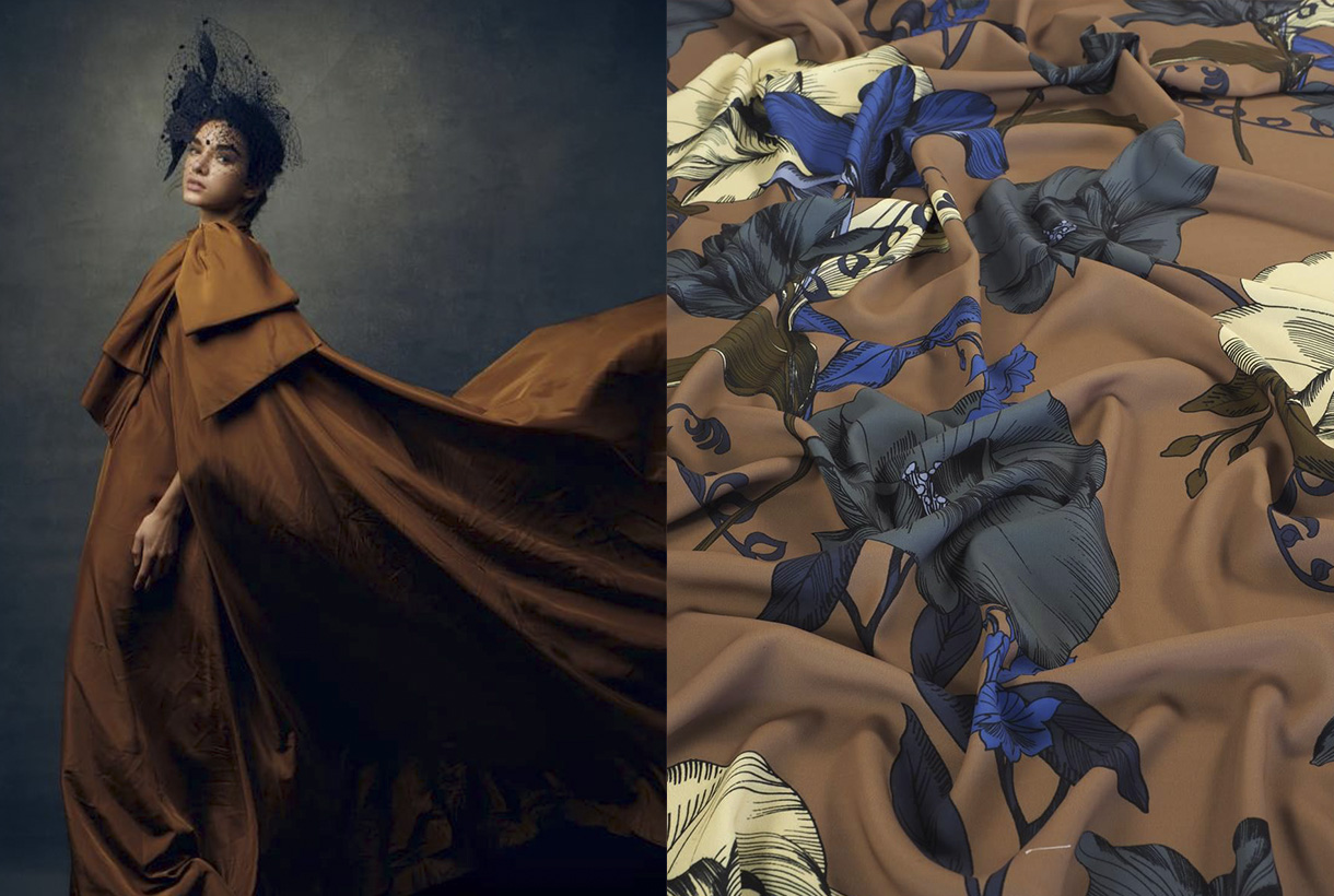
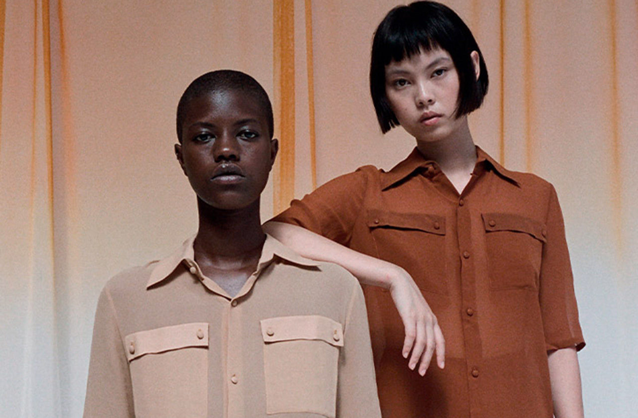
Brown. Right from the start it sounds ugly and unpleasant, it triggers some ridicule and in general, it represents an underappreciated colour: Only 1% of people admit to having it as a favorite, being the hue that generates the most rejection among the population. On a psychological level, brown has negative connotations because it is associated with the old and outdated, poverty, dirt or everyday life. The ordinary is represented in brown. The discreet also because brown, being the mixture of primary colours, goes unnoticed. These mental associations are related to the history of clothing and the use that was given to this underestimated colour in art. Despite this, brown also has a luminous underside: it represents the earth and is present in nature, through flora and fauna. In design and decoration, brown is highly appreciated because it refers to warmth, recollection and well-being. The rustic environments, with a great presence of wood, leather and mud and clay, are in brown tones. Below, we explain some curiosities about this reserved shade that is essential in autumn, the season that we psychologically associate with brown.
The origin of brown
Brown has always been there, and it abounds all around us. These tones are very common in nature: the bark of trees, the skin and hair of animals, clay soil, arid soils, mud flows… Brown represents mother earth, where it emanates with all its force. , its nature, and, therefore, life and death. Maturity is brown, so in autumn, this colour shines in all its intensity. The flowers lose their youth and the leaves gradually turn this shade to announce the end of their cycle.
Etymologically, the name of the colour is a Gallicism. It refers to “marron” which means chestnut in French. This word was introduced in the mid-nineteenth century to designate what was previously known as chestnut. The acceptance and use of the term among the population was so great that it was introduced into the normative dictionary in 1927. Therefore, not even a century has passed since our language has accepted the word brown to designate the brown or brown colour. Despite this, today we continue to use the old adjective to name hair and hair that is neither blonde nor brown.
The colour of humility and poverty
Historically, brown has always been an abundant colour, easy to produce and in many cases, represented undyed fabrics through elaborate pieces of flock and hair of goat, deer and hare spun with raw and brownish flax and hemp. Therefore, the brown clothing was the original and did not need any added treatment. Since Classical Greece and practically up until the end of the 18th century, pieces of clothing in bright colours such as red, ultramarine blue, green or golden yellow were status symbols -they were expensive colours to produce- and were reserved for women. privileged classes. The undyed garments clearly showed an inferior status and for this reason, the popular classes used them frequently, with brown being the colour associated with simplicity, humility and poverty. For example, in Ancient Rome, brown clothing was associated with the poor or the barbarians – those peoples who did not master the dyeing arts. The term used to address the commoners was “pullati”, which literally means those dressed in brown. In the Middle Ages, brown was considered the ugliest colour on the spectrum because it was the colour worn by peasants, serfs, servants, and beggars. It also represented an abundant, ordinary and vulgar colour, values opposed to the opulence of the nobility. Therefore, brown was seen as a worldly colour, associated with the crowd, the mob and why not, with dirt. Feces, mud and bitumen are brown and frequently surrounded the plebs.
If brown also represented a symbol of humility, it was not surprising that the first Christian monks used this colour to preach a simple life, away from all kinds of luxuries. When the colours for the different orders were established, the brown and gray colours dressed the monks who took a vow of “maximum poverty” such as the Franciscans known for their brown robes as a symbol of Christian humility.
Brown was also, for centuries, the colour of mourning for the poor because black-dyed fabrics were inaccessible to the most popular classes.
A change of conception
The aesthetic ideal of vibrant colours lasted as long as the cost of luminous tints remained high. This paradigm began to change from the eighteenth century when it was possible to dye pure colours for the first time (red, blue and green were the most valued) at reasonable prices. This fact changed the value system: pure colours were then considered simple, and the dyer’s art was transformed into the art of mixing dyes. From there arose, in the rococo era, the predilection for pastel colours, and the introduction of chestnut as a fashionable colour among the nobility. To obtain the coveted brown, they were dyed several times with different colours, one after the other, to obtain a more varied tone. For example, Louis XVI had a predilection for flea colours (he called them coleurs de puce ) with very varied nuances: old flea, young flea, flea back, flea head, flea leg… All would refer to a type of brown distinct.
Goethe, on the other hand, considered pure colours to be negligible, since they were difficult to combine in the clothing of sophisticated people: “The use of solid colours undoubtedly has many limitations; On the other hand, colours such as dirty, dead, the so-called fashion colours, show many gradations and nuances, most of which are graceful”, he said. The “dirty colours” were all shades of brown, and the “dead colours” referred to those that darkened to black with its various variations that were more versatile. This is how German culture progressively turned the meaning of brown upside down. From the plebs and marginalization, it came to represent the culture and good taste of the upper classes.
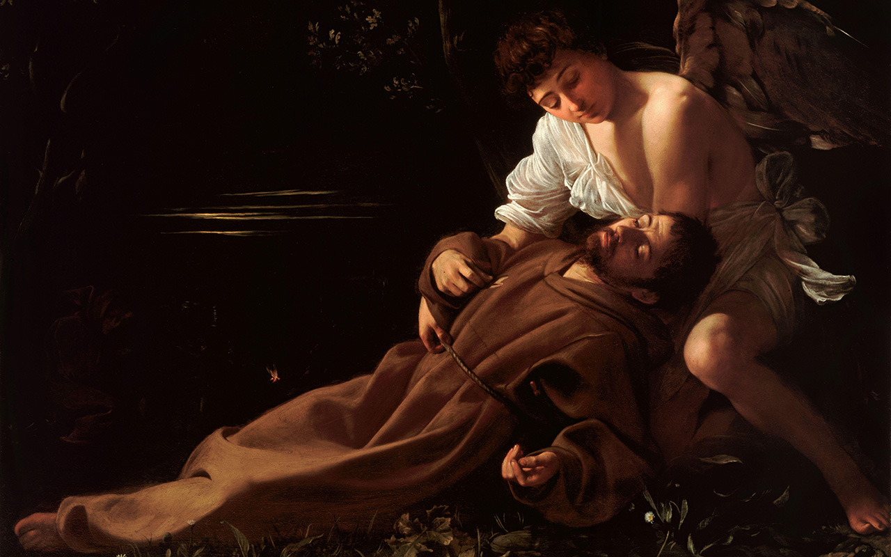
Brown in art
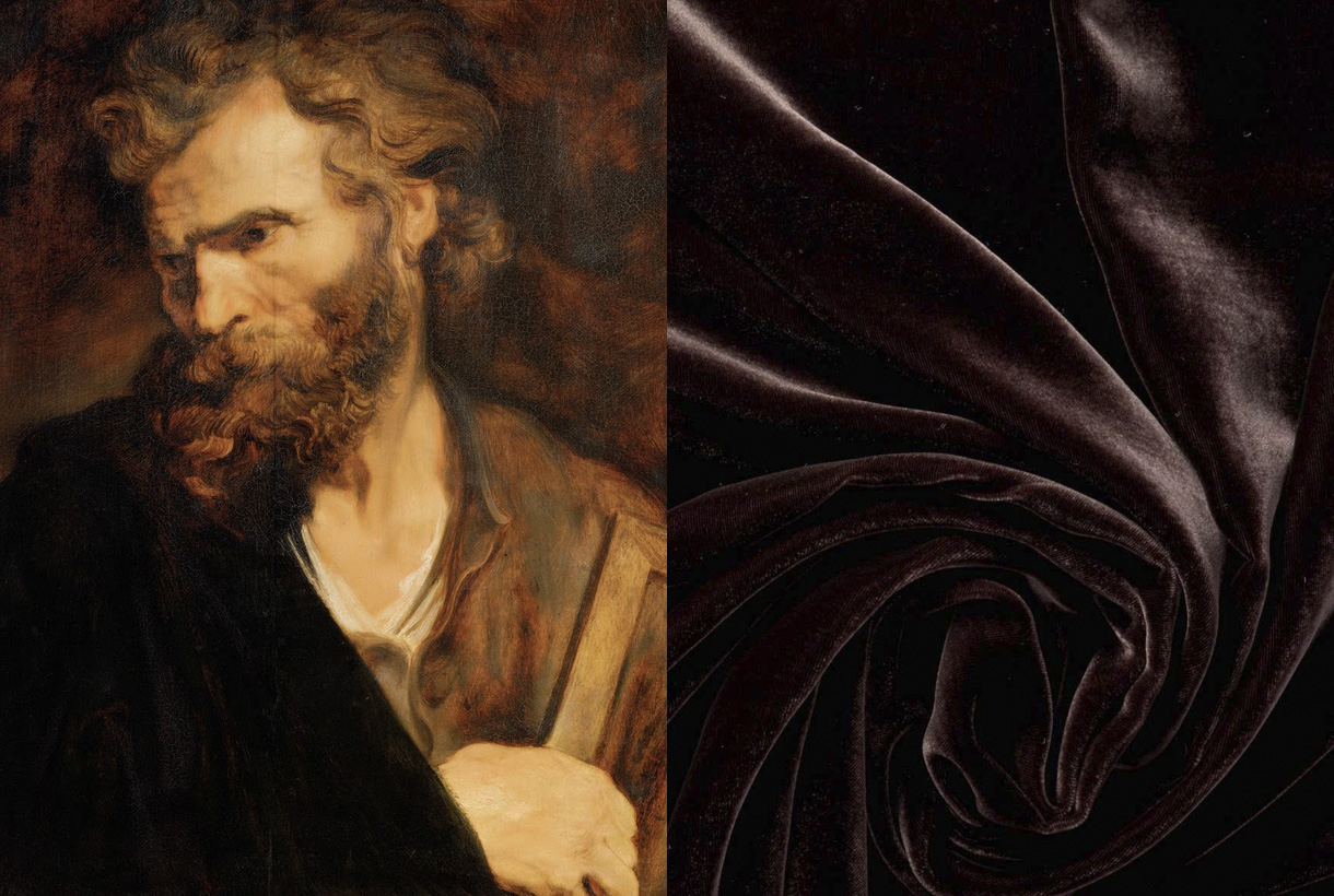
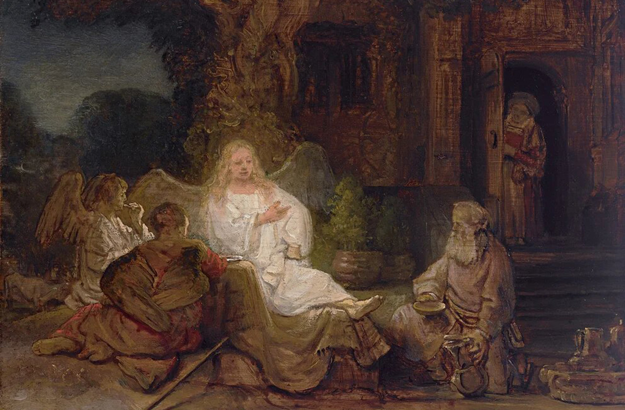
Although brown has been used in art since prehistoric times, this hue was rarely used in art until the Renaissance. In the Middle Ages, for example, artists preferred bright, distinctive colours to paint pictures or illustrate religious books. In the 17th and 18th centuries brown was in greater use. Caravaggio and Rembrandt used various shades of brown to create chiaroscuro effects, where the subject stood out from the darkness. Rembrandt also added shading to the ground layers of his paintings because it promoted faster drying. The artist began to use a new brown pigment, called Cassel earth or colony earth. This was a natural earth colour made up of organic matter, such as soil or peat. It was used by Rubens and Anthony van Dyck, and later became commonly known as Van Dyck brown. The French Impressionists of the 19th century were not very fond of the colour in question, with the exception of Paul Gauguin who created luminous brown portraits of the people and landscapes of French Polynesia.
A colour appreciated in fashion
Traditionally, it was thought that the person who wore brown conveyed to the world that they wanted to go unnoticed. The psychological effect it causes is that of being an ordinary colour, even mediocre. In fact, there are still rules attached to clothing issues that go back to this imaginary of colours. For example, high-ranking executives are said to be banned from wearing brown suits because they detract from their status.
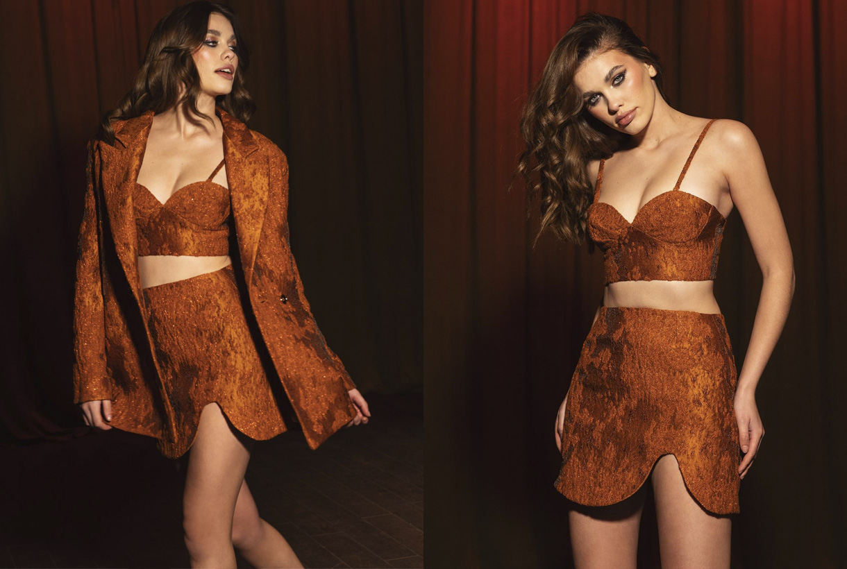
Beyond certain beliefs or traditions, fashion has adopted brown in its bed and has given it infinite possibilities. Brown is a warm and deep tone, it exudes magnetism, it is easy to combine, and therefore it adapts perfectly to countless looks because it makes its discretion its best asset. Not in vain is it considered a neutral like white, black or navy blue. Despite being traditionally related to autumn, brown this 2022 has been worn in spring and summer, through youthful and fresh looks that have been followed by some celebrities and fashion prescribers such as Cardi B, Dua Lipa, Selena Gómez, Kendell Jenner or Rihanna. Wearing it in a total look version has also been the preference of the big fashion firms.
At Gratacós we want to show you some of the key fabrics for the new season in shades of brown to show you their full potential. You will also find other items at discounted prices. You will find them available in our online store.
In short, brown will never go down in history as one of the most significant colours, but it will walk hand in hand with it thanks to its simple, versatile and discreet nature.
Sorry, this entry is only available in Español.
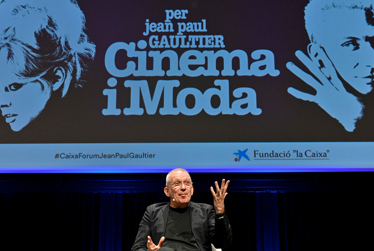
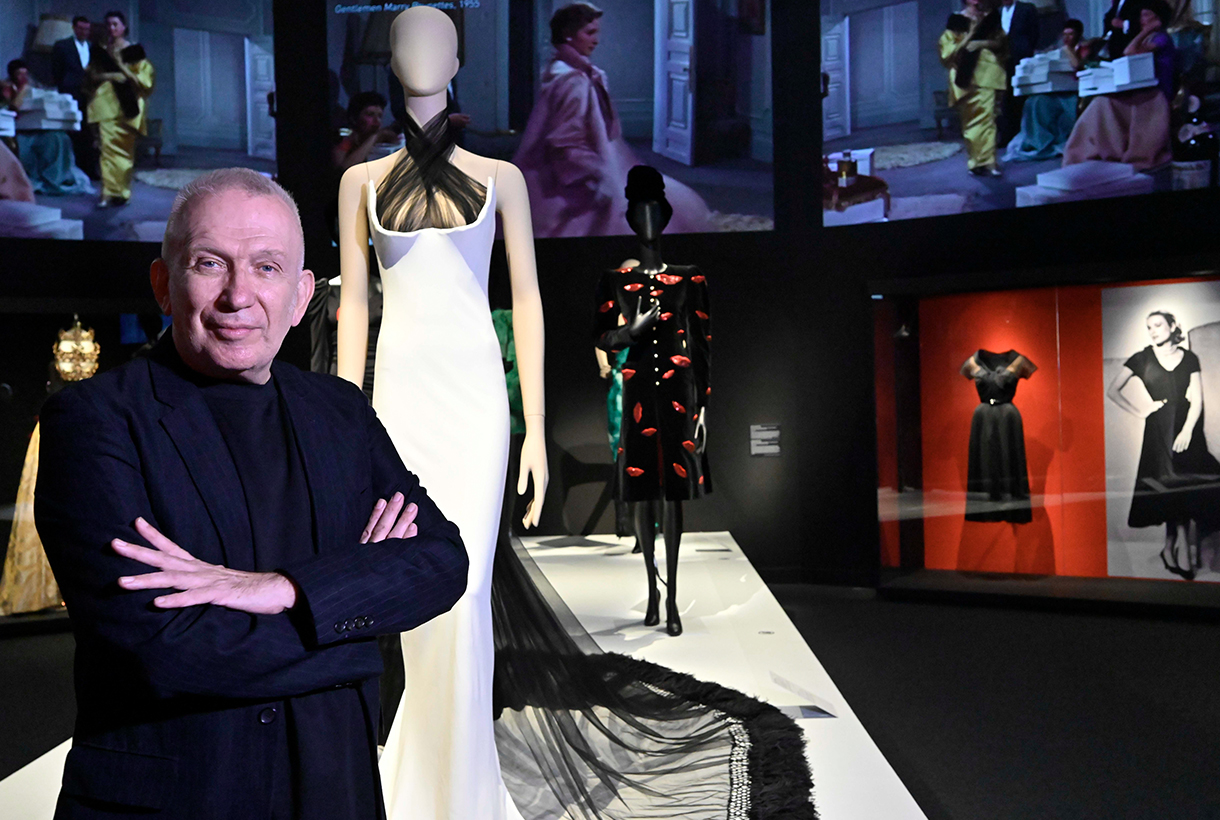 El diseñador de moda y director artístico de la muestra, Jean Paul Gaultier, en CaixaForum Barcelona.
Jean Paul Gaultier is the enfant terrible of fashion in his own right. Although he is no longer creatively spearheading his namesake brand, now spearheaded by his successor Olivier Rousteing, Gaultier will always be Gaultier. A self taught genius. Transgressive and irreverent, but from his kind facet. A free verse of fashion that he revolutionized in the 70s, 80s and 90s exalting difference, celebrating diversity, breaking stereotypes and exploring the beauty of the margins. Gaultier was not interested in the classic or the conventional, but he did investigate how he could empower the women of his time through clothing. His designs were the perfect armor for a new generation that wanted to express their strength, dynamism and freedom through clothing. One of Gaultier’s icons, the pointed corset worn by Madonna on the ‘Blonde Ambition’ world tour in 1990 was created thanks to the influence exerted by the woman who has most inspired him: his grandmother and her extensive lingerie wardrobe reminiscent of the enfant terrible from his childhood.
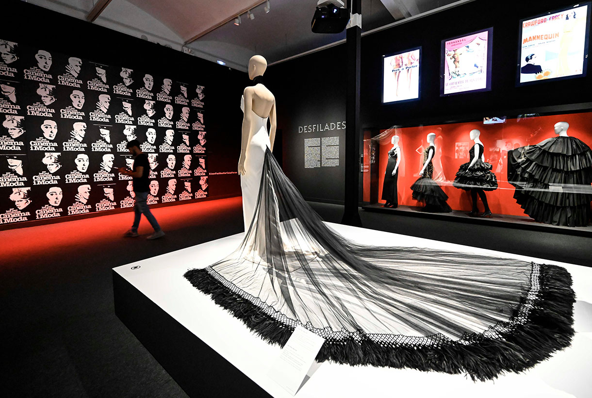
This iconic garment, among others, can be seen live in the new exhibition premiered at CaixaForum Barcelona: ‘Cine y moda. Por Jean Paul Gaultier’. An exhibition co-organized by the La Caixa Foundation and La Cinémathèque francaise that proposes an eclectic journey that intertwines cinema and fashion with great creators and artists, from the personal point of view of the controversial creator, as a costume designer and as a movie buff. For Gaultier there is no cinema without fashion, and vice versa.
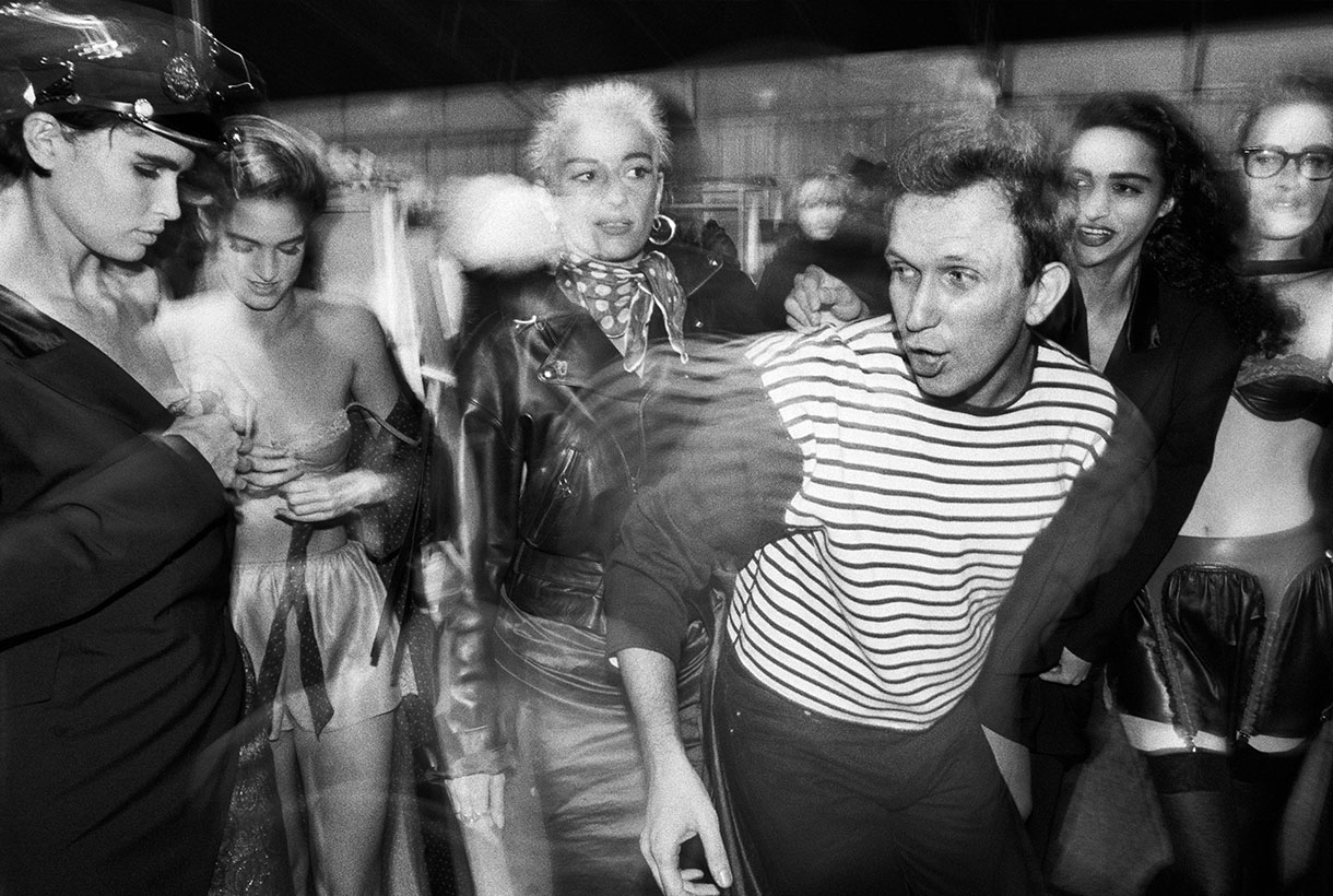
Backstage, desfile de Jean Paul Gaultier, colección Barbès, 1984, prêt-à-porter de mujer otoño-invierno 1984-1985. © William Klein.
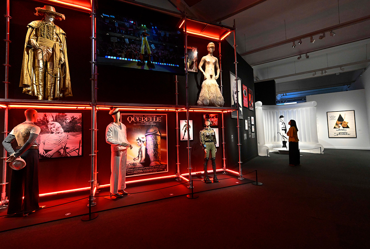
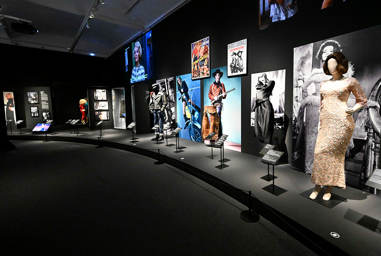
Divided into five areas, the author’s exhibition where Gaultier captures his gaze, reviews the presence of the world of fashion in cinema, the collaborations of great designers in film costumes and the creation of male and female archetypes. The enfant terrible of fashion emphasizes key aspects that are present in his career as a designer such as female empowerment and pays attention to heterodox figures of male and female warriors, androgynous and transvestites, as well as the influence of rock, punk and and queer that have marked fashion so much in recent years.
After passing through Paris and Madrid, the exhibition, dedicated to the memory of the filmmaker Tonie Marshall, brings together in Barcelona a heterogeneous set of more than 100 pieces of clothing that are shown in nearly 70 looks, fragments of more than 90 films and 125 graphic representations (posters, sketches, frames and photographs), between originals and reproductions, mostly from the prestigious collection of La Cinémathèque Française and complemented by works from more than twenty national and international lenders.

Díptico Marlene Dietrich. Masque & Narcisse, 2021. © Bastien Pourtout i Edouard Taufenbach, colección Pierre Passebon, 2021.
Among the nearly 70 iconic film looks are dresses worn by Grace Jones in ‘A View to a Kill’ (1985), Catherine Deneuve in ‘8 Women’ (2002), Grace Kelly in ‘Rear Window’ (1954); Sharon Stone in ‘Basic Instinct’ (1992); Marilyn Monroe in ‘Nude Eve’ (1950); ‘Tay Garnett’s Seven Sinners (1940); Brad Davies in ‘Querelle’ (1982) or as we said at the beginning, the famous pink corset that graced Madonna on her world tour.
Also, the ‘Superman’ suits (which Christopher Reeve wore); ‘The Mask of Zorro’ (1998), with Antonio Banderas; the shorts that Sylvester Stallone wore in ‘Rocky’, or Victoria Abril’s wardrobe in ‘Kika’ (1993) which, together with that of other films such as ‘Bad Education’ (2004) or ‘The Fifth Element’ (1997) , was designed by Gaultier. In this line, haute couture designs by Coco Chanel, Pierre Cardin, Hubert de Givenchy, Manuel Pertegaz, Balenciaga and Sybilla, among others, are also on display.
Fotografía entre bastidores de la película ¿Quién eres tú, Polly Maggoo? 1966 © William Klein/ Films Paris New York.
Two films that mark the beginnings of Gaultier
Among all the parade of looks, projections and key garments, there are two films that take pride of place in the exhibition and have to do with the origins of the designer. The first would change the course of his life. Gaultier was then 13 years old when he first saw Jacques Becker’s ‘Falbalas’ (1945). A melodrama starring a seamstress and set in the hustle and bustle of a sewing house during the postwar period. This film is the “culprit” of his desire to dedicate himself to the world of fashion. From there he began to design figurines that he would later transform into designs. The other film that has marked the French creator has been ‘Who are you, Polly Maggoo?’ (1996) by William Klein, who in the film analyzes his time with a keen eye and lays bare the then incipient reality shows. It is a satire of the egocentric delusions of the world of haute couture, where at that time the space age dominated and everyone from the misanthropic couturier to the most versatile editor-in-chief fell.
Pedro Almodóvar, Victoria Abril y Jean Paul Gaultier en el plató de Kika, 1994 © Nacho Pinedo.
Moda y arte, actividades en paralelo
The exhibition ‘Cinema and fashion. By Jean Paul Gaultier’ will be open to the public until October 23. On this occasion, to investigate the close relationship between fashion and art, CaixaForum Barcelona has organized a cycle of conferences in September that proposes dialogues on how art and fashion influence each other: is art the source of inspiration for fashion or are fashion codes the ways the artist chooses to develop his poetics? The French philosopher and sociologist Gilles Lipovetsky, the architect Manuel Blanco, the journalists Isabel Margalejo and Carlos Primo, the popularizer Charo Mora (responsible for the cycle) or the model Sita Abellán, are some of the names that will illustrate the links between fashion and art, architecture, literature and music.
Detalles de la exposición ‘Cine y moda. Por Jean Paul Gaultier’
Sorry, this entry is only available in Español.
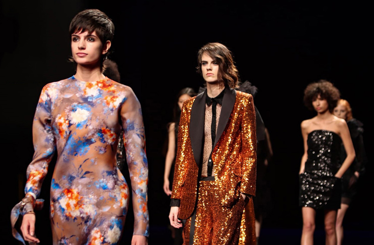
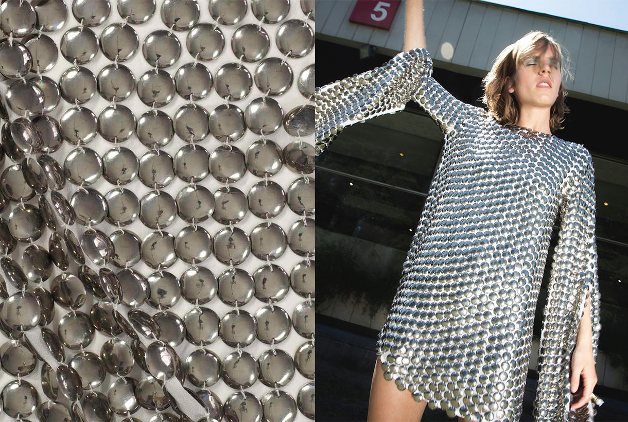
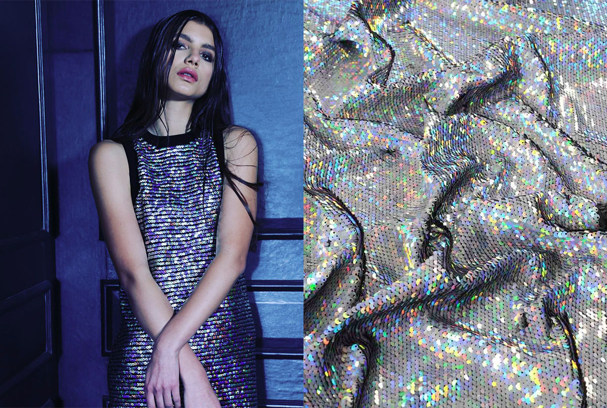
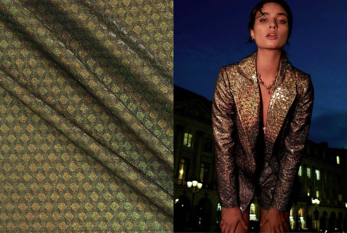
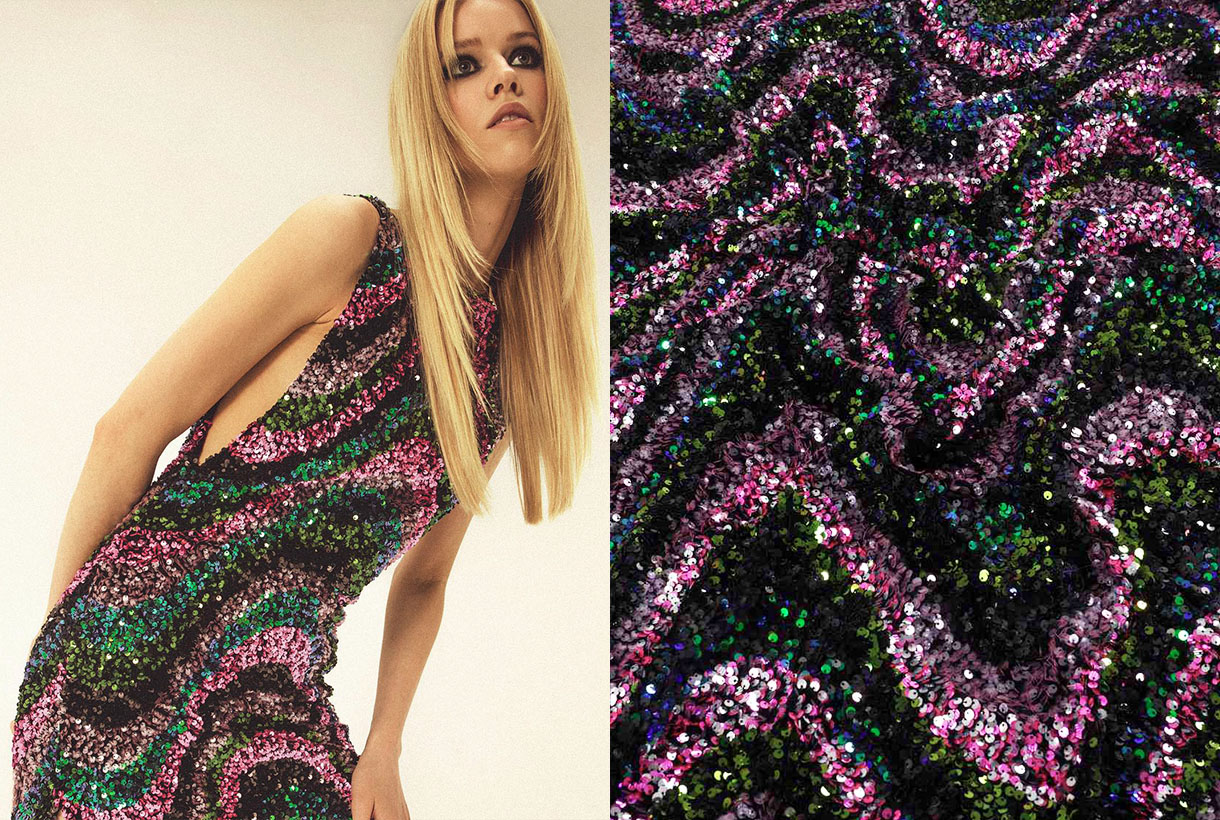
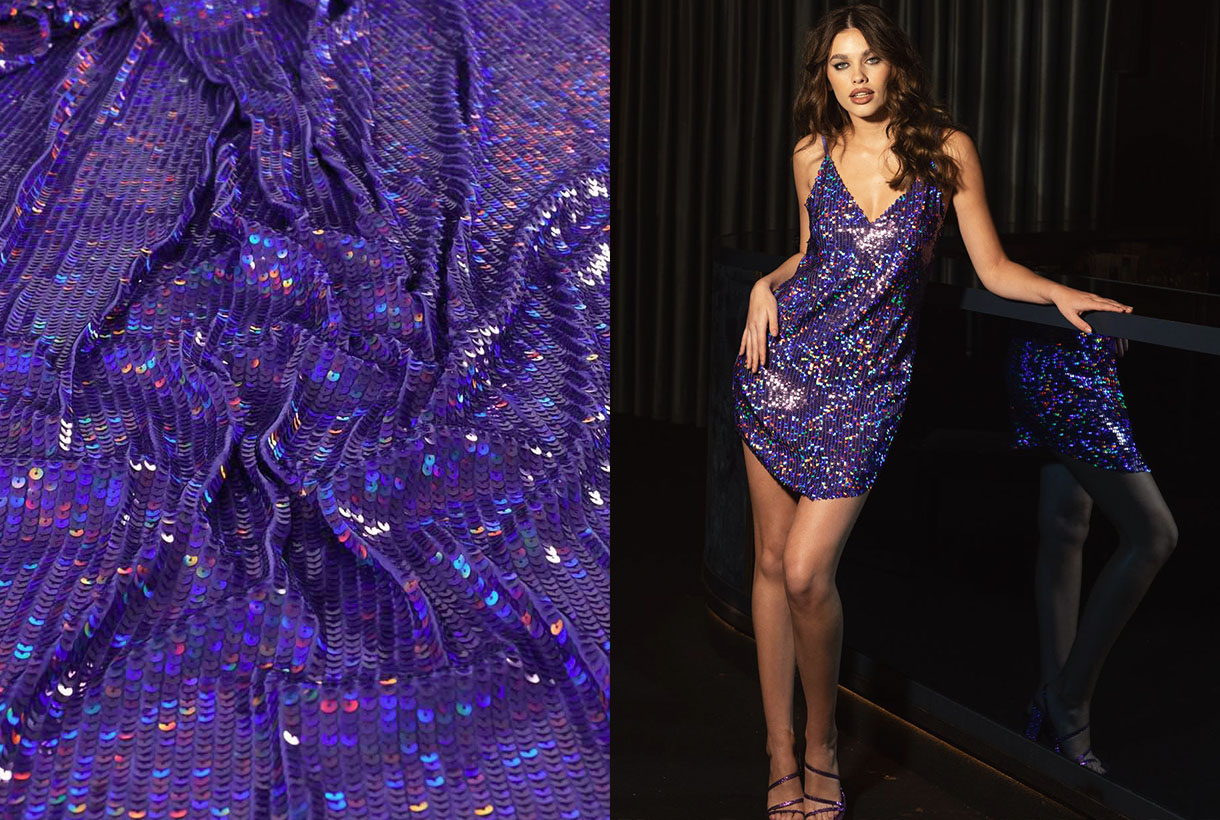
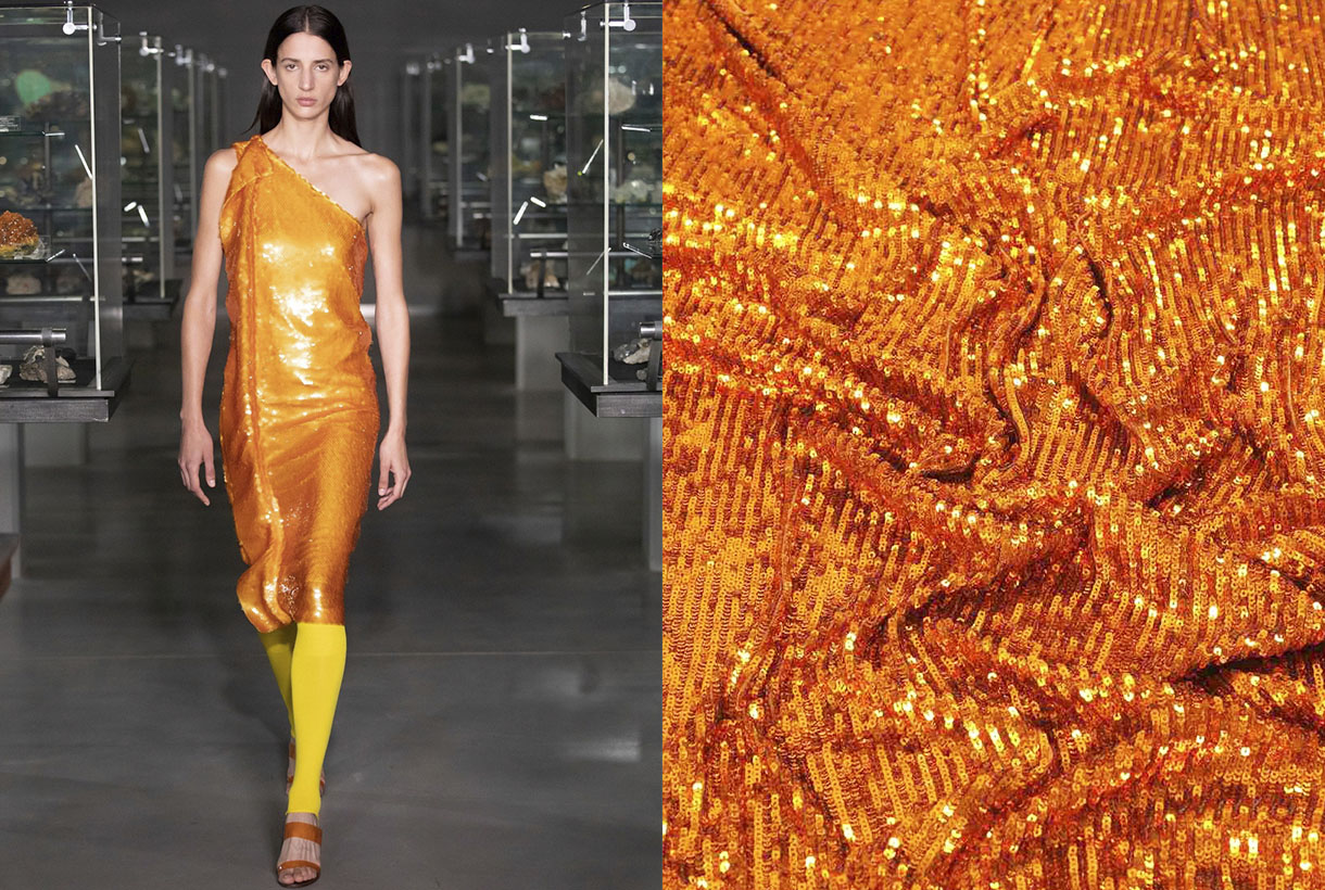
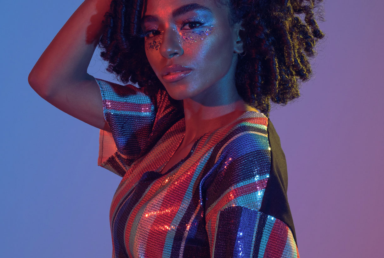 The summer season begins with a trend less and less reserved for special occasions: sequins, which with their glitter catch all eyes. Disconnected from their comfort zone, these small metallic sheets sewn into the fabric become the protagonists of the moment together with other materials that dazzle on their own, such as iridescence or satin finishes that produce a more discreet shine.
On this occasion, sequins, along with fluorescent colours and transparencies, have featured on the fashion shows of the SS22 collections of Tom Ford, Michael Kors, Loewe, Valentino or Rodarte and are set to invade the street through resplendent outfits. The key to sequins, until now reserved for specific celebrations such as New Year’s Eve, is that there are many options to show them off successfully in garments to wear at all hours. Day and night without paying attention to brightness or excesses. From the rock & roll looks of Saint Laurent, to the sophistication of Chanel and Celine that combine them with tweed or in key details such as Gucci, Balmain or Paco Rabanne, creator of the iconic metallic mesh.
From Tutankhamun to Leonardo da Vinci
The origin of sequins dates back to Ancient Egypt, where small gold and silver discs were sewn onto the clothes of the pharaohs and their consorts as a sign of wealth. In fact, it was during the discovery of Tutankhamun’s tomb in 1922 that archaeologists found, among other objects, clothing decorated with shiny metal disks. A time that coincided, in turn, with the metallic fever of the Roaring 20s, embodied by the costumes of the flappers and the Egyptomania that unleashed this fact, which inspired the designers of the time to design outfits with metallic discs to stand out on the dance floor.
In English, the word sequin (sequin, is linked to the Arabic term sikka (coin) and al zecchino, a golden coin minted in Venice during the 13th century. The first sequins were coins sewn onto clothing, for reasons ranging from displaying wealth and status to making life difficult for thieves. It is also said that Leonardo da Vinci, one of humanity’s great inventors, devised a machine to produce small metal discs. A prototype that was never manufactured, but that already establishes the age of the sequin.
Later, in the 17th and 18th centuries, wallets and cases began to be used, and pockets appeared. Therefore, in men’s and women’s clothing it was no longer necessary to sew the coins to the clothes to keep them safe, and the small metal disks became a purely aesthetic ornament.
The sequin shines in the 20th century
Sequins as we know them emerged in the 20th century. Its sparkles began to adorn the rich dresses of the Belle Époque, added touches of light to the creations of the 1920s and returned to adorn the garments of the sensual 1950s. Actresses like Marilyn Monroe or Rita Hayworth succumbed to the sparkle of sequins with innumerable outfits that shimmered on and off the celluloid. A sparkly dress from the era that connects with today is the iconic beige dress that the blonde diva wore when she sang ‘Happy Birthday’ to President John F. Kennedy in 1962. That same crystal-covered gown was worn by Kim Kardashian in the Met Gala 2022.
The materials used to create the sequins also changed over time. The metal of the first prototypes evolved into gelatin in the 1930s. The latter material was lighter, but it was brittle and did not withstand changes in temperature well. Later, they became plastic, flexible and resistant to washing. Thanks to this change, sequins became more practical, less expensive and more affordable than their previous versions.
An ornament linked to music, movement and excess
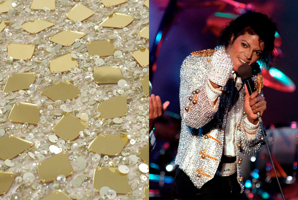
With the innovation of new materials and the triumph of prêt-à-porter in the sixties, the use of sequins became popular in more common clothing that became daring, lively and colourful. The objective? Adorn the silhouette, empower it and become the center of attention. This manifested very well in the seventies with disco fever. In the countercultural movements, sequins and all shiny fabrics became a symbol of rebellion against the system they considered serious and boring. That’s when the glam rock era began . A sensual, androgynous, eccentric and revolutionary movement whose symbol was David Bowie with his iconic alter ego: Ziggy stardust . The man with the stars, and other singers of the time, wrapped themselves in lamé suits, sequins and lots of glitter.
Shiny fabrics, with sequins being the favourite, shone again in the 1980s. Michael Jackson was responsible for bringing glitter and pharaonic garments back to life with memorable performances where the King of Pop donned suits covered in sequins and rhinestones.
Nowadays, sequins, as well as other shiny fabrics, are subjected to the ups and downs of cyclical fashion. Its material is still based on plastic, now mostly recycled, but with special coatings. What has not changed is its meaning. Sequins spark the imagination, become visible and illuminate people’s daily lives. They are an element of escapism, something to cling to other fantasy worlds. And we already know that fashion is a dream and at Gratacós we like to make you dream through our sequin fabrics. Here we leave you a selection of the most innovative so that you shine with your own light.
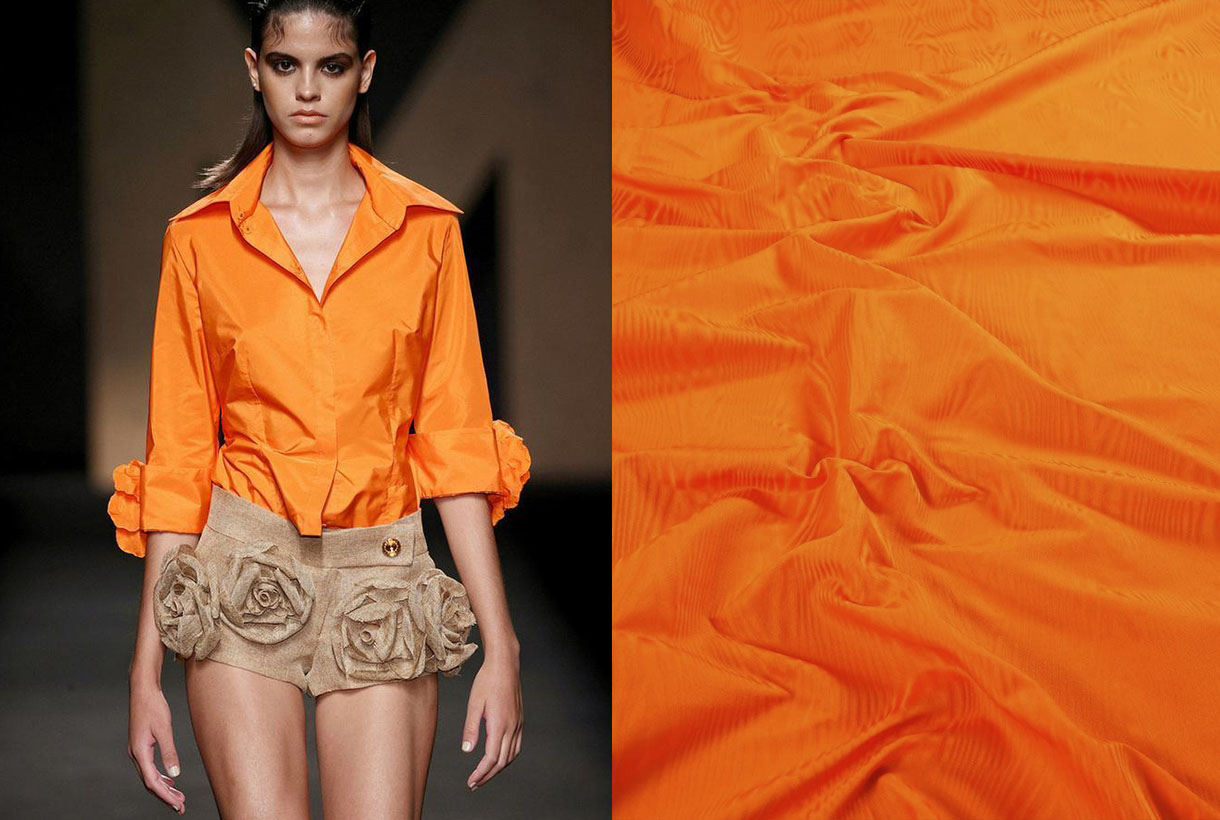
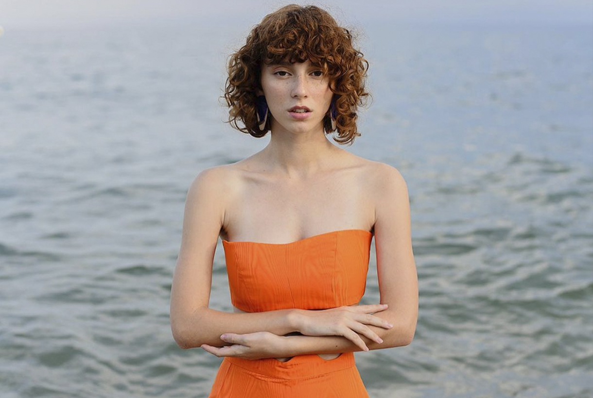 Orange is a more common colour than we think, although its role in history has always been relegated to the background. This hybrid shade between red and yellow provokes an immediate reaction when recognized. It activates, stimulates, surprises and entertains. Not surprisingly, this striking colour is always associated with the unconventional. Its uniqueness has played an important role in art, history and design. Since ancient times orange was present in Ancient Egyptian rituals, it has been considered a sacred colour in various Asian cultures and has come to fall in love with artists such as Vincent van Gogh and Toulouse-Lautrec who used orange in their paintings. We reveal some anecdotes about this exotic colour, often underestimated.
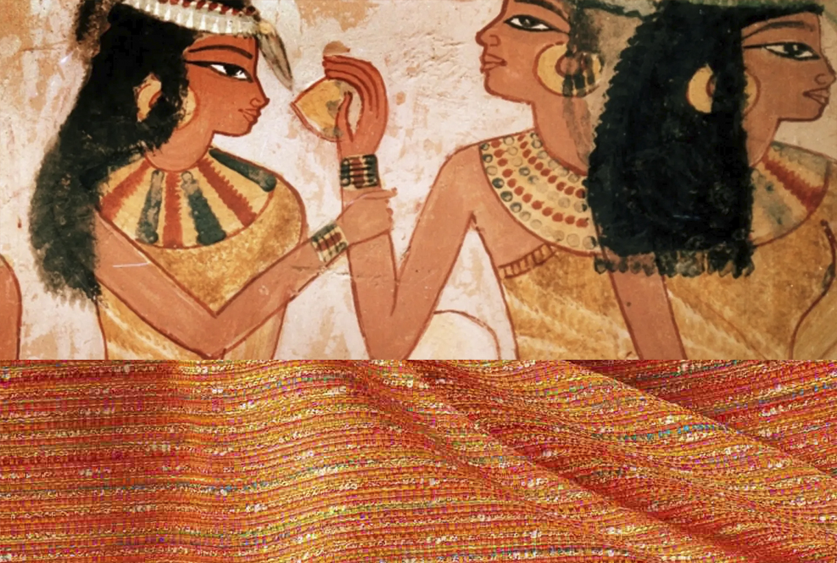
Orange in ancient times
The ancient Egyptians were the first to use a shade between yellow and orange that they extracted from the mineral realgar to decorate their tombs. The pigment that was extracted was toxic – it contains arsenic – and was used by the Chinese to drive away snakes, as well as being used in the country ‘s traditional medicine . Another related mineral, orpiment was also used as a pigment and was considered a highly valued trade commodity in ancient Rome. In the Middle Ages the orange pigment was used during the Middle Ages in manuscripts.
In Asia, orange was considered a symbol with different interpretations depending on the culture of each country. This tonality is present in many of the Asian religions. In Buddhism, orange is a sacred colour: it is considered the tone of enlightenment and the search for knowledge and for this reason, the clothing of Buddhist monks is traditionally of this colour. For Confucianism, orange symbolizes the colour of transformation. In Hinduism, the dress worn by Krishna – one of the most revered personified deities – is always in this brilliant hue. The name of the colour in India and China derives from saffron which in turn was the most expensive dye in the two countries. These Asian powers considered that orange represented the perfect balance between the perfection of yellow and the power of red.
A nameless colour
In Asia, orange was a revered hue. On the other hand, in Europe the colour did not have a name until the 16th century when Portuguese merchants brought from India and China the most exotic fruits of the time: oranges and tangerines, tinged with a colour that Europeans called reddish yellow until then. This striking colour imported from the Far East via orange trees was named after the fruit itself. Orange in Spanish, orange in english, arancia in italian and orange in Portuguese.
Another curiosity: today orange is a colour that connects on a psychological level with the world of flavours and is pleasing to the eye when linked to food. Peaches, apricots, mangoes, carrots, prawns, prawns, salmon, pumpkins, curries… Orange can be an appetizing colour, right?
Orange in art
In Western European art, the use of orange became common as from the 19th century, when the first synthetic orange pigment called chrome orange was produced. This tone was a favourite of Pre-Raphaelite and Impressionist painters, who made use of colour to capture the effects of natural light. Artists such as Monet, Gauguin, Renoir, and Toulouse-Lautrec used colour extensively to elicit feelings of warmth, escapism, and playfulness. If there is an artist who was directly linked to the colour orange, it was Vincent van Gogh, who through painting mixed his own shades of orange and used them in contrast to the blues and purples characteristic of his work.
A seasonal colour in 2022
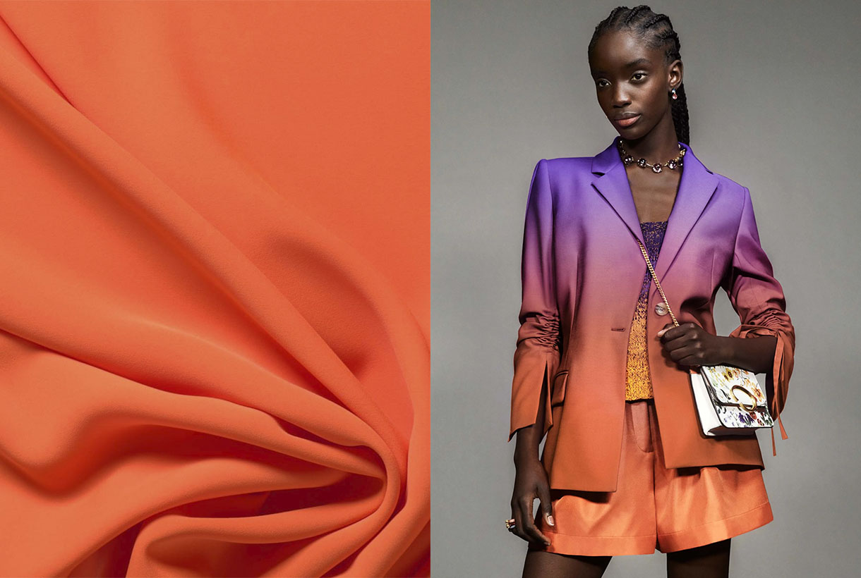
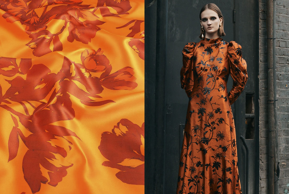
Although Pantone crowned Very Peri lilac as the colour of the year in 2022, the truth is that the fashion industry seems to have set its sights on a more intense and vital hue to lift the spirits. On catwalks through the summer and pre-fall collections , on the street style of fashion weeks , in the windows of the big firms… orange has emerged as one of the star shades of the season in all its possible ranges.
Orange has been present in the current SS22 collection by Christian Siriano, Collina Strada or Proenza Schouler, transmitting optimism and joy to the clothes presented, but it is in the transition collections that it gains more strength. For example, Erdem is one of the firms that has opted for this colour, but in its softer versions such as boiler orange for satin dresses with black motifs and looks that play with textures and use the same tone. For its part, Chloé has opted for pastel shades giving it a less aggressive look. Oscar de la Renta has given orange reddish nuances, always accompanied by other colours or in bag format. Instead, Gucci has opted this season for a vitamin orange that dyes a multi-layered skirt in the same tone.
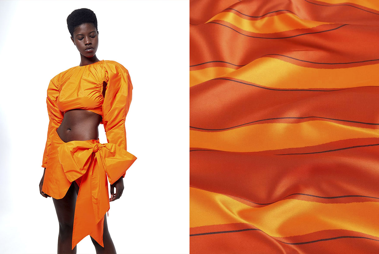
The namarillo is once again stepping strongly on the catwalks. A hybrid shade halfway between orange and yellow that became popular in 2016 among the spring collections and caused a furor due to its showiness and luminosity, being the summer shade at the time. Now Prabal Gurung has recovered this vitamin tone and has incorporated it into a large part of the looks of its latest collection. In a slightly more subdued tone, Staud has turned it into knitted sets with microshorts and Chanel into jumpsuits that are the hallmark of its creative director, Virginie Viard .
How to combine it?
Sometimes what is seen on the catwalk does not necessarily end up being worn on the street. And orange seduces at first sight, but it is not an easy colour to wear nor is it discreet. Still, the street style of the fashion prescribers or the looks exposed by the celebrities in the network carpets are the best reference to demonstrate the chromatic possibilities that orange has in the wardrobe.
The easiest way to get started in the colour orange is to do it in small doses through a single garment or simply relegating it to accessories. The tones that always go well with orange are the neutral ones: white, black and beige tones or makeup that creates a base effect. On the other hand, if your level of daring is high, orange looks great in a total look through dresses, jacket suits or combinations of tops with skirts. As for risky combinations that enhance this vitamin colour, there are some that are often repeated on the catwalk that flow due to their contrast: orange with fuchsia for maximum daring; orange with intense green to play with the complementary ones; orange with light blue or pale pink to reduce intensity; orange with purple to claim prominence; orange with gray for rainy days, or obviously, orange with orange for a harmonic visual game. This colour accepts more shades than you would have imagined!
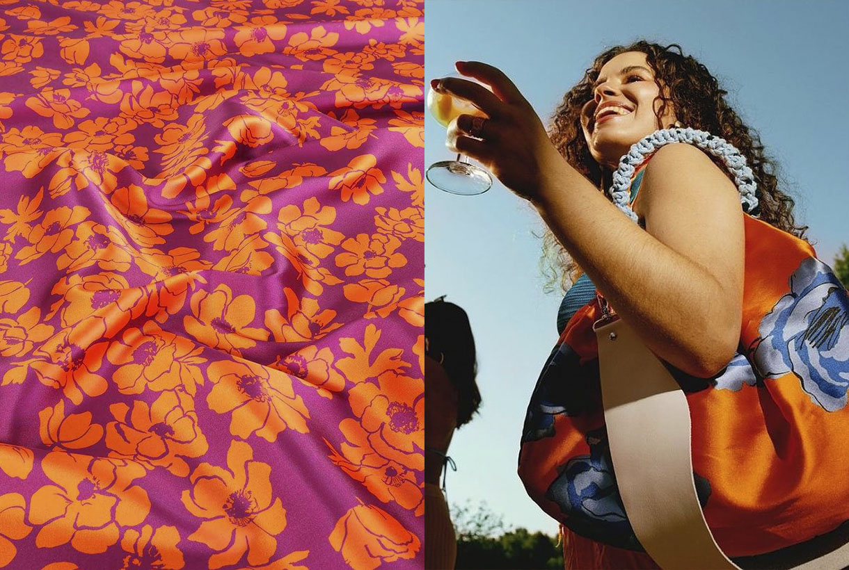
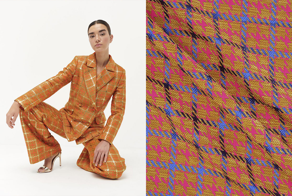
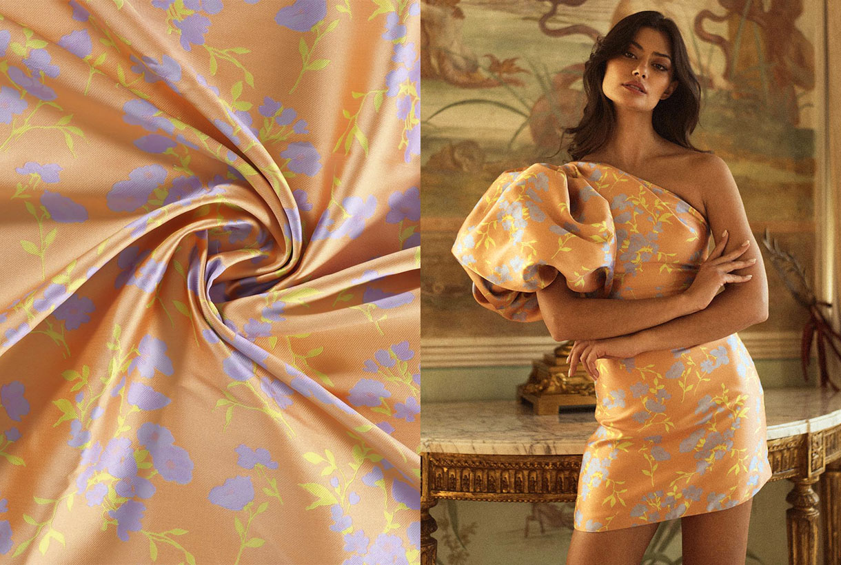
Finally, we show you some of our most vitamin-rich fabrics for the new season. What do you imagine designing with them?
Sorry, this entry is only available in Español.
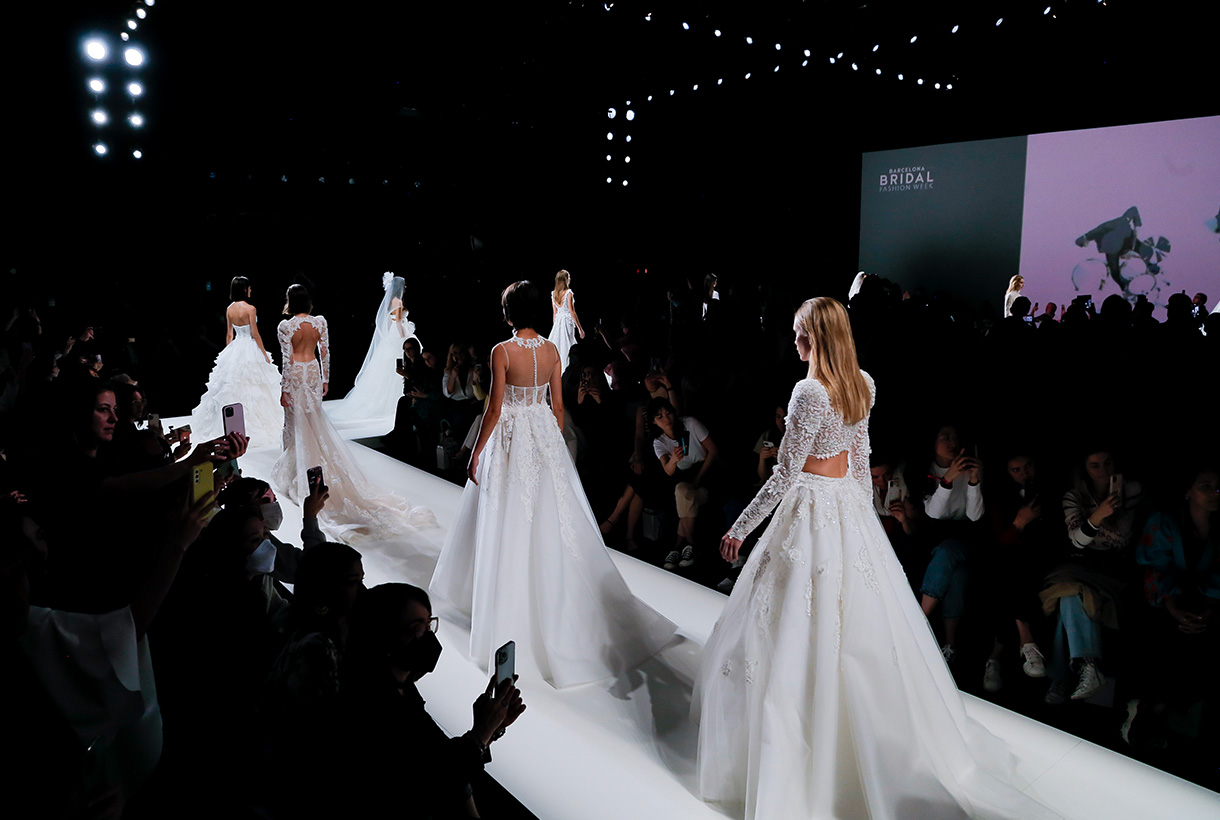
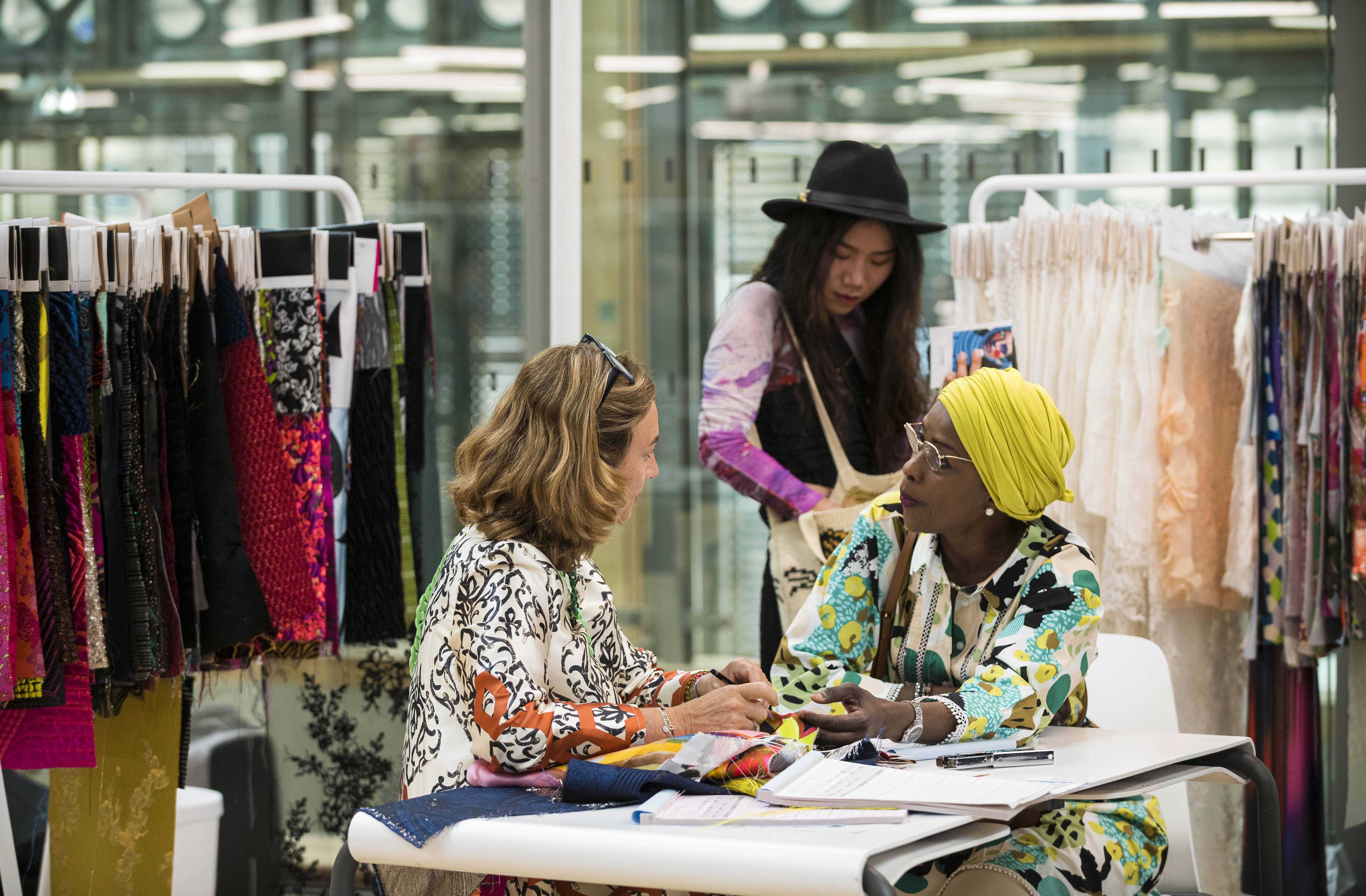
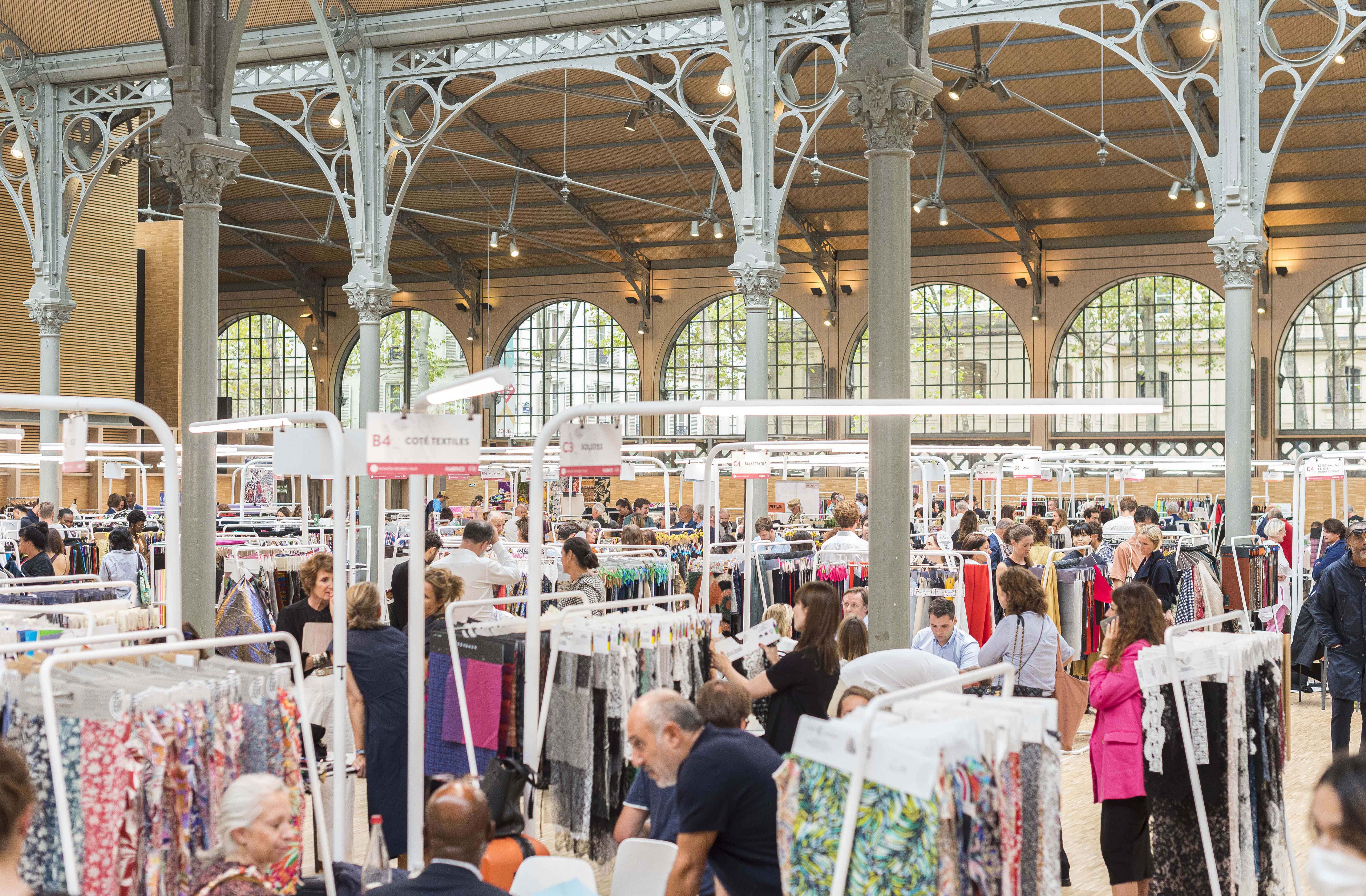
 The Barcelona Bridal Week 2022 has closed the calendar of catwalk shows in the Catalan capital. The international bridal fashion fair, which was held from April 20th to 24th at the Fira de Barcelona, has opted for a return to normality with face-to-face fashion shows of 34 designers aimed at professionals and future brides. It also had a large exhibition space in which 320 brands linked to the bridal and festive sector have participated.
Gratacós did not want to miss the opportunity to once again watch the live fashion shows of the bridal designers who use our fabrics in the preparation of the new season collections. That is why we have been attentive to each look presented because we are amazed to see once again how our fabrics are transformed into sophisticated bridal designs. Here we share with you some of the most special bridal looks of the 2023 season.
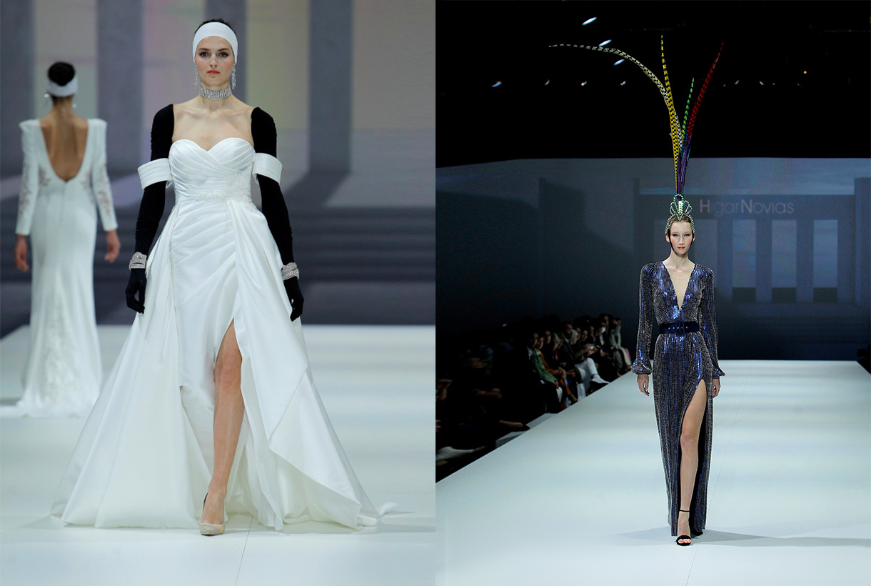
Higar Novias
The Sevillian family business Higar Novias, founded in 1980, presented the ‘Origen’ collection, based on the dialogue between sewing and architecture. The new proposal is developed based on the most emblematic patterns, merging them with pure and current lines of contemporary architecture. If we focus on detail, throughout the collection the wide variety of sophisticated, feminine and contemporary designs can be appreciated. Enriched fabrics and single-colour jacquards predominate, coexisting in harmony with silhouettes and semi-transparent bodies, adorned with feathers, on fabrics rich in beading, which combine with wide tulle skirts and small shiny details.
On the other hand, the party collection combines the versatility of urban fashion and the elegance that characterizes Higar Novias designs so much. Maxi prints and embroidery are combined with a palette of bright colours in dresses fitted at the waist that take on volume in the skirts. Also to be highlighted are the rhinestones on low-cut bodies and very feminine mermaid silhouettes, which invite you to love fashion for special occasions.
Isabel Sanchis
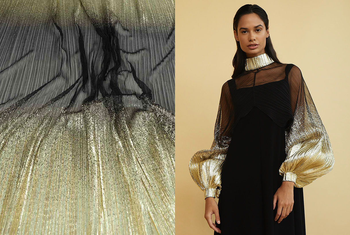
Isabel Sanchis new collection is inspired by the cultural diversity that characterizes her clients from all over the world, as well as her way of understanding fashion. As a result, the Valencian designer has created pieces that are based on a worked prêt-à-porter, from geometric prints close to op art to sewing pieces with volumes and meticulously made handicrafts, which are part of the essence of the firm. Isabel Sanchis wanted to show the best of the brand, highlighting the craftsmanship and precision of detail. As for the colour palette of the new collection, in addition to black, always present in the Isabel Sanchis collections, a range of browns, oranges, pistachios and pinks have been introduced that bring optimism and passion for living.
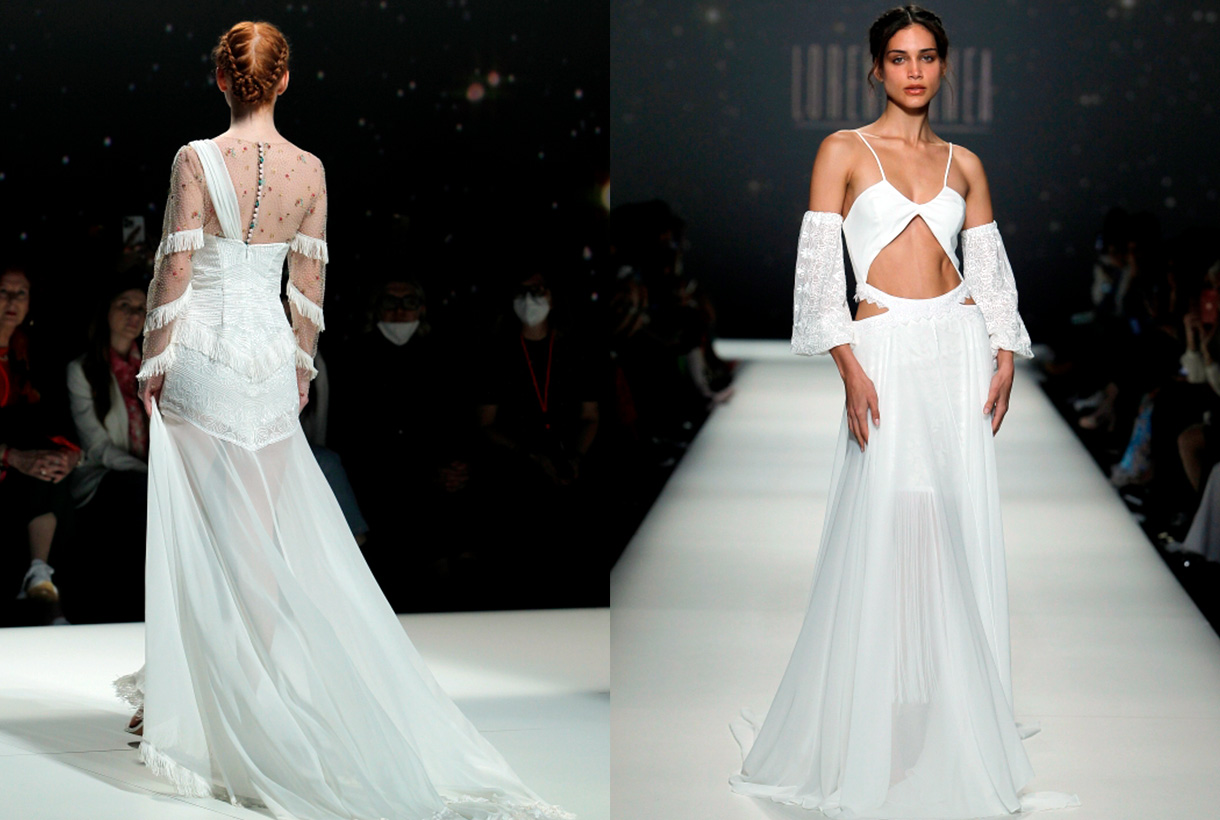
Lorena Panea
Lorena Panea is an atelier and women’s brand that pays homage to the designs of Antiquity, creating exclusive and timeless bridal fashion for contemporary women. The young designer presented the ‘Anatolia’ collection on this occasion. A set of six boho-style wedding dresses, inspired by the ancient goddesses of Mesopotamia, Egypt and Asia Minor. The designs collect ethnic and nomadic influences from those caravans that travelled across the continents spreading ancestral beliefs and merging the cults of ancient deities. Each design is made up of worked fabrics such as lace, embroidered tulle and striking ornaments.
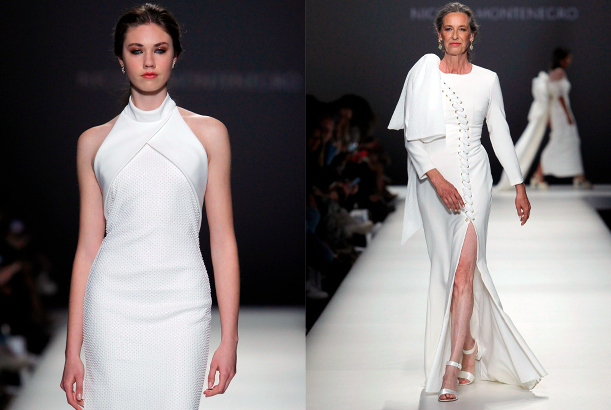
Nicolás Montenegro
Nicolás Montenegro recalls the testimony of the first interview he had with Rossy de Palma, muse and friend of the brand. Thus, ‘Savoir Fair’ is a precious and meticulous collection that is created based on the demand of clients who demand elaborate, different sewing and made with a selective sartorial pattern. The proposal is articulated through rich fabrics, such as silk tulle, Italian brocades and beading with embroidery made by hand on a frame, following Andalusian artisan techniques. Nicolás Montenegro’s girlfriend is undoubtedly a diva who feels unique and sure of herself.
Olga Macià
Olga Macià she is one of the revelation designers of bridal and party fashion. The creator who trained at the Felicidad Duce Higher School of Design and Fashion (FELI) hid the winning card at a wedding fair up her sleeve: the ‘Ace of Hearts’. This is the name of the new 2023 bridal proposal and festive collection that revolves around the symbolism of love. The proposal did not lack risky transparencies, vertiginous necklines, short designs with lengths and two-piece suits that merge with party dresses in energetic colours and bright tones. The fabrics are fantasy textures, flowers, transparencies, coloured sequins and impact nets.
YolanCris
Yolancris, the Spanish brand of design and craftsmanship of party and wedding dresses from the sisters Yolanda and Cristina Pérez, surprised once again at Bridal Week with its revolutionary designs that are born from the excellence of artisanal haute couture, accommodating every type and style of women. In diversity and in breaking with conventional bridal clichés, the firm finds a way to pay tribute to each woman by exalting her own personality. In the ‘Touch’ line, Yolancris extolled resilience, born during the pandemic, through anti-bride proposals that represented a new generation of brides with very particular tastes and needs. On the contrary, ‘Origins’ took up the essence of Yolancris, recovering the boho style for brides. Now, the ‘She’ collection continues with the values of Touch and Origins, but with a firm commitment that highlights the individuality and authenticity of each bride. A symphony of three styles: bohemian, anti-bride and haute couture in richer and more complex designs that adapt, better than ever, to the essence of each woman.
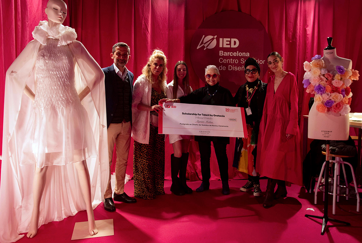
The new generations of bridal design
And who are the bridal designers of the future? IED Barcelona it is one of the best design quarries, a launch pad for young talents who graduate annually and await their first opportunity to enter the world of fashion. This year, the school renewed synergies with the Barcelona Bridal Fashion Week and was present at the world fair with a textile flower workshop that values sustainable design through the use of recovered haute couture fabrics. A raw material that Gratacós gave so that the students could recreate their designs. This event also served to celebrate a new edition of the Scolarship for Talent by Gratacós awards. On this occasion, the first prize went to Myriam Medina, a student on the Postgraduate Course in Wedding and Ceremony Dress Design, for the ‘Allegra’ model from the La Toscana collection, Siena. A proposal inspired by this region of central Italy that will be the star of the next showcase in May. Do not miss the opportunity to see the dress live in our space in Barcelona.