Fotografía: Paula Caballero
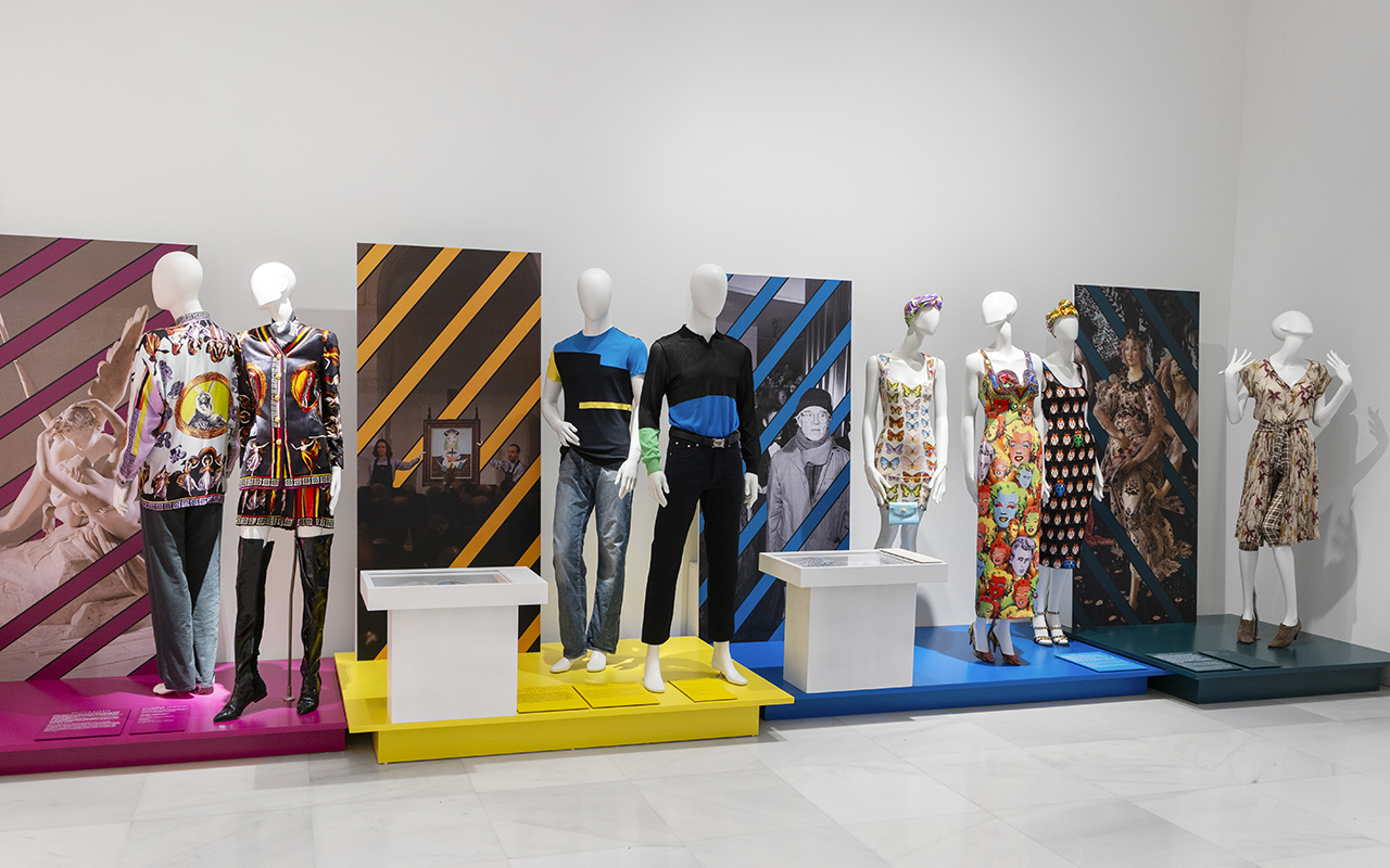
If there is a designer who understood fashion as a spectacle, it was Gianni Versace. He did not limit himself to creating clothes; he built his own universe, where excess was synonymous with elegance and pop culture was mixed with classical mythology. Now, his essence re-emerges in Gianni Versace Retrospective , an exhibition never seen before in Spain organized by Fundación Unicaja that lands in Malaga with more than 500 original pieces to take a tour through the mind of the Italian genius.
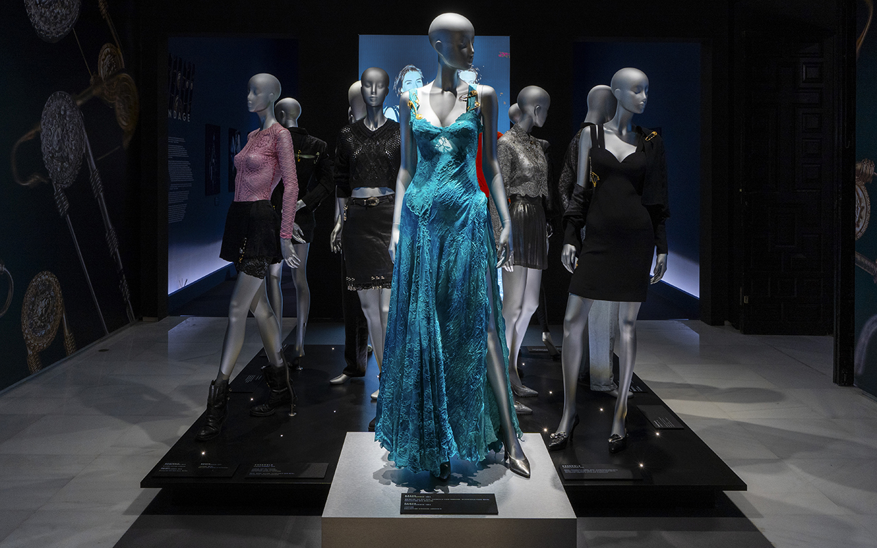
The exhibition is housed in the historic building of the Episcopal Palace and, across nine thematic sections, invites us to explore its inspirations, from Classical Greece to the vibrant Miami Beach scene in the 90s. Between shiny fabrics, baroque prints – such as the iconic Barocco – and looks that defined the era of the Supermodels, this exhibition reminds us that the Versace legacy is more alive than ever.
Fotografía: Paula Caballero
The designer who made fashion a spectacle
Gianni Versace didn’t just revolutionize fashion, he redefined it. In the 80s and 90s, his shows were events where supermodels walked like modern goddesses and the clothes screamed power and sensuality. His creations also dressed stars like Madonna, Prince and Elton John, cementing him as the designer of icons.
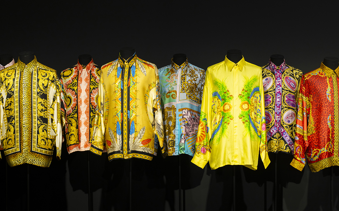
His ability to mix cultural references from different eras and geographies turned his designs into wearable pieces of art. From Greco-Roman classicism to punk aesthetics, Versace absorbed everything that inspired him and transformed it into something unique. His approach to fashion was instinctive and deeply visual: he was not afraid of colour, exuberant patterns or bold silhouettes. His brand became synonymous with daring luxury and boundless glamour.
The exhibition is unprecedented in Spain and captures that spirit, from his beginnings in Calabria, his arrival in Milan and his fascination with art and architecture to his last collection in 1997, before he was murdered. Through his most iconic looks, original sketches and previously unpublished photographs, Gianni Versace Retrospective immerses us in his creative process.
Fotografía: Paula Caballero
The keys to understanding the soul of Gianni Versace
The exhibition is structured into nine spaces that capture some of the key aspects of Gianni Versace’s imagination, evident in all of his designs.
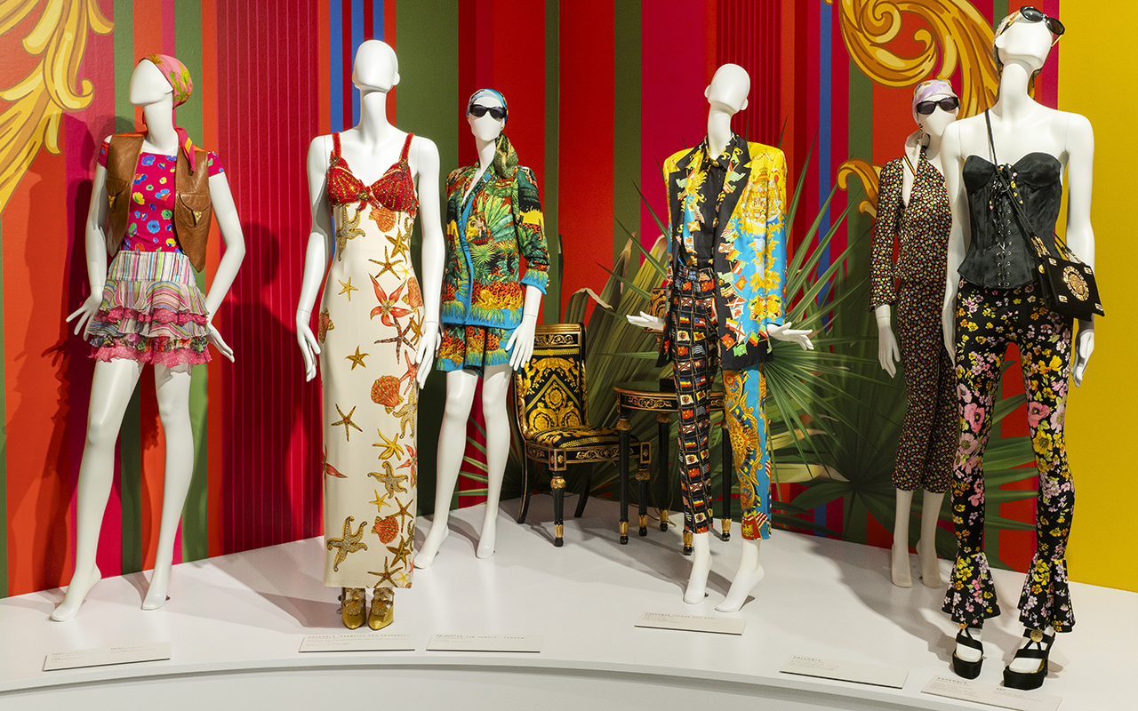
Inspiration from Greco-Roman mythology : Versace’s fascination with classical antiquity is reflected in his recurrent use of mythological iconography. The Medusa, which became the brand’s emblem, symbolised irresistible attraction and power. His collections incorporated motifs of Ionic columns, golden friezes and depictions of gods, fusing the opulence of imperial Rome with a modern vision of luxury.
Baroque splendour : No one like Versace at mixing gold, classical motifs and excess without losing sophistication. Inspired by art, the Christian religion and Italian architecture, his use of ornamentation and rich fabrics made him a master of maximalist luxury. Despite this, the exhibition also reveals his minimalist side towards the mid-90s. An interesting exercise in stylistic contrasts.
The magic of South Beach : Miami was his refuge and his muse. The Art Deco aesthetic, classic cars and multicultural energy of the city were reflected in his 90s collections. The light, colours and vitality of the city influenced the vibrant prints and marine motifs that characterised some of his most memorable collections.
Art and pop culture : Inspired by Warhol and the repetition of images, Gianni Versace created unforgettable prints. Versace understood before anyone else that fashion should dialogue with popular culture, and his collaborations with artists marked a turning point in the relationship between fashion and art.
Supermodels of the 90s : The Italian couturier elevated Cindy, Naomi, Claudia and Linda to the status of goddesses. He not only designed for them, but helped shape the modern concept of the “supermodel” by turning his shows into media extravaganzas. His 1991 show, where top models walked to George Michael’s Freedom , is an iconic fashion moment.
The power of provocation : She redefined rebellion with leather, studs and harnesses. Her reinterpretation of punk and fetish aesthetics proved that fashion could play with boundaries without losing its sophistication. The iconic Bondage collection of 1992 turned traditionally provocative elements into haute couture pieces that challenged established norms.
Fotografía: Paula Caballero
Fashion, culture and myths of the 90’s
Beyond the catwalk, Gianni Versace’s impact on popular culture was immense. His vision was cinematic, his shows were carefully orchestrated productions, and his approach to fashion broke with many of the conventions of the time. He pioneered a strong visual identity for his brand, integrating architectural elements, instantly recognizable prints, and a use of color that defied the trends of minimalism.
Versace also understood the power of image and marketing in fashion. He was one of the first designers to forge ties with the entertainment industry, dressing artists and creating moments that transcended the catwalk. Lady Diana, Madonna, Cher, Elizabeth Hurley… they all became ambassadors of his bold and sophisticated aesthetic.
Versace also made his mark in cinema and theatre, designing costumes for operas and films. His passion for dramatization and theatricality was reflected not only in his fashion, but in the way he presented his work to the world.
The legacy of a visionary
More than 25 years after his death, Versace’s impact is still felt. His influence can be seen on catwalks, red carpets and even in urban culture. The brand he founded, now under the direction of his sister Donatella, continues to reinterpret his aesthetic, keeping the DNA of the house alive.
The 1990s fashion revival has brought back into the spotlight many of the elements that Versace popularised: the tight-fitting clothes, the baroque prints, the fusion of luxury and rebellion. Contemporary designers continue to find inspiration in his work, and his name remains synonymous with audacity and opulence.
This exhibition is not just a tribute, it is an invitation to relive the art of a designer who turned fashion into a statement of intent. To immerse oneself in his universe is to understand how fashion can be much more than clothing: it is identity, it is art and it is history.
The Gianni Versace Retrospective exhibition will be open to the public until the 30th June at the Unicaja Foundation Cultural Center in Malaga.
Fotografía: Paula Caballero
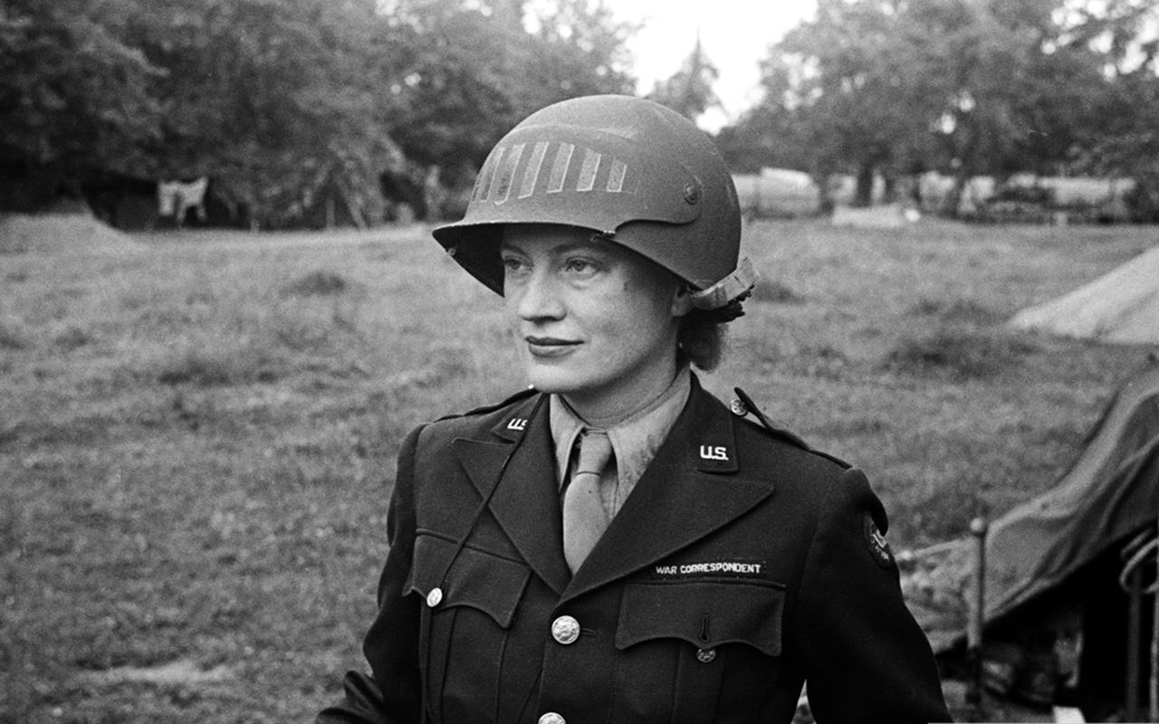 Lee Miller, con un casco prestado por el fotógrafo del ejército estadounidense Don Sykes (sargento), Normandía, Francia, 1944© LEE MILLER ARCHIVES
When we think of the Second World War, it is difficult to imagine that in the midst of chaos and devastation there was a woman who, camera in hand, captured some of the rawest and most revealing moments of the conflict. Also the most beautiful, revealing a new, more authentic side of the people who worked at the front. Lee Miller, one of the most daring photographers of the 20th century, comes to Barcelona with the exhibition War Chronicles, which can be visited at FotoNostrum until the 20th March, 2025.
Before becoming a war correspondent, Lee Miller was a haute couture model in New York, a muse to great artists such as Man Ray, and even a pioneer in photographic experimentation with the solarization technique. However, her restless spirit led her to reinvent herself again and again. It was in London, during the Luftwaffe bombings, that she found her true calling: telling the story with her lens.
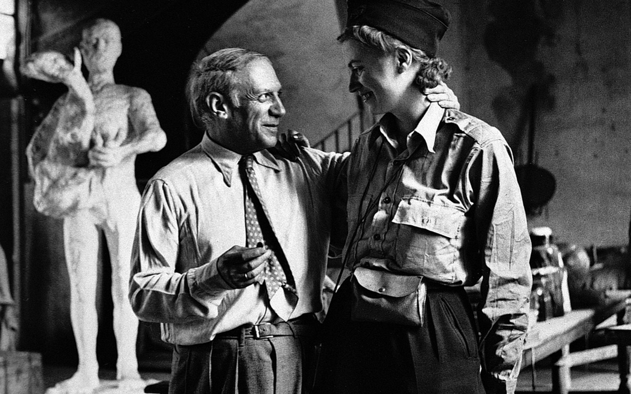 Foto del reencuentro de Picasso y Lee Miller en 1944 tras la liberación de París. Ella llegó como reportera con el Ejército de los EE UU© LEE MILLER ARCHIVES
The exhibition
War Chronicles brings together 124 photographs, focusing on the period from 1940 to 1947, that trace Miller’s career as a war correspondent for the US Army. His lens captured the liberation of Paris, the concentration camps of Buchenwald and Dachau, and the scars of Europe after D-Day. His images are raw, moving and, above all, necessary to understand the impact of war.
Miller not only documented history, he also lived it first-hand. Images of that closeness stand out, such as the iconic image of Lee Miller in Hitler’s bathtub in Munich on the same day that the Nazi leader committed suicide, or a warm meeting during the liberation of Paris in 1944, where he met Pablo Picasso, with whom he had a friendship. “It’s incredible that the first soldier I see after the liberation is a woman, and that it’s you too!” the artist from Malaga exclaimed. Intimate portraits that Lee Miller also shared with Miró.
The exhibition also shows us her most versatile side, with some of her iconic fashion photographs that portray women in the 1940s, when they began to enter the workforce in factories, demonstrating that aesthetics and drama can coexist in the same work.
After the war, Lee Miller found solace in the kitchen, becoming a culinary innovator inspired by surrealism.
Niños celebrando la liberación de París en 1944 © LEE MILLER ARCHIVES
A family legacy
The exhibition also features Antony Penrose, son of Lee Miller and surrealist artist Roland Penrose, who attended the opening. Antony, a renowned filmmaker, writer and curator, has dedicated his life to preserving his mother’s legacy through the Lee Miller Archives and the Penrose Collection. His son discovered his mother’s legacy when she died. In the attic were 40,000 photographs were found depicting the horror of the Great War, which his mother had kept quiet about due to the psychological trauma that led to alcoholism and depression. “I had no idea about my mother’s past; my view of her changed completely,” Penrose confesses. Thanks to his tireless work, Miller’s images have been exhibited in museums around the world, allowing new generations to discover their importance in the history of photography and art.
Together withhis daughter Ami Antony Bouhassane, co-director of Farleys House & Gallery Ltd., he has worked to promote Miller’s work, ensuring that her story continues to inspire future artists and photographers. Both bring a unique and intimate testimony that enriches the exhibition, offering a personal look at the life and work of this legendary photographer.
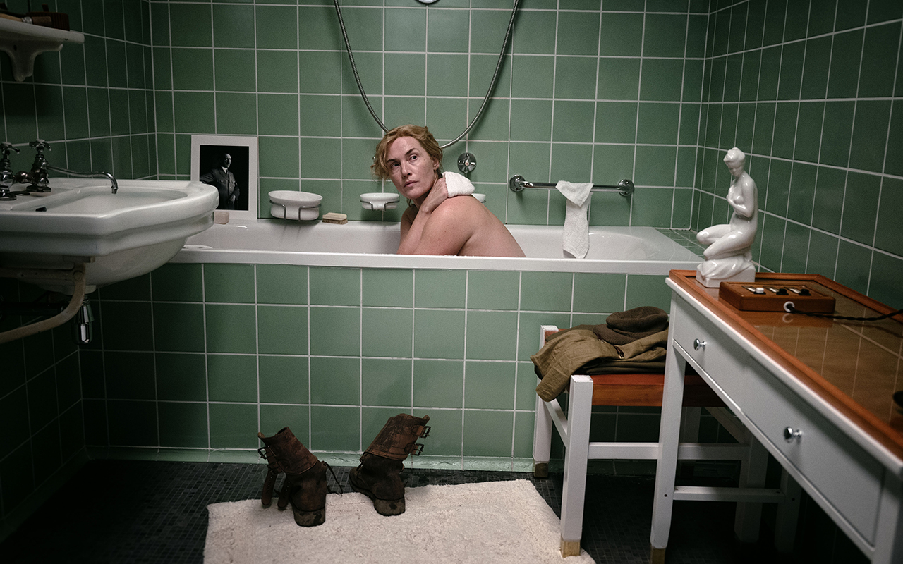
Kate Winslet reproduce la célebre foto de Lee Miller en la bañera de Hitler para la película sobre la fotógrafa. ©SKY UK
A life of cinema
Lee Miller, starring Kate Winslet and directed by Ellen Kuras , will be released in Spain on the 7th March 2025. The feature film delves into the life of this extraordinary woman, exploring the challenges she faced in a world dominated by men. Winslet ‘s performance has been widely praised, offering a new perspective on Miller’s complex personality. In fact, in the exhibition Winslet herself recalls several scenes from the filming that have attempted to maintain the essence of Lee Miller’s photographs.
Lee Miller was much more than a witness to history: she was a protagonist who knew how to capture beauty and horror in equal measure. Now, Barcelona has the opportunity to rediscover her. The exhibition will be available at FotoNostrum , at Calle Diputació , 48 in Barcelona, and promises to be an essential experience for lovers of photography and history. Totally recommended!
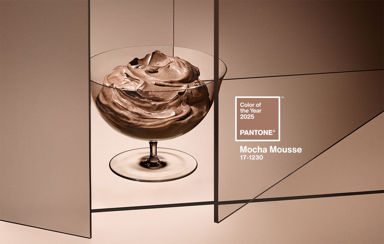 Mocha Mousse. Pic by Pantone
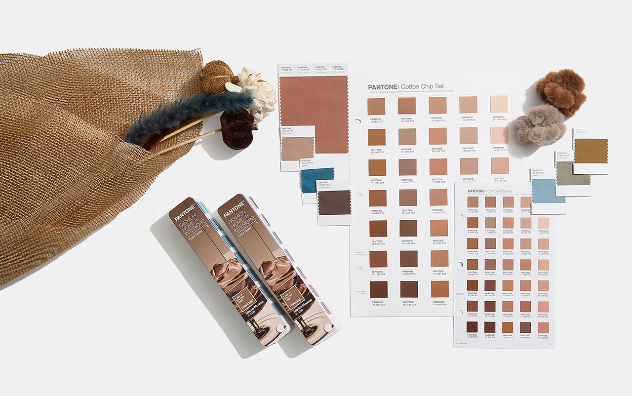
Imagine a creamy dessert that combines the aromas of cocoa, chocolate and coffee, with evocative textures and an intense brown tone that awakens both the sight and the palate. This suggestive image, which mixes everyday life and small pleasures, connects directly with the colour of the year 2025 chosen by Pantone: 17-1230 Mocha Mousse. This shade, described by the company as “a soft and evocative brown, but also intense and warm”, invites our senses to enjoy pleasure and exquisiteness.
A colour that opens the appetite
Mocha Mousse, suggestive and inspiring, takes over from Peach Fuzz 13-1023, the delicate peach shade that was the colour of the year 2024. “Inspired by our desire for everyday pleasures, 17-1230 Mocha Mousse expresses a level of thoughtful pleasure,” explains Leatrice Eiseman, executive director of the Pantone Colour Institute, as said in the new release announcing the long-awaited reveal. “Sophisticated and exuberant, yet an unpretentious classic, this colour expands our perception of browns as humble, understated tones to embrace aspiration and luxury. Infused with subtle elegance and earthy refinement, it presents a touch of understated, tasteful glamour,” says Eiseman.
Connecting with the origins
Although some on social media have criticised the choice of brown, associating it with the current period of instability and lack of authenticity, Pantone defends its decision by highlighting the growing search for connection with nature and the origins of humanity. “Characterised by its organic nature, 17-1230 Mocha Mousse honours and celebrates the sustenance offered by our physical environment. Infused with authenticity, it strikes a balance between the demands of modernity and the timeless beauty of artistic creation,” the company explains.
Laurie Pressman, vice president of the Pantone Colour Institute, describes Mocha Mousse as an extension of Peach Fuzz that came before it, sharing its essence of comfort but taking it a step further by including “the simple pleasures we can give away and share with others,” like a glass of mocha mousse. “The eternal quest for harmony permeates every aspect of our lives: our relationships, the work we do, our social connections, and the natural environment around us. This colour brings us contentment, inspiring a positive state of inner peace, calm, and balance, while attuning us to the world around us. Harmony encompasses both a culture of connection and unity and the synthesis of our mental, spiritual, and physical well-being,” Pressman details, highlighting how this shade reflects that longing for connection and balance.
How is the colour of the year created?
Pantone, the global authority on colour and a set of professional standards for the design community, began defining the colour of the year in 1999. The first choice was the iconic cerulean blue (Pantone 15-4020), a shade that achieved worldwide fame thanks to the film The Devil Wears Prada, released seven years later. In this film, Meryl Streep, as the feared Vogue editor, immortalised the colour with an unforgettable fashion speech to Anne Hathaway: “What you don’t know is that that sweater isn’t just blue. It’s not turquoise, and it’s not navy. It’s actually cerulean.”
The initial goal of this initiative was to generate conversation around colour, involving both the design community and colour enthusiasts. But choosing the colour of the year is not a simple or arbitrary process. Behind this decision there is a rigorous analysis. Each year, a committee of colour experts studies cultural, artistic and social trends worldwide to identify significant references. Based on this analysis, they select an existing colour from the Pantone catalog and name it with an easy-to-remember name.
Over the years, these choices have reflected the global socio-economic context: from Marsala, which evoked the world of wine in 2015, to the double choice of 2021 – Illuminating yellow and Ultimate Grey – which symbolised the challenges of the pandemic. In 2022, Very Peri, a bold lavender shade, connected the real world with the digital one. Beyond their beauty, these colours invite a reflection on the times we live in.
In 2010, Pantone expanded its reach beyond the design niche to connect with the general public, adapting to new creative disciplines inspired by colour. This is when two key initiatives emerged: the Pantone Colour Institute and the Colour of the World. the Year. These proposals not only investigate and promote the use of colour, but have also transformed the brand’s marketing strategy, turning it into a global trend. Today, the colour of the year directly influences product development and purchasing decisions in sectors such as fashion, decoration, design and advertising.
The Pantone guide, which began with 500 colours for the graphic arts, now has more than 2,000 references. Every 18 months, new and more precise shades are added, reflecting the evolution of colour in our daily lives. Today, Pantone is a multinational with a strong global presence. Since its acquisition by X-Rite, a company specialising in colour management, the company has grown exponentially. With 17 offices around the world, Pantone markets everything from its famous guides to branded products and strategic alliances. Recent examples include collaborations with Motorola for smartphones, special editions of Jägermeister bottles , and even coffee capsules in partnership with Nespresso, a partnership that raises the question: have these capsules inspired this year’s colour choice?
In 2025, to celebrate the 26th anniversary of the Pantone Colour of the Year, the company has taken the colour beyond its guides, highlighting it at global events and experiences. From New York and London to Shanghai and Mumbai, Pantone has curated public spaces and gatherings to make the colour of the year accessible to everyone.
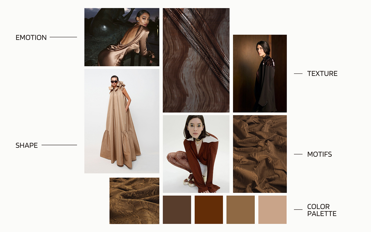
The gentle elegance of Mocha Mousse: applications in fashion and design
In the fashion world, Mocha Mousse is positioned as a highly versatile neutral shade. Dubbed “the colour of unpretentious elegance,” this shade stands out for its ability to create warm, minimalist looks that blend with different skin tones, creating a chromatic camouflage effect. The colour of the year 2025 also redefines our perception of brown, taking it from humble and earthy to luxurious and aspirational.
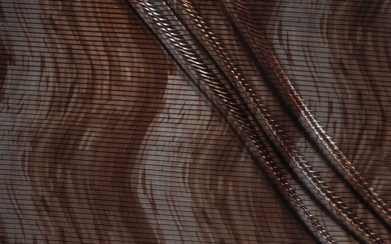
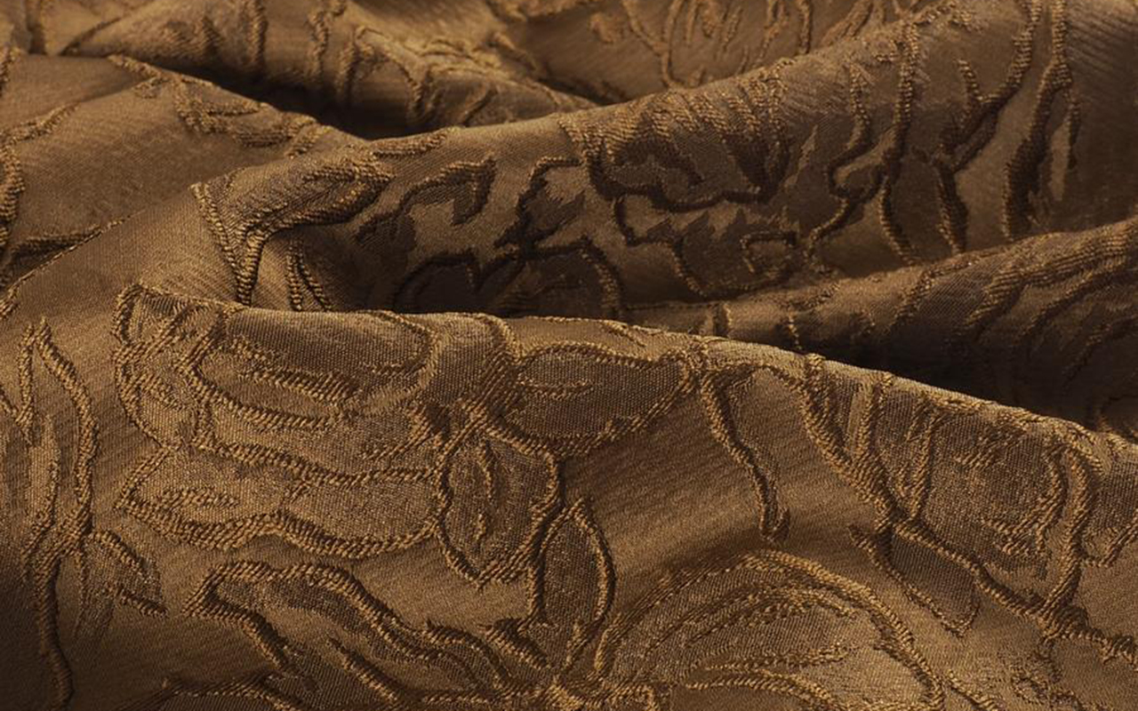
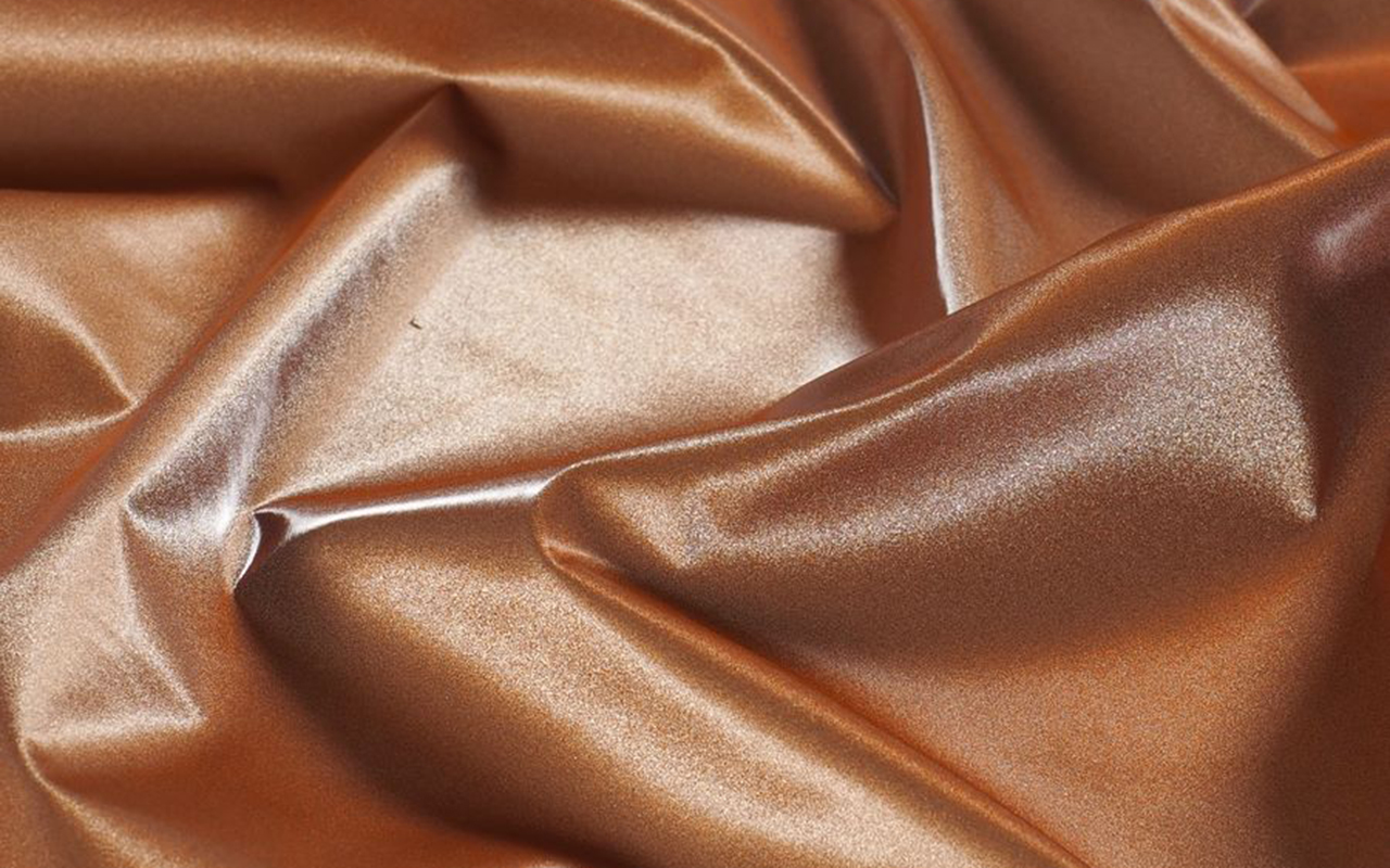
Translating this to the textile world, Mocha Mousse offers endless possibilities. Its sensorial warmth is reflected in fabrics with a delicate touch such as cashmere, angora, soft velvet and furry textures that envelop and comfort. It also shines in lighter materials such as airy chiffons, fluid satins or knits that provide movement and draped elegance. This shade, imbued with earthy refinement, embodies an organic and authentic luxury, promoting minimalist looks that opt for simplicity without artifice.
Mocha Mousse also adapts to various textures and finishes. From matte surfaces that highlight its naturalness to shiny or metallic finishes that give it a sophisticated touch, this colour works as a perfect base for bold colour combinations or monochromatic looks full of depth.
In decoration and interior design, Pantone 17-1230 Mocha Mousse connects with our desire for well-being and comfort. This earthy and refined brown brings a feeling of warm home, whether on floors, painted walls or decorative elements. Its presence stands out in natural materials such as wood, stone, rattan, wicker or leather, offering a balance between sophistication and homely warmth.
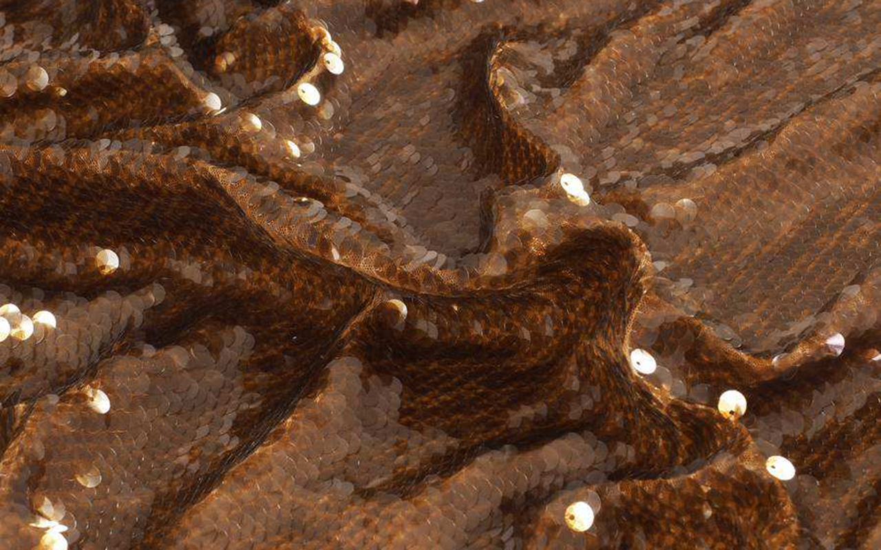
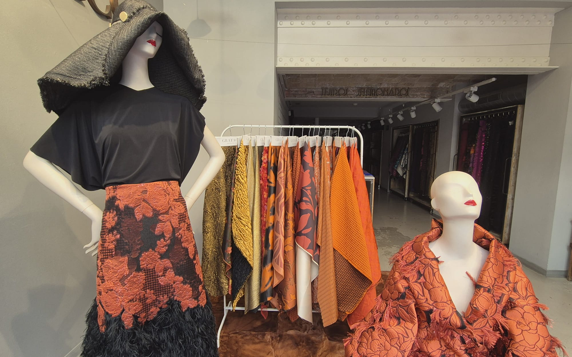
At Gratacós, we have selected some key fabrics that connect this colour of the year with our new collection. From luxurious textures to versatile finishes, you will find inspiration to bring Mocha Mousse to your fashion and design projects.

Miércoles 30 octubre 2024
Sorry, this entry is only available in Español.
 Collage: 1. Rodarte, 2. Gonçalo Peixoto, 3. Mariano Moreno, 4. ON RUSH, 5. Joplin Atelier, 6. Acuamona. Courtesy of the brands
Maroon, scarlet, burgundy, wine, cherry… There are many ways to refer to the range of dark reds with a blue or violet touch. This range of possibilities encompasses a captivating colour, synonymous with luxury, power and status, which seduces with its warmth and has fascinated both designers and artists throughout the centuries. This autumn 2024, it is once again taking centre stage on the catwalks, reaffirming its place as an elegant, versatile and personality-filled colour. Some call it “the new neutral”, but why does this dark shade of red have such a timeless, almost bewitching appeal? We will explore its history, psychology and the reason for its triumphant return in this season’s collections.
Origin of Colour. On Wine, Clothing and Theatricality
The garnet or burgundy colour Marsala is named after the famous red wines from the Burgundy region of France, known for their refinement. This connection makes it a colour associated with wealth, luxury and sophistication. In 2015, Pantone elevated this association – between fashion and wine – by crowning Marsala as the hue that would guide industrial design, fashion, beauty, furniture and interior decoration. For that year, the international colour authority imagined a world tinged with “a warm, yet elegant hue that is universally attractive and easily transposed into multidisciplinary arts”. Pantone considered Marsala to be equally attractive to men and women, capable of moving and awakening the sense of taste, as well as inciting creativity and experimentation with colour.
If we look back in history, the use of burgundy in textiles and clothing goes back much further than its contemporary name. Since ancient times, dark red dyes were prized for their rarity and the status they conferred on those who could afford to wear them. During the Middle Ages and Renaissance, burgundy dyes were extremely expensive due to the rare ingredients needed to produce them, such as the Tyrian purple snail or madder root. Consequently, this colour was reserved for aristocracy and royalty, who wore garments in dark reddish tones to symbolise power and authority. At the court of Henry VIII, for example, burgundy was a shade frequently used by high nobility, such as Mary Tudor, who wore an iconic burgundy velvet dress at her wedding to Louis XII of France in 1514. Another historical reference is found in the burgundy velvet and satin dresses worn by European royal women in the 18th century, such as Marie Antoinette, whose taste for rich, deep colours set a trend in court fashion.
In modern times, burgundy remains associated with theatricality and drama. Consider the shade of a theatre curtain and drapery. In cinema, this vibrant shade has been immortalised in films such as Gone with the Wind, where Scarlett O’Hara wears a majestic dress in this shade, designed to convey both power and sensuality. The colour has also been a key element in contemporary films such as Moulin Rouge, where it is used to enhance the drama and passion of the characters.
Why is it back in fashion this Autumn 2024? From the catwalk to the streets
Burgundy combines the passion of red with the depth of brown, evoking luxury, ambition and power. It is a versatile shade that suits different skin tones: on light skin, it highlights its luminosity; on dark skin, it provides sophistication without being strident. Its intensity varies depending on the material it is used on, acquiring a visual texture that can be modern and minimalist in fabrics such as satin, or luxurious and opulent in velvet.
Garnet is the star of the autumn-winter collections, both in monochrome looks and in daring combinations. From sixties trench coats combined with platform loafers and structured bags, as proposed by Sabato De Sarno for Gucci, to tailored suits in the collections of Roksanda and Ferragamo . In a more casual version, Lacoste opts for jumpsuits combined with oversized coats, creating a mix between comfort and style.
This shade also lights up autumn evenings, where fitted leather microdresses stand out in the collections of Thierry Mugler and Ermanno Scervino. Other proposals include bow tops and pleated trousers in the collection of Philosophy di Lorenzo Serafini, providing a second skin in burgundy that redefines discreet luxury. In addition, burgundy is combined with neutral tones, such as beige or midnight blue, in proposals by Victoria Beckham and Khaite, or with bolder colours such as fuchsia, in a bold bet championed by Pierre Cardin.
And in fabrics… What do we recommend?
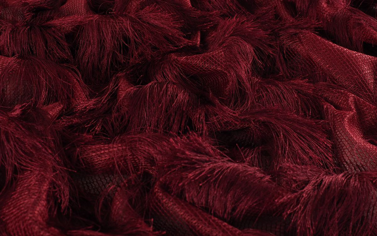
At Gratacós, we fall in love with burgundy, a classic that never goes out of style. This shade is enhanced in luxurious fabrics that allow you to play with texture and movement. To get the most out of it, we recommend these materials:
1. Silks and satins: Ideal for elegant garments with a fluid drape that enhances the sensuality of the garnet.
2. Wool cloths: Perfect for coats and outerwear, transmitting warmth and sophistication in winter looks.
3. Velvet: Provides depth and a luxurious air that turns any garment into a special piece.
4. Lace and tulle: For romantic and feminine looks, ideal for evening events or more delicate garments.
Check out our seasonal collection in our online store and discover the fabrics that best suit your style. Don’t miss the opportunity to be captivated by this timeless colour!


 Creative collage featuring looks by Marta Martí, By Sophie, and Mariano Moreno.
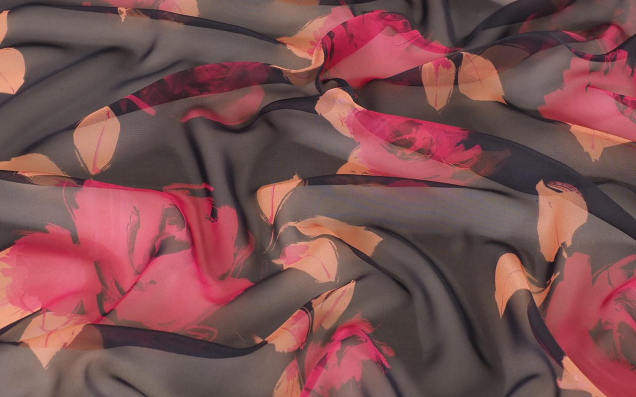
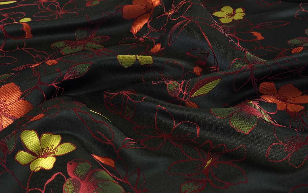
Traditionally associated with spring, floral prints are stepping out of their comfort zone to take on a new role during the cold season as well. This trend demonstrates its beauty, versatility and timelessness, characteristics that are ideal for a wardrobe that is not so concerned with passing trends, but with a style that lasts and is therefore immune to the passage of time.
This autumn, flowers are once again taking centre stage, proving that they can also provide warmth, colour and elegance during the colder months. An example of this is the new September window display that we have just launched in our space in Barcelona, embraced in warm colours ranging from brown to maroon and orange, with leaf and flower prints evoking the beginning of autumn.
Below, we will explore the origin of floral prints, their evolution in the fashion world, current trends and how major brands have reinterpreted this trend in their most recent collections. Without forgetting, of course, the new fabrics and items that we already have available in our online store.
Origin and popularization of floral prints
Floral prints have a long history dating back centuries. Originating in Asia, particularly China and Japan, textiles with floral motifs arrived in Europe via the Silk Route. In the 17th century, Indian fabrics with floral prints, known as “chintz”, became popular in Europe, sparking a trend that has continued to evolve.
Their popularisation in contemporary fashion is historically more recent. The rise of floral prints can be traced back to the late 19th and early 20th centuries, when the Art Nouveau movement adopted flowers as a key motif in textile design. However, it was in the 1960s and 1970s that these prints really reached a large number of people, thanks to the hippie and bohemian countercultural movements, which embraced nature as a form of personal expression and a symbol of rebellion against the values of society at the time.
Why do flowers never go out of style?
As we mentioned at the beginning of the article, floral prints have stood the test of time thanks to their versatility , adding a touch of romance and femininity. These designs can be adapted to a wide variety of styles, fabrics and garments, being essential both in a light summer dress and in an elegant transitional jacket. Floral prints bring freshness to any outfit. In addition, there is an emotional connection with nature that awakens feelings such as love, renewal, life and serenity. In a world increasingly dominated by technology and artificiality, floral designs connect us with nature and remind us of the ephemeral beauty of flowers.
Floral prints are also incredibly adaptable to different styles and eras. Among the most recognizable categories are:
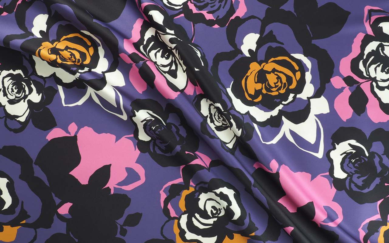
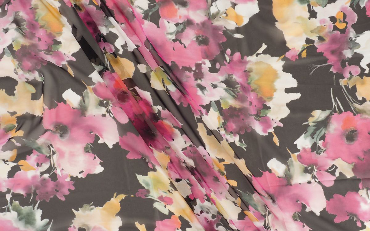
1. Abstract Flowers: Modern designs with artistic strokes that mix colours and unusual shapes.
2. Botanical flowers: Motifs that imitate nature or scientific illustrations, with a more realistic style.
3. Vintage Flowers: Inspired by the 1960s and 1970s, with warm colours and psychedelic shapes.
4. Dark flowers: With deep tones and dark backgrounds, which provide an air of sophistication and mystery.
Another reason why floral prints never go out of style is that they are an expression of individuality and define each person’s style. A bold and striking floral print in vibrant tones is not the same as a more subtle and delicate one in neutral tones. In between the two extremes, there is an infinite variety of options to choose from.
The beauty of flowers has also been a recurring theme in the inspiration of artists throughout history, from the Renaissance, through botanical art and the vision of the Impressionists, to the most avant-garde designers. Today, it continues to be an inexhaustible source of inspiration in various contemporary disciplines. In fact, in the field of fashion, practically no collection of the main luxury brands completely omits floral prints. And finally, a less obvious aspect: floral prints are flattering for all ages . They are visually pleasing and harmonious patterns that bring joy, vitality and freshness to the face, raising self-esteem. For this reason, floral prints remain a constant trend in all seasons.
How are floral prints being worn this season?
For the autumn-winter 2024/2025 season, floral prints are presented in innovative ways. Key combinations include layering and contrasting, mixing floral pieces with garments in textures such as wool, leather or denim for a modern contrast. The “total floral look ” also stands out, i.e. flowers from head to toe through long dresses and coordinated outfits with floral prints of different sizes. In the cold season, flowers predominate on dark backgrounds in shades such as burgundy, olive green, mustard and navy blue, perfect for autumn. In addition, accessories with floral details, such as bags, scarves and shoes, complement the more sober outfits and bring a fresh touch.
Discover the floral prints that suit your tastes and needs in our new season catalogue. Here you can find what suits you best!


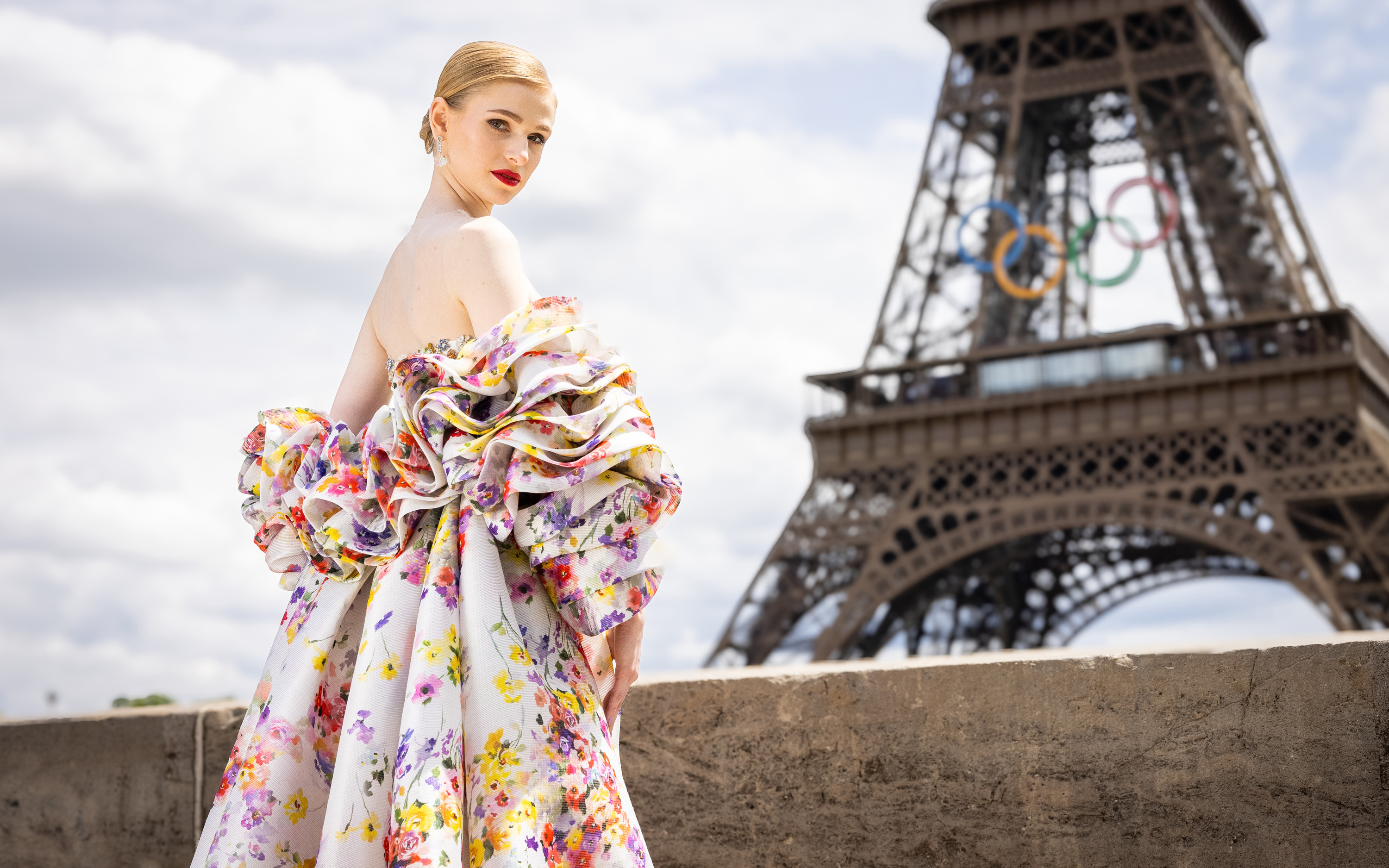 The Olympic Issue. A stunning editorial by Mariano Moreno and Vogue World Paris 2024.
Fashion, a reflection of each society, is present in all areas and silently analyzes what it represents. At the Paris 2024 Olympic Games, one of the largest showcases in the world, it could not be less. Millions of eyes of different nationalities have observed the presentations of the uniforms in recent days, and will analyze, without being experts in the matter, the details of the opening show with their clothing created for the occasion, as well as the outfits of the athletes who will star in each of the sporting feats. We are curious by nature, and the Olympic Games teach us that style does not have to be at odds with the competitive spirit.

What must be considered?
Uniforms represent the media focus where the relationship between fashion and sport becomes more evident, especially in recent years. This relationship is beneficial as long as one does not engulf the other, something that these days is giving something to talk about both for its successes and for some mistakes, generating a large number of memes. Behind every uniform is a needle: the participation of a renowned designer or brand that promises to take the relationship between fashion and sport to a new level. Although aesthetics are key when representing the culture and style of each country, we must never forget the main objectives of these special suits: comfort and functionality. An Olympic uniform must be practical. It is at the service of athletes and its mission is to ensure the best performance. Furthermore, they are not worn by models with normative and standardized measurements, quite the opposite. Athletes champion a diversity of bodies with diverse morphologies and this physical diversity must be taken into account when looking for a design that feels good and is comfortable. That said, combining aesthetics with functionality is no easy task, and this is reflected in the results. Everyone wants to project a cool and modern image of their country, after all, athletes are the representatives of their land in the eyes of the world, but no one wants to look ridiculous or wear clothes that look like a moving flag. Therefore, the uniform also plays an important role in the confidence and self-esteem of each athlete.
Most representative uniforms of the Olympic Games
The different delegations have presented the uniforms that their athletes will wear throughout the competition. The proposals are very varied, seeking this perfect formula between modernity and identity, and aesthetics with functionality. Some countries, such as Italy and France, have taken the opportunity to show the great fashion design potential they have. Other delegations, such as Spain or Japan, have presented more practical proposals that are far from design. We review the most interesting proposals without overlooking some successes and errors.
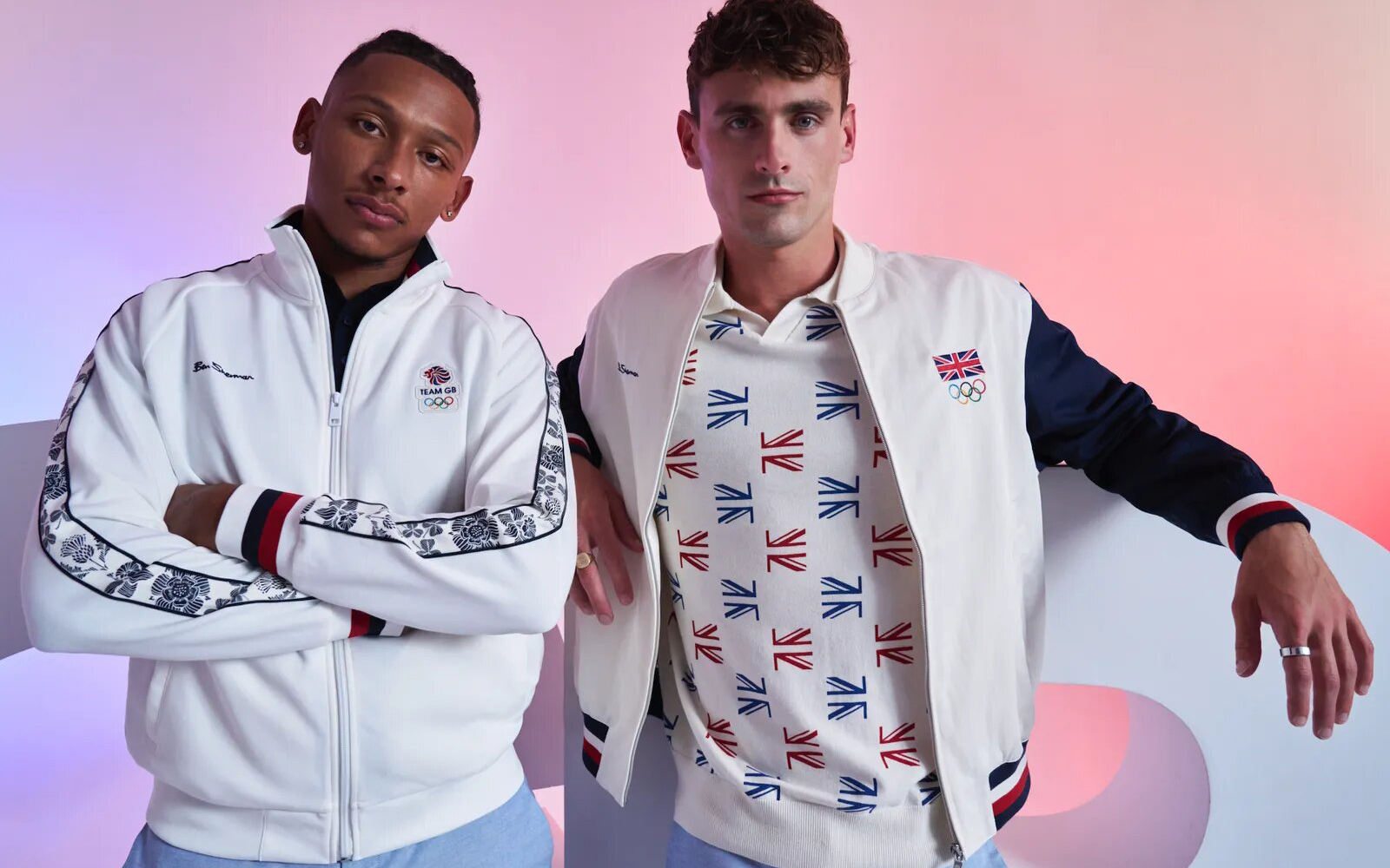
As host country, France has collaborated with Le Coq Sportif and Stéphane Ashpool to design a uniform adapted to both Olympic and Paralympic athletes, reflecting the essence of the culture and love of sport of the host country. The nineties-inspired t-shirts and sweatshirts are already a bestseller by achieving a fusion between fashion, sports and patriotism without fanfare. In the United Kingdom they have opted for a brand that represents English design and elegance: Ben Sherman. Dressed by mods in the 60s, this brand has always been characterized by encapsulating the magic of the unique British style. In addition to the colours of the Union Jack, the brand has added flowers to almost all the pieces in the Olympic and Paralympic collection.
Italy has trusted one of the great names in the history of fashion: Giorgio Armani. Their designs present a set of elegant and minimalist garments with navy blue as the main colour. On the sweatshirts, the word “Italy” in large white letters captures all the attention. Some critical voices claim that the result has been a bit dull, due to high expectations. The United States has once again trusted Ralph Lauren, a name synonymous with American fashion, to design its team’s uniforms. It has been doing so since 2008. This time, with a focus on sustainability, the uniforms are made from recycled materials, proving that eco-friendly fashion can also be stylish. Red, white and blue accents pay homage to the American flag, while modern silhouettes ensure maximum performance and comfort. Although the official uniform has been well received, Nike’s women’s track and field jersey has not been without controversy. Lauren Fleshman , former United States champion in the 5,000 meters, criticized the technical suit for its poor coverage.
Spain has opted for sustainability as a central axis. The Joma brand, in charge of the official equipment of Spanish athletes, has designed a collection that fuses tradition with modernity, making garments in high-performance fabrics inspired by the carnation, capturing the essence of Spanish culture with a contemporary touch. The kit has received mixed reviews: while some praise the chosen aesthetic, others compare it to the Iberia uniform. In Japan, faithful to their minimalism, they have trusted Asics, a flagship of the Japanese country, with a non-artificial proposal so that all the attention goes to the achievements of the athletes.
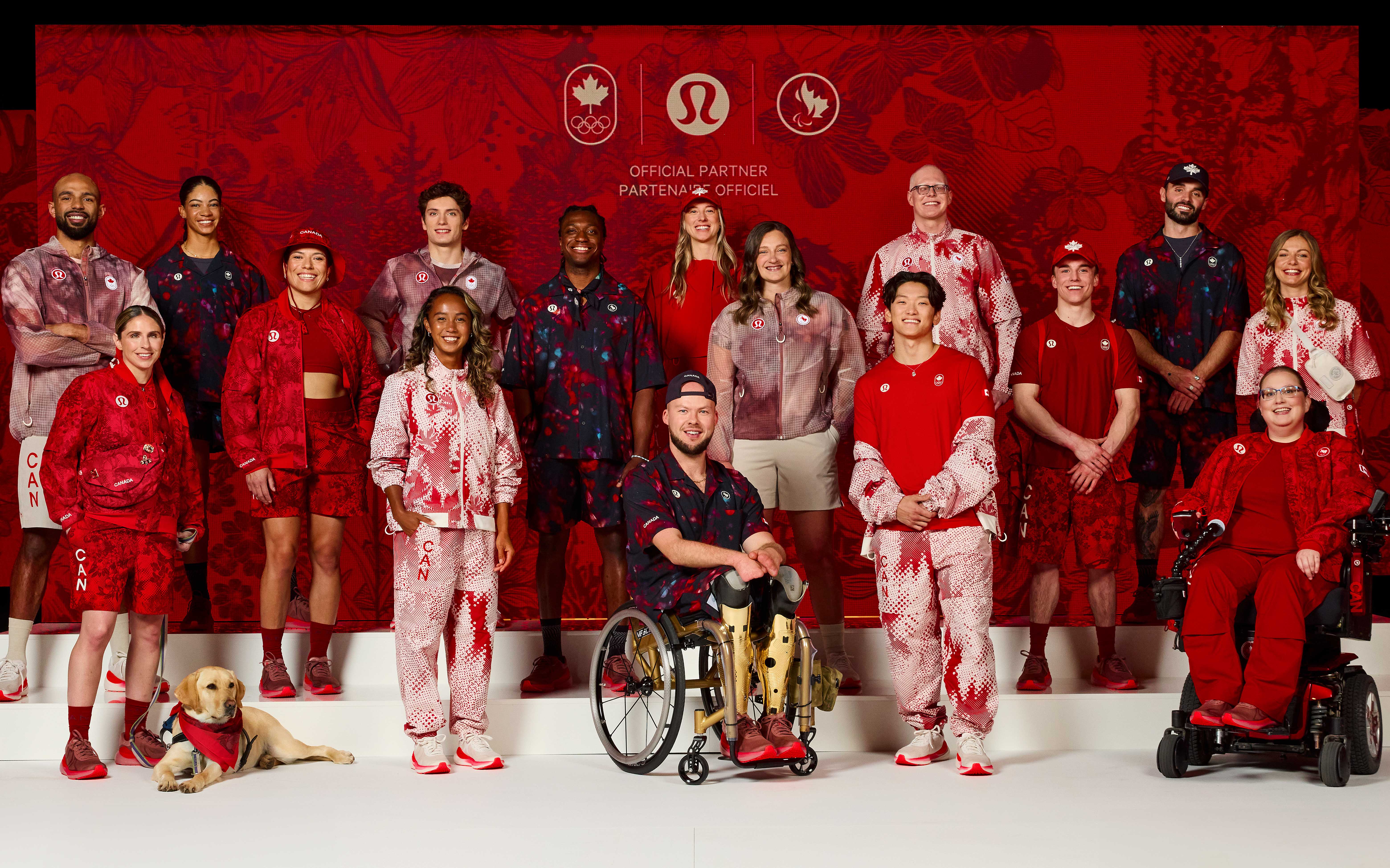
Other uniforms that have received good reviews have been those of Ethiopia. Adidas has created a uniform with a current and modern design for Ethiopian athletes. In Canada , Lululemon has designed a summer uniform focusing on adaptability, thermal comfort, fit and functionality, and national pride. The gender-neutral kit combines functionality and style through innovative construction and high-performance fabrics, with modern silhouettes and Canadian-inspired prints. In Australia, some critics have pointed out the length of the kit skirts and trousers. The Australian uniforms, designed by Sports Craft, present some similarities with Spanish clothing.
Finally, although in stylistic matters the colours vary, there is no doubt that some countries have won public opinion with sports uniforms that deserve an Olympic medal. This has been the case of Haiti. Haitian-Italian designer Stella Jean has collaborated with painter Philippe Dodard to create designs for the delegation that combine elegance and creativity. In terms of uniforms, Mongolia has presented the best design for its delegation, with intricately embroidered vests, pleated tunics and accessories inspired by traditional clothing. The designs are the work of Michel & Amazonka, a Ulaanbaatar -based brand that produces couture and ready-to-wear garments that “express the essence of Mongolian tradition and culture” in what the brand calls a “light contemporary”.

Sorry, this entry is only available in Español.
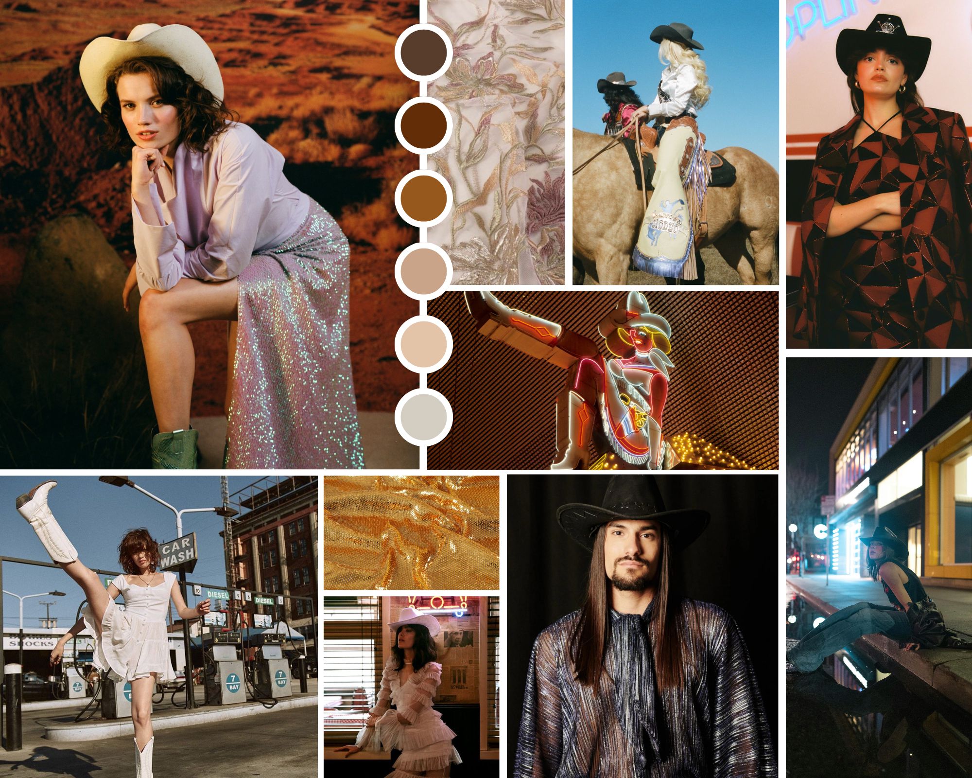
Collage cowboycore. Credits: Joplin Atelier, Free Form Style y Vanessa Mooney’s.
Every year we delight in a new microtrend that shakes up seasonal fashion in a whimsical way. The styling of an influential artist, the latest collection from a luxury brand, a revolutionary album, a blockbuster movie or the trends that accumulate the most hearts and likes on TikTok or Instagram. Social networks, which already create their own crushes, influence the creation of these passing trends that reach consumers like a gale and are established in editorials and fashion bazaars, also reinforcing themselves in the shop windows of fast fashion stores. Another phenomenon that confirms a microtrend is that as soon as they emerge, they disappear just as quickly.
If last year the fashion spotlight illuminated microtrends Barbiecore and Mermaidcore , inspired by the Mattel doll and the magnetism of mermaids, this spring season experiences a change of register, focusing on the aesthetics of Wild West cowboys. And yes, Beyoncé and her new country album have a lot to say about it. Indeed, the cowboycore style leaves the great American plains to capture the imagination of designers, celebrities and the general public with a contemporary interpretation of the western that renews style codes to get closer to the new generation, but maintains its hallmarks.
Why is cowboymania returning? The current resurgence of cowboycore can be attributed to a mix of nostalgia and a desire for authenticity. In an increasingly digital and globalized world, people seek to connect with styles that evoke a sense of history and tradition. Additionally, the trend toward sustainable and artisanal has made classic western garments, many of which are made from durable materials, even more attractive.
Origins of the trend
Cowboycore finds its roots in Western fashion, a recurring aesthetic in popular culture for decades. Classic western films, new adaptations, television series from the 60s and country music, with artists who capture the essence of deep America, have helped maintain this fashion that is perceived as a symbol of freedom and rebellion. Key pieces of this trend include all types of denim clothing, fringed leather and suede jackets, long ruffled dresses, and shirts with floral or check print motifs. As for accessories, country boots, wide-brimmed hats and belts with large metal buckles are essential. All this in a fusion of styles and other trends, such as glam and streetwear, creating unique and eclectic looks. This has been perceived on the streets of Milan and Paris among stylists and influencers who have worn their own interpretation of the cowboy – or cowgirl – aesthetic, coinciding with the main fashion weeks.
Cowboycore has been the protagonist in several fashion collections for 2024 and 2025, demonstrating its relevance and adaptability. Some notable fashion houses that have adopted this trend are, for example, Dior in its Pre- Fall 2024 collection, with fringed leather jackets and decorated cowboy boots. Also Balmain, with Olivier Rousteing incorporating elements of the microtrend in his Spring/Summer 2024 collection, fusing western aesthetics with glam and futuristic details. Calvin Klein reinterpreted the aesthetic in question with clean lines and a neutral colour palette, highlighting durability and classic style. Earlier this year, Pharrell Williams was inspired by the Old West and collaborated with Dakota and Lakota artists on his men’s collection for Louis Vuitton, filling the runway with turquoise stone bolo ties, pointed-toe cowboy boots (printed, by the way , with cacti) and worn jeans that looked like they had been worn during several rodeos. Finally, in the proposals of Ralph Lauren or Roberto Cavalli you can also find elements to the aesthetics of deep America.
 Credit: Joplin Atelier
Cowboy fashion among influential artists
Celebrities play a crucial role in its popularization. One of the most influential figures to showcase this trend is Beyoncé, who, beyond her new country music album, has incorporated the Wild West style into her stage costumes and music videos. Her ‘ Renaissance ‘ tour has witnessed numerous looks inspired by the trend, with a modern and glamorous touch, cementing her status as the queen of this fashion.
Artists like Lil Nas X and Miley Cyrus have also embraced the western aesthetic, combining western elements with modern touches. The American rapper has made this style a central part of his image, wearing cowboy boots and hats in his performances and music videos. Kacey Musgraves, a country star, has also popularized cowboycore, mixing traditional western elements with bright, futuristic details in her stage outfits. Her style has influenced both country and mainstream fashion.
The relationship between fashion and music is deep and symbiotic, and cowboycore is a clear example of this. Country music has been a constant source of inspiration for western fashion, and vice versa. Artists like Orville Peck, with his enigmatic style and cowboy mask, have brought the style to new audiences, fusing Western aesthetics with a more theatrical, but sophisticated touch at the same time.
The pop genre has also adopted elements with artists such as Billie Eilish and Post Malone incorporating cowboy boots and denim jackets into their personal styles, showing the versatility and universal appeal of this trend.
Beyond music
The impact of the microtrend extends beyond fashion and music, infiltrating other cultural spheres such as cinema, television and the visual arts. Recent movies and television series, such as “Yellowstone” and “The Power of the Dog “, have presented characters with styles that reflect Western fashion, contributing to its resurgence.
In contemporary art, the cowboycore aesthetic manifests itself in works that explore themes of identity, nostalgia and rebellion. Visual artists such as Richard Prince have incorporated elements of the west into their works, creating a dialogue between popular culture and high-end art.
These are just some examples of how this microtrend has demonstrated its ability to evolve and adapt to new contemporary languages, creating a unique fusion of styles. From the catwalks to the streets, and from music to art, cowboycore continues to influence and be influenced by various cultural spheres. Its enduring appeal and ability to reinvent itself ensure that it will continue to be a relevant force in fashion and beyond.
At Gratacós we have found in the current collection some fabrics that subtly refer us to this aesthetic. Here we leave you our inspirations:


 Exhibition ‘Dressing a Garden’. All photos published are provided by: Museum of Costume CIPE.
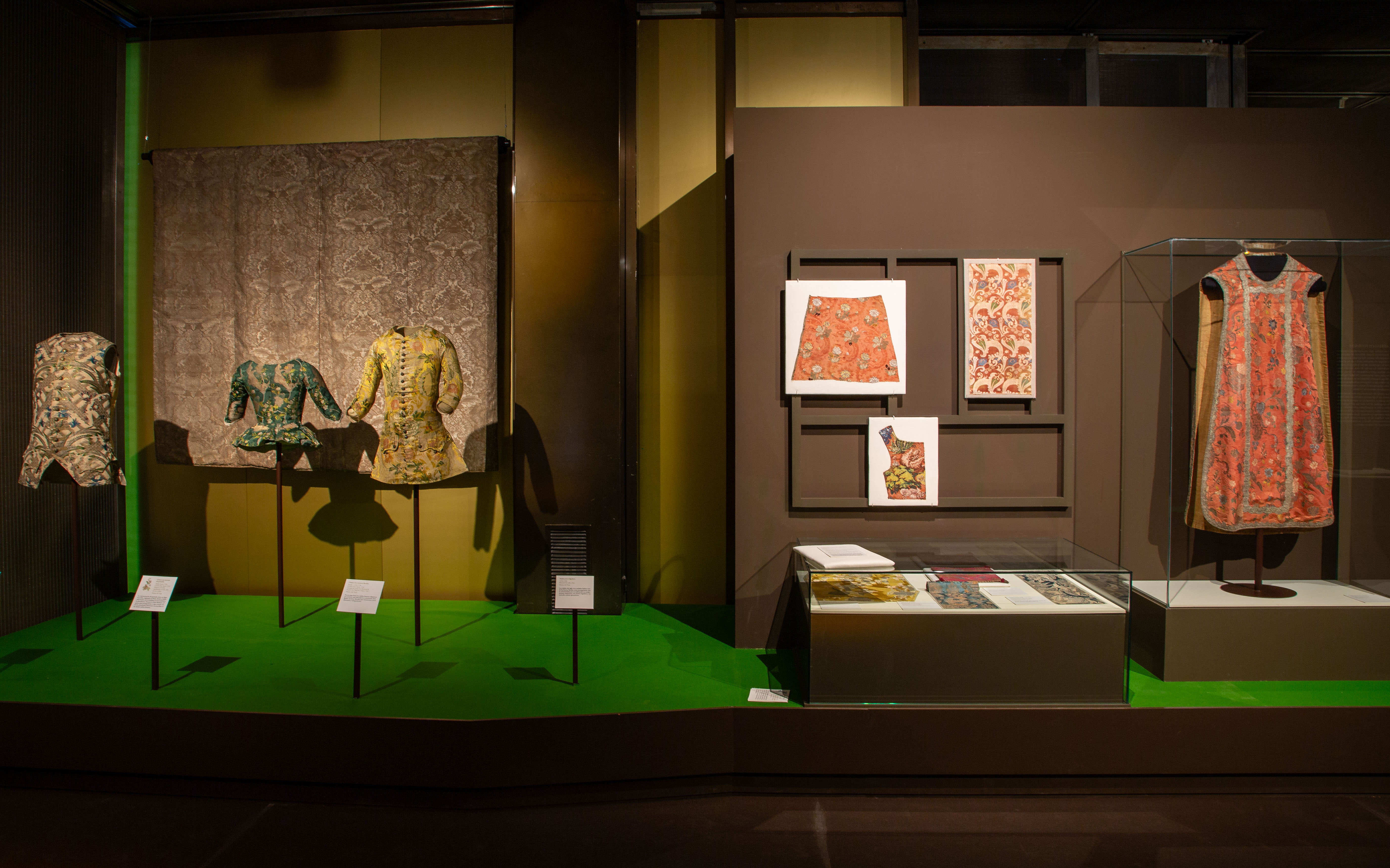
It has been a while since we recommended an exhibition, and we have just found a surprising exhibition that connects head-on with some of our most recurring inspirations and, specifically, with the floral theme of the 2024 Lookbook. The Madrid Costume Museum has just released the ‘Dressing a Garden’ exhibition, an exhibition curated by Gema Batanero that focuses on connecting nature with fashion through floral motifs as the backbone.
A historic binomial
Since ancient times, nature, and especially floral motifs, have been a constant source of inspiration for human beings. Like the self-portrait, flowers have focused attention and have become the first themes that humanity has captured in art and in all its cultural manifestations. This connection has endured over the centuries, especially in the field of fashion and interior design, where decorating with flowers meant a way of maintaining ephemeral beauty and union with the natural environment: the gardens, the countryside, the forests… In fact, each era has had its peculiar way of linking fashion and textiles with the language of flowers and doing so in an extraordinary way.
Starting from this historical premise, the exhibition “Dressing a Garden” at the Costume Museum explores how floral motifs in fashion evolved between the Baroque and the Enlightenment. This exhibition reveals how these floral representations reflect the profound changes in the relationship between humans and nature and the emergence of new artistic, scientific and philosophical ideas. Furthermore, the exhibition highlights how commercial exchanges and technological advances influenced the rapid transformation of these floral designs, making them a key testimony of the aesthetic taste of the 18th and early 19th centuries. Through the leitmotif of flowers, the exhibition also vindicates the study of creative and technical processes as a fundamental part in understanding the phenomenon of fashion, raising its transversality and continuous dialogue with different cultural fields.
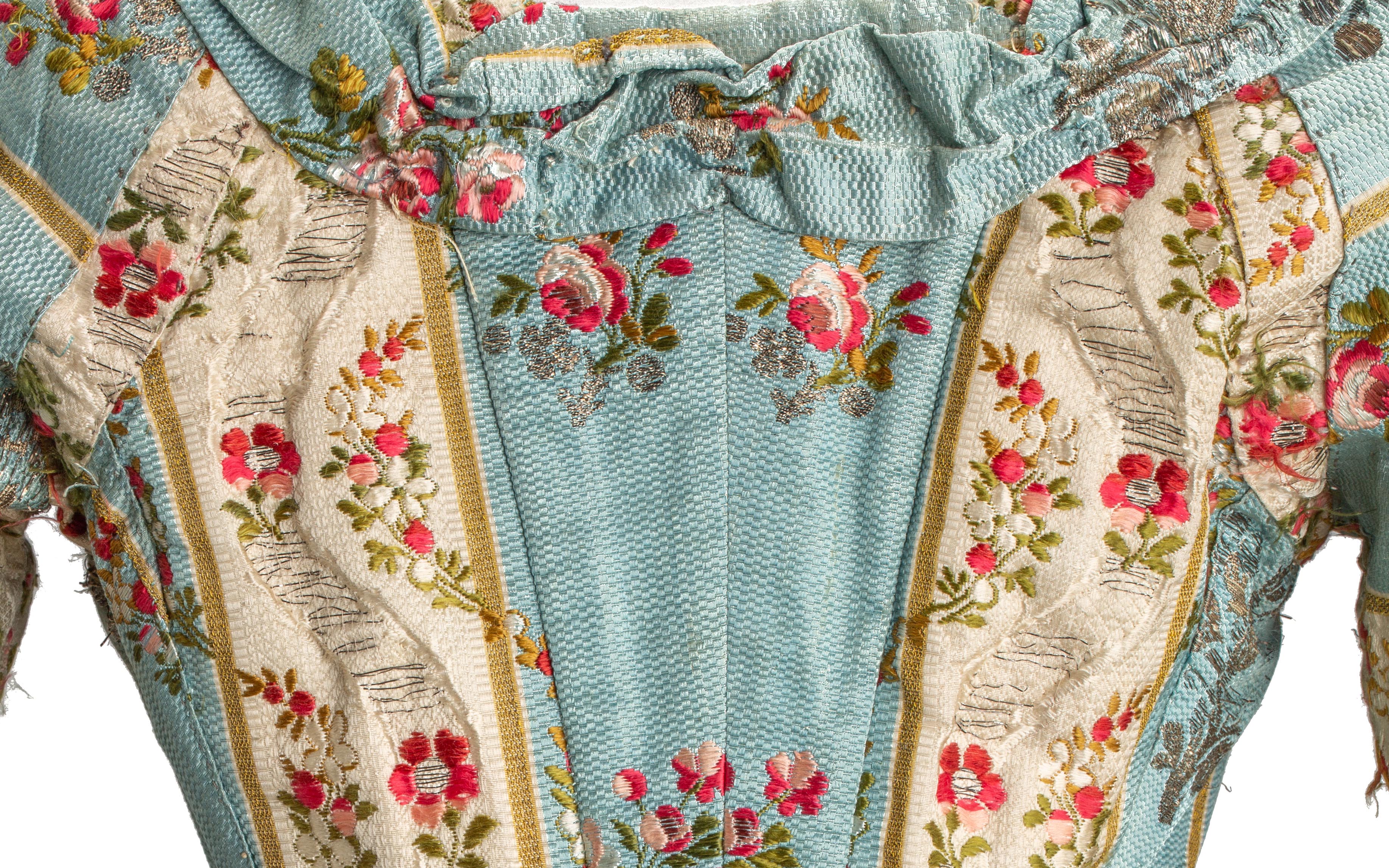
 Detail of an 18th-century dress from the exhibition ‘Dressing a Garden’. All photos published are provided by: Museum of Costume CIPE.
Floral motifs in more than a hundred pieces
The exhibition includes around 120 pieces, the core of which are collections of historical clothing and textiles from the 18th century and part of the 19th century from the Costume Museum. These pieces are accompanied by documentary and bibliographic collections, painting, ceramics and decorative arts from institutions such as the National Prado Museum, the National Archaeological Museum, the National Museum of Decorative Arts and the Royal Botanical Garden.
The first stop on the tour is titled “The Forest of the Furies” and places the visitor in the 18th century with an explosion of textile creativity: unusual fabrics, also called furies, due to the passionate and vibrant character of their decorative motifs. The exhibition continues with “A naturalistic still life”, which shows how, during the 1830s, the fanciful bizarre vegetations gave way to much more naturalistic representations. Starting in the 1940s, “The Line of Beauty” marks the evolution towards the Rococo style, characterized by its lightness and refinement.
Next, “The Flowers of Enlightenment” addresses the development of Enlightenment ideas and the return to the ideals of the classical world, marking a profound aesthetic change with respect to Rococo taste. “Gardens of the East” discusses how indianas, a textile phenomenon from India and the Middle East, made its way to Europe. The note of bucolic celebration is provided by “A country party”, which addresses the genre of the gallant party in Rococo and alludes to the social enjoyment of the countryside. Finally, the tour culminates in “The Return of Spring”, a space that explores how the relationship with nature is a constant in the lives of human beings, and how floral motifs, although they experienced an unprecedented boom in the centuries XVIII and XIX, are repeated cyclically throughout the history of fashion.
The exhibition is completed by a catalogue created by the General Subdirectorate of Publications and Palaces and Museums, which further develops the areas covered in the exhibition. The exhibition ‘Dressing a Garden’ can be visited for free until September 29th at the Madrid Costume Museum. A good opportunity to delight in this inspiring pairing: nature and fashion.
We took advantage of the exhibition to bring out some of our floral fabrics, which maintain a similar dialogue with some pieces on display. Let’s give rein to our imagination!