 Orange is a more common colour than we think, although its role in history has always been relegated to the background. This hybrid shade between red and yellow provokes an immediate reaction when recognized. It activates, stimulates, surprises and entertains. Not surprisingly, this striking colour is always associated with the unconventional. Its uniqueness has played an important role in art, history and design. Since ancient times orange was present in Ancient Egyptian rituals, it has been considered a sacred colour in various Asian cultures and has come to fall in love with artists such as Vincent van Gogh and Toulouse-Lautrec who used orange in their paintings. We reveal some anecdotes about this exotic colour, often underestimated.
Orange in ancient times
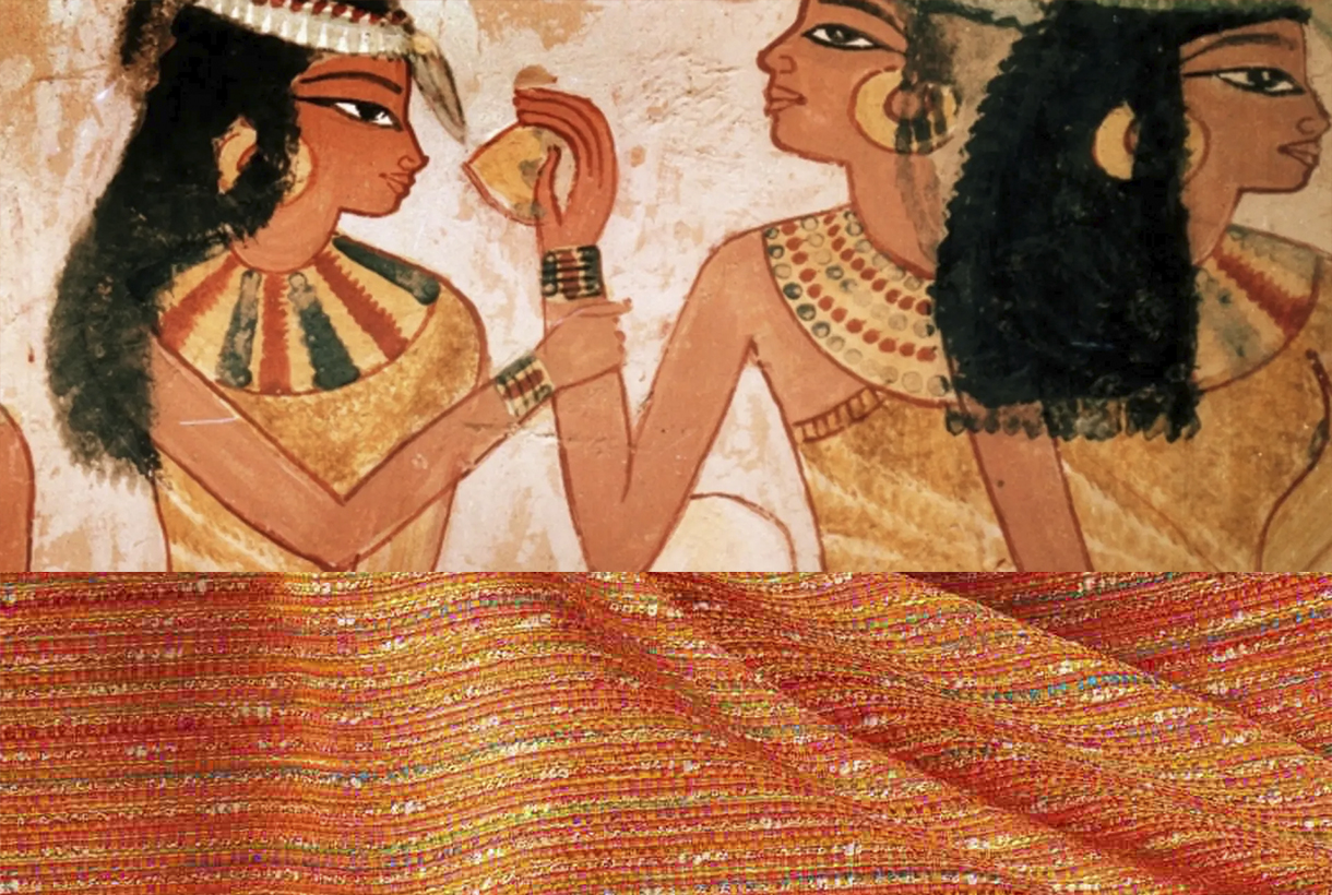
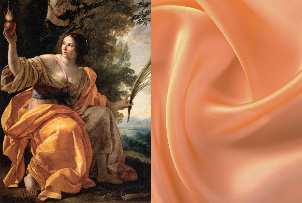
The ancient Egyptians were the first to use a shade between yellow and orange that they extracted from the mineral realgar to decorate their tombs. The pigment that was extracted was toxic – it contains arsenic – and was used by the Chinese to drive away snakes, as well as being used in the country ‘s traditional medicine . Another related mineral, orpiment was also used as a pigment and was considered a highly valued trade commodity in ancient Rome. In the Middle Ages the orange pigment was used during the Middle Ages in manuscripts.
In Asia, orange was considered a symbol with different interpretations depending on the culture of each country. This tonality is present in many of the Asian religions. In Buddhism, orange is a sacred colour: it is considered the tone of enlightenment and the search for knowledge and for this reason, the clothing of Buddhist monks is traditionally of this colour. For Confucianism, orange symbolizes the colour of transformation. In Hinduism, the dress worn by Krishna – one of the most revered personified deities – is always in this brilliant hue. The name of the colour in India and China derives from saffron which in turn was the most expensive dye in the two countries. These Asian powers considered that orange represented the perfect balance between the perfection of yellow and the power of red.
A nameless colour
In Asia, orange was a revered hue. On the other hand, in Europe the colour did not have a name until the 16th century when Portuguese merchants brought from India and China the most exotic fruits of the time: oranges and tangerines, tinged with a colour that Europeans called reddish yellow until then. This striking colour imported from the Far East via orange trees was named after the fruit itself. Orange in Spanish, orange in english, arancia in italian and orange in Portuguese.
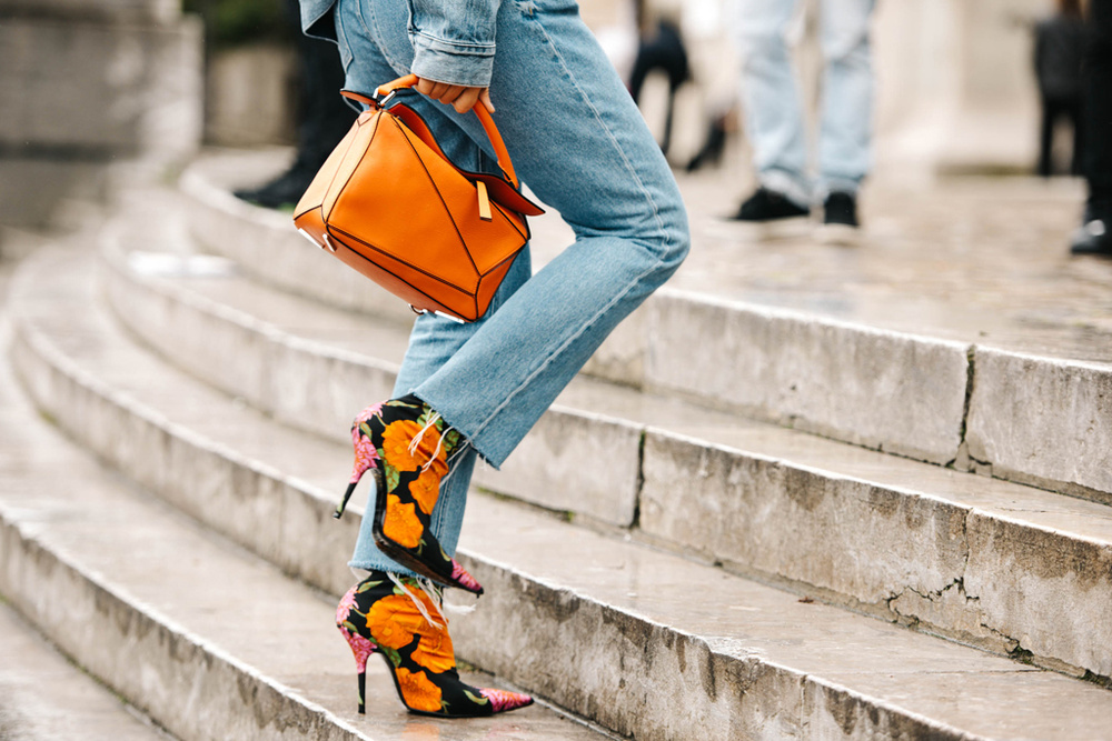
Another curiosity: today orange is a colour that connects on a psychological level with the world of flavours and is pleasing to the eye when linked to food. Peaches, apricots, mangoes, carrots, prawns, prawns, salmon, pumpkins, curries… Orange can be an appetizing colour, right?
Orange in art
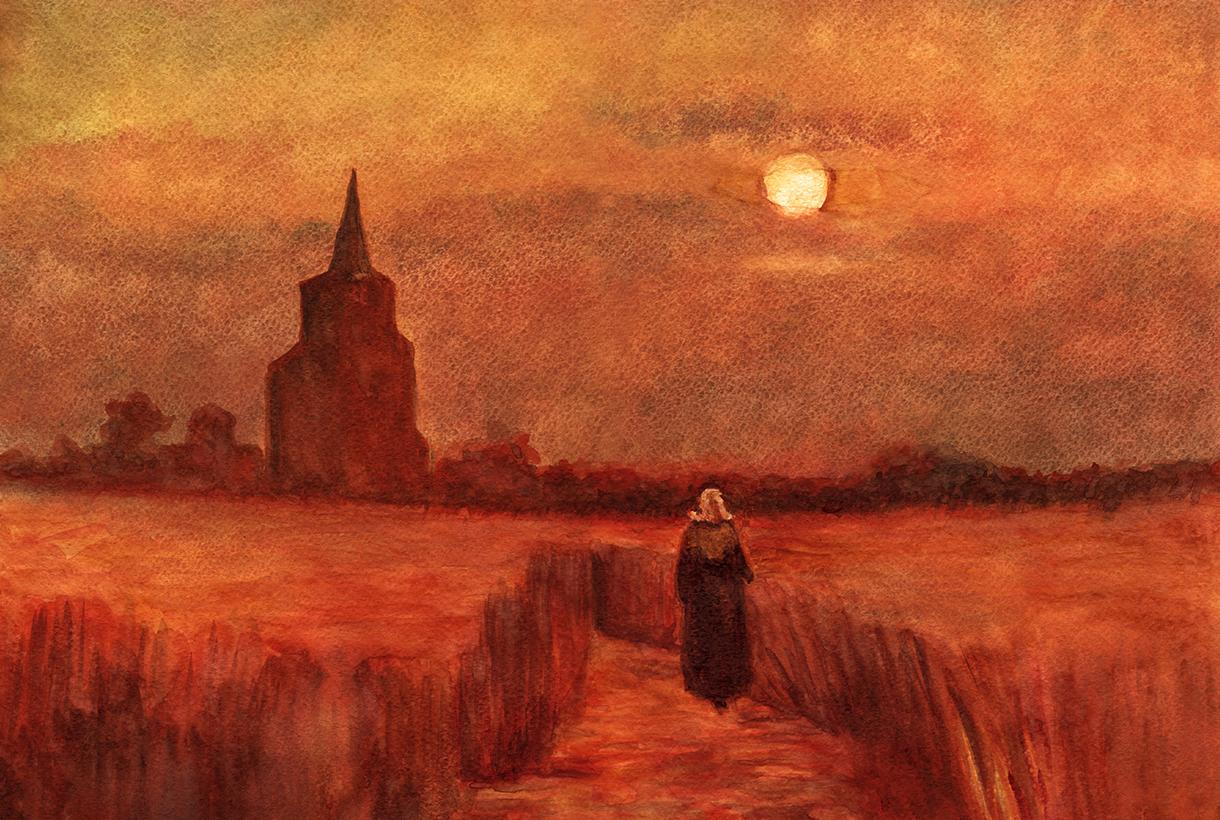
In Western European art, the use of orange became common as from the 19th century, when the first synthetic orange pigment called chrome orange was produced. This tone was a favourite of Pre-Raphaelite and Impressionist painters, who made use of colour to capture the effects of natural light. Artists such as Monet, Gauguin, Renoir, and Toulouse-Lautrec used colour extensively to elicit feelings of warmth, escapism, and playfulness. If there is an artist who was directly linked to the colour orange, it was Vincent van Gogh, who through painting mixed his own shades of orange and used them in contrast to the blues and purples characteristic of his work.
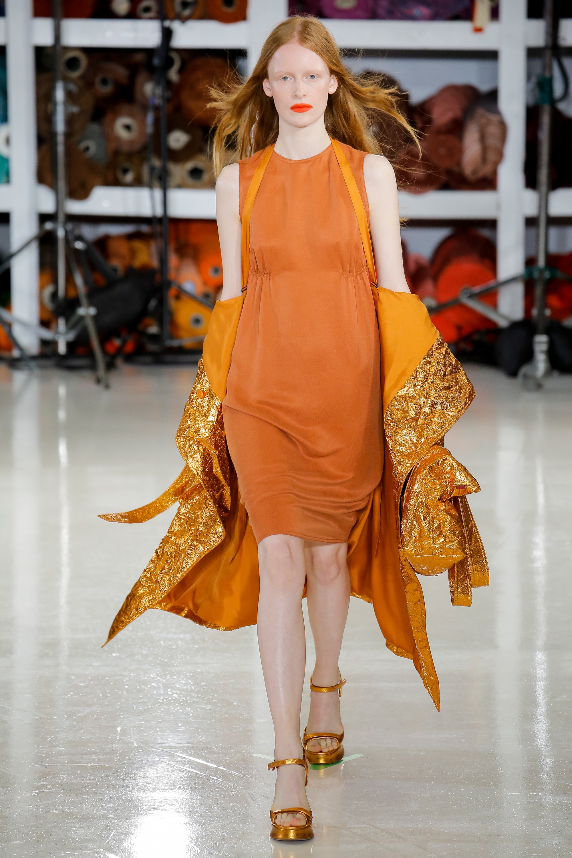
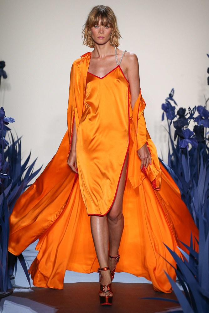
A seasonal colour in 2022
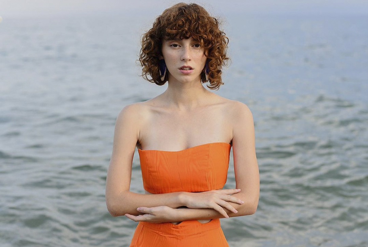
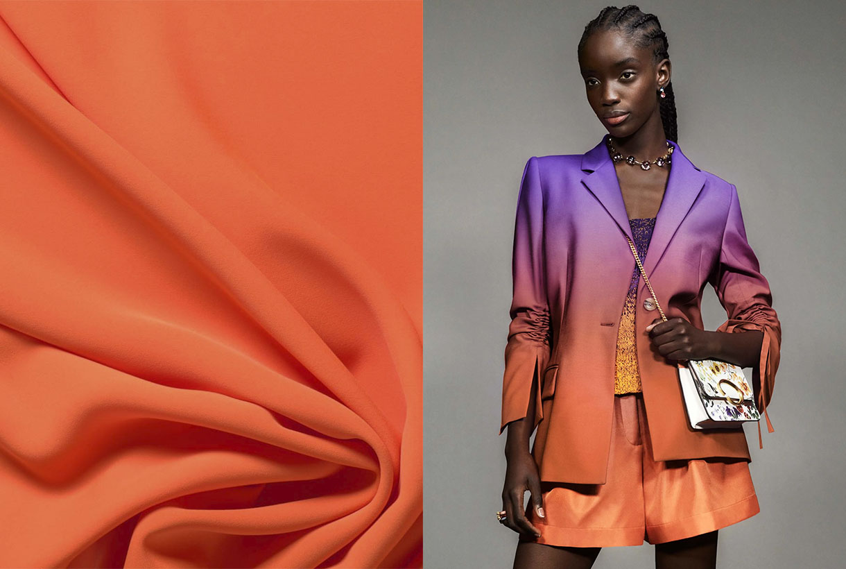
Although Pantone crowned Very Peri lilac as the colour of the year in 2022, the truth is that the fashion industry seems to have set its sights on a more intense and vital hue to lift the spirits. On catwalks through the summer and pre-fall collections , on the street style of fashion weeks , in the windows of the big firms… orange has emerged as one of the star shades of the season in all its possible ranges.
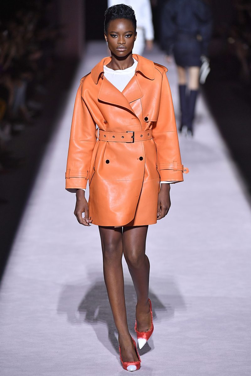
Orange has been present in the current SS22 collection by Christian Siriano, Collina Strada or Proenza Schouler, transmitting optimism and joy to the clothes presented, but it is in the transition collections that it gains more strength. For example, Erdem is one of the firms that has opted for this colour, but in its softer versions such as boiler orange for satin dresses with black motifs and looks that play with textures and use the same tone. For its part, Chloé has opted for pastel shades giving it a less aggressive look. Oscar de la Renta has given orange reddish nuances, always accompanied by other colours or in bag format. Instead, Gucci has opted this season for a vitamin orange that dyes a multi-layered skirt in the same tone.
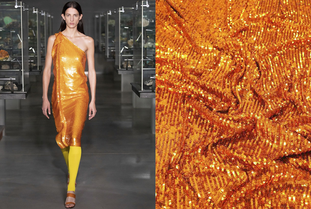
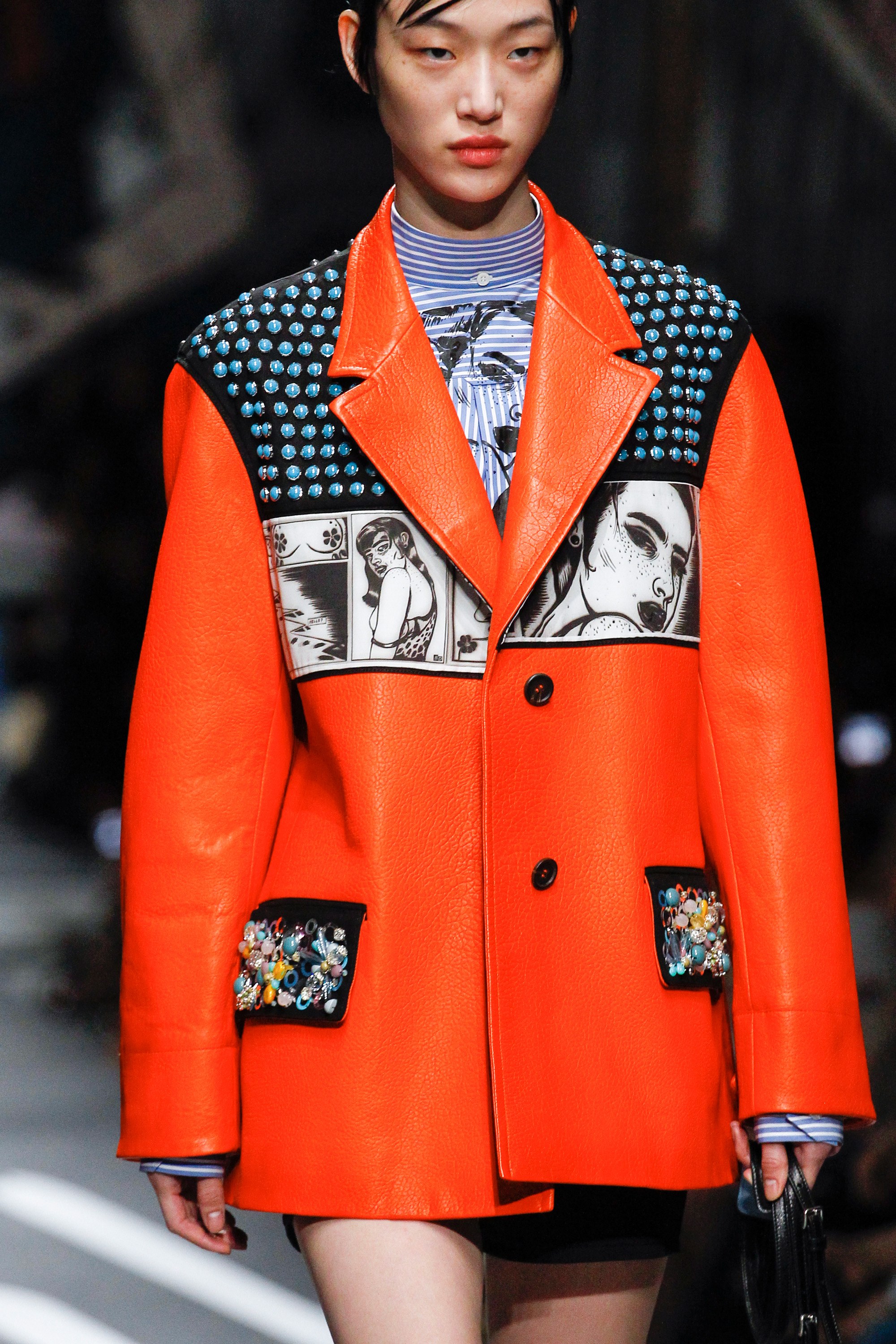
The namarillo is once again stepping strongly on the catwalks. A hybrid shade halfway between orange and yellow that became popular in 2016 among the spring collections and caused a furor due to its showiness and luminosity, being the summer shade at the time. Now Prabal Gurung has recovered this vitamin tone and has incorporated it into a large part of the looks of its latest collection. In a slightly more subdued tone, Staud has turned it into knitted sets with microshorts and Chanel into jumpsuits that are the hallmark of its creative director, Virginie Viard .
How to combine it?
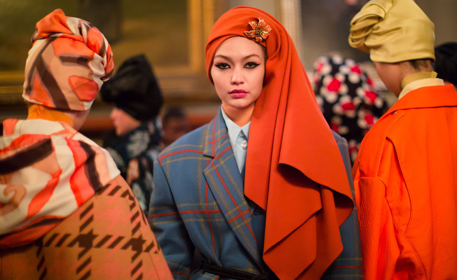
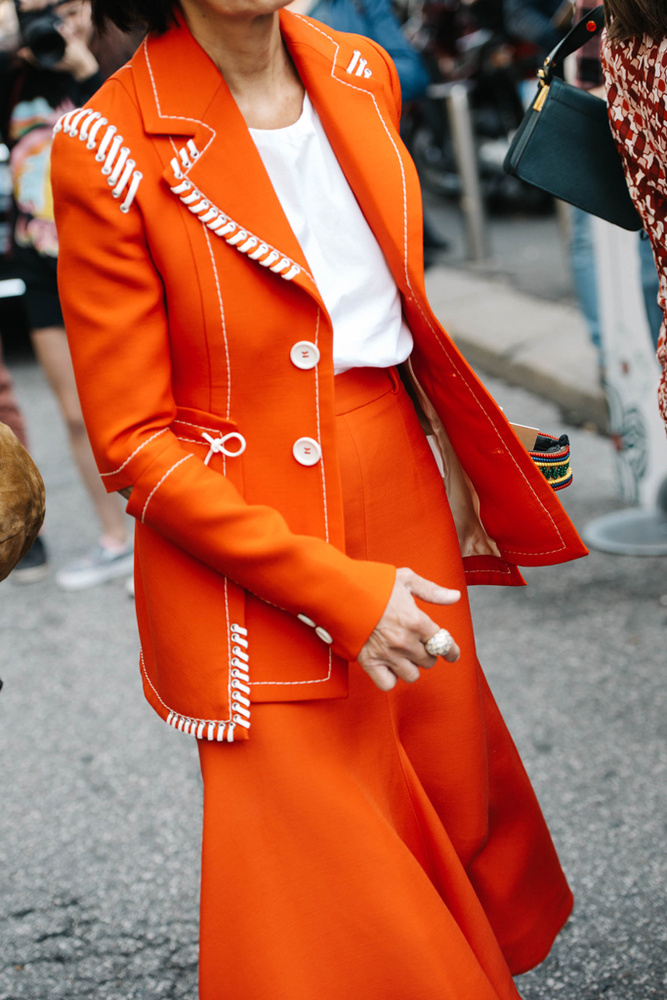
Sometimes what is seen on the catwalk does not necessarily end up being worn on the street. And orange seduces at first sight, but it is not an easy colour to wear nor is it discreet. Still, the street style of the fashion prescribers or the looks exposed by the celebrities in the network carpets are the best reference to demonstrate the chromatic possibilities that orange has in the wardrobe.
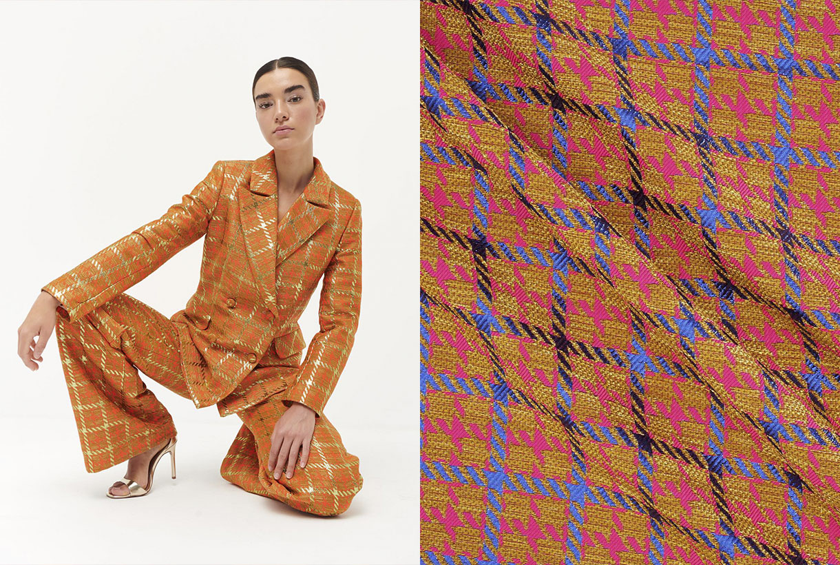
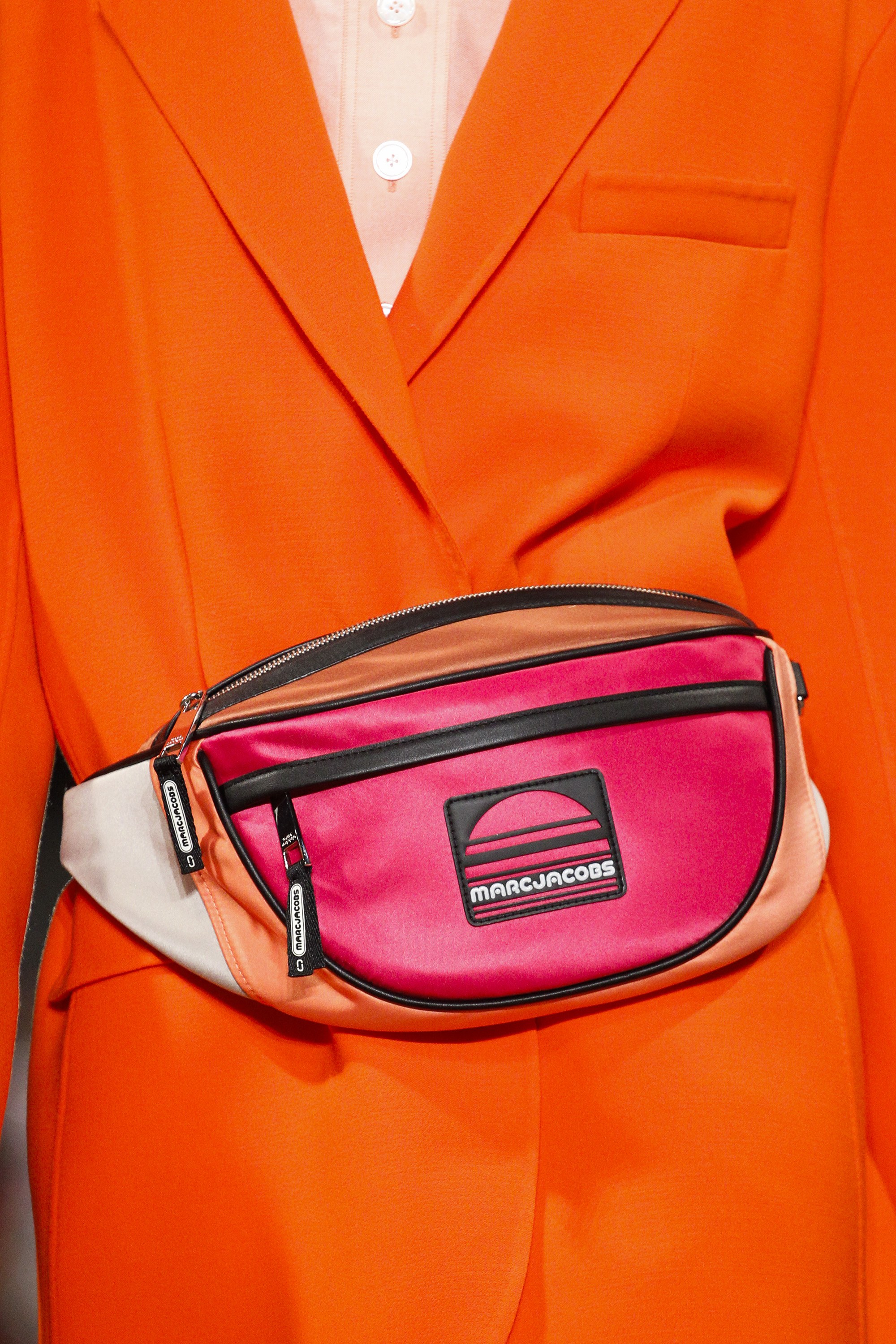
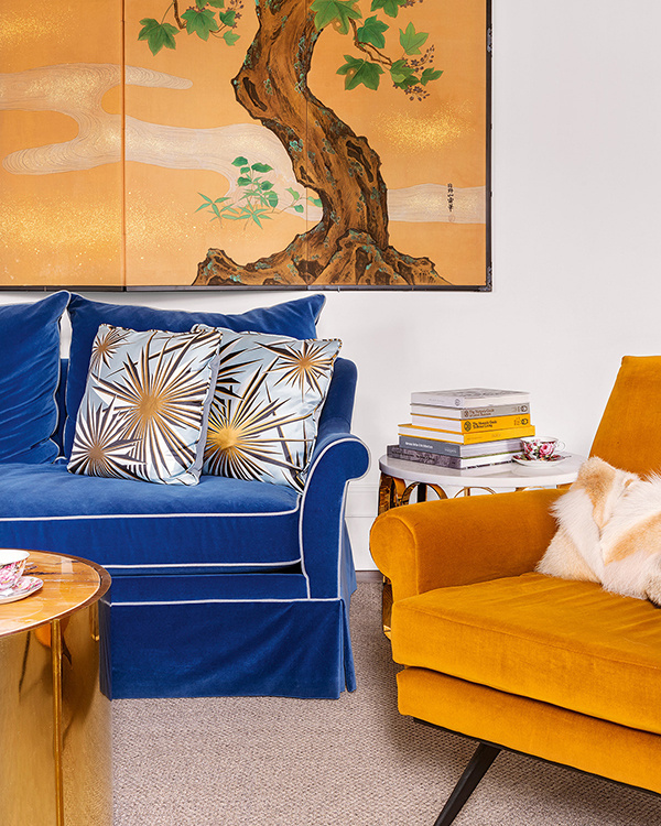
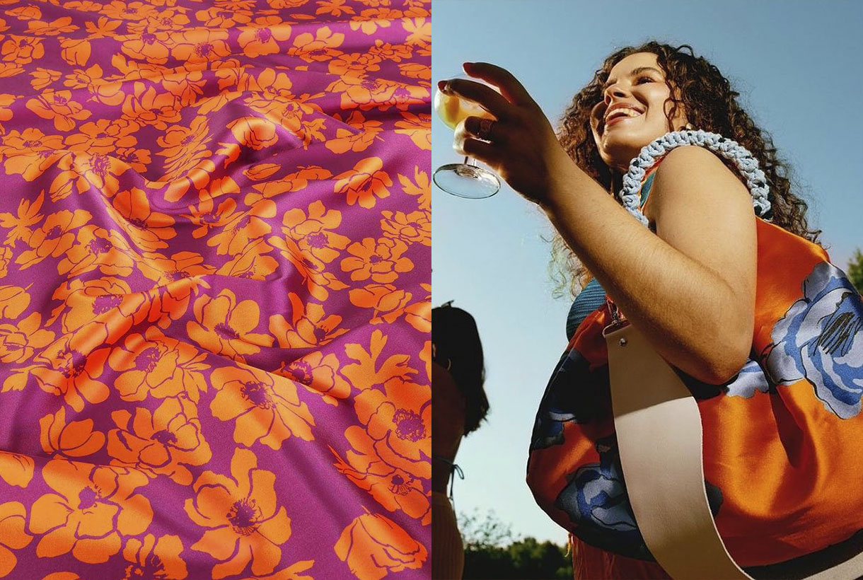
The easiest way to get started in the colour orange is to do it in small doses through a single garment or simply relegating it to accessories. The tones that always go well with orange are the neutral ones: white, black and beige tones or makeup that creates a base effect. On the other hand, if your level of daring is high, orange looks great in a total look through dresses, jacket suits or combinations of tops with skirts. As for risky combinations that enhance this vitamin colour, there are some that are often repeated on the catwalk that flow due to their contrast: orange with fuchsia for maximum daring; orange with intense green to play with the complementary ones; orange with light blue or pale pink to reduce intensity; orange with purple to claim prominence; orange with gray for rainy days, or obviously, orange with orange for a harmonic visual game. This colour accepts more shades than you would have imagined!
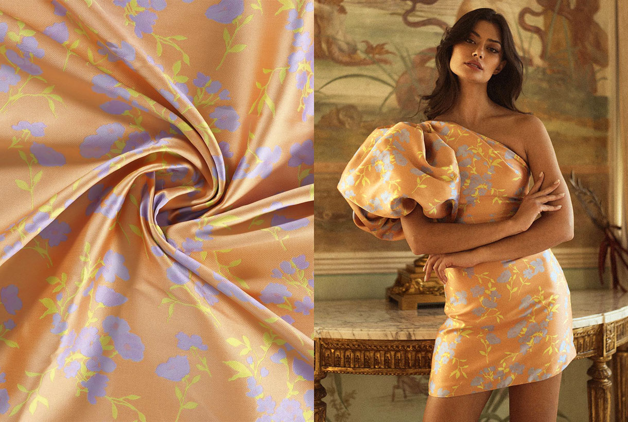
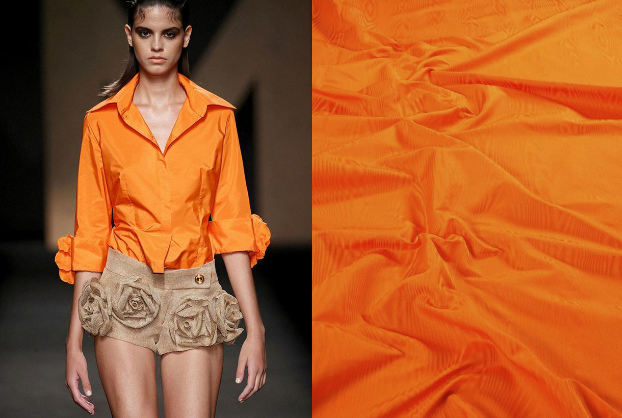
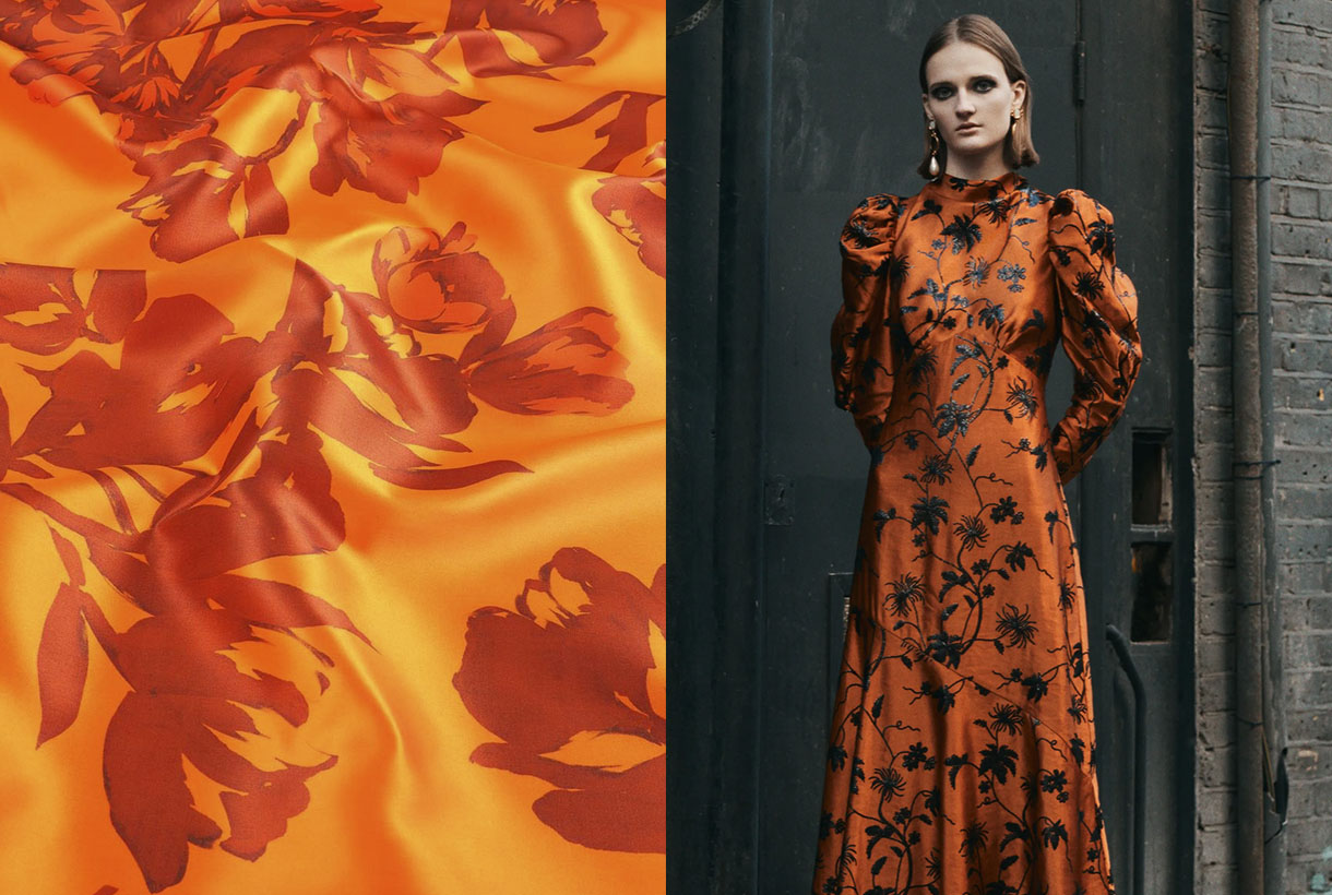
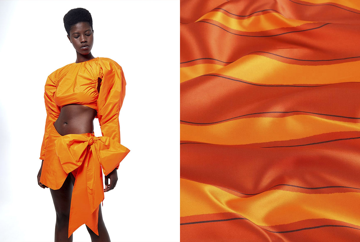
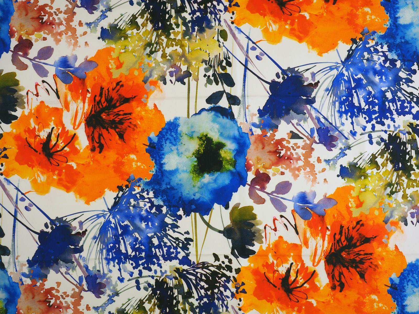
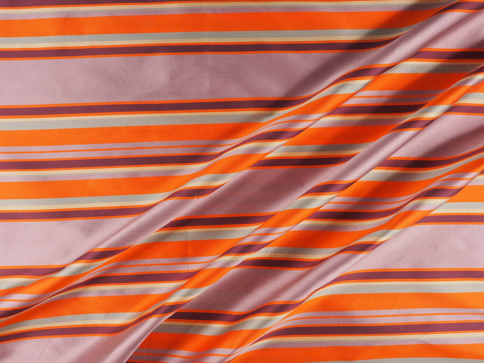
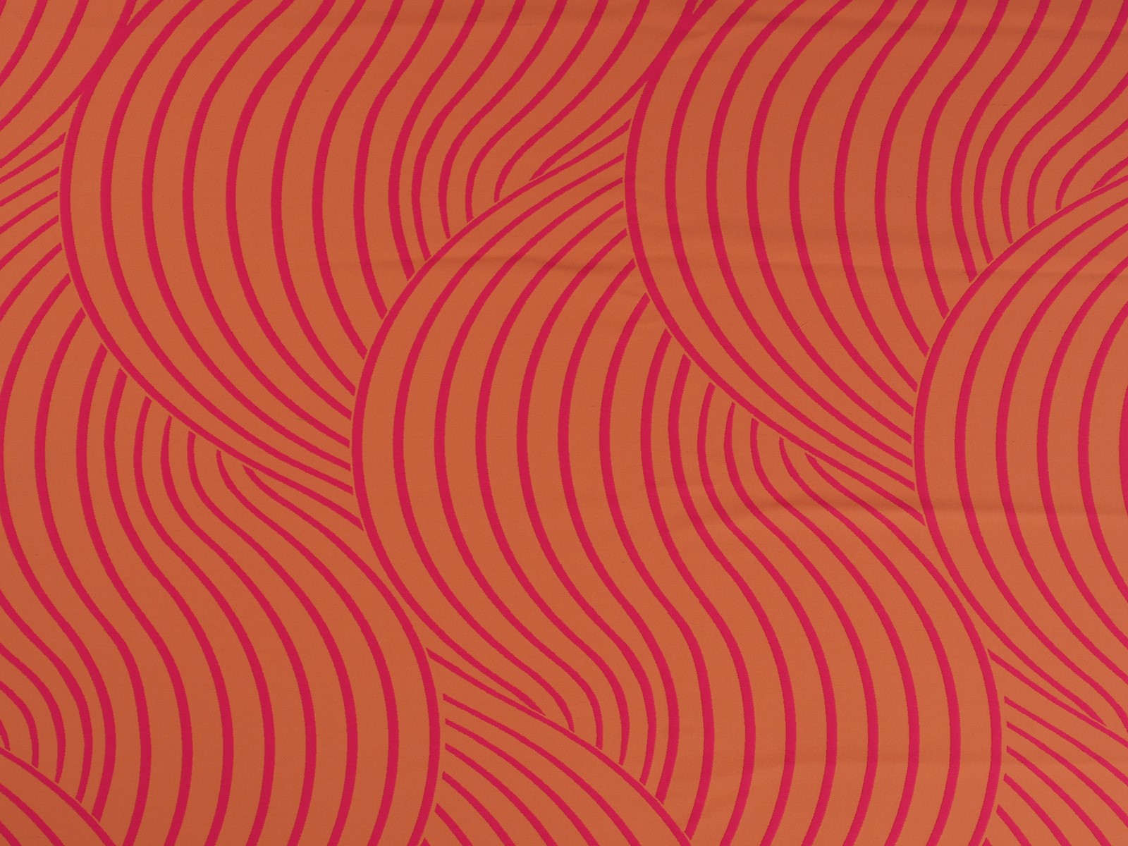
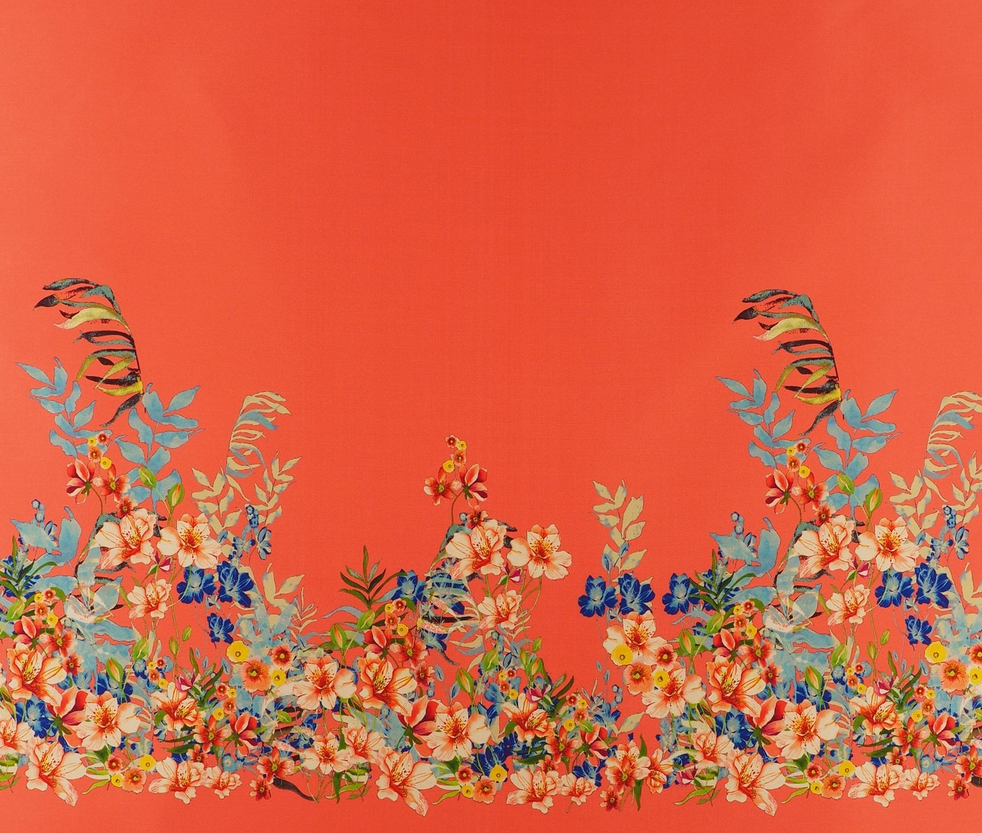
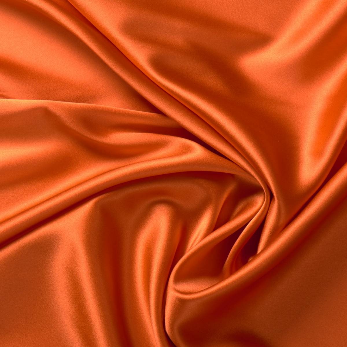
Finally, we show you some of our most vitamin-rich fabrics for the new season. What do you imagine designing with them?