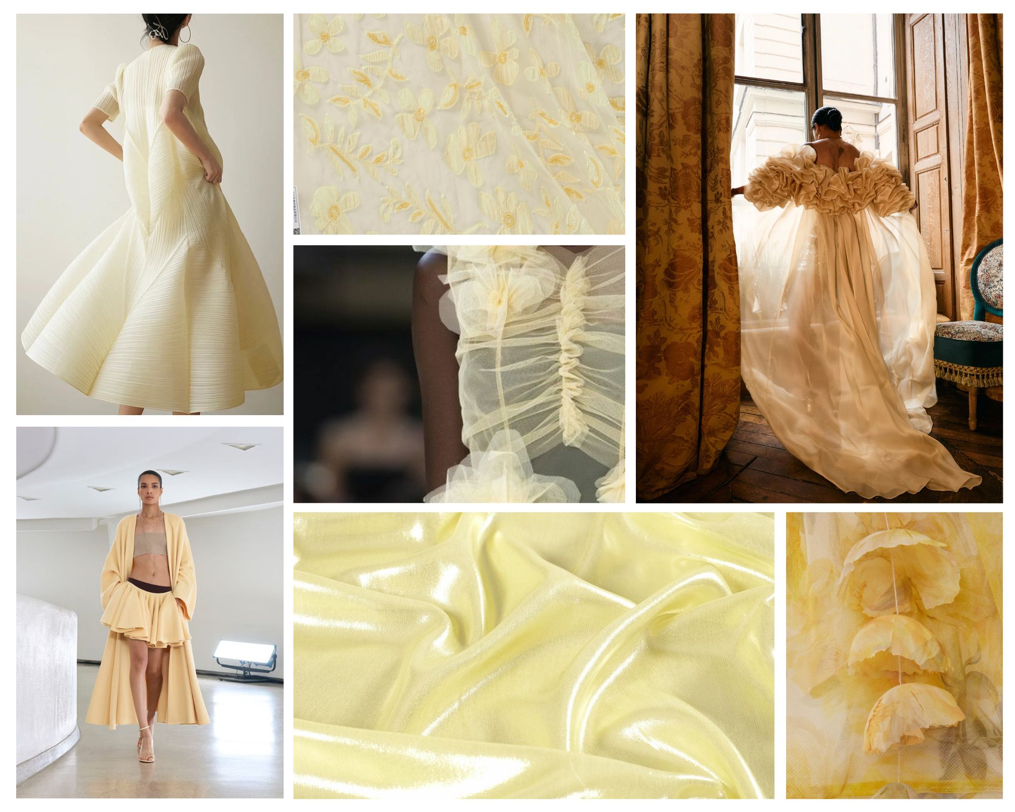
 Butter yellow inspirational collage. Photo by Mariano Moreno
Spring is blooming in all its splendor, and among the array of colours inspired by this chromatic renaissance, one stands out above the rest in 2025. Whether due to trend, taste, or natural predilection.
A colour that doesn’t shout. That doesn’t need to impose itself to be memorable. This season, yellow tones down to cream. It becomes buttery. A shade that illuminates without being too loud and glides smoothly over lightweight fabrics like organza, silk, and cotton.
Far from seeking prominence, butter yellow accompanies, soothes, and nuances. In a time when everything vibrates to the rhythm of the fleeting, this shade reappears as a nod to comfort, tenderness, and a quieter elegance. Once considered difficult, even feared, it now sneaks into refined collections, runways, and editorials as the preferred shade for those seeking a balance between the romantic and the contemporary.
We discover some of its many facets.
 Butter yellow inspirational collage. Photo by Gonçalo Peixoto
A Brief History of Yellow: From Noble to Marginal
Yellow is one of the oldest and most symbolically charged colours in the history of art and clothing. Found in the natural pigments of Ancient Egypt—where it was associated with gold, the sun, and eternity—it was also one of the most widely used shades in Roman and Byzantine frescoes for its ability to capture light.
For centuries, however, yellow lived in a constant duality: on the one hand, it represented light, energy, and nobility; on the other, it was stigmatized by its association with betrayal or marginality in certain historical contexts. In the Middle Ages, for example, it was the colour imposed on heretics and the marginalized. This chromatic ambivalence has carried over into modern times, leading yellow to be considered for decades a difficult, even “cursed” shade, especially in fashion.
Since the 20th century, with the explosion of modern design, the colour has regained its place as a symbol of avant-garde and provocation. From the neon yellow of the 1980s to the mustard of the 1970s to the fluorescent yellow of the 2000s, this shade has shifted its meaning with each generation.
Today, in its softest and creamiest version, butter yellow presents itself as a natural evolution: a meeting point between sophistication and warmth, between warmth and neutrality. It’s the yellow that leaves drama behind to become balanced.
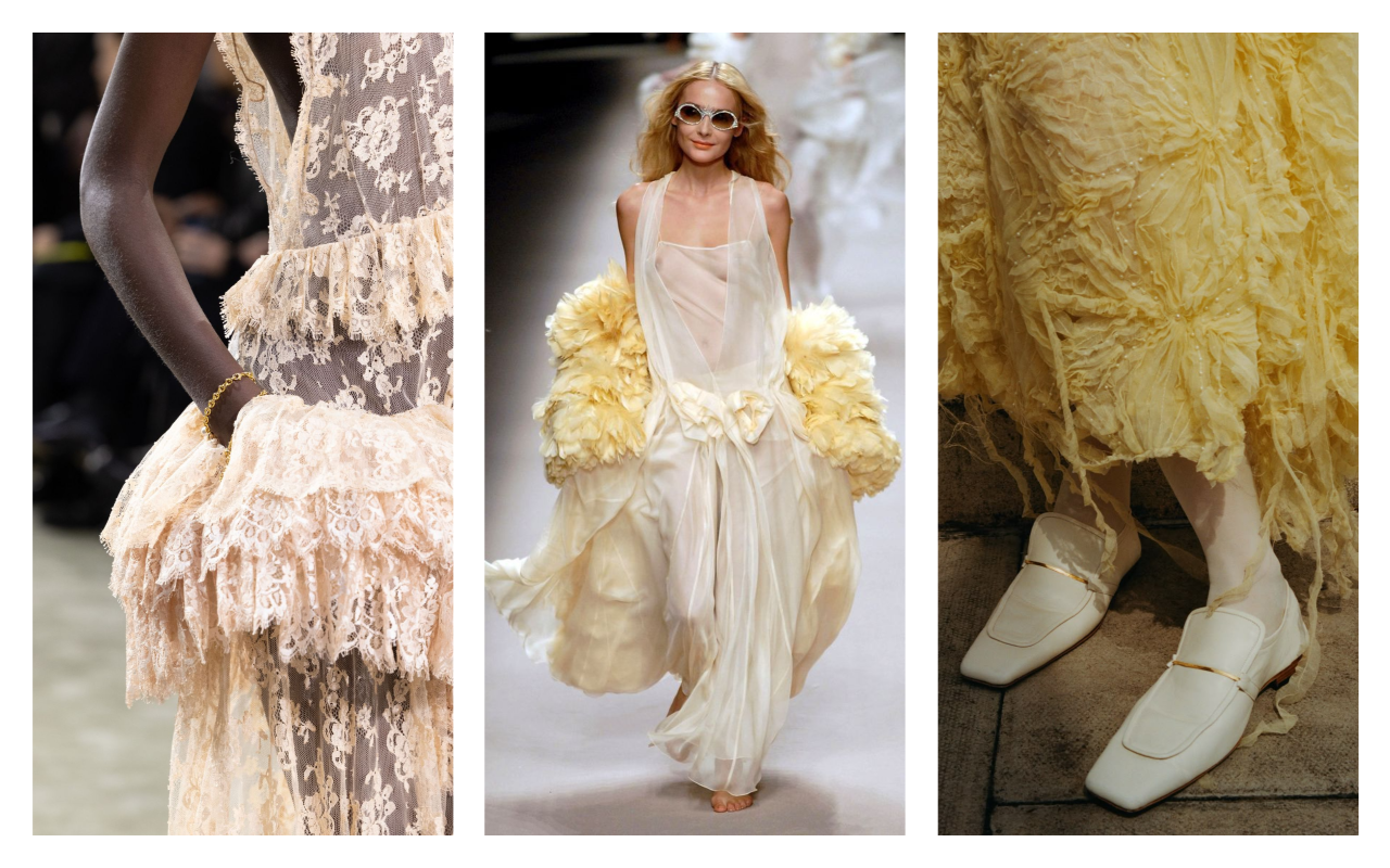 Butter yellow inspirational collage. Photo by Pinterest.
Why does this burst of butter yellow reach us?
In a world where trends change at the speed of a scroll And everything coexists with everything else, so talking about “colour trends” may seem anachronistic. However, there are shades that capture the emotional pulse of an era. Butter yellow is one of them.
This soft, approachable, and unpretentious hue connects with a collective desire for calm, well-being, and aesthetic refuge. In the face of excess, visual overload, and the chromatic noise of digital technology, colours emerge that invite us to slow down. Pastel yellow—specifically, this creamy and luminous version—is perceived as a visual balm. A microtrend that seeps into fashion, interior design, cosmetics, and even the digital world.
Colour psychology associates yellow with creativity, vitality, and optimism. In its softer form, this energy is nuanced and becomes something more introspective: tenderness, sensitivity, kindness. It’s a colour that doesn’t impose, but rather accompanies.
In a context where the ephemeral prevails but human beings continue to search for meaning, butter yellow represents an aesthetic response to an emotional need: returning to the essential, but with light.
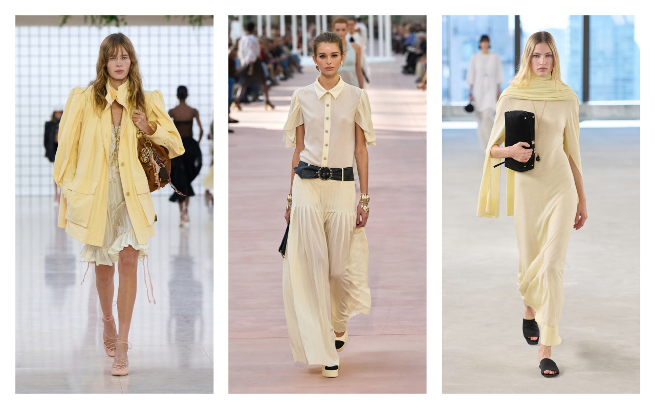 Catwalks SS25 Chloé, Chanel and Toteme.Butter yellow inspirational collage. Photo by Pinterest
From the catwalk to a global phenomenon
Butter yellow has gone from being a chromatic curiosity to becoming one of the most visible—and desirable—colours of the season. This spring/summer, its presence on runways, red carpets, and editorials has confirmed what the trends had already suggested. insiders : we are facing a new neutral.
It all started with a resounding gesture: Timothée Chalamet appeared on the Oscars red carpet in a butter yellow ensemble, breaking new ground and generating headlines. A few days later, Katie Holmes wore it elegantly to the Zimmermann show, pairing a trench coat and trousers in this shade with black and chocolate brown accessories . style immediately embraced it, leaving us with monochromatic styles and combinations with beige, off-white and earth tones that have multiplied its versatility.
On the catwalk, brands such as Givenchy, Bottega Veneta , Molly Goddard, Zimmermann, Christopher Esber either Rotate has dyed their collections this creamy shade. In Sarah Burton’s debut collection for Givenchy, a coat with pronounced shoulders and a cinched waist became one of the season’s most viral pieces. Meanwhile, Toteme presented scarf dresses, shawls, and minimalist blouses that bring this colour closer to the Scandinavian universe.
What’s interesting is how this shade adapts to all types of garments. From the most romantic midi and maxi dresses to structured suits, nappa leather jackets, silk blouses, or even denim outfits . Row and Jacquemus has reinterpreted it from two opposing but equally sophisticated perspectives: one more refined and urban, the other more sensual and Mediterranean.
What was once perceived as a “difficult” shade is now positioned as a new wardrobe staple. A colour that doesn’t seek to set a trend, but rather to maintain its place.
A colour rich in nuances
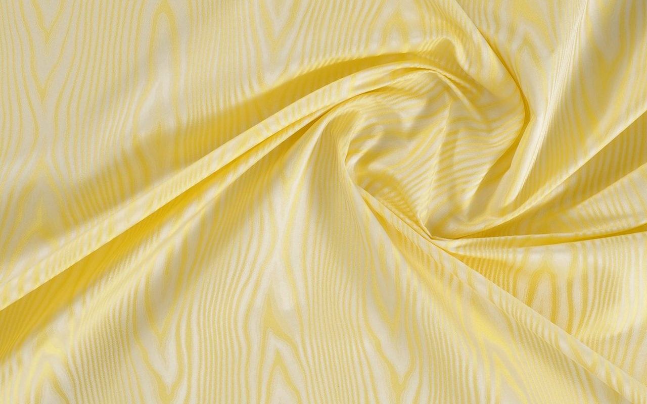
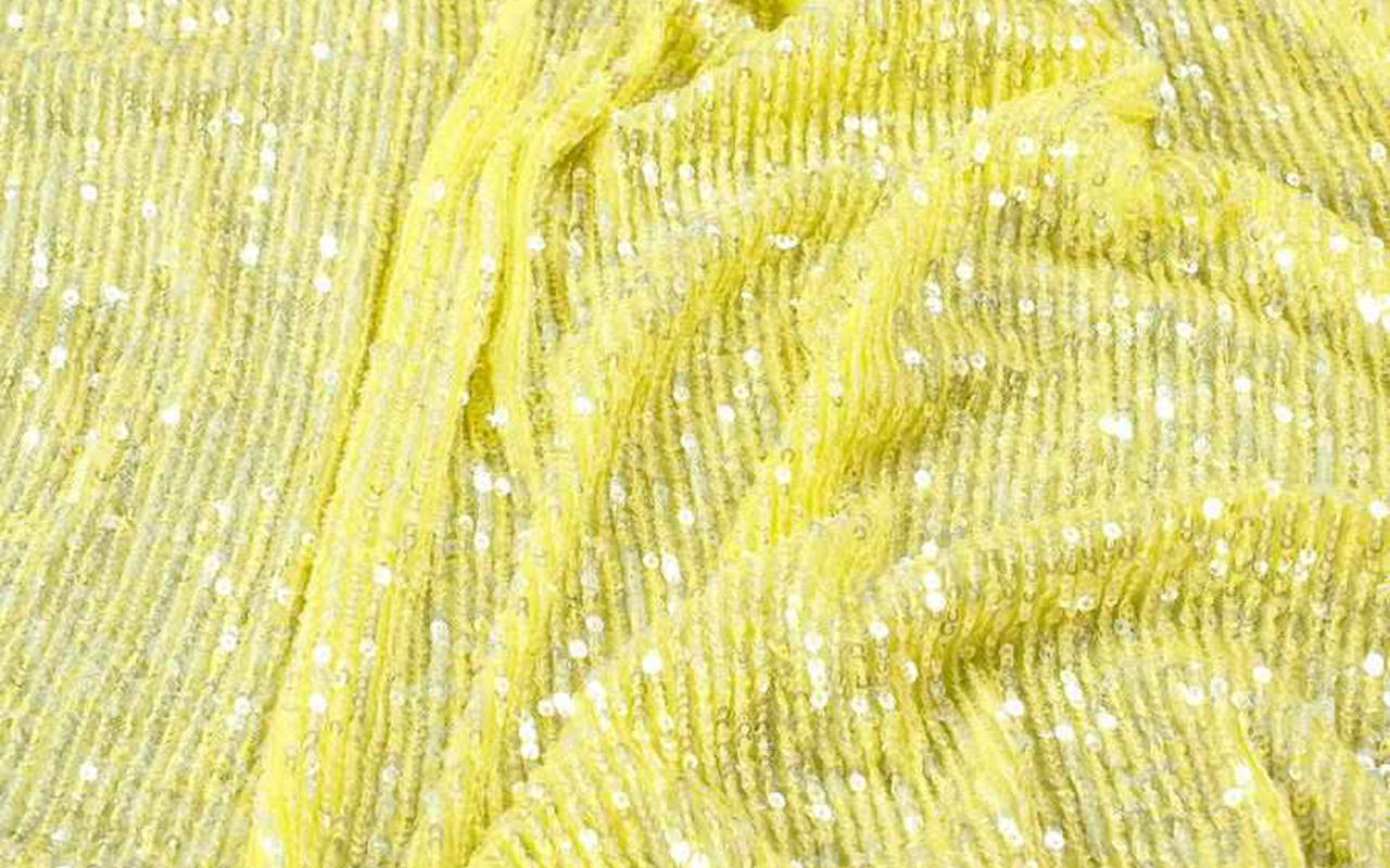
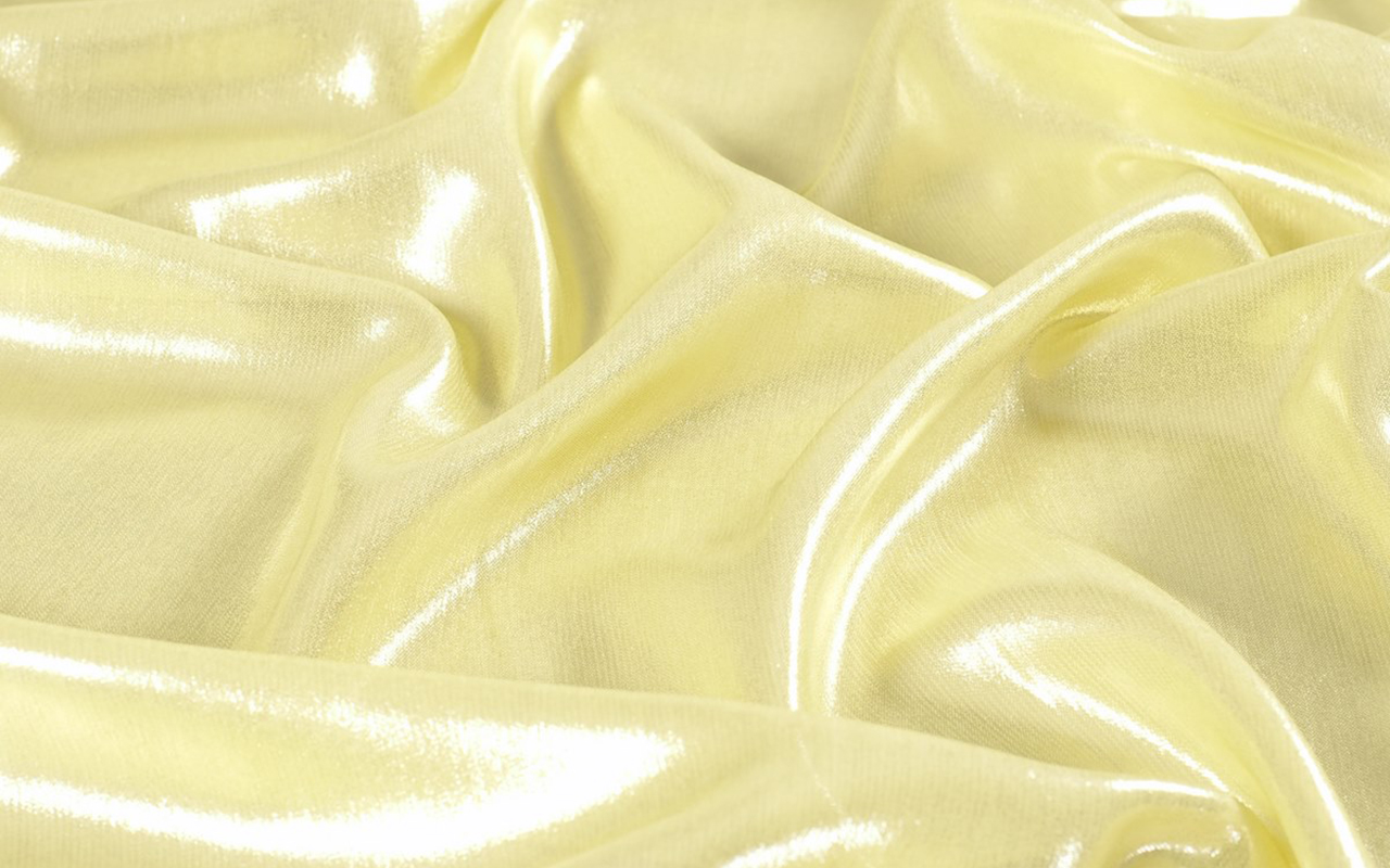
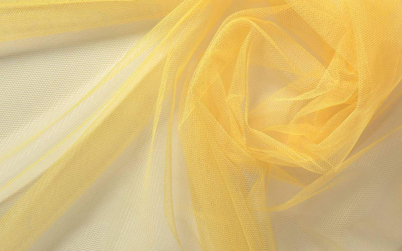
If there’s one place where butter yellow truly unleashes its potential, it’s in fabric. Its chromatic softness demands materials capable of delicately reflecting light, without losing body or definition. It’s a colour that doesn’t tolerate flatness: it requires textures, nuances, and structures that make it vibrate with every movement.
In drapey fabrics—such as satin silk, crepe, cotton voile , or embroidered tulle—it takes on an ethereal air, perfect for ceremony dresses, flowing pieces, or signature shirts. In more technical bases like mikado, taffeta, or lightweight nappa leather, it gains strength and sophistication, ideal for structured suits, capes, or details with sculptural volume.
Butter yellow also works surprisingly well in textured fabrics: floral jacquards, tonal embroidery, subtle lace, even in versions with an iridescent or dry sheen effect, providing richness without being too strident.
At GratacĂ³s we interpret it as a colour that doesn’t need to raise its voice to be noticed. It connects with honest design, with a personal perspective, and with sensitivity in the choice of materials.
And if you’re looking for inspiration…
Explore our selection of butter yellow fabrics in our online store: designs that combine softness, sophistication, and character to create timeless pieces with a contemporary soul. Because sometimes, the power of colour lies precisely in its delicacy.