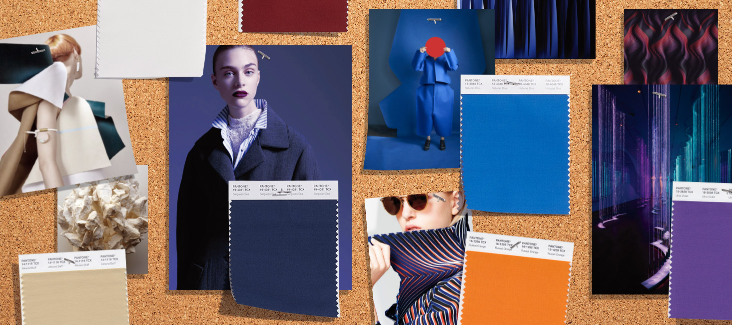
This autumn is especially colourful, with saturated and bright shades that radiate strength and energy for the darkest months of the year, where it is usual for neutral ranges and pale tones to predominate. Now it is just the opposite!
First it was the neon colours, then orange as a transition between summer and autumn and now there are other shades within the colder palette ready to take over. According to a Trends Report from Pantone (the international colour authority), the colours for Autumn-Winter 2018 “express our need for individuality, ingenuity and creativity”. They are unexpected autumnal tones that are complemented by more traditional ones that radiate this desire to break with the seasonal structures. The same report points out that they are “expressive colours that reinvent the history of seasonal colour and allow fashion to play with art and originality”.
Here we reveal four colours that illuminate the looks of autumn and that have already been seen on the catwalks:
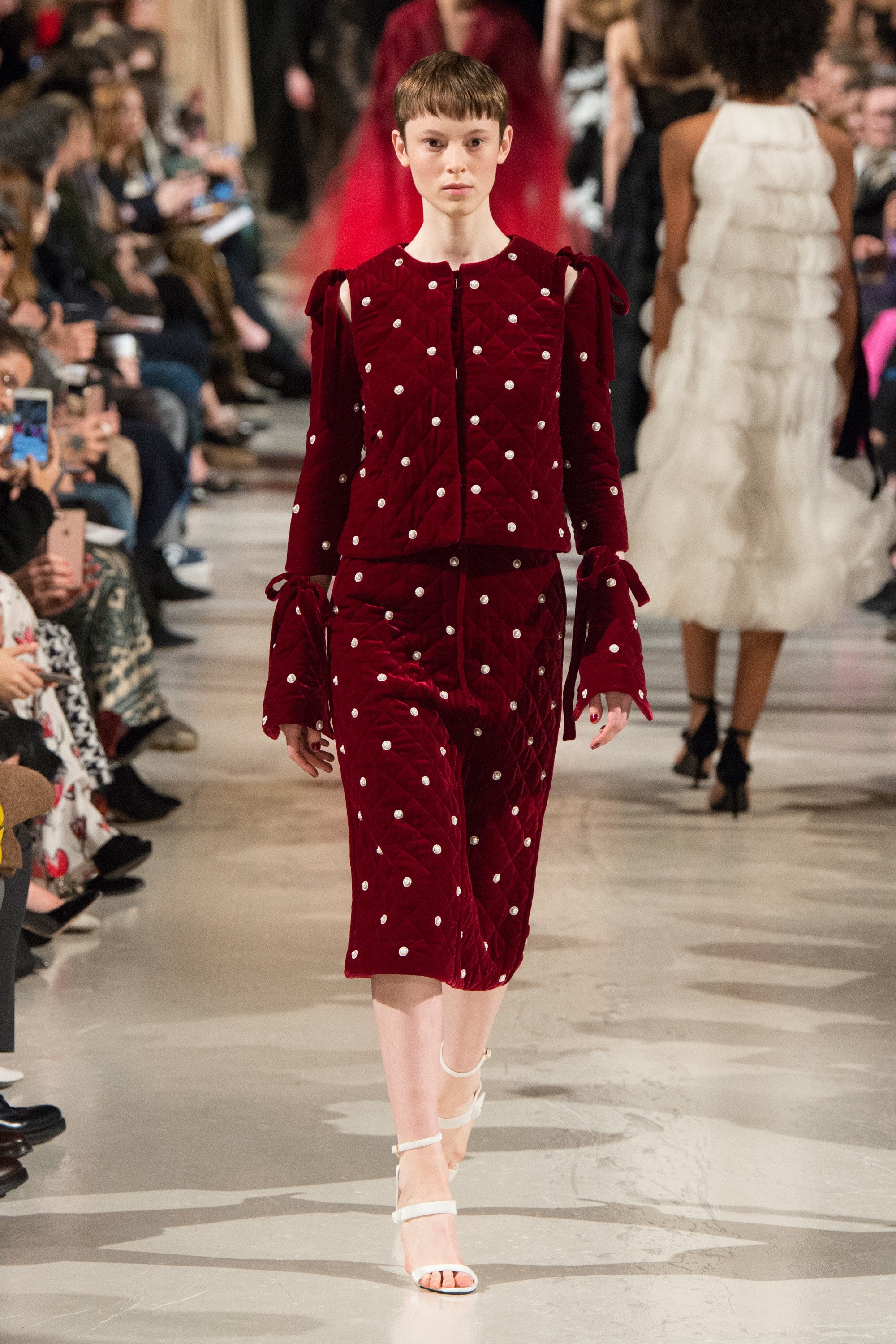
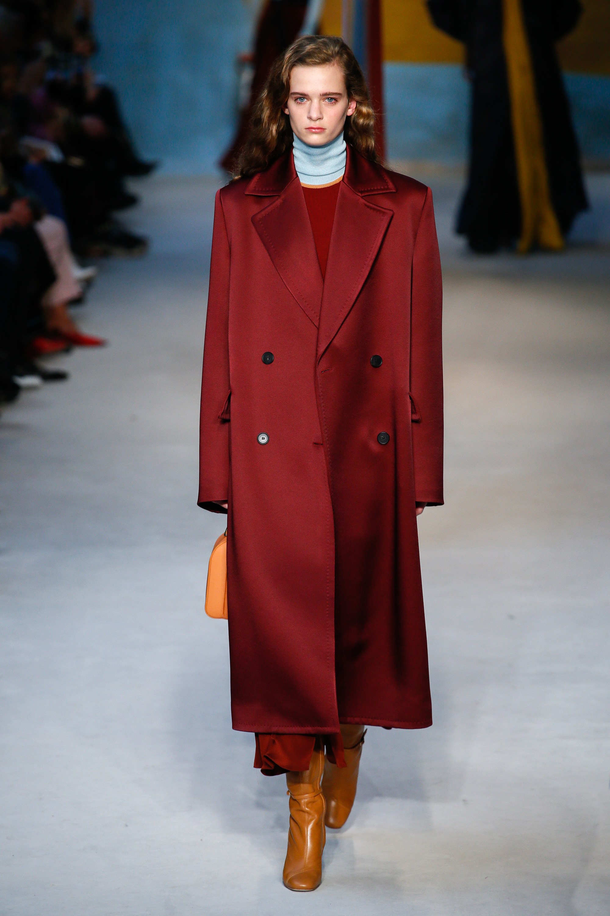
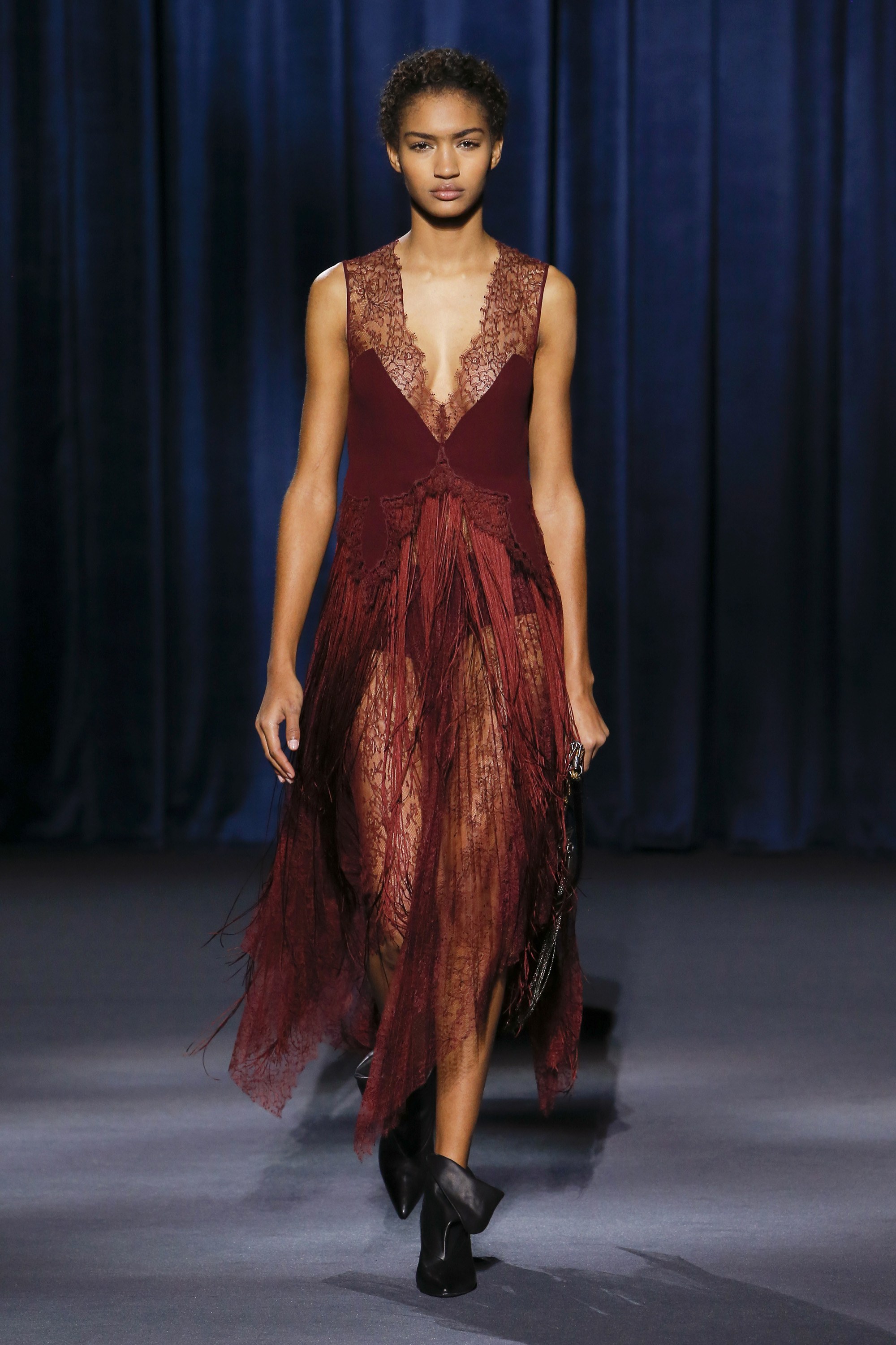
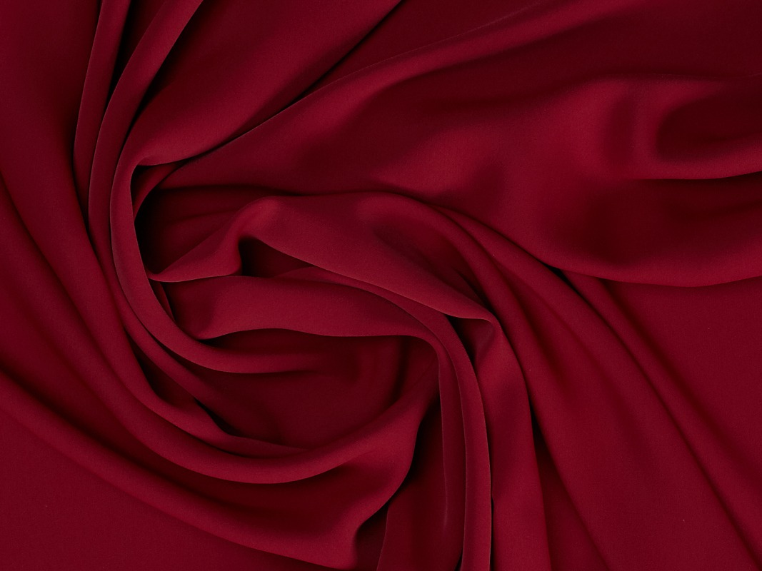
1.- Red Pear
 |
 |
 |
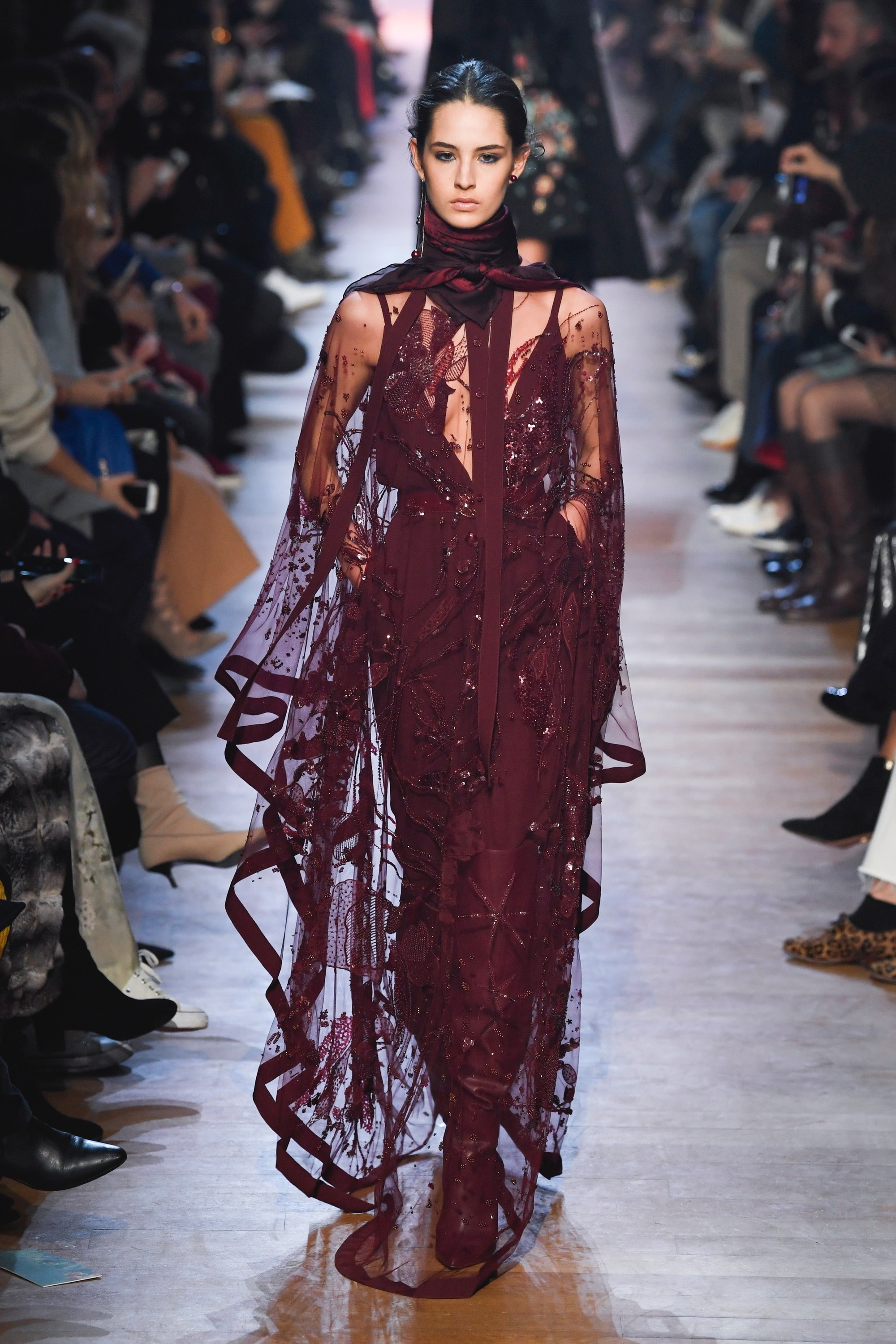 |
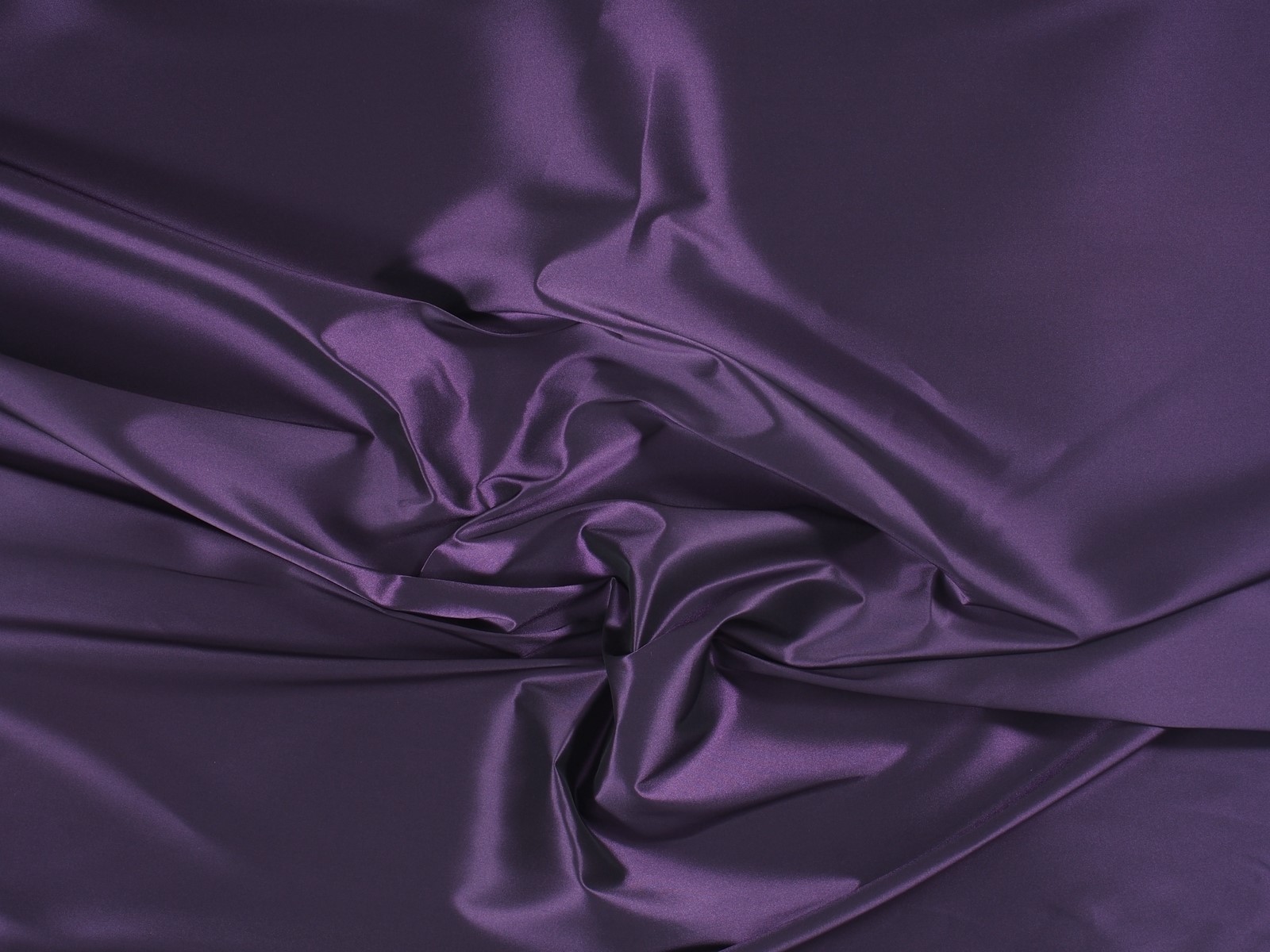
This red is the most appealing of the palette and perhaps also the most classic of the fashionable colours. Red Pear is an intense and delicate red that attracts by its exquisite depth. It is a seductive color (reminiscent of burgundy), which admits a great variety of shades and in fabrics it appears frequently thanks to its versatility with fully evocative reliefs and textures. Companies suach as Elie Saab , Bottega Veneta , Roksanda , Givenchy , Lanvin or Oscar de La Renta have incorporated this shade tone into their autumn collections, creating easy-to-match looks.
 |
 |
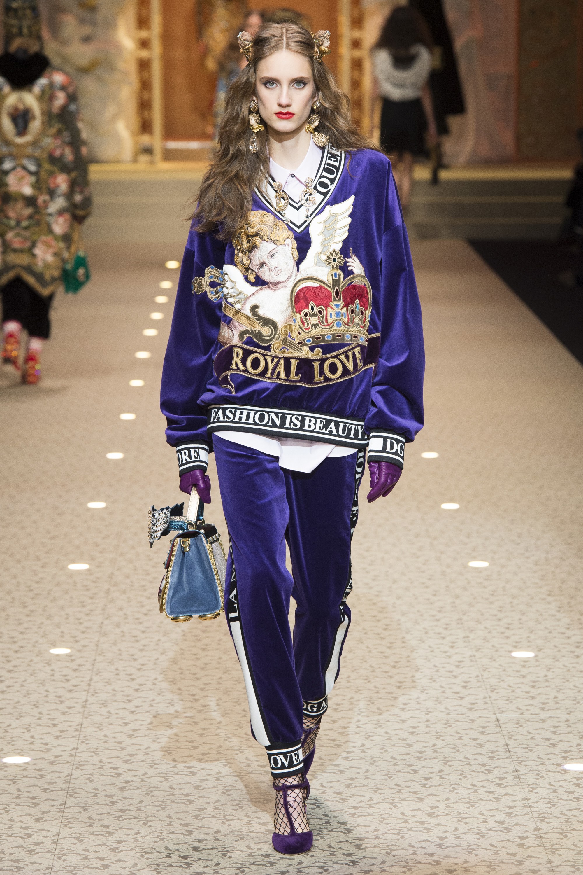
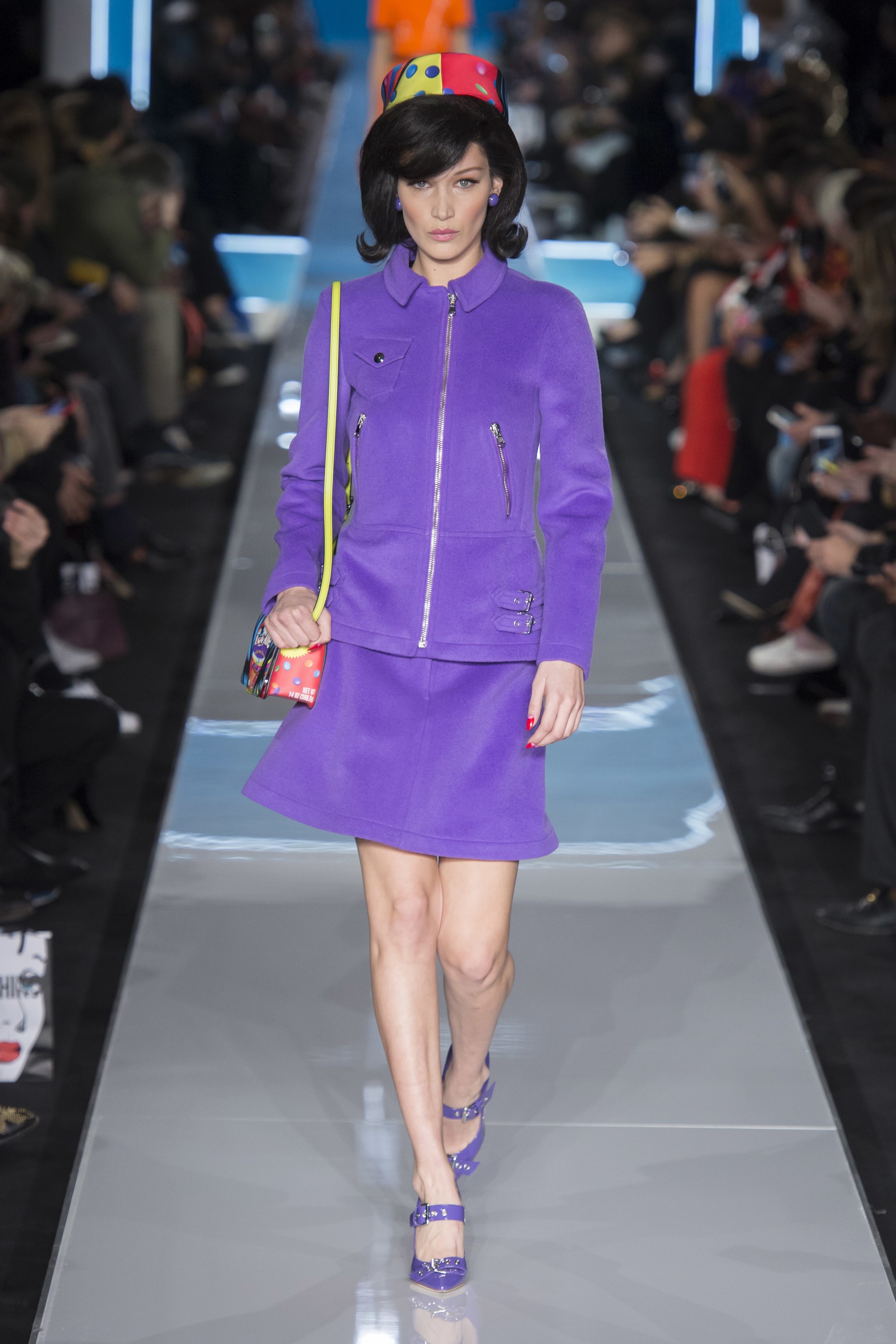
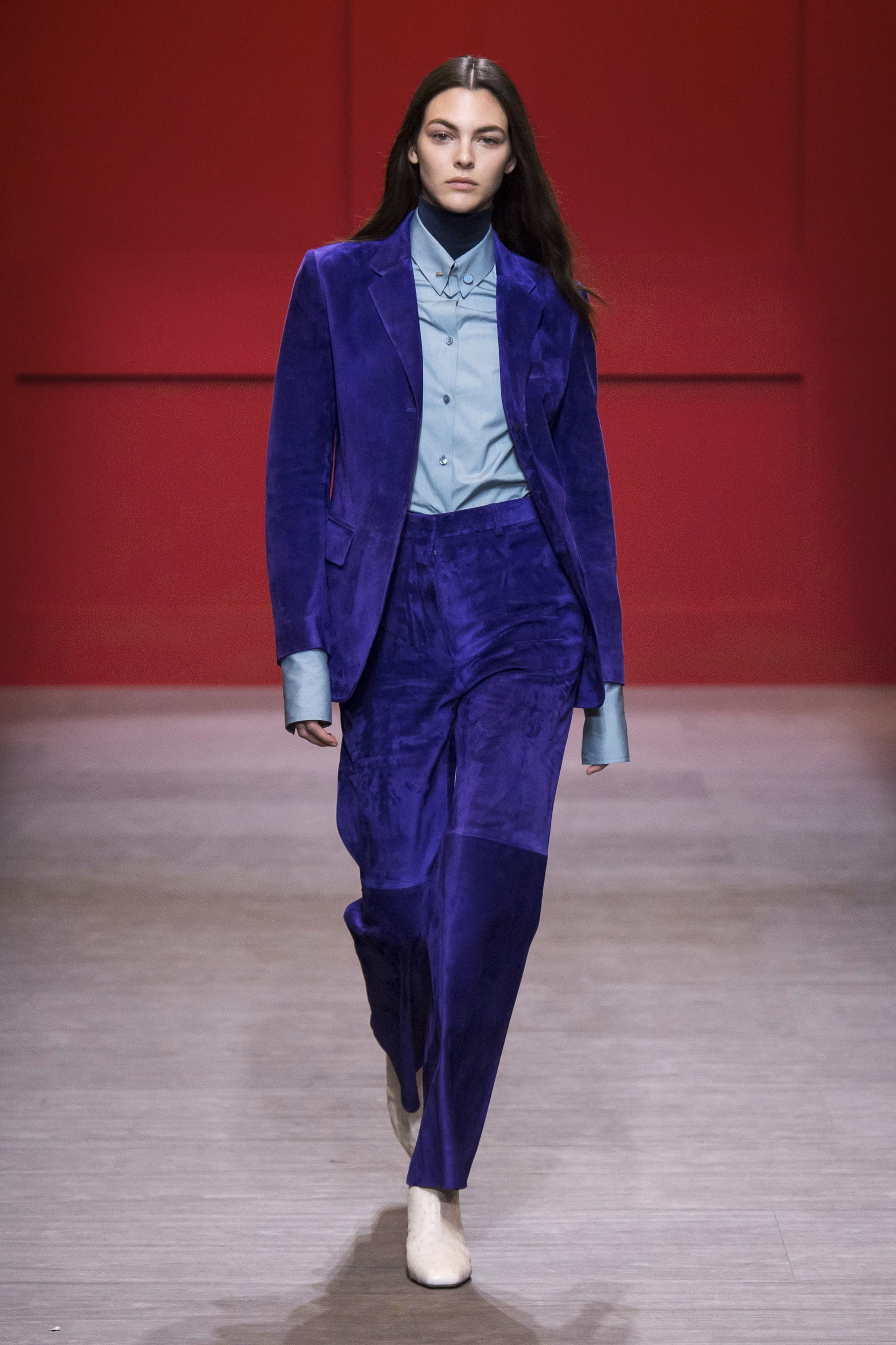
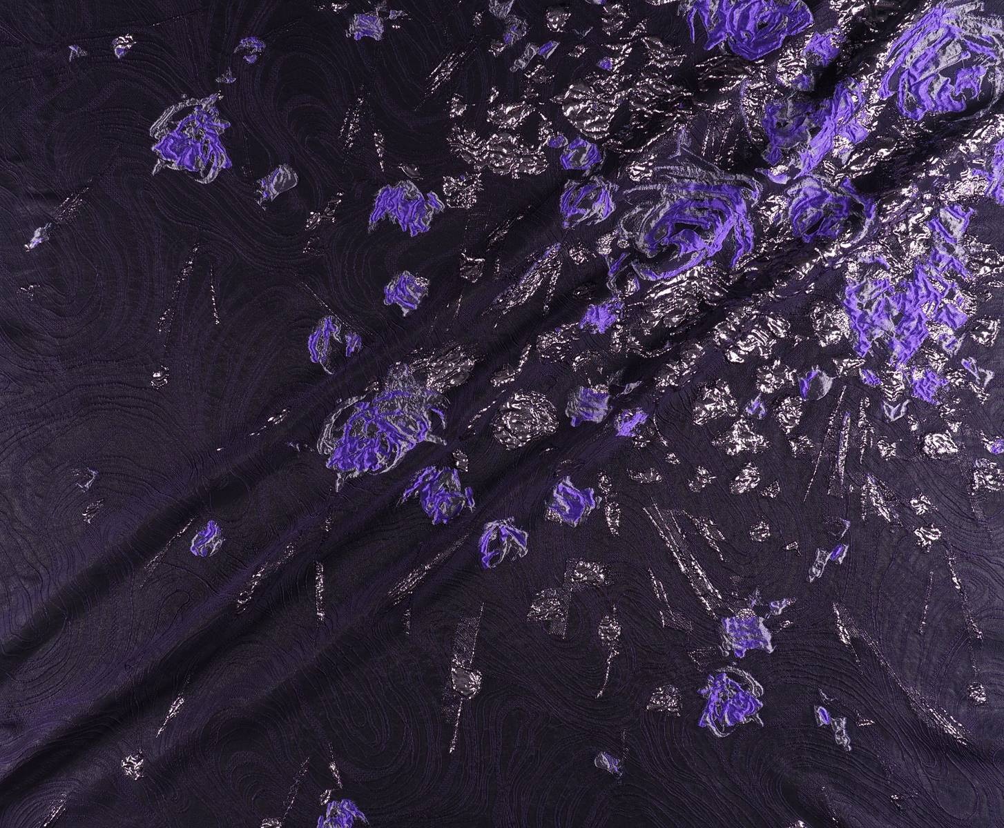
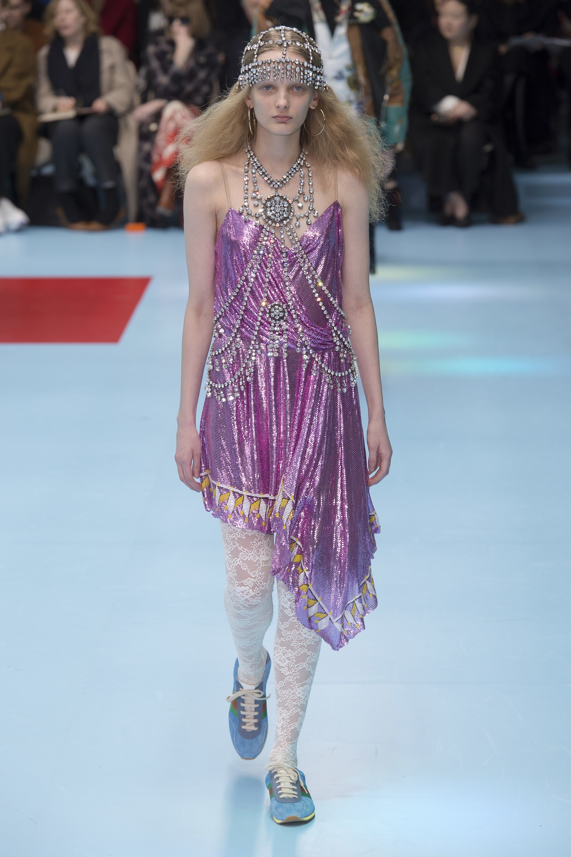
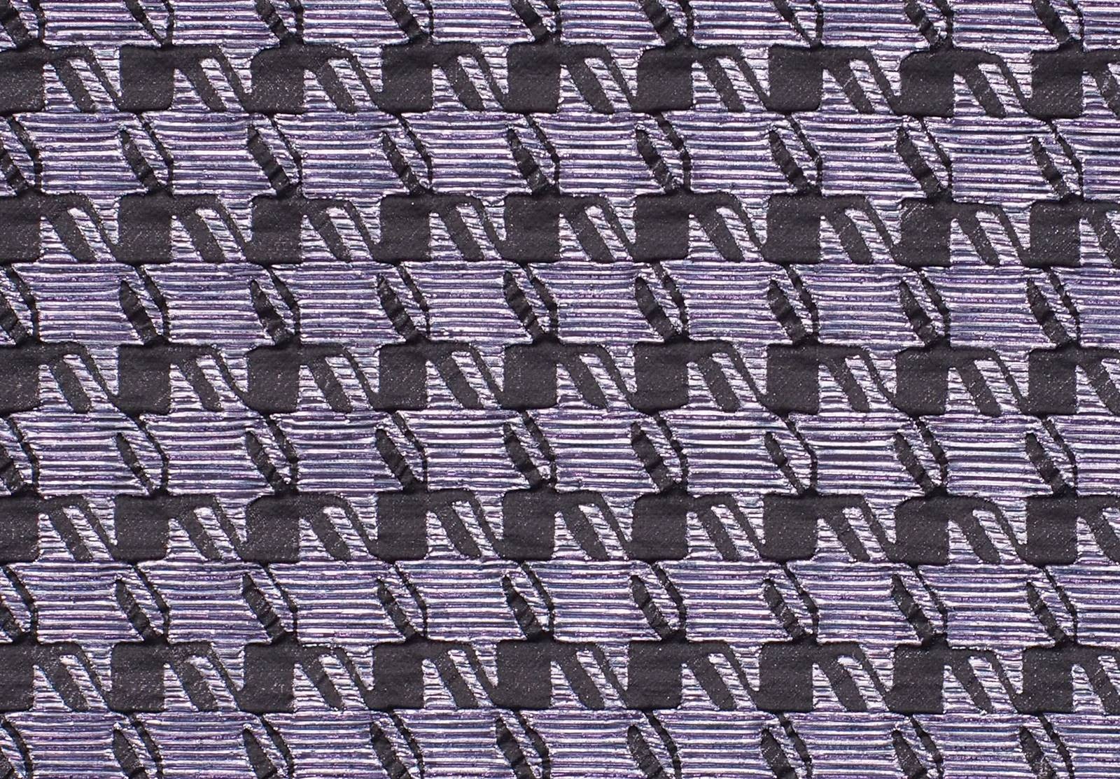
2.- Ultra Violet
 |
 |
 |
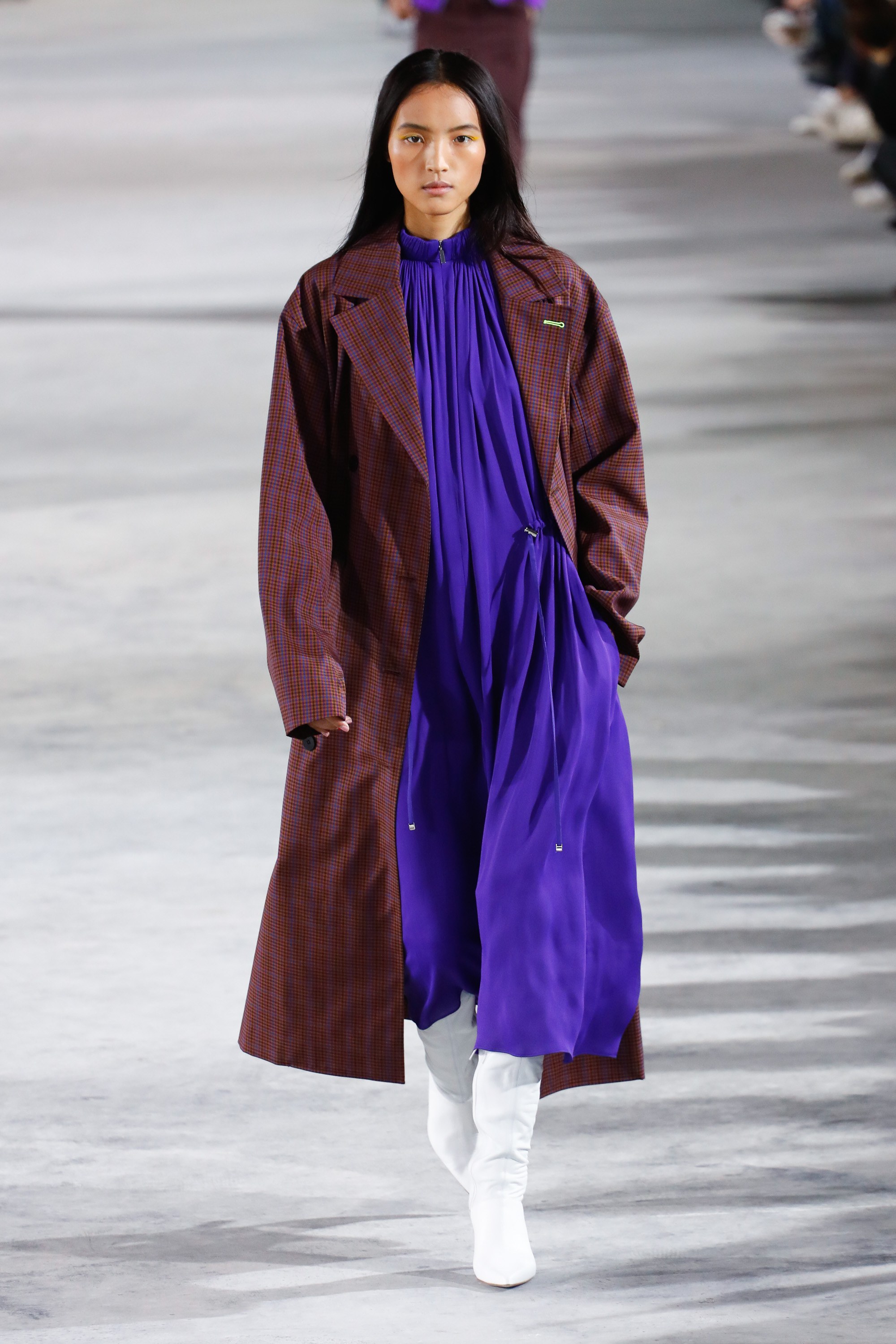 |
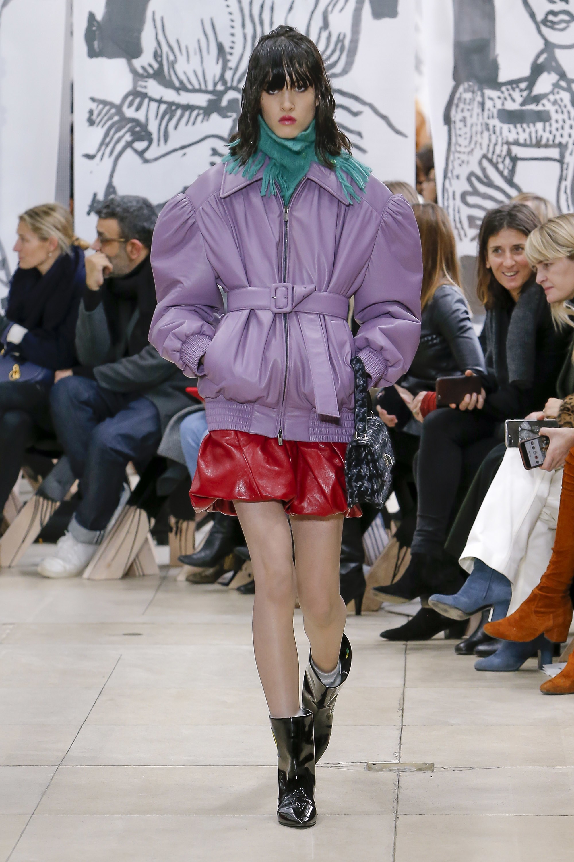
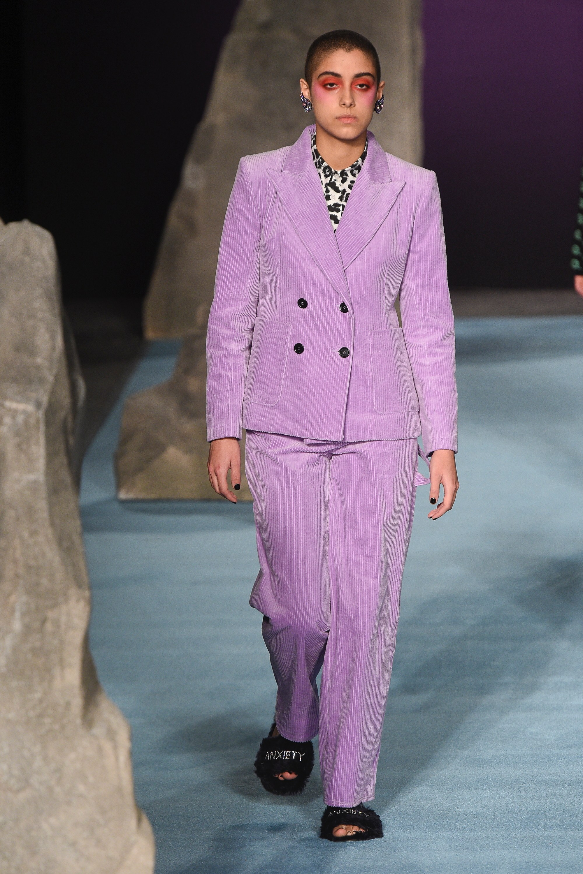
This tonality is more present in our minds because Pantone chose it as the colour of the year 2018. Whilst we thought it was merely a passing mention, this radiant hue of violet appears in all its splendour in the autumn collections. It is a bold tone linked with creativity and imagination. In fabrics such as velvet Ultra Violet acquires a more sophisticated side, although it also suits floral embroidery and Jacquard. On the catwalk companies such as Moschino, Tibi, Salvatore Ferragamo , Marni or Dolce & Gabbana have shown daring with this variety of violet.
 |
 |
-
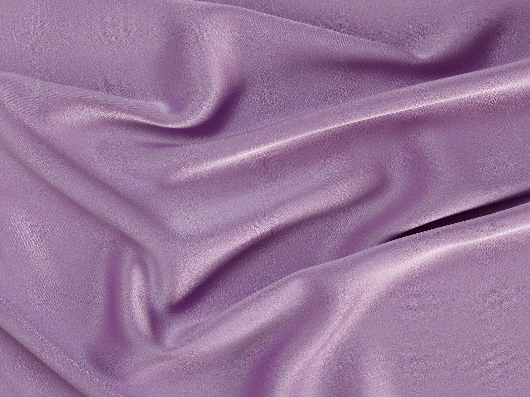
Crocus Petal
 |
 |
 |
 |
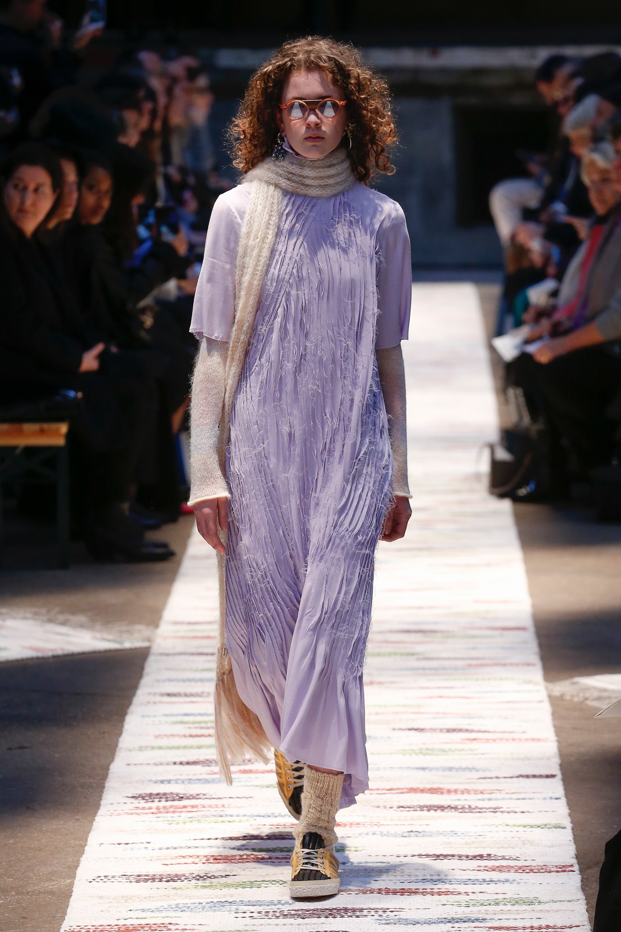
We continue with violet shades by focusing now on their softer version. Crocus Petal, according to Pantone is “a cultivated and refined shade that brings a feeling of lightness”. It is a very feminine pastel tone that softens traits and stands out from the rest for its unique character, a colour which enhances movement and which in fabrics can be appreciated very well on soft, smooth textures and with slight reflections. On the catwalk Crocus Petal has been seen in designs by Acne Studios, Miu Miu and Ashley Williams.
 |
 |
-
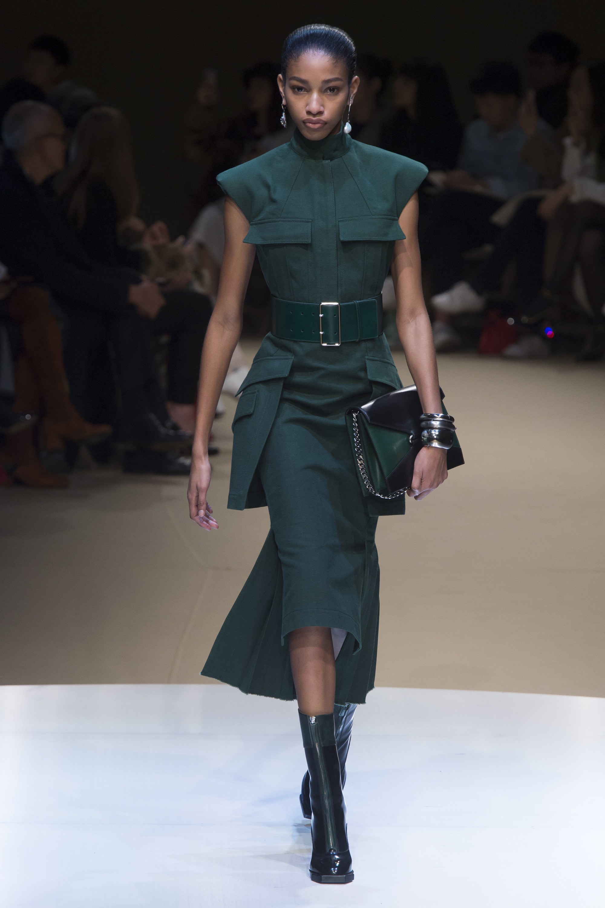
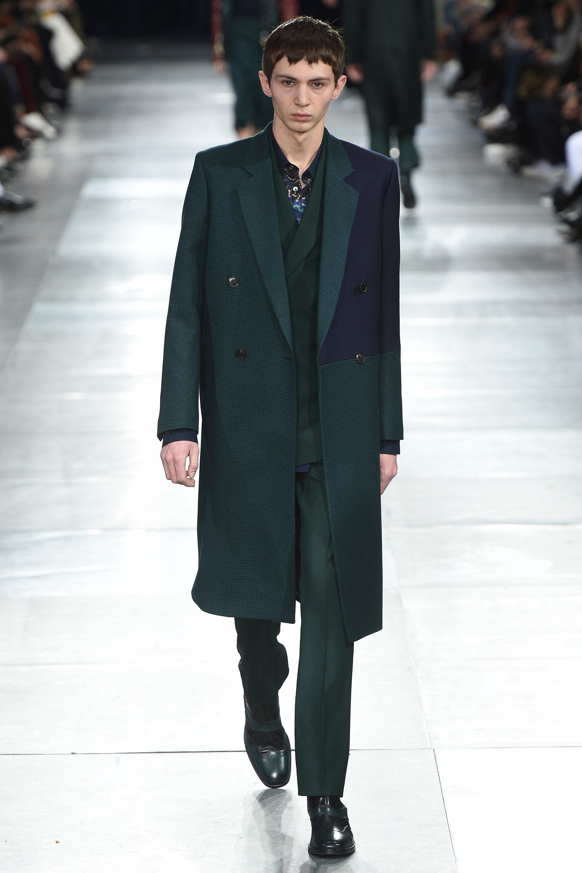
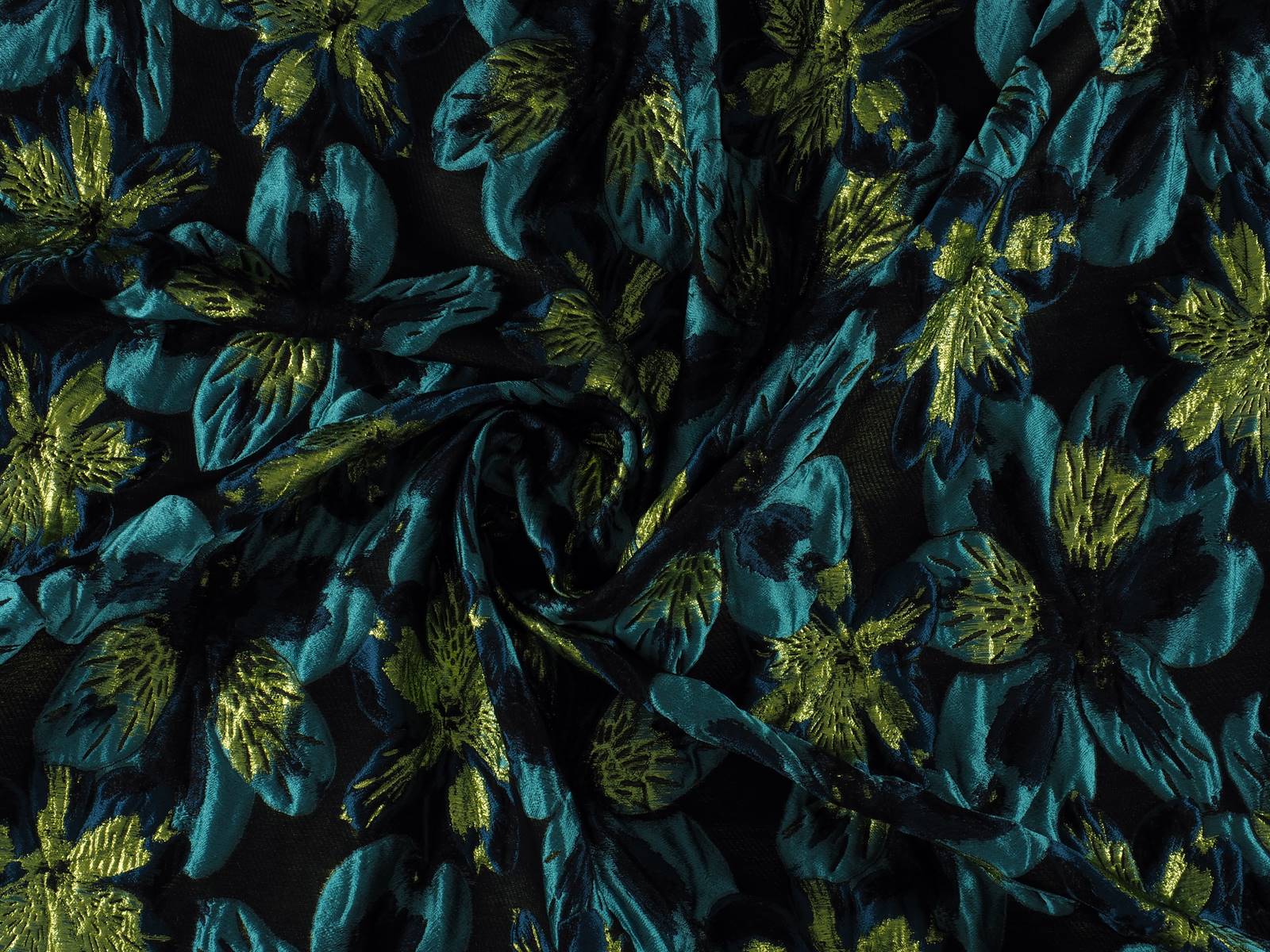
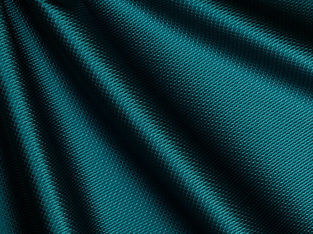
Quetzal Green
 |
 |
 |
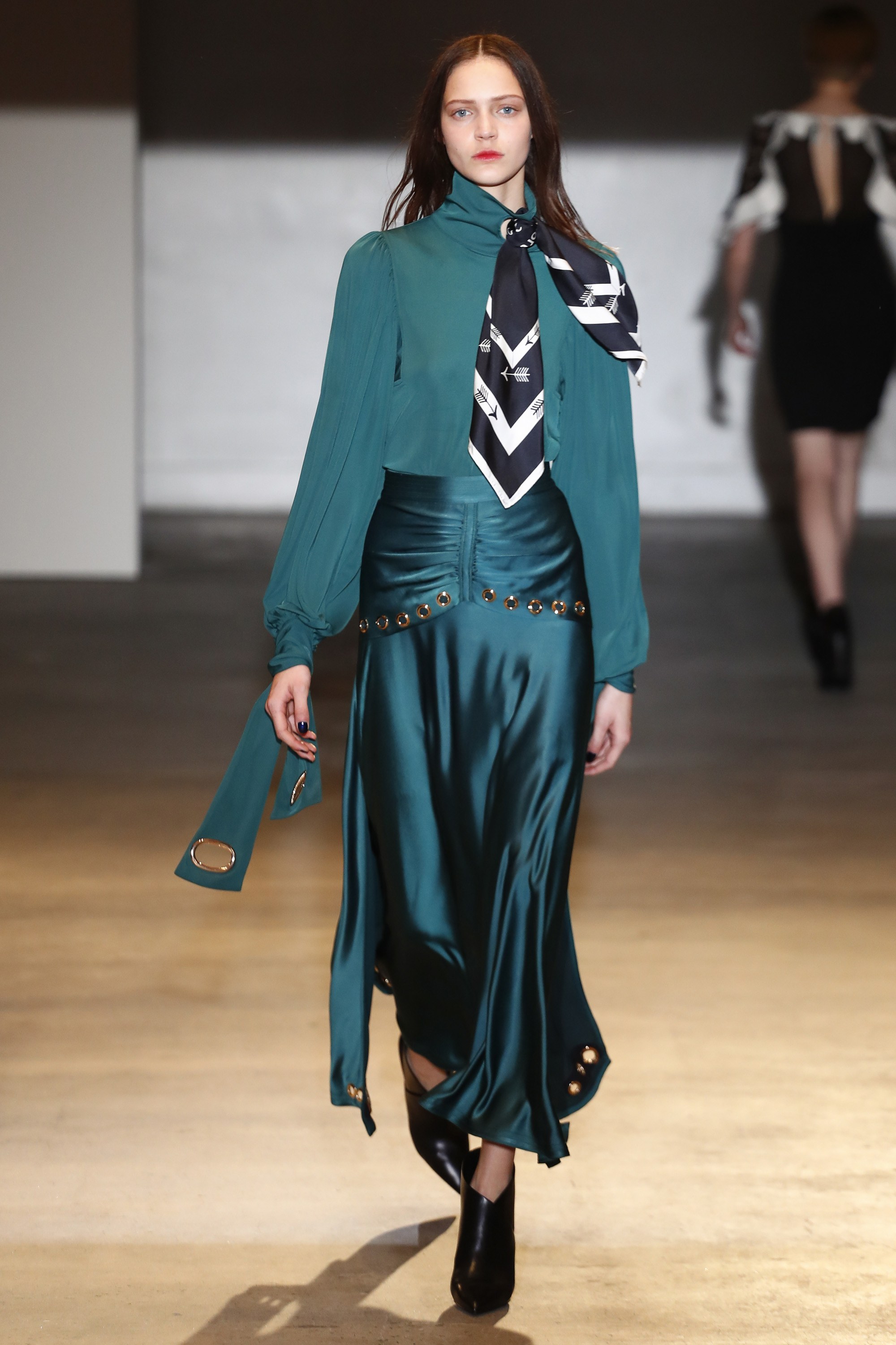 |
Deep, evocative, sophisticated … this shade of greenish blue is simply breathtaking. It is a colour that abounds in nature in certain bird plumages which stand out against females of the same species: ducks, peacocks … It is a beautiful mix of deep blue and turquoise that aligns with elegance and that allows practically all the textures that highlight the nuances of this rich colour. On the catwalk companies such as Alexander McQueen, Alberta Ferretti, Paul Smith or Self-Portrait have all given full expression to Quetzal Green.
 |
 |