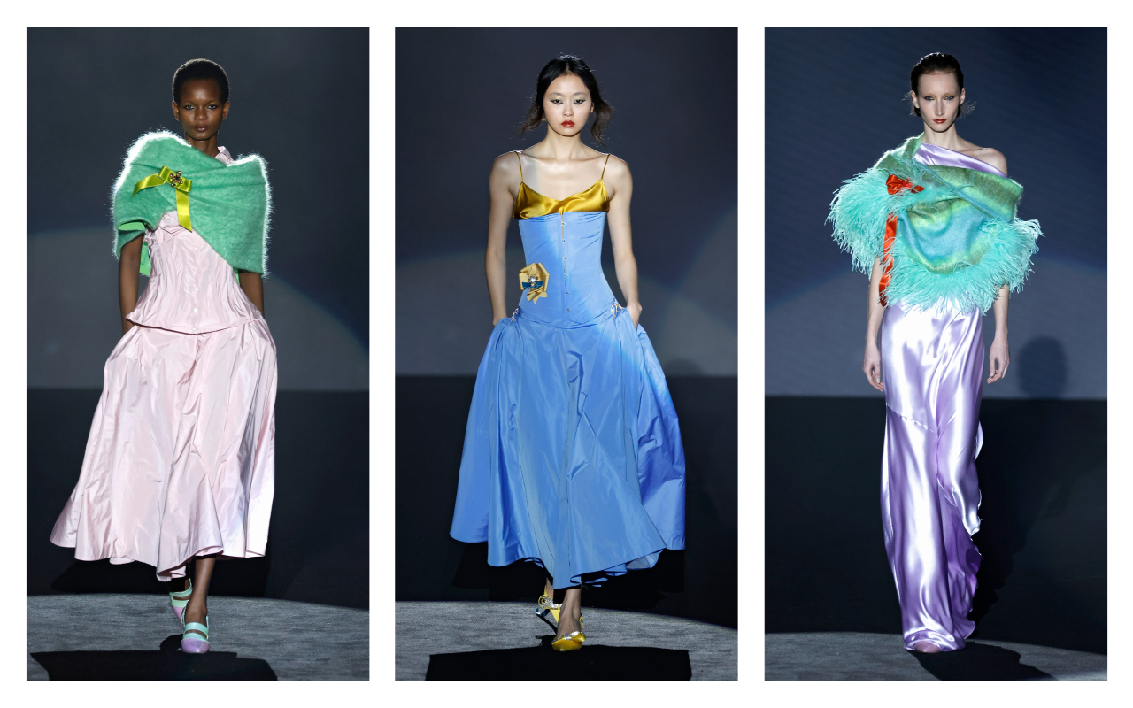
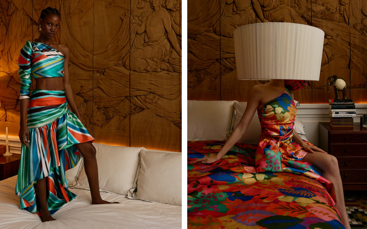
 Collection 2025 Mariano Moreno
Fashion contradicts itself, and that’s part of its charm. Today we no longer live in linear cycles where one trend replaces the previous. Opposing styles coexist in the same season, broadening the creative spectrum. And that’s precisely what’s happening this summer. While the colour palette focuses on the softness of pastel tones and powdery hues, prints do just the opposite: they scream. They’re dressed in colour, energy, and excess.
Maximalism is making a strong comeback, taking over fabrics with a clear attitude: fearless, unfiltered, and without asking permission. And at GratacÃģs , where we’ve always celebrated contradictions as a creative starting point, we embrace it with enthusiasm.
2025 invites us to dream big. No discretion. Bold, vibrant, and artistically inspired prints become allies of designers, interior designers, and style lovers who shun the predictable. Monumental florals, abstract brushstrokes, unstable geometries, and lines of colour with a retro soul invade runways, salons, and streets with a new intensity.
It’s the era of the visual statement : dressing not just to be seen, but to speak volumes. Below, we review three major print trends that will define the SS25 season.
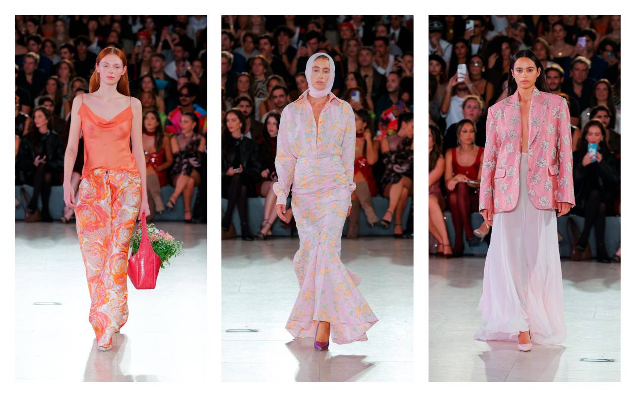 SS25 Gonçalo Peixoto
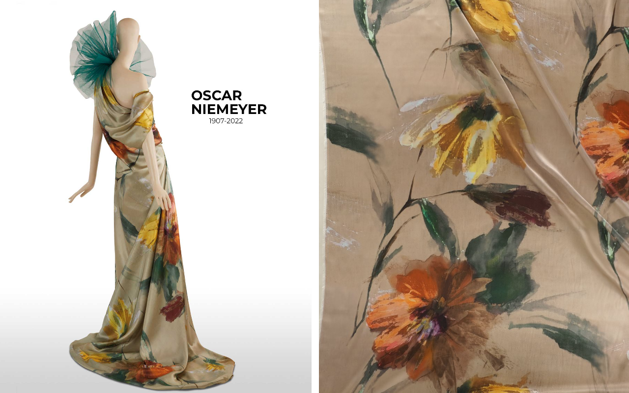
XXL Flowers: The garden overflows
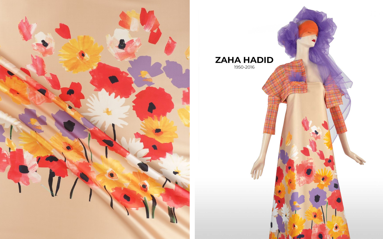
This season, an exaggerated, wild, and profoundly contemporary botanical style flourishes. Floral motifs expand, distort, and reclaim their space with a visual exuberance that leaves no one indifferent. Think of artistically drawn peonies, saturated-hued hibiscus, or oversized tropical leaves: shapes that expand across the fabric as if alive, freed from any classic contours.
Ink stains merge with the background, contours drawn with expressive lines, overflowing watercolour effects, blurred shadows, black and white montages with colour accents, or compositions that look like they’ve come from a digital herbarium. Anything goes, as long as it’s bold, showy, and excessive. It’s a new floral language: more abstract than literal, more expressionist than decorative.
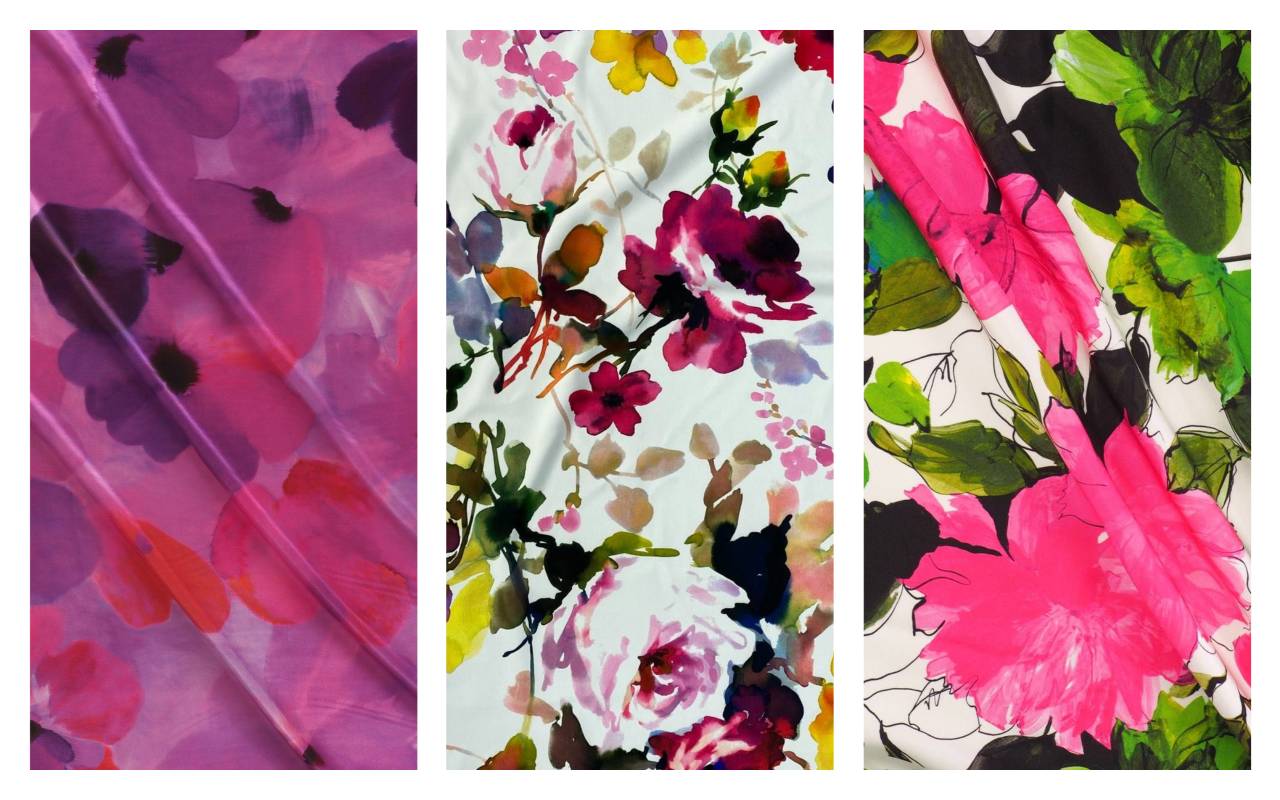
These prints find their best ally in fabrics with body and movement: gauzy organzas, satiny cottons, fluid silks, or embossed jacquards. Materials that allow colour to breathe, shapes to expand, and the garment to become a moving garden.
At GratacÃģs, this trend comes to life through large-scale floral fabrics with artistic prints and finishes that enhance the vibrant colours. Ideal for statement pieces that celebrate vitality, emotion, and unrestricted modernity.
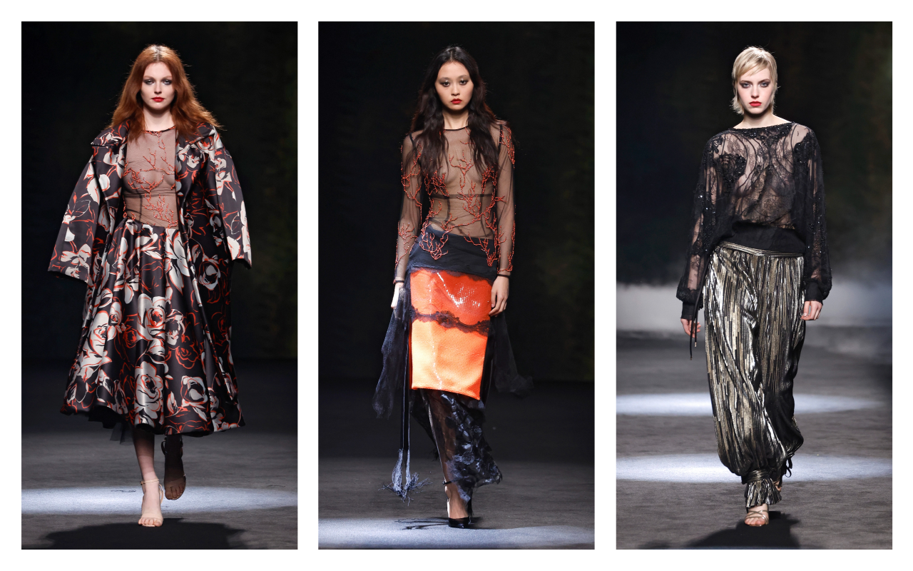
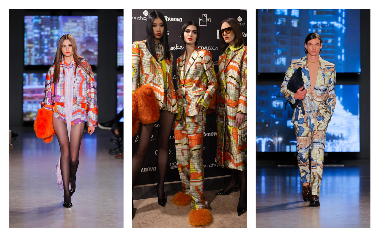 AW25/26 Carlos Gil
Abstract art and free geometry
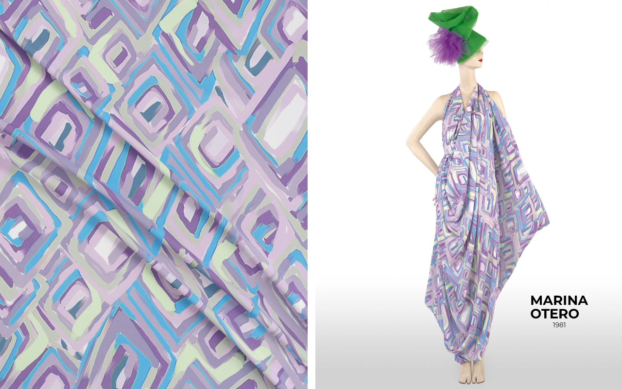
Not every print needs a flower. Sometimes a gesture is enough. A loose stroke, a splash of colour, a line that curves or breaks. In 2025, fabrics become living canvases where abstraction and geometry come together to create compositions full of rhythm, texture, and emotion.
Spontaneous brushstrokes, watercolour splashes, shapes reminiscent of action. Painting or sketchbook graphics: print art abandons figuration to focus on gestures. This trend coexists with another trend that is gaining strength: irregular and graphic geometries, as if drawn freehand. Imperfect grids, repetitive blocks interrupted by voids, floating dots, circular connections, or divisions that decisively break classical harmony.
The result is a new generation of prints where visual emotion replaces ornament. A balance between the technical and the poetic, between mathematical structure and deliberate imperfection.
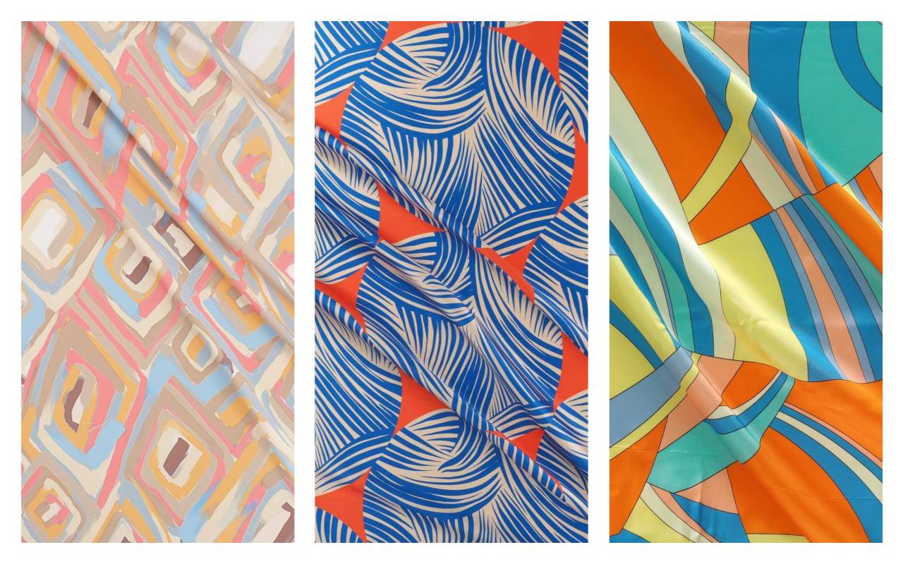
These prints work especially well on fabrics that allow the design to flow: soft twills, drapey crepes, full-bodied viscose fabrics, or satin silks where the colour vibrates more deeply. They’re perfect for flowing garments, statement shirts, or loose-fitting pants that move with their own flow.
At GratacÃģs , this trend translates into fabrics with abstract prints and contemporary graphics that appear hand-painted or structured with imperfect precision. These designs stimulate creativity and allow you to play with pattern as a starting point for a distinct visual story.
 SS25 Mariano Moreno
Stripes, nostalgia and graphic pop: the most vibrant revival
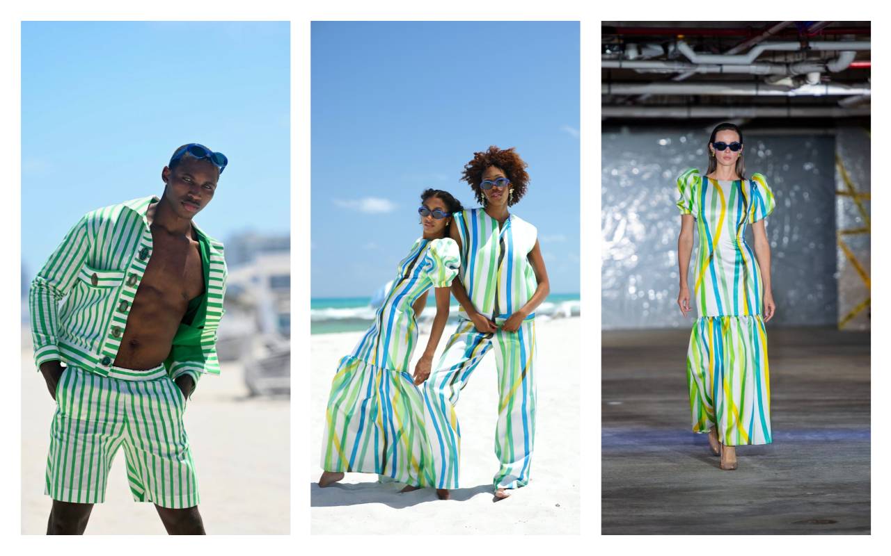
Stripes have never been around, but in 2025 they’re back with a new visual energy. They’re no longer discreet or sober. Now they’re widening, curving, and crisscrossing. They’re dressed in vibrant colours, overlapping fearlessly, drawing inspiration from the aesthetics of the 60s and 70s and blending with influences from contemporary graphic design.
This revival brings with it a visual joy that is expressed through candy Stripes , acidic palettes, deliberately clashing colour combinations, abstract lines that blur in motion, or compositions reminiscent of industrial graphic art. Motifs that look like they’ve been taken from a beach blanket, a circus tent, or a pop silkscreen poster.
The visual impact is immediate, but also structural. These stripes act as a reading direction: they lengthen, widen, or redraw the silhouette. In some cases, they even generate optical effects that merge body and pattern into a single visual architecture.
The ideal fabrics for this trend are those that offer crisp lines and rich colour saturation: technical cottons, multicoloured jacquards, structured poplins, or graphic satins that combine body and shine. There are also more relaxed versions in linens or rayons, perfect for summer garments with personality.
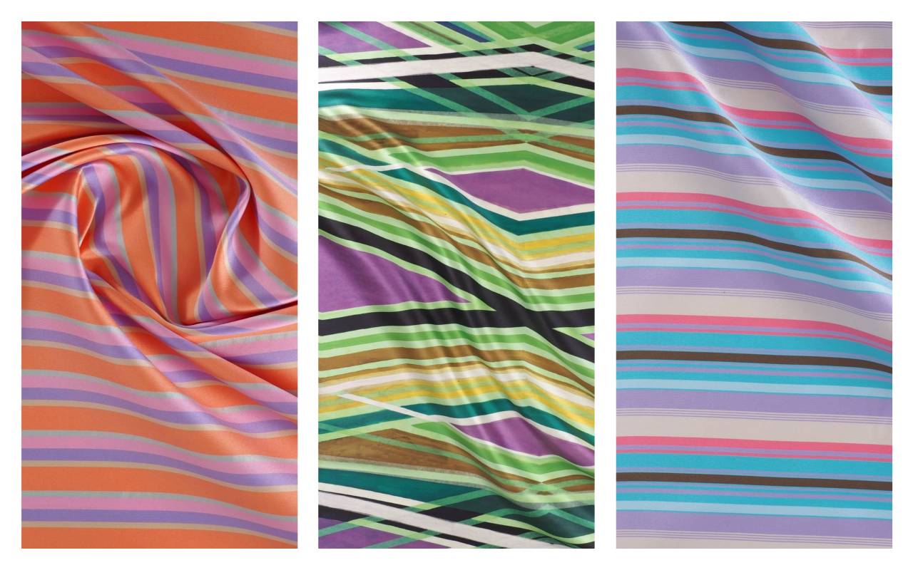
At GratacÃģs, this trend is embodied in striped fabrics with a vintage feel and colour combinations that play with harmony and contrast. A meeting point between nostalgia and contemporary design, designed for designers seeking rhythm, character, and their own graphic style.
In a summer where prints take centre stage, florals explode, lines create new narratives, and retro graphics make a strong comeback, fabrics become a tool for limitless expression. Because if this season reminds us of anything, it’s that dressingâand creatingâis also a way of taking a stand.
Welcome to a summer that’s anything but boring!
Bowie & Sukita Exhibition at Fotonostrum Gallery
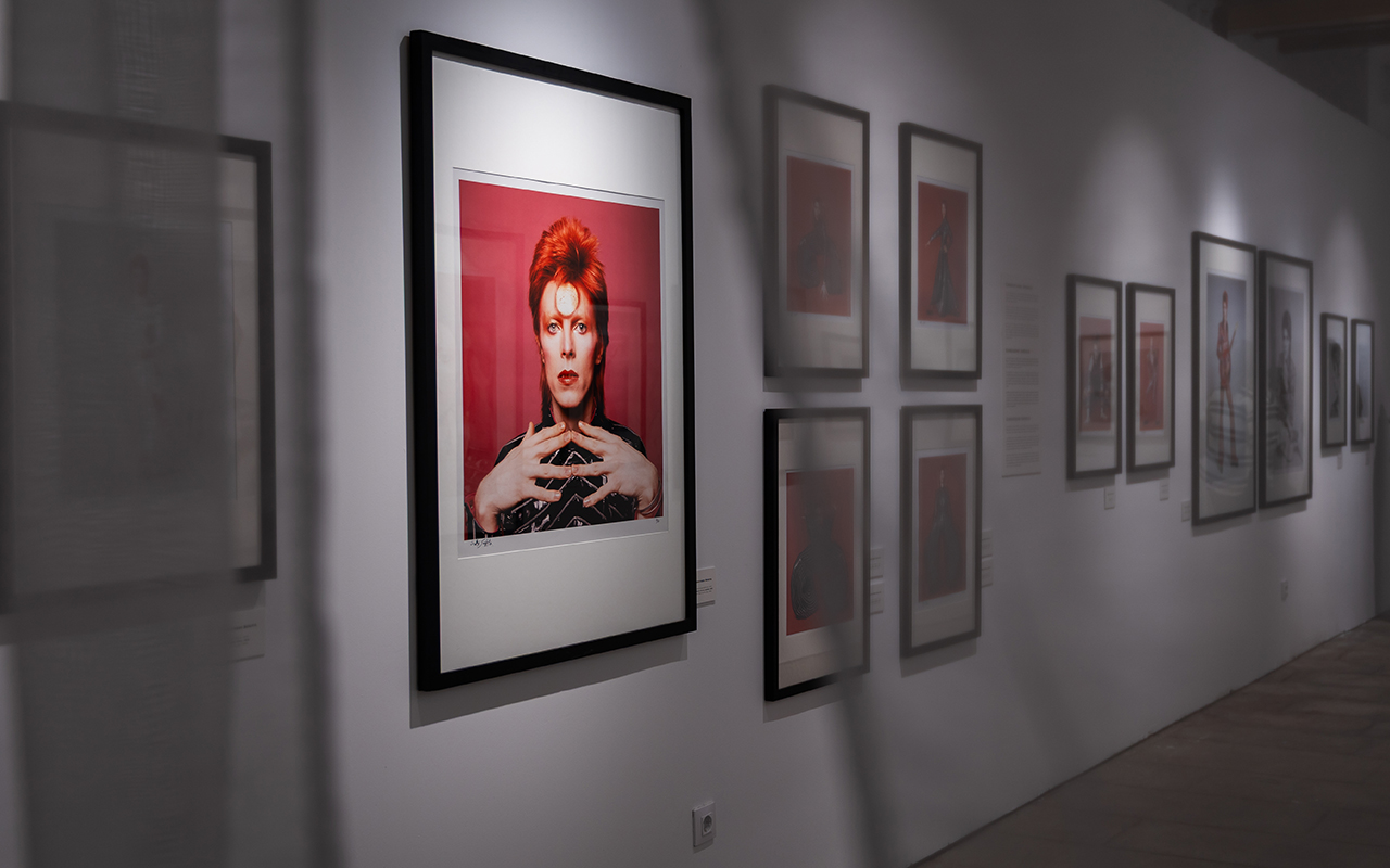
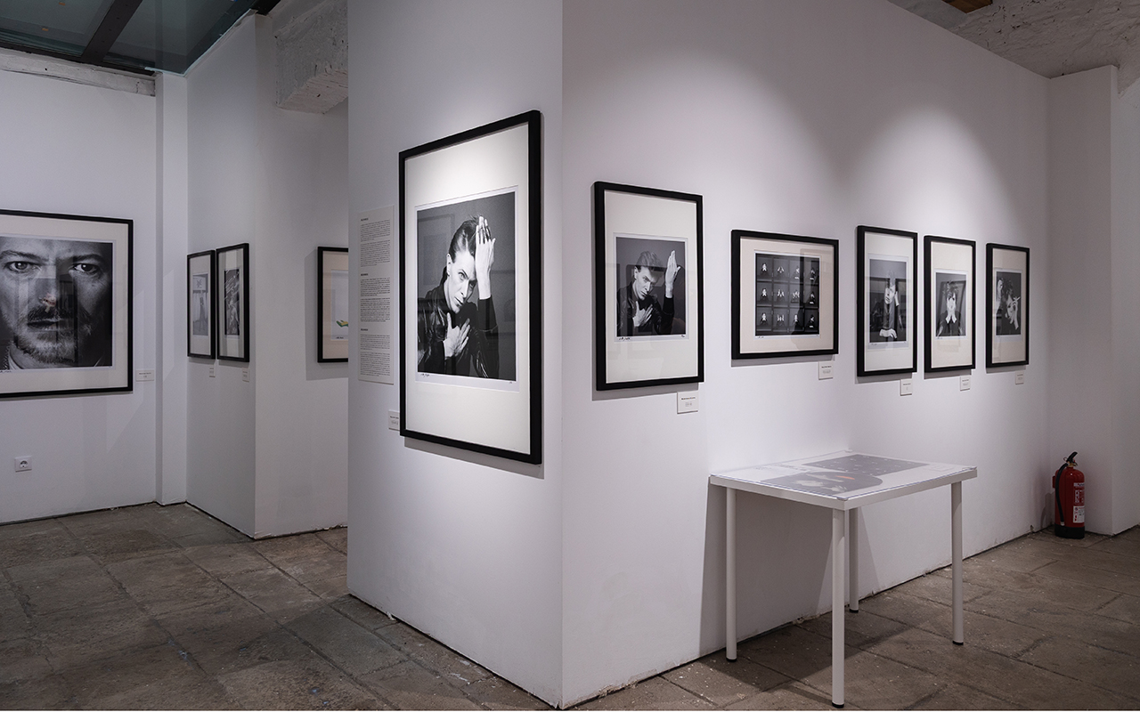
There are artists who change their skin. David Bowie collected them all. Beyond his musical legacy, his image was a constantly evolving work of art. His wardrobe was his armor, his manifesto, his mirror. And photography, the medium that immortalized each transformation. The Bowie x Sukita exhibition, which can be visited at the FotoNostrum gallery in Barcelona until 15th September, invites you to immerse yourself in this chameleon-like universe through more than 70 iconic images captured by Japanese photographer Masayoshi. Sukita , one of the great witnesses of his metamorphosis.
Curated by the Italian group Ono Arte, this intimate and visual exhibition draws a direct line between Bowie’s aesthetic and his artistic restlessness. From his beginnings as Ziggy From Stardust in the 1970s to his later years, each selected image reveals a new incarnation of the artist. Sukita ‘s lens remains with him for more than four decades: she observes him, understands him, follows him. And in return, Bowie offers her more than just poses. He gives her a developing persona that metamorphoses at each stage and, without the need for wordsâ Sukita didn’t speak Englishâbuilds a profound bond between artists.

Down of Hope, 1973 ÂĐ Photo by Sukita
A relationship sealed by the image
Their first contact arose sporadically in London in 1972, when Sukita traveled from Japan to photograph Marc Bolan of T-Rex and ended up meeting Bowie at one of his concerts. That first meeting marked the beginning of a sustained collaboration, which would give rise to one of the most recognizable images of the 20th century: the cover of the album Heroes (1977). But beyond this graphic icon, what emerges in this exhibition is the complicity between two creators who understand each other through intuition and silence.
In the images, we see Bowie as we knew himâradical, provocative, etherealâand also as we’ve never seen him before: serene, introspective, almost domestic. The exhibition also includes lesser-known photographs taken in Japan, a country that inspired the artist with its refined aesthetic, symbolic theatricality, and visual culture. These scenes exude a different calm, a more deliberate Bowie, but just as magnetic.
Costume as a narrative
Bowie never dressed casually. Each outfit was a statement of intent. His wardrobe oscillated between futurism and nostalgia, androgyny and exaggeration, craftsmanship and artifice. In these photographs, fashion ceases to be decoration and becomes visual text: a metallic latex jumpsuit, a military-inspired suit, a geometric ensemble with oriental reminiscencesâĶ The fabrics that envelop him tell stories without words.
Extreme silhouettes, shiny textures, impossible collars, gravity-defying sleeves. The choice of materialsâpatent leather, lurex , velvet, lamÃĐ âconstructed a silent choreography that dialogued with the music and the gesture. Bowie understood that a suit could sing on its own, and that a clothed body was also a clothed idea.
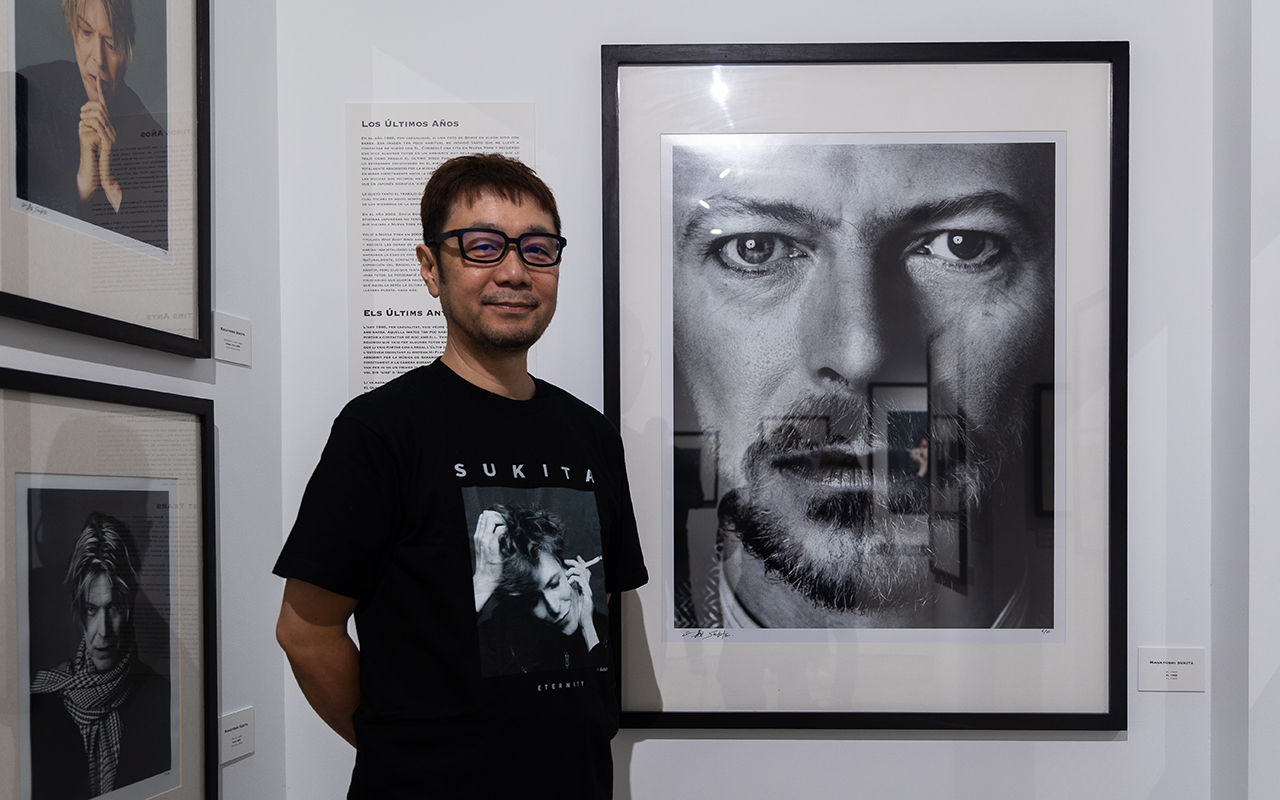
Aki Sukita, nephew of the renowned Japanese photographer, at the gallery. Pic by Fotonostrum
Sukita : the eye that intuited the myth
Masayoshi Sukita, born in Japan in 1938, came from the world of men’s fashion photography. His eye was trained to detect gestures, details, silences. Fascinated by urban subcultures and psychedelic rock, se attended Woodstock and photographed artists such as Iggy Pop, Joe Strummer , Devo , and YMO. But it was with Bowie that he found a true dialogue.
Sukita didn’t seek to capture the obvious, but the invisible. His mastery of composition, light, and scenic balance allowed him to create atmospheric, almost cinematic portraits. Many of the images that are now part of the collective imagination are born from this artistic bond and a trust forged over time.

A Day in Kyoto 6 – Departure, 1980 ÂĐ Photo by Sukita
A journey through style as freedom
Visiting Bowie x Sukita is like immersing yourself in an emotional archive where photography and fashion interact without hierarchy. There are intimate portraits, staged sessions, and concert photographs that capture the electricity of live performance. Each snapshot is an open door to the universe of an artist who made his body a canvas and his wardrobe a manifesto.
Today, designers, artists, and textile lovers continue to draw on his legacy. Because Bowie didn’t just dictate trends: he shattered them. He was haute couture without a runway, glam without gender, avant-garde without nostalgia. And that free, brave, and deeply visual spirit connects with the soul of GratacÃģs, where each fabric is also a creative act.
Practical information
📍 Bowie x Sukita
From May 23 to September 15, 2025
FotoNostrum â Carrer Princesa 19, Barcelona
www.fotonostrum.com
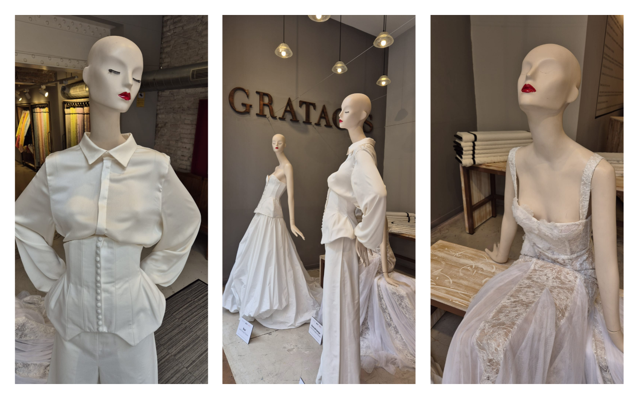
April bids farewell in white to a month dedicated to bridal tradition. From our showcase, once again dedicated to the technique of moulage through three designs created by students of the postgraduate course in wedding and ceremony dress design at IED Barcelona, to our special corner for brides, everything at GratacÃģs was filled with bridal spirit. The dreams of future brides- to- be and those who wanted to relive their stage presence were also tingued in white, without missing a single detail of the new edition of Barcelona Bridal Fashion Week 2025. A showcase of international relevance that once again demonstrates that bridal fashion is not just an act of creation: it is also a language that speaks of desire, beauty, and new possibilities.
This historic edition, the largest held to date, annually transforms Barcelona into the global epicenter of bridal art . A space where established designers, independent ateliers , and new voices reimagine the wedding dress as an intimate expression of identity, sensitivity, and future. More than 40 fashion shows, a vibrant showroom, and a stage that exudes innovation, craftsmanship, and emotion. Every stitch, every lace, every volume that paraded on MontjuÃŊc is an invitation to dream anew, to understand that true modernity lies in the connection between hands, material, and imagination.
At GratacÃģs, we draw inspiration from this universe of textures, volumes, and details that tell stories of love, but also of evolution, strength, and timeless beauty. Below, we analyze some of the shows we attended personally to highlight the trends we’ve seen for brides-to-be.
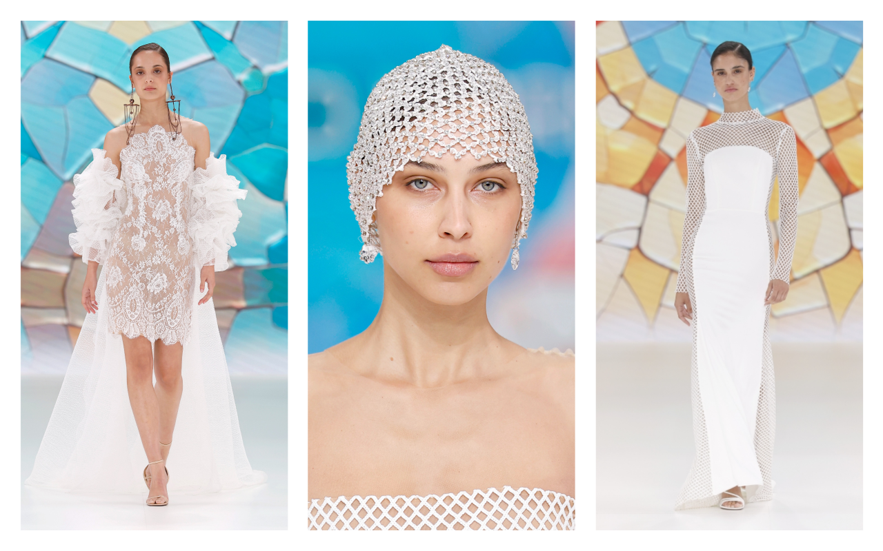 Mariano Moreno runway show. Photo: Barcelona Bridal Week 2025
Mariano Moreno, a wedding tribute to GaudÃ
At Barcelona Bridal Fashion Week 2025, Mariano Moreno presented his “I DO” collection, a design that pays homage to the city of Barcelona and the centuries-old legacy of Antoni GaudÃ. Inspired by Catalan modernist architecture, the designer created unique pieces that fuse art, volume, and organic forms with haute couture.
The collection stands out for its reinterpretation of iconic architectural elements, such as the modernist facades and GaudÃ’s signature undulating structures. The dresses incorporate details evoking the Sagrada Familia and Casa BatllÃģ, using fabrics that mimic the textures and shapes of these monuments. The use of sculptural volumes and seamless finishes reflects the essence of Catalan modernism in each design. With “I DO,” Mariano Moreno continues his mission to redefine luxury in bridal fashion, combining creativity, sustainability, and a contemporary vision. His designs seek to make every bride feel authentic and unique, fusing the magic of haute couture with elements that celebrate the identity and cultural heritage of Barcelona.
This collection stands out not only for its innovative aesthetic, but also for its commitment to sustainability and local craftsmanship, consolidating Mariano Moreno as a key figure in the evolution of contemporary bridal fashion.
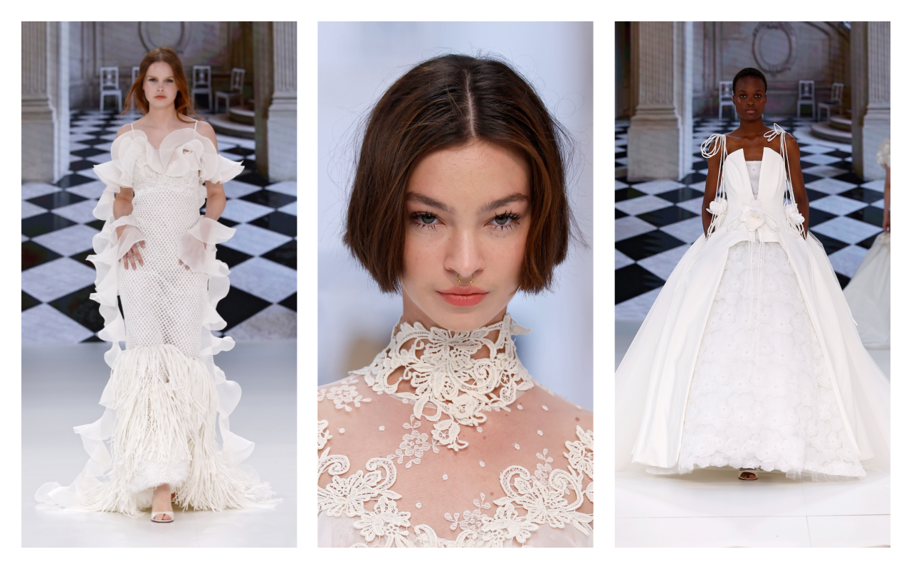 Yolancris runway show. Photo: Barcelona Bridal Week 2025
Yolancris , the beauty of imperfection
At Barcelona Bridal Fashion Week 2025, Yolancris presented its ” Paradoxe ” collection, an ode to the duality between tradition and innovation. The firm, directed by Yolanda PÃĐrez, fused bohemian spirit with haute couture, highlighting hand-painted tulle, silk mikados, Calais lace, and silk-preserved flowers.
The collection celebrated “perfect imperfection,” seeking sincere and creative beauty. The staging included an interview fragment with Japanese designer Yohji Yamamoto, emphasizing the importance of quality in creation. ‘ Paradoxe ‘ reaffirms Yolancris ‘s commitment to sustainability and craftsmanship, offering designs that reflect authenticity and innovation in contemporary bridal fashion.
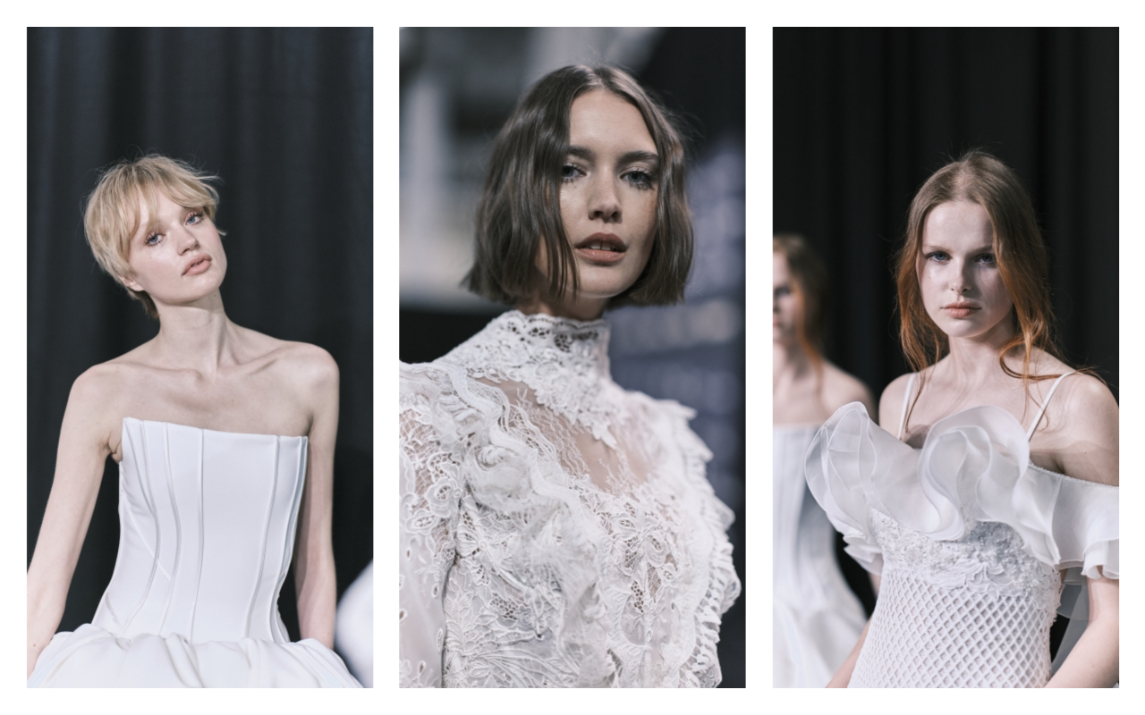 Backstage Yolancris. Photo: Barcelona Bridal Week 2025
What is today’s bride looking for? Deciphering some trends
The 2026 bride abandons traditional molds to embrace a new way of understanding her dress: as an extension of her personality, her roots, and her way of feeling. This season, bridal fashion is evolving toward a plural and emotional aesthetic, where each piece exudes freedom, naturalness, and conscious sophistication.
Fabrics are the soul of this new bridal collection. Botanical texturesâfloral embroidery, 3D appliquÃĐs, nature-inspired laceâdominate the most prominent collections, evoking a return to the essential and a connection with the environment. Alongside them, noble materials such as silk, crepe, tulle, and taffeta reaffirm the value of craftsmanship and quiet luxury.
Silhouettes are becoming more versatile: transformable dresses with detachable capes, removable sleeves, or skirts that adapt to every moment of the big day. This modularity allows the bride to experience the ceremony, the celebration, and the party with a single design, true to her essence and comfort.
In terms of form, several currents coexist: structured minimalism, sculptural volume as an art form, romanticism reinterpreted with a contemporary language, and, above all, extreme customization. Each dress seeks not only to beautify, but to tell a unique story.
The colour palette is also evolving: alongside classic white and ivory, shades of blush, lavender, soft green, terracotta, and subtle metallic sparkles are emerging, adding character and modernity.
The bride of todayâand tomorrowâwants to enter her new life wrapped in fabrics that caress, structures that inspire, and details that move. A brave, sensitive, and authentic bride who understands her dress as a personal work of art, not just a simple tradition.
We also take this opportunity to invite you to discover our collection of bridal fabrics , designed to create dresses that excite, inspire, and celebrate unique stories.
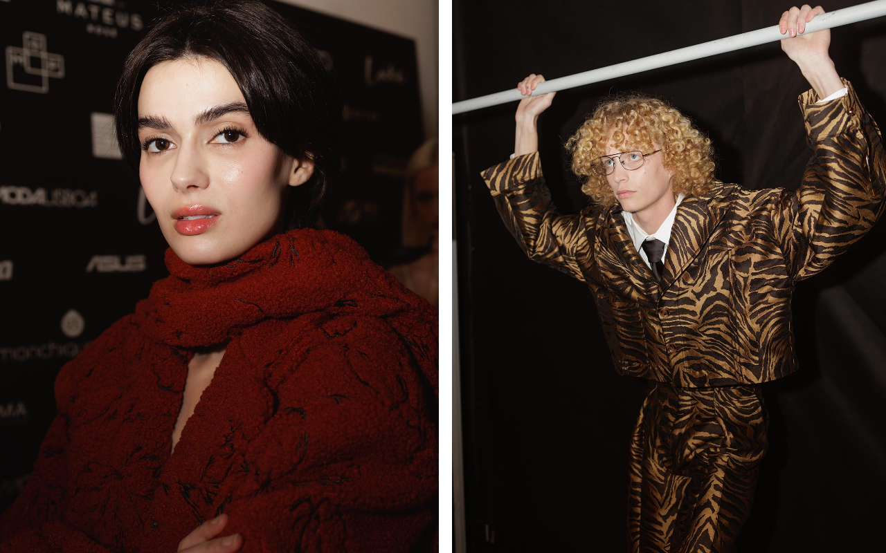 Pics by Ugo Camera
Forget London, Paris, Milan, Copenhagen, or Madrid. Or rather, introduce a new dimension to the leading European fashion capitals. Lisbon is in the spotlight in the fashion sector and has become a hotbed of trends in recent years. The city, with its vibrant and cosmopolitan atmosphere, has managed to merge its rich history with a vibrant creative scene. And this shift is evident both in the creative and practical spheres.
A new generation of independent designers has revitalized the Portuguese fashion scene, complementing established brands and achieving recognition both at home and abroad. This boom is no coincidence: the combination of a strong textile tradition, a commitment to sustainability, and a fresh, contemporary approach to design have positioned the Portuguese capital as a strategic hub for the industry.
The legacy of textile tradition remains alive
Nothing would make sense without this premise: Portugal is one of Europe’s leading textile producers, with factories that work for some of the world’s most prestigious brands. And it remains so today despite the relocation of its industrial fabric to emerging economies in Asia and Africa.
From organic cotton to the most innovative techniques in the production of sustainable fabrics, the Portuguese textile industry has evolved without losing its local and artisanal essence. In regions such as the Ave Valley and GuimarÃĢes, workshops and factories that combine artisanal know-how with cutting-edge manufacturing processes are concentrated, allowing many brands to focus on local production. This textile heritage has been key to the development of emerging designers who seek to differentiate themselves through quality and innovation. It is also important to note that this proximity also provides greater direct access to the consumer, turning fashion into a good that encompasses quality, proximity, and the prestige of the region.
Lisbon Fashion Week , the nerve centre of Portuguese fashion
It’s not the biggest or most media-driven catwalk show in terms of coverage, but it’s the one that’s gaining increasing relevance for offering the industry a fresh and different perspective. ModaLisboa not only presents fashion shows but also fosters dialogue and learning through talks and workshops, highlighting not only designers but also the country’s creative ecosystem. With each edition, Lisbon reaffirms its position as the epicentre of innovation, consolidating its unique identity within the European fashion landscape.
Lisbon Fashion Week, also known as ModaLisboa, is the benchmark event for Portuguese fashion. Founded in 1991, it has become a key platform for both emerging and established designers. Its focus on sustainability and unrestricted creativity have set it apart on the international fashion week circuit.
ModaLisboa is held twice a year and brings together designers, buyers, and media to present the season’s collections. Rather than being confined to a single exhibition venue, its shows take place in iconic venues around the city, such as the PavilhÃĢo Carlos Lopes or the PalÃĄcio Sinel de Cordes, turning the Portuguese capital into a fashion scene in itself.
One of its fundamental pillars is support for emerging talent, embodied in initiatives such as Sangue Novo. This program gives visibility to young designers, providing them with a platform to showcase their work and facilitating their entry into the industry. With this commitment to creativity and innovation, ModaLisboa not only promotes Portuguese fashion but also reinforces its role as a key event on the international scene.
Designers who catch our attention
There’s a wealth of talent, with proposals ranging from the most established to the most disruptive. At GratacÃģs, we keep an eye on designers and brands that regularly show at Lisbon Fashion Week, as well as other independent labels that are setting the pace in Portuguese fashion. Below, we highlight some of the designers who inspire us the most:
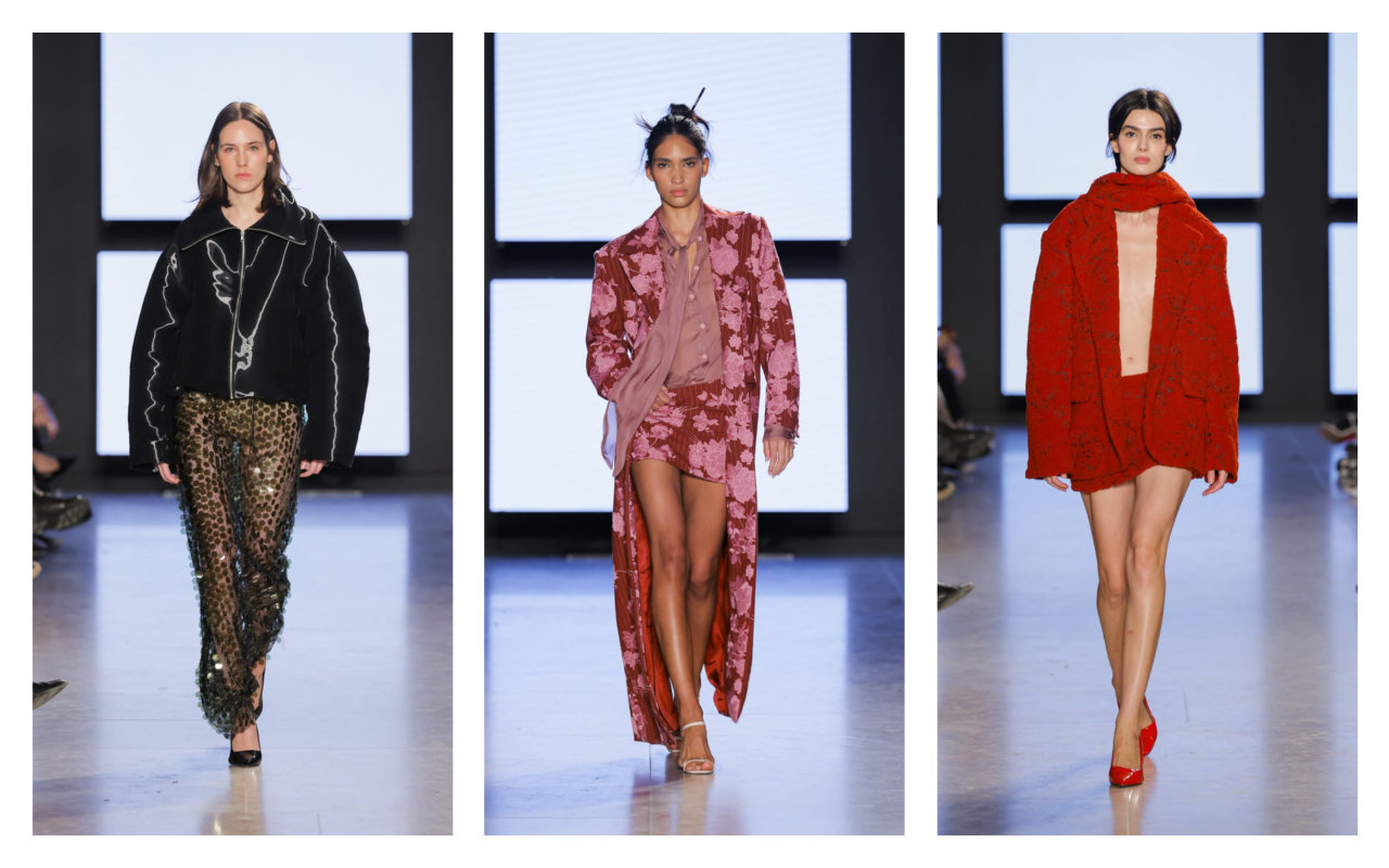 Pics by Ugo Camera
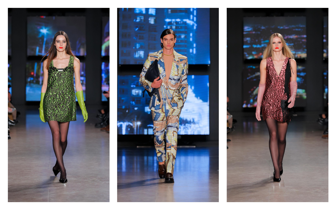
Gonçalo Peixoto
Gonçalo Peixoto is a young designer who began his training in Fashion Design in 2012 in GuimarÃĢes, and later graduated from ESAD in Matosinhos. From his earliest studies, he has proven to be a passionate artist, driven by his love of fashion and his desire to create. His collections have captured the attention of renowned fashion stores and specialized publications, quickly establishing himself on the Portuguese scene.
In September 2017, Gonçalo presented his first collection at London Fashion Week, and in March 2018 he joined the official ModaLisboa calendar, where he began showing his collections regularly.
With a youthful and sophisticated aesthetic, Peixoto embraces modern femininity, reinterpreting trends with a fresh and bold vision. Her latest collections, presented at Lisbon Fashion Week, frequently feature surprising combinations: metallic fabrics, sheer layers, and asymmetrical cuts, reflecting a contemporary vision of fashion. Vibrant colours and fitted silhouettes are often the focus of a collection designed for a self-confident woman with a strong personality.
 Pics by Ugo Camera
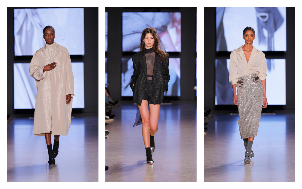
Carlos Gil
Carlos Gil is a designer with a solid track record, recognized for his mastery of pattern making and his ability to balance the classic with the contemporary. Born in Nampula, Mozambique, in the late 1960s, Carlos Gil trained in Fashion Design in Portugal. In 1998, he opened his atelier in FundÃĢo , the city where he lives and works, and a few years later, he opened his first store under the CARLOS GIL brand.
Carlos Gil regularly presents his collections at ModaLisboa and has successfully conquered international markets through his participation in major fashion weeks. Throughout his career, he has received numerous awards and recognitions, such as the Medalha de MÃĐrito da Cidade do FundÃĢo (2009), the Premio Jovem de Sucesso (Young Success Award ) in Portugal and abroad (2009), and the Commenda de Gran Oficial de la Orden del Infante D. Henrique (Command of Grand Officer of the Order of Infante D. Henrique) (2015).
The designer stands out for his ability to create striking pieces of remarkable quality, with an approach that combines sophistication and elegance. His collections are cosmopolitan and contemporary, yet always maintain a strong distinction. In his latest offerings, Gil has explored sophistication through structured fabrics, volumes, and embroidered details. The color palette ranges from neutral tones to bold color accents that bring dynamism to each look. His style reflects an updated retro vibe, with influences from the elegance of the 1970s reinterpreted for today’s audience.
 Pics by Ugo Camera
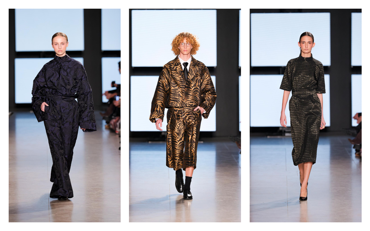
Nuno Balthazar
Nuno Baltazar is one of the most important designers in Portuguese fashion. He trained in Fashion Design at Citex (now Modatex ) and from his earliest days stood out for his talent, winning awards such as Young Designers from MÃĄxima Magazine and Porto Moda. In 1999, he began presenting his collections at ModaLisboa , initially with Cravo, and in 2004, he launched his own brand.
In 2005, he opened his store in Porto and created unique pieces under the label Nuno Baltazar Atelier, collaborating with figures such as Carminho , Raquel Strada , and VictÃģria Guerra. He has also designed the image of presenter Catarina Furtado and worked on costumes for television and theatre. Throughout his career, he has received awards such as the Fashion Award from Fashion TV Portugal (2011) and the Golden Globe for Best Designer (2013). In 2020, he returned to the ModaLisboa runways with his signature collections.
Nuno Baltazar is characterized by his minimalist approach and meticulous attention to detail, which has made his brand a benchmark in contemporary fashion. In his latest collections, he has showcased a series of pieces that fuse refined cuts with texture-rich materials, such as lightweight wools and printed silks. Reinvented tailoring has been a cornerstone of his designs, highlighting unstructured suits and a fusion of masculine and feminine, always with his signature touch.
 Pics by Ugo Camera
Luis Carvalho
LuÃs Carvalho , originally from Vizela , trained in Fashion and Textile Design at the Polytechnic Institute of Castelo Branco. Throughout his career, he has participated in various fashion competitions and worked at ModaLisboa and in the ateliÊs of renowned designers such as Filipe FaÃsca and Ricardo Preto . He was a designer at Salsa Jeans for two and a half years before creating his own label in 2013, debuting his first collection at ModaLisboa. That same year, he opened the LUIS CARVALHO | studio in Vizela, a combination of his atelier and his own store. Carvalho has received several awards, including the âMaison Mode MediterranÃĐeâ Prize in Marseille (2018 and 2019) and has presented her work in Paris, at the Moda Portugal Showcase.
The designer is known for dressing numerous public figures, both nationally and internationally. His creative approach has established him as a creator who challenges the boundaries between the conceptual and the commercial. His designs are distinguished by their experimentation with shapes and materials, opting for architectural volumes and high-quality fabrics. In his recent collections presented at Lisbon Fashion Week, Luis Carvalho has opted for garments that explore structure and movement. The fusion of geometric cuts and subtle draping has added fluidity to his designs, creating a contemporary and sophisticated aesthetic that defines his style.
At GratacÃģs, we’re closely following these events, which celebrate not only fashion but also the culture and identity of Portugal. The next edition promises to be even more exciting and full of surprises!
Sorry, this entry is only available in European Spanish.

At GratacÃģs, creativity and innovation are part of our essence. As creators and suppliers of fabrics for the major fashion houses, international brands and designers, our mission in each collection is to anticipate trends and offer items that define the future of fashion through the senses. Fabrics that are eye-catching, but also seductive to the touch.
Every year, we present our collections at the world’s leading textile fairs, such as PremiÃĻre Vision (New York and Paris) and Milano Unica (Milan). These events allow us to share our proposals with international designers and brands, as well as to obtain valuable feedback to continue adapting to a constantly evolving market.
So in February, we exclusively unveiled our Spring-Summer 2026 collection, a preview of the trends that will mark the coming seasons. But now, it’s time to dive into the SS25 Collection, the current one that we sell on our website and in our space in Barcelona.
An ode to creativity, freshness and lightness
In general terms, the SS25 collection is born from the need to explore the naive and the pure, connecting us with our most spontaneous essence. From tenderness, freshness and sweetness, the new season transports us to a universe of lightness, where fashion becomes a refuge of kind and optimistic sensations.
This collection is designed for simple, yet sophisticated, effortless and versatile fashion, perfect for those seeking elegance without sacrificing comfort. Through innovative fabrics and high-quality finishes, the new proposal creates ethereal garments that celebrate the arrival of summer.
Colour
Colour is a fundamental pillar of the season. Beyond the neutrals, always elegant and combinable, the collection explores a palette of soft and delicate tones, from the most ethereal pastels to vibrant shades inspired by sugared flowers.
The shades evoke purity and freshness, with nuances reminiscent of sunny days, clear skies and natural light. A play of colours that allows for the creation of elegant and versatile combinations for the summer season.
Textures and reliefs
GratacÃģs fabrics stand out for their innovation and richness in textures. In this collection, jacquards provide depth and sophistication, while embroidery adds a touch of fantasy to next spring-summer fashion.
Prints will be the main feature, with designs carefully crafted to offer a balance between modernity and timelessness. Each fabric is designed to be transformed into unique garments, ready to come to life in the hands of the most demanding designers.
SS25 not only marks a new era in summer fashion, but also reaffirms GratacÃģs’ commitment to innovation, creativity and textile excellence. An invitation to dream, create and reinvent summer fashion. We invite you to discover it!
Miércoles 26 febrero 2025
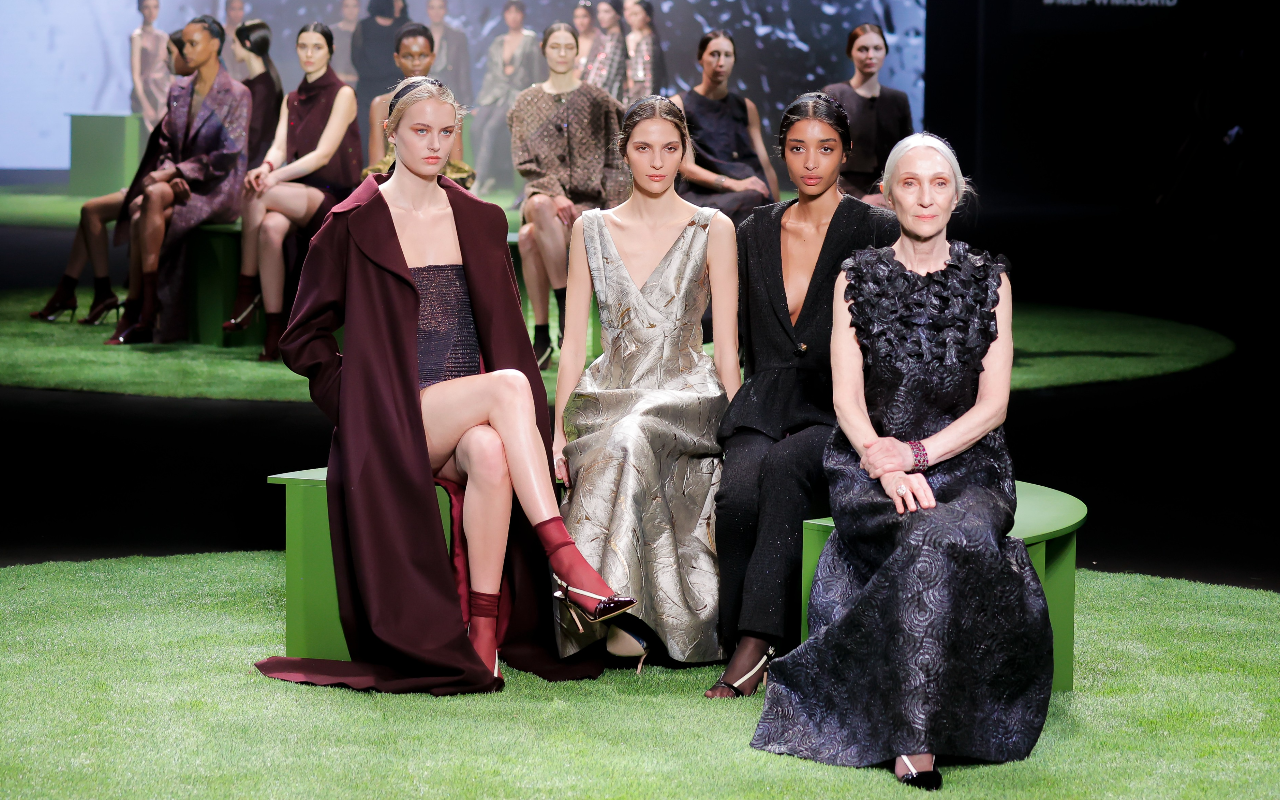 Fely Campo. Mercedes-Benz Fashion Week Madrid. Fall/Winter 2025/2026 Collection
At GratacÃģs, we closely follow the main Spanish fashion catwalks, always looking to discover how our fabrics become unique pieces full of creativity. We are fascinated to see the transformation of our fabrics in the hands of designers, who manage to give life to collections full of personality and their own style. This connection between raw material and inspiration is, without a doubt, what motivates us the most to continue betting on innovation and quality.
During the recent edition of Mercedes-Benz Fashion Week Madrid, held in February 2025, we had the opportunity to once again see the trust that many designers place in our fabrics for their designs. Female empowerment, sustainability, experimentation with textures and the commitment to materials that combine tradition and technology have been some of the key themes of this season, where each garment not only stands out for its aesthetics, but also for the story behind it.
Below, we present a selection of the most outstanding shows of the Fall- Winter 2025/2026 season, where our fabrics have been the protagonists. It is a privilege to see how each designer explores new forms of expression and plays with textures to propose trends that inspire.
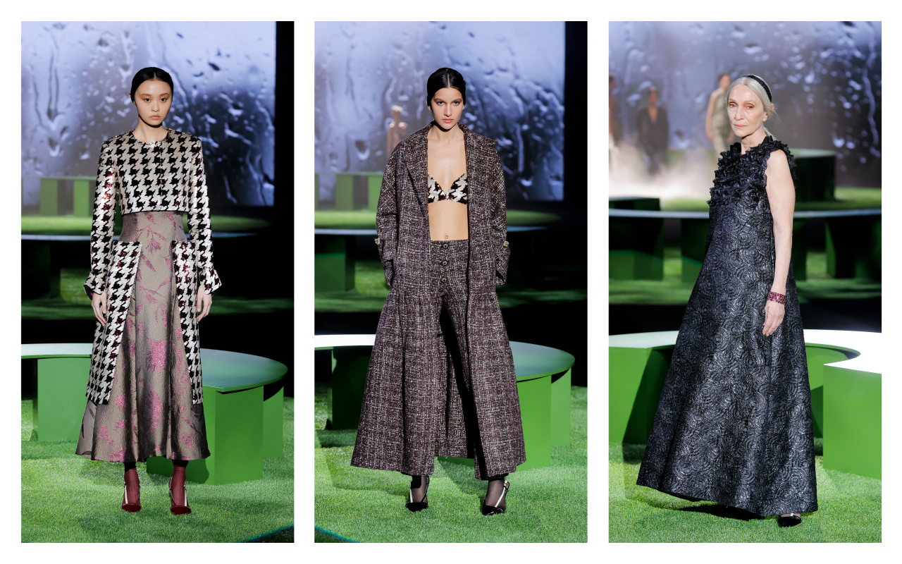 Fely Campo. Mercedes-Benz Fashion Week Madrid. Fall/Winter 2025/2026 Collection
Fely Campo
Fely Campo has presented SELF><WORLD , a collection that invites us to reflect on the relationship between our identity and our environment. What do we project to the world? How is our inner self translated into the image we show? With these questions as a starting point, the designer from Salamanca proposes luxury ready-to-wear where personal essence and external expression merge into the same language.
The autumn-winter 2025/26 collection stands out for its balance between structure and fluidity, playing with materials that evoke emotions and awaken the senses. Tweed, with its enveloping texture, brings warmth and recalls tradition, while velvet is presented as a tribute to sensorial richness, combined with sequins and embroidery that suggest restrained shine and sophistication. Silk, light and ethereal, slides between the pieces, providing movement and softness, in contrast with heavier fabrics such as wool, creating a visual dialogue between the robust and the delicate.
The colour palette breaks free from conventions, breaking the traditional boundaries of colour. Deep tones intertwine with bright flashes, reflecting the multiple facets of the ” self ” and the diversity of emotional states. The versatility of the garments allows each woman to express herself in her own way, with designs intended for everyday use that do not renounce elegance or timelessness.
True to its commitment to sustainability, Fely Campo is committed to pieces that transcend the ephemeral. Each design is conceived to last, resisting the urgency of the new and embracing the beauty that endures over time. The refined and comfortable silhouettes enhance the female figure without imposing themselves, leaving room for the personality of the wearer to be the true protagonist. SELF><WORLD is an invitation to recognize and show oneself as one is, with garments that accompany, envelop and reflect the authenticity of each woman. Because, as the designer herself says, “beauty is in the eyes of the beholder.”
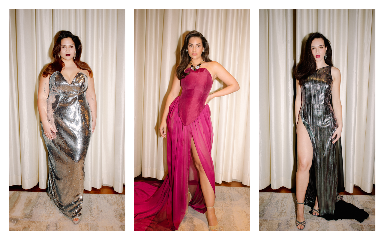
Johanna Calderon
Johanna CalderÃģn chose the emblematic Four Seasons in Madrid to celebrate a fashion show that represents a hymn to body diversity. Each design by the Madrid native with an Andalusian heart is a declaration of self-love, an exaltation of feminine strength and sensuality. Sequins, rhinestones and transparencies took over the catwalk, drawing silhouettes that embrace the body with strategic cuts that enhance the figure without losing elegance. Her collection immerses itself in a festive universe where each garment celebrates self-affirmation. Subtle transparencies coexist with meticulous embroidery and fabrics that shine with their own light, conceived for women who want to feel powerful and radiant. More than fashion, it is a hymn to security and empowerment, with pieces that invite you to dress with confidence and freedom.
To bring this proposal to life, CalderÃģn collaborated with Miah Management , the first Spanish agency dedicated entirely to curvy models. “I was not able to find such a diverse cast of models in any other agency,” explains the designer, a staunch defender of the real representation of women. Diversity was thus one of the central themes of the show, with sizes ranging from 38 to 56, vindicating beauty in all its forms. In short, Johanna CalderÃģn transforms the act of dressing into an experience full of meaning, where sensuality and diversity intertwine to pay tribute to the modern woman: strong, confident and in control of her own story.
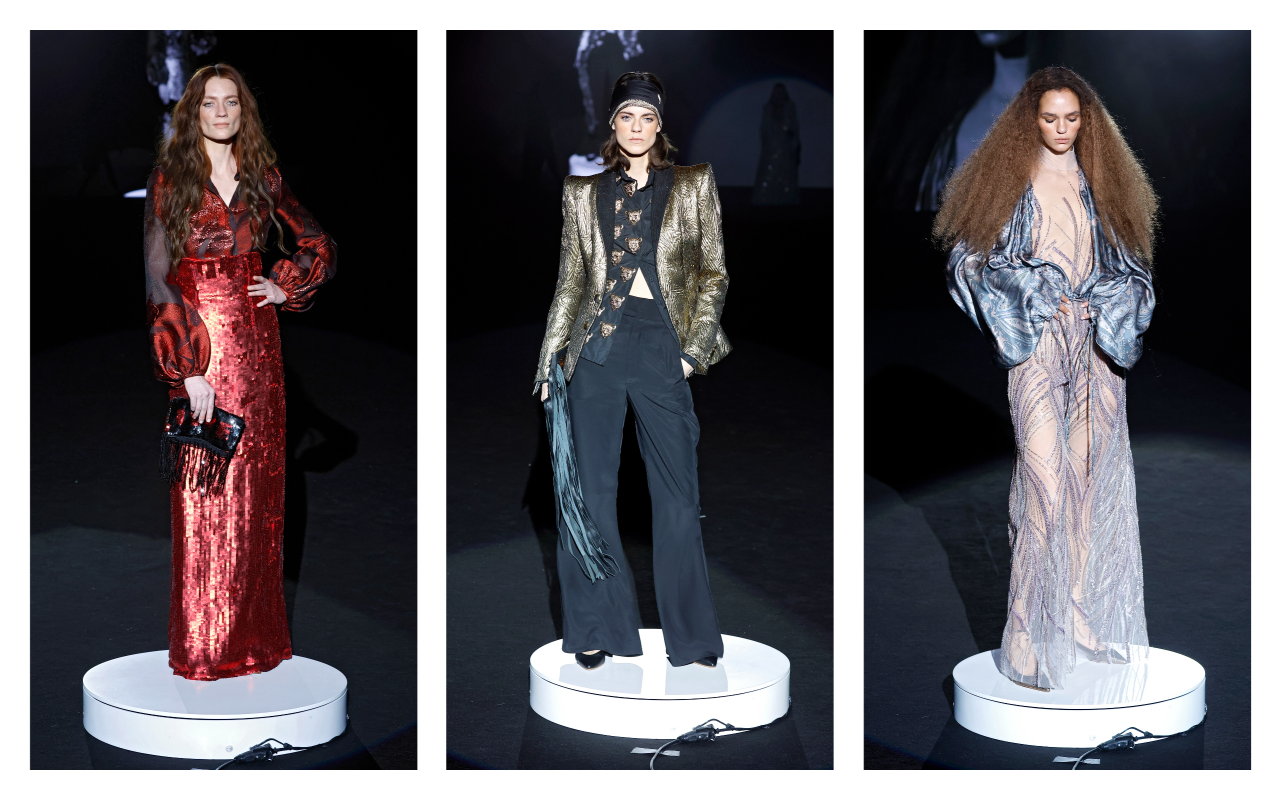 Malne. Mercedes-Benz Fashion Week Madrid. Fall/Winter 2025/2026 Collection
Malne
In “Bohemian Future” Malne has celebrated romantic glamour and the bohemian essence under a futuristic gaze. The firm, founded in 2016 by Paloma Ãlvarez and Juanjo MÃĄnez, once again opts for slow fashion and artisanal production from its atelier in Madrid, reaffirming its commitment to sustainability and the creation of timeless pieces. With a narrative that fuses the boho chic aesthetic of the 70s with an urban and contemporary approach, the collection dresses a woman who plays with fashion without losing sight of environmental responsibility.
The key garments explore the duality between delicacy and structure: impeccably cut tweed layers are combined with fluid tunics and vaporous blouses that glide over the catwalk. The chiffon dresses, voluptuous and light, are dyed in intense colours such as emerald green, ruby ââred and classic black, the firm’s fetish tone. Jackets, another of Malne’s distinctive features, are presented in a fitted version, enhancing the feminine silhouette with a sophisticated and urban touch.
As for the materials, the collection for next winter is based on noble fabrics such as tweed, silk chiffon, cashmere, gazar and micropaillettes, which provide texture and subtle shine to the compositions. Each piece is designed to transmit strength and personality, reflecting the DNA of the firm and its focus on fashion as a form of artistic expression. “This collection speaks of a woman of the future, conscious and free, who does not give up luxury or the beauty of what is well done,” comment Ãlvarez and MÃĄnez.
With this proposal, Malne not only reinterprets bohemian luxe, but reaffirms its place in the Spanish fashion scene as a benchmark for contemporary haute couture, where craftsmanship, sustainability and exclusivity go hand in hand to create unique and timeless garments.
 Mans. Mercedes-Benz Fashion Week Madrid. Fall/Winter 2025/2026 Collection
Mans
The Mans collection, winner of the L’OrÃĐal award for the best collection at the 81st edition of Mercedes-Benz Fashion Week Madrid, delves into the reinterpretation of the feminine suit with impeccable tailoring that balances tradition and innovation. Led by Seville designer Javier Ãlvarez, the proposal stands out for its careful construction and attention to detail, exploring structured silhouettes with straight lines and fluid volumes that adapt to the female figure, responding to the demands of comfort and contemporary elegance.
Key pieces include British-style suits with double-breasted jackets and large lapels, combined with high-waisted, wide-leg trousers, fitted with cummerbunds and bows that add a playful touch to the ensemble. The coats, in different versions, down to the feet with rounded lapels and enveloping textures, while the shirts, both in their feminine and masculine versions, surprise with horizontal pleats and ruffle details that add a romantic air. This gender duality is also reflected in the sheer blouses and mini and midi skirts, which add versatility to the collection.
The colour palette, dominated by neutral tones, is enlivened by vibrant accents such as red, purple, yellow and orange, evoking a cosmopolitan and bold spirit. Velvet, the textile protagonist of the proposal, pays homage to the aesthetics of the 90s with Tom Ford as a reference, while Scabal wools â iconic fabrics that have dressed characters such as James Bond or Vito Corleone â provide an extra touch of sophistication and sartorial heritage.
The recognition of this collection not only celebrates the excellence of the design, but also the evolution of Mans towards a fashion that embraces diversity, functionality and contemporary luxury, always maintaining the essence of tailoring that defines its DNA. For Javier Ãlvarez, this award is a reward for a collection that is “difficult to build” and reflects the firm’s connection with the needs of a public that seeks special and timeless pieces.
 Menchen Tomas. Mercedes-Benz Fashion Week Madrid. Fall/Winter 2025/2026 Collection
Menchen Tomas
BLITZ by MenchÃĐn TomÃĄs is a collection that travels to the heart of 1980s London to revive the creative and rebellious spirit of the legendary Blitz Club. Epicenter of the underground scene and cradle of the aesthetic and musical avant-garde of the time, this legendary club inspired a proposal that celebrates freedom of expression and stylistic audacity, reinterpreted from a contemporary perspective.
For autumn-winter 2025/26, the firm led by Olga MenchÃĐn proposes pieces that invite us to play with fashion as a creative and personal act. Delicate silks, structured crepe, triacetate and chantilly make up a selection of fabrics that offer movement, texture and a feeling of tactile luxury. The colour palette evolves from the sobriety of black and white to metallic shades, eucalyptus green, porcelain blue and pale pink, evoking emotions that complement the dynamism of the garments. The silhouettes explore volumes and structures that dialogue with the aesthetic experimentation of the Blitz Club. The designs dare to decontextualise traditional garments and materials, proposing tunics, oversized blouses, straight-cut trousers and dresses that play with layers and transparencies. Each look is an invitation to break free from established norms and embrace fashion as a form of self-expression.
Beyond aesthetics, BLITZ raises a reflection on sustainability and the importance of giving materials a second life. The firm champions local craftsmanship and the value of work done in Spain, guaranteeing meticulous control of each phase of production and reaffirming its commitment to quality and environmental responsibility.
This collection, presented on the catwalk at Mercedes-Benz Fashion Week Madrid, is an ode to creative daring and free identity, where each garment seeks to inspire and empower those who wear it. For MenchÃĐn TomÃĄs, dressing is much more than covering up: it is daring to imagine and express who we are.
 Yolancris. Mercedes-Benz Fashion Week Madrid. Fall/Winter 2025/2026 Collection
Yolancris
YOLANCRIS, the Barcelona-based label founded by sisters Yolanda and Cristina PÃĐrez, has presented its autumn-winter 2025/26 collection under the YC ready-to-wear line: a contemporary reinterpretation of the extravagance and art de vivre of the Marchioness Luisa Casati. Inspired by this iconic figure of the 20th century, the proposal pays homage to the empowered woman who turned her life into a work of art, challenging the established norms of her time.
The collection is based on three creative pillars: Catalan Modernism, the irreverent freedom of the 1970s and the artistic heritage of Mariano Fortuny. The result is a series of pieces that explore the duality between opulence and functionality, maintaining the artisanal essence that has defined the house since 2005. Wrap-around tunics and coats are combined with 70s-style trousers and maxi blouses, while straight dresses incorporate art deco details that provide sophistication without excess.
In terms of materials, Yolancris deploys a textile universe that emphasizes quality and texture. Leather and lace â the latter worked using the soleil pleating technique â coexist with rich velvets and silk gauzes that provide lightness and movement. Artisanal embroidery and hand-made ornamental details underline the firmâs commitment to excellence in tailoring and local savoir-faire. This combination of heavy and ethereal fabrics creates a visual contrast that, at the same time, reinforces the collectionâs versatility.
The colour palette ranges from dark, neutral tonesâsuch as intense blacks and deep graysâto more vibrant accents that evoke the free spirit of the 1970s. Yolancris ‘ proposal not only seeks to dress, but also to empower: each garment is a declaration of freedom, designed for the contemporary woman who values comfort without giving up elegance.
This first foray of the YC ready-to-wear line into Mercedes-Benz Fashion Week Madrid represents an important step for the brand, reaffirming its commitment to local production and sustainability. Yolancris demonstrates that everyday fashion can be a vehicle for self-expression and authenticity, fusing tradition and modernity with a sophisticated and contemporary approach.

FotografÃa: Paula Caballero
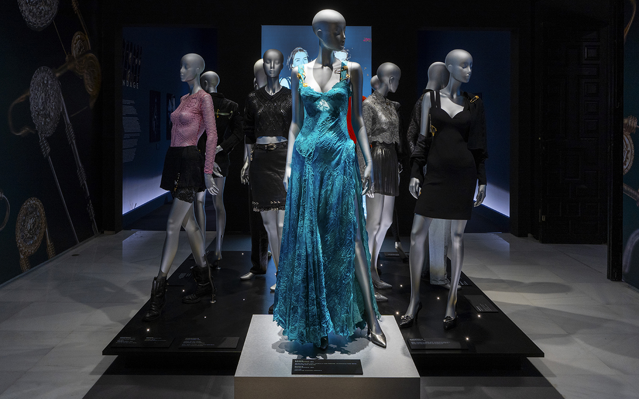
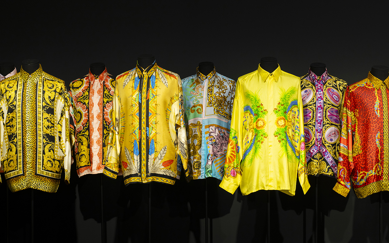
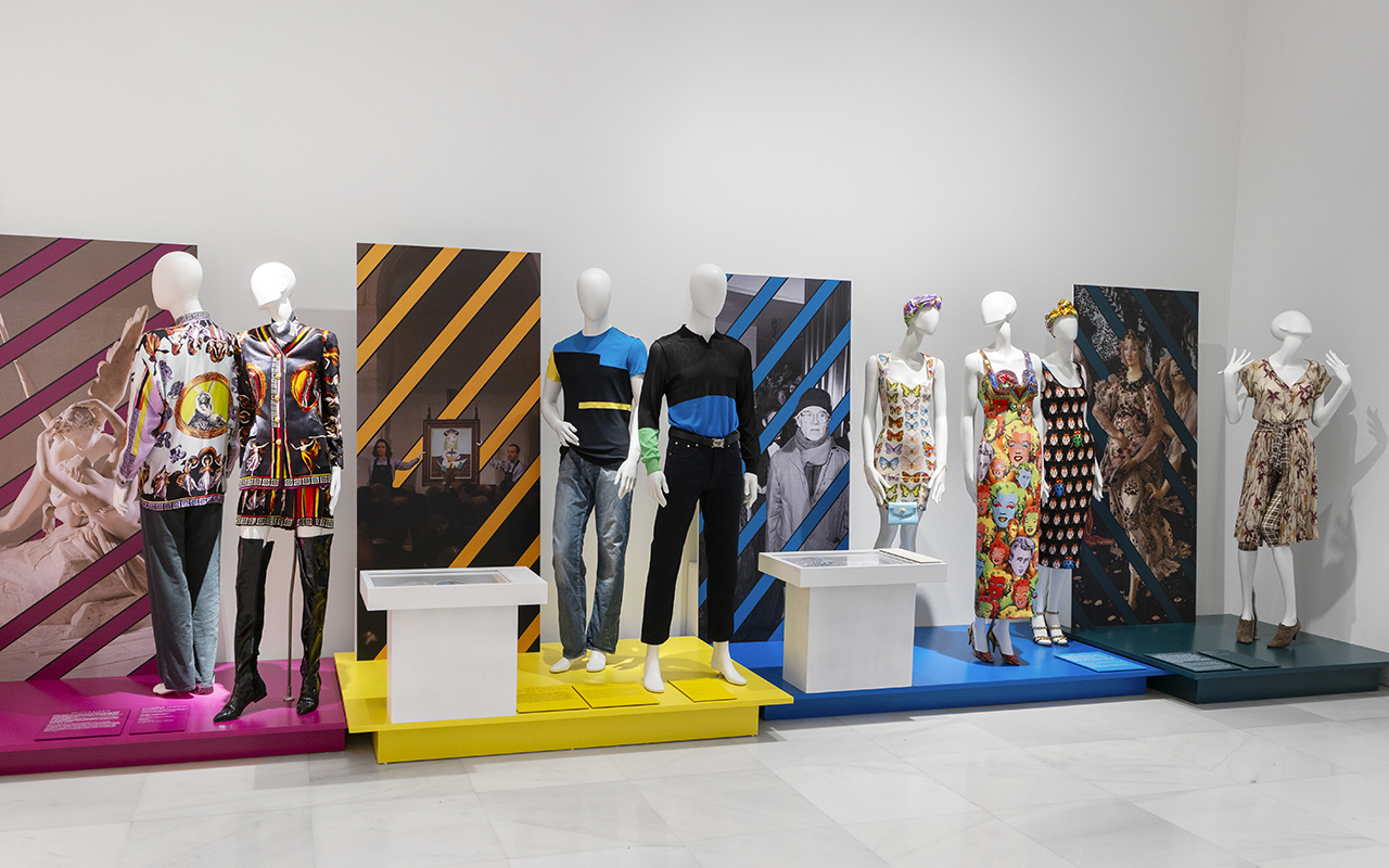
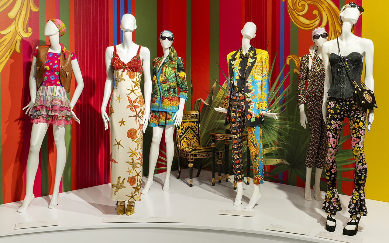
If there is a designer who understood fashion as a spectacle, it was Gianni Versace. He did not limit himself to creating clothes; he built his own universe, where excess was synonymous with elegance and pop culture was mixed with classical mythology. Now, his essence re-emerges in Gianni Versace Retrospective , an exhibition never seen before in Spain organized by FundaciÃģn Unicaja that lands in Malaga with more than 500 original pieces to take a tour through the mind of the Italian genius.
The exhibition is housed in the historic building of the Episcopal Palace and, across nine thematic sections, invites us to explore its inspirations, from Classical Greece to the vibrant Miami Beach scene in the 90s. Between shiny fabrics, baroque prints – such as the iconic Barocco – and looks that defined the era of the Supermodels, this exhibition reminds us that the Versace legacy is more alive than ever.

FotografÃa: Paula Caballero
The designer who made fashion a spectacle
Gianni Versace didn’t just revolutionize fashion, he redefined it. In the 80s and 90s, his shows were events where supermodels walked like modern goddesses and the clothes screamed power and sensuality. His creations also dressed stars like Madonna, Prince and Elton John, cementing him as the designer of icons.
His ability to mix cultural references from different eras and geographies turned his designs into wearable pieces of art. From Greco-Roman classicism to punk aesthetics, Versace absorbed everything that inspired him and transformed it into something unique. His approach to fashion was instinctive and deeply visual: he was not afraid of colour, exuberant patterns or bold silhouettes. His brand became synonymous with daring luxury and boundless glamour.
The exhibition is unprecedented in Spain and captures that spirit, from his beginnings in Calabria, his arrival in Milan and his fascination with art and architecture to his last collection in 1997, before he was murdered. Through his most iconic looks, original sketches and previously unpublished photographs, Gianni Versace Retrospective immerses us in his creative process.

FotografÃa: Paula Caballero
The keys to understanding the soul of Gianni Versace
The exhibition is structured into nine spaces that capture some of the key aspects of Gianni Versace’s imagination, evident in all of his designs.
Inspiration from Greco-Roman mythology : Versace’s fascination with classical antiquity is reflected in his recurrent use of mythological iconography. The Medusa, which became the brand’s emblem, symbolised irresistible attraction and power. His collections incorporated motifs of Ionic columns, golden friezes and depictions of gods, fusing the opulence of imperial Rome with a modern vision of luxury.
Baroque splendour : No one like Versace at mixing gold, classical motifs and excess without losing sophistication. Inspired by art, the Christian religion and Italian architecture, his use of ornamentation and rich fabrics made him a master of maximalist luxury. Despite this, the exhibition also reveals his minimalist side towards the mid-90s. An interesting exercise in stylistic contrasts.
The magic of South Beach : Miami was his refuge and his muse. The Art Deco aesthetic, classic cars and multicultural energy of the city were reflected in his 90s collections. The light, colours and vitality of the city influenced the vibrant prints and marine motifs that characterised some of his most memorable collections.
Art and pop culture : Inspired by Warhol and the repetition of images, Gianni Versace created unforgettable prints. Versace understood before anyone else that fashion should dialogue with popular culture, and his collaborations with artists marked a turning point in the relationship between fashion and art.
Supermodels of the 90s : The Italian couturier elevated Cindy, Naomi, Claudia and Linda to the status of goddesses. He not only designed for them, but helped shape the modern concept of the âsupermodelâ by turning his shows into media extravaganzas. His 1991 show, where top models walked to George Michaelâs Freedom , is an iconic fashion moment.
The power of provocation : She redefined rebellion with leather, studs and harnesses. Her reinterpretation of punk and fetish aesthetics proved that fashion could play with boundaries without losing its sophistication. The iconic Bondage collection of 1992 turned traditionally provocative elements into haute couture pieces that challenged established norms.

FotografÃa: Paula Caballero
Fashion, culture and myths of the 90’s
Beyond the catwalk, Gianni Versace’s impact on popular culture was immense. His vision was cinematic, his shows were carefully orchestrated productions, and his approach to fashion broke with many of the conventions of the time. He pioneered a strong visual identity for his brand, integrating architectural elements, instantly recognizable prints, and a use of color that defied the trends of minimalism.
Versace also understood the power of image and marketing in fashion. He was one of the first designers to forge ties with the entertainment industry, dressing artists and creating moments that transcended the catwalk. Lady Diana, Madonna, Cher, Elizabeth HurleyâĶ they all became ambassadors of his bold and sophisticated aesthetic.
Versace also made his mark in cinema and theatre, designing costumes for operas and films. His passion for dramatization and theatricality was reflected not only in his fashion, but in the way he presented his work to the world.
The legacy of a visionary
More than 25 years after his death, Versace’s impact is still felt. His influence can be seen on catwalks, red carpets and even in urban culture. The brand he founded, now under the direction of his sister Donatella, continues to reinterpret his aesthetic, keeping the DNA of the house alive.
The 1990s fashion revival has brought back into the spotlight many of the elements that Versace popularised: the tight-fitting clothes, the baroque prints, the fusion of luxury and rebellion. Contemporary designers continue to find inspiration in his work, and his name remains synonymous with audacity and opulence.
This exhibition is not just a tribute, it is an invitation to relive the art of a designer who turned fashion into a statement of intent. To immerse oneself in his universe is to understand how fashion can be much more than clothing: it is identity, it is art and it is history.
The Gianni Versace Retrospective exhibition will be open to the public until the 30th June at the Unicaja Foundation Cultural Center in Malaga.

FotografÃa: Paula Caballero
Sorry, this entry is only available in European Spanish.
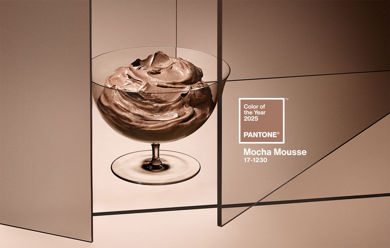
 Mocha Mousse. Pic by Pantone
Imagine a creamy dessert that combines the aromas of cocoa, chocolate and coffee, with evocative textures and an intense brown tone that awakens both the sight and the palate. This suggestive image, which mixes everyday life and small pleasures, connects directly with the colour of the year 2025 chosen by Pantone: 17-1230 Mocha Mousse. This shade, described by the company as âa soft and evocative brown, but also intense and warmâ, invites our senses to enjoy pleasure and exquisiteness.
A colour that opens the appetite
Mocha Mousse, suggestive and inspiring, takes over from Peach Fuzz 13-1023, the delicate peach shade that was the colour of the year 2024. âInspired by our desire for everyday pleasures, 17-1230 Mocha Mousse expresses a level of thoughtful pleasure,â explains Leatrice Eiseman, executive director of the Pantone Colour Institute, as said in the new release announcing the long-awaited reveal. âSophisticated and exuberant, yet an unpretentious classic, this colour expands our perception of browns as humble, understated tones to embrace aspiration and luxury. Infused with subtle elegance and earthy refinement, it presents a touch of understated, tasteful glamour,â says Eiseman.

Connecting with the origins
Although some on social media have criticised the choice of brown, associating it with the current period of instability and lack of authenticity, Pantone defends its decision by highlighting the growing search for connection with nature and the origins of humanity. âCharacterised by its organic nature, 17-1230 Mocha Mousse honours and celebrates the sustenance offered by our physical environment. Infused with authenticity, it strikes a balance between the demands of modernity and the timeless beauty of artistic creation,â the company explains.
Laurie Pressman, vice president of the Pantone Colour Institute, describes Mocha Mousse as an extension of Peach Fuzz that came before it, sharing its essence of comfort but taking it a step further by including âthe simple pleasures we can give away and share with others,â like a glass of mocha mousse. âThe eternal quest for harmony permeates every aspect of our lives: our relationships, the work we do, our social connections, and the natural environment around us. This colour brings us contentment, inspiring a positive state of inner peace, calm, and balance, while attuning us to the world around us. Harmony encompasses both a culture of connection and unity and the synthesis of our mental, spiritual, and physical well-being,â Pressman details, highlighting how this shade reflects that longing for connection and balance.

How is the colour of the year created?
Pantone, the global authority on colour and a set of professional standards for the design community, began defining the colour of the year in 1999. The first choice was the iconic cerulean blue (Pantone 15-4020), a shade that achieved worldwide fame thanks to the film The Devil Wears Prada, released seven years later. In this film, Meryl Streep, as the feared Vogue editor, immortalised the colour with an unforgettable fashion speech to Anne Hathaway: âWhat you donât know is that that sweater isnât just blue. Itâs not turquoise, and itâs not navy. Itâs actually cerulean.â
The initial goal of this initiative was to generate conversation around colour, involving both the design community and colour enthusiasts. But choosing the colour of the year is not a simple or arbitrary process. Behind this decision there is a rigorous analysis. Each year, a committee of colour experts studies cultural, artistic and social trends worldwide to identify significant references. Based on this analysis, they select an existing colour from the Pantone catalog and name it with an easy-to-remember name.
Over the years, these choices have reflected the global socio-economic context: from Marsala, which evoked the world of wine in 2015, to the double choice of 2021 â Illuminating yellow and Ultimate Grey â which symbolised the challenges of the pandemic. In 2022, Very Peri, a bold lavender shade, connected the real world with the digital one. Beyond their beauty, these colours invite a reflection on the times we live in.
In 2010, Pantone expanded its reach beyond the design niche to connect with the general public, adapting to new creative disciplines inspired by colour. This is when two key initiatives emerged: the Pantone Colour Institute and the Colour of the World. the Year. These proposals not only investigate and promote the use of colour, but have also transformed the brand’s marketing strategy, turning it into a global trend. Today, the colour of the year directly influences product development and purchasing decisions in sectors such as fashion, decoration, design and advertising.
The Pantone guide, which began with 500 colours for the graphic arts, now has more than 2,000 references. Every 18 months, new and more precise shades are added, reflecting the evolution of colour in our daily lives. Today, Pantone is a multinational with a strong global presence. Since its acquisition by X-Rite, a company specialising in colour management, the company has grown exponentially. With 17 offices around the world, Pantone markets everything from its famous guides to branded products and strategic alliances. Recent examples include collaborations with Motorola for smartphones, special editions of JÃĪgermeister bottles , and even coffee capsules in partnership with Nespresso, a partnership that raises the question: have these capsules inspired this year’s colour choice?
In 2025, to celebrate the 26th anniversary of the Pantone Colour of the Year, the company has taken the colour beyond its guides, highlighting it at global events and experiences. From New York and London to Shanghai and Mumbai, Pantone has curated public spaces and gatherings to make the colour of the year accessible to everyone.
The gentle elegance of Mocha Mousse: applications in fashion and design
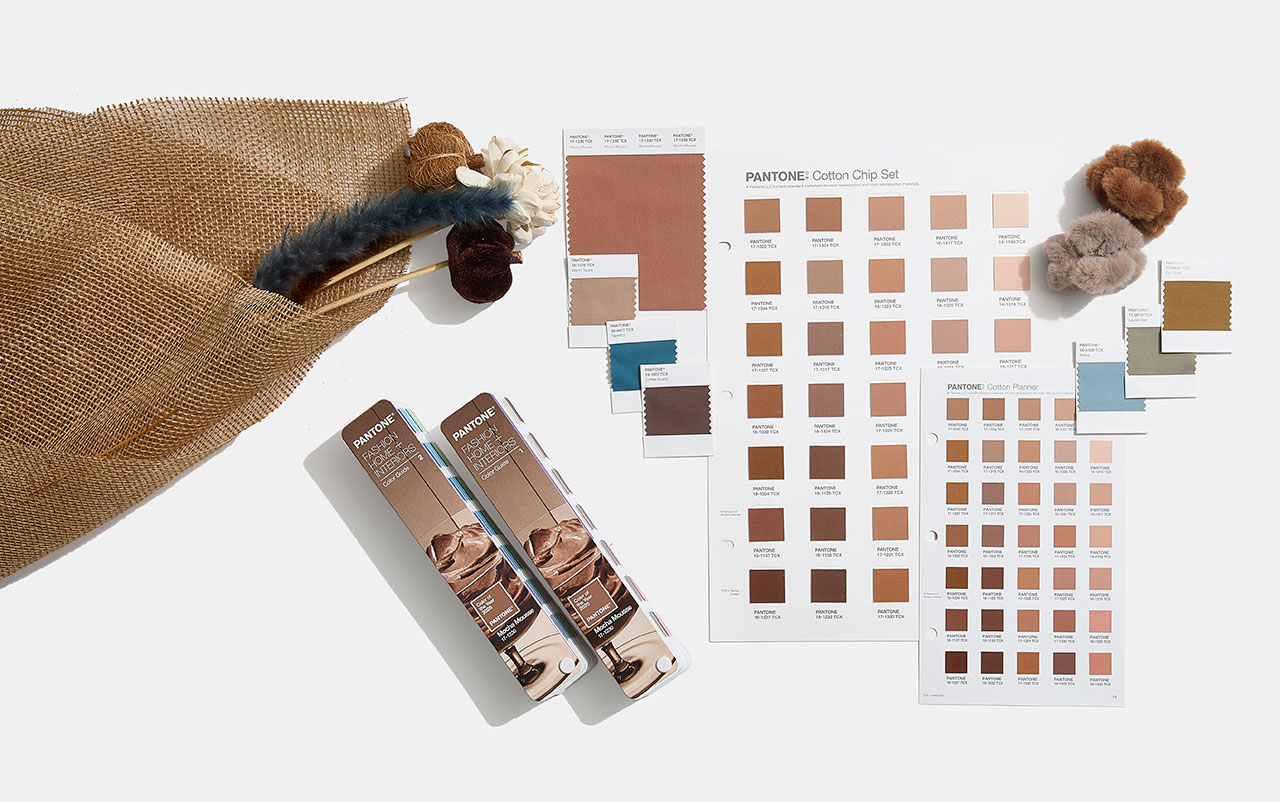
In the fashion world, Mocha Mousse is positioned as a highly versatile neutral shade. Dubbed âthe colour of unpretentious elegance,â this shade stands out for its ability to create warm, minimalist looks that blend with different skin tones, creating a chromatic camouflage effect. The colour of the year 2025 also redefines our perception of brown, taking it from humble and earthy to luxurious and aspirational.
Translating this to the textile world, Mocha Mousse offers endless possibilities. Its sensorial warmth is reflected in fabrics with a delicate touch such as cashmere, angora, soft velvet and furry textures that envelop and comfort. It also shines in lighter materials such as airy chiffons, fluid satins or knits that provide movement and draped elegance. This shade, imbued with earthy refinement, embodies an organic and authentic luxury, promoting minimalist looks that opt for simplicity without artifice.
Mocha Mousse also adapts to various textures and finishes. From matte surfaces that highlight its naturalness to shiny or metallic finishes that give it a sophisticated touch, this colour works as a perfect base for bold colour combinations or monochromatic looks full of depth.
In decoration and interior design, Pantone 17-1230 Mocha Mousse connects with our desire for well-being and comfort. This earthy and refined brown brings a feeling of warm home, whether on floors, painted walls or decorative elements. Its presence stands out in natural materials such as wood, stone, rattan, wicker or leather, offering a balance between sophistication and homely warmth.
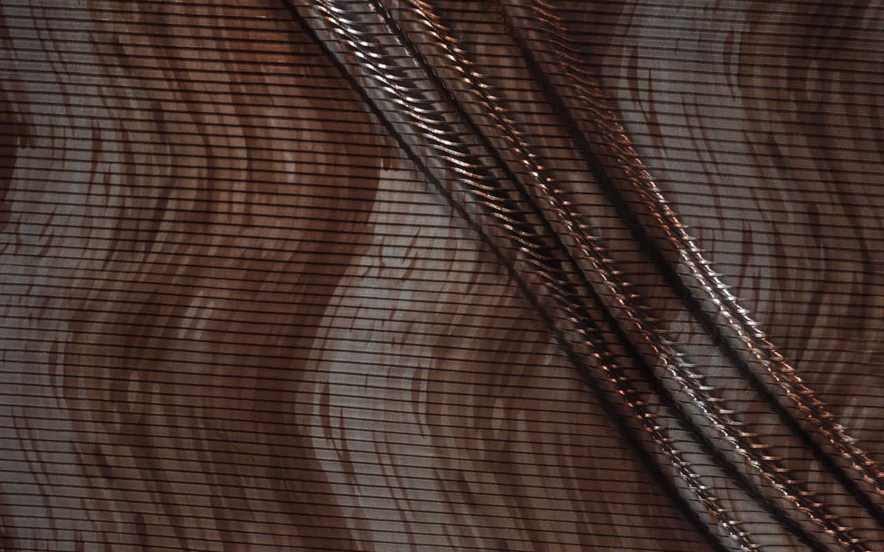
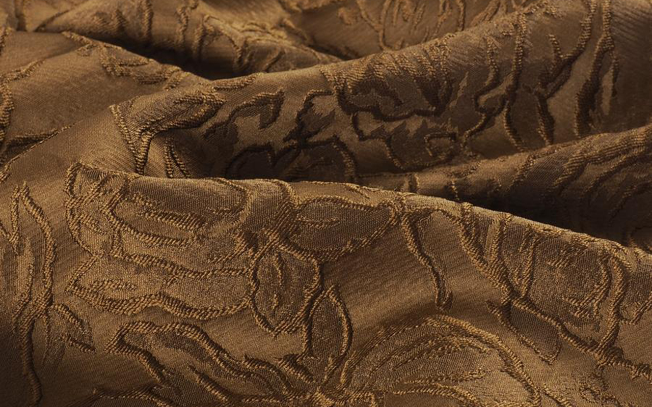
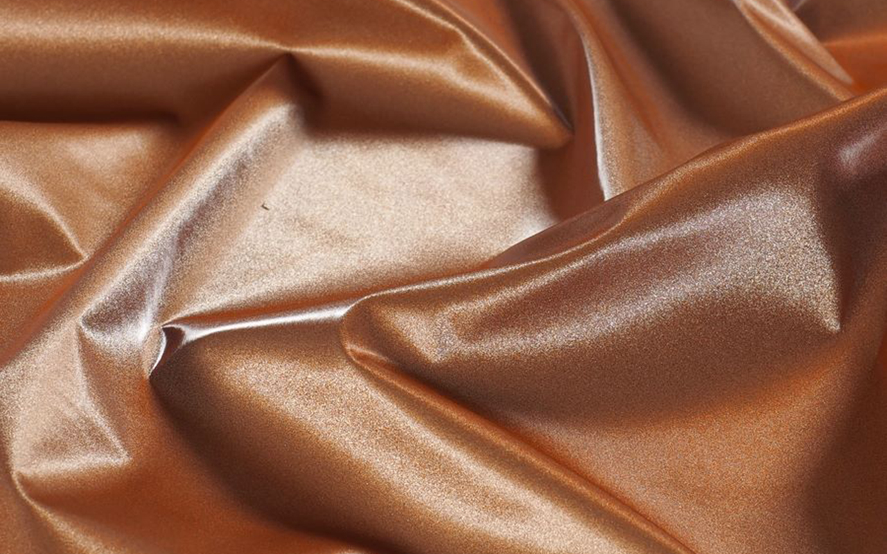
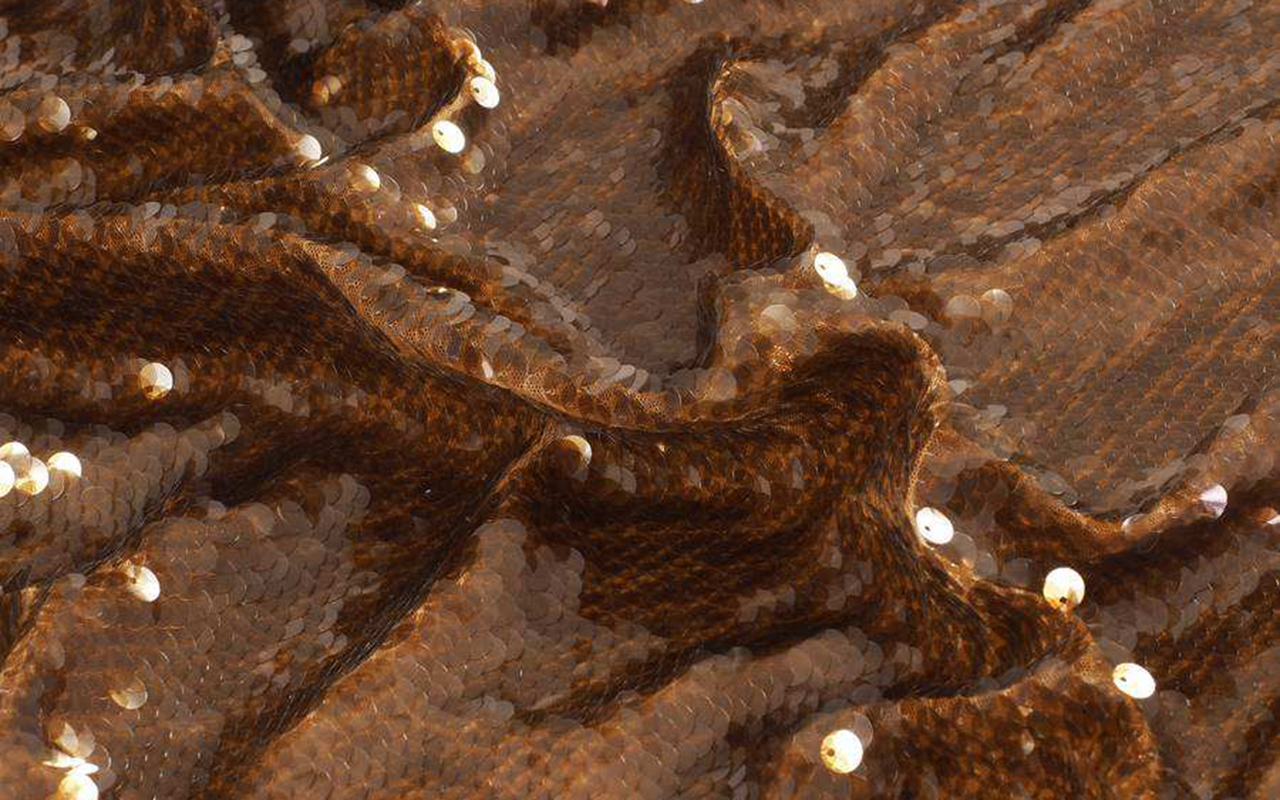
At GratacÃģs, we have selected some key fabrics that connect this colour of the year with our new collection. From luxurious textures to versatile finishes, you will find inspiration to bring Mocha Mousse to your fashion and design projects.


 Collection 2025 Mariano Moreno
  SS25 Gonçalo Peixoto
 AW25/26 Carlos Gil
 SS25 Mariano Moreno


 Malne. Mercedes-Benz Fashion Week Madrid. Fall/Winter 2025/2026 Collection
