In yet another edition the old Damm factory in Barcelona brought together the sensitive project The Color Community to publicize new trends in materials, textures and colours for the Spring / Summer season 2019. The initiative was organized by three multidisciplinary professionals, Eva Muñoz, designer and specialist in Colour & Trim, Pere Ortega, architect in Saeta Estudi and Rosa Pujol stylist in fabrics and colours at Gratacós, to inspire creative professionals from various fields such as art, fashion, design or architecture. “We do not want to instruct, but to suggest through a palette rich in colours and textures which is very upbeat and energetic , ” explained Rosa Pujol at the beginning of the presentation.
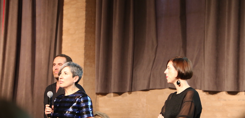
Rosa Pujol: “We do not want to instruct, but to suggest”
In fact, apart from the presentation of the four trends via a video with inspirational images ( parades, campaigns, front pages and still-lifes), other senses also played a role, such as that of hearing, with mood music and that of taste with the tasting of different ice creams, one for each trend. “We want to create a sensory path where all inputs generate different connections and help create a global vision”, declares Rosa Pujol.
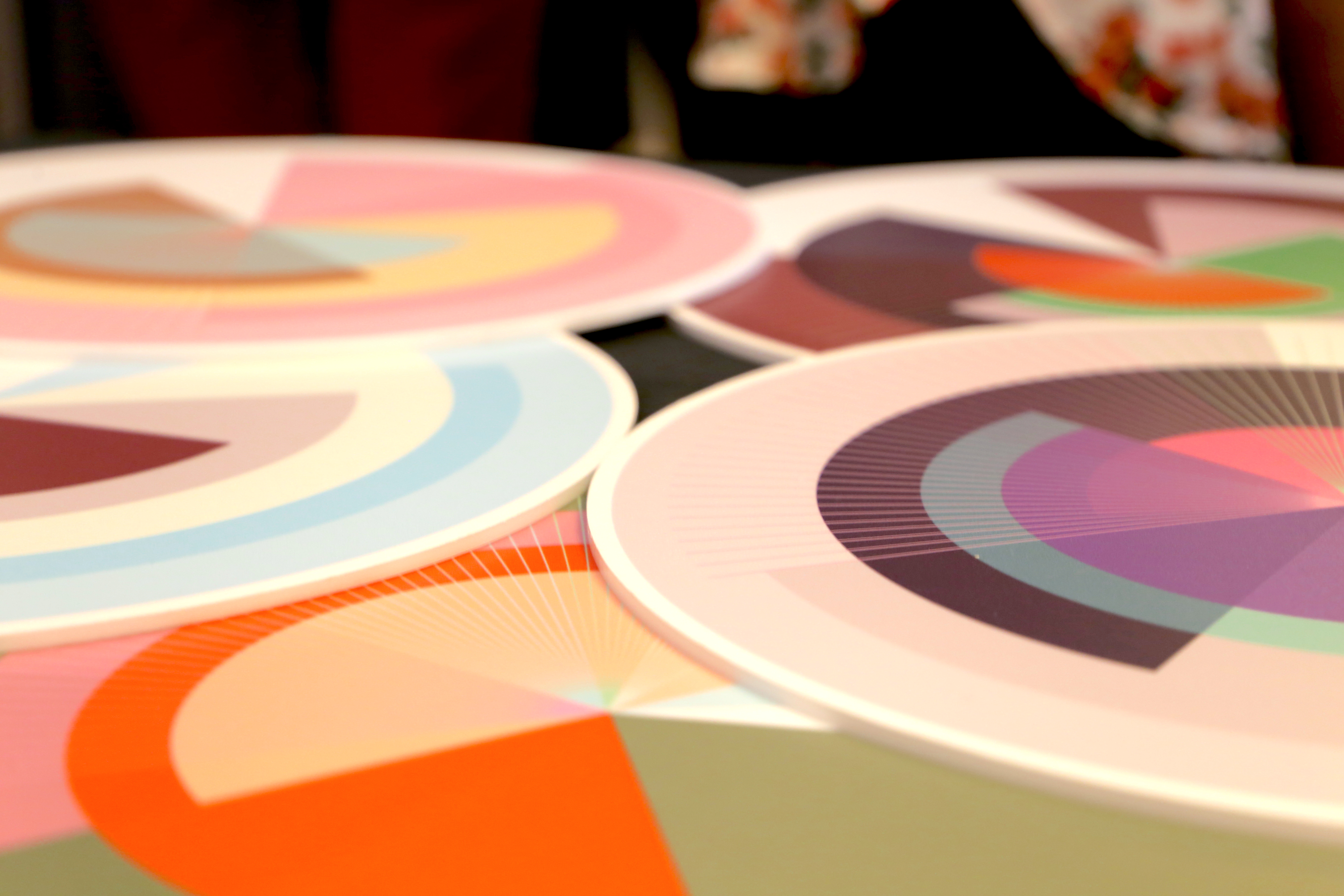
This edition of The Color Community focuses on the concept of ‘Synchro’: the constant connection between people and disciplines and how they interrelate with each other . The proposal is articulated through four colour ranges and textures.
 |
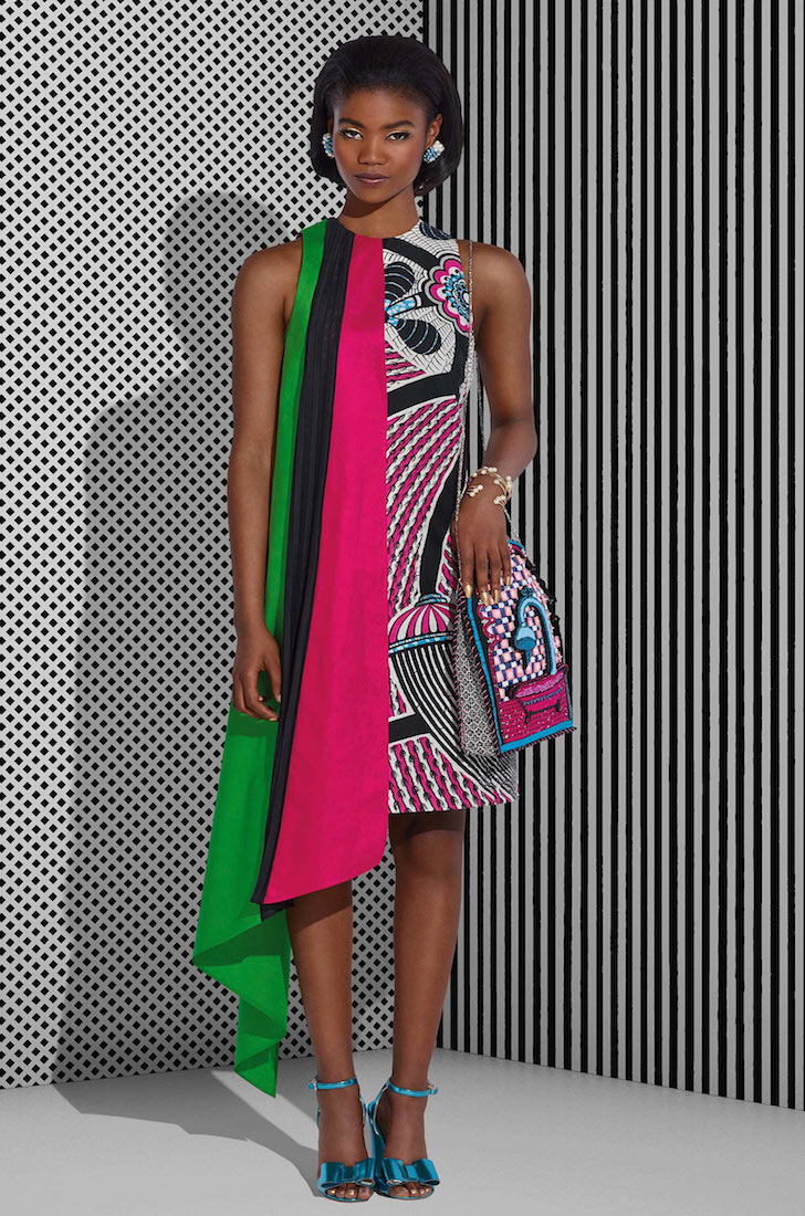 |
1.Newaddresses
It makes reference to multicultural connections with colours and materials that refer to the exoticism of other distant cultures. It aims for a reinterpretation of the ethnic style. There are tribal motifs,tones that mimic spices, cultural graphism, irregular geometry, elements of pop culture and a range of vivid and intense colours with shades like fuchsia, purple, blue or leaf-green.
 |
 |
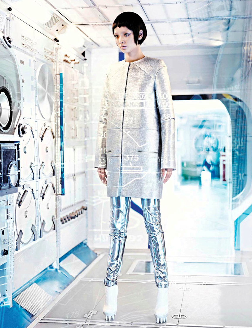
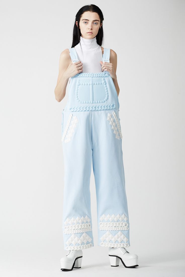
2.Blur
An emotional trend that connects technology and virtual reality with a touch of nostalgia for the past. Innovation inspired by retro. In this trend synthetic materials abound, with industrial references, iridescent fabrics or luminous fibres. The chromatic palette focuses on technical green, pale blue and greys that act as a bridge between palettes.
 |
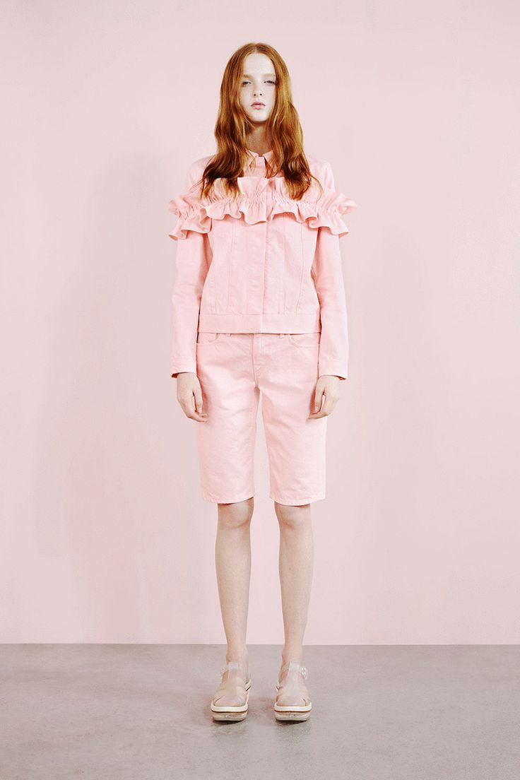 |
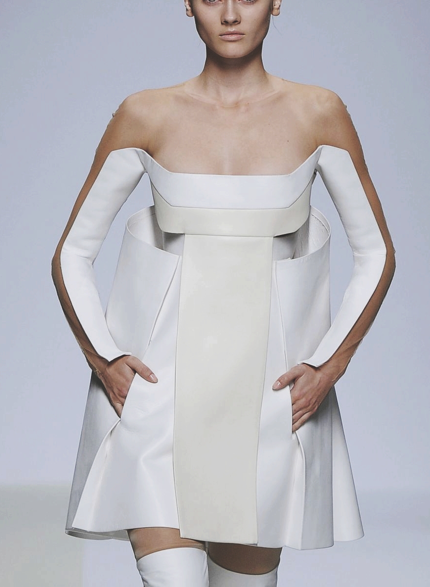
3.Me anymore
A calm, quiet and evocative style that aims to promote a pause for reflection and exalt silence. Soft textures without too many reliefs, watercolours, fine lines, multilayers and soft shades like pale pink, sky blue or white with beige tints add colour to this contemplative trend.
 |
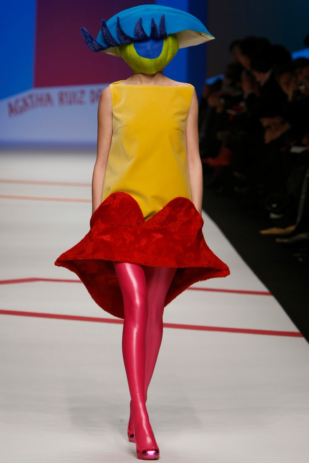 |
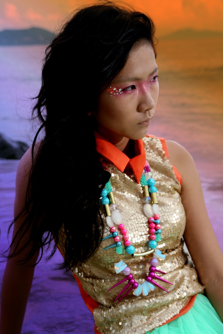
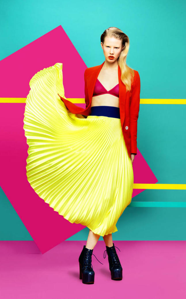
4.Sun-risa
It refers to eccentricity, delirium and surrealism. It connects these fantastic worlds with a naïve aesthetic through vivid and bold colours. It is a free and spontaneous style influenced by the plastic arts where there are abundant shades of fuchsia, yellow, turquoise or bright orange.
Finally, this edition of The Color Community was dedicated to Juan Gratacós Ortiz, president of Gratacós in a tribute after his recent death. “My father has always been a lover of colour and textures and in some way he is still present among us , “explained his son Juan Gratacós, full of emotion.